Create a Dream Design with 3D Typography
Mon, Oct 13, 2008
Illustrator
,
Photoshop
,
Tutorials
Hello, my name is Alex Beltechi, a designer that is currently studying in college and working in the print
media realm. I would love to explain my vast experience and overwhelming knowledge to you, but due to
the fact that I have no such qualities, I’ll stick to sharing what skills I’ve been developing lately, through
tutorials. Among keyboard shortcuts and mouse clicks, I enthusiastically tap piano keys and dream of
adjusting a lens’ focus. And in case you’d like to find me on the web, you can read my
tutorials
on
PSDTUTS or see more of my work on my
Behance
portfolio.
Introduction
In this tutorial, we’re going to create a 3D Typography based design. All the elements will revolve around
the centerpiece and theme: dreaming. The word will dictate the entire layout and control the space by
allowing everything else to emerge from within. The trees will grow out of the letters; the mountains will
show themselves behind the word and overshadow the glowing moon.
Dreaming often takes you to different places and unites bits and pieces of your memory. It basically takes
you to a whole new world, but that is usually made up of real elements. We’ll illustrate this by making
everything float in mid air, as if suspended in time, yet maintain realism by using common elements of
nature.
Naturally, people dream at night, so the overall lighting will be dark and predominated by a cold color
palette: cyan and lime green.
Also, the typography should have a classic, storytelling look; one that would complete the eerie atmosphere.
Feel free to download the PSD at the bottom of the post that contains the final image. Now that we’ve
planned everything, let’s begin.
Create the 3D text
The first thing to do is get this free font called
Storybook
. It’s a font that fits our context well, and that will
look well with 3D decorations due to its elegant serifs and bold stature. Type up the first letter of your word
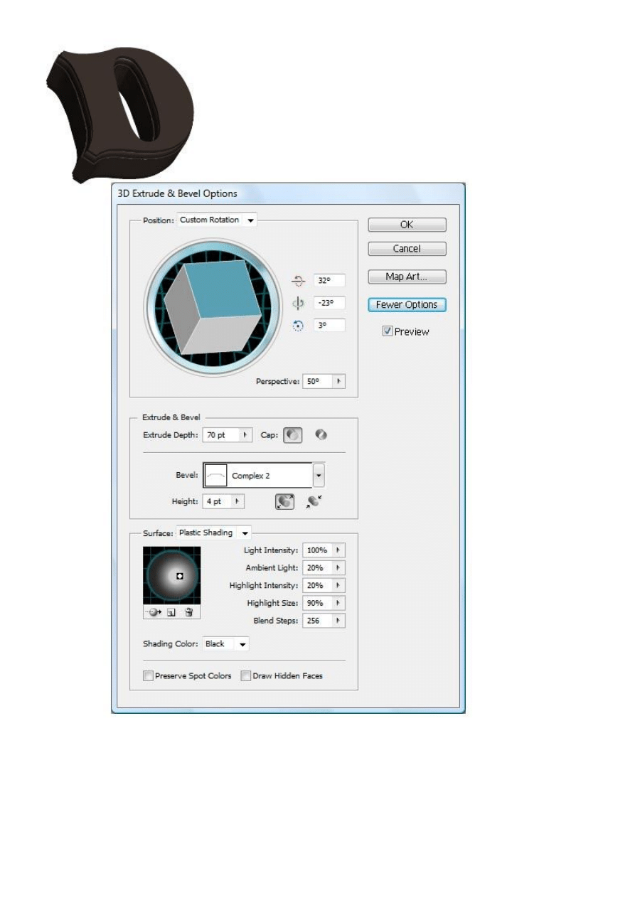
and give it this color: 4C3F38.
Now add a 3D effect by going to Effect > 3D > Extrude & Bevel. Play around with the settings yourself to
get the angle, lighting and form you want. You can recreate my treatment by using the same settings. Don’t
forget to use a ‘Complex 2’ Bevel.
Once you finish the first letter, repeat the process on the remaining letters. The only modifications you
should make are to alter the position. Then copy (Ctrl+C) each individual letter and paste (Ctrl+V) them in
Photoshop one at a time. Once you try pasting them, you’ll be prompted to choose a method of importing.
Choose the ‘Smart Object’ Option. By doing this you can make simple adjustments at all times to the
Illustrator file right inside Photoshop by double clicking the layer icon.
Position the letters onto an empty Photoshop canvas. I’m working at a rather large resolution of
approximately 6300 x 4500 px at 300 ppi.
Also, fill the background layer with this color: 17151d.
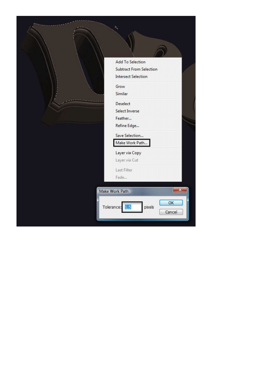
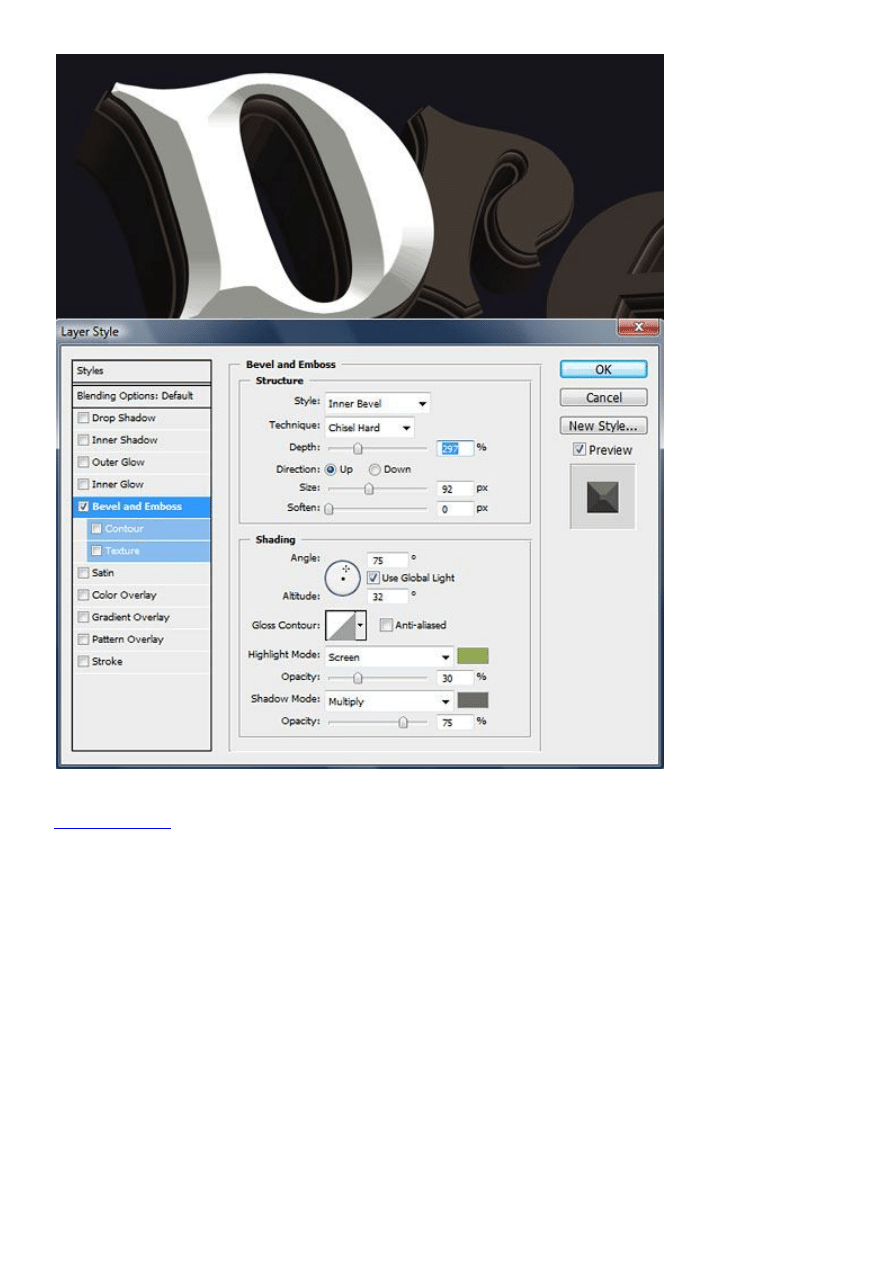
At this point we’ll begin stylizing the letters. Get the Magic Wand Tool (W) and make a selection of the
letter’s foreground. Right click, select Make Work Path and specify a tolerance level of 1,5.
Now that it’s a work path, we’ll fill it with a color by going to Layer > New Fill Layer > Solid Color. Fill it
with white. The path should now be a vector shape. Double click on its layer and give it a bevel. Use the
settings shown in the image below and choose the highlight color (94aa53) and shadow color (6c6f64).
It’s now time to create a pattern that will cover the front of each letter. I’m using a Go Media vector freebie:
Seamless Swirls
. Go on and download it if you haven’t already, and open the provided Illustrator file.
Change its color to this: 94aa52 and copy (Ctrl+C). Open a new Photoshop project with the clipboard size
(235 x 235 px) and fill the background color with another color: ebe77f. To make it into o a pattern go to
Edit > Define Pattern. Your new pattern will be saved in the pattern set that is currently opened.
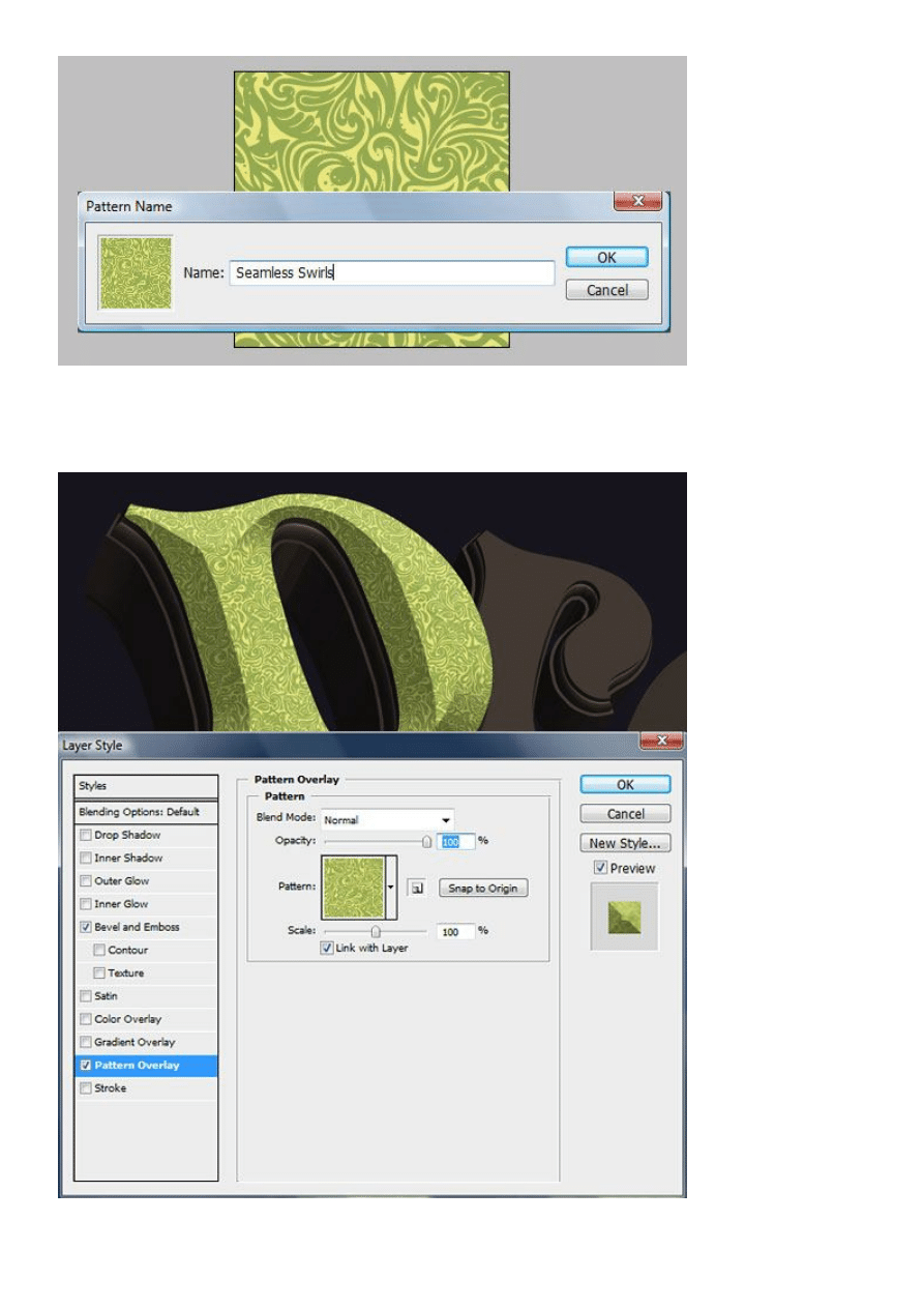
Now that you’ve created the pattern, you need to add the pattern to the face of the letter. Double click on the
white shape’s layer and add a Layer Style: Pattern Overlay. Your newly created pattern should already be
selected.
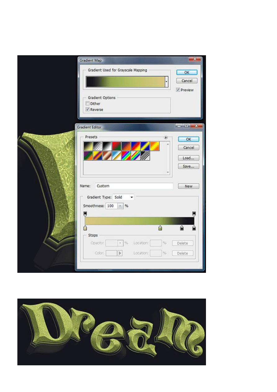
One last touch is a Gradient Map Adjustment Layer that we’ll place on top of the letter’s body. While
having the layer selected, go to Layer > New Adjustment Layer > Gradient Map. Then play around with the
colors until you get a similar result. My colors, from left to right are: d8c67f, 94aa53, 262628, and 141416.
Make sure that the Adjustment Layer Applies only to the letter. To do this, make it a clipping mask for the
letter layer by holding Alt and clicking right in between the two layers.
Now copy the layer style of the letter face and duplicate the Gradient Map. Apply these effects to the
remaining letters.

Draw the scenery
The text is now finished. Let’s add the trees and foliage.
This technique I’m about to show you is what I have developed for myself. It reduces complex imagery to
simple shape. A simple splatter, when grouped in a pattern begins to take a certain role, thus resembling an
element of nature. You may find it useful or dull, but it’s what we’ll use for this design.
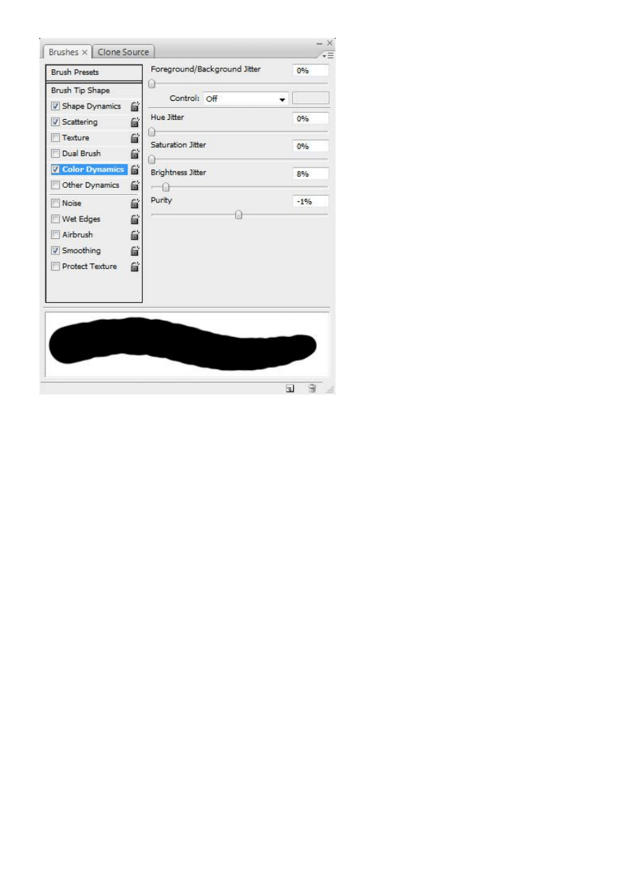
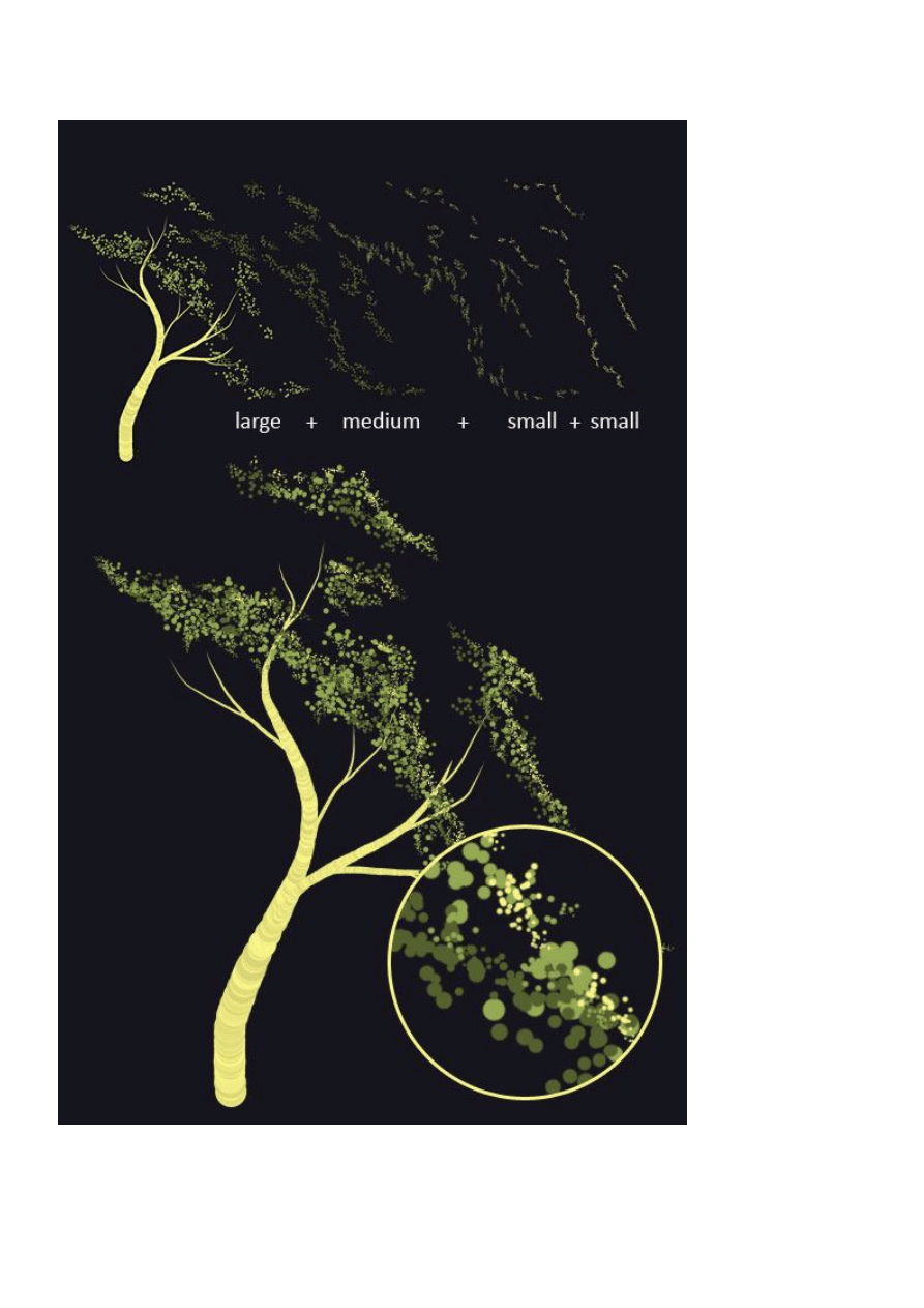
All you need is a standard Photoshop round brush and a mouse. Choose one using your Brush Tool (B) and
input the settings found in the images below.
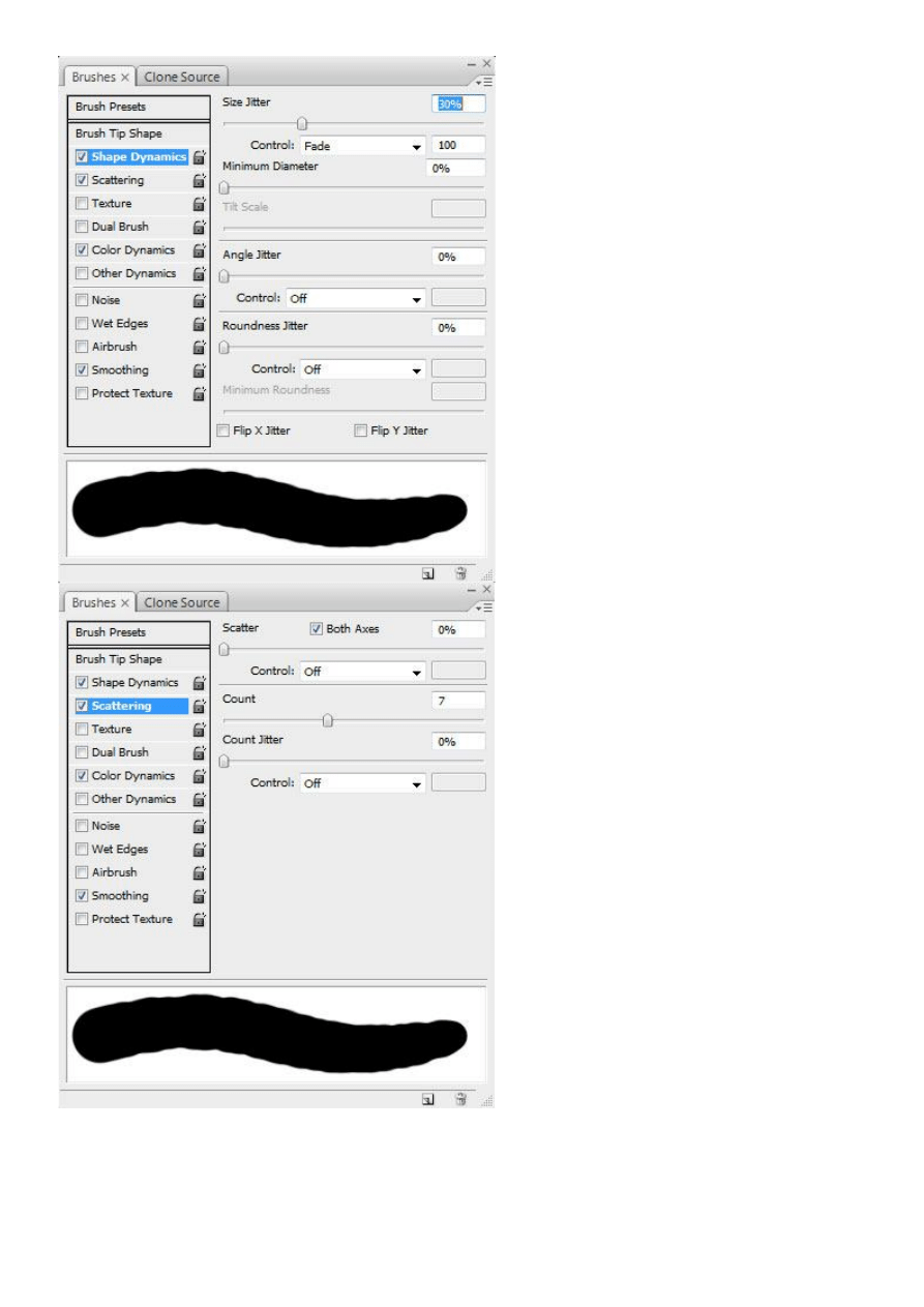
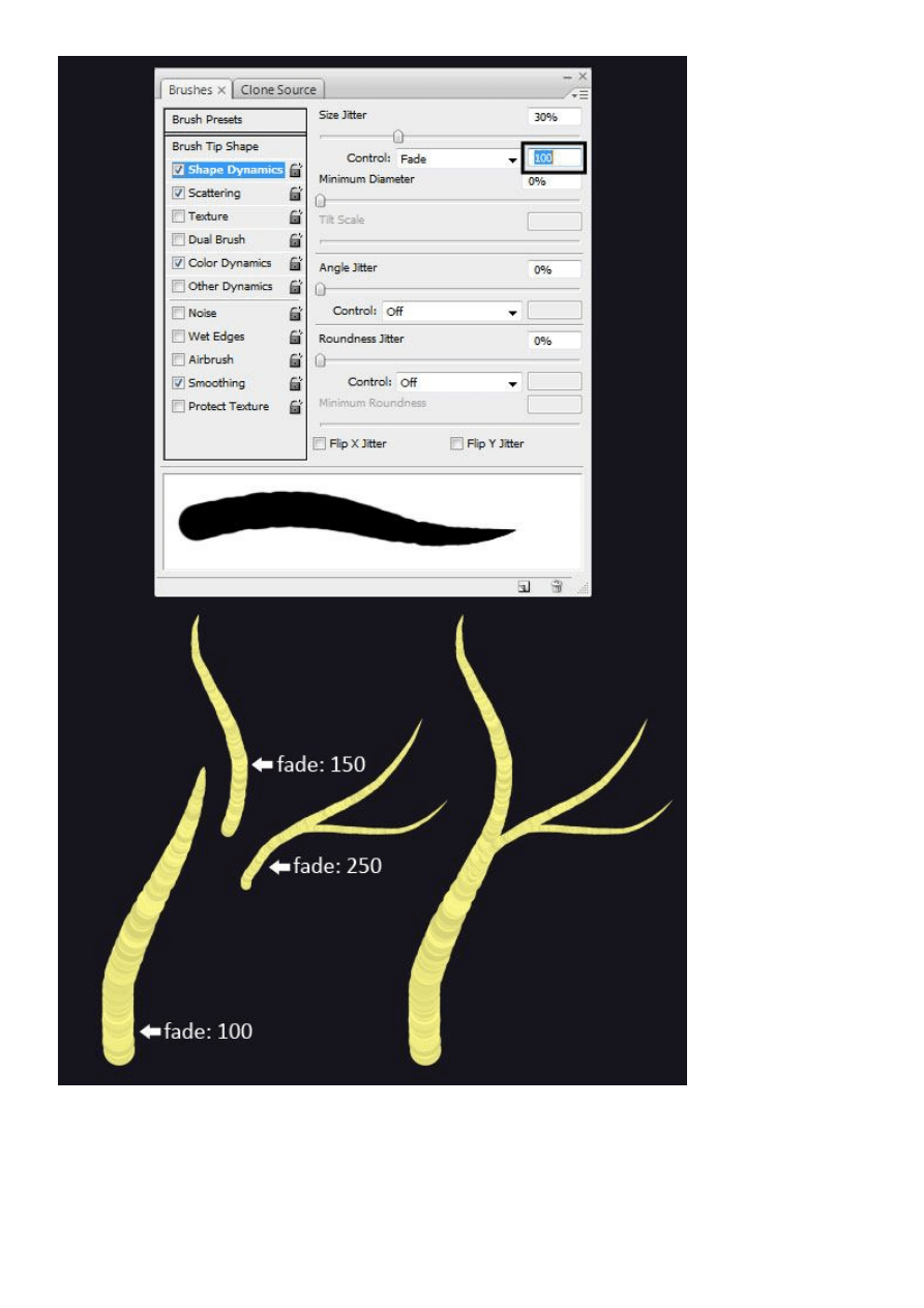
Now that your brush settings are all ready, begin painting a tree. It’s important to know that you shouldn’t
create the whole tree with the same brush settings. There is one adjustment you need to make along the way.
If you look under Shape Dynamics in your Brushes Window, you’ll see a setting we’re using: Fade. This
fades out your brush depending on how much you put in the adjacent field. A Fade set at 100 will end faster
than one set at 250. You can use whatever settings you find appropriate. I used 100 for the trunk, 150 for
extensions of the trunk, and 250 for thick branches. As you increase the fade, reduce the brush size at the
same time.
Continue using this technique in creating the rest of the trees and draw some roots too. Reduce the size
considerably for the thin branches and add even more fading when necessary.
It’s time for foliage. Prepare a separate brush using these settings.
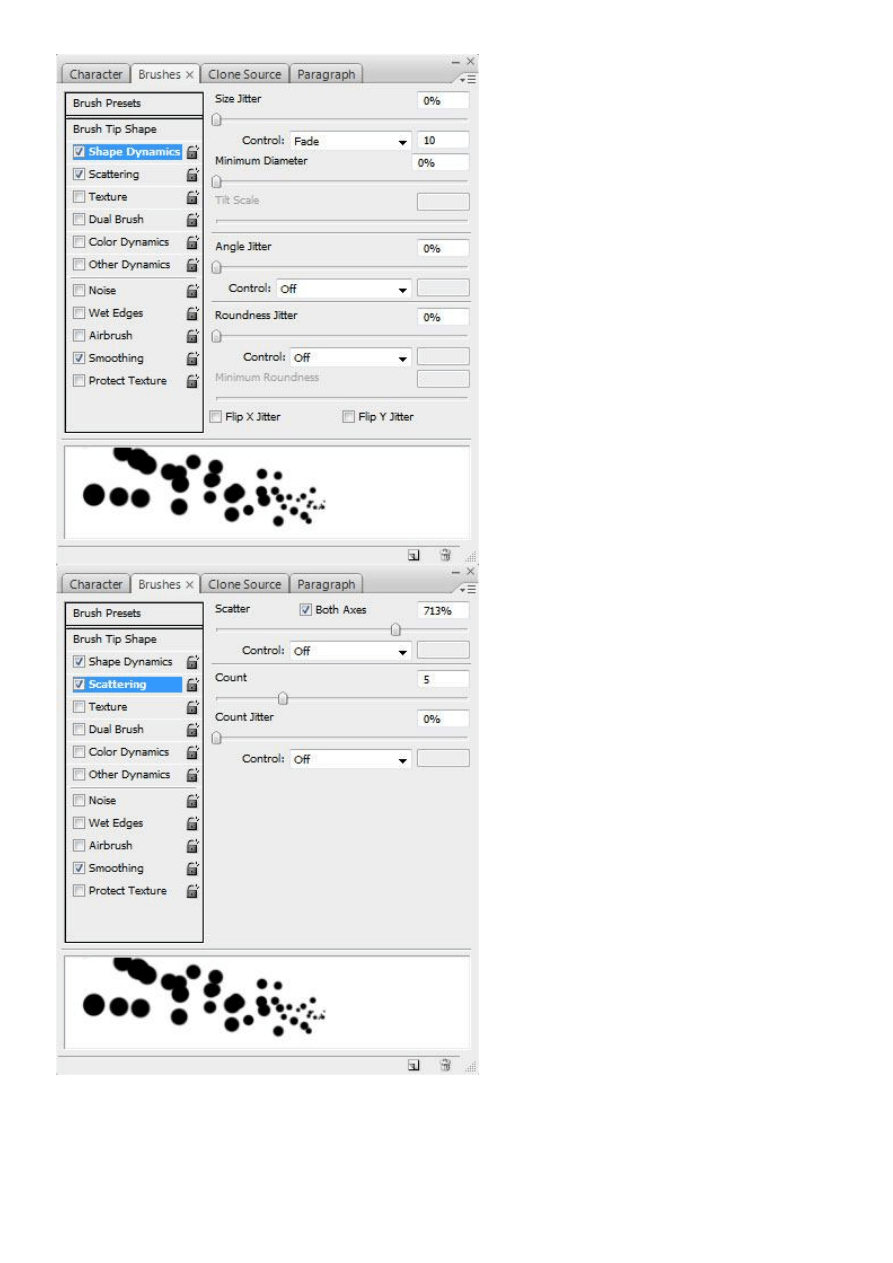
Now begin painting. Begin with a larger size using this green: 94aa53. In a layer underneath, with a smaller
sized brush, paint with a darker green: 55612f. Again over the light green layer, use the same color (94aa53)
with an even smaller size. For highlights, use the same size as the last one, but with this yellow: e3e07d.
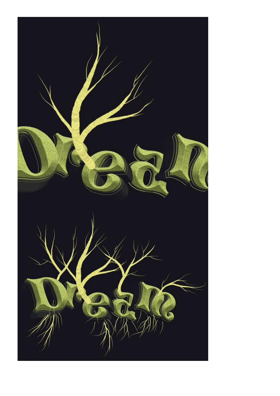
Here is an image you can use as a reference in creating your own trees.
I drew my inspiration from acacia trees, while coming up with the shape of the trunk and volume of the
foliage.
Following the branches as a reference, draw away!
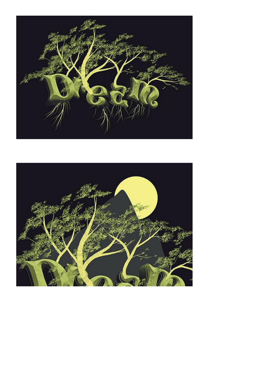
Add more nature elements now. I added a mountain and a moon. They will give depth to the image, and
prevent the composition from being scarce. Use the pen tool (P) and create them as vector shapes.
Make the mountain fade out on the bottom. An easy way to do it would be to create a new layer on top, clip
it to the mountain layer and paint with a large soft brush with the background color. I also added a glow on
the moon. To add one yourself, add a layer style: Outer Glow. Keep the standard color, increase its size and
reduce the opacity to 25%.
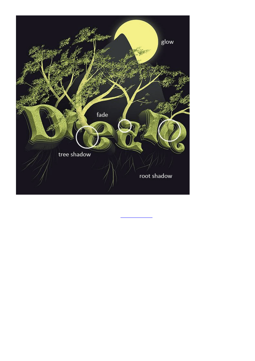
Some more improvements include adding dark accents to the lower part of the tree trunks and shadows that
stretch across the face of the letters. You can create those in the same way – clip a new layer to the one you
want darkened and paint with a soft brush using a dark color. This applies to the mountain, trees and roots.
Use a sharp brush to draw the tree shadow though.
Finalize the design
In order to complete the artistic feel of this design,
add this texture
to your canvas. Simply paste it on a new
layer, over all the other ones. Set the layer’s blending mode to Linear Burn and its opacity to 30%.
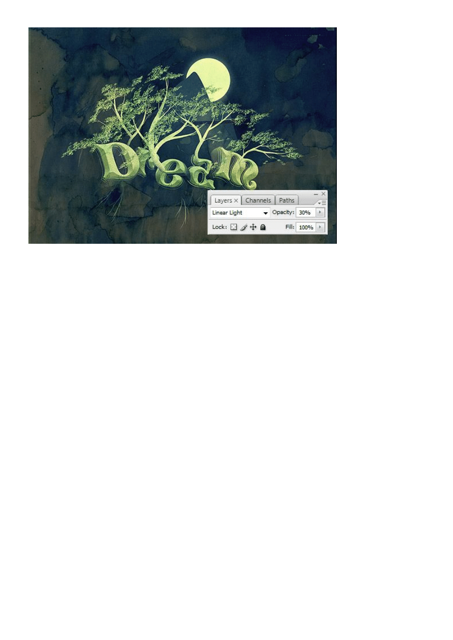
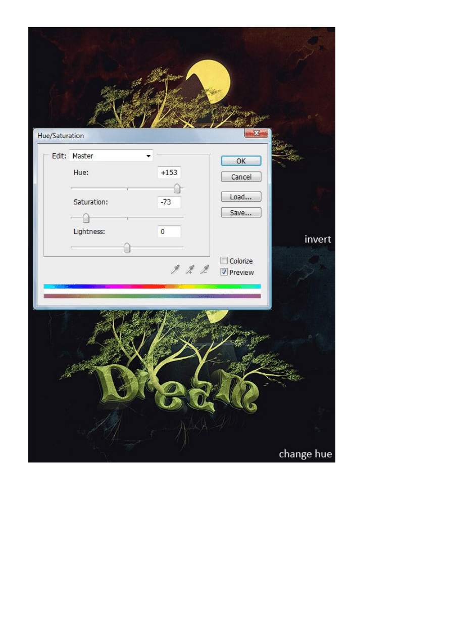
Now invert the texture (Ctrl+I) and change its hue by going to Image > Adjustments > Hue and Saturation.
Change the hue to 153 and saturation to -73.
One last touch – add the watercolor texture inside the mountain and moon, once more, with clipping masks.
Put their layers on Overlay (Mountain) and Multiply (Moon). Adjust the opacity.
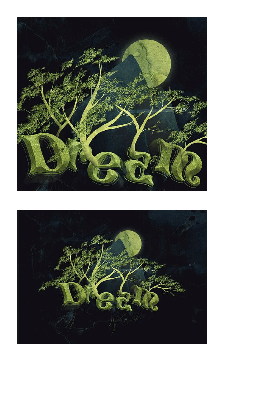
And that concludes it. Now go on and create your own, one of a kind, dream design.

Download Dream.PSD
Illustrator
,
Photoshop
,
tutorial
,
typography
This post was written by:
Adam Wagner
- who has written 59 posts on
GoMediaZine
.
I'm a marketer, designer, armchair singer/songwriter, wannabe theoretical physicist/philosopher and recent
college grad trying to pack as much living as possible into each day. Working at Go Media makes this pretty
easy. Catch me on
!!
Contact the author
Wyszukiwarka
Podobne podstrony:
napis
Drzewa binarne
drzewa rys
Drzewa owocowe(1)
IMPREGNACJA, drzewa, konstrukcje drewniane, Technologia
DRZEWA LIŚCIASTE wersja ostateczna
Olejek drzewa herbacianego?nny surowiec konserwujący w preparatach kosmetycznych
Drzewa w miastach Świadomość wartości przestrzeni
jak uzyskać zgodę na wyciecie drzewa
algorytmy drzewa
praca magisterska(17) jak napis Nieznany
Sortyment drewna, drzewa, konstrukcje drewniane, Technologia
NAPIS, SZKOŁA - NAUCZANIE ZINTEGROWANE, NIEPOSEGREGOWANE
Dlaczego należy chronić drzewa, KARTY PRACY MÓJ ŚWIAT 5
(Reflek)-Gdy z drzewa spadał liść - jak więcej widzieći, ● Wiersze moje ♥♥♥ for Free, ☆☆☆Religijne ☆
więcej podobnych podstron