

ii
©
2000 Adobe Systems Incorporated. All rights reserved.
Using WebObjects
®
with Adobe
®
GoLive
™
5.0 for Windows
®
and Macintosh
®
This manual, as well as the software described in it, is furnished under license and may be used or copied only in accordance with the
terms of such license. The content of this manual is furnished for informational use only, is subject to change without notice, and
should not be construed as a commitment by Adobe Systems Incorporated. Adobe Systems Incorporated assumes no responsibility or
liability for any errors or inaccuracies that may appear in this documentation. Except as permitted by such license, no part of this pub-
lication may be reproduced, stored in a retrieval system, or transmitted, in any form or by any means, electronic, mechanical, recording,
or otherwise, without the prior written permission of Adobe Systems Incorporated.
Please remember that existing artwork or images that you may want to include in your project may be protected under copyright law.
The unauthorized incorporation of such material into your new work could be a violation of the rights of the copyright owner. Please
be sure to obtain any permission required from the copyright owner.
Any references to company names in sample templates are for demonstration purposes only and are not intended to refer to any actual
organization.
Adobe, the Adobe logo, and GoLive are either registered trademarks or trademarks of Adobe Systems Incorporated in the United States
and/or other countries. Microsoft and Windows are either registered trademarks or trademarks of Microsoft Corporation in the United
States and/or other countries. Apple, Mac, Macintosh, and WebObjects are trademarks of Apple Computer, Inc. registered in the U.S.
and other countries. Java and Java Applet are trademarks or registered trademarks of Sun Microsystems, Inc. in the United States and
other countries. Unix is a registered trademark of The Open Group. All other trademarks are the property of their respective owners.
Contains an implementation of the LZW algorithm licensed under U.S. Patent 4,558,302.
Adobe Systems Incorporated, 345 Park Avenue, San Jose, California 95110, USA.
Notice to U.S. government end users. The software and documentation are “commercial items,” as that term is defined at 48 C.F.R.
§2.101, consisting of “commercial computer software” and “commercial computer software documentation,” as such terms are used in
48 C.F.R. §12.212 or 48 C.F.R. §227.7202, as applicable. Consistent with 48 C.F.R. §12.212 or 48 C.F.R. §§227.7202-1 through 227.7202-
4, as applicable, the commercial computer software and commercial computer software documentation are being licensed to U.S. gov-
ernment end users (A) only as commercial items and (B) with only those rights as are granted to all other end users pursuant to the
terms and conditions set forth in the Adobe standard commercial agreement for this software. Unpublished rights reserved under the
copyright laws of the United States.

iii
Using WebObjects with
Adobe GoLive
What You Need to Get Started . . . . . . . . . . . . . . . . . . . . . . . . . . . . . . . . . . 1
Adobe GoLive Approach to WebObjects . . . . . . . . . . . . . . . . . . . . . . . . . . . . 2
Adobe GoLive WebObjects Tools . . . . . . . . . . . . . . . . . . . . . . . . . . . . . . . . . 2
WebObjects in Web Settings . . . . . . . . . . . . . . . . . . . . . . . . . . . . . . . . . . . . 4
WebObjects Client-Side Components . . . . . . . . . . . . . . . . . . . . . . . . . . . . . 27

1
Using WebObjects with Adobe GoLive
This manual describes Adobe® GoLive™ support for WebObjects®, a powerful development environment
for creating dynamic Web pages.
General
Adobe GoLive comes with an easy-to-use front end for WebObjects 3.5, the object-oriented environment
from Apple Computer, Inc., for developing high-end World Wide Web applications.
Adobe GoLive makes creating dynamic content for WebObjects easy. It lets Web designers and application
developers share the workload involved in producing dynamic, interactive applications for the Web. Adobe
GoLive allows Web designers and application developers to work together efficiently: While the designer
creates the page layout, the developer can set up the logic acting behind the scenes.
For example, Adobe GoLive lets the Web author wrap up portions of the page into WOConditional tags to
dynamically adjust the page display to the audience’s requirements. Depending on user input, the Web page
will be dynamically generated by dynamic elements embedded in its HTML code. Combined with condi-
tional logic that the application developer programs or scripts, this capability gives Web designers a
powerful tool for integrating true interactivity.
What You Need to Get Started
To create interactive Web presentations using WebObjects, you need WebObjects Enterprise, the devel-
opment environment from Apple Computer. Serving pages requires WebObjects Server. For more detailed
information on development and deployment licenses, please consult Apple’s Web sites at
http://www.apple.com/webobjects/ and http://www.apple.com/enterprise/.
In addition, to use Adobe GoLive’s WebObjects tools, the Modules folder in the Adobe GoLive program
folder must contain the WebObjects Module. If you have trouble finding it, open the Modules Manager in
Adobe GoLive’s Preferences, locate the module in the list, then click its checkbox to enable it and relaunch
Adobe GoLive. If it doesn’t appear in the Modules Manager, you’ll have to install it from the Adobe GoLive
CD-ROM.
Manual Overview
This manual is subdivided in nine major sections:
•
“Adobe GoLive Approach to WebObjects” on page 2, lists the major components of a WebObjects
application and defines Adobe GoLive’s relationship with the WebObjects environment.
•
“Adobe GoLive WebObjects Tools” on page 2, provides an overview of the tools that the application
supplies.

2
ADOBE GOLIVE 5.0
Using WebObjects with Adobe GoLive
•
“WebObjects in Web Settings” on page 4, explains how the user can manage the WebObjects inventory
in Adobe GoLive’s Web Settings.
•
“WebObjects Types” on page 7, lists the basic WebObjects tags and provides instructions for use.
•
“WebObjects Client-Side Components” on page 27, describes the Client-Side Components that Adobe
GoLive supports and includes instructions for use.
•
“WebObjects Forms” on page 36, lists the WebObjects Forms tags and discusses how to use them.
•
“WebObjects Header Tags” on page 44, describes optional header tags and how to use them.
•
“WebObjects Frames” on page 45, describes Adobe GoLive’s inventory of conditional WebObjects
frames and how to insert frames and set them up.
•
“WebObjects Preferences” on page 47, specifies how users can customize Adobe GoLive’s WebObjects
editing environment.
Adobe GoLive Approach to WebObjects
When writing a WebObjects application, developers create components and connect them. A component
is a page or portion of a page that contains HTML content and behavior and is located in its own directory.
Components generally consist of the following files:
•
An HTML template (suffix is “.html”) that specifies how the page looks. This can be any HTML page built
with the WebObjects editing functionality of Adobe GoLive.
•
A declarations file (suffix is “.wod”) that binds the dynamic elements on the HTML template page to the
script’s variables and actions. This file is automatically written by Adobe GoLive as the Web author adds
WebObjects to the HTML template page.
•
A script file (suffix is “.wos”) that defines the component’s attributes and implements its behavior. The
application developer usually writes this script file using WebScript™, a proprietary scripting language for
WebObjects.
•
If necessary, any images or other resources referenced by the component.
As the preceding list indicates, Adobe GoLive lets Web authors generate the “visual” part of a component
and declare variables. Programming the logic is only possible in the WebObjects development
environment.
Adobe GoLive WebObjects Tools
Adobe GoLive comes with a complete inventory of WebObjects tags, so designers can easily build the visual
framework of dynamic HTML pages and interface smoothly with the logic that application developers
program.
3
ADOBE GOLIVE 5.0
Using WebObjects with Adobe GoLive
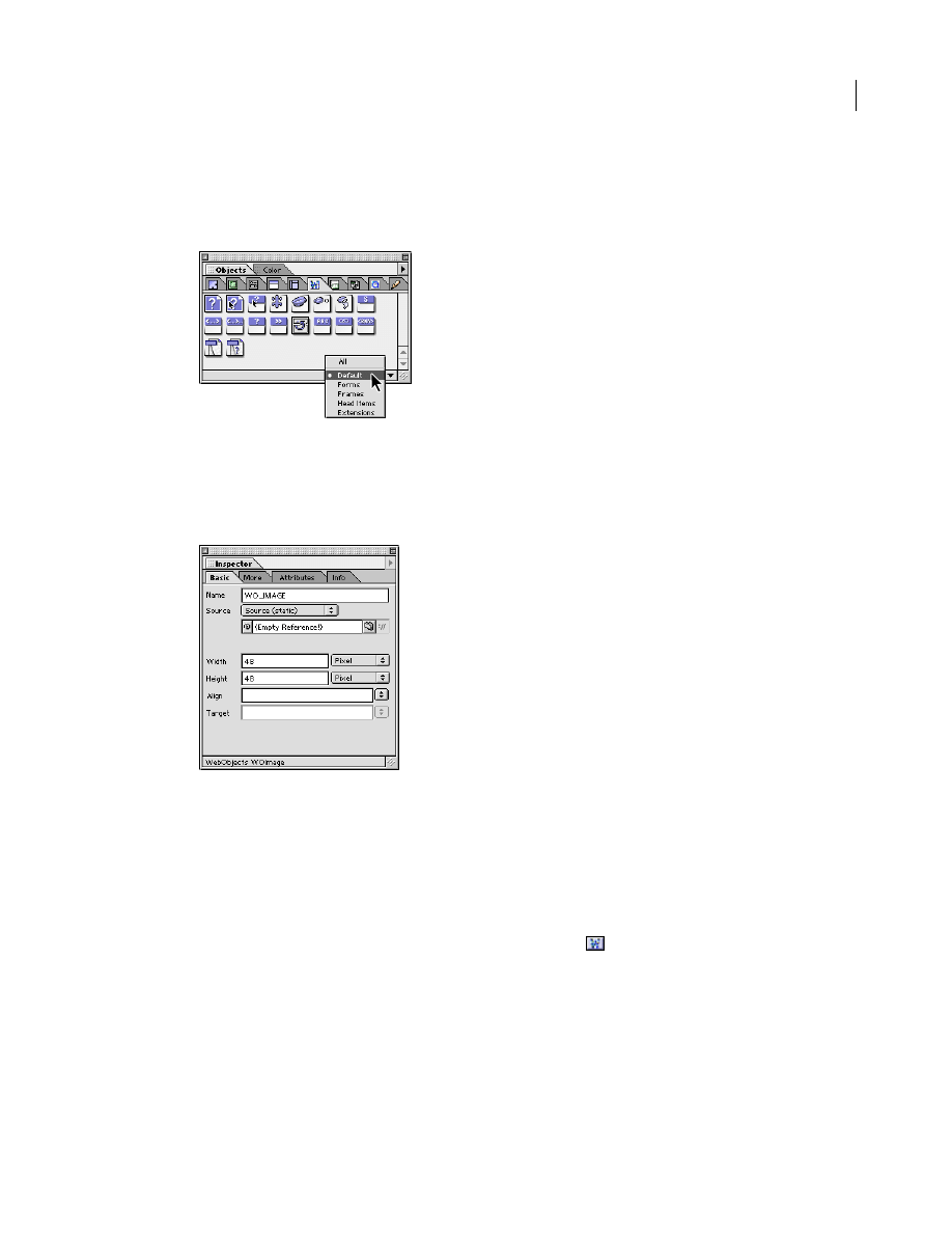
In five dedicated views, the WebObjects tab of the Objects palette contains a complete selection of building
blocks that let you add full interactivity to your pages—with drag and drop ease.
WebObjects-Specific Inspectors
You can inspect any elements placed in your page using a context-sensitive WebObjects Inspector. The
Inspector window lets you set up each WebObjects element individually by choosing object-specific
parameters and entering additional attributes as necessary.
WebObjects and HTML Fragments
WebObjects support requires the use of HTML fragments, allowing pages to be dynamically composed of
exchangeable portions. For more information, see Chapter 4 of the
User Guide
.
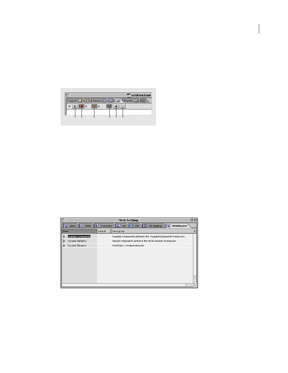
The WebObjects Declaration Editor
Any entry to the Inspector window is automatically written to the declarations file (.wod), which you can
view and edit by opening the WebObjects Declaration Editor tab
(
)
of the main document window.
4
ADOBE GOLIVE 5.0
Using WebObjects with Adobe GoLive
As with the Source editor, the WebObjects Declaration Editor supports color syntax highlighting and can
display the current line number to let you keep track of your code with ease. Syntax checking is also
available to ensure 100 percent error-free code usage in the declarations file. The entries in the WebObjects
tab of Web Settings supply the syntax rules.
A.
The Check Syntax button checks the syntax of the current document.
B.
Display Errors controls whether errors are shown when you check syntax.
C.
Display Warnings controls whether warnings are shown when you check syntax.
D.
Syntax Highlighting lets you highlight WebObjects syntax.
E.
Word Wrap toggles the wrapping of the source at the margin of the window.
F.
Line Numbers toggles the display of line numbers in the window.
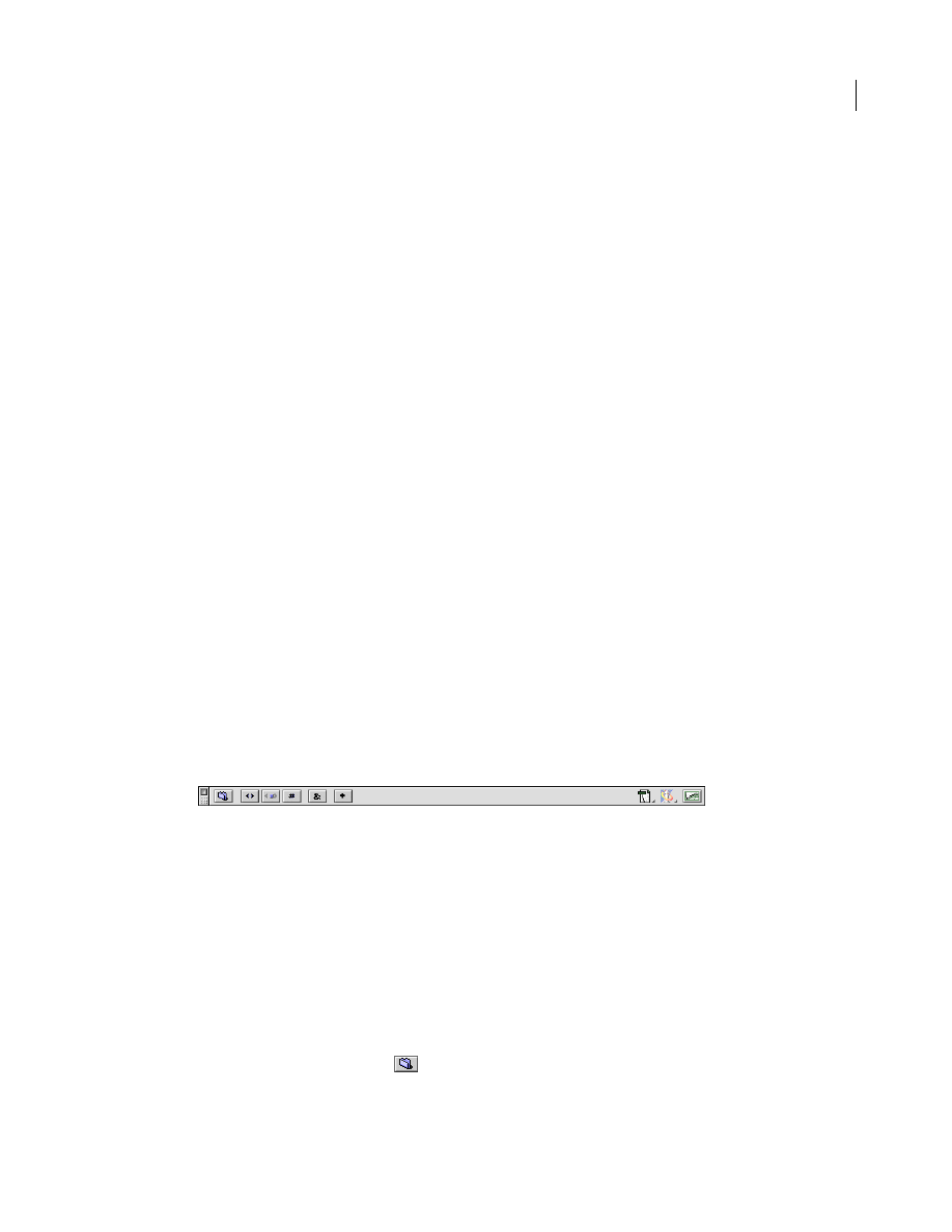
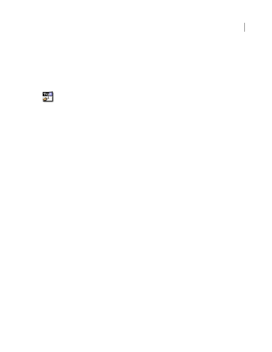
WebObjects in Web Settings
Adobe GoLive’s built-in Web Settings comes with a complete inventory of WebObjects elements to help
Web authors choose the proper building blocks for dynamic pages.
Just as with its HTML, CSS, and Chars counterparts, the content of the WebObjects tab of Web Settings
controls the standard options and default values that the element-specific Inspectors offer, thus ensuring
consistent use of WebObjects elements throughout your site.
The WebObjects tab of the Web Settings window appears below.
A
B
C
D
E
F
5
ADOBE GOLIVE 5.0
Using WebObjects with Adobe GoLive
Editing the WebObjects Inventory in Web Settings
Editing WebObjects in Web Settings is simple and straightforward, allowing users to keep their inventory
up-to-date by adding new tags as they emerge. You can add new WebObjects elements, attributes, default
values, and descriptions as well as edit or delete existing entries from the list when they become obsolete.
A complete set of editing tools is available in the Special menu and in a series of context-sensitive Inspector
windows that pop up as you select content from the Web Settings database.
Once you store an element you define in Web Settings, you can use it by inserting a generic WebObjects
and choosing the proper definition in the Inspector. (See “WOGenericElement” on page 18, “WOGener-
icContainer” on page 19, and “ReusableComponent” on page 26.)
Adding, Updating, or Removing WebObjects Elements
Web Settings provides a convenient set of editing tools for adding, updating, or removing WebObjects
elements and their attributes, values, and descriptions.
You can add the following items:
•
new sections
•
new types
•
new attributes
•
new enums (lists of known values)
The following sections include instructions for adding new items.
Web Settings Editing Tools
Editing tags in Web Settings is simple and straightforward. The context-sensitive toolbar turns into the
Web Settings toolbar when the WebObjects tab of the Web Settings window is activated. This toolbar
provides shortcut buttons to let you add new or duplicate sections, types, attributes, and enum properties.
The Web Settings toolbar appears below.
Important:
Do not edit any existing tags in the Web Settings unless you are absolutely sure what you’re doing.
Serious damage to your files may result.
Sections are user-defined categories that add structure to the content of Web Settings. Adobe GoLive comes
with two default sections: The Dynamic Elements section contains the full suite of dynamic objects that
WebObjects 3.5 supports, while the Reusable Components section includes interfaces for ready-to-use
code elements supplied with WebObjects 3.5, such as calendars and alert panels.
To add a section:
1
Choose Special > Web Settings to open Web Settings.
2
Click the WebObjects tab rider to display the WebObjects tab.
3
Click the New Section button
(
)
on the Web Settings toolbar.

6
ADOBE GOLIVE 5.0
Using WebObjects with Adobe GoLive
4
An entry named new section appears at the bottom of the WebObjects tab. At the same time, the WODB
Section Inspector appears. If the Inspector is not visible, choose Window > Inspector.
5
Place the pointer in the Section Name text box and enter a section name, then press Enter.
6
The section definition is now complete. See the Upcoming Components example in the section “Adding,
Updating, or Removing WebObjects Elements” on page 5. You can add new tags (see following) or use drag
and drop to move existing elements from the Dynamic Objects or Reusable Components subdivisions to
the new section.
To add a new WebObjects type:
1
Select the section you want to add a new tag to.
2
Click the New Tag button
(
)
on the Web Settings toolbar.
3
An entry named new_type appears at the bottom of the WebObjects tab. At the same time, the WODB
Type Inspector appears.
4
Place the pointer in the Type Name text box and enter a name, then press Enter.
5
If desired, select the softlocked checkbox to protect the new tag from accidental deletion from the
database.
Note:
The softlocked option is only available for user-defined tags. The core suite of WebObjects elements is
“softlocked” by default.
6
Move the pointer to the Description text box and enter descriptive text.
7
The type definition is now complete. See “Adding, Updating, or Removing WebObjects Elements” on
page 5. You can proceed to add attributes and enum definitions (see following).
To add an attribute to a WebObjects type:
1
Select the type you want to add a new attribute to.
2
Click the New Attribute button
(
)
on the Web Settings toolbar.
3
An entry named new_attribute appears below the tag entry. At the same time, the WODB Attribute
Inspector appears.
4
Place the pointer in the Attr. Name text box and enter an attribute name, then press Enter.
5
Move the pointer to the Default text box and enter a default value. If the attribute supports several
known values, go to the next section and enter enum properties, then return to the WODB Attribute
Inspector and choose one from the pop-up menu next to the Default text box.
6
Move the pointer to the Description text box and describe the attribute.
7
Now that the attribute definition is complete, see “Adding, Updating, or Removing WebObjects
Elements” on page 5, you can proceed to add enum definitions (see following).
To add an optional enum option to a WebObjects type attribute:
1
Select the type attribute you want to add a new enum definition to.
Enum definitions allow for passing a suite of initial values to an object—for example, user-selectable items
for a menu in a fill-in form.

7
ADOBE GOLIVE 5.0
Using WebObjects with Adobe GoLive
2
Click the New Enum button
(
)
on the Web Settings toolbar.
3
An entry named new_value appears at the bottom of the WebObjects tab. At the same time, the WODB
Value Inspector appears in the context-sensitive Inspector window.
4
Place the pointer in the Value text box and enter an enum value, then press Enter. Repeat this step until
you have specified all values that the new attribute supports.
The enum definition is now complete.
To update a WebObjects element:
1
Select the WebObjects element to be changed in the WebObjects tab of the Web Settings window.
2
Make the desired changes by editing the name, description, or other item of your choice in the Inspector,
then press Enter to have your changes written to Web Settings.
To duplicate a WebObjects element:
1
Select the WebObjects element to be duplicated in the WebObjects tab of the Web Settings window.
2
Click the Duplicate Item button
(
)
on the Web Settings toolbar. You can also right-click (Windows®)
or Control-click (Mac OS) the selected item and choose Duplicate from the pop-up menu.
3
An entry with named itemname_copy appears below the current item. At the same time, the respective
Inspector appears in the context-sensitive Inspector window.
4
Proceed to change the copied item.
To delete a WebObjects element:
1
Select the WebObjects element to be deleted in the WebObjects tab of the Web Settings window.
2
Press Command+Delete.
WebObjects Types
Adobe GoLive’s default WebObjects tag inventory contains the standard suite of elements you need to build
dynamic HTML pages, including visible items, such as images, applets and tables, as well as invisible items,
such as state storage and repetition elements.
Displaying Default WebObjects Types
The default WebObjects tag inventory resides in the Default view of the WebObjects tab. To display this
view, click the WebObjects tab and then select Default from the view control menu at the bottom of the
Objects palette.
The following section lists the default WebObjects elements sorted in the order of their appearance:
•
•
•
•
8
ADOBE GOLIVE 5.0
Using WebObjects with Adobe GoLive
•
•
•
•
•
“WOGenericContainer” on page 19
•
•
•
“Table with WORepetition” on page 22
•
•
•
•
“WOSwitchComponent” on page 25
•
“ReusableComponent” on page 26
WOImage
The WOImage icon inserts an image placeholder that can be linked with an image. As with its HTML
counterpart, a WOImage object displays a passive, non-clickable image on the Web page.
To insert a WOImage placeholder:
1
Drag the WOImage icon from the Objects palette and drop it in your layout grid or document window.
2
Set up the image in the context-sensitive Inspector window, now titled WebObjects WOImage Inspector.
It has four tabs:
•
Basic lets you set the source file and geometry for the WebObjects image.
•
More can be opened, but its options are disabled. Image maps are only available for WOActiveImage and
WOImageButton objects.
•
Attributes lets you inspect current attributes and add new ones.
•
Info briefly describes the WebObjects element.
3
Set the following options in the Basic tab of the WOImage Inspector:
•
The Name text box displays the name of the current WebObjects element.
•
Use the Source pop-up menu above the Source text box to set the source as Source (static), Source
(dynamic), Filename (static), or Filename (dynamic). Different options appear depending upon this
setting that let you specify the source file by typing in a path, using a Browse button, or a Point and Shoot
button.
To adjust the alignment of an image placed in the flow of HTML code or on a layout grid:
To align the image relative to text on the same line, select an option from the Align pop-up menu:
•
The Default option uses the alignment settings of the surrounding text.
9
ADOBE GOLIVE 5.0
Using WebObjects with Adobe GoLive
•
The Top option aligns surrounding text with the top of the image.
•
The Middle option horizontally centers the baseline of surrounding text with the image.
•
The Bottom option is the default setting. It aligns the baseline of surrounding text with the bottom of
the image.
•
The Left option aligns the image to the left of the text.
•
The Right option aligns the image to the right of the text.
•
The Texttop option aligns the image with the top of the surrounding text.
•
The Absmiddle option horizontally aligns the absolute center of surrounding text with the image.
•
The Baseline option aligns the image with the baseline of the surrounding text.
•
The Absbottom option aligns the absolute bottom of the surrounding text with the bottom of the image.
To adjust the vertical and horizontal spacing between the image and surrounding text:
1
In the HSpace text box, type the horizontal spacing in pixels and press Enter.
2
In the VSpace text box, type the vertical spacing in pixels and press Enter.
To enter alternative text you want the browser to display instead of the image:
Click to place the pointer in the Alt Text text box, enter the desired text string, and press Enter.
To activate a bounding box around the WOImage and adjust its width:
1
Type in the desired border width in pixels and press Enter.
2
Click the Preview tab to check the appearance of your image.
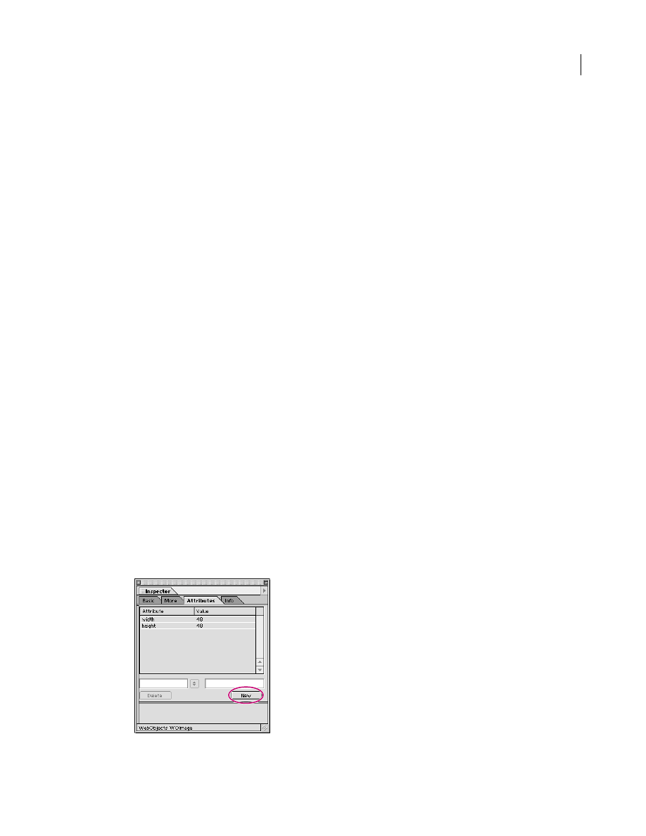
The Attributes tab of the WebObjects WOImage Inspector lets you inspect the settings made in the Basic
tab and add new attributes as required.
To add and delete attributes:
1
Click the New button to add new attributes for the WOImage. Clicking the New button enables the two
text boxes below the list box, allowing you to type in the attribute name (left) and value (right). Press Enter
and add the new attribute to the list.
10
ADOBE GOLIVE 5.0
Using WebObjects with Adobe GoLive
2
Click the Delete button to delete a selection from the Attributes list box.
Note: Consult the latest release of the WebObjects documentation for a list of valid attributes and attribute
values.
WOActiveImage
The WOActiveImage icon inserts an image placeholder that displays an image within the HTML page. If
the WOActiveImage is disabled, it simply displays as a passive element in the page. If enabled, the image is
active—that is, clicking the image generates a request.
If located outside an HTML form, a WOActiveImage functions as a mapped, active image. When the site
visitor clicks such a WOActiveImage, the coordinates of the click are sent back to the server. Depending on
where the site visitor clicks, different actions can be invoked. An image map file associates actions with each
of the defined areas of the image.
Within an HTML form, a WOActiveImage acts as a graphical submit button. You typically use WOActive-
Image when you need more than one submit button within a form.
To insert a WOActiveImage placeholder:
1
Drag the WOActiveImage icon from the Objects palette and drop it in your layout grid or document
window.
2
Set up the image in the context-sensitive Inspector window, now titled WebObjects WOActiveImage
Inspector. It has four tabs:
•
Basic lets you set the source file and geometry for the WebObjects image.
•
More allows you to create server-side clickable image maps.
•
Attributes lets you inspect current attributes and add new ones.
•
Info briefly describes the WebObjects element.
Set the following options in the Basic tab of the WebObjects WOActiveImage Inspector:
•
The Name text box displays the name of the current WebObjects element.
•
Use the Source pop-up menu above the Source text box to set the source as Source (static), Source
(dynamic), Filename (static), or Filename (dynamic). Different options appear depending upon this
setting that let you specify the source file by typing in a path, using a Browse button, or a Point and Shoot
button.
•
Use the Target pop-up menu to choose a frame in a frame set that will receive the page returned as a result
of the site visitor’s click.
For instructions on how to adjust image geometry, specify a target frame, set up display properties, and
enter alternative text, please refer to the respective instructions for the WOImage object:
•
“To adjust the alignment of an image placed in the flow of HTML code or on a layout grid:” on page 8
•
“To adjust the vertical and horizontal spacing between the image and surrounding text:” on page 9
•
“To enter alternative text you want the browser to display instead of the image:” on page 9
•
“To activate a bounding box around the WOImage and adjust its width:” on page 9

11
ADOBE GOLIVE 5.0
Using WebObjects with Adobe GoLive
The Attributes tab of the WebObjects WOActiveImage Inspector lets you inspect the settings you made in
the Basic and More tabs and add new attributes as necessary.
To add and delete attributes:
1
Click the New button to add new attributes for the WOActiveImage. Clicking the New button enables
the two text boxes below the list box, allowing you to type in the attribute name (left) and value (right).
Press Enter and add the new attribute to the list.
2
Click the Delete button to remove a selection from the Attributes list box.
Note: Consult the latest release of the WebObjects documentation for a list of valid attributes and attribute
values.
The More tab of the WebObjects WOActiveImage Inspector lets you edit server-side clickable image maps
served by the WebObjects runtime environment.
Adobe GoLive provides a complete selection of easy-to-use drawing and selection tools that lets you create
clickable maps, edit them right on top of the image, and link them to the WebObjects application. The
program also links the coordinates and shapes of clickable maps with associated actions, automatically
writing the resulting definitions to an image map file that goes to the WebObjects development
environment for further processing.
Note: To function as active images, WOActiveImage objects must be located outside an HTML form. They
cannot be enclosed in WOForm tags. See “WOForm” on page 36. Please note that the Use Map checkbox is
deselected when the user opens the HTML page via an FTP connection.
Because WOActiveImages are images with clickable hot spots on top of them, you will have to insert an
image before you can get started.
To insert an image and convert it into a clickable map:
1
Drop the WOActiveImage icon onto your document window.
2
With the WOActiveImage selected, click the Map tab in the WOActiveImage Inspector window.
3
In the More tab, check the Use Map checkbox.
4
Adobe GoLive will create an image map file. The file name, consisting of the WebObjects element name,
a hexadecimal identifier, and the suffix .map, will appear in the File text box of the More tab.
5
You can now edit the hot-spot area of the image map using image map tools. The toolbar features map-
specific buttons that let you shape, color, and otherwise edit your map area.
To draw a hot-spot area and adjust display options:
1
Click one of the map drawing tools in the toolbar.
2
Draw the hot spot at the desired location. The Map Area Inspector appears.
3
Place the pointer in the Action text box and type in the name of a method or script specifying the action
to occur when the site visitor clicks.
12
ADOBE GOLIVE 5.0
Using WebObjects with Adobe GoLive
WOImageButton
WOImageButton is a graphical submit button. Clicking the image generates a request and submits the
enclosing form’s values. You often use WOImageButton when you need more than one submit button
within a form.
To insert a WOImageButton placeholder:
1
Drag the WOImageButton icon from the Objects palette and drop it in your layout grid or document
window.
2
Set up the image in the context-sensitive Inspector window, now titled WebObjects WOImageButton
Inspector. It has four tabs:
•
Basic lets you set the source file and geometry for the WebObjects image.
•
More allows you to create server-side clickable image maps.
•
Attributes lets you inspect current attributes and add new ones.
•
Info briefly describes the WebObjects element.
Set the following options in the Basic tab of the WebObjects WOImageButtonInspector:
•
The Name text box displays the name of the current WebObjects element.
•
Use the Source pop-up menu above the Source text box to set the source as Source (static), Source
(dynamic), Filename (static), or Filename (dynamic). Different options appear depending upon this
setting that let you specify the source file by typing in a path, using a Browse button, or a Point and Shoot
button.
•
Use the Target pop-up menu to choose a frame in a frame set that will receive the page returned as a result
of the site visitor’s click.
For instructions on how to adjust image geometry, specify a target frame, set up display properties and
enter alternative text, please refer to the appropriate instructions for the WOImage object:
•
•
“To adjust the vertical and horizontal spacing between the image and surrounding text:” on page 9
•
“To enter alternative text you want the browser to display instead of the image:” on page 9
•
“To activate a bounding box around the WOImage and adjust its width:” on page 9
The Attributes tab of the WebObjects WOImageButton Inspector lets you inspect the settings made in the
Basic and More tabs and add new attributes as required.
To add and delete attributes:
1
Click the New button to add new attributes for the WOImageButton. Clicking the New button enables
the two text boxes below the list box, allowing you to type in the attribute name (left) and value (right).
Press Enter and add the new attribute to the list.
2
Click the Delete button to delete a selection from the Attributes list box.

13
ADOBE GOLIVE 5.0
Using WebObjects with Adobe GoLive
For information on the options in the More tab of the WebObjects WOImageButton Inspector, please refer
to the instructions on “WOActiveImage” on page 10 in the preceding section on the WOActiveImage tag.
Note: Consult the latest release of the WebObjects documentation for a list of valid attributes and attribute
values.
WOEmbeddedObject
The WOEmbeddedObject icon inserts an element that provides support for Netscape plug-ins.
To insert a WOEmbeddedObject placeholder:
1
Drag the WOEmbeddedObject icon from the Objects palette and drop it in your layout grid or
document window.
2
Set up the dynamic element in the context-sensitive Inspector window, now titled WebObjects
WOEmbeddedObject Inspector. It has three tabs:
•
Basic lets you make basic settings for WOEmbeddedObject.
•
Attributes lets you inspect current attributes and add new ones.
•
Info briefly describes the WebObjects element.
Set the following options in the Basic tab of the WebObjects WOEmbeddedObject Inspector:
•
Use the Name text box to give the WebObjects element a unique name.
•
Use the File text box and checkbox combination to type in the path to the plug-in file if the embedded
object’s content comes from outside the WebObjects application. If the embedded object’s content is
returned by a method within the WebObjects application, use the Attributes tab to specify the Value
attribute.
Note: Click the Browse button and select an applet in the following file selection dialog, or click the Point and
Shoot button to link to an image in the Site window.
•
Click to place the pointer in the Width text box, and enter the desired overall width of the area in pixels
to allocate space for the plug-in. Press Enter.
•
Click to place the pointer in the Height text box, and enter the desired overall height of the area in pixels
to allocate space for the plug-in. Press Enter.
•
Use the HSpace text box to specify the horizontal spacing in pixels, and press Enter.
•
Use the VSpace text box to specify the vertical spacing in pixels, and press Enter.
•
Use the Align text box and pop-up menu to align the plug-in relative to text on the same line. The Align
pop-up menu lets you select one of the following options:
The Default option uses the alignment settings of the surrounding text.
The Top option aligns surrounding text with the top of the plug-in.
The Middle option horizontally centers the baseline of surrounding text with the plug-in.
The Bottom option is the default setting. It aligns the baseline of surrounding text with the bottom of the
plug-in.
14
ADOBE GOLIVE 5.0
Using WebObjects with Adobe GoLive
The Left option aligns the plug-in to the left of the text.
The Right option aligns the plug-in to the right of the text.
The Texttop option aligns the plug-in with the top of the surrounding text.
The Absmiddle option horizontally aligns the absolute center of surrounding text with the plug-in.
The Baseline option aligns the plug-in with the baseline of the surrounding text.
The Absbottom option aligns the absolute bottom of the surrounding text with the bottom of the plug-in.
•
Use the Palette text box and pop-up menu to select the background or foreground palette for the plug-in.
The Attributes tab of the WebObjects WOEmbeddedObject Inspector lets you inspect the settings made in
the Basic tab and add new attributes as required.
To add and delete attributes:
3
Click the New button to add new attributes for the WOEmbeddedObject. Clicking the New button
enables the two text boxes below the list box, allowing you to type in the attribute name (left) and value
(right). Press Enter and add the new attribute to the list.
4
Click the Delete button to remove a selection from the Attribute list box.
Note: Consult the latest release of the WebObjects documentation for a list of valid attributes and attribute
values.
WOApplet
The WOApplet icon inserts a dynamic element that generates HTML to specify a Java applet. One or more
WOParam elements pass the applet’s parameters.
To insert a WOApplet placeholder:
1
Drag the WOApplet icon from the Objects palette and drop it in your layout grid or document window.
2
Set up the dynamic element in the context-sensitive Inspector window, now titled WebObjects
WOApplet Inspector. It has three tabs:
•
Basic lets you make basic settings for the WOApplet.
•
Attributes lets you inspect current attributes and add new ones.
•
Info briefly describes the WebObjects element.
Set the following options in the Basic tab of the WOApplet Inspector:
•
Use the Name text box to give the WebObjects element a unique name. This identifies the element as a
unique entity in case there are corresponding applets on the same page.
•
Use the Base text box to type in the path to the Java applet. If the directory containing the applet code is
omitted, the applet code is assumed to be in the same directory as the template HTML file.
Note: Click the Browse button and select an applet in the following file selection dialog, or click the Point and
Shoot button to link to an image in the Site window.
•
The Code text box displays the name of the Java class.

15
ADOBE GOLIVE 5.0
Using WebObjects with Adobe GoLive
•
Click to place the pointer in the Width text box, and enter the desired overall width of the area in pixels
to allocate space for the applet. Press Enter.
•
Click to place the pointer in the Height text box, and enter the desired overall height of the area in pixels
to allocate space for the applet. Press Enter.
•
Use the HSpace text box to specify the horizontal spacing in pixels, and press Enter.
•
Use the VSpace text box to specify the vertical spacing in pixels, and press Enter.
•
Use the Align text box and pop-up menu to align the applet relative to text on the same line. The Align
pop-up menu lets you select the following options:
The Default option uses the alignment settings of the surrounding text.
The Top option aligns surrounding text with the top of the applet.
The Middle option horizontally centers the baseline of surrounding text with the applet.
The Bottom option is the default setting. It aligns the baseline of surrounding text with the bottom of the
applet.
The Left option aligns the applet to the left of the text.
The Right option aligns the applet to the right of the text.
The Texttop option aligns the applet with the top of the surrounding text.
The Absmiddle option horizontally aligns the absolute center of surrounding text with the applet.
The Baseline option aligns the applet with the baseline of the surrounding text.
The Absbottom option aligns the absolute bottom of the surrounding text with the bottom of the applet.
•
Select the Show Content option to toggle the display of the HTML content on and off.
The Attributes tab of the WOApplet Inspector lets you inspect the settings made in the Basic tab and add
new attributes as required.
To add and delete attributes:
1
Click the New button to add new attributes for the WOApplet. Clicking the New button enables the two
text boxes below the list box, allowing you to type in the attribute name (left) and value (right). Press Enter
and add the new attribute to the list.
2
Click the Delete button to remove a selection from the Attributes list box.
Note: Consult the latest release of the WebObjects documentation for a list of valid attributes and attribute
values.
WOParam
The WOParam icon inserts an element that contains parameter definitions for the preceding applet.
WOParam elements can be cascaded to insert more complex parameter definitions.

16
ADOBE GOLIVE 5.0
Using WebObjects with Adobe GoLive
To insert a WOParam parameter definition element:
1
Drag the WOParam icon from the Objects palette and drop it on the WOApplet placeholder on your
layout grid or in the document window.
2
Set up the dynamic element in the context-sensitive Inspector window, now titled WebObjects
WOParam Inspector. It has four tabs:
•
Element lets you name the WebObjects element and change its type.
•
Attributes allows you to add new attributes.
•
Content lets you view alternative HTML content, if any.
•
Info briefly describes the WebObjects element.
3
Make sure you have checked the Show Content checkbox in the Basic tab of the WebObjects WOApplet
Inspector, see “WOApplet” on page 14 for instructions, to display the parameters.
Set the following options in the Element tab of the WebObjects WOParam Inspector:
•
Use the Name text box to give the WebObjects element a unique name. This identifies the WOParam
object as a unique entity in case more parameter definitions follow.
•
Use the Type text box and pop-up menu to change the type of the WebObjects, if required.
The Attributes tab of the WOParam Inspector lets you add attributes for the preceding Java applet.
To add and delete attributes:
1
Click the New button to add new attributes to the parameter definition. Clicking the New button enables
the two text boxes below the list box, allowing you to type in the attribute name (left) and value (right).
Press Enter and add the new attribute to the list.
2
Click the Delete button to delete a selection from the Attribute list box.
Note: Consult the latest release of the WebObjects documentation for a list of valid attributes and attribute
values.
WOJavaScript
The WOJavaScript icon inserts an element that lets you embed a script written in JavaScript in a dynami-
cally generated page.
To insert a WOJavaScript element:
1
Drag the WOJavaScript icon from the Objects palette and drop it in your layout grid or document
window.
2
Set up the script in the context-sensitive Inspector window, now titled WebObjects WOJavaScript
Inspector.
3
Set the following options in the WOJavaScript Inspector:
•
Use the Elementname text box to give the script element a unique name. This identifies the script more
clearly in case there are more scripts on the same page.

17
ADOBE GOLIVE 5.0
Using WebObjects with Adobe GoLive
•
Use the File text box to specify the path to the file containing the script. The path can be statically
specified in the declaration file or it can be an NSString, an object that responds to a description message
by returning an NSString, or a method that returns an NSString. For information on the NSString class,
please refer to the documentation on foundation classes, available from Apple Computer, Inc. (formerly
NeXT Software Inc.).
•
Use the String checkbox and Edit button to embed a string containing the script in the HTML page.
Clicking the Edit button opens Adobe GoLive’s JavaScript editor, which the Adobe GoLive User Guide
describes in more detail. Typically, ScriptString is an NSString object (see preceding), an object that
responds to a description message by returning an NSString, or a method that returns an NSString.
•
Use the Source text box to specify a URL for the location of the script.
•
Use the Use Comment text box and pop-up menu to determine whether the script will be enclosed in an
HTML comment. Setting the Comment option to YES will enclose the script in HTML comment tags.
Scripts can generate errors in some older browsers that weren’t designed to execute them, so you may want
to enclose your script in an HTML comment. Browsers designed to run these scripts will still be able to
execute them despite the surrounding comment tags.
WOStateStorage
The WOStateStorage icon inserts an element that provides a simple mechanism for storing application
states in an HTML page. If you include a WOStateStorage element in a form, any session and persistent
data will be stored in the page rather than on the server.
Because WOStateStorage elements are implemented using hidden fields–which in HTML must be located
within a form–they too must be located within a form. If a page has more than one form, you must declare
a WOStateStorage element within each form.
To insert a WOStateStorage tag:
1
Drag the WOStateStorage tag icon from the Objects palette and drop it in your layout grid or document
window.
2
Select the WOStateStorage tag to set up the state storage element in the context-sensitive Inspector
window, now titled WebObjects WOStateStorage Inspector. It has four tabs:
•
Element lets you set general properties for the current WebObjects.
•
Attributes lets you edit attributes for the current WebObjects.
•
Content displays object-specific text content, if any.
•
Info briefly describes the WebObjects element.
Set the following options in the Element tab of the WebObjects WOStateStorage Inspector:
•
Use the Name text box to give the WebObjects element a unique name. This name identifies the
WOStateStorage element as a unique entity in case more state storage elements follow in the HTML
template page.
•
Use the Type text box and pop-up menu to change the type of the WebObjects, if required.
The Attributes tab of the WebObjects WOStateStorage Inspector lets you add new attributes and values, as
required.

18
ADOBE GOLIVE 5.0
Using WebObjects with Adobe GoLive
To add and delete attributes:
1
Click the New button to add new attributes for the WOStateStorage object. Clicking the New button
enables the two text boxes below the list box, allowing you to type in the attribute name (left) and value
(right). Press Enter and add the new attribute to the list.
Currently supported attributes include:
•
size: This attribute indicates the maximum size (in bytes) for each of the hidden fields used to store the
state data. This attribute is optional; if size is not specified, the maximum size for hidden fields will be 1000
bytes.
2
Click the Delete button to delete a selection from the Attribute list box.
Note: Consult the latest release of the WebObjects documentation for a list of valid attributes and attribute
values.
WOGenericElement
The WOGenericElement icon inserts an element that provides a way for WebObjects to accommodate
custom HTML tags that are empty; in other words, they do not span a range of text. Because the HTML
language is evolving rapidly, it is convenient to have a way to dynamically generate elements that WebOb-
jects does not explicitly support.
To insert a WOGenericElement tag:
1
Drag the WOGenericElement tag icon from the Objects palette and drop it in your layout grid or
document window.
2
Select the WOGenericElement tag to set up the generic element in the context-sensitive Inspector
window, now titled WebObjects WOGenericElement Inspector. It has four tabs:
•
Element lets you set general properties for the current WebObjects.
•
Attributes lets you edit attributes for the current WebObjects.
•
Content displays object-specific text content, if any.
•
Info briefly describes the WebObjects element.
Set the following options in the Element tab of the WebObjects WOGenericElement Inspector:
•
Use the Name text box to give the WebObjects element a unique name. This name identifies the
WOGenericElement element as a unique entity in case more unary unknown HTML elements follow in
the page.
•
Use the Type text box and pop-up menu to select a custom WebObjects type from the Web Settings
database. See “Editing the WebObjects Inventory in Web Settings” on page 5.
The Attributes tab of the WebObjects WOGenericElement Inspector lets you add new attributes and
values.

19
ADOBE GOLIVE 5.0
Using WebObjects with Adobe GoLive
To add and delete attributes:
1
Click the New button to add new attributes for the WOGenericElement. Clicking the New button
enables the two text boxes and pop-up menus below the list box, allowing you to specify an attribute name
(left) and an HTML tag as a value (right).
2
Select elementName (see the following) from the left pop-up menu.
Currently supported attributes include:
•
elementName: This is the name of the HTML element to generate. This name (for example, “HR”) is
used to generate the element’s tag (<HR>). elementName must be defined as a constant. It cannot be
something returned by a script method, for example. Please note that for elements with URL attributes,
the URLs specified will appear as they are in the HTML document.
3
Go to the right pop-up menu and select an HTML tag—for example, “HR” for a horizontal ruler. Adobe
GoLive’s Web Settings database supplies the options on this pop-up menu.
4
To edit an attribute, click the Delete button to remove the selection from the Attribute list box, then start
over.
Note: Consult the latest release of the WebObjects documentation for a list of valid attributes and attribute
values.
WOGenericContainer
The WOGenericContainer icon inserts a box-shaped container that provides a way for WebObjects to
accommodate custom HTML container elements—that is, elements that span a range of text. Because the
HTML language is evolving rapidly, it is convenient to have a way to dynamically generate elements that
WebObjects does not explicitly support.
To insert a WOGenericContainer tag:
1
Drag the WOGenericContainer (Begin) tag icon from the Objects palette and drop it in your layout grid
or document window.
2
Drag the item(s) you want to be enclosed into the box-shaped container.
3
Select the WOGenericContainer box to set up the generic container in the context-sensitive Inspector
window, now titled WebObjects WOGenericContainer Inspector. It has four tabs:
•
Element lets you set general properties for the current WebObjects.
•
Attributes lets you edit attributes for the current WebObjects.
•
Content displays object-specific text content, if any.
•
Info briefly describes the WebObjects element.
Set the following options in the Element tab of the WebObjects WOGenericContainer Inspector:
•
Use the Name text box to give the WebObjects element a unique name. This name identifies the
WOGenericContainer object as a unique entity in case more unknown binary HTML elements follow in
the HTML template page.
The Attributes tab of the WebObjects WOGenericContainer Inspector lets you add attributes and values,
as necessary.
20
ADOBE GOLIVE 5.0
Using WebObjects with Adobe GoLive
To add and delete attributes:
4
Click the New button to add new attributes for the WOGenericContainer element. Clicking the New
button enables the two text boxes below the list box, allowing you to type in the attribute name (left) and
value (right). Press Enter and add the new attribute to the list.
5
Click the Delete button to delete a selection from the Attribute list box.
Note: Consult the latest release of the WebObjects documentation for a list of valid attributes and attribute
values.
WOConditional
The WOConditional icons insert a conditional container object that controls whether a portion of the
HTML page will be generated, based on the evaluation of its assigned condition.
To insert a WOConditional tag:
1
Drag the WOConditional (Begin) tag icon from the Objects palette and drop it in your layout grid or
document window.
2
Drag the item(s) you want to be conditional into the box-shaped container.
3
Select the WOConditional container to set up the conditional object in the context-sensitive Inspector
window, now titled WebObjects WOConditional Inspector. It has four tabs:
•
Element lets you set general properties for the current WebObjects.
•
Attributes lets you edit attributes for the current WebObjects.
•
Content displays object-specific text content, if any.
•
Info briefly describes the WebObjects element.
Set the following options in the Element tab of the WebObjects WOConditional Inspector:
•
Use the Name text box to give the WebObjects element a unique name. This name identifies the
WOConditional object as a unique entity in case more conditional portions follow in the HTML
template page.
•
Use the Type text box and pop-up menu to change the type of the WebObjects, if necessary.
The Attributes tab of the WebObjects WOConditional Inspector lets you add new attributes and values, as
required.
To add and delete attributes:
4
Click the New button to add new attributes for the WOConditional object. Clicking the New button
enables the two text boxes below the list box, allowing you to type in the attribute name (left) and value
(right). Press Enter and add the new attribute to the list.
Currently supported attributes include:
•
condition: An expression to evaluate. If the expression evaluates to YES (assuming negate is NO), the
HTML code that the WOConditional object controls is emitted; otherwise it is not.
•
negate: Inverts the sense of the condition. By default, negate is assumed to be NO.
21
ADOBE GOLIVE 5.0
Using WebObjects with Adobe GoLive
5
Click the Delete button to delete a selection from the Attribute list box.
Note: Consult the latest release of the WebObjects documentation for a list of valid attributes and attribute
values.
WORepetition
The WORepetition icons insert a container element that repeats its contents a given number of times. You
can use WORepetition to create dynamically generated ordered and unordered lists or banks of checkboxes
or radio buttons.
To insert a WORepetition tag:
1
Drag the WORepetition (Begin) tag icon from the Objects palette and drop it on your layout grid or in
the document window.
2
Drag the item(s) to be repeated into the box-shaped container.
3
Select the WORepetition container to set up the repetition object in the context-sensitive Inspector
window, now titled WebObjects WORepetition Inspector. It has four tabs:
•
Element lets you set general properties for the current WebObjects.
•
Attributes lets you edit attributes for the current WebObjects.
•
Content displays object-specific text content, if any.
•
Info briefly describes the WebObjects element.
Set the following options in the Element tab of the WORepetition Inspector:
•
Use the Name text box to give the WebObjects element a unique name. This identifies the WORepetition
object as a unique entity in case more repetitions follow.
•
Use the Type text box and pop-up menu to change the type of the WebObjects, if necessary.
The Attributes tab of the WebObjects WORepetition Inspector lets you inspect the settings you made in
the Basic tab and add new attributes as necessary.
To add and delete attributes:
1
Click the New button to add new attributes for the WORepetition object. Clicking the New button
enables the two text boxes below the list box, allowing you to type in the attribute name (left) and value
(right). Press Enter and add the new attribute to the list.
2
Currently supported attributes include:
•
count: The number of times this element will repeat its contents.
•
identifier: A value that uniquely identifies the item in the list array. Typically it is the primary key of an
enterprise object.
•
index: An index of the current iteration of the WORepetition.
•
item: A current item in the list array.
•
list: An array of objects that the WORepetition will iterate through.
22
ADOBE GOLIVE 5.0
Using WebObjects with Adobe GoLive
3
Click the Delete button to remove a selection from the Attribute list box.
Note: Consult the latest release of the WebObjects documentation for a list of valid attributes and attribute
values.
Table with WORepetition
The Table with WORepetition icon inserts a table, providing a way for WebObjects to accommodate
HTML tables in HTML template pages.
To insert a Table with WORepetition:
1
Drag the Table with WORepetition icon from the Objects palette and drop it in your layout grid or
document window.
2
Select the Table with WORepetition element to set up the table in the context-sensitive Inspector
window, now titled Table Inspector.
For a complete description of the Table Inspector, please refer to Chapter 4 of the User Guide. For an update
on new shortcuts and features, please see the Adobe GoLive Quick Reference Card.
WOString
The WOString icon inserts an object that represents itself in the HTML page as a dynamically generated
string.
To insert a WOString tag:
1
Drag the WOString tag icon from the Objects palette and drop it in your layout grid or document
window.
2
Select the WOString tag to set up the string object in the context-sensitive Inspector window, now titled
WebObjects WOString Inspector. It has four tabs:
•
Element lets you set general properties for the current WebObjects.
•
Attributes lets you edit attributes for the current WebObjects.
•
Content displays object-specific text content, if any.
•
Info briefly describes the WebObjects element.
Set the following options in the Element tab of the WebObjects WOString Inspector:
•
Use the Name text box to give the WebObjects element a unique name. This name identifies the
WOString object as a unique entity in case more string objects follow in the HTML template page.
•
Use the Type text box and pop-up menu to change the type of the WebObjects, if necessary.
The Attributes tab of the WebObjects WOString Inspector lets you add new attributes and values, as
needed.
To add and delete attributes:
3
Click the New button to add new attributes for the WOString object. Clicking the New button enables
the two text boxes below the list box, allowing you to type in the attribute name (left) and value (right).
Press Enter and add the new attribute to the list.

23
ADOBE GOLIVE 5.0
Using WebObjects with Adobe GoLive
Currently supported attributes include:
•
dateformat: This format string specifies how to format value as a date. If a date format is used, value must
be assigned an NSCalendarDate object. If value can’t be interpreted according to the format you specify,
value is set to nil. See the NSCalendarDate class specification in the documentation on foundation classes
for a description of the date format syntax.
•
escapeHTML: If escapeHTML is set to YES, HTML tags in WOString’s contents are protected from being
interpreted by the browser; otherwise, they are not. By default, WebObjects tries to ensure that the contents
of a WOString appears in the client browser just as it appears in the WebObjects application source code.
If escape HTML is set to NO, WebObjects simply passes the string to the browser without protecting
HTML tags from being interpreted as commands.
•
numberformat: This format string specifies how to format value as a number. If a number format is used,
value must be assigned an NSDecimalNumber object. If the element’s value can’t be interpreted according
to the format you specify, value is set to nil. See the NSNumberFormatter class specification in the
documentation on foundation classes for a description of the number format syntax.
•
value: This attribute specifies the text to be displayed in the HTML page. Value is typically assigned an
NSString object, an object that responds to a description message by returning an NSString, or a method
that returns an NSString. The NSString’s contents are substituted into the HTML in the place that this
dynamic element occupies. For a description of the NSString class, please refer to the documentation on
foundation classes, available from Apple Computer, Inc. (formerly from NeXT Software, Inc.).
4
Click the Delete button to remove a selection from the Attribute list box.
Note: Consult the latest release of the WebObjects documentation for a list of valid attributes and attribute
values.
WOHyperlink
The WOHyperlink icon inserts an element that generates a hypertext link in an HTML document.
To insert a WOHyperlink tag:
1
Drag the WOHyperlink tag icon from the Objects palette and drop it in your layout grid or document
window.
2
Select the WOHyperlink tag to set up the hyperlink element in the context-sensitive Inspector window,
now titled WebObjects WOHyperlink Inspector. It has four tabs:
•
Element lets you set general properties for the current WebObjects.
•
Attributes lets you edit attributes for the current WebObjects.
•
Content displays object-specific text content, if any.
•
Info briefly describes the WebObjects element.
Set the following options in the Element tab of the WebObjects WOHyperlink Inspector:
•
Use the Name text box to give the WebObjects element a unique name. This name identifies the
WOHyperlink element as a unique entity in case more unary unknown HTML elements follow in the page.
•
Use the Type text box and pop-up menu to change the type of the WebObjects, if necessary.
24
ADOBE GOLIVE 5.0
Using WebObjects with Adobe GoLive
The Attributes tab of the WebObjects WOHyperlink Inspector lets you add new attributes and values.
To add and delete attributes:
1
Click the New button to add new attributes for the WOHyperlink element. Clicking the New button
enables the two text boxes below the list box, allowing you to type in the attribute name (left) and value
(right). Press Enter and add the new attribute to the list.
Currently supported attributes include:
•
action: This attribute specifies the method to invoke when this element is activated. The method must
return a WOElement.
•
disabled: If this attribute is set to YES, the content string is displayed, but the hyperlink is not active.
•
fragmentIdentifier: This attribute specifies the named location to display in the destination page.
•
href: This attribute specifies the URL to direct the browser to when the image is clicked.
•
pageName: This attribute specifies the Name of the WebObjects page to display when the link is clicked.
•
string: This attribute specifies the text displayed to the site visitor as the link.
•
target: This attribute specifies the frame in a frame set that will receive the page returned as a result of the
site visitor’s click.
2
Click the Delete button to delete a selection from the Attribute list box.
Note: Consult the latest release of the WebObjects documentation for a list of valid attributes and attribute
values.
WOBody
The WOBody icon inserts an element that specifies the background image to display for the HTML page.
To insert a WOBody tag:
1
Drag the WOBody tag icon from the Objects palette and drop it in your layout grid or document
window.
2
Select the WOBody tag to set up the background image in the context-sensitive Inspector window, now
titled WebObjects WOBody Inspector. It has four tabs:
•
Element lets you set general properties for the current WebObjects.
•
Attributes lets you edit attributes for the current WebObjects.
•
Content displays the image content.
•
Info briefly describes the WebObjects element.
To avoid conflicts, disable the default HTML body tag in the page. In Layout mode, click the small page
icon above the main window area to open the Page Inspector. Go to the HTML tab and deselect the Body
checkbox (if selected).
Set the following options in the Element tab of the WebObjects WOBody Inspector:
•
Use the Name text box to give the WebObjects element a unique name.
25
ADOBE GOLIVE 5.0
Using WebObjects with Adobe GoLive
•
Use the Type text box and pop-up menu to change the type of the WebObjects, if necessary.
The Attributes tab of the WebObjects WOBody Inspector lets you add new attributes and values or change
the image file reference.
To add and change attributes:
1
Click the New button to add new attributes for the WOBody element. Clicking the New button enables
the two text boxes below the list box, allowing you to type the attribute name (left) or select it from the
pop-up menu to the right of the text box. After specifying the attribute, enter its value (right), that is, the
file specification. Press Enter and add the new attribute to the list.
Currently supported attributes include:
•
filename: Path to the image relative to the WebServerResources directory.
•
framework: Framework that contains the image file. This attribute is only necessary if the image file is in
a different location from the component.
•
src: URL containing the image data. Use this attribute for complete URLs; for relative URLs use filename
instead.
2
Click the Delete button to remove a selection from the Attribute list box.
WOSwitchComponent
The WOSwitchComponent element provides a way to determine at runtime which nested component to
display. This component is useful when you want to decide how to display information based on the state
of the application.
To insert a WOSwitchComponent tag:
1
Drag the WOSwitchComponent tag icon from the Objects palette and drop it in your layout grid or
document window.
2
Select the WOSwitchComponent tag to set up the background image in the context-sensitive Inspector
window, now titled WebObjects WOSwitchComponent Inspector. It has four tabs:
•
Element lets you set general properties for the current WebObjects.
•
Attributes lets you edit attributes for the current WebObjects.
•
Content displays the component content.
•
Info briefly describes the WebObjects element.
Set the following options in the Element tab of the WebObjects WOSwitchComponent Inspector:
•
Use the Name text box to give the WebObjects element a unique name.
•
Use the Type text box and pop-up menu to change the type of the WebObjects, if necessary.
The Attributes tab of the WebObjects WOSwitchComponent Inspector lets you add new attributes and
values or change the image file reference.
26
ADOBE GOLIVE 5.0
Using WebObjects with Adobe GoLive
To add and change attributes:
1
Click the New button to add new attributes for the WOBody element. Clicking the New button enables
the two text boxes below the list box, allowing you to type the attribute name (left) or select it from the
pop-up menu to the right of the text box. After specifying the attribute, enter its value (right), that is, the
file specification. Press Enter and add the new attribute to the list.
Currently, only one attribute is supported:
•
WOComponentName: Name of the component to display. This attribute can be a string or a method that
returns the name of a component.
2
Click the Delete button to delete a selection from the Attribute list box.
Note: Consult the latest release of the WebObjects documentation for a list of valid attributes and attribute
values.
ReusableComponent
The ReusableComponent icon inserts an unknown dynamic element (WOUnknownType) that can be
linked with any of the reusable components that WebObjects 3.5 supplies. For a complete listing of reusable
components that Adobe GoLive currently supports, please refer to the WebObjects tab of Web Settings.
To insert a WOUnknownType element:
1
Drag the ReusableComponent icon from the Objects palette and drop it in your layout grid or document
window.
2
Select the WOUnknownType tag to set up the unknown element in the context-sensitive Inspector
window, now titled WebObjects WOUnknownType Inspector. It has four tabs:
•
Element lets you set general properties for the current WebObjects.
•
Attributes lets you edit attributes for the current WebObjects.
•
Content displays object-specific text content, if any.
•
Info briefly describes the WebObjects element.
3
Control-double-click the icon in the document window to open the reusable component for editing.
Set the following options in the Element tab of the WebObjects WOUnknownType Inspector:
•
Use the Name text box to give the WebObjects element a unique name. This name identifies the
WOUnknownType element as a unique entity in case more unknown WebObjects elements follow in the
page.
•
Use the Type text box and pop-up menu to select a custom WebObjects type from the Web Settings
database. See “Editing the WebObjects Inventory in Web Settings” on page 5.
The Attributes tab of the WebObjects WOUnknownType Inspector lets you add new attributes and values.
To add and delete attributes:
1
Click the New button to add new attributes for the WOUnknownType element. Clicking the New button
enables the two text boxes below the list box, allowing you to type in the attribute name (left) and value
(right). Press Enter and add the new attribute to the list.

27
ADOBE GOLIVE 5.0
Using WebObjects with Adobe GoLive
2
Click the Delete button to remove a selection from the Attribute list box.
Note: Consult the latest release of the WebObjects documentation for a list of valid attributes and attribute
values.
WebObjects Client-Side Components
The WebObjects extensions of Adobe GoLive each reference a special Java applet to include it in a
WebObjects application. These applets are called “client-side components”. The client-side components
feature includes a suite of ready-to-use Java applets that display common controls (button, text field, etc.)
on a Web page.
Displaying WebObjects Extensions
The WebObjects Extensions inventory resides in the Extensions view of the WebObjects tab. To display this
view, click the WebObjects tab of the Objects palette and then select the Extensions item from the view
control menu at the bottom of the palette.
All of the elements in the Extensions view represent special cases of the basic WOApplet element described
earlier. See “WOApplet” on page 14. However, while WOApplets reside on the server, these Java applets are
preloaded onto the client machine at runtime to allow communication with the server.
WOApplets and client-side controls share the same Inspector window and, hence, the same set of param-
eters, the only difference being that each of these elements is connected with a dedicated Java class.
Unlike the generic WOApplet element, the elements in the Extensions view all have two extra attributes,
archiveNames and associationClass, which default to “WOExtensions” and “next.wo.client.SimpleAssoci-
ation.class”, respectively. The archiveNames attribute specifies archive files that contain all the Java classes
necessary to implement client-side components, while the associationClass attribute differentiates the
client-side components from any other applet you might include in your application.
For more details on client-side components, please refer to the WebObjects documentation.
The following pages present the WebObjects extensions that the Objects palette offers, sorted in the order
of their appearance:
•
•
“WOTextfieldApplet” on page 29
•
“WOScrollingTextApplet” on page 30
•
•
“WORadioGroupApplet” on page 32
•
•
WOButtonApplet
The WOButtonApplet icon inserts a dynamic element that generates HTML to specify a Java-driven
Submit button.

28
ADOBE GOLIVE 5.0
Using WebObjects with Adobe GoLive
To insert a WOButtonApplet placeholder:
1
Drag the WOButtonApplet icon from the Objects palette and drop it in your layout grid or document
window.
2
Set up the dynamic element in the context-sensitive Inspector window, now titled WebObjects
WOApplet Inspector. It has three tabs:
•
Basic lets you make basic settings for the WOButtonApplet.
•
Attributes lets you inspect current attributes and add new ones.
•
Info briefly describes the WebObjects element.
Set the following options in the Basic tab of the WebObjects WOApplet Inspector:
•
Use the Name text box to give the WebObjects element a unique name. This identifies the element as a
unique entity in case there are corresponding applets on the same page.
•
Use the Base text box to enter the path to the Java applet.
Note: Click the Browse button and select an applet in the following file selection dialog, or click the Point and
Shoot button to link to an image in the Site window.
•
The Code text box displays the name of the Java class.
•
Click to place the pointer in the Width text box, and enter the desired overall width of the area in pixels
to allocate space for the applet. Press Enter.
•
Click to place the pointer in the Height text box, and enter the desired overall height of the area in pixels
to allocate space for the applet. Press Enter.
•
Use the HSpace text box to specify the horizontal spacing in pixels, and press Enter.
•
Use the VSpace text box to specify the vertical spacing in pixels, and press Enter.
•
Use the Align text box and pop-up menu to align the applet relative to text on the same line. For infor-
mation on the options of the Align pop-up menu, please refer to the section “To adjust the alignment of
an image placed in the flow of HTML code or on a layout grid:” on page 8.
•
Select the Show Content option to toggle the display of the HTML content on and off.
The Attributes tab of the WebObjects WOApplet Inspector lets you inspect the settings made in the Basic
tab and add new attributes as required.
To add and delete attributes:
1
Click the New button to add new attributes for the WOApplet. Clicking the New button enables the two
text boxes below the list box, allowing you to type in the attribute name (left) and value (right). Press Enter
and add the new attribute to the list.
2
Click the Delete button to remove a selection from the Attributes list box.
To view an attribute description:
•
Select the desired attribute from the list. The description (if any) appears in the text field at the bottom
of the Inspector window.
Note: Consult the latest release of the WebObjects documentation for a list of valid attributes and attribute
values.
29
ADOBE GOLIVE 5.0
Using WebObjects with Adobe GoLive
WOTextfieldApplet
The WOTextfieldApplet icon inserts a dynamic element that generates HTML to display a bordered area
on the page. This area allows for viewing and editing one or more lines of text. If the amount of text exceeds
the display area, scrollbars enable you to move text up and down within the display area.
To insert a WOTextfieldApplet placeholder:
1
Drag the WOTextfieldApplet from the Objects palette and drop it in your layout grid or document
window.
2
Set up the dynamic element in the context-sensitive Inspector window, now titled WebObjects
WOApplet Inspector. It has three tabs:
•
Basic lets you make basic settings for the WOTextfieldApplet.
•
Attributes lets you inspect current attributes and add new ones.
•
Info briefly describes the WebObjects element.
Set the following options in the Basic tab of the WebObjects WOApplet Inspector:
•
Use the Name text box to give the WebObjects element a unique name. This identifies the element as a
unique entity in case there are corresponding applets on the same page.
•
Use the Base text box to enter the path to the Java applet.
Note: Click the Browse button and select an applet in the following file selection dialog, or click the Point and
Shoot button to link to an image in the Site window.
•
The Code text box displays the name of the Java class.
•
Click to place the pointer in the Width text box, and enter the desired overall width of the area in pixels
to allocate space for the applet. Press Enter.
•
Click to place the pointer in the Height text box, and enter the desired overall height of the area in pixels
to allocate space for the applet. Press Enter.
•
Use the HSpace text box to specify the horizontal spacing in pixels, and press Enter.
•
Use the VSpace text box to specify the vertical spacing in pixels, and press Enter.
•
Use the Align text box and pop-up menu to align the applet relative to text on the same line. For infor-
mation on the options of the Align pop-up menu, please refer to the section “To adjust the alignment of
an image placed in the flow of HTML code or on a layout grid:” on page 8.
•
Select the Show Content option to toggle the display of the HTML content on and off.
The Attributes tab of the WebObjects WOApplet Inspector lets you inspect the settings you made in the
Basic tab and add new attributes as necessary.
To add and delete attributes:
1
Click the New button to add new attributes for the WOApplet. Clicking the New button enables the two
text boxes below the list box, allowing you to type in the attribute name (left) and value (right). Press Enter
and add the new attribute to the list.
2
Click the Delete button to remove a selection from the Attributes list box.
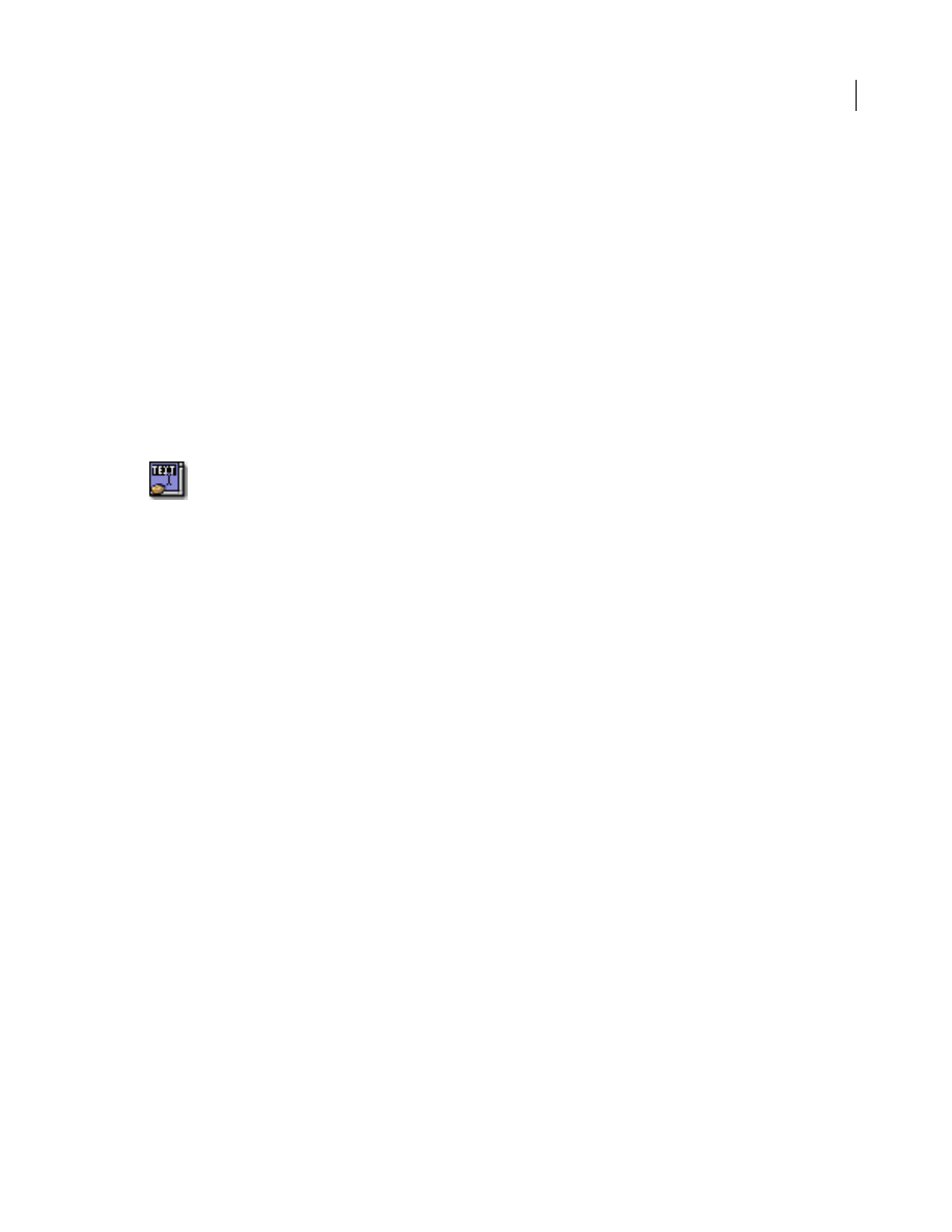
30
ADOBE GOLIVE 5.0
Using WebObjects with Adobe GoLive
To view an attribute description:
Select the desired attribute from the list. The description (if any) appears in the text field at the bottom of
the Inspector window.
Note: Consult the latest release of the WebObjects documentation for a list of valid attributes and attribute
values.
WOScrollingTextApplet
The WOScrollingTextApplet icon inserts a dynamic element that generates HTML to display a bordered
area on the page. This area allows for viewing and editing one or more lines of text. If the amount of text
exceeds the display area, scrollbars enable you to move text up and down within the display area.
To insert a WOScrollingTextApplet placeholder:
1
Drag the WOScrollingTextApplet from the Objects palette and drop it in your layout grid or document
window.
2
Set up the dynamic element in the context-sensitive Inspector window, now titled WebObjects
WOApplet Inspector. It has three tabs:
•
Basic lets you make basic settings for the WOScrollingTextApplet.
•
Attributes lets you inspect current attributes and add new ones.
•
Info briefly describes the WebObjects element.
Set the following options in the Basic tab of the WebObjects WOApplet Inspector:
•
Use the Name text box to give the WebObjects element a unique name. This identifies the element as a
unique entity in case there are corresponding applets on the same page.
•
Use the Base text box to enter the path to the Java applet.
Note: Click the Browse button and select an applet in the following file selection dialog, or click the Point and
Shoot button to link to an image in the Site window.
•
The Code text box displays the name of the Java class.
•
Click to place the pointer in the Width text box, and enter the desired overall width of the area in pixels
to allocate space for the applet. Press Enter.
•
Click to place the pointer in the Height text box, and enter the desired overall height of the area in pixels
to allocate space for the applet. Press Enter.
•
Use the HSpace text box to specify the horizontal spacing in pixels, and press Enter.
•
Use the VSpace text box to specify the vertical spacing in pixels, and press Enter.
•
Use the Align text box and pop-up menu to align the applet relative to text on the same line. For infor-
mation on the options of the Align pop-up menu, please refer to the section “To adjust the alignment of
an image placed in the flow of HTML code or on a layout grid:” on page 8.
•
Select the Show Content option to toggle the display of the HTML content on and off.
The Attributes tab of the WebObjects WOApplet Inspector lets you inspect the settings you made in the
Basic tab and add new attributes as necessary.
31
ADOBE GOLIVE 5.0
Using WebObjects with Adobe GoLive
To add and delete attributes:
1
Click the New button to add new attributes for the WOApplet. Clicking the New button enables the two
text boxes below the list box, allowing you to type in the attribute name (left) and value (right). Press Enter
and add the new attribute to the list.
2
Click the Delete button to remove a selection from the Attributes list box.
To view an attribute description:
Select the desired attribute from the list. The description (if any) appears in the text field at the bottom of
the Inspector window.
Note: Consult the latest release of the WebObjects documentation for a list of valid attributes and attribute
values.
WOCheckboxApplet
The WOCheckboxApplet icon inserts a dynamic element that generates HTML to specify a Java-driven
control that uses an image of a check box to indicate “off ” and “on” states.
To insert a WOCheckboxApplet placeholder:
1
Drag the WOCheckboxApplet icon from the Objects palette and drop it in your layout grid or document
window.
2
Set up the dynamic element in the context-sensitive Inspector window, now titled WebObjects
WOApplet Inspector. It has three tabs:
•
Basic lets you make basic settings for the WOCheckboxApplet.
•
Attributes lets you inspect current attributes and add new ones.
•
Info briefly describes the WebObjects element.
Set the following options in the Basic tab of the WebObjects WOApplet Inspector:
•
Use the Name text box to give the WebObjects element a unique name. This identifies the element as a
unique entity in case there are corresponding applets on the same page.
•
Use the Base text box to enter the path to the Java applet.
Note: Click the Browse button and select an applet in the following file selection dialog, or click the Point and
Shoot button to link to an image in the Site window.
•
The Code text box displays the name of the Java class.
•
Click to place the pointer in the Width text box, and enter the desired overall width of the area in pixels
to allocate space for the applet. Press Enter.
•
Click to place the pointer in the Height text box, and enter the desired overall height of the area in pixels
to allocate space for the applet. Press Enter.
•
Use the HSpace text box to specify the horizontal spacing in pixels, and press Enter.
•
Use the VSpace text box to specify the vertical spacing in pixels, and press Enter.
32
ADOBE GOLIVE 5.0
Using WebObjects with Adobe GoLive
•
Use the Align text box and pop-up menu to align the applet relative to text on the same line. For infor-
mation on the options of the Align pop-up menu, please refer to the section “To adjust the alignment of
an image placed in the flow of HTML code or on a layout grid:” on page 8.
•
Select the Show Content option to toggle the display of the HTML content on and off.
The Attributes tab of the WebObjects WOApplet Inspector lets you inspect the settings you made in the
Basic tab and add new attributes as needed.
To add and delete attributes:
1
Click the New button to add new attributes for the WOApplet. Clicking the New button enables the two
text boxes below the list box, allowing you to type in the attribute name (left) and value (right). Press Enter
and add the new attribute to the list.
2
Click the Delete button to delete a selection from the Attributes list box.
To view an attribute description:
Select the desired attribute from the list. The description (if any) appears in the text field at the bottom of
the Inspector window.
Note: Consult the latest release of the WebObjects documentation for a list of valid attributes and attribute
values.
WORadioGroupApplet
The WORadioGroupApplet icon inserts a dynamic element that generates HTML to specify a Java-driven
vertical matrix of checkboxes of which only one box can be checked at a time.
To insert a WORadioGroupApplet placeholder:
1
Drag the WORadioGroupApplet icon from the Objects palette and drop it in your layout grid or
document window.
2
Set up the dynamic element in the context-sensitive Inspector window, now titled WebObjects
WOApplet Inspector. It has three tabs:
•
Basic lets you make basic settings for the WORadioGroupApplet.
•
Attributes lets you inspect current attributes and add new ones.
•
Info briefly describes the WebObjects element.
Set the following options in the Basic tab of the WebObjects WOApplet Inspector:
•
Use the Name text box to give the WebObjects element a unique name. This identifies the element as a
unique entity in case there are corresponding applets on the same page.
•
Use the Base text box to enter the path to the Java applet.
Note: Click the Browse button and select an applet in the following file selection dialog, or click the Point and
Shoot button to link to an image in the Site window.
•
The Code text box displays the name of the Java class.
33
ADOBE GOLIVE 5.0
Using WebObjects with Adobe GoLive
•
Click to place the pointer in the Width text box, and enter the desired overall width of the area in pixels
to allocate space for the applet. Press Enter.
•
Click to place the pointer in the Height text box, and enter the desired overall height of the area in pixels
to allocate space for the applet. Press Enter.
•
Use the HSpace text box to specify the horizontal spacing in pixels, and press Enter.
•
Use the VSpace text box to specify the vertical spacing in pixels, and press Enter.
•
Use the Align text box and pop-up menu to align the applet relative to text on the same line. For infor-
mation on the options of the Align pop-up menu, please refer to the section “To adjust the alignment of
an image placed in the flow of HTML code or on a layout grid:” on page 8.
•
Select the Show Content option to toggle the display of the HTML content on and off.
The Attributes tab of the WebObjects WOApplet Inspector lets you inspect the settings you made in the
Basic tab and add new attributes as necessary.
To add and delete attributes:
1
Click the New button to add new attributes for the WOApplet. Clicking the New button enables the two
text boxes below the list box, allowing you to type in the attribute name (left) and value (right). Press Enter
and add the new attribute to the list.
2
Click the Delete button to remove a selection from the Attributes list box.
To view an attribute description:
Select the desired attribute from the list. The description (if any) appears in the text field at the bottom of
the Inspector window.
Note: Consult the latest release of the WebObjects documentation for a list of valid attributes and attribute
values.
WOChoiceApplet
The WOChoiceApplet icon inserts a dynamic element that generates HTML to specify a non-editable list
of items from which you can select one—for example, a pop-up menu.
To insert a WOChoiceApplet placeholder:
1
Drag the WOChoiceApplet from the Objects palette and drop it in your layout grid or document
window.
2
Set up the dynamic element in the context-sensitive Inspector window, now titled WebObjects
WOApplet Inspector. It has three tabs:
•
Basic lets you make basic settings for the WOChoiceApplet.
•
Attributes lets you inspect current attributes and add new ones.
•
Info briefly describes the WebObjects element.
Set the following options in the Basic tab of the WebObjects WOApplet Inspector:

34
ADOBE GOLIVE 5.0
Using WebObjects with Adobe GoLive
•
Use the Name text box to give the WebObjects element a unique name. This identifies the element as a
unique entity in case there are corresponding applets on the same page.
•
Use the Base text box to enter the path to the Java applet.
Note: Click the Browse button and select an applet in the following file selection dialog, or click the Point and
Shoot button to link to an image in the Site window.
•
The Code text box displays the name of the Java class.
•
Click to place the pointer in the Width text box, and enter the desired overall width of the area in pixels
to allocate space for the applet. Press Enter.
•
Click to place the pointer in the Height text box, and enter the desired overall height of the area in pixels
to allocate space for the applet. Press Enter.
•
Use the HSpace text box to specify the horizontal spacing in pixels, and press Enter.
•
Use the VSpace text box to specify the vertical spacing in pixels, and press Enter.
•
Use the Align text box and pop-up menu to align the applet relative to text on the same line. For infor-
mation on the options of the Align pop-up menu, please refer to the section “To adjust the alignment of
an image placed in the flow of HTML code or on a layout grid:” on page 8.
•
Select the Show Content option to toggle the display of the HTML content on and off.
The Attributes tab of the WebObjects WOApplet Inspector lets you inspect the settings you made in the
Basic tab and add new attributes as necessary.
To add and delete attributes:
1
Click the New button to add new attributes for the WOApplet. Clicking the New button enables the two
text boxes below the list box, allowing you to type in the attribute name (left) and value (right). Press Enter
and add the new attribute to the list.
2
Click the Delete button to remove a selection from the Attributes list box.
To view an attribute description:
Select the desired attribute from the list. The description (if any) appears in the text field at the bottom of
the Inspector window.
Note: Consult the latest release of the WebObjects documentation for a list of valid attributes and attribute
values.
WOListApplet
The WOListApplet icon inserts a dynamic element that generates HTML to specify a non-editable list of
items from which you can select one—for example, a pop-up menu.
To insert a WOListApplet placeholder:
1
Drag the WOListApplet from the Objects palette and drop it in your layout grid or document window.
2
Set up the dynamic element in the context-sensitive Inspector window, now titled WebObjects
WOApplet Inspector. It has three tabs:

35
ADOBE GOLIVE 5.0
Using WebObjects with Adobe GoLive
•
Basic lets you make basic settings for the WOListApplet.
•
Attributes allows you to inspect current attributes and add new ones.
•
Info briefly describes the WebObjects element.
Set the following options in the Basic tab of the WebObjects WOApplet Inspector:
•
Use the Name text box to give the WebObjects element a unique name. This identifies the element as a
unique entity in case there are corresponding applets on the same page.
•
Use the Base text box to enter the path to the Java applet.
Note: Click the Browse button and select an applet in the following file selection dialog, or click the Point and
Shoot button to link to an image in the Site window.
•
The Code text box displays the name of the Java class.
•
Click to place the pointer in the Width text box, and enter the desired overall width of the area in pixels
to allocate space for the applet. Press Enter.
•
Click to place the pointer in the Height text box, and enter the desired overall height of the area in pixels
to allocate space for the applet. Press Enter.
•
Use the HSpace text box to specify the horizontal spacing in pixels, and press Enter.
•
Use the VSpace text box to specify the vertical spacing in pixels, and press Enter.
•
Use the Align text box and pop-up menu to align the applet relative to text on the same line. For infor-
mation on the options of the Align pop-up menu, please refer to the section “To adjust the alignment of
an image placed in the flow of HTML code or on a layout grid:” on page 8.
•
Select the Show Content option to toggle the display of the HTML content on and off.
The Attributes tab of the WebObjects WOApplet Inspector lets you inspect the settings you made in the
Basic tab and add new attributes as needed.
To add and delete attributes:
1
Click the New button to add new attributes for the WOApplet. Clicking the New button enables the two
text boxes below the list box, allowing you to type in the attribute name (left) and value (right). Press Enter
and add the new attribute to the list.
2
Click the Delete button to remove a selection from the Attributes list box.
To view an attribute description:
Select the desired attribute from the list. The description (if any) appears in the text field at the bottom of
the Inspector window.
Note: Consult the latest release of the WebObjects documentation for a list of valid attributes and attribute
values.
36
ADOBE GOLIVE 5.0
Using WebObjects with Adobe GoLive
WebObjects Forms
The WebObjects view of the Forms tab contains a choice of WebObjects forms elements. Like their HTML
counterparts, WebObjects forms accept user input. However, WebObjects forms elements let designers and
developers work together to create interactive fill-in forms that are assembled dynamically at runtime,
depending on selections that the visitor makes.
Displaying WebObjects Forms Tags
The WebObjects forms tag inventory resides in the Forms view of the WebObjects tab. This view can be
displayed by clicking the WebObjects tab of the Objects palette and then selecting Forms from the view
control menu at the bottom of the palette.
The following pages describe the WebObjects forms elements that the Objects palette offers, sorted in the
order of their appearance:
•
•
•
•
•
•
•
•
•
•
•
WOForm
Like its HTML equivalent, a WOForm is a container element that generates a fill-in form. The WOForm
tag identifies the current page or section as a form and instructs the browser where and how to return form
information for processing at runtime.
To insert a WOForm tag:
1
Drag the WOForm icon from the Objects palette and drop it in your layout grid or document window
to insert the form.
2
Select the WOForm element to set up the form in the context-sensitive Inspector window, now titled
WebObjects WOForm Inspector.
Set the following options in the Basic tab of the WOForm Inspector:
•
Use the Target text box and pop-up menu to specify the frame in a frame set that will receive the page
returned as a result of the site visitor’s click.
•
Use the Encode pop-up menu to select an encoding method.

37
ADOBE GOLIVE 5.0
Using WebObjects with Adobe GoLive
•
Use the Method pop-up menu to determine how to send the form information:
Post sends the form information separately from the destination URL.
Get appends the form information to the destination URL.
Default omits the Method attribute.
Note: We recommend using the Post option because URLs have definite lengths that might be exceeded by
simply appending information to the destination file, resulting in accidental loss of data.
Set the following options in the WebObjects tab of the WebObjects WOForm Inspector:
•
The Elementname text box displays the name of the current WebObjects element.
•
Use the Name text box to name your WebObjects form element.
•
Use the Action text box to specify an action method that is invoked when the form is submitted. If the
form contains a dynamic element with its own action (such as a WOSubmitButton or a WOActiveImage),
that action is invoked instead of the WOForm’s action.
•
Use the HRef text box to type in a URL specifying where the form will be submitted.
Note: Click the Browse button and select a destination in the following file selection dialog to link to a desti-
nation URL in the Site window.
•
Use the Mult. Submit text box and pop-up menu to determine whether the form can have more than one
WOSubmitButton, each with its own action. By default, WOForm supports only a single WOSubmit-
Button. Setting Mult. Submit to YES enables multiple submit buttons.
Note: Some older browsers support only a single submit button in a form.
WOSubmitButton
The WOSubmitButton icon generates a submit button in an HTML form.
To insert a WOSubmitButton:
1
Drag the WOSubmitButton icon from the Objects palette and drop it in your layout grid or document
window on top of a WOForm element.
2
Click the Submit Button in the context-sensitive Inspector window, now titled WebObjects
WOSubmitButton Inspector.
Set the following options in the WebObjects tab of the WebObjects WOSubmitButton Inspector:
•
The Elementname text box displays the name of the current WebObjects element.
•
Use the Name text box to give your WebObjects submit button a name that uniquely identifies this
element within the form. You may specify a name or let WebObjects automatically assign one at runtime.
•
Check the Label checkbox and type in the title of the button you want the audience to see—for example,
Login instead of Submit.
•
Use the Action text box to specify an action method that is invoked when the form is submitted.
•
Use the Disabled text box and pop-up menu to temporarily disable the element. If set to YES, the element
appears in the page but is not active. A scripted method can override this property.
38
ADOBE GOLIVE 5.0
Using WebObjects with Adobe GoLive
WOResetButton
The WOResetButton icon generates a reset button in an HTML form.
To insert a WOResetButton:
1
Drag the WOResetButton icon from the Objects palette and drop it in your layout grid or document
window on top of a WOForm element.
2
Click the Reset Button in the context-sensitive Inspector window, now titled WOResetButton Inspector.
Set the following options in the WebObjects tab of the WebObjects WOResetButton Inspector:
•
The Elementname text box displays the name of the current WebObjects element.
•
The Name text box is disabled. A form can only have one reset button at a time.
•
Check the Label checkbox and type in the title of the button you want the audience to see—for example,
Clear instead of Reset.
•
Use the Action text box to specify an action method that is invoked when the form is reset.
•
Use the Disabled text box and pop-up menu to temporarily disable the element. If set to YES, the element
appears in the page but is not active. A scripted method can override this property.
WOTextField
The WOTextField icon inserts a single-line text field that lets site visitors enter text—for example, their
name or other personal data.
To insert a text field:
1
Drag the WOTextField icon from the Objects palette and drop it in your layout grid or document
window on top of a WOForm element.
2
Set up the text field in the context-sensitive Inspector window, now titled WebObjects WOTextField
Inspector.
Set the following options in the Basic tab of the WebObjects WOTextField Inspector:
•
In the Visible text box, type in the number of visible characters to determine the width of the text box.
•
In the Maximum text box, type in the maximum number of characters that the text box accepts before
truncation occurs. If empty, this limit is determined by the Web browser used to view the form.
•
Check the Password Field checkbox to convert the text field into a password field, if necessary.
Set the following options in the WebObjects tab of the WebObjects WOTextField Inspector:
•
The Elementname text box displays the name of the current WebObjects element.
•
Use the Name text box to give your WebObjects text field a name that uniquely identifies this element
within the form. You may specify a name or let WebObjects automatically assign one at runtime.
•
Use the Value text box to enter a default value displayed in the single-line text field while the page is being
built. During request handling, this field holds the value the site visitor entered or the default value if the
site visitor left the field untouched.

39
ADOBE GOLIVE 5.0
Using WebObjects with Adobe GoLive
•
Use the Dateformat text box and pop-up menu to select a format string that specifies how to format Value
as a date. If you use a date format, Value must be assigned an NSCalendarDate object. If Value can’t be inter-
preted according to the format you specify, Value is set to nil. See the WebObjects documentation for a
description of the date format syntax.
•
Use the Numberformat text box and pop-up menu to select a format string that specifies how to format
Value as a number. If you use a number format, Value must be assigned an NSDecimalNumber object. If
the element’s Value can’t be interpreted according to the format you specify, Value is set to nil. See the
WebObjects documentation for a description of the number format syntax.
•
Use the Disabled text box and pop-up menu to temporarily disable the element. If set to YES, the element
appears in the page but is not active. A scripted method can override this property.
•
Use the Read-only text box and pop-up menu to temporarily set the element to read-only. If set to YES,
the element appears in the page but cannot be edited. A scripted method can override this property.
WOPasswordField
The WOPasswordField icon inserts a password field that lets the site visitor enter a password without
echoing the characters typed.
To insert a password entry field:
1
Drag the WOPasswordField icon from the Objects palette and drop it in your layout grid or document
window on top of a WOForm element.
2
Click the Password Field checkbox on the Basic tab of the context-sensitive Inspector window, now titled
WebObjects WOPasswordField Inspector.
Set the following options in the Basic tab of the WebObjects WOPasswordField Inspector:
•
In the Visible text box, type in the number of visible bullets (the password itself is not echoed) to
determine the width of the text box.
•
In the Maximum text box, type in the maximum number of characters that the text box accepts before
truncation occurs. If empty, this limit is determined by the Web browser used to view the form.
Set the following options in the WebObjects tab of the WebObjects WOPasswordField Inspector:
•
The Elementname text box displays the name of the current WebObjects element.
•
Use the Name text box to give your WebObjects password entry field a name that uniquely identifies this
element within the form. You can specify a name or let WebObjects automatically assign one at runtime.
•
Use the Value text box to enter a default value for the password field used while the page is being built.
This value is not displayed to the site visitor. During request handling, this field holds the value the site
visitor entered or the default value if the site visitor left the field untouched.
•
The Dateformat text box and pop-up menu are disabled. Passwords are unformatted.
•
The Numberformat text box and pop-up menu are disabled. Passwords are unformatted.
•
Use the Disabled text box and pop-up menu to temporarily disable the element. If set to YES, the element
appears in the page but is not active. You can override this status by a scripted method.
40
ADOBE GOLIVE 5.0
Using WebObjects with Adobe GoLive
•
Use the Read-only text box and pop-up menu to temporarily set the element to read-only. If set to YES,
the element appears in the page but cannot be edited. A scripted method can override this property.
WOText
The WOText icon inserts a scrolling text area that lets the site visitor enter multiple lines of text—for
example, feedback on your Web page.
To insert a WOText:
1
Drag the WOText icon from the Objects palette and drop it in your layout grid or document window on
top of a WOForm element.
2
Set up the WOText element in the context-sensitive Inspector window, now titled WebObjects WOText
Inspector.
Set the following options in the Basic tab of the WebObjects WOText Inspector:
•
In the Rows text box, type in the maximum number of rows to determine the height of the text box.
•
In the Columns text box, type in the number of visible characters to determine the width of the WOText
element.
•
Choose the appropriate option from the Wrap pop-up menu to control the behavior of line breaks.
Default lets the browser use default settings for WOText objects.
Off instructs the browser to ignore the Columns limit and prevents text entered into the WOText from
wrapping at the right margin of the box.
Virtual and Physical instruct the browser to respect the Columns limit. The entered text wraps when
reaching the right margin of the box and starts scrolling vertically.
Set the following options in the WebObjects tab of the WebObjects WOText Inspector:
•
The Elementname text box displays the name of the current WebObjects element.
•
Use the Name text box to give your WebObjects password entry field a name that uniquely identifies this
element within the form. You can specify a name or let WebObjects automatically assign one at runtime.
•
The Value text box specifies the text or object that is displayed in the text field while the page is being
built. During request handling, this field holds the text as the site visitor left it.
•
Use the Disabled text box and pop-up menu to temporarily disable the element. If set to YES, the element
appears in the page but is not active. You can override this status by a scripted method.
•
Use the Read-only text box and pop-up menu to temporarily set the element to read-only. If set to YES,
the element appears in the page but cannot be edited. A scripted method can override this property.
WOCheckbox
The WOCheckbox icon inserts a checkbox that lets the site visitor select multiple items from a list or make
other selections to control processes.
41
ADOBE GOLIVE 5.0
Using WebObjects with Adobe GoLive
To insert a checkbox:
1
Drag the WOCheckbox icon from the Objects palette and drop it in your layout grid or document
window on top of a WOForm element.
2
Set up the checkbox in the context-sensitive Inspector window, now titled WebObjects WOCheckbox
Inspector.
Set the following options in the WebObjects WOCheckbox Inspector:
•
In the Name text box, type in a unique name to identify the checkbox as an entity within the form. You
may specify a name or let WebObjects automatically assign one at runtime.
•
In the Value text box, type in a value for this input element—for example, a variable. If not specified,
WebObjects provides a default value.
•
Use Selection to type in a string (for example, a variable) that causes WebObjects to check the checkbox
automatically. If Selection and Value are equal when the page is generated, the checkbox is checked. When
the page is submitted, Selection is assigned the value of the checkbox.
•
Use the Checked text box and pop-up menu to select a default state for the checkbox. Setting Checked to
YES causes the check box to appear in the checked state when the page is being generated. During request
handling, Checked reflects the state the site visitor left the checkbox in: YES if checked; NO if not.
•
Use the Disabled text box and pop-up menu to temporarily disable the element. If set to YES, the element
appears in the page but is not active. A scripted method can override this property.
WORadioButton
The WORadioButton icon inserts a radio button that acts as an on-off switch. Radio buttons are normally
grouped because their main purpose is to allow the site visitor to chose exactly one of several options. If
the site visitor selects one button, the previously selected button is deselected.
Because radio buttons usually appear as a group, WORadioButton is commonly placed within a
WORepetition. See “WORepetition” on page 21.
To insert a radio button:
1
Drag the WORadioButton icon from the Objects palette and drop it in your layout grid or document
window on top of a WOForm element.
2
Set up the radio button in the context-sensitive Inspector window, now titled WebObjects
WORadioButton Inspector.
Set the following options in the WebObjects WORadioButton Inspector:
•
In the Name text box, type in a unique name that identifies the radio button’s group. You can select only
one radio button at a time within a group.
•
In the Value text box, type in a value for this input element—for example, a variable. If not specified,
WebObjects will provide a default value.
•
Use Selection to type in a string (for example, a variable) that causes WebObjects to chose the radio
button automatically. If Selection and Value are equal when the page is generated, the radio button is
selected. When the page is submitted, Selection is assigned the value of the radio button.

42
ADOBE GOLIVE 5.0
Using WebObjects with Adobe GoLive
•
Use the Checked text box and pop-up menu to select a default state for the radio button. Setting Checked
to YES causes the radio button to appear in the selected state when the page is being generated. During
request handling, Checked reflects the state the site visitor left the radio button in: YES if selected; NO if
not.
•
Use the Disabled text box and pop-up menu to temporarily disable the element. If set to YES, the element
appears in the page but is not active. A scripted method can override this property.
Note: A value for either Checked or Value is required in a WORadioButton declaration, but they are mutually
exclusive.
WOPopUpButton
The WOPopUpButton icon inserts a pop-up menu with multiple options to choose from. It displays itself
as a selection list that allows the site visitor to select only one item at a time.
The related element WOBrowser is similar to WOPopUpButton except that it allows the site visitor to select
more than one item at a time.
To insert a WOPopUpButton menu:
1
Drag the WOPopUpButton icon from the Objects palette and drop it in your layout grid or document
window on top of a WOForm element.
2
Set up the list box in the context-sensitive Inspector window, now titled WebObjects WOPopUpButton
Inspector.
Set the following options in the Basic tab of the WebObjects WOPopUpButton Inspector:
•
In the Rows text box, type in the number of rows you want displayed when the site visitor drags the menu.
•
Check the Multiple checkbox to turn the element into a WOBrowser and allow the site visitor to select
several options at a time.
Set the following options in the WebObjects tab of the WebObjects WOPoUpButton Inspector:
•
The Elementname text box displays the name of the current WebObjects element.
•
Use the Name text box to give your WebObjects pop-up menu a name that uniquely identifies this
element within the form. You may specify a name or let WebObjects automatically assign one at runtime.
•
Use the List text box to specify an array of objects from which the WOPopUpButton derives its values.
For example, anArray could name the array containing objects that represent individual items you want
the site visitor to choose from.
•
Use the Item text box to specify an identifier for the elements of the list—for example, anItem could
represent an object in the anArray array.
•
Use the Value text box to specify a value to display in the selection list—for example, aValue for each
object in the list.
•
Selection holds an array of objects that the site visitor can choose from the selection list. For the above
example, Selection would hold an object from anArray. Because a WOPopUpButton lets the site visitor
select only one item at a time, this array holds a single item at a time.

43
ADOBE GOLIVE 5.0
Using WebObjects with Adobe GoLive
•
Use the Disabled text box and pop-up menu to temporarily disable the element. If set to YES, the element
appears in the page but is not active. A scripted method can override this property.
WOBrowser
The WOBrowser icon inserts a multi-line browser. WOBrowser displays itself as a selection list that allows
the site visitor to select multiple items at a time.
The related element WOPopUpButton is similar to WOBrowser except that it restricts the site visitor to
selecting only one item at a time.
To insert a WebObjects WOBrowser:
1
Drag the WOBrowser icon from the Objects palette and drop it in your layout grid or document window
on top of a WOForm element.
2
Click Multiple on the Basic tab in the context-sensitive Inspector window, now titled WebObjects
WOBrowser Inspector.
Set the following option in the Basic tab of the WebObjects WOBrowser Inspector:
•
In the Rows text box, type in the number of rows you want displayed when the site visitor views the
browser.
Set the following options in the WebObjects tab of the WebObjects WOBrowser Inspector:
•
The Elementname text box displays the name of the current WebObjects element.
•
Use the Name text box to give your WebObjects browser a name that uniquely identifies this element
within the form. You can specify a name or let WebObjects automatically assign one at runtime.
•
Use the List text box to specify an array of objects from which the WOBrowser derives its values. For
example, anArray could name the array containing objects that represent individual items you want the
site visitor to select.
•
Use the Item text box to specify an identifier for the elements of the list—for example, anItem could
represent an object in the anArray array.
•
Use the Value text box to specify a value to display in the selection list—for example, aValue for each
object in the list.
•
Selection holds an array of objects that the site visitor can choose from the selection list. For the above
example, Selection would hold one or more objects from anArray.
•
Use the Disabled text box and pop-up menu to temporarily disable the element. If set to YES, the element
appears in the page but is not active. A scripted method can override this property.
WOHiddenField
The WOHiddenField icon inserts a hidden field. Hidden fields are sometimes used to store application
state data in an HTML page. In WebObjects, the WOStateStorage (see “WOStateStorage” on page 17)
element is designed expressly for this purpose.

44
ADOBE GOLIVE 5.0
Using WebObjects with Adobe GoLive
To insert a hidden field:
1
Drag the WOHiddenField icon from the Objects palette and drop it in your layout grid or document
window on top of a WOForm element.
2
Set up the WOHiddenField element in the context-sensitive Inspector window, now titled WebObjects
WOHiddenField Inspector. It has four tabs:
•
Element lets you set general properties for the current WebObjects.
•
Attributes lets you edit attributes for the current WebObjects.
•
Content displays object-specific text content, if any.
•
Info briefly describes the WebObjects element.
Set the following options in the Element tab of the WebObjects WOHiddenField Inspector:
•
In the Name text box, type in a unique name to identify the hidden tag as an entity within the form. You
can specify a name or let WebObjects automatically assign one at runtime.
•
Use the Type text box and pop-up menu to change the type of the WebObjects, if necessary.
Important: Use the Type option with care. You may lose your settings after you change the type of an object!
Set the following options in the Attributes tab of the WebObjects WOHiddenField Inspector:
•
Click the New button to add new attributes for the hidden text field. Clicking the New button enables the
two text boxes below the list box, allowing you to type in the attribute name (left) and value (right). Press
enter and add the new attribute to the list.
•
Click the Delete button to delete a selection from the Attributes list box.
Note: Consult the latest release of the WebObjects documentation for a list of valid attributes and attribute
values.
WebObjects Header Tags
The Head Items view of the Palette’s WebObjects tab contains a choice of four WebObjects head elements.
WebObjects header tags give developers a means to trigger actions. Like their HTML counterparts,
WebObjects tags can be inserted in the header section of the Web page to perform specific tasks—for
example, load JavaScript code the browser needs to know before loading the body (such as JavaScript
dictionaries accessed by scripts throughout the page).
Displaying WebObjects Header Tags
The WebObjects header tag inventory resides in the Head Items view of the WebObjects tab. To display this
view, click the WebObjects tab of the Objects palette and then select Head Items from the view control
menu at the bottom of the palette.
The following pages present the WebObjects head items that the Objects palette offers, sorted in the order
of their appearance:
•
“WebObjects Tag (WOUnknownType)” on page 45
•
45
ADOBE GOLIVE 5.0
Using WebObjects with Adobe GoLive
WebObjects Tag (WOUnknownType)
The WebObjects Tag icon inserts a WOUnknownType element that provides a way for WebObjects to
accommodate custom empty HTML elements (elements that don’t span a range of text) in the header.
Because the HTML language is evolving rapidly, it is convenient to have a way to dynamically generate
elements that WebObjects does not explicitly support.
To insert a WebObjects Tag element:
1
Drag the WebObjects Tag icon from the Objects palette and drop it in the header section of your page.
If the header section is not open, drag the item at the triangle control to the left of the small document icon
above the main content area, wait for the header section to open, then drag on and drop it in the header
window section.
2
Select the WebObjects Tag icon to set up the generic element in the context-sensitive Inspector window,
now titled WebObjects WOUnknownType Inspector. It has four tabs:
•
Element lets you set general properties for the current object.
•
Attributes lets you edit attributes for the current WebObjects.
•
Content displays object-specific text content, if any.
•
Info briefly describes the WebObjects element.
3
For instructions on how to set up the new generic element, please refer to the section
“WOGenericElement” on page 18.
WOJavaScript
The WOJavaScript icon inserts an element that lets you embed or write a JavaScript script in the header of
a dynamically generated page.
To insert a WOJavaScript element:
1
Drag the WOJavaScript icon from the Objects palette and drop it in your layout grid or document
window.
2
Set up the script in the context-sensitive Inspector window, now titled WebObjects WOJavaScript
Inspector.
3
For instructions on how to set up or write a new JavaScript for the header section, please refer to the
section “WOJavaScript” on page 16.
WebObjects Frames
Contained in the Frames view of the WebObjects tab is a choice of WebObjects frames. Like their HTML
counterparts, WebObjects frames let you subdivide the Web page in static sections that can be separately
updated, scrolled, or manipulated in any other way. Unlike HTML frames, though, WebObjects frames can
be built and filled with content dynamically, depending on input from the visitor.
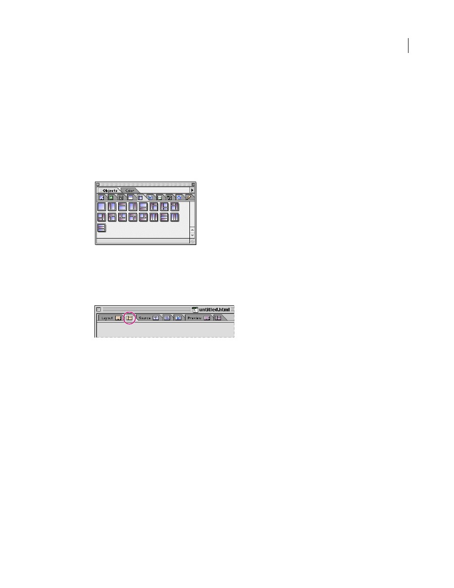
46
ADOBE GOLIVE 5.0
Using WebObjects with Adobe GoLive
Frame sets and frames created with any of the WOFrames elements represent themselves as dynamically
generated Netscape Frame elements. Either another WebObjects page or a scripted method supports their
content.
Displaying WebObjects Frames
The WebObjects frames inventory resides in the Frames view of the WebObjects tab. To display this view,
click the WebObjects tab of the Objects palette and then select the Frames item from the view control menu
at the bottom of the palette.
Using WebObjects Frame Sets and Frames
To insert a WOFrame Set:
1
Switch to the Frames view by clicking the Frames Editor tab of the document window.
2
Drag any WebObjects frame set from the Objects palette into the document window.
Note: You can’t use HTML frames to build interactive Web pages with WebObjects-based content.
If you have some working experience with frames and frame sets, you’ll find that the WebObjects
WOFrame Inspector offers exactly the same options as its HTML counterpart.
For more detailed instructions, please see Chapter 5, of the User Guide.
The Basic tab of the WebObjects WOFrame Inspector lets you adjust basic frame properties, such as size,
scrolling behavior, and resize capability.
To set up the basic properties of a WebObjects frame in a frame set or document window:
1
Click the frame to select it and display the WebObjects WOFrame Inspector.
2
Place the pointer in the Size text box of the WebObjects WOFrame Inspector and type in a numerical
value to resize the frame.
The pop-up menu next to the text box lets you choose the following options:
•
The Pixel option lets you enter the width precisely in pixels.

47
ADOBE GOLIVE 5.0
Using WebObjects with Adobe GoLive
•
The Scale option sizes the frame automatically, based on the preferences of the browser. This is the default
setting.
•
The Percent option lets you enter the size relative to the width of the screen.
3
Place the pointer in the Name text box and type in a name for the frame.
4
Leave the URL text box empty. The source supplying the frame is selected in the following section.
5
Select an option from the Scrolling pop-up menu:
•
Auto enables auto-scrolling, allowing the end user to scroll the page by dragging against the margin of
the window.
•
Yes enables scrolling via the scrollbar.
•
No disables scrolling completely.
6
Check the Resize Frame checkbox to permit resizing of the pane in the Web browser.
Other than static HTML frames, WebObjects frames need a special setup to account for their dynamic
display properties. The major difference is that the content of a frame is provided by the logic acting behind
the scenes, rather than by a reference to a static HTML file. You can specify these parameters in the
WebObjects tab of the WebObjects WOFrame Inspector.
To set up the dynamic properties of a WebObjects frame:
1
Type in a name for the dynamic element in the Elementname text box.
2
Use the Value text box to specify a method or the Pagename text box to specify the name of the
WebObjects component (enclosed in straight quotes) that will supply the content.
WebObjects Preferences
The WebObjects, Source, Font, Colors, and Printing panes in the WebObjects group of the Preferences
dialog box let you customize various basic settings that influence the behavior and appearance of the
WebObjects elements in the source code.
To open the WebObjects group in the Preferences dialog box:
1
Choose Edit > Preferences.
2
Locate and click the WebObjects icon in the scrolling sidebar.
3
The WebObjects pane appears.
WebObjects Settings
The WebObjects Preferences pane lets you control the display of invisible WebObjects elements in the
Layout view and how to format various items of source code in the source and declaration files.
The WebObjects pane contains the following options:
The WebObjects Source File Format options let you make two choices:
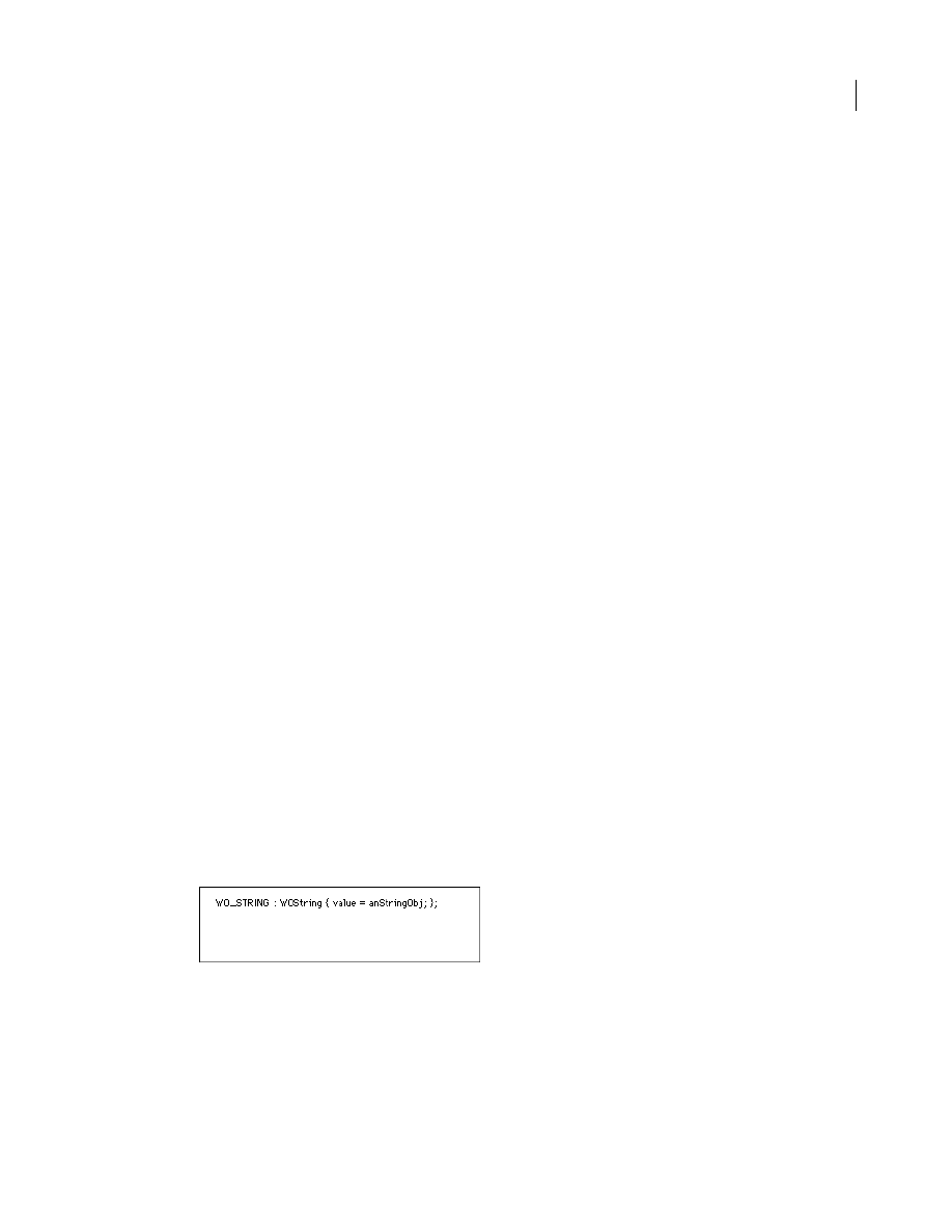
48
ADOBE GOLIVE 5.0
Using WebObjects with Adobe GoLive
•
Use the Line Breaks menu to adjust the line break format that the HTML and declarations files use to the
targeted server platform:
Macintosh (CR) inserts Carriage Return characters only.
Unix® (LF) inserts Line Feed characters only.
Windows (CR/LF) inserts a Carriage Return/Line Feed character combination.
•
The radio buttons in Order of Declarations in WOD File (see “The WebObjects Declaration Editor” on
page 3) control the sort order:
Same as in Layout writes declarations to the wod.file in their order of appearance in the Layout view.
Alphabetical Order sorts declarations in the wod.file by alphabet.
•
Use the Framework Location text box or the Browse button to specify the location of the WebObjects
Framework suite of tools on the Web server.
Source Code Settings
The Source Preferences pane lets you control the display of your HTML and WebObjects source code in
Adobe GoLive’s Source and Declarations views. A preview area at the bottom of the window lets you see
the impact of your changes instantly.
To open the Source pane of the WebObjects Preferences dialog box:
1
Choose Edit > Preferences.
2
Locate and click the WebObjects icon in the scrolling sidebar.
3
To view more options, click the small triangle control next to the WebObjects icon. This expands the
WebObjects group of preferences and displays four additional options.
4
Click the Source item below the WebObjects icon.
The Source pane contains the following options:
•
Select the Word wrap option to let the source code wrap at the margin of the Source view window.
•
Select the Print in single line option to have Adobe GoLive write each WebObjects element and its
attributes into a single line.
Example:
•
Select the Insert newline after type option to have Adobe GoLive insert an extra line between the WebOb-
jects element and its attributes.
This option is disabled if the Print in single line checkbox is selected.
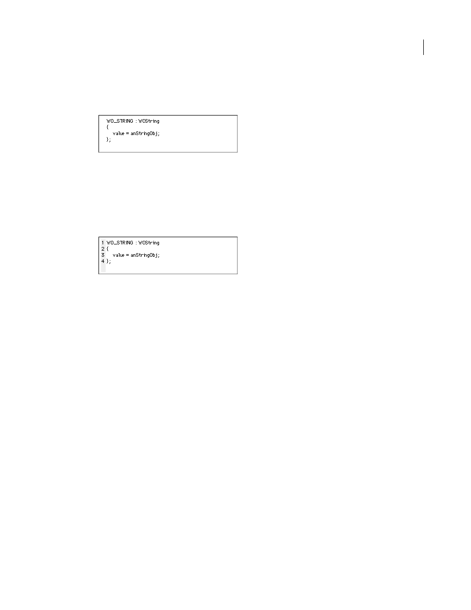
49
ADOBE GOLIVE 5.0
Using WebObjects with Adobe GoLive
Example:
•
Select the Auto-indenting option to have Adobe GoLive indent attributes, then use the Tab Size text box
to set the width of the indentation (in monospaced character widths).
•
Select the Line Numbers option to have Adobe GoLive automatically number the lines of WebObjects
source code. Line numbers are a visual feature that the Source view supplies. They are not added to the
source code.
Example:
•
Select the Enable dragging of marked text checkbox to activate drag and drop support in the Source view.
Font Preferences
The Font Preferences pane lets you select a custom font, font size, and font style for your HTML and
WebObjects code to override the default Monaco 9 pt plain setting.
To open the Font pane of the WebObjects Preferences dialog box:
1
Choose Edit > Preferences.
2
Locate and click the WebObjects icon in the scrolling sidebar.
3
To view more options, click the small triangle control next to the WebObjects icon. This expands the
WebObjects group of preferences and displays four additional options.
4
Click the Font item below the WebObjects icon.
The Font pane contains the following options:
•
Choose an alternative font from the Name menu, then set its size and style using the associated font style
options.
Color Preferences
The Colors pane lets you enable syntax highlighting for the Source and Declaration views and select
custom colors used for highlighting.
To open the Colors pane of the WebObjects Preferences dialog box:
1
Choose Edit > Preferences.

50
ADOBE GOLIVE 5.0
Using WebObjects with Adobe GoLive
2
Locate and click the WebObjects icon in the scrolling sidebar.
3
To view more options, click the small triangle control next to the WebObjects icon. This expands the
WebObjects group of preferences and displays four additional options.
4
Click the Colors item below the WebObjects icon.
The Colors pane contains the following options:
•
Select the Syntax Highlighting checkbox to activate syntax highlighting.
•
Click any of the Normal text, Components, Keywords, Strings, Typing errors, and Comments color fields
to open the Mac OS Color Picker and select display colors.
Printing Preferences
The Printing pane lets you control the way your source code is printed in hardcopy and select a custom
font, font size, and font style.
To open the Printing pane of the WebObjects Preferences dialog box:
1
Choose Edit > Preferences.
2
Locate and click the WebObjects icon in the scrolling sidebar.
3
To view more options, click the small triangle control next to the WebObjects icon. This expands the
WebObjects group of preferences and displays four additional options.
4
Click the Printing item below the WebObjects icon.
The Printing pane contains the following options:
•
Select the Printer specific settings option to enable the hardcopy printing options.
Syntax highlighting reproduces the different colors Adobe GoLive uses for highlighting code elements
(see “Color Preferences” on page 49) on a color printer.
Bold Typeface for Tags prints tags in a bold font to make them stand out from the rest of the code.
Line Numbers adds the optional line numbers (see “Source Code Settings” on page 48) to the printout.
•
Select the Use special font for printing checkbox and modify the associated style options if you want to
use a custom font for printing, instead of the default Geneva 11 pt.
Document Outline
- Using WebObjects Index
- General
- What You Need to Get Started
- Manual Overview
- Adobe GoLive Approach to WebObjects
- Adobe GoLive WebObjects Tools
- WebObjects in Web Settings
- WebObjects Types
- WebObjects Client-Side Components
- WebObjects Forms
- WebObjects Header Tags
- WebObjects Frames
- WebObjects Preferences
Wyszukiwarka
Podobne podstrony:
O&O Services Single Sign On on Linux using LDAP with Active Directory (2002)
IBM Using Ajax with PHP and Sajax (2005)
Using Log4j with JBoss by Scott Stark
ADOBE PHOTOSHOP CS6 EXTENDED PL
adobe type library 3L4OQ6UISISW Nieznany (2)
przeglądarka plików Adobe Bridge
2004 03 Adobe Photoshop i Linux [Grafika]
adobe premiere 6 biblia zaawansowane techniki montażu (helion) fake OCYCGOTBVADD5AIZJNVFVB7K5LDHKD3V
Improving Grape Quality Using Microwave Vacuum Drying Associated with Temperature Control (Clary)
Adobe After Effects 6 0 Oficjalny podręcznik
Adobe Dreamweaver CS3 z ASP, ColdFusion i PHP Oficjalny podrecznik
Photoshop-Dodatki i instrukcje, Adobe ImageReady, Adobe ImageReady
więcej podobnych podstron