Heavy Metal
This appears difficult at first but it's really not. Follow along closely and I'll show how
easy it is to make an object appear Metalic.
Step 1: 50% Grey
Whatever your object is..start with a flat fill of 50%
grey
Step 2: Selection Samba
1) Using the rectangular Marquee tool Make a
"banded" selection horizontally across the object.
Hold down shift and creat several more marquee
selections of varying size across the object.
2) "feather" the selections by 5 pixels (keyboard
shortcut alt+ctrl D ..cmd+opt D for mac users)
3) Open the levels dialog box(ctrl L) and increase
the black output slider to about 64. Click ok.
4) with you keyboards arrows. move the selection
down about 8 taps and invert it (ctrl+i)
Step 3: Double check
Your object should look something like this now.
You can probably get the same effect by holding
shift and airbrushing dark bands across the object.
It's up to you...just make sure the object is all
greyscale and banded like you see here.
Step 4: Bevel it
If you have Photoshop 5 or higher. Add a bevel
using layer effects. Once you have created the
bevel...make a new blank layer beneath the object
and merge the object layer down with the blank
layer...this fuses the effect to the object so we can
do step 5.
If you are using eyecandy...just make a nice bevel
and join us on step 5.
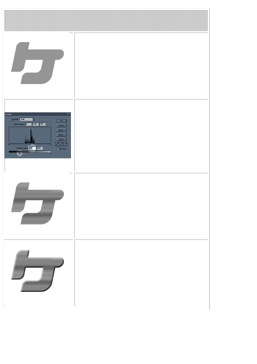
Step 5: Curve it
Here's the magic. With your object layer selected.
Open your curves dialog box (keyboard shortcut
ctrl+M) and make a curve kinda like you see here.
Just click on the diagonal line and drag up and
down.
Step 5: Double Check 2
You should now look something like this. Neat eh?
but it's still missing a little something.
Step 5: colorize it
Hit Ctrl+U to bring up your hue & saturation dialog
box. Click on the "Colorize" box on the lower right
and slide hue to about 225 and saturation down to
about 15. This will make the metal kind of blueish.
You can color it however you want though.
Click OK
Step 6: sharpen it
I know the filter is called "Unsharp" but it does just
the opposite. Run the filter with settings similar to
what you see here and it will make the darker parts
of the chrome "pop" out a bit and lend an air of
realism to the whole effect.
Step 7: drop shadow and completion
There ya go! A drop shadow...maybe a few
lensflares and you have a cool chrome object and
you never had to resort to a 3D application.
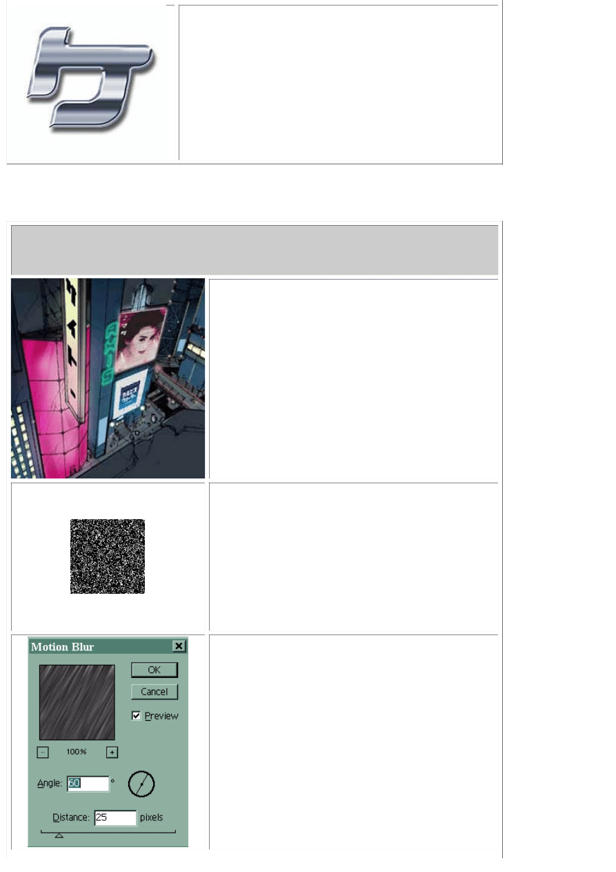
Rain
I just posted this as a response on Megatokyo's board...figured it was valuable enough
to post here as an effect tutorial.
Step 1: Have a source pic
Make sure you got something to rain on...not
really a step 1 but I had to start somewhere.
Step 2: Make some noise
Create a new layer above the background
layer and fill it with black.
Run Filter>Noise>Add Noise
Choose: Gaussian, Monochrome and an
amount of around 65..depends on how big
your pic is and how much rain you want.
Step 3: Motion Blur
Now...run a motion blur filter
>Filter>Blur>Motion Blur
Use a setting similar to what I have here.
Change the layers blending mode to "Screen"
(That makes all the black transparent)
Now do this:
>Image>Adjust>Levels
Slide the central grey arrow to the right till
the rain looks right.
Step 4: Tada
Now you have rain! Easy!
Add to it's realism by adding puddles and
reflections on hard surfaces..make little white
"v"s where the rain bounces off stuff in the
foreground.
Smoke
How to make a smoking Gun, Cigarette...whatever. EASY!!
Step 1: Choose your smoking object
In this case...it's a gun...now I know guns only smoke
for a second after you shoot them but there are certain
liberties the entertainment industry takes with
physics...like spaceships making rumblesounds and
firey exposions in the vacuum of space. Smoking guns
just add drama to a picture.
Step 2: Airbrush
On a new layer..Airbrush some grey over the origin of
the smoke. Use a soft brush setting and a lower
opacity.
Step 3: Spatter fun
Now we need some "pepper". Change you airbrushes
setting to "dissolve" and shoot some white and black
particles onto the grey spot. Not too many...just
enough to smear
Step 4: Smudge
Grab the smudge tool (looks like a pointing finger) and
smear the pixels upward in an "S" like motion. Don't
worry if the effect is too severe right now...just smooth
it all out.
Step 5: Finishing Effects
Grab your eraser tool and set it to airbrush with a soft
brush setting and trim out the unwanted smoke. Use
the dodge and burn tools to add highlites and shadows
to the smoke. Re-smear any pixels or effects that look
"too hard"
Lower the smoke layers opacity to taste.
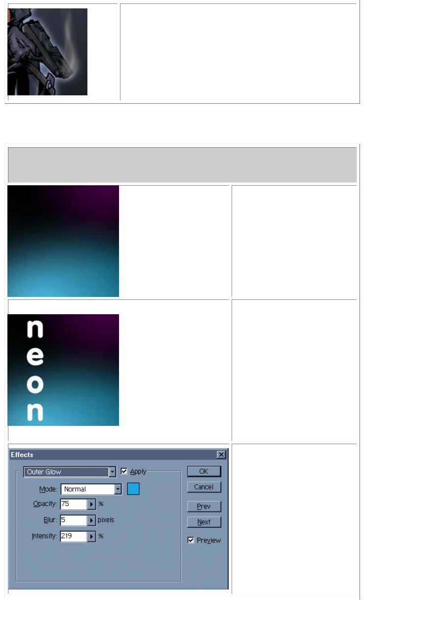
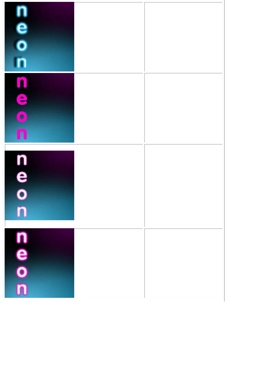
Neon Sign
Neon signs are also really easy to make in Photoshop 5. I'll show you both ways in
case you have an earlier version.
Step 1: make it dark
Your background
should be dark and
use colder nightime
colors.
Step 2: Pick a round
font
Neon signs are
basically bent tubes
filled with glowing gas.
There aren't any sharp
corners so pick a font
the has rounded
edges. I usually make
the font color white.
The NEON colors are
produced by the filters
in the next few steps.
Step 3: Layer Effects
If you have photoshop
5 or higher you can do
it this way. Don't fret if
you dont..i have
alternative steps listed
below.
Make your settings
similar to what you see
here. Do this for both
Inner and Outer glow.
Make sure you use the
same color.
Step 4: Add a drop
shadow
Add a drop shadow
and call it good.
Maybe airbrush some
of the signs color onto
the wall it's attached
to.
Alternative step 1
Type your text. Only
this time..instead of
white, use the color
you want the neon
sign to be.
Alternative step 2
Select the text
(cntrl-click the layer
the text is on).
Contract your
selection by a few
pixels. Feather the
selection by a few
pixels and create a
new layer..fill the
contracted, feathered
selection with white.
Alternative step 3
Now..go back to your
base neon color layer
and apply a gaussian
blur to it. Make about 3
copies of this blurred
color layer to enhance
the effect.
Alternative step 3
Now add a drop
shadow and airbrush
some of the neons
color onto the
background layer to
make it believable.
There's a few extra
steps to this
alternative method but
the results are a little
more realistic. Try this
technique with
outlined text.
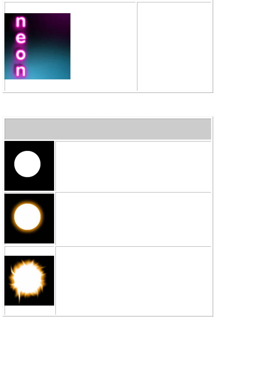
Fire/Plasma Ball
Fireballs are really easy but it's best if you have a WACOM tablet so you can take
advantage of its pressure sensitive features.
Step 1: make a ball
Make a white ball on it's own layer...easy
Step 2: Make a glow
I don't use Layer effects for this. I make a copy of the ball.
Select it...expand the selection by 5 pixels..feather the
selection by 5 pixels and fill it with orange or a good fire color.
I then merge the original white ball onto the orange glow I
created...should look like this.
Step 3: Get to smudgin'!
I start with a larger brush setting and softly drag from the
center out. I then choose a smaller brush setting and make
the little wisps you see around the edges. If this was blue it
would make a nice Plasma ball. The Wacom tablet allows me
to control where the wisps fade out. If you don't have a wacom
tablet you may have to go back in with the eraser tool and
taper off the wisps manually. If you smear the ball in one
direction only you can add the illusion of motion.
Give it a try!
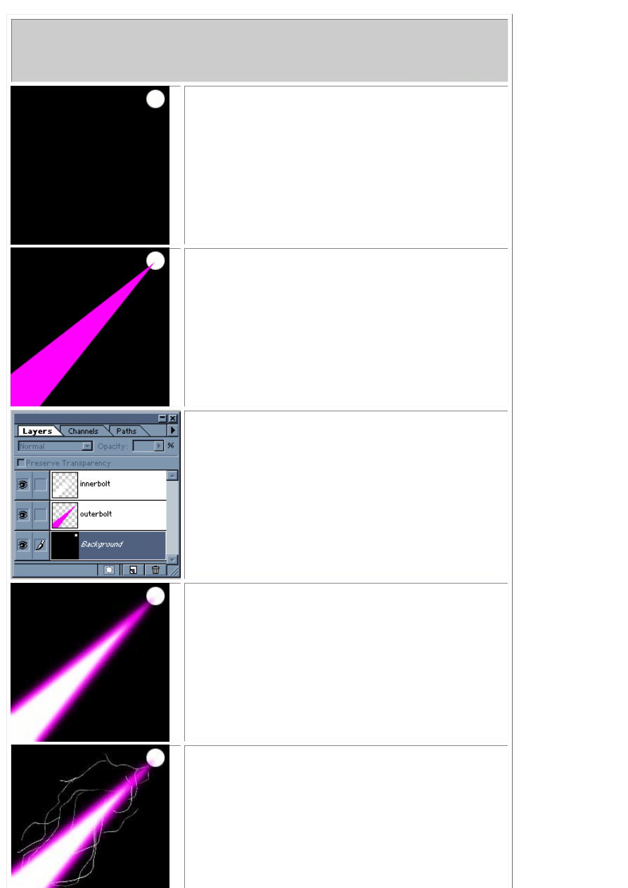
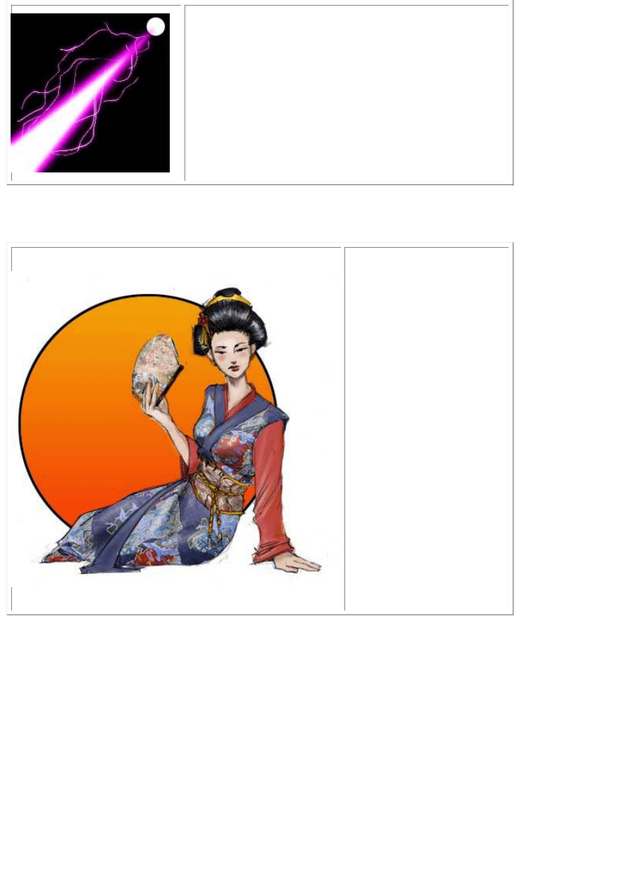
Power Blast
I get a lot of questions on how to make energy bolts like they use in Dragonball or in
StarBlazer (Wave Motion Gun..YEAH). Here's a recipe for a cracklin' energy blast you
can use to destroy things with.
Step 1: Choose your source
The blast has to come from somewhere. I put a
circle here for tutorial purposes but you just pretend
it's a gun muzzle or someones hand, k?
Step 2: Make the base of the bolt
Use the polygon lasso tool and click out a blast
beam selection in perspective like you see
here.Make sure it's on it's own layer. Fill it with a
good bolt color...light blues, purples, greens and
reds are good. Make sure it's a bright color high on
the saturation.
Step 3: Getting in touch with your inner bolt
Now...create a new blank layer above the outer bolt.
ctrl+click on the outerbolt layer to make the bolt a
selection. Contract this selection by a few pixels
and fill this new contracted selection with white on
it's own layer. You should now have something like
you see here.
Step 4: Blurry
Apply a gaussian blur to each layer. Play with the
settings..I used a 2.5 pixel blur...you may need less
or more depending on the size of your picture.
This technique also makes a good light saber.
Step 5: snap, crackle, pop
On another new blank layer, grab your paintbrush,
set it to 1 pixel, 100% opacity, normal
blendingmode and brush out some lightning forks
along the beam.
Step 5: Glow
If you have photoshop 5 or higher you can apply the
"OuterGlow" layer effect to the lightning layer. Use
the eyedropper to select the outer glow color from
the beam itself.
TaDa.
If I was actually using this in a pic I'd probably
sharpen the beginning of the beam a little and add a
lensflare or muzzle flash to the origin.
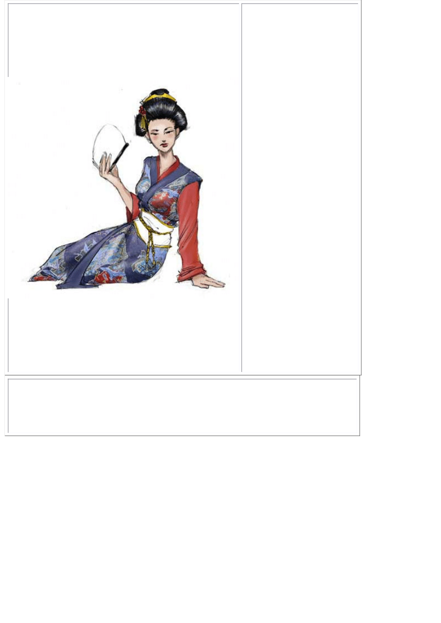
Displacement Maps
Displacement Maps
are useful for
making 2D patterns
"wrap" around fold
or curves on an
object with a
perceivable depth.
I was studying
Intron Depot 2 and
noticed Master
Shirow uses
displacement maps
a lot when texturing
clothing or
monsters.
I'm no master
Shirow and this art
to the left was a bit
rushed but
hopefully it will be
enough to help you
unlock the secrets
of this advanced
photoshop
technique.
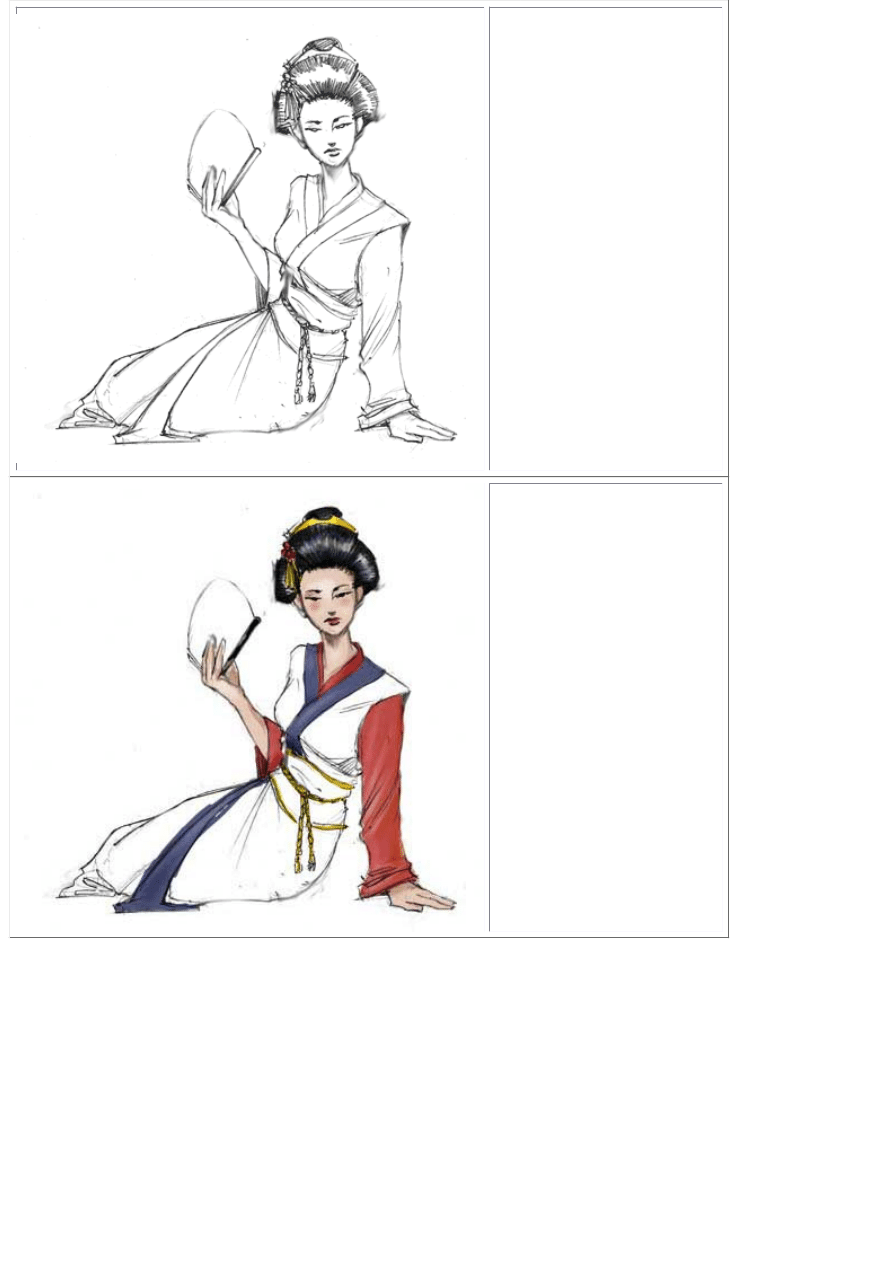
First...prepare your
lineart like I've
shown you in past
tutorials on
coloring.
Place the lineart on
it's own layer and
change it's blending
mode to "Multiply".
This will allow you
to paint and work
on layers
underneath the line
art without painting
over or obstructing
the lineart.
Basically, "Multiply"
makes white
invisible whereas
"Screen" makes
Black invisible
Color in the
portions that will not
be affected by the
displacement map.
In this pic I just plan
on adding patterns
to the Kimono, OBI
and Fan.
I've already chosen
my pattern and
used the
eyedropper to grab
complimentary
colors from the
pattern so the
Kimono's trim will
look nice with it
when I apply it.
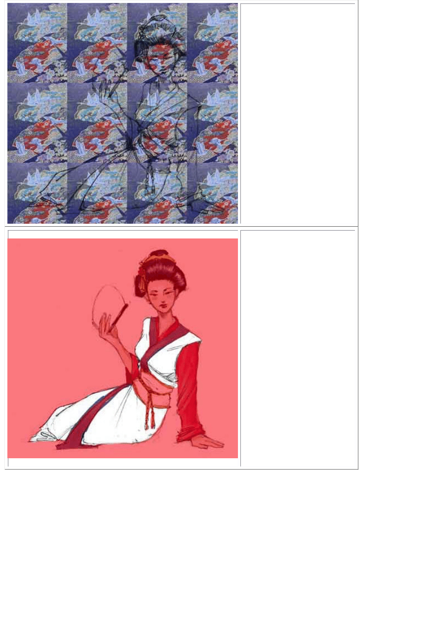
Create a new layer
above your color
layer and below
your lineart layer.
Name it "Pattern"
so you know what it
is later.
Find a pattern on
the net or scan one
in that you like. Fill
the entire layer with
this pattern.
Hide your pattern
layer by clicking the
EYE off.
Switch to your
channels pallete ,
Create a new
channel and mask
out the part of the
drawing you want to
apply the pattern to.
(Paint the area
white)
If you see only
black, make sure
you click the "EYE"
on for the RGB
channel. Your new
Alpha channel
should then be 50%
red so you can see
what your painting
over.
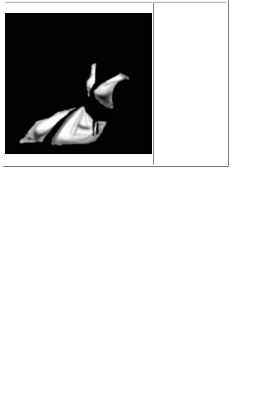
Make a copy of the
channel you just
masked out and
begin shading it to
match the light
source you've
established in your
picture. Apply a
Gaussian Blur of a
few pixels when
you have it shaded
the way you like it.
Copy this channel
(select all, COPY)
and paste it into it's
own document.
(ctrl+N , ctrl+V).
Make sure the new
document's mode is
set to "Grayscale"
Flatten the new
document and save
it as
"displacement.psd"
Go back to your
main art document
and make the
"Pattern" layer
active by clicking on
it.
Go to your filters
menu and choose
"Distort>Displace"
Choose the default
setting of
10,10..repeat edge
pixels. Click OK and
browse to the
"Displacement.PSD"
document we
previously saved.
Click OK.
Now your texture is
"wrapped" around
the folds and curves
we shaded. If the
effect is too
strong..undo the
filter and redo it with
a lower setting like
5,5 or so.
Use the mask
channel we made
that doesnt have
shading to select
the textured area.
Invert the selection
and trim away the
excess pattern.
Now the pattern is wrapped but still requires some shading. Use the dodge tool to add
highlights in the appropriate areas. Repeat this process for any other areas you want to
wrap a pattern around. Go back to page 1 to see the completed version of this piece.
Document Outline
Wyszukiwarka
Podobne podstrony:
How To Draw Manga Basics of Hair, Eyes, Super Deform, Photoshop Tips Characters Mangazeichnen
How to Draw Manga Dressing Your Character in Casual Wear
How to draw manga Body
How To Draw Manga Vegeta (Dragon Ball Z)
How To Draw Manga Getting Started
How to Draw Manga Anime Clothing And Folds Drawing
How To Draw Manga Shampoo (Ranma 1 2)
How To Draw Manga Creating A Dragon (2)
How to Draw Manga Dressing Your Character in Casual Wear
How to Draw Manga Dressing Your Character in Casual Wear
3100873 how to draw manga anime female figure drawing tutorial
How To Draw Manga Eyes
How to Draw Manga Vampire Hunter D
How To Draw Manga Goku (Dragon Ball Z)
więcej podobnych podstron