by Deborah Sorensen
blueprints
spring/summer 2008
Bachelor Modern
N
ot long after Ludwig Mies van der Rohe’s
experimental Farnsworth House (com-
pleted in 1951) inspired public debate over
the appropriateness of the International Style for
residential architecture, United Artists and director
Otto Preminger took a gamble on the inappropriate-
ness of The Moon is Blue (1953). Centering upon the
24
-hour romance between an architect and the young
woman he meets at the Empire State Building, the
film largely takes place within the bachelor architect’s
apartment. The space reflects essential elements of
mid-century modern design: it is bright, spare, and
functional, but it is also casual and comfortable (as
evidenced by Maggie McNamara curling up in an
Eero Saarinen-designed Womb Chair to sew a loose
button, or how easily the Eames “bikini” wire chairs
are reconfigured for dining with a convertible coffee
table!). The film’s light treatment of sexuality would
become a hallmark of similarly styled films—particu-
larly the Doris Day/Rock Hudson vehicles of the late
1950
s and early ’60s. Precisely because of its candid
discussions of adult themes (and the specific use of
forbidden words like “mistress” and “virgin”), it was
denied a seal of approval from the Production Code
Administration—the equivalent of today’s MPAA
rating. One of the first to defy the production code,
Preminger released the film independently and it
became a runaway success, garnering three Academy
Award nominations.
The National Building Museum’s recent film series,
Bachelors, Secretaries & Spies: Mid-Century Style in Ameri-
can Film, was inspired by the exhibitions Marcel Breuer:
Design and Architecture (which closed in February) and
Eero Saarinen: Shaping the Future (opening May 3). Given
that film can offer unique insights into design history and
trends in popular taste, how do American movies of the
1950
s and ’60s reflect or diverge from developments in
mid-century modern architecture and design?
During this period in film history, bachelors, working
women, and spies or super-villains exist on film as indepen-
dent figures, detached from—if not in direct opposition to—
safe havens of community and family. In contrast to these
metropolitan singles, families are shown to live in homes that
are traditional in style (Colonial or Victorian), suggesting
security and comfort. Nonetheless, the domestic trappings
of middle class success are often undermined by themes of
anxiety, instability, and financial burden, further fueling the
desire for a bachelor existence free of responsibility. The great
irony of the mid-century bachelor film is that practically all
of the free agents featured find themselves well on their way
to marriage and family by the end of the picture.
The high number of films in this broad genre seems
to indicate that the public found great pleasure in seeing
independent men and women pulled back into “normal”
society. What follows is an exploration of how the mid-
century modern homes of single men and women in
American film reflected changing lifestyles and shifts in
architecture and design during the same era.
Mid-Century Style
in American Film
Do you have a mistress?
Mistress? Isn’t that an old-fashioned term?
It may be old-fashioned, but at least it’s specific!
—TheMoonisBlue(1953)
Deborah Sorensen is a
curatorial associate at
the National Building
Museum. Her research
interests include the
relationship between
film and the built
environment.

spring/summer 2008
blueprints
What does “Modern” Mean?
In April 1953, Elizabeth Gordon, editor of House Beautiful,
launched a now infamous attack on modern architecture,
embodied by Mies’s Farnsworth House and deemed “The
Threat to the Next America.” Gordon wrote that “[t]he
much touted all-glass cube of International Style architec-
ture is perhaps the most unlivable type of home for man
since he descended from the tree and entered a cave.” The
editors of Architectural Forum returned fire with a full-page
editorial that mused, “Who can really declare that his or
her preferences represent ‘free taste’ but yours are part of
a conspiracy to subvert the nation?. . . Major ideas do not
gestate favorably in a mob” (May 1953).
As a result of this editorial scuffle, Architectural
Forum initiated a series of articles “[t]o help sort out the
main Design trends so the public as well as architects may
understand them” (May 1953). The series began with Eero
Saarinen’s look at “The Six Broad Currents in Modern
Architecture,” identified as: “Wright and organic unity”;
“Wurster, Belluschi and handicraft architecture”; “Aalto
and the European individualists”; “LeCorbusier—func-
tion and plastic form”; “Gropius—an architecture for the
machine age”; “Mies van der Rohe, the form-giver”; and
then Nervi and Fuller, as “the engineer-scientists” (July
1953
). Saarinen acknowledged that “each seeks in its own
way,” but he was nonetheless hopeful about the shared
future of modern architecture:
It is, therefore, logical to assume that with the matur-
ing of our civilization and the resulting respect for cultural,
nonmaterialistic aims, spiritual qualities will flourish. They
will catch up to the physical advances. Our archi-
tecture will then have the balance necessary
for its flowering and some day will take an
important place in history with the Greek,
the Gothic and the Renaissance.
Furniture designers in the post-war period shared
the same optimism and faith in “better living through
better design” that Saarinen expressed. Saarinen himself,
along with individuals like Charles and Ray Eames,
Harry Bertoia, George Nelson, Edward J. Wormley,
Paul McCobb, and even the classically-informed
decorator T.H. Robsjohn-Gibbings, was inspired by
new materials and advances in mass production, as well
as by the collaborative spirit found in design laboratories
like the Cranbrook Academy of Art.
Companies like Herman Miller, Knoll, and Dun-
bar Furniture Company supported these designers and
brought their goods to market. A steady stream of
innovative designs could be seen in department
stores, magazines, books, and museum exhibitions.
The missionary zeal on the part of mid-century
“form-givers” and their advocates helped to
generate public demand for products and designs
that complemented changing lifestyles. By the
late 1950s, what was once considered a style had
simply become the style. Hollywood, however,
had its own ideas about “better living,” and
used mid-century designs to send a
very different message to American
consumers.
Mid-Century Style
in American Film
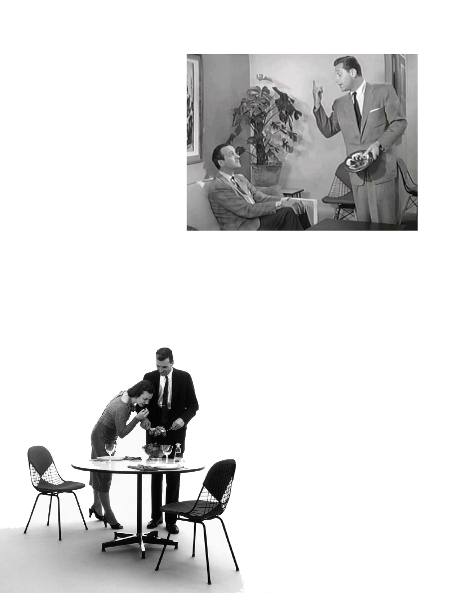
above: The Moon is Blue avoids feeling
trapped by its central location—an apartment
living room—by constantly repositioning
characters among seating areas created by
strategically placed modern furnishings.
© 1953, united artists.
below left: The Eames wire chair, including
this “bikini” version, is rivaled by only
Saarinen’s own chair designs for the number
of appearances made in mid-century movies.
Herman Miller advertisement, ca. 1952.
Courtesy Rooks Photography and
Herman Miller, inc.

Stylish Singles
Looking at films from this time period, one can see that
it is almost exclusively single men and women who are
associated with mid-century modern design. Dozens of
films from the 1950s and ’60s feature independent men
and women living in modern environments.
The most common feature of these adult-themed
comedies and dramas is the bachelor pad; a space that
offered men an escape, a lair of their own, and an oppor-
tunity to inhabit a distinctly male domestic environment.
Regarding this last point, Frank Sinatra’s highly-decorated
but very male nightclub of a “pad” in Come Blow Your
Horn (1963)—including bar, TV den, lounge seating, and
visible loft bedroom—makes The Moon is Blue set look
like a modernist motel room. In Boys’ Night Out (1962)
a group of friends work together to create, and share,
one perfect “lair,” while almost all of the locations in
Ocean’s Eleven (1960) could be considered bachelor pads,
especially Mr. Acebos’ Japanese-modern home (with a
Mondrian twist). Other examples would include Sinatra’s
subdued Asian-inflected apartment in The Tender Trap
(1955) and Bob Hope’s tract home (“It’s not pink, it’s Cali-
fornia Coral!”) with freestanding red fireplace, in Bachelor
in Paradise (1961). The most disturbing example would
be John Frankenheimer’s film Seconds (1966), which
takes the bachelor movie into Twilight Zone
territory. Rock Hudson, in a role very
much against type, abandons his family
and undergoes radical cosmetic surgery
so that he might be “reborn” as a
bachelor artist in Malibu. Appear-
ing repeatedly in films of the ’50s,
and especially the ’60s, the bach-
elor pad or beachfront hideaway
would seem the ultimate fantasy of personal freedom for
a large population of veterans, “organization men,” and
male breadwinners in American society.
For female characters the theme of freedom or
the lack thereof, is also ever-present in 1950s and ’60s
film. Yet in the same films that show men living and
working in modern style, most women are portrayed
as wives living in ruffle-curtained suburbia (The Man
in the Grey Flannel Suit, 1956), in posh luxury (Desk
Set, 1957), or sharing a shabby flat with other working
girls (The Best of Everything, 1959). When women are
shown living alongside the likes of Knoll or Herman
Miller designs, their non-traditional surroundings are
justified by their being performers or artists.
In Torch Song (1953), Joan Crawford’s apartment is
the jaw-dropping domain of the ultimate Broadway queen,
the design of which is echoed in the set for Judy Garland’s
luxurious living room in George Cukor’s 1954 version of
A Star is Born. Barbara Bel Geddes’ cheery artist’s studio in
Vertigo (1958) is all Eames-ian artistic clutter and comfort.
The same year brought audiences Kim Novak’s earth-toned
Danish Modern den/office in Bell, Book and Candle (1958).
Sometimes a woman was unhappy with her modern sur-
roundings, as in The Girl Next Door (1953) where a stage star
discovers that her new home is not the dreamed-for cottage
but a glass-walled oddity, complete with giant chimney-less
hearth and Calder mobile (“Frankenstein slept here!”). But
it is the exuberant Pillow Talk (1959) that encapsulates the
variety of mid-century modern styles available to both men
and women at the end of the decade—from Tony Randall’s
sleekly modular office, to Hudson’s wood-paneled but
electronically-controlled bachelor pad, to Doris Day’s pastel
paradise of an apartment.
blueprints
spring/summer 2008
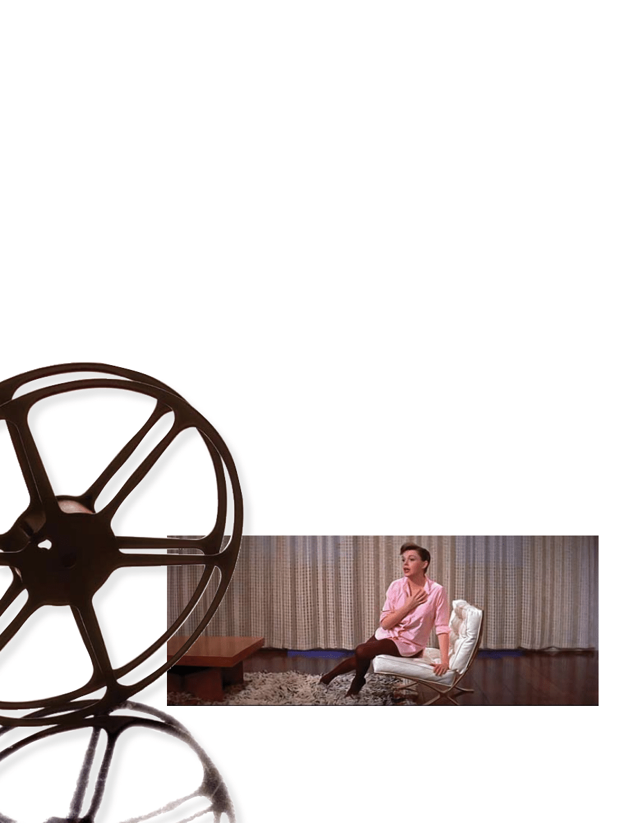
below: While performing the showstopper
“Someone At Last,” Judy Garland dances all
over the set of her mid-century modern home,
turning a tri-cone lamp into a spotlight before
alighting atop a Barcelona-type chair and
Flokati-inspired rug to croon in A Star is Born.
© 1954, Warner Bros.

spring/summer 2008
blueprints
Mid-Century Modern Madness
By the end of the 1950s, architects mirrored Hollywood in
their search for a way to reconcile the state of their art (the
“material” and “spiritual” aims of Saarinen) to the popular
taste and needs of the American public. In 1958, Architec-
tural Forum presented another series of essays on the state
of modern architecture. Douglas Haskell’s contribution,
“Architecture and popular taste” (August 1958), noticed that
a growing number of architects were “shifting away from
the adaptation of design to machine production toward
the highly psychological task of adapting design to an era
of popular mass consumption.” He described three areas
in which popular taste was having an impact on modern
architecture, namely, the desire for more decoration or
romantic expression; a need for drama or symbolic form;
and an inclination towards the improvisational and abstract
over the linear and clearly-defined.
By 1959, there was a definite increase of decorative
elements in mid-century modern film designs—a trend
that sadly coincided with a rapid decline in mature rep-
resentations of male-female relationships. The transfor-
mation of style and subject matter is particularly telling
when comparing two successful Day/Hudson films,
Pillow Talk (1959) and Lover Come Back (1961).
Style-wise, the first film is more closely aligned with
the trim aesthetic of The Moon is Blue (1953), albeit with a
spiral staircase similar to the one found in the Eames’s Case
Study house (1949). The main level of Hudson’s bachelor
pad is small, with a wall-hung cabinet reminiscent of those
designed by Bauhaus master Marcel Breuer, pickled wall
paneling, and a tasteful display of framed and lit modern
art (in addition to the discreet control panel that dims the
lights and locks the doors). In Lover Come Back, Hudson
lives in a sprawling penthouse filled with orange and black
surfaces that gleam like a Chinese cabinet of curiosities.
Filling the screen are a biomorphic couch, curvy wetbar,
built-in hi-fi, court jester wall-hangings, Japanese prints
and padded headboard—all of which are far more deco-
rated and dramatic than sets in the earlier film.
While the general plot of both films is nearly iden-
tical, not only is Lover Come Back more outlandish visu-
ally, but the manner and the lengths to which Hudson’s
character misleads Day make the film more unsettling.
In Pillow Talk, Hudson finds it difficult to let go of his
false identity as his affection for Day grows, but in Lover
Come Back, the fact that Day is a rival advertising execu-
tive would seem to justify Hudson’s drawn out and ma-
licious manipulation of her professional and private life.
By the time the baroque designs of In Like Flint (1967)
appear, along with similar 1960s bachelor and spy films,
women have become just another modern convenience
found in the bachelor pad.
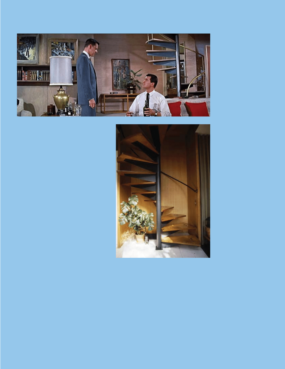
above: Hudson’s bachelor pad in Pillow Talk
is visually grounded by a strong emphasis on
horizontal lines as seen in the wall cabinet,
side table, stair steps, and low couch.
© 1959, universal international.
left: Even a simple, functional design element,
like the spiral staircase ordered from a marine
catalogue and installed in the Eames House
(Case Study House #8), could be transformed
on film into an icon of luxurious modern living,
as in Hudson’s bachelor pad above.
Courtesy of and © 2008 eames office llC.

blueprints
spring/summer 2008
Fall (and rise) of the Roman Empire
A particular trend in film design towards the end of the
1950
s was the widespread use of classical forms and mo-
tifs. In 1960, well-known decorator and designer T. H.
Robsjohn-Gibbings debuted his popular Klismos line of
Grecian furniture, followed soon after by his book The
Furniture of Classical Greece (1963). Greco-Roman de-
signs appear in Ocean’s Eleven (1960), Strangers When We
Meet (1960), Lover Come Back (1961), and Come Blow
Your Horn (1963). In That Touch of Mink (1962), Cary
Grant’s office presents a particularly odd combination
of a sleek modern entryway next to a series of bas-relief
urns and trompe l’oeil columns. Featured as stylized wall
decoration and objets d’art, these classical elements had
unambiguous associations of culture and sophistication.
Seeing how plotlines of the virginal 1950s evolved into
the ’60s sex farce, it is no wonder that the veneer of
Grecian glamour applied by Hollywood became increas-
ingly suggestive of Roman decadence.
In the architectural world, meanwhile, a more
mature expression of classical ideals was taking form.
By 1959, Eero Saarinen’s Miller House (completed
1957
) had become a superstar of modern residential
design and decoration—though in a very different
way than Mies’s Farnsworth House had earlier in
the decade. Architectural Forum deemed the home
a “contemporary Palladian villa” in September 1958,
followed shortly thereafter by the February 1959 Better
Homes & Gardens issue, which featured the home on
the cover as its third “Hallmark House.” The home’s
“pinwheel arrangement” of rooms, around a central
space with a luxurious conversation “pit” and playful
round fireplace, is supported by elegant white columns
and bathed with light from a perimeter of skylights.
This vision of white marble is brightened throughout
by the colorful interior design work of Alexander
Girard. Here, the “spiritual” element of architecture
that Saarinen looked forward to in 1953 had clearly
caught up with his own “material” advances.
While Hollywood was busy taking modern design
to “mod” extremes, playing fast and loose with an eclec-
tic mix of neoclassical forms and extravagant textures
and colors, architects like Saarinen were recognizing the
need for architecture to express modernist ideals in an
individualized fashion. Although 1950s and ’60s films
appropriated mid-century modern design and used it
in ways that the designers and architects could never
have envisioned, they nonetheless provide a unique lens
through which to view how popular taste challenged
and reinforced the norms of a culture struggling with
Cold War anxiety and rapid social change. In the end,
Hollywood’s one-sided love affair with mid-century
modernism helped create a long-lasting association
between a particular moment in design history and an
ongoing stereotype of the swinging single.
•
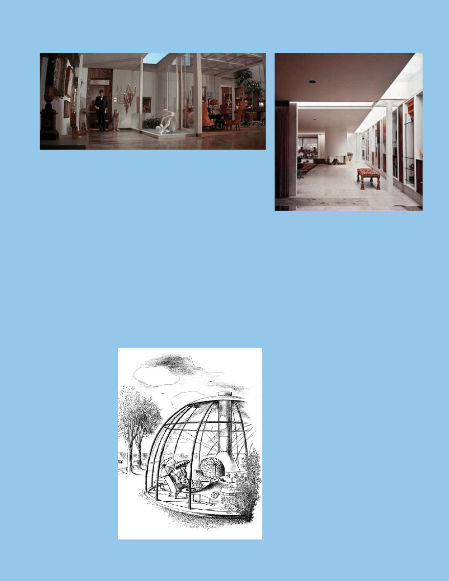
above: While the first Flint film featured dark,
Moorish designs for the hero’s apartment,
the second film essentially presents Flint’s
apartment as a sprawling modern-day Roman
bathhouse.
© 1967, twentieth Century-Fox.
above right: As with the Eames staircase and
Pillow Talk, the design for the Miller House
predates by nearly a decade several elements
echoed in the film In Like Flint (above left),
such as Saarinen’s ingenious and sculptural
support columns and skylight system.
© ezra stoller/esto.
below: In response to George Nelson’s vision
of plastic “space-container” homes, New York
decorator T.H. Robsjohn-Gibbings lampooned
the degree to which the mid-century modern
home might, in effect, become more window
than wall. The “Dome, Sweet Dome,” illustration
by Mary Petty comes from Robsjohn-Gibbings
book Homes of the Brave.
© Knopf: New York, 1954.
Wyszukiwarka
Podobne podstrony:
Mid Century Style in American Film
A 20th century acceleration in Nieznany (2)
CJR1 CFSP (2014) Shariah in American Courts
censorship in american society
The Role of?rican American Women Writers in American Literature
The Role of?rican American Women Writers in American Liter
Tobacco in America
Extensive History of Labor in America doc
Peter Stearns Anxious Parents, A History of Modern Childrearing in America (2003)
you cant do that in america tn 29 05 08
democracy in america
terrorism in america 2
Ecclesia in America, s 122
Piper Michael Collins The New Jerusalem Zionist Power In America
Cavalcade of Bacchus in America ver 2
Second Acts in American Lives
D B Reynolds Vampires in America 01 Raphael
więcej podobnych podstron