M
any people ask themselves the question in this chapter’s
title. Is it in the way you create the content? Is it in the way
you put the pieces together? Is it in the way you deliver the
presentation?
I know that you’d agree that there have been times when
you went to a presentation or a company meeting, only to walk
away feeling that it was a total waste of time. It was not a great
presentation. But why?
Actually, a great presentation is a combination of the three
elements: content, design, and delivery. Stay focused and use
what’s presented in this book and you will severely lessen the
chance that your participants will walk away after one of your
presentations with the feeling that it was a total waste of time.
This book was specifically written to help you create a great
presentation.
Content, Design, and Delivery
There are three elements to a great presentation: content, design,
and delivery. Content includes the research and organization of
1
What Makes a
Great Presentation?
1

materials. Design is the architecture of the slides and the graphi-
cal enhancements. Delivery is how you voice your message. To
make the presentation great, there must be synergy of these
three elements. Each of these elements carries equal weight and
importance. Your presentation will not be great unless you have
all three of these elements.
For example, let’s say you don’t do a good job researching
and organizing your content, but you spend hours designing the
presentation with all the bells and whistles and hours practicing
your delivery. What’s going to happen when you get in front of
your audience? You’re going to run through your presentation and
it won’t be interactive because you don’t know more than what’s
on your slides. Your audience is going to pay attention to the next
sound or wild animation.
When someone asks you
questions, you’re not going
to know the answers,
which will severely hurt
your credibility. The audi-
ence will take little or noth-
ing back from the content
of your presentation and
you will look unprofession-
al as a presenter. By prop-
erly combining content,
design, and delivery, you’ll
create a great presentation!
Presentation Skills for Managers
2
Presentation A visual and aural event intended to com-
municate, for the purposes of providing information, helping
to understand, gaining agreement, and/or motivating to act.
That’s a rough, general definition. Some guides will divide presentations
according to the purpose—motivational, informational, persuasive, and
so forth. Although your purposes should determine many choices that
you’ll make, any presentation requires proper attention to the three
basics: content, design, and delivery.
Know More than
You Show
You should always be ready
to answer any questions that are like-
ly to arise. However, don’t assume
that the members of your audience
will necessarily want or need to know
all that you know. As a friend once
remarked, “It’s not hard to know a lot
of stuff; what’s hard is to know what
stuff to share.” But if you know why
you’re doing the presentation and for
whom, that decision gets a lot easier.

The Process
There is a process to creating that great presentation. First, you
must create your content. Then, you must design for that con-
tent. Finally, you must develop your delivery strategy and style.
Content
There are some key steps to keep in mind when creating your
content. First, you do your research. Then, group the informa-
tion into logical categories. Finally, you create your outline.
(We’ll get into that in Chapter 2.)
Too often presenters
don’t follow those key
steps. The night before a
meeting, they’re cramming
information onto slides try-
ing to create this great
presentation. They may
even be adding items to
their presentation at the
last minute.
To avoid the problems
of late preparation and
last-minute editing, think
of creating the content of
your presentation in terms
of these three steps:
1. Do your research.
2. Group your information into logical categories.
3. Create your outline.
Design
Once you’ve outlined your presentation, you’re ready to create
your slides and add graphics, charts, and animation. Chapters
3, 4, 5, and 6 are dedicated to helping you take your presenta-
tion from outline form to a solid complete piece of work.
What Makes a Great Presentation?
3
Don’t Wrap It Up
Some people feel that
properly preparing for a
presentation means putting together
a package that cannot change. But
we’ve all attended presentations that
came across as canned.
Put your package together, but
keep alert to any changes in the con-
text of your presentation: new infor-
mation, a shift in mood, a sense of
greater interest or urgency. Don’t
hesitate to adjust your presentation
to make it more effective by being
fresh and current.

Although there are other presentation programs (such as
Corel Presentations, Astound Presentation, Sun Microsystem
Impress, and Lotus Freelance), in this book we discuss how to
create your presentation using Microsoft PowerPoint. We show
you how to create the proper slide, when to use images, and the
proper way to use charts. We also offer insights into creating
that great presentation.
Delivery
And finally, there’s the delivery. You need to know the logistics of
your meeting. (We cover that subject in Chapter 7.) You need to
understand how to make the participants retain your message.
(Just because you’re talking and participants appear to be lis-
tening does not mean there is knowledge being transferred from
you to them.) You need to set clear objectives in the presentation
as well as state your expectations for your audience. They need
to find value in your presentation. Your presentation needs to be
such that what you present and how you present it causes a
change in behavior of those who attend the presentation. Maybe
it’s a case of helping them to better understand the long-range
vision of the company; if you can get them to see it in a way that
helps them embrace change, improves morale, and increases
productivity, your presentation has done the job. Chapters 8 and
9 will help you deliver that great presentation that gets results.
Presentation Skills for Managers
4
Choosing Software
There are numerous presentation programs on the market,
including free software.You may already have a program on
your computer or your organization may use a certain program, so you
don’t need to choose. If you’ve got a choice, you can read the reviews
in periodicals and on the Web. If you’re unsure, it’s probably wisest to
go with what Gregg Keizer of (CNET Review, Oct. 12, 2000) called “the
reigning prince of presentations . . . the presentation standard”—
PowerPoint.
Noting that it’s “slightly pricey,” he recommended for smaller budg-
ets StarOffice Impress, which is free.
I would add that I gave a rating of 5 out of 5 to Astound Presentation
(Presentations, November 2000), noting that it contains “pretty much
everything a PowerPoint junky could ever want.”

The Situation
Up to this point, we’ve been dealing with presentations in gener-
al. That may be the best way to begin a book on presentations,
but it’s the worst way to begin any presentation—and probably
the best way to fail.
When you decide or find out that you’re going to do a pres-
entation, get all of the details. This advice might seem obvious,
but some people immediately start thinking and/or worrying
about what they’ll do, getting at least one big step ahead of
themselves before they really know where they’re going.
The details that you should get will generally fall into four
categories, which you can remember as the four P’s:
• Purpose
• People
• Point
• Place
Purpose
Why are you doing this presentation? The full answer to that
question is your purpose. And that full answer has two parts.
The first part is your subject area, the what of your presen-
tation. What will you be addressing or covering? The proposed
What Makes a Great Presentation?
5
Beware the Tyranny of Your Tools
Don’t let your software dictate the content, design, and
delivery of your presentation. In his online article, “The
Tyranny of Presentation Software,” Rick Altman warns that presenta-
tion software “dummies” down good presenters:
“In too many cases, presentation software has detracted from
speeches, not enhanced them. . . .
“Resist. Don’t fall prey to the tyranny. Don’t let the presentation
software take over the presentation. If you’re an experienced speaker,
make sure that the software doesn’t turn you into a robot. If you’re not
experienced, don’t expect the software to save you. . . . Presentation
software is a tool, it is not the art itself. In the hands of an artist, the
tool can do wonderful things. In the wrong hands, it can turn a good
speaker into a bad one, and a bad one into a dreadful one.”

changes in the employee manual? The recent negative media
reports about the new product? The update of the company
intranet?
It’s essential to find out how broad or narrow your scope
should be and how deep you should go—aspects that depend to
a great extent on the other P’s. It may be just as important to
find out if there’s anything that you should avoid, such as a pro-
posal that the board is still debating or a recent resignation in
the department that developed the new product.
The second part of your purpose is the reason, the why of
your presentation. What are you expected to do? Provide infor-
mation? Help participants understand? Persuade them to agree
on something? Motivate them to act? Entertain them? There
may be several reasons for doing the presentation. Unless you
know them all, it’s not likely that you’ll balance and structure
your presentation appropriately.
The full answer to the why question may not come easily—
or at all. Sometimes you have to ask and then ask again—and
sometimes you have to figure out the rest of the answer by
yourself.
Let’s take an example. The CEO asks you to provide new
employees with an overview of the employee manual. It may
seem that your reason is simple: to inform. But there may be
other reasons behind her request. She may not mention that
Presentation Skills for Managers
6
Rating Presentations
Here’s how Rick Altman rates presentations (“The Tyranny
of Presentation Software”):
• Best Presentation: Truly excellent speaker, great ideas, and slides that
amplify on the points made, instead of repeating them.
• Very Good: Truly excellent speaker, great ideas, and no slides.
• Still OK: Excellent speaker, redundant slides that don’t add anything.
• Not So Good: Bad speaker, good slides.
• Pretty Bad: Bad speaker, no slides.
• The Worst: Bad speaker, redundant slides.
As you prepare a presentation, imagine your audience rating you by
this scale. How would you score?

she’s concerned about low morale in the company and is hop-
ing that you’ll help the new hires understand the reasons behind
certain unpopular policies. She may not mention that she sus-
pects that the managers responsible for other aspects of the ori-
entation program may have come across as serious and uncar-
ing and is expecting that you’ll be entertaining enough to
change their image of the company.
The why of your purpose is probably as important as the
what—and it often may be even more important. If it makes
sense to ask, do so. If it’s wiser to find out on your own, do so.
You don’t want to find out about hidden agendas or unexpressed
expectations too late.
People
To whom are you delivering this presentation? The answer to
that question may seem simple enough, especially if you know
the target group. But make sure you know how much or how
little they know about the subject of your presentation and why
they need to know any more.
You might imagine yourself sitting among those people.
Answer the following key questions:
• Why are you attending this presentation?
• How do you feel about attending it?
• What do you expect to get out of it?
If you can’t imagine how those people would answer those
questions, maybe you don’t have a good enough sense of who
they are. Find out more about them until you can answer those
questions with confidence.
Point
What do you want to happen as a result of your presentation?
That’s the point, the objective.
How will the participants be different because of your pres-
entation? In other words, what will be evidence that you suc-
ceeded, that you met your expectations?
What Makes a Great Presentation?
7

If you know your purpose, why you’re doing the presenta-
tion, you should have little trouble figuring out the point. (Now,
as for reaching the point, well, that’s where things get more
complicated. . . . )
Place
Where are you doing the presentation? And don’t settle for just
a room designation—unless you know all about that location.
Here some questions to answer:
• How big is the room?
• What is the layout of seats and other furniture? How
much can it be changed, if needed?
• Where are you going to be in that room?
• What equipment will be in that room? A screen? A
microphone? (What kind?) A podium?
• Where are the electrical outlets?
• Where is the connection for the intranet and/or Internet?
• How good is the lighting and how is it controlled?
• How well does the heating and air conditioning work?
• Are there windows? If so, how many, how big, and where
are they? Is the view likely to distract participants? Are
there curtains?
• Is the room relatively quiet? How likely is it that there
will be disruptions?
You may not need to ask all of these questions, depending
on the nature of your pres-
entation. You may already
have most or all of the
answers. But it’s always
smartest to make sure.
Finally, a question
that’s related to location
only in that it’s also a
logistics issue: How much
time will you have for your
presentation?
Presentation Skills for Managers
8
Post Your P’s
When you’ve got the answers
to your questions about the sit-
uation for your presentation—pur-
pose, people, point, and place—sum-
marize them on an index card.Then,
as you prepare your presentation,
post that card with the four P’s
where you can conveniently use it as
a touchstone to keep on track.

Presentation Checklists
Before we move on to the chapters that get into the specifics of
creating your content, designing for that content, and develop-
ing your delivery strategy and style, I think that we should start
with some general guidelines for presentations. I find it helpful
to use two checklists. Every time you create a presentation, I
recommend that you use these checklists as guidelines for help-
ing you to make that presentation be as effective and successful
as you hope it will be.
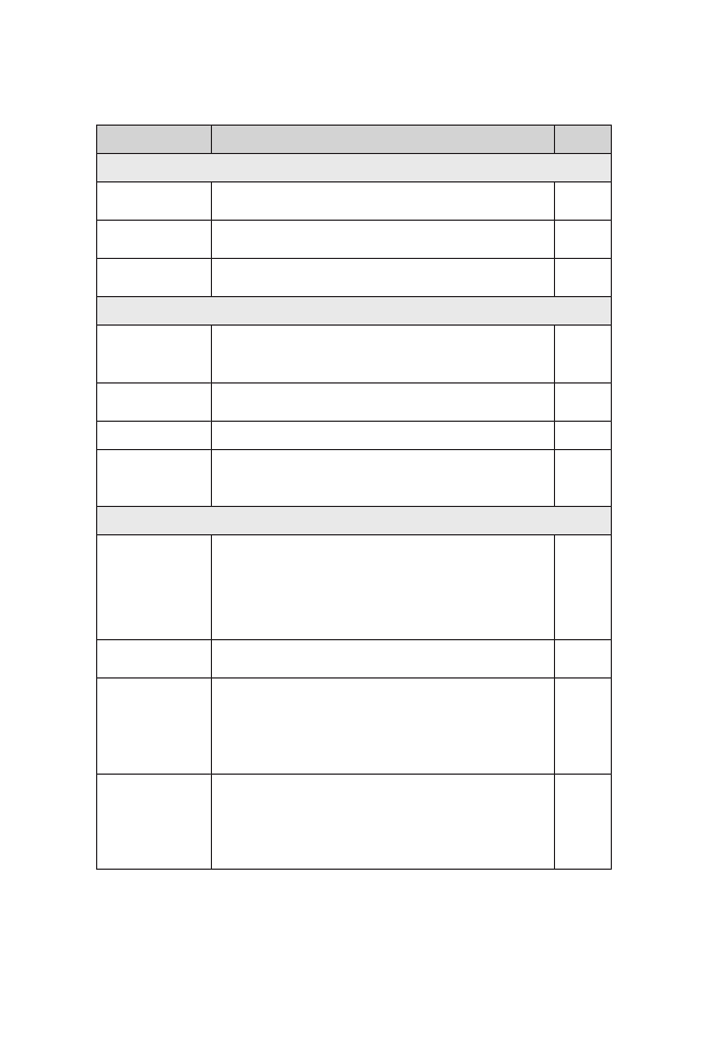
Total Visual Checklist
The first checklist is the Total Visual Checklist. Use this one for
the entire presentation. It helps you with the organization, the
content, and the look of the presentation. Use this when you’re
reviewing your presentation as a whole.
What Makes a Great Presentation?
9
Taming the Butterflies
Research shows that public speaking scares many people. If
you’re one of them, or if you just feel nervous, you could
use the technique of visualization.This may work better the more you
know about the situation for your presentation—and it’s definitely
more effective when you prepare well.
Imagine yourself beginning with confidence, making a great first
impression, establishing rapport with the participants. Imagine your
preparation paying off as you move through your presentation with
poise, ready for anything. Choose positive, successful images of your-
self and you’ll feel less nervous.
Attribute
Description
✔
Organization
Agenda
Present the agenda within the first three slides.
Logical Flow
Ensure that the flow follows the agenda and is easy
for the audience to follow.
Data Clustering Check that all information related to one topic is
together.
Account
Customization
Include placeholders for account information.

Presentation Skills for Managers
10
Attribute
Description
✔
Organization
Blank or Logo
Screen
Include blank or logo slides as the first and last
slides of the presentation.
Appendix
Include an appendix for easy reference for the
audience.
Hidden Slides
Use hidden slides that contain additional details;
use only if needed.
Content/Flow
Variety
Vary the slides. For example, don't show six pie
charts or six bullet slides in a row. Change slide
style approximately every 3-5 slides.
Appropriate
Chart
Ensure that the type of chart you choose is the
best way to display the data.
Transitions
Build transitional phrases into your speaking notes.
Necessity of
Slide
Cut out unnecessary slides. Create hidden slides
or hyperlinks to address questions that might be
asked.
Look
Appropriate
Template
Ensure that the template matches presentation
objective, presentation medium, and content.
Determine how best to use sidebars, titles, and
footers. Determine background color: light or
dark. Use best contrast: light text on dark
background.
Informative
Headings
Use different headings that provide instant
identification of the main point/content of slide.
Presentation
Medium
Use color, black and white, or textures in charts
and graphs, based on the presentation method.
For example, don't use yellow text if black and
white hard copies will be left behind; yellow text
can't be seen on white paper.
Graphics
Ensure that the graphics accurately and appro-
priately represent the topic and message. Use
appropriate graphics for your message: for a refer-
ence to something, use a symbol or clip art; for an
accurate representation, use a picture or video.

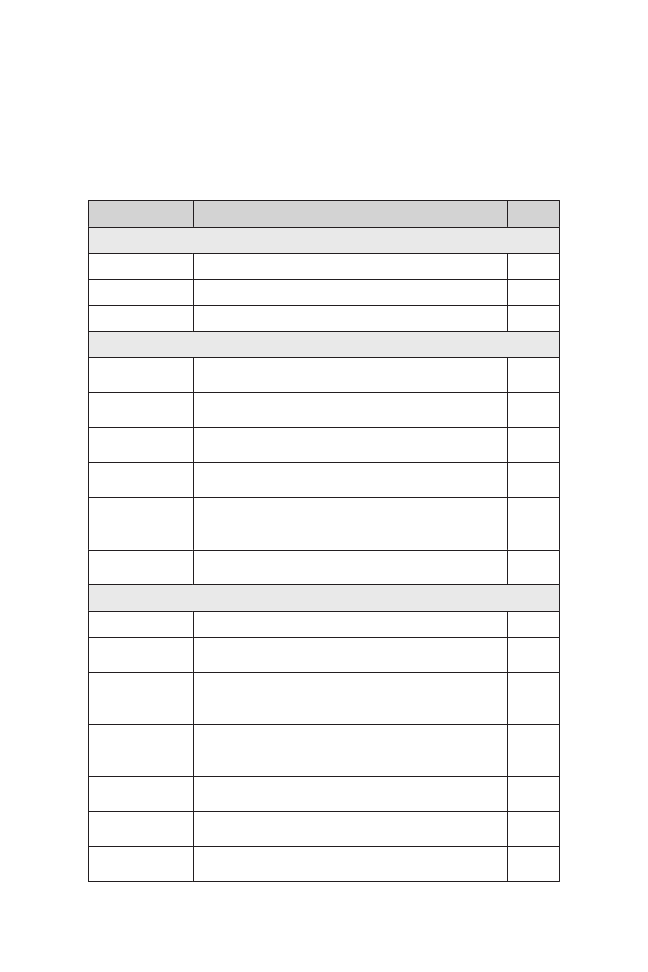
Single Visual Checklist
For each individual slide, use the Single Visual Checklist. This
will help you review the organization, understanding, look, and
flow for each individual slide.
What Makes a Great Presentation?
11
Attribute
Description
✔
Organization
Major Point
Have only one major point on each slide.
Understanding
Titles
Write informative titles that tell your audience the
importance of the slide within three seconds.
Illustrate
Illustrate information with charts, comparison
tables, and/or pictures.
Look
Focal Point
Create one primary point of focus on each slide.
Concise
Leave out information the presenter can say.
Call Attention
Use arrows or symbols that draw attention to the
important part of the chart or diagram.
Interpretation
Build into your speaker’s notes an explanation of
why the data is important.
Charts
Keep the charts simple, with a clear focus. Make
sure that data points are well placed and easy to
read.
Abbreviations
Use abbreviations only when the audience will
understand.
Phrases
Use phrases; not sentences.
Parallel
Structure
Ensure that all phrases start the same way, with all
verbs or all nouns.
Limited Words
Add the fewest words needed to explain a picture
or chart. Put full explanation in your speaker’s
notes to enable presenter to discuss.
Fonts
Use 24-point font for text; no less than 20, if
absolutely necessary. Use a sans serif type face,
such as Tahoma or Arial.
Clip Art
Use only to enhance a point; avoid cartoon clip art
in most cases.
Sizing Photos/
Clip Art
Ensure that images are sized to the appropriate
scale.
Spell Check
Check spelling of bullet points and chart
information. Use software tool and check visually.

Both of these checklists include information that goes
beyond what is discussed in this book. So, keep these check-
lists handy and refer back to them often, for every presentation.
Don’t worry if you don’t understand all of the terms used in
these checklists. We’ll cover those in our discussions. I also
encourage you to customize these checklists, by adding to them
points that you want to remember from the chapters that follow.
Manager’s Checklist for Chapter 1
❏
There are three elements to a great presentation: content,
design, and delivery. Content includes the research and
organization of materials. Design is the architecture of the
slides and the graphical enhancements. Delivery is how
you voice your message.
❏
Create your content in three steps: do your research,
group the information into logical categories, and create
your outline.
❏
Before you begin planning, know the specifics of your situa-
tion: Why are you doing this presentation? What is your sub-
ject and what is your reason? To whom are you delivering
this presentation? What do you want to happen as a result
of your presentation? Where are you doing the presentation?
How much time will you have for your presentation?
❏
Use the Total Visual Checklist to help with the organization,
the content, and the look of your presentation and the
Single Visual Checklist to help with the organization,
understanding, look, and flow for each individual slide.
Presentation Skills for Managers
12
Attribute
Description
✔
Flow
Photographs
Ensure that there's enough memory to have
photos come up quickly. Use JPEG format at a low
resolution (72dpi).
Builds
Use builds to emphasize and speak on one bullet
point at a time. Choose transitions that are simple
and easy on the eyes.
Wyszukiwarka
Podobne podstrony:
Mcgraw Hill Briefcase Books Leadership Skills For Managers
McGraw Hill Briefcase Books Negotiating Skills for Managers
Mcgraw Hill Briefcase Books Interviewing Techniques For Managers
McGraw Hill Briefcase Books Skills for New Managers
McGraw Hill Briefcase Books Budgeting for Managers
McGraw Hill Briefcase Books Customer Relationship Management
McGraw Hill Briefcase Books The Manager s Guide to Business Writing
McGraw Hill Briefcase Books The Manager s Guide to Effective Meetings
McGraw Hill Briefcase Books Six Sigma Managers
McGraw Hill Briefcase Books Performance Management
McGraw Hill Briefcase Books The Manager s Survival Guide
McGraw Hill Briefcase Books Building a High Morale Workplace
McGraw Hill Briefcase Books Effective Coaching
McGraw Hill (Briefcase Books) Communicating effectively
McGraw Hill Briefcase Books Conflict Resolution
McGraw Hill Briefcase Books Hiring Great People
McGraw Hill Briefcase Books Managing Multiple Projects
więcej podobnych podstron