
Surfing the Market Waves
With
Jan Arps’
Swing Trader’s Toolkit
For SuperCharts
®
and TradeStation
®
Jan Arps’
Trader’s Toolbox
Certified Omega Solution Provider
534 Lindley road
Greensboro, NC 27410
Phone: 336-292-1641 Fax: 336-292-5784
Website:
www.janarps.com
Copyright © 1998, Jan L. Arps

Table of Contents
WHAT FORCES AFFECT THE MARKET’S SWING PATTERNS? ................................... 2
CREATING A VISUAL FRAMEWORK FOR THE SWING TRADER ............................... 6
TT AUTO UPTREND / TT AUTO DOWNTREND LINES WITH TRENDLINE
TOOLS TO DEFINE POTENTIAL SUPPORT/RESISTANCE LEVELS ........................... 18
TT FLOOR PIVOTS SUPPORT/RESISTANCE LINES ....................................................... 20
PERCENTAGE RETRACEMENTS AND EXTENSIONS .................................................... 23
TT RADAR 3 OVERBOUGHT/OVERSOLD INDEX............................................................ 31
TT DIVERGENCE NORMAL AND TT DIVERGENCE TYPE 2........................................ 32
TT PRO STOP AND REVERSE ADAPTIVE TRAILING STOP SYSTEM........................ 35

Page
1
Surfing the Market Waves With
Jan Arps’
Swing Trader’s Tool Kit
The objective of this course is to give you a thorough understanding of the
TRADERS’
TOOLBOX
Swing Trader’s tools, to teach you how get a “feel” for the rhythm of the
market swings and to trade the swings like a pro – that is, to buy the bottoms and sell the
tops. After all, the points at which the trend changes direction represent the opportunities
with the lowest risk of loss and the highest potential for profit.
The termination points of upswings and downswings will be referred to interchangeably
in this course as “Pivot” points, “Swing” points or “Turning” points. All mean the same
thing - that is, they represent significant points in the progression of prices where the
direction of the price movement changes from up to down or from down to up. The price
interval between a low Pivot and the next high Pivot, or from a high Pivot to the next low
Pivot will be referred to interchangeably in this course as a “Wave” or as a “Swing”.
A Swing trader tries to exploit the swings of the market with as little exposure to
risk as possible. Swing trading consists of looking for optimum times to jump in at the
beginning of a new swing and exiting at or near the end of that swing to await the
development of a new swing trading opportunity.
A successful swing trader is like a surfer, waiting offshore on his board for just the right
wave to ride to the beach. He may let several waves go by, because they don’t “feel”
quite right, or maybe he wasn’t paying attention and missed catching the wave until it
was too late, but he doesn’t mind, because there will always be another wave, and in the
meantime he waits patiently. One of the most important attributes of a successful Wave
Trader is patience. Exposure is Risk, and an important characteristic of a successful
Swing Trader is that he is always aware of the balance between Risk and Reward,
and strives to maintain as large a ratio as possible of Reward over Risk.
No market goes up or down in a straight line. Prices don’t go straight to the moon, they
follow a jagged path up and soon come back down. The markets are made up of many
different individual buyers and sellers, each having his own concept of where the market
is going and each motivated by varying degrees of the basic human emotions of fear and
greed. the interrelationships between these individuals, all acting in their own best
interest, create the market patterns we call, “Swings”.
The sequence of upswings and downswings is a manifestation of the Market’s “breathing
in and out” as it moves in a meandering fashion along its path from point “A” to point
“B”. Although these meanderings may appear to be random, there is, in fact, an
underlying pattern and logic to their movement that is based on the laws of physics,
geometry, and the dynamics of crowd behavior. Understanding these patterns and the
reasons for them can greatly improve your chances for success as a trader.

Page
2
What forces affect the market’s swing patterns?
There are both psychological and geometric reasons controlling the markets’ swing
patterns. Let us first consider the psychological aspects.
Markets exist to facilitate trade. In order to facilitate trade, markets must entice both
buyers and sellers. In order to entice buyers and sellers there must be price movement as
well price uncertainty.
With an anticipation of an upward price movement, buyers will buy at a given price in
anticipation of being able to sell later at a higher price. Sellers will sell at a given price in
anticipation of the likelihood that prices will be lower in the future than they are now. If
at any point in time demand (buyers) exceeds supply (sellers), prices will have a tendency
to rise, thereby attracting more sellers. As supply catches up with demand, and buying
begins to dry up, the sellers lower prices to attract more buying.
This constant, self-adjusting process between buyers and sellers is what causes markets to
move not in a straight line from point A to point B, but in a more or less erratic, zig-zag
pattern consisting of thrusts in the direction of the underlying trend, followed by
reactions against the underlying trend.
Let’s examine the swing patterns of a complete market cycle, from neutral, to uptrend, to
top reversal, to downtrend from the standpoint of crowd psychology.
Prior to the beginning of a new market cycle, let’s assume that the market is in neutral
territory. There are no strong bearish or bullish biases, and the market is basically trading
up and down within a rather narrow channel. At this point the market’s behavior is
somewhat like a dog being taken for a walk around the block. The dog and its owner stay
on the sidewalk, progressing from one street corner to the next. The dog, however,
having a curious nature, will meander from one side of the sidewalk to the other, sniffing
a bush, investigating a squirrel, running, then walking again. The result is that the dog’s
path, while constantly progressing forward, travels a much greater distance to achieve his
forward progress than does his master.
In a relatively flat market there is an equal degree of uncertainty between the buyers and
the sellers as to the future trend in prices. Consequently, prices meander back and forth
within a well-defined relatively narrow horizontal channel. Upswings are generally the
same length as downswings, and the angles are roughly equivalent mirror angles.
Eventually, an increase in the number of buyers relative to the sellers begins to generate a
bias to the upside and prices begin a gradual rise. As the awareness of the bullish bias
grows, more and more discerning buyers jump on the bullish bandwagon. Rising prices
attract more buyers, and a significant upthrust occurs.
At some point in the upthrust, the initial flurry of buying slows down. Short-term buyers
begin selling to lock in their profits and serious long-term buyers back away to let prices
settle down a little bit so as not to bid prices up too far too fast. Also, the floor brokers,
who have had to sell into all the buying that has occurred, have an incentive to force

Page
3
prices back down somewhat to cash out their short positions at a profit and to build up
their inventory. This is called a pullback, or reaction, or a countertrend move.
Pulbacks are usually steeper and shorter in duration than thrust moves. Pullbacks in
strong trends may retrace 35-40% of the upthrust swing. Pullbacks in weaker trends may
retrace 50-60% of the upthrust swing. If the pullback exceeds 65% of the upthrust swing,
it is a sign of overall weakness and the major upthrust in all likelihood is over.
After an initial pullback for the market to catch its breath and regain its energy, a new
upthrust begins, usually with greater force and duration than the initial thrust. At this
point, the uptrend has become well advertised, and buyers are eager to climb on board
this accelerating train. This is the main thrust of the upmove and is usually the strongest
leg.
After the main thrust has moved a distance equal to anywhere between 100% and 200%
of the initial upthrust, a marked increase in selling pressure begins to occur, as buyers
who bought near the beginning of the trend start taking their profits, while short sellers,
believing the market now to be “overbought”, begin selling into the uptrend. This
generally results in a sharp selloff. The selloff is further fueled by the triggering of
protective stop-loss orders close below the lows of the uptrend bars and buyers exiting
their positions in expectation of a major sell-off.
This selling is offset somewhat by the buying of “bargain hunters”, who sense an
opportunity to buy into a rapidly appreciating market at prices lower than the recent
highs. Buying also comes in from the floor brokers, who had been forced to sell into the
rising market covering their shorts and rebuilding their inventory.
This leads into the final, or blowoff phase of the uptrend. As prices once again begin to
rally, eager late buyers, fearing that they will once again be left behind, begin clamoring
to get back on board. Floor traders accommodate them by selling out of their inventory
at increasingly higher prices. In the meantime, the short sellers, who had sold into the
previously “overbought” upthrust swing now begin entering protective stop-loss buy
orders to cover their short positions if prices exceed the high of the previous upthrust
swing.
Because many smart traders are aware of the likely existence of these short-covering
stops above the previous high, there is a strong incentive for the bulls to force prices
higher, into the territory above the previous high, where they know eager buyers are
waiting to take the stock off their hands. This is where the smart traders and floor traders
liquidate their long inventory and begin putting on short positions, and we see a classic
double top pattern, with the second top typically exceeding the first top.
It usually doesn’t take long after that for the buying pressure to exhaust itself, and in the
absence of more eager buyers, the market begins to collapse of its own weight.
Page
4
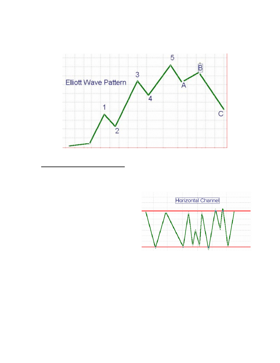
The characteristic 5-swing fear-greed pattern consisting of an initial upthrust, an initial
reaction, a main upthrust, a secondary reaction, and finally a blowoff upthrust is the
classic pattern popularized by R.N. Elliott, referred to as an Elliott Wave pattern.
The Geometry of Market Swings
So far, we’ve looked at swing patterns from the psychological point of view, the
motivation of Fear and Greed. Now let’s change our perspective and look at the same
process from a physical, or geometric point
of view.
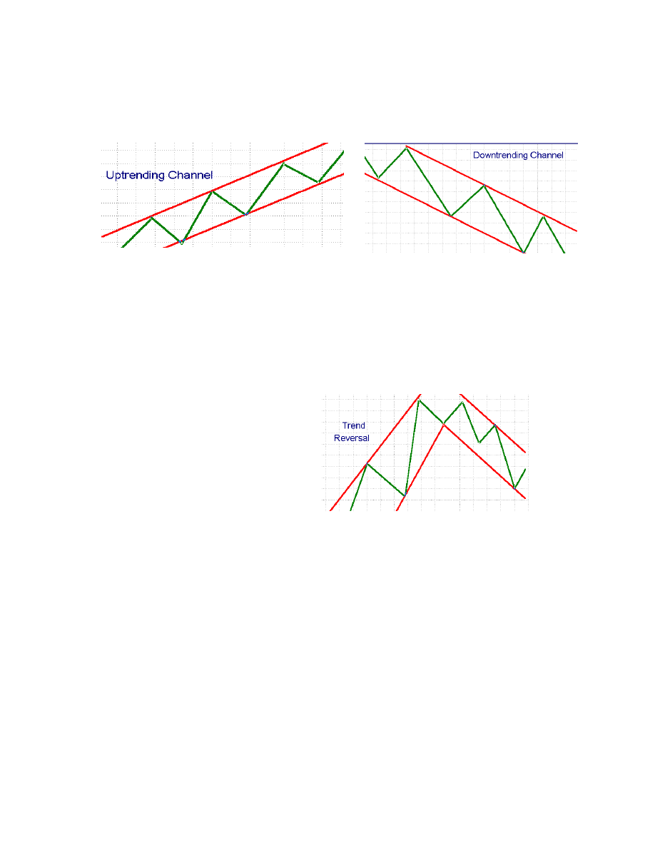
The example on the right shows swings
taking place in a horizontal channel. Note
that the legs and angles are of
approximately equal length and there is no
strong bias creating any noticeable
differences in the lengths or angles of
downswings versus upswings.
Page
5
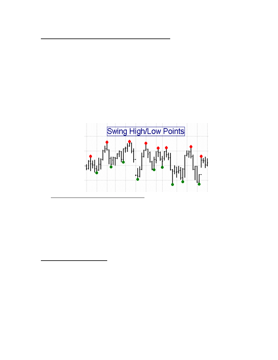
The example below shows intermediate swings occurring within a major uptrend channel
and within a major downtrend channel. Note that it is the geometry of the channel that
makes the thrust swings longer and steeper than the reaction swings, leading to a
characteristic sawtooth effect.
Now look at what happens at the transition between an uptrend and a downtrend in the
example shown below. Note carefully that as the intermediate swings change from being
part of an uptrend to being part of a downtrend, the length and angle of the upthrust
swing approaches that of the reaction swing, and as the trend turns over, what used to be
a reaction swing now becomes a downthrust swing, and the former upthrusts are now
reaction swings in a downtrend.
Focusing on the transition itself, we
notice that the process of changing
direction from up to down in the major
swing leads to characteristic patterns in
the intermediate swings, either as a
double top or a head and shoulders
pattern. As you can see, the geometry
of the reversal process creates these
patterns naturally; that’s why they
happen! The same process occurs at
market bottoms, only in reverse.
Page
6
Creating a Visual Framework for the Swing Trader
Market swings come in all sizes, from Micro to Macro. When looking at price charts we
need to have a way to define the size of the swing we are interested in. How can we
define the parameters of the price swings on our chart in a consistent manner? Well,
there are two basic methods by which we commonly identify the degree of importance of
a swing: (1) swing bar strength, and (2) amount of price reversal.
Swing Bar Strength
The Swing Bar Strength method defines a Pivot high as a high which is higher than
“STRENGTH” bars on either side of it. A swing high with a strength of 3, for example, is
defined as a bar whose high is higher than the highs of the three bars preceding it and the
highs of the three bars after it.
The TT Swing High/Low Points Indicator is the tool we use to identify Pivot Points
by the Swing Bar Strength method. This study plots red dots above swing highs and
green dots below swing lows. The strength of the Pivot points identified by this tool is
controlled by the input value, “STRENGTH”.
TT Swing High/Low Points Indicator is extremely useful to use in conjunction with any
of the other Swing Trader’s Toolkit studies that use a “STRENGTH” input value, such
as the TT Auto Divergence tool, the TT Auto Trendline tool, and the TT Price Magnets
tool.
Amount of Price Reversal
There is a drawback to identifying Pivot points by the Swing Bar Strength method. There
is no guarantee that a Pivot high of a given STRENGTH value will necessarily be
followed by a Pivot low of the same STRENGTH value. Several Pivot highs may be
encountered before encountering a swing low
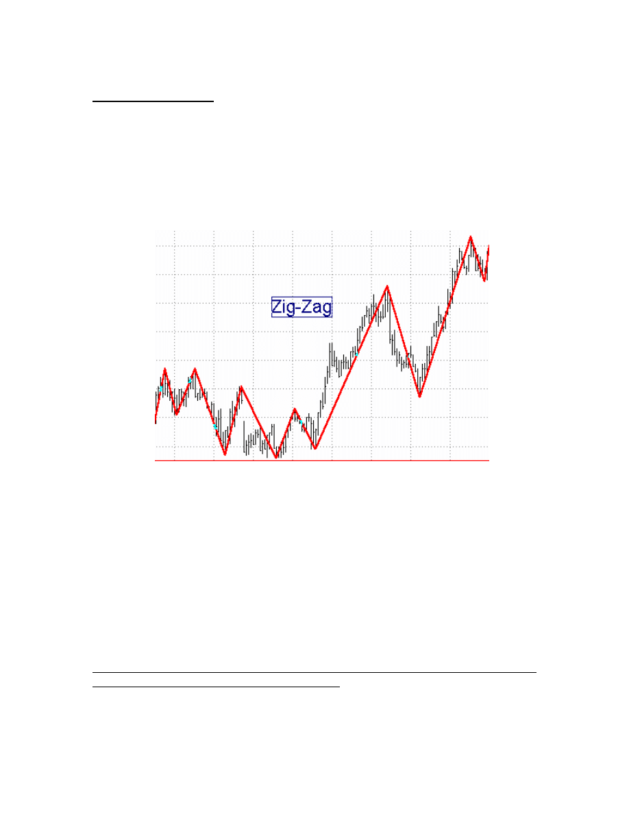
A more effective way to identify waves and patterns in the market is to use a relatively
simple device: Define pivot highs and lows in terms of the minimum number of ticks
change or price percentage change required in the opposite direction from the existing
swing for a new swing leg to be recognized, then connect alternate Pivot highs and lows
with straight lines. This technique filters out all moves smaller than the specified
minimum price reversal amount.
Page
7
TT Zig-Zag indicator is a tool which connects alternate swing highs and swing lows
with a price change in excess of either a predefined percentage of price or a predefined
number of ticks. Its two variable inputs, "PCTCHG" and "TICKCHG, allow the user to
vary the sensitivity either in terms of percentage points or price ticks required to begin
the development of a new Zig-Zag swing. This method assures that a swing high will
always be followed by a swing low and is very effective in most dynamic swing analysis
studies The programs in the Swing Trader’s Tool Kit which have “PCTCHG” and
“TICKCHG” input parameters utilize this method for identifying swing highs and lows.
These include, among others, the TT AutoFib studies, TT Linear Regression Channels,
TT Andrews Pitchfork, and TT “Fox” Waves.
If the TICKCHG Input of any of the studies described above is set to 20, for example, a
reversal in price of at least 20 ticks from a potential pivot high or low is required to
define a new swing high or low pivot. A tick is defined as the minimum move for a
particular instrument. For example, in most stocks, a tick is 1/8th. In Treasury Bonds,
one tick is 1/32nd. In the S&P, one tick is .10 point.
If TICKCHG is set to 0 and PCTCHG is set to 2, on the other hand, a reversal in price of
at least 2 percent from a potential pivot high or low is required to define it as a new swing
high or low. Fractional percentages are acceptable.
For example, in the S&P a typical PCTCHG on a 1-minute chart may be 0.1% to 0.5%,
while on a daily chart it may be in the range of 1% to 10%.
IMPORTANT NOTE: One or the other of the input variables, PCTCHG or TICKCHG,
must be set to zero for the study to work correctly.
The most recent swing leg on the Zig Zag chart is plotted in yellow. It connects the most
recent high/low with the last confirmed turning point. As you follow this line in real time

Page
8
you will see that it changes as new highs/lows are reached, until it is finally confirmed as
a turning point by accomplishing the required reversal amount.
The zig zag tool is one of the most important tools in your swing trader’s tool kit.
Learning to use it effectively will make mastering many of the other
TRADERS’ TOOLBOX
indicators that use a “PCTCHG” and “TICKCHG” input value much easier.
Pattern Recognition Tools for Complex Wave Structures
Now that we have explored the subtleties of the Zig Zag tool, let’s look at a pair of
patterns that the Zig Zag helps to illustrate: We recommend experimenting first with the
Zig Zag tool to determine the correct “PCTCHG” or “TICKCHG” value for a particular
chart and time compression.
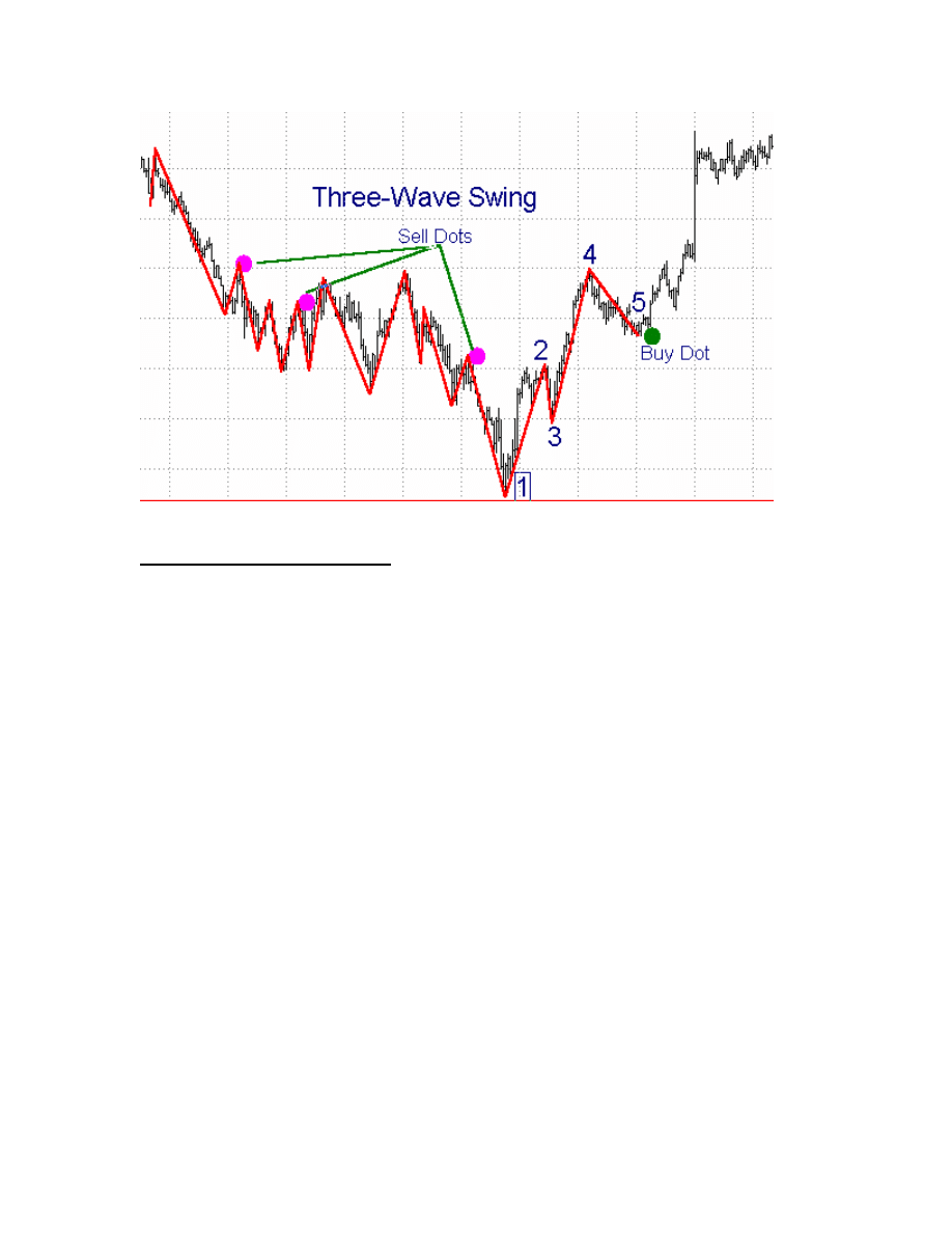
TT Three-Wave Swing Pattern
The Three-Wave Swing Pattern has been found to have a high correlation with potential
changes in trend direction. Consider a swing pattern consisting of five consecutive
up/down Pivots, P[1]……P[5]. For a bullish trend change pattern the following Swing
Pivot relationship must exist:
P[5] > P[3]
and P[3] > P[1]
and P[4] > P[2];
For a bearish trend change pattern, following swing Pivot relationship must exist:
P[5] < P[3]
and P[3] < P[5]
and P[4] < P[2];
The TT Three-Wave Swing Pattern Indicator generates a colored dot on the price
chart to identify the occurrence of a three-wave swing pattern. A green dot indicates a
recommended sell point and a red dot indicates a recommended buy point.
The sensitivity of this tool is controlled by the input variables TICKCHG and PCTCHG,
as described previously.
Page
9
TT Arps “Fox” Wave Pattern
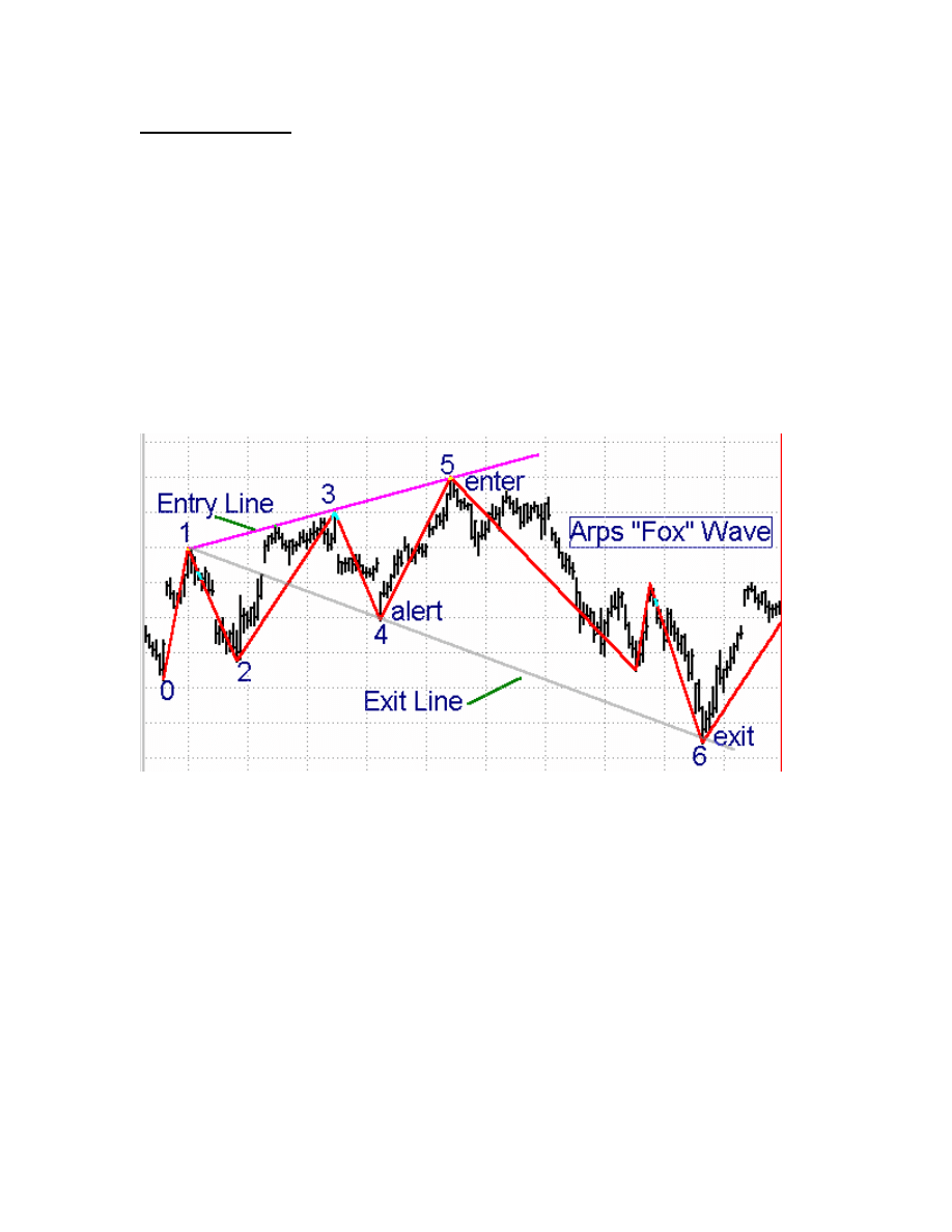
The Arps “Fox” Wave pattern is a 6-Pivot pattern. Points 1, 2, 3 and 4, when in the
correct alignment, set up the “Fox” Wave pattern. The TT Arps “Fox” Waves indicator
automatically looks for the occurrence of Arps “Fox” Wave patterns, and when the
correct pattern occurs the study draws an “entry” line through points 1 and 3 and a
“target” line through points 1 and 4. An optional “arrival on target time” line can also be
drawn, through points 2 and 4. After point 4 has been identified, if the price moves to or
through the “entry” line and establishes a point 5, a highly predictive “Fox” wave pattern
has been created and an entry signal is generated.
After generation of an entry signal, there is then a high probability that the price will
return to the 1-4 “target” line at a time corresponding roughly to the time of intersection
of the 2-4 “arrival on target time” line with the 1-3 “entry” line. The position is exited
when the price reaches the 1-4 “target” line.
For a P1-P2-P3-P4 swing to meet the Arps “Fox” Wave criteria the following rules must
be met:
For an up-wave:
P2 > P1;
P4 > P3;
P4 < P2;
P3 < P1;
P4 > P1;
The horizontal distance from P1 to P2 must be greater than the horizontal distance from
P3 to P4 .
Page
10
For a down-wave
P2 < P1;
P4 < P3;
P4 > P2;
P3 > P1;
P4 < P1.
The horizontal distance from P1 to P2 must be greater than the horizontal distance from
P3 to P4 .
If either condition is met, the study plots a magenta entry line through points P1 and P3
and a gray target line through points P1 and P4. If the price pulls back from P4 through
the extension of the P1-P3 entry line, a P5 entry point is created, with a target at the
extension of the P1-P4 target line. The point of intersection of the green P2-P4 target
timing line with the magenta P1-P3 entry line denotes the approximate point in time at
which the price is expected to reach the P1-P4 target line.
The amount of price reversal required to define a swing reversal, and therefore the
sensitivity of the system, is controlled by the input variables TICKCHG and PCTCHG,
as described previously.
The input, OCCUR, allows the user to select an individual Arps “Fox” Wave pattern
other than the most recent one. The default pattern setting is 1 for the most recent wave.
If the OCCUR input is set to 2, for example, the study will display the Arps “Fox” Wave
prior to the most recent one.
The input, PLOTBARS, sets the number of bars beyond the #4 point to which the
indicator will extend the Arps “Fox” Wave entry and target lines. In other words, it sets
an endpoint for the plot so that steeply-trending lines do not extend to the degree that the
price bars become badly truncated. Since the Arps “Fox” Wave lines are plotted as
Trendline Drawing Objects, you can also double click on the Arps “Fox” Wave line to
alter its properties. You will first be asked if you want to change the study on which it is

Page
11
based. The answer is NO. You can then click on Properties, and select Extend Right.
You can also click on the trendline, grab the “handle”, and drag the trendline out to the
right.
The input TIMELINE, when set to TRUE, will display the thin green 2-4 target timing
line. When set to FALSE, it will only display the two support/resistance lines of the
Arps “Fox” Wave. The target timing line is particularly useful in evaluating the potential
validity of the Arps “Fox” Wave setup, and it is therefore recommended that it be turned
on in most applications.
The input ZIGZAG, when set to TRUE, will display the zig-zag lines connecting
alternate Pivot highs and lows for the PCTCHG or TICKCHG value entered. This allows
the user to more clearly visualize the swings being analyzed.
The input SHOWALL when set to TRUE displays all of the Arps “Fox” Wave setups
detected by the study over the entire price chart. When set to FALSE, only a single
occurrence of the Arps “Fox” Wave is displayed.
If SHOWALL is set to FALSE and OCCUR is set to 1, the most recent Arps “Fox” Wave
setup will be displayed. If OCCUR is set to some number greater than 1, the Arps “Fox”
Wave of OCCUR occurrences ago will be displayed. For example, for an OCCUR input
of 3, the third most recent Arps “Fox” Wave will be displayed.
The input P4ALERT, when set to TRUE, will cause an alert to be triggered when a new
Arps “Fox” Wave Setup is first detected. The input P5ALERT, when set to TRUE, will
cause an additional alert to be triggered when the P5 swing price comes within INCR
points of the magenta P1-P3 entry line.
Channel Definition Tools
Channel definition tools serve to define a “highway” for prices to follow.
The direction
of the channel shows the overall trend, and prices tend to meander within the limits of the
channel. The studies described in this section have proved useful to the Swing Trader in
helping him to visualize where the swing Pivots are occurring within the perspective of
the larger-scale trend channel.
TT Fib Channels “A” and “B”
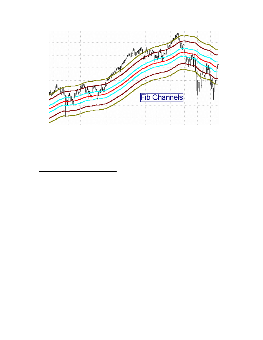
This pair of indicators plot support and resistance channel lines around an 89-bar moving
average. The lines are spaced above and below the center average line based on ratios of
8%,13%,21%,39%, and 55%. Both indicators must be run on a chart together to provide
complete coverage.
It has been observed that when prices cross outside the outer boundaries of the Fib
channels, they almost invariably return all the way back to the outer channel boundary on
the opposite side.
Page
12
This indicator has one Input, SCALING, which adjusts the width of the channels to
accommodate different chart scales and bar compressions. Generally, a SCALING value
between 1 and 3 works well, with a value of 1 giving the widest channel, and 3 giving a
narrower channel. Because the indicator looks back 89 bars, you must have at least 200
bars on your chart for this pair of indicators to be effective and useful.
TT Andrews’ Pitchfork Indicator
In the late thirties a Dr. Alan Andrews developed a price channel technique based on
what he called his “median line” theory. This technique later evolved into a price pattern
known as Andrews’ Pitchfork, because it resembles the shape of a pitchfork.
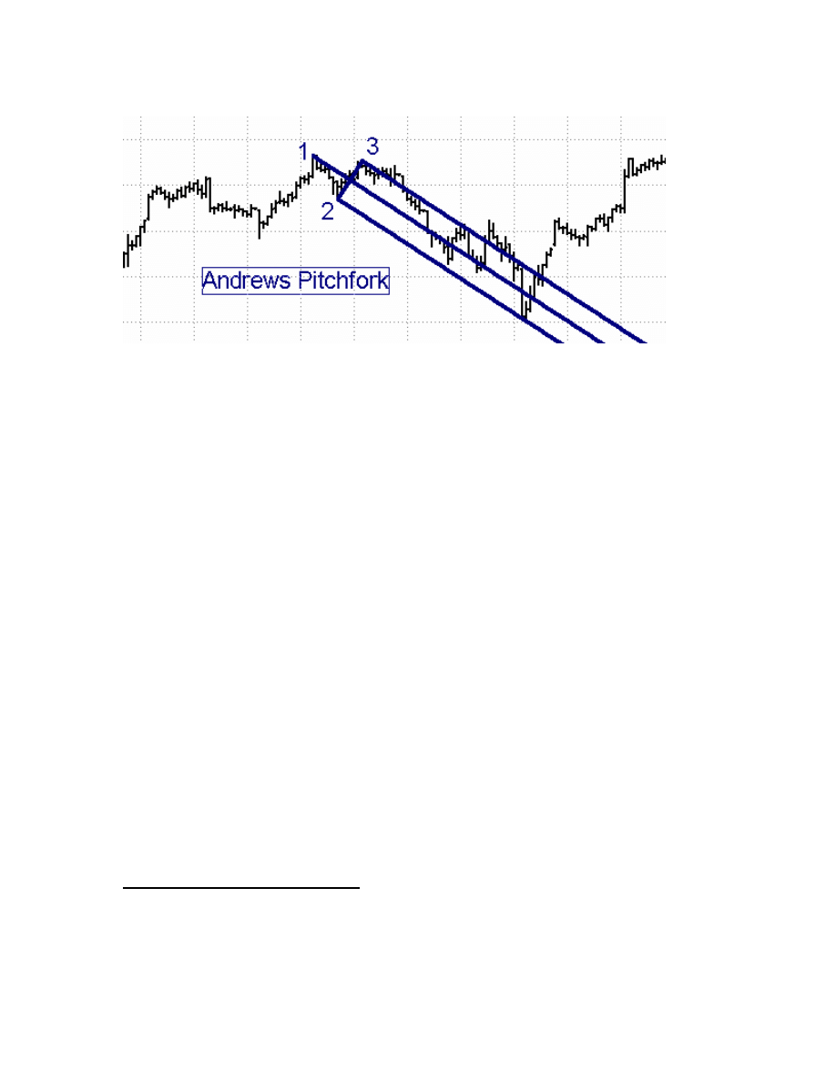
The Median Line is drawn as follows: Consider an upswing-downswing combination.
The beginning point of the upswing is P1, the upswing peak is P2, and the ending point
of the subsequent downswing is P3. In the case of such a swing, the Andrews Median
Line, also known as the “handle” of the pitchfork, is constructed from point P1 through
the midpoint of swing P2-P3 and is extended right to the end of the chart. Two “pitchfork
tine” lines are then plotted parallel to the “handle” line. One tine begins at point P2, one
tine begins at point P3, and both extend right to the end of the chart.
As prices approach the Median Line the market will usually reverse at the Median Line.
If prices do not reverse at the Median Line but trade on through they will generally head
all the way to the opposite channel boundary and then reverse.
When performing Elliott Wave analysis, if the 1-2 line of an Andrews Pitchfork
represents an Elliott # 1 thrust line and the 2-3 line represents an Elliott #2 retracement
line, then Elliott Wave 3 will usually end on either the mid-line or one of the upper/lower
outside lines of the Andrews’ Pitchfork plotted through the 1-2-3 points. A breakout of
the Andrews Pitchfork channel indicates the beginning of a new swing direction.
Page
13
The TT Andrews’ Pitchfork study detects the most recent three swing Pivots on a price
chart and automatically plots a set of Andrews Pitchfork lines through these points.
When a new swing reversal occurs, the study calculates a new set of P1-P2-P3 points and
constructs a new set of Andrews’ Pitchfork lines.
The amount of price reversal required to define an Andrews Pitchfork swing reversal, and
therefore the sensitivity of the system, is controlled by the input variables TICKCHG and
PCTCHG, as described previously. We recommend experimenting first with the Zig
Zag tool to determine the correct “PCTCHG” or “TICKCHG” setting for a particular
chart and time compression.
The input, OCCUR allows the user to move the pitchfork back in time. The default value
for OCCUR is 1, which plots the most recent set of 1-2-3 points. If OCCUR is set to 2,
for example, the pitchfork moves back in time by one half swing cycle. Each increment
of OCCUR moves the pitchfork back by another half-cycle.
There are times when a swing retraces at a very steep rate. An input, ADJUST, normally
set to FALSE, is provided to permit modifying the location of the end of the handle in
steep markets. When ADJUST is set to TRUE, the end of the handle is moved from
point P1 to the halfway point between point P1 and point P2, and the angles of the tines
and mid-line are adjusted accordingly.
A separate program, Andrews Extensions, plots upper and lower extended lines parallel
to the mid-line at a distance twice the distance of the main parallel lines from the mid-
line. These are useful in catching the top or bottom of a powerful Elliott Wave #3.
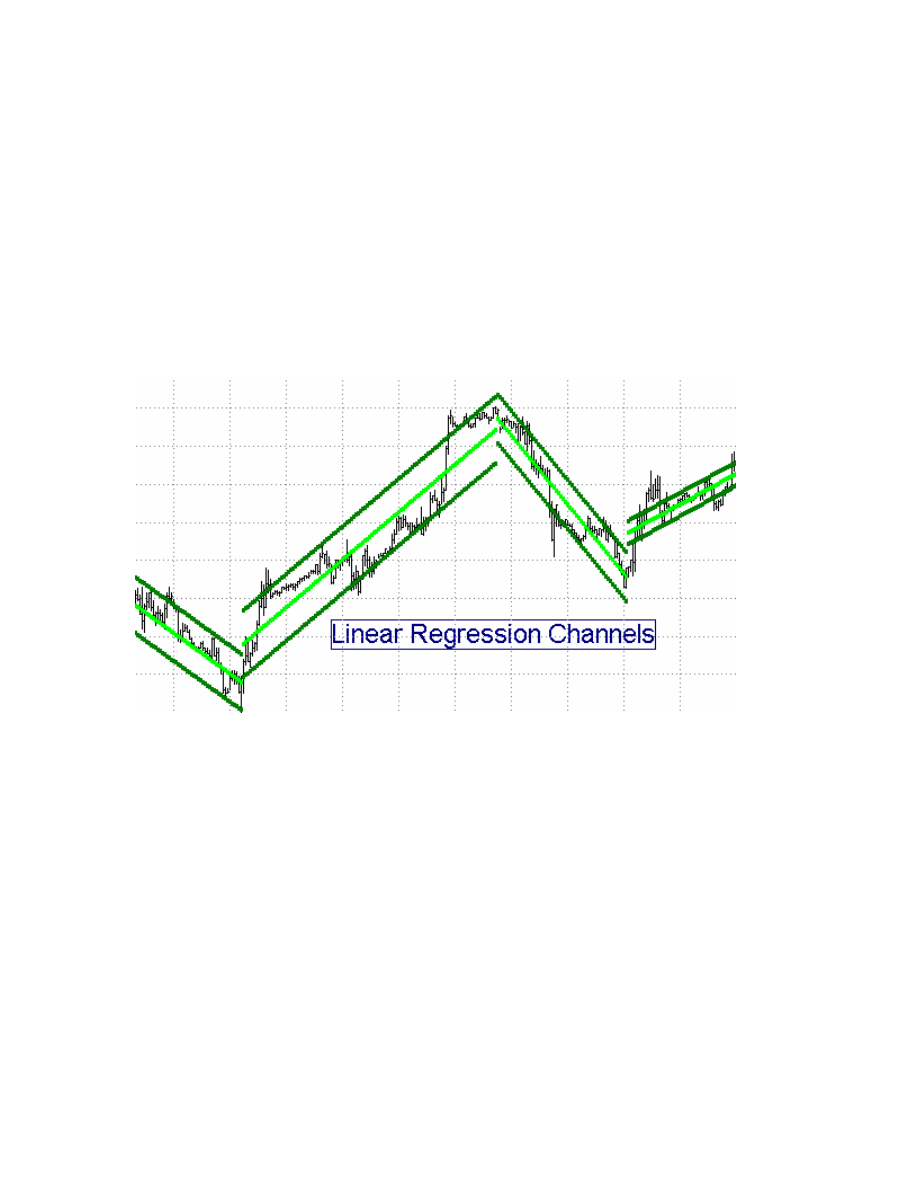
TT Linear Regression Channel
Another way to draw a channel midline is to plot a “linear regression line” through the
interval covering a given swing. Linear Regression analysis is a statistical concept
sometimes referred to as the “least squares method” or “best fit” line. Linear Regression
analysis calculates a straight line through a series of data points in such a way that the
sum of the squares of the distances between each data point and the line is minimized.
Page
14
The trend channel boundaries are then drawn parallel to the median line and spaced apart
at a distance controlled by one of several possible mathematical techniques, the most
common of which is to space the channel boundaries a given number of standard
deviations on either side of the center line.
Linear Regression Channels can be very useful tools to the swing trader, since they
provide several important pieces of information simultaneously:
1. They indicate the direction of the immediate trend.
2. The width of the channel is an indicator of the level of price volatility within the
immediate trend.
3. The length of the channel is an indicator of trend persistence.
4. The channel boundaries and centerline are excellent trending support/resistance lines.
5. A solid break of the channel boundaries signals a probable change in trend direction.
The TT Linear Regression Channel study automatically plots a linear regression center
line over the interval covered from the beginning to the end of a trend swing, as
calculated by the Zig Zag algorithm using either the PCTCHG or the TICKCHG input, as
described previously. We recommend experimenting first with the Zig Zag tool to
determine the correct settings for this study for a particular chart and time compression.
The spacing of the channel boundary lines on either side of the center line is controlled
by one of several possible user-selected mathematical techniques. The choice of channel
width calculations is as follows:
STD_ERR(TRUE/FALSE), {Uses Standard Error Function to calculate channel width}
STD_DEV(TRUE/FALSE), {Uses Standard Deviation Function to calculate channel
width}
PCT_CHAN(TRUE/FALSE), {Uses a fixed percentage of price to calculate channel
width}
HILOBARS(TRUE/FALSE), {Plots channel lines through highest high and lowest low
over the length of the current trend }

Page
15
RAFFCHAN(TRUE/FALSE) {Raff Channel – Plots channel lines through the first
minor Pivot high and the first minor Pivot low occurring after the start point of the
median line.
Note: Only one of the above inputs should be set to “TRUE”. All others must be set
to “FALSE”! When in doubt, set STD_DEV to TRUE and the rest to FALSE.
Other inputs include the following:
PRICE {Price value used to calculate the Linear Regression Centerline, for example,
Close, or (H+L)/2). With this input you can also set the study to run on an indicator by
entering the name of a User Function or on a second data stream by specifying Data 2.}
PCTCHG { Percent change in price required to set up a new swing high/low. }
TICKCHG: { Change (number of ticks) required to set up a new swing high/low. }
SHOWALL(TRUE/FALSE) { When set to TRUE, it will plot all of the channels on the
chart from the first bar to the last. When set to FALSE, it will plot only the current
channel.}
STDEVAMT(2) {For STD_DEV = TRUE or STD_ERR = TRUE, Defines width of
channel in Standard Deviations. }
CHAN_PCT(0.3) {For PCT_CHANN = TRUE, Defines width of channel, in percent of
the closing price of the last bar. }
PCTZONE(10) {Sets limits for the Alert function. If the Alert function is turned on, an
alert will be triggered whenever price crosses above Centerline plus PCTZONE percent
of the ½ channel range or above the Upper Channel Line minus PCTZONE percent of the
½ channel range, and vice-versa. }
MANUAL(TRUE/FALSE) {When set to TRUE, the automatic swing function is
disabled and the indicator looks manual inputs STRTDATE, STRTTIME, ENDDATE,
ENDTIME to define the beginning and end points of the channel }
STRTDATE and STRTTIME {Define the date and time for the first bar of the manual
input channel. On daily charts or greater, the STRTTIME and ENDTIME inputs are
ignored. }
ENDDATE and ENDTIME {Define the date and time of the last bar in the manual
input channel. If ENDDATE is set to LastCalcDate and ENDTIME is set to
LastCalcTime, the channel will extend from the STARTDATE/STARTTIME bar to the
rightmost bar on the chart and automatically update at the end of every new bar.}
EXTENDRT(TRUE/FALSE) { When set to TRUE and MANUAL is set to TRUE, the
channel lines are extended to the right beyond ENDDATE and ENDTIME.
TT Auto Uptrend / TT Auto Downtrend Lines With Trendline Breakout
Detector
Ask a dozen traders to draw a set of trendlines on a chart and you will get a dozen
different trendline interpretations. In 1994 Tom DeMark in his popular book, The New
Science of Technical Analysis, set forth the hypothesis that there is only one “right” way
to draw a trendline, and that is from right to left, with downtrend lines (also referred to as
“supply lines”), connecting successively lower high Pivots and uptrend lines (also
referred to as “demand lines”) connecting successively higher low Pivots. With such a
clear, rigorous definition, the technique of drawing trendlines moved from being an

Page
16
arcane art to becoming a science which could be easily translated into computer
language. DeMark further postulated a set of rules by which the trader could distinguish
between “genuine” price breakouts through the trendline and “false” price breakouts
which had a high likelihood of failing.
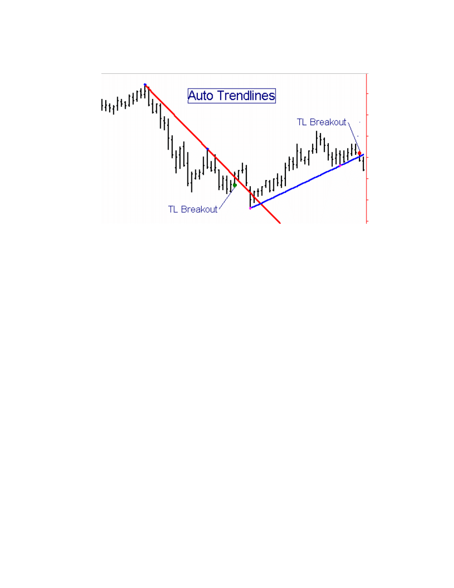
Based on the DeMark concepts described above, the “TT AUTO UPTREND” and “TT
AUTO DOWNTREND” automatic trendline indicators are extremely powerful tools
that can be used with any chart, daily or intraday. These tools automatically plot a
trendline from right to left through recent swing high or swing low points of a selected
STRENGTH input. Uptrend lines are plotted through swing lows and downtrend lines are
plotted through swing highs. A pair of small crosses on the trendline identify the price
swing lows or highs through which the trendline has been drawn.
The trendline is automatically extended to the right until a new swing high/low
necessitates a different trendline. In addition to plotting the trendlines, the Auto
Trendline tools also include a Breakout Detector that highlights the first bar to break
through the trendline. If the Alert option is set, the program will also generate an Alert
signal upon the occurrence of a trendline breakout.
When the price breaks through the trendline, a determination is automatically made to see
if the breakout is valid in accordance with qualifiers described by DeMark in his book.
In his chapter on trendlines, DeMark describes three possible conditions which would
qualify an uptrend line breakout to be a valid breakout to the downside. Upside
breakouts of a downtrend line work in a similar manner:
1. The close of the bar prior to the breakout bar must be greater than the close of the
second bar prior to the breakout bar.
2. The breakout bar must open below the uptrend line and the low of the bar prior to the
breakout bar must be above the uptrend line.
3. The total of the close of the bar prior to the breakout bar minus the difference between
the higher of (a) the true high of the bar prior to the breakout bar or (b) the close of the
second bar prior to the breakout bar, and the close of the bar prior to the breakout bar
must be higher than the breakout price.
If any one of these three qualifying conditions is met, the breakout is considered to be
valid and a green cross is plotted below the breakout bar. If an uptrend line breakout is
confirmed as valid, a green cross is plotted above the breakout bar.
If the trendline breakout is not considered to be valid based on the DeMark qualifiers, a
red cross is plotted below the downtrend line breakout bar or above the uptrend line
breakout bar. This means that the breakout is not considered to be a valid breakout and
should not be followed.
Page
17
The STRENGTH Input controls the Price Bar Strength Pivot algorithm, which is used in
the AutoTrendline tools to control the strength of the pivots through which the trendlines
will be drawn.
The input, OCCUR allows the user to move the trendline back in time. The default value
for OCCUR is 1, which will cause a trend line to be plotted from the most recent Pivot of
strength “STRENGTH” and the next most recent higher(if downtrend) or lower (if
uptrend) Pivot of strength “STRENGTH”. If OCCUR is set to 2, for example, the
trendline moves back in time by one Pivot point. Each increment of OCCUR moves the
trendline back by another Pivot point.
The input value, LENGTH defines the interval (in number of bars) over which the
indicator will search for the swing low pair which will define the trendline. LENGTH
should be set at some number greater than the maximum number of bars expected
between the two swing lows defining the trendline.
If you attempt to draw a downtrend line and the most recent pivot is the highest pivot
over the interval “LENGTH”, the study will not be able to locate a higher Pivot to the left
and no trendline will be drawn. This is where the input, OCCUR, can be helpful in
selecting a pivot through which a valid trendline can be drawn. Use the Price Swing H/L
Points Indicator to help you determine which STRENGTH and OCCUR values you
should use on a given chart.
As time progresses and new bars are drawn on the chart, the trendline will be redrawn if a
new swing low of strength “STRENGTH” is generated. If you want to continue to show
the previous trendline instead of the new one, you will have to increase the OCCUR
value by 1. Alternatively, the indicator includes an input called “FREEZE”. The default
value for FREEZE is FALSE. If FREEZE is set to TRUE, whatever trendline was
defined when the chart was first opened will remain on the chart as is, in spite of the

Page
18
occurrence of new swing highs and lows. If you want to redraw the uptrend line based on
the new swing low points, set FREEZE back to FALSE.
An input value, “SHOBKOUT” has been included to give the user the option of turning
off the breakout signals. The default value of SHOBKOUT is “TRUE”. To turn off the
breakout signals and target lines, set SHOBKOUT to “FALSE”.
The TT Auto Downtrend Line tool works in a similar, but reverse, fashion as the TT Auto
Uptrend Line tool.
Tools to Define Potential Support/Resistance Levels
During any given trading period there exist certain price levels which represent areas of
“support” or “resistance” in the marketplace. Support levels are price points where
traders believe the market is oversold and buying enthusiasm is likely to overcome
selling pressure, thereby causing the market to rise. Conversely, Resistance levels are
price points where traders believe the market is overbought and selling pressure is likely
to overcome buying enthusiasm, thereby causing the market to fall. Most support and
resistance levels are subjective and based on crowd psychology. Many methods for
determining support and resistance levels have become accepted folklore in the markets
and hence have become, in effect, self-fulfilling prophecies.
Support and resistance occurs quite often, however. Having a knowledge and
understanding of where these points might occur provides the trader with an important
additional tool to give him a reference frame providing possible areas to enter and exit
the market.
Once a support point is broken, the level becomes a resistance point. The converse is true
where a resistance point which is broken becomes a support point. Why does this
happen? Support and resistance points indicate levels where significant buying and
selling occur. If a support point is broken, the traders who were long will now tend to
become sellers at the same place in order to break even on the trade. Whenever a trader
begins to lose money, one of the first impulses is to get out at the original point of entry
in order to break even, thus a previously broken support point now becomes a resistance
level and a previously broken resistance level now becomes a support point.
Previous daily, weekly, and monthly highs and lows represent important
support/resistance points. Traders should be aware of the level of current prices with
respect to these points when they plan their entries and exits in order to evaluate the
potential rewards and risks of their planned trade.
Page
19
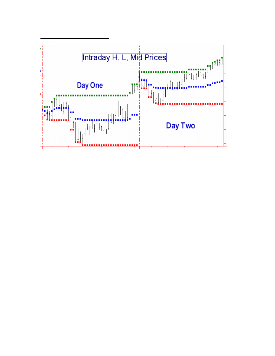
TT Intraday H, L, Mid Lines
This indicator, when plotted on an intraday chart, draws lines on the price chart
representing the high, low, and average price for the current day. These lines serve as
key support/resistance lines for many traders.
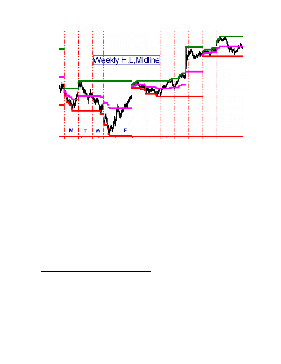
TT Weekly H, L, Mid Lines
This indicator, when plotted on an intraday or daily chart, draws lines on the price chart
representing the high, low, and average price for the week. These lines serve as key
support/resistance lines for many traders. The indicator has one input, CALENDAR.
When set to TRUE, the indicator plots the H, L, Mid for the week starting with Monday.
When set to FALSE on a daily chart, the indicator plots the H, L, Mid for the past five
trading days. When CALENDAR is set to FALSE, the Weekly indicator does not plot on
an intraday chart.
Page
20
TT Monthly H, L, Mid Lines
This indicator, when plotted on an intraday, daily or weekly chart, draws lines on the
price chart representing the high, low, and average price for the month. These lines serve
as key support/resistance lines for many traders. The indicator has one input,
CALENDAR. When set to TRUE, the indicator plots the H, L, Mid for the calendar
month. When set to FALSE on a daily or weekly chart, the indicator plots the H, L, Mid
for the past 23 trading days, regardless of the length of the actual month. When
CALENDAR is set to FALSE, the Monthly indicator does not plot on an intraday chart.
The above support/resistance tools provide the trader with “hard” information, based on
actual historical price levels. The following support/resistance tools are based on
theoretical, or calculated, levels based on formulas that have become widely known and
used, and consequently have fallen into the category of self-fulfilling prophecies. It is
important for the trader to be aware of these levels, because others use these levels to
determine their buying/selling strategies.
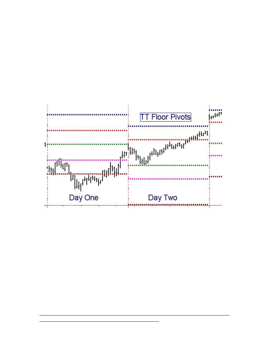
TT Floor Pivots Support/Resistance Lines
Many traders on the floor of the exchange, most of whom are too busy to do sophisticated
calculations during the trading day, come into the pits in the morning with a set of price
levels written on a little card which represent the predicted support/resistance levels for
the day. These price levels, based on the Floor Traders’ Pivot Formulas, have been
calculated based on the values of the previous day’s open, high, low, and close, as
follows:
Avg Price = (H+L+C)/3
Resistance 2 = Avg Price + H - L;
Page
21
Resistance 1 = 2*Avg Price - L;
Support 1 = 2* Avg Price - H;
Support 2 = Avg Price + L - H;
The TT Floor Pivots “A” and “B” indicators plot the Floor Traders’ Pivot
support/resistance zone boundaries based on the above formulas on an intraday chart. The
indicator comes in two parts: TT Floor Pivots “A” plots Support1, Support2, and the
Average Price line, while TT Floor Pivots “B” plots Resistance1 and Resistance2. You
need at least 4 days’ worth of data to plot the indicator correctly. An additional input on
Floor Pivots “A”, PRINTLOG, when set to ‘TRUE” , will print the Pivot, support,
resistance, and midline values in the PrintLog.
Since the “Secret” Floor Pivot formulas have become common public knowledge, they
are rapidly becoming self-fulfilling prophecies and the floor traders are beginning to
“gun” for them. Now the midpoints between the classic support/resistance lines have
become the new “Pivot lines”. The TT Floor Pivots Mid indicator calculates these
midpoints and plots them as white lines. Try them and see if you don’t find a lot of
support and resistance at these lines.
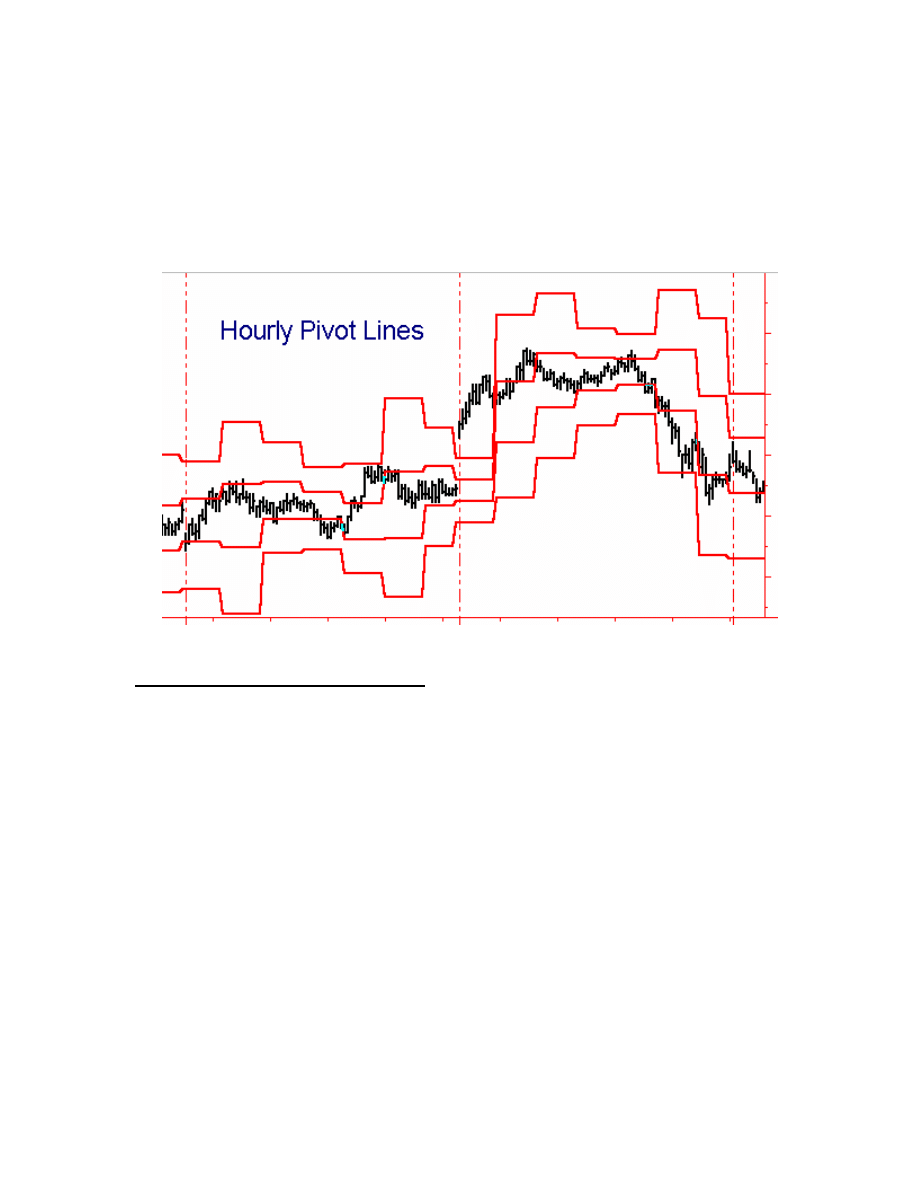
The TT Hourly Pivot Lines indicator, based on a concept developed by Ray Wertheim,
plots a 5-minute graph a series of support/resistance lines updated hourly based on the
previous hour's action. This indicator uses the same classic "secret" Pivot formulas as
described in the TT Floor Pivots daily support/resistance lines above, except that the
calculations are being performed based on the previous hour’s high, low, and close. You
will find the Pivot lines created by this tool to be excellent short term support/resistance
lines.
To use the Hourly Pivot Lines indicator, you must construct a multi-data chart with a 5-
minute chart as Data1 and a 60-minute chart as Data2. (To create a multi-data chart, you
Page
22
must first create a new chart window containing a 5-minute chart. Then, without leaving
that chart window, click on “Insert” “Price Data” and select a 60-minute chart of the
same price data. Check the “Plot Options” section in the bottom of the Insert Price Data
window and uncheck the box marked “Replace Selected Price Data.” Then click on
“Plot”. In the “Format Price Data” window, click on the “Properties” tab and set the
“Subgraph” box to “Hidden” for Data2. )
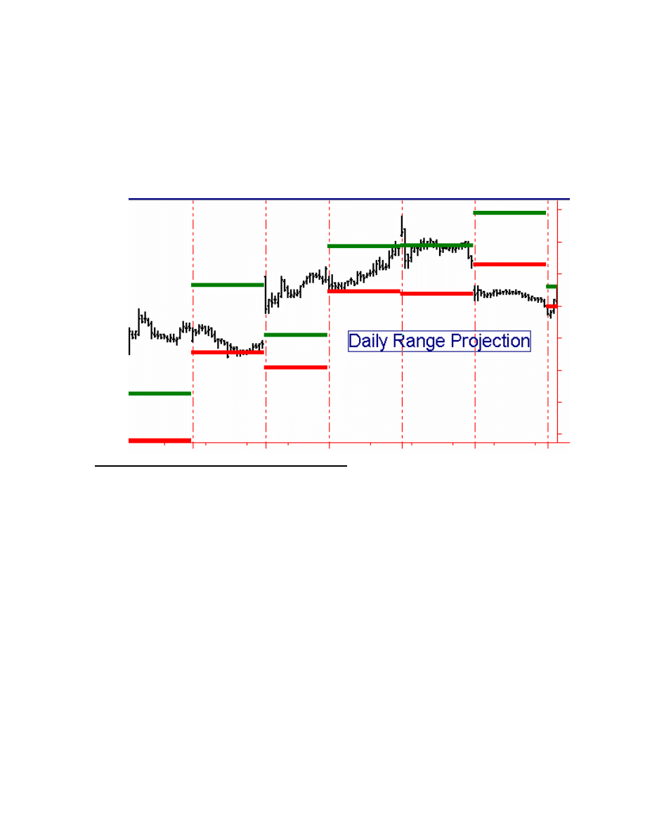
TT Daily Range Projection 1 and 2
The TT Daily Range Projection 1 indicator plots gray lines on an intraday chart
showing the projected high and low for the day based on a method described by Larry
Williams in his book, “The Definitive Guide to Futures Trading”.
Williams’ formulas are as follows:
Williams’ Projected High = (H+L+C) * 2/3 – H;
Williams’ Projected Low = (H+L+C) * 2/3 – L;
Where H,L, and C are yesterday’s high, low, and close.
The TT Daily Range Projection 2 indicator is based on a method described by Thomas
R. DeMark in his book, " The New Science of Technical Analysis" and plots red and
green lines on an intraday chart showing the projected high and low for the day.
DeMark’s formulas are as follows:
Pivot = H+L+C of yesterday;
If today’s Open < yesterday’s Close, then X = (Pivot + H)/2;
Page
23
If today’s Open > yesterday’s Close, then X = (Pivot + L)2;
If today’s Open = yesterday’s Close, then X = (Pivot + C)/2;
DeMark’s Projected High = X – L;
DeMark’s Projected Low = X – H;
Percentage Retracements and Extensions
Percentage retracement analysis refers to the process of projecting possible retracement
swing support/resistance levels following the completion of a thrust swing. The most
popular retracement levels include 38%, 50%, and 62% of the length of the thrust swing.
Percentage extensions are a means of predicting the length of the current thrust swing as
a percentage of the length of the previous thrust swing. The most popular extension
levels include 138%, 162%, 262%
38% and 62% are approximations of the so-called Fibonacci ratios of 0.382 and 0.618.
The ratio of 0.618 is called the golden mean, or divine proportion, and has had special
mathematical and aesthetic significance since the ancient Greek and Egyptian cultures.
Many buildings, including the pyramid, were built with this ratio in mind. Many
occurrences in nature seem to exhibit the golden mean ratio. For example, many plants,
exemplified by the patterns in daisies, sunflowers and pineapples, increase the number of
their petals in a Fibonacci sequence. Many animal shapes and even dimensions in
galaxies exhibit golden mean relationships.
The Fibonacci ratios are derived from the Fibonacci number series. The Fibonacci series
begins with the numbers 0 and 1, and subsequent numbers in the series are the sum of the
two previous numbers. The first 10 numbers in the series are 0,1,1,2,3,5,8,13,21,34…….
Page
24
The ratio of the higher to the lower of two adjacent numbers approaches 1.618 as the
series continues, while the ratio of the lower to the higher of two adjacent numbers
approaches 0.618. 0.382 is the limiting ratio of every second pair of numbers in the
series, (e.g., 13/34), and 0.382 is also 1 / 2.618.
Significant Fibonacci ratios used in retracement/extension analysis include: 0.236, 0.382,
0.500, 0.618, 0.786 (square root of 0.618), 1.00, 1.272 (square root of 1.618), 1.618,
2.000, 2.618, and 4.236.
What does the golden mean, or Fibonacci ratios, have to do with trading levels? If
nothing else, it’s the self-fulfilling prophecy again. Historical evidence has shown that
time and again, swing retracements and extensions terminate at Fibonacci levels, so it is
an important phenomenon to recognize and study.
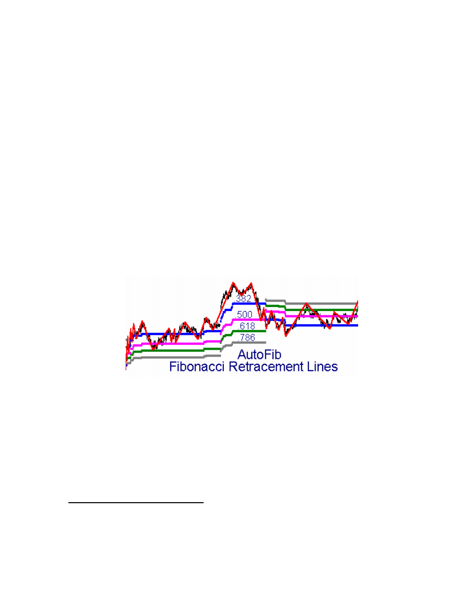
The TT AutoFib Retracement Indicator automatically detects the most recent swing
high and swing low of a price chart and then plots a continuing series of dotted lines on
the chart representing selected retracement levels as percentages of the length of the
current swing. The retracement ratios are defined by the adjustable Inputs, RETRACE1
through RETRACE4 The AutoFib retracement levels are plotted as horizontal colored
dotted lines whose levels will change as new highs/lows are achieved in the current swing
leg.
The amount of price reversal required to define a swing reversal, and therefore the
sensitivity of the system, is controlled by the input variables TICKCHG and PCTCHG, as
described previously. We recommend that you use the Zig Zag indicator to determine the
best settings to use for PCTCHG or TICKCHG inputs in the AutoFib. Once you have
determined the optimum PCTCHG or TICKCHG settings for an acceptable Zig Zag
swing size, we recommend you use double that value for the AutoFib tool. This way the
AutoFib tool better relates the Zig Zag swings on your chart to the longer-term swing
retracement levels.
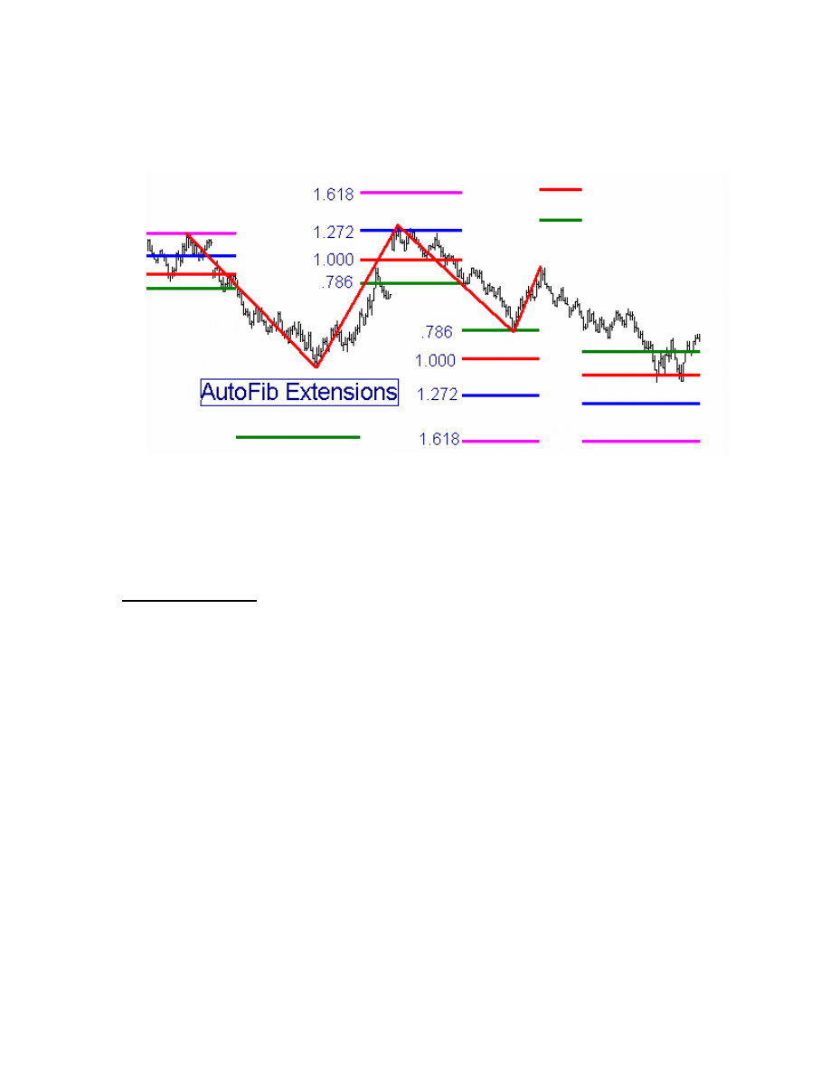
TT AutoFib Extension Indicator
Page
25
The AutoFib Extension indicator automatically plots Fibonacci extension levels for the
most recent high or low swing of a price chart in a manner identical with the AutoFib
Retracement Indicator described above.
Fibonacci extension levels are calculated as follows: If prices are currently in an
Upswing, the AutoFib Extension Tool calculates the length of the previous Upswing,
multiplies that length by the Inputted Fibonacci ratios, and adds those Fibonacci
extension lengths to the beginning of the current upswing. The Fibonacci extension
ratios are defined by the adjustable Inputs, EXTEND1 through EXTEND4.
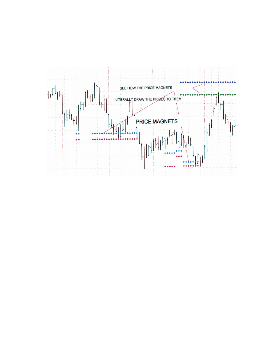
TT Price Magnets
One of the most effective tools to generate support/resistance levels is the TT Price
Magnets Up/Down set of indicators. These indicators are based on a revolutionary new
concept developed to define price projection zones based on price swing analysis. The
indicator is fully automatic and plots on the price chart a pair of horizontal lines, in the
form of colored crosses, which define the upper and lower boundaries of a Price
Magnets support/resistance zone. The width of the zone is determined by the price
patterns generated by the previous swings.
The TT Price Magnets Up indicator projects resistance zones above the market and TT
Price Magnets Down projects support zones below the market Over 75% of the time,
these Price Magnets will draw the prices to them and provide resistance/support when the
prices reach them. On those occasions where prices do not stop and reverse at the Price
Magnets but trade on through them, the price movement usually continues with increased
strength, while the Price Magnet resistance levels become support levels and support
levels become resistance levels.
If a new swing pattern is detected which qualifies as a Price Magnet swing, a revised
Price Magnet target zone is calculated and plotted on the price chart. A specific Price
Magnet line continues to be plotted on the chart until either (1) the price reaches the
Price Magnet target, or (2) a new Price Magnet swing pattern is detected which
Page
26
establishes a new Price Magnet target zone. THE ESTABLISHMENT OF A NEW
PRICE MAGNET TARGET ZONE DOES NOT NECESSARILY DISQUALIFY THE
EARLIER ZONE. Due to a limitation in TradeStation/SuperCharts, only one set of
Price Magnets Up and one set of Price Magnets Down lines can be plotted at any one
time.
The Price Magnet indicator has two controllable inputs: STRENGTH and LOOKBACK.
STRENGTH defines the magnitude of the swings to be used in establishing the Price
Magnet targets, and therefore the sensitivity of the Price Magnets indicator. It should be
tuned consistent with other STRENGTH settings. (See the section, “What is a
“Swing?” for a more detailed description of the STRENGTH setting.)
LOOKBACK defines the interval (in number of bars) over which the indicator will
search for the price swing pattern which will define the target zone. The total number of
bars loaded into the chart should be greater than twice the value of LOOKBACK.
Normally a little experimentation will be necessary to establish the optimum values for
STRENGTH and LOOKBACK for each chart window. The default LOOKBACK value
is set for 70 bars, but if you have a daily or weekly chart with less than 140 bars, you will
have to reduce the LOOKBACK size.
Typical values for STRENGTH range from 1 to 5, with the higher numbers causing the
Price Magnets to identify the more significant price targets. Some users prefer to run the
Price Magnets indicator more than once on the same chart using different STRENGTH
values and different colors for the target lines in order to see both the major and minor
price targets.

Page
27
As you watch the Price Magnet zones develop in real time on your charts, you will be
amazed at the uncanny way they draw the price to them. In downtrending markets,
you will often see a stair step effect as the Price Magnet Up target lines follow the trend
down. In this situation, the first time you see a Price Magnet target zone being drawn
at a price level higher than the previous one which was on a stair step down, prices are
usually ready to turn and this new Price Magnet zone is often penetrated with
increasing momentum. Similarly, in uptrending markets, the first Price Magnet target
zone which is lower than its predecessor usually signals a trend reversal and the new
Price Magnet zone is often penetrated with increasing momentum.
Traders’ Toolbox Oscillators
Over the years we have created and tested hundreds of oscillators, many based on our
own research, many based on published concepts by others. Based on this extensive
research we have selected three that we believe can best serve the Swing Trader in
identifying turning points in the market’s swing pattern. Because these oscillators “look
ahead” and can “see through the clutter”, we have called them Radar 1 Sentiment, Radar
2 Acceleration, and Radar 3 OB/OS.
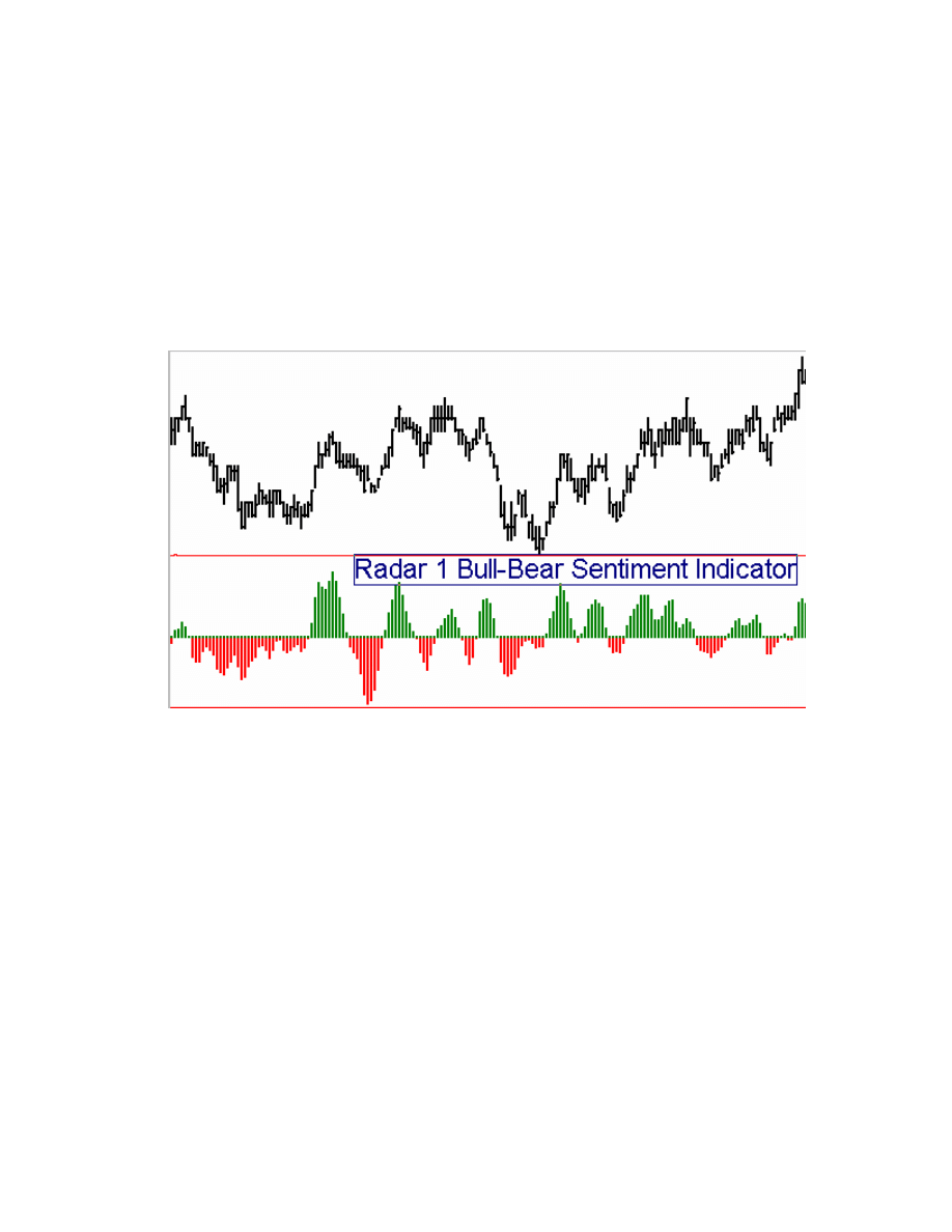
TT Radar 1 Sentiment Indicator
RADAR 1 is an oscillator which creates a histogram based on the relationship between
price changes and volume changes to measure the ratio of buying strength to selling
strength. This tells us whether the Bulls or the Bears are in control at any particular point
in time. It is an excellent oscillator for divergence analysis and for identifying trend
persistence, and works in real time on charts in any time frame, either intrabar or end-of-
bar.
When RADAR 1 is in the green zone, buying pressure exceeds selling pressure and the
Bulls are in control. The height of green upward-pointing RADAR 1 histogram bars is
an indicator of the strength of the Bulls’ buying pressure. Conversely, if the RADAR 1
oscillator line is in the red zone, selling pressure exceeds buying pressure and the Bears
are in control. The depth of the red downward-pointing RADAR 1 histogram bars is an
indicator of the strength of the Bears’ selling pressure.
RADAR 1 serves as an excellent turning point indicator in all kinds of markets, as it
usually begins to turn before the price does. It generally reveals the exhaustion of the
Bulls/Bears while the price is still moving up/down of its own momentum. If a sudden
move in price is not confirmed or anticipated by a similar move in RADAR 1, it usually
means a fake-out swing and represents a move to be ignored or faded.
RADAR1 often creates a characteristic "double peak" or "double valley" pattern prior to
a major price reversal. On the other hand, if the pattern is a smooth up-and-down curve
uninterrupted with a minor dip, the chances are that the existing trend will continue
further.
When a RADAR 1 valley is shallower than its predecessor while the price corresponding
to the most recent RADAR 1 valley is lower than the price corresponding to the previous
Page
28
RADAR 1 valley, a diverging condition has occurred which generally signals an
imminent price reversal to the upside. Conversely, when a RADAR 1 peak is lower than
its predecessor while the price corresponding to the most recent RADAR 1 peak is higher
than the price corresponding to the previous RADAR 1 peak, a diverging condition has
occurred which generally signals an imminent price reversal to the downside.
RADAR 1 is an extremely robust indicator which works equally well on end-of-day data
as it does on intraday data. It has only one user-controlled input, ALRTLEVL, which
defines the cutoff value at which an alert is triggered. If ALRTLEVL is set to 1, for
example, an alert is triggered when RADAR 1 crosses above 1 or crosses below –1.
Page
29
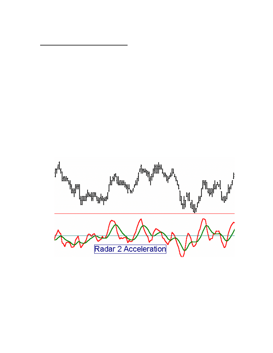
TT Radar 2 Acceleration Oscillator
TT Radar 2 is an excellent acceleration-based early warning indicator. This indicator is
very useful in all markets and time frames to identify impending changes in direction. A
crossover of the red Fast Radar 2 line over the green Slow Radar 2 line signals an
impending change in direction for the market. Price direction changes are confirmed by a
crossover of the Slow Radar 2 line over the 50 centerline.
When the oscillator is above the 50 centerline it means that price is still accelerating to
the upside. When the oscillator crosses below the 50 centerline it means that price
acceleration has reversed and the momentum is now slowing. The greater the prior
excursion away from the centerline, the stronger the price move will be in the opposite
direction when TT Radar 2 “slingshots” back across the centerline.
If you compare the performance of Radar 2 with other oscillators such as MACD,
Stochastics, or RSI, you will see that Radar 2 calls the turns BEFORE they happen,
giving you time to enter your orders before the move picks up momentum.
Not only does the direction of the oscillator change just before major tops and bottoms,
but even more importantly, most of the time divergences appear between TT Radar 2 and
price to confirm the pending change in market direction. This means that it frequently
works best if you ignore the first reversal in the oscillator and wait for the second. If the
two peaks or valleys in the oscillator show a divergence from the price tops and bottoms,
the odds are greatly increased that a major turning point is at hand. TT Radar 2 is a
powerful trading tool that can lead to consistent profits when used consistently and with
trading discipline.
The principal shortcoming of the TT Radar 2 oscillator when used alone is that it is so
sensitive that it generates signals even on swings in price too small to trade profitably.

Page
30
For this reason, it is advisable to trade primarily on divergences or to filter the signals
with other oscillators. One of the best confirming filters is the TT Radar 1 oscillator,
which looks at the relationship between volume and price to ascertain whether the buyers
or the sellers are in charge, and taking TT Radar 2 signals only when they are consistent
with what TT Radar 1 is telling us.
TT Radar 2 has three Inputs, as follows:
FASTLEN controls the sensitivity of the fast Radar 2 line. Higher numbers make it
smoother, but cause crossover signals to occur later.
SLOWLEN controls the sensitivity of the slow Radar 2 line. Higher numbers flatten the
line and increase the spread between the fast and slow lines.
This indicator’s default settings have been optimized for fast response. However, a
True/False Input called SMOOTH has been included which automatically sets the
parameters to a customized combination which presents a more smoothed appearance and
offsets the slow line to the right by one bar. When set to “True”, the SMOOTH setting
overrides the FASTLEN and SLOWLEN settings.
Page
31
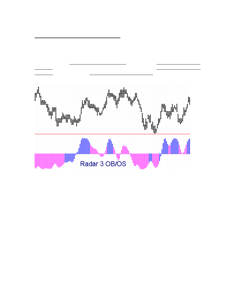
TT Radar 3 Overbought/Oversold Index
This exciting new oscillator from Traders Toolbox has been designed to give the user the
clearest possible insight into the inner workings of the markets. The plot is a
magenta/blue histogram of a proprietary triple smoothed overbought-oversold oscillator.
When the bars are blue and above the centerline, the trend is up. Magenta bars above the
centerline indicate a pullback in an uptrend. When the bars are magenta and below the
centerline, the trend is down. Blue bars below the centerline indicate a pullback in a
downtrend.
TT Radar 3 is a very robust indicator which works across all time frames. It has only
one user-controlled Input, SENSITIV. The higher the value of SENSITIV, the longer the
time horizon of the indicator.
SENSITIV Values in the range of 1 to 20 represent a normal range of sensitivities. 1 is
more sensitive, 20 is less sensitive. 5 is a typical value for charts of 3 minutes up to
weekly. Below 3 minutes values in the range of 2 to 4 work well.

Page
32
TT Divergence Normal and TT Divergence Type 2
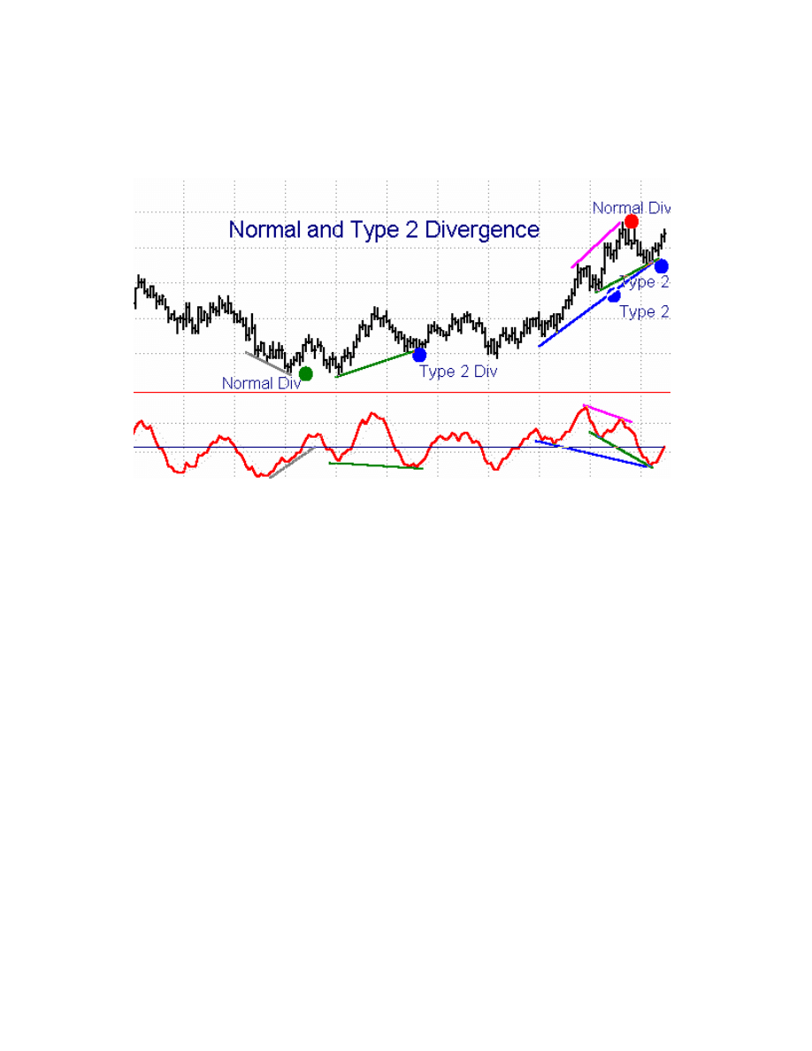
When an oscillator valley is shallower than its predecessor while the price corresponding
to the most recent oscillator valley is lower than the price corresponding to the previous
oscillator valley, a “normal” diverging condition has occurred which generally signals an
imminent price reversal to the upside. Conversely, when a oscillator peak is lower than
its predecessor while the price corresponding to the most recent oscillator peak is higher
than the price corresponding to the previous oscillator peak, a “normal” converging
condition has occurred which generally signals an imminent price reversal to the
downside.
A “Type 2” divergence occurs when an oscillator valley is deeper than its predecessor
while the price corresponding to the most recent oscillator valley is higher than the price
corresponding to the previous oscillator valley or when an oscillator peak is higher than
its predecessor while the price corresponding to the most recent oscillator peak is lower
than the price corresponding to the previous oscillator peak.
The TT Divergence Detector, which is considerably superior to the Omega “canned”
divergence study, generates a signal in the form of a colored dot above or below the
price when a divergence exists between price and any oscillator for which a User
Function exists. A filter can be turned on which requires the first of the two oscillator
swing highs/lows to be in the overbought/oversold zones as defined by the inputs
OBZONE and OSZONE.
The TT Divergence Normal indicator plots a green dot below a price low when a
convergence occurs between successive oscillator lows of a given STRENGTH and
corresponding price lows. Conversely, it plots a red dot above a price high when a
divergence occurs between successive oscillator highs of a given STRENGTH and
corresponding price highs. In addition, the indicator plots a small cross on the price chart
to the left of the colored dot at the time corresponding to the left side of the divergence
pattern in order to illustrate to the user the two points for which the divergence was
detected.
The TT Divergence Type 2 indicator plots a blue dot below a price low when a
divergence occurs between the oscillator lows and the price lows, and it plots a magenta
dot above a price high when a convergence occurs between the oscillator highs and the
price highs. Type 2 divergences, while more rare than Normal divergences, are very
strong price reversal signals and trades taken on these signals have a high probability of
success.
When run together, the TT Divergence Normal and the TT Divergence Type 2 indicators
will clearly identify most significant price trend turns.
As described in the section, What is a “Swing?” an oscillator low with a STRENGTH
input of 1 will have at least one adjacent higher bar to the left and one adjacent higher bar
to the right of it. If the STRENGTH input is set to 3, then the oscillator low must be
lower than the preceding three bars and the following 3 bars. The divergence dot is
Page
33
plotted on the bar where the divergence is confirmed, (i.e. 2 bars after the swing high/low
for a STRENGTH of 2).
Although this indicator has numerous inputs, a new user needs to focus only on the inputs
OSC, STRENGTH, and MINBARS to define his divergence criteria. Keep the other,
more advanced inputs at their default settings initially.
Inputs include the following:
OSC(SlowD(14)), {The oscillator user function and user function parameters}
STRENGTH(3), {The required strength for a swing high/low in the oscillator to
qualify for a divergence/convergence calculation.}
MINBARS(4),
{ The minimum number of bars over which a divergence must
occur.}
OS_OBFLT(FALSE) {The overbought/oversold filter toggle. When set to FALSE, this
filter is disabled.}
OSZONE(20)
{The boundary of the OverSold zone.}
OBZONE(80)
{ The boundary of the OverBought zone.}
PLOTINCR(3)
{ The number of price ticks beyond the price high/low to plot the
divergence dots. If your divergence dots obscure the bar high/low,
increase the size of PLOTINCR.}
Page
34
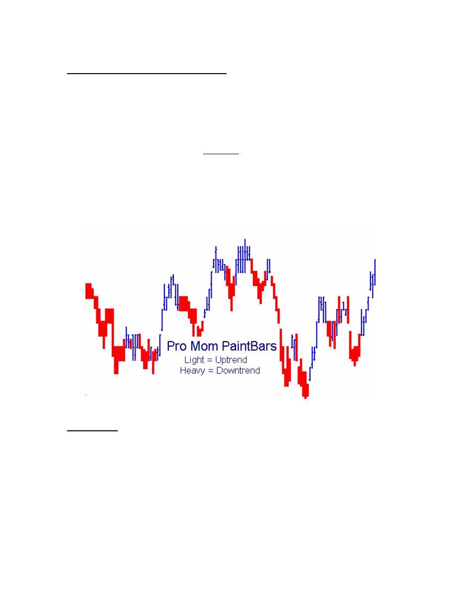
TT Pro Mom Bars Up/Down PaintBars
This pair of enhanced trend PaintBar Studies are highly accurate in revealing the overall
trend direction. When the bars are painted blue, an uptrend is underway. When the bars
are painted red, a downtrend is underway. The greater the number of consecutive bars
painted, the more reliable is the trend detection on any time frame. When alternating
clusters of red and blue bars appear, it suggests a sideways market with no real trend.
The paintbars have one input value, LENGTH. The optimum value for this input will
vary from market to market and time frame to time frame. We have found a value of 5 to
work well on the S&P and T-Bond 5-tick and 1-minute charts. A value of 6 works well
on the S&P and T-Bond charts with time scales ranging from 3 to 30 minutes.
Do not be afraid to experiment with these values; you should be able to use this indicator
very effectively on every chart you choose, with the best accuracy possible. It was
designed to give you a better picture of the market as each day unfolds.
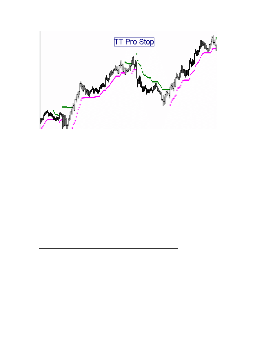
TT Pro Stop
This indicator is a highly effective volatility-based adaptive trailing stop which captures
the majority of the position profit while minimizing whipsaws. The input value,
“STOPSENS”, adjusts the probability for tomorrow’s expected range to stay within the
limits projected by the stop algorithm. It is usually best to determine this sensitivity
value empirically by experimenting to find the best value which keeps the stop point just
out of range of the typical pullbacks in price within the trend. Typically, we find that an
input value range between 1.5 to 5 works well, with the smaller value giving a closer
stop.
Page
35
This stop algorithm comes as both an INDICATOR and as a SYSTEM, both called, TT
PRO STOP. The indicator will plot a continuous dotted line on the price chart indicating
the ongoing stop level. In addition to the sensitivity input, STOPSENS, the Indicator also
has an input, PLOTBOTH. When set to TRUE, the indicator will plot both the buy stop
and the sell stop levels continuously. When set to FALSE, the indicator plots only one
stop or the other, depending on whether it is long or short. (This does not reflect whether
whatever system you are running is long or short, but rather whether the JLAG stops have
been hit and reversed your position.)
The TT PRO STOP system will issue exit commands to whatever other system you may
connect it to. To incorporate the TT PRO STOP SYSTEM into another system as a
trailing stop, insert the following line into your system’s code in Power Editor:
INPUT:
STOPON(TRUE), {This allows you to select the stop “on” or “off”, at your choice. }
STOPSENS(3.0); {The sensitivity of the stop }
INCLUDESYSTEM: "TT PRO STOP",STOPON, STOPSENS, PASSWORD;
TT Pro Stop and Reverse Adaptive Trailing Stop System
This always-in Stop-and-Reverse system simply uses the stop as a trigger point to reverse
your position when the stop is triggered. The single input, STOPSENS, works the same
as described above.
Document Outline
- Surfing the Market Waves
- With
- Jan Arps’
- Swing Trader’s Toolkit
- Jan Arps’
- What forces affect the market’s swing patterns?
- The Geometry of Market Swings
- Creating a Visual Framework for the Swing Trader
- TT Three-Wave Swing Pattern
- TT Arps “Fox” Wave Pattern
- For a down-wave
- Channel Definition Tools
- TT Fib Channels “A” and “B”
- TT Andrews’ Pitchfork Indicator
- TT Linear Regression Channel
- TT Auto Uptrend / TT Auto Downtrend Lines With Trendline Breakout Detector
- Tools to Define Potential Support/Resistance Levels
- TT Intraday H, L, Mid Lines
- TT Weekly H, L, Mid Lines
- TT Monthly H, L, Mid Lines
- TT Floor Pivots Support/Resistance Lines
- TT Daily Range Projection 1 and 2
- Percentage Retracements and Extensions
- TT AutoFib Extension Indicator
- TT Price Magnets
- TT Radar 1 Sentiment Indicator
- TT Radar 2 Acceleration Oscillator
- TT Radar 3 Overbought/Oversold Index
- TT Divergence Normal and TT Divergence Type 2
- TT Pro Mom Bars Up/Down PaintBars
- TT Pro Stop
- TT Pro Stop and Reverse Adaptive Trailing Stop System
Wyszukiwarka
Podobne podstrony:
the swing era
#0358 – Surfing the Internet
Jan Brzechwa AT THE VEGETABLE STALL
Surfing the Internet busuu
Kiernan Kelly Surfing the Dawn
Level II Trading Warfare The Underground Trader's Powerful Weapons for Winning
Mark B Fisher, The Logical Trader Applying A Method To The Madness
Booker Rob The Currency Trader s Handbook Strategies For Forex Success
Richard D Wyckoff The Day Trader s Bible Or My Secret In Day Trading Of Stocks
Reading Price Charts Bar by Bar The Technical Analysis of Price Action for the Serious Trader Wiley
Paley The Marketing Strategy
Woolf The Waves
Forex For Everyone Learn To Trade The Forex Market Like A Professional
An Overreaction Implementation of the Coherent Market Hypothesis and Options Pricing
Beating The Bear Short Term Trading Tactics for Difficult Markets with Jea Yu
de bondt, thaler does the stock market overreact
Nial Fuller Exits Let the market take you out, not your emotions
Luther The Marketing Plan How to Prepare and Implement It
więcej podobnych podstron