
Teach Yourself Borland Delphi 4 in 21
Days
Table of Contents:
Day 1 - Getting Started with Delphi
Day 3 - Classes and Object-Oriented Programming
Day 4 - The Delphi IDE Explored
Day 5 - The Visual Component Model
Day 6 - Working with the Form Designer and the Menu Designer
WEEK 1 - IN REVIEW
Day 8 - Creating Applications in Delphi
Day 9 - Projects, the Code Editor, and the Code Explorer
Day 10 - Debugging Your Applications
Day 11 - Delphi Tools and Options
Day 12 - Graphics and Multimedia Programming
WEEK 2 - IN REVIEW
Day 16 - Delphi Database Architecture
Day 17 - Building Database Forms

Day 19 - Creating and Using DLLs
Day 21 - Delphi and C++Builder
WEEK 3 - IN REVIEW
APPENDIXES
Appendix A - Answers to the Quiz Questions
Appendix B - Delphi Internet Resources
Bonus Day - Building Internet Applications
, Macmillan Computer Publishing. All rights reserved.

Teach Yourself Borland Delphi 4 in 21
Days
Introduction: You Are Here
Isn't it helpful when an arrow on a map points out exactly where you are? So you are here! Maybe you
are here because you have used Delphi before and you want to see what is new in Delphi 4. Maybe
you are here because your boss told you to be here. Or maybe you are here as a complete beginner
who would like to explore the wonderful world of Windows programming.
Regardless of why you are here, welcome! I can assure you that the trip will be an interesting one.
You will no doubt find it enjoyable, too. It will involve some work, but there will be some fun thrown
in along the way. Believe me when I say that there's nothing quite like taking a passing thought and
turning it into a working Windows program. I hope you get the fever and lose yourself in hour after
hour of programming.
I encourage you to experiment as you read this book. Putting the book down and playing around for a
while can prove more valuable than the best teacher. Getting through this book isn't a race. The first
one to reach the end doesn't receive a prize. I'd rather you spent 21 weeks learning Delphi
programming than to rush through this book without taking time to apply the concepts discussed here.
By the way, my experience has been that the best way to learn is to have an application in mind that
you want to write and then work on that application as you work through this book. Solving
real-world problems is the kind of schooling that sticks.
So it doesn't really matter why you are here. What's important is that you are here. I'm glad you are
here, and I hope you enjoy your Delphi experience. Relax, put your feet up, and have fun learning
how to use Delphi. I know I did.
About the Author
KENT REISDORPH is a senior software engineer at TurboPower Software Co. He also has his own
consulting business. Kent is a contributing editor for The Cobb Group's C++Builder Developer's
Journal and contributes regularly to the Delphi Developer's Journal. He is also a member of TeamB,
Borland's online volunteer support group. As a member of TeamB, Kent puts in many hours each
week on the Borland newsgroups answering questions, primarily on C++Builder and Windows
programming. He is the author of Sams Teach Yourself C++Builder in 21 Days and Sams Teach
Yourself C++Builder 3 in 21 Days. Kent lives in Colorado Springs, Colorado, with his wife, Jennifer,
and their six children, James, Mason, Mallory, Jenna, Marshall, and Joshua.

Dedication
This book is dedicated to my wife, Jennifer. I couldn't imagine dedicating it to anyone else. Thank you
as always, Jen, for keeping everything going while I'm off in my own world.
Acknowledgments
This part of the book comes fairly easily for me. It's easy to remember those people who were
instrumental in making a project like this come to completion. First I want to thank Brian Gill for his
hard work on this project. I did my best to rattle Brian on one or more occasions, but he never
wavered (not that I could see anyway!). I also want to thank Kezia Endsley for her work on this book.
Kezia did a tremendous job as development editor. I'm certain that I have benefited from working
with her. Other people at Macmillan Publishing I want to thank are Dana Lesh and Heather Urschel.
There are several people at INPRISE Corporation (formerly Borland International) whom I want to
thank. Although I didn't have much direct contact with Nan Borreson on this project, I know she was
there behind the scenes doing her usual excellent work. I want to thank my tech editors, Bill Fisher
and Ellie Peters. They both did a good job keeping me straight. I can't mention Ellie without adding
that I'm glad to have Ellie as a friend as well as a tech editor. Also thanks to Steve Teixeira, Steve
Trefethen, and Ryder Rishel who were quick to answer specific questions I had during this project.
Last but in no way least, I want to thank my wife, Jennifer. This is the third such project I have
undertaken, and Jennifer has always been way, way beyond supportive. She has grown far too
accustomed to seeing me "head down and headphones on." One of these days I'll make it up to her. I
promise.
Tell Us What You Think!
As the reader of this book, you are our most important critic and commentator. We value your opinion
and want to know what we're doing right, what we could do better, what areas you'd like to see us
publish in, and any other words of wisdom you're willing to pass our way.
As the executive editor for the Programming team at Macmillan Computer Publishing, I welcome
your comments. You can fax, email, or write me directly to let me know what you did or didn't like
about this book--as well as what we can do to make our books stronger.
Please note that I cannot help you with technical problems related to the topic of this book, and that
due to the high volume of mail I receive, I might not be able to reply to every message.
When you write, please be sure to include this book's title and author as well as your name and phone
or fax number. I will carefully review your comments and share them with the author and editors who
worked on the book.
Fax:
317-817-7070
Email:
Mail: Executive Editor

Programming Macmillan Computer Publishing 201 West 103rd Street Indianapolis, IN 46290 USA
, Macmillan Computer Publishing. All rights reserved.
Teach Yourself Borland Delphi 4 in 21 Days
- 1 -
Getting Started with Delphi
●
A Quick Look at the Delphi IDE
❍
❍
●
Your First Program: Hello World
❍
❍
❍
●
Your Second Program: Hello World, Part II
Creating the Hello World II Program
❍
Modifying the Hello World II Program
❍
●
Object Pascal Language Overview
●
❍
❍
❍
❍
❍
❍
❍
❍
❍
●
●
❍
❍
❍
●
Congratulations--you've chosen one of today's hottest programming tools! Before you get started using all that Delphi has to
offer, though, you first need to learn a little about the Delphi IDE and about Object Pascal. In this chapter you will find
A quick tour of Delphi
●
An introduction to the Object Pascal language
●
Facts about Pascal units, variables, and data types
●
A discussion of arrays
●
Information about strings in Pascal
●
What Is Delphi?
By now you know that Delphi is Borland's best-selling rapid application development (RAD) product for writing Windows
applications. With Delphi, you can write Windows programs more quickly and more easily than was ever possible before. You
can create Win32 console applications or Win32 graphical user interface (GUI) programs. When creating Win32 GUI
applications with Delphi, you have all the power of a true compiled programming language (Object Pascal) wrapped up in a
RAD environment. What this means is that you can create the user interface to a program (the user interface means the menus,
dialog boxes, main window, and so on) using drag-and-drop techniques for true rapid application development. You can also
drop ActiveX controls on forms to create specialized programs such as Web browsers in a matter of minutes. Delphi gives you
all this, and at virtually no cost: You don't sacrifice program execution speed because Delphi generates fast compiled code.
I can hear you saying, "This is going to be so cool!" And guess what? You're right! But before you get too excited, I need to
point out that you still have to go to work and learn about Pascal programming. I don't want you to think that you can buy a
program like Delphi and be a master Windows programmer overnight. It takes a great deal of work to be a good Windows
programmer. Delphi does a good job of hiding some of the low-level details that make up the guts of a Windows program, but
it cannot write programs for you. In the end, you must still be a programmer, and that means you have to learn programming.
That can be a long, uphill journey some days. The good news is that Delphi can make your trek fairly painless and even fun.
Yes, you can work and have fun doing it!
So roll up your sleeves and put on your hiking shoes. Delphi is a great product, so have fun.
A Quick Look at the Delphi IDE
This section contains a quick look at the Delphi integrated development environment (IDE). I'll give the IDE a once-over now
and examine it in more detail on Day 4, "The Delphi IDE Explored." Because you are tackling Windows programming, I'll
assume you are advanced enough to have figured out how to start Delphi. When you first start the program, you are presented
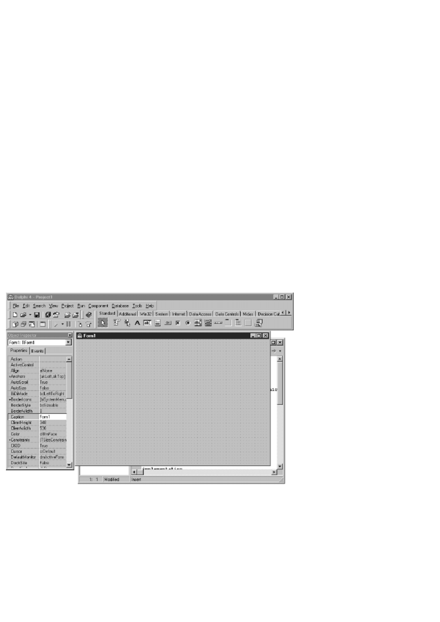
with both a blank form and the IDE, as shown in Figure 1.1.
FIGURE 1.1.The Delphi IDE and the
initial blank form.
The Delphi IDE is divided into three parts. The top window can be considered the main window. It contains the toolbars and
the Component palette. The Delphi toolbars give you one-click access to tasks such as opening, saving, and compiling projects.
The Component palette contains a wide array of components that you can drop onto your forms. (Components are text labels,
edit controls, list boxes, buttons, and the like.) For convenience, the components are divided into groups. Did you notice the
tabs along the top of the Component palette? Go ahead and click on the tabs to explore the different components available to
you. To place a component on your form, you simply click the component's button in the Component palette and then click on
your form where you want the component to appear. Don't worry about the fact that you don't yet know how to use

components. You'll get to that in due time. When you are done exploring, click on the tab labeled Standard, because you'll
need it in a moment.
New Term: A component is a self-contained binary piece of software that performs some specific predefined function, such as
a text label, an edit control, or a list box.
The Object Inspector
Below the main window and on the left side of the screen is the Object Inspector. It is through the Object Inspector that you
modify a component's properties and events. You will use the Object Inspector constantly as you work with Delphi. The
Object Inspector has two tabs: the Properties tab and the Events tab. A component's properties control how the component
operates. For example, changing the Color property of a component changes the background color of that component. The list
of properties available varies from component to component, although components usually have several common elements
(Width and Height properties, for instance).
New Term: A property determines the operation of a component.
The Events tab contains a list of events for a component. Events occur as the user interacts with a component. For example,
when a component is clicked, an event is generated that tells you that the component was clicked. You can write code that
responds to these events, performing specific actions when an event occurs. As with properties, the events that you can respond
to vary from component to component.
New Term: An event is something that occurs as a result of a component's interaction with the user or with Windows.
New Term: An event handler is a section of code that is invoked in your application in response to an event.
The Delphi Workspace
The main part of the Delphi IDE is the workspace. The workspace initially displays the Form Designer. It should come as no
surprise that the Form Designer enables you to create forms. In Delphi, a form represents a window in your program. The form
might be the program's main window, a dialog box, or any other type of window. You use the Form Designer to place, move,
and size components as part of the form creation process.
Hiding behind the Form Designer is the Code Editor. The Code Editor is where you type code when writing your programs.
The Object Inspector, Form Designer, Code Editor, and Component palette work interactively as you build applications.
Now that you've had a look at what makes up the Delphi IDE, let's actually do something.
Your First Program: Hello World
It's tradition. Almost all programming books start you off by having you create a program that displays Hello World on the
screen. I'm tempted to do something else, but tradition is not a force to be reckoned with, so Hello World it is. You've got some
work ahead of you in the next few chapters, so I thought I'd give you a taste of Delphi's goodies before putting you to work
learning the seemingly less glamorous basics of the Pascal language. You'll have a little fun first. Delphi (and its cousin,
C++Builder) gives you possibly the quickest route to Hello World of any Windows programming environment to date.
Creating the Program
Right now you should have Delphi running, and you should be looking at a blank form. By default, the form is named Form1.
(The form name is significant in Delphi, but I'll address that a little later.) To the left of the form, the Object Inspector shows
the properties for the form. Click on the title bar of the Object Inspector. The Caption property is highlighted, and the cursor is
sitting there waiting for you to do something. (If the Caption property is not in view, you might have to scroll the Object
Inspector window to locate it. Properties are listed in alphabetical order.) Type Hello World! to change the form's caption.
NOTE: As you modify properties, Delphi immediately displays the results of the property change when
appropriate. As you type the new caption, notice that the window caption of the form is changing to reflect the
text you are typing.
Now click the Run button on the toolbar (the one with the green arrow). (You can also press F9 or choose Run | Run from the
main menu.) Before you even know what has happened, Delphi has built the program. The form is displayed, and the caption
shows Hello World!. In this case, the running program looks almost identical to the blank form. You might scarcely have
noticed when the program was displayed because it is displayed in the exact location of the form in the Form Designer. (There
is a difference in appearance, though, because the Form Designer displays an alignment grid and the running program does
not.) Congratulations--you've just written your first Windows program with Delphi. Wow, that was easy!
"But what is it?" you ask. It's not a lot, I agree, but it is a true Windows program. Try it out and see. The program's main
window can be moved by dragging the title bar, it can be sized, it can be minimized, it can be maximized, and it can be closed
by clicking the Close button. You can even locate the program in Windows Explorer (it will probably be in your \Delphi40\Bin
directory as Project1.exe) and double-click on it to run it.
Modifying the Program
Okay, so maybe displaying Hello World! in the caption was cheating a little. Let's spruce it up a bit. If you still have the Hello
World program running, close it by clicking the Close button in the upper-right corner of the window. The Form Designer is
displayed again, and you are ready to modify the form (and, as a result, the program).
To make the program more viable, you're going to add text to the center of the window itself. To do this, you'll add a text label
to the form:
1. First, click on the Standard tab of the Component palette. The third component button on the palette has an A on it. If
you put your mouse cursor over that button, the tooltip (a small pop-up window) will display Label.
2. Click the label button and then click anywhere on the form. A label component is placed on the form with a default
caption of Label1.
3. Now turn your attention to the Object Inspector. It now displays the properties for Label1 (remember that previously
it was showing the properties for Form1). Again the Caption property is highlighted.
4. Click on the title bar of the Object Inspector or on the Caption property and type Hello World!. Now the label on the
form shows Hello World!.
5. As long as you're at it, you can change the size of the label's text as well. Double-click on the Font property. The
property will expand to show the additional font attributes below it.
6. Locate the Size property under Font and change the font size to 24 (it is currently set to 8). As soon as you press Enter
or click on the form, the label instantly changes to the new size.
Because the label is probably not centered on the form, you might want to move it. To move a component, simply click on it
and drag it to the position you want it to occupy. When you have the label where you want it, you're ready to recompile and
run the program. Click the Run button again and, after a split second, the program runs. Now you see Hello World! displayed
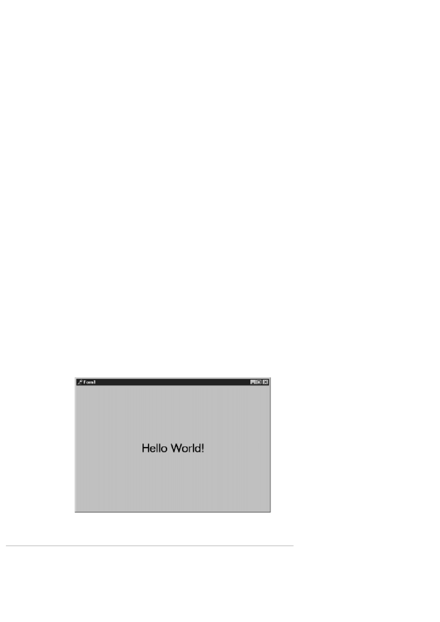
in the center of the form as well as in the caption. Figure 1.2 shows the Hello World! program running.
FIGURE 1.2. Your Hello World!
program running.
Closing the Program
With this little taste of Delphi, you can see that writing Windows programs with Delphi is going to be a great deal more
interesting than it was in the good ol' days. To prepare for what you are going to do next, you need to close the current project
in the Delphi IDE. Choose File | Close All from the main menu. Click on No when prompted to save changes to Project1, or
save the project if you are fond of your new creation.
Your Second Program: Hello World, Part II
Before you can move on to learning the Pascal language you need a little more information about how Delphi works. You'll
need this information to test the various Pascal language features as you work through the next couple of days. This section
will contain just a glimpse into the power of Delphi. On Days 4, 5, and 6, you get a more detailed look into how Delphi works.
Creating the Hello World II Program
The goal of this exercise is to have the words Hello World, Part II appear on the screen when a button is pressed. This exercise
will also give you a pattern you can follow when you test various code snippets as you work through the next couple of days.
Perform the following steps:
1. Choose File | New Application from the main menu to start a new application (click No if you're prompted to save the
current project).
2. Click the Standard tab on the Component palette and click the icon that has an OK button on it (the Button
component).
3. Place your cursor anywhere on the form and click. A button appears on the form.
4. Choose a Label component and place it near the center of the form.
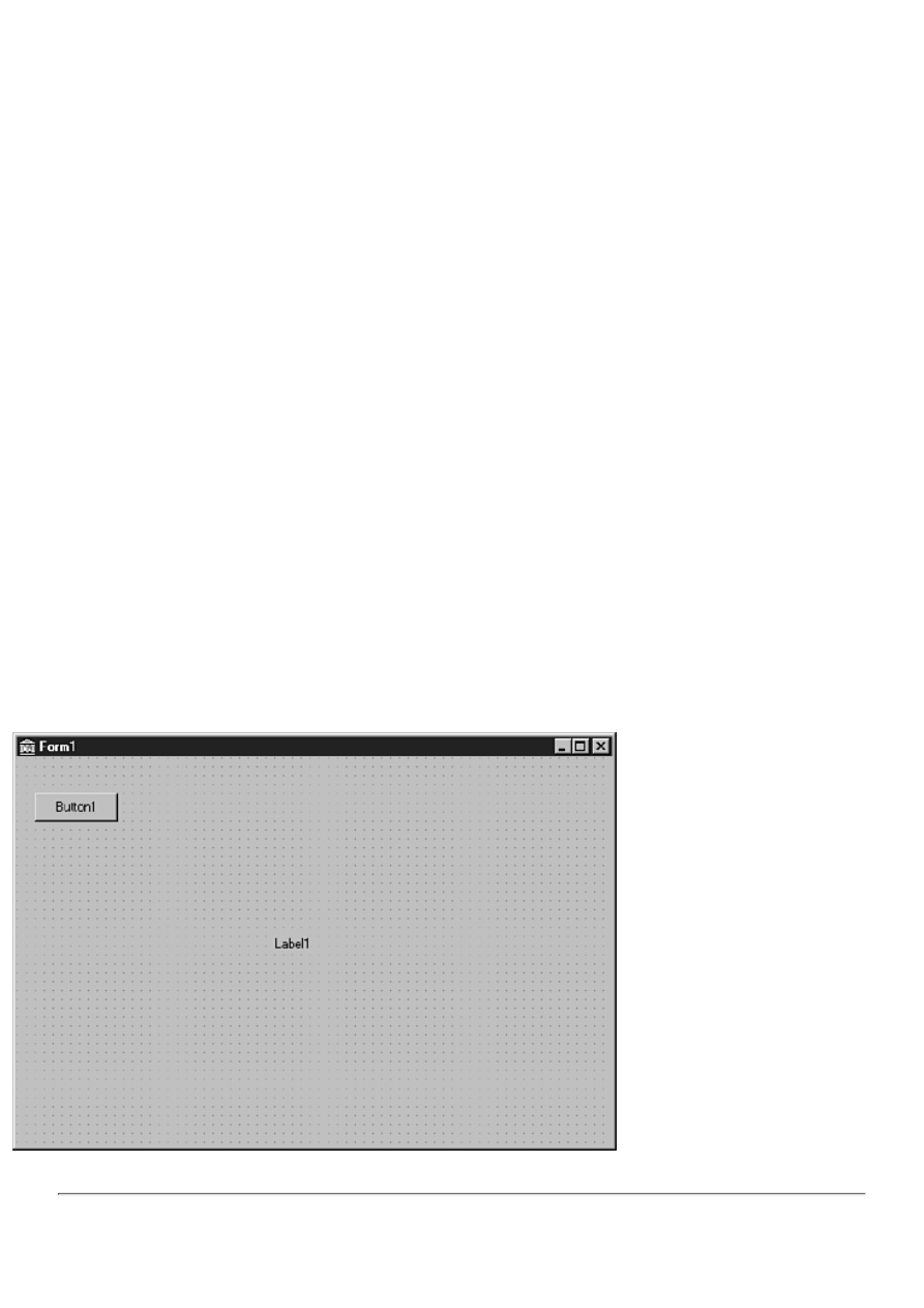
At this point your form should look similar to Figure 1.3. Notice that the label component has a default caption of Label1 and
the button has a default caption of Button1.
Modifying the Hello World II Program
In the first version of Hello World, you used the Object Inspector to change the Caption property of a label. That change was
applied at design time and as such was seen as soon as the program ran. In this exercise, you are going to change the caption of
the label through code.
FIGURE 1.3.The new form after placing
the button and label components.
NOTE: When you change a component's properties through the Object Inspector and Form Designer, you are
said to make a design-time change. When you modify a property through code that executes when the program

runs, you are said to make a runtime change.
To change the Caption property at runtime, follow these steps:
1. Double-click on the button on your form. As soon as you do, Delphi generates an event handler for the button's
OnClick event. The generated code looks like this:
procedure TForm1.Button1Click(Sender: TObject);
begin
end;
2. Right now you don't need to be concerned with everything you see here. You only need to understand that the
OnClick event handler is a section of code that will be executed every time the button is clicked (as long as the program
is running, that is). The editing cursor is placed between the begin and end statements and is waiting for you to type
code. Enter this code at the cursor:
Label1.Caption := `Hello World, Part II';
I always indent two spaces (considered by many programmers to be proper coding practice) so my completed event
handler now looks like this:
procedure TForm1.Button1Click(Sender: TObject);
begin
Label1.Caption := `Hello World, Part II';
end;
This code is pretty simple. It simply assigns the value Hello World, Part II to the Caption property of the label (the
Caption property is used to set the text that the label displays).
3. Now click on the Run button on the toolbar to run the program. When you run the program, notice that the label still
has the caption Label1. Click the form's button and the label's caption changes to Hello World, Part II. Hey, how about
that! Magic? No, just Delphi at work!
You'll be doing many such exercises in the next few days so you'll get plenty of practice placing labels, buttons, and other
components on the form. I realize that I didn't fully explain what is going on behind the scenes here, but I don't want to get
ahead of myself so I'll save that explanation for a later time.
Object Pascal Language Overview
Before you can learn about the RAD features of Delphi, you need to learn the basics of the Object Pascal language. This part
of the book will probably not be the most exciting for you, but you need a basic understanding of Object Pascal before you
move on.
It would be nice if presenting the Object Pascal language could be handled sequentially. That's not the case, though, because
all the features you will learn about are intertwined. I'll take the individual puzzle pieces one at a time and start fitting them
together.
By the end of Day 3, you'll have a fairly complete picture of the Object Pascal language. Don't be concerned if you don't
instantly grasp every concept that is presented. Some of what is required to fully understand Object Pascal can only come with
real-world experience.
During the next few days, you will see short code snippets that illustrate a particular feature of the Object Pascal language.
You will also do some exercises that enable you to test your newfound knowledge. In the first few days, you will only see your
Delphi applications in small sections. I don't want to get ahead of myself and go too far into the Delphi IDE or the Visual
Component Library (VCL) at this early stage. You will have to settle for bits and pieces until later in the book when you start
to get the complete picture. The code that you can download from the book's site contains complete programs for some of the
exercises that you will perform over the next several days. (Go to http://www.mcp.com/info and type 0-672-31286-7.)
In the Beginning...
Back in 1994 or so, Borland began working on a RAD tool that it code-named Delphi. When it was decided that the
component model architecture was the best way to implement RAD, it was then necessary to settle on the programming
language that would be the heart of the system.
At that time, Borland was the only compiler vendor mass marketing a Pascal compiler. Borland was known as the company
that produced the best Pascal tools. If you were a Pascal programmer, you probably used Borland's TurboPascal in one flavor
or another. Borland more or less "owned" Pascal. Although Borland didn't own the Pascal language in a legal sense, it no doubt

felt that because of its position in the Pascal world, it could take considerable liberties in implementing new language features
and enhancements. In addition, there was no Pascal standards committee, nor even a written standard defining the Pascal
language. So Borland created Delphi using Pascal as the base language (the Borland internal code name stuck and became the
official product name).
Before Delphi came into being, Borland had already modified the Pascal language in positive ways. For example, Borland had
already extended Pascal by creating a new language called Object Pascal. It can be said that Object Pascal is to Pascal what
C++ is to C. Object Pascal added classes to Pascal, thereby hurling Pascal into the world of object-oriented programming
(OOP) languages. As Delphi was being developed, new language behavior and keywords were added to deal with the
component model. Keywords such as published and property were added, as were others. This enabled Borland to fully
implement the power of the component model. By modifying the Pascal language to suit the component model, Borland was
able to implement RAD the right way. In essence, the Object Pascal language was modified as needed when design issues
came up during the development of the then-unknown product called Delphi. The result is a language that works seamlessly
with the component model.
Although modifying the Pascal language could be considered a bold step for Borland, it was not without precedent. Previously,
Microsoft had taken the BASIC language and modified it to produce a new language called Visual Basic. This new language
was nearly unrecognizable when compared to the original BASIC language that served as its base.
Borland took a risk in modifying Pascal. After all, it had a loyal base of customers that might not take kindly to enhancements
to the language they had come to know and love. Still, Borland was in a solid position in the Pascal market and went ahead
with its plans. The result was a smash hit, of course.
Make no mistake about it, Object Pascal is a powerful programming language, and I don't make that statement lightly. I have a
C/C++ background and, like other C/C++ programmers, I viewed Delphi with a bit of skepticism at first. I found out quickly,
though, that the Object Pascal language is very capable. In fact, in the hands of the average programmer there is almost no
difference in the two languages in terms of power. Object Pascal is unique in that it is both powerful and relatively easy to
learn. I don't in any way want to leave the impression that Object Pascal is a not a full-featured programming language. Pascal
has often been knocked as a less-than-serious programming language. That has never been true, and is even less true with
today's Object Pascal.
NOTE: Several different terms have been adopted by Delphi programmers to describe what they do. The base
language of Delphi is, of course, Object Pascal, and some folks call it exactly that. Others might say, "I program
in Pascal," or even just, "I'm a Delphi programmer." In the end it's up to you to decide what terminology you will
use. I'll use the terms Object Pascal and Pascal interchangeably throughout this book and will typically reserve use
of the word Delphi to refer to the Delphi IDE or its tools.
Object Pascal enables you to take advantage of object-oriented programming to its fullest. OOP is not just a buzzword. It has
real benefits because it enables you to create objects that can be used in your current program and reused in future programs.
New Term: An object, like components described earlier, is a binary piece of software that performs a specific programming
task. (Components are objects, but not all objects are components. I'll explain that later.)
An object reveals to the user (the programmer using the object) only as much of itself as needed; therefore, using the object is
simplified. All internal mechanisms that the user doesn't need to know about are hidden from sight. All this is included in the
concept of object-oriented programming. OOP enables you to take a modular approach to programming, thus keeping you
from constantly re-inventing the wheel. Delphi programs are very OOP-centric because of Delphi's heavy use of components.
After a component is created (either one of your own or one of the built-in components), it can be reused in any Delphi
program. A component can also be extended by inheritance to create a new component with additional features. Best of all,
components hide their internal details and let the programmer concentrate on getting the most out of the component. Objects
and classes are discussed in detail on Day 3, "Classes and Object-Oriented Programming."
Pascal Units
Programming is more than just typing code. Ultimately, it is the combination of conceptualizing a programming task and then
typing code to carry out that task. The code you type simply goes into a text file. The compiler takes that text file and compiles
it into machine code that the computer can understand. The text file that Delphi compiles into machine code is called a unit.
New Term: A unit is a text file that can be compiled into a module of code.
Types of Units
A Delphi GUI application will contain at least two units. The project source unit contains the project source code. Project

source code units have an extension of DPR. You can view the project source unit by choosing Project | View Source from the
main menu. It is not normally necessary to modify the project source unit. In fact, you shouldn't modify the project source unit
unless you know exactly what you are doing. If you accidentally modify the project source unit in undesirable ways, you might
find that your application won't compile anymore. (Certain advanced programming techniques require modification of the
project source code, but that's not something you need to be concerned with at this time.)
The second type of unit that a Delphi GUI application always has is the main form's unit. A form unit, as its name implies, is a
source code unit with an associated form. This type of unit has a filename extension of PAS. This is the type of unit you will
use most often in your Delphi programs. A Delphi GUI application will always have one form unit (for the main form), but it
can have one or more additional form units as well. For example, an application that displays an About box will have the main
form unit and a unit for the About box.
NOTE: You might have noticed that I keep saying "Delphi GUI application." This is because I want to
distinguish a GUI application from a console mode application. A console mode application is a 32-bit Windows
application that runs in a console window (DOS box). A console application has no main form and may or may
not contain other forms. A console application does, however, have one or more units.
There is a third type of unit you can use in Delphi applications. This type of unit is a unit that contains only source code. A
code-only unit contains code that is called from other units in the project. I won't go into any more detail than that right now,
but you'll learn more about this type of unit in later chapters.
Anatomy of a Delphi Unit
Delphi units must follow a predefined format. This shouldn't come as a surprise to you. The unit has to be in a predefined
format so that the compiler can read the unit and compile the unit's code.
A Delphi project unit contains the program keyword followed by the name of the unit and a code block marked by the begin
and end keywords. You can see how a basic unit looks by choosing View | Project Source from the Delphi main menu. The
project source unit for a default Delphi project looks like Listing 1.1.
NOTE: The line numbers in Listing 1.1 are not part of the unit itself. I have put them there for reference only.
Some of the listings you see in this book will have line numbers for reference and others will not. In either case,
be sure to understand that the Pascal language does not use line numbers as some other languages do (most
notably, BASIC).
LISTING 1.1. THE PROJECT SOURCE FOR A DEFAULT DELPHI PROJECT.
01: program Project1;
02:
03: uses
04: Forms,
05: Unit1 in `Unit1.pas' {Form1};
06:
07: {$R *.RES}
08:
09: begin
10: Application.Initialize;
11: Application.CreateForm(TForm1, Form1);
12: Application.Run;
13: end.
On line 1, the program keyword identifies this unit as a program's main source unit. You can see that the unit name, Project1,
follows the program keyword (Delphi gives the project a default name until you save the project with a more meaningful
name). Beginning on line 3, you see a section identified by the uses keyword. Any unit names following the uses keyword, up
to the semicolon, are other units that this unit requires in order to compile. The uses keyword is described in more detail a little
later in the section, "The uses List."
On line 7 you see a compiler directive that tells Delphi to include this project's resource file. Resource files are discussed in
more detail on Day 8, "Creating Applications in Delphi."
Line 9 contains the begin keyword, and line 13 contains the end keyword. Notice that the final end keyword in the unit is
followed by a period. (A unit can have many code blocks marked with begin and end, but only one final end statement.) The

code on lines 10, 11, and 12 is code that initializes the application, creates the application's main form, and starts the
application running. You don't need to be concerned about the details of this code to write Delphi programs.
NOTE: The begin and end keywords mark a code block. A code block can contain just a few lines of code, or it
can contain several hundred lines of code (or even thousands of lines). You will see the begin and end keywords
used throughout the book. As you work through the book, you will get a better handle on how and when the begin
and end keywords are used.
Let's take a look at another basic Pascal unit. Choose File | New from the main menu. When the New Items dialog comes up,
locate the icon labeled Unit and double-click it. Delphi will create a new unit and display it in the Code Editor. Listing 1.2
shows the code generated for this unit.
LISTING 1.2. A BLANK PASCAL UNIT.
01: unit Unit2;
02:
03: interface
04:
05: implementation
06:
07: end.
There isn't much here, is there? This unit has two things in common with the unit
shown in Listing 1.1. First, the unit starts with the unit keyword followed by the
unit name Unit2 (again, a default name created by Delphi). I realize the code in
Listing 1.1 starts with the program keyword and this code starts with the unit
keyword, but there are a few common elements: A Pascal unit starts with one of these
two keywords followed by the unit name, and the end keyword appears at the end of
both
listings. Here again, the end keyword is followed by a period to mark the end of the
unit.
The code in Listing 1.2 differs from that of Listing 1.1 in that it has sections marked interface and implementation. A unit that
is not the program's main source unit must contain an interface section and an implementation section. These two keywords
will be described in more detail in the sections entitled, "The interface Section" and "The implementation Section,"
respectively. Listing 1.2 also differs from Listing 1.1 in that there is no begin statement. A program's main unit must have both
begin and end statements, but a source unit only has to contain a final end statement.
The following sections describe keywords that are used within a Pascal unit.
The uses List
New Term: The uses list is a list of external units that this unit references.
Refer to Listing 1.1. Notice the uses keyword on line 3. The uses keyword designates the start of a section that will contain a
list of other units that this unit is dependent on. For example, line 11 of Listing 1.1 looks like this:
Application.CreateForm(TForm1, Form1);
This line of code contains information that is located in other units and cannot be found in this unit. The procedure identified
by Application.CreateForm is located in a Delphi unit called Forms.pas, and the identifiers TForm1 and Form1 are located in
the project's main form unit, which is called Unit1.pas. Do you see the connection? The uses list tells Delphi where to look for
additional information that it will need to compile this unit. Here's another look at the uses list:
uses
Forms,
Unit1 in `Unit1.pas' {Form1};
Notice that the uses list contains two unit names, Forms and Unit1. In some ways this is not a good example of a uses list
because the second unit listed contains additional text not usually found in a uses list (Unit1 in `Unit1.pas' {Form1}).
This text is used to specify a form that is contained in a unit and is only used by the project's main source unit. (The text
between the curly braces is a comment used for reference and has no bearing on the rest of the code. Comments are discussed
later in the section "Comments in Code.")
There are two rules you need to be aware of when constructing the uses list:

First, each unit in the list must be separated from the following unit by a comma.
●
Second, a semicolon must follow the last unit listed. The semicolon marks the end of the uses list.
●
Naturally the list must contain valid unit names. The uses list, then, is designated by the uses keyword and ends with a
semicolon. Other than that, it doesn't matter how the uses list is organized. For example, the following two uses lists are
identical as far as the compiler is concerned:
uses
Windows, Messages, SysUtils, Classes, Graphics,
Controls, Forms, Dialogs, StdCtrls;
uses
Windows,
Messages,
SysUtils,
Classes,
Graphics,
Controls,
Forms,
Dialogs,
StdCtrls;
A unit can have any number of uses lists. It is not required that all units needed by this unit be in a single uses list.
NOTE: In some cases, Delphi will add units to your uses list for you. This is done via the File | Use Unit menu
item. This feature will be discussed in more detail on Day 4.
The interface Section
Take another look at Listing 1.2. Notice that this listing has a section marked by the interface keyword. This keyword marks
the start of the interface section for the unit.
The interface section is the section of a unit in which identifiers exported from this unit are declared. An exported identifier is
one that can be accessed by other units in the project.
Most units will contain code that other units use. The code might be implemented as a class, a procedure, a function, or a data
variable. Any objects that are available to other units from this unit must be declared in the interface section. You could say
that the interface section contains a list of items in this unit that other units can use. The interface section starts with the
interface keyword and ends at the implementation keyword.
The implementation Section
New Term: The implementation section of a unit is the section that contains the actual code for the unit.
The implementation section starts with the implementation keyword and ends with the next unit keyword. The next unit
keyword is usually the unit's final end keyword, but could be the initialization keyword in units that have an initialization
section. It's difficult to say more than that right now, because there are other aspects of Pascal that I need to discuss before
tying all of this together. However, let me give you an example that will illustrate the use of the interface and implementation
sections.
Let's say that you create a unit that has a procedure called DoSomething. Let's further say you want DoSomething to be
available to other units in your project. In that case, you would declare the DoSomething procedure in the interface section and
then define the procedure in the implementation section. The entire unit would look like Listing 1.3.
LISTING 1.3. A UNIT WITH A PUBLIC FUNCTION.
unit Unit2;
interface
procedure DoSomething;
implementation
procedure DoSomething;
begin
{ Code for DoSomething goes here. }

end;
end.
Notice that the DoSomething procedure is declared in the interface section and defined later in the implementation section. I
realize I'm getting a little ahead of myself here. Functions and procedures will be discussed more tomorrow, and I'll go over
declarations and definitions in detail at that time.
The initialization and finalization Sections
The initialization and finalization sections can be used to perform any startup and cleanup code that a unit requires. Any code
in the initialization section will be executed when the unit is loaded into memory. Conversely, any code in the finalization
section will be executed just before the unit is unloaded from memory. You can have just an initialization section, but you
cannot have a finalization section without an initialization section. The initialization and finalization sections are optional.
Additional Keywords Used in Units
A Pascal unit can contain other, optional keywords that mark sections set aside for a particular purpose. Some of these
keywords have multiple uses. The following sections describe those keywords only as they pertain to units.
The const Keyword
A unit can optionally have one or more const sections. The const section is designated with the const keyword. The const
section describes a list of variables that are known as constants.
A constant is an identifier that cannot change. For example, let's say you have certain values that your program uses over and
over. You can set up constant variables for those values. To illustrate, let's add a const section to the program in Listing 1.3.
You'll add one const section for constants that are public (available to other units) and another const section for constants that
are available only to this unit. Listing 1.4 shows the unit with the two const sections added.
LISTING 1.4. THE UNIT WITH const SECTIONS ADDED.
unit Unit2;
interface
const
AppCaption = `My Cool Program 1.0';
procedure DoSomething;
implementation
const
BaseX = 20;
BaseY = 200;
procedure DoSomething;
begin
{ Code for DoSomething goes here. }
end;
end.
Because the AppCaption constant is declared in the interface section, it can be used anywhere in the unit and in any unit that
has this unit in its uses list. The BaseX and BaseY constants, however, are only available within this unit because they are
declared in the implementation section.
The const keyword has other uses besides the one described here. I'll discuss one of those uses tomorrow in the section,
"Value, Constant, and Variable Parameters."
The type Keyword
New Term: The type keyword is used to declare new types that your program will use.
Declaring a new type is an esoteric programming technique that is difficult to explain at this stage of the game, so perhaps an
example will help. Let's say that your application needs an array (a collection of values) of 20 bytes and that this type of array
will be used over and over again. You can declare a new type as follows:
type
TMyArray = array [0..19] of Byte;
Now you can use the identifier TMyArray instead of typing out array [0..19] of Byte every time you want an array of 20 bytes.
I'll have to leave it at that for now, but you'll see more examples of declaring types later in the book.

The var Keyword
New Term: The var keyword is used to declare a section of code in which variables are declared.
You use the var keyword to declare variables (variables are discussed in detail in the section entitled "Variables"). There are
several places you can declare a var section. You can have a var section at the unit level, you can have a var section for a
procedure or function, or both. You can even have multiple var sections in a unit. Listing 1.5 shows the sample unit with type
and var sections added.
LISTING 1.5. THE UNIT WITH type AND var SECTIONS ADDED.
unit Unit2;
interface
type
TMyArray = array [0..19] of Byte;
const
AppCaption = `My Cool Program 1.0';
var
X : Integer;
MyArray : TMyArray;
procedure DoSomething;
implementation
const
BaseX = 20;
BaseY = 200;
procedure DoSomething;
begin
{ Code for DoSomething goes here. }
end;
end.
As with the const keyword, the var keyword has more than one use. It is also used to declare function and procedure
parameters as variable parameters. Rather than go into that now, I'll save that discussion for tomorrow when you read about
functions and procedures.
NOTE: The sections described by the var, const, and type keywords begin at the keyword and end at the next
keyword in the unit.
Comments in Code
Before getting into the Pascal language in detail, let me talk briefly about commenting code. Comments are lines of text in your
source code that are there for documentation purposes. Comments can be used to describe what the code does, to supply
copyright information, or simply to make a note to yourself or other programmers.
Comments can be designated in as many as three different ways. The following are all valid comments lines:
{ Don't forget to free this memory! }
{
ADTAPI.PAS 2.50
Copyright (c) TurboPower Software 1996-98
}
(* Mason needs to fix this section of code *)
// This is really good code!
{ This code needs to be reworked later }
Probably the most common type of comment used in Delphi programs uses curly braces as illustrated in the first two cases
above. The opening brace is used to start a comment, and the closing brace is used to end a comment. Another type of
comment uses (* to start the comment, and *) to end the comment. There is one difference between comments designated this
way as opposed to using curly braces: The (*/*) comment pair can be used to block out large sections of code containing other
comment lines. These two comment types can be used to comment single lines of code or multiple lines.
NOTE: Curly braces have another use in Pascal. When used in conjunction with a dollar sign, the braces signify a

compiler directive. To tell the compiler not to generate compiler hints, you can put a line like this in your source
code:
{$HINTS OFF}
When the compiler sees this line, it stops generating hints in this unit until a corresponding {$HINTS ON}
directive is encountered. I'll talk about individual compiler directives at different points in the book as the need
arises.
The third type of comment is designated by the double slash. This is often called the C-style comment because it is used by C
and C++. This type of comment can only be used on single lines of code. You should also be aware that this type of comment
is not valid in all versions of Delphi. If you are writing code that might be used in Delphi 1 as well as later versions, you
should be sure not to use this style of comment.
NOTE: I use the curly brace style of comment for production code (code that others will see). I use the double
slash type of comment for quickly commenting out a line or two for testing purposes, but only as a temporary
measure. I rarely use the (*/*) style of comment.
Any commented text is ignored by the compiler. If you are using the default Delphi IDE settings, all comment lines will show
up in italicized, blue text. This makes it easy to quickly identify comment lines.
NOTE: If you work in a team programming environment, you might have to read your coworkers' code and vice
versa. Concise comments in the code can save hours of time for any programmer who has to read and maintain
another programmer's code. Even if you work in a single-programmer environment, commenting your code is a
good idea. You'd be surprised how quickly you forget what code you wrote is supposed to do. Good code
commenting can save you and your coworkers hours of time, so don't forget to comment your code!
Variables
Variables have to be declared before they can be used. You declare a variable in a special section of code designated with the
var keyword, as described earlier--for example,
var
X : Integer; { variable X declared as an integer variable }
Y : Integer; { variable Y declared as an integer variable }
Earlier, I talked about the var keyword in terms of a Pascal unit. In that section, I
said that variables used in the unit are declared in the unit's var section. That's
true, but you can also have a var section in a function or procedure. This
enables you to declare variables in functions and procedures as well as in units.
Here's an example of a var section in a procedure:
procedure TForm1.Test;
var
S : string;
begin
S := `Hello World!';
Label1.Caption := S;
end;
After you declare a variable, you can then use it to manip
Teach Yourself Borland Delphi 4 in 21 Days
- 2 -
More on Pascal
Executing Multiple Instructions
Functions, Procedures, and Methods
Value, Constant, and Reference Parameters
Local Functions and Procedures
Default Parameters for Functions
You now have a pretty good start on learning Object Pascal. In this chapter, you will continue to learn about the Object
Pascal language by examining more of the fundamentals of Object Pascal. Today you will learn about
The if, then, and else keywords
●
Loops: for, while, and repeat
●
The case statement
●

Scope
●
Records
●
Functions and procedures
●
if, then, else
There are some aspects of programming that are common to all programming languages. One such item that Object Pascal
has in common with other programming languages is the if statement. The if statement is used to test for a condition and
then execute sections of code based on whether that condition is True or False. Here's an example:
var
X : Integer;
begin
X := StrToInt(Edit1.Text);
if X > 10 then
Label1.Caption := `You entered a number greater than 10.';
end;
This code gets the contents of an edit control and stores it in an integer variable. If the number is greater than 10, the
expression x > 10 evaluates to True and the message is displayed; otherwise, nothing is displayed. Note that when the
conditional expression evaluates to True, the statement immediately following the if...then expression is executed. The
conditional part of an if statement is always followed by then.
New Term: The if statement is used to test for a condition and execute one or more lines of code when that condition
evaluates to True.
Executing Multiple Instructions
Let's say you have multiple lines of code that should be executed when the conditional expression is True. In that case, you
would need begin and end keywords to block those lines:
if X > 10 then begin
Label1.Caption := `You entered a number greater than 10.';
DoSomethingWithNumber(X);
end;
When the conditional expression evaluates to False, the code block associated with the if expression is ignored and program
execution continues with the first statement following the code block.
NOTE: Object Pascal contains a few shortcuts. One of those shortcuts involves using just a Boolean variable's
name to test for True. Look at this code:
if FileGood then ReadData;
This method is shortcut for the longer form, which is illustrated with this line:
if FileGood = True then ReadData;
This shortcut only applies to Boolean variables. You can test for False by applying the not keyword to a
variable name:
var
FileGood : Boolean;
begin
FileGood := OpenSomeFile;
if not FileGood then ReportError;
end;
Learning the Object Pascal shortcuts helps you write code that contains a degree of elegance. Knowing the
shortcuts will also help you understand Object Pascal code that you read in examples and sample listings.

Adding else
In some cases, you might want to perform an action when the conditional expression evaluates to True and perform some
other action when the conditional expression evaluates to False. You accomplish this by implementing the else statement:
if X = 20 then
DoSomething(X)
else
DoADifferentThing(X);
New Term: The else statement is used in conjunction with the if statement and
identifies a section of code that is executed when the if statement fails (that is,
evaluates to False).
In this example, one of the two functions will be called based on the value of X, but not both.
I want you to notice something about the preceding example. The line following the if statement does not end in a
semicolon. This is because the entire if...then...else sequence is viewed as a single statement. You omit the semicolon on the
first line following the if statement only if it's a single line of code (that is, you are not using begin and end following the if
statement). Here are a couple of examples of legal if...then...else syntax:
if X = 20 then
DoSomething(X) { no semi-colon here because }
else { it's a single line of code }
DoADifferentThing(X);
if X = 20 then begin
DoSomething(X); { semi-colon needed here because }
end else begin { of the begin/end block }
DoADifferentThing(X);
end;
if X = 20 then begin
DoSomething(X); { Multiple lines, use semi-colons }
X := 200; { at the end of each line. }
Y := 30;
end else begin
DoADifferentThing(X);
X := 100;
Y := 15;
end;
NOTE: It doesn't matter where you put the then, begin, and else keywords. The following two blocks of code
are identical as far as the compiler is concerned:
{ One way to do it... }
if X = 20 then begin
DoSomething(X);
X := 200;
Y := 30;
end else begin
DoADifferentThing(X);
X := 100;
Y := 15;
end;
{ Same code, different layout... }
if X = 20
then
begin
DoSomething(X);
X := 200;
Y := 30;
end
else
begin

DoADifferentThing(X);
X := 100;
Y := 15;
end;
Ultimately it's up to you to decide on the coding style that you will use. While coding style is largely a matter
of preference, be sure you settle on a style that makes your code easy to read.
NOTE: Remember that the equality operator is the equal sign (=) and that the assignment operator is
colon-equal (:=). A common coding mistake is to use the assignment operator where you mean to use the
equality operator. Fortunately, the compiler will issue an error when you do this.
Nested if Statements
You can nest if statements when needed. Nesting is nothing more than following an if statement with one or more additional
if statements.
if X > 10 then
if X < 20 then
Label1.Caption := `X is between 10 and 20';
Keep in mind that these are simplified examples. In the real world, you can get lost in the maze of begin and end statements
that separate one code block from the next. Take a look at this code snippet, for instance:
if X > 100 then begin
Y := 20;
if X > 200 then begin
Y := 40;
if X > 400 then begin
Y := 60;
DoSomething(Y);
end;
end;
end else if X < -100 then begin
Y := -20;
if X < -200 then begin
Y := -40;
if X < -400 then begin
Y := -60;
DoSomething(Y);
end;
end;
end;
Even this is a fairly simple example, but you get the idea.
[BEGTIP: When a section of code contains more than two or three consecutive if statements testing for
different values of the same variable, it might be a candidate for a case statement. The case statement is
discussed later in this chapter in the section "The case Statement."
So far I have used only one conditional expression in the if examples I have given you. When you have just one conditional
expression, you can use parentheses around the expression or not use parentheses as you see fit. If, however, you have more
than one conditional expression, you must surround each conditional expression with parentheses. For example:
if (X = 20) and (Y = 50) then
DoSomething;
If you forget the parentheses, the compiler will, of course, let you know by issuing a compiler error.
The if statement is heavily used in Object Pascal programming. It's straightforward, so you won't have any trouble with it.
The main thing is keeping all the begin and end keywords straight!

The if...then...else Statement, Form 1
if cond_expr then
true_statement
else
false_statement;
If the conditional expression cond_expr is True, the line of code represented by true_statement is executed. If the optional
else clause is specified, the line of code represented by false_statement is executed when the conditional expression
cond_expr is False.
The if...then...else Statement, Form 2
if cond_expr_1 then begin
true_statements;
end else begin
false_statements;
end;
If the conditional expression cond_expr_1 is True, the block of code represented by true_statements is executed. If it is
False, the block of code represented by false_statements is executed.
Using Loops
The loop is a common element in all programming languages. A loop can be used to iterate through an array, to perform an
action a specific number of times, to read a file from disk...the possibilities are endless. In this section, I will discuss the for
loop, the while loop, and the repeat loop. For the most part they work in very similar ways. All loops have these common
elements:
A starting point
●
A body, usually enclosed in begin and end keywords, that contains the statements to execute on each pass
●
An ending point
●
A test for a condition that determines when the loop should end
●
Optional use of the Break and Continue procedures
●
A loop is an element in a programming language that is used to perform an action repeatedly until a specific condition is
met.
The starting point for the loop is one of the Object Pascal loop statements (for, while, or repeat). The body contains the
statements that will execute each iteration through the loop. The body can contain any valid Object Pascal code and can be a
single line of code or multiple lines of code. If the body contains multiple lines of code, the code must be blocked with
begin and end statements (with the exception of the repeat loop). The ending point for the loop is either the end keyword (in
the case of the for loop and the while loop) or the until keyword (in the case of the repeat loop). When the body of a loop is
a single line of code, the begin and end keywords are not required.
Most loops work something like this: The loop is entered and the test condition is evaluated. If the test condition evaluates
to False, the body of the loop is executed. When program execution reaches the bottom of the loop, it jumps back to the top
of the loop where the test condition is again evaluated. If the test condition is still False, the whole process is repeated. If the
test condition is True, program execution jumps to the line of code immediately following the loop code block. The
exception to this description is the repeat loop, which tests for the condition at the bottom of the loop rather than at the top.
The test condition tells the loop when to stop executing. In effect the test condition says, for example, "Keep doing this until
X is equal to 10," or "Keep reading the file until the end-of-file is reached." After the loop starts, it continues to execute the
body of the loop until the test condition evaluates to True.
CAUTION: It's easy to accidentally write a loop so that the test condition never evaluates to True. This will
result in a program that is locked up or hung. Your only recourse at that point is to press Ctrl+Alt+Del and kill
the task. The Windows Close Program box (or the Windows NT Task Manager) will come up and display the
name of your program with (Not Responding) next to it. You'll have to select your program from the list and
click End Task to terminate the runaway program.

TIP: In Delphi you typically run a program using the Run button on the toolbar or by pressing F9. If you need
to kill a runaway program that was run from the IDE, you can choose Run | Program Reset from the main
menu or press Ctrl+F2 on the keyboard. Note, however, that Windows 95 does not like you to kill tasks with
Program Reset and might crash if you reset a program several times (Windows NT is much more forgiving in
this area). Always run your programs to completion if possible, especially when developing on the Windows
95 platform.
Given that general overview, let's take a look at each type of loop individually.
The for Loop
The for loop is probably the most commonly used type of loop. It takes two parameters: the starting value and ending value.
If the loop is to count up, the to keyword is used. If the loop is to count backward, then the downto keyword is used.
The for Loop Statement, Counting Up
for initial_value to end_value do begin
statements;
end;
T
Teach Yourself Borland Delphi 4 in 21 Days
- 3 -
Classes and Object-Oriented Programming
Styles := Styles - [fsItalic];
❍
❍
●
●
Local Versus Dynamic Memory Usage
❍
Dynamic Allocation and Pointers
❍
❍
●
●
●
❍
❍
❍
❍
❍
❍
●
●
❍
●
●
❍
❍
❍
●
Today you get to the good stuff. In this chapter you will learn about classes. Classes are the heart of Object Pascal and a major
part of object-oriented programming. Classes are also the heart of the Visual Component Library (VCL), which you will use
when you start writing real Windows applications. (The VCL is discussed in detail on Day 5, "The Visual Component
Model.") Today you will find out what a class is and how it's expected to be used. Along the way you will learn the meaning of
Object Pascal buzzwords like inheritance, object, and data abstraction. Before you get to that, however, I want to cover a few
more aspects of Object Pascal that I haven't yet covered.
Sets
Sets are used frequently throughout Delphi, so you need to know what sets are and how they work.
A set is a collection of values of one type.

That description doesn't say too much, does it? An example that comes to mind is the Style property of a VCL font object. This
property can include one or more of the following values:
fsBold
●
fsItalic
●
fsUnderline
●
fsStrikeout
●
A font can have any combination of these styles or none of them at all. A set of font styles, then, might have none of these
values, it could have all of them, or it could have any combination.
So how do you use a set? Let me use the Style property to illustrate. Typically, you turn the individual Style values for the font
on or off at design time. Sometimes, however, you need to set the font's Style property at runtime. For example, let's say that
you want to add the bold and italic attributes to the font style. One way is to declare a variable of type TFontStyles and then
add the fsBold and fsItalic styles to the set. Here's how it looks:
var
Styles : TFontStyles;
begin
Styles := Styles + [fsBold, fsItalic];
end;
This code adds the elements fsBold and fsItalic to the Styles set. The elements are enclosed in brackets to indicate that you are
adding elements to the set. The brackets, when used in this way, are called a set constructor. Notice that this code doesn't
actually change a font's style; it just creates a set and adds two elements to it. To change a font's style, you have to assign this
newly created set to the Font.Style property of some component:
Memo.Font.Style = Styles;
Now, let's say that you want the font to be bold but not italic. In that case, you have to remove the italic style from the set:
Styles := Styles - [fsItalic];
The style now contains only the fsBold value because the fsItalic value has been removed.
Often you want to know whether a particular item is in a set. Let's say you want to know whether the font is currently set to
bold. You can find out whether the fsBold element is in the set by using the in keyword:
if fsBold in Styles then
DoSomething;
Sometimes you need to make sure you are starting with an empty set. You can clear a set of its contents by assigning an empty
set to a set variable. This is done with an empty set constructor--for example,
{ start with an empty set }
Styles := [];
{ now add the bold and italic styles }
Styles := Styles + [fsBold, fsItalic];
In this example the font style is cleared of all contents, and then the bold and italic styles are added. This same thing can be
accomplished in a slightly different way by just assigning directly to a set:
Styles := [fsBold, fsItalic];
You don't specifically have to create a TFontStyles variable to change a font's style. You can just work with the property
directly--for example,
Memo.Font.Style := [];
Memo.Font.Style := Memo.Font.Style + [fsBold, fsItalic];
A set is declared using the set keyword. The TFontStyles property is declared in the VCL source file GRAPHICS.PAS like
this:
TFontStyle = (fsBold, fsItalic, fsUnderline, fsStrikeOut);
TFontStyles = set of TFontStyle;
The first line here declares an enumeration type called TFontStyle. (An enumeration is a list of possible values.) The second
line creates the TFontStyles set as a set of TFontStyle values.

Sets are used often in VCL and in Delphi programming. Many component properties are defined as sets. You'll get the hang of
sets quickly as you work with Delphi.
Casting
New Term: Cast means to tell the compiler to treat one data type as if it were a
different type. Another term for cast is typecast.
Here's an example of a Char data type typecast to an Integer:
procedure TForm1.Button1Click(Sender: TObject);
var
AChar : Char;
AnInteger : Integer;
begin
AChar := `A';
AnInteger := Integer(AChar);
Label1.Caption := IntToStr(AnInteger);
end;
In this example, the cast Integer(AChar) tells the compiler to convert the value of AChar to an Integer data type. The cast is
necessary because you can't assign the value of a Char data type to an Integer type. If you attempt to make the assignment
without the cast, the compiler will issue an error that reads Incompatible types: `Integer' and `Char'.
By the way, when the preceding code executes, the label will display the text 65 (65 is the integer value of the character A).
It is not always possible to cast one data type to another. Take this code, for example:
procedure TForm1.Button1Click(Sender: TObject);
var
Pi : Double;
AnInteger : Integer;
begin
Pi := 3.14;
AnInteger := Integer(Pi);
Label1.Caption := IntToStr(AnInteger);
end;
In this case, I am trying to cast a Double to an Integer. This is not a valid cast,
so the compiler will issue an error that reads Invalid typecast. To convert a
floating-point value to an integer value, use the Trunc, Floor, or Ceil functions.
These functions do just as their names indicate, so I don't need to explain further.
See the Delphi help for more information on these functions.
Pointers can be cast from one type to another using the as operator. (Pointers are discussed in the next section.) I'll discuss the
as operator later in the section "Class Keywords: is and as."
Pointers
Pointers are one of the most confusing aspects of the Object Pascal language. So what is a pointer? It's a variable that holds the
address of another variable. There, that wasn't so bad, was it? I wish it were that simple! Because a pointer holds the address of
another variable, it is said to "point to" the second variable. This is called indirection because the pointer does not have a direct
association with the actual data, but rather an indirect association.
New Term: A pointer is a variable that holds the address of another variable.
Let's look at an example. Let's say you have a record, and you need to pass the address of that record to a procedure requiring a
pointer. You take the address of a record instance using the @ operator. Here's how it looks:
var
MLRecord : TMailingListRecord;
APtr : Pointer;
begin
{ Fill MLRecord with data. }
APtr := @MLRecord;

SomeFunction(APtr);
end;
The APtr variable (which is of type Pointer) is used to hold the memory address of
the MLRecord record. This type of pointer is called an untyped pointer because the
Pointer data type simply holds a memory address. Another type of pointer
is a pointer that is declared as a pointer to a specific type of object. For example,
let's say that you create a new type, a pointer to TMailingListRecord record. The
declaration would look like this:
type
PMailingListRecord = ^TMailingListRecord;
TMailingListRecord = record
FirstName : string;
LastName : string;
Address : string;
City : string;
State : string;
Zip : Integer;
end;
The type PMailingListRecord is declared as a pointer to a TMailingListRecord. You will often see records and their
corresponding pointers declared in this way. You might be wondering what the point is (no pun intended). Let's go on to the
next section and I'll show you one way pointers are used.
NOTE: I almost never use long strings in records as I have done here with the TMailingListRecord. I usually use
an array of Char rather than a long string. The reason for this is that long strings are dynamically allocated and are
not a fixed size. Fixed-size fields are important if you are writing records to disk. I used long strings in the case of
TMailingListRecord because I didn't want to muddy the waters with a discussion on fixed-length records at this
point in the book.
Local Versus Dynamic Memory Usage
Yesterday when you read about records, I showed you some examples. All of those examples used local allocation of objects.
That is, the memory required for the record variable was obtained from the program's stack.
New Term: Local allocation means that the memory required for a variable or object is obtained from the program's stack.
New Term: The stack is an area of working memory set aside by the program when the program starts.
Any memory the program needs for things such as local variables, function calls, and so on is taken from the program's stack.
This memory is allocated as needed and then freed when it is no longer needed; usually this happens when the program enters
a function or other local code block. Memory for any local variables the function uses is allocated when the function is entered.
When the function returns, all the memory allocated for the function's use is freed. It all happens for you automatically; you
don't have to give any thought to how the memory is freed or whether the memory is freed at all.
Local allocation has its good points and its bad points. On the plus side, memory can be allocated from the stack very quickly.
The negative side is that the stack is a fixed size and cannot be changed as the program runs. If your program runs out of stack
space, weird things start to happen. Your program might crash, it might start behaving oddly, or it might seem to perform
normally but crash when the program terminates. This is less of a problem in the 32-bit world than in 16-bit programming, but
it's still a consideration.
For things like variables of the built-in data types and small arrays, there is no point in doing anything other than local
allocation. But if you are going to be using large records, you will probably want to use dynamic allocation from the heap. The
heap amounts to your computer's free physical RAM plus all your free hard disk space. In other words, you can easily have
100MB of heap memory available on a typical Windows system. The good news here is that you have virtually unlimited
memory available for your programs. The bad news is that memory allocated dynamically requires some additional overhead
and, as such, is just a smidgen slower than memory allocated from the stack. In most programs the extra overhead is not
noticed in the least. An additional drawback of dynamic allocation is that it requires more from the programmer--not a lot
more, mind you, but a little.
New Term: Dynamic allocation means that memory required for an object is allocated from the heap.
New Term: The heap in a Windows program refers to all of your computer's virtual
memory.

Dynamic Allocation and Pointers
In an Object Pascal program, memory can be allocated dynamically in several different ways. Perhaps the best way is to use
the AllocMem function. AllocMem allocates memory and fills the allocated memory with zeros. (Other ways to dynamically
allocate memory include the GetMem procedure and the New function.) All things considered, AllocMem probably provides
the best way of allocating memory dynamically. Let's go back to the TMailingListRecord record. In previous examples, I
allocated memory for one of these records from the stack like this:
var
MLRecord : TMailingListRecord;
begin
{ Fill MLRecord with data. }
MLRecord.FirstName := `Per';
MLRecord.LastName := `Larsen';
{ etc. }
end;
Now I'll create the record dynamically rather than locally:
var
APtr : PMailingListRecord;
begin
APtr := AllocMem(SizeOf(TMailingListRecord));
APtr.FirstName := `Per';
APtr.LastName := `Larsen';
{ Do some other things. }
FreeMem(APtr);
end;
Notice that this time I declare a PMailingListRecord (a pointer to a TMailingListRecord) rather than a TMailingListRecord
itself. Also notice that I allocate memory for the structure by calling the AllocMem function. The parameter passed to
AllocMem is the amount of memory to allocate. The SizeOf function returns the size of the record, so I use that function to
determine how much memory to allocate. The call to AllocMem allocates memory and initializes the pointer by creating a new
instance of a TMailingListRecord dynamically. After the memory has been allocated, you can use the pointer variable just as
you do a regular variable. Finally, notice that after I am done with the object, I free the memory associated with the object by
using the FreeMem procedure. Failure to call FreeMem to free dynamically allocated objects will result in a program that leaks
memory (uses up memory that it never releases).
This is the process by which you dynamically create and access records in Object Pascal. You probably won't use dynamic
allocation very much, but sometimes it's necessary, so you should know how it's done.
NOTE: Dynamic allocation of memory for records and arrays is optional. It is mandatory for classes. I'll discuss
that in just a bit when I talk about classes.
NOTE: The nil keyword is used to specify a pointer that has no value. If you want to clear a pointer of its value,
you use the nil keyword like this:
SomePointer := nil;
You can also use nil to test a pointer to see whether it has been allocated:
if SomePointer = nil then
SomePointer := AllocMem(Size);
This code checks a pointer to see whether it has been assigned a value. If it hasn't
been assigned a value, then memory is allocated for the pointer.
Dereferencing a Pointer
Sometimes you need to dereference a pointer.
New Term: Dereferencing a pointer means retrieving the object that the pointer points to.
Let's say that you dynamically created a mailing list record as described earlier. Now you want to assign the contents of that

mailing list record to another mailing list record variable that was allocated from the stack. Here's what you have so far:
var
APtr : PMailingListRecord;
Rec : TMailingListRecord;
begin
APtr := AllocMem(SizeOf(TMailingListRecord));
Now let's say you want to copy the contents of APtr to the Rec variable. The APtr variable is a pointer to a
TMailingListRecord and the Rec variable is a TMailingListRecord. You might try this:
Rec := APtr;
That won't work, however, because APtr contains a memory address, not a
TMailingListRecord. In order to make this assignment, you have to dereference the
pointer by using the pointer operator (^). It looks like this:
Rec := APtr^;
When you dereference a pointer, you are telling the compiler, "Give me the object pointed to by the pointer and not the value
of the pointer itself."
What's a Class?
A class is a collection of fields and methods (functions and procedures) that work together to accomplish a specific
programming task. In this way a class is said to encapsulate the task. Classes have the following features:
The capability to control access
●
Constructors
●
Destructors
●
Fields
●
Methods (procedures and functions)
●
A hidden, special pointer called Self
●
Before diving into an explanation of these features, let me give you a quick example
of how a class might be used. Let's use a typical Windows control as an example--a
check box, for instance. A class that represents a check box would have fields
for the caption of the check box and for the state (checked or unchecked). This class
would also have methods that enable you to set and query both the check box caption
and the check state. These methods might be named GetCheck, SetCheck, GetCaption,
and SetCaption. After the class has been written, you can create an instance of the
class to control a check box in Windows. (It's not quite that simple, but this is
just an example after all.) If you have three check boxes, you would have three
instances of the CheckBox class that could then be used to control each check box
individually.
var
Check1 : TMyCheckBox;
Check2 : TMyCheckBox;
Check3 : TMyCheckBox;
begin
Check1 := TMyCheckBox.Create(ID_CHECK1);
Check2 := TMyCheckBox.Create(ID_CHECK2);
Check3 := TMyCheckBox.Create(ID_CHECK3);
Check1.SetCaption(`Thingamabob Option');
Check1.SetCheck(True);
Check2.SetCaption(`Doohickey Options');
Check2.SetCheck(False);
Check3.SetCaption(`Whodyacallum Options');
Check3.SetCheck(True);
if Check1.GetCheck then DoThingamabobTask;
if Check2.GetCheck then DoDoohickeyTask;
{ etc. }
end;

In this example, each instance of the class is a separate object. Each instance has its own fields, and the objects operate
independently of one another. They are all objects of the same type but are separate instances in memory. With that brief
introduction, you can roll up your sleeves once more and go to work on understanding classes.
NOTE: The previous example might have been more clear if I had used properties rather than methods called
SetCheck, GetCheck, and SetCaption. I didn't because I'm not ready to talk about properties in detail at this time.
In fact, most of this chapter will talk about classes without much emphasis on properties. I'll talk about properties
more on Day 5.
Anatomy of a Class
A class, like a record, has a declaration. The class declaration is always in a type section.
Class Access Levels
Classes can have four levels of access:
Private
●
Public
●
Protected
●
Published
●
Each of these access levels is defined in this section.
Class access levels control how a class is used. As a single programmer, you might be not only the class's creator but also a
user of the class. In team programming environments, one programmer might be the creator of the class and other
programmers the users of the class. To understand the role that levels of access play in class operation, you first need to
understand how classes are used.
In any class there is the public part of the class, which the outside world has access to, and there is the private part of a class.
The private part of a class is the internal implementation of the class--the inner workings, so to speak.
Part of a well-designed class includes hiding anything from public view that the user of the class doesn't need to know.
New Term: Data abstraction is the hiding of internal implementations within the class from outside views.
Data abstraction prevents the user from knowing more than he or she needs to know about the class and also prevents the user
from messing with things that shouldn't be messed with. For example, when you get in your car and turn the key to start it, do
you want to know every detail about how the car operates? Of course not. You only want to know as much as you need to
know to operate the car safely. In this analogy, the steering wheel, pedals, gear shift lever, speedometer, and so on represent
the public interface between the car and the driver. The driver knows which of those components to manipulate to make the car
perform the way he or she wants.
Conversely, the engine, drive train, and electrical system of the car are hidden from public view. The engine is tucked neatly
away where you never have to look at it if you don't want to. It's a detail that you don't need to know about, so it is hidden from
you--kept private, if you prefer. Imagine how much trouble driving would be if you had to know everything the car was doing
at all times: Is the carburetor getting enough gas? Does the differential have enough grease? Is the alternator producing
adequate voltage for both the ignition and the radio to operate? Are the intake valves opening properly? Who needs it! In the
same way, a class keeps its internal implementation private so the user of the class doesn't have to worry about what's going on
under the hood. The internal workings of the class are kept private and the user interface is public.
The protected access level is a little harder to explain. Protected class members, like private class members, cannot be accessed
by users of the class. They can, however, be accessed by classes that are derived from this class. Continuing with the car
analogy, let's say you want to extend the car (literally) by making it a stretch limousine. To do this, you need to know
something about the underlying structure of the car. You need to know how to modify the drive shaft and frame of the car at
the very minimum. In this case you would need to get your hands dirty and, as a limousine designer, get at the parts of the car
that were previously unimportant to you (the protected parts).
The internal workings of the engine are still kept private because you don't need to know how the engine works to extend the
frame of the car. Similarly, most of the public parts of the car remain the same, but you might add some new public elements
such as the controls for the intercom system. I've strayed a little here and given you a peek in to what is called inheritance, but
I won't go in to further details right now. I will talk more about protected access a little later in the section "Methods," and

about inheritance in the section "Inheritance." The point here is that the protected section of a class contains the parts of a class
that someone extending the class will need to know about.
The published access level is used when writing components. Any components declared in the published section will appear in
the Object Inspector at design time. I'll talk more about the published section on Day 20, "Creating Components."
The Object Pascal language has four keywords that pertain to class access. The keywords are (not surprisingly) public, private,
protected, and published. You specify a class member's access level when you declare the class. A class is declared with the
class keyword. Here's an example:
TVehicle = class
private
CurrentGear : Integer;
Started : Boolean;
Speed : Integer;
procedure StartElectricalSystem;
procedure StartEngine;
protected
procedure StartupProcedure;
public
HaveKey : Boolean;
Start : Boolean;
procedure SetGear(Gear : Integer);
procedure Accelerate(Acceleration : Integer);
procedure Brake(Factor : Integer);
procedure Turn(Direction : Integer);
procedure ShutDown;
end;
Notice how you break the class organization down into the three access levels. You might not use all of the access levels in a
given class. For example, I am not using the published access level in this example. You are not required to use any of the
access levels if you don't want, but typically you will have a public and a private section at the least.
Constructors
Classes in Object Pascal have a special method called the constructor.
New Term: The constructor is a method that is used to create an instance of a class.
The constructor is used to initialize any class member variables, allocate memory the class will need, or do any other startup
tasks. The TVehicle example you just saw does not have a constructor. If you don't provide a constructor, you can use the base
class's constructor when you create the class. (If not otherwise specified, all Object Pascal classes are derived from TObject.
The TObject class has a constructor called Create, so it is this constructor that will be called if you don't provide a constructor.
I'll discuss base classes and inheritance later in the section "Inheritance.") Although using the base class's constructor is fine
for simple classes, you will almost always provide a constructor for classes of any significance. The constructor can be named
anything, but it must be declared using the constructor keyword. This is what distinguishes it as a constructor. Given that, let's
add a constructor declaration to the TVehicle class:
TVehicle = class
private
CurrentGear : Integer;
Started : Boolean;
Speed : Integer;
procedure StartElectricalSystem;
procedure StartEngine;
protected
procedure StartupProcedure;
public
HaveKey : Boolean;
Start : Boolean;
procedure SetGear(Gear : Integer);
procedure Accelerate(Acceleration : Integer);
procedure Break(Factor : Integer);

procedure Turn(Direction : Integer);
procedure ShutDown;
constructor Create; { the constructor }
end;
Notice that the constructor is a special type of method. It does not have a return type because a constructor cannot return a
value. If you try to add a return type to the constructor declaration, you will get a compiler error.
A class can have more than one constructor. This can be accomplished in two different ways. The first way is to simply give
the constructor a different name--for example,
TVehicle = class
{ rest of class deleted }
constructor Create;
constructor CreateModel(Model : string);
end;
This example shows two constructors, one called Create and the other called CreateModel.
Another way to declare multiple constructors is through method overloading, which I discussed yesterday. Here is an example
that uses constructors with the same name, but with different parameters:
TVehicle = class
{ rest of class deleted }
constructor Create; overload;
constructor Create(AOwner : TObject); overload;
end;
Because method overloading is new in Delphi 4, I don't expect to see this way of declaring multiple constructors used very
much in Delphi programs. The traditional method is to declare constructors with different names, and I suspect that trend will
continue for quite some time. Still, both methods are legal and either one can be used.
NOTE: If you create components for the retail market, you should be sure that your components' constructors
have different parameter lists. This will ensure that your components will work with C++Builder as well as with
Delphi (C++Builder does not have named constructors, so method overloading is used to differentiate
constructors). Even if you don't plan on selling your components to the C++Builder market, you'd be wise to plan
ahead for the possibility.
What's the point of multiple constructors? Multiple constructors provide different ways of creating a class. For instance, a class
can have a constructor that takes no parameters and a constructor that takes one or more parameters to initialize fields to
certain values. For example, let's say you have a class called TMyRect that encapsulates a rectangle (rectangles are frequently
used in Windows programming). This class could have several constructors. It could have a default constructor that sets all the
fields to 0, and another constructor that enables you to set the class's fields through the constructor. First, let's take a look at
how the class declaration might look:
TMyRect = class
private
Left : Integer;
Top : Integer;
Right : Integer;
Bottom : Integer;
public
function GetWidth : Integer;
function GetHeight : Integer;
procedure SetRect(ALeft, ATop, ARight, ABottom : Integer);
constructor Create;
constructor CreateVal(ALeft, ATop, ARight, ABottom : Integer);
end;
The definitions for the constructors would look something like this:
constructor TMyRect.Create;
begin
inherited Create;
Left := 0;

Top := 0;
Right := 0;
Bottom := 0;
end;
constructor TMyRect.CreateVal(ALeft, ATop, ARight, ABottom : Integer);
begin
inherited Create;
Left := ALeft;
Top := ATop;
Right := ARight;
Bottom := ABottom;
end;
The first constructor simply initializes each field to 0. The second constructor takes the parameters passed and assigns them to
the corresponding class fields. The variable names in the parameter list are local to the constructor, so each of the variable
names begins with an A to differentiate between the local variables and the class fields (the use of the leading A is customary
for Delphi programs). Notice the use of the inherited keyword in the constructors. I'll talk about the inherited keyword later in
the section "Inheritance." I wanted to point it out here just so you would know I'm not leaving you in the dark.
NOTE: It's not strictly necessary to initialize the fields to 0 as the Create constructor does here. All fields are
automatically initialized to 0 when an object of the class is created.
New Term: Instantiation is the creation of an object, called an instance, of a class.
So how do you use one of these constructors instead of the other? You do that when
you instantiate an instance of a class. The following code snippet creates two
instances of the TMyRect class. The first uses the Create constructor and the second
uses the CreateVal constructor:
var
Rect1 : TMyRect;
Rect2 : TMyRect;
begin
Rect1 := TMyRect.Create;
Rect2 := TMyRect.CreateVal(0, 0, 100, 100);
end;
You can have as many constructors as you like as long as they all have different names or, if overloaded, as long as they follow
the rules of method overloading.
There is one thing that I need to point out about the previous example: Both instances of the TMyRect class are allocated
dynamically. Earlier I said that you allocate memory for an object dynamically by calling the GetMem procedure. Now I seem
to be contradicting myself, but in truth I am not. The reason is that memory for Object Pascal classes is always allocated
dynamically. Although that is not true of records, it is true of classes. That also means that the previous code snippet leaks
memory because I didn't free the memory associated with the two classes. I'll talk about that next. Because all Object Pascal
classes are created on the heap, all class variables are, therefore, pointers. The Rect1 and Rect2 variables in the preceding
example are both pointers to the TMyRect class.
Destructors
New Term: The destructor is a special method that is automatically called just before the object is destroyed.
The destructor can be considered the opposite of the constructor. It is usually used to free any memory allocated by the class or
do any other cleanup chores. A class is not required to have a destructor because the base class's destructor can be used instead.
Like a constructor, a destructor has no return value.
Although a class can have multiple destructors, it is not something that is typically done. If you have just one destructor, you
should name it Destroy. This is more than just tradition. When you free an instance of a class (remove it from memory), you
call the Free method. Free is a method of the TObject class that calls the class's Destroy method just before the class is
removed from memory. This is the typical way to free the memory associated with a class. Here's an example:
Rect1 := TMyRect.Create;
{ Do some things with Rect1. }
{ ... }
{ Now delete Rect1. }

Rect1.Free;
The example in the "Constructors" section would actually leak memory because the two
TMyRect objects were never freed.
The following shows the updated code for the TMyRect class, complete with destructor (some code removed for brevity):
TMyRect = class
private
Left : Integer;
Top : Integer;
Right : Integer;
Bottom : Integer;
Text : PChar; { new field }
public
function GetWidth : Integer;
function GetHeight : Integer;
procedure SetRect(ALeft, ATop, ARight, ABottom : Integer);
constructor Create;
constructor CreateVal(ALeft, ATop, ARight, ABottom : Integer);
destructor Destroy; override;
end;
constructor TMyRect.Create;
begin
inherited Create;
{ Allocate memory for a null-terminated string. }
Text := AllocMem(1024);
end;
destructor TMyRect.Destroy;
begin
{ Free the allocated memory. }
FreeMem(Text);
inherited Destroy;
end;
The modified version of the TMyRect class allocates storage for a null-terminated string (a PChar) named Text in its
constructor and frees that storage in the destructor. (I can't think of a good reason for a class that handles rectangles to have a
text field, but you never know! It's just an example, after all.)
Take a closer look at the declaration of the destructor in the TMyRect class declaration. It looks like this:
destructor Destroy; override;
Notice the override keyword at the end of the declaration. This keyword tells the
compiler that you are overriding a method that is also found in the base class. I'm
getting ahead of myself again, so I'll continue this discussion later in the
section entitled "Inheritance." (I keep saying that, so I'll bet you expect that
section to be really good!)
NOTE: Typically, you will call inherited as the first statement in your constructor and the last statement in your
destructor.
Data Fields
Data fields of a class are simply variables that are declared in the class declaration; they can be considered as variables that
have class scope. Fields in classes are essentially the same as fields in records except that their access can be controlled by
declaring them as private, public, or protected. Regardless of a field's access, it is available for use in all methods of the class.
Depending on the field's access level, it can be visible outside the class as well. Private and protected fields, for example, are
private to the class and cannot be seen outside the class. Public fields, however, can be accessed from outside the class but only
through an object. Take the TMyRect class declared previously, for example. It has no public fields. You could try the
following, but you'll get a compiler error:
Rect := TMyRect.CreateVal(0, 0, 100, 100);
Rect.Left := 20; { compiler error! }
The compiler error will say Undeclared identifier: `Left'. The compiler is telling you that Left is a private field, and you can't
get to it. If Left were in the public section of the class declaration, this code would compile.
NOTE: The preceding discussion of private data fields holds true if the TMyRect class were declared in a
separate unit, but not true if the TMyRect class is declared in the unit where it is used. Classes contained in the
same unit have what are sometimes called friend privileges, which means that the classes can access each other's
private data fields. This applies only to classes declared in the same unit.
Object Pascal uses properties to control the access to private fields. A property can
be read/write, read-only, or write-only (although write-only properties are rare). A
property can have a read method that is called when the property is read,
and a write method when a property is written to. Neither is required, however,
because a property can have direct access to the private field. These read and write
methods are called any time the property is accessed. The write method is
particularly
important, as it can be used to validate input or to carry out other tasks when the
property is assigned a value. In this way the private field is never accessed
directly, but always through a property. I'm getting ahead of myself again so I'll
leave
it at that for now. Properties are discussed in detail on Day 5.
NOTE: Some OOP extremists say that fields should never be public. They would advise you to use properties to
access all fields. On the other end of the spectrum is the group that recommends making all your fields public.
The truth lies somewhere in between. Some fields are noncritical and can be left public if doing so is more
convenient. Other fields are critical to the way the class operates and should not be made public. If you are going
to err, it is better to err on the side of making fields private.
When you create an instance of a class, each class has its own data. You can assign a value to the variable Left in one instance
of a class and assign a different value to the Left variable in a different instance of the class--for example,
Rect1 := TMyRect.CreateVal(100, 100, 500, 500);
Rect2 := TMyRect.CreateVal(0, 0, 100, 100);
This code creates two instances of the TMyRect class. Although these two instances are identical in terms of their structure,
they are completely separate in memory. Each instance has its own data. In the first case, the Left field would have a value of
100. In the second case it would have a value of 0. It's like new cars on the showroom floor: Every model of a particular car
comes from the same mold, but they are all separate objects. They all vary in their color, upholstery style, features, and so on.
Methods
Methods are functions and procedures that belong to your class. They are local to the class and don't exist outside the class.
Methods can be called only from within the class itself or through an instance of the class. They have access to all public,
protected, and private fields of the class. Methods can be declared in the private, protected, or public sections of your class.
Good class design requires that you think about which of these sections your methods should go into.
* Public methods, along with properties, represent the user interface to the class. It is through the public methods that users of
the class access the class to gain whatever functionality it provides. For example, let's say you have a class that plays and
records waveform audio. Public methods might include methods named Open, Play, Record, Save, Rewind, and so on.
Private methods are methods that the class uses internally to "do its thing." These methods are not intended to be called
by users of the class; they are private in order to hide them from the outside world. Frequently a class has startup chores
to perform when the class is created (for example, you have already seen that the constructor is called when a class is
created). In some classes the startup processing might be significant, requiring many lines of code. To remove clutter
from the constructor, a class might have an Init method that is called from the constructor to perform those startup tasks.
This method would never be called directly by a user of the class. In fact, more than likely bad things would happen if
this method were called by a user at the wrong time, so the method is private in order to protect both the integrity of the
class and the user.
●
Protected methods are methods that cannot be accessed by the outside world but can be accessed by classes derived
from this class. I haven't talked yet about classes being derived from other classes; I'll save that discussion for a little
later when it will make more sense. I discuss deriving classes in the section "Inheritance."
●
Methods can be declared as class methods. A class method operates more like a regular function or procedure than a method of
a class. Specifically, a class method cannot access fields or other methods of the class. (In just a bit I'll tell you why this

restriction exists.) Most of the time, you will not use class methods, so I won't go into any detail on them.
About Self
New Term: All classes have a hidden field called Self. Self is a pointer to the instance of the class in memory.
Obviously, this will require some explanation. First, let's take a look at how the TMyRect class would look if Self were not a
hidden field:
TMyRect = class
private
Self : TMyRect;
Left : Integer;
Top : Integer;
Right : Integer;
Bottom : Integer;
Text : PChar;
public
function GetWidth : Integer;
function GetHeight : Integer;
procedure SetRect(ALeft, ATop, ARight, ABottom : Integer);
constructor Create;
constructor CreateVal(ALeft, ATop, ARight, ABottom : Integer);
destructor Destroy; override;
end;
This is effectively what the TMyRect class looks like to the compiler. When a class object is created, the Self pointer is
automatically initialized to the address of the class in memory:
Rect := TMyRect.CreateVal(0, 0, 100, 100);
{ Now `Rect' and `Rect.Self' have the same value }
{ because both contain the address of the object in memory. }
"But," you ask, "what does Self mean?" Remember that each class instance gets its own copy of the class's fields. But all class
instances share the same set of methods for the class (there's no point in duplicating that code for each instance of the class).
How does the compiler figure out which instance goes with which method call? All class methods have a hidden Self
parameter that goes with them. To illustrate, let's say you have a function for the TMyRect class called GetWidth. It would
look like this:
function TMyRect.GetWidth : Integer;
begin
Result := Right - Left;
end;
That's how the function looks to you and me. To the compiler, though, it looks something like this:
function TMyRect.GetWidth : Integer;
begin
Result := Self.Right - Self.Left;
end;
That's not exactly accurate from a technical perspective, but it's close enough for this discussion. In this code you can see that
Self is working behind the scenes to keep everything straight for you. You don't have to worry about how that happens, but
you need to know that it does happen.
CAUTION: Never modify the Self pointer. You can use it to pass a pointer to your class to other methods or as a
parameter in constructing other classes, but don't change its value. Learn to treat Self as a read-only variable.
Although Self works behind the scenes, it is still a variable that you can access
from within the class. As an illustration, let's take a quick peek into VCL. Most of
the time, you will create components in VCL by dropping them on the form at
design time. When you do that, Delphi creates a pointer to the component and does all
sorts of housekeeping chores on your behalf, saving you from concerning yourself with
the technical end of things. Sometimes, however, you will create a component at
runtime. VCL insists (as all good frameworks do) on keeping track of which child

objects belong to which parent. For example, let's say you want to create a button on
a form when another button is clicked. You need to tell VCL what the parent of the
new button is. The code would look like this:
procedure TForm1.Button1Click(Sender: TObject);
var
Button : TButton;
begin
Button := TButton.Create(Self);
Button.Parent := Self;
Button.Left := 20;
Button.Top := 20;
Button.Caption := `Click Me';
end;
In this code, you can see that Self is used in the constructor (this sets the Owner property of the button, but I'll get into that
later when I cover VCL components on Day 7, "VCL Components") and also that it is assigned to the Parent property of the
newly created button. This is how you will use the Self pointer the vast majority of the time in your Delphi applications.
NOTE: Earlier I said that class methods can't access class fields. The reason this is true is because class methods
don't have a hidden Self parameter; regular methods do. Without Self, a method cannot access class fields.
Don't worry too much about Self right now. When you begin to use VCL, it will quickly become clear when you are required
to use Self in your Delphi applications.
A Class Example
Right now it would be nice if you could see an example of a class. Listing 3.1 shows
a unit that contains a class called TAirplane. This class could be used by an
aircraft controller program. The class enables you to command an airplane by
sending it messages. You can tell the airplane to take off, to land, or to change its
course, altitude, or speed. First take a look at the unit and then I'll discuss what
is going on within this class.
LISTING 3.1. AIRPLANU.PAS.
unit AirplanU;
interface
uses
SysUtils;
const
{ Airplane types. }
Airliner = 0;
Commuter = 1;
PrivateCraft = 2;
{ Status constants. }
TakingOff = 0;
Cruising = 1;
Landing = 2;
OnRamp = 3;
{ Message constants. }
MsgChange = 0;
MsgTakeOff = 1;
MsgLand = 2;
MsgReport = 3;
type
TAirplane = class
private
Name : string;
Speed : Integer;
Altitude : Integer;
Heading : Integer;

Status : Integer;
Kind : Integer;
Ceiling : Integer;
protected
procedure TakeOff(Dir : Integer); virtual;
procedure Land; virtual;
public
constructor Create(AName : string; AKind : Integer = Airliner);
function SendMessage(Msg : Integer; var Response : string;
Spd : Integer; Dir : Integer; Alt : Integer) : Boolean;
function GetStatus(var StatusString : string) : Integer; overload; Âvirtual;
function GetStatus : Integer; overload;
function GetSpeed : Integer;
function GetHeading : Integer;
function GetAltitude : Integer;
function GetName : string;
end;
implementation
constructor TAirplane.Create(AName : string; AKind : Integer);
begin
inherited Create;
Name := AName;
Kind := AKind;
Status := OnRamp;
case Kind of
Airliner : Ceiling := 35000;
Commuter : Ceiling := 20000;
PrivateCraft : Ceiling := 8000;
end;
end;
procedure TAirplane.TakeOff(Dir : Integer);
begin
Heading := Dir;
Status := TakingOff;
end;
procedure TAirplane.Land;
begin
Speed := 0;
Heading := 0;
Altitude := 0;
Status := OnRamp;
end;
function TAirplane.SendMessage(Msg : Integer; var Response : string;
Spd : Integer; Dir : Integer; Alt : Integer) : Boolean;
begin
Result := True;
{ Do something based on which command was sent. }
case Msg of
MsgTakeOff :
{ Can't take off if already in the air! }
if status <> OnRamp then begin
Response := Name + `: I''m already in the air!';
Result := False;
end else
TakeOff(dir);
MsgChange :
begin
{ Check for bad commands and exit if any found. }
if Spd > 500 then
Response := `Command Error: Speed cannot be more than 500.';

if Dir > 360 then
Response := `Command Error: Heading cannot be over 360 Âdegrees.';
if Alt < 100 then
Response := Name + `: I''d crash!';
if Alt > Ceiling then
Response := Name + `: I can''t go that high.';
if (Spd = 0) and (Dir = 0) and (Alt = 0) then
Response := Name + `: Huh?';
if Response <> `' then begin
Result := False;
Exit;
end;
{ Can't change status if on the ground. }
if status = OnRamp then begin
Response := Name + `: I''m on the ground.';
Result := False;
end else begin
Speed := Spd;
Heading := Dir;
Altitude := Alt;
Status := Cruising;
end;
end;
MsgLand :
{ Can't land if already on the ground. }
if status = OnRamp then begin
Response := Name + `: I''m already on the ground.';
Result := False;
end else
Land;
MsgReport :
begin
GetStatus(Response);
Exit;
end;
end;
{ Standard response if all went well. }
if Result then
Response := Name + `: Roger.';
end;
function TAirplane.GetStatus(var StatusString : string) : Integer;
begin
StatusString := Format(`%s, Altitude: %d, Heading: %d, ` +
`Speed: %d', [Name, Altitude, Heading, Speed]);
Result := Status;
end;
function TAirplane.GetStatus : Integer;
begin
Result := Status;
end;
function TAirplane.GetSpeed : Integer;
begin
Result := Speed;
end;
function TAirplane.GetHeading : Integer;
begin
Result := Heading;
end;
function TAirplane.GetAltitude : Integer;
begin

Result := Altitude;
end;
function TAirplane.GetName : string;
begin
Result := Name;
end;
end.
ANALYSIS: Look first at the class declaration in the interface section. Notice that the TAirplane class has one overloaded
function called GetStatus. When called with a string parameter, GetStatus will return a status string as well as the status data
member (the string parameter is a variable parameter). When called without a parameter, it just returns Status. Note that the
only way to access the private fields is via the public methods. For example, you can change the speed, altitude, and heading of
an airplane only by sending it a message. To use an analogy, consider that an air traffic controller cannot physically change an
aircraft's heading. The best he can do is send a message to the pilot and tell him to change to a new heading.
NOTE: This class would benefit greatly from properties. As I said earlier, I'm not ready to discuss properties in
detail at this point in the book, so I'll have to admit that this class could be much better than it is and move on.
Now turn your attention to the definition of the TAirplane class in the interface section. The constructor performs some
initialization chores. You have probably noticed that the SendMessage function does most of the work. A case statement
determines which message was sent and takes the appropriate action. Notice that the TakeOff and Land procedures cannot be
called directly (they are protected) but rather are called through the SendMessage function. Again, as an air traffic controller,
you can't make an aircraft take off or land, you can only send it a message telling it what you want it to do.
There's something else here that I haven't discussed yet. Note the virtual keyword. This specifies that the function is a virtual
method.
New Term: A virtual method is a method that is automatically called if a method of that name exists in the derived class.
I'll discuss virtual methods in the next section, but I wanted to point them out to you now.
The book's code contains a program called Airport, which enables you to play air traffic controller. (You can find the book's
code at the Web site http://www.mcp.com/info. Type in the book's ISBN: 0-672-31286-7.) The program first sets up an array
of TAirplane classes and then creates three instances of the TAirplane class. You can send messages to any airplane by
selecting the airplane, setting up the parameters for the message, and then clicking the Execute button. Clicking the button
results in a call to the selected airplane's SendMessage function. When you send a message, you get a response back from the
airplane, and that response is displayed in a memo component. Run the program and play with it to get a feel for how it works.
Figure 3.1 shows the Airport program running.
Inheritance
One of the most powerful features of classes in Object Pascal is that they can be extended through inheritance.
New Term: Inheritance means taking an existing class and adding functionality by deriving a new class from it.
New Term: The class you start with is called the base class or ancestor class, and
the new class you create is called the derived class.
To illustrate, let's go back to the TAirplane class. The civilian and military worlds are quite different, as you know. To
represent a military aircraft, I can derive a class from TAirplane and add functionality to it:
TMilitaryPlane = class(TAirplane)
private
TheMission : TMission;
constructor Create(AName : string; AType : Integer);
function GetStatus(var StatusString : string) : Integer; override;
protected
procedure TakeOff(Dir : Integer); override;
procedure Land; override;
procedure Attack; virtual;
procedure SetMission; virtual;
end;
A TMilitaryPlane has everything a TAirplane has, plus a few more goodies. Note the first line of the class declaration. The
class name in parentheses after the class keyword is used to tell the compiler that I am inheriting from another class. The class
from which I am deriving this class is the base class and, in this case, is the TAirplane class.
NOTE: When you derive a class from another class, the new class gets all the functionality of the base class plus
whatever new features you add. You can add fields and methods to the new class, but you cannot remove anything
from what the base class offers.
You'll notice that in the private section there is a line that declares a variable of the TMission class. The TMission class is not
shown here, but it could encapsulate everything that deals with the mission of a military aircraft: the target, navigation
waypoints, ingress and egress altitudes and headings, and so on. This illustrates the use of a field that is an instance of another
class. In fact, you'll see that a lot when programming in Delphi.
Overriding Methods
I want to take a moment here to discuss virtual methods. Note that the TakeOff procedure is a virtual method in the TAirplane
class (refer to Listing 3.1). Notice that TakeOff is called by SendMessage in response to the MsgTakeOff message. If the
TMilitaryPlane class did not provide its own TakeOff method, the base class's TakeOff method would be called. Because the
TMilitaryPlane class does provide a TakeOff method, that method will be called rather than the method in the base class.
New Term: Replacing a base class method in a derived class is called overriding the method.
In order for overriding to work, the method signature must exactly match that of the method in the base class. In other words,
the return type, method name, and parameter list must all be the same as the base class method. In addition, the method in the
derived class must be declared with the override keyword.
NOTE: Object Pascal also has dynamic methods. Dynamic methods can be treated the same as virtual methods as
far as most programmers are concerned. The difference is in the way the method pointers are stored in the class's
virtual method table (VMT). It's not important for you to understand the difference right now, but I wanted you to
know about dynamic methods in case you encounter them looking through any of the Delphi examples or VCL
source code. For the most part, you can treat dynamic methods in your programs just as you would treat virtual
methods.
You can override a method with the intention of replacing the base class method, or you can override a method to enhance the
base class method. Consider the TakeOff method, for example. If you want to completely replace what the TakeOff method of
TAirplane does, you would override it and supply whatever code you want:
procedure TMilitaryPlane.TakeOff(Dir : Integer);
begin
{ New code here. }
end;
But if you want your method to take the functionality of the base class and add to
it, you would first call the base class method and then add new code. Calling the
base class method is done with the inherited keyword--for example,
procedure TMilitaryPlane.TakeOff(Dir : Integer);
begin
{ First call the base class TakeOff method. }
inherited TakeOff(Dir);
{ New code here. }
end;
By calling the base class method, you get the original behavior of the method as written in the base class. You can then add
code before or after the base class call to enhance the base class method. Note that the TakeOff method is declared in the
protected section of the TAirplane class. If it were in the private section, this would not work because even a derived class
cannot access the private members of its ancestor class. By making the TakeOff method protected, it is hidden from the outside
world but still accessible to derived classes.
NOTE: There is an exception to the rule of protected versus private access. If a derived class is declared in the
same unit as the base class, the private fields and methods of the base class are available to the derived class. If
the derived class is declared in a separate unit, only protected fields and methods of the base class are available to
the derived class.
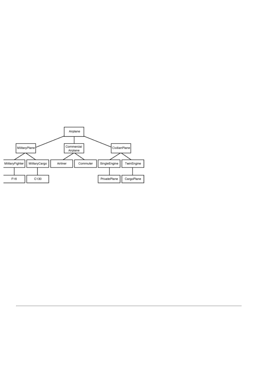
When you derive a class from another class, you must be sure to call the base class's constructor so that all ancestor classes are
properly initialized. Calling the base class constructor is also done with the inherited keyword. Look again at the constructor
for the TAirplane class:
constructor TAirplane.Create(AName : string; AKind : Integer);
begin
inherited Create;
Name := AName;
Kind := AKind;
Status := OnRamp;
case Kind of
Airliner : Ceiling := 35000;
Commuter : Ceiling := 20000;
PrivateCraft : Ceiling := 8000;
end;
end;
Notice that the base class Create constructor is called to ensure that the class is properly created. "Hey, wait a minute!" I can
hear some of you saying. "The TAirplane class doesn't have a base class!" Actually, it does. If no base class is specified when
the class is declared, the base class is automatically TObject. Be sure to call the base class constructor in your class
constructor. Figure 3.2 illustrates the concept of inheritance.
FIGURE 3.2.An example of inheritance.
You can see in Figure 3.2 that the class called F16 is descended from the class called MilitaryFighter. Ultimately, F16 is
derived from TAirplane because TAirplane is the base class for all of the airplane classes.
Class Keywords: is and as
Object Pascal has two operators that pertain specifically to classes. The is operator is used to determine whether a class is of a
specific type. Let's go back to the example of the TAirplane and TMilitaryPlane classes. Let's say you have an instance of a
class called Plane. The class might be an instance of the TAirplane class, it might be an instance of the TMilitaryPlane class, or
it might be an instance of a different class altogether. You can use the is operator to find out. For example:
if Plane is TMilitaryPlane then
Attack;
The is operator returns a Boolean value. If the variable is of the requested type, is
returns True. If the variable is not of the requested type, is returns False. The is
operator will also return True if the requested class type is an ancestor
of the variable. For example, because TMilitaryPlane is derived from TAirplane, the
following will be True:
if Plane is TAirplane then
DoSomething;
NOTE: Because all classes are derived from TObject, the following will always be True:
if AnyClass is TObject then
DoSomething;
The is operator is not used as much as the as operator. The as operator is used to cast a pointer to a specific class
type. It looks like this:
with Plane as TMilitaryPlane do
Attack;
The as operator is usually used in conjunction with the with operator (yes, this conversation is a bit confusing). In this code
snippet the Plane variable is a pointer that could be an instance of the TAirplane class, the TMilitaryPlane class, or neither. The
as operator is used to cast the pointer to a TMilitaryPlane type and then the Attack method is called. If the Plane variable is not
an instance of the TMilitaryPlane class (or one of its ancestor classes), this cast will fail and the Attack method will not be
called. If, however, the Plane variable is a pointer to an instance of the TMilitaryPlane class, the cast will succeed and the
Attack method will be called.
Summary
Today you have learned about classes in Object Pascal. A well-designed class is easy to use and saves many programming
hours. I'd even go so far as to say a well-designed class is a joy to use--especially when it's your own creation.
The lessons of these first three days are important to understand as you progress through this book. If they don't make
complete sense to you yet, don't despair. As you continue through the next days, you will see these concepts repeated and put
to use in programs that have more practical application than the short, incomplete examples you've been working with thus far.
CAUTION: Learning Object Pascal can and will lead to brain overload! It's natural and you shouldn't worry
about it. You might put down this book for the evening, turn out the lights, and think, "I'll never get it." Trust me,
you will.
Sometimes it's necessary to take a couple of days off and let it all soak in. In fact, if I thought I could get by with
it, I'd make Day 4 a blank chapter called "A Day of Rest." Take it a little at a time, and one of these days you'll be
just like Archimedes--you'll be running around your office or your house shouting "Eureka!" because the light just
came on in your head. But keep track of your clothes, will you? The neighbors could be watching.
Workshop
The Workshop contains quiz questions to help you solidify your understanding of the material covered and exercises to
provide you with experience in using what you have learned. You can find the answers to quiz questions in Appendix A,
"Answers to the Quiz Questions."
Q&A
Q How can I keep a method private to the outside world but enable derived classes to call it?
A Make it protected. A protected method is not accessible to users of your class but is accessible to derived classes.
Q What does data abstraction mean?
A Data abstraction means hiding the details of the class that the users of the class don't need to see. A class might have
dozens of fields and methods but only a few that the user can see. Only make visible (public) the methods that a user
needs to know about to use the class.
Q What is an object?
A Effectively, an object is any block of code that can be treated as a separate entity in your programs. An object in
Object Pascal generally means a class. In Delphi that definition is expanded to include VCL components. ActiveX
controls are also objects.
Q Can my class have more than one constructor?
A Yes. Your class can have as many constructors as needed.
Q Are all VCL objects pointers?
A Yes. Because all VCL objects are allocated from the heap, all VCL objects are pointers.
Q Pointers confuse me. Am I alone?
A No! Pointers are one of the most confusing aspects of Object Pascal programming. After you have used Delphi for a
period of time, you will come to understand pointers.

Quiz
1. How do you clear a set of all values?
2. What is the purpose of having private fields and methods?
3. How can you keep fields private and yet enable users to read and set their values?
4. When is a class's destructor called?
5. What does it mean to override a method of the base class?
6. How can you override a base class method and still get the benefit of the operation the base class method performs?
7. What operator is used to dereference a pointer?
8. Can a class contain other class instances as fields?
9. What keyword is used to specify a pointer that has no value?
10. What is the as keyword used for?
Exercises
1. Write a class that takes a person's height in inches and returns the height in feet.
2. Derive a class from the class in exercise 1 that also returns the height in meters, centimeters, or millimeters. (Hint:
There are 25.4 millimeters in an inch.)
3. Take a day off. You've earned it!
©

Teach Yourself Borland Delphi 4 in 21 Days
- 4 -
The Delphi IDE Explored
●
❍
❍
●
The Delphi Main Menu and Toolbar
●
Placing Multiple Copies of a Component
❍
Placing and Centering a Component on the Form
❍
The Component Palette Context Menu
❍
Navigating the Component Palette
❍
●
❍
Compiling, Building, and Linking
❍
●
Compiling and Building Other Object Pascal Programs
●
❍
❍
Secondary Windows Versus Dialog Boxes
❍
The Multiple Document Interface Model
❍
❍
❍
❍
❍
●
❍
❍
❍
●
❍
Experimenting with Dockable Windows
❍
❍
●
❍
Writing Code for the File | Open and File | Save As Menu Items
❍
Writing Code for the Window Menu
❍
●
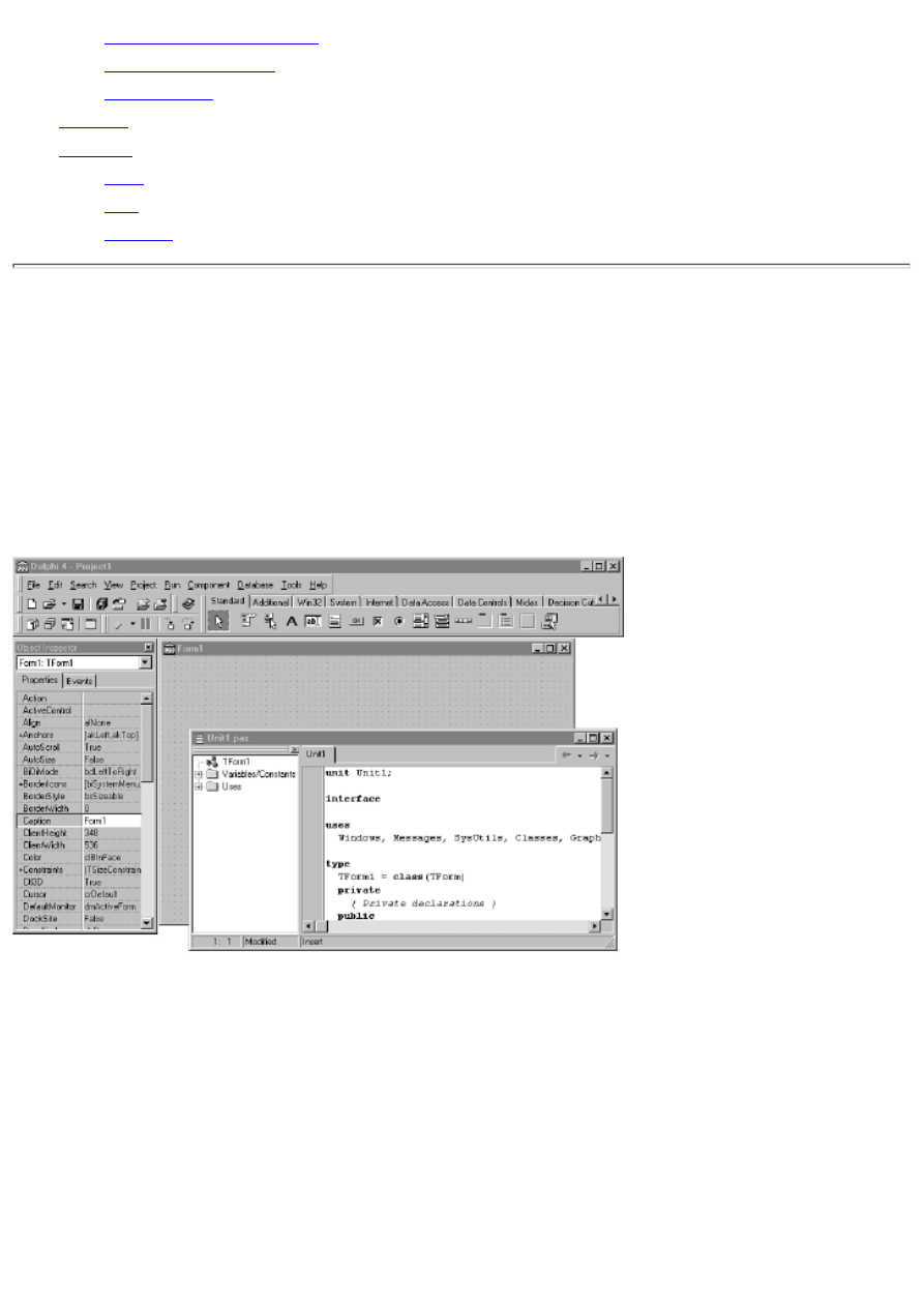
❍
❍
❍
●
❍
❍
❍
●
One of the most difficult aspects of learning how to use a new programming environment is finding your way around: getting
to know the basic menu structure, what all the options do, and how the environment works as a whole. If you are new to
programming or new to Object Pascal, this task is complicated by the fact that you have to learn a new program (the Delphi
IDE) and learn a new language at the same time. It can be overwhelming at times. I'll do my best to make learning the Delphi
IDE an enjoyable experience. For the most part, you will learn by example, which is more interesting (not to mention more
effective).
The Delphi IDE
So, without further ado, take a look at Figure 4.1 and let's get on with it. Oh, by the way, if you have used Delphi before, you
might find this chapter elementary. If that is the case, you might want to at least skim the chapter lightly to catch any tidbits
that you did not previously know, particularly features that are new to Delphi 4.
FIGURE 4.1.The Delphi IDE.
The Delphi IDE consists of these main parts:
The main menu and toolbars
●
The Component palette
●
The Form Designer
●
The Code Editor
●
The Object Inspector
●
The Code Explorer
●
The Project Manager
●

I can't cover all these in a single chapter, so over the next several chapters I will show you around the Delphi IDE and
examine each of these features in detail. I'll start today by discussing projects and how they are used in writing Delphi
applications. After that you'll look at the Delphi toolbar and the Component palette. Then I'll move to discussing forms in
greater detail than I have up to this point.
Along the way you'll create some sample programs to illustrate various aspects of Delphi. You'll also take a closer look at the
Object Inspector. This will be a warm-up for Day 6, "Working with the Form Designer and the Menu Designer," when you
learn all about the Delphi Form Designer. Later today, I will cover the IDE's dockable windows. Dockable windows make it
easy to customize the IDE to suit your tastes and your work style.
For starters, let's look at the way Delphi views applications and how it has simplified the process of creating programs.
Projects in Delphi
As you know by now, a lot goes on behind the scenes as you write a Delphi application. In fact, more goes on than I have
told you about up to this point. It's not vital that you know every detail about what happens behind the scenes as you write a
Delphi application, but it is a good idea to have a general overview.
New Term: A project is a collection of files that work together to create a standalone executable file or dynamic link library
(DLL).
New Term: In addition to a single project, Delphi enables you to create what is known as a project group. A project group is
a collection of Delphi projects.
A project group is used to manage a group of Delphi projects that work together to form a complete software product. I'll talk
about project groups in more detail on Day 9, "Projects, the Code Editor, and the Code Explorer." For now, you only need to
understand that Delphi creates a new, unnamed project group for you each time you start Delphi (provided you haven't turned
on the option to save the desktop when you close Delphi). Any new projects you create will go into that project group. You
can save the project group if you like, or you can treat the default project group as temporary.
Files Used in Delphi Projects
Delphi manages a project through the use of several support files. To illustrate, let's create a simple application to get a look
at some of what goes on when Delphi builds an executable file for your program. Perform the following steps:
1. Before you begin, create a fresh directory on your hard drive. (You can name the directory anything you like.)
2. First choose File | Close All from the main menu so that you are starting from scratch. Now choose File | New
Application from the main menu. A blank form is displayed.
3. Choose File | Save All from the main menu. You will be prompted for the name of the unit file. Be sure to navigate
to the empty directory you just created.
4. Type the name MyUnit for the unit filename and click the Save Button.
5. Now you are prompted for the project name. Type Test in the File Name field and click Save.
6. Choose Project | Build Test from the main menu. Delphi compiles the program. (It takes just a few seconds.)
7. Choose File | Close All from the main menu. (Yes, this exercise does have a purpose.)
8. Now run Windows Explorer and locate the directory where you saved the project. You will see a number of files.
You should see a total of about eight files. (The exact number depends on the Delphi IDE options.) First, let me tell you what
happens when Delphi builds an application; then I'll explain what each of these files is for.
NOTE: Files with extensions that begin with a tilde (~) are backup files. Delphi might create several backup
files depending on the number of source files in the project and the project options you have set. Project options
are discussed on Day 9.
When you first create a project, Delphi creates a minimum of four files (assuming a typical Delphi GUI application):
The project source file
●
The main form unit
●
The main form resource file
●
The project resource file
●
The project source file is the file that contains the Delphi startup code. You can view the project source file by choosing
Project | View Source from the main menu. The main form unit contains the class declaration and definition for the main
form's class. Delphi will create an additional unit file for each new form you create. The main form resource file and project
resource file are binary files that describe the main form and the application's icon.
When you tell Delphi to compile the project, it compiles the project source, the main form unit, and any other units in the
project. Several things happen during this process. First, the Object Pascal compiler compiles the project's units into binary
object files. Then, the resource compiler compiles any resources, such as the program's icon and form files, into binary
resource files. Next, the linker takes over. The linker takes the binary files the compiler created, adds any library files the
project needs, and binds them all together to produce the final executable file. When it's all over, you have a stand-alone
program that can be run in the usual ways.
Okay, but what are all those files for? Table 4.1 lists the file extensions Delphi uses with a description of the role that each
file type plays.
TABLE 4.1. TYPES OF FILES USED IN DELPHI.
Extension Description
.pas
The Object Pascal source files. There will be one for each unit, as well as any other source files that you add to
the project.
.dfm
The form file. This file is actually a binary resource file (.res) in disguise. It is a description of the form and all its
components. Each form has its own .dfm file.
.dsk
The project desktop file. This file keeps track of the way the desktop appeared when you last saved (or closed)
the project. All the open windows' sizes and positions are saved so that when you reopen the project it looks the
same as you left it. This file is created only if you turn on the option to save your desktop (Environment Options
dialog box).
.dof
The project options file. This file contains the project options as set in the Project Options dialog.
.exe
The final executable program.
.cfg
The project configuration file. This file primarily contains the current compiler and linker settings for the project.
.dcu
The compiled binary object files. These are the files that the compiler produces when it compiles your Object
Pascal units.
.dpr
The project source file.
.res
The compiled binary resource file.
NOTE: Delphi has other associated file extensions as well. For example, the .bpg extension is used to denote a
project group, the .dpk extension is used to designate a Delphi package source file, and the .bpl extension
represents a compiled package. Packages are discussed in detail on Day 8, "Creating Applications in Delphi,"
and project groups are discussed on Day 9.
The files that Delphi produces can be divided into two categories: files Delphi relies on to build the project and files that
Delphi creates when it compiles and links a project. If you were to move your source files to another computer, for example,
you wouldn't have to move all the files, just the files Delphi needs to build the application. Conveniently, the source files
happen to be the smallest files in the project. It does not take a lot of disk space to back up just the project source files.
The minimum set of files consists of the .pas, .dfm, and .dpr files. All other files are files that Delphi will re-create when you
compile the program. The desktop file (.dsk) is one that you might want to hang on to because it keeps track of the state your
project was in when you last worked on it.
NOTE: In addition to the source files I've mentioned, some applications use a resource script file (resource
scripts have an .rc extension). Resource scripts are text files that are used to define resources such as bitmaps,
icons, or cursors. If you use a resource script, be sure to keep it with the project if you move the project to
another location. Resource script files are not commonly used with Delphi projects.
Figure 4.2 illustrates how Delphi compiles source files and links them to form the final executable file.
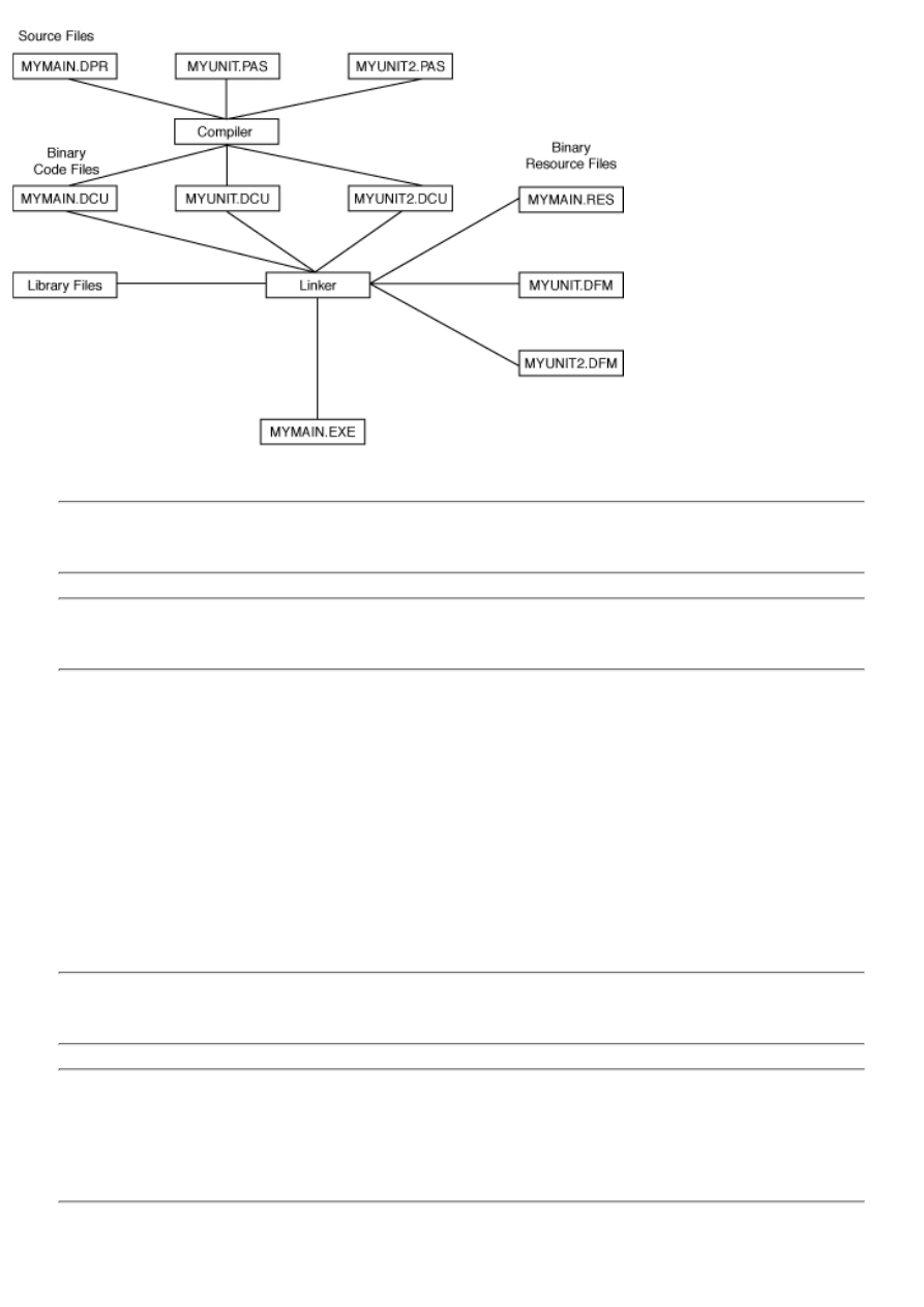
FIGURE 4.2. The Delphi compile/link
process.
TIP: If you find yourself running low on hard disk space, you can delete some of the Delphi files from projects
you are not currently working on. It is safe to delete the files with a .dcu extension. These files will be
regenerated when the project is built, and there is no use in keeping them for noncurrent projects.
CAUTION: Do not delete any files from the Delphi directories other than the Examples directory. If in doubt,
don't delete!
Source Code Units
Earlier I mentioned that most applications of any size have several source files, which are called units. Each time you create a
new form, Delphi does the following:
Creates a form file (.dfm)
●
Derives a class from TForm
●
Creates a unit (.pas file) for the class definition
●
Adds the new form information to the project source
●
Initially Delphi assigns a default name of Form1 to the form and Unit1.pas to the form's unit. The second form created for the
project would have a default name of Form2, and so on. Each time you create a new form, Delphi creates a new unit (.pas)
and form file (.dfm) for that form.
NOTE: As soon as you create a new project, you should save it with a meaningful name. Likewise, every time
you create a new form, you should save it with a descriptive name. This makes it easier to locate forms and units
when you need to make modifications. Remember, you can use long filenames when naming your units.
NOTE: When writing a technical book, a difficult situation often arises. I want to use meaningful examples to
reinforce the presentation of information. In order to write those examples, I have to use techniques or methods
that I haven't talked about yet. But I can't talk about those methods until I've given you some good, meaningful
examples. But I can't...well, you see my dilemma. So I'm going to digress a little here and talk about the main
menu, toolbar, and Component palette. As you read the next section, remember that I'm off on a tangent, but for
a good reason.
The Delphi Main Menu and Toolbar
The Delphi main menu has all the choices necessary to make Delphi work. Because programming in Delphi is a highly visual
operation, you might not use the main menu as much as you might with other programming environments. Still, just about
anything you need is available from the main menu if you prefer to work that way. I'm not going to go over every item on the
main menu here because you will encounter each item as you work through the next several chapters.
The Delphi toolbars provide a convenient way of accomplishing often-repeated tasks. A button is easier to locate than a menu
item, not to mention that it requires less mouse movement. The Delphi main window toolbars are illustrated in Figure 4.3.
(The Component palette has been removed for clarity.)
FIGURE 4.3.The Delphi main window
toolbars.
If you are like me, you often forget to use the toolbar. But I'm telling you: Don't forget to learn and use the toolbar! As the
old saying goes, "Do as I say, not as I do." If you take the time to learn the toolbar, it will save you time and make you more
efficient in the long run. One of the reasons you bought Delphi was to produce Windows applications quickly, so you might
as well make the most of it.
The Delphi toolbar is fully customizable. You can place the toolbars anywhere you want on the main window. You can
rearrange the placement of the menu, the toolbars, or the Component palette to suit the way you work.
Customizing the toolbars is remarkably easy. Delphi enables you to add buttons to the toolbar, remove buttons, and rearrange
buttons however you see fit. To configure a toolbar, right-click on the toolbar to display the context menu. Choose Customize
from the context menu. When you choose this menu item, the Customize dialog box is displayed.
The Customize dialog box contains three tabs:
The first tab, Toolbars, shows you the toolbars available with a check mark next to toolbars that are currently visible.
You can add or remove existing toolbars or reset the toolbars to their original default settings.
●
The second tab, labeled Commands, shows all the available toolbar buttons. To add a button to the toolbar, just locate
its description in the Commands list box and drag it to the place you want it to occupy on any toolbar. To remove a
button from a toolbar, grab it and drag it off the toolbar. It's as simple as that. Figure 4.4 shows the act of adding a
button to a toolbar. If you really make a mess of things, simply go back to the Toolbars page and click the Reset
button. The toolbar will revert to its default settings.
●
FIGURE 4.4.Customizing the toolbar.
The third tab, Options, contains options such as whether the tooltips are displayed and how they are displayed.
●
Feel free to customize the Delphi IDE any way you like. It's your development environment, so make it work for you.

Using the Component Palette
The Delphi Component palette is used to select a component or other control (such as an ActiveX control) in order to place
that control on a form. The Component palette is a multipage window. Tabs are provided to enable you to navigate between
pages. Clicking on a tab displays the available components or controls on that page.
Placing a component on a form is a two-step process. First, go to the Component palette and select the button representing
the component you want to use. Then click on the form to place the component on the form. The component appears with its
upper-left corner placed where you clicked with the mouse.
You have already seen the Component palette's basic operations, but it has a couple of other features that you haven't seen
yet. The following sections explain these features.
Placing Multiple Copies of a Component
So far you have placed only one component at a time on a form. You can easily place multiple components of the same type
without selecting the component from the Component palette each time. To place multiple components on a form, press and
hold the Shift key as you select the component from the Component palette. After you select the component, you can release
the Shift key.
The component's button on the Component palette will appear pressed and will be highlighted with a blue border. Click on
the form to place the first component. Notice that the button stays pressed on the Component palette. You can click as many
times as you like; a new component will be placed each time you click the form. To stop placing components, click the
selector button on the Component palette (the arrow button). The component button pops up to indicate that you are done
placing components.
Seeing is believing, so follow these steps:
1. Create a new project.
2. Press and hold the Shift key on the keyboard and click the Label component button in the Component palette.
3. Click three times on the form, moving the cursor each time to indicate where you want the new component placed.
A new Label is placed on the form each time you click.
4. Click the arrow button on the Component palette to end the process and return to form design mode.
TIP: It's fastest to place all components of a particular type on your form at one time using this technique.
Components can always be rearranged and resized at a later time.
NOTE: When placing multiple copies of a particular component, it's easy to forget to click the arrow button
when you're done. If you accidentally place more components than you intend, you can simply delete any extras.
Placing and Centering a Component on the Form
Delphi provides a shortcut method of placing a component on a form. Simply double-click the component's button in the
Component palette and the component will be placed on the form. The component will be centered on the form both
horizontally and vertically. Components placed with this method can be moved to another location on the form just like
components placed in the usual method.
NOTE: Each time you double-click a button on the Component palette, a component will be placed on the
center of the form in the component's default size. If you repeatedly double-click the component button, multiple
copies of the component will be placed on the form. Each component will be placed in the center of the form
and will be stacked on top of the previous one. It will appear as if you have a single component, so you might
not realize that you have several components occupying the same space. If you accidentally place multiple
components, just click the extra components and delete them from the form.
The Component Palette Context Menu
When you place the mouse cursor over the Component palette and right-click, you will see a menu specific to the Component
palette (see Figure 4.5).
FIGURE 4.5.The Component palette context menu.
The Show Hints item toggles the tooltips on and off for the component buttons. Unless you really dislike tooltips, this should
be left on. The Hide item on the context menu hides the Component palette. In order to show the Component palette again,
you have to choose Component Palette from the toolbar context menu.
The Help item on the context menu brings up Delphi help with the Component Palette page displayed. The Properties item
brings up the Palette page of the Environment Options dialog box, where you can customize the Component palette. Here
you can add and remove pages of the Component palette. You can also add, remove, or rearrange the order of components on
the individual pages. I'll discuss this in more detail on Day 11, "Delphi Tools and Options," when you learn about setting the
environment options.
Navigating the Component Palette
When the Component palette is sized small enough so that it cannot display all its tabs, you will see scroll buttons in the
upper-right corner of the Component palette. Click these scroll buttons to display tabs not currently in view. Likewise, if a
particular page of the Component palette contains more buttons than will fit the width of the display window, scroll buttons
will be enabled to allow you to scroll through the available buttons. Figure 4.6 shows the Component palette with both types
of scroll buttons enabled.
FIGURE 4.6.The Component palette
scroll buttons.
The Component palette is not terribly complicated, but a basic understanding of its use is vital for programming with Delphi.
Now that you've finished with this quick overview of the Delphi main window, you can return to the main topic again.
A Multiple-Form Application
To illustrate how Delphi uses units, you can create an application with multiple forms. You'll create a simple application that
displays a second form when you click a button:
1. Create a new project by choosing File | New Application from the main menu.
2. Change the Name property to MainForm and the Caption property to Multiple Forms Test Program.
3. Save the project. Save the unit as Main and the project as Multiple.
4. Now place a button on the form. Make the button's Name property ShowForm2 and the Caption property Show
Form 2.
5. Choose File | New Form from the main menu (or click the New Form button on the toolbar) to create a new form. At
this point, the new form has a name of Form1 and is placed exactly over the main form. You want the new form to be
smaller than the main form and more or less centered on the main form.
6. Size and position the new form so that it is about 50 percent of the size of the main form and centered on the main
form. Use the title bar to move the new form. Size the form by dragging the lower-right corner.
7. Change the new form's Name property to SecondForm and the form's Caption property to A Second Form.
8. Choose File | Save from the main menu (or click the Save File button on the toolbar) and save the new form with the
name Second.
9. Choose a Label component and drop it on the new form. Change the label's Caption property to This is the second
form. Change the label's size and color as desired. Center the label on the form. Your form should now look roughly
similar to the one shown in Figure 4.7.
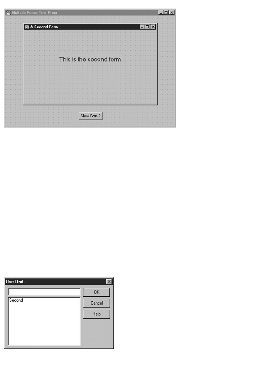
FIGURE 4.7.The form up to this point.
10. Click on the main form. The second form is covered by the main form. Double-click the Show Form 2 button. The
Code Editor is displayed and the cursor is placed just where you need to begin typing code (double-clicking a button is
a shortcut way of generating an OnClick event handler).
11. Type in code so that the function looks like this (you have to type only one line of code):
procedure TMainForm.ShowFrom2Click(Sender: TObject);
begin
SecondForm.ShowModal;
end;
12. Run the program.
At this point you get a message box that says, Form `MainForm' references form `SecondForm' declared in unit `second'
which is not in your USES list. Do you wish to add it? Click Yes and Delphi will add the unit Second to the uses list of the
unit Main. Click the Run button again and this time the application will run. When you click the Show Form 2 button on the
main form, the second form is displayed. You can close the second form by clicking the system close box on the form's title
bar.
Adding Units
Rather than having Delphi prompt you to add a unit to your uses list, you can add units yourself. You can manually type the
unit name in the uses list for the form, or you can choose File | Use Unit from the main menu. When you choose the latter
method, the Use Unit dialog box is displayed, as shown in Figure 4.8. The Use Unit dialog box shows a list of available units.
Choose the unit you want to add and click OK. Delphi will add the unit to the current form's uses list. Note that the Use Unit
dialog box will show only those units that exist in the project and have not yet been included in this unit. Units that have
already been included do not show up in the list of available units.
FIGURE 4.8.The Use Unit dialog box.

As you can see, Delphi does a good job of managing units for you. Later, when your programming needs are more
sophisticated, you'll have to do a little more source file management, but at this stage of the game Delphi does most of the
work for you.
Now let's take a moment to look at the different compiling options available to you when writing programs in Delphi.
Compiling, Building, and Linking
Each time you click the Run button, Delphi compiles and links your program. But it doesn't necessarily compile every unit in
the project. It only compiles any units that have changed since the last compile. This feature saves you time because you don't
have to wait for the compiler to compile files that haven't changed. Delphi keeps track of which files have changed and which
haven't, so you don't need to do anything special to use this feature--it's automatic.
Most of the time you want to see the results of any changes you have made in action. In those cases, click the Run button and
the program is compiled, linked, and executed. Sometimes, however, you don't want to run the program. For example, you
might just want to compile the program to see whether there are any errors.
Delphi has three menu items in addition to Run that enable you to control the compile/link process. If you choose the Project
menu item on the main menu, you see three menu items called Compile, Build, and Syntax Check. These menu items' text
changes to reflect the name of the active project. For example, when you first start Delphi, these menu items will say
Compile Project1, Build Project1, and Syntax Check Project 1. (There are also menu items called Compile All Projects and
Build All Projects, but I'll save that discussion for Day 9 when I discuss project groups.) Let's take these in order of simplest
to most complex (from the compiler's perspective):
The Syntax Check option is one I really like. This feature causes Delphi to compile the project and report any errors
and warnings. This is the fastest way to check for errors in your code. Delphi only compiles the project--it does not
perform a link. The purpose of the Syntax Check option is to check your code for syntax errors as quickly as possible.
Because the link phase takes extra time, the Syntax Check option skips that step.
●
The Compile option compiles any units that have changed since the last compile just as Syntax Check does, but it also
links the entire project. Naturally, this takes slightly longer than the Syntax Check option. Use the Compile option
when you want to be sure the program will compile and link but you don't want to run the program.
●
TIP: The keyboard shortcut for the Compile option is Ctrl+F9.
The Build option takes the longest to perform. This option compiles every unit in the project regardless of whether it
has changed since the last build. After compiling all units, Delphi links the entire project.
●
So far, you have been letting Delphi add units to your projects. Further on down the road you might have to do some
hand-editing of your source files to add units or compiler directives. You might even end up editing the project source. From
time to time things can get goofed up (hey, we all make mistakes). Performing a build will bring everything up-to-date so that
you can better sort out any problems you might be running into. Sometimes a build resolves compiler and linker errors
without the need for you to do anything further.
TIP: Any time you get unexpected (out of the ordinary) compiler or linker errors, first try a build. It could just
be that something is out of sync, and a build might cure it. If performing a build doesn't fix the problem, you'll
have to go to work figuring out where the problem lies.
Delphi gives you the option of displaying a compile status dialog box during compiles. You can turn on this option through
the Environment Options dialog box (Preferences page). When this option is on, the compile status dialog box shows the
filename of each unit as the unit is being compiled. If there are errors, the compile status dialog box will report There are
errors and will list the number of errors that were detected as well as any warnings.
Figure 4.9 shows the compile status dialog box after detecting errors. Delphi compiles your projects so quickly that the
compile status dialog box is not generally necessary. In fact, the compile status dialog box will increase your compile times
because it takes time to display information in the compile status dialog box.
FIGURE 4.9.The compile status dialog box reporting
errors.
Regardless of the method chosen to compile the project, if errors are detected, the Code Editor will come to the top and the
message window at the bottom of the Code Editor will show a list of errors and warnings. The Code Editor highlights the line
where the first error occurred. After a successful syntax check, compile, or build, you can immediately run the program via
the Run button if you choose.
Compiling and Building Other Object Pascal Programs
Delphi's strength is in its visual programming environment. That environment is tied directly to VCL and cannot be separated
from it. To get the most out of Delphi, you will most likely be writing applications based on VCL. There are times, however,
when you might want to write other types of applications.
New Term: A dynamic link library (DLL) is an external file that contains code that can be executed from a program or from
another DLL.
Probably the most obvious type of "other" program you might want to build is a DLL. DLLs might seem a bit like black
magic, but they are really not very complicated: They are simply bits of compiled code that you can call from your
application. After you create the DLL, calling a function contained in a DLL is no different than calling a function contained
in your main program. That's a bit of an oversimplification, but it is still accurate. DLLs are discussed on Day 19, "Creating
and Using DLLs."
Another type of application you might write with Delphi is a Win32 console application.
New Term: A Win32 console application is a 32-bit program that runs in a DOS box under Windows 95 or Windows NT.
Console applications are useful for small utility programs, servers such as TCP/IP servers or mail servers, and a whole host of
other possibilities. Basically, any application that does not require a graphical interface is a good candidate for a console
application.
More About Delphi Forms
Before I continue with the discussion about the Delphi IDE, I need to spend some time explaining forms. You have seen
several forms in action as you have worked through this book, and on Day 6 you are going to learn all about the Form
Designer. Before you get there, you need some more background information on forms, so I'll cover that now.
Main Window Forms
Forms are the main building block of a Delphi application. Every GUI application has at least one form that serves as the
main window. The main window form might be just a blank window, it might have controls on it, or it might have a bitmap
displayed on it. In a typical Windows program, your main window would have a menu. It might also have decorations such
as a toolbar or a status bar. Just about anything goes when creating the main window of your application. Each application is
unique, and each has different requirements.
Dialog Box Forms
Forms are also used for dialog boxes. In fact, to the user there is no difference between a Delphi form acting as a dialog box
and a true dialog box. (By "true dialog box" I mean a dialog box created the traditional way with a resource editor and a
resource script file. This is how dialog boxes are created in some other programming environments. Delphi doesn't use
traditional dialog boxes, so you will likely never have to deal with dialog boxes on this level.) Dialog boxes usually have
several traits that distinguish them from ordinary windows:
Dialog boxes are not usually sizable. They usually perform a specific function, and sizing of the dialog box is neither
useful nor desirable.
●
Dialog boxes almost always have an OK button. Some dialog boxes have a button labeled Close that performs the
same task. A simple dialog box such as an About dialog box typically has only the OK button.
●
Dialog boxes can also have a Cancel button and a Help button.
●
Dialog boxes typically have only the system close button on the title bar. They do not usually have minimize and
maximize buttons.
●
Some dialog boxes are tabbed dialog boxes that display several tabs from which the user can choose. When a tab is
clicked, a different page of the dialog box is displayed.
●
The Tab key can be used to move from one control to the next in most dialog boxes.
●
There are certainly exceptions to every rule. Most dialog boxes have the usual characteristics, but some dialog boxes perform
specialty tasks and as such depart from the norm in one way or another.
Dialogs the Old-Fashioned Way
In a traditional Windows program (one written in Borland Pascal or using a framework such as OWL), a dialog box is created
with a dialog box editor. In most cases, the dialog box editor is a visual tool that works somewhat like the Delphi Form
Designer. When the user is done designing the dialog box, the visual representation of the dialog box is converted into a
dialog box definition in a resource script file. To illustrate, take a look at the dialog box shown in Figure 4.10.
New Term: A resource script is a text file that is later compiled into a binary resource file by the resource compiler.
FIGURE 4.10.A typical About dialog box.
Figure 4.10 shows a typical About dialog box. It contains the program name, the copyright information, and the application's
icon. The resource script definition for the dialog box is shown in Listing 4.1.
LISTING 4.1. A DIALOG BOX RESOURCE DEFINITION.
1: IDD_ABOUT DIALOG 58, 53, 194, 119
2: STYLE DS_MODALFRAME or WS_POPUP |
3: WS_VISIBLE or WS_CAPTION or WS_SYSMENU
4: CAPTION `About TMMPlayer Example Program'
5: FONT 8, `MS Sans Serif'
6: {
7: DEFPUSHBUTTON `OK', IDOK, 72, 96, 50, 14
8: CTEXT `TMMPlayer Example Program', -1, 48, 22, 128, 8
9: CTEXT `Copyright © 1996, by Kent Reisdorph', -1, 32, 47, 136, 8
10: CTEXT `March 15, 1996', -1, 24, 59, 146, 8
11: CONTROL `', 99, `button', BS_GROUPBOX |
12: WS_CHILD or WS_VISIBLE or WS_GROUP, 12, 4, 176, 70
13: CONTROL 1, 1, `static', SS_ICON |
14: SS_SUNKEN or WS_CHILD or WS_VISIBLE, 24, 17, 20, 20
15: }

The resource script contains information that Windows uses to build the dialog box at runtime. This information includes the
number and type of controls on the dialog box, their size, position, text, options, and so on. Of course, the resource script also
includes the same type of information for the actual dialog box.
Some Windows programmers don't use a dialog box editor at all, but prefer to write the dialog box definition from scratch
with a text editor. Although I can't fault those programmers for creating dialog boxes in that manner, I can say that for most
programmers to take that approach would be, er..., less than 100 percent efficient. It takes many times longer to create a
dialog box in that manner as opposed to the visual approach.
Usually, all the application's dialog box definitions are contained in a single resource script file that has a filename extension
of .rc. At some point in the program-creation process, the resource script is compiled into a .res file (the binary resource file),
which then is linked to the .exe by the linker. At runtime the dialog box is displayed either modally or modelessly depending
on the dialog box's intended purpose. When the dialog box is invoked, Windows loads the dialog box resource from the
executable file, builds the dialog box, and displays it.
Dialog Boxes the Delphi Way
In Delphi, dialog boxes are simply another form. You create a dialog box just like you do a main window form or any other
form. To prevent the dialog box from being sized, you can change the BorderStyle property to bsDialog or bsSingle. If you
use bsDialog, your dialog box will have only the close box button on the title bar, which is traditional for dialog boxes. Other
than that, you don't have to do anything special to get a form to behave like a dialog box. All Delphi forms have tabbing
support built in. You can set the tab order by altering the TabOrder property of the individual controls on the dialog box.
New Term: A modal dialog box is one that must be dismissed before the user can continue using the application. The main
window of an application is disabled while this type of dialog box is open. Most dialog boxes are modal.
New Term: A modeless dialog box is one that allows the user to continue to work with the application while the dialog box
is displayed. The Find dialog box in some word-processing programs is an example of a modeless dialog box.
A Delphi dialog box (any Delphi form, actually) is modal or modeless depending on how it is displayed. To execute a modal
dialog box, you call the ShowModal method of TForm. To create a modeless dialog box, you call the Show method.
Creating a Dialog Form
You can now add an About box to the multiple-forms project you created earlier. If you don't have that project open, choose
File | Open Project from the main menu or click the Open Project button on the toolbar and locate the file. (You should have
saved it with the project name of Multiple.)
TIP: Delphi keeps a list of the files and projects you have used most recently. Choose File | Reopen to view the
MRU (most recently used) list. The MRU list is divided into two parts. The top part shows the projects you have
used most recently, and the bottom part shows the individual files that you have used most recently. Just click on
one of the items to reopen that project or file.
First you'll add a button to the form that displays the About dialog box:
1. Bring the main form into view. Choose the Button component from the Component palette and drop a button on the
form.
2. Arrange the two buttons that are now on the form to balance the look of the form.
3. Change the Name property of the new button to AboutButton and the Caption property to About....
4. Double-click the AboutButton you just created on the form. The Code Editor is displayed with the cursor placed in
the event-handler function. Add this line of code at the cursor:
AboutBox.ShowModal;
You haven't actually created the About box yet, but when you do you'll name it AboutBox, so you know enough to type the
code that will display the About box.
Now create the dialog box itself by following these steps:
1. Create a new form (click the New Form button on the toolbar). Size the form to the size of a typical About box
(roughly the same size as the form named SecondForm you created earlier).
2. Change the Name property to AboutBox and change the Caption property to About This Program.
3. Locate the BorderStyle property (it's just above Caption) and change it to bsDialog.
4. Now add three text labels to the box. Edit the labels so that the About box resembles the one shown in Figure 4.11.
(You can type any text you want, of course.) You can leave the default names Delphi generates for the text labels'
Name properties. You aren't actually going to do anything with the Name property, so you don't need a descriptive
name.
FIGURE 4.11.The About box with text labels added.
TIP: The copyright symbol (") has an ASCII value of 169 in most typefaces. To create the copyright symbol,
press and hold the Alt key and type the numbers 0169 on the numeric keypad (be sure Num Lock is on). When
you let go of the Alt key, the copyright symbol appears. You can insert the ASCII value of any character this
way. You must type all four numbers, though. For example, the ASCII value of a capital A is 65. To insert an A,
you have to hold down Alt and type 0065 on the numeric keypad.
Next, you can add an icon to the About box:
1. Click the Additional tab on the Component palette and choose the Image component. Place the component to the left
of the text on the form.
2. Locate the AutoSize property for the Image component and change it to True.
3. Locate the Picture property and double-click the Value column. The Picture Editor dialog box is displayed.
4. Click the Load button. In the File Open dialog box, navigate to the \Borland Shared Files\Images\Icons directory and
choose an icon from the icon files listed. Click Open. The icon you selected is displayed in the Picture Editor window.
Click OK to close the Picture Editor. The icon is displayed on the form. Note that the Image component has sized itself
to the size of the icon.
5. Position the icon as desired.
At this point you need an OK button on the form. Let's branch out a little and take a look at a new component:
1. If you're not already there, click the Additional tab on the Component palette. Select the BitBtn component and
place a BitBtn on the form near the bottom and center it horizontally.
2. Locate the Kind property and change it to bkOK. Notice that a green check mark has appeared on the button and the
Caption property has changed to OK. That's all you have to do with the button. The BitBtn component already includes
code to close the form when the OK button is clicked.
Let's add one final touch to the About box:
1. Locate the Bevel button (on the Additional tab in the Component palette) and click it.
2. Move to the form, but rather than clicking on it, drag a box around the three text labels. The Bevel component
appears when you stop dragging. If you didn't get it quite right, you can resize or reposition the component.
3. Locate the Shape property and change it to bsFrame. You now have a 3D frame around the static text.
Your form should now look something like the one shown in Figure 4.12. Save the unit (File | Save) and give it the name
About.
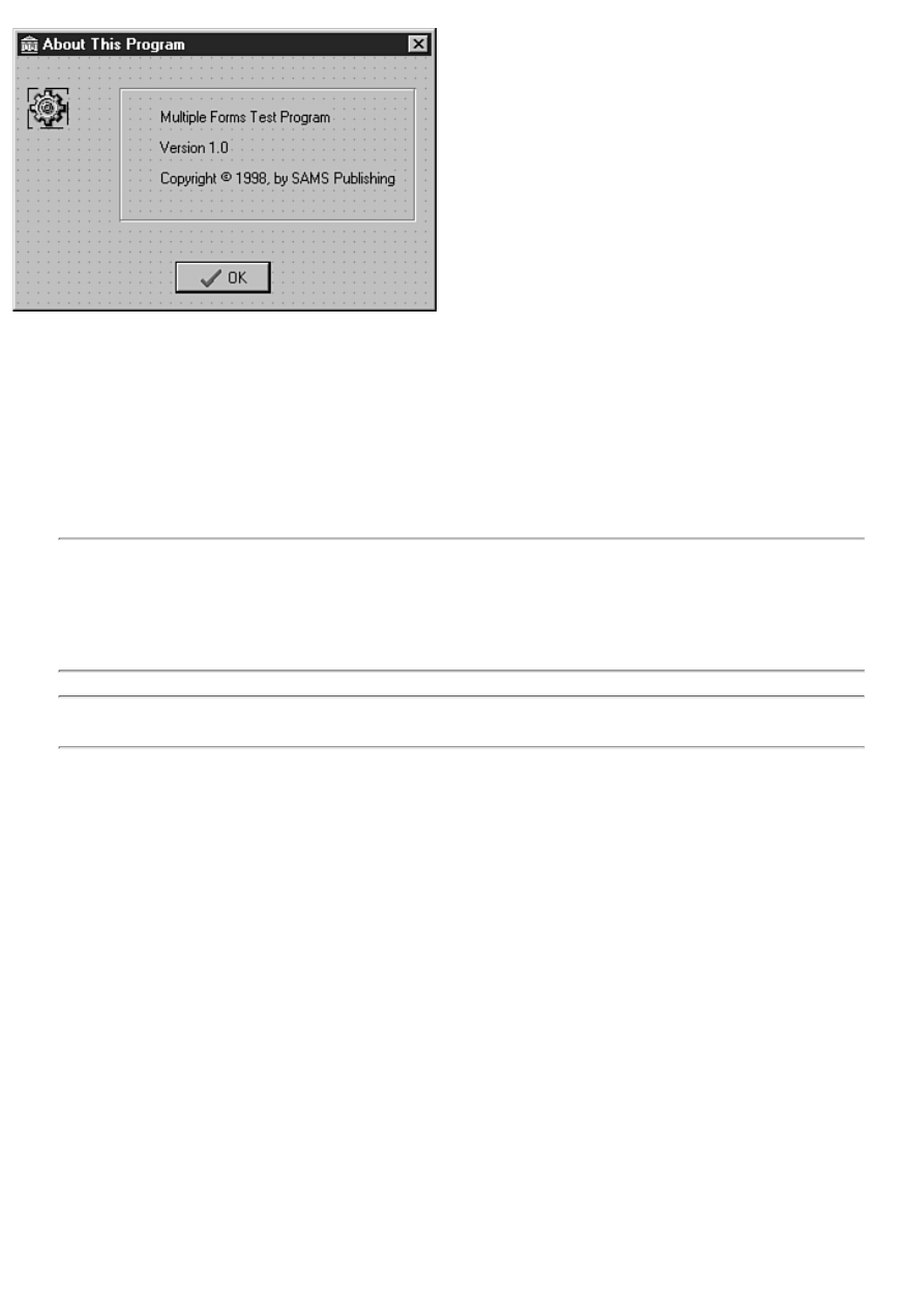
FIGURE 4.12.The finished About box.
Are you ready to compile and run the program? Not yet. You need to add the About unit to the main form's uses list. Perform
these steps:
1. Switch to the Code Editor (press F12) and select the Main.pas tab.
2. Choose File | Use Unit from the main menu.
3. Choose the About unit from the Use Unit dialog box and click OK.
Now you're ready to run the program, so click the Run button. When the program runs, click the About button, and the About
dialog box is displayed. Note that the dialog box is modal (you can't go back to the main window while the dialog box is
displayed) and that it cannot be sized. The About form behaves in every way like a regular Windows dialog box.
NOTE: The common dialog box classes (TOpenDialog, TSaveDialog, TFontDialog, and so on) do not represent
dialog boxes created as Delphi forms. Windows provides these dialog boxes as a set of common dialog boxes
that all Windows applications can use (the actual dialog boxes are contained in a file called COMDLG32.DLL).
The VCL dialog box classes encapsulate the common dialog boxes to make using them easier. Encapsulate in
this sense means to take a common dialog box's functionality and roll it into a VCL component. The component
makes it much easier to use the dialog box than it would otherwise be.
NOTE: Delphi includes several prebuilt forms that you can choose from to help you build dialog boxes as
quickly as possible. I'll discuss those on Day 8.
Secondary Windows Versus Dialog Boxes
A secondary window is a form that you display from your main window. So when is a form a secondary window and when it
is a dialog box? When it really comes down to it, there is no difference between a secondary window and a dialog box in
Delphi. You might have windows that resemble dialog boxes, and you might have other windows that resemble a traditional
window.
In the grand scheme of things, they all are forms and it doesn't make much sense to differentiate between the terms dialog
box and secondary form. It's all the same in the end. In traditional programming environments, you have to specifically create
a dialog box or specifically create a secondary window in an application. Delphi frees you from that restriction and enables
you to treat both dialog boxes and windows exactly the same.
The Multiple Document Interface Model
So far, you have built only single document interface (SDI) applications. An SDI application has a single main window and
typically displays dialog boxes as needed, but does not otherwise display child windows.
New Term: Some programs follow the multiple document interface (MDI) model. MDI applications consist of a main
window (the MDI parent) and child windows (the MDI children).
Examples of programs that use the MDI model are the Windows System Configuration Editor (SYSEDIT) and the Windows
3.1 Program Manager.
One of the most obvious characteristics of the MDI model is that the MDI child windows are confined to the parent. You can
drag the child windows within the parent window, but you cannot drag them outside the parent. MDI applications almost

always have a Window item on their main menu. This menu usually contains items named Cascade and Tile, which enable
you to display the MDI child windows in either a cascaded or tiled arrangement. When an MDI child is minimized, its icon is
contained within the MDI parent's frame. When a regular (non-MDI) child window is minimized, its icon is placed on the
Windows desktop.
To create an MDI application in Delphi, you must set the main form's FormStyle property to fsMDIForm. Each of the MDI
child windows must have the FormStyle property set to fsMDIChild. Aside from that restriction, there is very little to
creating an MDI application in Delphi. You simply create the main window form and one or more forms to be used as child
windows, and you're off and running.
Key Properties for Forms
The TForm class has a lot of properties. Some of these properties are obscure and rarely used; others are widely used. I'll
touch on the most widely used properties here. I won't include obvious properties such as Caption, Color, Left, Top, Width,
and Height unless they have a particular feature you should be aware of.
Design-Time Properties
The properties outlined in this section can be set at design time and also at runtime. Almost all these properties can be read at
runtime as well.
ActiveControl The ActiveControl property is used to set the control that will have focus when the form is activated. For
example, you might want a particular edit control to have focus when a dialog box form is displayed. At design time, the
Value column for the ActiveControl property contains a list of components on the form. You can choose one of the
components from this list to make that component the active control when the form is first displayed.
AutoScroll, HorzScrollBar, and VertScrollBar Together, the AutoScroll, HorzScrollBar, and VertScrollBar properties
control the scrollbars for a form. If AutoScroll is set to True (the default), scrollbars automatically appear when the form is
too small to display all its components. The HorzScrollBar and VertScrollBar properties each have several properties of their
own that control the scrollbar operations.
BorderIcons The BorderIcons property controls which system buttons will appear on the form at runtime. Choices include
the system menu, the minimize button, the maximize button, and the help button.
BorderStyle The BorderStyle property indicates what type of border the form will have. The default value is bsSizeable,
which creates a window that can be sized. Non-sizable styles include bsDialog and bsNone.
ClientWidth and ClientHeight You can specify the client area width and height rather than the full form's width and height
by using the ClientWidth and ClientHeight properties. (The client area of the form is the area inside of the borders and below
the title bar and menu bar.) Use these properties when you want the client area to be a specific size and the rest of the window
to adjust as necessary. Setting the ClientWidth and ClientHeight properties makes automatic changes to the Width and Height
properties.
Constraints The Constraints property is used to set the maximum and minimum width and height of the form. Simply set
the MaxHeight, MaxWidth, MinHeight, and MinWidth values as desired and the form will conform to those constraints.
DefaultMonitor The DefaultMonitor property determines which monitor the form will appear on in a multimonitor
environment (such as Windows 98).
DockSite The DockSite property determines whether the form will act as a dock site for dockable components. Dock sites
and dockable components are discussed on Day 13, "Beyond the Basics."
Font The Font property specifies the font that the form uses. The important issue to understand here is that the form's font is
inherited by any components placed on the form. This also means that you can change the font used by all components at one
time by changing just the form's font. If an individual control's font has been manually changed, that control's font will not be
changed when the main form's font changes.
FormStyle This property is usually set to fsNormal. If you want a form to always be on top, use the fsStayOnTop style. MDI
forms should use the fsMDIForm style and MDI child forms should use the fsMDIChild style. MDI forms and MDI child
windows were discussed earlier in this chapter in the section "The Multiple Document Interface Model."
HelpContext and HelpFile The HelpContext property is used to set the help context ID for a form. If context help is
enabled for a form, the Windows Help system will activate when the F1 key is pressed. The context ID is used to tell the
Help system which page in the help file to display. The HelpFile property is the name of the help file that will be used when
F1 is pressed.

Icon The Icon property sets the icon that is used on the title bar for the form when the form is displayed at runtime and also
when the form is minimized. In some cases, setting this property has no effect. For example, when the FormStyle is set to
fsDialog, the Icon property is ignored.
KeyPreview When KeyPreview is True, the form's OnKeyPress and OnKeyDown events will be generated when a key is
pressed in any component on the form. Ordinarily, forms don't receive keyboard events when a component on the form has
focus.
Position The Position property determines the size and position of the form when the form is initially displayed. The three
basic choices are poDesigned, poDefault, and poScreenCenter:
poDesigned causes the form to be displayed in the exact position it was in when it was designed.
●
poDefault enables Windows to set the size and position according to the usual Windows Z-ordering algorithm.
(Z-ordering is what Windows uses to decide where it displays a new window on the screen. If the new window does
not have specific placement information, it will be displayed just below and to the right of the last window displayed
on the screen.)
●
The poScreenCenter option causes the form to be displayed in the center of the screen each time it is shown.
●
Visible The Visible property controls whether the form is initially visible. This property is not particularly useful at design
time, but at runtime it can be read to determine whether the form is currently visible. It can also be used to hide or display the
form.
WindowState The WindowState property can be read to determine the form's current state (maximized, minimized, or
normal). It can also be used to indicate how the form should initially be displayed. Choices are wsMinimized, wsMaximized,
and wsNormal.
Runtime-Only Properties
Some properties can be accessed only at runtime through code. The following are the most commonly used runtime
properties.
ActiveMDIChild When read, the ActiveMDIChild property returns a pointer to the currently active MDI child window.
This property is read only. If no MDI child is currently active or if the application is not an MDI application,
ActiveMDIChild returns nil.
Canvas The form's canvas represents the drawing surface of the form. The Canvas property gives you access to the form's
canvas. By using the Canvas property, you can draw bitmaps, lines, shapes, or text on the form at runtime. Most of the time
you will use a Label component to draw text on a form, an Image component to display graphics, and a Shape component to
draw shapes. However, there are times when you need to draw on the canvas at runtime and the Canvas property enables you
to do that. The Canvas property can also be used to save an image of the form to disk. Canvases are discussed in more detail
on Day 12, "Graphics and Multimedia Programming."
ClientRect The ClientRect property contains the top, left, right, and bottom coordinates of the client area of the form. This is
useful in a variety of programming situations. For example, you might need to know the client area's width and height in
order to place a bitmap on the center of the form.
Handle The Handle property returns the window handle (HWND) of the form. Use this property when you need the window
handle to pass to a Windows API function.
ModalResult The ModalResult property is used to indicate how a modal form was closed. If you have a dialog box that has
OK and Cancel buttons, you can set ModalResult to mrOK when the user clicks the OK button and to mrCancel when the
user clicks the Cancel button. The calling form can then read ModalResult to see which button was clicked to close the form.
Other possibilities include mrYes, mrNo, and mrAbort.
Owner The Owner property is a pointer to the owner of the form. The owner of the form is the object that is responsible for
deleting the form when the form is no longer needed. The parent of a component, on the other hand, is the window (a form or
another component) that acts as the container for the component. In the case of a main form, the application object is both the
owner of the form and the parent of the form. In the case of components, the owner would be the form, but the parent could
be another component such as a panel.
Parent The Parent property is a pointer to the parent of the form. See the previous section about Owner for an explanation of
Owner versus Parent.

Form Methods
Forms are components, too. As such, forms have many methods in common with components. Common methods include
Show, ShowModal, and Invalidate, to name just a few. There are some methods, however, that are specific to forms. As
before, I'll discuss only the most commonly used methods.
BringToFront
The BringToFront method causes the form to be brought to the top of all other forms in the application.
Close and CloseQuery
The Close method closes a form after first calling CloseQuery to ensure that it's okay to close the form. The CloseQuery
function in turn calls the OnCloseQuery event handler. If the Boolean variable passed to the OnCloseQuery handler is set to
False, the form is not closed. If it is set to True, the form closes normally. You can use the OnCloseQuery event handler to
prompt the user to save a file that needs saving and to control whether a form can close.
The Print method prints the contents of the form. Only the client area of the form is printed, not the caption, title bar, or
borders. Print is handy for quick screen dumps of a form.
ScrollInView
The ScrollInView method scrolls the form so that the specified component is visible on the form.
SetFocus
The SetFocus method activates the form and brings it to the top. If the form has components, the component specified in the
ActiveControl property will receive input focus (see the ActiveControl property in the section "Design-Time Properties").
Show and ShowModal
The Show and ShowModal methods display the form. The Show method displays the form as modeless, so other forms can
be activated while the form is visible. The ShowModal method executes the form modally. Recall that a modal form must be
dismissed before the user can continue to use the application.
MDI Methods
Several form methods deal specifically with MDI operations. The ArrangeIcons method arranges the icons of any minimized
MDI children in an MDI parent window. The Cascade method cascades all nonminimized MDI child windows. The Tile
method tiles all open MDI child windows. The Next method activates (brings to the top) the next MDI child in the child list,
and the Previous method activates the previous MDI child in the child list. The MDI methods apply only to MDI parent
windows.
Form Events
Forms can respond to a wide variety of events. Some of the most commonly used are listed in the following sections.
OnActivate
The OnActivate event occurs when the form is initially activated. The form might be activated as a result of its initial creation
or when the user switches from one form to another. The Application object also has an OnActivate event that is generated
when the user switches from another application to your application.
OnClose and OnCloseQuery
When an application is closed, the OnClose event is sent. OnClose calls the OnCloseQuery event to see whether it is okay to
close the form. If the OnCloseQuery event returns False, the form is not closed.
OnCreate
The OnCreate event occurs when the form is initially created. Only one OnCreate event will occur for any instance of a
particular form. Use the OnCreate handler to perform any startup tasks that the form needs in order to operate.
OnDestroy
The OnDestroy event is the opposite of OnCreate. Use this event to clean up any memory a form allocates dynamically or to
do other cleanup chores.
OnDragDrop
The OnDragDrop event occurs when an object is dropped on the form. Respond to this event if your form supports drag and
drop.
OnMouseDown, OnMouseMove, and OnMouseUp
Respond to the OnMouseDown, OnMouseMove, and OnMouseUp events in order to respond to mouse clicks and mouse
movements on a form.
OnPaint
The OnPaint event occurs whenever the form needs repainting, which could happen for a variety of reasons. Respond to this
event to do any painting that your application needs to display at all times. In most cases, individual components will take
care of painting themselves, but in some cases you might need to draw on the form itself.
OnResize
The OnResize event is sent every time the form is resized. You might need to respond to this event to adjust components on
the form or to repaint the form.
OnShow
The OnShow event occurs just before the form becomes visible. You can use this event to perform any processing that your
form needs to do just before it is shown.
NOTE: When a form is created, many events are generated. Likewise, when a form is destroyed, several events
are generated. But in what order are these events generated? When a form is created, the following events occur
in this order (the constructor and AfterConstruction virtual methods are listed in addition to the events):
The form's constructor
OnCreate event
AfterConstruction method
OnShow event
OnActivate event
When a form is destroyed, the following events are generated in this order:
OnCloseQuery event
OnClose event
BeforeDestruction method
OnDestroy event
The form's destructor
In most applications, keeping the order straight generally is not important. In some cases, however, it can be
critical. Knowing the order in which the event handlers, the constructor, and the destructor are called can save
you some frustration when you really need to know.
The Object Inspector
An integral part of the Delphi IDE is the Object Inspector. This window works with the Form Designer to aid in the creation
of components. I'm going to discuss the Form Designer on Day 6, but before I do I want to talk a little about the Object
Inspector.
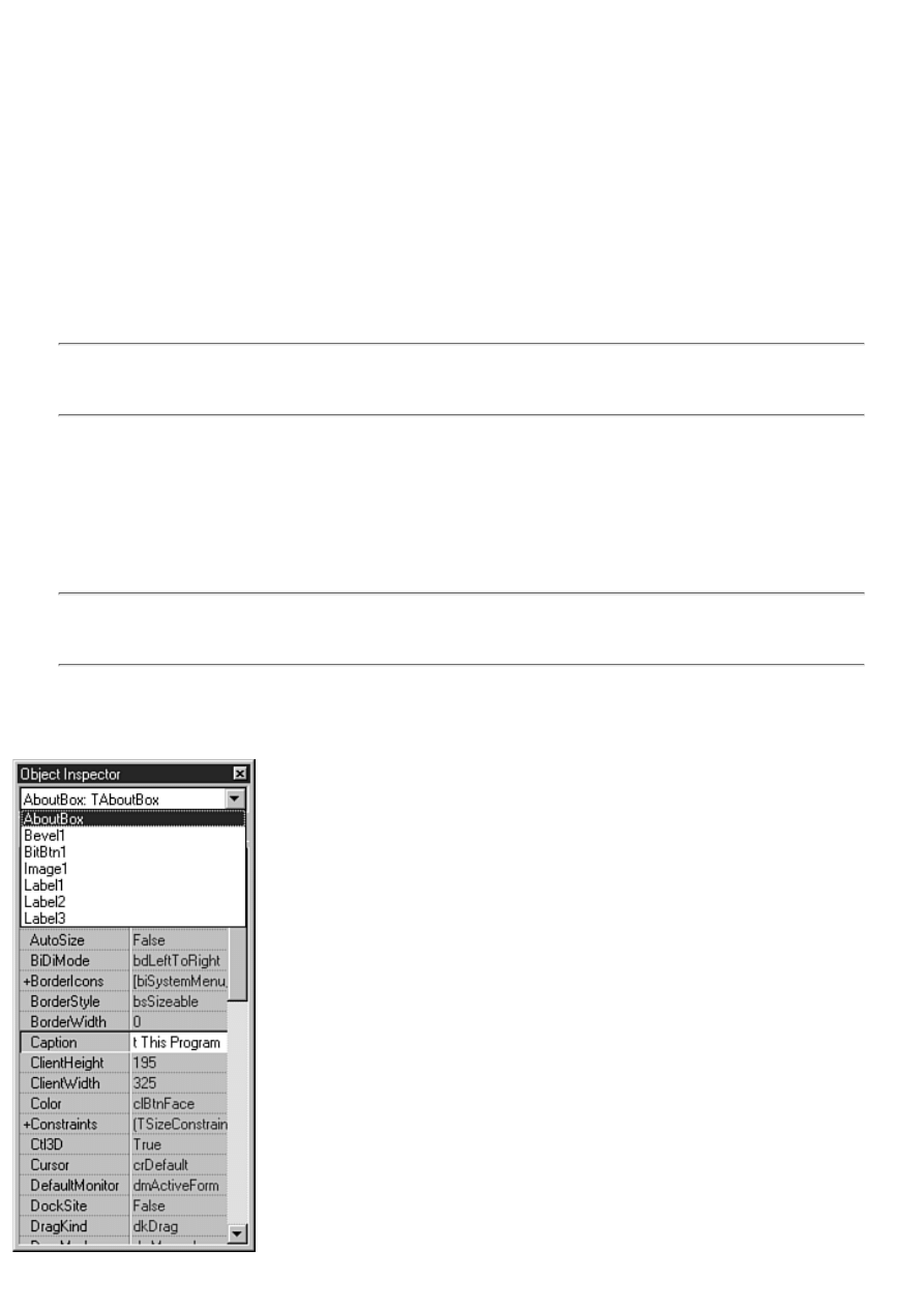
The Object Inspector is where you set the design-time properties that affect how the component acts at runtime. The Object
Inspector has three main areas:
l
The Component Selector
●
l
The Properties page
●
l
The Events page
●
You have been using the Object Inspector quite a bit up to this point, so I'll review what you already know and show you a
few features you probably don't know about.
The Component Selector
Normally, you select a component by clicking the component on a form. The Component Selector provides an alternative
way of selecting a component to view or modify. The Component Selector is a drop-down combo box that is located at the
top of the Object Inspector window.
NOTE: Usually the quickest way to select a component is by clicking the component on the form. Choosing the
component from the Component Selector is convenient if the component you are looking for is hidden beneath
another component or is off the visible area of the form.
The Component Selector displays the name of the component and the class from which it is derived. For example, a memo
component named Memo would appear in the Component Selector as
Memo: TMemo
The class name does not show up in the drop-down list of components; it only appears in the top portion of the Component
Selector. To select a component, click the drop-down button to reveal the list of components and then click the one you want
to select.
NOTE: The Component Selector shows only the components available on the current form and the name of the
form itself. Other forms and their components will not be displayed until they are made active in the Form
Designer.
After you select a component in the Component Selector, the component is selected on the form as well. The Properties and
Events tabs change to display the properties and events for the selected component. (Remember that a form is a component,
too.) Figure 4.13 shows the Object Inspector with the Component Selector list displayed.
FIGURE 4.13.The Component Selector list.
The Properties Page
The Properties page of the Object Inspector displays all the design-time properties for the currently selected control. The
Properties page has two columns: The Property column is on the left side of the Properties page and shows the property
name; the Value column is on the right side of the Properties page and is where you type or select the value for the property.
If the selected component has more properties than will fit in the Object Inspector, a scrollbar will be provided so that you
can scroll up or down to locate other properties.
NOTE: If you have multiple components selected on the form, the Object Inspector shows all the properties that
those components have in common. You can use this feature to modify the properties of several components at
one time. For example, to change the width of several components at one time, you can select all the
components and then modify the Width property in the Object Inspector. When you press Enter or move to
another property, all the components you selected will have their Width property modified.
Figure 4.14 shows the Object Inspector when a Memo component is selected.
FIGURE 4.14.The Object Inspector showing Memo component properties.
Properties can be integer values, enumerations, sets, other objects, strings, and other types. (Properties are discussed in detail
tomorrow.) The Object Inspector deals with each type of property according to the data type of the property. Delphi has
several built-in property editors to handle data input for the property. For example, the Top property accepts an Integer value.
Because the Integer type is a basic data type, no special handling is required, so the property editor is fairly basic. The
property editor for this type of property enables you to type a value directly in the Value column for integer properties such
as Top, Left, Width, and Height.
NOTE: In most cases, the property editor does parameter checking for any properties in which you can enter an
integer value. The Width property, for example, cannot be a negative number. If you attempt to enter a negative
number for the Width of a control, Delphi will force the width to the minimum allowed for that control (usually
0). If you enter a string value for a property that expects an integer value, Delphi will display an error message.
It is the job of the property editor to do parameter checking.
In many cases, the property editor for the property contains a list of items from which you can choose. Properties that have an
enumeration or Boolean value as their base data type fall into this category. When you click the Value column with this type
of property editor, you will see a drop-down button on the right side of the Value column. Clicking this button displays the
list of possible values.

TIP: If you double-click the Value column for this type of property, the property editor will cycle through the
possible choices. To quickly change a Boolean property, for example, simply double-click its value. Because the
only choices are True and False, double-clicking the value has the effect of toggling the property's value.
If you look closely at the Object Inspector, you will see that some properties have a plus sign preceding their names.
Properties that are sets and properties that are classes both have the plus sign in front of their names. The plus sign indicates
that the property node can be expanded to show the set or, in the case of properties that are classes, the properties of that
class. To expand a node, double-click on the Property column for that property (on the property name) or choose Expand
from the Object Inspector context menu. To collapse the node, double-click it again or choose Collapse from the Object
Inspector context menu.
To see an example of a set property, choose a form and then double-click the BorderIcons property in the Object Inspector.
The node expands and you see four members of the set. You can turn on or off any of the four members as needed.
In the case of properties that are objects (instances of a VCL class), you have two choices in editing the property. First, you
can click the Value column for the property and then click the button to the right side of the value (if one exists). This button
is indicated by an ellipsis (...) on its face. Clicking this button invokes the property editor for that particular control. For
example, click the Font property and then click the ellipsis button. The Choose Font dialog box is displayed so that you can
select the font.
The second way you can edit this type of property is by expanding the property node.
The property's properties (yes, it's true) will be displayed, and you can edit them
just like any other property. Again, locate the Font property and
double-click it. The TFont properties will be displayed. You can now modify the
font's Height, Color, Name, and other properties.
Some properties have only the ellipsis button as a means of editing the property. Earlier you used the Image component to
select an icon for the Multiple program's About box. As you found out then, the Image component's Picture property can be
changed only by invoking that property's property editor. In that case, the property editor is the Delphi Picture Editor.
Rest assured that each property knows what it needs to do to present you with the correct property editor. You will see
different types of property editors as you are introduced to new components and new properties.
The Events Page
The Events page lists all the events that the component is designed to handle. Using the Events page is pretty basic. In order
to create an event handler for an event, you simply double-click in the Value column next to the event you want to handle.
When you do, Delphi creates an event-handling function for you with all the parameters needed to handle that event. The
Code Editor is displayed and the cursor is placed in the event handler. All you have to do is start typing code. The name of
the function is generated based on the Name property of the component and the event being handled. If, for example, you
have a button named OKBtn and are handling the OnClick event, the function name generated would be OKBtnClick.
You can let Delphi generate the name of the event-handling function for you or you can provide the function name for Delphi
to use. To provide the function name yourself, type the name in the Value column next to the event and press Enter. The
Code Editor is displayed, and so is the event-handling function, complete with the name you supplied.
NOTE: Delphi will remove any empty event handlers when you run, compile, or save a unit. For example, let's
say you created an event handler for the OnCreate event but didn't type any code. The next time you run,
compile, or save the unit, Delphi will remove the event handler you just created because it doesn't contain any
code. This is the way Delphi is designed and it makes perfect sense, but it can be a bit puzzling if you aren't
aware of what is going on. If you don't want Delphi to remove the event handler, either type code right away or
type a comment line so that the event handler won't be removed.
After you create an event-handling function for a component, you can use that event handler for any component that handles
the same event. Sometimes it's convenient to have several buttons use the same OnClick event, for example. To take it a step
further, you might have a main menu item, a pop-up menu item, and a toolbar button all use the same OnClick handler. You
will learn to appreciate this kind of code reuse as you gain experience with Delphi. Even though you are dealing with three
different components, they can still share a common OnClick handler. The Value column of the Events page contains a
drop-down button that can be used to display a list of all event handlers compatible with the current event. All you have to do
is choose an event from the list.

Dockable IDE Windows
A new feature in Delphi 4 is dockable windows.
New Term: A dockable window is a window that can be dragged from its current location (using the mouse) and docked to
one of the IDE's dock sites.
New Term: A dock site is a specific location in the IDE where a dockable window can be docked. The IDE has several dock
sites.
Just about every window in Delphi is dockable. This includes the Project Manager, the Code Explorer, the Object Inspector,
the Watch List window, the Message window, and on and on. In fact, there are very few windows in Delphi that are not
dockable.
Am I enamored with dockable windows just for the sake of dockable windows alone? Not in the least. I don't even bother
with dockable windows in most Windows programs I own. In the Delphi IDE, however, dockable windows make me more
productive and that's why I like them.
Dock Sites
You can't talk about dockable windows without talking about dock sites. Sure, you can undock a window and drag it around
on the screen, dropping it wherever you want. That just makes for a bunch of scattered windows all over your screen, though.
In order for dockable windows to make sense, you have to have a place to dock them. In the Delphi IDE that usually means
the Code Editor window.
The Code Editor has three dock sites. One dock site is along the left side of the Code Editor window. This dock site is where
the Code Explorer is docked when you first start Delphi. Another dock site is along the bottom of the Code Editor window.
The default Delphi configuration places the Message window in the bottom dock site (although you don't see the Message
window unless there are messages to display). The third Code Editor dock site is along the left edge of the Code Editor
window. These three dock sites are really all you need to fully customize the IDE.
There is one other type of dock site that I want to mention. If you have a tool window open (such as the Project Manager),
you can dock another tool window to it. This enables two or more Delphi windows to be hosted within the same tool window.
For example, the Code Explorer and Project Manager can both be docked in the same floating tool window. A floating tool
window has five dock sites: right, left, top, bottom, and center.
When you dock a window to the center of a tool window, the tool window becomes a tabbed window. Each tab in the
window contains the title of the window that tab represents. I realize that doesn't make a lot of sense, so in just a bit I'll show
you how to dock two tool windows together.
Experimenting with Dockable Windows
Rather than trying to put the relationships between the various windows into words, I think an exercise is in order. I'll start
with the most basic docking operations and move to the more complex. This exercise doesn't take long and should prove very
enlightening. Here goes:
1. Create a new application and switch to the Code Editor. Notice the Code Explorer is docked to the left side of the
Code Editor.
2. Click the grip at the top of the Code Explorer window and drag to the right. Notice that you are dragging a gray
rectangle. This rectangle indicates where the Code Explorer will appear when you stop dragging.
3. Drag the Code Explorer to the middle of the Code Editor and let go of the mouse. The Code Explorer becomes a
floating tool window.
4. Click on the title bar of the Code Explorer tool window and drag it back to the left side of the Code Editor. When
your mouse pointer reaches the left edge of the Code Editor, the drag rectangle pops into place. Let go of the mouse
and the Code Explorer is once again docked to the Code Editor.
5. Undock the Code Explorer again and drag it to the bottom of the Code Editor. When your mouse pointer reaches the
bottom edge of the Code Editor window, the drag rectangle snaps into place and is as wide as the Code Editor. Let go
of the mouse button. The Code Explorer is docked to the Code Editor's bottom dock site. Notice that the drag grip is
vertical when the Code Explorer is docked to the bottom dock site.
6. Move the Code Explorer back to the dock site on the left side of the Code Editor window. The Code Editor and
Code Explorer should now look like they did when you started.
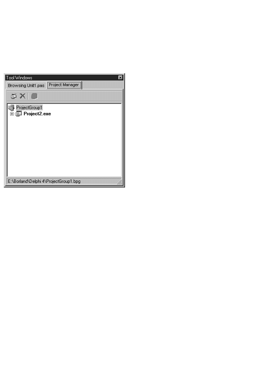
This exercise is simple but gives you an idea of what you can do with dockable windows at the most basic level. The next
exercise is a little more interesting. Perform these steps:
1. Undock the Code Explorer and move it to the right. Drop it anywhere on the right side of the Code Editor.
2. Size the Code Explorer window so that it is roughly square.
3. Choose View | Project Manager from the main menu. The Project Manager is displayed.
4. Drag the Project Manager over the Code Explorer window. When the drag rectangle snaps into place in the center of
the Code Explorer window, release the mouse button. The floating tool window should now look similar to Figure
4.15. Notice that the floating tool window has become a tabbed window and has the title Tool Windows. You can click
on either of the two tabs to see the Code Explorer or the Project Manager.
FIGURE 4.15.The Code Explorer and Project Manager docked
together in a tool window.
5. Drag the tool window back to the left side of the Code Editor and dock it there. Now you have both the Code
Explorer and the Project Manager docked where you can get to them easily whenever you want them.
Are you starting to get the picture? You can have as many tool windows as you want in one tabbed window. Let's do one
more exercise along the same lines. Often you want the debugger Watch List window in view while you are debugging
(debugging is discussed on Day 10, "Debugging Your Applications"). Let me show you how you can keep the Watch List
window handy at all times. Perform these steps:
1. Right-click on the Code Editor and choose Message View from the Code Editor context menu. The message window
appears in the Code Editor's bottom dock site.
2. Choose View | Debug Windows | Watches from the main menu. The Watch List window is displayed as a floating
tool window.
3. Drag the Watch List window over the Message window and dock it to the center of the Message window. Two tabs
appear in the dock site: Messages and Watch List.
Now you can click on the Watch List tab at the bottom of the Code Editor anytime you want to view your watches. The
Message window takes care of itself, as it will come and go in the tabbed window any time there are messages to display.
Figure 4.16 shows the IDE after performing the last exercise.
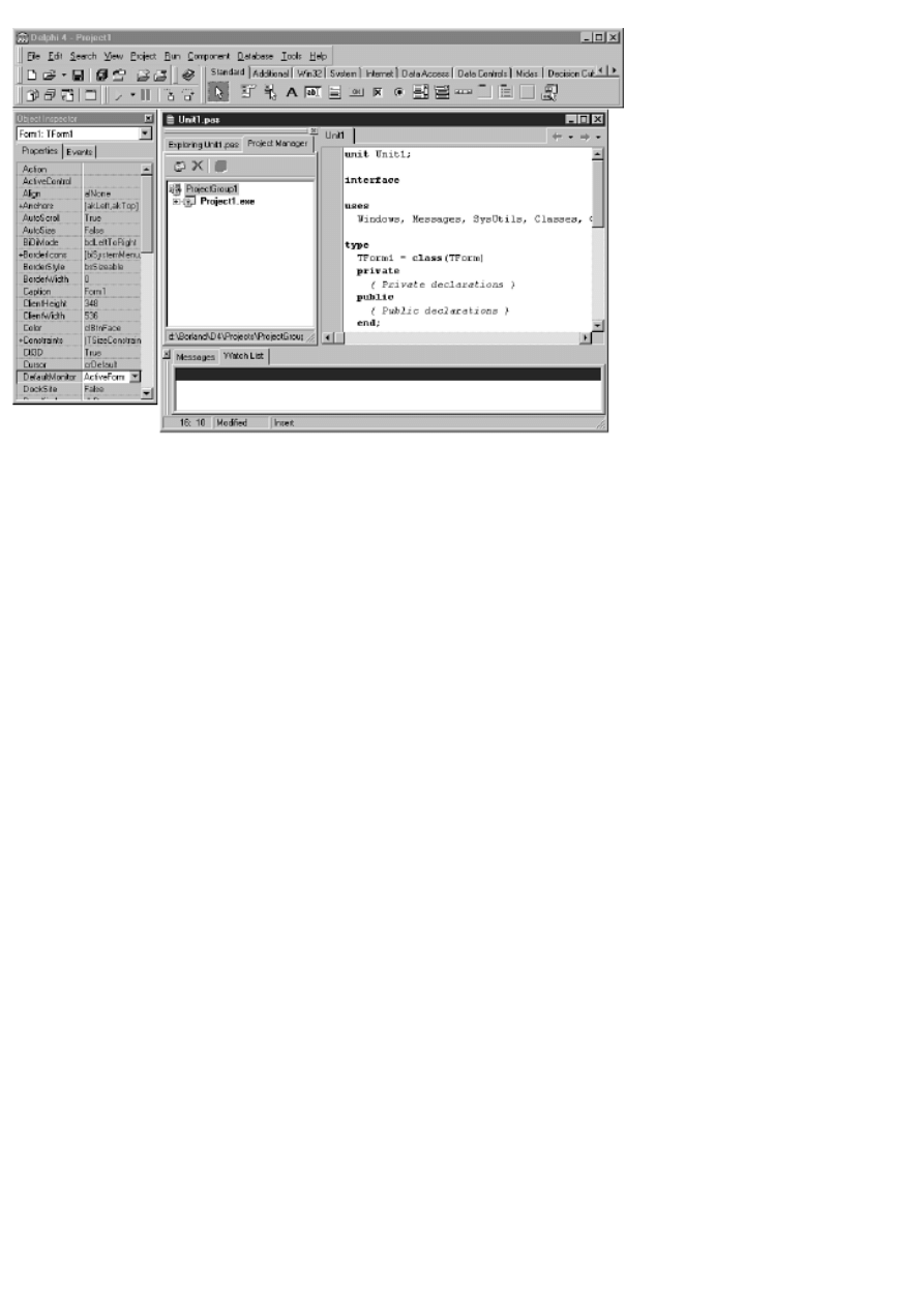
FIGURE 4.16.Four tool windows
docked to the Code Editor.
No Docking, Please
Sometimes you don't want a particular window to be dockable. As nice as dockable windows are, sometimes it's hard to find
a location to place a window when you don't want it docked. It seems like anywhere you try to put the window it wants to
dock to something. The good news is that you can shut off the docking capability of any tool window.
Each of the dockable tool windows has a menu item at the bottom of its context menu called Dockable. If Dockable is
checked, the window is dockable. If Dockable is not checked, the window is not dockable and you can place it anywhere in
the IDE.
The dockable windows in the Delphi IDE are a great feature. You can arrange the tool windows you use most often in any
way you want. You no longer have to go hunting for a Project Manager, Watch List, or Object Inspector hidden under other
windows. The window you are looking for is just a couple of mouse clicks away.
An MDI Sample Program
To help solidify today's discussion of projects and forms, let's create an MDI application. This application will enable you to
open and save graphics files such as bitmaps, icons, and metafiles. In order to complete the task, you should have a master
plan. Here's what you need to do:
1. Create the main window form (an MDI parent), including a menu.
2. Write code for the File | Open and File | Save menu selections.
3. Write code for the Cascade, Tile, and Arrange All items on the Window menu.
4. Create the MDI child forms.
5. Create an About box.
6. Stand back and admire your work.
There's no point in dawdling (time is money!), so let's get right to it.
Creating the Main Window Form
First you'll create the main window form. The main window for an MDI application must have the FormStyle property set to
fsMDIForm. You also need to add a menu to the application, as well as File Open and File Save dialog boxes. Follow these
steps:
1. Start Delphi and choose File | New Application from the main menu.
2. For the main form, change the Name property to MainForm.
3. Change the Caption property to Picture Viewer.
4. Change the Height to 450 and the Width to 575 (or other suitable values for your display resolution).
5. Change the FormStyle to fsMDIForm.
Okay, now you've got the main part of the form done. Next you'll add a menu to the form. Because I haven't discussed the
Menu Designer yet, you will take the easy route to creating a menu. To do that, you can take advantage of a Delphi feature
that enables you to import a predefined menu, as follows:
1. Click the Standard tab of the Component palette and click the MainMenu button.
2. Click on the form to place a MainMenu component on the form. It doesn't matter where you place the component
because the icon representing the menu is just a placeholder and won't show on the form at runtime. This is how
nonvisual com-ponents appear on a form.
3. Change the Name property to MainMenu.
4. Double-click the MainMenu component. The Menu Designer is displayed. (You'll read about the Menu Designer in
more detail on Day 6.)
5. Place your cursor over the Menu Designer and click your right mouse button. Choose Insert from Template from the
context menu. The Insert Template dialog box appears. Figure 4.17 shows the Insert Template dialog box with the
Menu Designer behind it.
FIGURE 4.17.The Menu Designer with the
Insert Template dialog box open.
6. Choose MDI Frame Menu and click OK. The menu is displayed in the Menu Designer.
7. Click the system close box on the Menu Designer to close it.
Now you should be back to the main form. Notice that you have a menu on the form. You can click on the top-level items to
see the full menu. Don't click on any menu subitems at this point--you'll do that in a minute. Notice that there are a lot of
menu items. You won't need all them, but for now you can just leave the extra items where they are.
Now you need to prepare the File Open and File Save dialog boxes:
1. Click the Dialogs tab on the Component palette. Choose an OpenPictureDialog component and place it on the form.
The OpenPictureDialog component's icon can be placed anywhere on the form.
2. Change the Name property of the Open dialog box to OpenPictureDialog.
3. Change the Title property to Open a Picture for Viewing.
4. Add a SavePictureDialog component.
5. Change the Name property of the component to SavePictureDialog and the Title property to Save a Picture.
Your form should now look like the one shown in Figure 4.18.
FIGURE 4.18.The form up to this
point.
Writing Code for the File | Open and File | Save As Menu Items
Now you are ready to write the code to implement the File | Open and File | Save As menu items. Delphi provides a slick way
of writing menu handlers with a minimum amount of fuss. You haven't created the MDI child form yet, but you know enough
about it to write the code for the menu handlers. Keep in mind that the application won't compile until you create the MDI
child form. Here you go:
1. On the main form, choose File | Open from the menu. An event handler is created for that menu item and the Code
Editor is displayed.
2. Type code so that the event handler looks like this:
procedure TMainForm.Open1Click(Sender: TObject);
var
Child : TChild;
begin
if OpenPictureDialog.Execute then begin
Child := TChild.Create(Self);
with Child.Image.Picture do begin
LoadFromFile(OpenPictureDialog.FileName);
Child.ClientWidth := Width;
Child.ClientHeight := Height;
end;
Child.Caption := ExtractFileName(OpenPictureDialog.FileName);
Child.Show;
end;
end;
This code first executes the File Open dialog box and gets a filename. If the Cancel button on the File Open dialog box
is clicked, the function returns without doing anything more. If the OK button on the File Open dialog box is clicked, a
new TChild object is created (TChild will be the name of the MDI child class you'll create later). The image file is
loaded into the Image component on the child form and the MDI child's client area is sized to match the size of the
image. Finally, the Caption property is set to the filename selected and the child window is displayed.
NOTE: In the Open1Click method the ExtractFileName function is used to extract just the filename from the
path and filename contained in the FileName property of the OpenPictureDialog component. Related functions
include ExtractFilePath, ExtractFileDir, ExtractFileDrive, and ExtractFileExt.
NOTE: Remember yesterday's discussion about calling Free for all objects created dynamically? Notice that I
appear to be violating that rule in the preceding code. In reality I am not, because VCL will take the
responsibility of freeing the memory allocated for the MDI child windows. Notice that the single parameter in
the TChild constructor is Self. That tells VCL that the Owner of the MDI child is the MDI form window. When
the MDI form is destroyed (when the application closes), it will be sure to delete all its MDI child objects.
3. Press F12 to switch back to the form. Now choose File | Save As from the menu. The File | Save As event handler is
displayed.
4. Type code so that the File | Save As event handler looks like this:
procedure TMainForm.SaveAs1Click(Sender: TObject);
begin
if SavePictureDialog.Execute then
with ActiveMDIChild as TChild do
Image.Picture.SaveToFile(SavePictureDialog.FileName);
end;
The code for the File | Save As menu item is simple. The first two lines check to see whether an MDI child window is active.
If so, the File Save dialog box is displayed. If the user clicks OK, the image is saved to disk using the TPicture class's
SaveToFile method.
NOTE: In the preceding code you see the as operator in use. The ActiveMDIChild property returns a pointer to
a TForm object. What you actually need in this case is a pointer to a TChild object (your MDI child class,
derived from TForm) so that you can access the Image property of the MDI child form. The as operator casts the
ActiveMDIChild variable to a TChild pointer. If for some reason as is unable to perform the cast, the code block
following the as statement is ignored.
Before going on, it is a good idea to save the project. Choose File | Save All from the main menu. Save Unit1 (the default
name Delphi assigns to a new unit) as PctViewU and the project as PictView.
Writing Code for the Window Menu
Now you can add code to the Window menu. This part is simple:
1. Switch back to the form by pressing F12. Choose Window | Tile from the form's menu.
2. You need to enter only a single line of code for the event handler. The finished event handler will look like this:
procedure TMainForm.Tile1Click(Sender: TObject);
begin
Tile;
end;
3. Switch back to the form and repeat the process for Window | Cascade. The finished function looks like this:
procedure TMainForm.Cascade1Click(Sender: TObject);
begin
Cascade;
end;
4. Repeat the steps for the Window | Arrange All menu item. The single line of code to add for the function body is the
following:
ArrangeIcons;
Okay, now you're done with the main form. You can now move on to creating the MDI child form.
Creating the MDI Child Form
The MDI child form is surprisingly simple. In fact, you don't have to write any code at all. Just follow these steps:
1. Create a new form using the New Form button on the toolbar or by choosing File | New Form from the main menu.
2. Change the Name property to Child. The Caption property can be ignored because you will be setting the dialog
box's caption at runtime.
3. Change the FormStyle property to fsMDIChild. This is necessary for the form to be treated as an MDI child
window.
That's it for the form itself. Now let's put an Image component on the form. The Image component will display the graphics
file selected by the user.
1. Click the Additional tab on the Component palette. Click the Image button and place an Image component anywhere
on the form.
2. Change the Name property to Image.
3. Change the Stretch property to True.
4. Change the Align property to alClient. The Image component expands to fill the client area of the form.
5. Choose File | Save and save the form's unit as MDIChild.
6. Switch to the Code Editor (press F12 to toggle between the Form Designer and the Code Editor). Click the
PctViewU tab. Now choose File | Use Unit from the main menu, select the MDIChild unit, and click OK. This is so the
compiler is happy when you reference the TChild object.
The form is fairly unimpressive at this point, but it should look similar to Figure 4.19.
FIGURE 4.19.The MDI child form
with an Image component.
You still have to create the About box, but right now you're probably eager to try the program out. Go ahead and click the
Run button. After a while, the program is displayed. You can choose File | Open and open any graphics file (any file with a
.bmp, a .wmf, or an .ico extension, that is).
Notice that the MDI child window sizes itself to the graphic it contains. Open several files and then try out the Cascade and
Tile options under the Window menu. If you want, you can save a file with a different name using the File | Save As menu
item.
Creating the About Box
By now you should know enough about Delphi to create the About box on your own. Create the About box so that it looks
something like the one in Figure 4.20. If you get stuck, you can jump back a few pages and review the steps you took to
create the About box earlier in the chapter. Feel free to make your About box as personalized as you like.
FIGURE 4.20.The About box for the application.
After you create the box, you can take these steps to call the box from the menu:
1. Change the Name property to AboutBox.
2. Save the unit as PVAboutU.
NOTE: Delphi has full support for long filenames. I use the 8.3 file-naming convention in this book for reasons
related to electronic publishing. For applications you write, you can take advantage of long filenames.
3. Switch to the PctViewU tab in the Code Editor (press F12). Choose File | Use Unit from the main menu and include
the PVAboutU unit.
4. Press F12 to switch back to the main form. Choose Help | About from the menu. You are taken to the Code Editor
with the OnClick handler for the menu item displayed.
5. Add this line to the event handler:
AboutBox.ShowModal;
That should do it for now. Click the Run button and try out the About item on the Help menu. Figure 4.21 shows the Picture
Viewer program running with several child windows open.
FIGURE 4.21.The Picture Viewer
program running.
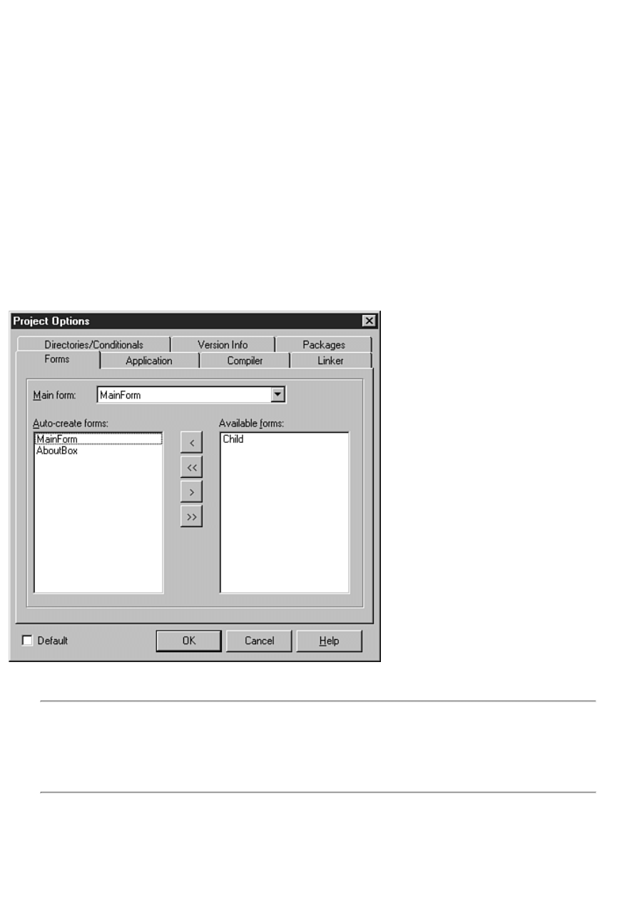
Polishing It Up
At this point the program is functional, but it isn't polished by any means. Still, for a 30-minute programming job, it's not too
bad! There are a few problems with the program as it stands right now. If you try to open a file that is not a graphic, you will
find that the program will throw an exception. I discuss exceptions and exception handling on Day 14, "Advanced
Programming." Also, you have a lot of extra menu items that you need to get rid of. I'll show you how to do that on Day 6 as
you work more with the Menu Designer.
There are two problems with this program that I think you should deal with because they are easy to fix. First, did you notice
that a blank MDI child window was displayed when the application started? That's because a Delphi application
automatically creates all forms when the application runs. In the case of an MDI child, that means the window is displayed
when the application becomes visible. You are creating each MDI child form as needed, so you don't need to have Delphi
auto-create the form for you.
Fortunately, removing the MDI child window form from the auto-create list is easy. Follow these steps:
1. Choose Project | Options from the main menu. The Project Options dialog box is displayed.
2. If necessary, click the Forms tab. The list of forms to auto-create is displayed.
3. Click the child form and then click the > button. This removes the child form from the auto-create list and puts it in
the Available forms list. Figure 4.22 shows the Project Options dialog box after moving the child form to the Available
forms list.
FIGURE 4.22.The Project Options dialog box.
Now run the program again. This time the blank MDI child is not displayed.
CAUTION: If you remove a form from the auto-create list, you must be sure to specifically create the form
prior to using it. If you do not create the form, the pointer to the form is uninitialized, which means that the
pointer has not yet been assigned a meaningful value. (Remember that the pointer is automatically created by
Delphi.) Attempting to use the pointer will result in an access violation or erratic program behavior. After you
remove a form from the auto-create list, it is your responsibility to make sure the form has been created before
using it.
Your application has one other problem I need to address. When you click the close button on one of the MDI windows, you
will find that the window minimizes instead of closing. Believe it or not this is the standard behavior as prescribed by
Microsoft. Standard behavior or not, it's weird, so you can fix it so that clicking the close box actually closes the window (as
any rational person would expect). To do so, follow these steps:

1. Bring up the child window form in the Form Designer. Be sure the form itself is selected and not the Image
component on the form (choose the Child from the Component Selector at the top of the Object Inspector, if
necessary).
2. Double-click the Value column next to the OnClose event in the Object Inspector. Add a line of code to the event
handler so that it looks like this:
procedure TChild.FormClose(Sender: TObject; var Action: TCloseAction);
begin
Action := caFree;
end;
Setting the close action to caFree tells VCL to close the child window and to free the memory associated with the
window. Now the child window will behave as it should when the close box is clicked.
3. Again run the program to prove that the program behaves as advertised.
Summary
The Delphi IDE can be intimidating until you become familiar with it. If you learn it a little at a time, it's not nearly so
daunting. Today you learned more about the various pieces that make up the Delphi IDE. Then you learned about how
projects are used to create an executable file. You also learned more about forms. You found out how Delphi deals with
dialog boxes and other child windows. You found out more about the Object Inspector and how it can be used to change a
component's properties. You also learned about the docking features of the Delphi IDE. Finally, you got to create a program
that actually does something interesting. Tomorrow you'll find out about the visual component model.
Workshop
The Workshop contains quiz questions to help you solidify your understanding of the material covered and exercises to
provide you with experience in using what you have learned. You can find the answers to the quiz questions in Appendix A,
"Answers to the Quiz Questions."
Q&A
Q The Delphi toolbar doesn't have buttons for the features I use most often. Can I change the toolbar?
A Absolutely. The toolbar is fully customizable. You can add or remove buttons as you see fit.
Q I placed multiple Label components on a form and then attempted to select them all by dragging. Instead I
just got another big Label component. What have I done wrong?
A You forgot to turn off the multiple placement option. After placing multiple components on the form, you need to
click the arrow button on the Component palette to turn off the multiple placement option.
Q I'm trying to position one of the IDE windows off to the side of the Code Editor. Every time I try, however,
the window wants to dock to the Code Editor. How do I prevent the window from docking?
A Right-click on the window and turn the Dockable option off.
Q When I accidentally type a character for my form's Top property, I get an error message. I realize I should
type a number rather than a character, but where does the error message come from?
A The Object Inspector knows what kind of value is correct for a given property. A character is not valid for an integer
property, so an error message is shown. In some cases it is the property editor that performs checks on the value input.
Q What do I need to do in order for my application to be an MDI application?
A Just be sure that the main form has a FormStyle of fsMDIForm and that any MDI child forms have a FormStyle of
fsMDIChild.
Q What's the difference between a dialog box and a child window in Delphi?
A There is no real difference. A dialog box form might have certain traits such as a dialog box border rather than a
sizing border; OK, Cancel, and Help buttons; and no minimize or maximize buttons. But a dialog box is just a form
like any other. A form might have the appearance of a dialog box or of a child window, but a form is just a form.
Q Can I check the unit I'm working on for errors without running the program?
A Yes. Just choose Project | Syntax Check from the main menu. Delphi will compile any units that have changed since
the last compile and will report any errors encountered.

Quiz
1. How do you invoke the main window's Customize dialog box?
2. When you have the Customize dialog box open, how do you add buttons to a toolbar?
3. How do you remove buttons from a toolbar?
4. What's the easiest way to place multiple components of the same type on a form?
5. What's the easiest way to place a component in the center of the form?
6. List the file types needed to build an application in Delphi.
7. What VCL method do you use to display a form modelessly?
8. What VCL method do you use to display a form modally?
9. How can you attach an event to an event handler that has been previously defined?
10. When using the Object Inspector, how can you enumerate the choices for a particular property?
Exercises
1. Remove the Pause, Step Over, and Trace Into buttons from the Delphi View toolbar. Add Compile, Build, and
Syntax Check buttons to the toolbar.
2. Reset the toolbar to its default settings.
3. Spend some time looking over the components on each page of the Component palette. Place any components you
are curious about on a form and experiment with them.
4. Create a new directory on your hard drive. Create a new application in Delphi. Add three new forms to the project
(they can be blank if you want). Save the project to the new directory you created and run the program. Close the
program. Now examine the directory where the project was saved. Compare the files you see there with the file types
listed in Table 4.1.
5. Run the Picture Viewer program you created earlier. Open several graphics files. Drag the MDI child windows
around in the parent window. Attempt to move a child window outside the parent. What happens?
6. Experiment with docking various IDE windows to the dock sites on the Code Editor.
7. Start a new application. Place several components on the form. Click on each component and observe the properties
for each component in the Object Inspector.
8. Create a blank form. Double-click in the Value column next to the Color property to invoke the Color dialog box.
Choose a color and click OK.
, Macmillan Computer Publishing. All rights reserved.
Teach Yourself Borland Delphi 4 in 21 Days
- 5 -
The Visual Component Model
●
So Why Should I Care About Frameworks?
❍
●
❍
Properties, Methods, and Events
❍
❍
●
❍
❍
❍
●
●
❍
❍
❍
●
Today I am going to talk about the visual component model and Borland's Visual Component Library (VCL). Before getting
into that, though, I'll talk a little about class frameworks. In this chapter you will find
The fundamentals of frameworks
●
The Visual Component Library overview
●
VCL classes, including the form, application, and component classes
●
Frameworks Fundamentals
"In the beginning there was C. . . ." Well, not quite. As far as Windows programming is concerned, though, that statement is
accurate. In the beginning, the vast majority of Windows programs were written in C. In fact, the Windows Application
Programming Interface (API) is just a huge collection of C functions--hundreds of them. There are still undoubtedly
thousands of programmers out there writing Windows programs in C.
Somewhere along the line, the folks at Borland decided, "There has got to be an easier way." (Actually, the framework
revolution might have started on several different fronts, but Borland was certainly a leader.) It was apparent that Windows
programming was very well suited to object-oriented programming. By creating classes that encapsulate common Windows
programming tasks, a programmer could be much more productive. After a class was created to encapsulate a window's
various duties, for instance, that class could be used over and over again. The framework revolution began.
But I haven't yet told you what a framework is.
New Term: A framework is a collection of classes that simplifies programming in Windows by encapsulating often-used
programming techniques. Frameworks are also called class libraries. Encapsulation means taking a complex programming
task and making it easier by providing a simplified interface.

Popular frameworks have classes that encapsulate windows, edit controls, list boxes, graphics operations, bitmaps, scrollbars,
dialog boxes, and so on.
So Why Should I Care About Frameworks?
That's a good question. The bottom line is that frameworks make Windows programming much easier than it would be in
straight C, in assembler, or in the original Pascal language (the Pascal that came prior to Object Pascal). Let me give you an
example. Listing 5.1 contains a portion of a Windows program written in C++. This section of code loads a bitmap file from
disk and displays the bitmap in the center of the screen. None of this will make sense to you right now, but be patient.
LISTING 5.1. C++ CODE TO LOAD AND DISPLAY A BITMAP.
HPALETTE hPal;
BITMAPFILEHEADER bfh;
BITMAPINFOHEADER bih;
LPBITMAPINFO lpbi = 0;
HFILE hFile;
DWORD nClrUsed, nSize;
HDC hDC;
HBITMAP hBitmap;
void *bits;
do {
if ((hFile = _lopen(data.FileName, OF_READ)) == HFILE_ERROR) break;
if (_hread(hFile, &bfh, sizeof(bfh)) != sizeof(bfh)) break;
if (bfh.bfType != `BM') break;
if (_hread(hFile, &bih, sizeof(bih)) != sizeof(bih)) break;
nClrUsed =
(bih.biClrUsed) ? bih.biClrUsed : 1 << bih.biBitCount;
nSize =
sizeof(BITMAPINFOHEADER) + nClrUsed * sizeof(RGBQUAD);
lpbi = (LPBITMAPINFO) GlobalAllocPtr(GHND, nSize);
if (!lpbi) break;
MoveMemory(lpbi, &bih, sizeof(bih));
nSize = nClrUsed * sizeof(RGBQUAD);
if (_hread(hFile, &lpbi->bmiColors, nSize) != nSize) break;
if (_llseek(hFile, bfh.bfOffBits, 0) == HFILE_ERROR) break;
nSize = bfh.bfSize-bfh.bfOffBits;
if ((bits = GlobalAllocPtr(GHND, nSize)) == NULL) break;
if (_hread(hFile, bits, nSize) != nSize) break;
hDC = GetDC(hWnd);
hBitmap = CreateDIBitmap(hDC, &(lpbi->bmiHeader), CBM_INIT,
bits, lpbi, DIB_RGB_COLORS);
if (hBitmap) {
LPLOGPALETTE lppal;
DWORD nsize = sizeof(LOGPALETTE)
+ (nClrUsed-1) * sizeof(PALETTEENTRY);
lppal = (LPLOGPALETTE) GlobalAllocPtr(GHND, nSize);
if (lppal) {
lppal->palVersion = 0x0300;
lppal->palNumEntries = (WORD) nClrUsed;
MoveMemory(lppal->palPalEntry, lpbi->bmiColors,
nClrUsed * sizeof(PALETTEENTRY));
hPal = CreatePalette(lppal);
(void) GlobalFreePtr(lppal);
}
}
} while(FALSE);
if (hFile != HFILE_ERROR) _lclose(hFile);
HPALETTE oldPal = SelectPalette(hDC, hPal, FALSE);
RealizePalette(hDC);

HDC hMemDC = CreateCompatibleDC(hDC);
HBITMAP oldBitmap =(HBITMAP)SelectObject(hMemDC, hBitmap);
BitBlt(hDC, 0, 0, (WORD)bih.biWidth, (WORD)bih.biHeight,
hMemDC, 0, 0, SRCCOPY);
SelectObject(hMemDC, oldBitmap);
DeleteDC(hMemDC);
SelectPalette(hDC, oldPal, FALSE);
ReleaseDC(hWnd, hDC);
if (bits) (void) GlobalFreePtr(bits);
if (lpbi) (void) GlobalFreePtr(lpbi);
That looks just a little intimidating, doesn't it? Now look at the equivalent using Borland's VCL:
Image.LoadFromFile(`winnt.bmp');
So which would you rather use? You don't even have to know what these code snippets do to make that decision. It's easy to
see that the VCL version is shorter (just a bit!) and more readable.
These examples sum up what frameworks are all about. Frameworks hide details from you that you don't need to know.
Everything that is contained in Listing 5.1 is performed behind the scenes in the VCL code (albeit in Pascal rather than in
C++). You don't need to know every detail about what goes on behind the scenes when VCL does its job, and you probably
don't want to know. All you want is to take the objects that make up a framework and put them to use in your programs.
A good framework takes full advantage of OOP, and some do that better than others. Borland's Object Windows Library
(which came in both C++ and Pascal versions) and Visual Component Library are excellent examples of object-oriented
programming. They provide the proper abstraction needed for you to rise above the clutter and get down to the serious
business of programming.
So What's the Catch?
A little skeptical, are you? Good. You're bright enough to figure out that if you have all that ease of use, you must be giving
up something. Truth is, you are right. You might think that a program written with a framework would be larger and slower
than its counterpart written in a low-level language. That's partially correct. Applications written with frameworks don't
necessarily have to be slower than those other programs, though. There is some additional overhead inherent in an
object-oriented language, certainly, but for the most part, it is not noticeable in a typical Windows program.
The primary trade-off is that Windows programs written in Delphi tend to be larger than programs written in languages such
as C. For example, let's say you had a simple Windows program written in C that was 75KB. The equivalent program written
with Delphi might be 250KB. That might seem like a significant difference, but this example demonstrates the worst-case
scenario. The difference in final program size between a C application and a Delphi application written with a framework is
most noticeable in very small programs. As your programs increase in size and sophistication, the size difference is much less
noticeable.
One reason for the size difference is simply the difference between a procedural language and an object-oriented language.
Object-oriented languages (C++ and Object Pascal, for example) carry additional overhead for features such as exception
handling, runtime type information (RTTI), and other OOP goodies. In my opinion, the difference in code size is an
acceptable trade-off for the features that Object Pascal provides.
Now, before you label me as a code-bloat proponent, let me say that I am as conscientious as the next person when it comes
to code bloat. I believe that we should all write the tightest code we can given the tools we use. I am also a realist, and I
understand that time-to-market is a driving force in the software industry today. I am willing to trade some code size for the
power that Object Pascal and VCL give me. Let me put it another way. I'm not interested in spending a month to write a
Windows program that compiles to a 100KB executable when I can accomplish the same thing in Delphi in two days and end
up with a 400KB executable. The size of the resulting executables is insignificant when compared to the development time
saved.
FRAMEWORKS TEACH OBJECT-ORIENTED PROGRAMMING AND DESIGN
If you end up getting serious about this crazy game called Windows programming, you will eventually end up
peeking into the source code of your favorite framework. Sooner or later you'll want to know how the pros do
things. The VCL source code is a great place to go for that kind of information.
Some weekend when the leaves are raked, the house trim is painted, the laundry is done, the kids are at
Grandma's, and you think you have a good handle on Delphi, spend some time browsing the VCL source code.

(Delphi Professional and Client/Server ship with the VCL source code.) It can be intimidating at first, but after a
while you'll see what the designers were doing. Don't strain yourself. Attempt to understand the things that bump
up against the limits of your knowledge regarding Object Pascal. Leave the complicated stuff for later.
But notice how the VCL designers use private, protected, and public access in classes. Notice how things that
should be kept hidden from the user aren't in public view. Studying the VCL source can teach you a great deal
about Object Pascal and object-oriented design.
The Visual Component Library
You have probably noticed that this book contains "Delphi 4" in its title. Obviously Delphi has been around a while. When
Delphi 1 was introduced in 1995, it was an instant hit. Delphi offered rapid application development (RAD) using something
called components. Components are objects that can be dropped on a form and manipulated via properties, methods, and
events. It's visual programming, if you will.
The concept of form-based programming was first popularized by Microsoft's Visual Basic. Unlike Visual Basic, though,
Delphi used a derivative of Pascal as its programming language. This new language, called Object Pascal, introduced OOP to
the Pascal language. Delphi and Object Pascal represented the marriage of object-oriented programming and form-based
programming. In addition, Delphi could produce standalone executables. Real programs. Programs that did not require a
runtime DLL to run; programs that were compiled, not interpreted; programs that ran tens of times faster than Visual Basic
programs. The programming world was impressed.
Delphi didn't just throw Object Pascal at you and let you flounder. It also introduced the Visual Component Library. As I
have said, VCL is an application framework for Windows programming in Object Pascal. The most noticeable feature of
VCL is that it was designed around the concept of properties, methods, and events--the visual component model. Let's look at
the visual component model in more detail.
Components
As I talked about on Day 1, "Getting Started with Delphi," VCL components are objects that perform a specific programming
task. VCL components are wrapped up in Object Pascal classes. From now on in this book, you will be encountering
components on a daily basis. I won't spend a lot of time explaining every detail of components right now because you will
see by example how they work throughout the rest of the book. I'll explain components in more detail on Day 7, "VCL
Components."
Properties, Methods, and Events
On Day 1, I gave you a brief introduction to the properties, methods, and events model. These three ingredients make up the
public interface of components in VCL (the part of the component the user will see). Let's take a look at these elements one at
a time.
Properties
Properties are elements of a component that control how the component operates. Many components have common
properties. All visual components, for example, have a Top and a Left property. These two properties control where the
component will be positioned on a form both at design time and at runtime. All components have an Owner property, which
VCL uses to keep track of the child components a particular parent form or component owns.
Properties and the Object Inspector A picture is always worth a thousand words, so let's start up Delphi again and see
properties in action. When you start Delphi, you are greeted with a blank form and the Object Inspector.
NOTE: If you have the Delphi options configured to save the desktop when you close Delphi, you might see the
last project you were working on when you start Delphi. If that's the case, choose File|New Application from the
main menu to get a blank form.
The Object Inspector will look something like Figure 5.1. (When Delphi starts, it sizes the Object Inspector based on your
current screen resolution, so your Object Inspector might be taller or shorter than the one shown in Figure 5.1.) If necessary,
click on the Properties tab of the Object Inspector window so that the form's properties are displayed. The component's
properties are arranged in alphabetical order.
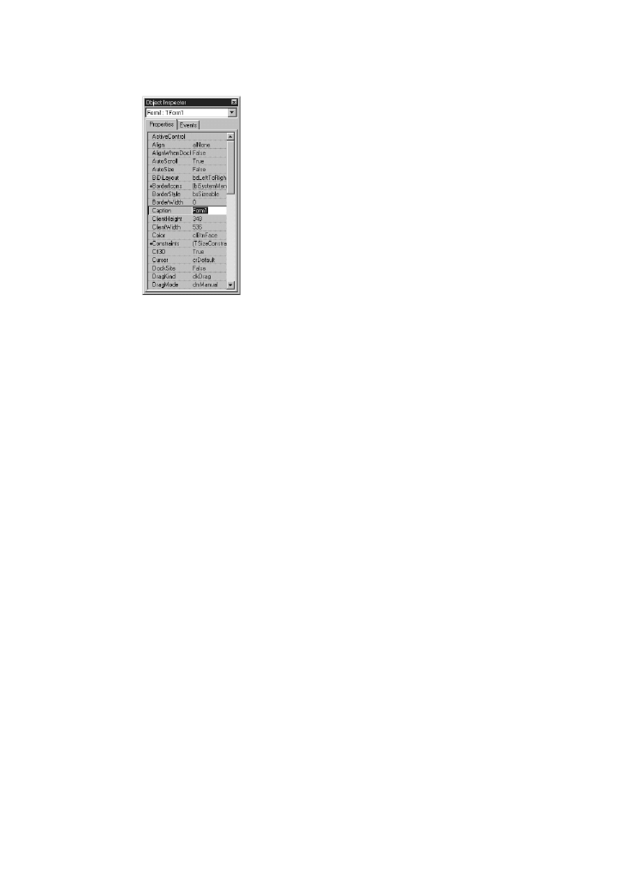
FIGURE 5.1.The Object Inspector.
If more properties exist than can be displayed at one time, the Object Inspector displays a scrollbar so that you can view
additional properties. The Object Inspector window can be moved and sized. I like my Object Inspector as tall as my screen
permits so that I can see the maximum number of properties at one time. Scroll through the properties until you locate the
Left property and then click on it. Change the value for the Left property (any number between 0 and 600 will do) and press
Enter on the keyboard. Notice how the form moves as you change the value.
This illustrates an important aspect of properties: they are more than simple fields of a class. Each property has an underlying
data field associated with it, but the property itself is not a class data field. Changing a property often leads to code executed
behind the scenes.
New Term: Properties are often tied to access methods that execute when the property is modified.
Changing a Property's Value Properties can be changed at design time (when you are designing your form) and at runtime
(when the program is running through code you write). In either case, if the property has an access method, that access
method will be called and executed when the property is modified. You already saw an example of changing a property at
design time when you changed the Left property and watched the form move on the screen.
That is one of the strengths of VCL and how it is used in Delphi: You can instantly see on the screen the result of your design
change. Not all properties show a visible change on the form at design time, however, so this doesn't happen in every case.
Still, when possible, the results of the new property value are immediately displayed on the form.
To change a property at runtime, you simply make an assignment to the property. When you make an assignment, VCL
works behind the scenes to call the access method for that property. To change the Left property at runtime, you use code like
this:
Left := 200;
In the case of the Left property (as well as the Top property), VCL moves and repaints the form. (For you Windows API
programmers, you can figure out that this eventually translates into calls to the Windows API functions SetWindowPos and
InvalidateRect.)
New Term: Property Access Specifiers Properties have two access specifiers, which are used when properties are read or
modified. There is a read specifier and a write specifier.
Suffice it to say that access specifiers associate read and write methods with the property. When the property is read or
written to, the methods associated with the property are automatically called. When you make an assignment as in the
previous example, you are accessing the write specifier. In effect, VCL checks to see whether an access method exists for the
write specifier. If it does, the access method is called. If no access method exists, VCL assigns the new value to the data field
associated with the property.

When you reference a property (use the property as the right side of an equation), you are accessing the read specifier:
X := Left;
In this case, VCL calls the read specifier to read the value of the Left property. In many cases the read specifier does very
little more than return a property's current value.
Property Attributes The properties of the property (sorry, I couldn't resist) are
determined by the writer of the component. A property can be read-only. A read-only
property can be read--its value can be retrieved--but not
written to. In other words, you can fetch the property's value, but you can't change
it. In rare cases, a property can be made write-only (a property that can be written
to but not read isn't very useful in most cases). This is obviously the opposite
of a read-only property.
Finally, some properties can be specified runtime-only. A runtime-only property can be accessed only at runtime, not design
time. Because a runtime-only property doesn't apply at design time, it is not displayed in the Object Inspector. A
runtime-only property can be declared as read-only, too, which means that it can be accessed only at runtime and can only be
read (not written to).
Property Types Some properties use an instance of a VCL class as the underlying data field. To illustrate, let's put a memo
component on our blank form:
1. Go to the Delphi Component palette, choose the Standard tab, and click the Memo button. (The tooltip will tell
when you are over the Memo button.)
2. Now move to the form and click on it where you want the memo's top-left corner to appear. As soon as you place
the memo component on the form, the Object Inspector switches to show you the properties of the component just
placed on the form, in this case a TMemo.
3. Locate the Lines property and click on it. Notice that the property value contains the text (TStrings) and that there is
a little button with an ellipsis (. . .) to the right of the property value.
The ellipsis button tells you that this property can be edited by using a property editor. For an array of strings,
for instance, a dialog box will be displayed in which you can type the strings. In the case of the Font property,
clicking the ellipsis button will invoke the Choose Font dialog box. The exact type of the property editor is
property-specific, although certain properties can share a common editor. You can bring up the property editor
by clicking the ellipsis button or by double-clicking the property value.
The Lines property for a memo component is an instance of the TStrings class. When you double-click the Value column, the
string editor is displayed and you can then type the strings you want displayed in the memo component when the application
runs. If you don't want any strings displayed in the memo component, you need to clear the property editor of any strings.
The Font property is another example of a property that is an instance of a VCL class. A font includes things like the
typeface, the color, the font size, and so on. Locate the Font property in the Object Inspector. (It doesn't matter whether you
have selected the memo component or the form.)
Notice that there is a plus sign before the word Font. This tells you that there are individual properties within this property
that can be set. If you double-click on the property name, you will see that the Object Inspector expands the property to
reveal its individual elements. You can now individually edit the Font property's elements. In the case of the Font property,
these same settings can be edited by invoking the property editor. You can use either method with the same results.
Some properties are sets (I talked about sets on Day 3, "Classes and Object-Oriented Programming"). The Style property
within the Font object is a good example of a set. Notice that Style has a plus sign in front of it. If you double-click on the
Style property, you will see that the Style node expands to reveal the set's contents. In this case, the set consists of the various
styles available for fonts: bold, italic, underline, and strikeout. By double-clicking a style, you can turn that style on or off. A
set can be empty or can contain one or more of the allowed values.
New Term: Some properties can be enumerations, a list of possible choices.
An enumeration is a list of possible choices for a property. When you click on an enumeration property, a drop-down arrow
button appears to the right of the value. To see the choices in the enumeration, click the drop-down button to display the list
of choices. Alternatively, you can double-click the Value column for the property. As you double-click on the property's
value, the Object Inspector will cycle through (or enumerate) the choices. The Cursor property gives a good example of an
enumerated property. Locate the Cursor property and click the arrow button to expose the list of possible cursors to choose
from.

Enumerations and sets differ in that with an enumeration property, only one of the presented choices can be selected (only
one cursor can be in effect at any time). The set can contain none or any number of the choices (a font style can contain bold,
underline, italic, or none of these).
As long as you have Delphi running and a blank form displayed, you might as well spend some time examining the various
components and their properties. Go ahead, I'll wait.
HOUSE RULES: PROPERTIES
Properties appear to be class fields and are accessed like class fields.
●
Properties are not class fields. They are a special category of class member.
●
Properties often invoke an access method when they are written to (assigned a value), but not always. It depends on
how the particular component is written.
●
Published properties usually have default values. The default value is the value that initially shows up in the Object
Inspector when a component is first utilized and is the value that will be used if no specific value is assigned.
●
Properties can be designed as read/write, read-only, or write-only.
●
Runtime-only properties don't show up in the Object Inspector and can be modified only at runtime.
●
Properties can include
●
Simple data types
●
Strings
●
Arrays
●
Sets
●
Enumerations
●
VCL class objects
●
Methods
I discussed methods on Day 3, "Classes and Object-Oriented Programming," so I don't
need to cover them again here in any great detail. Methods in VCL components are
functions and procedures that can be called to make the
component perform certain actions. For example, all visual components have a method
called Show, which displays the component, and a method called Hide, which hides the
component. For example:
MyWindow.Show;
{ do some stuff, then later... }
MyWindow.Hide;
Methods in VCL can be declared as public, protected, or private. Public methods can be accessed by the component's users.
In this example, both the Show and Hide methods are public. Protected methods cannot be accessed by the component users
but can be accessed by classes (components) derived from a component. Of course, private methods can be accessed only
within a class itself.
Some methods take parameters and return values, others don't. It depends entirely on how the method was written by the
component writer. For example, the GetTextBuf method retrieves the text of a TEdit component. This method can be used to
get the text from an edit control as follows:
var
Buff : array [0..255] of Char;
NumChars : Integer;
begin
NumChars := EditControl.GetTextBuf(Buff, SizeOf(Buff));
end;
As you can see, this particular method takes two parameters and returns an integer. When this method is called, the edit
control contents are placed in the variable Buff and the return value is the number of characters retrieved from the edit
control.
For now, that's all you need to know in order to use methods. I'll discuss them in more detail on Day 20, "Creating
Components."
House Rules: Methods

Methods can be private, protected, or public.
●
Methods are called using the dot operator.
●
Methods can take parameters and can return values.
●
Some methods take no parameters and return no values.
●
Only public methods can be called by component users.
●
Events
New Term: Windows is said to be an event-driven environment. Event-driven means that a program is driven by events that
occur within the Windows environment. Events include mouse movements, mouse clicks, and key presses.
Programmers moving from DOS or mainframe programming environments might have some difficulty with the concept of
something being event-driven. A Windows program continually polls Windows for events. Events in Windows include a
menu being activated, a button being clicked, a window being moved, a window needing repainting, a window being
activated, and so forth.
Windows notifies a program of an event by sending a Windows message. There are over 200 possible messages that
Windows can send to an application. That's a lot of messages. Fortunately, you don't have to know about each and every one
of them to program in Delphi; there are only a couple dozen that are used frequently.
VCL Events In VCL, an event is anything that occurs in the component that the user might need to know about. Each
component is designed to respond to certain events. Usually this means a Windows event, but it can mean other things as
well. For example, a button component is designed to respond to a mouse click, as you would expect. But a nonvisual
control, such as a database component, can respond to non-Windows events, such as the user reaching the end of the table.
New Term: Handling Events When you respond to a component event, you are said to handle the event.
Events are handled through methods called event handlers. You used event handlers
extensively as you worked through the first three days of the book.
A typical Windows program spends most of its time idle, waiting for some event to occur. VCL makes it incredibly easy to
handle events. The events that a component has been designed to handle are listed under the Events tab in the Object
Inspector window. Event names are descriptive of the event to which they respond. For instance, the event to handle a mouse
click is called OnClick.
NOTE: You don't have to handle every event that a component defines. In fact, you rarely do. If you don't
respond to a particular event, the event message is either discarded or handled in a default manner as described
by either VCL or the component itself. You can handle any events you have an interest in and ignore the rest.
These concepts will make more sense if you put them into practice. To begin, let's start a new application. Choose File|New
Application from the main menu. If you are prompted to save the current project, click No. Now you will again have a blank
form. First, set up the main form:
1. Change the Name property to PMEForm (PME for properties, methods, and events).
2. Change the Caption property to PME Test Program.
Next, you need to add a memo component to the form:
1. Choose the Standard tab on the Component palette and click the Memo button.
2. Click on the form to place a memo component on the form.
3. Change the Name property to Memo. Be sure the memo component is selected so that you don't accidentally change
the form's name instead of the memo component.
4. Double-click on the Lines property in the Value column. The String list editor will be displayed.
5. Delete the word Memo and type A test program using properties, methods, and events. Click OK to close the String
list editor.
6. Resize the memo component so that it occupies most of the form. Leave room for a button at the bottom.
Your form will now look like the form shown in Figure 5.2.
Now you can place a button on the form:
1. Choose the Standard tab on the Component palette and click the Button component.
●
2. Click on the form below the memo component to place the button on the form.
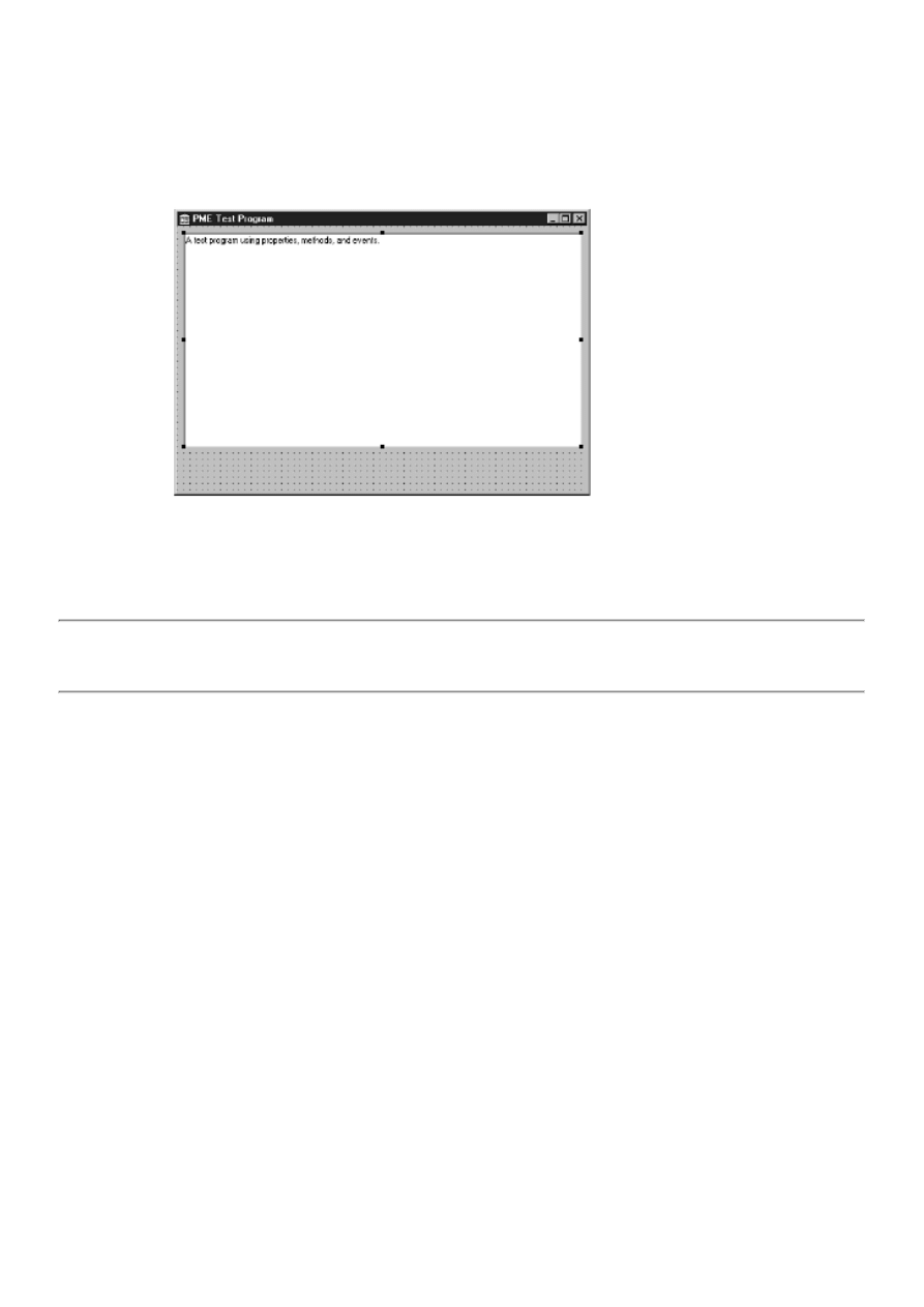
3. Change the Name property for the button to Button.
4. Change the Caption property to Show/Hide.
FIGURE 5.2.The form with a memo
component added.
5. Center the button horizontally on the form.
TIP: You can center components visually, but for a more exact method use the Alignment palette. Choose
View|Alignment Palette from the main menu and then click the Center horizontally in window button on the
Alignment palette to center a component horizontally on the form.
You will use this button to alternately show and hide the memo component. Now you need to write some code so that the
button does something when it is clicked. Be sure that the button component is selected, and then click on the Events tab in
the Object Inspector.
A list of the events that a button component is designed to handle is presented. The top event should be the OnClick event.
Double-click on the Value column of the OnClick event. What happens next is one of the great things about visual
programming. The Code Editor comes to the top and displays the OnClick procedure ready for you to type code. Figure 5.3
shows the Code Editor with the OnClick handler displayed.
FIGURE 5.3.The Delphi Code Editor
with the OnClick handler displayed.
NOTE: Your Code Editor might not look exactly like Figure 5.3. I removed the Module Explorer from the Code
Editor window to show more of the code. One of the great things about the Delphi IDE is that it is fully
customizable. If you don't like the default layout, you can always change it.
Adding Event Handler Code Notice that the event handler is already set up for you, all you have to do is type the code. If
you take a good look at the event handler, you will see that it is a procedure, that it is called ButtonClick, that it is a member
of the TPMEForm class, and that it takes a pointer to a TObject called Sender as a parameter. (I'll talk about the Sender
parameter in just a bit.) All that is left to do now is type code that shows and hides the button each time the button is clicked.
We'll borrow a little code from our earlier discussion of methods. Edit the ButtonClick method until it looks like this:
procedure TPMEForm.ButtonClick(Sender: TObject);
const
IsVisible : Boolean = False;
begin
IsVisible := not IsVisible;
if IsVisible then
Memo.Hide
else
Memo.Show;
end;
This code first declares a typed constant named IsVisible.
New Term: A typed constant, when used in this way, is a variable that retains its value between calls to the method.
The first line of code in this method flips the Boolean variable between True and False by applying a logical NOT to the
variable's present value. It works like so:
1. Initially the static variable is set to False. The first time the event handler is called, the variable is assigned NOT
False, which is, of course, True.
2. The next time the event handler is called, the variable is assigned NOT True, and so on.
3. Each time the method is called, IsVisible contains the opposite value it had on the previous call. After that, the
if/else pair calls either Show or Hide depending on the value of IsVisible.
That's all there is to it. But does it work? Let's find out. Click the Run button on the toolbar. After being compiled, the
program runs and is displayed. It's the moment of truth. Click the button, and the memo component is hidden. Click the
button again, and the memo component is again displayed. It works!
After playing with that for a minute, close the program (use the Close Program button in the upper-right corner of the title
bar) and you are back to the Code Editor.
Before you go on, save the project. Choose File|Save All from the main menu. The first thing you are prompted for is the
name of the unit (source file). Type PMEMain and click OK. Next, you are prompted for a filename for the project. Type

PMETest and press Enter or click OK.
Using the Visible Property All that work with a Boolean variable is a bit cumbersome. Think back to the discussion about
properties. Wouldn't it be nice if the memo component had a property that could tell us whether the component was currently
visible? Is there such a beast? Of course there is. It's called, predictably, Visible. Let's make use of it. Again, edit the event
handler until it looks like this:
procedure TPMEForm.ButtonClick(Sender: TObject);
begin
if Memo.Visible then
Memo.Hide
else
Memo.Show;
end;
Again click the Run button. The program is displayed and, lo and behold, the button does what it's supposed to. How about
that? You managed to use properties, methods, and events in the same example.
Are you getting the fever yet? Hold on, because there's much more to come. Oh, and wipe that silly grin off your face. . .your
boss thinks you're working!
The Sender Parameter As you can see, the ButtonClick method takes a pointer to a TObject called Sender (whether you
know it or not, all class variables in Delphi are pointers). Every event handler will have at least a Sender parameter.
Depending on the event being handled, the event handler might have one or more additional parameters. For instance, the
OnMouseDown event handler looks like this:
procedure TPMEForm.FormMouseDown(Sender: TObject; Button: TMouseButton;
Shift: TShiftState; X, Y: Integer);
begin
end;
Here you are getting information on the button that was pressed, which keyboard keys were pressed at the time the mouse
was clicked, and the x, y coordinate of the cursor when the mouse button was clicked. The event handler contains all the
information you need to deal with the particular event the event handler is designed to handle.
So what exactly is Sender? Sender is a pointer to the component that is sending the message to the message handler. In this
example, the Sender parameter is extra baggage because you know that the Show/Hide button is the sender. Sender exists to
enable you to have more than one component use the same event handler.
To illustrate, let's create a new button and make one of our buttons the Show button and the other the Hide button:
1. If the Code Editor is on top, press F12 to switch back to the Form Editor.
2. Click on the Show/Hide button to select it. Change both the Name and Caption properties to Show.
3. Add a new button to the form to the right of the Show button. Arrange the buttons if you want to give an even look
to the form.
4. Change the Name property for the new button to Hide. The Caption property will also change to Hide (you'll have to
press Enter before the Caption property will change).
5. Click the Show button and then click on the Events tab in the Object Inspector. Notice that the OnClick event now
says ShowClick. Edit it to say ButtonClick again. (The initial event-handler name is a default name. You can change it
to any name you like.)
6. Click the Hide button and find the OnClick event in the Object Inspector (it will be selected already). Next to the
value is a drop-down arrow button. Click the arrow button and choose ButtonClick from the list that drops down (there
will be only one name in the list at this point).
7. Double-click on the value ButtonClick. You are presented with the Code Editor with the cursor in the ButtonClick
method. Modify the code so that it reads like this:
procedure TPMEForm.ButtonClick(Sender: TObject)
begin
if Sender = Hide
then Memo.Hide
else
Memo.Show;
end;
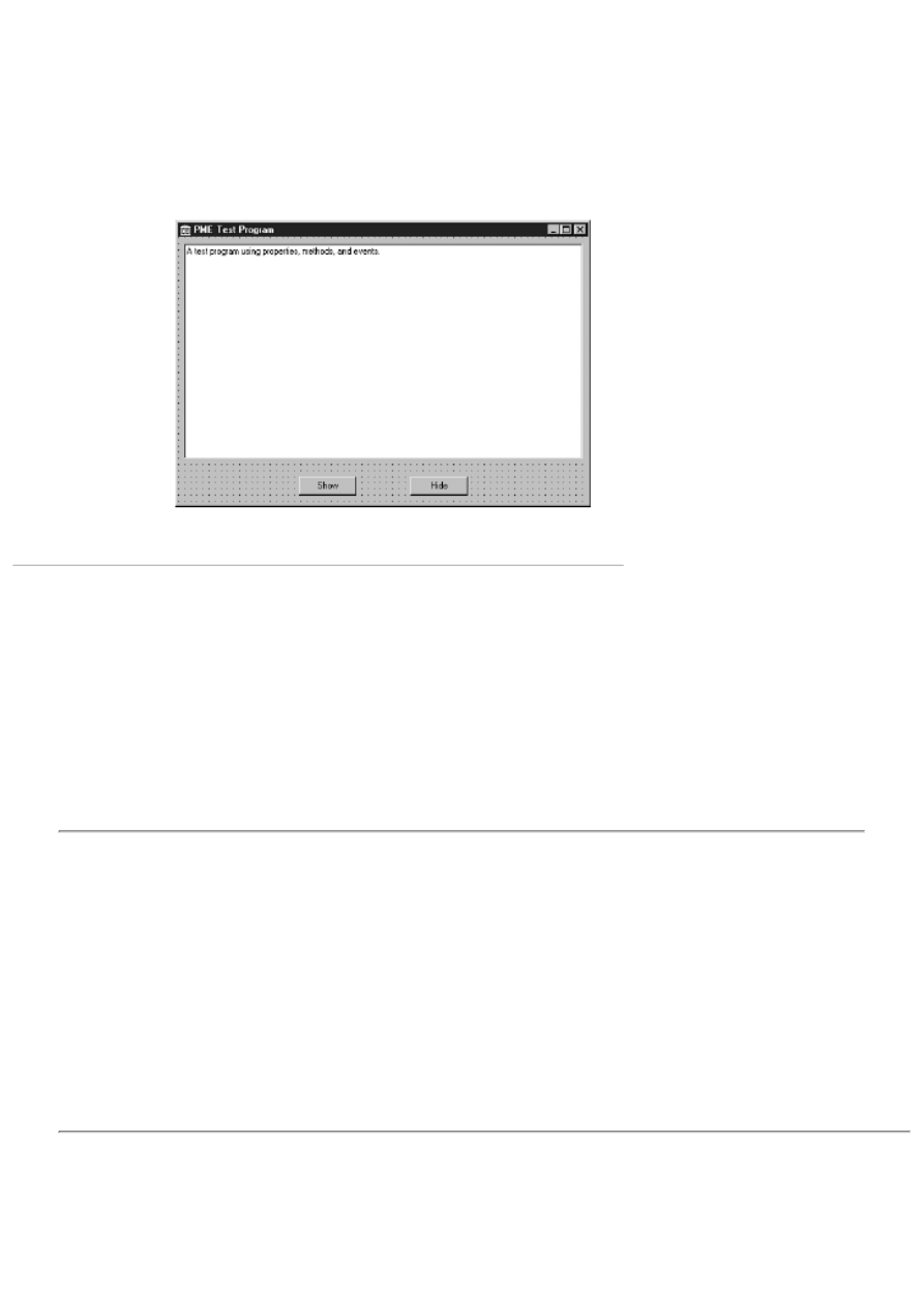
8. Bake at 425 degrees for one hour or until golden brown. (Just checking.)
Your form will look similar to Figure 5.4. Compile and run the program. Click each
button to be sure that it functions as advertised.
FIGURE 5.4.The form with all
components added.
What you have done here is create a single event-handling method that handles the OnClick event of both buttons. You use
the Sender parameter to determine which button sent the OnClick event and then either hide or show the memo component as
needed. You could have created a separate OnClick handler for each button, but with this method the code is more compact.
Besides, it's a good illustration of how Sender can be used.
Note that I am comparing the Sender variable to a component's Name property. Because both are pointers, a comparison is
being made to see whether both variables contain the same address.
Step 6 in the previous exercise illustrates an important point: After you create an OnClick event handler for a particular
component, you can attach that same handler to the OnClick event of any component on the form. This enables you to use the
same event handler for multiple components. I'll discuss events in more detail as you progress through the book.
HOUSE RULES: EVENTS
You can respond to any of a component's events as needed.
●
You are not required to respond to all events a component defines.
●
Events are handled by event-handling methods called event handlers.
●
Several components can share a common event handler.
●
Event-handler names produced by Delphi are default names and can be changed by the programmer.
●
Be sure to change an event handler's name only in the Object Inspector.
●
An event handler's Sender parameter can be used to determine which component generated the event.
●
Double-clicking the event handler's name in the Object Inspector displays the Code Editor and takes you to the section
of code containing the event handler.
●
Each event handler contains the parameters needed to properly handle that event.
●
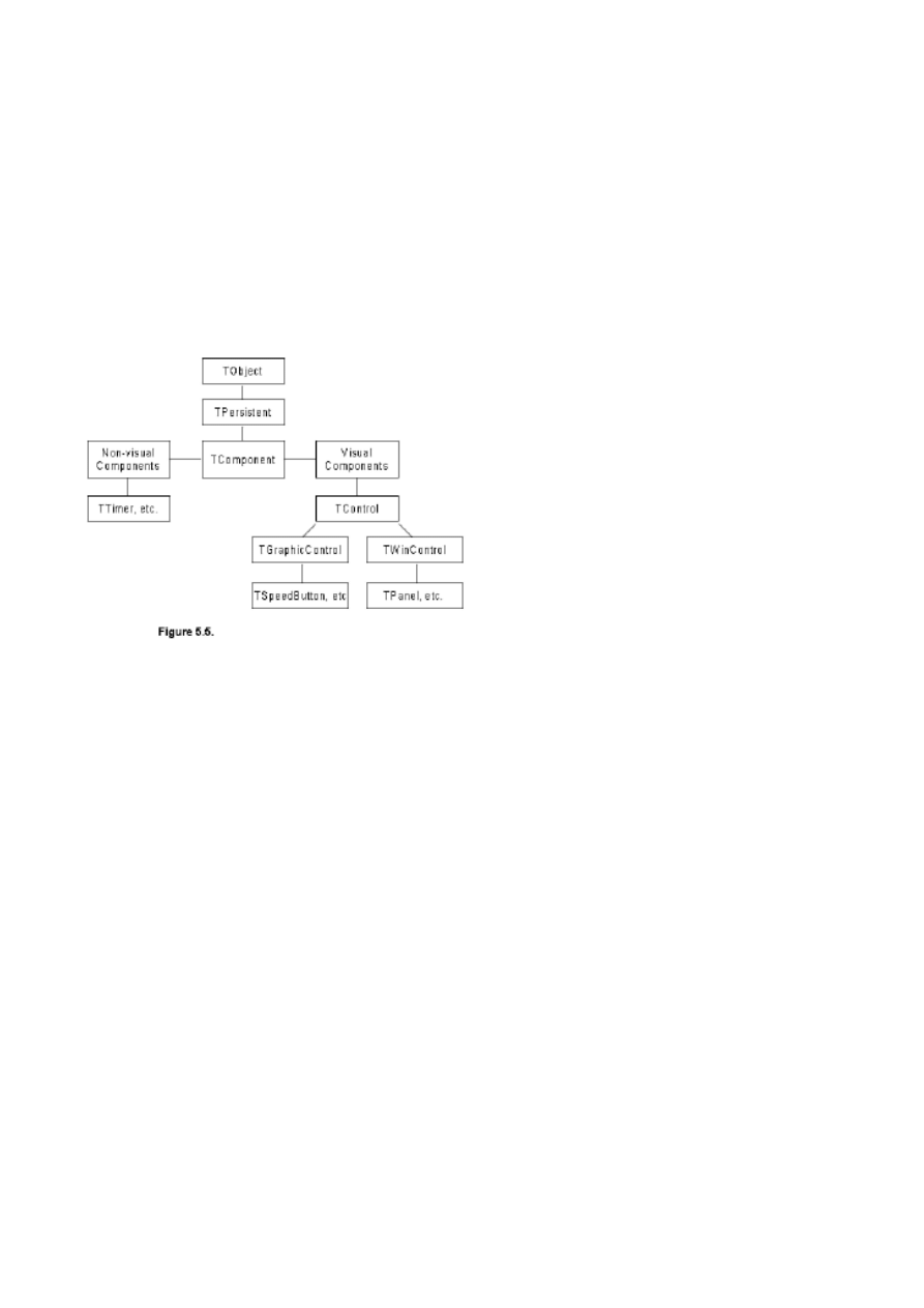
VCL Explored
The Visual Component Library is a well-designed framework. As with most good frameworks, VCL makes maximum use of
inheritance. The bulk of the VCL framework is composed of classes that represent components. Other VCL classes are not
related to components. These classes perform housekeeping chores, act as helper classes, and provide some utility services.
The VCL class hierarchy dealing with components is complex. Fortunately, you don't have to know every detail of VCL to
begin programming in Delphi. At the top of the VCL chain, you will find TObject. Figure 5.5 shows some of the main base
classes and the classes derived from them.
FIGURE 5.5.The VCL class hierarchy.
TObject is the granddaddy of all VCL component classes. (Remember that all classes in Object Pascal are derived from
TObject.) Below TObject you see TPersistent. This class deals with a component's capability to save itself to files and to
memory as well as other messy details you don't need to know ab

Teach Yourself Borland Delphi 4 in 21
Days
- 6 -
Working with the Form Designer and
the Menu Designer
Working with the Form Designer
The Form Designer's Context Menu
Preventing Components from Being Moved or Sized
Ordering, Cutting, Copying, and Pasting Components
Building an Example Application
Step 1: Starting a New Application
Step 4: Adding the Memo Component
And Now, the Moment You've All Been Waiting For...
As you know by now, Delphi is heavily form-based, a model that takes maximum advantage of the
visual programming environment. In this chapter you will explore
The Form Designer
●
The Menu Designer
●
To illustrate the use of the Form Designer, you will build an application that approximates the
Windows Notepad program. Along the way you will gain valuable experience working with the Form
Designer. Later in the chapter, you'll explore the Menu Designer in detail.
This chapter might seem elementary if you have used Delphi extensively. Even so, be sure to take a
quick look to discover things previously unknown or to rediscover things you've forgotten. I'm willing
to bet there is at least one thing in this chapter that will be new to you.
Working with the Form Designer
The Delphi Form Designer is a powerful visual programming tool. It enables you to place, select,
move, resize, and align components and much more. The Form Designer also enables you to size and
position the form itself, add menus, and create specialized dialog boxes--everything you need to create
the user interface to a typical Windows program.
I'll examine each Form Designer feature in the following sections. As you read, I encourage you to
stop and experiment any time you are curious about how something works. Sometimes a few minutes
playing around can teach you a technique that you will use for a long time to come.
The Form Designer's Context Menu
When you first start Delphi or when you create a new project, you are presented with a blank form in
the Form Designer. The Form Designer, like most Delphi windows, has a context menu associated
with it. Table 6.1 lists and describes each item on the Form Designer context menu.
TABLE 6.1. THE FORM DESIGNER'S CONTEXT MENU ITEMS.
Item
Description
Align to Grid
Aligns selected components to the Form Designer grid.
Bring to Front
Brings selected components to the front of all other components.
Send to Back
Sends selected components behind all other components.
Revert to Inherited Causes the selected control to revert to its original state when you are working
with a form that you have inherited from the Object Repository. (Inheriting
forms from the Object Repository is covered on Day 8, "Creating Applications in
Delphi.")
Align
Displays the Alignment dialog box.
Size
Displays the Size dialog box.
Scale
Displays the Scale dialog box.
Tab Order
Displays the Edit Tab Order dialog box.
Creation Order
Displays the Creation Order dialog box.
Flip Children
For non-English versions of Windows, this command changes the reading order
of a component. Disabled for English versions of Windows.
Add to Repository Adds this form to the Object Repository. Custom forms can be saved to be used
later. (The Object Repository is discussed on Day 8.)
View as Text
Shows the form description as text in the Code Editor. You can edit the form's
text version if you like. Choose View as Form from the Code Editor context
menu to go back to the form. You can also use Alt+F12 to switch from the View
as Text and View as Form options.
NOTE: Delphi creates a form file (DFM) for every form you create and places it in your
project's directory. The form file is a binary resource file that can't be read by mere
humans. When you choose the View as Text context menu item, Delphi converts the
binary resource to readable form. When you switch back to the View as Form option,
Delphi recompiles the form file to implement any changes you have made.
Most of the context menu options are discussed in the following sections. Others are discussed in later
chapters when you examine the particular aspect of Delphi to which they pertain.
Placing Components
Placing a component on a form is simple. All you have to do is select the component you want from
the Component palette and click on the form to place the component. When you click on the form, the
component's upper-left corner is placed at the location you clicked. Notice that when you click a
button on the Component palette, the button appears as pressed. When you click on the form to place
the component, the button on the Component palette pops up again to indicate that the action is
complete.
TIP: As you learned on Day 4, "The Delphi IDE Explored," to place a component on a
form multiple times, press and hold Shift when you first select the component's button on
the Component palette. Each time you click on the form, a new component will be added.
Click the Arrow button on the Component palette to stop placing components.
Most components can be sized. You can place a component on a form and then size it, or you can size
the component at the same time you place it on the form. To size while placing the component, click
on the form where you want the top-left corner to be placed and then drag with the mouse until the
component is the desired size. When you release the mouse, the component will be placed at the size
you specified.
NOTE: Not all components can be sized in this manner. Nonvisual components, for
example, are represented on the form by an icon. Although you can click and drag to

place a nonvisual component, the drag size will be ignored. Another example is a
single-line edit component. The edit component can be placed by dragging, but only the
drag width will be used. The drag height will be ignored because the height of a
single-line edit component defaults to the height of a single-line edit control.
CAUTION: If you change your mind while placing the control via the dragging method,
you can press the Esc key on the keyboard before you release the mouse button to cancel
the operation. The component's button will still be pressed on the Component palette,
however, so you might need to click the Arrow button to return to component-selection
mode.
Placing components is simple enough that you don't need to spend much time on the subject. You had
some experience with placing components yesterday, so let's move on to other things.
The Form Designer Grid
The Form Designer has a built-in grid that aids in designing forms. By default, Delphi shows the grid.
The grid size is initially set to eight pixels horizontally and eight pixels vertically. When the Form
Designer is set to display the grid, a dot is placed at the intersection of each grid point. Components
placed on a form will snap to the nearest grid point. By snap to I mean that the component's top-left
corner will automatically jump to the nearest grid point. This is an advantage because you frequently
want a group of controls to be aligned either on their left, right, top, or bottom edge. When the Snap to
Grid option is on, you merely get close enough to the correct location and the Form Designer
automatically places your component at the nearest grid point. This saves you time by sparing you
from tweaking the individual component's size or position on the form.
The grid settings can be modified via the Preferences page of the Environment Options dialog box.
(I'll discuss the Environment Options in detail on Day 9, "Projects, the Code Editor, and the Code
Explorer.") From here you can change the grid size or turn off the Snap to Grid feature. You can also
turn the grid display on or off. When the grid display is off, the grid is still active (assuming Snap to
Grid is on), but the dots marking grid points are not drawn on the form.
Selecting Components
After you place a component on a form, you often have to select the component in order to modify it
in some way. You might have to select a component to perform one of the following actions:
Move the component.
●
Change the component's properties.
●
Align the component.
●
Size the component.
●
Cut or copy the component to the Clipboard.
●
Order the component (bring to front or send to back).
●
Delete the component.
●
Selecting Individual Components
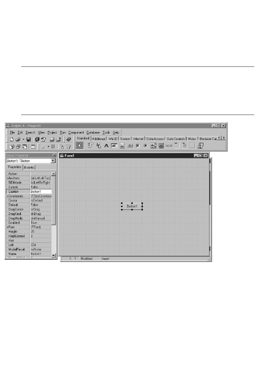
To select a single component, just click on it. When you select the component, eight black sizing
handles appear around the component to indicate that it is selected. (I'll discuss the sizing handles in a
moment.) Figure 6.1 shows a form with a button component selected.
As soon as you select a component, the Object Inspector changes to show the properties and events
for the control you selected. To deselect a control, click on the form's background or Shift+click on
the control. (Shift+click is described in the next section.)
NOTE: Each component has a default event handler associated with it. When you
double-click a component on a form, the Code Editor displays the default event handler
for that component, ready for you to type code. In most cases, the default event handler is
the OnClick handler. Exactly what happens when the component is double-clicked
depends on how the component is designed. For example, in the case of the Image
component, double-clicking will display the Picture Editor dialog box.
FIGURE 6.1.A
form with a button component selected.
Selecting a Group of Components
You can also select multiple components so that you can act on them as a group. This is accomplished
in one of three ways:
Shift+click with the keyboard and mouse.
●
Drag with the mouse.
●
Choose Edit | Select All from the main menu.
●

To select all components on the form, choose Edit | Select All from the main menu.
Selecting Components with Shift+Click
To use the Shift+click sequence, first select one control. Then press and hold the Shift key on the
keyboard and click on any other controls you want to include in the selection. Each control you click
is bounded by four gray boxes to indicate that it is part of the selection.
You can remove a control from the selection by continuing to hold the Shift key and again clicking on
the component. In other words, the Shift+click sequence toggles a component's inclusion in the
selection. To illustrate, first start with a blank form and then perform the following steps:
1. Place three button components anywhere on the form. They will automatically be labeled
Button1, Button2, and Button3.
2. Click Button1. The black sizing rectangles appear around the component.
3. Press and hold the Shift key on the keyboard. Click Button2. It is added to the selection. Gray
boxes now appear at the corners of both Button1 and Button2.
4. Shift+click on Button3. Now all three buttons are part of the selection.
5. Shift+click again on Button2. Button2 is removed from the selection (the gray boxes
disappear), but Button1 and Button3 are still included in the selection.
6. Shift+click on Button1. Now Button3 is the only component in the selection. The gray boxes
are replaced with the black sizing rectangles.
7. Shift+click on Button1 and Button2. All three buttons are now part of the selection again.
Figure 6.2 shows the form as it will look at the end of this sequence. Keep in mind that your buttons
could have been placed anywhere on the form. Keep the form handy because you'll use it again in the
next exercise.
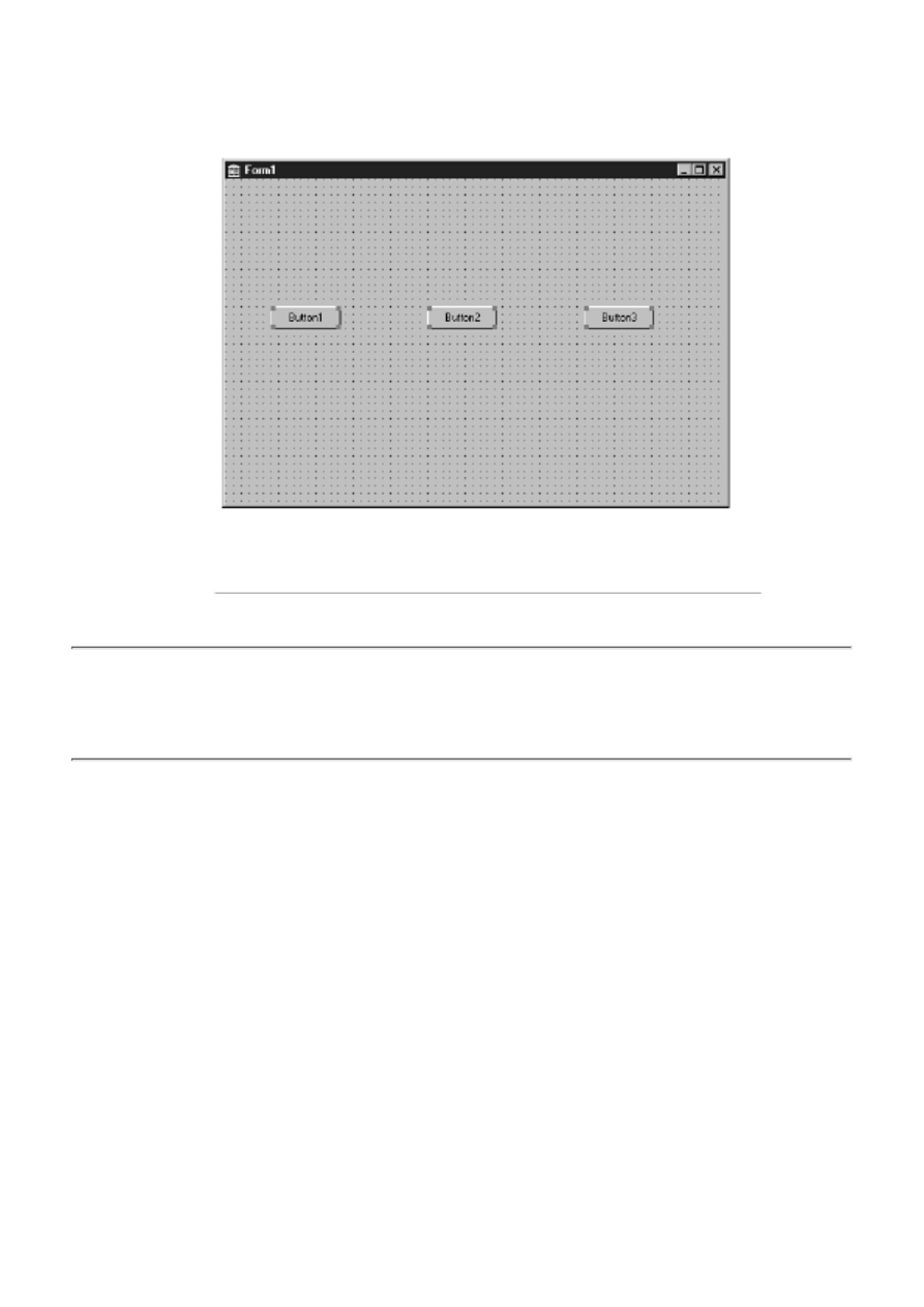
FIGURE 6.2. A
form with three buttons selected.
NOTE: If you click on a component that is part of a selection, nothing will happen. To
select a single control that is currently part of a group selection, you need to first click on
the form's background or press the Esc key to remove the group selection. Then you can
click on the individual control you want to select.
Selecting Multiple Components by Dragging
You can select multiple controls by dragging a bounding rectangle around the controls to be selected.
The bounding rectangle is a broken-line rectangle that changes size as you drag. In fact, you don't
have to drag the bounding rectangle completely around the components. You have only to touch a
component with the bounding rectangle in order for it to be included in the selection.
Be sure that you start by placing the mouse cursor over the form's background and not on a
component. Hold the left mouse button down and begin dragging. You will see the bounding
rectangle as you drag. Surround or touch the components you want selected and release the mouse
button. Any components that were inside the bounding rectangle (or touching it) are included in the
selection.
When you have selected a group of controls, you can use the Shift+click technique explained in the
previous section to add other controls to the selection or to remove controls from the selection. For
example, you might want to select all controls in one area of your form except for one. Surround the
controls and then deselect the control you want to exclude from the selection.
Go back to the form with the three buttons you created earlier (if you've already discarded that form,
create a new one and place three buttons on it). Start at the top-left corner and drag down and to the
right to surround the buttons. Let go of the mouse button and the controls will be selected. Figure 6.3
shows the form and the bounding rectangle being dragged.
FIGURE 6.3.
Controls being selected by dragging.
CAUTION: You can use Shift+drag to select non-adjacent groups of controls. If, for instance, you
have two separate groups of controls in different areas on your form, you can drag around the first set
and then hold the Shift key down and drag around the second set. Both groups will be selected.
NOTE: You don't have to drag down and to the right. You can drag in any direction to
select components.
Selecting Multiple Items: Components within Components
Frequently you will have components placed within other components. The Panel component is often
used as a container for other components. To select a group of components on a panel, you have to
hold down the Ctrl key on the keyboard while you drag to select the components. (Try it without
holding down the Ctrl key and see what happens!) In case you're wondering, yes, you can use a
combination of Ctrl+Shift+drag. (I suppose the Borland designers could have figured out some way of
working the Alt key in there, too.)
To illustrate, first start with a blank form. Then do the following:
1. Select a Panel component from the Component palette and place it on the form using the drag
method. Drag it so that it occupies most of the form.
2. Now select a Button component and place six buttons on the form. Your form will look
something like Figure 6.4.
FIGURE 6.4.
The form with a panel and six buttons.
3. Drag a bounding rectangle around Button1, Button2, and Button3. Notice that you moved the
panel, which is not what you expected (and not what you wanted). Move the panel back to
where it was.
4. Hold down the Ctrl key and drag a rectangle around Button1, Button2, and Button3. The
buttons are selected.
5. Now hold down both the Ctrl and Shift keys and drag the bounding rectangle around Button5
and Button6. Now all buttons are selected except Button4.
Using the Ctrl+drag sequence is the only way to select a group of components contained within
another component if you are using the drag method. You can use the Shift+click method to select
components contained within another component just as you do when selecting components on a
form.
Moving Components
Moving components is a common and simple task. To move an individual component, place the
mouse cursor over the component and drag. As you drag, a rectangle that represents the component
moves with the mouse cursor. When you have the rectangle where you want it, let go of the mouse
button and the component will be moved to that location.
NOTE: When you move a control via drag and drop, the control's Left and Top
properties are automatically updated. If you pause for a moment while moving a
component, you will notice a tooltip appear next to the mouse cursor. The tooltip shows
what the new top and left position of the component will be when you stop dragging.
A similar tooltip is displayed when sizing a component by dragging. In the case of sizing
a component, the tooltip shows what the new width and height of the component will be
when you stop dragging. Figure 6.6 shows the tooltip you see when sizing a component
(in the lower-right corner).
If you have the Snap to Grid option on, the dragging rectangle will snap to the nearest grid point as
you drag.
TIP: If you change your mind while dragging, you can press the Esc key on the keyboard
before you release the mouse button to cancel the drag operation. The component will
return to its original position.
Dragging a group of controls works the same way. After you have a group of components selected,
place the mouse cursor over any one of the controls and begin dragging. The dragging rectangle will
be displayed for each control in the group. This enables you to visualize where the group will be
placed when you release the mouse button.
NOTE: You cannot move a group of components if components in the group have
different parent controls. For instance, let's say you select both a Button component on
the main form and a SpeedButton on a panel. Because these two components have
different parent controls, you cannot move them as a group.
TIP: When you have selected a control, you can nudge it a pixel at a time by holding
down the Ctrl key while using the arrow keys on the keyboard. This technique works for
both groups of controls and individual controls. The Snap to Grid feature is overridden
when you use this technique.
After you have moved a component using this method, the component is no longer on a
grid point--it is offset by some amount. If you now drag the component, it will maintain
its offset from the grid point as you drag.
TIP: If you move a control using the Ctrl+arrow method and want to align it again to the
grid, choose Edit | Align to Grid from the main menu. The control's top-left corner will
snap to the nearest grid point.
A control cannot be dragged outside its parent form. If you drag a component off the form's left or top
edge, you will see that the component is clipped at the form's edge. If, however, you drag the
component off the right or bottom of the form and drop it, scrollbars will appear on the form so that
you can scroll to see the rest of the form.
The form's Width and Height properties are not altered. If you drag the component back onto the
visible part of the form, the scrollbars disappear again. This is the default behavior and will occur
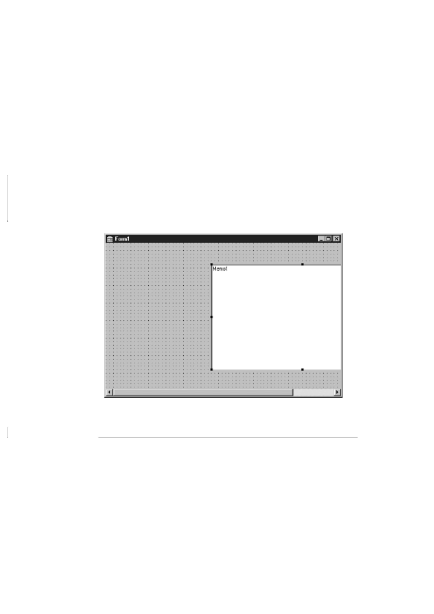
unless you change the form's AutoScroll property to False. Figure 6.5 shows a Memo component that
has been dragged partially off the form's right edge. Notice the scrollbar that appears at the bottom of
the form.
Preventing Components from Being Moved or Sized
Components can be locked into place so that they cannot be moved. Locking components is useful if
you know that a form's design is final and you don't want to worry about accidentally moving
controls. To lock a form's controls, choose Edit | Lock Controls from the main menu. Locked controls
cannot be moved or sized. When controls are locked, their sizing handles are gray with a black border.
To unlock the controls, choose Edit | Lock Controls again. The controls can now be moved as before.
You can lock all components on a form with this technique or none of the components. You cannot,
however, lock just selected components.
FIGURE 6.5. A
form with AutoScroll in action.
Ordering, Cutting, Copying, and Pasting Components
Sometimes you will place components on top of one another to achieve a visual effect. For example, a
shadowed box can be created by placing a white box over a black box (both would be Shape
components). Obviously you can't have the shadow on top of the box, so you have to order the
controls to tell Delphi which controls go on top and which go on the bottom. Let's do a simple
exercise that illustrates this. Along the way, you will also see how you can use Copy and Paste with
components. First, start with a blank form (you know the drill by now). Now follow these steps:
1. Click on the Additional tab on the Component palette and choose the Shape component.
Click on the form to place the shape. A white square appears on the form.

2. Size the shape as desired (mine ended up being 209 pixels by 129 pixels).
3. Be sure the Shape component is selected. Choose Edit | Copy from the main menu.
4. Choose Edit | Paste from the main menu. A copy of the shape is placed below and to the right
of the original shape. Conveniently, this is exactly where you want it.
NOTE: After a paste operation, the component just pasted will be selected.
5. Double-click the Brush property in the Object Inspector and change its Color property to
clBlack. The new shape is now black, but it is on top of the original shape. Can't have that!
6. Click the secondary mouse button and choose Send to Back from the context menu (you can
also choose Edit | Send to Back from the main menu). The black shape is moved behind the
white shape. You now have a box with a shadow. (As an alternative, you could have clicked on
the white shape and used Bring to Front to move it on top of the black shape.)
This exercise illustrates two features of the Form Designer. It shows how you can change the stacking
order of controls and how you can use Copy and Paste to copy components. The original component's
properties are copied exactly and pasted in as part of the pasting process. Each time you paste a
component, it is placed below and to the right of the previous component you pasted.
NOTE: If a component that can serve as a container is selected when you perform Paste,
the component in the Clipboard will be pasted as the container component's child. For
example, you might want to move a button from the main form to a panel. You can select
the button and choose Edit | Cut from the main menu to remove the button from the form
and place it in the Clipboard. Then you can select the panel and choose Edit | Paste from
the main menu to paste the button onto the panel.
I don't need to go into much detail on the cut operation. When you cut a component, the component
disappears from the form and is placed in the Clipboard. Later, you can paste the component onto the
form or onto another component such as a Panel component.
TIP: You can also copy a component and paste it into your source code. The results will
be something like this:
object Edit1: TEdit
Left = 24
Top = 16
Width = 457
Height = 21
TabOrder = 0
Text = `Edit1'
end
This is not code that will compile, but this technique will give you a component's size
and position as it appears on the form. This information comes in handy when you create
components on-the-fly at runtime rather than at design time. You can place a dummy
component visually on the form, get its size and position using Copy and Paste, and then
delete the component. Then you can write code to create the component at runtime and
know that it will be properly sized and positioned.

Sizing Components
With some components, you drop them on a form and accept the default size. Buttons are a good
example. A standard button has a height of 25 pixels and a width of 75 pixels. For many situations,
the default button size is exactly what you want. With some components, however, the default size is
rarely exactly what you need. A Memo component, for example, nearly always has to be sized to fit
the specific form on which you are working.
Sizing by Dragging
When you select a control, eight black sizing handles appear around the control. When you place the
mouse cursor over one of the sizing handles, the cursor changes to a double-headed arrow known as
the sizing cursor. When you see the sizing cursor, you can begin dragging to size the control. How the
component is sized depends on which sizing handle you grab.
The sizing handles centered at the top and bottom of the component size it vertically (taller or
shorter). Likewise, the right and left sizing handles size the component horizontally (wider or
narrower). If you grab one of the sizing handles in the component's corners, you can size both
horizontally and vertically at the same time. As with moving a component, a sizing rectangle appears
as you drag. When the sizing rectangle is the desired size, let go of the mouse button and the
component will be resized. Figure 6.6 illustrates a memo component being sized by dragging; Figure
6.7 shows the form after the drag operation.
NOTE: Sizing applies to visual components only. Nonvisual components appear on the
form as an icon that cannot be sized. The sizing handles appear on nonvisual components
and the handles can be dragged, but the result of the dragging operation will be ignored.
FIGURE 6.6. A
memo component being sized.
FIGURE 6.7.
The form after sizing the memo component.
Groups of controls cannot be sized by dragging. The sizing handles (black squares) are replaced by
selection indicators (gray squares) when you select more than one component.
TIP: To size all the components in a group at one time, modify the Width or Height
property in the Object Inspector or use the Size dialog box (the Size dialog box is
discussed in the next section). All components in the selection will take on the new
values.
TIP: To size a control or group of controls by one pixel at a time, hold down the Shift
key and press any arrow key on the keyboard. The up and down arrows size the control
vertically and the right and left arrows size it horizontally. Only the component's Width
and Height properties are affected. The Top and Left properties are not modified.
Sizing with the Size Dialog Box
Another sizing option is the Size dialog box. You can bring up the Size dialog box by choosing Edit |
Size from the main menu. Figure 6.8 shows the Size dialog box.
FIGURE 6.8.
The Size dialog box.
The Size dialog box is used when you want to force a group of controls to the same width or height.
For instance, let's say you have six edit components on a form, all with different widths. To make the
form appear more balanced, you might want to make all the edit components the same width. First,
select the components and then invoke the Size dialog box. From there you can choose Shrink to
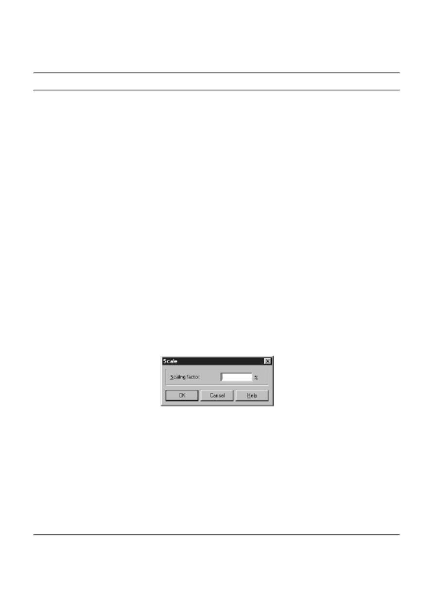
smallest (in the Width column) to make all the components the width of the shortest edit component,
or Grow to largest to make all the components the width of the longest component in the group. You
can also enter an exact width in the Width box, in which case you would leave the Height set on No
change. When you click OK, the components will all be the same width.
TIP: The Size dialog box can also be invoked from the Form Designer context menu.
Sizing with the Scale Dialog Box
Another sizing tool is the Scale dialog box, shown in Figure 6.9. This dialog box enables you to
specify a scaling percentage. To make the components twice as large, enter 200 in the Scaling factor
box. To reduce the components' size by half, enter 50 in the Scaling factor box. The Scale dialog box
is convenient for quickly changing the size of all the form's components. You can bring up the Scale
dialog box by choosing Edit | Scale from the main menu or Scale from the Form Designer context
menu.
A control can also be sized and moved by using the various Alignment options. Let's take a look at
those in the next section.
FIGURE 6.9.
The Scale dialog box.
NOTE: Remember, components can always be moved by modifying their Left and Top
properties and sized by modifying their Width and Height properties in the Object
Inspector.

Aligning Components
Regardless of whether you have the Snap to Grid option turned on, you sometimes need to align
components after placing them. Aligning components could mean aligning several components along
a common edge, centering components on the form, or spacing components. There are two ways to
align components:
Use the Alignment palette and Alignment dialog box.
●
Modify a component's Align property.
●
The following sections explain these two methods.
NOTE: You might have noticed the Alignment property for some components. This
property pertains only to the way the component's text is aligned (centered,
right-justified, or left-justified) and has nothing to do with aligning components on a
form.
The Alignment Palette and the Alignment Dialog Box
It is often necessary to move or size components relative to the form or relative to one another. The
Alignment palette contains several buttons that aid in that task. The Alignment dialog box performs
the same operations as the Alignment palette, but in a different format. To display the Alignment
palette, choose View | Alignment Palette from the main menu. Figure 6.10 shows the Alignment
palette and describes each button. If you pause the mouse cursor over a button on the Alignment
palette, a tooltip describing the button will appear.
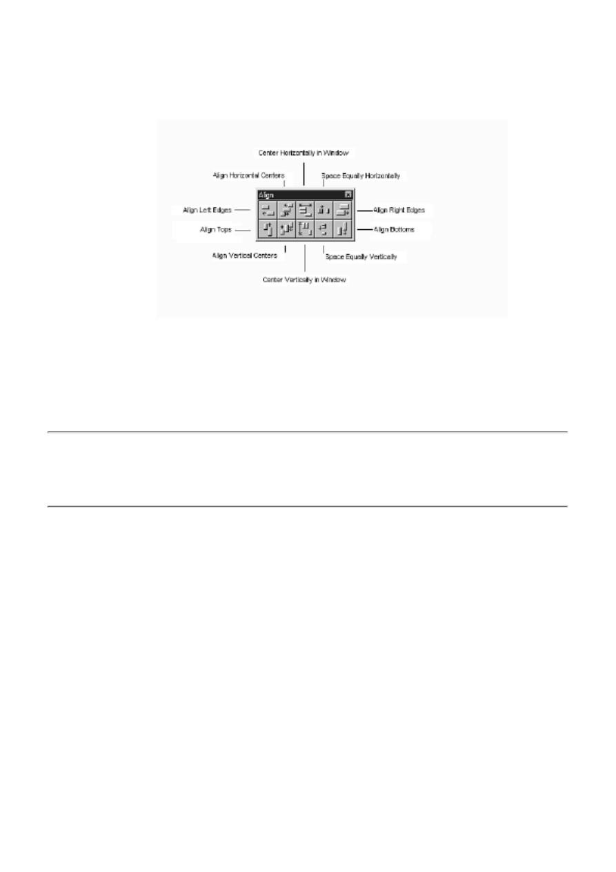
FIGURE 6.10.
The Alignment palette.
TIP: The Alignment palette can save you a lot of work. Don't spend too much time
trying to get controls to line up exactly. Place the components on the form and then use
the Alignment palette to position them.
The Align Left Edges button is used to line up components on their left edges. Start with a blank form
and then do the following:
1. Place five button components vertically on the form without regard to their left edges.
2. Select the buttons by dragging a bounding rectangle around them. The selection indicators
show that all the buttons are selected. The form will look something like the one in Figure 6.11.
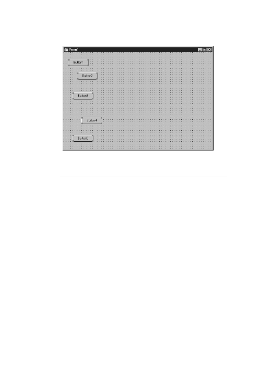
FIGURE 6.11.
The form with the buttons randomly placed.
3. Choose View | Alignment Palette from the main menu. The Alignment palette is displayed.
Move the Alignment palette, if necessary, so that it doesn't obscure the form.
4. Click the Align Left Edges button on the Alignment palette. The buttons are all lined up.
See how easy that is? As long as you have the buttons selected, let's look at another alignment option.
The Space Equally Vertically alignment option can now be used to space the buttons evenly. The
buttons should still be selected, so all you have to do is click the Space Equally Vertically button on
the Alignment palette, and voilà! The buttons are perfectly spaced. The form will now look like
Figure 6.12.
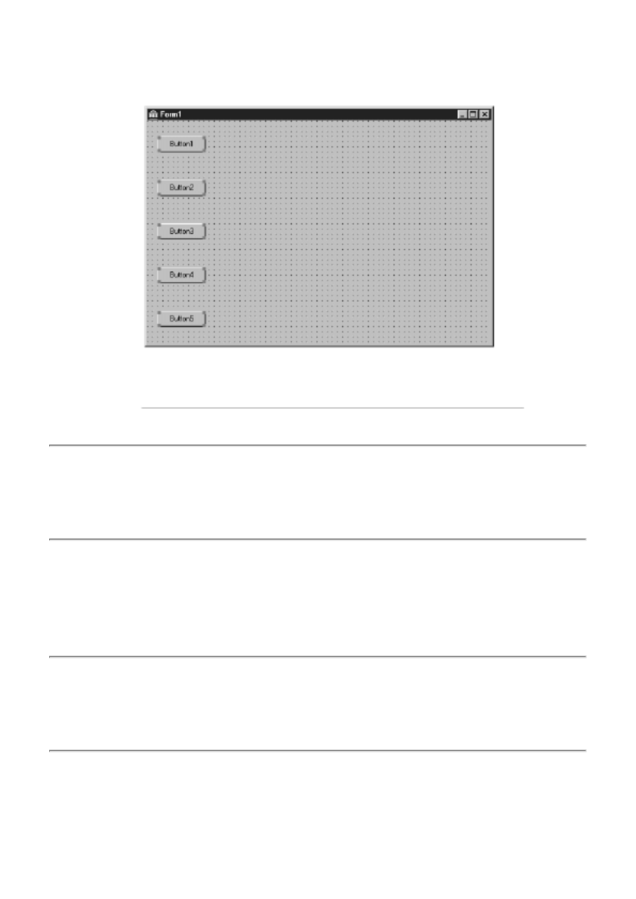
FIGURE
6.12.The form with the buttons aligned and equally spaced.
NOTE: The Space Equally Vertically alignment option spaces the components equally
between the first component in the column (the top component) and the last component
in the column (the bottom component). Be sure to set the first and last components where
you want them before choosing the Space Equally Vertically alignment option. This is
true of the Space Equally Horizontally alignment option as well.
The Center Horizontally in Window and Center Vertically in Window alignment options do exactly as
their names indicate. These options are convenient for centering a single control on the form or for
centering a group of controls. As long as you still have the group of buttons selected, click both the
Center Horizontally in Window and Center Vertically in Window buttons on the Alignment palette.
The buttons will be centered on the form both horizontally and vertically.
NOTE: When you select a group of controls and click one of the centering buttons, the
controls will be treated as a group. If you choose each control individually and center it
both horizontally and vertically on the form, all the controls will be stacked on top of one
another in the middle of the form. By selecting the group and then centering, you get the
entire group centered as you intended.
The form will now look like the one shown in Figure 6.13.
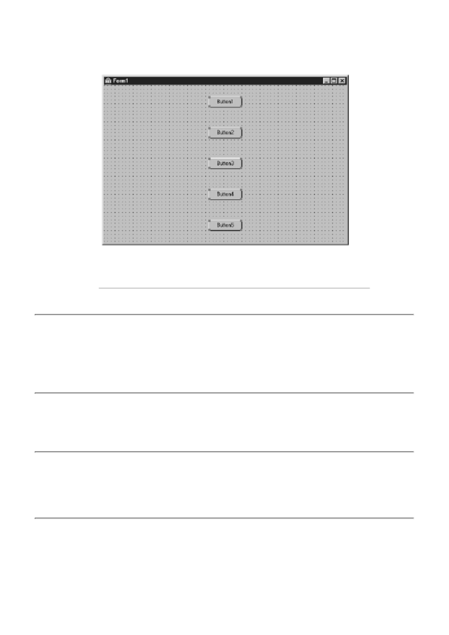
FIGURE
6.13.The form with the buttons centered.
NOTE: The Center Horizontally in Window and Center Vertically in Window alignment
options can be used to align components contained within other components, such as
buttons on a panel. The components will be centered horizontally or vertically on their
parent component regardless of whether the parent is a panel, a form, or some other
container component.
The Align Tops, Align Bottoms, and Align Right Edges options work just like the Align Left Edges
option you used earlier. There's not much point in going over all the possibilities that exist for their
use.
TIP: The first component selected will be the anchor point when using any
edge-alignment option. Refer to Figure 6.4. Let's say you selected Button3 first and then
used Shift+click to select the remaining buttons. When you choose Align Left Edges,
Button3 will remain where it is and all the other buttons will line up with Button3's left
edge because Button3 is the anchor component.
The Align Horizontal Centers and Align Vertical Centers options can be used to center components
relative to one another. This is best illustrated with shapes. Start with a new form (or delete the
buttons from the form you have been working on). Now do the following:
1. Click on the Additional tab on the Component palette and choose the Shape component.
Click somewhere on the upper left of the form to add the shape.
2. Change the Shape property to stCircle.
3. Change the Width and Height properties to 150.
4. Double-click the Brush property and change its Color property to clBlack.
5. Place another Shape component on the form.
6. Change the second shape's Shape property to stCircle as well. Now you have two circles of
different sizes on the screen--a white circle and a black circle.
7. Click on the black circle. Hold the Shift key and click on the white circle. Both shapes are
selected.
8. Choose View | Alignment Palette from the main menu, if necessary (it might already be
displayed). Arrange the Alignment palette so you can see the two shapes on the form. Observe
the shapes as you perform the last two steps.
9. Click the Align Vertical Centers button on the Alignment palette. The vertical centers are
aligned.
10. Click the Align Horizontal Centers button on the Alignment palette. The horizontal centers
are aligned. Congratulations--you made a tire!
Did you see the effect as you performed the last two steps? Notice that because you selected the black
circle first, it did not move (it is the anchor component), but the white circle moved as you clicked the
alignment buttons. You can use these alignment options to center any number of controls on one
another. These two alignment options have no effect when used on a single control.
Like the Component palette, the Alignment palette has a context menu associated with it. Place the
mouse cursor over the Alignment palette and click the secondary mouse button. The context menu is
displayed. Table 6.2 lists the items on the Alignment palette's context menu and explains their uses.
TABLE 6.2. THE ALIGNMENT PALETTE'S CONTEXT MENU ITEMS.
Menu Item
Description
Stay on Top Forces the Alignment palette to always be on top. This is useful if you are frequently
switching back and forth between the Form Designer and the Code Editor. Because the
Alignment palette is a small window, it's easy to lose it.
Show Hints Turns the hints (tooltips) for the Alignment palette buttons on and off.
Hide
Hides the Alignment palette. (You can also use the close box on the
Alignment palette to hide it.) To show the Alignment palette again, you
have to choose View | Alignment Palette from

Teach Yourself Borland Delphi 4 in 21
Days
- 7 -
VCL Components
The ParentColor, ParentCtl3D, ParentFont, and ParentShowHint Properties
Standard Windows Control Components
The File Open and File Save Dialog Boxes
The File Open Picture and File Save Picture Dialog Boxes
The Find and Replace Dialog Boxes
As you know by now, components are much of what gives Delphi its power. Using the Form
Designer, you can place a component on a form and modify its design-time properties. In some cases,
that's all you have to do. If needed, you can also manipulate the component at runtime by changing its
properties and calling its methods. Further, each component is designed to respond to certain events. I
discussed properties, methods, and events on Day 5, "The Visual Component Model," so I'm not
going to go over that again.
Today you will find out more about components. You will learn about often-used components and, as
a result, learn about the Visual Component Library (VCL) classes that represent those components. As
you go through this chapter, feel free to experiment. If you read something that you want to test, by all
means do so. Learning by experience is as valuable as anything you can do, so don't be afraid to
experiment.
A Review of Components
Let's review some of what you already know about components. Before doing that, though, I want to
take a moment to explain the differences between a VCL component and a Windows control.
Windows controls include components such as edit controls, list boxes, combo boxes, static controls
(labels), and buttons, not to mention all the Win32 controls. Windows controls, by nature, don't have
properties, methods, and events. Instead, messages are used to tell the control what to do or to get
information from the control. To say that dealing with controls on this level is tedious and
cumbersome would be an understatement.
A VCL component is a class that encapsulates a Windows control (not all VCL components
encapsulate controls, though). A VCL component in effect adds properties, methods, and events to a
Windows control to make working with the control easier. You might say that VCL takes a fresh
approach to working with Windows controls. It could be said that all VCL components are controls,
but not all controls are components. A VCL Edit component, for example, is a control, but a standard
Windows edit control is not a VCL component. VCL components work with Windows controls to
raise the job of dealing with those controls to a higher level.

Given that discussion, then, I will use the terms control and component interchangeably when
referring to VCL components. (But I will never call a Windows control a component!)
Visual Components
Visual components include components such as edit controls, buttons, list boxes, labels, and so on.
Most components you will use in a Delphi application are visual components. Visual components, as
much as possible, show you at design time what the component will look like when the program runs.
New Term: Some components are visual components; others are nonvisual components. A visual
component, as its name implies, is one that can be seen by the user at design time.
Nonvisual Components
New Term: A nonvisual component is one that cannot be seen by the user at design time.
Nonvisual components work behind the scenes to perform specific programming tasks. Examples
include system timers, database components, and image lists. Common dialog boxes such as File
Open, File Save, Font, and so on are considered nonvisual components as well. (They are nonvisual
because they don't show themselves at design time. At runtime, they become visible when they are
invoked.) The common dialog components are discussed later in the section "The Common Dialog
Boxes."
When you place a nonvisual component on a form, Delphi displays an icon representing the
component on the form. This icon is used to access the component at design time in order to change
the component's properties, but the icon does not show up when the program runs. Nonvisual
components have properties, methods, and events just like visual components do.
Now let's look at some of the common properties components share.
The Name Property
The Name property serves a vital role in components. On Day 5, "The Visual Component Model," in
the section "VCL Explored," I discussed some of what happens when you place a component on a
form. As soon as you place a component on a form, Delphi goes to work in the background while you
ponder your next move. One thing Delphi does is create a pointer to the component and assign the
Name property as the variable name. For example, let's say you place an Edit component on a form
and change the Name property to MyEdit. At that point, Delphi places the following in the class
declaration for the form (in the published section):
MyEdit: TEdit;
When the application runs, Delphi creates an instance of the TEdit class and assigns it to MyEdit. You
can use this pointer to access the component at runtime. To set the text for the edit control, you would
use
MyEdit.Text := `Jenna Lynn';
Delphi also uses the Name property when creating event-handler names. Let's say that you want to
respond to the OnChange event for an Edit component. Normally, you double-click the Value column
in the Object Inspector next to the OnChange event to have Delphi generate an event handler for the
event. Delphi creates a default function name based on the Name property of the component and the

event being handled. In this case, Delphi would generate a function called MyEditChange.
You can change the Name property at any time provided that you change it only via the Object
Inspector. When you change a component's Name property at design time, Delphi goes through all the
code that it previously generated and changes the name of the pointer and all event-handling
functions.
NOTE: Delphi will change all the code that it generated to reflect the new value of the
component's Name property, but it will not modify any code you wrote. In other words,
Delphi will take care of modifying the code it wrote, but it is up to you to update and
maintain the code you wrote. Generally speaking, you should set the Name property
when you initially place the component on the form and leave it alone after that. There's
no problem with changing the name at a later time, but it might lead to more work.
Continuing with this example, if you change the Name property of the edit control from MyEdit to
FirstName, Delphi will change the pointer name to FirstName and the OnChange handler name to
FirstNameChange. It's all done automatically; you don't have to do anything but change the Name
property and trust that Delphi will do the rest of the work.
CAUTION: Never change the Name property at runtime. Never manually change a
component's name (the name that Delphi assigned to the component's pointer) or
event-handler names in the Code Editor. If you perform either of these actions, Delphi
loses track of components and the results are not good, to say the least. You might even
lose the ability to load your form. The only safe way to change the Name property of a
component is through the Object Inspector.
Delphi assigns a default value to the Name property for all components placed on a form. If you place
an Edit component, for example, Delphi assigns Edit1 to the Name property. If you place a second
Edit component on the form, Delphi will assign Edit2 to that component's Name property, and so on.
You should give your components meaningful names as soon as possible to avoid confusion and extra
work later on.
NOTE: You can leave the default names for components that will never be referenced in
code. For example, if you have several label components that contain static (unchanging)
text, you can leave the default names because you won't be accessing the components at
runtime.
Important Common Properties
All components have certain properties in common. For example, all visual components have Left and
Top properties that determine where the component is placed on the form. Properties such as Left,
Top, Height, and Width are self-explanatory, so I won't go over them here. A few of the common
properties, however, warrant a closer look.
The Align Property
On Day 6, "Working with the Form Designer and the Menu Designer," I discussed the Align and
Alignment properties, so I won't go over those again in detail. Refer to Day 6 for complete
information on Align. It should be noted here, however, that not all components expose the Align
property at design time. A single-line edit control, for example, should occupy a standard height, so
the features of the Align property do not make sense for that type of component. As you gain
experience with Delphi (and depending on the type of applications you write), you will probably rely
heavily on the Align property.
The Color Property
The Color property sets the background color for the component. (The text color is set through the
Font property.) Although the Color property is simple to use, there are a few aspects of component
colors that should be addressed.
The way the Color property is handled in the Object Inspector is somewhat unique. If you click the
Value column, you see the drop-down arrow button indicating that you can choose from a list of color
values. That is certainly the case, but there's more to it than that. If you double-click the Value
column, the Color dialog box will be displayed. This dialog box enables you to choose a color from
one of the predefined colors or to create your own colors by clicking the Define Custom Colors
button. Figure 7.1 shows the Color dialog box after the Define Custom Colors button has been
clicked.
FIGURE
7.1.The Color dialog box.
NOTE: This is the same Color dialog box that will be displayed if you implement the ColorDialog

component in your application.
If you choose a color from the Color dialog box, you see that the value of the Color property changes
to a hexadecimal string. This string represents the red, green, and blue (RGB) values that make up the
color. If you know the exact RGB value of a color, you can type it in (not likely!).
Most of the time you will probably choose a color from the list of color values provided. When you
click the drop-down button to display the list of possible values, you will see what essentially amounts
to two groups of values. The first group of colors begins with clBlack and ends with clWhite. These
are the Delphi predefined colors; this list represents the most commonly used colors. To choose one of
the listed colors, simply click the color in the list. If you can't find a color in the list that suits your
needs, you can invoke the Color dialog box as discussed.
The second group of colors in the list begins with clScrollBar. This group of colors represents the
Windows system colors. If you use colors from this list, your application will automatically adjust its
colors when the user changes color schemes in Windows. If you want your application to follow the
color scheme the user has chosen for his or her system, you should choose colors from this list rather
than from the first list.
Use of color should be carefully considered. Proper use of color provides an aesthetically pleasing
environment for the user. Abuse of colors makes for an obnoxious application that is annoying to use.
Color is like a magnet to new programmers. It is common to want to throw lots of colors on a form
because it's fun and easy, but don't get caught up in the fun at the expense of your users.
The Cursor Property
The Cursor property controls the cursor that is displayed when the user moves the mouse cursor over
the component. Windows automatically changes cursors for some components. For example,
Windows changes the cursor to an I-beam when the cursor is moved over an Edit, Memo, or RichEdit
component.
To let Windows manage the cursor, leave the Cursor property set to crDefault. If you have specialized
windows (components), you can specify one of the other cursors. When the mouse is moved over that
component, Windows will change the cursor to the one you specified.
Frequently, you will need to change cursors at runtime. A long process, for example, should be
indicated to the user by displaying the hourglass cursor. When you reset the cursor, you need to be
sure to set the cursor back to whatever it was originally. The following code snippet illustrates this
concept:
var
OldCursor : TCursor;
begin
OldCursor := Screen.Cursor;
Screen.Cursor := crHourGlass;
{ do some stuff which takes a long time }
Screen.Cursor := OldCursor;
end;
This ensures that the cursor that was originally set for the application is properly restored.
Another cursor property, DragCursor, is used to set the cursor that is used when the mouse cursor is

over a component that supports drag-and-drop. As with colors, you should be prudent in your use of
cursors. Use custom cursors when needed, but don't overdo it.
The Enabled Property
Components can be enabled or disabled through the Enabled property. When a component is disabled,
it cannot accept focus (clicking on it has no effect), and usually it gives some visual cue to indicate
that it is disabled. In the case of buttons, for example, the button text is grayed out as is any bitmap on
the button. Enabled is a Boolean property: Set it to True to enable the component or set it to False to
disable the component. Enabling and disabling windows (remember that windowed components are
windows, too) is a feature of Windows itself.
NOTE: Some components show their disabled state at design time, but most don't. The
BitBtn component is one that does show its disabled state at design time.
The Enabled property applies mostly to windowed components, but it can apply to non-windowed
components as well. The SpeedButton component is an example of a non-windowed component that
can be disabled.
NOTE: Modifying the Enabled property for a Panel component has additional
implications. Panels are often used as containers for other controls. Therefore, a panel
becomes the parent of the controls that are placed on the panel. If you disable a panel, the
components on the panel will not show as disabled, but they will not function because
their parent (the panel) is disabled.
Although components can be disabled at design time, enabling and disabling components is
something that is usually done at runtime. Menu items, for example, should be enabled or disabled
according to whether they apply at a given time. The same is true of buttons. There are a variety of
reasons why you might want to disable other types of controls as well.
To disable a component at runtime, just assign False to its Enabled property, and to enable a
component assign True to Enabled. The following code snippet enables or disables a menu item based
on some condition:
if CanSave then
FileSave.Enabled := True
else
FileSave.Enabled := False;
This process is often referred to as command enabling and is an important part of a
professional-looking Windows program.
TIP: The TActionList component can be used to enable or disable a component or
groups of components. TActionList is discussed in detail on Day 13, "Beyond the
Basics," in the section "Command Enabling."
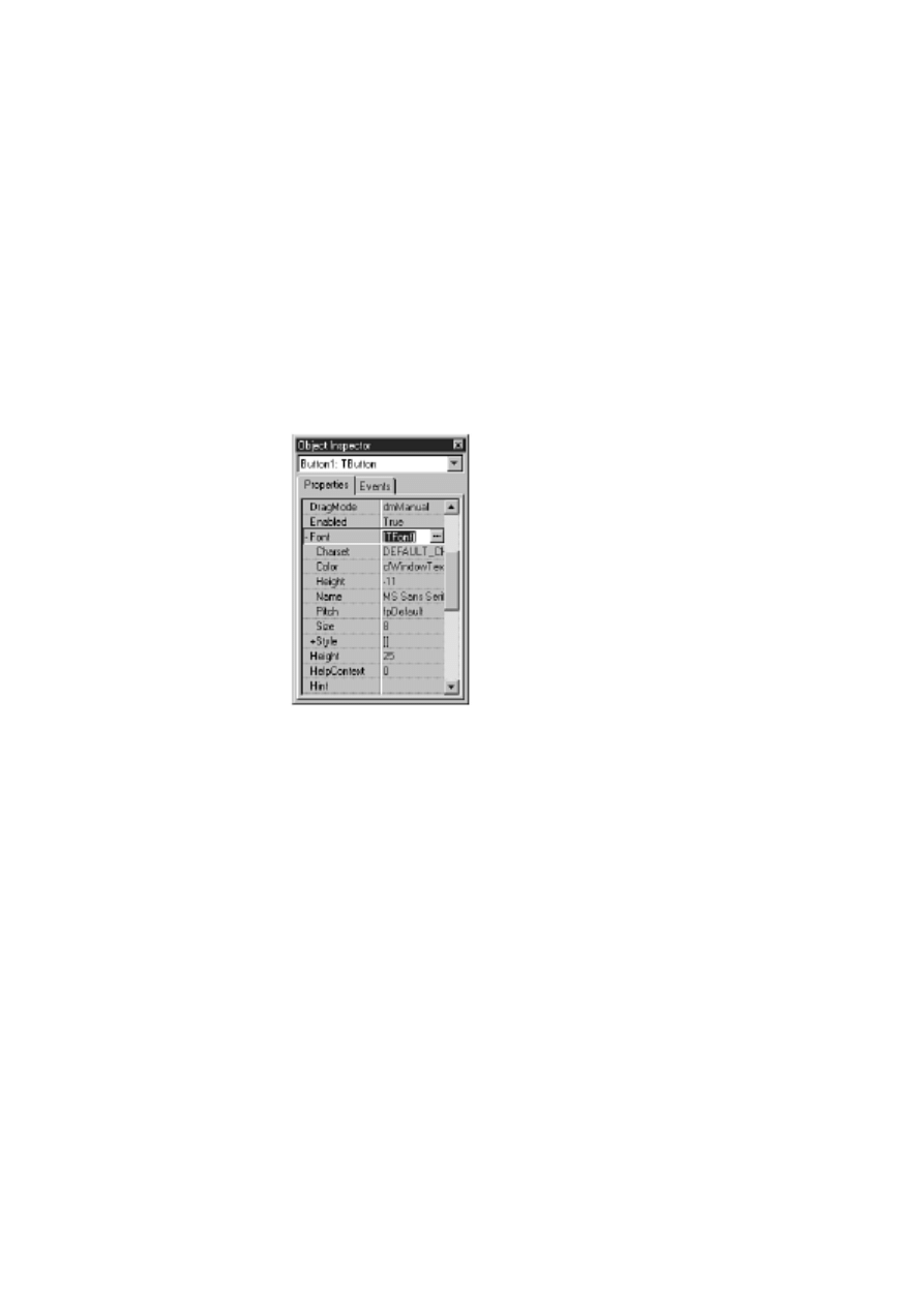
The Font Property
The Font property is a major property and therefore needs to be included here, but there is not a lot
that needs to be said about it. The Font property is an instance of the TFont class and, as such, has its
own properties. You can set the Font properties by double-clicking on the font name in the Object
Inspector (which will expand the Font node and show the Font properties) or by invoking the Font
dialog box. (The Font dialog box is discussed in more detail later in this chapter in the section "The
Font Dialog Box.") Figure 7.2 shows the Object Inspector with the Font property node expanded to
reveal the TFont properties.
FIGURE
7.2.The Object Inspector showing the Font property.
The Color property sets the color of the font, and the Name property enables you to choose the
typeface for the font.
The Height and Size properties of TFont deserve special mention as well:
The Height property is used to specify the height of the font in pixels.
●
The Size property is used to specify the height of the font in points.
●
When you change one of these properties, the other will change automatically. The Height is often
specified as a negative number. Refer to the online help for TFont for an explanation of why this is the
case.
The Pitch property is not particularly useful. I'll explain it in just a moment, but first a quick tutorial
on fonts. A font can be either proportionally spaced or fixed space:
Most fonts are proportionally spaced, which means that each letter only takes as much space as
needed. For example, an uppercase M takes up much more space than a lowercase i. Take a
●

look at the letters in this book and you will see what I mean. Examples of proportional fonts
include Times New Roman, Arial, and Bookman.
With a fixed space font (typically called a fixed-pitch font), on the other hand, all characters
take exactly the same amount of space. This is convenient for windows such as code editors
(the Delphi Code Editor, for example) or any other window where a fixed-pitch font is desired.
Courier New is probably the most commonly used fixed-pitch font, although Fixedsys is the
Windows fixed-pitch font of choice in some Windows applications. Fixed space fonts are
harder to read, so they aren't normally used for long blocks of text other than code.
●
In theory, the Pitch property can be used to force a proportionally spaced font to fixed space and vice
versa. The problem is that Windows might perform font substitutions to carry out the conversion. In
other words, you really don't know what you might get. It is far better to pick exactly the font you
require than to rely on the Pitch property.
Finally, the Style property of TFont can be used to toggle bold, italic, underline, or strikethrough.
These styles are not mutually exclusive, so you can mix styles in any way you choose.
TIP: Although you can use the Object Inspector to change font properties, the Font
dialog box (invoked when you click the ellipsis button next to the Font property) has the
added benefit of showing you a sample of what the font looks like as you choose
different font options. To simply change the font's Style property or Size property, use
the Object Inspector. But if you are looking for just the right font, the Font dialog box is
a better choice.
The Hint Property
The Hint property is used to set hint text for a component. The hint text has two parts. The first part is
sometimes called the short hint. This is the hint text that is displayed when the user places the cursor
over the component and pauses. The pop-up window that displays the hint text is called a tooltip.
The second part of the hint text is sometimes called the long hint. The long hint is the optional hint
text that shows in the status bar when the user moves the mouse cursor over the component. The short
and long hint texts are separated by a pipe (|). For example, to specify both the short hint text and the
long hint text for a File Open speed button, you would enter the following for the Hint property:
File Open|Open a file for editing
In order for short hints to show, you must have the Application object's ShowHint property set to True
(the default) as well as the component's ShowHint property. Displaying the long hint in the status bar
requires a little more work, so I'll save that discussion for tomorrow.
NOTE: You can specify the short hint text, the long hint text, or both. You can use the
pipe to tell Delphi which hint text you are supplying. If you don't use the pipe, both the
short hint and the long hint will use the same text.
NOTE: Although there are no limits on the length of either the long hint or the short
hint, you should keep each hint's use in mind when you create them. Short hints should
probably be limited to 30 characters or fewer. Long hints can be more descriptive, but
keep in mind that long hints that are very long will be truncated when displayed in the
status bar.
The ParentColor, ParentCtl3D, ParentFont, and ParentShowHint
Properties
The ParentColor, ParentCtl3D, ParentFont, and ParentShowHint properties work the same way, so I'll
discuss them at the same time. When these properties are set to True, the component takes its Color,
Ctl3D, Font, or ShowHint settings from its parent. For example, for most components the ParentFont
property is set to True by default. This means the component will inherit the font that its parent is
currently using. To better understand this, do this exercise:
1. Create a blank form. Set the Font property's Size property to 16.
2. Place a Label component on the form. Notice that the label automatically uses the 16-point
font.
3. Place a Button component on the form. It also uses the 16-point font.
You can set this property to False, but by the time the component is placed it is already too late and
you will have to change the font manually to the font you want for the component.
The Tag Property
The Tag property is nothing more than a four-byte variable set aside for your use. You can use the
Tag property to store any data that your component might need. The data stored might be a pointer to
another class, an index value, or any number of other possibilities. Using the Tag property would
probably be considered an advanced programming technique.
Other Common Properties
Table 7.1 lists other common properties that are frequently used. These properties don't require as
much explanation, so they are listed here for your reference. Not all components have each of the
properties listed.
TABLE 7.1. ADDITIONAL COMPONENT PROPERTIES.
Property
Description
BorderStyle Can be bsSingle or bsNone. Use bsNone when you want the component to blend in
with the background.
BoundsRect The rectangle of the entire component (not limited to only the client area).
Caption
Sets the component's caption. Many components don't have captions, so for those
components the Caption property is not exposed.
ClientHeight Contains the height of the client area of the component.
ClientRect
Contains the rectangle for the client area of the component.
ClientWidth Contains the width of the client area of the component.
Constraints
Sets the size constraints for the component (maximum width and height, minimum
width and height). More important for forms than for other components.
Ctl3D
Indicates whether the control should be drawn with a 3D border. If BorderStyle is set
to bsNone, this property has no effect.
Height
Sets the component's height.
HelpContext The HelpContext property is used to associate an index number in a help file with a
particular component.
Left
Sets the x-coordinate of the component.
Parent
A pointer to the parent of the component.
PopupMenu Specifies the pop-up menu that will be displayed when the user clicks the secondary
mouse button.
TabOrder
For windowed components. Sets this component's position in the tab order.
TabStop
For windowed components. Indicates that this component can be tabbed into. Setting
this property to False removes the component from the tab order.
Top
Sets the y-coordinate of the component.
Visible
When read, indicates whether the component is currently visible. When written to,
Visible either hides or shows the component.
Width
Sets the width of the component.
Primary Methods of Components
There are more than 20 methods that most components have in common. Windowed components have
more than 40 common methods from which to choose. Interestingly, not many of these are widely
used. Much of the functionality of components is accomplished via properties. For example, to hide a
component, you can call the Hide method or you can set the Visible property to False. In addition,
components typically have methods specific to their purpose, and it will likely be those methods that
you use most when dealing with a particular component.
There are a few methods worthy of note, however, so I'll list them here (see Table 7.2). Note that
some of these methods are not available to all controls. These are not the most often used methods
common to every component, but rather the most commonly used methods of components in general.
Also, this list concentrates on components representing controls (components placed on forms) rather
than components as forms. Methods particular to forms were discussed on Day 4, "The Delphi IDE
Explored."
TABLE 7.2. COMMON METHODS OF COMPONENTS.
Method
Description
Broadcast
Used to send a message to all windowed child components.
ClientToScreen Converts client window coordinates into screen coordinates.
ContainsControl Returns True if the specified component is a child of the component or form.
HandleAllocated Returns True if the Handle property for the component has been created. Simply
reading the Handle property automatically creates a handle if it hasn't already been
created, so HandleAllocated can be used to check for the existence of the handle
without creating it.
Hide
Hides the component. The component is still available to be shown again later.
Invalidate
Requests that the component be redrawn. The component will be redrawn at
Windows's earliest convenience.
Perform
Sends a message directly to a component rather than going through the Windows
messaging system.
Refresh
Requests that a component be redrawn immediately and erases the component
prior to repainting.
Repaint
Requests that a component be redrawn immediately. The component's background
is not erased prior to repainting.
SetBounds
Enables you to set the Top, Left, Width, and Height properties all at one time. This
saves time having to set them individually.
SetFocus
Sets the focus to a component and makes it the active component. Applies only to
windowed components.
Update
Forces an immediate repaint of the control. Typically, you should use Refresh or
Repaint to repaint components.
Now let's take look at some of the events to which a component is most likely to respond.
Common Events
As with properties and methods, there are some events that will be responded to most often.
Components cover a wide variety of possible Windows controls, so each component will have
individual needs. Events specific to forms are not covered here because I covered that information on
Day 4. The most commonly used events are listed in Table 7.3.
TABLE 7.3. COMMONLY HANDLED COMPONENT EVENTS.
Event
Description
OnChange
This event is triggered when a control changes in one way or another. Exact
implementation depends on the component.
OnClick
Sent when the component is clicked with either mouse button.
OnDblClick
This event occurs when the user double-clicks the component.
OnEnter
This event occurs when a windowed component receives focus (is activated).
OnExit
This event occurs when a windowed component loses focus as the result of the user
switching to a different control. It does not occur, however, when the user switches
forms or switches to another application.
OnKeyDown
This event is triggered when the user presses a key while the control has focus.
Keys include all alphanumeric keys as well as keys such as the arrow keys, Home,
End, Ctrl, and so on.
OnKeyPress
This event is also triggered when the user presses a key, but only when
alphanumeric keys or the Tab, backspace, Enter, or Esc keys are pressed.
OnKeyUp
This event occurs whenever a key is released.
OnMouseDown This event is triggered when the mouse button is pressed while it's over the
component. The parameters passed to the event handler give you information on
which mouse button was clicked, special keys that were pressed (Alt, Shift, Ctrl),
and the x,y coordinate of the mouse pointer when the event occurred.
OnMouseMove This event occurs any time the mouse is moved over the control.
OnMouseUp
This event is triggered when the mouse button is released while over a control. The
mouse button must first have been clicked while on the control.
OnPaint
This event is sent any time a component needs repainting. You can respond to this
event to do any custom painting a component requires.
DEALING WITH MOUSE EVENTS
Mouse events have a couple of peculiarities that you should be aware of. If you are
responding just to a mouse click on a component, you will want to keep it simple and
only respond to the OnClick event. If you must use OnMouseDown and OnMouseUp,
you should be aware that the OnClick event will be sent as well as the OnMouseDown
and OnMouseUp events. For example, a single click will result in these events occurring
(and in this order):
OnMouseDown
OnClick
OnMouseUp
Similarly, when the user double-clicks with the mouse, it can result in the application
getting more events than you might think. When a component is double-clicked, the
following events occur:
OnMouseDown
OnClick
OnDblClick
OnMouseUp
The point I am trying to make is that you need to take care when responding to both
double-click and single-click events for a component. Be aware that you will get four
events for a double-click event.
Multiple events will occur when a key is pressed, too. A keypress in an edit control, for
example, will result in OnKeyDown, OnKeyPress, OnChange, and OnKeyUp events
occurring.
The book's code (go to
and type 0-672-31286-7) contains a
program called EventTst, which illustrates the fact that multiple events occur on mouse
clicks and keypresses. Run this program and you will see how multiple events can be
triggered based on certain user actions.
In just a moment you're going to look at some of the VCL components in more detail. First, however,
I want to introduce you to a class that is used by certain VCL components--TStrings.

TStrings
The TStrings class is a VCL class that manages lists of strings. Several VCL components use
instances of TStrings to manage their data (usually text). For example, on Day 6 you used TStrings
when you built the ScratchPad application. "I don't recall using a TStrings class," you say. Well, you
did, but you just weren't aware of it. Remember when you saved and loaded files? You used
something like this:
Memo.Lines.SaveToFile(SaveDialog.FileName);
The Lines property of TMemo is an instance of the TStrings class. The SaveToFile method of
TStrings takes the strings and saves them to a file on disk. You can use the same technique to load a
list box from a file on disk or save the contents of a list box to disk. In the case of the TListBox class,
the property that holds the list box items is called Items. For example, try this exercise:
1. Create a new application and place a ListBox component on the form. Size the list box as
desired.
2. Change the Name property of the list box to ListBox.
3. Double-click the background of the form (not on the list box). The Code Editor displays the
FormCreate function.
4. Modify the FormCreate function so that it looks like this:
procedure TForm1.FormCreate(Sender: TObject);
var
WinDir : array [0..255] of Char;
FileName : string;
begin
GetWindowsDirectory(WinDir, SizeOf(WinDir));
FileName := WinDir + `\win.ini';
ListBox.Items.LoadFromFile(FileName);
end;
5. Click the Run button to compile and run the program.
When the program runs, the list box will contain the contents of your WIN.INI file. Using this
method, it's easy to load a list box from any ASCII text data file. The ComboBox component also has
an Items property that works in exactly the same way.
You can add, delete, insert, and move items in a list box, combo box, or memo by calling the Add,
Append, Delete, Insert, and Move methods of the TStrings class.
NOTE: How Add performs depends on the value of the Sorted property. If the Sorted
property is set to True, Add will insert the string where it needs to be in the list of items.
If Sorted is False, the new string will be added at the end of the list.
A component can be cleared of its contents by calling the Clear method. An individual string can be
accessed by using the array subscript operator. For example, to retrieve the first string in a list of
strings, you would use
Edit.Text := ListBox.Items[0];
NOTE: The strings in a TStrings class are actually contained in the Strings property. The
Strings property is declared as the default array property for the TStrings class, so you
don't specifically have to reference it when retrieving a specific string (although you can
if you want to). Given that, then, the following two lines result in the same code being
generated by the compiler:
Edit.Text := ListBox.Items[0];
Edit.Text := ListBox.Items.Strings[0];
Each string in a TStrings array contains the string itself and four bytes of extra storage. This extra
storage can be accessed through the Objects property, and you can use the extra storage any way you
like. Let's say, for example, that you create an owner-drawn list box that displays bitmaps. You can
store the string in the usual way and store a pointer to the TBitmap object in the Objects array.
TIP: There might be times when you need to manage a list of strings unrelated to a
component. The TStringList class is provided for exactly that purpose. This class works
just like TStrings but can be used outside of components. TStringList is particularly
convenient for reading, manipulating, and storing text files.
NOTE: In reality, TStrings is what is called an abstract base class. An abstract base
class is never used directly; it serves only as a base class from which to derive other
classes. The Lines property is actually an instance of the TMemoStrings class rather than
an instance of the TStrings class as I said in this section. This can be confusing because
the Lines property is declared as a TStrings pointer but is actually an instance of
TMemoStrings. The declaration and creation of the Lines property looks like this:
var
Lines : TStrings;
{ ...later }
Lines := TMemoStrings.Create;
This is why the Lines property appears to be a TStrings but is really not. I didn't mean to
lead you astray, but I thought it was best to make this distinction after the discussion on
TStrings rather than confuse you with this information during that discussion.
New Term: An abstract base class is a class that cannot be used directly. A descendent class must be
created using the abstract base class, and an instance of the descendent class is used instead.
Standard Windows Control Components
Back in the Jurassic age, there was something called Windows 3.0. Windows 3.0 gave you options
such as edit controls (single line and multiline), list boxes, combo boxes, buttons, check boxes, radio
buttons, and static controls. These controls must have been fairly well designed because they are very
prevalent in Windows programs today--even considering all the new Win32 controls.
I'm not going to go over every Windows control and its corresponding VCL component. There are a
few points, though, that you should know regarding the standard components, which are covered in
the next sections.

NOTE: I will refer to components in one of two ways: by the component's name or by
the name of the VCL class that defines the component. I might say, "The Label
component is used for..." or I might say, "TLabel is used for...." In either case, I am
talking about the same component.
Edit Controls
Delphi comes with four edit-control components. The Edit, Memo, and MaskEdit components are
based on the standard Windows edit control. The RichEdit component is based on the Win32 rich edit
control, which is not one of the standard Windows controls. Still, I will discuss RichEdit here because
it has many features in common with the other edit controls.
The Edit Component
The Edit component encapsulates the basic single-line edit control. This component has no Align or
Alignment property. It has no Alignment property because the text in a single-line edit control can
only be left-justified. The Edit component has no Align property because it cannot (or more
accurately, should not) be expanded to fill the client area of a window.
TIP: If you need text in an edit component to be right-justified or centered, use a Memo
component but make its height the height of a standard Edit component. Then set the
Alignment property as needed.
NOTE: Keep your forms standard whenever possible. Although you can make an Edit
component as tall as you like, it will confuse users if you make its height greater than a
standard Windows edit control (it might appear to the user to be a multiline edit).
The MaskEdit Component
The MaskEdit component is an Edit component with an input filter, or mask, attached. The MaskEdit
does not represent a Windows control per se, but rather is just a VCL extension of a standard edit
control. A mask is used to force input to a specific range of numbers or characters. In addition, the
mask can contain special characters that are placed in the edit control by default. For example, a date
is commonly formatted as follows:
03/21/98
An edit mask for a date can already have the slashes in place so the user only has to enter the
numbers. The edit mask would specify that only numbers can be entered to avoid the possibility of the
user entering a nonnumeric character.
NOTE: The DateTimePicker component (found on the Win32 tab) enables you to pick a
date or a time from a specialized edit component. When the Kind property is set to
dtkDate, the component displays a drop-down calendar from which the user can choose a
date. When Kind is set to dtkTime, the DateTimePicker displays a multi-field edit control
that enables the user to set the hours, minutes, seconds, and AM or PM. The
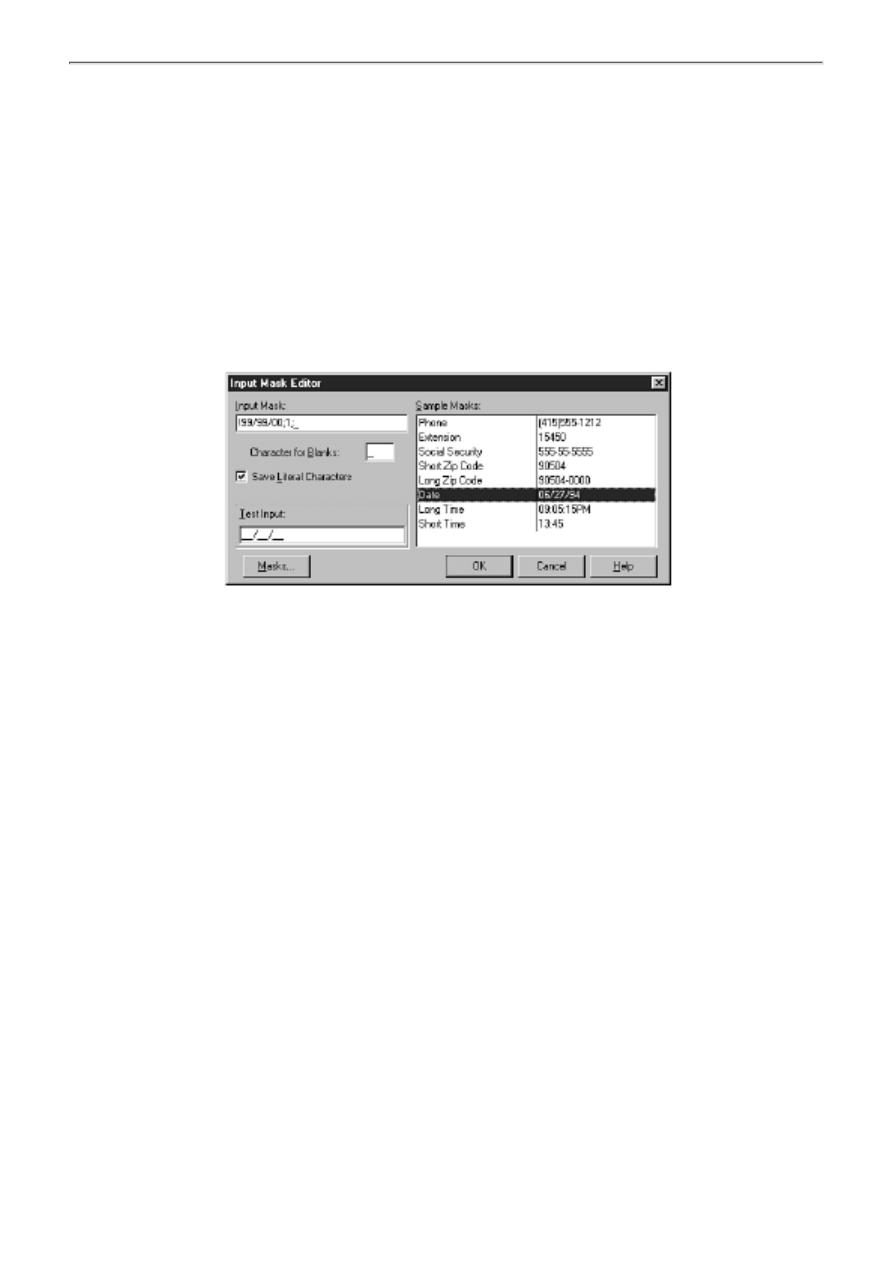
DateTimePicker is preferred over the MaskEdit for date and time entry.
The EditMask property controls the mask that is used. When you click the ellipsis button in the Value
column for the EditMask property, the Input Mask Editor is displayed. This dialog box enables you to
choose from one of the predefined masks or to create your own. You can choose prebuilt masks from
several countries. Figure 7.3 shows the Input Mask Editor displaying the United States' set of
predefined input masks.
FIGURE 7.3.
The Input Mask Editor.
For more information on building your own masks, see the Delphi online help.
The Memo Component
The Memo component encapsulates a multiline edit control. The Lines property is the most significant
property in a Memo component. As I mentioned earlier in the discussion on TStrings, the Lines
property enables you to save the contents of the Memo component to disk, load the Memo with text
from a file, or access the memo's lines individually.
The ScrollBars property is unique to the Memo component. This property enables you to specify
whether your component has a horizontal scrollbar, a vertical scrollbar, or both. You used the
ScrollBars property on Day 6 when you wrote the ScratchPad application. The Memo component is a
very versatile component that you will probably find yourself using frequently.
The RichEdit Component
The RichEdit component is the biggest and the best of all the edit components; it is based on the
Win32-rich edit control. The RichEdit component enables you to change fonts, use indentation, set
text to bold, italic, or underlined, and much more. Basically, the RichEdit component is a mini word
processor in one neat package. RichEdit has surprisingly few design-time properties over what the
Memo component has.
Key runtime properties include SelAttributes and Paragraph. The RichEdit component is complex but
easy to use, considering its complexities. See the Delphi online help for full details on the RichEdit
component.
Common Edit Control Properties
Table 7.4 lists the properties specific to components based on edit controls.
TABLE 7.4. PROPERTIES FOR EDIT CONTROLS.
Item
Applies To
Description
Properties
AutoSelect
Edit, MaskEdit
When set to True, text in the edit control will automatically
be selected when the user tabs to the control. Default: True
AutoSize
Edit, MaskEdit
When set to True, the edit control will automatically resize
itself when the font of the edit control changes. Otherwise,
the edit control does not change size when the font changes.
Default: True
CharCase
Edit, MaskEdit
Determines whether the edit control displays uppercase
(ecUpperCase), lowercase (ecLowerCase), or mixed text
(ecNormal). Default: ecNormal.
HideScrollBars RichEdit
When set to True, the scrollbars will be shown when needed
but hidden otherwise. When set to False, the scrollbars are
shown as determined by the value of the ScrollBars property.
HideSelection Edit, Memo, RichEdit When set to True, any text selected will not show as selected
when the user tabs to another control. Default: False
Lines
Memo, RichEdit
The text contained in the component. Lines is an instance of
the TStrings class.
MaxLength
All
Specifies the maximum number of characters that the
component will hold. When set to 0, the amount of text that
can be input is unlimited (limited only by system
considerations). When set to any non-zero value, limits the
number of characters to that value. Default: 0
OEMConvert
Edit, Memo
Set this property to True when the text input will consist of
filenames. Default: False
PasswordChar Edit, MaskEdit
When this property is set to a value other than ASCII #0, any
text entered will be echoed with the character provided. The
actual text in the edit control is unaffected. Most password
edits use the asterisk (*) as the password character. Default:
#0
PlainText
RichEdit
When set to True, RTF (rich text format) files will be shown
as plain text without character and paragraph formatting.
When set to False, RTF files are displayed with full
formatting. Default: False
ReadOnly
All
When set to True, the component will display its text, but
new text cannot be entered. The user can, however, highlight
text and copy it to the Clipboard. Default: False
ScrollBars
Memo, RichEdit
Determines which scrollbars to display. Choices are ssNone,
ssBoth, ssHorizontal, and ssVertical. Default: ssNone
Text
Edit, MaskEdit
Contains the text in the component.
WantReturns
Memo, RichEdit
When set to True, the component keeps the return character
and a new line is inserted in the edit control when the user
presses Enter. When set to False, return characters go to the
form and are not placed in the edit control. If you have a form
with a default button and WantReturns set to False, pressing
Enter will cause the form to close. Default: True
WantTabs
Memo, RichEdit
When set to True, a tab character is placed in the edit control
when the user presses the Tab key. When set to False, tab
characters go to the form, which would enable tabbing out of
the edit control. Default: False
WordWrap
Memo, RichEdit
When set to True, text entered will wrap to a new line when
the right edge of the edit control is reached. When set to
False, the edit control automatically scrolls as new text is
entered. Default: True
Modified
All
Indicates whether the contents of the edit control have
changed since the last time the Modified property was set.
After saving the contents of a Memo or RichEdit component
to a file, you should set Modified to False.
SelLength
All
Contains the length of the text currently selected in the edit
control.
SelStart
All
Contains the starting point of the selected text in the edit
control. The first character in the edit control is 0.
SelText
All
Contains the currently selected text in an edit control.
Edit controls have many common methods; they are too numerous to list here. The CutToClipboard,
CopyToClipboard, PasteFromClipboard, and Clear methods deal with Clipboard operations and text
manipulation. The GetSelTextBuff and GetTextBuff methods retrieve the selected text in the
component and the entire text in the component, respectively. See the Delphi online help topics TEdit,
TMaskEdit, TMemo, and TRichEdit for a complete list of methods associated with each edit
component.
The edit component events that you are most likely to be interested in are dependent on the type of
edit control you are using. In general, though, the OnEnter, OnExit, OnChange, OnKeyDown (or
OnKeyPress), and OnKeyUp events will be the most widely used.
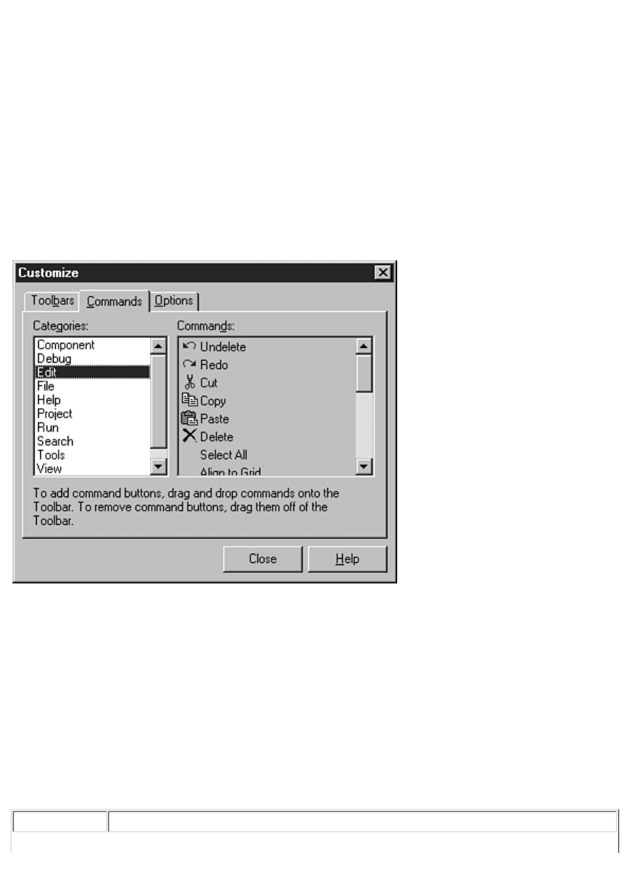
The ListBox and ComboBox Components
The ListBox and ComboBox components are also widely used. The ListBox component represents a
standard Windows list box, which simply presents a list of choices that the user can choose from. If
the list box contains more items than can be shown at one time, scrollbars provide access to the rest of
the items in the list box.
New Term: Some list boxes are owner-drawn list boxes. In an owner-drawn list box, the programmer
takes the responsibility for drawing the items in the list box.
You can do owner-drawn list boxes if needed. Owner-drawn list boxes are fairly common, although
you might not realize it. On Day 4 I talked about customizing the Delphi toolbar. As part of that
discussion, you looked at the Delphi Toolbar Editor dialog box. The Toolbar Editor dialog box
contains two list boxes (see Figure 7.4).
FIGURE 7.4. The Toolbar Editor's
Commands list box is owner-drawn.
The list box on the left is a regular list box; it lists the possible button groups you can choose from.
The list box on the right is an owner-drawn list box. It shows the actual button as it will appear on the
toolbar, as well as a textual description of what function the button performs.
Combo boxes are specialized list boxes. Actually, a combo box is a combination of a list box and an
edit control. The user can choose from the list or type in a value in the edit portion. When the user
chooses an item from the list, that item is placed in the edit control. There are three different types of
combo box. The combo box type is determined by the Style property. Table 7.5 lists the types of
combo boxes and a description of each.
TABLE 7.5. TYPES OF COMBO BOXES.
Item
Description
Simple
The simple style of the combo box is nothing more than an edit control placed on top
of a list box. The user can choose from the list or type text in the edit portion.
Drop-down
Similar to the simple style, except the list box portion is not initially displayed. A
drop-down button is provided so that the user can view the list and choose an item.
The user can also type text in the edit portion.
Drop-down list This is the most restrictive type of combo box. As with the drop-down style, the list
is not initially exposed. The user can click the drop-down button to expose the list
and choose an item from the list, but cannot enter text in the edit portion. Use this
style when you want the user to select only from a predetermined set of choices.
The book's code contains a program called ComboTst that illustrates the different types of combo
boxes. Figure 7.5 shows the test program running. Run the program and try out the combo boxes to
get a feel for how each works.
FIGURE 7.5.
The ComboTst program.
Table 7.6 lists the properties common to list boxes and combo boxes.
TABLE 7.6. PROPERTIES FOR EDIT CONTROLS.
Property
Applies To Description
Properties
Columns
ListBox
Contains the number of columns in the list box. You can create
multiple columns by making this property greater than 1. Default: 0
ExtendedSelection ListBox
Determines whether extended selection is allowed. Extended
selection enables the user to select items using Shift+click and
Ctrl+click. Has no effect if MultiSelect is set to False. Default: True
IntegralHeight
ListBox
When True, the list box height will be resized to be sure that no
partial lines are displayed. When False, the list box might show
partial lines. Default: False
ItemHeight
Both
For use with owner-drawn list boxes and combo boxes. Sets the
height of the items in the control. Default: 13
Items
Both
A TStrings instance that contains the list of items in the list box.
(See the section on TStrings earlier in this chapter for a description
of available properties and methods.)
MaxLength
ComboBox The maximum number of characters the user can type in the edit
portion of the combo box. Same as MaxLength in edit controls.
Default: 0 (no limit)
MultiSelect
ListBox
When True, the list box enables multiple items to be selected.
Default: False
Sorted
Both
When set to True, the list box items are sorted in ascending order.
When set to False, the items are not sorted. Default: False
Style
ComboBox The style of the combo box. Choices are csSimple, csDropDown,
csDropDownList, lbOwnderDrawFixed, and csOwnerDrawVariable.
(See Table 7.5 for a description of the three basic styles.) Default:
csDropDown
ListBox
Style choices for list boxes are lbStandard, lbOwnderDrawFixed,
and csOwnerDrawVariable. Default: lbStandard
TabWidth
ListBox
List boxes can use tabs. This property sets the tab width in pixels.
Default: 0

Teach Yourself Borland Delphi 4 in 21
Days
- 8 -
Creating Applications in Delphi
Working with the Object Repository
Object Repository Pages and Options
Creating New Objects from the Object Repository
Adding Objects to the Object Repository
Adding Projects to the Object Repository
Object Repository Housekeeping
Building Forms and Applications with the Wizards
Creating Applications with the Application Wizard
Adding Methods and Data Fields to Code
How Delphi Manages Class Declarations
Deleting Delphi-Generated Code
Linking Resource Files to Your Executable
A Sample Program Using Resources
Static Linking Versus Dynamic Linking
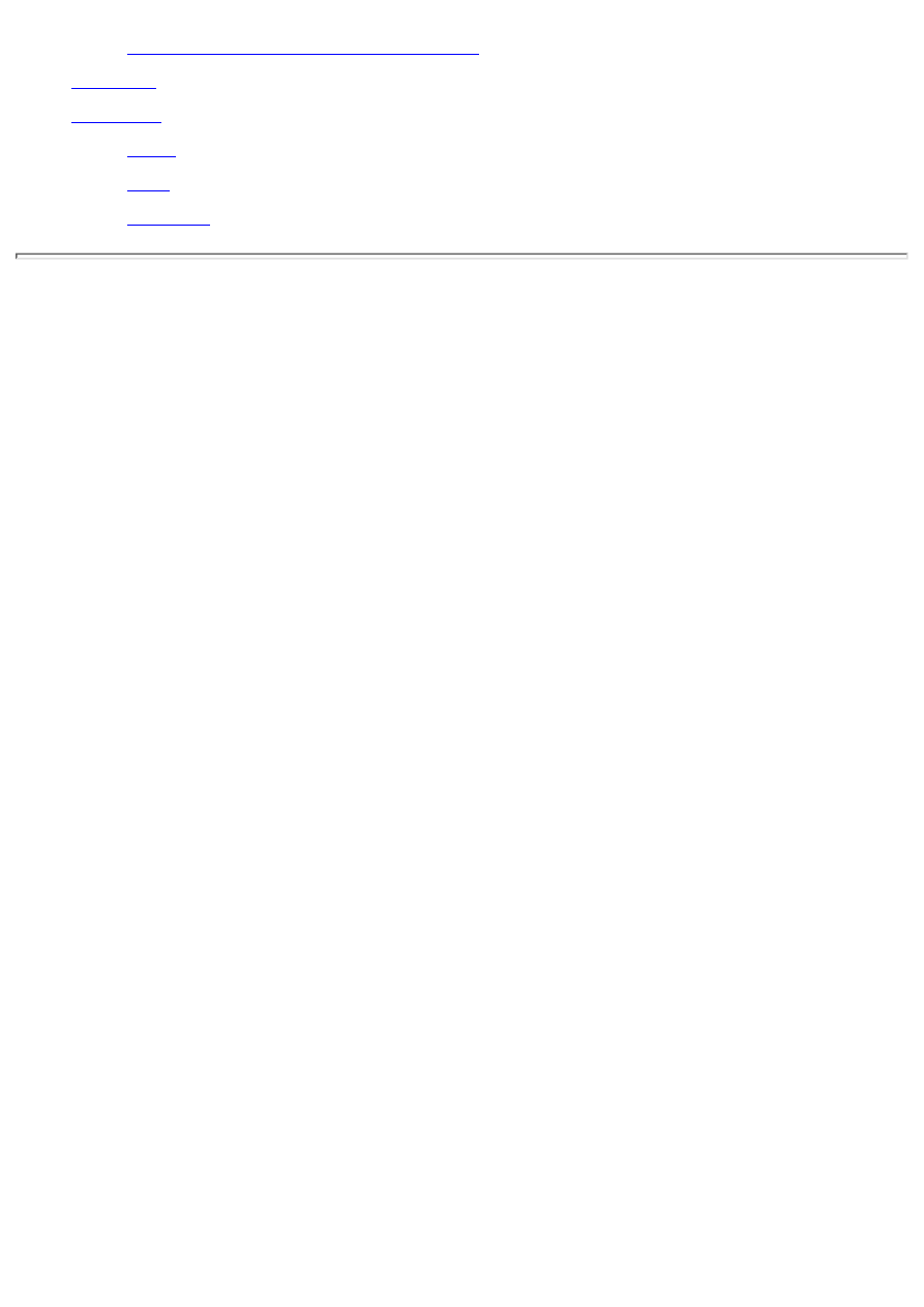
Deploying Applications Using Packages
Delphi provides a variety of tools that aid you in creating forms, dialog boxes, and applications.
Today you learn about the following:
The Object Repository
●
The Dialog Wizard
●
The Application Wizard
●
Adding methods and data fields to your code
●
Component templates
●
Using resources in your Delphi applications
●
Packages
●
For starters, I'll spend some time discussing the Object Repository, which is where Delphi stores any
prebuilt forms, applications, or other objects for you to reuse.
Following that discussion, you meet the wizards. Wizards provide a series of dialog boxes that guide
you step by step through the creation process. You provide the details, and Delphi builds the form or
application based on the information you provided. The wizards are a powerful tool for rapid
application development. Later in the day I'll tell you how you can use resources in your Delphi
applications. Finally, I'll close the day by talking about packages in Delphi.
Working with the Object Repository
The Object Repository is the means by which you can select predefined objects to use in your
applications.
The Object Repository enables you to do the following:
Choose a predefined application, form, or dialog box to implement in your application.
●
Add your own forms, dialog boxes, and applications to the Object Repository.
●
Add other objects to your application such as ASCII text files and additional source code units.
●
Manage data modules.
●
Create new components.
●
Create new packages.
●
Create new ActiveX controls or ActiveForms.
●
Invoke wizards to help you build a dialog box or an application.
●
That's just a sampling of what the Object Repository provides. There are other objects you can create
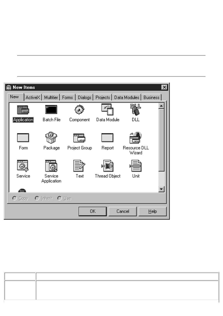
in addition to those listed here.
Object Repository Pages and Options
The Object Repository is displayed automatically whenever you choose File | New from the main
menu. Figure 8.1 shows the Object Repository window as it initially appears when you choose File |
New with no project open.
NOTE: Strange as it might seem, the Object Repository is titled New Items, and the
Object Repository configuration dialog box is titled Object Repository. To say that this is
confusing is a bit of an understatement.
FIGURE 8.1. The
Object Repository window.
The Object Repository has several pages, each of which contains different objects that you can
incorporate into your applications. As you can see from Figure 8.1, the New tab is what is initially
selected when the Object Repository is displayed. Table 8.1 lists the Repository pages and a
description of the items you find on each page.
TABLE 8.1. THE OBJECT REPOSITORY PAGES.
Page/Tab
Description
New
Enables you to create a new application, form, or unit for use in your application.
Also enables you to create advanced objects such as packages, DLLs, components,
NT service applications, Web server applications, and data modules.
ActiveX
Enables you to create new ActiveX controls, type libraries, COM objects,
ActiveForms, and other ActiveX objects.
Multitier
Enables you to create CORBA and MTS objects and data modules (Client/Server
version only).
Forms
Enables you to create standard forms from prebuilt forms such as an About box, a
dual list box, tabbed pages, or QuickReports.
Dialogs
Presents choices of several basic dialog box types from which you can choose. Also
contains the Dialog Wizard.
Projects
Displays full projects that you can choose from to initially set up an application. Also
contains the Application Wizard.
Data Modules Enables you to choose from data modules in your application.
Business
Includes wizards for database forms, database Web applications, reports, and charts,
and a Decision Cube sample application.
NOTE: If you invoke the Object Repository when you already have a project open, you
will see an additional tab in the Object Repository. The tab will have the name of your
project on it. Clicking this tab will display a page that contains all the objects currently in
the project. This enables you to quickly reuse a form or other object by simply selecting
it from the Object Repository.
Across the bottom of each page you see three radio buttons. These buttons, labeled Copy, Inherit, and
Use, determine how the selected object is implemented. Depending on the object selected, some of the
radio buttons (or all) might be disabled. For example, all three radio buttons are always grayed out
when the New page is displayed. This is because Copy is the only option available for objects on this
page, so Delphi grays out all choices and applies the Copy option automatically.
NOTE: The Object Repository is sometimes called the Gallery.
The Copy Button
When you choose the Copy radio button, Delphi creates a copy of the selected object and places it in
your application. At this point you are free to modify the object in any way you choose. The original
object in the Repository is not altered when you make changes to the new object in your application.
To illustrate, let's say you have an often used form (a form in the traditional sense, not in the Delphi
sense) printed on paper--a work schedule, for example. Let's say that you want to fill in that form with
scheduling information. You wouldn't modify the original form because it would then be unusable for
future reuse. Instead, you would put the original form in the copy machine, make a copy, and then
return the original to some location for safekeeping.
You would then fill out the copy of the form as needed. Making a copy of an object in the Repository
works in exactly the same way. You are free to modify the copy in any way you choose and the
original remains safely tucked away. Making a copy is the safest method of object usage.
The Inherit Button

The Inherit method of usage is similar to Copy, but with one important distinction: The new object is
still tied to the base object. If you modify the base object, the newly created object will be updated to
reflect the changes made to the base object. The inverse is not true, however. You can modify the new
object without it having any effect on the base object.
To illustrate this type of object usage, consider the following scenario: Frequently, information
managers create a spreadsheet in a spreadsheet program and use the contents of that spreadsheet in a
word-processing program to present a report.
They usually opt to link the data to the spreadsheet when pasting from the Clipboard or importing the
spreadsheet into the word processor. That way, when changes are made to the spreadsheet, the
word-processing document is automatically updated to reflect the new data. In the same way, changes
made to a base form will automatically be reflected in all forms inherited from the base form. Use the
Inherit option when you want to have several forms based on a common form that might change at
some point. Any changes in the base form will be reflected in all inherited forms.
The Use Button
The Use option is not common. When you use an object, you are opening that object directly for
editing. Select this option when you have saved an object in the Repository and you want to make
permanent changes to that object. In the section about the Inherit option, I said that changes made to a
base form would be reflected in all inherited forms. If you wanted to make changes to a base form,
you would open it in the Object Repository with the Use option.
Using the Object Repository
Exactly what takes place when you select an object from the Object Repository depends on several
factors. The factors include the type of object selected, whether a project is currently open, and the
usage type you select (Copy, Inherit, or Use).
If you have an application open and you choose to create a new application from the Object
Repository, you are prompted to save the current project (if necessary) before the new project is
displayed.
TIP: Choosing File | New Application from the main menu is a shortcut for starting a
new application. It is equivalent to choosing New from the main menu and then choosing
the Application object from the Object Repository. Similarly, the New Form item on the
main menu is a shortcut for its equivalent in the Object Repository.
Creating a new form from the Object Repository is treated differently based on whether a project is
open at the time. If a project is open, the new form is added to the application as a form/unit pair. If no
project is open, a new form and unit are created as a standalone form. A form created outside of a
project must be added to a project before it can be used at runtime. Use this option when creating a
new base form to add to the Object Repository.
If you choose to create a new unit or text file, the new file is simply created in the Code Editor (and,
in the case of a new unit, added to the current project). You might create a new text file for several
reasons. For example, let's say you want to implement a configuration file (an .ini file) in your
application. You could create a new text file in the Object Repository to initially create the
configuration file. Create a new unit any time you want to start a new source file for your application
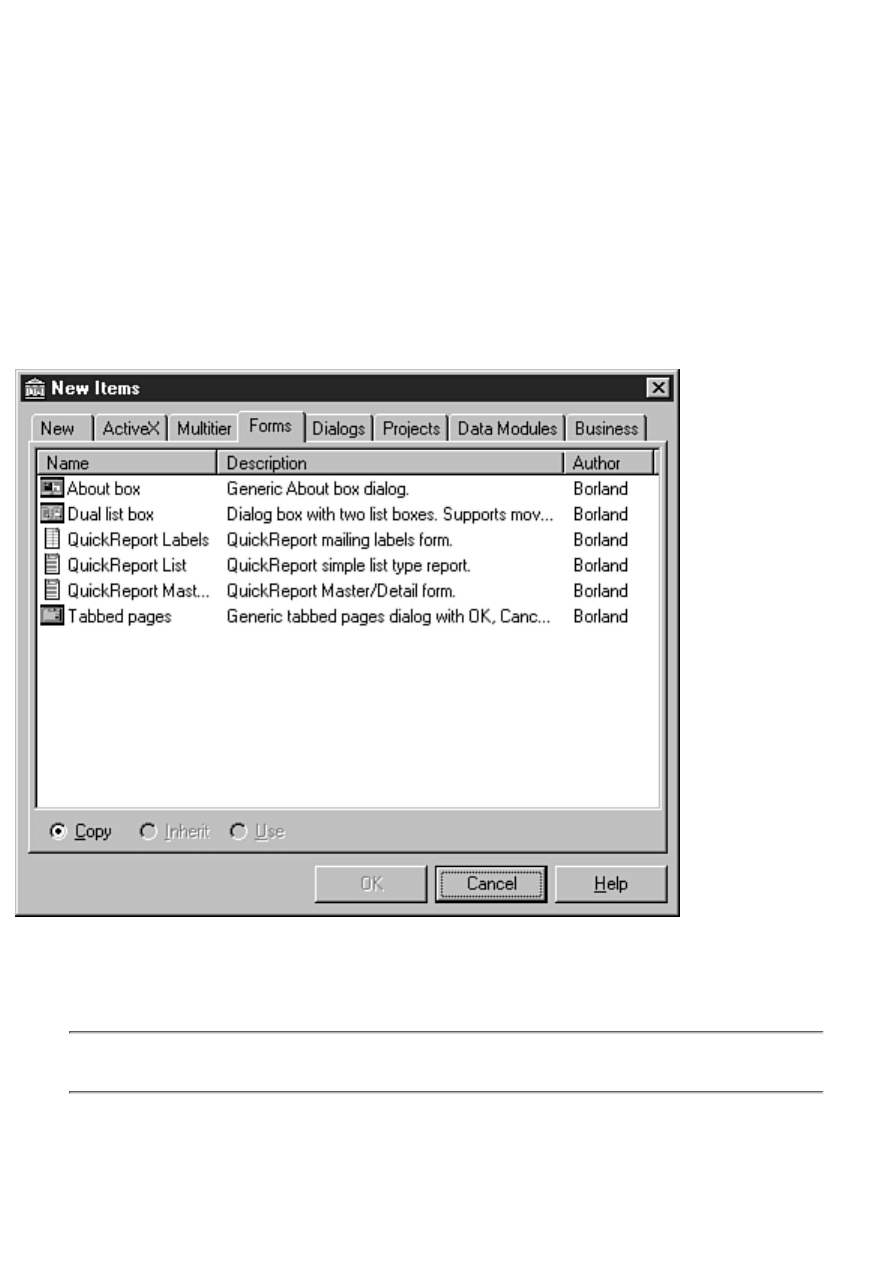
that is not associated with a form (an include file, for example).
Choosing a new DLL results in a new project being created with the project set up for a DLL target.
Creating a new component or thread object results in a dialog box being presented that asks for more
information about the object you are creating.
The Object Repository Views
The actual Object Repository window is a Win32 list view control similar to the right side of
Windows Explorer (where the files are listed). As such, it has several views that you can choose from:
Large Icons, Small Icons, List, and Details. By default, the view is set to Large Icons. To change the
Object Repository view, right-click on the Object Repository and choose the view you want from the
Object Repository context menu. Figure 8.2 shows the Object Repository with the Forms page
selected and the view set to Details.
FIGURE 8.2. The
Object Repository in Details view.
The Object Repository context menu also shows several sorting options. You can sort by object name,
description, date, or author.
TIP: When the Object Repository is in the Details view, you can click a column header
(Name, Description, Date, or Author) to instantly sort by that category.

Creating New Objects from the Object Repository
Certainly the most basic use of the Object Repository is creating a new object using an object from the
Repository. To illustrate, you can create a simple application with a main form, an About dialog box,
and a second form. Follow these steps:
1. Ensure that no other application is open. Choose File | New from the main menu. The Object
Repository is displayed.
2. Click the Application icon and click OK to create a new application. A new application is
created and a blank form is displayed.
3. Place two buttons on the form. Change the Caption property of one of the buttons to About...
and the Caption property of the other button to Display Form2. Change the Name properties if
desired.
4. Choose File | New from the main menu. The Object Repository is displayed again.
5. Click the Forms tab in the Object Repository.
6. Choose the About box object. Ensure that the Copy radio button is selected and click OK to
create a new About Box form. The About box is displayed. Change any properties as needed.
7. Modify the About box as desired. (Enter your own information, change the icon, size,
position, and so on.)
8. Select File | New from the main menu again. The Object Repository is displayed for the third
time.
9. Click the Forms tab and choose the Dual list box object. Click OK to close the Object
Repository. A dual list box form is displayed. (I had you choose this one just so you could see
it.)
10. Write event handlers for the two buttons that display the About box and the second form as
required. Don't forget to add the units for the About box and the second form in the uses clause
of your main form.
11. Compile, run, and test the program.
No, this program doesn't do anything, but it does illustrate how you can use the Object Repository to
quickly prototype an application. As time goes on, you will add your own custom objects to the
Object Repository and then you can really be effective! Let's look at that next.
Adding Objects to the Object Repository
The Object Repository wouldn't be nearly as effective if you couldn't add your own objects to it. But
you can add your own objects and you should. Adding frequently used objects to the Object
Repository makes you a more efficient and, therefore, a more valuable programmer. There is no point
in reinventing the wheel.
After you create an application, form, or other object, save it to the Repository so that you can reuse it
whenever you want. Of course, you don't want to save every form you ever create in the Object
Repository, just the ones you will reuse most often.
You can set out to create an object with the express purpose of adding it to the Repository, or you can
add an object to the Repository during the normal course of application development. (The term
object is pretty broad, so I'll use a specific example in order for this to make sense.) Let's say that you
create an About box form while creating an application. Suddenly it dawns on you that you'd like to
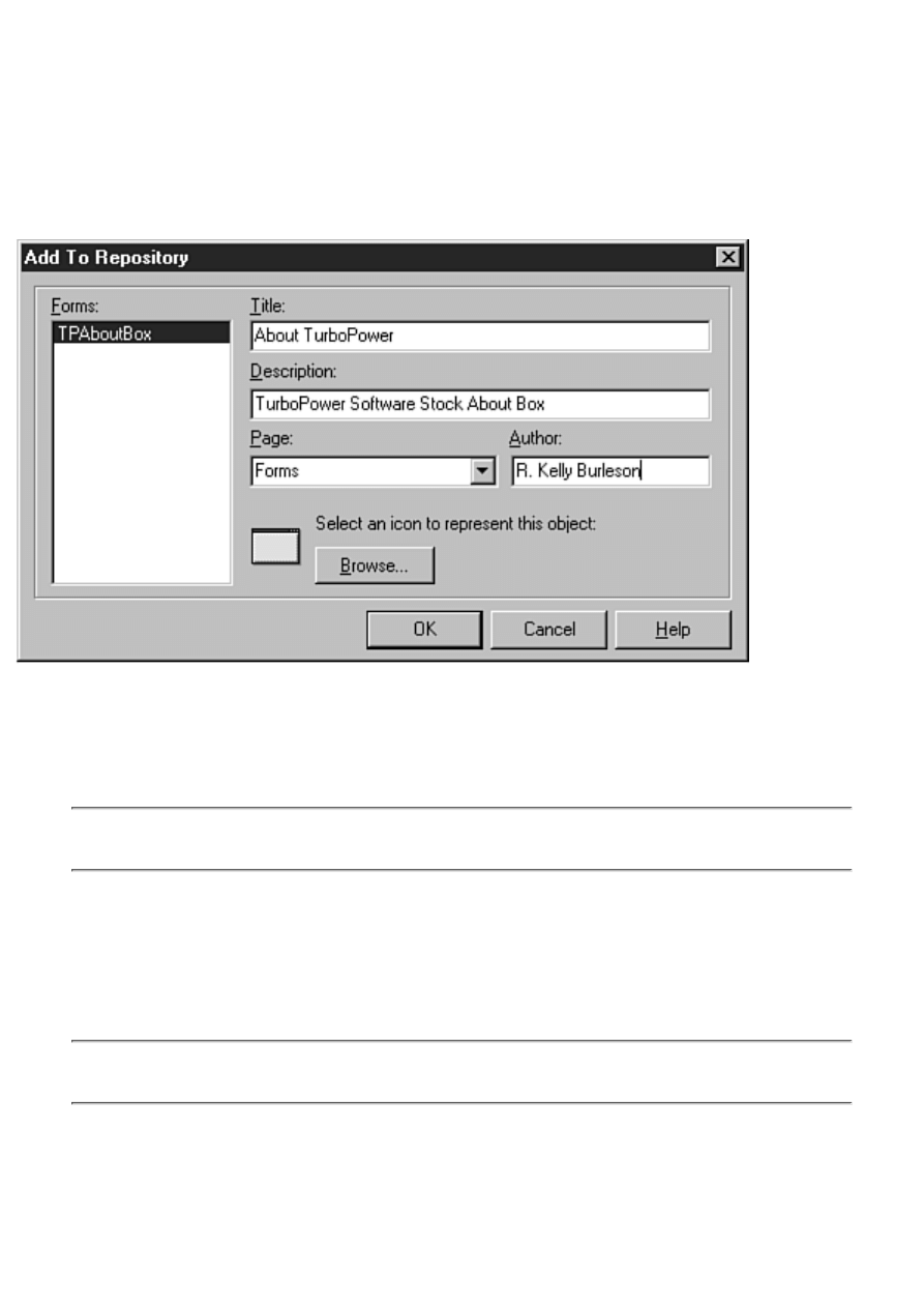
save this About box to use in all your programs. After all, it has your company name, logo, and all the
copyright information all laid out just the way you like it, so it'd be a shame to have to re-create the
same About box for every application you write. No problem--just add it to the Repository.
To add a form to the Object Repository, first save the form (if you don't save the form, you will be
prompted to save it before continuing). Next, right-click anywhere on the form and choose Add To
Repository from the Form Designer context menu. When you do, the Add To Repository dialog box is
displayed as shown in Figure 8.3.
FIGURE 8.3.
The Add To Repository dialog box.
The Forms list box on the left side of this dialog box lists the current forms as well as any other
objects in the application (such as data modules). First, select the form that you want to add to the
Object Repository.
NOTE: The active form in the Form Designer will already be selected in the Forms list
box in the Add To Repository dialog box.
Now enter the object's title. This is the title that will appear below the icon in the Object Repository.
The Description field is used to give further information about the object. This description is
displayed when the Object Repository view is set to display all object details (refer to Figure 8.2). The
Author field is where you type your name as the author of the object. You can enter your personal
name, a company name, or any other identifying name.
NOTE: Most of the prebuilt objects in the Object Repository that come with Delphi have
"Borland" as the author name (the exceptions are the QuickReport and TeeChart objects).
The Page field is used to select the Object Repository page where the new object will be placed. You
can choose from one of the existing pages or simply type the name of a new page in the Page field. If
a page with the name you type doesn't exist, Delphi will create a new page with that name. Near the
bottom of the dialog box is a button labeled Browse that you can use to select the icon used to
represent the object.
You can choose icons from the Borland Shared Files\Images\Icons directory or the
Delphi 4\Objrepos directory. The icons in the Delphi 4\Objrepos directory are the icons
used by Delphi for the items it places in the Object Repository.
After you fill in all the fields and select an icon, click OK to add the object to the Repository. The
object is added to the Object Repository on the page you specified. You can now reuse that object any
time you want. As you can see, adding an object to the Object Repository is nearly as easy as using an
object.
When you add an object to the Object Repository, Delphi makes an entry in the Object
Repository file that describes the object. This information includes the pathname where
the form and source file for the object are located. If you move or delete an object's form
or source file, you will not be able to use the object from the Object Repository.
Adding Projects to the Object Repository
Adding projects to the Object Repository is not much different than adding individual forms. To add a
project to the Object Repository, choose Project | Add to Repository from the main menu. The Add To
Repository dialog box is displayed just like it is when you add objects to the Repository, except the
Forms list box is not displayed. Fill in any required information (title, description, author, and so on)
and click OK and the project is added to the Repository.
After you are familiar with Delphi, you should create an application shell that has the features you use
most often in your applications. Each time you start a new standard application, make a copy of the
shell from the Object Repository. This way you can have your menus, toolbar, About box, and other
standard dialog boxes all set up and ready to go in a matter of seconds. After the new application has
been created, it can then be modified as with any project. You can add new forms, delete any
unwanted forms, and so on.
Object Repository Housekeeping
You can manage the pages and objects in the Object Repository by using the Object Repository
configuration dialog box.
To view the Object Repository configuration dialog box, choose Tools | Repository from the main
menu or, if you have the Object Repository open, choose Properties from the Object Repository
context menu. The configuration dialog box is displayed as shown in Figure 8.4.
This dialog box enables you to delete objects and pages from the Object Repository, move objects
from one page to another, change the order of pages in the Object Repository, and more. The list of
pages in the Object Repository is displayed in the list box labeled Pages on the left side of the dialog
box. When you select one of the pages in the Pages list, the list box on the right (labeled Objects)
displays the objects contained on that page.
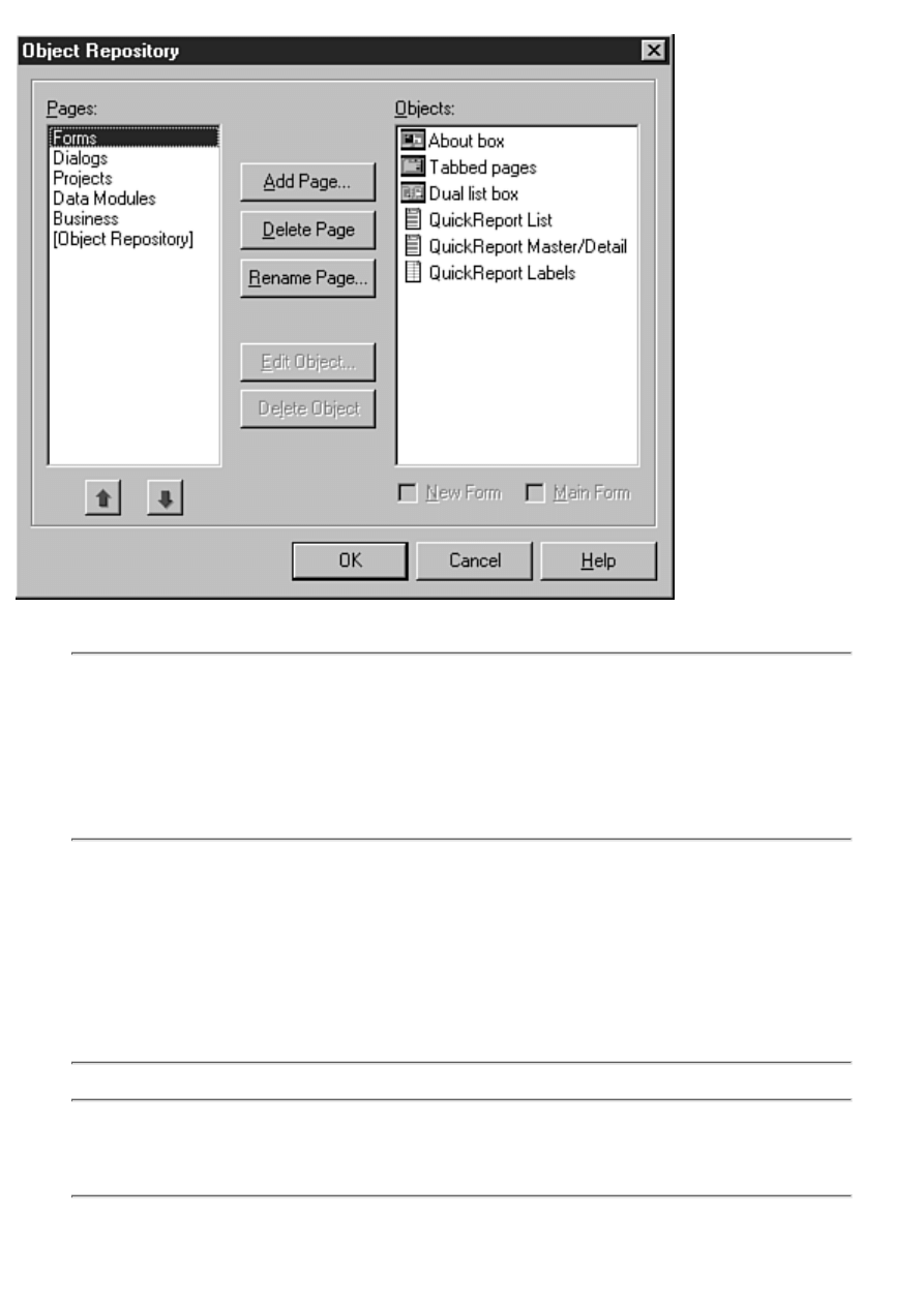
FIGURE 8.4. The Object
Repository configuration dialog box.
NOTE: The Pages list box has two important items of note. First, notice that the New
page, which is always the first page displayed when the Object Repository is invoked, is
not listed here. (The ActiveX and Multitier pages aren't listed in the Pages list box,
either.) The New page is fixed and cannot be altered. Also notice that there is an item
labeled [Object Repository]. This item is actually a list of all items on all pages of the
Repository.
Managing Objects
Before you can edit, delete, or move an object, you must first select it. To select an object, click the
object in the Objects list box. After you select an object, you can edit it by clicking the Edit Object
button. Editing an object enables you to change the object's name, description, and author information,
as well as the page on which the object is displayed.
TIP: To quickly edit an object, double-click it in the Objects list box.
You can delete an object by selecting it and then clicking the Delete Object button. You are prompted
for confirmation before the object is removed from the page and from the Repository.
When an object is deleted from the Object Repository, it is removed from the Object
Repository file and no longer shows up on any page in the Object Repository. However,

the actual form file and source file that describe the object are not deleted from your hard
drive.
An object can be moved from one page to another by simply dragging the object from the Objects list
box to the Pages list box. Drop the object on the page on which you want the object to be located, and
the object is moved.
Managing Pages
The previous section deals with editing, deleting, and moving individual objects. You can also add,
delete, or remove Object Repository pages through the Object Repository configuration dialog box.
Before you can delete a page, you must first delete all the objects on the page. After a page is empty,
you can remove the page by clicking on the page name in the Pages list box and then clicking the
Delete Page button. After checking to be sure the page is empty, Delphi deletes the page from the
Object Repository.
A new page can be added by clicking the Add Page button. A dialog box pops up asking for the name
of the new page. Just supply a new page name and when you click OK, the new page appears in the
Pages list box. Renaming a page works essentially the same way. When you select a page and click
the Rename Page button, a dialog box appears prompting you for the new page name.
The order in which the pages appear in the Object Repository can be changed. To change a page's
position in the page order, click the page to highlight it and then click the up or down arrow button
underneath the Pages list box to move the page up or down in the list. You can also drag a page to its
new location if you want.
Setting Default Forms and Projects
The Object Repository configuration dialog box enables you to set three default objects:
The default form that is used when you choose File | New Form from the main menu.
●
The default form that is used as the main form when you choose File | New Application from
the main menu.
●
The default project that is used when you choose File | New Application from the main menu.
●
You will notice that, depending on the object you select, one or two check boxes appear beneath the
Objects list box. If you select a form, the New Form and Main Form check boxes appear. If you select
a project, the New Project check box appears.
Making a form or project the default is easy. Let's say you create a main form that you want to be the
default main form when a new application is created. Select the form from the Objects list box and
click the Main Form check box at the bottom of the screen. When you click OK, that form will now
be the default. Similarly, if you have a project that you want to be the default project, first locate it in
the Object Repository configuration dialog box, click on it, and then check the New Project check
box. From that point on, when you choose File | New Application from the main menu, the project
you set as the default will appear.
NOTE: If you aren't careful, you can accidentally select a form as the default form for a
new application. If this happens, be sure you check each form in the Object Repository
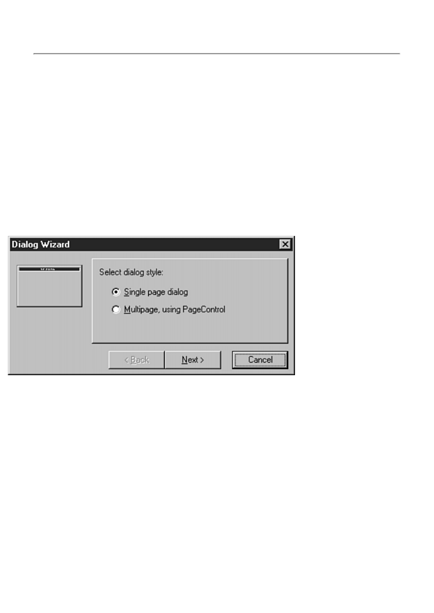
configuration dialog box. One form will have the Main Form check box checked. Clear
the check box and all will be back to normal. This also applies to the default project.
Check the Projects page for any items that have the New Project check box checked.
Building Forms and Applications with the Wizards
Delphi has two built-in wizards designed to guide you through the application creation process. The
Dialog Wizard aids you in creating dialog boxes, and the Application Wizard helps you create the
basic layout of an application. These wizards are discussed in the following sections.
Using the Dialog Wizard
Truthfully, there isn't very much for a dialog box wizard to do because dialog boxes of any real value
will need to be customized with the Form Designer. The Dialog Wizard is started from the Object
Repository. First, choose File | New from the main menu to display the Object Repository. Next,
switch to the Dialogs page and then double-click the Dialog Wizard icon. The Dialog Wizard is
displayed as shown in Figure 8.5.
FIGURE 8.5. The Dialog
Wizard.
You can choose to create a single-page dialog box or a tabbed (multipage) dialog box. The icon on the
left side of the dialog box shows you what the dialog box looks like at each step. If you choose to
create a single-page dialog box, when you click the Next button, you will see the next page of the
Dialog Wizard (see Figure 8.6).
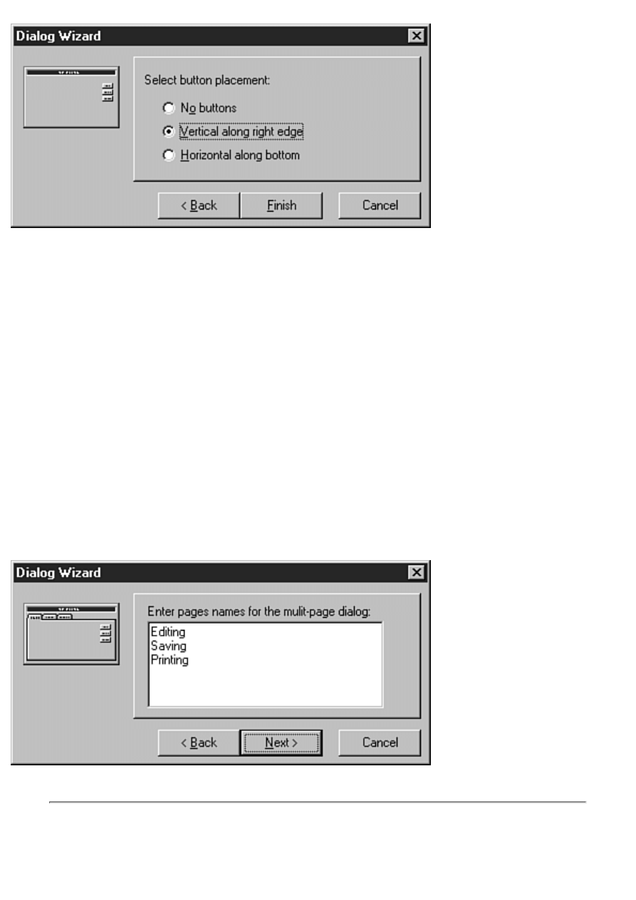
FIGURE 8.6. The second page
of the Dialog Wizard.
This page enables you to choose whether you want buttons on the dialog box and, if so, whether you
want them on the right side or the bottom of the dialog box. This is the last page of the Dialog Wizard
when creating a single-page dialog box. After choosing the button layout you want, click the Finish
button to have Delphi create the dialog box for you.
The new dialog box is displayed on the Form Designer complete with the features you chose through
the wizard. It also has its BorderStyle property set to bsDialog, which is customary for forms used as
dialog boxes. After the Dialog Wizard has created the basic dialog box, you can go to work with the
Form Designer to add functionality to the dialog box.
If you choose to create a tabbed dialog box, the second page of the dialog box looks like the one
shown in Figure 8.7. (Figure 8.7 shows the dialog box after page names have been added.)
This page has a multiline edit control in which you can enter the names of the individual tabs you
want to see on the dialog box. Enter the text for each tab on a separate line, as illustrated in Figure 8.7.
When you click the Next button, you will see the last page of the Dialog Wizard as you saw in Figure
8.6. Choose the location of the buttons, if any, and click the Finish button to have Delphi create the
tabbed dialog box.
FIGURE 8.7.The Dialog
Wizard creating a tabbed dialog box.
NOTE: The Dialog Wizard is most useful when creating tabbed dialog boxes. When
creating single-page dialog boxes, it is easier to choose one of the pre-defined dialog
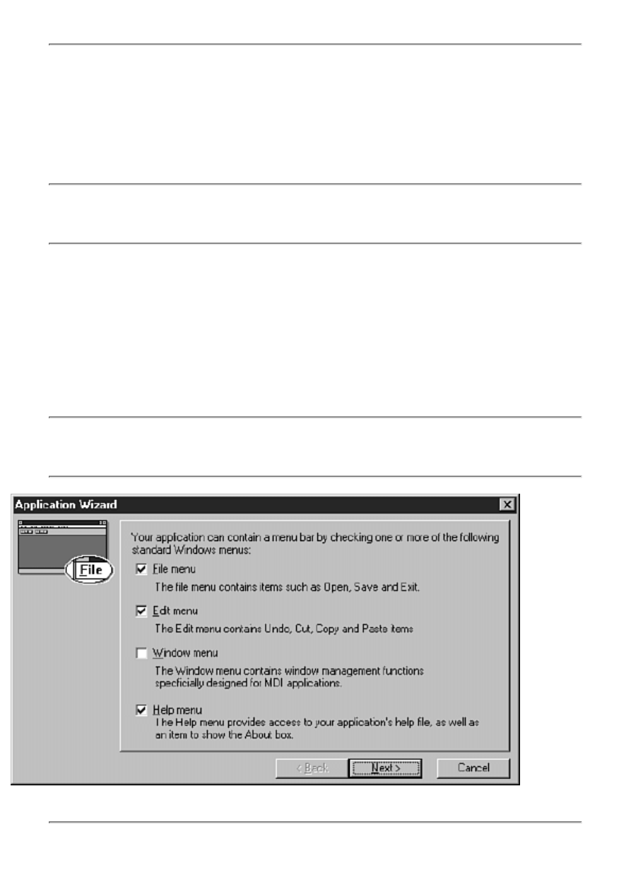
boxes from the Object Repository rather than going through the Dialog Wizard.
Creating Applications with the Application Wizard
The Application Wizard is a useful tool that can help you quickly set up the shell of an application. To
create a new application using the Application Wizard, choose File | New from the main menu. When
the Object Repository appears, click the Projects tab and then double-click the Application Wizard
icon.
NOTE: The New Application item on the main menu creates a new application based on
the current default project setting. It doesn't start the Application Wizard as you might
expect.
Let's walk through the Application Wizard one page at a time.
Page One: Selecting the Menus
When you start the Application Wizard, the first page is displayed as shown in Figure 8.8.
This page enables you to select the items you want on your application's main menu. You can choose
to add a File menu, an Edit menu, a Window menu, and a Help menu. Place a check in the box for
each menu item you want to appear on your menu bar.
NOTE: The Window menu is usually reserved for MDI applications. You probably
won't put a Window menu on your SDI application's menu bar unless you have a
specialty application that requires it.
FIGURE 8.8.
Page one of the Application Wizard.
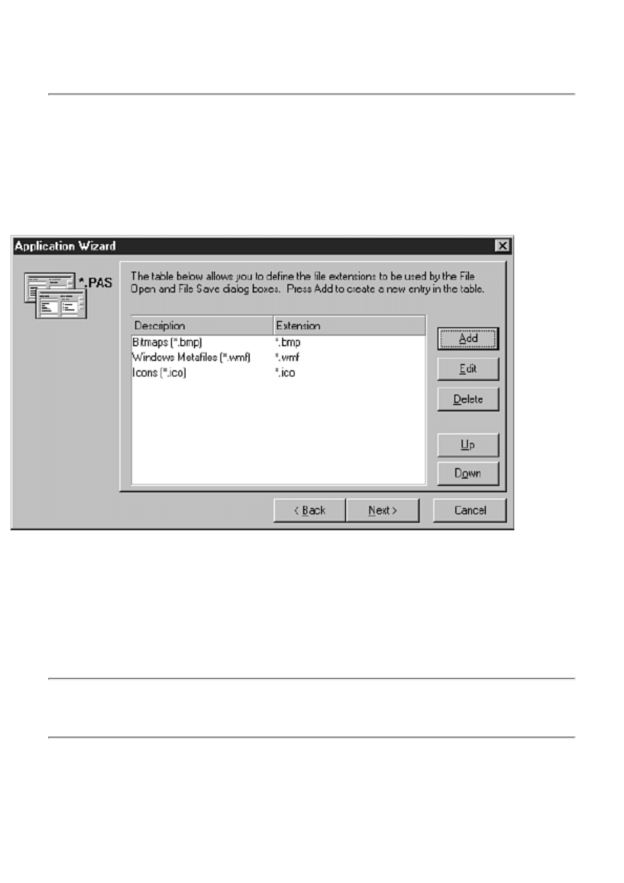
NOTE: The menus added by the Application Wizard are a reasonable representation of
the menu items that are most commonly used in Windows applications. Remember that
the Application Wizard is intended to give you a head start in creating your application.
It is up to you to take the basic structure and modify it to make a working application.
After you have chosen the menus you want for your application, click the Next button to move to the
next page.
Page Two: Setting the File Dialog Filters
If you chose to add a File menu to your application, the next page displayed will look like the one
shown in Figure 8.9.
FIGURE 8.9.
Setting filters for the file dialog boxes.
This page enables you to set the filters that your application's File Open and File Save dialog boxes
will use. (Figure 8.9 shows the dialog box after the filters have been added.) Click the Add button to
add a new filter. A dialog box is displayed asking for the description and the filter. Enter the filters
exactly as you do when setting the Filter property for the common file dialog box components. Enter
the textual description and then the actual file mask (*.bmp, for example). The Edit, Delete, Up, and
Down buttons can be used as necessary to change, delete, or move the filter in the list.
NOTE: Pages two and three will be displayed only if you previously selected menus on
page one of the Application Wizard. More specifically, page two will be displayed only
if you selected a File menu on page one.
Page Three: Setting Up the Speedbar
Page three of the Application Wizard aids you in setting up a speedbar (also called a toolbar) for your
application. This is possibly the most useful feature of the Application Wizard (not that the other
features aren't useful). You can quickly lay out your speedbar through this page. Figure 8.10 shows
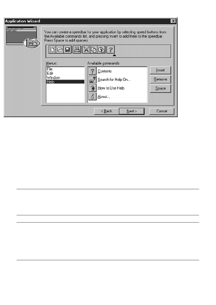
the third page of the Application Wizard after a speedbar has been created.
FIGURE 8.10.
Setting up the speedbar.
The list box on the left side of the page, labeled Menus, shows the four menus for which you can add
buttons. When you choose one of the menus, the available buttons for that menu are displayed in the
list box to the right of the Menus list box (labeled Available Commands). To add a speedbar button,
click the button in the Available Commands list box and then click the Insert button. The button will
be added to the sample speedbar at the top of the page.
The Space button can be used to add a separator to the speedbar. Adding separators visually
distinguishes groups of buttons. Continue to add buttons and spaces as needed until the speedbar is
complete. If you decide to remove a button, just click it in the sample speedbar and then click the
Remove button.
NOTE: If you elected not to add a particular menu to your application, no buttons will be
shown for that menu group. For example, if you did not add a Window menu, the
Available Commands list box will be empty when you click on the Window item in the
Menus list box.
TIP: Some specialty applications have a speedbar but don't have a menu. To create a
speedbar with the Application Wizard, you must first have created a menu. To work
around this, tell the Application Wizard that you want a menu and then build the
speedbar. After the application has been generated, you can delete the MainMenu
component from the application to remove the menu.
Page Four: Setting the Final Options
The fourth and last page of the Application Wizard enables you to set the program name, the path
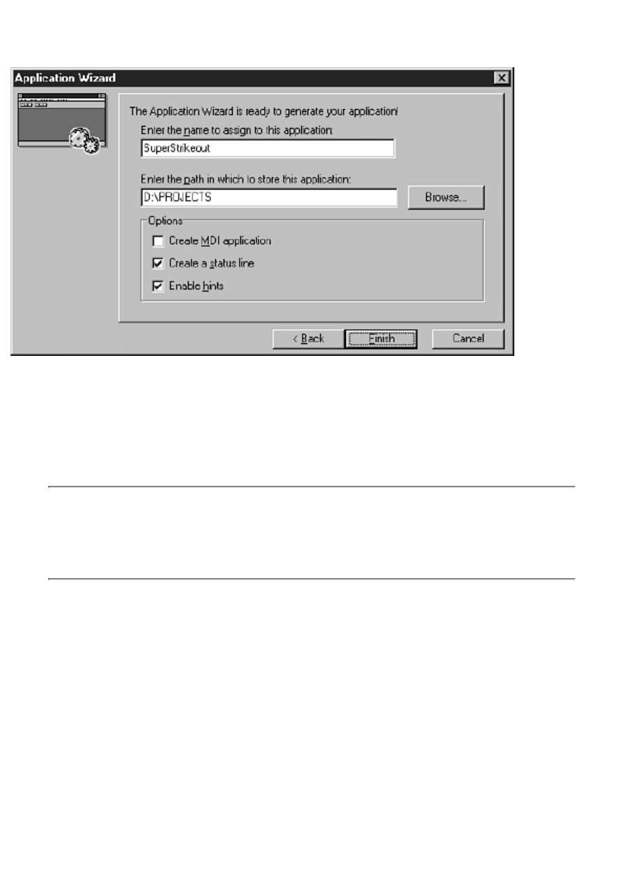
where the project should be stored on disk, and a few final options. Figure 8.11 shows the last page of
the Application Wizard.
FIGURE 8.11.
The final Application Wizard settings.
The first field on this page is where you specify the name of the application. This is not the name as it
appears on the Project Options dialog box, but the filename that Delphi will use to save the project.
You still need to set the application name in the Project Options dialog box. The second field is used
to specify the directory in which the project should be saved. If you don't know the exact path, click
the Browse button to the right of this field and choose the path from the Select Directory dialog box.
NOTE: You can use the Select Directory dialog box to create a directory as well as to
select a directory. Click the Browse button to display the Select Directory dialog box.
Enter the path for the directory you want to create and then click OK or press Enter.
Delphi will prompt you to create the new directory if the directory you entered doesn't
exist.
The bottom half of the final page gives you three additional options. If you are creating an MDI
application, click the check box marked Create MDI Application. (MDI applications were discussed
on Day 4, "The Delphi IDE Explored.") The remaining two check boxes enable you to implement a
status bar and hint text for your components.
When you are sure you have made all the choices for your new application, click the Next button.
Delphi creates the application based on the options you specified. Delphi writes as much code as
possible for the application. This doesn't amount to a lot of code, but some of the basic code is already
written for you. For example, if you chose a File menu, the FileOpenClick handler has been written
and looks like this:
procedure TMainForm.FileOpen(Sender: TObject);
begin
if OpenDialog.Execute then
begin
{ Add code to open OpenDialog.FileName }
end;
end;
The code to execute the File Open dialog box is in place; you only have to write the code that actually
deals with the returned filename.
TIP: After you create an Application Wizard project, you can choose Project | Add to
Repository to save the project for later use. This will save you the trouble of going
through the Application Wizard to create your basic application. You might want to add
an About box before saving the project to the Repository.
Using the wizards is fast and easy. You will still need to write the program, of course, but Delphi
gives you a head start by saving you from the tedium of creating the basic application elements. As
RAD-friendly as Delphi is overall, the wizards simplify this process even more. The Delphi wizards
are sort of like RAD on RAD!
NOTE: Delphi provides wizards other than the Dialog Wizard and the Application
Wizard. For example, the Database Form Wizard (discussed on Day 17, "Building
Database Forms") is used to create database forms, and the ActiveX Control Wizard
(discussed on Day 15, "COM and ActiveX") aids in the creation of ActiveX controls.
These are specialized wizards, so I didn't cover them in this chapter.
Adding Methods and Data Fields to Code
As you know by now, Delphi is a great tool for quickly creating the UI (user interface) portion of a
Windows application. It creates event handlers for you so that you can begin entering code to drive
your application. It won't be long, however, before you find the need to start adding more complicated
code to your applications.
Part of that means adding your own data fields and methods to the code that Delphi generates. For
example, a simple application might contain two dozen event handlers of various types. Delphi creates
all these event handlers for you; you simply fill in the blanks with working code. To make the
application a viable, working application, however, you might have to write another two-dozen
methods of your own.
Adding your own methods and data fields to code generated by Delphi is not a difficult task, but you
need to know the rules or you can get into trouble.
How Delphi Manages Class Declarations
As you know, when you create a new form in the Form Designer, Delphi creates the unit's source file
automatically. When Delphi creates the class declaration, it essentially creates two sections. The first
section is the part of the class declaration that Delphi manages. The second section is the part that you
manage.
On Day 6, "Working with the Form Designer and the Menu Designer," you created the ScratchPad
program. If you did the exercises at the end of that chapter, you also created an About box for the
program and added a few more buttons. Listing 8.1 contains the main form's class declaration as it

appears after adding these enhancements.
Keep in mind that the individual component declarations appear in the order the components were
placed on the form. Your class declaration should have the same components as shown in Listing 8.1,
but they might not be in the same order.
LISTING 8.1. THE class DECLARATION FOR ScratchPad'S MAIN FORM.
TMainForm = class(TForm)
StatusBar1: TStatusBar;
ToolBar1: TToolBar;
ToolButton1: TToolButton;
ToolButton2: TToolButton;
Memo: TMemo;
MainMenu: TMainMenu;
FileMenu: TMenuItem;
FileNew: TMenuItem;
FileOpen: TMenuItem;
FileSave: TMenuItem;
FileSaveAs: TMenuItem;
N1: TMenuItem;
FilePrint: TMenuItem;
FilePrintSetup: TMenuItem;
N2: TMenuItem;
FileExit: TMenuItem;
Edit1: TMenuItem;
EditReplace: TMenuItem;
EditFind: TMenuItem;
N4: TMenuItem;
EditPaste: TMenuItem;
EditCopy: TMenuItem;
EditCut: TMenuItem;
N5: TMenuItem;
EditUndo: TMenuItem;
Help1: TMenuItem;
HelpAbout: TMenuItem;
HelpContents: TMenuItem;
EditSelectAll: TMenuItem;
N3: TMenuItem;
EditWordWrap: TMenuItem;
OpenDialog: TOpenDialog;
SaveDialog: TSaveDialog;
MemoPopup: TPopupMenu;
PopupCut: TMenuItem;
PopupCopy: TMenuItem;
PopupPaste: TMenuItem;
procedure FileExitClick(Sender: TObject);
procedure EditCutClick(Sender: TObject);
procedure EditCopyClick(Sender: TObject);

procedure EditPasteClick(Sender: TObject);
procedure FileNewClick(Sender: TObject);
procedure FileSaveClick(Sender: TObject);
procedure FileOpenClick(Sender: TObject);
procedure FileSaveAsClick(Sender: TObject);
procedure EditUndoClick(Sender: TObject);
procedure EditSelectAllClick(Sender: TObject);
procedure EditWordWrapClick(Sender: TObject);
procedure HelpAboutClick(Sender: TObject);
private
{ Private declarations }
public
{ Public declarations }
end;
It is important to understand that the section between the first line of the class declaration and the
private keyword should be considered off-limits. As they say, "Don't go there." Leave this section to
Delphi to manage.
CAUTION: Placing any code in the Delphi-managed section of a form's class
declaration can cause problems with your program. In some cases, you might just get
compiler errors. In other cases, your program might be beyond repair (unusual but
possible). Get in the habit of avoiding this section of the class declaration like the plague.
You can safely place any of your own class data fields or method declarations in either the private or
the public section of the class declaration. You could add a protected section and place data fields or
methods there too, of course.
A WORD ABOUT STATUS BARS AND HINTS
In a moment you're going to add support for hint text displayed in the status bar of the
ScratchPad program. Before you do, though, you need a brief primer on how hint text is
handled.
When the Application object's ShowHint property is set to True (the default) and the
mouse cursor is placed over a component that also has its ShowHint property set to True,
a hint event is triggered. The Application object has an event called OnHint that occurs
whenever a hint event is triggered. The Application's Hint property will contain the hint
text for the control that generated the hint event. An application can use the OnHint event
to display the hint on a status bar.
The problem is that you can't directly access the OnHint event of the Application object.
What you can do, however, is reassign the value of OnHint to point to one of your own
methods. Then, when the hint event occurs, the event gets rerouted to your own OnHint
handler. To do that, you have to write your own event handler for the OnHint event. Let's
do that next.

Adding a Method to Your Code
To illustrate adding a method to an application, let's implement hint text for the ScratchPad program
you wrote earlier. First, reopen the ScratchPad program.
What you do in this series of steps is assign hint text to each of the toolbar buttons and prepare the
status bar to receive the hints. Remember, the toolbar buttons you placed on the toolbar on Day 6 are
just for show right now, but that doesn't prevent you from adding hints to them. Do the following:
1. Ensure that the ScratchPad main form is visible. Click the first button on the main form's
toolbar.
2. Locate the Hint property in the Object Inspector and type the following for the hint text:
Open|Open an Existing File
3. Change the ShowHint property to True.
4. Repeat steps 2 and 3 for any other buttons on the toolbar, adding whatever hint text you like
for each button.
5. Click the status bar component along the bottom of the main form. Change the SimplePanel
property to True. This enables the full status bar to display a text string through the SimpleText
property.
Okay, now everything is ready to go, so it's time you did what you came here for. You're going to
create your own OnHint handler and then name the method MyOnHint. Let's take this one step at a
time. First, add the method declaration to the class declaration. Here goes:
1. Switch to the Code Editor and be sure the SPMain.pas file is visible.
2. Scroll down through the class declaration for the TScratchPad class until you locate the
private section. Add this line of code after the private keyword:
procedure MyOnHint(Sender : TObject);
To give you perspective, the last few lines of the class declaration should now look like this:
private
{ Private declarations }
procedure MyOnHint(Sender : TObject);
public
{ Public declarations }
end;
Okay, so far, so good. Now you've added the method declaration for your new method. Two more
steps and you'll be done. First, you need to add the actual method to the implementation section. After
that, you need to assign your new method to the Application object's OnHint event. Follow these
steps:
1. Scroll to the bottom of the implementation section.
2. Enter the following code (just above the unit's final end keyword):
procedure TMainForm.MyOnHint(Sender: TObject);
begin
StatusBar.SimpleText := Application.Hint;
end;
3. Go to the Object Inspector. Select the main form, ScratchPad, from the Object Selector.

4. Switch to the Events page in the Object Inspector and double-click in the Value column next
to the OnCreate event. The Code Editor is displayed and is ready for you to type code.
5. Enter a line of code so that the FormCreate method looks like this:
procedure TMainForm.FormCreate(Sender: TObject);
begin
Application.OnHint := MyOnHint;
end;
6. Compile and run the program. The long hint text you entered will appear in the status bar
when you place the mouse cursor over a toolbar button. The short hint text will be displayed in
a tooltip when you pause over the button.
Step 2 sets the hint text (from the Hint property of the Application object) to the SimpleText property
of the StatusBar component. Step 5 takes the method you created in step 2 and assigns it to the
OnHint event of the Application class. Each time an OnHint event occurs, the MyOnHint method is
called and the hint text is displayed in the status bar.
NOTE: In the preceding example of implementing status bar hints, I took you the long
way around. I wanted to show you how to add a method to your form and how to assign a
method to an event. There is an easier way to implement status bar text, though. Simply
set the status bar's AutoHint property to True. You still have to specify each component's
hint text, but the rest is automatic. The AutoHint property is new in Delphi 4.
Adding a Class Data Field
Adding class data fields to a class generated in Delphi works in exactly the same way. All you have to
do is ensure that you add the data field to the private or public section of the class declaration as you
did earlier when adding a method to the class. You can also place data field declarations in the
protected section if you have created one for your class.
Deleting Delphi-Generated Code
There might be times when you need to delete code that Delphi generated in your application. For
example, you might have a button on a form that, due to design changes, is no longer needed. To
delete the button, of course, all you have to do is select the button in the Form Designer and press the
Delete button on the keyboard. No more button. Delphi deletes the button, but the OnClick handler
associated with that button is still in the code.
Delphi knows that the button associated with that OnClick handler is gone, but it still doesn't delete
the event handler because it is possible that other components are using the same event handler. It's up
to you to delete the event handler if you want it removed from your code.
The actual deletion of the event handler is a trivial task. Simply remove the code from the event
handler and save or compile the project. Delphi will remove any empty event handlers it finds.
NOTE: Some might say that if you are unsure about an event handler being used by
other components, just leave it in the code. That's a bad solution, in my opinion. You
need to take the responsibility for knowing what is in your code and getting rid of any
unused methods. Although unused code doesn't hurt anything, it leads to a larger .exe

file. In some cases, unused code can lead to performance degradation. Be diligent in
paring your programs of unused or inefficient code.
Creating Component Templates
New Term: A component template is a component or group of components that you modify as
desired and then save for later reuse.
Component templates enable you to create, save, and reuse groups of components. In fact, a
component template doesn't have to be a group of components at all--it can be a single component. A
quick example would probably help you see how useful component templates can be. But first, a
quick lesson on the Windows edit control.
The standard Windows single-line edit control, like all Windows controls, has certain predefined
behaviors. One of those behaviors deals with the way the Enter key is handled. If the user presses the
Enter key when in an edit control, Windows looks for a default button on the window. If a default
button is found, Windows essentially clicks the button.
What does this mean to you? Let's say you have several edit controls on a form and a default button
such as an OK button (or any button with the Default property set to True). When you press the Enter
key when an edit control has focus, the form will close. If there is no default button on the form,
Windows will just beep. Although this is standard Windows behavior, many users find it annoying
and confusing. What many users prefer, particularly when working with a form that has several edit
fields, is that the Enter key moves focus to the next control rather than closing the form.
The solution to this problem is really pretty simple. All you have to do is provide an event handler for
the OnKeyPress event and add code so that it looks like this:
procedure TForm1.Edit1KeyPress(Sender: TObject; var Key: Char);
begin
if Key = Char(VK_RETURN) then begin
Key := #0;
PostMessage(Handle, WM_NEXTDLGCTL, 0, 0);
end;
end;
This code first checks to see whether the key pressed was the Enter key (a virtual key code of
VK_RETURN). If so, it sets the value of Key to #0. This eliminates the beep that Windows emits
when the Enter key is pressed in an edit control. The next line posts a Windows WM_NEXTDLGCTL
message to the form. This message sets focus to the next control in the tab order. That's all there is to
it.
After you have written the code for your new Edit component, you can save it as a component
template. When you do, all the code is saved as well. Any code templates you create go into the
Templates page of the Component palette. Let's create a component template so that you can see how
it works. Perform these steps:
1. Place an Edit component on a blank form. Change its Name property to EnterAsTab and
clear its Text property.
2. Switch to the Events page in the Object Inspector and create an event handler for the
OnKeyPress event. Enter this code in the event handler:
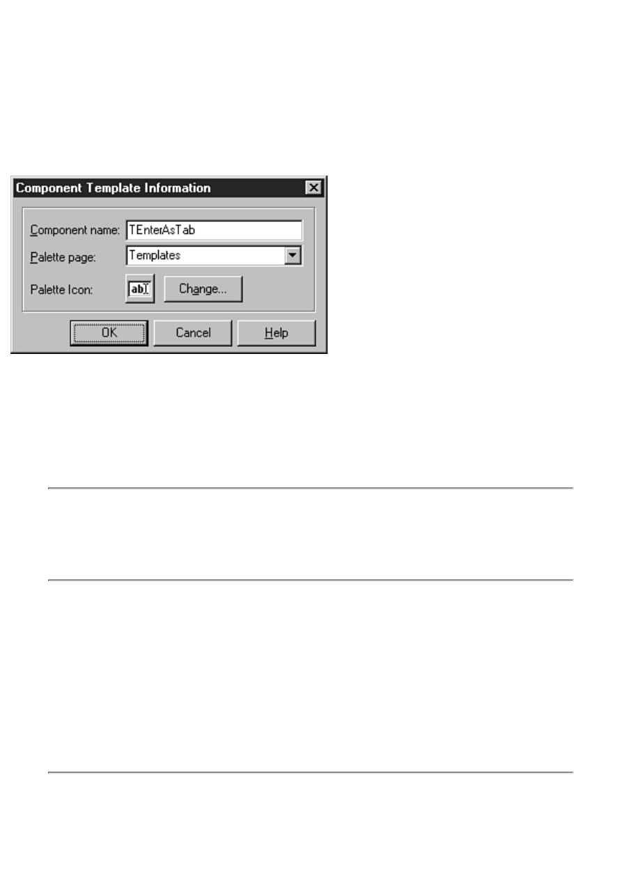
if Key = Char(VK_RETURN) then begin
Key := #0;
PostMessage(Handle, WM_NEXTDLGCTL, 0, 0);
end;
3. Be sure the Edit component is selected and choose Component | Create Component Template
from the main menu. The Component Template Information dialog box is displayed.
4. Enter TEnterAsTab in the Component Name field. The Component Template Information
dialog box should now look like the one shown in Figure 8.12.
FIGURE 8.12. The Component Template
Information dialog box.
5. Click OK to save the component template.
Now your Component palette has a tab called Templates. Switch to the Templates tab (you might
have to scroll the Component palette tabs to find it), select your new component, and place it on the
form. You will see that the code for the OnKeyPress event handler was included when the component
was placed on the form.
TIP: If you have several of these components on a form, the code for the OnKeyPress
event handler would be repeated for every EnterAsTab component on the form. Rather
than duplicating code, you can just place one EnterAsTab component on the form. Any
other components could be standard Edit components that have their OnKeyPress events
hooked up to the OnKeyPress event handler for the EnterAsTab component.
One of the biggest advantages of component templates is that the code written for each component's
event handlers is saved along with the component. Component templates enable you to have a
collection of customized components at your disposal: common dialog boxes with predefined filters
and titles, speed buttons with glyphs already included, list boxes or combo boxes that automatically
load items from a file, or any of a number of other possibilities.
Although the concept of a component template works for a single component, it makes even more
sense when dealing with multiple components. If you have a group of components that you place on
your forms over and over again, you can create a component template from those components. After
you have created a component template, reusing a group of components is only a click away.
NOTE: There are certainly some similarities between component templates and saving
forms in the Object Repository. Use component templates for groups of components that
you typically use as part of a larger form. Use the Object Repository to save entire forms
that you want to reuse.
Using Resource Files
New Term: Every Windows program uses resources. Resources are those elements of a program that
support the program but are not executable code.
A typical Windows program's resources include
Accelerators
●
Bitmaps
●
Cursors
●
Dialog boxes
●
Icons
●
Menus
●
Data tables
●
String tables
●
Version information
●
User-defined specialty resources (sound and video files, for example)
●
NOTE: Version information can be easily added to your Delphi projects through the
Version Info tab of the Project Options dialog box. The Project Options dialog box is
discussed in detail tomorrow.
Resources are generally contained in a resource script file (a text file with an .rc extension). The
resource script file is compiled by a resource compiler and then bound to the application's .exe file
during the link phase.
Resources are usually thought of as being bound to the executable file. Some resources, such as
bitmaps, string tables, and wave files, can be placed in external files (.bmp, .txt, and .wav) or they can
be bound to the .exe and contained within the application file. You can opt to do it either way. Placing
resources in the .exe file has two main advantages:
The resources can be accessed more quickly because it takes less time to locate a resource in
the executable file than it does to load it from a disk file.
●
The program file and resources can be contained in a single unit (the .exe file) without the need
for a lot of supporting files.
●
The downside to this approach is that your .exe will be slightly larger. The program file won't be any
larger than the combined external resource files plus the executable, but the extra size could result in
slightly longer load times for the program.
Your exact needs will determine whether you decide to keep your resources in external files or have
your resources bound to the .exe. The important point to remember is that you can do it either way (or
even both ways in the same program).

Resources in Delphi
A traditional Windows program will almost always contain at least one dialog box and an icon. A
Delphi application, however, is a little different. First of all, there are no true dialog boxes in a Delphi
application, so there are no dialog box resources per se (Delphi forms are stored as resources, but they
are RCDATA resources and not dialog box resources).
A Delphi application does have a traditional icon resource, though. Delphi takes care of creating the
resource file for the icon for you when you create the application. Similarly, when you choose bitmaps
for speed buttons, Image components, or BitBtn components, Delphi includes the bitmap file you
chose as part of the form's resource. The form and all its resources are then bound to the program file
when the application is built. It's all more or less handled for you automatically.
There are times, however, when you will want to implement resources aside from the normal Delphi
processes. For example, if you want to do animation, you will have to have a series of bitmaps that
can be loaded as resources for the fastest possible execution speed. In that kind of situation, you are
going to need to know how to bind the resources to your Delphi program file.
The act of binding the resource file to the executable is trivial, actually. It's much more difficult to
actually create the resources. Creating basic resources such as bitmaps, icons, and cursors is not
difficult with a good resource editor, but creating professional quality 3D bitmaps and icons is an art
in itself. How many times have you seen a fairly decent program with really awful bitmap buttons?
I've seen plenty. (Sorry, I'm getting off-track here.) You can create bitmaps, icons, and cursors with
the Delphi Image Editor. (The Image Editor is discussed on Day 11, "Delphi Tools and Options.")
If you are going to create string resources, user data resources, wave file resources, or other specialty
resources, you will probably need a third-party resource editor.
NOTE: If you have an old copy of Borland Pascal lying around, you can use the
Resource Workshop from that product to edit specialty resources. After creating the
resources, you will have an .rc file that you can compile into a .res file using the Borland
Resource Compiler (BRCC32.EXE). The Borland Resource Compiler comes with
Delphi. Technically, you could create the .rc file with any text editor and compile it with
the Resource Compiler, but in reality it is much easier to use a resource editor.
Compiling Resource Files
After you create a resource file, you need to compile it with the resource compiler. You can do this in
one of two ways:
Compile the resource file manually from the command line.
●
Add a batch file target to your project group.
●
Either way you end up with a .res file that you link to your application (I'll discuss that in just a bit).
Project groups are discussed in detail tomorrow.
Compiling from the Command Line
To compile a resource file from the command line, simply open a command prompt box in Windows
and enter a line similar to this:
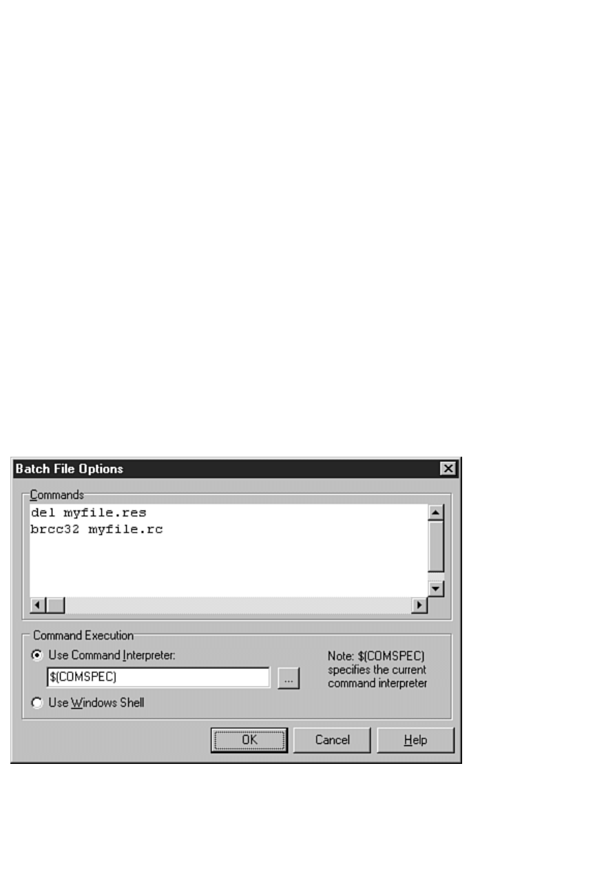
brcc32 jjres.rc
This assumes, of course, that your Delphi 4\Bin directory is on the system path. If not, you'll have to
type the full path to BRCC32.EXE. The resource compiler is very fast, so you might not even notice
that the resource script was compiled.
Using a Batch File Project
Adding a batch file project to your project group is just as simple as compiling from the command line
and has the added benefit of ensuring that the resource file will always be up to date. To get an idea
how a batch file project works, perform these steps:
1. Create a new application. This application is just to add perspective to the process.
2. Choose View | Project Manager to open the Delphi Project Manager.
3. Click the Add New Project button on the Project Manager toolbar. The Object Repository is
displayed.
4. Double-click the Batch File icon to create a new batch file project. The batch file project is
added to the Project Manager as Project2.
5. Right-click on the batch file node and choose Save. Save the file as test.bat.
6. Right-click the batch file node again and choose Edit | Options. The Batch File Options
dialog box is displayed.
7. Enter the following text in the Commands memo field:
del myfile.res
brcc32 myfile.rc
Figure 8.13 shows the Batch File Options dialog box after performing this step.
FIGURE 8.13. The
Batch File Options dialog box.
8. Click OK to close the Batch File Options dialog box.
What you did in this exercise is create a batch file that will execute when the project group is
compiled. The batch file commands you entered in step 7 delete a file called myfile.res and then call
the Delphi resource compiler to build myfile.rc. Compiling myfile.rc with the resource compiler will
produce a file called myfile.res.
Presumably the next project in the project group would be the project that uses myfile.res. You might
be wondering why I delete the myfile.res first. I delete the file so that I am certain the resource
compiler will build the file. If the resource compiler fails to create the resource file, any subsequent
projects that use that resource file will fail to compile and a compiler error will alert me that
something has gone wrong building the resource file.
NOTE: The book's code for today includes a project group that uses a batch file project
in exactly this way. You can download the code from
.
Linking Resource Files to Your Executable
After you compile the resource script file, you must bind the compiled resource file to the program's
executable file. You do this with the $R compiler directive. For example, to bind the binary resources
contained in myfile.res, you place this line near the top of your main form's unit:
{$R myfile.res}
That's all there is to it. As long as the specified file exists, Delphi will bind the compiled resources to
the executable file at link time.
A Sample Program Using Resources
Listing 8.2 contains the main form unit for a program called Jumping Jack. This program shows a
simple animation with sound effects. The main form contains just two buttons, an Image component
and a Label component. The Jumping Jack program illustrates several aspects of using resources in a
Delphi application. Specifically, it shows how to load a bitmap stored as a resource, how to load and
display a string resource, and how to play wave audio contained as a resource. Listing 8.3 is a partial
listing of the resource file that is used by the Jumping Jack program. Examine the listings, and then I'll
discuss what the program does.
TIP: Download this project from http://www.mcp.com/info to examine the resource file
and the project group.
LISTING 8.2. JJMain.pas.
unit JmpJackU;
interface
uses
Windows, Messages, SysUtils, Classes, Graphics, Controls,
Forms, Dialogs, StdCtrls, ExtCtrls, MMSystem;
{$R JJRES.RES}
const
IDS_UP = 101;
IDS_DOWN = 102;
type

TMainForm = class(TForm)
Image: TImage;
Label1: TLabel;
Start: TButton;
Stop: TButton;
procedure FormCreate(Sender: TObject);
procedure StartClick(Sender: TObject);
procedure StopClick(Sender: TObject);
private
{ Private declarations }
Done : Boolean;
procedure DrawImage(var Name: string);
public
{ Public declarations }
end;
var
MainForm: TMainForm;
implementation
{$R *.DFM}
procedure TMainForm.FormCreate(Sender: TObject);
begin
Image.Picture.Bitmap.
LoadFromResourceName(HInstance, `ID_BITMAP1');
end;
procedure TMainForm.StartClick(Sender: TObject);
var
S : string;
ResName : string;
I : Integer;
Buff : array [0..9] of Char;
begin
{ When the Start button is clicked the animation }
{ loop starts. The bitmap resources are named }
{ ID_BITMAP1 through ID_BITMAP5 so we'll start }
{ with a string called `ID_BITMAP' and append }
{ the last digit when needed. }
S := `ID_BITMAP';
{ A flag to let us know when we're done. }
Done := False;
{ Start the loop and keep looping until the }
{ `Stop' button is pressed. }
while not Done do begin
{ Loop through the five bitmaps starting with }
{ 1 and ending with 5. }
for I := 1 to 5 do begin
{ Append the value of `I' to the end of the string }
{ to build a string containing the resource name. }
ResName := S + IntToStr(I);

{ Call a method to display the bitmap. }
DrawImage(ResName);
end;
{ Load the `Up' string resource using the WinAPI }
{ function LoadString, display the string, and }
{ tell Windows to repaint the Label. }
LoadString(HInstance, IDS_UP, Buff, SizeOf(Buff));
Label1.Caption := Buff;
Label1.Refresh;
{ Play the `up' sound using the WinAPI function }
{ PlaySound. Play it asynchronously. }
PlaySound(`ID_WAVEUP',
HInstance, SND_ASYNC or SND_RESOURCE);
{ Pause for a moment at the top of the jump. }
Sleep(200);
{ Repeat all of the above except in reverse. }
for I := 5 downto 1 do begin
ResName := S + IntToStr(I);
DrawImage(ResName);
end;
PlaySound(`ID_WAVEDOWN',
HInstance, SND_ASYNC or SND_RESOURCE);
LoadString(HInstance, IDS_DOWN, Buff, SizeOf(Buff));
Label1.Caption := Buff;
Label1.Refresh;
Sleep(200);
end;
end;
procedure TMainForm.StopClick(Sender: TObject);
begin
{ Stop button pressed, so tell the loop to }
{ stop executing. }
Done := True;
end;
procedure TMainForm.DrawImage(var Name : string);
begin
{ Load the bitmap from a resource }
{ using the name passed to us. }
Image.Picture.Bitmap.
LoadFromResourceName(HInstance, name);
{ Must pump the message loop so that Windows }
{ gets a chance to display the bitmap. }
Application.ProcessMessages;
{ Take a short nap so the animation doesn't
{ go too fast. }
Sleep(20);
end;
end.

LISTING 8.3. JJRes.rc.
STRINGTABLE
BEGIN
101, "Up"
102, "Down"
END
ID_WAVEUP WAVE "up.wav"
ID_WAVEDOWN WAVE "down.wav"
ID_BITMAP1 BITMAP LOADONCALL MOVEABLE DISCARDABLE IMPURE
BEGIN
`42 4D 76 02 00 00 00 00 00 00 76 00 00 00 28 00'
`00 00 20 00 00 00 20 00 00 00 01 00 04 00 00 00'
`00 00 00 02 00 00 00 00 00 00 00 00 00 00 00 00'
remainder of bitmap resources follow
New Term: The main form's class declaration declares a Boolean data field called Done that is used
to determine when to stop the animation. The DrawImage method is used to display the bitmap in the
Image component.
In Listing 8.2, notice that two Windows API functions are used to load the string and wave file
resources. In the StartClick method, the LoadString function loads a string resource into a text buffer
based on the numerical identifier of the string (refer to Listing 8.3 to see how the string resources are
created). The string is then assigned to the Caption property of the Label component on the form.
The PlaySound function is used to play a wave file contained as a resource. The SND_ASYNC flag
used with the PlaySound function tells Windows to play the sound and immediately return control to
the program (playing sounds is discussed in detail on Day 12, "Graphics and Multimedia
Programming"). This enables the animation to continue while the sound is being played. The
SND_RESOURCE flag tells Windows that the sound is contained as a resource and not as a file on
disk. Both the LoadString and PlaySound functions use the HInstance global variable to tell Windows
to look in the executable file for the resources. The bitmap resources are loaded using the VCL
method LoadFromResourceName.
The first five lines of Listing 8.3 illustrate how a string table looks in a resource script file. Creating
string tables is very easy with any text editor. Following that, a WAVE resource is created for each of
the two wave files, which were previously recorded and reside in the project's directory. When the
resource compiler sees the WAVE declaration, it reads the individual sound files and compiles them
into the binary resource file.
NOTE: As you can see from Listing 8.3, you can create some types of resources easily
with a text editor. If you have bitmaps and wave audio stored as external files, you can
include them in an .RC file as illustrated in Listing 8.3 and have them compiled into the
binary resource file using the resource compiler. Later, the binary resource file can be
bound to your application's executable file.
Listing 8.3 is a partial listing. Bitmaps created with a traditional resource editor are often contained in
the resource file as numerical data. The resource descriptions for bitmaps can get very long. The rest
of the bitmap resource descriptions for the Jumping Jack bitmaps require about 200 lines of resource
code, so I decided not to list them all. Figure 8.14 shows Jumping Jack in mid-stride.
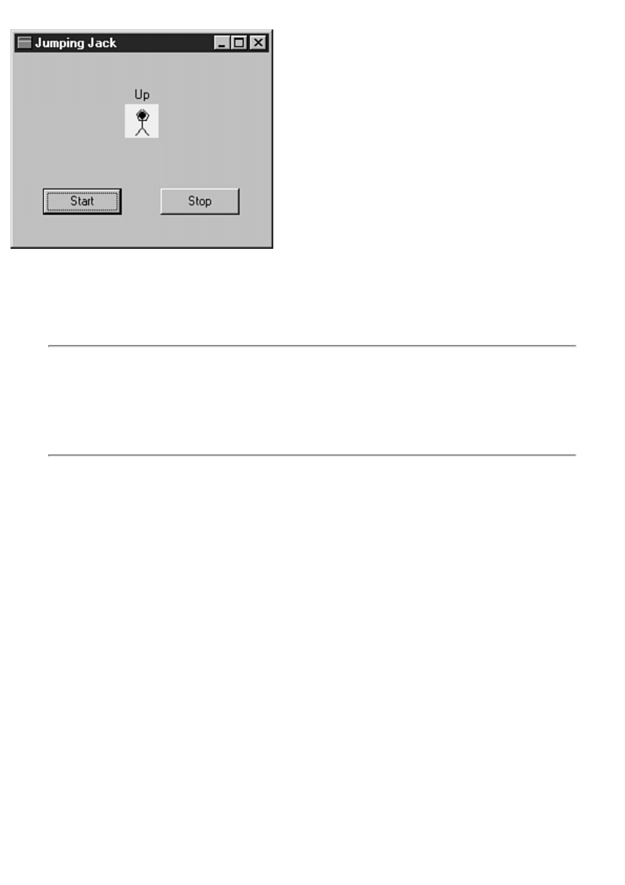
FIGURE 8.14. Jumping Jack in action.
Creating additional resources for your programs is not rocket science, but it is not exactly trivial,
either. It takes some time to realize how it all fits together. You might never need to add additional
resources to your applications. If you do, though, it's good to have an idea where to begin. If this
section left you a little dazed and confused, don't worry. Over time, it all starts to make sense.
NOTE: Bitmaps, icons, and cursors found in other programs are usually copyrighted
material. Don't use resources from any copyrighted program without permission. Further,
assume all programs are copyrighted unless they are specifically said to be freeware. You
are free to use the bitmaps, icons, and cursors that are provided with Delphi (in the
Common Files\Borland Shared Files\Images directory) in your applications without
permission from Borland.
Using Packages
After your application is written you can deploy it in one of two ways. (Deploying means the act of
distributing your application to your users.) You might be distributing your application to the general
public or possibly to users within your company. Either way, you need to know what options are
available to you. Essentially you have two choices: static linking or dynamic linking using packages.
In this section, I'll discuss those options so that you can make an informed choice on how to deploy
your application. I'll start with a discussion of packages and then I'll discuss deployment options.
What's a Package?
Before I discuss the options available to you, it is a good idea to define what a package is.
A package is a piece of compiled code that resides in a file with an extension of BPL.
That explanation probably doesn't tell you enough, so let me explain further. When you take off the
wrappings, a package is, essentially, just a DLL with an extension of .bpl rather than the traditional
.dll extension. (There's a bit more to it than that, but that description is close enough for the purposes
here.) There are two types of packages in Delphi: runtime packages and design packages. I'll go over
each of these two types next so that you can get an understanding of how packages work.
Runtime Packages

A runtime package contains code your application needs to run. Although Delphi provides many
different packages, the primary package is called VCL40.BPL. This package contains all the base
VCL code in one package. If you choose to use packages in your application, your application will
load a package called VCL40.BPL and call routines from that package as needed. If your application
is a database application, it will also load VCLDB40.BPL and call routines from that package as
needed. There are other Delphi packages in addition to the two mentioned here.
In addition to the VCL packages, your application might require other packages. This will be the case
if you are using any third-party components or any components that you write yourself. You will have
to check the documentation for any third-party components to find out which packages your
application requires to run. I'm getting ahead of myself a little, so let me tell you about design
packages and then I'll get back to deploying applications that use packages.
Design Packages
To explain design packages it might be a good idea to first give you a short tutorial on component
design. Most components created for Delphi include a runtime package and a design package. The
runtime package contains all the code needed for a component to operate. The design package
contains the code needed for the component to operate on a form at design time, including property
editors and component editors.
The design package has a Requires list that tells Delphi which packages it requires to operate. The
design package almost always requires code from the runtime package and probably code from one or
more VCL packages as well. It's important to understand that one package (both runtime and design)
can contain the code for several components. It's not necessary to have a separate package for each
component.
Because design packages contain just the code needed to display components at design time, they are
usually much smaller than their runtime counterparts. Design packages are used by Delphi only at
design time--they are not needed for your application to operate.
Static Linking Versus Dynamic Linking
Now that you know a little about packages, you can learn about static linking versus dynamic linking.
Static Linking
When an application uses static linking of the VCL, it doesn't use packages at all. Any code your
application requires to run is linked directly into your application's executable file. Your application is
a standalone program and doesn't require any supporting files (packages or DLLs).
NOTE: There are exceptions to every rule. The statement that a statically linked
application doesn't require any supporting DLLs makes a couple of assumptions. The
first assumption is that the application is not a database application. A Delphi database
application needs the Borland Database Engine (BDE) to operate. The BDE is primarily
a collection of DLLs, so a database application will require DLLs to operate, even if the
application is statically linked. The second assumption is that the application doesn't use
any ActiveX controls. ActiveX controls are actually a form of DLL, so if your
application uses ActiveX controls, it is no longer a standalone application.

Although Delphi gives you a choice of linking options, static linking is the default. Static linking has
two primary advantages over dynamic linking:
The first advantage is that you don't have to worry about shipping any additional files with your
application. Your application contains all the code it needs to run and no runtime libraries are
required.
●
The second advantage is that an application that is statically linked is generally smaller in total
size than an application that requires packages. I'll talk about this more in just a bit when I talk
about the advantages and disadvantages of dynamic linking.
●
Static linking has one major drawback but it only shows up in applications that use many user-defined
DLLs. The drawback is that the VCL and RTL code is duplicated in every module (the main
application itself) and in every DLL. This means that code is duplicated unnecessarily.
For example, let's say that every module requires a minimum of 200KB of VCL base code and RTL
code. Now let's say that you have a main application and 10 supporting DLLs. That means that
2200KB of code is used (11 modules ¥ 200KB each) when only 200KB is actually required. The
application and DLLs are all statically linked and can't share the VCL and RTL code among
themselves.
Dynamic Linking
Dynamic linking refers to a scenario in which an application dynamically loads its library code at
runtime. In the case of a Delphi application, this means that any required packages are loaded at
runtime. Required packages will certainly include one or more VCL packages and might require
third-party packages as well.
NOTE: The loading of packages by your application is automatic. You don't have to
write code to load the packages. Delphi takes care of that for you. Choosing dynamic
linking over static linking doesn't require any changes to your code. It does require
changes to the way you deploy your application, which I tell you about shortly.
Dynamic linking has one primary advantage over static linking: Several modules can share code from
a central location (the packages). Remember earlier when I gave an example of an application and 10
supporting DLLs? Using dynamic linking, the application and all DLLs can all share code from the
VCL packages. Each module will be at least 200KB smaller because all the base code is contained in
the runtime DLLs. This is an advantage when your overall product contains several applications or
many DLLs.
Dynamic linking comes with a couple of problems. The first problem is that the packages and DLLs
that you need to ship with your application can be quite large. The primary VCL package,
VCL40.BPL, is 1.8MB alone. Your application might require other packages besides the base VCL
package. This means that your application will require a minimum of 1.8MB of DLLs to run.
A second problem with dynamic linking is more subtle and more troublesome. The problem could be
summed up in one word: versioning. To explain the problem, let me give you a possible scenario.
Let's say you create an application using Delphi 4.02 (assuming a couple of revisions to Delphi) and
that you use dynamic linking, which requires you to ship the VCL packages and RTL DLL. Your
customer installs your application on his or her machine and everything works fine.

Meanwhile, I build an application using Delphi 4.0 (I'm too cheap to pay the shipping for the update)
and I also use dynamic linking. Your customer buys my application and installs it. My installation
program is homemade and doesn't play by the rules, so I overwrite the packages and DLLs that your
application installed. Suddenly your application quits working because my packages are older than
yours and the two are not compatible. Do you see the problem?
In reality, commercial software companies such as Inprise prevent this problem by naming their
packages and DLLs by different names for each release of a product and by embedding version
information in the packages and DLLs. (A good installation program will check the version number
and only install a package if the package is newer than any existing packages on the user's system.)
But packages from Borland aren't the real problem.
The real problem comes when using components from companies that are less careful about how they
do business. If you buy a component package from Billy Bob's Software Company, you are trusting
that Billy Bob knows what he is doing when it comes to creating packages. That might or might not
be a good assumption. Let's face it, with the boom of the Internet, components are available from a
wide variety of sources. You don't know what you are getting in a lot of cases, so be careful when
purchasing inexpensive or freeware components.
So Which Is Better?
I can hear you thinking, "So should I use static linking or dynamic linking?" The answer to that
question depends on the type of applications you write. In general, if you are writing a single small or
medium-sized application, you should use static linking. If you are writing very large applications or
applications with a large number of DLLs, you should probably use dynamic linking.
A simple case study might help put this in perspective. On Day 6 you created the ScratchPad program.
That program compiles to around 365KB (give or take a few KB) when static linking is used. If you
link ScratchPad using packages, you can get the EXE size down to around 21KB, but you have to ship
1.8MB of packages. As you can see, dynamic linking is not a good choice in this case.
Using Runtime Packages in Your Applications
If you choose to use dynamic linking, you need to change only one setting in the project options.
Here's what you need to do:
1. Choose Project | Options from the main menu to bring up the Project Options dialog box.
2. Click the Packages tab and check the Build with runtime packages option near the bottom of
the page (you can ignore the top of the page that deals with design packages).
3. Click OK to close the Project Options dialog box.
4. Rebuild the project.
That's all there is to it. Remember, using dynamic linking doesn't require any changes to your code.
Deploying Applications Using Packages
Deploying an application that uses dynamic linking requires you to know which packages your
application uses. If you followed the steps in the previous section, you can be assured that you need
VCL40.BPL at a minimum. You might need other VCL packages as well depending on the
components your application uses.
To find out for sure, you have to run a utility such as TDUMP.EXE and examine the imports that your
EXE references. TDUMP can be found in your \Delphi 4\Bin directory. To run TDUMP, just open a
command-prompt box and switch to the directory where your application resides. Then type the
following at the command line (assuming that \Delphi 4\Bin is on your path, you don't have to type
the path to TDUMP):
tdump myproject.exe
Get ready on the Pause button because TDUMP will start spitting out information right away.
Somewhere along the line you will see some lines like this:
Imports from Vcl40.bpl
System::initialization() __fastcall
System::Finalization() __fastcall
System::RegisterModule(System::TLibModule*) __fastcall
This might be repeated several times. You will have to watch for any files with a .BPL extension and
make note of their filenames. When you are done, you will have a list of packages that you must ship
with your application.
NOTE: The output from TDUMP can be redirected to a text file for easier viewing. For
example:
tdump myproject.exe > dump.txt
Now you can open DUMP.TXT in the Delphi Code Editor and view the contents.
NOTE: You can save yourself a lot of time and trouble by getting a good installation
program. InstallShield Express comes with Delphi Professional and Client/Server
versions, so you might already have an installation program that you can use. I also like
Wise Install from Great Lakes Business Solutions. The better installation programs figure
out which packages your application requires and automatically includes them in the
installation. I don't recommend writing your own installation program under any
circumstances. There are just too many issues that you can fail to take into account when
writing an installation program.
Most of the time you probably won't use runtime packages in your applications. On the other hand,
sometimes packages are just what you need.
Summary
The Object Repository is a great tool for reusing previously created forms, dialog boxes, projects, and
other objects. The capability to add your own objects to the Repository is a huge benefit to you.
The Dialog Wizard and Application Wizard take it a step further and guide you through the creation
process. The Application Wizard, in particular, is a very useful tool. In the middle of the chapter you
learned how to add data fields and methods to the classes that Delphi generates.
Toward the end of the chapter I touched on the different types of resources that you might need to
incorporate into your applications and how to add them to your Delphi projects. At the end of the
chapter I talked about packages. Packages give you flexibility in deciding how to deploy your

applications and also make installing custom components easier.
Workshop
The Workshop contains quiz questions to help you solidify your understanding of the material
covered and exercises to provide you with experience in using what you have learned. You can find
the answers to the quiz questions in Appendix A, "Answers to the Quiz Questions."
Q&A
Q When would I use the Use option of the Object Repository?
A When you have an object stored in the Object Repository that you want to update or make
other changes to.
Q Is there a limit to the number of objects that can be stored in the Object Repository?
A Technically, you can store as many objects as you like. Remember, though, that the purpose
of the Object Repository is to help you quickly locate and reuse your forms, dialog boxes, and
other objects. If you put too many seldom-used objects in the Object Repository, you will start
to lose efficiency because it takes longer to find the specific object you are looking for. It also
takes longer for the Object Repository to load and display all those objects.
Q I've got a bunch of old objects in the Object Repository that I don't use any more. How
can I get rid of them?
A Choose Tools | Repository from the main menu. The Object Repository configuration dialog
box is displayed. To remove an object, first select the object in the Objects list box and then
click the Delete Object button. The object will be removed from the Object Repository.
Q I had an object stored in the Object Repository. Now, when I try to use that object, I get
a message box that says, Unable to find both a form and a source file. What's the
problem?
A You have either moved or deleted the source or form file for the object. The Object
Repository keeps track of the directory where the object is stored. If you move or delete the
object, the Object Repository is unable to find the object and reports an error.
Q Can I add objects to the New page of the Object Repository?
A No. The New page of the Object Repository is fixed. It cannot be deleted or modified. You'll
have to place your objects on another page.
Q I added a method to my main form class. Now I can't compile. What's the problem?
A You probably added the method declaration to the Delphi-managed section of the class
declaration accidentally. Be sure that the declaration for your method is in either the public or
the private section of the class declaration (or the protected section if you have one).
Q I have a resource editor that enables me to decompile resources contained in other
programs. This lets me "borrow" bitmaps and other resources from other programs. Is
this okay?
A The short answer is, "No." You should assume all resources in other programs to be
copyrighted material that cannot be freely copied. Consult a lawyer for a qualified opinion.
Q I have a lot of bitmaps and sound files that go with my application. Can I put all those
resources in a file other than the program's executable file?

A Yes. You can store your resources in a dynamic link library (DLL).
Quiz
1. When do you use the Inherit option when selecting an object in the Object Repository?
2. What is the procedure for saving a project to the Object Repository?
3. What happens to inherited forms when you change the base form?
4. Where in the form's class declaration do you place user method declarations?
5. Where do you place the method definition (the method itself) when you add your own
methods to Delphi code?
6. How can you determine who wrote a particular object in the Object Repository?
7. Where do you add and delete pages in the Object Repository?
8. Is it easier to create a basic application from scratch or by using the Application Wizard?
9. Which is better for small applications: static linking or dynamic linking using packages?
10. Can you create a resource script file containing a string table with a text editor?
Exercises
1. Create a new form. Add several components of your choosing to the form. Save the form to
the Forms page of the Object Repository with the name BaseForm.
2. Start a new application. Choose File | New to view the Object Repository. Switch to the
Forms page. Click the Inherit radio button. Choose the BaseForm object you created in exercise
1 and add it to the application. (Be sure you used the Inherit option.) Save the project and close
it.
3. Open the BaseForm object you created in exercise 1. Delete all components on the form and
save the form.
4. Reopen the project you created in exercise 2. Display the new form you created in that
exercise. Note that the components are all gone. (Remember, you inherited this object, so all
changes made to the base form were also made to the inherited form.)
5. Choose Tools | Repository from the main menu. Delete the BaseForm created earlier.
6. Create a project using the Application Wizard. Use all menu options and make the
application an MDI application.
7. Add a multipage dialog box to the application you created in exercise 6. Use the Dialog
Wizard.
8. Use the Object Repository to add an About box to the program you created in exercise 6.
9. Create a simple program and build it. Run Windows Explorer and examine the size of the
.EXE created by Delphi. Now change the project options to use runtime packages. Rebuild the
program. Check the size of the .EXE now. What is the difference in size?
10. Write "I will not borrow bitmaps from other programs." 100 times on the blackboard.
, Macmillan Computer Publishing. All rights reserved.
Teach Yourself Borland Delphi 4 in 21 Days
- 9 -
Projects, the Code Editor, and the Code Explorer
●
❍
❍
Creating and Using Project Groups
❍
Building Projects or Project Groups
❍
●
❍
❍
❍
❍
The Directories/Conditionals Page
❍
❍
❍
●
❍
❍
❍
❍
❍
❍
●
The Code Explorer Context Menu
❍
❍
Adding Code Using the Code Explorer
❍
❍
●
●
❍
❍
❍
●
Today you learn more about the Delphi IDE and how it all works together to create real-world working programs. Specifically
you learn about
Projects and the Project Manager
●
The Code Editor
●

The Code Explorer
●
It will be a long day, but a rewarding one.
Everyone Needs a Project
On Day 4, "The Delphi IDE Explored," you were introduced to Delphi projects and found out a little about how projects work.
In this section, I cover projects in detail. Projects are a fact of life with Delphi. You cannot create a program without a project.
The project makes sure that everything works together to create a working application. The following sections talk about
The Project Manager
●
Project groups
●
The Project Options dialog box
●
Using the Project Manager
At some point, every project needs some management. Maybe you must add a new source unit to the project, or maybe you
must remove a source unit. You might need to add another type of file to the project, such as a binary resource file. You add
and remove units and other project files through the Project Manager.
Project Groups
On Day 4, I said that a project is a collection of files that work together to create a stand-alone executable file or DLL. That's
the definition of a project as far as the Delphi IDE is concerned. In the real world, you might have a different kind of project,
such as a job that you have to complete.
A large project might include one or more executable files and several DLLs. Because some projects consist of more than a
single executable program, Delphi enables you to group several Delphi projects together and deal with them as a single unit.
This unit is called a project group.
Why Use Project Groups?
You might be wondering what advantage project groups provide. Project groups give you the following:
Better control over a complete software project.
●
The ability to work on a DLL and a test EXE for the DLL at the same time.
●
The ability to build (compile and link) a group of projects all at one time.
●
The ability to have several projects open at one time and to easily switch between open projects.
●
A way to organize related projects.
●
A project that creates a single executable file doesn't need a project group. A single project can hardly be considered a group,
right? In the case of a single project, the concept of a project group is out of place.
But imagine for a moment a program that includes an EXE and a single supporting DLL. Both the DLL and the EXE go
together. Usually, if you are working on the DLL, you will want the EXE present so that you can immediately test any changes
you make to the DLL. In this scenario, a project group makes perfect sense because the EXE and DLL go everywhere together.
You can create a project group that contains these two individual projects and save it. When you want to work on either the
application or the DLL, you can open the project group rather than an individual project. When you open the project group,
both the EXE project and the DLL project are displayed. You can work on either the DLL or the EXE in the Code Editor and
switch back and forth between them any time you want. Figure 9.1 shows the Project Manager window with this type of
project group open.
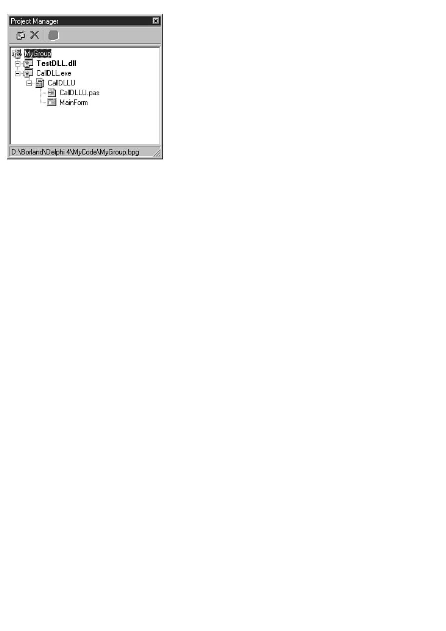
FIGURE 9.1. The Project Manager window showing a project group.
Another reason to have a project group is so that you can group related projects. That probably sounds like it doesn't make
much sense, so let me explain. Here at TurboPower Software we have a product called Async Professional, which is a
collection of serial communications components. These components include three main categories: basic serial
communications, faxing, and TAPI. We include dozens of sample programs with Async Professional covering each of these
three categories.
Given that scenario, we could create a project group for all of our faxing examples, one for all of our TAPI examples, and one
for all of our basic serial communications examples. Our users could then open the TAPI Examples project group and have all
the TAPI examples in one neat package. The entire project group could be built at one time, thereby saving the time and
aggravation of opening and building each project individually. In this case, the projects don't work together like a DLL and
EXE do, but the projects are related, so the concept of a project group makes just as much sense.
The Active Project
In any project group there is always an active project. The active project is displayed in the Project Manager in bold type. In
Figure 9.1, the active project is the project called TestDll. The active project is the project that will be built when you choose
Make or Build from the Project menu on the Delphi main menu.
These menu items are modified each time a project is made the active project. For example, if the active project is called
Project1, the menu items will be called Make Project1 and Build Project1. If a project called PictView is made the active
project, these two menu items will be called Make PictView and Build PictView.
The active project also has significance when a new form or a new unit is added using the Project Manager. When you create a
new form using the Project Manager, the new form will be added to the active project regardless of which node in the Project
Manager is currently selected. The active project is also the project to which new forms or units are added if you add new
elements via the Delphi main menu or the Delphi toolbar.
You can make a project the active project in one of several ways. One way is to select any item in the project node that you
want to make the active project and click the Activate Selected Project button on the top of the Project Manager. Another way
is to simply double-click the project node itself. Finally, you can choose Activate from the project node context menu to
activate a particular project.
The Project Manager Window
The Project Manager in Delphi 4 is brand-new. The Project Manager concept is not new to Delphi 4, but the current
implementation is much better than the previous Project Manager. The Project Manager is the central controller for all of your
projects and your program groups. It enables you to add files to a project, delete files from a project, view a unit or form, add
projects to the project group, change the order of projects, and more. To display the Project Manager, choose View|Project
Manager from the main menu or press Ctrl+Alt+F11.
The Project Manager window contains a tree view control that displays up to four levels. Those levels are as follows:
The project group
●
The projects within the project group
●
Forms and other files within the project
●
Individual form files and units under the form node
●
Naturally, the individual nodes can be collapsed or expanded as with any tree view control. The Project Manager nodes have
icons that indicate whether the node contains a project, an individual file, a form, or a form/unit pair. Refer to Figure 9.1 to see
the different icons and levels that the Project Manager displays.
NOTE: In previous versions of Delphi, the Project Manager showed the path to any units as well as the unit
filename. The Delphi 4 Project Manager does not show the path and filename in the same way. To see the path
and filename, click on a unit in the Project Manager window and the Project Manager status bar will show the full
path and filename for the unit (refer to Figure 9.1).
The Project Manager Context Menus
Most of the Project Manager's work is done through the Manager's context menus. There are four separate context menus for
the Project Manager. The following sections describe each of the context menus.
The Project Group Context Menu
The project group context menu is the context menu you see when you right-click the project group node at the top of the
Project Manager tree. Table 9.1 lists the project group context menu items that appear on this menu.
TABLE 9.1. THE PROJECT GROUP CONTEXT MENU ITEMS.
Item
Description
Add New Project
Opens the Object Repository so that you can choose a new target. Targets include applications,
DLLs, forms, data modules, components, or any other object available from the Object
Repository.
Add Existing Project
Opens a project file from disk and adds it to the project group.
Save Project Group
Saves the project group. Project groups have a .bpg extension.
Save Project Group As
Saves the project group with a new name.
View Project Group Source Displays the project group source. The project group source is a special file (a makefile) that
contains references to all projects within the project group.
Toolbar
Toggles the Project Manager toolbar on and off.
Status Bar
Toggles the Project Manager status bar on and off.
Dockable
Specifies whether the Project Manager is dockable.
NOTE: The Toolbar, Status Bar, and Dockable menu items appear on each of the Project Manager context
menus. I won't mention them again when I discuss the other Project Manager context menus.
The Project Context Menu
The project context menu is displayed when you right-click a project node in the Project Manager. Table 9.2 lists the context
menu items specific to the project context menu.
TABLE 9.2. THE PROJECT CONTEXT MENU ITEMS.
Item
Description
Add
Opens the Add to Project dialog box so that you can add a file to the project. The same as choosing
Project|Add to Project from the main menu or from the Delphi toolbar.
Remove File
Opens the Remove From Project dialog box so that you can remove a file from the project. The same as
choosing Project|Remove from Project from the main menu or from the Delphi toolbar.
Save
Saves the project. The same as choosing File|Save from the Delphi main menu.
Options
Displays the Project Options dialog box for this project. The same as choosing Project|Options from the
Delphi main menu.
Activate
Makes this project the active project.
Compile
Compiles this project. The difference between compile and build was discussed on Day 4.
Build
Builds this project.
View Source
Displays the project source file. The same as choosing Project|View Source from the Delphi main menu.
Close
Closes this project and all its files. If the project is part of a saved project group, the project node icon will
be grayed out. The project is still part of the group but is not open in the IDE. If the project is part of the
default project group, the project is closed and removed from the default group.
Remove Project Removes this project from the project group. The project is not deleted from your hard drive, just removed
from the project group. Same as clicking the Remove Selected Project button on the Project Manager
toolbar.
Build Sooner
Moves the project up in the project tree. Projects are built from the top of the Project Manager down.
Build Later
Moves the project down in the project tree.
NOTE: The Project Manager context menus are even more diverse than represented in this section. The project
context menus contain additional items if the project is a Batch File or a Package project. The differences are not
significant, so I won't go over those additional menu items.
The Unit Context Menu
The unit context menu is displayed when you right-click a unit node in the Project Manager. Table 9.3 lists the unit context
menu items.
TABLE 9.3. THE UNIT CONTEXT MENU ITEMS.
Item Description
Open Displays the unit in the Code Editor (for standalone units) or Form Designer (if the unit has an associated form).
Remove From Project removes the unit from the project. The Project Manager does not prompt you to remove the unit and
there is no undo for this action. You an always add the unit back to the project if you remove a unit by accident.
Save
Saves the unit. The same as choosing File|Save from the Delphi main menu.
Save As Opens the Save As dialog box so that you can save the unit with a new name. The same as choosing File|Save As
from the Delphi main menu.
The File Context Menu
The file context menu is displayed when you right-click a node other than the project group node, a project node, or a unit
node (usually a .pas or .dfm file). This context menu has only one item. The Open menu item displays the selected node in
either the Code Editor or the Form Designer, depending on the type of the selected node.
The Project Manager Toolbar and Keyboard Commands
In addition to the Project Manager context menus, the Project Manager has a toolbar to make working with the Project
Manager easier. The Project Manager toolbar contains three buttons:
The Add New Project button displays the Object Repository so that you can add a new project to the project group. This
is the same as clicking the Add New Project menu item from the project context menu.
●
The Remove Selected Project button removes the selected project from the project group. Use this button only to remove
an entire project, not to remove a particular form or file from a project.
●
The Activate Selected Project button makes the selected target the active project.
●
Keyboard commands include the Delete key and the Insert key. When you press Delete, the selected node is removed. If a
project node is selected, the project is removed from the project group. If a unit node is selected, the unit is removed from the
project to which the unit belongs. The Insert key behaves exactly the same as choosing Add to Project from the project context
menu.
TIP: The Project Manager toolbar buttons can be either large or small. By default, the Project Manager toolbar
buttons are small. You can change the toolbar button size by dragging the bottom of the toolbar either up (to show
the small buttons) or down (to show the large buttons).
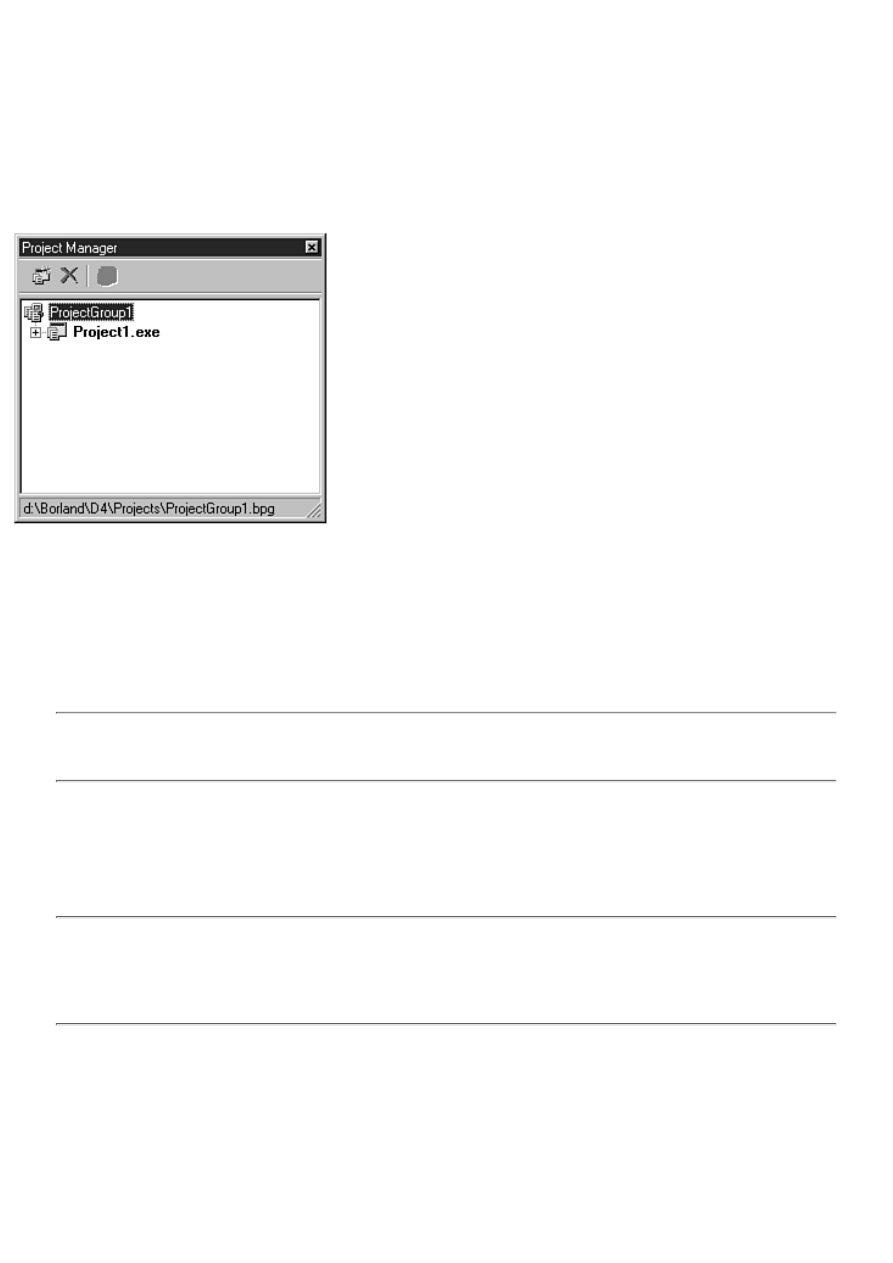
Creating and Using Project Groups
Project groups are a great benefit for complex projects, but using project groups is not mandatory. You don't have to use
project groups with every project. The Project Manager has a default project group called ProjectGroup1 that is used when you
don't specifically open or create a project group. Try this:
1. Choose File|Close All to close any open projects or project groups.
2. Choose File|New Application to create a new application.
3. Choose View|Project Manager to display the Project Manager. The Project Manager is displayed as shown in Figure
9.2.
FIGURE 9.2. The Project Manager showing the default project group.
The project group called ProjectGroup1 is a temporary project group. When you choose Save All from the File menu, you are
prompted to save the project, but not the project group. If you want to save the project group, you must explicitly save it using
the Save Project Group or Save Project Group As menu item from the Project Manager context menu.
Adding Units
Adding existing units to your projects is as simple as clicking the Add To Project button on the Project Manager toolbar or
choosing Add To Project from the Project Manager context menu.
NOTE: You cannot add a unit to a project if a form with the same name already exists in the project. For
example, if you have a form called MainForm and try to add a unit from another project that also has a form
named MainForm, you get an error message from Delphi even if the filenames are different.
Removing Units
You use the Remove From Project option to remove files from the project. Alternatively, you can select the unit you want to
remove and press the Delete key on the keyboard. Files removed from the project are not deleted from your hard drive, but are
just removed from the project compile/link process.
CAUTION: Be careful when removing units from your projects. You must take care not to remove units that are
referenced by other units in the project. If you remove units that are required by your project, a compiler error will
result. Before removing a unit, be sure it is not used in your project. If you accidentally remove a needed unit
from your project, you can add it back to the project with the Add To Project option as explained in the preceding
section.
The Remove From Project dialog box enables multiple selection, so you can remove several units from a project at one time if
you want.
Viewing Units or Forms
To view a unit, form, or other file, just double-click the node representing the form or unit you want to view. You can also
choose Open from the Project Manager context menu. The form or unit will be displayed in either the Form Designer or Code
Editor, depending on the type of node you are viewing.
Building Projects or Project Groups
To build a particular project, you can do one of the following:
Right-click the project node in the Project Manager and choose Build from the context menu.
●
Choose Project|Build <project name> from the Delphi main menu. The name of this menu item will change based on the
name of the active project.
●
Press Ctrl+F9 on the keyboard to compile the active project.
●
To build an entire project group, choose Project|Build All Projects from the Delphi main menu. All projects in the project
group will be built starting with the first project in the group (the project at the top of the Project Manager tree) and proceeding
down through the last project in the group.
Understanding Project Options
Project options are another of those features that are easy to ignore. For one, the defaults are usually good enough when you
are just starting out. After all, who has time to worry about all those compiler/linker options when you are simply struggling to
learn a new programming environment? At some point, though, you will start to become more interested in what all those
options do, and it's good to have some reference when the time comes.
This section looks at the Project Options dialog box. You can invoke this dialog box by choosing Project|Options from the
main menu. The Project Options dialog box is a tabbed dialog box with several pages:
Forms
●
Application
●
Compiler
●
Linker
●
Directories/Conditionals
●
Version Info
●
Packages
●
I won't discuss every page of the Project Options dialog box, but you'll take a look at the most important pages so that you can
understand more about what each of these pages does. I'll start you out easy by discussing the Forms and Application pages.
After that I'll move on to the more complicated pages.
NOTE: At the bottom of each page of the Project Options dialog box is a check box labeled Default. If you want
the current settings to become the default settings for all new projects created, check the Default box. When you
click OK, the current settings become the new default settings.
The Forms Page
The Forms page of the Project Options dialog box is where you control how your application handles its forms. You saw this
dialog box on Day 4 when you created the Picture Viewer program. Figure 9.3 shows the Forms page of the Project Options
dialog box for the ScratchPad program.
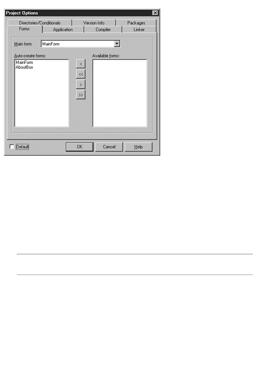
FIGURE 9.3. The Forms page of the Project
Options dialog box.
At the top of the Forms page is the Main form combo box. This is where you tell Delphi which form to display when the
application starts. By default, the first form you create will be the main form. If you change your project around in such a way
that a different form becomes the main form, you must change this setting so that the new form becomes the application's main
form.
In the middle of the dialog box are two list boxes. The list box on the left is labeled Auto-create forms; the one on the right is
labeled Available forms. Before I talk about how to use these two list boxes, let's take a moment to go over auto-creation of
forms.
Auto-creation means that Delphi will construct the form during the application startup process.
Each time you create a form, Delphi places that form in the auto-create list for the application. Forms that are auto-created
display more quickly than forms that are not auto-created. The disadvantage to auto-creation of forms is that your application
will use more memory than it would if your forms were not auto-created. Another disadvantage, although probably
insignificant, is that your application will take slightly longer to load if you are auto-creating a lot of forms.
NOTE: The first form in the Auto-create forms list box is always the main form. If you change the main form, the
new form selected will move to the top of the Auto-create forms list box. Another way to set the main form is to
drag and drop any of the forms in the Auto-create forms list box to the top of the list.
The nice thing about auto-creation is that displaying an auto-created form is easy. All you do is call that form's Show or
ShowModal function:
AboutBox.ShowModal;
If you do not have your forms auto-created by Delphi, you must take the responsibility of creating the form before you use it:
procedure TForm1.Button1Click(Sender: TObject);
var
About : TAboutBox;
begin
About := TAboutBox.Create(Self);
About.ShowModal;
About.Free;
end;
This example does not use the Delphi-generated pointer to the About box. It creates a local pointer, displays the form, and then
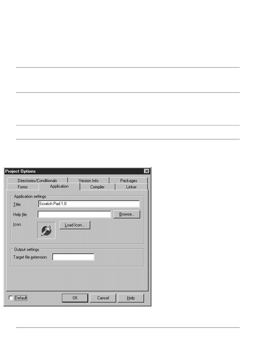
deletes the pointer as soon as the form is no longer needed. As is often the case in Object Pascal programming, there are
several ways to perform this particular task. Because Delphi always creates a pointer to the form object, you could have written
the previous code like this:
if not Assigned(AboutBox) then
AboutBox := TAboutBox.Create(Self);
AboutBox.ShowModal;
This code checks to see whether the form has already been created. If it has not, the object is created, and then the ShowModal
method is called. Deciding which method of form creation you will use is up to you, but I prefer the former because it handles
everything locally.
NOTE: Each time you create a form in the Form Designer, Delphi creates a pointer to the form. If you enable
Delphi to auto-create a form, you don't have to worry about the pointer being valid. If you choose not to have a
form auto-created, the pointer to the form will be nil until you explicitly create the form and initialize the pointer.
If you forget and use the pointer before it is initialized, Windows will generate an access-violation error.
Okay, now turn your attention back to the Project Options dialog box. The Auto-create forms list box contains a list of the
forms that will be auto-created. If you do not want a form to be auto-created, drag the form from the Auto-create forms list box
to the Available forms list box. To move several forms at one time, simply select the forms you want to move (both list boxes
support multiple selection) and drag and drop them all at once. It's that easy.
NOTE: You can use the buttons between the two list boxes to move forms from one list box to the other, but it's
usually easier to use drag and drop.
The Application Page
The Application page of the Project Options dialog box is very simple (see Figure 9.4).
FIGURE 9.4. The Application page.
The Title field on this page is used to set the title of the application. The title is the text that will appear on the Windows
taskbar when your application is minimized.
NOTE: The application's title and the caption of the main form are two separate items. If you want your
program's name to show up when you minimize your program, you must be sure that you set the title for the
application in the Project Options dialog box. If you do not provide an application title, the name of the project
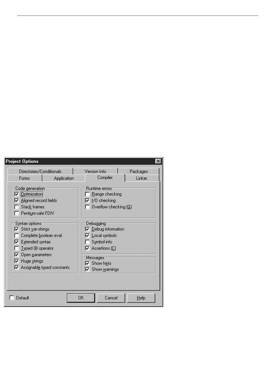
file is used by default.
The Help file field of the Application page is used to set the help file that your application will use. This is the help file that the
program will load when you press F1 while your application is running. You can use the Browse button to locate the help file
if you can't remember the name or location of the help file. If you do not supply a help file, pressing F1 in your application will
have no effect.
The Icon option enables you to choose an icon for your application. This is the icon that will be displayed in the Windows
taskbar when your application runs and when it is minimized. In addition, this icon will be displayed on your main form's title
bar unless you have explicitly set an icon for the main form. To choose an icon, click the Load Icon button and locate the icon
file (.ico) using the Application Icon dialog box.
You use the Target file extension field to specify the filename extension of the project when the project is built. For example, if
you were creating a screen saver, you would change this field to scr so that your screen saver would be created with an
extension of .scr rather than .exe. Control Panel applets are another example. These are special programs saved with a .cpl
extension. The project filename extension is automatically set to .exe for executable projects (console applications and GUI
applications) and to .dll for DLLs, so you don't have to provide a value for this field for normal projects.
The Compiler Page
The Compiler page of the Project Options dialog box is where you set the options that the compiler uses to build your project.
Figure 9.5 shows this page of the Project Options dialog box.
The Compiler page is divided into five sections. I'll take each section and examine it so that you can better understand the
different options on this page.
FIGURE 9.5. The Compiler page of the Project
Options dialog box.
Code Generation
The compiler can be configured to perform optimizations on your code. When optimizations are turned off (the Optimization
check box is not selected), the compiler makes no attempts to optimize code in any way. If you turn the Optimization option
on, the compiler will generate the fastest code possible without regard to code size. In most cases, you should leave this option
on the default setting. Sometimes, however, it is better to turn optimization off while debugging your application. I'll discuss
optimization and debugging in more detail on Day 10, "Debugging Your Applications."
The Aligned Record Fields option is used to control how records are aligned in memory. When this option is on, records are
aligned on 4-byte boundaries. When this option is off, records are byte-aligned.
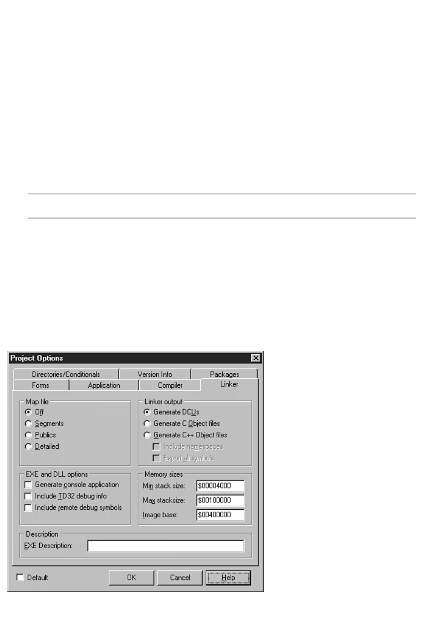
You might want to turn the Stack Frames option on when debugging. When you are finished debugging, you can turn off this
option to have the compiler generate smaller and faster code, but compile times will be slightly longer with the Stack Frames
option off.
The Pentium-Safe FDIV option causes the compiler to generate code that detects a faulty floating-point division instruction.
Syntax Options and Runtime Errors
These two sections affect how the compiler generates code for a project. The Delphi help for the Compiler page explains what
each of these options is for, so I won't repeat that information here. To display the help page for the compiler options, click the
Help button when the Compiler page is displayed or press the F1 key on the keyboard.
Debugging
The Debugging section of the Compiler page of the Project Options dialog box controls how the compiler generates code for
debugging sessions. When the Debug information option is enabled, Delphi generates debug information for the project. If you
do not generate debug information, you will not be able to stop on breakpoints and inspect variables during debugging. Put
another way, you can't debug your program unless you tell Delphi to generate debug information.
NOTE: If you change any of the options on the Compiler page, you should do a build immediately following the
change. This will ensure that all units are rebuilt using the same compiler settings.
Messages
The Messages section determines whether you want the compiler to report hints and warnings after compiling. I always leave
both the Show Hints and Show Warnings options on. Hints and warnings should not be ignored in the long term (in the short
term, you can ignore warnings that you know are due to temporary conditions in your code). Usually, compiler warnings can,
and should, be resolved. Learn to treat hints and warnings as errors. Quality code compiles without warnings.
The Linker Page
The Linker page of the Project Options dialog box is where you set options that specify how you want the linker to operate.
Until you become very familiar with Delphi, you can leave this page alone and accept the default settings. Figure 9.6 shows the
Linker page of the Project Options dialog box. The options available on this page are explained in the following sections.
FIGURE 9.6. Project Linker options.

Map File
The Map File settings control whether a map file is generated and how much detail is included in it. A map file is an advanced
debugging tool and is something that you will not likely use until you get further into Delphi. For that reason, I won't go into
more detail on the Map File options.
EXE and DLL Options
The EXE and DLL Options section determines the type of executable file produced by Delphi for an application project. When
the Generate Console Application check box is checked, Delphi produces a console application as opposed to a GUI
application.
The Include TD32 Debug Info option causes the linker to link the debug information into the EXE or DLL. ("TD32" refers to
the 32-bit version of the venerable old Turbo Debugger. TD32 is an advanced standalone debugger that used to ship with
Borland C++ products and with some versions of Delphi.) Some debugging utilities use debug information in TD32 format.
TurboPower's Memory Sleuth, for example, requires TD32 debug information to be present in the EXE. Turn this option on
when using programs like Memory Sleuth.
The Include Remote Debug Symbols option generates the debug symbols necessary for remote debugging of Web broker
applications.
Linker Output
The Linker Output section determines what type of compiled binary file the linker should produce. Normally the linker
produces DCU files (the default for Delphi applications). You might, however, want to generate C or C++ object files (OBJs)
rather than DCUs, thereby allowing your Pascal units to be used with a C or C++ program built with Borland C++Builder.
Memory Sizes
The Memory Sizes section can be ignored by all but the most advanced users. The default values are acceptable for all
applications. In some cases, you might change the Image base address when building a DLL, but doing so is rarely necessary.
Description
The EXE Description field is used to specify a string that will be embedded in the application. This field is sometimes used to
add copyright information to an EXE or DLL. Most of the time, you will use version info to store copyright information in a
file rather than using the EXE Description field on this page. Version info is described later in the section "The Version Info
Page."
The Directories/Conditionals Page
The Directories/Conditionals page of the Project Options dialog box is where you set the directories that your project uses to
find library files. Figure 9.7 shows the Directories/ Conditionals page. The fields on this page are described in the following
sections.
FIGURE 9.7. The Directories/ Conditionals page.
Directories
The fields in this section determine where Delphi can find various source files during compilation of the project. It also
contains fields that determine where certain files created by the compiler and linker will be placed during a build of the project.
The Output Directory field is used to specify the directory where the final executable file or DLL will be placed. The Unit
Output Directory determines where the DCU files will be placed for each unit compiled. The Search Path field is used to
specify the directories where any additional libraries needed to build the project can be found. The Debug Source Path field is
used to specify the path to any source units that you want to debug, but which are not in the current project's directory. For
example, if you want to step into a DLL while debugging, you have to enter the path to the DLL's source code in this field. The
BPL Output Directory and the DCP Output Directory fields specify where the BPL and DCP files should be placed when
building a package.
Note that a small button with an ellipsis on it appears next to several of the fields on the Directories/Conditionals page.
Clicking this button displays an editor that enables you to add, remove, or rearrange the items in a particular field. Figure 9.8
shows this dialog box while editing the Search Path field.
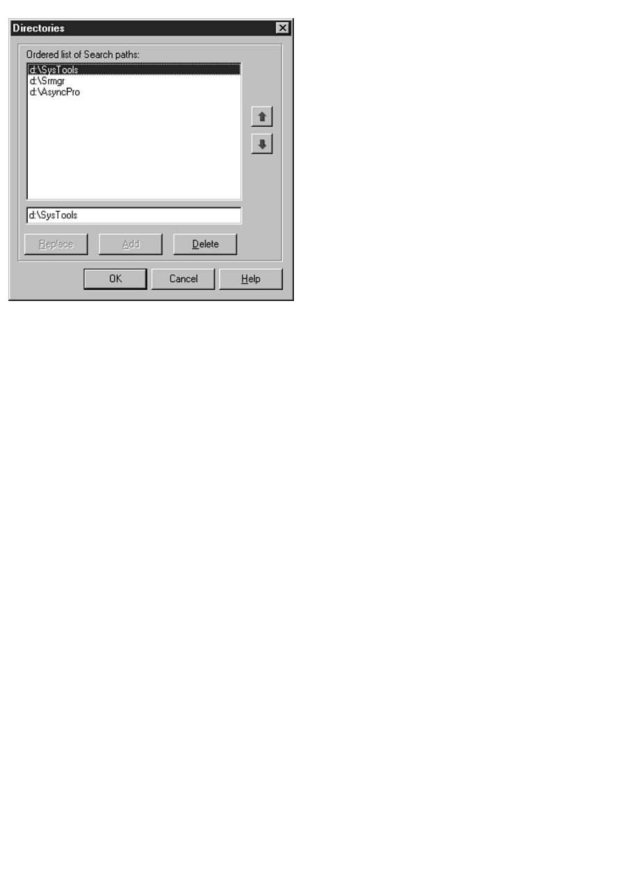
FIGURE 9.8. The Directories editor dialog box.
Conditionals
You use the Conditional Defines field to specify any defines that you want to add at the project level. For example, let's say
you have code in your project that will be compiled only if the symbol TRIALRUN is defined. In that case, you would add
TRIALRUN to the Conditional Defines field. If you have more than one symbol to define, make sure that each symbol is
separated by a semicolon.
Aliases
The Unit Aliases field is used to specify any unit aliases. For example, Delphi 1 used units called WinTypes.pas and
WinProcs.pas for all Windows-specific code. Delphi 2, 3, and 4 use a unit called Windows.pas in place of WinTypes and
WinProcs. The Unit Aliases field aliases WinTypes and WinProcs to the Windows unit. In this case, aliasing enables programs
written in Delphi 1 to compile in Delphi 4 without modification of the uses list.
The Version Info Page
The Version Info page enables you to set the version information for your applications. Version information is stored in your
program's EXE file or in a DLL or ActiveX file. It is used by installation programs to determine whether a file being installed
is older or newer than the file it is replacing.
Version info has other uses as well. You can view the version information for a file from Windows Explorer. Just right-click
the file and choose Properties from the Explorer context menu. When the Properties dialog box comes up, click the Version tab
to view the version information for the file. Figure 9.9 shows the Properties dialog box displaying version information for the
Database Desktop utility that comes with Delphi.
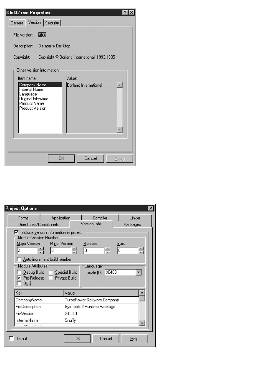
FIGURE 9.9. The Properties dialog box showing version
information for DBD32.EXE.
Figure 9.10 shows the Version Info page of the Project Options dialog box. At the top of the page is a check box labeled
Include Version Information in Project. When this check box is checked, version information will be included in the project's
executable file. When this check box is not checked, version information is not included in the project, and the rest of the page
is disabled.
FIGURE 9.10. Version information for your
projects can be supplied on the Version Info page.
The remaining fields on the Version Info page are used to specify the various pieces of version information. The Major
Version, Minor Version, Release, and Build fields work together to form the file version number. The version number of the
file in Figure 9.10 is version 2.0, build 0. If you check the Auto-Increment Build Number option, the build number will
automatically increment by one each time you perform a build.
The Module Attributes section can be used to determine any special attributes you want specified for the file. The Language
section enables you to select a locale identifier for the file. For more information on the possible values for the Locale ID field,
see the Windows API online help under the topic "Language Identifiers and Locales."
The table at the bottom of the Version Info page can be used to set a variety of information. This information includes your
company name, the file description, the internal name of the file, the legal copyright or trademark information, the product
name, product version, and any comments you want to add.
You can provide information for any of these fields or none at all (the FileVersion field is set based on the fields in the Module
Version Number section). You can even add your own custom version information fields. To add a custom version info field,
simply click in the version info table and scroll to the end of the table using the down-arrow key. Type the down-arrow key
once more and a dialog box will be displayed asking you for the version key to add. Supply a key name and that key is added
to the version info for the project. Adding version information to a project has never been so easy!
The Packages Page
The Packages page is where you determine the type of linking that your projects will use. The top part of the page enables you
to add or remove design packages, but that really doesn't have anything to do with the current project. The only option that
pertains to the current project is the Build with Runtime Packages check box.
When this option is selected, your application will use dynamic linking of the VCL and any third-party components. This
means that your executable file will be smaller, but you will have to be sure to ship the correct packages with your application.
When this check box is off, your application uses static linking. Static linking means that any VCL code and the code from any
third-party components that your application uses is linked directly into your executable file. Packages were discussed in detail
yesterday in the section "Using Packages." Figure 9.11 shows the Packages page of the Project Options dialog box.
FIGURE 9.11. The Packages page.
The Delphi Code Editor
There is no question that Delphi is highly visual in nature--that's one of the great benefits of programming with Delphi. Still,
any program of any significance will have a great deal of code that must be written by hand. After you get the UI part of your
application written with Delphi's impressive visual tools, you'll likely spend a long stretch with the Delphi Code Editor. The

Code Editor has some features you'll learn to appreciate when you discover them.
In this section, you learn about the following:
Basic editor operations
●
Specialized editor features
●
The Code Editor context menu
●
Changing the editor options
●
NOTE: The Delphi Code Editor enables you to choose from four keyboard-mapping configurations: Default, IDE
Classic, BRIEF, and Epsilon. The rest of this chapter assumes Default keyboard mapping. If you are already
familiar with one of the other keyboard mapping configurations, you can ignore any references to specific
keystrokes.
Basic Editor Operations
I'm going to assume that you know enough to be able to enter and delete text, highlight text with the mouse, cut, copy, paste,
and so on. I won't spend any time going over functions at that level.
When it comes right down to it, the Delphi Code Editor is a typical code editor. It features syntax highlighting, which makes
identifying keywords, strings, numeric constants, and comments at a glance easy. You'll look at setting the editor preferences a
little later.
The Code Editor is a tabbed window. You can open as many editor windows as you like; each window will be represented by a
tab along the top of the editor window that will display the name of the file. To switch to a source file, simply click the tab
corresponding to the file you want to view. If more tabs exist than can be displayed at one time, scroll buttons will appear so
that you can scroll among the tabs.
The status bar at the bottom of the Code Editor gives status information (obviously). The current line number and the cursor
position on the line are reported in the left panel of the status bar. If the file has changed since it was last saved, the status bar
will say Modified in the center panel of the status bar. The right panel of the status bar shows the current mode, either Insert or
Overwrite. If the file has been set to read-only, this panel will say Read Only.
The editor window has a gray strip in the left margin that is called the gutter. The gutter is used to display icons at different
stages of the development process. For example, when you set a debugger breakpoint (discussed tomorrow), a red dot is placed
in the gutter. When you set a bookmark (discussed in just a bit), an icon representing the bookmark is placed in the gutter.
NOTE: If you accidentally click on the gutter when trying to select text or place the cursor, you will find that a
breakpoint is set on that line. Click the gutter again to clear the breakpoint.
Opening and Saving Files
Nothing is very mysterious about opening and saving files in the Code Editor. It should be pointed out, though, that there is a
difference between opening a project and opening a source file. When you choose File|Open Project from the main menu, you
are prompted for the name of a project file to open. When you choose File|Open from the main menu, you can open an
individual Delphi source file or form file. Actually, you can open any type of text file (including file types not listed in the
Open dialog box's Files of Type field). This includes .pas, .rc, .txt, and even C++ source and header files (.cpp and .h). Both
the Open and Open Project menu items have corresponding toolbar buttons.
NOTE: If you open a unit file (.pas) that contains a form, Delphi will open the source file in the Code Editor and
will also open the form in the Form Designer.
You can also open multiple files at one time. To open multiple files, choose the files you want to open in the Open dialog box
and click OK. Each file selected will be loaded, and a tab for each file will be placed at the top of the editor window.
TIP: You can also use drag-and-drop to open files. For example, you can choose a file (or a group of files) in
Explorer, drag it onto the Code Editor, and drop it. The file will be opened in the Code Editor.
To save a file, choose File|Save or File|Save As from the main menu or type Ctrl+S on the keyboard. If the file has not been
previously saved, the Save As dialog box will appear, and you can enter a filename at that time.

Highlighting Text
Although text highlighting is basic text-editor stuff, I thought it wouldn't hurt to remind you of a few basic highlighting
techniques you can use in the Delphi Code Editor.
To highlight a short block of text, you can use the mouse to drag across any text you want to highlight. After you've selected
the text, you can cut, copy, or paste as needed. To highlight longer blocks of code, you can use the Click+Shift+Click method.
First, click at the beginning of the block you want to highlight. Next, hold the Shift key on the keyboard and then click again at
the end of the block. All text between the starting point and the ending point is highlighted.
Another useful feature is the capability to quickly select an individual word. To select a keyword, function name, or variable,
just double-click on the word. Now you can perform any editing operations you want with the highlighted word.
TIP: To select a single line of code with the mouse, click at the beginning of the line and drag straight down to
the beginning of the next line. To highlight a single line of code with the keyboard, first press the Home key to
move to the beginning of the line and then use Shift+down-arrow key to highlight the line.
Dozens of keyboard combinations can be used to highlight text and do other editing chores. For a complete list of all the
keyboard shortcuts available, consult the Delphi online help.
TIP: As you program you often add, delete, or move blocks of text. Sometimes you will need to indent an entire
block of code. At other times you will need to un-indent (outdent?) an entire block of code. To indent a block of
code, highlight the lines that you want to indent and then press Ctrl+Shift+I on the keyboard. The entire block will
be indented. To un-indent a block of code, press Ctrl+Shift+U on the keyboard.
The Code Editor also supports drag-and-drop editing. To move a section of code, first highlight it. Next, place the mouse
cursor over the highlighted text and drag. Drag until the cursor reaches the location where you want the code to be placed.
Release the mouse button and the code will be moved to the new location. To copy text rather than move it, repeat the
preceding steps but hold down the Ctrl key before you drop the text.
Undo
The Code Editor has a virtually limitless number of undo levels (32,767 by default). Normally, you can only undo commands
up to the last time you saved a file. By changing the editor options, you will be able to undo past commands even after saving
the file. I'll talk about editor options and preferences later in the chapter in the section titled "Changing the Editor Options."
In general, it pays to remember this simple maxim: "Undo is your friend."
Find and Replace
Find and Replace are used fairly heavily in programming. You might use Find to find a specific piece of code or a specific
variable in your code. You might use Replace to change a variable's name or to change the name of a method. The possibilities
are endless.
The Delphi Find Text and Replace Text dialog boxes implement more or less standard find-and-replace operations. To bring
up the Find Text dialog box, choose Search|Find from the main menu or press Ctrl+F. Enter text in the Text to find field and
click OK or press Enter. If the text is found, it will be highlighted.
NOTE: Text highlighted by the Find Text dialog box is not the same as text highlighted with the mouse. You will
notice that searched text is highlighted in black whereas text selected with the mouse is highlighted in blue
(assuming you haven't changed the editor defaults). Text highlighted after a search operation is not selected for
editing, it's just marked so that you can see it better.
To invoke the Replace Text dialog box, choose Search|Replace from the menu or press Ctrl+R. Figure 9.12 shows the Delphi
Replace Text dialog box. With a few obvious exceptions, the Find Text dialog box contains the same options.
For the most part, the options on the Find Text and Replace Text dialog boxes do exactly what they indicate. If you choose the
Case Sensitive option, you must type the search text exactly as it appears in the source file.
FIGURE 9.12. The Replace Text dialog box.
Use the Whole Words Only option when you want to be sure that text for which you are searching is not part of a longer word
or variable name. For example, let's say you want to replace Form with MyForm. In this case, you would want to search for
whole words only because the word Form might be used in other variable names (such as TForm).
The Regular Expressions option requires explanation as well. When this option is on, you can use special and wildcard
characters when doing searches. The special characters enable you to find elements such as the beginning of a line or the end
of a line in your search strings. Wildcard characters work much like they do in directory operations. For a complete description
of regular expressions, see the Delphi online help under the topic "Regular Expressions."
When replacing text, it is safest to leave the Prompt on Replace option on. When you do a Replace All operation with this
option on, the editor will highlight each found word and prompt you whether to replace it. It is easy to miscalculate the results
of a Replace All operation, so always use Replace All with care. Even then, it still pays to remember that maxim: "Undo is
your friend."
The rest of the Find and Replace options are self-explanatory and therefore don't need additional mention.
Find in Files
Find in Files is a great tool for searching for text in multiple files. I frequently use Find in Files to search the VCL source code
for particular methods, variables, or classes. This tool is useful and convenient, and you should learn how to use it.
To display the Find Text dialog box, you can choose Search|Find in Files from the main menu. Perhaps an easier way is to type
Ctrl+F on the keyboard to bring up the Find Text dialog box and then click the Find in Files tab. Figure 9.13 shows the Find
Text dialog box with the Find in Files tab showing.
FIGURE 9.13. The Find Text dialog box.
Find in Files uses some of the same search options as the regular Find operation (case-sensitive, whole word only, and regular
expressions). In addition, you have the option to search all files in the project, all open files, or files in a particular directory,
including subdirectories.
When you start Find in Files, a small window with a title of Searching appears in the lower-right portion of your screen. This
window shows the status of the Find in Files operation. It will show you the current file being searched and the number of
matches up to this point. To cancel the search, just close the Searching window.
Any matches are reported in the Code Editor's message window. The message window shows the filename of the file in which
the text was found, the line number where the text was found, and the line containing the search text with the search text
displayed in bold. To view the file that contains a match, just double-click a line in the message window. Delphi will open the
appropriate file and display the exact line containing the text for which you are searching. Figure 9.14 shows Delphi searching
a set of files.
When specifying the file mask, all the usual wildcard characters apply. For example, if you want to search all text files in a
directory, you would enter the following in the File masks field:
c:\MyStuff\*.txt
Find in Files is an indispensable tool. I find myself using it all the time. Learning to use Find in Files will save you a lot of
time.
FIGURE 9.14. Delphi searching for text.
Getting Help
One of the most useful features of the Code Editor is its integration with the Delphi help system. Just place the editor cursor
over an Object Pascal keyword, a VCL property or method, or any other Delphi-specific text and press F1. If a help topic for
the text under the cursor exists in the Delphi help files, Windows Help will run with the appropriate page showing. If no help
topic exists for the selected text, an error message will be displayed.
This feature is extremely useful when you can't remember how to use a particular aspect of Delphi, Object Pascal, or VCL.
Help, as they say, is just a keystroke away.
Specialized Editor Features
The Delphi Code Editor has a few features that are extremely useful when you are writing a lot of code. They are explained in
the following sections.
Code Templates
Code templates are another nice feature of the Delphi Code Editor. Code templates enable you to insert any predefined code
(or any text, for that matter) in your source units. To use code templates, just type Ctrl+J on the keyboard while editing in the
Code Editor. When you do, a list box will pop up giving you a list of templates from which to choose. Choose a template from
the list, press Enter, and the text corresponding to that code template will be inserted into your source code. Figure 9.15 shows
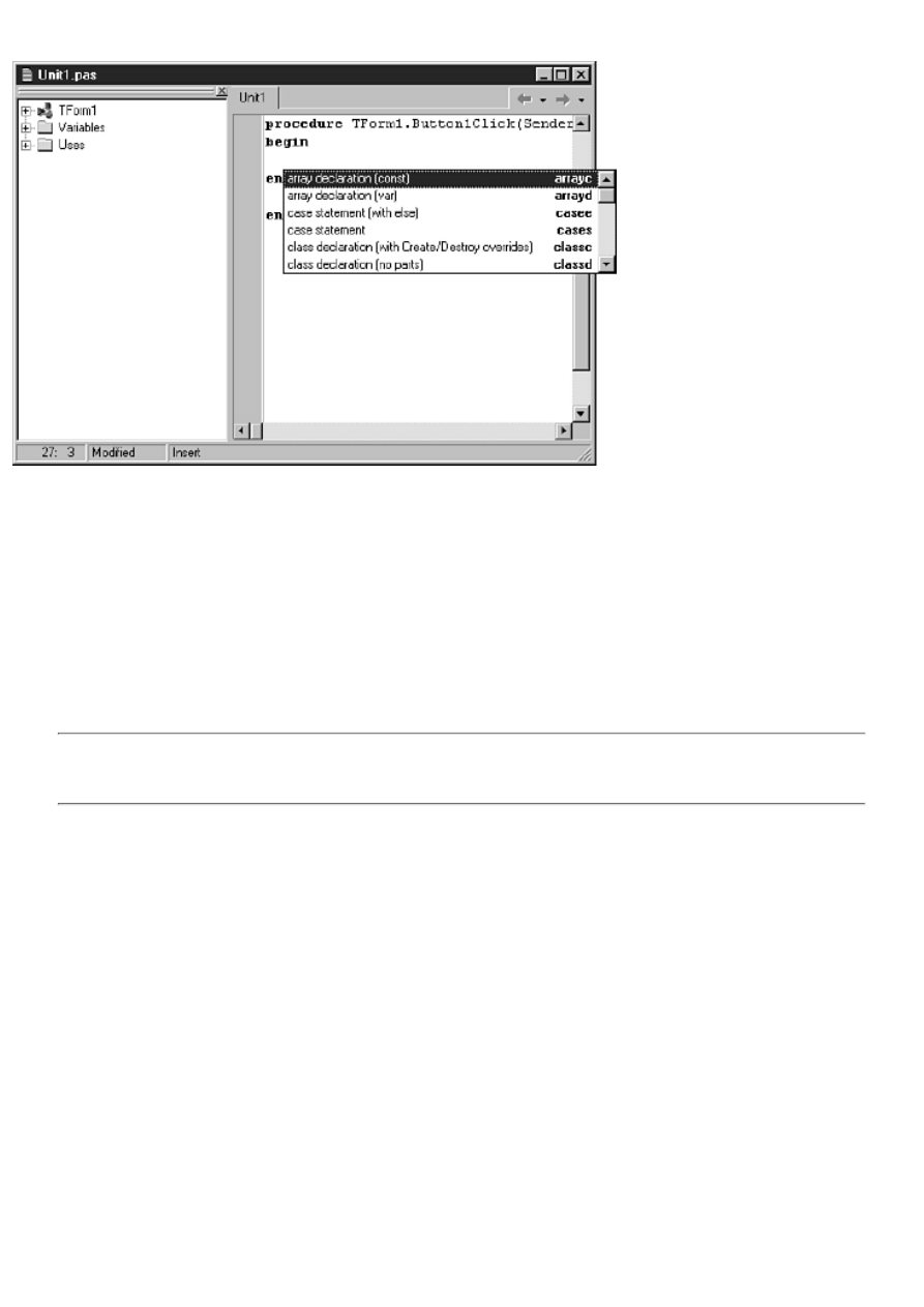
the code template list box as it appears when you type Ctrl+J.
FIGURE 9.15. The Delphi code template
list box.
You can add new templates or edit existing templates via the Code Insight page of the Environment Options dialog box. Or, if
you prefer, you can open the code template file with any text editor (such as the Delphi Code Editor) and edit the code
templates there. The code template file is called DELPHI32.DCI and is located in the Delphi 4\Bin directory.
Feel free to modify the code templates in any way you see fit. For example, I have modified my code template representing the
for statement to look like this:
for I := 0 to Pred(|) do begin
end;
Notice the pipe character (|) in the code snippet. The pipe in a code template entry is a placeholder that determines where the
cursor will be placed after the text is inserted into your source code.
TIP: If you make a lot of modifications to the code template file, be sure to keep a backup of the file in a safe
location. You will need a backup because the Delphi installation program will overwrite your modified
DELPHI32.DCI file when you update or reinstall Delphi.
You can use code templates for more than just code. Here at TurboPower Software our source files always have a header at the
top of the unit. It looks something like this:
{*********************************************************};
{* Filename and version *};
{* Copyright (c) TurboPower Software 1998 *};
{* All rights reserved. *};
{*********************************************************};
Because most of this text stays constant, I have a template that quickly inserts the header in any new source units I create. Use
code templates for any text that you use frequently in your day-to-day programming.
Code Parameters
The code parameters feature of the Code Editor displays a tooltip that prompts you with the needed parameters of a VCL
method or Windows API function. With hundreds of VCL methods and Windows API functions, there is virtually no way to
remember every function's parameters. The code parameters feature saves you time by showing you the parameters of a
method as you type. For example, let's say you are calling the SetBounds method. When you type the opening parentheses, a
hint window pops up as shown in Figure 9.16.
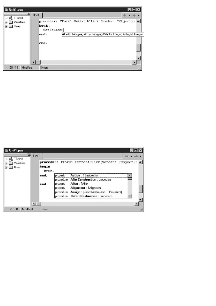
FIGURE 9.16. Code parameters in
action.
As you can see in Figure 9.16, each parameter is listed in the tooltip. The parameter you need to type next is displayed in bold.
As you type a parameter, the next parameter is displayed in bold. This continues until you type all the method's parameters.
After you have typed all the required parameters, the code parameters tooltip disappears. The code parameters options are set
on the Code Insight page of the Environment Options dialog boxes. I'll discuss that page later in the section "The Code Insight
Page."
Code Completion
Code completion is another Code Editor feature that can save you development time. Type a class variable name followed by
the dot operator, and the Code Editor will display a list box with all of that class's properties and methods. If, for example, you
have a memo component called Memo, you will type
Memo.
and pause for a moment. A list box pops up as shown in Figure 9.17.
FIGURE 9.17. Code completion
displaying the properties and methods of TMemo.
When you see the list box, you can select an item from the list in one of two ways. One way is to locate a property or method
in the list box using the mouse or the keyboard and press Enter. The property or method will be inserted into your code.
Alternatively, you can type the first few letters of the property or method you want to insert into your code. As you type,
Delphi searches the list of properties and methods for a match and highlights the item in the list that most closely matches the
text you are typing.
When you see the property or method you want, press the Enter key and the property or method will be inserted into your
code. If you don't want to use the code completion list box, you can press the Esc key on the keyboard and the code completion
list box will disappear.
Code completion saves you time by providing a list of properties and methods from which to choose. It has the added benefit
of providing perfect spelling and capitalization of property and method names. Just choose the property or method you want,
press the Enter key, and Delphi inserts the identifier in your code.
Tooltip Symbol Insight

Tooltip symbol insight pops up a tooltip when you place your mouse cursor over just about any identifier in your source code.
For example, a standard new project will have this line in the interface section:
TForm1 = class(TForm)
When you place your mouse cursor over the identifier TForm, a tooltip pops up that says:
type Forms.TForm = class(TCustomForm) - Forms.pas (584)
This line shows you the TForm class declaration and tells you that TForm is declared on line 584 of the Forms.pas unit.
Tooltip symbol insight will tell you information about any variable in your program. This is particularly convenient when you
forget the type of a variable (was X declared as a Byte, a Word, or an Integer?).
Class Completion
Class completion is a new feature in Delphi 4. Type any properties or method declarations in the interface section and type
Ctrl+Shift+C on the keyboard. Delphi will add the necessary code to the implementation section to complete the class. This is
best illustrated by performing an exercise. Perform these steps:
1. Start with a blank project.
2. Switch to the Code Editor and locate the form's class declaration in the interface section.
3. Type the following code in the public section of the form's class declaration:
procedure Test;
function GetSomething : Integer;
4. Type Ctrl+Shift+C on the keyboard.
When you perform step 4, Delphi automatically adds the bodies of the Test and GetSomething methods to the implementation
section and places the editing cursor in the first method. The added code looks like this:
function TForm1.GetSomething: Integer;
begin
end;
procedure TForm1.Test;
begin
end;
Keep this unit handy because you will use it again in the next section when I discuss module navigation.
Code completion works with property declarations as well as methods. Type a property declaration, type Ctrl+Shift+C, and
Delphi completes the property declaration. It even adds a write method for your property. I don't cover writing properties until
Day 20, "Creating Components," so this might not make much sense to you right now. It will be more clear when you begin
writing your own components.
For me, class completion is one of the best of Delphi 4's new features. This feature alone has saved me a lot of time when
writing components. I wouldn't be without it now that I have been using it for a period of time.
Module Navigation
Module navigation enables you to quickly move from a method in the implementation section to that method's declaration in
the interface section, and vice versa. Again, an exercise is worth a thousand words. Do this:
1. Navigate to the class declaration of the form you modified in the previous exercise.
2. Click on the line containing the Test procedure's declaration.
3. Type Ctrl+Shift+down arrow on the keyboard. The Code Editor jumps to the Test procedure body in the
implementation section.
4. Type Ctrl+Shift+up arrow. The Code Editor jumps back to the Test procedure's declaration in the interface section.
5. Move down a line to the GetSomething function declaration. Type Ctrl+Shift+down arrow again. The Code Editor
jumps to the GetSomething method in the implementation section.
As you can see, module navigation makes it easy to quickly move between the implementation and interface sections.
TIP: It doesn't matter whether you use the up arrow button on the keyboard or the down arrow button. Either
button acts as a toggle between the interface and implementation sections.

Module Browsing
Module browsing is another module navigation tool. In the Code Editor, hold down the Ctrl key and place the mouse cursor
over an identifier name. The identifier will be highlighted in blue and underlined. Click on the identifier and Delphi will take
you to the place in the source where that identifier is declared.
In this regard, the module browser is like the module navigation feature. It goes beyond that, however. With the module
browser, you can click on a VCL identifier as well as your own identifiers. Let me illustrate with an example. Before starting,
however, I should point out that this exercise will work only if you have the Professional or Client/ Server version of Delphi. It
requires the Delphi source code to work. Perform these steps:
1. Create a new application. Place a button and a memo on the form.
2. Choose Project|Options from the main menu. Click on the Directories/Conditionals tab of the Project Options dialog
box. Type the following in the Search path field:
$(DELPHI)\source\vcl;$(DELPHI)\source\rtl\win
Click OK to close the Project Options dialog box.
3. Double-click the button and add this text in the OnClick event handler for the button:
Memo1.Clear;
The Clear method of TMemo clears the memo of its contents. Are you curious about what the VCL source looks like for
the Clear method? Keep going. . .
4. Hold down the Ctrl key on the keyboard and click on Clear.
5. After a few moments, the VCL StdCtrls unit is displayed in the Code Editor with the cursor on the TCustomEdit.Clear
method (the Clear method is defined in the TCustomEdit class, one of TMemo's ancestor classes). The method looks
like this:
procedure TCustomEdit.Clear;
begin
SetWindowText(Handle, `');
end;
Interesting. Just one line of code. But where does SetWindowText come from? Next step, please.
6. Hold down the Ctrl key again and click on SetWindowText. After a few seconds the Windows unit is opened and the
cursor is on this line:
function SetWindowText; external user32 name `SetWindowTextA';
This line tells you that SetWindowText is a Windows function contained in the DLL called USER32. Case closed.
You're not quite done yet, though.
7. Now look at the tab in the top-right corner of the Code Editor window. See the back and next browse buttons? Click
the back button (the one that points to the left). The Code Editor switches to the previous browse point (the Clear
method in the StdCtrls unit).
8. Click the next button. The Code Editor displays the SetWindowText import in the Windows unit.
9. Click on the drop-down arrow next to the back button. You will see a list of source code locations in the browser
history list. Click a location to switch the Code Editor cursor to that location.
The module browser is a great tool for navigating not only your own code, but also the VCL source code and the source code
of any third-party component libraries you have installed. Remember, reading the VCL source code can teach you a lot, so
don't be afraid to browse through the source.
Using Bookmarks
You can set bookmarks in your code to temporarily mark your place in a source file. For example, you often must temporarily
leave a block of code on which you are working to review previously written code or to copy code from another location. By
dropping a bookmark at that point in your code before running off to do your other work, you can return to that section of code
with a simple keystroke. You can have up to 10 bookmarks set at any one time.
To set a bookmark at a particular location, press Ctrl+Shift and the number of the bookmark to set. For example, to set
bookmark 0 (the first bookmark), place the editor cursor at the location you want to mark and then press Ctrl+Shift+0
(Ctrl+K+0 will work as well). When you set a bookmark, an icon is placed in the Code Editor gutter to indicate that a
bookmark exists on that line. The icon shows the number of the bookmark. Figure 9.18 shows the Code Editor with a
bookmark dropped on a line.
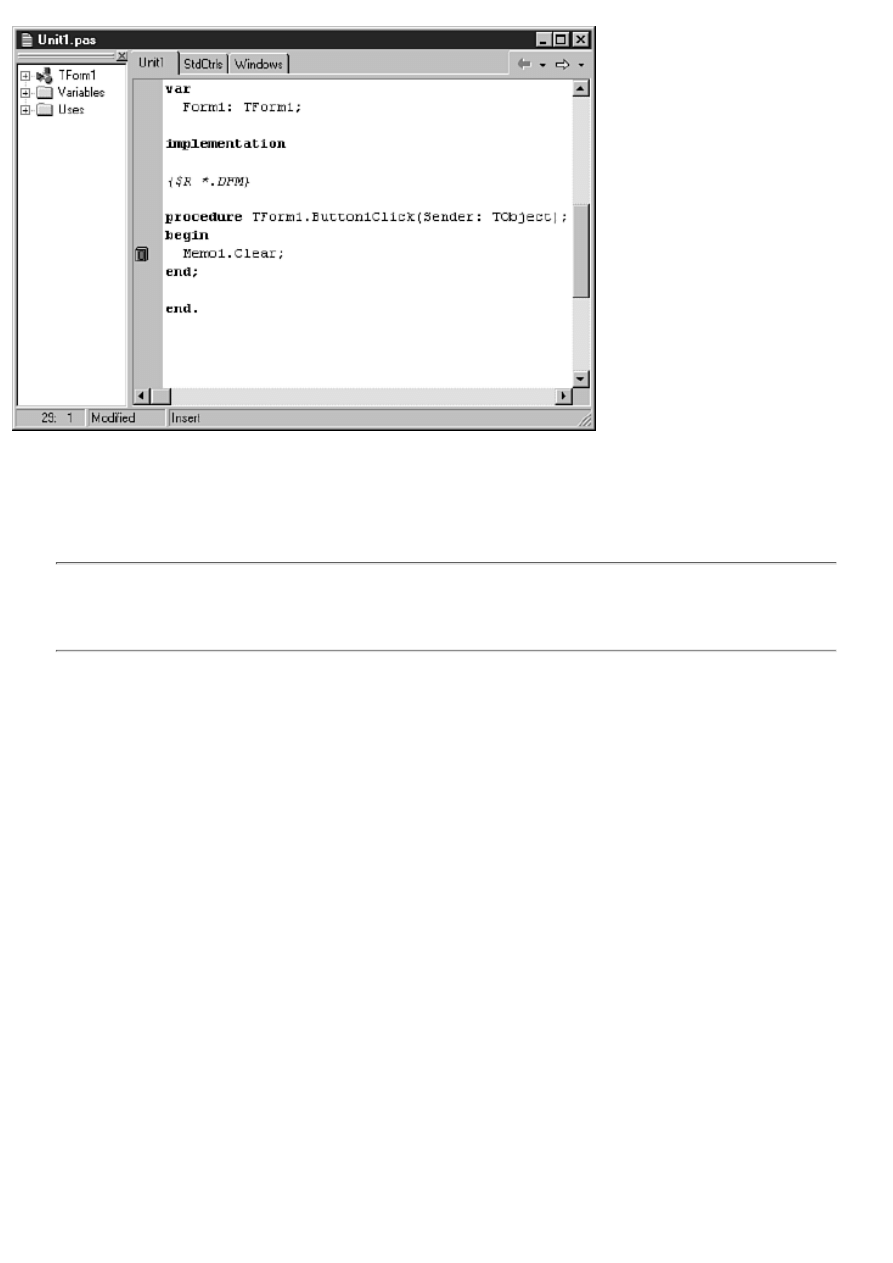
FIGURE 9.18. The Code Editor with a
bookmark set.
To return to the bookmark, press Ctrl plus the number of the bookmark to which you want to return. Using the same example,
you would type Ctrl+0 to go back to the bookmark. (You can also set bookmarks and go to bookmarks using the Code Editor
context menu.) To clear a bookmark, place the editor cursor anywhere on the line containing the bookmark and again press
Ctrl+Shift+0.
NOTE: Bookmarks can be set for each file you have open in the Code Editor. For example, you can have
bookmark #0 set in one source file and another bookmark #0 set in another source file. This means that
bookmarks cannot be found across source files. If you set bookmark #0 in Unit1.pas, you cannot press Ctrl+0 in
Unit2.pas and expect to be taken to the bookmark in Unit1.pas.
To illustrate the use of bookmarks, do the following:
1. Open any source file in the Code Editor.
2. Scroll almost to the bottom of the file and click on a line of code.
3. Press Ctrl+Shift+0 to set a bookmark. The bookmark icon shows in the Code Editor gutter.
4. Press Ctrl+Home to move to the top of the source file.
5. Now press Ctrl+0 to jump back to the bookmark. The Code Editor changes to show the line of code where the
bookmark was set, and the cursor is placed exactly where it was when you set the bookmark.
6. Type Ctrl+Shift+0 again to clear the bookmark. The bookmark is cleared and the bookmark icon disappears from the
Code Editor gutter.
Note that bookmarks are temporary. When you close the source file and reopen it, the bookmark is not preserved. Note also
that to set and remove bookmarks you must type the number keys on the main keypad. The numeric keypad is ignored when
setting and removing bookmarks.
Incremental Search
You can use the incremental search option to quickly find a short series of
characters. To start an incremental search, choose Search|Incremental Search from the
main menu or press Ctrl+E on the keyboard. To understand how the incremental search
works, it is easiest to do an exercise. Do the following:
1. Create a new text file from the Object Repository. (It doesn't matter whether you currently have a project open.)
2. Type the following text:
Learning to write Windows
programs a bit at a time
is not so bad. Isn't it
time you got back to work?
3. Move the cursor back to the top of the file (Ctrl+Home).
4. Press Ctrl+E to start the incremental search. You will be searching for the word back. Note that the Code Editor status
bar says Searching for:.
5. Type a b on the keyboard. The letter b in the word bit is highlighted. That's not what you are looking for.
6. Now type an a on the keyboard. The next occurrence of ba is found, this time in the word bad. That's still not what
you are looking for.
7. Type a c on the keyboard. The letters bac in the word back are highlighted. Now type a k. The Code Editor status bar
now says Searching for: back and the word back is highlighted. Congratulations, you found what you were looking for!
8. Press Esc (or Enter) on the keyboard to stop the incremental search. Close the text file without saving it.
That's all there is to it. The incremental search is handy when you are searching for short amounts of text.
TIP: If you make a mistake when typing the characters while doing an incremental search, you can use the
Backspace key to remove from the search string the last character typed.
Finding Matching Brackets and Parentheses
The Code Editor has a feature to help you find a bracket or parenthesis that matches the bracket or parenthesis the cursor is
currently on. To find a matching bracket, place the cursor before a bracket (it doesn't matter whether it's the opening or closing
bracket). Now press Alt+[ on the keyboard. The cursor jumps to the bracket that matches the bracket on which you started.
Press Alt+[ again, and the cursor jumps back to where you started. The same keystrokes work for parentheses as well as
brackets. Getting lost in the maze of parentheses and brackets is still a possibility, but at least now you know how to find your
way out again.
The Code Editor Context Menu
Like most of the different windows you encounter in Delphi, the Code Editor has its own context menu. The Code Editor
context menu can essentially be divided into two parts: editor items and debugger items. I will leave the debugger items of the
context menu for tomorrow when I discuss debugging, but I'll go over the editor items on the context menu now. Table 9.4
contains a list of the context menu items that pertain to the editor, along with a description of each.
TABLE 9.4. THE CODE EDITOR CONTEXT MENU ITEMS.
Item
Description
Close Page
Closes the active page in the edit window. If the file on the page has been modified since it was
last saved, you are prompted to save the file.
Open File At Cursor
Opens the file under the cursor. This option has an effect only when the text under the cursor
represents a source code file. For example, if you have a file in your uses list called MyUnit2, you
could click on the filename and choose this menu item to open the file. The file will be placed in a
new editor window and focus will be set to the window.
New Edit Window
Opens a new copy of the Code Editor. This is convenient if you want to compare two source files
side by side.
Browse Symbol At Cursor Starts the browser with the current symbol as the browse target.
Topic Search
Displays the help topic for the item under the cursor (if it can be found). Same as pressing F1 on
the keyboard.
Add to Interface
Adds a property, function, or procedure to an ActiveX component. This item is disabled if the
project is not an ActiveX project.
Toggle Bookmarks
Toggles a bookmark (0 through 9) on or off. The bookmark is set on the source code line
containing the editing cursor.
Goto Bookmarks
Moves the source code editor to a bookmark.
View As Form
If the active file in the Code Editor is displaying a form's contents as text, choosing this option
will again display the form in the Form Designer.
Read Only
Toggles the currently active file between read-only and read/write mode. When set to read-only,
the file cannot be modified, although text can be selected and copied to the Clipboard. The status
bar displays Read Only to indicate the file is read-only. When the file is closed and reopened, it is
again in read/write mode.
Message View
Displays or hides the Delphi message window. The message window automatically appears when
there are compiler or linker errors or warnings, but can be specifically shown or hidden with this
command.
View Explorer
Sets focus to the Code Explorer window. If the Code Explorer is not docked, this command will
bring it to the top of all other windows.
Properties
Displays the Environment Options dialog box so that the editor options can be set.
Depending on the current state of the Code Editor and the particular type of file open, some of the items in Table 9.4 can be
disabled at any given time.
Changing the Editor Options
The editor options occupy three pages of the Environment Options dialog box. To view this dialog box, choose
Tools|Environment Options from the main menu.
TIP: You can also choose Properties from the Code Editor context menu to view the editor options. The
difference with this method is that only the four pages pertaining to the editor options will be displayed. When
displayed this way, the dialog box is titled Editor Properties rather than Environment Options. The figures in the
following sections were taken using this method.
The four pages of the Environment Options that are specific to the Code Editor are as follows:
Editor
●
Display
●
Color
●
Code Insight
●
Let's examine these pages in the following sections.
The Editor Page
The Editor page of the Editor Properties dialog box enables you to control how the
editor wor

Teach Yourself Borland Delphi 4 in 21
Days
- 10 -
Debugging Your Applications
Setting and Clearing Breakpoints
Using the Watch Properties Dialog Box
Enabling and Disabling Watch Items
Adding Variables to the Watch List
The OutputDebugString Function
Tracking Down Access Violations
A major feature of the Delphi IDE is the integrated debugger. The debugger enables you to easily set
breakpoints, watch variables, inspect objects, and do much more. Using the debugger, you can quickly
find out what is happening (or not happening) with your program as it runs. A good debugger is vital
to efficient program development.
Debugging is easy to overlook. Don't tell anyone, but when I first started Windows programming, I
ignored the debugger for a long time because I had my hands full just learning how to do Windows
programming. When I found out how valuable a good debugger is, I felt a little silly for cheating
myself out of the use of that tool for so long. Oh well, live and learn. You have the luxury of learning
from my mistakes. Today, you learn about what the debugger can do for you.
The IDE debugger provides several features and tools to help you in your debugging chores. The
following are discussed today:
Debugger menu items
●
Using breakpoints
●
Inspecting variables with the Watch List
●
Inspecting objects with the Debug Inspector
●
Other debugging tools
●
Stepping through code
●
Debugging techniques
●
Why Use the Debugger?
The quick answer is that the debugger helps you find bugs in your program. But the debugging
process isn't just for finding and fixing bugs--it is a development tool as well. As important as
debugging is, many programmers don't take the time to learn how to use all the features of the IDE
debugger. As a result, they cost themselves time and money, not to mention the frustration caused by
a bug that is difficult to find.
You begin a debugging session by starting up the program under the debugger. You automatically use
the debugger when you click the Run button on the toolbar. You can also choose Run|Run from the
main menu or press F9 on the keyboard.
The Debugging Menu Items
Before getting into the details of the debugger, let's review the menu items that pertain to the
debugger. Some of these menu items are on the main menu under Run, and others are on the Code
Editor context menu. Table 10.1 lists the Code Editor context menu items specific to the debugger
along with their descriptions.
TABLE 10.1. CODE EDITOR CONTEXT MENU DEBUGGING ITEMS.
Item
Shortcut
Description
Toggle Breakpoint
F5
Toggles a breakpoint on or off for the current line in the Code
Editor.
Run to Cursor
F4
Starts the program (if necessary) and runs it until the line in the
editor window containing the cursor is reached.
Item
Shortcut
Description
Inspect
Alt+F5
Opens the Debug Inspect window for the object under the cursor.
Goto Address
Ctrl+Alt+G Enables you to specify an address in the program at which
program execution will resume.
Evaluate/Modify
Ctrl+F7
Enables you to view and/or modify a variable at runtime.
Add Watch at Cursor Ctrl+F5
Adds the variable under the cursor to the Watch List.
View CPU
Ctrl+Alt+C Displays the CPU window.
The Run item on the main menu has several selections that pertain to running programs under the
debugger. The Run menu items enable you to start a program under the debugger, to terminate a
program running under the debugger, and to specify command-line parameters for your program, to
name just a few functions. Some items found here are duplicated on the Code Editor context menu.
Table 10.2 shows the Run menu items that control debugging operations.
TABLE 10.2. THE RUN MENU'S DEBUGGING ITEMS.
Item
Shortcut Description
Run
F9
Compiles the program (if needed) and then runs the program
under the control of the IDE debugger. Same as the Run toolbar
button.
Parameters
None
Enables you to enter command-line parameters for your
program and to assign a host application when debugging a
DLL.
Step Over
F8
Executes the source code line at the execution point and pauses
at the next source code line.
Trace Into
F7
Traces into the method at the execution point.
Trace to Next Source Line Shift+F7 Causes the execution point to move to the next line in the
program's source code.
Run to Cursor
F4
Runs the program and pauses when program execution reaches
the current line in the source code.
Show Execution Point
None
Displays the program execution point in the Code Editor.
Scrolls the source code window if necessary. Works only when
program execution is paused.
Program Pause
None
Pauses program execution as soon as the execution point enters
the program's source code.
Program Reset
Ctrl+F2 Unconditionally terminates the program and returns to the
Delphi IDE.
Inspect
None
Displays the Inspect dialog box so that you can enter the name
of an object to inspect.
Evaluate/Modify
Ctrl+F7 Displays the Evaluate/Modify dialog box.
Add Watch
Ctrl+F5 Displays the Watch Properties dialog box.
Add Breakpoint
None
Displays a submenu that contains items to add a source,
address, data, or module load breakpoint.
You will use these menu items a lot when you are debugging your programs. You should also become
familiar with the various keyboard shortcuts for the debugging operations. Now let's take a look at
breakpoints and how to use them in your program.
Using Breakpoints
When you run your program from the Delphi IDE, it runs at full speed, stopping only where you have
set breakpoints.
New Term: A breakpoint is a marker that tells the debugger to pause program execution when it
reaches that place in the program.
Setting and Clearing Breakpoints
To set a breakpoint, click in the editor window's gutter to the left of the line on which you want to
pause program execution (the gutter is the gray margin along the Code Editor window's left edge).
The breakpoint icon (a red circle) appears in the gutter and the entire line is highlighted in red. To

clear the breakpoint, click on the breakpoint icon and the breakpoint is removed. You can also press
F5 or choose Toggle Breakpoint from the Code Editor context menu to toggle a breakpoint on or off.
NOTE: A breakpoint can be set only on a line that generates actual code. Breakpoints
are not valid if set on blank lines, comment lines, or declaration lines. You are not
prevented from setting a breakpoint on these types of lines, but the debugger warns you if
you do. Attempting to set a breakpoint on any of the following lines will produce an
invalid breakpoint warning:
{ This is a comment followed by a blank line. }
X : Integer; { a declaration }
Breakpoints can be set on a function or procedure's end statement.
If you set a breakpoint on an invalid line, the Code Editor will display the breakpoint in green
(assuming the default color scheme) and the breakpoint icon in the gutter will be grayed.
When the program is run under the debugger, it behaves as it normally would--until a breakpoint is
hit, that is. When a breakpoint is hit, the IDE is brought to the top and the breakpoint line is
highlighted in the source code. If you are using the default colors, the line where the program has
stopped is highlighted in red because red indicates a line containing a breakpoint.
New Term: The execution point indicates the line that will be executed next in your source code.
As you step through the program, the execution point is highlighted in blue and the editor window
gutter displays a green arrow glyph. Understand that the line highlighted in blue has not yet been
executed but will be when program execution resumes.
NOTE: The current execution point is highlighted in blue unless the line containing the
execution point contains a breakpoint. In that case, the line is highlighted in red. The
green arrow glyph in the gutter is the most accurate indication of the execution point
because it is present regardless of the line's highlighting color.
When you stop at a breakpoint, you can view variables, view the call stack, browse symbols, or step
through your code. After you have inspected any variables and objects, you can resume normal
program execution by clicking the Run button. Your application will again run normally until the next
breakpoint is encountered.
NOTE: It's common to detect coding errors in your program after you have stopped at a
breakpoint. If you change your source code in the middle of a debugging session and
then choose Run to resume program execution, the IDE will prompt you with a message
box asking whether you want to rebuild the source code. If you choose Yes, the current
process will be terminated, the source code will be recompiled, and the program will be
restarted.
The problem with this approach is that your program doesn't get a chance to close
normally, and any resources currently in use might not be freed properly. This scenario
will almost certainly result in memory leaks. Although Windows 95 and Windows NT
handle resource leaks better than 16-bit Windows, it is still advisable to terminate the
program normally and then recompile it.
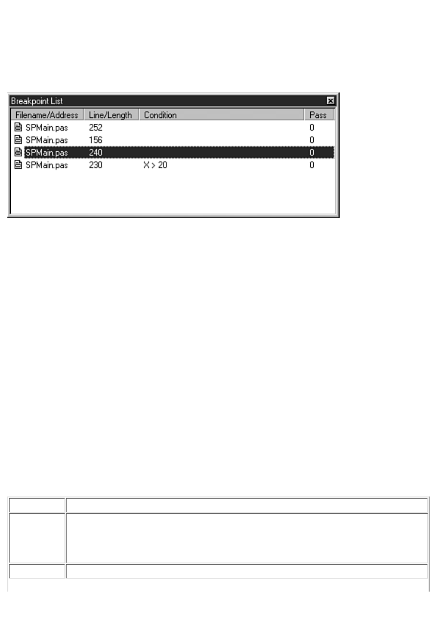
The Breakpoint List Window
The Delphi IDE keeps track of the breakpoints you set. These breakpoints can be viewed through the
Breakpoint List window. To view the breakpoint list, choose View|Debug Windows|Breakpoints from
the main menu. The Breakpoint List window is displayed as shown in Figure 10.1.
FIGURE 10.1.The
Breakpoint List window.
The Breakpoint List window has four columns:
The Filename/Address column shows the filename of the source code unit in which the
breakpoint is set.
●
The Line/Length column shows the line number on which the breakpoint is set.
●
The Condition column shows any conditions that have been set for the breakpoint.
●
The Pass column shows the pass count condition that has been set for the breakpoint.
(Breakpoint conditions and pass count conditions are discussed in the section "Conditional
Breakpoints.")
●
The columns can be sized by dragging the dividing line between two columns in the column header.
NOTE: The Pass column doesn't show the number of times the breakpoint has been hit; it only shows
the pass condition that you have set for the breakpoint.
Breakpoint List Context Menus
The Breakpoint List window has two context menus. Table 10.3 lists the context menu items you will
see when you click the right mouse button over any breakpoint. I will refer to this as the window's
primary context menu.
TABLE 10.3. THE PRIMARY BREAKPOINT LIST CONTEXT MENU.
Item
Description
Enable
Enables or disables the breakpoint. When a breakpoint is disabled, its glyph is grayed
out in the Breakpoint List window. In the source window, the breakpoint glyph is also
grayed, and the breakpoint line is highlighted in green to indicate that the breakpoint is
disabled.
Delete
Removes the breakpoint.
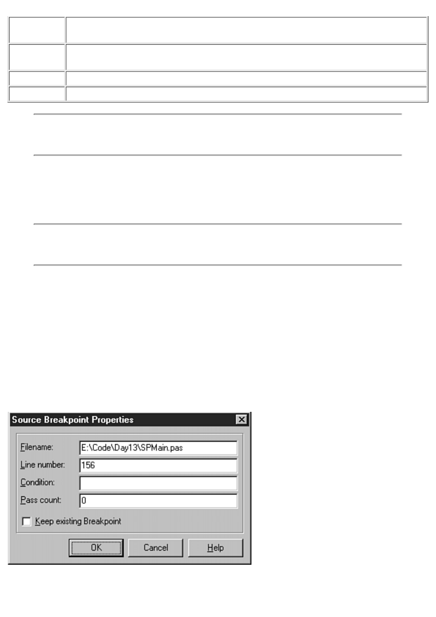
View Source Scrolls the source file in the Code Editor to display the source line containing the
breakpoint. (The Breakpoint List retains focus.)
Edit Source Places the edit cursor on the line in the source file where the breakpoint is set and
switches focus to the Code Editor.
Properties
Displays the Source Breakpoint Properties dialog box.
Dockable
Determines whether the Breakpoint List window is dockable.
TIP: To quickly edit the source code line on which a breakpoint is set, double-click on
the breakpoint in the Filename column of the Breakpoint List window. This is the same
as choosing Edit Source from the Breakpoint List context menu.
The secondary context menu is displayed by clicking the right mouse button while the cursor is over
any part of the Breakpoint List window that doesn't contain a breakpoint. This context menu has items
called Add, Delete All, Disable All, Enable All, and Dockable. These items are self-explanatory, so I
won't bother to comment on them.
NOTE: In my opinion, the Add context menu item isn't very useful. It is much easier to
set a breakpoint in the Code Editor than to add a breakpoint via the Add command in the
Breakpoint List window.
Enabling and Disabling Breakpoints
Breakpoints can be enabled or disabled any time you like. You disable a breakpoint if you want to run
the program normally for a while; you can enable the breakpoint later without having to re-create it.
The debugger ignores breakpoints that are disabled. To enable or disable a breakpoint, right-click on
the breakpoint in the Breakpoint List window and toggle the Enable item on the context menu.
Modifying Breakpoints
If you want to modify a breakpoint, choose Properties from the primary Breakpoint List context
menu. When you do, the Source Breakpoint Properties dialog box is displayed (see Figure 10.2).
FIGURE 10.2.The Source Breakpoint
Properties dialog box.

The primary reason for modifying a breakpoint is to add conditions to it. (Conditional breakpoints are
discussed in the section "Conditional Breakpoints.")
To remove a breakpoint, select the breakpoint in the Breakpoint List window and then press the
Delete key on the keyboard. To delete all breakpoints, right-click and then choose Delete All. Now
let's take a look at the two breakpoint types: simple and conditional.
Simple Breakpoints
A simple breakpoint causes program execution to be suspended whenever the breakpoint is hit. When
you initially set a breakpoint, it is by default a simple breakpoint. Simple breakpoints don't require
much explanation. When the breakpoint is encountered, program execution pauses and the debugger
awaits your bidding. Most of the time you will use simple breakpoints. Conditional breakpoints are
reserved for special cases in which you need more control over the debugging process.
Conditional Breakpoints
In the case of a conditional breakpoint, program execution is paused only when predefined conditions
are met. To create a conditional breakpoint, first set the breakpoint in the Code Editor. Then choose
View|Debug Windows|Breakpoints from the main menu to display the Breakpoint List window.
Right-click on the breakpoint for which you want to set conditions and choose Properties. When the
Source Breakpoint Properties dialog box is displayed, set the conditions for the breakpoint.
Conditional breakpoints come in two flavors. The first type is a conditional expression breakpoint.
Enter the conditional expression in the Condition field of the Source Breakpoint Properties dialog box
(refer to Figure 10.2). When the program runs, the conditional expression is evaluated each time the
breakpoint is encountered. When the conditional expression evaluates to True, program execution is
halted. If the condition doesn't evaluate to True, the breakpoint is ignored. For example, look back at
the last breakpoint in the Breakpoint List window shown in Figure 10.1. This breakpoint has a
conditional expression of X > 20. If at some point in the execution of the program X is greater than
20, the program will stop at the breakpoint. If X is never greater than 20, program execution will not
stop at the breakpoint.
The other type of conditional breakpoint is the pass count breakpoint. With a pass count breakpoint,
program execution is paused only after the breakpoint is encountered a specified number of times. To
specify a pass count breakpoint, edit the breakpoint and specify a value for the Pass Count field in the
Source Breakpoint Properties dialog box. If you set the pass count for a breakpoint to 3, program
execution will stop at the breakpoint the third time the breakpoint is encountered.
NOTE: The pass count is 1-based, not 0-based. As indicated in the preceding example, a
pass count of 3 means that the breakpoint will be valid the third time the breakpoint is
encountered by the program.
Use pass count breakpoints when you need your program to execute through a breakpoint a certain
number of times before you break to inspect variables, step through code, or perform other debugging
tasks.
NOTE: Conditional breakpoints slow down the normal execution of the program
because the conditions need to be evaluated each time a conditional breakpoint is
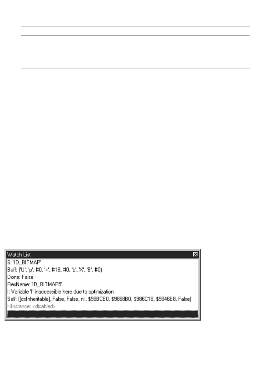
encountered. If your program is acting sluggish during debugging, check your breakpoint
list to see whether you have conditional breakpoints that you have forgotten about.
TIP: The fact that conditional breakpoints slow down program execution can work in
your favor at times. If you have a process that you want to view in slow motion, set one
or more conditional breakpoints in that section of code. Set the conditions so that they
will never be met, and your program will slow down but not stop.
The Run to Cursor Command
There is another debugging command that deserves mention here. The Run to Cursor command
(found on the Run menu on the main menu and on the Code Editor context menu) runs the program
until the source line containing the editing cursor is reached. At that point, the program stops as if a
breakpoint were placed on that line.
Run to Cursor acts as a temporary breakpoint. You can use this command rather than set a breakpoint
on a line that you want to immediately inspect. Just place the cursor on the line you want to break on
and choose Run to Cursor (or press F4). The debugger behaves exactly as if you had placed a
breakpoint on that line. The benefit is that you don't have to clear the breakpoint after you are done
debugging that section of code.
Watching Variables
So what do you do when you stop at a breakpoint? Usually you stop at a breakpoint to inspect the
value of one or more variables. You might want to ensure that a particular variable has the value you
think it should, or you might not have any idea what a variable's value is and simply want to find out.
The function of the Watch List is basic: It enables you to inspect the values of variables. Programmers
often overlook this simple but essential feature because they don't take the time to learn how to fully
use the debugger. You can add as many variables to the Watch List as you like. Figure 10.3 shows the
Watch List during a debugging session.
FIGURE 10.3.The
Watch List in action.
The variable name is displayed in the Watch List followed by its value. How the variable value is
displayed is determined by the variable's data type and the current display settings for that watch item.
I'll discuss the Watch List window in detail in just a bit, but first I want to tell you about a feature that
makes inspecting variables easy.
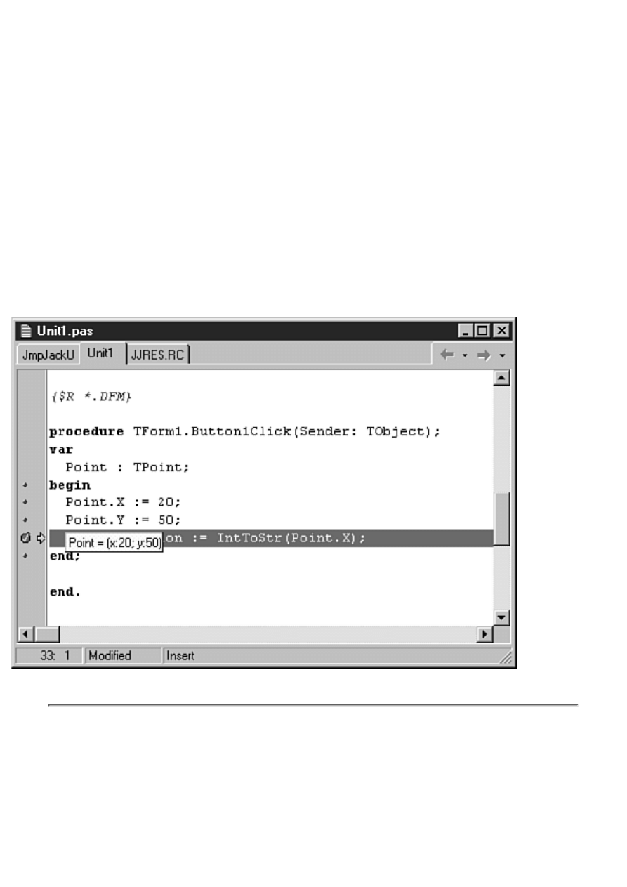
Tooltip Expression Evaluation
The debugger and Code Editor have a nice feature that makes checking the value of a variable easy.
This feature, the Tooltip expression evaluator, is on by default, so you don't have to do anything
special to use it. If you want, you can turn off the Tooltip evaluator via the Code Insight page of the
Environment Options dialog box (the Code Insight page was discussed yesterday).
So what is Tooltip expression evaluation (besides hard to say)? It works like this: After you stop at a
breakpoint, you place the editing cursor over a variable and a tooltip window pops up showing the
variable's current value. This makes it easy to quickly inspect variables. Just place your cursor over a
variable and wait a half second or so.
The Tooltip evaluator has different displays for different variable types. For regular data members
(Integer, Char, Byte, string, and so on), the actual value of the variable is displayed. For dynamically
created objects (an instance of a class, for example), the Tooltip evaluator shows the memory location
of the object. For records, the Tooltip evaluator shows all the record elements. Figure 10.4 shows the
Tooltip expression evaluator inspecting a record's contents.
FIGURE
10.4.Tooltips are a great debugger feature.
NOTE: Sometimes the Tooltip evaluator acts as if it's not working properly. If, for
example, you place the editing cursor over a variable that is out of scope, no tooltip
appears. The Tooltip evaluator has nothing to show for that particular variable, so it
doesn't display anything.
Be aware, also, that variables optimized by the compiler might not show correct values.
Optimization was discussed yesterday and is also discussed later in this chapter.
Another case where the Tooltip evaluator doesn't work is within a with block. Take this
code, for example:
with Point do begin
X := 20;
Y := 50;
Label1.Caption := IntToStr(X);
end;
If you were to place the mouse cursor over the variable X, the Tooltip evaluator would
not report the value of X because X belongs to the target of the with statement (the Point
variable). Instead, place the mouse cursor over the Point variable, and the debugger
shows you the value of Point (including the X field).
The Tooltip expression evaluator is a great feature, so don't forget to use it.
The Watch List Context Menu
As with every other Delphi window discussed so far, the Watch List has its own context menu. (You'd
be disappointed if it didn't, right?) Table 10.4 lists the Watch List context menu items and their
descriptions.
TABLE 10.4. THE WATCH LIST CONTEXT MENU.
Item
Description
Edit Watch
Enables you to edit the watch item with the Watch Properties dialog box.
Add Watch
Adds a new item to the Watch List.
Enable Watch
Enables the watch item.
Disable Watch
Disables the watch item.
Delete Watch
Removes the watch item from the Watch List.
Enable All Watches
Enables all items in the Watch List.
Disable All Watches
Disables all items in the Watch List.
Delete All Watches
Deletes all items in the Watch List.
Stay on Top
Forces the Watch List to the top of all other windows in the IDE.
Break When Changed When the variable in the watch window changes, the debugger will break.
The watch variable is displayed in red to indicate that Break When Changed
is in effect.
Dockable
Determines whether the Watch List window is dockable.
Both the Edit Watch and Add Watch context menu items invoke the Watch Properties dialog box, so
let's look at that next.
Using the Watch Properties Dialog Box
You use the Watch Properties dialog box when you add or edit a watch. Figure 10.5 shows the Watch
Properties dialog box as it looks when editing a variable called Buff.


Teach Yourself Borland Delphi 4 in 21
Days
- 11 -
Delphi Tools and Options
Foreground and Background Colors
Transparent and Inverted Colors
Configuring the Delphi Tools Menu
Using the Configure Tools Dialog Box
Delphi comes with several tools to aid in your application development. Today you learn about some
of Delphi's tools. Specifically, you learn about the following:
The Image Editor
●
Messages and the Windows messaging system
●
WinSight
●
Package Collection Editor
●
Configuring the Tools menu
●
Delphi Environment Options
●
First, you take a general look at these tools. Then you learn how to add your own tools to the Delphi
Tools menu. The day ends with a look at the Delphi Environment Options dialog box.
NOTE: In addition to the tools listed here, Delphi also comes with a host of database
tools such as Database Desktop, BDE Administrator, SQL Builder, and SQL Explorer. A
discussion of those tools would be too lengthy for today's purposes.
Using the Image Editor
The Delphi Image Editor is a tool that enables you to create and edit bitmaps (.bmp), icons (.ico), and
cursors (.cur). You can also create a resource project containing multiple bitmaps, icons, and cursors
in a single resource file (.res). The resource file can then be added to your Delphi project, and you can
use the resources as needed. Figure 11.1 shows the Image Editor editing a bitmap.
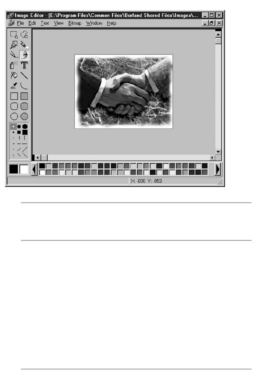
FIGURE 11.1.
The Image Editor.
NOTE: All Windows images are bitmaps, whether they are actual Windows bitmap files
(.bmp) or icons or cursors. In this chapter, I refer to all images collectively as bitmaps.
Image Editor deals only with Windows bitmap files. Other file formats such as PCX,
TIFF, JPEG, and GIF are not supported.
You can start the Image Editor by either double-clicking on the Image Editor icon in the Delphi folder
or choosing Tools|Image Editor from the Delphi main menu. The Image Editor is a stand-alone
program and doesn't have to be run from the Delphi IDE.
Foreground and Background Colors
The Image Editor enables you to create 2-color, 16-color, and, in the case of bitmap files, 256-color
images. You can choose any available colors when drawing on a bitmap. In the bottom-left corner of
the Image Editor are two boxes containing the current foreground and background colors. (The
foreground color is represented by the far left box.)
When using a drawing tool, you can draw with either the foreground color or the background color.
To draw with the foreground color, use the left mouse button. For example, if you choose the filled
rectangle tool and draw a rectangle on the bitmap, the rectangle will be filled with the foreground
color. To draw a filled rectangle with the background color, use the right mouse button to drag the
rectangle. The same is true for most of the other drawing tools.

NOTE: The Text tool uses only the foreground color. You cannot place text with the
background color. If you want to use the background color, you have to change the
foreground color and then place your text.
To change the foreground color, click a color on the color palette with the left mouse button. (The
color palette is located along the bottom of the Image Editor window.) When you choose a new
foreground color, the square that represents the foreground color changes to show the new color
selected. To change the background color, click a color in the color palette with your right mouse
button.
NOTE: If you are editing a 256-color image, the color palette will have scroll buttons on
either side so that you can scroll through the available colors.
The colors that appear in the color palette are determined by the bitmap when you are loading a
bitmap that already exists. If you are starting a new 256-color image, the default 256-color palette is
used.
You can also set the foreground or background colors with the Eyedropper tool. The Eyedropper
enables you to set the foreground or background color by picking up a color that is already used on
the image.
To set the foreground color with the Eyedropper, choose the Eyedropper tool from the Tools palette,
place the tip of the Eyedropper over a portion of the image that has the color you want to use, and then
click the left mouse button. The foreground color changes to the color under the Eyedropper. To set
the background color, click with your right mouse button instead of the left mouse button. The
Eyedropper tool is invaluable when you want to exactly match a color that was previously used on
your bitmap.
NOTE: The foreground and background colors might work differently in the Image
Editor than in other bitmap editors you have used. For example, in some bitmap editors,
the outline of a filled rectangle is drawn with the foreground color and filled with the
background color. With the Image Editor, filled objects have no discernible border. A
filled rectangle is in either the foreground or the background color.
Transparent and Inverted Colors
In the case of icons and cursors, you can also choose the transparent color (the word color being
relative here). When you use the transparent color, the background beneath the icon shows through
wherever the transparent color is used. That could mean the Windows background in the case of a
shortcut, or it could mean the title bar of your application.
Whether you use the transparent color depends on your personal tastes and the particular icon you are
creating. In the case of cursors, you will almost always use the transparent color as the background for
the icon. Rarely do you have a cursor that appears as a solid block.
Choosing the inverted color causes the background underneath the icon to be inverted (like reverse
video). Use of the inverted color isn't common, but it is there if and when you need it.
Both the transparent and inverted colors are shown next to the color palette when editing icons and
cursors. They are represented by color squares with a curved line running through them.
NOTE: By default, new icon and new cursor resources have the background filled with
the transparent color.
Image Editor Drawing Tools
The Image Editor drawing tools are similar to most paint programs. Because these are common
drawing tools, I'm not going to go over each and every one. Fifteen minutes of experimentation with
the Image Editor will be more beneficial than anything I can tell you. Fire up the Image Editor and
experiment with it for a while. I'll wait.
At the top of the Image Editor Tools palette, you find the Marquee and Lasso tools. These work in
essentially the same way, so I'll cover them together. Both tools enable you to select a region on the
current image. The Marquee tool is used to define a rectangular region. Choose the Marquee tool and
then drag a bounding rectangle on the image. When you stop dragging, a marquee is drawn around the
region to mark it. The Lasso tool works in much the same way but enables you to define a freehand
region. A Lasso region is filled with a hatch pattern to identify it.
TIP: When using the Lasso tool, you don't have to close the region. When you release
the mouse button, the Image Editor automatically closes the region by drawing a
connection line between the start point and the end point.
When a region is defined, you can cut or copy the image within the region and paste it somewhere
else on the image or to another image you are working on (you can have multiple bitmaps open at one
time). When you choose Edit|Paste from the main menu, the image within the marquee is placed in the
upper-left corner of the bitmap with a marquee around it. The pasted image can now be dragged into
position.
When you place your mouse cursor within the marquee, the cursor changes to a hand. When you see
the hand cursor, you can drag the bitmap within the marquee to another location and drop it. You can
continue to move the bitmap until you have it positioned exactly where you want it. After you have
the bitmap where you want it, click again on the image outside the marquee and the bitmap within the
marquee merge into the existing image.
TIP: The Image Editor has a shortcut method of cut and paste. Create a Marquee or
Lasso region, place your mouse cursor inside the region, and drag. The image within the
region moves as you drag.
When you cut a region or move it by dragging, the current background color will fill the area that the
image originally occupied. The background shows through the hole created by the cut operation.
TIP: You can copy portions of one bitmap to another using cut and paste. First, open
both images in the Image Editor. Place a marquee around the portion of the original
image you want to copy and then choose Edit|Copy from the main menu. Switch to the
other image and choose Edit|Paste from the main menu. Move the pasted image as
needed.
NOTE: If you have a marquee selected when you paste, the pasted image will shrink or
stretch to fit the size of the marquee.
The Eraser tool works just the opposite of the other tools in regard to the left and right mouse buttons.
With the Eraser, the left mouse button draws with the background color and the right mouse button
draws with the foreground color.
The Text tool enables you to place text on the image. The text is drawn using the current text settings.
The text settings can be changed by clicking the Text item on the main menu. Here you can set the
text alignment (left, right, or centered) or the font (typeface). To change the typeface, choose
Text|Font from the main menu. Now you can choose a new typeface or make the font bold, italic,
underlined, and so on.
The other drawing tools are self-explanatory. As I said earlier, a little time behind the wheel of the
Image Editor will teach you just about everything you need to know about those tools.
TIP: When drawing rectangles, you can press and hold the Shift key to force a rectangle
to a square. Likewise, you can draw a perfect circle by choosing the Ellipse or Filled
Ellipse tool and holding the Shift key as you drag. Using the Shift key with the Line tool
enables you to draw straight lines (vertical, horizontal, or 45-degree angles).
Zooming
The Image Editor enables you to zoom in so that you can work on your bitmaps up close and personal.
You can zoom either by using the Zoom tool or via the View menu. To zoom in on a particular part of
your image using the Zoom tool, first select the Zoom tool from the Tools palette and then drag a
bounding rectangle around the portion of the image you want to magnify. The magnification will
change depending on the size of the rectangle you created when you dragged. You can now see well
enough to change fine details in your bitmap.
To zoom using the menu, choose View|Zoom In or press Ctrl+I. When you choose Zoom In from the
menu, the image is magnified by a predetermined amount. To zoom out again using the menu, choose
View|Zoom Out (Ctrl+U) or View|Actual Size (Ctrl+Q).
When you are creating a cursor or an icon, the Image Editor shows a split view. Figure 11.2 shows an
Image Editor window while creating an icon.
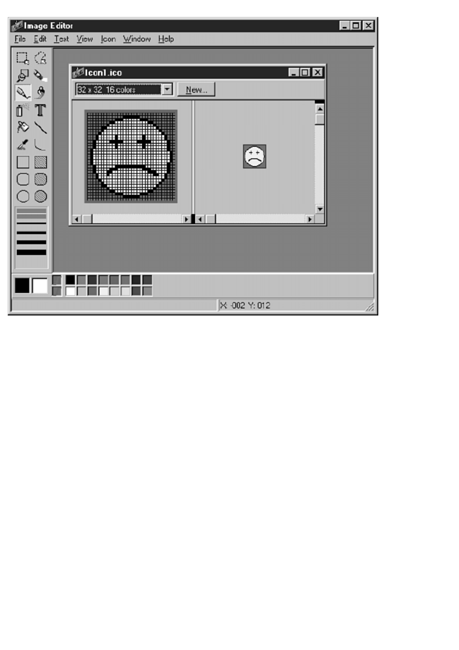
FIGURE
11.2.Editing an icon.
Although you can zoom either side of the split window, you will usually work with a zoomed-in copy
on the left side and an actual-size image on the right, as shown in Figure 11.2.
The Line Width Palette
The Line Width palette is displayed directly below the Tools palette. Depending on the currently
selected tool, the Line Width palette might show line widths or brush shapes that you can choose. To
pick a line width, click one of the five widths displayed. Subsequent drawing operations will use the
new line width until you change it. Similarly, to change a brush shape, just click the brush shape you
want to use. If you refer to Figure 11.1, you will see the Line Width palette showing brush shapes.
Working with Bitmap Files
You can create a bitmap from scratch or load an existing bitmap and modify it. To open an existing
bitmap file, choose File|Open from the main menu (bitmap files have a BMP extension). To create a
new bitmap file, choose File|New from the main menu and then choose Bitmap File from the pop-up
menu. The Bitmap Properties dialog box is displayed, as shown in Figure 11.3.
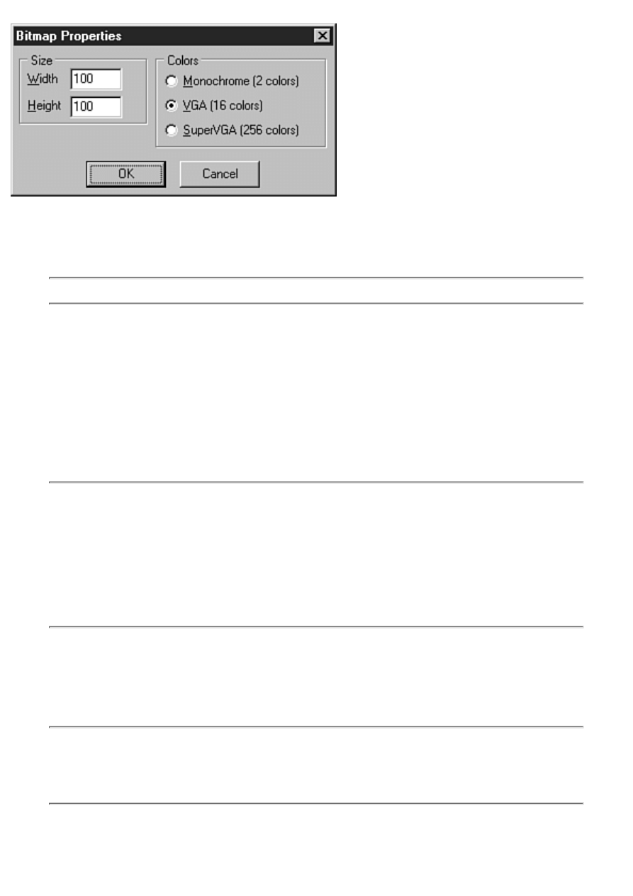
FIGURE 11.3. The Bitmap Properties dialog
box.
Here you can set the initial size of the bitmap (in pixels) as well as the color depth. You can create a
2-color, 16-color, or 256-color bitmap.
NOTE: The Image Editor does not support bitmaps of more than 256 colors.
Select the size and color depth you want and click OK. A blank bitmap is displayed in an editor
window. Do any drawing you want on the bitmap. When you are finished editing, choose File|Save or
File|Save As to save the bitmap file to disk.
Any time you are working with a bitmap file, the Image Editor main menu has a menu item called
Bitmap. This menu has a single item under it called Image Properties. Choosing Bitmap|Image
Properties displays the Bitmap Properties dialog box just as when you create a new bitmap file. The
Bitmap Properties dialog box enables you to change the size and color depth of the bitmap. Select a
new width, height, or color depth and click OK.
NOTE: There is one difference in the Bitmap Properties dialog box when it is displayed
for an existing bitmap as opposed to when you're creating a new bitmap. When displayed
for an existing bitmap, the Bitmap Properties dialog box has a check box labeled Stretch.
This is used by the Image Editor when changing the bitmap size. If the Stretch option is
off, the bitmap will not be stretched (either larger or smaller) when the bitmap size is
changed. If the Stretch option is on, the bitmap will be stretched to fill the new bitmap
size. Stretching a bitmap is an inexact science, so sometimes the results of stretching are
less than perfect.
All in all, there isn't much to working with bitmap files. Although the Image Editor is fine for simple
bitmaps, you will probably not find it adequate for sophisticated graphics. If you need high-quality
bitmaps, you might consider purchasing a full-featured image-editing package or hiring a computer
artist to create your bitmaps.
TIP: Don't forget to check online sources for computer-graphic artists. These people
know their craft far better than all but the most gifted programmers and are often very
reasonable in their pricing. Repeat this 10 times: "I am a programmer, not an artist."
(Okay, maybe some of you are doubly blessed.)
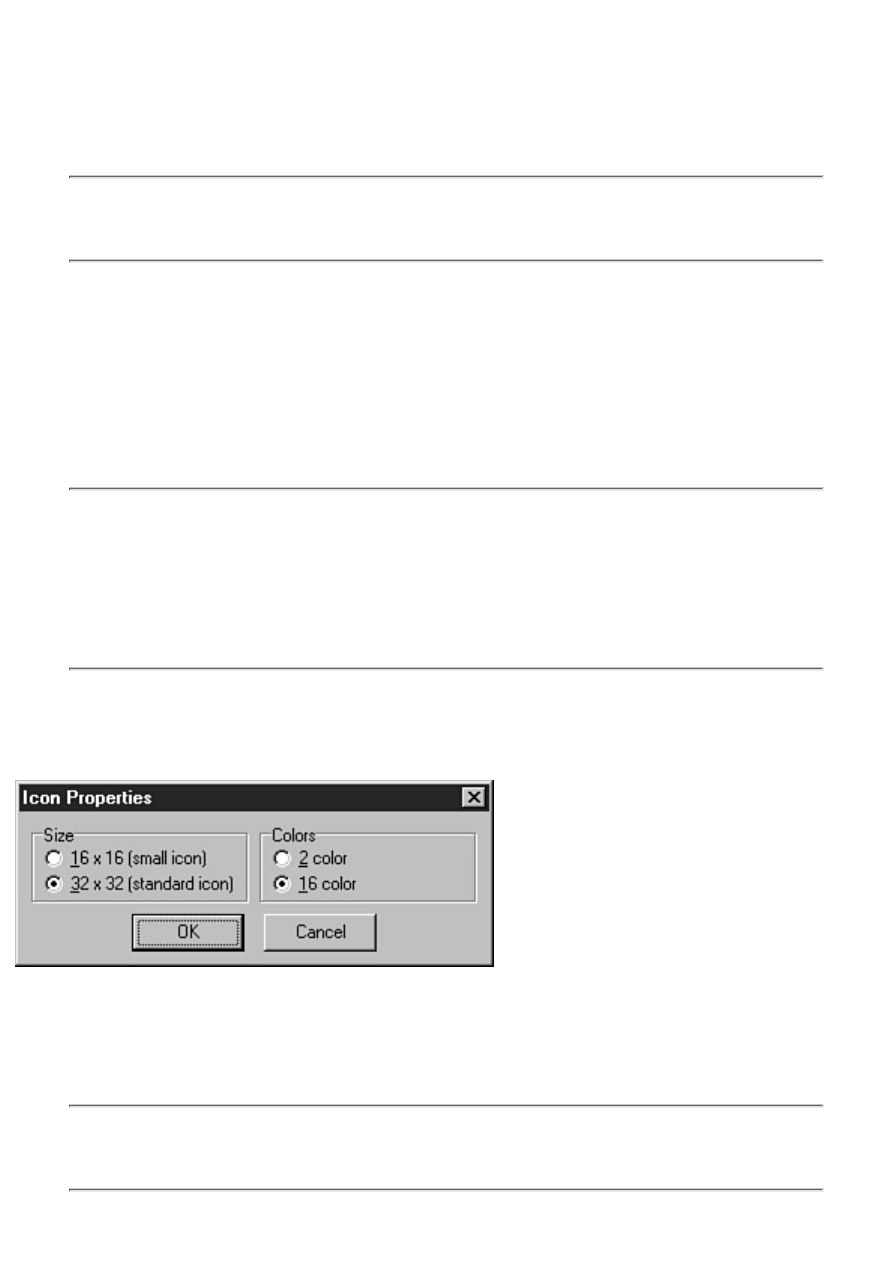
Working with Icons
Creating icons is also an art form, but icons are not quite as demanding as full-color bitmaps. Most of
the time you can create your own icons, but great-looking icons still require skill. If you flip back to
Figure 11.2, you will see an icon as it is displayed in the Image Editor while editing.
TIP: Load icon files from any source you can find and zoom in on them to get tips on
how the best-looking icons are created. Creating 3D icons takes practice (and is
something I never get quite right).
An icon in 32-bit Windows is actually two icons in one. The large icon is 32¥32 pixels. The large icon
can be placed on a dialog box such as an About box. It is also the icon that Windows uses when
creating a shortcut to your application. In addition, the large icon is used by Windows Explorer when
the file list view is set to display large icons.
The small icon is 16¥16 pixels and is the icon used by Windows on the title bar of your application,
on the Windows taskbar, in the File Open dialog box, and in Windows Explorer when the view is set
to small icons. Both the large and the small icons are stored in the same icon file (.ico).
NOTE: You don't have to supply both a large icon and a small icon. If you supply only
the large icon, Windows will shrink the large icon when it needs to display a small icon.
Sometimes, however, the results are not quite what you expect and might not be good
enough quality for your tastes. In those cases, you can also create the small icon so that
you are in control of how your application looks, rather than rely on Windows to do the
right thing.
Creating a New Icon Resource
To create a new icon resource, choose File|New from the main menu and then choose Icon from the
pop-up menu. When you create a new icon in the Image Editor, you see the Icon Properties dialog
box, as shown in Figure 11.4.
FIGURE 11.4. The Icon Properties dialog
box.
This dialog box enables you to choose the icon you are creating (either the large or the small icon) and
the number of colors to use for the icon. The default is to create the standard icon (the large icon) and
to use 16 colors. (In reality, 2-color icons are rarely used. When was the last time you saw one?)
NOTE: Even if you are creating both the large icon and the small icon, you must choose
one or the other to start with. For example, if you are creating a new icon, you should
start with the large icon. After creating the large icon, you can then create the small icon.
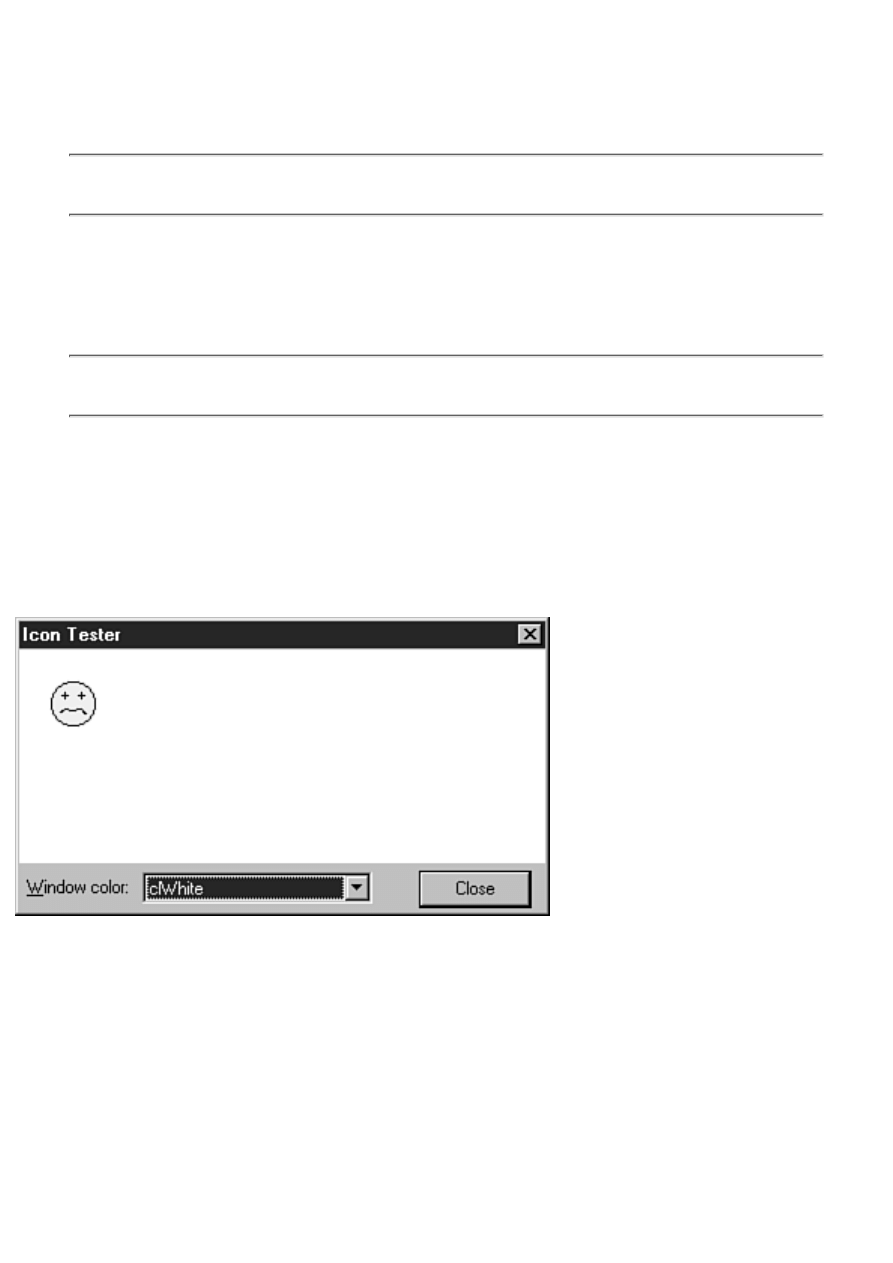
When you are editing an icon, the Image Editor menu bar has an item called Icon. The Icon menu has
items called New, Delete, and Test. The New menu item enables you to create a new large or small
icon. For example, if you had already created the large icon, you could choose Icon|New from the
main menu to create the small icon.
TIP: The Icon Editor window has a button called New that also creates a new icon and is
faster than using the main menu (refer to Figure 11.2).
When you choose New to create a second icon, the Icon Properties dialog box is displayed just as
before. If you have already created the large icon, the small icon will be selected by default and all
you have to do is click OK. The editor window will change to display the new, blank icon. The Image
Editor will not let you create an icon that already exists in the icon file.
TIP: When both icons are present, you can switch between them using the combo box at
the top of the Icon Editor window.
Icon Editing Options
The Delete item on the Icon menu enables you to delete either the large or the small icon from the
icon resource. You cannot delete the last icon in the icon resource.
The Test item on the Icon menu displays the Icon Tester dialog box, which shows you what the icon
will look like when displayed. Figure 11.5 shows the Icon Tester dialog box in action.
FIGURE 11.5. The Icon Tester dialog
box.
The Icon Tester enables you to change the background color so that you can view the effect that
different backgrounds have on the appearance of your icon. If you are currently editing the large icon,
the large icon appears in the Icon Tester. If you are currently editing the small icon, the Icon Tester
dialog box displays the small icon.
Working with Cursors
Working with cursors is not much different than working with icons. A cursor has only two colors:
white and black. (Multicolor and animated cursors are not supported by the Image Editor.) Draw the
cursor as you want it to appear.
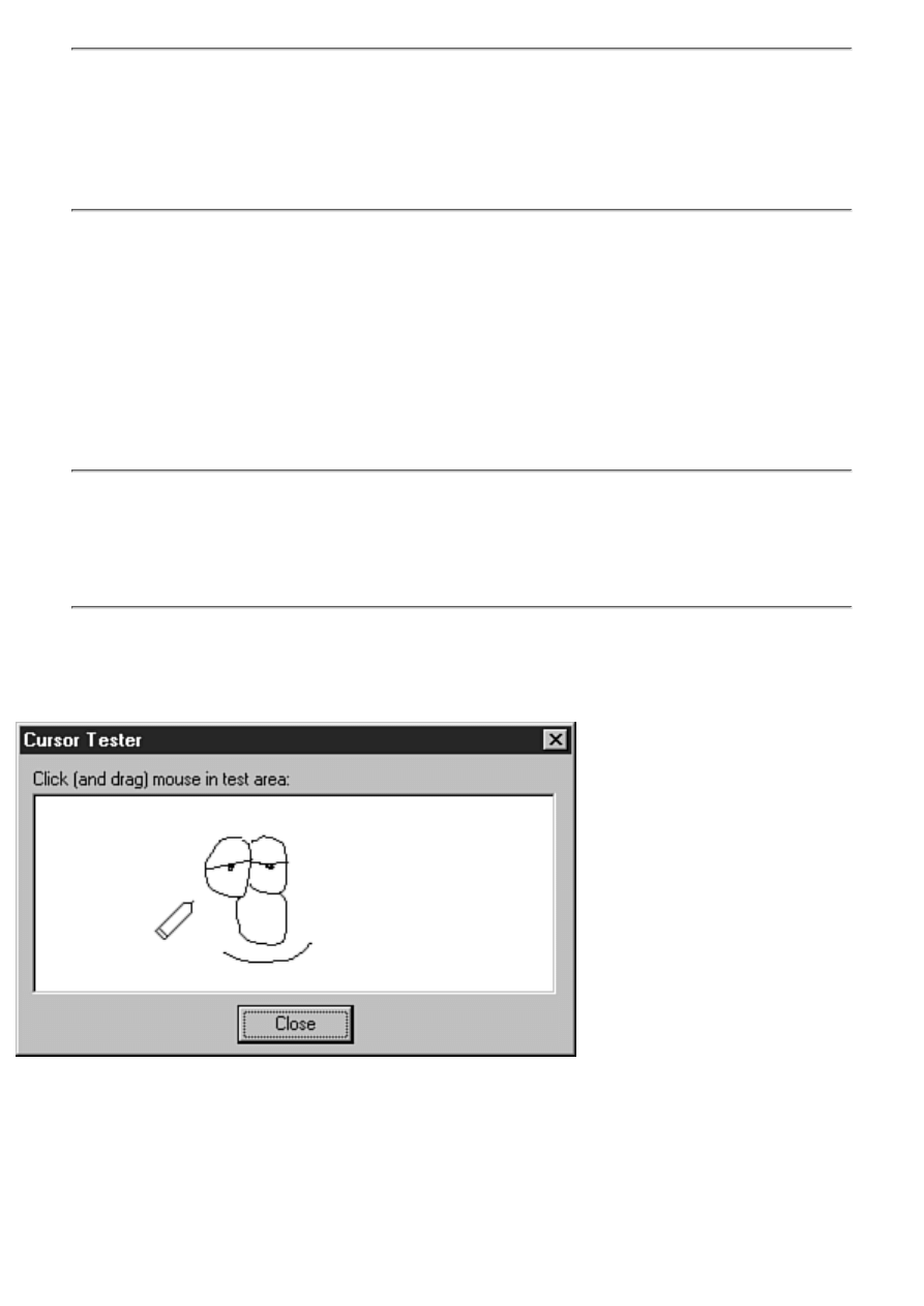
NOTE: A peculiarity of the Cursor Editor is that the transparent color is set to the color
of your system's background color instead of the dark green color used for the Icon
Editor. If you have your Windows background color set to a very light color, it can be
difficult to see what is transparent and what is white. If you are having difficulty
distinguishing the background color from white, set your Windows background color to a
different value (such as dark green).
As when editing bitmap files and icons, the Image Editor menu displays a menu item called Cursor
when you are editing a cursor. This menu item has two items: Set Hot Spot and Test.
The Set Hot Spot item enables you to specify the cursor's hot spot. The hot spot is the specific pixel of
the cursor that Windows uses to report the mouse coordinates when your cursor is being used. For
example, the hot spot on a crosshair cursor is the exact center of the crosshairs. For a pointer cursor,
the hotspot is set to the tip of the arrow's point. To set the hot spot, choose Cursor|Set Hot Spot from
the main menu. The Set Cursor Hot Spot dialog box appears, where you can enter the x and y
coordinates of the hot spot.
TIP: You must enter the exact x and y coordinates for the hot spot. To make this easier,
before setting the hot spot, place the editing cursor over the point on the cursor where
you want the hot spot. The Image Editor status bar will display the x and y coordinates of
the point under the cursor. Make note of the x and y coordinates, and then choose
Cursor|Set Hot Spot from the main menu and enter those x and y coordinates.
The Test item on the Cursor menu gives you the opportunity to try out your new cursor. Choose
Cursor|Test from the main menu and the Cursor Tester dialog box will be displayed, as shown in
Figure 11.6.
FIGURE 11.6. Testing the cursor.
Hold down either mouse button to draw on the Cursor Tester window. If you haven't yet set the hot
spot, you will probably notice that the hot spot is set to the upper-left corner of the cursor by default.
You should always set the hot spot to a point on your cursor that will be logical to users of your
application.
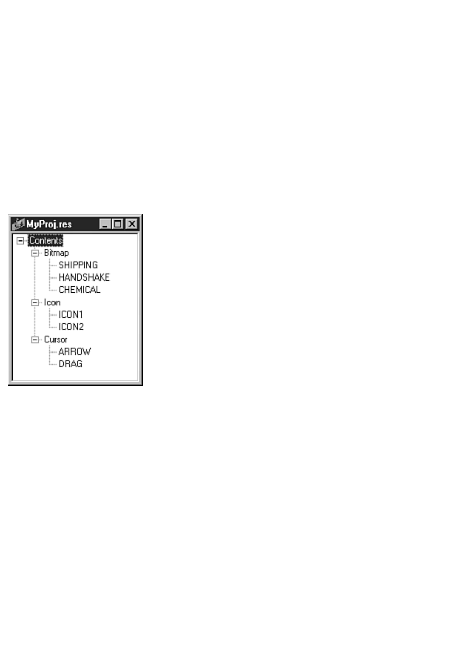
Image Editor Context Menus
The Image Editor has context menus for each editing mode (Bitmap, Cursor, and Icon). You might
recall that the right mouse button is used for drawing, so you can't bring up the context menus by
clicking the mouse button while over the image. To display the Image Editor context menus,
right-click when the cursor is within the editor window but outside the image. The context menus
contain the same items found on the individual menus, as discussed in the previous sections.
Creating Resource Projects
The Image Editor also enables you to create a resource project file for storing all your bitmaps, icons,
and cursors. To create a resource project, choose File|New from the main menu and then choose
Resource File from the pop-up menu. A project window is displayed. The project window is a tree
view control that shows the bitmaps, icons, and cursors in the project. Figure 11.7 shows the project
window for a sample project.
FIGURE 11.7. The Image Editor project window.
The project window has a context menu that can be used to create new resources, edit resources,
rename resources, and delete resources. The items on the context menu are also duplicated on the
main menu under the Resource menu item.
When you save the resource project, the Image Editor will compile it into a binary resource file (.res).
You can then add the binary resource file to your Delphi project.
Creating New Resources
To create a new resource for your project, choose New from the project window context menu or
Resource|New from the main menu.
Teach Yourself Borland Delphi 4 in 21 Days
- 12 -
Graphics and Multimedia Programming
●
●
❍
❍
❍
❍
❍
❍
❍
❍
●
Wave Audio with the Windows API
❍
❍
MediaPlayer Properties, Methods, and Events
❍
❍
❍
❍
●
●
❍
●
●
❍
❍
❍
●
Graphics and multimedia programming represent the fun part of programming. In this chapter, you are introduced to graphics
and multimedia programming with Delphi. In the case of graphics programming, most of that introduction comes in the form
of an examination of the TCanvas and TBitmap classes.
I start with a look at the easiest ways to display graphics in Delphi. After that, you learn about the Windows Graphics Device
Interface and the components that make up that interface. Along the way, you learn about the various line and shape drawing
routines and the different ways to display bitmaps. Later in the day, you learn about offscreen bitmaps and how they can
benefit you. The multi-media programming sections deal with how to play sound files with the Windows API. You also learn
how to play wave audio, MIDI, and AVI video files using the TMediaPlayer class. So let's get started!

Graphics the Easy Way
Graphics programming does not have to be difficult. Sometimes all you need to do is display a picture or a simple shape on a
form. VCL provides ready-made components for those times. I'll take a brief look at some of these components before moving
on to real graphics programming.
The Shape component (found on the Additional tab of the Component palette) can be used to add simple shapes to your forms.
Using the Shape component is easy. Just drop one on a form and change the Brush, Pen, and Shape properties as desired. You
can draw circles, ellipses, squares, rectangles, and rectangles with rounded edges. Change the Brush property to modify the
background color of the shape. Change the Pen property to change the color or thickness of the border surrounding the shape.
An Image component can be used to display a bitmap on a form. This component is great for many graphics operations,
including a bitmap background for a form. The Picture property of TImage is an instance of the TPicture class. You can select
the picture at design time through the Object Inspector, or you can load a picture at runtime. For example, here's how you
change the image in the component at runtime:
Image1.Picture.Bitmap.LoadFromFile(`bkgnd.bmp');
The Stretch property determines whether the image will be enlarged or compressed to fit the size of the component. The Center
property determines whether the bitmap is centered in the component. The AutoSize property can be used to force the
component to size itself according to the size of the image.
I'll also mention the PaintBox component here. If you want drawing confined to a certain area of a form, this component
provides a canvas on which you can draw. The only significant property of the PaintBox component is the Canvas property.
This property is an instance of the TCanvas class. It is with this class that most drawing is done in a Delphi application. Let's
look at the TCanvas class now.
Device Contexts and TCanvas
Windows uses the term device context to describe a canvas on which you can draw. A device context can be used to draw on
many surfaces:
To a window's client area or frame
●
To the desktop
●
To memory
●
To a printer or other output device
●
These are just a few examples. There are other, more obscure device contexts (menus, for example), but those listed above are
the device contexts that you will be most interested in.
Dealing with device contexts at the API level can be a bit complex. First, you have to obtain a handle to a device context from
Windows. Then you have to select various objects into the device context (pens, brushes, or fonts). After that, you can draw on
the device context. When you are done drawing, you have to be sure that the objects you select into the device context are
removed before deleting the device context. If you forget to remove objects selected into the device context, your application
will leak memory (use up memory that is never released back to the system). It's a tedious process to say the least.
The good news is that VCL provides the TCanvas class to make dealing with device contexts easier. Let me give you a quick
example. The following code uses the Windows API to draw a circle on the screen with a blue outline and red interior:
procedure TForm1.Button1Click(Sender: TObject);
var
DC : HDC;
Brush, OldBrush : HBrush;
Pen, OldPen : HPen;
begin
DC := GetDC(Handle);
Brush := CreateSolidBrush(RGB(255, 0, 0));
Pen := CreatePen(PS_SOLID, 1, RGB(0, 0, 255));
OldBrush := SelectObject(DC, Brush);
OldPen := SelectObject(DC, Pen);
Ellipse(DC, 20, 20, 120, 120);
SelectObject(DC, OldBrush);
SelectObject(DC, OldPen);
ReleaseDC(Handle, DC);
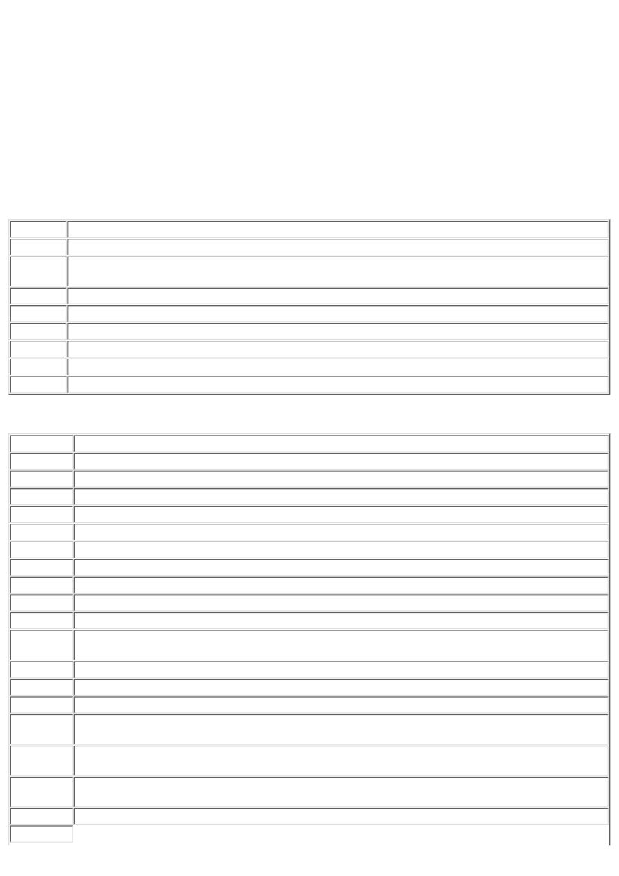
end;
This code isn't so terribly bad, but it's easy to forget to restore objects when you are done with them. When that happens, your
application will leak resources. Now look at the equivalent VCL code:
Canvas.Brush.Color := clRed;
Canvas.Pen.Color := clBlue;
Canvas.Ellipse(20, 20, 120, 120);
Not only is this code shorter and more readable, it is also much more robust. The TCanvas class takes care of freeing resources
as needed, so you don't have to worry about it. TCanvas is a simpler and more effective approach than using the API.
The TCanvas class has many properties and methods. I'll look at some of these properties and methods while working through
today's material. Table 12.1 lists the primary properties of TCanvas and Table 12.2 lists the primary methods.
TABLE 12.1. PRIMARY TCanvas PROPERTIES.
Property
Description
Brush
The brush color or pattern used for filling shapes.
ClipRect
The current clipping rectangle for the canvas. Any drawing is confined to this rectangle. This property is
read-only.
CopyMode Determines how drawing will be performed (normal, inverse, xor, and so on).
Font
The font the canvas uses for drawing text.
Handle
The handle (HDC) of the canvas. Used when calling the Windows API directly.
Pen
Determines the style and color of lines drawn on the canvas.
PenPos
The current drawing position in x and y coordinates.
Pixels
An array of the canvas' pixels.
TABLE 12.2. PRIMARY TCanvas METHODS.
Method
Description
ARC
DRAWS AN ARC ON THE CANVAS USING THE CURRENT PEN.
BrushCopy Displays a bitmap with a transparent background.
CopyRect
Copies part of an image to the canvas.
Draw
Copies an image from memory to the canvas.
Ellipse
Using the current pen, draws an ellipse that is filled with the current brush on the canvas.
FloodFill
Fills an area of the canvas with the current brush.
LineTo
Draws a line from the current drawing position to the location specified in the x and y parameters.
MoveTo
Sets the current drawing position.
Pie
Draws a pie shape on the canvas.
Polygon
Draws a polygon on the canvas from an array of points and fills it with the current brush.
Polyline
Using the current pen, draws a line on the canvas from an array of points. The points are not automatically
closed.
Rectangle
Draws a rectangle on the canvas outlined by the current pen and filled with the current brush.
RoundRect
Draws a filled rectangle with rounded corners.
Method
Description
StretchDraw Copies a bitmap from memory to the canvas. The bitmap is stretched or reduced according to the size of the
destination rectangle.
TextExtent
Returns the width and height in pixels of the string passed in the Text parameter. The width is calculated using
the current font of the canvas.
TextHeight Returns the height in pixels of the string passed in the Text parameter. The width is calculated using the current
font of the canvas.
TextOut
Using the current font, draws text on the canvas at a specified
location.
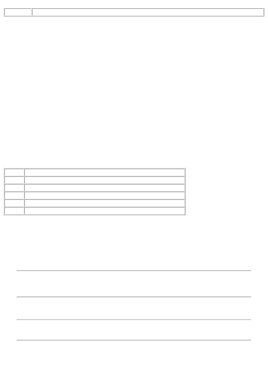
TextRect
Draws text within a clipping rectangle.
Believe it or not, these properties and methods represent just a small part of the functionality of a Windows device context.
The good news is that these properties and methods cover 80 percent of the tasks you will need to perform when working with
graphics. However, before I can talk more about the TCanvas class in detail, I need to talk about graphics objects used in
Windows programming.
GDI Objects
The Windows Graphics Device Interface (GDI) has many types of objects that define how a device context functions. The
most commonly used GDI objects are pens, brushes, and fonts. Other GDI objects include palettes, bitmaps, and regions. Let's
take a look at pens, brushes, and fonts first and then move on to more complex objects.
Pens, Brushes, and Fonts
Pens, brushes, and fonts are straightforward. Let's take a brief look at each of these GDI objects and how the TCanvas class
uses them.
Pens
A pen defines the object that is being used to draw lines. A line might be a single line from one point to the next, or it might be
the border drawn around rectangles, ellipses, and polygons. The pen is accessed through the Pen property of the TCanvas class
and is an instance of the TPen class. Table 12.3 lists the properties of TPen. There are no methods or events of TPen that are
worthy of note.
TABLE 12.3. TPen PROPERTIES.
Property Description
Color
Sets the color of the line.
Handle
The handle to the pen (HPEN). Used when calling the GDI directly.
Mode
Determines how lines will be drawn (normal, inverse, xor, and so on).
Style
The pen's style. Styles can be solid, dotted, dashed, dash-dot, clear, and more.
Width
The width of the pen in pixels.
For the most part, these properties are used exactly as you would expect. The following example draws a red, dashed line:
Canvas.Pen.Color := clRed;
Canvas.Pen.Style := psDash;
Canvas.MoveTo(20, 20);
Canvas.LineTo(120, 20);
To test this code, drop a button on a form and type the code in the OnClick handler for the button. When you click the button,
the line will be drawn on the form.
NOTE: The simple examples in this chapter can all be tested in this manner. However, if you cover the
application and bring it to the top, the drawing will be gone. This is because the drawing is temporary. If you want
the drawing to be persistent, place the drawing code in the OnPaint event handler for the form. Any time a
window needs to be repainted, its OnPaint event is generated and your drawing code will be executed.
The dashed and dotted pen styles can be used only with a pen width of 1. The psClear pen style can be used to eliminate the
line that the Windows GDI draws around the outside of objects such as rectangles, ellipses, and filled polygons.
TIP: You can experiment with the various properties of TPen by dropping a Shape component on a form and
modifying the shape's Pen property. This is especially useful for seeing the effects of the Mode property of the
TPen class.
Brushes
A brush represents the filled area of a graphical shape. When you draw an ellipse, rectangle, or polygon, the shape will be
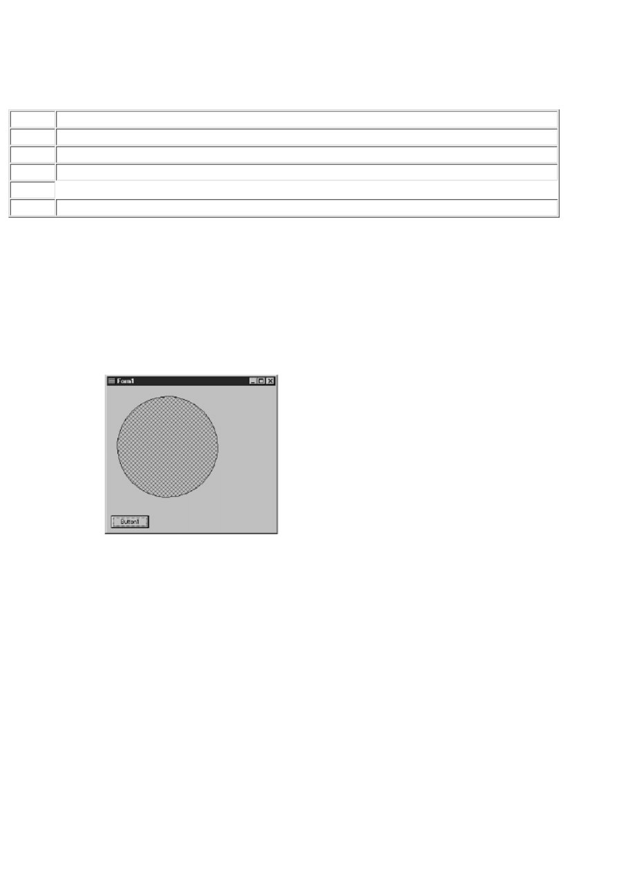
filled with the current brush. When you think of a brush you probably think of a solid color. Many times this is the case, but a
brush is more than just a color. A brush can also include a pattern or a bitmap. The TCanvas class has a property called Brush,
which you can use to control the appearance of the brush. The Brush property is an instance of the TBrush class. As with TPen,
the TBrush class doesn't have any methods or events of note. The TBrush properties are listed in Table 12.4.
TABLE 12.4. TBrush PROPERTIES.
Property Description
Bitmap
The bitmap to be used as the brush's background. For Windows 95 the bitmap must be no larger than 8¥8.
Color
Sets the color of the brush.
Handle
The handle to the brush (HBRUSH). Used when calling the GDI
directly.
Style
The brush's style. Styles include solid, clear, or one of several patterns.
By default, the Style property is set to bsSolid. If you want a pattern fill, you should set the Style property to one of the pattern
styles (bsHorizontal, bsVertical, bsFDiagonal, bsBDiagonal, bsCross, or bsDiagCross). The following example draws a circle
on the form using a 45 degree hatched pattern. Figure 12.1 shows the form when this code executes.
Canvas.Brush.Color := clBlue;
Canvas.Brush.Style := bsDiagCross;
Canvas.Ellipse(20, 20, 220, 220);
FIGURE 12.1. A circle filled with a
hatched brush.
When using a pattern brush, the brush's Color property defines the color of the lines that make up the pattern. For some reason,
VCL automatically forces the background mode to transparent when using a pattern fill. This means that the background color
of the brush will be the same as the background color of the window on which the shape is drawn.
Take another look at Figure 12.1 and you will see that the background color of the circle is the same color as the form (I know
it's not easy to see in grayscale). If you want to specify a background color, you need to circumvent VCL and go to the API.
Here's how the code would look if you want to use a blue hatch on a white background:
Canvas.Brush.Color := clBlue;
Canvas.Brush.Style := bsDiagCross;
SetBkMode(Canvas.Handle, OPAQUE);
SetBkColor(Canvas.Handle, clWhite);
Canvas.Ellipse(20, 20, 220, 220);
Now the background color of the brush will be white. Figure 12.2 shows the circle with the new code applied.
FIGURE 12.2. The hatched brush with a
white background.
Another interesting feature of brushes is the bitmap background option. First look at the code and then I'll tell you more about
bitmap brushes. Here it is:
Canvas.Brush.Bitmap := TBitmap.Create;
Canvas.Brush.Bitmap.LoadFromFile(`bkgnd.bmp');
Canvas.Ellipse(20, 20, 220, 220);
Canvas.Brush.Bitmap.Free;
The first line in this code snippet creates a TBitmap object and assigns it to the Bitmap property of the brush. The Bitmap
property is not assigned by default, so you have to specifically create a TBitmap object and assign it to the Bitmap property.
The second line loads a bitmap from a file. The bitmap must be no larger than 8 pixels by 8 pixels. You can use a larger
bitmap, but it will be cropped to 8¥8. The third line in this example draws the ellipse. After the ellipse has been drawn, the
Brush property is deleted. It is necessary to delete the Brush property because VCL won't do it for you in this case. If you fail
to delete the Brush property, your program will leak memory. Figure 12.3 shows the ellipse drawn with a bitmap brush.
FIGURE 12.3. An ellipse with a bitmap
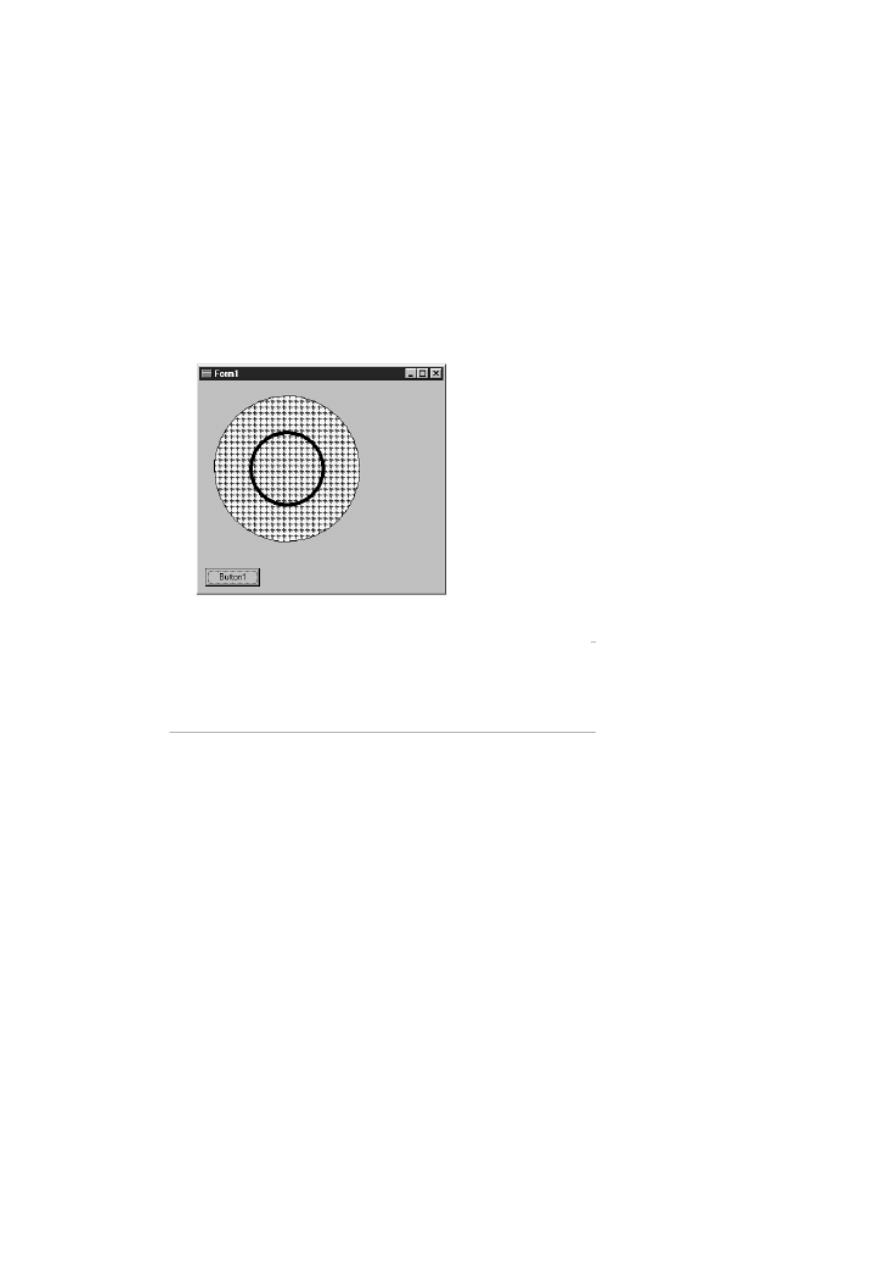
brush.
Sometimes you need a hollow brush. A hollow (or clear) brush enables the background to show through. To create a hollow
brush, just set the brush's Style property to bsClear. Let's take the previous example and add a second circle inside the first
using a hollow brush. Figure 12.4 shows the results. Here's the code:
Canvas.Pen.Width := 1;
Canvas.Brush.Bitmap := TBitmap.Create;
Canvas.Brush.Bitmap.LoadFromFile(`bkgnd.bmp');
Canvas.Ellipse(20, 20, 220, 220);
Canvas.Brush.Style := bsClear;
Canvas.Pen.Width := 5;
Canvas.Ellipse(70, 70, 170, 170);
Canvas.Brush.Bitmap.Free;
FIGURE 12.4. A circle with a hollow
brush.
You can do other things with brushes if you go directly to the API. Most of the time, though, the VCL TBrush class does the
job.
Fonts
Fonts aren't anything new to you; you have been using them throughout the book. Fonts
used with the TCanvas class are no different than those used with forms or other
components. The Font property of TCanvas is the same as the Font property of
any other component. To change the font for the canvas, just do this:
Canvas.Font.Name := `Courier New';
Canvas.Font.Size := 14;
Canvas.Font.Style := Canvas.Font.Style + [fsBold];
Canvas.TextOut(20, 20, `Testing');
That's all there is to it. I'll talk more about what to do with fonts a little later in the section "Drawing Text."
Bitmaps and Palettes
Bitmaps and palettes go together most of the time. The TBitmap class encapsulates a bitmap object in Delphi. Loading and
displaying bitmaps is easy when using this class. You already saw TBitmap in action in the Jumping Jack program on Day 8,
"Creating Applications in Delphi." The TBitmap class is used in a wide variety of situations. I'll look at some of those
situations later today when talking about drawing bitmaps and about memory bitmaps. The TBitmap class is complex, so I
won't go over every property and method here.

Palettes are one of the most confusing aspects of Windows programming. Most of the time the palette is maintained by the
TBitmap object, so you really don't have to worry about it. Rather than trying to explain the importance of palettes, let me
show you an example.
Start a new application and type the following code in the OnPaint event handler, or use a button click event. Be sure to enter
the correct path to the HANDSHAK.BMP file. (You should find it in the Borland Shared Files/Images/Splash/256Color
directory.) Here's the code:
var
Bitmap : TBitmap;
begin
Bitmap := TBitmap.Create;
{ Bitmap.IgnorePalette := True; }
Bitmap.LoadFromFile(`handshak.bmp');
Canvas.Draw(0, 0, Bitmap);
Bitmap.Free;
end;
Notice that one line is commented out with curly braces. Run the program and you will
see a nice bitmap on the form. Now uncomment the line that is commented out. This
line tells the VCL to ignore the palette information when displaying the
bitmap. Run the program again. This time you should notice that the bitmap's colors
are all wrong (you might not notice this effect if your video adapter is set to
display more than 256 colors). This is because the palette is not being applied. The
palette makes sure that the correct colors for the bitmap are mapped to the system
palette.
Bitmap and palette objects play an important role in graphics operations. It takes some time to understand everything that they
entail, so don't feel bad if you don't catch onto it right away.
Clipping Regions
Regions are areas of the screen that can be used to control the parts of the canvas that can be drawn on. The TCanvas class has
a ClipRect property, but it is read-only. To change the clipping region, you have to use the Windows API. Let's take the
previous example and modify it slightly to illustrate how clipping regions work. Here's the code:
var
Bitmap : TBitmap;
Rgn : HRGN;
begin
Bitmap := TBitmap.Create;
Bitmap.LoadFromFile(`handshak.bmp');
Rgn := CreateRectRgn(50, 50, 250, 250);
SelectClipRgn(Canvas.Handle, Rgn);
Canvas.Draw(0, 0, Bitmap);
Bitmap.Free;
end;
Now when you run the program you will see that only a portion of the bitmap is displayed. The SelectClipRgn function sets
the canvas' clipping region to the rectangle identified by the coordinates 50, 50, 250, and 250. The bitmap is still being drawn
in the same location it was before, yet now only a portion of the bitmap (defined by the clipping region) can be seen.
Everything outside the clipping region is ignored.
Regions don't have to be rectangular. Let's take the previous example and make it more interesting. Remove the line that
creates the rectangular region and replace it with this line:
Rgn := CreateEllipticRgn(30, 30, 170, 170);
Now run the program again. This time, the bitmap is limited to a circular region.
Figure 12.5 shows the program with the elliptical region in place.
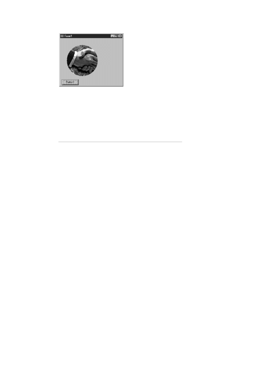
FIGURE 12.5. An elliptical clipping
region.
Let's try another type of region. Again, remove the line that defines the region and replace it with these lines:
const
Points : array[0..3] of TPoint =
((X:80;Y:0), (X:0;Y:80), (X:80;Y:160), (X:160;Y:80));
var
Bitmap : TBitmap;
Rgn : HRGN;
begin
Bitmap := TBitmap.Create;
Bitmap.LoadFromFile(`handshak.bmp');
Rgn := CreatePolygonRgn(Points, 4, ALTERNATE);
SelectClipRgn(Canvas.Handle, Rgn);
Canvas.Draw(0, 0, Bitmap);
Bitmap.Free;
end;
This time you are using a polygon region. The points array defines the points that create the region. The CreatePolygonRgn
function creates a region from a series of points. You can use as many points as you want. You don't even have to specify the
closing point because the region is automatically closed between the first point and the last point. Run the program again and
see what you get. Figure 12.6 shows the results of this exercise.

FIGURE 12.6. A polygon clipping
region.
NOTE: This code snippet also shows how to initialize a const array of records. Here's the code I'm referring to:
const
Points : array[0..3] of TPoint =
((X:80;Y:0), (X:0;Y:80), (X:80;Y:160), (X:160;Y:80));
This code declares an array of TPoint records and initializes it with data. TPoint has two fields: X and Y. Notice
that the field name is listed, followed by a colon and the value to be assigned to that field (X:80, for example).
Notice also that both the X and Y fields are assigned values and those values are paired with parentheses. This is
done four times because the array has four elements. This is the only way to declare and initialize a const array of
records.
Regions can be very useful when you are doing certain kinds of drawing operations. You might not need to use clipping
regions often, but when you need them, they are invaluable.
Basic Drawing Operations
You have already encountered some of the basic graphics routines as you have worked through the book. By now you know
that the Rectangle method is used to draw squares and rectangles, the Ellipse method is used to draw circles and ovals, and that
the MoveTo and LineTo methods are used to draw lines.
There is also the Arc method for drawing arcs and the Pie method for drawing pie-shaped objects. All in all, it's fairly basic.
There's not much point in going into a lot of detail on the methods of TCanvas. Instead, let's move on to the more interesting
(and troublesome) graphics operations you are likely to encounter when writing Delphi applications.
Drawing Text
Drawing text doesn't sound like it should be too difficult, does it? The truth is that there are several little pitfalls that, if you
aren't aware of them, can make drawing text a difficult experience. In addition, there are several nice text drawing features that
you should know about.
The TextOut and TextRect Methods
The TextOut method is the most basic way to draw text on a canvas. There really isn't too much to say about TextOut. You just
pass it the X position, the Y position, and the text to display--for example,
Canvas.TextOut(20, 20, `Joshua Reisdorph');
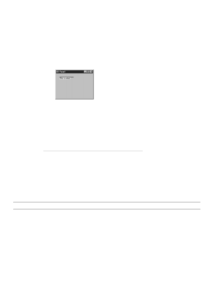
This code displays the given string at position 20, 20 on the form. The X and Y coordinates specify the top left corner of the
text to be drawn, not the baseline. To illustrate what I mean, test this code:
Canvas.TextOut(20, 20, `This is a test.');
Canvas.MoveTo(20, 20);
Canvas.LineTo(100, 20);
This code displays some text at position 20, 20 and then draws a line from that same position to position 100, 20. Figure 12.7
shows the results of this code. Notice that the line is drawn across the top of the text.
FIGURE 12.7. Text drawn with TextOut.
Use TextOut whenever you have text to display that doesn't need a lot of fine positioning.
The TextRect method enables you to specify a clipping rectangle in addition to the text to be displayed. Use this method when
the text needs to be constrained within certain boundaries. Any of the text that falls outside the boundary will be clipped. The
following code snippet ensures that no more than 100 pixels of the text will be displayed:
Canvas.TextRect(Rect(20, 50, 120, 70), 20, 50,
`This is a very long line that might get clipped.');
Both TextOut and TextRect can only draw single lines of text. No wrapping of the text
is performed.
TIP: To draw text with tab stops, see the Windows API function TabbedTextOut.
Text Backgrounds
Refer to Figure 12.7. Notice that the text has a white background--not very appealing on a gray form. The text background is
obtained from the current brush (white by default). To remedy the unsightly results of Figure 12.7, you need to take one of two
actions: Either change the color of the canvas brush, or make the text's background transparent.
Changing the background color of the text is fairly easy. The question is, do you know what color to make the text's
background? In this case, the text's background can be the same color as the form, so you can do this:
Canvas.Brush.Color := Color;
This code will work for most situations, but in some cases you need more control. It would be easier if you could just make the
background of the text transparent. The good news is, you can. Here's how the code would look:
var
OldStyle : TBrushStyle;
begin
OldStyle := Canvas.Brush.Style;
Canvas.Brush.Style := bsClear;
Canvas.TextOut(20, 20, `This is a test.');
Canvas.Brush.Style := OldStyle;
end;
First, save the current brush style. Next, set the brush style to transparent
(bsClear). After you display the text, set the brush style back to what it was
before. You should get into the habit of saving the previous style and resetting it
when
you are done drawing the text. It is unlikely that you'll want to leave the brush
style set to transparent, so resetting the previous style is always a good idea.
Using a transparent background has other advantages as well. Let's say you want to display some text over a bitmap
background. In that case you can't use a solid background. Here's a code snippet that illustrates the point (the FACTORY.BMP
file can be found in your Borland Shared Files56Color directory):
var
OldStyle : TBrushStyle;
Bitmap : TBitmap;
begin
Bitmap := TBitmap.Create;
Bitmap.LoadFromFile(`factory.bmp');
Canvas.Draw(0, 0, Bitmap);
Canvas.Font.Name := `Arial Bold';
Canvas.Font.Size := 13;
OldStyle := Canvas.Brush.Style;
Canvas.Brush.Style := bsClear;
Canvas.TextOut(20, 5, `Transparent Background');
Canvas.Brush.Style := OldStyle;
Canvas.TextOut(20, 30, `Solid Background');
Bitmap.Free;
end;
This code draws a bitmap on the form. Next, text is drawn on the form (over the bitmap) with a transparent background. After
that, more text is drawn with the regular background. Figure 12.8 shows the results of this code. As you can see, making the
background transparent creates a much more appealing image.
FIGURE 12.8. Text drawn over a
bitmap with transparent and solid backgrounds.
Another reason for using transparent backgrounds for text is illustrated on Day 13 in the section, "Owner-Drawn Status
Panels." There you give the status bar text a 3D look by drawing the text once in white and drawing it again, slightly offset, in
black. The only way that code works is by using a transparent background. As you can see, sometimes a transparent
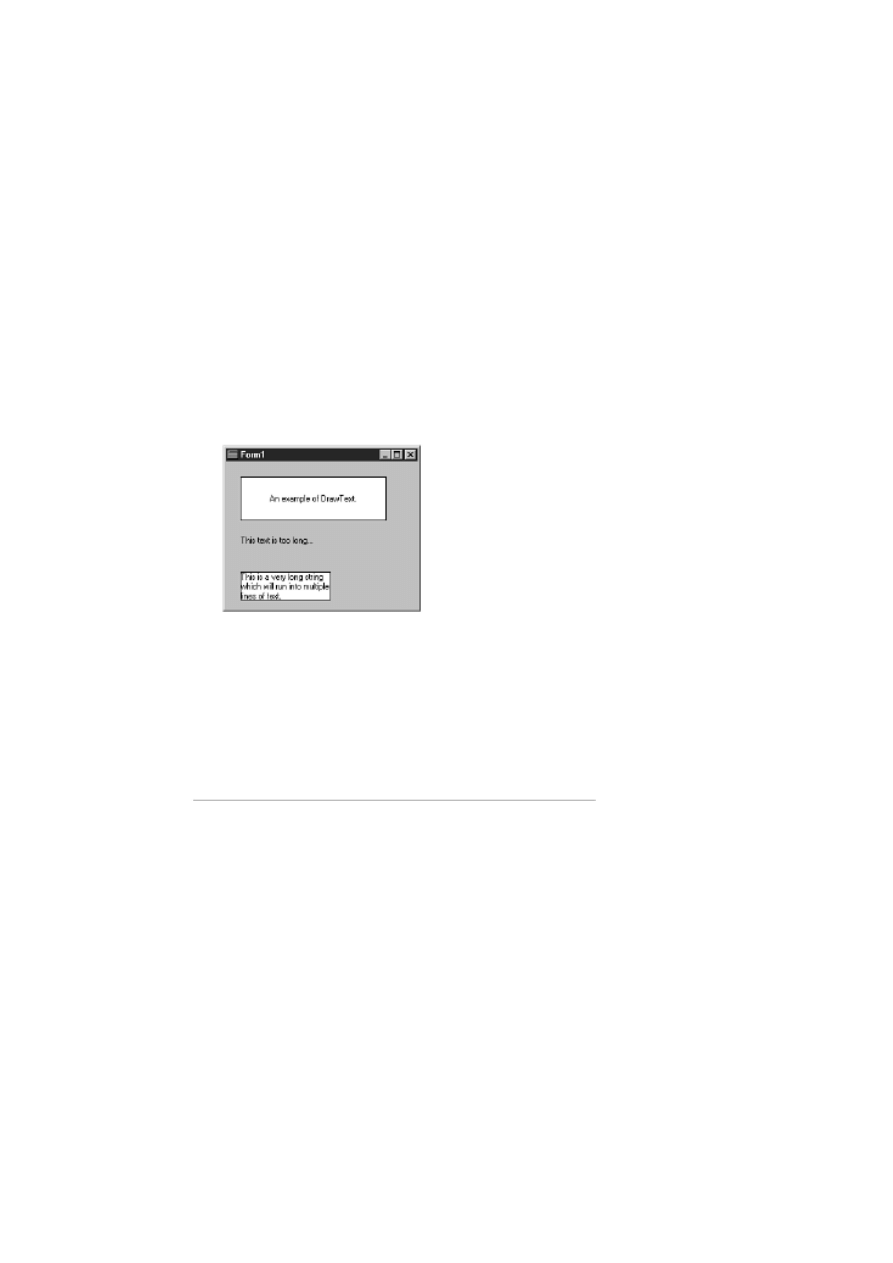
background is the only option for achieving the effect you are looking for.
The DrawText Function
The Windows API DrawText function gives you much greater control over text that is drawn on the canvas than does TextOut.
For some reason, the TCanvas class does not have a DrawText method. To use DrawText, then, means using the API directly.
First, let's look at a basic DrawText example and then I'll tell you more about the power of this function:
var
R : TRect;
begin
R := Rect(20, 20, 220, 80);
Canvas.Rectangle(20,20, 220, 80);
DrawText(Canvas.Handle, `An example of DrawText.',
-1, R, DT_SINGLELINE or DT_VCENTER or DT_CENTER);
end;
Figure 12.9 shows the results of this code as well as results from the following examples.
FIGURE 12.9. Examples of the
DrawText function.
First, a TRect record is initialized using the Windows API Rect function. After that, a regular rectangle is drawn on the canvas.
(The rectangle is drawn on the canvas so that you can visualize the size of the rectangle that you are about to draw on.) Finally,
the DrawText function is called to draw the text.
Let's take a minute to discuss the various parameters of this function, as follows:
The first parameter is used to specify the device context on which to draw. The Handle parameter of TCanvas is the
HDC (handle to a device context) of the canvas, so you pass that for the first parameter.
●
The second parameter is the string that will be displayed.
●
The third parameter is used to specify the number of characters to draw. When this parameter is set to -1, all of the
characters in the string will be drawn.
●
The fourth parameter of DrawText takes a var TRect. This parameter is a var parameter because some DrawText
operations modify the rectangle passed in.
●
The key to how DrawText behaves is in the final parameter. This parameter is used to specify the flags that are used
when drawing the text. In this example, you use the DT_SINGLELINE, DT_VCENTER, and DT_CENTER flags.
These flags tell Windows that the text is a single line, and to draw the text centered both vertically and horizontally. All
in all, there are almost 20 flags that you can specify for DrawText. I'm not going to go over every flag, so for a complete
list see the Win32 API online help.
●

The previous example illustrates one of the DrawText function's most common uses: to center text either horizontally,
vertically, or both. This is a great feature when doing owner-drawing of components. In particular, owner-drawn list boxes,
combo boxes, and menus often need to center text. You might not realize the benefit of this function right now, but you will if
you start doing owner-drawn components, or if you start writing your own graphical components.
Another interesting flag of DrawText is the DT_END_ELLPSIS flag. If the text is too long to fit in the specified rectangle,
Windows truncates the string and adds an ellipsis to the end, indicating the string was truncated. Take this code, for example:
var
R : TRect;
begin
R := Rect(20, 100, 120, 150);
DrawText(Canvas.Handle, `This text is too long to fit.',
-1, R, DT_END_ELLIPSIS);
end;
When this code is executed, it will result in this text being displayed:
This text is too long...
You can use this flag any time you anticipate text that could be too long for the rectangle in which the text is drawn.
DT_CALCRECT is another flag that is invaluable. It calculates the height of the rectangle needed to hold the specified text.
When you use this flag, Windows calculates the needed height and returns that height but doesn't draw the text. You tell
Windows how wide the rectangle should be, and Windows will tell you how high the rectangle needs to be to contain the text.
In fact, Windows also modifies the bottom and left members of the rectangle passed in so that it contains the needed values.
This is particularly important when drawing multiple lines of text.
The following example asks Windows how high the rectangle needs to be to contain all of the text. After that, a rectangle is
drawn onscreen. Finally, the text is drawn in the rectangle. Here's the code:
var
R : TRect;
S : string;
begin
R := Rect(20, 150, 150, 200);
S := `This is a very long string which will ` +
`run into multiple lines of text.';
DrawText(Canvas.Handle, PChar(S),
-1, R, DT_CALCRECT or DT_WORDBREAK);
Canvas.Brush.Style := bsSolid;
Canvas.Rectangle(R.left, R.top, R.right, R.bottom);
Canvas.Brush.Style := bsClear;
DrawText(Canvas.Handle, PChar(S), -1, R, DT_WORDBREAK);
end;
Notice that you have to cast S to a PChar for the second parameter of DrawText. This is necessary because DrawText wants a
pointer to a character array for the text parameter and not a string type.
NOTE: If you are writing components that can be used with all versions of Delphi, you cannot use the cast from
string to PChar. This cast won't compile under Delphi 1. Instead, you have to use the StrPCopy function as
follows:
var
Temp : array [0..50] of Char;
R : TRect;
S : string;
begin
DrawText(Canvas.Handle, StrPCopy(Temp, S),
-1, R, DT_CALCRECT or DT_WORDBREAK);
{ etc. }
If you don't have to worry about supporting Delphi 1, you can cast the string to a PChar as shown previously.
Place this code in the OnPaint event handler for a form. Run the program several times and modify the length of the text string
that is displayed. Notice that no matter how much text you add to the string, the rectangle will always be drawn precisely

around the text. Refer to Figure 12.9 for the results of this exercise as well as the results of the previous exercises on
DrawText.
TIP: If you need even more text drawing options, you can use the DrawTextEx function. See the Win32 API
online help for full details.
NOTE: Drawing text with DrawText is slightly slower than using TextOut. If your drawing operations are speed-sensitive,
you should use TextOut rather than DrawText. You'll have to do more work on your own, but the execution speed will likely
be better. For most drawing, though, you won't notice any difference between TextOut and DrawText.
DrawText is a very useful and powerful function. When you start writing your own components, you will no doubt use this
function a great deal.
Drawing Bitmaps
Drawing bitmaps sounds like it should be difficult, yet as you have seen several times up to this point, drawing bitmaps is very
easy. The TCanvas class has several methods for drawing bitmaps. The most often-used method is the Draw method. This
method simply draws a bitmap (represented by a descendant of the TGraphic class) onto the canvas at the specified location.
You've seen several examples up to this point, but here's another short example:
var
Bitmap : TBitmap;
begin
Bitmap := TBitmap.Create;
Bitmap.LoadFromFile(`c:\winnt\winnt256.bmp');
Canvas.Draw(0, 0, Bitmap);
Bitmap.Free;
end;
This code creates a TBitmap object, loads the file called WINNT256.BMP, and displays it in the upper-left corner of the form.
Use Draw when you want to display bitmaps without modification.
The StretchDraw method is used when you want to alter a bitmap's size. You specify a rectangle for the location of the bitmap
and an image to draw. If the supplied rectangle is larger than the original size of the bitmap, the bitmap will be stretched. If the
rectangle is smaller than the bitmap's original size, the bitmap will be reduced to fit. Here's an example:
var
Bitmap : TBitmap;
R : TRect;
begin
Bitmap := TBitmap.Create;
Bitmap.LoadFromFile(`c:.bmp');
R := Rect(0, 0, 100, 100);
Canvas.StretchDraw(R, Bitmap);
Bitmap.Free;
end;
NOTE: No attempt is made by StretchDraw to maintain the bitmap's original aspect ratio. It's up to you to be sure
that the bitmap retains its original width-to-height ratio.
Another bitmap drawing method is CopyRect. This method enables you to specify both a source rectangle and a destination
rectangle. This enables you to split a bitmap into sections when displaying it. Take this code, for example:
var
Bitmap : TBitmap;
Src : TRect;
Dst : TRect;
I, X, Y : Integer;
Strips : Integer;
Stripsize : Integer;
OldPal : HPalette;
begin
Bitmap := TBitmap.Create;
Bitmap.LoadFromFile(`factory.bmp');
Strips := 6;
Stripsize := (Bitmap.Height div Strips);
OldPal := SelectPalette(Canvas.Handle, Bitmap.Palette, True);
for I := 0 to Pred(Strips) do begin
Src := Rect(0, i * Stripsize,
Bitmap.Width, (i * Stripsize) + Stripsize);
X := Random(Width - Bitmap.Width);
Y := Random(Height - Stripsize);
Dst := Rect(X, Y, X + Bitmap.Width, Y + Stripsize);
Canvas.CopyRect(Dst, Bitmap.Canvas, Src);
end;
SelectPalette(Canvas.Handle, oldPal, True);
Bitmap.Free;
end;
This code loads a bitmap, dissects it into strips, and then displays the strips in random locations on the form. Figure 12.10
shows a sample run of this code. Enter this code in the OnPaint handler of your main form and run the program. Cover up the
main form and then bring it to the top again. The images will be redrawn each time the form is repainted.
FIGURE 12.10. Sections of a bitmap
written randomly to the screen with CopyRect.
Copying sections of a bitmap like FACTORY.BMP might not appear to make a lot of sense at first glance. A common
graphics programming technique, however, is to create one large bitmap made up of several smaller images and copy just the
image you want to the screen. In that type of situation, CopyRect is the way to go.
NOTE: In the previous code example I used the SelectPalette function to set the form's palette to the Palette
property of the bitmap. For some strange reason, the TCanvas class doesn't have a Palette property, so you have to
go to the API to set the palette for the form. If I didn't set the palette for the form, the colors would be wrong
when the bitmap strips are displayed on the form. The CopyRect method uses a different mechanism for
displaying a bitmap on the canvas, so taking this extra step is necessary when using this method.
There is one other bitmap drawing method I want to mention. The BrushCopy method enables you to specify a source
rectangle, a destination rectangle, an image, and a transparent color. The online help for BrushCopy says to use the ImageList
component rather than using this method. That's a bit extreme, in my opinion. There are times when BrushCopy works nicely,
and it's a whole lot easier to use than the ImageList component. Don't overlook BrushCopy if you are using bitmaps with
transparent backgrounds.

Offscreen Bitmaps
Offscreen bitmaps, also called memory bitmaps, are used commonly in Windows programming. Offscreen bitmaps enable you
to draw an image in memory and then display the image onscreen by using the Draw method. Offscreen bitmaps help avoid the
flicker that you see when you try to draw too much directly to the screen in a short period of time. Offscreen bitmaps are also
good for complex drawing programs. You can prepare the image in memory and then display it when ready. Offscreen bitmaps
are used in animation, and the most popular new technology for animation is Microsoft's DirectX SDK.
The principle behind offscreen bitmaps is a simple three step process:
1. Create a memory bitmap.
2. Draw on the memory bitmap.
3. Copy the memory bitmap to the screen.
Creating a Memory Bitmap
Creating a memory bitmap is easy. In fact, you've already done it several times in this chapter. Surprised? Each time you
created a TBitmap object you were creating a memory bitmap. In those cases, you were loading a file into the memory bitmap.
In other cases you will create a memory bitmap, set the its size, and then draw on it--for example,
var
Bitmap : TBitmap;
I, X, Y, W, H : Integer;
Red, Green, Blue : Integer;
begin
Bitmap := TBitmap.Create;
Bitmap.Width := 500;
Bitmap.Height := 500;
for I := 0 to 19 do begin
X := Random(400);
Y := Random(400);
W := Random(100) + 50;
H := Random(100) + 50;
Red := Random(255);
Green := Random(255);
Blue := Random(255);
Bitmap.Canvas.Brush.Color := RGB(Red, Green, Blue);
Bitmap.Canvas.Rectangle(X, Y, W, H);
end;
Canvas.Draw(0, 0, Bitmap);
Bitmap.Free;
end;
To try out this code, place a button on a form and type the code in the event handler for the button's OnClick event. Each time
you click the button, a new random set of rectangles is drawn onscreen. This code simply draws on the memory bitmap and
then copies the bitmap to the form's canvas. If you are using a 256-color video adapter, the colors will be dithered because you
are not implementing a palette for this exercise.
NOTE: When you create a memory bitmap, the bitmap will have the same color depth as the current video
display settings. In other words, if you have your video display set for 256 colors, the memory bitmap will be a
256-color bitmap. If you have your video display set for 24- or 32-bit video, your memory bitmap will contain
32K, 64K, or 16 million colors.
Saving a Memory Bitmap
Saving a memory bitmap to a file is ridiculously easy. Here's all it takes:
BITMAP.SAVETOFILE(`TEST.BMP');
Yes, that's it. In fact, you can easily create your own screen capture program. All you have to do is copy the appropriate part of
the desktop to a memory bitmap and then save it to file. It looks something like Listing 12.1.

LISTING 12.1. SCREEN CAPTURE ROUTINE.
procedure MainForm.CaptureButtonClick(Sender: TObject);
var
DtCanvas : TCanvas;
Bitmap : TBitmap;
NumColors : Integer;
LogPal : PLogPalette;
Src, Dst : TRect;
begin
{ Create a TCanvas object for the desktop DC. }
DtCanvas := TCanvas.Create;
DtCanvas.Handle := GetDC(0);
{ Create a new TBitmap object and set its }
{ size to the size of the form. }
Bitmap := TBitmap.Create;
Bitmap.Width := Width;
Bitmap.Height := Height;
{ Create a palette from the form's Canvas }
{ and assign that palette to the Bitmap's }
{ Palette property. }
NumColors := GetDeviceCaps(Canvas.Handle, SizePalette);
GetMem(LogPal, SizeOf(TLogPalette) +
(NumColors - 1) * SizeOf(TPaletteEntry));
LogPal.palVersion := $300;
LogPal.palNumEntries := NumColors;
GetSystemPaletteEntries(
Canvas.Handle, 0, NumColors, LogPal.palPalEntry);
Bitmap.Palette := CreatePalette(LogPal^);
FreeMem(LogPal);
{ Copy a section of the screen from the }
{ desktop canvas to the Bitmap. }
Src := BoundsRect;
Dst := Rect(0, 0, Width, Height);
Bitmap.Canvas.CopyRect(Dst, DtCanvas, Src);
{ Save it to disk. }
Bitmap.SaveToFile(`form.bmp');
{ Clean up and go home. }
Bitmap.Free;
DtCanvas.Free;
end;
NOTE: This code goes the extra mile and implements a palette for the form in case the form is displaying graphics. This code
was translated from the code that was originally part of an article I wrote for The Cobb Group's C++Builder Developer's
Journal. Although you probably aren't interested in the C++Builder journal, you might be interested in the Delphi Developer's
Journal. You can sign up for a free copy of the Delphi Developer's Journal on The Cobb Group's Web site at
http://www.cobb.com/ddj.
Sample Memory Bitmap Program
Listing 12.2 contains a program called MemBmp that illustrates the use of memory bitmaps. This program scrolls a marquee
across the screen when you click one of two buttons. The first button scrolls the text across the screen without using a memory
bitmap (writing directly to the form's canvas). The second button uses a memory bitmap for smoother scrolling. A third button
is used to stop the marquee. Figure 12.11 shows the MemBmp program running.
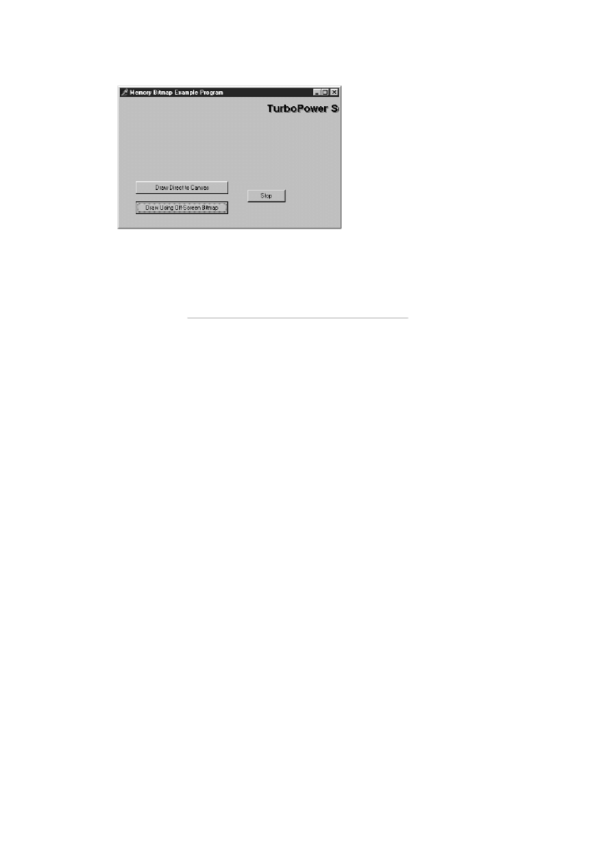
FIGURE 12.11. The MemBmp program
running.
LISTING 12.2. MemBmpU.pas.
unit MemBmpU;
interface
uses
Windows, Messages, SysUtils, Classes, Graphics,
Controls, Forms, Dialogs, StdCtrls;
const
DisplayText = `TurboPower Software Co.';
type
TForm1 = class(TForm)
Button1: TButton;
Button2: TButton;
Button3: TButton;
procedure Button1Click(Sender: TObject);
procedure Button2Click(Sender: TObject);
procedure Button3Click(Sender: TObject);
private
{ Private declarations }
Done : Boolean;
public
{ Public declarations }
end;
var
Form1: TForm1;
implementation
{$R *.DFM}
procedure TForm1.Button1Click(Sender: TObject);
var
I : Integer;
begin
Canvas.Font.Name := `Arial Bold';
Canvas.Font.Size := 16;
Canvas.Brush.Color := clSilver;
Done := false;
while not Done do begin

for I := -Canvas.TextWidth(DisplayText)
to Pred(Width) do begin
Sleep(1);
Application.ProcessMessages;
if Done then
Break;
Canvas.Font.Color := clGray;
Canvas.Brush.Style := bsClear;
Canvas.TextOut(i + 2, 12, DisplayText);
Canvas.Font.Color := clBlack;
Canvas.Brush.Style := bsClear;
Canvas.TextOut(i, 10, DisplayText);
Canvas.Font.Color := clSilver;
Canvas.TextOut(i + 2, 12, DisplayText);
Canvas.TextOut(i, 10, DisplayText);
end;
end;
end;
procedure TForm1.Button2Click(Sender: TObject);
var
Bitmap : TBitmap;
I : Integer;
begin
Bitmap := TBitmap.Create;
Bitmap.Width := Width;
Bitmap.Height := 40;
Bitmap.Canvas.Font.Name := `Arial Bold';
Bitmap.Canvas.Font.Size := 16;
Bitmap.Canvas.Brush.Color := clSilver;
Bitmap.Canvas.FillRect(Rect(0, 0, Width, 40));
Done := False;
while not Done do begin
for I := -Bitmap.Canvas.TextWidth(DisplayText)
to Pred(Width) do begin
Application.ProcessMessages;
if (Done) then
Break;
Sleep(1);
Bitmap.Canvas.Font.Color := clGray;
Bitmap.Canvas.Brush.Style := bsClear;
Bitmap.Canvas.TextOut(2, 12, DisplayText);
Bitmap.Canvas.Font.Color := clBlack;
Bitmap.Canvas.Brush.Style := bsClear;
Bitmap.Canvas.TextOut(0, 10, DisplayText);
Canvas.Draw(I, 0, Bitmap);
end;
end;
Bitmap.Free;
end;
procedure TForm1.Button3Click(Sender: TObject);
begin
Done := True;
end;
end.
The MemBmp program is included with the book's code, along with other example programs (called BrushTst, Capture,
Gradient, and Rotate) that illustrate the concepts discussed today.

Multimedia Programming
Multimedia programming is a deceivingly innocent phrase. The reason for this is that multimedia programming encompasses a
wide range of possibilities. Multimedia typically includes wave audio, MIDI audio, AVI video clips, and animation. I don't
want to confuse multimedia programming with game programming.
Game programming certainly involves multimedia, but it is much more involved than adding sound or video to an application.
I'm going to lightly cover multimedia in this section and show you what you can do given the tools that Delphi provides right
out of the box. I'm not going to talk about graphics or multimedia APIs such as OpenGL or Direct Draw. For more information
on graphics programming using those libraries, get a good book that specializes in graphics programming. Delphi 4 Unleashed
(ISBN: 0-672-312-859) would be a good choice.
Wave Audio with the Windows API
Normally I wouldn't talk a lot about Windows API functions because most of the time VCL offers you a better way of
performing a task than does the API. In the case of playing a wave file, however, there is nothing more simple than the Win32
API PlaySound function. Playing a wave file by using this function is very easy. The first thing you need to do is add
MmSystem to your unit's uses list. Then call PlaySound with the proper parameters:
PlaySound(`test.wav', 0, SND_FILENAME);
That's pretty simple, isn't it? As you can see, the first parameter to PlaySound is used to specify a sound file to play. The last
parameter is used to specify flags that determine how the sound should be played. When playing a wave audio file on disk, you
specify SND_FILENAME as the last parameter (you can specify other flags as well, but I'll get to that in just a bit).
The PlaySound function can also play system sounds as well as files on disk. To play a system sound, specify the sound alias
in the first parameter passed to PlaySound, and SND_ALIAS in the flags parameter--for example,
PlaySound(`SystemAsterisk', 0, SND_ALIAS);
This code plays the system sound associated with the Asterisk event (assuming one has been set up on your system). To see a
list of system sound events, look at the Sound applet in the Control Panel. To determine the sound alias for the event, you can
look in the Windows Registration Database (the Registry). The aliases are listed under the HKEY_CURRENT_USER key.
If the requested sound cannot be found, Windows will play the default sound (the ding if you have the default sound scheme).
You can prevent Windows from playing the default sound by specifying the SND_NODEFAULT flag. For example, if you
want to play a system sound but don't want the default sound to play if the system sound cannot be found, you could use this
code:
PlaySound(`MailBeep', 0, SND_ALIAS or SND_NODEFAULT);
Notice that the SND_ALIAS and SND_NODEFAULT flags are or'd together.
NOTE: The Win32 API MessageBeep function can also be used to play system sounds by their index number.
See MessageBeep in the Win32 online help for more information.
There are two other flags that are important when dealing with the PlaySound function:
The SND_ASYNC flag stipulates that the sound should be played asynchronously. When this flag is used, the sound
starts playing and immediately returns control to the calling application. This means that the sound can play while your
application goes on its way.
●
The SND_SYNC flag stipulates that control should not return to the calling application until after the sound is finished
playing. SND_SYNC is the default for PlaySound, so you shouldn't have to specifically set this flag.
●
There are many other flags that can be used to control how sounds are played with PlaySound. For complete information, see
the PlaySound topic in the Win32 online help.
The TMediaPlayer Component
VCL provides the MediaPlayer component for simple multimedia operations. This component, located on the System tab of
the Component palette, can play wave files, MIDI files, AVI videos, and more. TMediaPlayer is easy to use, too. For just
playing wave files I usually use the PlaySound function as described in the previous section. For anything more complex,
though, you can use the MediaPlayer component.
The most obvious way of using TMediaPlayer is to simply drop one on a form. When you do, the media player controller is
displayed. This controller has buttons for play, pause, stop, next, previous, step, back, record, and eject. Figure 12.12 shows a
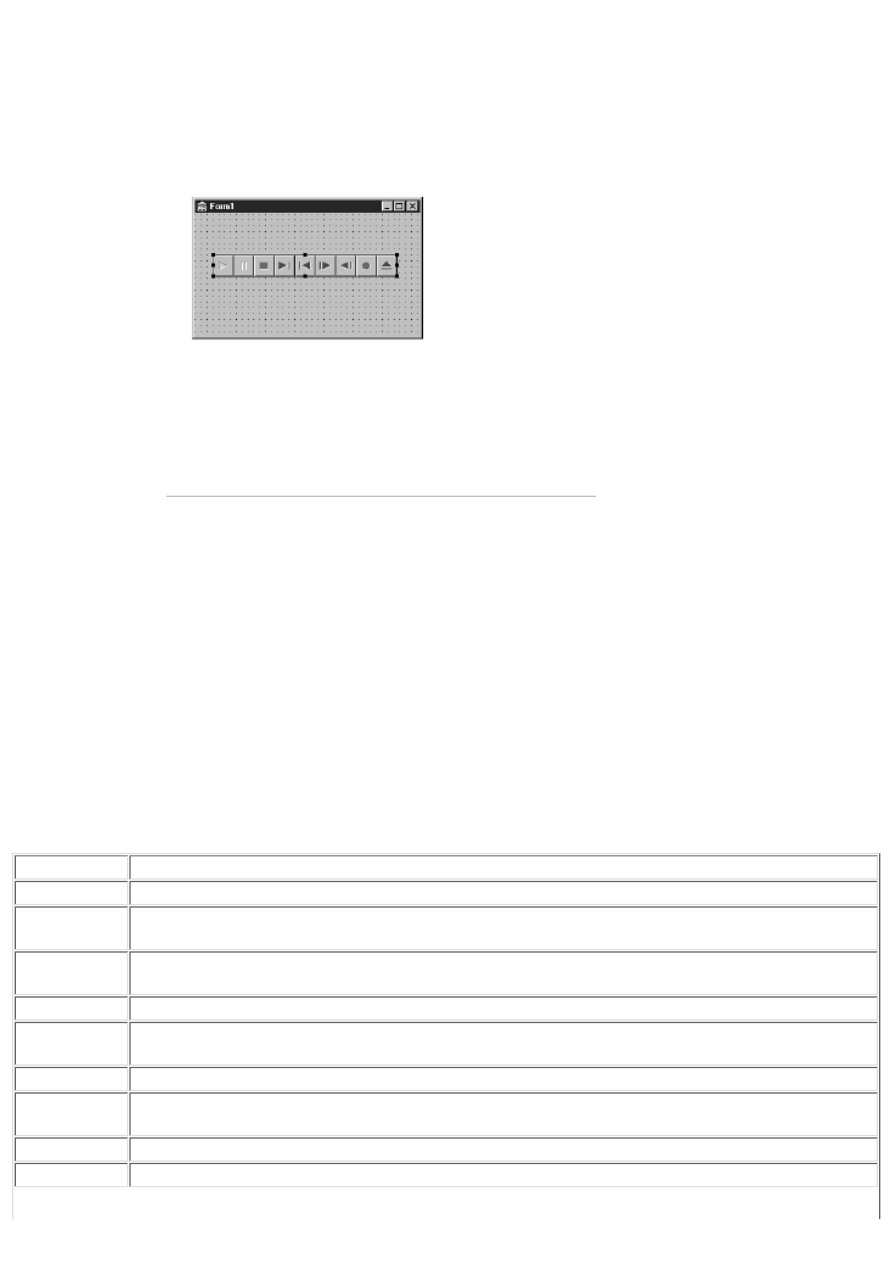
form with a MediaPlayer.
FIGURE 12.12. A form with a
MediaPlayer component.
Using the media player in its most basic form is extremely simple. All you have to do is set the FileName property to the name
of a valid multimedia file and click the Play button on the MediaPlayer. You can select any .WAV, .MID, or .AVI file. The
MediaPlayer knows what to do with the file automatically and no additional intervention is required. Most of the time, you
want to do something a little more interesting with the MediaPlayer, and for those times you'll have to dig a little deeper.
Although the visual control bar of the MediaPlayer is nice in some situations, you will probably use the MediaPlayer without
the control bar at times. You can manipulate the MediaPlayer through code to play, start, stop, or rewind the media. If you
don't want to see the MediaPlayer control bar at runtime, you'll have to set the Visible property to False.
MediaPlayer Properties, Methods, and Events
TMediaPlayer has a lot of properties. Most of them are pretty easy to understand, but some are a bit more complicated. Table
12.5 lists the primary properties of TMediaPlayer.
TABLE 12.5. PRIMARY TMediaPlayer PROPERTIES.
Property
Description
AutoOpen
Specifies whether the device should be opened as soon as the media player is created. Default: False
AutoRewind
When True, the media position pointer will be reset to the beginning of the media after the media has played.
Default: True
DeviceType
The type of the multimedia device. Set to dtAutoSelect to have the device type automatically selected based
on the filename extension. Default: dtAutoSelect
Display
Used to set the display window to a specific component (for video devices).
DisplayRect
Used to set the size and position of the playback window for video devices. The video is resized to fit this
rectangle.
EnabledButtons The buttons on the MediaPlayer that should be enabled. Default: All Buttons
EndPos
The media ending position. The media is played from StartPos to EndPos. If EndPos is not specified, the
media plays to the end. The value you assign to EndPos depends on the type of media being played.
Error
The error code of the last operation.
ErrorMessage
A textual description of the last error.
Frames
The number of frames to move when the Back or Next methods are called, or when the Back or Next buttons
on the MediaPlayer control bar are clicked.
Length
The length of the media. The value of Length depends on the type of media being played and the current
value of TimeFormat.
Mode
The state of the device. Can be mpNotReady, mpStopped, mpPlaying, mpRecording, mpSeeking, mpPaused,
or mpOpen.
Notify
When True, the OnNotify event is generated when the MediaPlayer finishes an operation.
NotifyValue
The results of the last notification operation. Can be nvSuccessful, nvSuperseded, nvAborted, or nvFailure.
Position
The current position in the media.
StartPos
The media starting position. The media is played from StartPos to EndPos. If StartPos is not specified, the
media is played from the beginning. The value you assign to StartPos depends on the type of media being
played.
TimeFormat
The time format to use for this device. The time format can be specified in milliseconds, frames, bytes,
samples, tracks/minutes/seconds, hours/minutes/seconds, and more.
Tracks
The number of tracks the media contains (for CD audio devices).
VisibleButtons Specifies the buttons that should be displayed on the MediaPlayer control bar. Default: All Buttons
Wait
Specifies whether control should be returned to the calling application immediately or only after the media
has finished playing.
The MediaPlayer component also has a lot of methods. Many of these methods perform the same function as the control bar
buttons. Table 12.6 lists the primary methods of TMediaPlayer.
TABLE 12.6. PRIMARY TMediaPlayer METHODS.
Method
Description
Back
Backs up the media the number of steps specified by the Frames property.
Close
Closes the device.
Eject
Ejects the media, if applicable (ejects an audio CD, for example).
Next
Advances the start of the next track for devices that support tracks.
Open
Opens the device. (Used when AutoOpen is set to False.)
Pause
Pauses playback or recording.
Play
Starts playback of the device.
Previous
Moves to the beginning of the previous track.
Resume
Resumes the action (playing or recording) suspended with Pause.
Rewind
Resets the media position to the beginning of the media.
Save
Saves the media to a file specified by the FileName property.
StartRecord Starts recording of data.
Step
Moves forward the number of frames specified in the Frames property.
Stop
Stops the current action (playing or recording).
The MediaPlayer component has only one important event. The OnNotify event is called whenever a command has completed,
but only if the Notify property is set to True. You can examine the Error and NotifyValue properties to see whether the
operation was successfully carried out.
Wave Audio
Playing wave audio is one of the most basic multimedia operations. It is probably also the most common. Playing a wave file
synchronously would look like this:
Player.Wait := True;
Player.FileName := `test.wav';
Player.Open;
Player.Play;

Notice that the Wait property is set to True to force the wave file to play synchronously. This is necessary if you want to play
wave files back to back--for example,
Player.FileName := `Sound1.wav';
Player.Open;
Player.Wait := True;
Player.Play;
Player.FileName := `Sound2.wav';
Player.Wait := True;
Player.Play;
Notice that I set Wait to True before playing each file. The Wait property gets reset after an operation, so you must reset it each
time you want to force the program execution to wait until the operation finishes.
If you don't set Wait to True, the first sound will start playing and will be immediately superseded by the second sound when it
starts a few milliseconds later. If you want a sound to play in the background, set Wait to False.
To play a portion of a wave file, you can set the StartPos and EndPos before playing the file. The following example opens a
wave file and plays two seconds of audio, starting at one second and ending at three seconds:
Player.FileName := `test.wav';
Player.Open;
Player.StartPos := 1000;
Player.EndPos := 3000;
Player.Play;
The StartPos and EndPos values are specified in milliseconds, the default for wave audio devices.
NOTE: If you set either StartPos or EndPos to invalid values, the wave file won't play. Invalid values include a
StartPos greater than the EndPos or an EndPos value larger than the media length.
Setting the Output Volume
Setting the volume of the wave output device is relatively simple, but you have to go to the Windows API to do it. The
waveOutGetVolume and waveOutSetVolume functions can be used to get the volume and set the volume, respectively.
The volume is stored as an integer. The high word specifies the right channel volume setting, and the low word specifies the
left channel volume setting. If the device doesn't have the capability of setting the right and left channel volumes
independently, the low word is used to set the volume and the high word is ignored.
A value of 0 is no volume, and a value of $FFFF hexadecimal specifies full volume. Given that, the following code sets the
volume of both channels to 50%:
WAVEOUTSETVOLUME(0, $80008000);
This example sets the volume to full volume:
waveOutSetVolume(0, $FFFFFFFF);
Notice that I am using 0 as the first parameter to waveOutSetVolume. This is cheating a little, because I am assuming that the
wave device is device 0. That's almost always the case, so you can generally get by with this trick.
Setting the volume is as easy as that. Note that waveOutSetVolume sets only the volume for the wave output device and not
the master volume. The master volume can be set only through the multimedia mixer control, a subject beyond the scope of
this book. I realize that this discussion about setting the volume is a bit advanced. If you didn't understand it all, don't fret. You
can always come back and review this section later if you need to.
Recording Wave Audio
Recording wave audio is not quite as straightforward as it should be. You would think that all you have to do is call
StartRecording. It's not quite that simple, however, because of some problems with TMediaPlayer.
To record a wave file, you first have to open an existing wave file that has the same recording parameters as you want your
new file to have. You can then record the new wave data, change the FileName property to the name of the new file, and then
save the file. It's a bit cumbersome, but it does work.

For example, let's say you have a file called DUMMY.WAV that was recorded with a wave format of 22050 kHz, 8 bits per
sample, and one channel (you can easily create this kind of file using Windows Sound Recorder). In this case, you could start
recording wave audio on a button click like this:
procedure TForm1.StartBtnClick(Sender: TObject);
begin
with MediaPlayer do begin
{ Set FileName to the dummy.wav file to }
{ get the recording parameters. }
FileName := `dummy.wav';
{ Open the device. }
Open;
{ Start recording. }
Wait := False;
StartRecording;
end;
end;
At this point the recording has started and control has returned to your application. You now need to stop recording, which can
be done in response to a second button click--for example,
procedure TForm1.StopBtnClick(Sender: TObject);
begin
with MediaPlayer do begin
{ Stop recording. }
Stop;
{ Change the filename to the new file we want to write. }
FileName := `new.wav';
{ Save and close the file. }
Save;
Close;
end;
end;
NOTE: At the time of this writing, these steps are necessary to perform wave audio recording because of a bug in
TMediaPlayer. It's possible that this bug will be fixed by the time Delphi 4 is released. To find out, place a
MediaPlayer on a form and call the Record method. If Delphi doesn't raise an exception, the bug was fixed.
The factors that control how wave audio is recorded include the sample rate, the number of channels (mono or stereo), and the
number of bits per sample (usually 8 or 16). Common waveform sampling rates are 8,000 kHz, 11,025 kHz, 22,050 kHz, and
44,100 kHz. The higher the sampling rate, the higher the quality of the recorded audio. For the most part, you probably will not
use stereo recording unless you are doing game programming. Even then, you should only use stereo when needed. The
number of bits per sample also affects the quality of the recorded sound. The number of bits per sample can be set at either 8
bits or 16 bits.
NOTE: The higher the quality of the sound, the more disk space a recorded waveform audio file will consume. A
wave file recorded in stereo will, naturally, be twice the size of a file recorded in one channel. Likewise, using 16
bits per sample will double the size of the wave file over 8 bits per sample. A file recorded at 22,050 kHz, mono,
and 8 bits per sample might be 200K, whereas its equivalent recorded at 22,050, stereo, and 16-bits per sample
would be 800K. For the most part, stereo and 16 bits per sample don't provide enough benefit to warrant the
additional disk space. A wave format of 22,050 kHz, mono, and 8 bits per sample offers a good compromise
between sound quality and file size.
MIDI Audio
Not much needs to be said regarding MIDI audio. All you have to do is set the FileName property of the MediaPlayer to a
MIDI file and call the Play method. MIDI files have either .mid or .rmi extensions.
NOTE: If you intend to go beyond simple playing of MIDI files, you will have to study the low-level midiInXXX
and midiOutXXX functions. These functions are documented in the MMEDIA.HLP file. This file might be in
your Delphi Help directory (it might be called MM.HLP). If not, you can probably obtain the file from Microsoft.

Most sound cards do not enable two wave files to be played at one time. Likewise, most do not enable more than one MIDI file
to be played at one time. Most do, however, enable a wave file and a MIDI file to be played simultaneously. You have
probably noticed this effect in games where you have a music track and sound effects being played at the same time. To play a
wave file and a MIDI file at the same time, you can use two MediaPlayer components. Alternatively, you could use a
MediaPlayer for the MIDI file and use PlaySound for any wave files you need to play.
A MIDI file is often used as background music for games. If you use a MIDI file in this way, you will want to restart the music
when it reaches the end. TMediaPlayer doesn't have a built-in way to play a sound continuously. You can, however, make use
of MediaPlayer's OnNotify event to achieve a looping effect. First you need to tell the MediaPlayer to notify you when
something happens. That part is easy:
MediaPlayer.Notify := True;
After that, you need to provide an OnNotify event handler. In the event handler, you need code that restarts the MIDI file after
it successfully completes. The OnNotify event would look something like this:
procedure TForm1.MediaPlayerNotify(Sender: TObject);
begin
with MediaPlayer do
if NotifyValue = nvSuccessful then begin
Position := 0;
Play;
end;
end;
First I check to see whether the NotifyValue property contains a value of nvSuccessful. If so, I reset the file position to 0 and
call the Play method to start the file playing again. That's pretty simple, but there are a couple of issues you should be aware of.
First, notice that I am setting the Position property to 0. This effectively rewinds the file to the beginning. This is not necessary
if the AutoRewind property is set to True. The second issue that you should be aware of is that there are several MediaPlayer
actions that could cause the OnNotify event to be called with a NotifyValue of nvSuccessful.
For example, a simple Stop command will result in a value of nvSuccessful, providing the command completed without
incident. You might need to set up a state machine so that you know that the OnNotify event is being called in response to the
file reaching the end, and not as a result of some other media player operation.
CD Audio
Playing CD audio is relatively simple with TMediaPlayer. To play an audio CD, you simply change the DeviceType property
to dtCDAudio and click the Play button (or call the Play method).
The most difficult aspect to grasp in programming CD audio devices is the different time formats used in CD audio. You will
use the TMSF (time, minutes, seconds, frames) time format to gather information about a particular track or to set the current
position to a particular track. Any minute, second, or frame values will be set relative to the track number. For example, the
following code formats a string to report the playing position within the current track:
var
Time : Integer;
Track : Integer;
Minutes : Integer;
Seconds : Integer;
TimeStr : string;
begin
MediaPlayer.TimeFormat := tfTMSF;
Time := MediaPlayer.Position;
Track := mci_TMSF_Track(Time);
Minutes := mci_TMSF_Minute(Time);
Seconds := mci_TMSF_Second(Time);
TimeStr := Format(`Track Time: %2.2d:%2.2d', [Minutes, Seconds]);
Label1.Caption := `Track: ` + IntToStr(Track);
Label2.Caption := TimeStr;
end;
First, the TimeFormat is set to tfTMSF to ensure the proper time format. Next, the current position is stored in a variable called

Time. Following that, the different time values (track, minutes, and seconds) are extracted using Windows' time conversion
macros, mci_TMSF_Track, mci_TMSF_Minute, and mci_TMSF_Second. These macros are contained in the MMSystem unit.
You will have to add that unit to your uses list if you use these macros. After the individual time values have been extracted, a
time string is built to display the track time. Then the track number and track time are displayed in Label components.
You will use the MSF (minutes, seconds, frames) time format to gather information about the CD at the global level. For
example, you would use the MSF time format to retrieve the current position of the CD in relation to the start of the CD.
Likewise you would use the MSF time format if you want to set the current position of the CD to the 30 minute mark on the
CD, regardless of the track. This code shows how to retrieve and display the current position on the CD in minutes and
seconds:
var
Time : Integer;
Minutes : Integer;
Seconds : Integer;
TimeStr : string;
begin
MediaPlayer.TimeFormat := tfMSF;
Time := MediaPlayer.Position;
Minutes := mci_MSF_Minute(Time);
Seconds := mci_MSF_Second(Time);
TimeStr := Format(`Total Time: %2.2d:%2.2d', [Minutes, Seconds]);
Label3.Caption := TimeStr;
end;
The book's code contains a program called CDPlayer that illustrates how TMediaPlayer can be used to create an audio CD
player.
AVI Video
To play an AVI video with TMediaPlayer, select an AVI file and call the Play method (or click the Play button). If you use the
default MediaPlayer settings, a separate window will pop up and the AVI will play in that window. As an alternative, you can
set the Display property to any windowed component, and the video will play in that component's client area.
For example, let's say you have a panel on your form called AVIPanel and that you want to play an AVI video in the panel. In
this case, you would set the Display property like this:
MediaPlayer.Display := AVIPanel;
When the AVI plays, it will play in the panel. If the video is larger than the panel's rectangle, the video will be clipped to the
size of the panel.
You can stretch or shrink a video by setting the DisplayRect property. This code will shrink or stretch a video to the size of the
display panel:
MEDIAPLAYER.DISPLAYRECT := AVIPANEL.CLIENTRECT;
There are many types of AVI video formats, and not all AVIs will play on all systems. In order to play a particular video, you
have to be sure that your users have the drivers installed for that type of video. If you want to play it safe, stick with the
standard Microsoft AVI video types. Your users will almost certainly have the drivers for Microsoft AVIs installed because
they are installed as part of the normal Windows installation.
NOTE: The TAnimate component (found on the Win32 tab of the Component palette) is used for playing small
videos such as those you see used by Windows. Examples of these animations are those you see when Explorer is
copying files and the animation that Explorer displays in the Find dialog when it is searching for files. The AVIs
that can be played by TAnimate must be either uncompressed or run length encoded (RLE) compressed only. No
other forms of compression are allowed. Also, the AVI cannot contain audio.
NOTE: The MediaPlayer component can play many types of videos and animations, provided the correct drivers
are installed. For example, Autodesk Animator (AA) animations have a filename extension of either .fli or .flc. To
play an AA animation, all you have to do is set the DeviceType property to dtAutoSelect and select an Animator
file. As long as the AA drivers are installed, MediaPlayer will play the animation.

Summary
Graphics programming can be very interesting and very rewarding. It can also be very frustrating. VCL takes much of the
frustration out of graphics programming by providing the TCanvas and TBitmap classes, along with their supporting classes
such as TPen, TBrush, and TFont. These classes enable you to get on with the business of the visual aspects of graphics
programming rather than worry about how to load or save bitmap files. Multimedia programming can be a lot of fun. It's
rewarding to write a few lines of code and then see or hear the results a few seconds later. Multimedia can certainly add
excitement to your programs, but be careful not to overdo it.
Although I can't claim that this chapter is an in-depth look at either graphics or multimedia programming in Delphi, it's a good
start and introduces you to some concepts that you can carry with you for a long time.
Workshop
The Workshop contains quiz questions to help you solidify your understanding of the material covered and exercises to
provide you with experience in using what you have learned. You can find answers to the quiz questions in Appendix A,
"Answers to the Quiz Questions."
Q&A
Q Can the graphics concepts discussed in this chapter be used when printing as well as drawing on the screen?
A Yes. As far as Windows is concerned, a device context is a device context. It doesn't matter whether that device
context is for the display screen, a memory bitmap, or a printer.
Q I see the Ellipse method, but I don't see a method for drawing perfect circles. How do I draw circles?
A Use the Ellipse method. Just be sure that the rectangle used to draw the ellipse is perfectly square and you will get a
perfect circle (if that makes any sense).
Q How do I change the color of the text that DrawText produces?
A Change the Color property of the canvas font.
Q Why should I bother with a memory bitmap?
A You might not need to. However, if you ever see noticeable flicker in your drawing routines, you should think about
using a memory bitmap.
Q What is the default time format for wave audio devices?
A Wave audio devices use milliseconds by default (one second is 1000 milliseconds).
Q Can I play more than one wave file at a time?
A Not with the MediaPlayer component. Microsoft's DirectX API has sound mixing capabilities that make it sound as if
two or more sounds are playing at one time. If you need sound mixing, check out DirectX (free from Microsoft).
Q How can I play an AVI video directly on my form?
A Set the Display property of TMediaPlayer to the name of the form.
Quiz
1. What component can you use to draw graphics on a form?
2. Which TCanvas property controls the fill color of the canvas?
3. What does a clipping region do?
4. What function do you use to draw multiple lines of text on a canvas?
5. What TCanvas method can be used to draw a bitmap with a transparent background?
6. Which TCanvas method do you use to copy an entire bitmap to a canvas?
7. How do you save a memory bitmap to a file?
8. What component do you use to play a wave file?
9. What is the TimeFormat property of TMediaPlayer used for?
10. Can you record wave audio with the MediaPlayer component?
Exercises
1. Write a program that displays a circle on the screen when a button is clicked.
2. Write a program that draws random lines on the screen each time the form is shown (including when the form is
restored after being hidden).
3. Write a program that creates a memory bitmap, draws text and shapes on the bitmap, and then displays the bitmap on
the form's canvas.
4. Modify the program you wrote in exercise 3 to save the memory bitmap to disk.
5. Write a program that displays an AVI video on the application's main form.
6. Write a program that plays a wave file when the program starts.
©

Teach Yourself Borland Delphi 4 in 21
Days
- 13 -
Beyond the Basics
Adding Functionality with Command Enabling
Command Enabling with TActionList and TAction
Printing in Delphi Applications
The Common Printing Dialog Boxes
Loading and Using Stock Cursors

Today you learn ways to turn a good Windows application into a great Windows application.
Specifically, I discuss the following:
Window decorations: toolbars and status bars
●
Command enabling
●
Printing in Delphi applications
●
Using cursors
●
This discussion continues tomorrow as you look at implementing advanced Windows programming
features in your Delphi applications.
Creating Window Decorations
No, I'm not talking about pretty lights around the front window of your house. What I am talking
about are features such as toolbars and status bars. These features are often called window
decorations. This section deals with these types of decorations and how to implement them in your
application.
Toolbars
A toolbar (also called a control bar or a speedbar) is almost standard equipment for Windows
programs today. Users expect certain amenities, and a toolbar is one of them. A top quality toolbar
should have the following features and capabilities:
Buttons representing tasks that are also available on the application's menus.
●
Enabling and disabling of buttons when appropriate.
●
Tooltips describing a button's function.
●
Additional hint text that is displayed in the application's status bar.
●
Docking capability.
●
Other controls such as combo boxes or drop-down menu buttons.
●
Some of the features in this list are optional features that not every toolbar needs to have. With
Delphi, implementing these toolbar features is easy to accomplish. A little later in the chapter I talk
about command enabling in the section "Adding Functionality with Command Enabling." I'll save
discussion of command enabling for toolbar buttons for that time.
NOTE: It is considered good practice to place on the toolbar only buttons that have
corresponding menu items. The toolbar is an alternative to using the menu. It should not
contain items found nowhere else in the program.
On Day 8, "Creating Applications in Delphi," I said that the easiest way to construct a toolbar is to use
the Application Wizard. Even if you already have a partially written application, you can still use the
Application Wizard to create a toolbar. Just generate an application with the Application Wizard, copy
the panel with the toolbar to the Clipboard, reopen your original application (don't bother saving the
Application Wizard application), and paste the toolbar into your application from the Clipboard. Slick
and easy.

However, the Application Wizard doesn't give you everything you could possibly need in a toolbar.
Most notably, the Application Wizard uses the old method of creating a toolbar--with a panel and
speed buttons. The preferred way of creating a toolbar is to use the ToolBar and CoolBar components
(found on the Win32 tab of the Component palette). Let's take a look at those components next.
NOTE: The CoolBar and ToolBar components require version 4.72.2106.4 or later of
COMCTL32.DLL, which should have been installed as part of the Delphi installation. If
you don't have the latest version of this DLL, you can find it at Microsoft's Web site
(http://www.microsoft.com). When you deploy your applications using these
components, you should install COMCTL32.DLL version 4.70 or later. Be sure you are
using a good installation program so that you don't overwrite a new version of this DLL
when you install your application.
The CoolBar Component
The CoolBar component is an encapsulation of the Win32 cool bar (sometimes called a rebar). This
component is a specialized container control. Most of the time the CoolBar is used as a container for
toolbars, but its use isn't limited strictly to toolbars.
Cool Bar Bands
A cool bar has bands that can be moved and resized at runtime. The bands show a sizing grip on the
left side, giving the user a visual cue that the band can be moved or sized. Cool bar bands are
represented by the TCoolBand class. A cool bar band can contain only one component. Usually that
component is a toolbar, but it can be a combo box or any other component. Let's do an exercise to
better understand how the CoolBar component works:
1. Start with a new application and drop a CoolBar component on the form.
2. Drop a ComboBox component on the cool bar. Delphi creates a new band to hold the combo
box. Notice that the combo box fills the width of the cool bar.
3. Drop another ComboBox component on the cool bar. Another band is created and is placed
below the first band.
4. Place your mouse cursor between the sizing grip and the combo box on the second band. The
cursor will change to a pointing hand, indicating that you can move the band. (You can also use
the sizing grip to drag the band.) Drag the band up into the band above it. As you do, the first
band will shrink to make room for the band you are dragging. Drop the band near the middle of
the cool bar. You can now use the sizing grips to resize either band.
5. Place a Panel component on the cool bar. A new band is created to hold the panel.
6. Select the cool bar and change its AutoSize property to True.
7. Place a Memo component on the form below the cool bar. Set its Align property to alClient.
Now your form looks like Figure 13.1.
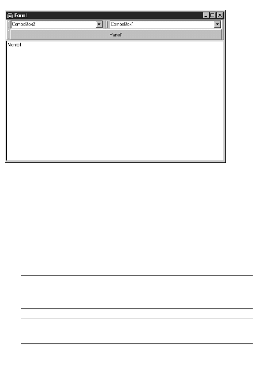
FIGURE 13.1.
The form with a cool bar and three bands.
Now run the program. Experiment with the cool bar bands. Drag them up or down or resize them.
Notice that as you drag the bands up or down, the cool bar resizes as needed and the memo always
fills the remaining client area.
Cool bar bands are accessed through the Bands property. This property is a TCoolBands, which is a
list of TCoolBand components. If you want to hide the second band, you can do this:
CoolBar.Bands[1].Visible := False;
You can add bands in two ways. As you have already seen, you can create a band by dropping any
component on the cool bar, but you can also use the Bands Editor. To invoke the Bands Editor,
double-click the cool bar or click the ellipsis button next to the Bands property in the Object
Inspector. You add bands by clicking the Add button; you delete bands by clicking the Delete button.
The Move Up and Move Down buttons enable you to change the order of the bands.
NOTE: If the AutoSize property is set to True, you will have to turn it off temporarily if
you want to add new bands by dropping components on the cool bar. Set the AutoSize
property to False, make the cool bar higher, drop a component on the cool bar, and set
the AutoSize property to True again.
NOTE: When you select a band in the Bands Editor, the Object Inspector displays the
band's properties. Figure 13.2 shows the Bands Editor and the Object Inspector when a
band is selected.
FIGURE 13.2.
The cool bar Bands Editor.
The Bitmap property enables you to set a background bitmap for a band. To select an image that will
appear to the left of the band, you use ImageIndex. ImageIndex requires the ImageList property of the
cool bar to be set to a valid TImageList. You can set a band's minimum height and width through the
MinHeight and MinWidth properties. To make a band immovable, set the FixedSize property to True.
Other CoolBar Properties
A cool bar can be either vertical or horizontal. By default the Align property is set to alTop. To make
a vertical cool bar, change the Align property to alRight or alLeft. Some components, when placed on
a cool bar, automatically orient themselves based on whether the cool bar is vertical or horizontal.
Another way to change the orientation of the cool bar is by setting the Vertical property.
The Bitmap property enables you to set a background bitmap for the cool bar. The bitmap you choose
will be tiled to fill the cool bar's background. Note that this sets the background bitmap for the cool
bar itself, not for any individual bands on the cool bar (as discussed in the previous section). You use
the ImageList property to set the image list that the bands will use to display an image to the left of
any band that has its ImageIndex property set.
The AutoSize property determines whether the cool bar will resize itself when bands are moved. You
saw the effect of the AutoSize property in the preceding exercise.
NOTE: Check out the TControlBar component on the Additional tab of the Component
palette. TControlBar is a native VCL component that works very much like a cool bar.
This component does not rely on COMCTL32.DLL as does TCoolBar, so it is less
susceptible to the whims of Microsoft.
The ToolBar Component
The ToolBar component encapsulates the Win32 toolbar control. The toolbar will automatically
arrange and size the controls placed on the toolbar so that they all have a consistent height. You can
use the ToolBar component with or without a cool bar. If you have only a single toolbar, use the

toolbar without a cool bar. If you have multiple toolbars that you want to enable the user to move,
place two or more toolbars on a cool bar.
Creating a toolbar and adding buttons to it is very easy. If your toolbar buttons will have glyphs (and
most do), you have to use an ImageList component for the glyphs. To illustrate how to build a toolbar
with the ToolBar component, let's again go back to the ScratchPad program. You'll tear it apart and
put it back together.
Removing the Old Toolbar
If you recall, the toolbar you created for ScratchPad originally was just a placeholder. The first thing
you need to do is get rid of the old toolbar by performing these steps:
1. Click the Memo component and change its Align property to alNone. Drag down the top of
the Memo to make room for the new toolbar.
2. Click the toolbar component and delete it.
Adding a New Toolbar
Now you can start adding components back again. The first thing to do is add a cool bar and a toolbar.
You don't really need a cool bar at this stage because you have only one toolbar, but you might want
to add another toolbar later, so it's best to plan ahead. Perform these steps:
1. Drop a CoolBar component on the form. It automatically aligns itself to the top of the form.
Change its Name property to CoolBar.
2. Drop a ToolBar component on the cool bar. Change its Name property to MainToolBar.
3. Double-click the EdgeBorders property in the Object Inspector to show all the edge border
items. Change the ebTop style to False (all EdgeBorders styles should now be False).
4. Change the Flat property to True. This gives the toolbar buttons a flat appearance until the
cursor passes over them.
5. Click the cool bar and change the AutoSize property to True. The cool bar sizes itself to the
size of the toolbar.
6. Click the Memo component and change its Align property back to alClient.
Adding Buttons to the Toolbar
Now you begin adding buttons to the toolbar; you will add several buttons and a few spacers. At first
the buttons won't have glyphs on them, but you'll take care of that later. For now, follow these steps:
1. Right-click the toolbar and choose New Button. A button is placed on the toolbar. Change
the button's Name property to FileNewBtn. Set the Hint property to New|Create A New File
and the ShowHint property to True. (Remember when you wrote the hint code on Day 8? That
code is still in the program, so the new hints will work immediately.)
2. Right-click on the toolbar and again choose New Button. A second button is placed on the
toolbar to the right of the first button. Change its Name property to FileOpenBtn. Set the Hint
property to Open|Open An Existing File and the ShowHint property to True.
3. Add another button. Change this button's Name property to FileSaveBtn. Set the Hint
property to Save|Save A File and the ShowHint property to True.
TIP: Buttons and spacers added to the toolbar always appear to the right of the toolbar's
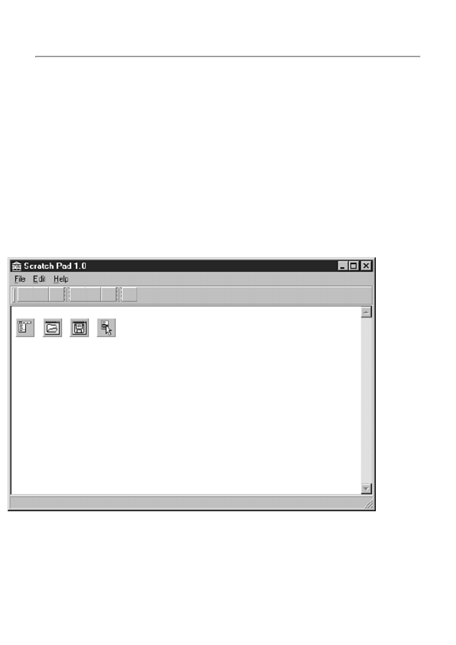
last control. You can't insert a button at a specific location in the toolbar, but after a
button or spacer is added, you can drag it to a different location on the toolbar. The
existing buttons will make room for the new button.
That finishes the first set of buttons (except for the glyphs). You are about to add a second set of
buttons, but before you do, there needs to be a little separation between the first set of buttons and the
second. Back to work:
1. Right-click on the toolbar again, but this time choose New Separator. A separator is added to
the toolbar.
2. Add another button. This time change the Name property to EditCutBtn and the Hint
property to Cut|Cut To Clipboard.
3. Add buttons for Copy and Paste. Change their Name and Hint properties as appropriate.
4. Add another separator.
5. Add a button called HelpAboutBtn. Change its Hint property to About|About ScratchPad.
6. Select the Cut, Copy, Paste, and Help buttons (use Shift+-Click to select each button).
Change the ShowHint property to True. It will be changed for all buttons selected.
Your form now looks like the one shown in Figure 13.3.
Figure 13.3.
The ScratchPad main form after adding a toolbar.
Making the Toolbar Buttons Functional
You now have a good start on the toolbar, but the toolbar buttons don't do anything because you
haven't assigned any event handlers to their OnClick events. Let's do that next.
1. Click the FileNewBtn (the first button) and select the Events page in the Object Inspector.
Click the drop-down arrow next to the OnClick event and choose FileNewClick. The button is

now hooked up to the FileNewClick event handler.
2. Repeat step 1 for each remaining button, being careful to select the appropriate OnClick
handler for each button (FileOpenClick, FileSaveClick, EditCutClick, and so on).
3. If you haven't yet created an About Box for ScratchPad, create one. When you are done,
create an event handler for the Help|About menu item. Hook the OnClick event of the
HelpAboutBtn to the event handler for the Help|About menu item.
Adding Bitmaps to the Toolbar Buttons
Obviously this toolbar is missing something. You need to add glyphs to the toolbar buttons. To do so,
you must add an ImageList component to the form by following these steps:
1. Place an ImageList component on the form. (You find it on the Win32 tab of the Component
palette.) Change the Name property to ImageList.
2. Right-click the ImageList component's icon on your form and choose ImageList Editor. The
ImageList Editor is displayed. (You can also double-click the ImageList icon on your form to
display the ImageList Editor.)
3. Click the Add button. Navigate to the Common Files\Borland Shared\Images\ Buttons
directory. Select the FILENEW.BMP file and click Open.
A message box appears and asks whether you want to separate the bitmap into two images.
What is happening here is that the image list's Width and Height properties are both set to 16.
The bitmap you have selected is wider than 16 pixels, so it has to be split into two images or
shrunk to fit. If you recall, the button bitmaps that come with Delphi are a single bitmap with
two images. The first image is the normal button bitmap, and the second image is for the
disabled button. You will have the ImageList Editor split the bitmap into two images, and then
you will delete the second part of the image.
4. Click Yes to have the ImageList Editor split the bitmap into two images. The ImageList
Editor now shows two images. You need only the first of these images, so click on the second
image (the disabled button image) and click the Delete button.
5. Click the Add button again. This time choose the FILEOPEN.BMP file. Click Yes again
when prompted to split the bitmap into two images. Click on the disabled image for this bitmap
and delete it. Figure 13.4 shows the image editor as it looks just before deleting the second
image.
FIGURE 13.4. The
ImageList Editor after adding three images.
6. Repeat step 5 for each remaining button (File Save, Cut, Copy, Paste, and About). Use any
bitmaps you like, but make certain you delete the extra bitmap each time you add an image to
the list. Also make sure that the images in the ImageList editor follow the order of the buttons
on the toolbar. When you are done, you will have seven images in the image list, numbering
from 0 to 6.
7. Click OK to close the ImageList Editor.
TIP: You can select multiple images in the ImageList Editor's Add Images dialog box
and add them all to the image list at one time.
Now you are ready to hook the image list to the toolbar. Click on the toolbar. Locate the Images
property in the Object Inspector and choose ImageList from the drop-down list. If you did everything
right, your buttons now have glyphs. You probably didn't notice, but each time you added a toolbar
button, Delphi automatically incremented the ImageIndex property for the button. Because you
created the buttons and images in the same order, the glyphs on the buttons should be correct. If a
button is wrong, you can either change the button's ImageIndex property or go back to the ImageList
Editor and change the order of the images in the image list.
TIP: To rearrange the images in an image list, drag them to a new position in the
ImageList Editor.
Disabled Button Glyphs
Right now you have glyphs only for the buttons in the enabled state. You also need glyphs that will be
displayed when the buttons are disabled. You aren't disabling the toolbar buttons yet, but you will be
before the day is done. There are two ways to implement the disabled button glyphs:
Let the toolbar create the disabled state glyphs automatically.
●
Create a second image list that contains disabled state bitmaps for the buttons.
●
Certainly the easier of these two methods is to let the toolbar create the disabled state buttons
automatically. Most of the time this is sufficient. Sometimes, however, the algorithm for creating the
disabled buttons glyphs doesn't work well. (The glyphs end up losing definition and don't look quite
right.) This happens with buttons that don't have enough contrasting colors. In that case, you can
create a second image list that contains the disabled button glyphs. Set the DisabledImages property of
the toolbar to the image list containing the disabled glyphs, and the rest is automatic. For ScratchPad
you're going to go with the automatic disabling of toolbar buttons, so nothing further is required.
Poor old ScratchPad is back together again. This is a good time to save the project. After saving the
project, click the Run button and give the program a workout. Click the buttons and see whether they
do what they are supposed to do. If all went well, you have a working program again. If your program
won't compile, review the steps and try to fix the problem. If all else fails, you can refer to the
ScratchPad project of the book's code, available at http://www.mcp.com/info (Day 13).
Toolbar Tips and Hints
I covered nearly everything there is to be said about tooltips and hints in the discussion of components
on Day 7, "VCL Components"; again on Day 8, "Creating Applications in Delphi," when adding hint
text support for the ScratchPad program; and again today when rebuilding the toolbar.
There is one issue I didn't talk about, and that is changing the tooltip properties. The TApplication
class has four properties that control how the tooltips behave. Table 13.1 lists these properties and
their descriptions.
TABLE 13.1. TApplication PROPERTIES PERTAINING TO TOOLTIPS.
Property
Description
Hintcolor
Sets the background color of the Tooltip window. Default: CLINFOBK
HintHidePause Controls how long to wait (in milliseconds) before hiding the tooltip if the mouse
cursor remains stationary over the component. Default: 2500 milliseconds
HintPause
Controls the interval between the time the mouse cursor is paused over a component
and the time the tooltip appears (in milliseconds). Default: 500 milliseconds
HintShortPause Controls how long to wait before showing tooltips after they have already been
shown--for example, when the user is roaming over a group of toolbar buttons.
Default: 50 milliseconds
The default values for these properties are sufficient for most applications. Still, if you need to change
any hint properties, you have that option.
HOUSE RULES: TOOLBARS AND HINTS
Don't use tooltips on controls where they will be in the way when the user wants to
read the text in the control. In particular, don't use tooltips for edit controls and
combo boxes. At a minimum, give the user the option to turn off tooltips for those
types of controls.
●
Keep your tooltip hint (the short hint) brief and to the point.
●
Make your status bar hint (the long hint) more descriptive and meaningful.
●
Consider giving your users the option of turning off hints altogether.
●
Adding Other Controls to Toolbars
Because the ToolBar component is so versatile, nothing special needs to be done to add other types of
controls to your toolbar. The most common type of control to add to a toolbar is a combo box. You
can use a toolbar combo box to select a font, a configuration option, a zoom setting. . . the possibilities
are endless.
To add a component to the toolbar, select the component from the Component palette and drop it on
the toolbar. The toolbar will take care of aligning the component. Add spacers as necessary to separate
components visually. When the component is on the toolbar, you deal with it just as you would a
component on a form. I could try to complicate this for you, but the truth is, it's just that simple. If
you've never tried to implement a combo box on a toolbar using the Windows API, you cannot
appreciate how much work Delphi saves you. Take my word for it--it's significant.
Toolbars come in many shapes and sizes, and Delphi makes creating and implementing toolbars very
easy. With Delphi, you no longer have the excuse, "That's too hard!" In fact, you might even enjoy
creating toolbars with Delphi.
Dockable Toolbars
Dockable toolbars are common in many Windows programs. Dockable toolbars are a paradox of sorts.
On the one hand, they are a cool feature and most power users expect a good application to have
dockable toolbars. On the other hand, I doubt anyone actually uses the docking capability of most
dockable toolbars. Still, dockable toolbars are easy enough to implement in Delphi, so you might as
well provide them.
NOTE: The docking features discussed in this section apply to any windowed control,
not just to toolbars.
Creating a Dockable Toolbar
Making a toolbar dockable requires two steps:
Set the DragKind property to dkDock.
●
Set the DragMode property to dmAutomatic.
●
After you set these two properties, you can drag your toolbar around the screen. Dragging the toolbar
around the screen doesn't get you very much, though. In order for dockable toolbars to make sense,
you have to have a target for the drop part of the drag-and-drop equation.
Dock Sites
A dockable toolbar needs to have a place to dock. As Roger Waters said, "Any fool knows a dog
needs a home." Home for a dockable toolbar is a dock site. A dock site is any windowed component
that has its DockSite property set to True. Components that are typically used as dock sites are
TCoolBar, TControlBar, TPageScroller, TPanel, and TPageControl. There are other controls that have
a DockSite property, but those controls are less likely to be used as dock sites.
An exercise helps illustrate the use of dock sites. Follow these steps:
1. Drop a CoolBar component on a blank form. Set its DockSite property to True.
2. Drop a ToolBar on the CoolBar. Set the toolbar's DragKind property to dkDock and its
DragMode property to dmAutomatic. Create a few buttons on the toolbar so that you can better
see the toolbar.
3. Place a second CoolBar on the form. Change its Align property to alBottom and its DockSite
property to True.
4. Place a third CoolBar on the form. Change its Align property to alLeft and its DockSite
property to True. Size the CoolBar so that its width is 40 pixels or so.
Now run the program. Drag the toolbar from dock site to dock site. Notice how the toolbar changes its
orientation when you drag it to the cool bar on the left side of the form.
Let's experiment some more. Set each of the CoolBar components' AutoSize properties to True. This
will cause each CoolBar to change its size based on the controls it contains. Now run the program
again and move the toolbar to the individual dock sites. Notice that each cool bar is nearly invisible
until the toolbar is docked to the site. Then the cool bar expands to contain the toolbar.
Floating Toolbars
A toolbar can be made into a floating toolbox by simply dragging the toolbar off its dock site and
dropping it anywhere (anywhere other than another dock site, that is). The toolbar becomes a floating
window. You can specify the type of window that should host the floating dock site by setting the
FloatingDockSiteClass property to the name of the class you want to act as the parent to the floating
toolbar. For example, suppose that you design a form that has all the characteristics you want for a
custom floating toolbox, and that the form is called MyToolBox. In that case, you could cause this
form to be the host for a floating toolbar with this code:
ToolBar.FloatingDockSiteClass := TMyToolBox;
When the toolbar is undocked and the mouse button released, Delphi will automatically create an
instance of the TMyToolBox class and place the toolbar in the form for that class. To dock the
floating toolbox again, simply drop it on any dock site. To make a dock site accept a floating toolbox,
you must respond to the OnDockOver and OnDockDrop events for the dock site. In the OnDockDrop
event handler, call the ManualDock method of the toolbar to cause the toolbar to dock.
Status Bars
A status bar is another feature that makes an application more marketable. Not all applications benefit
from a status bar, but many can. The VCL StatusBar component, which encapsulates the Win32 status
bar control, makes creating status bars a breeze. First, take a quick look at the major properties of the
StatusBar component, listed in Table 13.2.
TABLE 13.2. StatusBar PROPERTIES.
Property
Description
AutoHint
Automatically displays hints in the status bar when the mouse cursor passes over
any component whose Hint property has been set.
Panels
For status bars with multiple panels. This property defines the individual panels.
SimplePanel
Determines whether the status bar shows a simple panel or multiple panels.
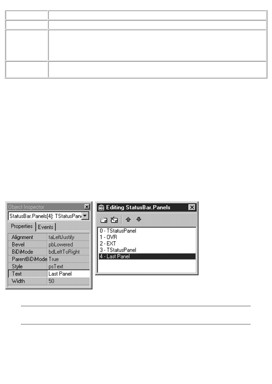
SimpleText
The text for the status bar's simple panel.
Property
Description
SizeGrip
Determines whether the status bar displays the sizing grip in the lower-right corner.
The sizing grip provides an area that the user can drag to size the window. The
absence of the sizing grip doesn't prevent the window from being sized, but the
presence of the size grip makes sizing a window easier.
UseSystemFont Always uses the current system font, overriding the settings of the Font property.
This is particularly useful for users who use Plus pack themes.
As you can see from this table, a status bar can be a simple status bar or have multiple panels. Let's
discuss this choice next.
Simple or Complex?
A status bar can be either a simple status bar or a complex status bar. A simple status bar has a single
panel that occupies the entire status bar. If you want a simple status bar, set the SimplePanel property
to True. The SimplePanel property acts as a toggle. You can switch between a simple and a complex
status bar at runtime by setting SimplePanel to True or False, accordingly.
A complex status bar is one with multiple panels. If you elect to use a complex status bar, you can use
the StatusBar Panels Editor to set up the panels you want to see on your status bar. To invoke the
StatusBar Panels Editor, double-click on the Value column of the Panels property. To add a panel,
click the Add New button on the StatusBar Panels Editor. To delete a panel, click the Delete Selected
button. To edit a panel, select the panel and then make changes to the panel's properties in the Object
Inspector. Figure 13.5 shows the StatusBar Panels Editor and Object Inspector when editing panels.
FIGURE 13.5. The
StatusBar Panels Editor.
NOTE: The individual panels in a complex status bar are instances of the TStatusPanel
class.
Most of the properties are self-explanatory, but a couple require further note. The Text property
contains the text that will be displayed in the panel. You can also use the Text property at runtime to
change the text in the panel. Setting the status bar text is discussed a little later; you don't need to
supply text for the panel at design time if you are going to change the text at runtime.

You can set the Style property to either psText or psOwnerDraw. If the Style is set to psText (the
default), the panel behaves as you would expect. The text is aligned in the panel according to the
value of the Alignment property. If the Style is set to psOwnerDraw, it is up to you to draw any text or
image that is displayed in the panel. Owner drawing of panel items is discussed later in the section
"Owner-Drawn Status Bar Panels."
The Width, Bevel, and Alignment properties for the panel are straightforward. Experiment with these
properties to see how they affect your status bar's appearance.
NOTE: In the Form Designer you immediately see the results of changes made to the
status bar via the StatusBar Panels Editor. Position the StatusBar Panels Editor so that
you can view the status bar as you work with the StatusBar Panels Editor. Each time you
make a change, it will be reflected in the Form Designer.
When you are done adding panels to the status bar, close the StatusBar Panels Editor and return to the
Form Designer.
NOTE: When you modify the Panels property of a StatusBar component, the Form
Designer automatically sets the SimplePanel property to False. The assumption is that if
you are using multiple panels, you don't want to have a simple status bar.
Changing Text in the Status Bar
There are two ways to change text in a status bar:
Manually modify the SimpleText property of the status bar (for simple status bars) or the Text
property of an individual panel (for complex status bars).
●
Let VCL automatically supply the status bar text by setting the AutoHint property to True.
●
Manually changing the text in the status bar is simple, particularly if you have a simple status bar.
When the SimplePanel property is True, you can set the SimpleText property to the text you want
displayed in the status bar:
StatusBar.SimpleText := `This shows up in the status bar.';
In the case of complex status bars, changing the text is only slightly more complicated. If you want to
change the text for the first panel of a complex status bar, you would use something like this:
StatusBar.Panels[0].Text := `Status Bar Text';
The Panels property of the StatusBar component has a property called Items that is an array of panels
in the status bar. Setting the Text property for an element in the Items array changes the text for that
panel (because Items is the default array property for the Panels object, you don't have to specifically
reference Items). As you can see, the array is 0-based. The first panel in the status bar is array element
0.
Automatic status bar hint text doesn't require much in the way of explanation. All you have to do is set
the AutoHint property to True. The rest is, as the property name implies, automatic.
NOTE: You can still modify the status bar's text manually even when using AutoHint.
There's nothing to stop you from changing the text manually, but remember that the text
will be replaced the next time the mouse passes over a component with hint text.
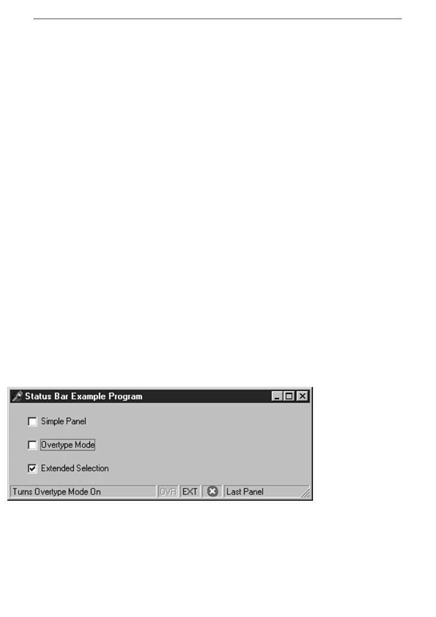
Owner-Drawn Status Bar Panels
Earlier I said that a panel's Style property can be either psText or psOwnerDraw. When you set a
panel's style to psOwnerDraw, you must take the responsibility of drawing anything in the panel that
needs to be displayed there. It is unlikely that you are going to go to the trouble of using an
owner-drawn panel just to display text. Usually it means you are going to display some sort of icon or
bitmap in the status bar. Regardless of what is being drawn on the panel, the steps are the same:
1. Set the panel's Style property to psOwnerDraw (usually via the StatusBar Panels Editor).
2. Respond to the OnDrawPanel event.
Obviously, the real work here is going to take place in the event handler for the OnDrawPanel event.
The declaration for the OnDrawPanel event handler looks like this:
procedure TForm1.StatusBar1DrawPanel(StatusBar: TStatusBar;
Panel: TStatusPanel; const Rect: TRect);
The StatusBar parameter is a pointer to the status bar. Usually you have a pointer to the status bar
anyway (the Name property of the StatusBar component), so this parameter is not all that useful
unless you are using multiple owner-drawn status bars. The Panel property is a pointer to the
particular panel that currently needs drawing. You can use this parameter to determine which panel
needs drawing if you have more than one owner-drawn panel in your status bar. The Rect parameter
contains the panel's size and position. The Rect parameter is important because it tells you the exact
dimensions of the drawing area.
The OnDrawPanel event handler is called once for each panel that has its Style property set to
psOwnerDraw. If you have only one panel to draw, you don't have to worry about much except the
Rect parameter. If you have multiple panels to draw, you must first determine which panel to draw
and then do your drawing. An illustration might help to explain this. The book's code includes a
program called StatBar that illustrates some of the things you can do with status bars. Run the
program and examine its source for tips on implementing status bars in your applications. Figure 13.6
shows the StatBar program running.
FIGURE 13.6. The StatBar
program with owner-drawn status bar panels.
As you can see, the status bar in this program has multiple panels. The middle three panels are
owner-drawn. The panels marked OVR and EXT simulate the status bar on a word processing
program or code editor. In those types of programs, the Overtype or Extended Selection modes might
be on or off. If the mode is on, the text in the status bar panel shows in black. If the mode is off, the
text has a 3D disabled-text appearance. The third owner-drawn panel displays a stock Windows icon

to illustrate the use of a graphic on a status bar. Run the program and experiment with it to learn how
it works.
Listing 13.1 shows the OnDrawPanel event handler from the StatBar program. Examine it and read
the comments to understand what is going on in the code.
LISTING 13.1. THE StatusBarDrawPanel METHOD OF THE StatBar PROGRAM.
procedure TMainForm.StatusBarDrawPanel(StatusBar: TStatusBar;
Panel: TStatusPanel; const Rect: TRect);
var
R : TRect;
Icon : HIcon;
begin
with StatusBar.Canvas do begin
{ Create a temporary TRect object. The Rect parameter
{ is const so we can't change it. }
R := Rect;
{ Check to see if panel 3 is the panel which needs
{ to be drawn. If so, draw an icon in the panel. }
if Panel.Index = 3 then begin
{ Load one of the stock Windows icons. This time
{ using the API is easier than using VCL. }
Icon := LoadIcon(0, IDI_HAND);
{ Draw the icon and shrink it down to 15 x 15 pixels. }
{ Center it in the panel, too. }
DrawIconEx(Handle, Rect.Left + 6, 3,
Icon, 15, 15, 0, 0, DI_NORMAL);
{ Nothing more to do. }
Exit;
end;
{ This rather lengthy if statement checks to see if
{ either the Overtype Mode or Extended Selection
{ check boxes are checked. If so, then what we need
{ to do is to draw the text twice. First, we draw it
{ in white. Then we draw it again, offset by 1 pixel,
{ in gray. The effect is a 3D disabled-text look. }
if ((Panel.Index = 1) and (OvrMode.Checked = False)) or
((Panel.Index = 2) and (ExtendedSel.Checked = False))
then begin
{ Move over and down one pixel for the offset. }
Inc(R.Left);
Inc(R.Top, 2);
{ Change the text color to white. }
Font.Color := clWhite;
{ Set the backround mode to transparent so the
{ text appears hollow and so that the white
{ text can be seen under the gray. }
Brush.Style := bsClear;

{ Draw the text using the API function DrawText. }
{ I use DrawText because it allows me to center
{ the text both horizontally and vertically within
{ the given rectangle. }
DrawText(Handle, PChar(Panel.Text), -1,
R, DT_CENTER or DT_VCENTER or DT_SINGLELINE);
{ Set the color to gray because we're going to
{ draw the text in gray in a moment. }
Font.Color := clGray;
{ Set the rect back to the original size. }
Dec(R.Left);
Dec(R.Top, 2);
end;
{ Display the text. If the item is not disabled then
{ the default color (black) is used to draw the text. }
{ If the item is disabled, then the text color has
{ been set to gray by the code above. }
DrawText(Handle, PChar(Panel.Text), -1,
R, DT_CENTER or DT_VCENTER or DT_SINGLELINE);
end;
end;
This code might seem intimidating, but most of it is comment lines. The code itself is relatively
simple. The comment lines explain what is happening at each step: The 3D appearance for the
disabled text is accomplished by drawing the text once in white and then drawing it again in gray with
a slight offset. The result is that the text looks recessed. The icon is displayed using the Windows API
functions LoadIcon and DrawIconEx.
Owner drawing of status bar panels is daunting at first, but you'll soon find out that it's not all that
bad. You might write Windows applications for a long time and never need owner-drawn panels in
your status bar. If you ever need them, however, you'll know that's not impossible to accomplish.
Adding Functionality with Command Enabling
Command enabling is the process of enabling or disabling buttons depending on current conditions.
For example, there's not much point of having the Cut or Copy button or menu item enabled for a text
editor when no text is currently selected. Likewise, if there is no text in the Clipboard, the Paste
button should be disabled.
Command enabling isn't difficult, especially with Delphi's new TActionList component. Still, it takes
time to get right. It takes time because you have to pay attention to detail. (Sometimes it is attention to
detail that separates the great applications from the mediocre applications.)
Command Enabling with TActionList and TAction
The TAction class provides a convenient way of performing command enabling. TActionList, the
nonvisual component that manages actions, is found on the Additional tab of the Component palette.
TActionList, as its name implies, contains a list of TAction objects. You create an action and then
assign that action to any controls that need to be enabled or disabled based on that action. By controls

I mean menu items, toolbar buttons, context menu items, and so on.
Let's take the Edit|Cut menu item, for example. You could have at least three objects associated with
this particular task:
A main menu item
●
A toolbar button
●
A pop-up menu item
●
You create actions with the ActionList Editor. Given the Edit|Cut example, you would create an
action for Cut called, say, CutAction. Then, using the Object Inspector, you assign CutAction to the
Action property of each of the objects that correspond to the cut operation (toolbar buttons and menus,
for example). At runtime, when you need to enable the Cut option, you can do so with just one line of
code:
CutAction.Enabled := True;
This will enable all components with their Action properties set to CutAction. Disabling the Cut items
is as simple as assigning False to the Enabled property of the action. The OnUpdate event of TAction
and TActionList provides a convenient place to put your command-enabling code.
Command enabling with TAction is something that you have to experience to fully appreciate. You
add command enabling to ScratchPad in the next section.
Teach Yourself Borland Delphi 4 in 21 Days
- 14 -
Advanced Programming
Implementing Context-Sensitive Help
❍
Context Identifiers and the HelpContext Property
❍
Implementing Context-Sensitive Help
❍
Adding Menu Support for the Help File
❍
❍
❍
●
Checking Errors with Exception Handling
Exception-Handling Keywords: try, except, finally, and raise
❍
❍
❍
Catching Unhandled Exceptions at the
Application Level
❍
Debugging and Exception Handling
❍
●
❍
❍
❍
❍
●
Implementing Specialized Message
Handling
❍
❍
❍
Handling Other Windows Messages
❍
❍
●
●
❍
❍
❍
●
●
Today you get into some of the more advanced aspects of Windows programming with Delphi. Specifically, you learn about
Implementing context-sensitive help
●
Exception handling
●

Using the Windows Registry
●
Specialized message handling
●
You have a lot to do today, so let's get right to it.
Implementing Context-Sensitive Help
Not too long ago, you might have been able to get by with not providing context-sensitive help in your applications. In fact, for
small applications you might have been able to get by without providing a help file at all. I wouldn't recommend that in today's
market, though. Users are increasingly demanding when it comes to features. A help file is a no longer an option but a required
component of a full-featured application.
Context-sensitive help means that when the user presses the F1 key, a particular page of the application's help file is displayed
depending on the program's current context. Take the Delphi IDE, for example. Let's say you have the Project Options dialog
box open and have the Application page displayed. When you press F1 (or press the Help button on the dialog box), WinHelp
runs and displays the help topic for the Application page of the Project Options dialog box.
Likewise, if you press F1 when the Object Repository Options dialog box is on the screen, you get help for that particular
dialog box. Context-sensitive help works with menu items as well. If you highlight a menu item and press F1, you are taken to
the help file page regarding that menu item.
To implement context-sensitive help in your application, you must perform the following steps:
1. Create a help file for your application.
2. Assign the name of your help file to the HelpFile property of the Application object.
3. Set the HelpContext property of any forms or components for which context-sensitive help is supported.
4. Create menu items for the Help menu so that your users can invoke help from the menu.
Let's examine these steps one at a time.
Writing the Help File
Writing help files is a chore. I don't exactly hate it, mind you, but it's not one of the tasks I look forward to. If you are
fortunate, you have a documentation department that writes the help files for you.
NOTE: Even some limited-budget programmers have documentation departments that write help files for them.
Frequently they refer to the doc writers as "Honey" or "Dear." For example, a programmer might say to her
documentation writer, "Honey, when you get done with that help page would you put the kids to bed?"
Regardless of who writes the help file, there must be some coordination between the help-file writer and the programmer. The
context identifiers in the help file must match those specified for the components in the program itself. Although this is not
exactly a difficult task, coordination is still required so that everyone is on the same page (pun intended).
A Windows help file might be constructed from several individual files. The source for a Windows help file is called the topic
file. The topic file is a rich text format (.rtf) file with lots of special codes that the help compiler understands. If your help file
includes graphics, you might have one or more graphics files. Graphics files used in creating a help file include bitmap (.bmp),
Windows metafile (.wmf), and some other specialized graphics files.
Finally, you have the help project file (.hpj). The project file contains a description of how the help compiler should go about
merging the topic file, the graphics files, and any other specialized files the target help file needs. It also includes a [MAP]
section that maps context ID numbers to particular help topics. After the project file is created, it is compiled with a help
compiler such as the Microsoft Help Workshop (you can find it in the \Delphi 4\Help\Tools directory). The Help Workshop
takes the help project file and compiles it to produce the final help file (.hlp).
TIP: Although you can write help files with any word processor that supports .rtf files, I strongly recommend
buying a help-authoring program. A good help-authoring package can take much of the frustration out of writing
help files. Commercial help authoring tools include ForeHelp by Fore
Front, Inc. (
) and RoboHelp by Blue Sky Software (
ForeHelp and, for the most part, I like the way it works. There are also some good shareware help authoring tools
out there. One such shareware help authoring program is HelpScribble. You can check out HelpScribble at
http://www.ping.be/jg/.

Context Identifiers and the HelpContext Property
Regardless of what method you use to create the help file, you need to have a context number associated with each major topic
in the help file. The context number is used by the Windows help system, WinHelp32.exe, to display a particular page in the
help file.
For example, let's say you have an Options dialog box in your application. When the user presses F1 with the Options dialog
box open, your program will pass the context ID for that dialog box to WinHelp. WinHelp will run and display the page in the
help file that explains the application's Options dialog box. You don't need a context ID for every page in the help file, but you
should have a help context ID for your main topic pages, dialog boxes, and other major components of your application.
Most components (forms, menu items, and controls) have a property called HelpContext. This property contains the context ID
that will be passed to WinHelp if the user presses the F1 key when that component has focus. By default, the HelpContext
property is set to 0. If the HelpContext property is 0 for a component, the component will inherit the HelpContext value of its
parent window. This enables you to set the HelpContext for a form and then, no matter which component on the form has input
focus, the help context for the form will be used when F1 is pressed.
NOTE: You might have noticed that the SpeedButton and ToolButton components do not have a HelpContext
property. Because these components are non-windowed controls, they can never gain input focus. Therefore, the
F1 key cannot be used with speed buttons and toolbar buttons.
At a minimum, you should provide context-sensitive help for each form in your application (a form being a dialog box or
secondary window). Ultimately, it is up to you to decide which items to provide context-sensitive help for. If you are going to
err, you should probably err on the side of providing too much context-sensitive help (if there is such a thing) rather than not
enough.
Implementing Context-Sensitive Help
Implementing context-sensitive help in your Delphi applications is relatively easy. As I said earlier, the real work in adding
context-sensitive help to your Delphi applications is in the writing of the help file. The rest is easy in comparison.
Setting the Help File
Regardless of how you implement context-sensitive help, you first have to tell Windows the name of the help file for your
application. To do that, you assign the help filename to the HelpFile property of the Application class. You can do this in one
of two ways. The easier way is at design time via the Project Options dialog box.
On Day 9, "Projects, the Code Editor, and the Code Explorer," you learned about the project options. I discussed the fact that
the Application page of the Project Options dialog box has a field called Help File that is used to specify the name of the help
file for the application. Simply type the name of your help file in this field. VCL will assign the help file name to the HelpFile
property, and then the application will use that filename each time help is requested.
You can also set the name of the help file at runtime. This might be necessary if you enable your users to place the help file in
a directory of their own choosing. You could store the location of the help file in the Windows Registry (the Registry is
discussed later, in the section titled "Using the Registry") and then assign the help file's path and filename to the Application
object's HelpFile property. For example, part of your OnCreate event handler might look like this:
var
Filename : string;
begin
Filename := GetHelpFileName; { user-defined function }
Application.HelpFile := Filename;
Although it's not very common, you can change the HelpFile property at different points in your program if you want. You
might do this to switch between different help files, for example. After you have the help filename set up, you can go on to the
actual implementation of the help system.
Adding F1 Key Support
To add F1 support for forms and components, all you have to do is set the HelpContext property to the matching context ID in
the help file; VCL takes it from there. Be sure that you have assigned a help filename to the HelpFile property of the
Application class and that the help file contains valid context identifiers.
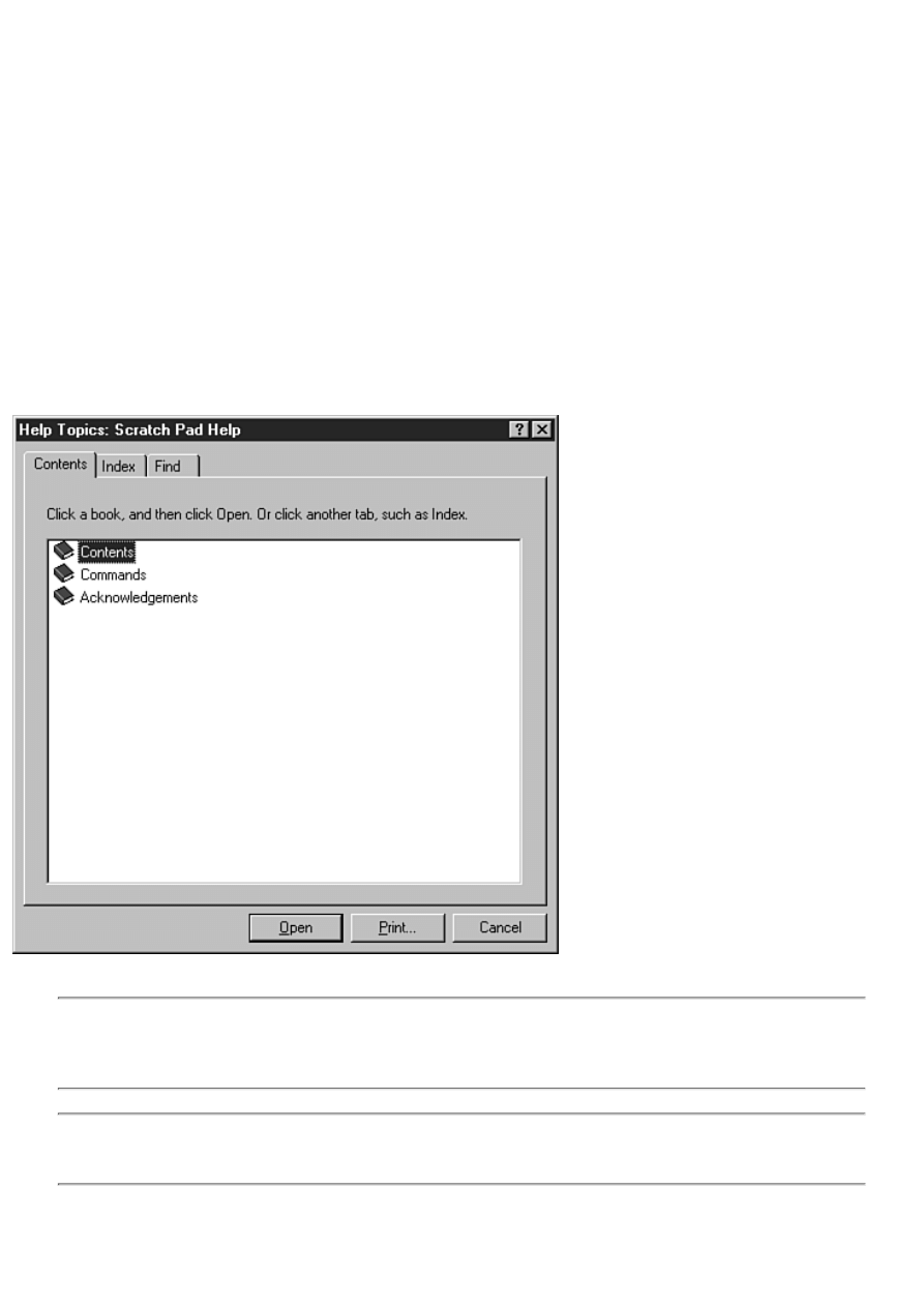
Adding Menu Support for the Help File
In addition to F1 key support, most applications have one or two menu items under the Help menu (where else?) that can be
used to start WinHelp. There will usually be a menu item called Contents. Choosing this item will display the contents page for
the help file. In addition to a Contents menu item, some applications have a Help menu item called Help Topics. Choosing this
menu item displays the index for the help file. (The index is created as part of the help file creation process.)
To implement these and other Help items, you have to do some programming. (It's only one line of code in each case.) VCL
provides a method called HelpCommand that can be used to display WinHelp in one of several modes. If you were to
implement the Help|Contents menu item, the code would look like this:
procedure TForm1.Contents1Click(Sender: TObject);
begin
Application.HelpCommand(HELP_FINDER, 0);
end;
The HelpCommand method calls WinHelp with the specified command. (See the Windows API help under WinHelp for a
complete list of available commands.) In this case, WinHelp is invoked with a command of HELP_FINDER. This command
tells WinHelp to display the contents page, as shown in Figure 14.1. The final parameter of the HelpCommand method is used
to pass additional data to WinHelp. This parameter is not used with the HELP_FINDER command, so it is set to 0.
FIGURE 14.1. The ScratchPad Help Contents
page.
NOTE: In order for WinHelp to show the Contents page, you must have a contents file for your help file. The
contents file has an extension of .cnt and is a text file that describes how the contents page should be displayed.
You can read more about the contents file in the Microsoft Help Workshop help. You can find the Help Workshop
and its help file in the \Delphi 4\Help\Tools directory.
NOTE: A good index for your help file is invaluable. The quality of the help file--and the quality of the help file's
index--are directly proportional to the amount of technical support you will have to provide. Don't overlook this
fact.
Context-Sensitive Help on Demand

Most of the time the two help implementations I just told you about are all you need for your application. At other times,
however, you need to call WinHelp directly and with a specific context ID. For these times, VCL provides the HelpContext
method. This method takes, as its single parameter, the context ID of the page you want to see when WinHelp runs. For
example, let's say you have a help page with a context ID of 99. To run WinHelp and display that specific page, you would do
the following:
Application.HelpContext(99);
By supplying a specific context ID, you can cause WinHelp to display any page of your help file on demand. This is what VCL
does for you when you specify the HelpContext property for a particular component.
Using Help Include Files
Most of the time, setting the HelpContext properties for the forms or components for which you want to implement
context-sensitive help is all you need to do. If, however, you need to call specific help pages in your application, you might
consider defining constants for your help identifiers. Using named constants is much easier than trying to remember an integer
value for a particular help context ID.
In the last section, I talked about using the HelpContext method to call WinHelp with a particular context ID. I used the
example of a help context ID of 99. Rather than using the numerical value of the context identifier, you can use a constant like
this:
Application.HelpContext(IDH_FILEOPEN);
Obviously, the string is easier to remember than its integer value equivalent. The context-sensitive help symbols can be kept in
a separate include file that is added to your application where needed (using the {$I} compiler directive). Listing 14.1 shows a
typical include file containing context-sensitive help identifiers.
LISTING 14.1. HELP.INC.
const
IDH_FILENEW = 1;
IDH_FILEOPEN = 2;
IDH_FILESAVE = 3;
IDH_FILESAVEAS = 4;
IDH_FILEPRINT = 5;
IDH_FILEPRINTSETUP = 6;
IDH_FILEEXIT = 7;
IDH_EDITUNDO = 8;
IDH_EDITCOPY = 9;
IDH_EDITCUT = 10;
IDH_EDITPASTE = 11;
IDH_EDITSELECTALL = 12;
IDH_EDITWORDWRAP = 13;
IDH_HELPABOUT = 14;
Somewhere in your source file you can add a line that includes the help file header:
{$I HELP.INC}
Now you can use the name of the context ID rather than the actual integer value.
How the help include file is created depends on the tools you are using to write your help files. Most help-authoring software
includes an option to generate an include file of some kind that contains the named constants. The specific implementation
depends on whether the help file is being written by you or by a coworker and what help-authoring software you are using. If
you are not using help-authoring software, you can simply type the symbols in.
Putting It to Work
It's time to put your newly acquired knowledge into practice. In this section, you add context-sensitive help to the ScratchPad
program. (You knew we'd come back to old ScratchPad, didn't you?)
The book's code contains a simple help file for the ScratchPad program. Copy the help file, Scratch.hlp, to your working
directory so that Delphi can find it when you build the ScratchPad application.
Context-sensitive help should take about 10 minutes to implement. Here you go:
1. Load the ScratchPad project. Go to the Application page of the Project Options dialog box and type Scratch.hlp in the
Help File field. Click OK to close the dialog box. (Be sure you have moved the Scratch.hlp file into the project's
directory.)
2. Display the ScratchPad main form in the Form Designer. Double-click the MainMenu icon to invoke the Menu
Designer.
3. In the Menu Designer, select the File|New menu item. Locate the HelpContext property in the Object Inspector and
change its value to 1.
4. Repeat with the remaining menu items. Use the values from Listing 14.1 to set the HelpContext properties of each
menu item.
5. Choose Help|Contents. Set its Enabled property to True. Close the Menu Designer.
6. In the Form Designer, choose Help|Contents from the ScratchPad main menu. The Code Editor displays the
HelpContentsClick function. Type this line at the cursor:
Application.HelpCommand(HELP_FINDER, 0);
7. Change the HelpContext property of the main form to 1000 (the context ID of the contents page).
Run the program and experiment with it. If you press F1 when the cursor is in the memo window, the Contents page of the
help file will be displayed. If you highlight a menu item and press F1, help for that menu item is displayed. Also check out the
Contents item on the main menu to see whether it works as expected.
TIP: If you compile and run the ScratchPad program for Day 14 that comes with the book's code, you will see
that it has a feature not discussed here. The program has a Help Mode that can be used to get help on a specific
speedbar button or menu item. To start the Help Mode, press the Help button on the speedbar. The cursor changes
to the help cursor. Now select any menu item or speedbar button. The help topic for the item selected is displayed.
The Help Mode turns off automatically after you choose an item. Browse the source code to see how the Help
Mode is implemented. This feature also makes use of special message handling as discussed later in the chapter.
Context-sensitive help is no longer a luxury. Whether your users are members of the general public or your coworkers, they are
still your users. They demand certain features and context-sensitive help is one of them. As easy as context-sensitive help is to
implement in a Delphi application, there is no reason for it to be missing from your applications.
Checking Errors with Exception Handling
Even in the most well-designed program, events that are beyond the control of the programmer can go wrong. Users make
mistakes. For example, a user might input a bad value into a data field or open a file of the wrong type for your application.
Whatever the scenario, you should be prepared to handle these types of errors wherever and whenever possible. You can't
anticipate your users' every move, but you can anticipate some of the more common blunders and handle them gracefully.
Exception handling is essentially a sophisticated form of error checking. Although any program can implement and use them,
exceptions are of primary benefit to users of components and other Object Pascal classes. For example, if you are using a
component and something nasty happens within the component, you need to know about it. A well-written component will
raise an exception when something goes wrong. You can catch that exception and handle it however you want--maybe by
terminating the program or by allowing your user to correct the problem and try again.
You might not write a lot of exception handling into your day-to-day code. Your primary use of exceptions will be in handling
exceptions that VCL raises when things go wrong within a component. If you write components, you will almost certainly use
exception handling more frequently.
NOTE: The use of exceptions in your programs should be reserved for extreme error conditions. You should raise
an exception when the error condition is serious enough to make continued use of the program difficult. Most
runtime errors can be handled with parameter checking, validation of user input, and other more traditional
error-checking techniques.
A full discussion of exception handling could easily take an entire chapter, so I limit this discussion to how you can handle
exceptions raised by VCL components.

Exception-Handling Keywords: try, except, finally, and raise
Exception-handling syntax is not terribly complicated. The four exception-handling keywords are try, except, finally, and raise.
The try, except, and finally keywords are used when handling exceptions, and the raise keyword is used to initiate an
exception. Let's look at these in more detail.
try with except
try
TryStatements
except
on TypeToCatch do begin
ExceptStatements
end;
end;
The try keyword marks the beginning of the try block. The statements in TryStatements are executed. If any exceptions are
raised during the execution of TryStatements, ExceptStatements are executed. If no exception is raised, ExceptStatements are
ignored and program execution proceeds to the statement following the end statement. TypeToCatch is of the VCL exception
handling classes. If the optional TypeToCatch is not specified, all exceptions are caught regardless of the type of exception
raised.
try with finally
try
TryStatements
finally
FinallyStatements
end;
The try keyword marks the beginning of the try block. The statements in TryStatements are executed. FinallyStatements will
always be executed regardless of whether an exception occurs in TryStatements.
Before I attempt to explain the try and except keywords, let's look at a simple example. Listing 14.2 contains the File|Open
event handler from the Picture Viewer program you created on Day 4, "The Delphi IDE Explored." The event handler has been
modified to use exception handling. If you recall, this code attempts to load a picture file (.bmp, .wmf, or .ico). If the file
chosen by the user is not a picture file, VCL raises an exception. If that happens, you need to catch the exception and display a
message box telling the user that the file is not a picture file.
LISTING 14.2. AN EXCEPTION-HANDLING EXAMPLE.
01: procedure TMainForm.Open1Click(Sender: TObject);
02: var
03: Child : TChild;
04: begin
05: if OpenPictureDialog.Execute then begin
06: Child := TChild.Create(Self);
07: with Child.Image.Picture do begin
08: try
09: LoadFromFile(OpenPictureDialog.FileName);
10: Child.ClientWidth := Width;
11: Child.ClientHeight := Height;
12: except
13: Child.Close;
14: Application.MessageBox(
15: `This file is not a Windows image file.',
16: `Picture Viewer Error', MB_ICONHAND or MB_OK);
17: Exit;
18: end;
19: end;
20: Child.Caption :=
21: ExtractFileName(OpenPictureDialog.FileName);

22: Child.Show;
23: end;
24: end;
In this code, you see a try block (line 8) and an except block (line 12). The try block is used to define the code for which an
exception might be raised. The try statement tells the compiler, "Try this and see if it works." If the code works, the except
block is ignored and program execution continues. If any of the statements inside the try block raise an exception, the code
within the except block is executed. The except block must immediately follow the try block.
It is important to realize that as soon as an exception is raised, program execution jumps immediately to the except block. In
this example, the call to LoadFromFile on line 9 could raise an exception. If an exception is raised, program execution jumps
to the first statement following the except keyword. In that case, lines 10 and 11 will never be executed.
Raising Exceptions
As you can see, the except statement catches an exception that was raised somewhere in the program. Most of the time, this
means an exception was raised in VCL somewhere (or in a third-party component library if you have other component libraries
installed). An exception is raised by using the raise keyword. The code that raises the exception does so for a particular class.
For example, a typical raise statement might look
like this:
if BadParameter then
raise EInvalidArgument.Create(`A bad parameter was passed');
The raise statement raises an instance of an exception-handling class, EInvalidArgument in this case. When you write your
own code, you can raise exceptions of the exception classes created by VCL or you can create your own exception classes.
Let's say you have an error code 111 for a particular type of error and that you have an exception class named EMyException.
In that case, you can write the raise statement like this:
raise EMyException.Create(`Error 111');
The compiler makes a copy of the object being raised and passes it on to the except statement immediately following the try
block (I'll get back to that in a moment).
More on except
As I said, for starters your involvement with exceptions will likely be in catching VCL exceptions. If something goes wrong in
a VCL component, VCL is going to raise an exception. If you do not handle the exception, VCL will handle it in the default
manner. Usually this means that a message box will be displayed that describes the error that occurred. By catching these
exceptions in your code, you can decide how they should be handled rather than accepting the default behavior.
Take a look at Listing 14.2 again. Starting at line 12, you see this code:
except
Child.Close;
Application.MessageBox(
`This file is not a Windows image file.',
`Picture Viewer Error', MB_ICONHAND or MB_OK);
Exit;
end;
The except keyword tells the compiler that you want to catch all exceptions of any type. Because no case statement follows the
except statement, the code in the except block will be executed regardless of the type of exception raised. This is convenient if
you don't know what type of exception a particular piece of code will raise or if you want to catch any and all exceptions
regardless of the type. In the real world, though, you will probably need to be more specific in what exceptions you catch.
Let's go back to Listing 14.2 again. The code on line 9 might raise an exception if the file the user is trying to open is not a
graphics file. If that happens, VCL will raise an EInvalidGraphic exception. You can catch that type of exception only and let
all others be handled in the default manner. The code looks like this:
except
on EInvalidGraphic do begin
Child.Close;
Application.MessageBox(
`This file is not a Windows image file.',
`Picture Viewer Error', MB_ICONHAND or MB_OK);
Exit;

end;
end;
Notice that this code is catching an EInvalidGraphic exception only. This is the preferred method of catching exceptions. Now
any exceptions of this type will be caught by the except block and all other exception types will be handled in the default
manner.
It is important to understand that when you catch an exception, code execution continues after executing the except block. One
of the advantages to catching exceptions is that you can recover from the exception and continue program execution. Notice
the Exit statement in the preceding code snippet. In this case, you don't want to continue code execution following the
exception, so you exit the procedure after handling the exception.
NOTE: VCL will handle many types of exceptions automatically, but it cannot account for every possibility. An
exception that is not handled is called an unhandled exception. If an unhandled exception occurs, Windows
generates an error message and your application is terminated. Try to anticipate what exceptions might occur in
your application and do your best to handle them.
Multiple Exception Types
You can catch multiple exception types in your except block. For example, say you have written code that calls some VCL
methods and also calls some functions in your program that might raise an exception. If a VCL EInvalidGraphic exception
occurs, you want to handle it. In addition, your own code might raise an exception of type EMyOwnException (a class you
have written for handling exceptions). You want to handle that exception in a different manner. Given that scenario, you write
the code like this:
try
OneOfMyFunctions;
Image.Picture.LoadFromFile(`test.bmp');
AnotherOfMyFunctions;
except
on EInvalidGraphic do begin
{ do some stuff }
end;
on EMyOwnException do begin
{ do some stuff }
end;
end;
In this case you are preparing to catch either a VCL EInvalidGraphic exception or
your EMyOwnException. You want to handle each type of exception in a specific manner,
so you catch each type of exception independently.
NOTE: Creating your own exception handling class can be as simple as one line of code:
type
EMyOwnException = class(Exception);
Often you create you own exception classes simply to distinguish the type of exception. No additional code is
required.
Note that in the preceding examples you are catching a VCL exception class, but you aren't actually doing anything with the
class instance passed to the except block. In this case you don't really care what information the EInvalidGraphic class contains
because it is enough to simply know that the exception occurred.
To use the specific instance of the exception class passed to the except block, declare a variable for the exception class in the
do statement--for example,
try
Image.Picture.LoadFromFile(`test.bmp');
except
on E : EInvalidGraphic do begin
{ do something with E }
end;
end;
Here the variable E is declared as a pointer to the EInvalidGraphic class passed to the except block. You can then use E to
access properties or methods of the EInvalidGraphic class. Note that the variable E is valid only within the block where it is
declared. You should check the online help for the specific type of VCL exception-
handling class you are interested in for more information about what properties and methods are available for that class.
TIP: The VCL exception classes all have a Message property that contains a textual description of the exception
that occurred. You can use this property to display a message to the user:
except
on E : EInvalidGraphic do begin
{ do some stuff }
MessageDlg(E.Message, mtError, [mbOk], 0);
end;
end;
Sometimes the VCL messages might not be descriptive enough for your liking. In those cases you can create your
own error message, but often the Message property is sufficient.
Using finally
The finally keyword defines a section of code that is called regardless of whether an exception occurs. In other words, the code
in the finally section will be called if an exception is raised and will be called if no exception is raised. If you use a finally
block, you cannot use except.
The primary reason to use finally is to ensure that all dynamically allocated memory is properly disposed of in the event an
exception is raised--for example,
procedure TForm1.FormCreate(Sender: TObject);
var
Buffer : Pointer;
begin
Buffer := AllocMem(1024);
try
{ Code here that might raise an exception. }
finally
FreeMem(Buffer);
end;
end;
Here, the memory allocated for Buffer will always be freed properly regardless of whether an exception is raised in the try
block.
Catching Unhandled Exceptions at the
Application Level
Your application can also handle exceptions at the application level. TApplication has an event called OnException that will
occur any time an unhandled exception is raised in your application. By responding to this event, you can catch any exceptions
raised by your applications.
NOTE: This event occurs when an unhandled exception is raised. Any exceptions you catch with try and except
are handled; therefore, the OnException event will not occur for those exceptions.
You hook the OnException event just like you do when hooking the OnHint event like you did earlier:
1. Add a method declaration to the main form's class declaration:
procedure MyOnException(Sender : TObject; E : Exception);
2. Add the method body to the main form's implementation section:
procedure TForm1.MyOnException(Sender : TObject; E : Exception);
begin
{ Do whatever necessary to handle the exception here. }
end;

3. Assign your MyOnException method to the OnException event of the Application object:
Application.OnException := MyOnException;
Now your MyOnException method will be called when an unhandled exception occurs.
CAUTION: If you do not handle an exception properly, you can lock up your program and possibly even crash
Windows. It is usually best to let VCL and Windows handle exceptions unless you know exactly how to handle
them.
The ShowException function can be used to display a message box that describes the error that occurred. This function is
usually called by the default OnException handler, but you can use it in your applications as well. One of the parameters of the
OnException event handler is a pointer to an Exception object (Exception is VCL's base exception-handling class). To display
the error message box, pass the Exception object to the ShowException function:
procedure TForm1.MyOnException(Sender : TObject; E : Exception);
begin
{ Do whatever necessary to handle the exception here
{ then display the error message. }
Application.ShowException(E);
end;
Now the error message box is displayed just as it would be if VCL were dealing with the unhandled exception.
As you can see, handling exceptions at the application level is an advanced exception-handling technique and is not something
you should attempt unless you know exactly what you're doing.
Debugging and Exception Handling
Simply put, debugging when using exception handling can be a bit of a pain. Each time an exception is raised, the debugger
pauses program execution at the except block just as if a breakpoint were set on that line. If the except block is in your code,
the execution point is displayed as it would be if you had stopped at a breakpoint. You can restart the program again by
clicking the Run button, or you can step through your code.
NOTE: You might not be able to continue execution of your program after an exception is raised. Whether you
can continue debugging depends on what went wrong in your program.
Sometimes the except block is in the VCL code. This will be the case for VCL exceptions that you don't handle in your code.
In this circumstance, the CPU view will show the execution point.
Another aspect of debugging with exceptions is that the VCL exception message box is displayed even when you are handling
the exception yourself. This can be confusing and somewhat annoying if you haven't encountered it before. To prevent the
VCL message box from being displayed and the debugger from breaking on exceptions, go to the Language Exceptions page
of the Debugger Options dialog box and uncheck the Stop on Delphi Exceptions check box at the top of the page. When Stop
on Delphi Exceptions is off, the debugger will not pause program execution when a VCL exception is raised.
As with many other aspects of Delphi and VCL, learning exception handling takes
some time. Remember to use exception handling where necessary, but use traditional error-handling techniques for the minor
errors.
The book's code contains a program called EHTest. This program demonstrates raising and catching several kinds of
exceptions. For this program to function properly, be sure that the Stop on Delphi Exceptions option is off as described earlier.
You can download the book's code at
FIGURE 14.2. The EHTest program running.
Using the Registry
Once upon a time, Windows programs used configuration files (.ini files) to store application-specific information. The master
configuration file is, as you probably know, called WIN.INI. Applications could store system-wide information in WIN.INI or
application-specific configuration data in a private .ini file. This approach has several advantages, but also some disadvantages.
Somewhere along the line someone smarter (presumably) than I decided that the new way to do things would be to use the
Registry to store application-specific configuration information. Throughout the land, knaves everywhere bowed to the king
and said, "The Registry is good." Whether good or bad, conventional wisdom has it that the use of .ini files is out and the use
of the Registry is in.
The term Registry is short for the Windows Registration Database. The Registry contains a wide variety of information about
your Windows configuration. Just about every option and every setting in your Windows setup is stored in the Registry. In
addition to the system information stored in the Registry, you will find data specific to installed applications. The type of
information stored for each application depends entirely on the application but can include information such as the last size and
position of the window, a list of most recently used documents for the application, the last directory used when opening a file,
and on and on. The possibilities are endless.
Windows 95 and NT come with a program called the Registry Editor (REGEDIT.EXE) that can be used to browse the Registry
and to make changes to the entries in it.
CAUTION: Be very careful about making changes to the Registry! Registry changes can affect how individual
programs operate and even how Windows itself operates.
Figure 14.3 shows the Registry Editor as it displays the Delphi Code Insight options.
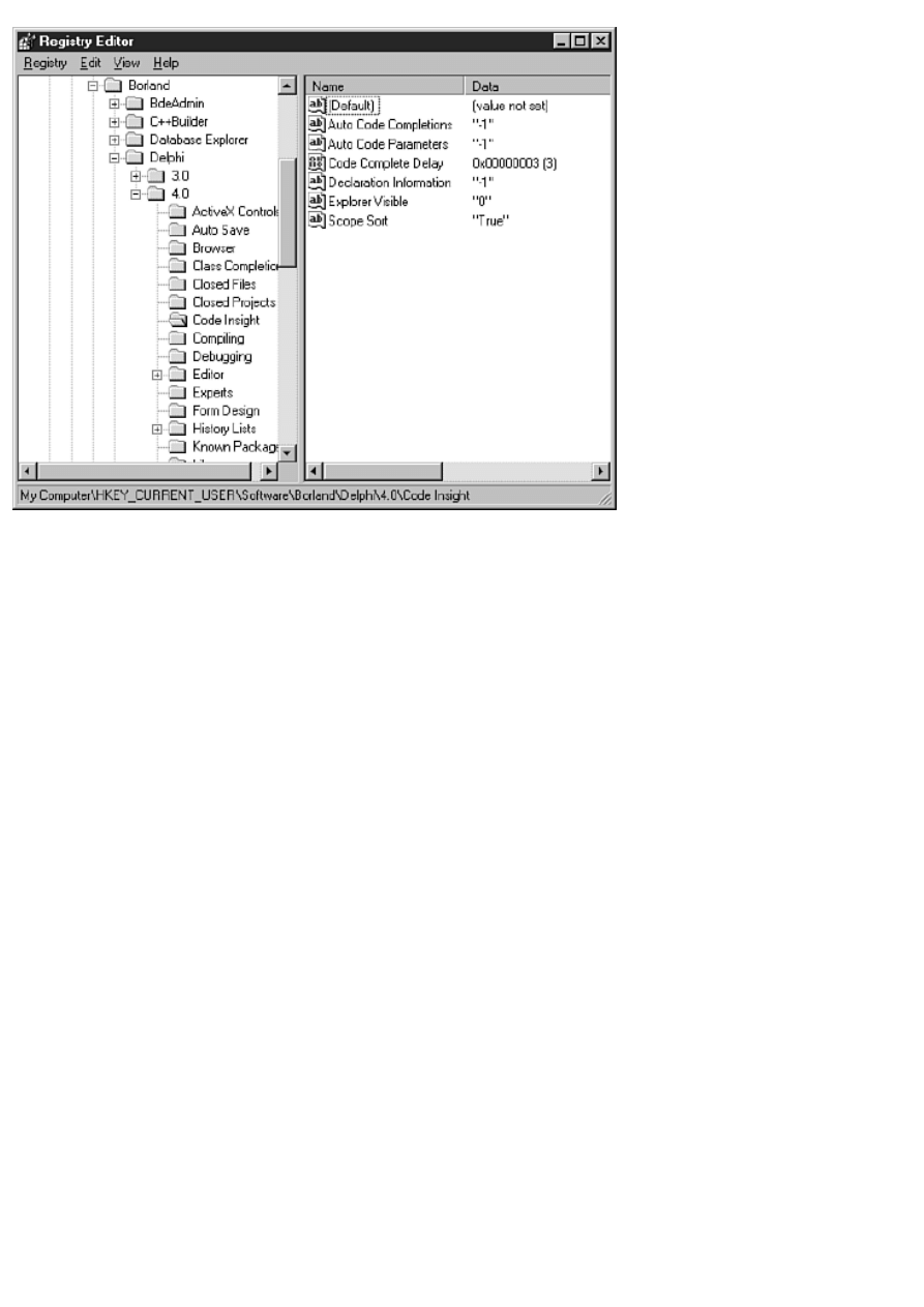
FIGURE 14.3. The Windows Registry
Editor.
As you can see from Figure 14.3, the Registry is hierarchical. You can approach the Registry exactly as you approach files and
directories on a hard drive.
Registry Keys
Each item in the Registry is called a key. A key can be likened to a directory on your hard drive. To access a particular key,
you first have to open the key. After the key is open, you can write to or read from it. Take a look at Figure 14.3. The key that
is being displayed is
MY COMPUTER\HKEY_CURRENT_USER\SOFTWARE\BORLAND\DELPHI\4.0\CODE INSIGHT
You can't see every branch of the Registry tree, but if you look at the status bar of the Registry Editor you can see the current
key displayed. Also notice that the Delphi\4.0 key has several subkeys. You can create as many keys and subkeys as you want
for your application.
An individual key can store data in its data items. Every key has a data item called (Default). The default value is not normally
used because you will almost always create your own data items for a particular key. By looking at Figure 14.3, you can see
that the Code Insight key has the following data items:
Auto Code Completions
Auto Code Parameters
Code Complete Delay
Declaration Information
Explorer Visible
Scope Sort
If you've been paying attention, you will recognize that these data items correspond to the Code Insight options on the Code
Insight page of the Environment Options dialog box. Each data item has an associated value. You can write to the Registry to
change the data item or you can read the data item.
Registry Data Types
The Registry has the capability to store several different types of data in the data items. The primary types of data are the
binary data, string, and integer data types. The binary data type can be used to store any kind of binary data. You can, for
example, store an array of integers in a binary data item. You probably won't directly use the binary data type very often, if
ever.
For most of your purposes, you will probably be concerned only with reading and writing strings or integer values. As you can
see in Figure 14.3, even numerical data can be stored as strings. It's really up to you to decide how to store data in the Registry.
Up to this point, I have discussed what you can do with the Registry but not how you do it. Let's look at that next.
The TRegistry Class
The Windows API provides several functions for Registry manipulation. These functions include RegCreateKey,
RegOpenKey, RegQueryValue, RegSetValue, RegDeleteKey, and many more. Dealing with the Registry at the API level is a
bit tedious. I am thankful (and you should be, too) that the folks at Borland thought to provide a VCL class called TRegistry
that encapsulates Registry operations. This class provides everything you need to write to and read from the Registry. Before I
get into how to use the TRegistry class, let's go over the properties and methods of this class.
TRegistry Properties
TRegistry has just four properties. The CurrentKey property contains the value of the current key, which is an integer value
that identifies the key. When you call a TRegistry method, that method acts on the current key. The CurrentKey property is set
for you when you open a key. This property can be read, but reading it is of dubious value.
The RootKey and CurrentPath properties work together to build a text string to the current key. The CurrentPath property
contains a text description of the current key's path excluding the RootKey value. Take this key, for example:
\HKEY_CURRENT_USER\Software\Borland\Delphi\4.0\Code Insight
In this case the root key, \HKEY_CURRENT_USER, comes from the RootKey property, and the value,
Software\Borland\Delphi\4.0\Code Insight, comes from the CurrentPath property.
NOTE: By default, the RootKey has a value of \HKEY_CURRENT_USER. This is where you should store
application-specific data, so it is not normally necessary to change the root key. If you need to change the root
key, you can assign a new value to the RootKey property. Note that the root key types are not string values, but
are special Windows-defined values. Other root key
values include HKEY_CLASSES_ROOT, HKEY_LOCAL_MACHINE, HKEY_USERS,
HKEY_CURRENT_CONFIG, and HKEY_DYN_DATA.
The LazyWrite property determines how the application writes the data to the specific key. If LazyWrite is True, control is
immediately returned to the application when you close the key. In other words, the writing of the key begins and then your
application goes on its way. If LazyWrite is False, control will not return to the application until the writing of the key is
completed. By default, LazyWrite is True, and you should leave it set to True unless you have some critical data that needs to
be written before your application resumes operation.
TRegistry Methods
The TRegistry class has several methods that you use to read from and write to the Registry. Table 14.1 lists the primary
methods and their descriptions.
TABLE 14.1. PRIMARY METHODS OF TRegistry.
Method
Description
CloseKey
Closes the key and writes the data to the key. You should close a key as soon as you are done with it, but
you don't have to specifically call CloseKey because the TRegistry destructor will close the key for you.
CreateKey
Creates a key but does not open it for use. Use the OpenKey method rather than CreateKey if you are going
to create the key and begin writing data to it.
DeleteKey
Deletes the specified key. You can specify any key to delete. To delete the current key, pass an empty
string to DeleteKey.
GetKeyNames
Returns all of the subkeys for the current key in a TStrings object. You can use this method if you need to
iterate all the subkeys for a given key.
GetValueNames Returns the names of all of the data items for the current key. Use this method if you need to iterate the
data items of a given key.
KeyExists
Returns True if the key exists or False if it does not exist. You can use this method to check for the
existence of a key before attempting to read the key.
LoadKey
Loads a key previously stored on disk. See the Delphi online help for specific details.
OpenKey
Opens the specified key. If the key does not exist, the value of the CanCreate parameter determines whether
the key will be automatically created. Use this method rather than CreateKey if you are going to create the
key and begin writing data to it because OpenKey creates the key and then opens it, whereas CreateKey
just creates the key but does not open it.
ReadBinaryData Reads binary data from the specified data item.
ReadBool
Reads a Boolean value from the specified data item.
ReadDateTime
Reads a date and time value from the specified data item. The returned value is an instance of the
TDateTime class. To retrieve just a date value, use ReadDate; to retrieve just a time value, use ReadTime.
ReadFloat
Reads a floating-point value from the specified data item.
ReadInteger
Reads an integer value from the specified data item.
ReadString
Reads a string value from the specified data item.
SaveKey
Saves a key to disk so that it can be loaded later with LoadKey. Generally speaking, you shouldn't store
more than 2KB (2048 bytes) of data by using this method.
ValueExists
Returns True if the specified data item exists.
WriteBinaryData Writes a binary data item to the specified key. Use this item to store arrays or other types of binary data.
WriteBool
Writes a Boolean value to the specified data item. The value is converted to an integer and then stored in
the data item.
WriteDateTime
Writes a TDateTime object to the specified data item. To store just a date object, use WriteDate. To store
just a time object, use WriteTime. The TDateTime object is converted to a binary data type before being
stored.
WriteFloat
Writes a floating-point value to the specified data item after converting it to binary data.
WriteInteger
Writes an integer value to the specified data item.
WriteString
Writes a string to the specified data item.
Although there are a lot of methods listed in Table 14.1, many of them perform the same operations--they just use different
data types. When you know how to use one of these methods, you pretty much know how to use them all. Notice that several
of these methods convert the value passed to binary data and then store it in the Registry.
Using TRegistry
Using TRegistry is fairly easy. Most of your interaction with the Registry will require just these four steps:
1. Create an instance of the TRegistry class.
2. Create, if necessary, and open a key by using the OpenKey method.
3. Read or write data using one or more of the Read or Write functions.
4. Free the instance of the TRegistry class.
NOTE: Before you can use TRegistry, you must add the Registry unit to your form's uses list.
The following code illustrates these steps:
procedure TForm1.FormCreate(Sender: TObject);
var
Reg : TRegistry;
KeyGood : Boolean;
Top : Integer;
Left : Integer;
Width : Integer;
Height : Integer;
begin
Reg := TRegistry.Create;
try
KeyGood := Reg.OpenKey(
`Software\SAMS\Delphi 4 in 21 Days', False);
if not KeyGood then begin
Top := Reg.ReadInteger(`Top');
Left := Reg.ReadInteger(`Left');

Width := Reg.ReadInteger(`Width');
Height := Reg.ReadInteger(`Height');
SetBounds(Left, Top, Width, Height);
end;
finally
Reg.Free;
end;
end;
This code opens a key and reads values for the top and left coordinates and the width and height of a form. It then calls the
SetBounds function to move or size the window. Notice that the result of the OpenKey method is assigned to a Boolean
variable. OpenKey returns True if the key was successfully opened and False if it was not. If the key was successfully opened,
the individual data items are read. You should always check the return value of OpenKey if there is any doubt that opening the
key might fail. Notice also that this code uses a try. . . finally block to ensure that the Reg variable is properly freed before the
function returns.
NOTE: VCL will raise exceptions if reading data from or writing data to a key fails. If you attempt to read data
from an unopened key, you will get an exception. Either be prepared to handle the exception or be sure to check
the return value from OpenKey before reading or writing data items.
Finally, notice that the key is not specifically closed in the preceding code. If you neglect to close the key, the TRegistry
destructor will close the key for you. In that case, the destructor will be called (and the key closed) as soon as the Reg object is
deleted, so an explicit call to CloseKey is not necessary.
NOTE: The OpenKey function automatically prepends the value of the RootKey property
(HKEY_CURRENT_USER by default) to the front of the string passed to OpenKey, so you don't have to include
the root when opening a key.
Writing to the Registry
I have the cart just slightly before the horse here because I am talking about reading from the Registry when you haven't yet
written to it. No matter--writing to the Registry is just as simple:
procedure TForm1.FormDestroy(Sender: TObject);
var
Reg : TRegistry;
begin
Reg := TRegistry.Create;
try
Reg.OpenKey(
`Software\SAMS\Delphi 4 in 21 Days', True);
Reg.WriteInteger(`Top', Top);
Reg.WriteInteger(`Left', Left);
Reg.WriteInteger(`Width', Width);
Reg.WriteInteger(`Height', Height);
finally
Reg.Free;
end;
end;
This code simply opens a key and writes the form's Top, Left, Width, and Height properties to the key using the WriteInteger
method. Notice that the last parameter of the OpenKey method is True. This specifies that the key should be created if it does
not yet exist. If you use this construct, you should never need to call the CreateKey method at all.
That's basically all there is to reading values from and writing values to the Registry. The other data reading and writing
methods are just variations on the previous code snippet.
Using the Registry to Store Data
Listing 14.3 shows the main unit of a program called RegTest that uses the Registry to store application-specific data. This
program stores several items in the Registry: the last size and position of the window; the window state (normal, minimized, or
maximized); the last directory, last file, and last filter index used when opening a file with the File Open dialog box; and the

date and time the program was last run. To clear out the Registry key created by the RegTest program, you can click the Delete
Key button on the main form (see Figure 14.4, later in the chapter). This program is also included with the book's code.
LISTING 14.3. RegTestU.pas.
unit RegTestU;
interface
uses
Windows, Messages, SysUtils, Classes, Graphics, Controls,
Forms, Dialogs, Menus, StdCtrls, ExtCtrls, Registry;
type
TForm1 = class(TForm)
Panel1: TPanel;
Label1: TLabel;
DeleteKey: TButton;
Panel2: TPanel;
Label2: TLabel;
Label3: TLabel;
TimeLabel: TLabel;
DateLabel: TLabel;
MainMenu: TMainMenu;
File1: TMenuItem;
FileOpen: TMenuItem;
FileExit: TMenuItem;
OpenDialog: TopenDialog;
procedure FormCreate(Sender: TObject);
procedure FileOpenClick(Sender: TObject);
procedure FormDestroy(Sender: TObject);
procedure FileExitClick(Sender: TObject);
procedure DeleteKeyClick(Sender: TObject);
private
{ Private declarations }
KeyDeleted : Boolean;
public
{ Public declarations }
end;
var
Form1: TForm1;
implementation
{$R *.DFM}
procedure TForm1.FormCreate(Sender: TObject);
var
Reg : TRegistry;
KeyGood : Boolean;
DT : TDateTime;
Top : Integer;
Left : Integer;
Width : Integer;
Height : Integer;
begin
{ Initialize the KeyDeleted variable to False. This
{ variable is used if the user deletes the key from
{ the program. See the MainFormClose function. }
KeyDeleted := False;
{ Create a TRegistry object to access the registry. }
Reg := TRegistry.Create;
try
{ Open the key. }
KeyGood := Reg.OpenKey(
`Software\SAMS\Delphi 4 in 21 Days', False);
{ See if the key is open. If not, then this is the first

{ time the program has been run so there's nothing to do. }
{ If the key is good then read all of the data items
{ pertinent to application startup. }
if KeyGood then begin
Top := Reg.ReadInteger(`Top');
Left := Reg.ReadInteger(`Left');
Width := Reg.ReadInteger(`Width');
Height := Reg.ReadInteger(`Height');
SetBounds(Left, Top, Width, Height);
WindowState :=
TWindowState(Reg.ReadInteger(`WindowState'));
{ The TDateTime class is a handy item to have around
{ if you are doing date and time operations. }
DT := Reg.ReadDate(`Date and Time');
DateLabel.Caption := DateToStr(DT);
TimeLabel.Caption := TimeToStr(DT);
end;
finally
Reg.Free;
end;
end;
procedure TForm1.FileOpenClick(Sender: TObject);
var
Reg : TRegistry;
begin
{ This function displays the File Open dialog but
{ doesn't actually open a file. The last path, filter,
{ and filename are written to the registry when the
{ user presses OK. }
{ Create a TRegistry object to access the registry. }
Reg := TRegistry.Create;
try
{ Open the key. }
Reg.OpenKey(`Software\SAMS\Delphi 4 in 21 Days', True);
{ Read the values. Check if the value exists first. }
if Reg.ValueExists(`LastDir') then
OpenDialog.InitialDir := Reg.ReadString(`LastDir');
if Reg.ValueExists(`LastFile') then
OpenDialog.FileName := Reg.ReadString(`LastFile');
if Reg.ValueExists(`FilterIndex') then
OpenDialog.FilterIndex := Reg.ReadInteger(`FilterIndex');
{ Display the File Open dialog. If the user presses OK then
{ save the path, filename, and filter to the registry. }
if OpenDialog.Execute then begin
Reg.WriteString(`LastDir',
ExtractFilePath(OpenDialog.FileName));
Reg.WriteString(`LastFile',
ExtractFileName(OpenDialog.FileName));
Reg.WriteInteger
(`FilterIndex', OpenDialog.FilterIndex);
end;
finally
Reg.Free;
end;
end;
procedure TForm1.FormDestroy(Sender: TObject);
var
Reg : TRegistry;
begin
{ If the user pressed the button to the key then

{ we don't want to write out the information. }
if KeyDeleted then
Exit;
{ Create a TRegistry object to access the registry. }
Reg := TRegistry.Create;
try
{ Open the key. }
Reg.OpenKey(
`Software\SAMS\Delphi 4 in 21 Days', True);
{ Write out the values. }
Reg.WriteInteger(`WindowState', Ord(WindowState));
if WindowState <> wsMaximized then begin
Reg.WriteInteger(`Top', Top);
Reg.WriteInteger(`Left', Left);
Reg.WriteInteger(`Width', Width);
Reg.WriteInteger(`Height', Height);
end;
Reg.WriteDate(`Date and Time', Now);
finally
Reg.Free;
end;
end;
procedure TForm1.FileExitClick(Sender: TObject);
begin
Close;
end;
procedure TForm1.DeleteKeyClick(Sender: TObject);
var
Reg : TRegistry;
begin
{ The user pressed the Key button so delete the key. }
{ Set a flag so that we don't re-create the key when
{ the program closes. }
Reg := TRegistry.Create;
try
Reg.DeleteKey(`Software\SAMS');
KeyDeleted := True;
finally
Reg.Free;
end;
end;
end.
By examining this listing and running the RegTest program, you can learn a lot about using the Registry in your applications.
Figure 14.4 shows the RegTest program running; Figure 14.5 shows the Registry key that is created by the program.
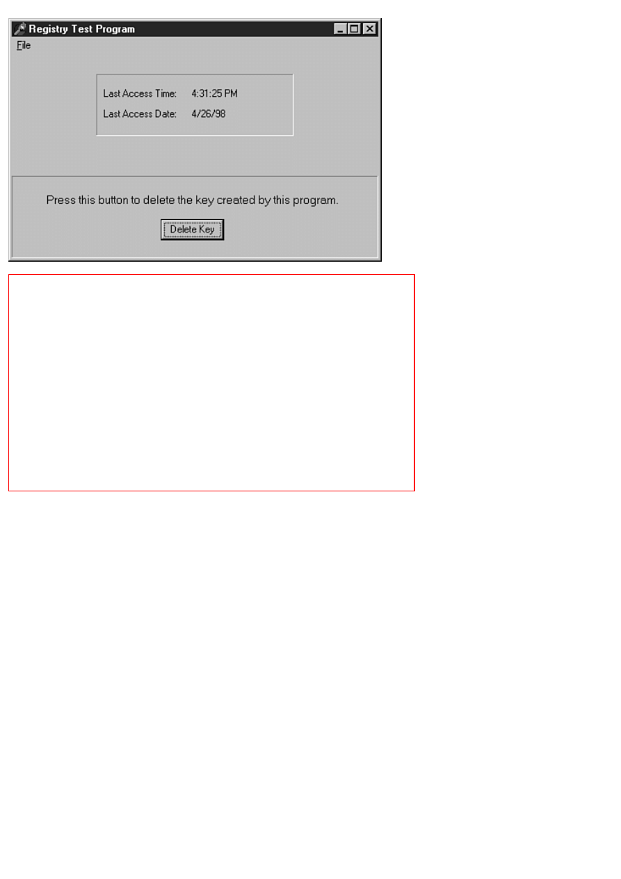
FIGURE 14.4. The RegTest program running.
FIGURE 14.5. The Registry Editor
showing the key created by the RegTest program.
Implementing Specialized Message
Handling
On Day 11, "Delphi Tools and Options," I talked about Windows messages as part of the discussion of the WinSight program.
For the most part, Delphi makes message handling easy through its use of events. As I have said, an event is usually generated
in response to a Windows message being sent to an application. There are times, however, when you might want to handle
messages yourself. There are two primary scenarios that require you to handle messages outside of the normal Delphi
messaging system:
Windows messages that VCL does not handle
●
User-defined messages
●
Handling messages on your own requires a few extra programming techniques; you learn about those techniques in this
section.
More on Windows Messages
How do Windows messages get sent? Some messages are sent by Windows itself to instruct the window to do something or to
notify the window that something has happened. At other times, messages are sent by the programmer or, in the case of VCL,
by the framework the programmer is using. Regardless of who is sending the messages, you can be guaranteed that a lot of
messages are flying around at any given millisecond.
Message Types

Basically, messages fall into two categories:
Command messages--Cause something to occur either in Windows or within a particular control.
●
Notification messages--Sent by Windows to notify you that something has happened.
●
To illustrate the difference between these two types of messages, let's take a look at the standard edit control. The standard
Windows edit control has almost 80 command messages and nearly 20 notification messages. Surprised? It's true, and don't
forget that the edit control is just one control out of dozens of Windows controls.
NOTE: I lied to you back on Day 5, "The Visual Component Model," when I talked about events (well, not
exactly). At that time I said that there are over 200 messages that Windows could send to an application, and that
is essentially true. But when you consider messages specific to controls as well as messages that can be sent to
main windows, the count goes to something like 700 messages. Wow! And that only includes command
messages, not notification messages. You should have a new appreciation for VCL after reading this section.
A programmer writing a Windows program in C has to send a lot of messages to accomplish tasks. For example, to get the
length of the currently selected text in an edit control requires the following code:
int start;
int end;
long result = SendMessage(hWndEdit, EM_GETSEL, 0, 0);
start = LOWORD(result);
end = HIWORD(result);
int length = end - start;
This is how C programmers spend their days. Contrast that with the VCL way of doing things:
Length := Edit.SelLength;
Which do you prefer? Regardless of who is sending the message, command messages are
used heavily both by programmers and by Windows itself.
Notification messages, however, are sent only by Windows itself. Notification messages tell Windows that something has
happened within a control. For example, the EN_CHANGE message is sent when the contents of an edit control have changed.
VCL has an event for the Edit, MaskEdit, and Memo components called OnChange that is triggered in response to the
EN_CHANGE notification message (as well as some others). Programmers using traditional Windows programming tools
have to intercept these messages and deal with them as needed--which brings you to the next subject: message parameters.
WPARAM, LPARAM, and Message Cracking
Every Windows message has two parameters: the WPARAM (short for word parameter) and the LPARAM (short for long
parameter).
NOTE: In 32-bit Windows, WPARAM and LPARAM are both 32-bit values. In 16-bit Windows, the WPARAM
is a 16-bit value (a Word), and the LPARAM is a 32-bit value (a LongInt). That ends your history lesson on the
names WPARAM and LPARAM. And now back to your program. . .
These two parameters could be likened to the parameters sent to a function. When a Windows message is received, the
parameters are examined to obtain information specific to the message being sent. For example, the WM_LBUTTONDOWN
message is a notification message that is sent when the left mouse button is clicked on a window. For a
WM_LBUTTONDOWN message, the WPARAM contains a special code that tells which of the other mouse buttons were
pressed and also what keys on the keyboard were pressed when the event occurred. The LPARAM contains the coordinates of
the mouse cursor when the mouse button was clicked: the X position is contained in the low-order word and the Y position is
contained in the high-order word.
To get at this information, the message must be cracked to reveal what's inside. The code for cracking a
WM_LBUTTONDOWN message can look like this:
procedure MessageCracker(wParam, lParam : Integer);
var
Shift, X, Y : Integer;
begin
Shift := wParam;
X := LOWORD(lParam);
Y := HIWORD(lParam);
{ Code that does something with Shift, X, and Y. }
end;
This is a fairly simple example, but it's indicative of what goes on each time a message is handled in a Windows application.
NOTE: Because the X and Y coordinates in the preceding example are contained in a single value (the lParam
variable), they must be individually extracted. HIWORD and LOWORD are used for that purpose. In the C/C++
programming world, HIWORD and LOWORD are Windows macros. In Object Pascal, LOWORD is simply a
type that is identical to a Word. HIWORD is a function that extracts the left-most 16 bits from a 32-bit variable.
LOWORD, when used as you see in the preceding code snippet, extracts the right-most 16 bits.
You'll be relieved to know that VCL performs message cracking for you for all VCL events. For example, if you set up a
message handler for the OnMouseDown event, Delphi generates a function in your code that looks like this:
procedure TForm1.FormMouseDown(Sender: TObject; Button: TMouseButton;
Shift: TShiftState; X, Y: Integer);
begin
if Button = mbLeft then begin
{ Put your code here. }
end;
end;
As you can see, the event handler generated by Delphi contains all the information you need. VCL will crack the WPARAM
and LPARAM for you and hand them to you in sensible pieces that you can deal with more easily. This same thing happens for
every message for which VCL creates an event.
NOTE: VCL takes messaging and message cracking one step further in the case of the mouse button messages.
Windows actually generates up to three different mouse down messages: one for the left button being pressed, one
for the middle button (if one exists), and yet another when the right button is pressed. VCL handles all of these
messages in a single event. The TMouseButton parameter of the OnMouseDown event tells you which of the
three buttons was pressed.
With that primer on Windows messages under your belt, let's take a brief look at exactly how to send messages.
Sending Versus Posting
The Windows API provides two functions for sending messages: PostMessage and SendMessage. The PostMessage function
posts the message to the Windows message queue and immediately returns. This function simply hands the message to
Windows and goes on its way. PostMessage returns 1 if the function call succeeded or 0 if it did not. (About the only reason
for PostMessage to fail is if the message is sent to an invalid window.)
The SendMessage function, however, sends the message to Windows and waits until the message is carried out before
returning. The return value from SendMessage depends on the message being sent. Sometimes the biggest reason to use
SendMessage over PostMessage is because you need the return value from a particular message.
NOTE: The differences between situations when you use PostMessage versus SendMessage are subtle. For
example, due to timing issues within Windows, there are times when sending a message will fail to have the effect
you expected. In those cases you'll have to use PostMessage. The reverse is also true: Sometimes PostMessage is
wrong for a given set of circumstances and you'll have to use SendMessage. Although this is not something you
really need to be concerned with right now, it is something to file away for future reference.
You can use both PostMessage and SendMessage in your Delphi applications. For example, to post yourself a message you
would do something like this:
PostMessage(Handle, WM_QUIT, 0, 0);
The first parameter of both PostMessage and SendMessage is the window handle of the window to which you want to send the
message. In this case you are sending the message to the main form (assuming this code was written in the main form's source
code unit).
In addition to the Windows API functions, VCL provides a method called Perform that you can use to send messages to any
VCL window. Perform bypasses the Windows messaging system and sends the message directly to the message-handling
mechanism for a given window. The Perform equivalent of the preceding example is as follows:
Perform(WM_QUIT, 0, 0);
You can use any of these three functions to send messages to your application and to other windows within your application.
Handling Events
You've already learned about handling VCL events, but a short review can't hurt. When a particular component receives a
Windows message, it looks up the message and checks to see whether there is an event handler assigned for that particular
message. If an event handler has been assigned for that event, VCL calls the event handler. If no event handler is assigned, the
message is handled in the default manner. You can handle any messages you like and ignore the rest.
What happens in your event handlers depends on a variety of factors: the particular message being handled, what your program
does in response to the message, and whether you are modifying the incoming message or just using the event handler as
notification that the event occurred. As you get further into Windows programming, you will see that there are literally
hundreds of things you might do in response to events.
Most of the time, you will be using the event handler for notification that a particular event occurred. Take the OnMouseDown
event, for example. If you handle the OnMouseDown event, you are simply asking to be notified when the user clicks the
component with the mouse (remember that forms are components, too). You probably are not going to modify the message
parameters in any way; you just want to know that the event occurred. A great number of your event handlers will be used for
notification purposes.
Sometimes, however, you want to change one or more of the message parameters before sending the message on its way. Let's
say, for example, that you want to force the text in a particular edit control to uppercase. (You could set the CharCase property
of the Edit component to ecUpperCase, of course, but let's stick with this example for now.) To change all keystrokes to
uppercase, you could do something like this in your OnKeyPress event handler:
procedure TForm1.Edit1KeyPress(Sender: TObject; var Key: Char);
begin
if Key >= `a' then
Dec(Key, 32);
end;
In this way you are actually modifying some aspect of the message before it gets sent to VCL for processing. The parameters
sent in the event handler are often passed by reference for exactly this reason.
NOTE: Delphi protects you a bit by passing message parameters that you should not change by value rather than
by reference (by var parameter). This is also true of message parameters for which changing the value has no
effect. Take the OnMouseDown event discussed earlier. This event is for notification only. There is no point in
modifying the Button, Shift, X, or Y parameters, so all are passed by value.
Whether you change one or more of the parameters sent depends entirely on the message and what you intend to do with the
message. Over time, you will likely run into situations where modification of a particular message is required to cause
Windows to behave in a particular way. At other times, you will not modify the parameters at all, but will inspect them to
determine what is happening with your application. Because the possibilities are so numerous, I'll have to leave further
exploration of message parameters as an exercise for the reader.
Handling Other Windows Messages
There will undoubtedly be some point when you need to respond to a Windows message for which VCL provides no event.
When that time comes, you are going to want to know how to handle those messages, and that is what this section is about.
VCL provides events for the most commonly used Windows messages. Obviously, with over 700 Windows messages, VCL
does not provide events for them all. The 80/20 theory says, among other things, that 20 percent of the people do 80 percent of
the work. The same is probably true of Windows messages. VCL may only provide events for 20 percent of Windows
messages, but they are the messages you will use 80 percent of the time. Still, there are plenty of Windows messages that VCL
does not provide events for, and you need to know how to handle those messages when the time comes.
You'll be glad to know that you can handle just about any Windows message when you know how. After you have the basics
down, each message is just a variation on the same theme. The mechanism that Delphi uses to handle messages not covered by
VCL events is the message keyword. This keyword is used to associate a certain Windows message with a method in your
code. When your window receives that message, the method is called. Hmmm. . . sounds like events, doesn't it? There are
certainly some similarities.

Implementing Message Handling
Implementing message handling at this level is as easy as the following:
1. Add the method declaration for the message handler to the class declaration.
2. Add the definition of the message handler to your form's implementation section.
Here's an example of a method declaration for a method that handles the WM_ERASEBKGND message:
procedure WmEraseBkgnd(var Msg : TWMEraseBkgnd); message WM_ERASEBKGND;
Notice the message keyword at the end of the method declaration. The message keyword is followed by the Windows message
that this method is designed to handle. Notice also that the method's parameter is a var TWMEraseBknd record. VCL has a
message-cracking record for most Windows messages. The record name is the Windows message name preceded by T and
minus the underscore.
As you can see, the Windows message WM_ERASEBKGND gets translated into the record named TWMEraseBkgnd. You
sort of have to guess at the capitalization, but for the most part it makes perfect sense. This record gets passed along to the
message handler (more on that in the next section). The method itself can be named anything you like, but the form you see
here is traditional.
NOTE: The message-cracking records are defined in the VCL unit called Messages.pas. Browse the Messages
unit if you need information on a particular message-cracking record.
To put this in perspective, you need to see the entire class declaration for a class that implements custom message handling.
Listing 14.4 shows a typical main form class declaration for a class that uses custom message handling.
LISTING 14.4. Message.h.
TMainForm = class(TForm)
ShowTBoix: TButton;
GroupBox1: TGroupBox;
Hatched: TCheckBox;
LetVCLHandle: TCheckBox;
Instructions: TButton;
procedure InstructionsClick(Sender: TObject);
procedure ShowTBoixClick(Sender: TObject);
procedure HatchedClick(Sender: TObject);
private
{ Private declarations }
procedure WmNCHitTest(var Msg : TWMNCHitTest);
message WM_NCHITTEST;
procedure WmEraseBkgnd(var Msg : TWMEraseBkgnd);
message WM_ERASEBKGND;
procedure WmGetMinMaxInfo(var Msg : TWMGetMinMaxInfo);
message WM_GETMINMAXINFO;
procedure MyMessage(var Msg : TMessage);
message My_Message;
public
{ Public declarations }
end;
Notice in particular the method declarations in the private section. I put the message keyword on the line following the method
declaration in order to keep the line length down. Normally you would put the message keyword immediately following the
method declaration. In the end, it doesn't matter to the compiler how you write the declarations, so suit yourself. Don't let the
declaration for the WmMyMessage method throw you. This is the message handler for a user-defined message. I'll talk about
user-defined messages a little later.
The Message-Handling Method
The message-handling method (or just message handler) is the method that is called whenever the message you are responding
to is received by your application. The message handler has a single parameter: the message-cracker record I discussed earlier.
The message handler for the WM_ERASEBKGND message would look like this:
procedure TMainForm.WmEraseBkgnd(var Msg: TWMEraseBkgnd);

begin
{ Your message handling code here. }
end;
As I said, the message-cracker record will contain all the parameters necessary to handle the message. The message-cracker
record for the WM_ERASEBKGND message is as follows:
TWMEraseBkgnd = record
Msg: Cardinal;
DC: HDC;
Unused: Longint;
Result: Longint;
end;
All message-cracking records have two data members in common: Msg and Result. The Msg member contains the message
that is being sent. This parameter is used by VCL and is not something you will be concerned with.
The Result data member, however, is important. This is used to set the return value for the message you are handling. The
return value varies from message to message. For example, the return value from your message handler for
WM_ERASEBKGND should return True (non-zero) if you erase the background prior to drawing, or False (zero) if you do
not erase the background. (Check the Win32 API online help for the individual message you are processing to determine what
to set the Result data member to.) Set the Result data member of the message-cracker record as needed:
procedure TMainForm.WmEraseBkgnd(var Msg: TWMEraseBkgnd);
begin
{ Do some stuff. }
Message.Result := 0;
end;
Any other data members of the message-cracking record will vary from message to message.
Sometimes you will need to call the default message handler for a particular message in addition to performing your own
handling. In that case, you can call DefaultHandler. For example, you might want to paint on the background of your window
in some circumstances but not in others. If you don't paint the background, you want VCL to paint the background in the
default way. So, you would do this:
procedure TMainForm.WmEraseBkgnd(var Msg: TWMEraseBkgnd);
begin
if LetVCLHandle.Checked then begin
DefaultHandler(Msg);
Exit;
end;
{ Do some other drawing. }
Msg.Result := 1;
end;
In other cases you will use DefaultHandler to perform some default processing for you. Whether you call DefaultHandler
before you do your processing or afterward depends, again, on what you are trying to accomplish.
User-Defined Messages
Besides the normal Windows messages, Windows enables you to create what is called a user-defined message.
New Term: A user-defined message is nothing more than a private message that you can send to yourself or to one of the
other windows in your application.
Implementing and catching a user-defined message is nearly identical to handling a regular Windows message. The one
exception is that you need to first define the message. You define a user-defined message like this:
const
My_Message = WM_USER + 1;
This code declares user-defined message called My_Message.
NOTE: The symbol WM_USER is a special symbol that marks the beginning of the range of numbers that can be
used for user-defined messages. You can use anything up to WM_USER + 31,743 for user-defined messages. I
usually just pick something in the WM_USER + 100 range. The exact number you use is not important; just be

sure that you do not accidentally use the same value for two messages.
If you look back to Listing 14.4, you will notice the declaration for the user-defined message. After you define the message,
you can declare the message handler as follows:
procedure MyMessage(var Msg : TMessage); message My_Message;
Notice that the message-cracker record passed is of the TMessage type. This is the generic message-cracker record. It is
defined as follows:
TMessage = record
Msg: Cardinal;
WParam: Longint;
LParam: Longint;
Result: Longint);
end;
NOTE: The actual declaration of TMessage looks slightly different, but the record shown here is the result.
When you send a user-defined message, you pass any parameters you want in the WParam and LParam members. For
example, let's say you are sending a user-defined message indicating that error code 124 occurred on iteration 1019 of a
processing loop. The call to Perform would look like this:
Res := MainForm.Perform(MyMessage, 124, 1019);
You could use either PostMessage or SendMessage to send the message, too, of course. For user-defined messages, you can
probably use Perform for most of your messaging.
Okay, so the message is defined and sent. Now you need to write code to handle it. The message handler for the
MYMESSAGE message might look like this:
procedure TMainForm.WmMyMessage(var Msg: TMessage);
var
S : string;
begin
S := Format(`Error #%d occurred on iteration number %d.',
[Msg.WParam, Msg.LParam]);
MessageDlg(`Error Message', mtError, [mbOk], 0);
Msg.Result := 1;
end;
The return value from Perform will be the value of the Result member of the TMessage record. It's up to you whether you send
parameters and whether your message handler returns a result.
The book's code contains a program called MsgTest that illustrates the use of handling Windows messages not covered by
VCL events. It also illustrates the use of a user-defined message. This program illustrates the implementation of a Windows
programming trick: The window can be dragged by clicking and dragging anywhere on the client area of the form.
Summary
You have covered a lot of ground today. You started with a look at context-sensitive help and how to put it to use. Remember,
context-sensitive help is not necessarily easy, but it is something you should implement. After that, you looked at exception
handling and how you can use it to trap VCL exceptions. You have also gotten some insights into the Windows Registry. The
Registry is something that can and should be used to store
application-specific data. Knowing how to use the Registry can help you to implement those little features that make users
smile. Finally, we ended with a discussion on how to handle messages other than through the use of events. All in all, it was a
long day, but a rewarding one.
Workshop
The Workshop contains quiz questions to help you solidify your understanding of the material covered and exercises to
provide you with experience in using what you have learned. You can find the answers to the quiz questions in Appendix A,
"Answers to the Quiz Questions."

Q&A
Q Writing help files with a word processor is kind of tedious. What do you suggest?
A Get a commercial or shareware help-authoring program. These programs take care of all the little stuff that drives you
crazy when trying to write help files "the hard way." Writing help files is not much fun for most people, but using a
good help-authoring program can really ease the pain. Also, be aware that more and more vendors are using HTML help
systems. It's possible that HTML help will replace the traditional Windows help file in years to come.
Q Do I have to put context identifiers in my help file?
A Not necessarily. You can just have your users invoke help from the main menu. You won't be able to support
context-sensitive help without help context IDs in the help file, though.
Q Why should I bother with exception handling?
A By using exception handling, you can more closely control what happens when errors occur in your program.
Q I've caught a VCL exception. How can I reproduce the error message box that VCL creates when it raises an
exception?
A Call Application.ShowException, and VCL will display the error message.
Q Do I have to use the Registry to store my program's preferences and settings?
A No. You can use .ini files or any other type of configuration file. However, the Registry is the preferred location for
application-specific data. The TRegistry class makes it easy to use the Registry, so you might as well put it to work for
you.
Q I get exceptions every time I try to create a key and then use WriteString to write a data item to the key. What
could be wrong?
A You are probably using CreateKey to create the key. CreateKey creates the key but does not open it. Use OpenKey to
create and open your keys rather than CreateKey.
Q What is a user-defined message?
A A user-defined message is a message defined by you, the user, for private use in your application. This is in contrast
to Windows messages that are defined and used by Windows on a global level.
Q What should I do to get the default message-handling behavior for a particular Windows message?
A Call the DefaultHandler method:
DefaultHandler(Msg);
Quiz
1. How do you set the help file that your application will use?
2. How do you implement F1 key support for a particular form or dialog box?
3. What method do you call to display the index for your help file?
4. What types of objects can an exception raise?
5. Is it legal to have more than one except statement following a try statement?
6. How do you raise an exception?
7. What is the default value of the TRegistry class RootKey property?
8. Must you call CloseKey when you are done with a key?
9. What is the difference between SendMessage and PostMessage?
10. What is the name of the VCL method that is used to send a message directly to a component?
Exercises
1. Research the availability of help-file authoring tools. Although this might seem like a strange exercise, it might be the
most beneficial exercise you can do in regard to help files.
2. Create a new project. Add some components to the main form. Give each a different HelpContext number.
3. Attach a help file to the project (any help file will do). If you have help-authoring software, create a simple help file
for the program to use. Run the program and press F1 when a component has focus.
4. Modify the ScratchPad program to use the Windows Registry. Save the filename and path of the last file opened.
5. Modify the ScratchPad program to use the filename and path retrieved from the Registry when the File Open and File
Save dialog boxes are displayed.

6. Write a program that sends itself a user-defined message when a button is clicked. Display a message box when the
message is received.
7. Add a message handler for the Windows WM_MOVE message to the program in exercise 6. When the window is
moved, beep the speaker and display the new coordinates on the form.
8. Extra Credit: Modify the PictureViewer program from Day 4, "The Delphi IDE Explored," to catch an exception if
the user attempts to open a file other than a graphics file.
In Review
Wow, that was intense, wasn't it? But did you enjoy yourself? Are you starting to get the fever? By now I'll bet the wheels in
your head are really turning. It's likely that you have already envisioned an application or two of your own. Maybe you have
even begun work on an application. I hope you have because, as I have said many times, that is how you really learn. If you
haven't yet developed an idea for an application, don't worry about it. It will come to you in good time.
This week includes a mixture of material. Early in the week, you found out the basics of building a Delphi application. You
can drop components on a form all you want, but someday you have to write code. It can be daunting to branch out on your
own. Delphi has lead you by the hand up to this point. But now it's time to leave the nest. You found out how to add your own
functions and data members to your code. You also learned how to add resources such as bitmaps and sounds to your
programs. This is good stuff. Before long you'll be doing all these things on your own like a pro.
This week's less-than-exciting material deals with more on Delphi projects and how to use the debugger. These chapters might
not be flashy, but they still contain vital information that you need when developing applications. It's all about maximizing
your time. Learning how to use the debugger takes a few hours or even a few days, but it will save you weeks of work in the
long run. Trust me. If you know how to use the debugger, you can really get in there and find out what is going wrong when
you encounter a bug in your program. If you don't have a good handle on the debugger, I urge you to go back and review Day
10. As I said, the debugger is not the most thrilling Delphi feature you learn about in this book, but it certainly is one of the
most valuable. Learning how to effectively use your projects falls into this same category. Proper project management will
save you time in the long run, too.
You learned a bit about graphics and multimedia programming this week. Graphics and sound can really add glitz to your
programs. Don't overdo it, though, or your programs might turn your readers off. It's easy to get carried away with graphics
and multimedia, so be careful to use these features only where needed.
Toward the end of the week, you learned about some features that can take an average program and turn it into a great
program. Let's face it, window decorations such as status bars and toolbars cannot take a weak programming idea and
transform it into a great program. No amount of gadgetry can do that. But if you have a good program to start with, adding
bells and whistles can make your program stand out from the competition. There's nothing stopping you from adding these
kinds of goodies to your applications because Delphi makes it easy.
You also learned about printing from a Delphi programming. Printing is, by nature, nonvisual. Delphi's great visual
programming tools can't help you here. Still, Visual Component Library (VCL) makes printing much less frustrating than it
would be with the straight API. When you begin printing, you will find that it is not all that difficult. Once again, experiment
as much as you can. Playing around can be the best teacher. Don't worry about the boss--tell him or her that I said it was okay
to play around. (That's play around not play a round. Don't blame me if you're caught playing golf on company time!)
Finally, you ended the week with some more in-depth programming techniques. Implementing context-sensitive help is
something you will have to do in today's competitive market. The good news is that Delphi makes it easy. The bad news is that
there is no shortcut to writing good help files. Take my advice and get a good help authoring program. Such a program can
take the frustration out of creating help files. If you write help files the hard way, you will probably get bogged down in the
tedium and start skimping on the details. Using a good help authoring program helps you avoid that situation. Remember that
the help file is as important as the program itself. After all, what good is a Maserati if you can't figure out how to get it out of
first gear?
Using the Registry can put a real shine on your program, too. Oh, it won't make your program appear any different, but when
you give the users options, you increase the value of your program. Storing these options in the Registry makes your job easier,
too. There's no excuse for omitting features that users have come to expect. Sure, it takes a little time and you have to pay
attention to detail, but there's no substitute for quality.
You ended the week with a discussion on message handling. This is a lower level of programming than you have encountered
thus far. Handling messages is not something that you might have to do often, but when you must handle messages, knowing
how will be more than half the battle. The section on message handling will benefit you down the road if not immediately.

Teach Yourself Borland Delphi 4 in 21 Days
- 15 -
COM and ActiveX
❍
❍
❍
❍
❍
●
Using Third-Party ActiveX Controls
❍
❍
Changing the ActiveX Palette Bitmap
❍
●
Web Deploying ActiveX Controls and ActiveForms
❍
❍
●
❍
❍
❍
●
OLE, ActiveX, COM, DCOM, VCL, CORBA, MTS. . . the industry certainly doesn't lack for acronyms when it comes to the
subject of component architecture! In this chapter, I explain some of these acronyms and at least mention the others in
passing. I'll explain what these terms mean and try to shed some light on the often-confusing world of COM and ActiveX.
Specifically, I cover
What COM is
●
Creating COM objects
●
The Delphi Type Library Editor
●
Creating ActiveX controls
●
Creating ActiveForms
●
Deploying ActiveX controls
●
I'd be lying if I said that COM, ActiveX, and OLE are easy to understand. They are not. It can be very confusing at first. I
can't do justice to this subject in one chapter. My goal for this chapter is to give you enough of a background on these
architectures so that you can better understand the acronyms you see bandied about these days. You will also get some good
hands-on training in creating COM and ActiveX controls. Fortunately, Delphi takes a great deal of the pain out of dealing
with these APIs.

Understanding COM
You can't talk about OLE and ActiveX without talking about COM, which stands for Component Object Model.
New Term: COM (Component Object Model) is a Microsoft specification for creating and implementing reusable
components.
"Components? I thought Delphi used VCL components." Certainly VCL components are the most effective use of
components in Delphi. They aren't the only possibility, though. As you work through this hour, you will get a clearer picture
of how COM and ActiveX work with Delphi.
COM is the basis for both OLE and ActiveX. An analogy might be the TObject class in VCL. All classes in VCL are
ultimately inherited from TObject. Derived classes automatically get the properties and methods of TObject. They then add
their own properties and methods to provide additional functionality. Similarly, OLE and ActiveX are built on top of COM.
COM is the foundation for all OLE and ActiveX objects.
As a component architecture, COM has two primary benefits:
COM object creation is language independent. (COM objects can be written in many different programming
languages.)
●
A COM object can be used in virtually any Windows programming environment including Delphi, C++Builder, Visual
C++, Visual Basic, PowerBuilder, Visual dBASE, and many more.
●
NOTE: One major drawback to COM is that it is heavily tied to the WinTel (Windows/Intel) platform. So
although you can use a COM object in many different Windows programming environments, you can't
necessarily use that COM object in a UNIX programming environment. Recently Microsoft has tried to move
COM to non-Windows platforms, but it remains to be seen whether this attempt will ultimately succeed. This
chapter deals only with COM and ActiveX as they exist in the Win32 programming environment.
You can use a number of different languages and environments to write COM objects. You can create COM objects with
Delphi, C++Builder, Visual C++, Visual Basic, and probably a few other development environments. When created, a COM
object can be used in an even wider variety of development environments. A COM object created in Delphi can be used by a
VB programmer, a C++Builder programmer, or even a Visual dBASE or PowerBuilder programmer.
A COM object is typically contained in a DLL. The DLL might have an extension of .DLL or it might have an extension of
.OCX. A single library file (DLL or OCX) can contain an individual COM object or can contain several COM objects.
COM Terminology
COM is full of confusing terminology. The following sections explain some of the terms used in COM and how the many
pieces of COM fit together. All of these pieces are interrelated, so you'll have to read the entire section to get the big picture.
COM Objects
New Term: A COM object is a piece of binary code that performs a particular function.
A COM object exposes certain methods to enable applications to access the functionality of the COM object. These methods
are made available via COM interfaces. A COM object might contain just one interface, or it might contain several interfaces.
To a programmer, COM objects work a lot like Object Pascal classes.
COM Interfaces
Access to a COM object is through the COM object's interface.
New Term: A COM interface is the means by which the user of a COM object accesses that object's functionality.
A COM interface is used to access a COM object; to use the object, if you will. The interface in effect advertises what the
COM object has to offer. A COM object might have just one interface, or it might have several. In addition, one COM
interface might implement one or more additional COM interfaces.
COM interfaces typically start with the letter I. The Windows shell, for example, implements interfaces called IShellLink,
IShellFolder, and IShellExtInit. Although you can use any naming convention you like, the leading I universally and
immediately identifies the class as a COM interface to other programmers.

COM interfaces are managed internally by Windows according to their interface identifiers (IIDs). An IID is a numerical
value contained in a data structure (a record). The IID uniquely identifies an interface.
COM Classes
New Term: A COM class (also known as a coclass) is a class that contains one or more COM interfaces.
You can't use a COM interface directly. Instead, you access the interface through a coclass. A coclass includes a class factory
that creates the requested interface and returns a pointer to the interface. COM classes are identified by class identifiers
(CLSIDs). A CLSID, like an IID, is a numerical value that uniquely identifies a COM class.
GUIDs
COM objects must be registered with Windows. This is where CLSIDs and IIDs come into play. CLSIDs and IIDs are really
just different names for the same base data structure: the Globally Unique Identifier (GUID).
New Term: A GUID is a unique 128-bit (16-byte) value.
GUIDs are created by a special COM library function called CoCreateGUID. This function generates a GUID that is virtually
guaranteed to be unique. CoCreateGUID uses a combination of your machine information, random number generation, and a
time stamp to create GUIDs. Although it is possible that CoCreateGUID might generate two GUIDs that are identical, it is
highly unlikely (more like a statistical impossibility).
Thankfully, Delphi programmers don't have to worry about creating GUIDs. Delphi automatically generates a GUID when
you create a new automation object, COM object, ActiveX control, or ActiveForm control. GUIDs in Delphi are defined by
the TGUID record. TGUID is declared in System.pas as follows:
TGUID = record
D1: Integer;
D2: Word;
D3: Word;
D4: array[0..7] of Byte;
end;
When you create a new COM object, Delphi automatically creates the GUID for you. For
example, here's the GUID for a test COM object I created:
Class_Test: TGUID = `{F34107A1-ECCF-11D1-B47A-0040052A81F8}';
Because GUIDs are handled for you by Delphi, you won't typically have to worry very much about GUIDs. You will,
however, see GUIDs a lot as you create and use COM objects (including ActiveX controls).
TIP: If you need to generate a GUID manually, you can type Ctrl+Shift+G in the Code Editor. Delphi will
generate a GUID for you and insert it at the cursor point.
Type Libraries
COM objects often use a type library.
New Term: A type library is a special file that contains information about a COM object. This information includes a list of
the properties, methods, interfaces, structures, and other elements that the control contains. The type library also provides
information about the data types of each property and the return type and parameters of the object's methods.
This information includes the data types in the object, the methods and properties of the object, the version information,
interfaces in the object, and so on. Type libraries can be contained in the COM object as resources or as a standalone file.
Type library files have a .TLB extension. A type library is necessary if other developers are going to use your COM objects
as development tools. A COM object's type library contains more information about the object than is available by simply
querying the object for its interfaces. The Delphi IDE, for example, uses the information found in type libraries to display an
ActiveX control on the Component palette. Users of a COM object can examine the type library to see exactly what methods
and interfaces the object contains.
DCOM
Distributed COM (DCOM) is a subset of COM that provides the capability to use COM objects across networks or across the
Internet. DCOM extends COM to provide the mechanism for using COM in a networking environment. A detailed discussion
of DCOM is beyond the scope of this book, but note that DCOM is definitely prevalent in certain types of network
programming.
NOTE: CORBA (Common Object Request Broker Architecture) is a competing technology to DCOM. CORBA
is platform-independent, which makes it more desirable than DCOM in many ways. In addition, CORBA is an
open architecture supported by a consortium of software companies (unlike DCOM, which is a
Microsoft-specific solution). Fortunately, Delphi gives you the option of creating both DCOM and CORBA
objects.
Reference Counting
Every COM object has a reference count. The reference count, naturally, contains the number of processes that are currently
using the COM object. A process is any application or DLL that uses a COM object. Because a COM object can be used by
any number of processes at one time, reference counting is used to determine when the COM object is no longer needed in
memory.
When a COM object is created, its reference count is initialized to 1. The reference count is incremented by one each time a
process attaches to the COM object. When a process detaches from the COM object, the reference count is decremented by
one. When the reference count gets to 0, the COM object is freed from memory.
The IUnknown Interface
All COM interfaces descend from a base interface called IUnknown. Table 15.1 lists the methods of IUnknown.
TABLE 15.1. IUnknown METHODS.
Method
Description
QueryInterface Queries the interface to obtain a list of supported interfaces.
AddRef
Increments the interface's reference count.
Release
Decrements the interface's reference count. When the reference count reaches 0, the object is freed from
memory.
I mention IUnknown primarily for historical reasons. Delphi programmers don't really have to worry much about IUnknown
as other programmers do. Delphi takes care of handling reference counting and freeing the memory for the COM object.
Delphi also elevates dealing with COM objects to a level that makes an intimate knowledge of IUnknown all but obsolete.
Creating a COM Object
To help bring this into perspective, let's create a COM object. This COM object will be ridiculously simple but should
illustrate how to use and build COM objects in Delphi. The COM object you create will have these characteristics:
Type
Name Description
property X
The first number to multiply.
property Y
The second number to multiply.
method DoIt A method that multiplies the two numbers and returns the result.
The following sections explain the process of creating the COM object.
Creating an ActiveX Library
The first step in creating a COM object is to create a DLL project that will contain the COM object's code. Delphi uses the
term "ActiveX Library" to refer to all COM library projects. This description isn't entirely accurate, but it's close enough.
Perform these steps to create an ActiveX Library:
1. Close all projects. Choose File|New from the main menu to display the Object Repository.
2. Click on the ActiveX tab to show the ActiveX page (see Figure 15.1). Double-click the ActiveX Library icon.
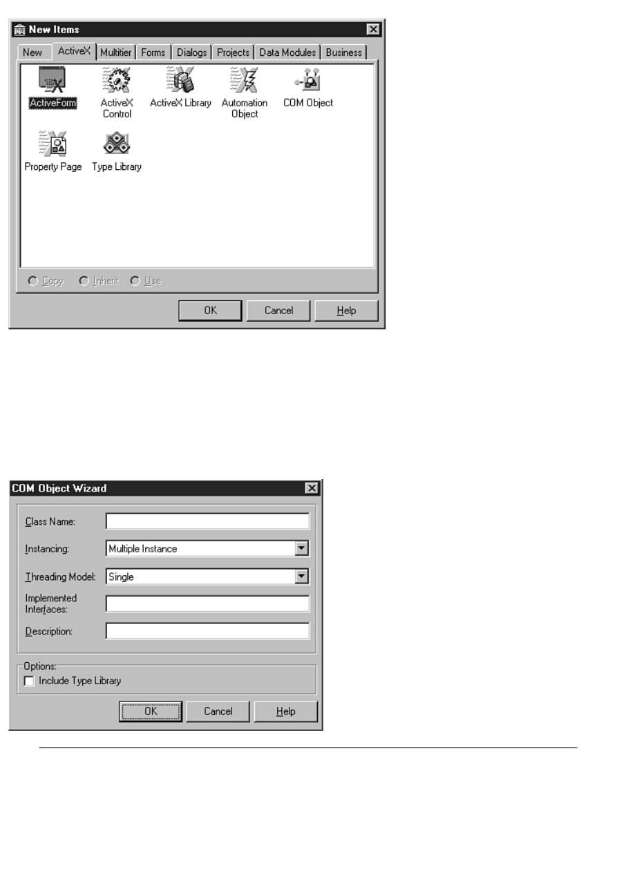
Figure 15.1.The Object Repository's ActiveX
page.
3. Choose File|Save and save the project as ComTest.
That's all there is to this particular step. Delphi creates a DLL project for you and is waiting for your next move.
Creating the Actual Object
The next step is to create the COM object itself. This step is also relatively simple. Perform these steps to do so:
1. Choose File|New from the Delphi main menu. The Object Repository is displayed. Click on the ActiveX page.
2. Double-click on the COM Object icon. Delphi displays the COM Object Wizard, as shown in Figure 15.2.
FIGURE 15.2. The COM Object Wizard.
THE COM OBJECT WIZARD
Let me take a moment to talk about the COM Object Wizard. The Class Name field is used to specify the class
name for your COM object. Type the class name here, but don't prepend the class name with either a T as you
would for a Delphi class, nor an I as is customary for interfaces. Delphi will take care of creating the class and

interface names automatically.
The Instancing field is used to control how multiple instances of the COM object are handled. Choices include
Internal, Single Instance, or Multiple Instance. See the "COM object wizard" topic in the Delphi help for
descriptions of these instancing options (you can click the Help button on the COM Object Wizard to display the
correct help topic).
The Threading Model field is used to specify how client applications can call your COM object. Choices include
Single, Apartment, Free, or Both. Again, see the Delphi help for descriptions of the threading models.
The Implemented Interfaces field is where you add the names of any interfaces that your COM object will
implement. If you have an interface called IMyFileIO and you want to use that interface in your new COM
object, you would type IMyFileIO in this field.
The Description field is used to supply a description for the COM object. The description is optional, but it's a
good idea to provide one.
When the Include Type Library check box is checked, Delphi will create a type library for the COM object.
Creating a type library enables your COM object to be used by client applications.
Okay, let's get back to work:
3. Enter Multiply in the Class Name field.
4. Enter Test COM Object in the Description field.
5. Check the Include Type Library check box. The other fields on the dialog box can be left at their default values.
6. Click OK to close the dialog box.
When you click the OK button, Delphi creates a unit for the COM object's class and displays the Type Library Editor, as
shown in Figure 15.3. Before continuing, I need to take a moment to talk about the Type Library Editor.
Using the Type Library Editor
The Type Library Editor is used to manipulate a type library. The Type Library Editor enables you to add or remove
interfaces, add properties and methods to interfaces, remove elements from interfaces, and create host of other COM
elements such as enumerations, records, or coclasses. The Type Library Editor makes it easy to add elements to a type
library. You'll learn about adding elements in the next section when you add properties and a method to the COM object.
On the left side of the Type Library Editor is the Object pane. The Object pane contains a tree view control. At the top of the
tree view hierarchy is the type library itself. Below the type library are elements contained in the type library. In Figure 15.3,
you see two elements: the IMultiply interface and the Multiply coclass.
On the right side of the Type Library Editor is the Information pane. This pane provides information about the object
currently selected in the Object pane. The information presented in the information pane varies with the type of object
selected. The Attributes page shows the type library name, its GUID, version, help string, help file, and so on.
NOTE: Remember earlier when I said that Delphi programmers don't need to worry much about GUIDs? The
COM object you just created already has a GUID, as does the type library itself. Delphi creates these GUIDs for
you automatically. As I said before, you'll see GUIDs a lot as you work with COM objects, but you don't have to
worry about creating them.
When the type library node is selected, the Information pane shows a tab labeled Uses. When you click on this tab you will
see a list of type libraries that this type library relies on. In almost all cases, this list will include the OLE Automation library,
but it can contain others as well. The exact libraries a particular type library relies on depends on the type and complexity of
the COM object the type library describes.
The Text page shows the type library definitions in IDL syntax. IDL is sort of a scripting language used to create binary type
library files. You shouldn't change any of the text on this tab unless you know exactly what you are doing. You might,
however, refer to the Text page for reference. This is probably of more value to experienced programmers than to beginners.
Other pages might be displayed in the Information pane depending on the type of object selected. For complete details, be
sure to read the "Type Library Editor" help topic in the Delphi help.
You will learn more about the Type Library Editor as you work through the rest of the chapter. Now let's get back to creating
the COM object.

Adding Properties and Methods to the COM Object
Before going further, you should save the project again. You didn't realize it, but Delphi created a new unit when you created
the COM object in the previous step. Choose File|Save All from the main menu and save the unit as MultiplyU.
Now you are ready to make the COM object do something. Remember, this COM object is incredibly simplistic, so it won't
do much, but it will at least do something.
ADDING PROPERTIES
First you will add properties to the COM object. Here are the steps:
1. Click on the IMultiply node in the Type Library Editor's Object pane. Notice that the Information pane shows the
interface's name, GUID, and version. Notice also that the Parent Interface field shows the ancestor of IMultiply as
IUnknown. If you recall, I said earlier that IUnknown is the base (or parent) interface from which all other interfaces
are derived. Delphi automatically assumes a base interface of IUnknown. You can change the base interface to some
other interface if you want by choosing an interface from the list of available interfaces. Other interfaces in the list are
themselves derived from IUnknown or one of its descendants.
2. Right-click and choose New|Property from the context menu. The Type Library Editor adds two new nodes to the
Objects pane under the IMulitply interface. The cursor is in editing mode so that you can type the name of the new
property.
3. Type X for the property name and then press the Enter key. Both of the new nodes change to X. There are two nodes
to each property because, by default, a property is assumed to be a read/write property. COM requires a Get method to
read a property and a Put method to write to a property, hence the two entries. Click on either of the two nodes labeled
X. Notice the Invoke Kind field in the Information pane as you select first one X node and then the other. Notice that
the field changes from Property Set to Property Get.
4. Notice in the Information pane that the Type field says Integer. That's the data type you want for this property, so
you don't need to change the type.
5. Create another new property but this time use a different approach. Locate the New Property button on the Type
Library Editor toolbar. Click the drop-down arrow next to the New Property button. Choose Read|Write from the list of
property types. The Type Library Editor creates the new property. Name this property Y. You can accept the default
data type of Integer for this property as well. Behind the scenes Delphi is adding code to the project's units as you add
elements.
Adding a Method
Next, you add a method. Perform these steps:
1. Select the IMultiply object in the Object pane and click the New Method button on the Type Library Editor toolbar.
2. Name the method DoIt. Notice that the Invoke Kind field says Function (as opposed to Property Get and Property
Set).
Next you must set the method's parameters. The method will have this syntax:
function DoIt : Integer;
3. Click on the Parameters tab in the Information pane. Change the Return Type field to Integer (choose Integer from
the combo box). This method doesn't have any parameters, so you can leave the Parameters list empty. After you have
set the return type, click the Attributes tab to display the Attributes page. This step isn't strictly necessary, but does
serve the purpose of taking you back to where you started.
4. Click the Refresh Implementation button on the Type Library Editor toolbar.
Now that you have added the two properties and methods, it's time to see what Delphi has been doing behind the scenes.
Listing 15.1 shows the class's unit as it appears after performing the steps up to this point. (Don't worry if your unit doesn't
look exactly like Listing 15.1. My version of Delphi might have added code in a slightly different order than yours.)
LISTING 15.1. MultiplyU AFTER ADDING PROPERTIES AND A METHOD.
unit MultiplyU;
interface
uses
Windows, ActiveX, ComObj, ComTest_TLB;
type
TMultiply = class(TTypedComObject, IMultiply)

protected
function DoIt: Integer; stdcall;
function Get_X: Integer; stdcall;
function Get_Y: Integer; stdcall;
procedure Set_X(Value: Integer); stdcall;
procedure Set_Y(Value: Integer); stdcall;
{Declare IMultiply methods here}
end;
implementation
uses ComServ;
function TMultiply.DoIt: Integer;
begin
end;
function TMultiply.Get_X: Integer;
begin
end;
function TMultiply.Get_Y: Integer;
begin
end;
procedure TMultiply.Set_X(Value: Integer);
begin
end;
procedure TMultiply.Set_Y(Value: Integer);
begin
end;
initialization
TTypedComObjectFactory.Create(ComServer, TMultiply, Class_Multiply,
ciMultiInstance, tmSingle);
end.
This is the shell of the COM object. Notice that the TMultiply class is derived from both TTypedComObject and IMultiply.
(To C++ programmers, this might look like multiple inheritance. It's not exactly multiple inheritance, but it is similar in some
ways.) You haven't seen the IMultiply class yet, but you will a bit later. You must fill out this shell in order to make the COM
object do something. You will do that next.
Adding Code
You will now add code to the TMultiply class to make the COM object functional. Perform these steps (refer to Listing 15.2
if necessary):
1. Display the MuliplyU.pas unit in the Code Editor. Add these lines to the TMultiply class declaration, just above the
protected keyword:
private
FX : Integer;
FY : Integer;
These are the declarations for the data fields that will hold the X and Y property values.
2. Scroll down into the implementation section and locate the Get_X method (use the Code Explorer if you like). Type
this line of code in the method:
Result := FX;
3. Locate the Get_Y method and add this line:
Result := FY;
4. Locate the DoIt method and add this line of code:
Result := FX * FY;
This line of code multiplies the value of FX and FY and returns the result.
5. Scroll down further until you see the Set_X method. Type this line of code in the Set_X method:
FX := Value;
6. Locate the Set_Y method and add this line:
FY := Value;

That's all you need to do. Your code should now look like Listing 15.2.
LISTING 15.2. THE COMPLETED MultiplyU UNIT.
unit MultiplyU;
interface
uses
Windows, ActiveX, ComObj, ComTest_TLB;
type
TMultiply = class(TTypedComObject, IMultiply)
private
FX : Integer;
FY : Integer;
protected
function DoIt: Integer; stdcall;
function Get_X: Integer; stdcall;
function Get_Y: Integer; stdcall;
procedure Set_X(Value: Integer); stdcall;
procedure Set_Y(Value: Integer); stdcall;
{Declare IMultiply methods here}
end;
implementation
uses ComServ;
function TMultiply.DoIt: Integer;
begin
Result := FX * FY;
end;
function TMultiply.Get_X: Integer;
begin
Result := FX;
end;
function TMultiply.Get_Y: Integer;
begin
Result := FY;
end;
procedure TMultiply.Set_X(Value: Integer);
begin
FX := Value;
end;
procedure TMultiply.Set_Y(Value: Integer);
begin
FY := Value;
end;
initialization
TTypedComObjectFactory.Create(ComServer, TMultiply, Class_Multiply,
ciMultiInstance, tmSingle);
end.
Although you were working on the MulitplyU unit, Delphi was busy building the type library and a unit to contain the type
library code. The unit has the same name as the project with a trailing _TLB. This project is named ComTest. The full unit
name for the type library unit, then, is ComTest_TLB.pas. Listing 15.3 shows this unit as it exists at this point. Remember,
your unit might not look exactly like Listing 15.3.
LISTING 15.3. THE ComTest_TLB.pas UNIT.
unit ComTest_TLB;
// ******************************************************************** //
// WARNING //
// ------- //
// The types declared in this file were generated from data read from a //

// Type Library. If this type library is explicitly or indirectly (via //
// another type library referring to this type library) reimported, or //
// the `Refresh' command of the Type Library Editor activated while //
// editing the Type Library, the contents of this file will be //
// regenerated and all manual modifications will be lost. //
// ******************************************************************** //
// PASTLWTR : $Revision: 1.11.1.55 $
// File generated on 6/8/98 7:16:51 PM from Type Library described below.
// ******************************************************************** //
// Type Lib: D:\Borland\D4\Bin\ComTest.tlb
// IID\LCID: {7CDAFB76-FF36-11D1-81F1-0040052A83C4}\0
// Helpfile:
// HelpString: ComTest Library
// Version: 1.0
// ******************************************************************** //
interface
uses Windows, ActiveX, Classes, Graphics, OleCtrls, StdVCL;
// *********************************************************************//
// GUIDS declared in the TypeLibrary. Following prefixes are used: //
// Type Libraries : LIBID_xxxx //
// CoClasses : CLASS_xxxx //
// DISPInterfaces : DIID_xxxx //
// Non-DISP interfaces: IID_xxxx //
// *********************************************************************//
const
LIBID_ComTest: TGUID = `{7CDAFB76-FF36-11D1-81F1-0040052A83C4}';
IID_IMultiply: TGUID = `{7CDAFB77-FF36-11D1-81F1-0040052A83C4}';
CLASS_Multiply: TGUID = `{7CDAFB79-FF36-11D1-81F1-0040052A83C4}';
type
// *********************************************************************//
// Forward declaration of interfaces defined in Type Library //
// *********************************************************************//
IMultiply = interface;
// *********************************************************************//
// Declaration of CoClasses defined in Type Library //
// (NOTE: Here we map each CoClass to its Default Interface) //
// *********************************************************************//
Multiply = IMultiply;
// *********************************************************************//
// Interface: IMultiply
// Flags: (0)
// GUID: {7CDAFB77-FF36-11D1-81F1-0040052A83C4}
// *********************************************************************//
IMultiply = interface(IUnknown)
[`{7CDAFB77-FF36-11D1-81F1-0040052A83C4}']
function Get_X: Integer; stdcall;
procedure Set_X(Value: Integer); stdcall;
function Get_Y: Integer; stdcall;
procedure Set_Y(Value: Integer); stdcall;
function DoIt: Integer; stdcall;
end;
CoMultiply = class
class function Create: IMultiply;
class function CreateRemote(const MachineName: string): IMultiply;
end;
implementation
uses ComObj;
class function CoMultiply.Create: IMultiply;
begin
Result := CreateComObject(CLASS_Multiply) as IMultiply;
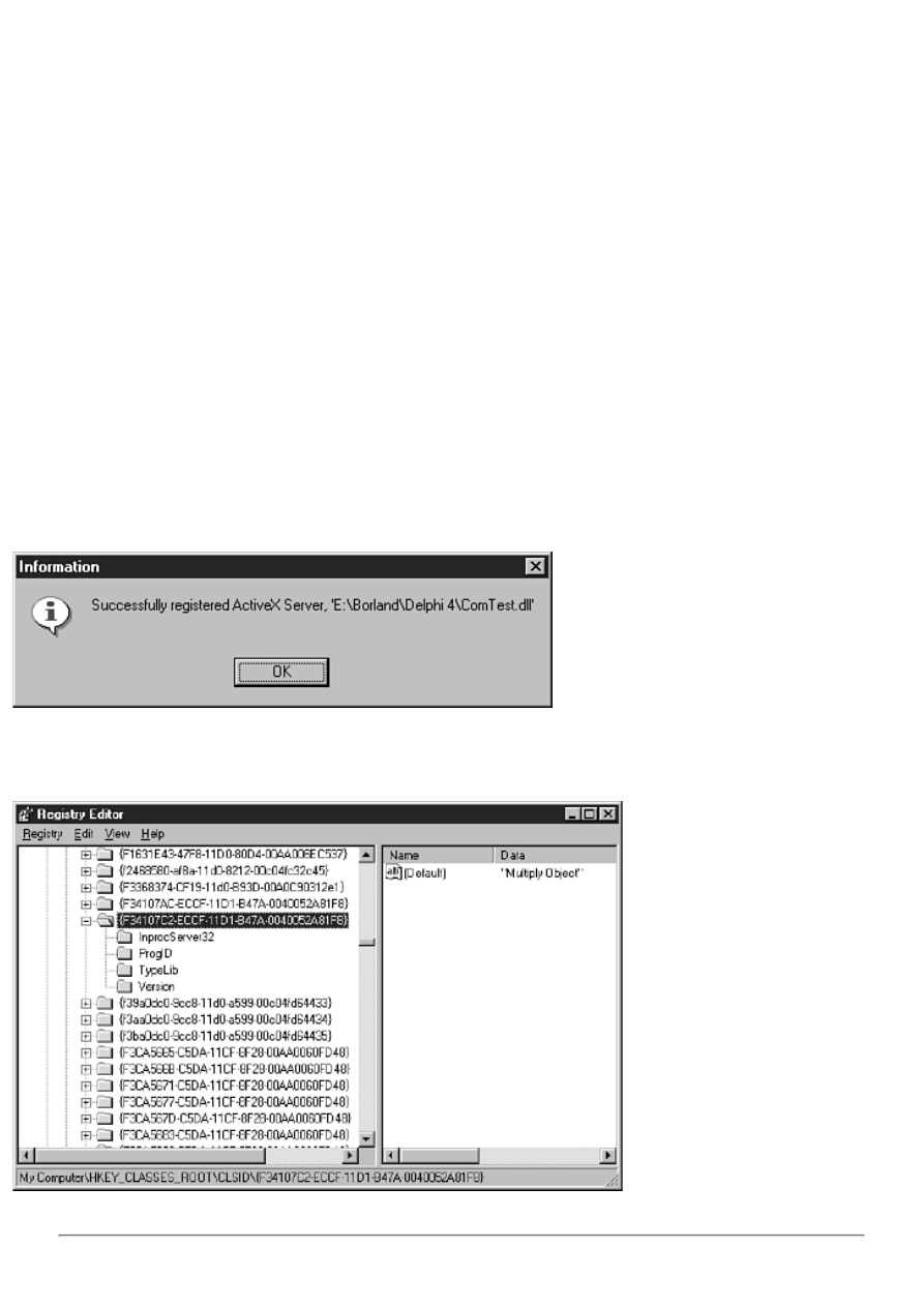
end;
class function CoMultiply.CreateRemote(const MachineName: string): ÂIMultiply;
begin
Result := CreateRemoteComObject(MachineName, CLASS_Multiply) as ÂIMultiply;
end;
end.
Notice that this unit contains the declaration for the IMultiply interface. As you can see, IMultiply is derived from IUnknown.
Notice also that this unit contains the coclass Multiply.
It is important to understand that this unit is regenerated each time you compile an ActiveX library project. It is generated
from the type library file. Note the warning at the top of the unit. The comments are telling you that any changes you make to
this file will be lost the next time the COM object is rebuilt. It really doesn't do any good to modify the type library source
file, because it will be regenerated automatically.
Building and Registering the COM Object
Now you are ready to compile the ActiveX library project. This step compiles the COM object and builds the DLL in which
the COM object resides. After building the COM object, you can register it. Here are the steps:
1. Choose Project|Build ComTest from the main menu. Delphi will build the DLL containing the COM object.
2. Choose Run|Register ActiveX Server from the main menu. This step registers the COM object with Windows. If
you fail to perform this step, you will get an exception that says, "Class not registered" when you attempt to access the
COM object.
Delphi registers the COM object DLL with Windows. After the DLL has been registered, Delphi displays a message box, as
shown in Figure 15.4.
FIGURE 15.4. Delphi reporting the COM object
successfully registered.
When Windows registers the COM object, it adds information about the object to the Registry. Figure 15.5 shows the
Registry entry created when the COM object was registered with Windows.
FIGURE 15.5. The Registry key
created when the COM object was registered.
NOTE: Delphi ships with a utility called TREGSVR.EXE that can be used to register an ActiveX control from

the command line. To register a control called MYSTUFF.OCX, you would run TREGSVR from a command
prompt like this:
tregsvr mystuff.ocx
To unregister an ActiveX, use the -u switch as follows:
tregsvr -u mystuff.ocx
Sometimes this is more convenient than loading an ActiveX project in Delphi and registering or unregistering
the control from the IDE.
NOTE: In this exercise I had you create a COM object. You could also have used an automation object. An
automation object derives from IDispatch rather than IUnknown. IDispatch provides the additional functionality
required for a COM object to act as an automation server (an object that can control one application from
another).
Your COM object is now ready to use.
Building an Application That Uses the COM Object
A COM object doesn't do you much good if you can't use it. In this step, you create an application that uses the COM object
you just created. Follow these steps:
1. Create a new application. Place a Button component and a Label component on the form. Save the project as
ComApp and the main form's unit as ComAppU.
2. Switch to the Code Editor and locate the uses list for the main unit. Add these units to the uses list:
ComObj
ComTest_TLB
This ensures that the code that references the COM object will compile.
3. Double-click the form's button to create an OnClick event handler. Modify the OnClick handler so that it looks like
this:
procedure TForm1.Button1Click(Sender: TObject);
var
Mult : IMultiply;
Res : Integer;
begin
Mult := CreateComObject(CLASS_Multiply) as IMultiply;
if Assigned(Mult) then begin
Mult.Set_X (20);
Mult.Set_Y (60);
Res := Mult.DoIt;
Label1.Caption := IntToStr(Res);
end;
end;
This code first declares a pointer to the IMultiply interface called Mult and an Integer variable to hold the result. Next, the
CreateComObject function is called with a parameter of CLASS_Multiply. CLASS_Multiply is a constant that contains the
GUID for the COM object class (refer to Listing 15.3).
The return value from CreateComObject is assigned to the Mult pointer. Notice that I use the as operator to cast the return
value to an IMultiply pointer. CreateComObject returns an IUnknown pointer, so the as operator is used to cast the
IUnknown pointer to an IMultiply pointer.
After the COM object is created, I assign values to the X and Y properties. After that I call the DoIt method of the COM
object and display the result in the Label component.
NOTE: In the real world, I would have written the preceding procedure differently. For example:
procedure TForm1.Button1Click(Sender: TObject);
begin
with CreateComObject(CLASS_Multiply) as IMultiply do begin

Set_X(20);
Set_Y(60);
Label1.Caption := IntToStr(DoIt);
end;
end;
I wrote the procedure the way I did to illustrate each step.
Run the program. When you click the form's button, the label should change to say "1200" (the product of 20 * 60). That's it!
Your COM object works. This COM object can be used from Visual Basic, Visual C++, C++Builder, or any other
development environment that supports COM.
Understanding ActiveX
ActiveX is a relatively new term for a technology that has been around for awhile. Originally ActiveX controls were called
OCX controls. The term OCX is still widely used in some circles. An ActiveX control typically has a filename extension of
either DLL or OCX.
An ActiveX control is essentially a COM object in disguise. The primary difference between an ActiveX control and a COM
object is that an ActiveX control has a design-time interface. An ActiveX control also has code that enables it to be deployed
on a Web page or over a network. ActiveX is a subset of COM, so everything you learned about COM objects in the first part
of the chapter applies to ActiveX controls as well.
Using Third-Party ActiveX Controls
There isn't a lot to know about installing and using third-party ActiveX controls. All you have to do is import the ActiveX
into the IDE and begin using the control. To see how this works, let's do a quick exercise. This exercise requires that you
have Microsoft Internet Explorer installed on your system. If you don't have Internet Explorer installed, skip this exercise.
(You won't be missing anything because I show you how to install an ActiveX control you have built in the section "Build,
Register, and Install the Control.") Perform these steps:
1. Choose Component|Import ActiveX Control from the main menu. The Import ActiveX dialog box is displayed.
2. Scroll down through the list of installed components until you find Microsoft Internet Controls (the exact text of the
item will depend on the version of Internet Explorer you have installed on your system). Select the item. Figure 15.6
shows the Import ActiveX dialog box after this step.
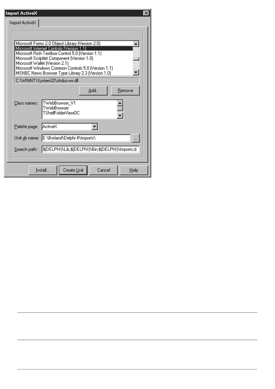
FIGURE 15.6.The Import ActiveX dialog box.
Notice the Class names list box in the middle of the page. This list box contains a list of ActiveX controls in the
selected file (SHDOCVW.DLL in this case).
3. The Palette page field shows ActiveX. This is a the palette page where the new controls will be installed. Click on
this field and type ActiveXTest.
4. Leave the Unit dir name and Search path fields on their default settings and click the Install button. The Install
dialog box comes up and asks what package you want the controls installed into. (All controls, whether they are VCL
or ActiveX, must be in a package.)
5. Click on the Into new package tab. Enter MSIE in the File name field and Internet Explorer Package in the
Description field.
6. Click the OK button. Delphi creates a new package called MSIE.dpk and prompts you to build and install the
package. Click Yes to install the package. After the package is built, Delphi displays a message box telling you which
controls were added to the Component palette. Click Yes to dismiss the message box.
7. Scroll the Component palette to find the ActiveXText tab. You should see two or three controls on that page of the
Component palette (again, depending on the version of Internet Explorer you have installed). The components are
ready for use.
Experiment with the new controls and see how they work. You probably won't get very far without documentation, but at
least you get a sense for how installing an ActiveX works. (For a more complete explanation of using Internet Explorer as an
ActiveX, see the section, "Using Internet Explorer as an ActiveX Control" on the Bonus Day, "Building Internet
Applications.")
NOTE: You must have a design-time license in order to use an installed ActiveX control. A design-time license
is a file with an .LIC extension. In some cases you can import ActiveX controls to the Delphi Component palette
without a design-time license, but you will get an error message when you attempt to place the control on your
form.
To remove the Internet Explorer controls from the Component palette, choose Component|Install Packages from the main
menu. Locate the Internet Explorer Package in the Design packages list box and click the Remove button. The ActiveXTest
tab is removed from the Component palette.
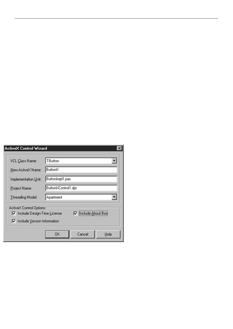
NOTE: Deploying an application that uses ActiveX controls requires special attention. Deploying applications
using ActiveX controls is covered in detail on the Bonus Day in the section "Deploying Internet Applications."
Creating New ActiveX Controls
There are two ways to create an ActiveX control in Delphi:
From an existing VCL component
●
From scratch using an ActiveForm
●
In this section, you create an ActiveX control using both of these methods.
Creating an ActiveX Control from an Existing VCL Component
Creating an ActiveX control from an existing VCL component is downright simple. After you create a component, you can
turn it into an ActiveX control in no time at all. I haven't talked about creating components yet, so I don't want to go into a lot
of detail on creating components now (covered on Day 20, "Creating Components"). What you will do, then, is create an
ActiveX control from one of the VCL components provided by Borland.
Generate the ActiveX Project with the ActiveX Control Wizard
The first step is to generate the ActiveX project. As always, Delphi does most of the work for you. All you have to do is
supply a few fields in the ActiveX Control Wizard. Here are the steps:
1. Choose File|Close All to close all projects and then choose File|New from the main menu. The Object Repository is
displayed.
2. Click the ActiveX page and then double-click the ActiveX Control icon. The ActiveX Control Wizard is displayed
(see Figure 15.7).
FIGURE 15.7.The ActiveX Control Wizard.
3. Select TButton from the list of classes in the VCL Class Name combo box. The next four fields are automatically
filled in with default values. Because this is just a test, you can leave those fields on their default values. The fields are
self-explanatory, so I don't need to go over each one.
4. The Threading Model is set to Apartment. Leave this setting as it is. Other threading models include Single, Free,
and Both. See the Delphi help for more information on threading models.
5. Check the Include Design-Time License check box. When this option is checked, Delphi will create a design-time
license for the control. The design-time license will prevent other programmers from using the control unless they have
the license.
6. Check the Include Version Information check box. This will enable you to add version info to the control via the
Project Options dialog box.
7. Check the Include About Box check box as well. When this box is checked, Delphi will automatically create an
About dialog box for the control. Click OK to close the ActiveX Control Wizard.

Delphi will create a project file (ButtonXControl1.bpr) and three units for the project. The first unit is the TButtonX class
unit (ButtonXImp1.pas). The second unit is the type library file for the control, named ButtonXControl1_TLB.pas. This file
contains the information Delphi needs to create the type library for the control. The third file, About1.pas, is the unit for the
About box. If you want to customize the About box, you can do that at this time. The About box is just another Delphi form,
so feel free to customize it in any way you like.
NOTE: Version info is required in order for your ActiveX controls to work in Visual Basic.
Build, Register, and Install the Control
Because you aren't making any modifications to the control itself, you can jump right to building the control and registering
it. This is the same process you went through when you registered the COM object you created earlier. An extra step is
required when implementing ActiveX controls, though, because ActiveX controls have a design-time interface. Try this:
1. Choose Project|Build ButtonXControl1 from the main menu. Delphi builds the ActiveX project.
2. Choose Run|Register ActiveX Server from the main menu. The ActiveX control is registered and Delphi displays a
message box telling you that the OCX is registered (ActiveX projects have a default extension of .OCX). Click OK to
dismiss the message box.
3. Choose Component|Import ActiveX Control from the main menu. Choose ButtonXControl1 Library (Version 1.0)
from the list of installed controls (had you not performed step 2, this entry would not have been present in the list of
installed controls). The class name of the button, TButtonX, shows in the Class names list box.
4. Set the Palette page field to ActiveX. Click Install to continue.
5. The Install dialog box is displayed. You are going to install the control into the default Delphi user package
DCLUSR40.BPL. The File name field should already contain this package. If it doesn't, choose it from the combo box.
The Description field now says Delphi User's Components. Click the OK button to install the control.
6. Click Yes to the message box regarding building and installing DCLUSR40.BPL. Click OK when the message box
confirming the installation is displayed. The control is now installed.
Test the ActiveX Control
Now you can test your new ActiveX control. First, create a new project.
NOTE: When you create a new project, Delphi will prompt you to save the package file (DCLUSR40.DPK) and
the ActiveX control project. Whether you save these files is up to you. My intention was to have you create a
quick ActiveX. There's really no need to save the files. If, however, you think you might want to save the files to
examine them later, save the files.
Now follow these steps:
1. Locate the ActiveX tab on the Component palette.
2. The last control in the list is the ButtonX control. Select it.
3. Place a ButtonX control on your form. Notice that the button doesn't have a default caption as a regular VCL button
does.
4. Change the Caption property to Test. The button's caption changes just as a VCL button's caption would change.
Notice the list of properties in the Object Inspector. They are mostly the same properties you would see on a VCL
button (the ActiveX was created from a VCL TButton after all), but you might have noticed that the Value column
looks slightly different. Remember, this is an ActiveX control and is intended to be used in any environment that hosts
ActiveX controls. For that reason, some of the property values are expressed in a more generic way.
5. Double-click the button and you will find that nothing happens. An ActiveX control doesn't have the capability to
automatically create an event handler when you double-click the button like a VCL component does. Instead, switch to
the Events page and double-click the Value column next to the OnClick event. An event handler is generated. Type
this line of code:
MessageDlg(`Hey, it works!', mtInformation, [mbOK], 0);
6. Run the program and test the button to ensure that it works. When you have verified that the button works, close the
program.
7. Bring up the form and right-click on the button. Choose About from the context menu. The control's About box is
displayed. The About box is not customized in any way, but you can go back and do that later if you want (provided
you saved the file earlier).

NOTE: The idea behind one-step ActiveX is to take a working VCL component and create an ActiveX control
from that component. Most of the time, you won't have to modify the ActiveX code in any way. However, you
certainly can modify the ActiveX code after it has been generated by Delphi if you so desire. Be aware, though,
that if you regenerate the ActiveX code from your original VCL component, all changes made to the ActiveX
source will be lost.
NOTE: You can create ActiveX controls only from windowed VCL controls (controls derived from
TWinControl or one of its descendents). The list of VCL controls from which you can build an ActiveX control
contains all installed components that specifically meet this criteria.
Unregister the ActiveX Control
After experimenting with your new ActiveX control, you should unregister it so that it doesn't occupy space in the Registry.
To unregister the ActiveX control, do this:
1. Choose Component|Import ActiveX Control from the main menu.
2. Select the ActiveX in the list of installed ActiveX controls and click the Remove button.
3. Click Yes on the confirmation dialog box to have Delphi unregister the ActiveX.
Alternatively, you can load the ActiveX project (if you previously saved it) and choose Run|Unregister ActiveX Server from
the main menu.
NOTE: If all else fails, you can always locate the ActiveX control in the Registry and delete the key for that
control. Use the Registry Editor's find function to find the key (search for the control's name or its GUID).
Naturally, you want to be careful when editing the Registry manually.
Creating ActiveForms
Creating an ActiveForm is almost as easy as creating an ActiveX from an existing VCL component. Naturally, you can create
a complex ActiveX containing many components on a single form. Contrary to what its name implies, however, an
ActiveForm can be used to create a simple ActiveX control from scratch (a colored button, for example). In other words,
ActiveForms are not only for creating fancy forms with dozens of gadgets. They are for creating single-use ActiveX controls
as well.
In this section, you will create an ActiveForm. The ActiveForm will have two edit controls, a label and a button. The button
will take the contents of the two edit controls, multiply them together, and display the result in the label. Yes, I know it
doesn't require a lot of imagination to stick with the "multiply two numbers" idea, but my goal is to show you how to create
an ActiveForm with the minimum amount of code. Keeping the code to a minimum allows you to focus on the ActiveForm
creation process without getting bogged down in code.
Create the ActiveForm
Creating an ActiveForm is so easy it's amazing. Follow these steps:
1. Close all projects and then choose File|New from the main menu. The Object Repository is displayed.
2. Double-click the ActiveForm icon. The ActiveForm Wizard is displayed. This dialog box is identical to the ActiveX
Control Wizard except for the fact that the VCL Class Name field is grayed (it doesn't apply here).
3. Enter MyFormX in the New ActiveX Name field.
4. Change the Implementation Unit field to read MyFormImpl.pas.
5. Change the Project Name field to MyFormProj.dpr.
6. Leave the Thread Model set to Apartment. Check the Include Version Information check box.
7. Click the OK button to continue.
Delphi creates the required units and displays a form.
Create the Form
An ActiveForm form is just a regular form at this stage. You can add controls to the form, add code, and respond to events
just like you do for a form that belongs to an application. The one difference is that the title bar on an ActiveForm does not
appear on the control itself. It's just there at design time.
In this step, you will add components and code to make the ActiveForm functional. As you work through the steps, it might
help to refer to Figure 15.8 later in the chapter, which shows the completed form. I'm going to give you the primary
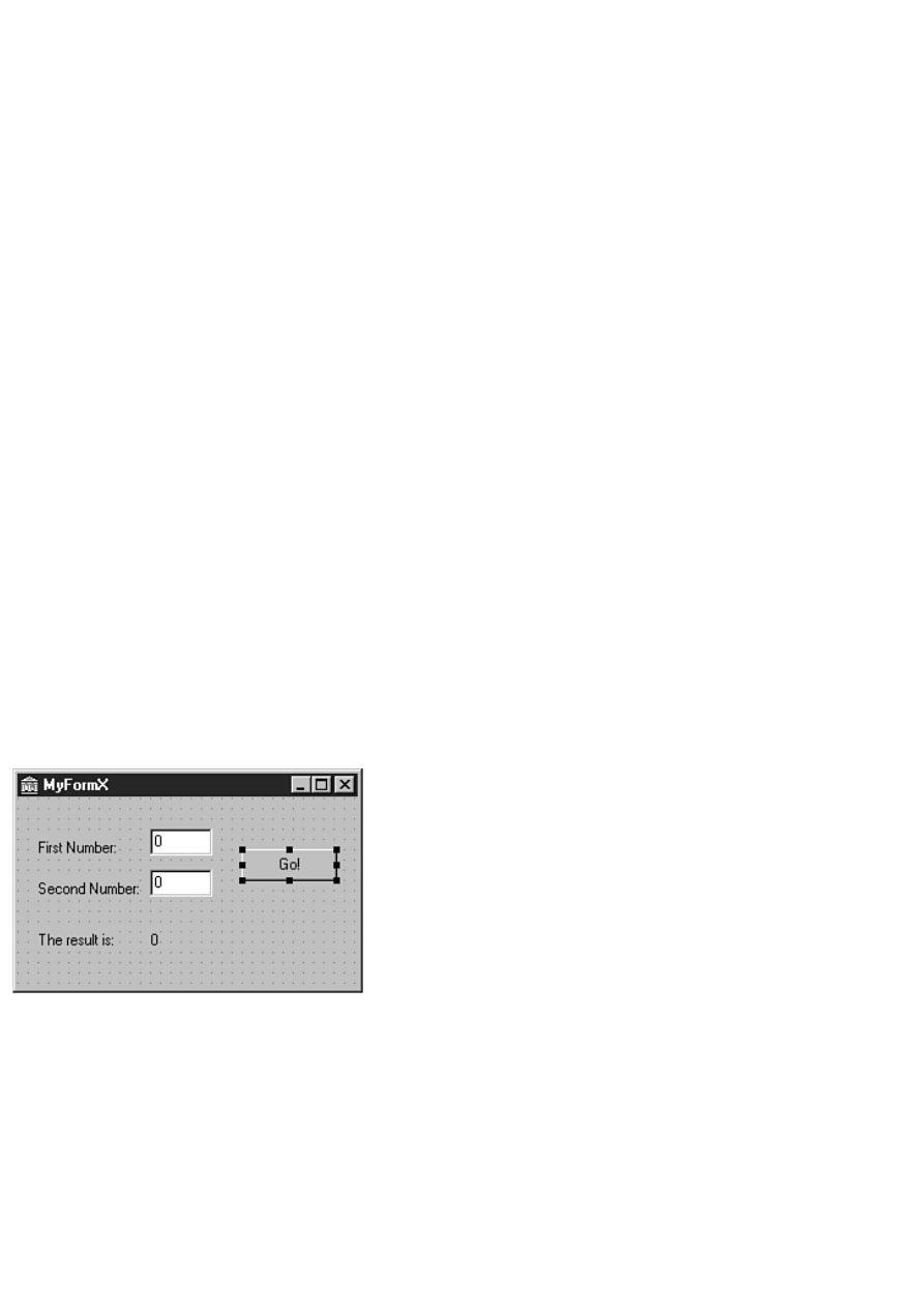
components in the following steps and let you finish the rest on your own. Perform these steps:
1. Size the form to approximately 175 (width) by 275 (height).
2. Add an Edit component near the top-center of the form (see Figure 15.8). Change its Name property to Num1Edit,
its Text property to 0, and its Width to 50 or so (the exact width is not important). Change the AxBorderStyle property
to afbRaised.
3. Click on the Edit component and copy it to the Clipboard; paste a new component from the Clipboard. Place the new
component below the first. Change its Name property to Num2Edit.
4. Place a Label component below the two edit controls. This label will display the results. Change the label's Name
property to ResultLbl and its Caption property to 0.
5. Place a Button component on the form to the right of the Edit components. Change its Name to GoButton and its
Caption to Go!.
6. Double-click the button and make the OnClick event handler look like this:
procedure TMyFormX.GoButtonClick(Sender: TObject);
begin
try
ResultLbl.Caption := IntToStr(
StrToInt(Num1Edit.Text) * StrToInt(Num2Edit.Text));
except
on EConvertError do
MessageDlg(`Oops! You entered an invalid value.',
mtError, [mbOK], 0);
end;
end;
This code simply extracts the values of the two edit controls, multiplies them together, and displays the result in the
ResultLbl label. The exception handling code displays a message box if the user enters invalid values. An
EConverError exception will be raised if the conversion from text to integer fails (if one of the edit controls contains
text, for example).
7. Add additional labels to match Figure 15.8.
8. Choose View|Type Library from the main menu. In the Information page, change the Help String field to My Test
ActiveForm Library. This is the text that will be displayed in the Import ActiveX dialog box when you install the
ActiveForm.
9. Save the project. Accept the default filenames. (You specified them in the ActiveForm Wizard.) Figure 15.8 shows
the completed form.
FIGURE 15.8. The finished ActiveForm.
Build, Register, and Import the ActiveForm
Now you can build, register, and import the ActiveForm. When built, the ActiveForm is like any other ActiveX control.
Because you've done this several times now, I'm not going to go over every step. Follow these steps:
1. Choose Project|Build MyFormProj from the main menu.
2. When the project is built, choose Run|Register ActiveX Server from the main menu.
3. Choose Component|Import ActiveX Control from the main menu. Install My Test ActiveForm Library (Version 1)
into the DCLUSR40 package. Install to the ActiveX page or any other page you choose.
The ActiveForm is now installed as an ActiveX control.
Try the ActiveForm

Now it's time to take the ActiveForm for a test drive. This will be fairly simple:
1. Create a new application.
2. Click the ActiveX tab on the Component palette and choose MyFormX button (the one with the default Delphi
icon).
3. Place a MyFormX control on your form.
4. Run the program and test out the ActiveX.
That's all there is to it. With Delphi, great-looking ActiveX controls are a breeze to create! There simply is no better
development environment for creating ActiveX controls than Delphi, bar none.
Changing the ActiveX Palette Bitmap
Ultimately you will want to change the bitmap of the ActiveX from the default that Delphi provides to one of your own
design. Changing the bitmap requires following these steps:
1. Create a binary resource file (.RES) with Image Editor.
2. Create a 24¥24 bitmap. Give the bitmap a numeric name (2 for example).
3. Link the resource file to the ActiveX project with the $R compiler directive. (Linking resources was discussed on
Day 8, "Creating Applications in Delphi" and is discussed further on Day 20, "Creating Components.")
4. Modify the ActiveX class factory creation routine in the implementation unit (the ActiveForm's .PAS file). A typical
class factory creation routine looks like this (it's in the initialization section at the bottom of the unit):
TActiveFormFactory.Create(
ComServer,
TActiveFormControl,
TMyFormX,
Class_MyFormX,
1, { Change this number. }
`',
OLEMISC_SIMPLEFRAME or OLEMISC_ACTSLIKELABEL,
tmApartment);
Notice the line I have marked with a comment. This parameter of TActiveFormFactory.Create is the resource number
of the bitmap you want displayed on the Component palette. If you saved the new bitmap with a name of 2, you would
replace the 1 in this code snippet with a 2.
5. Rebuild, reregister, import, and install the ActiveForm again. The new bitmap should now show up in the
Component palette.
Alternatively, you can modify the ActiveForm project's .RES file and change the bitmap named 1 to look like you want.
Web Deploying ActiveX Controls and ActiveForms
One of the great features of ActiveForms is that you can use them on a Web page. In order to use an ActiveForm on a Web
page, you must use the Web Deploy option. Using Web Deploy requires a Web server, so I can't effectively walk you through
the Web deployment process. I can, however, give you a little insight into the process. When you choose Web Deploy,
Delphi performs two tasks:
Builds the ActiveX control and copies the file to the Web Deploy target directory
●
Creates an HTML file that contains the code needed to load the ActiveX control
●
The locations of these files is determined by the Web deployment options. Let's look at that next.
Web Deployment Options
Before you can use Web Deploy, you must set the Web deployment options. To set the Web deployment options, choose
Project|Web Deployment Options from the main menu. The Web Deployment Options dialog box is displayed, as shown in
Figure 15.9.
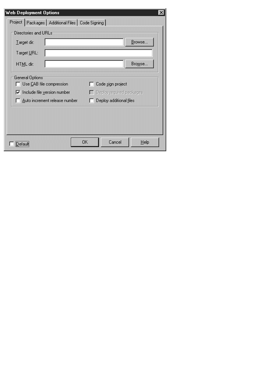
Figure 15.9. The Web Deployment Options
dialog box.
At the bottom of the Web Deployment Options dialog box is a check box labeled Default. Check this box if you want the
settings you have specified to be the new defaults for future projects. Most of the time, you will deploy to the same Web site,
so you will probably want to set the defaults after you have everything set up just the way you want it.
Project Page: Directories and URLs Section
The Directories and URLs section is where you specify the target location for your ActiveX. The Target dir field is used to
specify the directory where Delphi will copy the ActiveX after it is built. This field must be a directory--it cannot be an URL
location.
If you are like me, you might not have direct access to the directory where your Web site is located. (TurboPower's Webster
Royland keeps access pretty tightly controlled.) If that is the case, you will have to specify a local directory in this field and
then later use your Web publishing software to publish the files to your Web site.
The Target URL field is used to specify the page where the ActiveX will reside on the server. This page is used by Delphi
when it creates the HTML page that shows the control. For example, the HTML file that Delphi created for me is shown in
Listing 15.4. (I had to break a couple of lines because they were too long for the page.)
LISTING 15.4. THE HTML CODE GENERATED BY DELPHI FOR THE ACTIVEX FILE.
<HTML>
<H1> Delphi 4 ActiveX Test Page </H1><p>
You should see your Delphi 4 forms or controls
embedded in the form below.
<HR><center><P>
<OBJECT
classid="clsid:52FB5B97-EDA3-11D1-B47B-0040052A81F8"
codebase="http://www.home.turbopower.com/~kentr/test/MyFormProj.cab
#version=1,0,0,0"
width=275
height=175
align=center
hspace=0
vspace=0
>
</OBJECT>

</HTML>
Notice the URL in the codebase statement. This is the path I typed in the Target URL field of the Web Deployment Options
dialog box. By the way, you can copy the entire OBJECT tag from the Delphi-generated HTML code directly to your Web
page's HTML source when you get ready to officially deploy your ActiveX code.
NOTE: The name of the HTML file created by Delphi is the project name with an extension of .htm.
The HTML dir field of the Web Deployment Options dialog box is used to specify the location where Delphi will place the
HTML code it generates (refer to Listing 15.4). As with the Target dir field, if you don't have direct access to your Web site's
directories, you will have to specify a local directory and then publish the HTML file to your Web site.
Project Page: General Options Section
This section is where you specify the global Web deployment options. The Use CAB file compression field determines
whether the ActiveX is compressed. Compressing the ActiveX reduces the size of your ActiveX, making downloading the
control that much faster. I used CAB compression on the ActiveForm created earlier in the project and the ActiveX size went
from 312KB in OCX form to 204KB in CAB form. Windows takes care of automatically decompressing and registering the
ActiveX, so there's no real disadvantage to using CAB compression.
The Include file version number indicates whether Delphi should include the version number in the codebase statement
(again refer to Listing 15.4). The version tag is optional, so you don't specifically need it. Note, however, that some browsers
won't load the ActiveX if the version tag is present (Netscape Navigator with an ActiveX plug-in, for example).
The Auto increment release number will automatically increment the version number in the ActiveX's version info each time
the ActiveX is deployed.
The Code sign project option plays an important role in ActiveX deployment. When this option is on, Delphi will code sign
the ActiveX. Code signing is the process of attaching a binary signature to a file. This binary signature identifies the company
that created the ActiveX, among other information.
Code signing is important because Internet Explorer expects ActiveX controls to be code signed. If Internet Explorer's
security level is set to High or Medium, any ActiveX controls that are not code signed will not load. Simply put, if you are
going to deploy your ActiveX controls so that the public can use them, they must be code signed.
The Code Signing page of the Web Deployment Options dialog box contains the information needed to code sign the
ActiveX. Delphi does not provide the credentials file or the private key needed to code sign files. To obtain a credentials file
and private key, you will need to contact Microsoft. For more information, search the Microsoft Web site for the terms
"Digital Signing" and "Certificate Authority."
The Deploy required packages and Deploy additional files options are used if you have built your ActiveX with runtime
packages or if there are additional files that must ship with your control. If you choose either of these options, you must
specify the packages or additional files on the Packages and Additional Files pages of the Web Deployment Options dialog
box.
NOTE: When in doubt, click the Help button in the Web Deployment Options dialog box. Delphi help explains
each of the pages of this dialog box.
Web Deploy
After you set the deployment options, you are ready to deploy your ActiveX. To deploy the ActiveX, simply load the
ActiveX project and choose Project|Web Deploy from the Delphi main menu. Delphi will build the ActiveX and deploy it
based on the settings in the Web Deployment Options dialog box. If you elected to use CAB compression, Delphi will
compress the ActiveX into a CAB file as well. Remember, if you don't have direct access to your Web site's directories, you
will have to publish the ActiveX and HTML file to your Web site before you can test the ActiveX.
The act of deploying the ActiveX is trivial--setting the Web deployment options is the hard part. Figure 15.10 shows the
example ActiveForm created earlier running on a Web page.
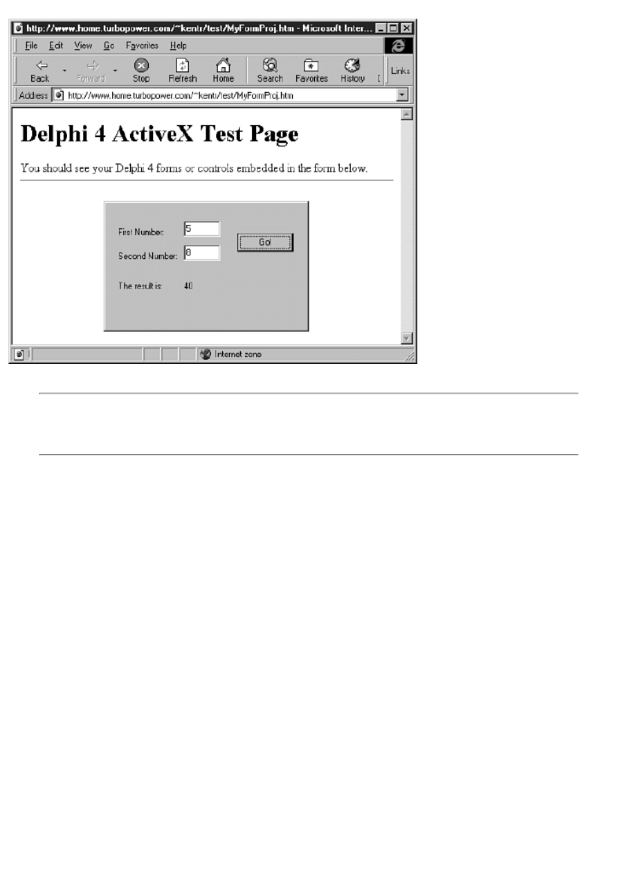
FIGURE 15.10.The test ActiveForm
running on a Web page.
NOTE: ActiveX controls have virtually no security restrictions. Be careful when downloading ActiveX controls
from unknown (or unverified) sources. When downloaded, an ActiveX control has access to your entire system.
Be equally careful when writing your own ActiveX controls. Make absolutely sure that your ActiveX control
won't do anything to negatively impact other users' machines.
Summary
I won't lie to you--there's a lot more to COM and ActiveX than what is presented here. For example, I didn't talk about OLE.
OLE, like ActiveX, is a subset of COM. OLE adds a layer to COM to enable applications to link and embed OLE automation
servers in a container application. Still, you learned a great deal about COM and ActiveX today. Most importantly, you found
out how to create COM objects, ActiveX controls, and ActiveForms. You also learned a bit about Web Deploy and how to
use it to deploy your ActiveX controls on a Web page.
Workshop
The Workshop contains quiz questions to help you solidify your understanding of the material covered and exercises to
provide you with experience in using what you have learned. You can find the answers to the quiz questions in Appendix A,
"Answers to the Quiz Questions."
Q&A
Q Do I have to understand the inner workings of COM to write ActiveX controls in Delphi?
A Although some understanding of COM is certainly helpful, it is not vital to creating ActiveX controls with Delphi.
Delphi makes it easy to create ActiveX controls without an in-depth understanding of COM.
Q What is a type library?
A A type library is a binary file that describes the interfaces, data types, methods, and classes in a COM library
(including ActiveX).
Q Are OLE and COM the same thing?
A No. COM is the base upon which OLE is built. OLE is much more complex and convoluted than COM. Certainly

OLE has more functionality, but OLE is a bloated beast that is best avoided if possible.
Q I noticed some nifty-looking ActiveX controls registered on my system, so I installed them on the Delphi
Component palette. They show up on the Component palette but when I try to use one of the controls, I get an
error message about a design-time license. Why is that?
A In short, you are not authorized to use those controls in a design environment (Delphi, for example). ActiveX users
must deploy and register their ActiveX controls on every system that uses those controls. To prevent anyone from
freely using those controls, the control vendors require a design-time license before the control can be used at design
time. When you purchase an ActiveX control from a vendor, you get the design-time license.
Q I created an ActiveX control and placed it on my form. The program used to work fine, but now when I try to
run the program I get an exception that says, Class not registered. Why is that?
A Every ActiveX control must be registered on the system on which it is being used. You might have inadvertently
unregistered the ActiveX control on your system some time after you originally installed the control. To reregister the
control, load the ActiveX project in Delphi and choose Run|Register ActiveX Server. Alternatively, you can register
the OCX file with the TREGSVR.EXE utility.
Q I created and installed an ActiveForm and everything went fine. Later I wanted to change the ActiveForm. I
couldn't compile the ActiveForm project, though, because I kept getting an error, Could not create output file
MyProj.OCX. What's wrong?
A You need to remove the ActiveForm control from the Delphi Component palette before you can rebuild the control.
When the control is installed in Delphi, its OCX file is loaded by the Delphi IDE and cannot be overwritten.
Q Web Deploy confuses me. There are so many options. Am I the only one who doesn't understand this stuff?
A Certainly not. After you have worked through the Web Deploy process a few times, it's not nearly so daunting as it
might appear the first time you try it.
Q I'm having problems getting my ActiveX to work on a Web page. I keep getting an error from Internet
Explorer when I try to load the page. The error says, Your current settings prohibit ActiveX controls. What's
wrong?
A Your ActiveX control is not code signed. An ActiveX control must be code signed before Internet Explorer will
download the control when the user's security settings are set to either medium or high.
Quiz
1. What is the base (or parent) interface for all COM interfaces?
2. What is a GUID?
3. What happens when a COM object's reference count reaches 0?
4. What is the name of the Delphi utility used when working with type libraries?
5. How do you create GUIDs when writing COM objects in Delphi?
6. What do you choose from the Object Repository when creating an ActiveX from a VCL component?
7. Can you use Delphi-created ActiveX controls in Visual Basic?
8. After your ActiveX control is built and registered, how do you install it to the Delphi Component palette?
9. How do you unregister an ActiveX that you have created?
10. Can you use the ActiveX controls created in Delphi on a Web page?
Exercises
1. Create a simple COM object from scratch. It isn't important what the COM object does, just that you go through the
steps of creating it.
2. Write a Delphi application that uses the COM object created in exercise 1 (don't forget to register the COM object).
3. Create an ActiveX control from a VCL TEdit component. Install the control to the Delphi Component palette and
use it on a form.
4. If you have access to Visual Basic, take the ActiveX created in exercise 3 and use it in a VB application.
5. Create an ActiveForm control of your own design.
6. If you have a Web site, deploy the ActiveForm created in step 5 and display it on a Web site page.
7. Extra Credit: Modify the ActiveForm control created in step 5 so that it uses a custom bitmap on the Delphi
Component palette rather than the default bitmap.

Teach Yourself Borland Delphi 4 in 21 Days
- 16 -
Delphi Database Architecture
❍
●
Single-Tier, Two-Tier, and Multitier Database Architecture
❍
●
❍
❍
❍
❍
●
❍
❍
❍
❍
❍
❍
❍
❍
❍
●
❍
●
Client/Server Database Components
●
Creating an Alias with the BDE Administrator
❍
●
Creating an Alias Through Code
●
●
❍
❍
❍
●
Today you begin to learn about database programming in Delphi. If you are new to database programming, at first glance it
might appear overwhelming. Today I'll try to eliminate any confusion by presenting a clear picture of the labyrinth known as
database programming. First, I'll give you an overview of the Delphi database architecture. After that I'll go over some of the
data access components.
Make no mistake: Database programming is complicated. I'll give you a high-level view of database programming in Delphi,
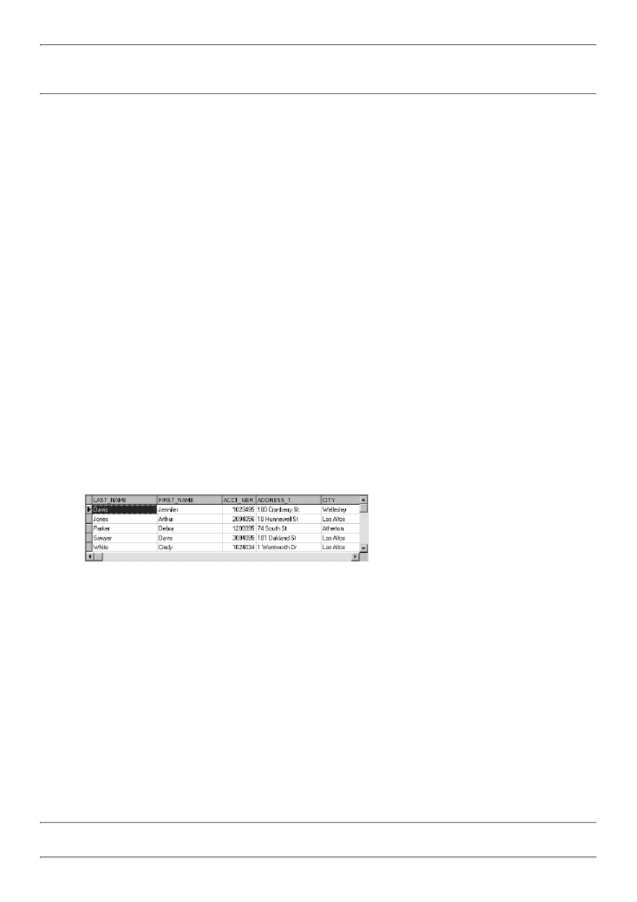
but I won't attempt to cover every detail.
NOTE: Not all the concepts and components discussed in this chapter pertain to every version of Delphi. The
Professional version of Delphi has more database capabilities than the Standard version. The Client/Server version
of Delphi has many more database capabilities than either the Standard or Professional version.
Database Basics
Database programming comes with a whole gaggle of buzzwords: BDE, client, server, ODBC, alias, SQL, query, stored
procedure, and so on. The good news is that it isn't all that bad after you learn some basics. First, let's take a moment to talk
about databases. When you hear the word database, you probably imagine data stored in table format. The table probably
contains fields such as FirstName, LastName, and PhoneNumber. These fields are filled with data to create individual records
in a database file.
If that's what you envision when you think of a database, you're not too far off, but you aren't exactly correct, either. The term
database is used to describe an all-encompassing data creation and maintenance system. It is true that a database can be as
simple as one table. On the other hand, a real-world database can include dozens or even hundreds of tables with thousands or
millions of records. These tables can contain one or more indexes. A complete client/server SQL database solution can also
contain numerous queries and stored procedures. (Don't worry; I'll explain some of these terms later in the chapter.) So as you
can see, a database is more than just a table with data.
Speaking of tables, let's quickly cover some table basics. A table consists of at least two parts: fields and records. Fields are the
individual categories of data in a table. For example, a table containing an address book would have a field called FirstName, a
field called LastName, one called Address, PhoneNumber, and so on. Fields are also referred to as columns. A record, then, is
one person's complete address: first name, last name, address, and so on. Records are also called rows.
A database is just a collection of data, of course, but database tables are often displayed in spreadsheet format. The column
headers across the top indicate the field names. Each row in the table contains a complete record. Figure 16.1 shows just such a
database table displayed in grid (or table) format.
FIGURE 16.1. A typical database table.
New Term: The pointer to the current record within a database is called the cursor.
The cursor points to the record that will be read if data is requested and the record that will be updated if any edits are made.
The cursor is moved when a user browses the database, inserts records, deletes records, and so on.
NOTE: When I say the cursor is a pointer, I don't mean it's a pointer in the Object Pascal sense. I merely mean it
is an indicator of the current record's position.

New Term: A collection of data returned by a database is called a dataset.
A dataset can be more than just the data contained in a table. A dataset can be the results of a query containing data acquired
from many tables. For example, let's say you have a database containing names and addresses of your customers, their orders,
and the details of each order. This data might be contained in tables named Clients, Orders, and Order Details. Now let's say
you request the details of the last 10 orders placed by Company X. You might receive a dataset containing information from
the Clients table, the Orders table, and the Order Details table. Although the data comes from several different sources, it is
presented to you as a single dataset.
Local Databases
The simplest type of database is the local database. A local database is a database that resides on a single machine. Imagine
that you have a program that needs to store a list of names and addresses. You could create a local database to store the data.
This database would probably consist of a single table. The table is accessed only by your program; no one else has access to
it. Any edits made to the database are written directly to the database. Paradox, dBASE, and Access databases are usually local
databases.
Client/Server Databases
Another way a database can be implemented is as a client/server database. The database itself is stored and maintained on a
file server (the server part of the equation). One or more users (the clients) have access to the database. The users of this type
of database are likely to be spread across a network. Because the users are oblivious to one another, more than one might
attempt to access the database at the same time. This isn't a problem with client/server databases because the server knows how
to handle all the problems of simultaneous database access.
The users of a client/server database almost never work with the database directly. Instead, they access the database through
applications on their local computer. These applications, called client applications, ensure that the users are following the rules
and not doing things to the database that they shouldn't be. It's up to the client application to prevent the user from doing
something that would damage the database.
DATABASE SERVERS
As long as I am talking about client/server databases, let's take a moment to talk about database servers. Database
servers come in several flavors. Some of the most popular include offerings from InterBase (a Borland-owned
company), Oracle, Sybase, Informix, and Microsoft. When a company purchases one of these database servers, it
also purchases a license that enables a maximum number of users to access the database server. These licensed
users are often referred to as seats. Let's say a company buys InterBase and purchases licenses for 50 seats. If that
company grows to the point that 75 users require access to the database, that company will have to buy an
additional 25 seats to be in compliance with the license. Another way that client/server databases are sold is on a
per connection basis. A company can buy a license for 50 simultaneous connections. That company can have
1,000 users of the database, but only 50 can be connected to the database at any one time. The database server
market is big business, no question about it.
Single-Tier, Two-Tier, and Multitier Database Architecture
Local databases are often called single-tier databases. A single-tier database is a database in which any changes--such as
editing the data, inserting records, or deleting records--happen immediately. The program has a more direct connection to the
database.
In a two-tier database, the client application talks to the database server through database drivers. The database server takes
the responsibility for managing connections, and the client application is largely responsible for ensuring that the correct
information is being written to the database. A fair amount of burden is put on the client application to make sure the
database's integrity is maintained.
In a multitier client/server architecture, the client application talks to one or more application servers that, in turn, talk to the
database server. These middle-level programs are called application servers because they service the needs of the client
applications. One application server might act as a data broker, responding to and handling data requests from the client and
passing them on to the database. Another application server might only handle security issues.
Client applications run on local machines; the application server is typically on a server, and the database itself might be on
another server. The idea behind the multitier architecture is that client applications can be very small because the application
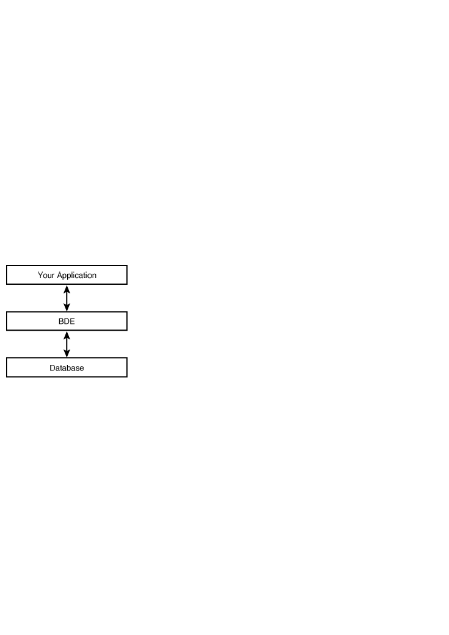
servers do most of the work. This enables you to write what are called thin-client applications.
Another reason to use a multitier architecture is management of programming resources. The client applications can be written
by less experienced programmers because the client applications interact with the application server that controls access to the
database itself. The application server can be written by more experienced programmers who know the rules by which the
database must operate. Put another way, the application server is written by programmers whose job is to protect the data from
possible corruption by errant client applications.
Although there are always exceptions, most local databases make use of the single-tier architecture. Client/server databases use
either a two-tier or a multitier architecture.
So how does this affect you? Most applications you write with Delphi for use with a client/server database will be client
applications. Although you might be one of the few programmers given the task of writing server-side or middle-tier
applications, it's a good bet that you will write primarily client applications. As an application developer, you can't talk directly
to these database servers. Let's look next at how a Delphi application talks to a database.
The Borland Database Engine
To enable access to local databases and to client/server databases, Delphi provides
the Borland Database Engine (BDE). The BDE is a collection of DLLs and utilities that
enables access to a variety of databases.
To talk to client/server databases, you must have the Client/Server version of Delphi. This version ships with SQL Links
drivers used by the BDE to talk to client/server databases. Figure 16.2 shows the relationship between your application, the
BDE, and the database.
FIGURE 16.2. Your application, the BDE, and the database.
BDE Drivers
Naturally, database formats and APIs vary widely. For this reason the BDE comes with a set of drivers that enables your
application to talk to several different types of databases. These drivers translate high-level database commands (such as open
or post) into commands specific to a particular database type. This permits your application to connect to a database without
needing to know the specifics of how that database works.
The drivers that are on your system depend on the version of Delphi you own. All versions of Delphi come with a driver to
enable you to connect to Paradox and dBASE databases. This driver, called STANDARD, provides everything you need to
work with these local databases.
The Client/Server version of Delphi includes drivers to connect to databases by Sybase, Oracle, Informix, InterBase, and
others.
BDE Aliases
The BDE uses an alias to access a particular database. This is one of those terms that might confuse you at first. The terms
alias and database are often used interchangeably when talking about the BDE.
New Term: A BDE alias is a set of parameters that describes a database connection.
When it comes right down to it, there isn't much to an alias. In its simplest form, an alias tells the BDE which type of driver to
use and the location of the database files on disk. This is the case with aliases you will set up for a local database. In other

cases, such as aliases for client/server databases, the alias contains other information as well, such as the maximum size of
BLOB data, the maximum number of rows, the open mode, or the user's username. After you create an alias for your database,
you can use that alias to select the database in your Delphi programs. Later today, in the section "Creating a BDE Alias," I'll
tell you how to go about creating a BDE alias for your own databases.
Delphi's Built-in Databases
As long as I am on the subject of aliases, let's take a quick look at the aliases already set up on your system. To view existing
aliases, perform these steps:
1. Start Delphi or create a new application if Delphi is already running.
2. Switch to the Data Access tab of the Component palette, select a Table component, and place it on the form.
3. Click on the DatabaseName property in the Object Inspector and then click the drop-down arrow button to display a
list of aliases.
After performing these steps, you'll see a list of available databases. At least one of these should be the DBDEMOS alias. This
database alias is set up when Delphi is installed. Select the DBDEMOS database from the list.
NOTE: The list of databases you see depends on several factors. First, it depends on whether you have the Standard,
Professional, or Client/Server version of Delphi. It also depends on whether you elected to install Local InterBase. Finally, if
you happen to have C++Builder or another Borland product installed (such as Visual dBASE or IntraBuilder), you might see
additional databases.
As long as you are here, move to the TableName property and take a look at the available tables. The tables you see are those
available for this database (this alias). Select another alias for the DatabaseName property. Now look at the table names again.
You will see a different list of tables.
SQL Links
The Client/Server version of Delphi comes with SQL Links in addition to the BDE. SQL Links is a collection of additional
drivers for the BDE. These drivers enable Delphi applications to connect to client/server databases such as those provided by
Oracle, InterBase, Informix, Sybase, and Microsoft. Details regarding deployment of SQL Links drivers are also available in
DEPLOY.TXT.
LOCAL INTERBASE
The Standard and Professional versions of Delphi come with a single-user copy of Local InterBase. Local
InterBase is just what its name implies: a version of InterBase that operates on local databases. The Client/Server
version of InterBase, on the other hand, is a full-featured client/server database. The main reason that Delphi ships
with Local InterBase is so that you can write an application that operates on local databases and then later change
to a client/server database with no programming changes. This gives you an opportunity to hone your client/server
programming skills without spending the money for a client/server database.
If you attempt to access a Local InterBase table at either design time or runtime, you will be prompted for a
username and password. The Local InterBase administrator is set up with a username of SYSDBA and a password
of masterkey. You can use these for login, or you can go to the InterBase Server Manager utility and add yourself
as a new user to the InterBase system.
Delphi Database Components
Okay, so the preceding section isn't exactly the type of reading that keeps you up all night turning pages. Still, it's important to
understand how all the database pieces fit together. With that background, you can now turn your attention to the database
components provided by VCL and how those components work together to create a database application. First, I'll give you a
quick overview of the VCL database components, and then you'll look at individual classes and components in more detail.
The VCL database components fall into two categories: nonvisual data access components and visual data-aware components.
Simply put, the nonvisual data access components provide the mechanism that enables you to get at the data, and the visual
data-aware components enable you to view and edit the data. The data access components are derived from the TDataSet class
and include TTable, TQuery, and TStoredProc. The visual data-aware components include TDBEdit, TDBListBox, TDBGrid,
TDBNavigator, and more. These components work much like the standard edit, list box, and grid components except that they
are tied to a particular table or field in a table. By editing one of the data-aware components, you are actually editing the
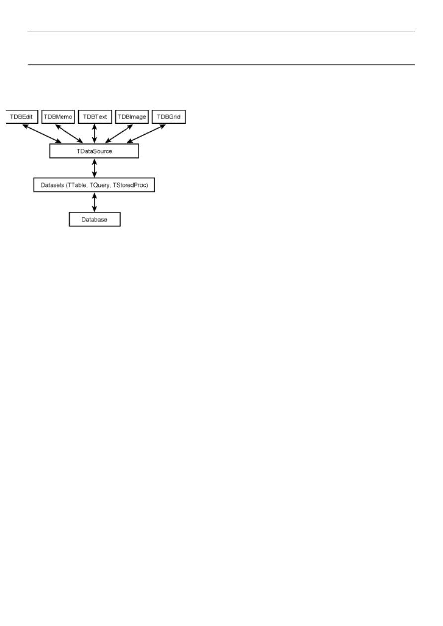
underlying database as well.
NOTE: All the VCL database components can be termed data components. I use the term data access
components for the nonvisual database components on the Data Access tab of the Component palette and the term
data-aware components for the visual database components from the Data Controls tab.
Interestingly, these two component groups cannot talk directly to each other. Instead, the TDataSource component acts as an
intermediary between the TDataSet components and the visual data-aware components. This relationship is illustrated in
Figure 16.3.
FIGURE 16.3. The architecture of the VCL database components.
You'll look at these components in more detail, but first I'll walk you through a quick exercise to illustrate the relationship
described in this section. Start Delphi or create a new application if Delphi is already running. Now do the following:
1. Place a Table component on the form.
2. Locate the DatabaseName property in the Object Inspector and choose the DBDEMOS database.
3. Locate the TableName property and choose the ANIMALS.DBF table.
4. Drop a DataSource component on the form and set its DataSet property to Table1 (choose Table1 from the drop-down
list). The data source is now linked to the dataset (the Table).
5. Drop a DBGrid component on the form and change its DataSource property to DataSource1. This connects the grid to
the data source and, indirectly, to the dataset.
6. Now click the Table component on your form to select it. Change its Active property to True. You now have data in
the table.
That was easy, but you're not done yet. Notice, by the way, that you can use the scrollbars on the grid even at design time.
Okay, just a couple more steps:
1. Place a DBImage component on the form and change its DataSource property to DataSource1 and its DataField
property to BMP (BMP is a field name in the ANIMALS.DBF table that contains a picture of the animal). Hey, a fish!
Size the DBImage as desired to fit the size of the image that is showing in the component.
2. Place a DBNavigator component on the form and change its DataSource property to DataSource1.
Now run the program. Click any of the DBNavigator buttons. When you click on the Next Record button, the record pointer
changes in the DBTable and the picture changes in the DBImage component. All that without writing a line of code!
The data access components are used to connect to a database and to a particular table in a database. The Table component is
used to access a database table. This is the simplest way of accessing the data in a table.
The Query component is a way of accessing a database table using Structured Query Language (SQL) statements. SQL is a
more powerful way of accessing tables, but it is also more complex. You will use either a Table or Query component to access
a database, but not both. Another component is the StoredProc component that enables you access to a database via stored
procedures. A stored procedure is a collection of database statements that performs one or more actions on a database. Stored
procedures are usually used for a series of database commands that is repeated often.
The TDataSet Class
TDataSet is the ancestor class for TTable, TQuery, and TStoredProc. As such, most properties, methods, and events that these
classes use are actually defined by TDataSet. Because so many characteristics of the derived classes come from TDataSet, I'll
list the primary properties, methods, and events of TDataSet here, and later I'll list the properties, methods, and events
particular to each derived class.
Table 16.1 lists the most commonly used properties of the TDataSet class, Table 16.2 lists the primary methods, and Table
16.3 lists the primary events.
TABLE 16.1. PRIMARY TDataSet PROPERTIES.
Property
Description
Active
Opens the dataset when set to True and closes it when set to False.
AutoCalcFields Determines when calculated fields are calculated.
Bof
Returns True if the cursor is on the first record in the dataset and False if it isn't.
CachedUpdates When True, updates are held in a cache on the client machine until an entire transaction is complete. When
False, all changes to the database are made on a record-by-record basis.
CanModify
Determines whether the user can edit the data in the dataset.
DataSource
The DataSource component associated with this dataset.
DatabaseName The name of the database that is currently being used.
Eof
Returns True if the cursor is at the end of the file and False if it isn't.
FieldCount
The number of fields in the dataset. Because a dataset might be dynamic (the results of a query, for
example), the number of fields can vary from one dataset request to the next.
Fields
An array of TFields objects that contains information about the fields in the dataset.
FieldValues
Returns the value of the specified field for the current record. The value is represented as a Variant.
Filter
An expression that determines which records a dataset contains.
Filtered
When True, the dataset is filtered based on either the Filter property or the OnFilterRecord event. When
False, the entire dataset is returned.
FilterOptions
Determines how filters are applied.
Found
Indicates whether a find operation is successful.
Handle
A BDE cursor handle to the dataset. This is used only when making direct calls to the BDE.
Modified
Indicates whether the current record has been modified.
RecNo
The current record number in the dataset.
RecordCount
Returns the number of records in the dataset.
State
Returns the current state of the dataset (dsEdit, dsBrowse, dsInsert, and so on).
UpdateObject
Specifies the TUpdateObject component to use for cached updates.
UpdatesPending When True, the cached update buffer contains edits not yet applied to the dataset.
TABLE 16.2. PRIMARY TDataSet METHODS.
Method
Description
Append
Creates an empty record and adds it to the end of the dataset.
AppendRecord Appends a record to the end of the dataset with the given field data and posts the edit.
ApplyUpdates
Instructs the database to apply any pending cached updates. Updates are not actually written until the
CommitUpdates method is called.
Cancel
Cancels any edits to the current record if the edits have not yet been posted.
CancelUpdates Cancels any pending cached updates.
ClearFields
Clears the contents of all fields in the current record.
CommitUpdates Instructs the database to apply updates and clear the cached updates buffer.
Close
Closes the dataset.
Delete
Deletes the current record.
DisableControls Disables input for all data controls associated with the dataset.
Edit
Enables editing of the current record.
EnableControls Enables input for all data controls associated with the dataset.
FetchAll
Gets all records from the cursor to the end of the dataset and stores them locally.
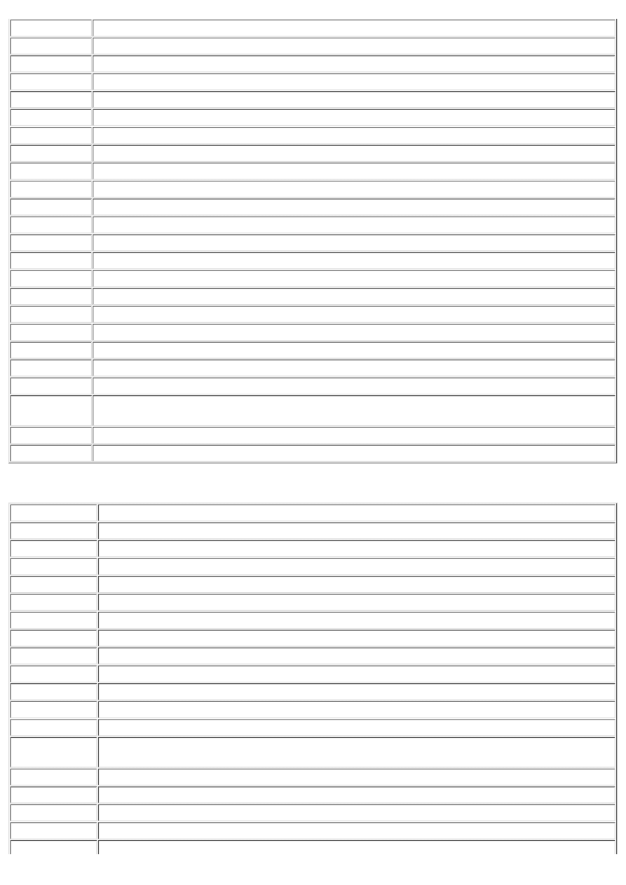
FieldByName
Returns the TField pointer for a field name.
FindFirst
Finds the first record that matches the current filter criteria.
FindNext
Finds the next record that matches the current filter criteria.
FindLast
Finds the last record that matches the current filter criteria.
FindPrior
Finds the previous record that matches the current filter criteria.
First
Moves the cursor to the first record in the dataset.
FreeBookmark
Erases a bookmark set previously with GetBookmark and frees the memory allocated for the bookmark.
GetBookmark
Sets a bookmark at the current record.
GetFieldNames Retrieves a list of the field names in the dataset.
GotoBookmark Places the cursor at the record indicated by the specified bookmark.
Insert
Inserts a record and puts the dataset in edit mode.
InsertRecord
Inserts a record in the dataset with the given field data and posts the edit.
Last
Positions the cursor on the last record in the dataset.
Locate
Searches the dataset for a particular record.
Lookup
Locates a record by the fastest possible means and returns the data contained in the record.
MoveBy
Moves the cursor by the specified number of rows.
Next
Moves the cursor to the next record.
Open
Opens the dataset.
Post
Writes the edited record data to the database or to the cached update buffer.
Prior
Moves the cursor to the previous record.
Refresh
Updates the data in the dataset from the database.
RevertRecord
When cached updates are used, this method discards changes previously made to the record but not yet
written to the database.
SetFields
Sets the values for all fields in a record.
UpdateStatus
Returns the current update status when cached updates are enabled.
TABLE 16.3. PRIMARY TDataSet EVENTS.
Event
Description
AfterCancel
Generated after edits to a record are canceled.
AfterClose
Generated when a dataset is closed.
AfterDelete
Generated after a record is deleted from the dataset.
AfterEdit
Generated after a record is edited.
AfterInsert
Generated after a record is inserted.
AfterOpen
Generated after the dataset is opened.
AfterPost
Generated after the changes to a record are posted.
BeforeCancel
Generated before edits are canceled.
BeforeClose
Generated before a dataset is closed.
BeforeDelete
Generated before a record is deleted.
BeforeEdit
Generated before the dataset goes into edit mode.
BeforeInsert
Generated before a record is inserted.
BeforeOpen
Generated just before a dataset is opened (between the time Active is set to True and the time the dataset is
actually opened).
BeforePost
Generated before edits are posted to the database (or the update cache).
OnCalcFields
Generated when calculations are performed on calculated fields.
OnDeleteError
Generated if an error occurs in deleting a record.
OnEditError
Generated if an error occurs while editing a record.
OnFilterRecord
Generated whenever a new row is accessed and Filter is set to True.
OnNewRecord
Generated when a new record is added to the dataset.
OnPostError
Generated when an error occurs while posting the edits to a record.
OnUpdateError
Generated when an error occurs while cached updates are being written to the database.
OnUpdateRecord Generated when cached updates are applied to a record.
The Fields Editor
Any TDataSet descendant (TTable, TQuery, or TStoredProc) gives access to the Fields Editor at design time. The Fields Editor
enables you to select the fields that you want to include in the dataset.
To invoke the Fields Editor, right-click on a Table, Query, or StoredProc component on your form and choose Fields Editor
from the context menu. The Fields Editor is displayed. At first the Fields Editor is blank, enabling all fields to be included in
the dataset. You can add as many fields as you want to the dataset by selecting Add fields from the Fields Editor context menu.
You can also create new fields for the table by choosing New field from the context menu. Figure 16.4 shows the Fields Editor
as it appears after adding fields.
FIGURE 16.4. The Fields Editor.
After you add fields to the dataset, you can click on any field and modify its properties. The properties show up in the Object
Inspector, enabling you to change the display format, constraints, display label, or other field characteristics.
Cached Updates
Cached updates enable you to control when edits are applied to a database, and they
are controlled by the CachedUpdates property. When cached updates are allowed,
changes to records aren't written directly to the database. Instead, the changes
are written to an update cache on the local machine. Records are held in

Teach Yourself Borland Delphi 4 in 21 Days
- 17 -
Building Database Forms
Creating a Simple Form Using the Database Form Wizard
❍
❍
❍
●
Creating Database Forms by Hand
●
A Closer Look at the Data Components
Properties Common to Data Components
❍
❍
❍
❍
❍
❍
❍
The DBListBox and DBComboBox Components
❍
❍
❍
The DBLookupListBox and DBLookupComboBox Components
❍
❍
❍
❍
●
●
❍
❍
❍
●
After a relatively unexciting look at Delphi database architecture, you can move on to the more interesting task of building a
database application. The first step in that task is to learn how to create database forms, so that's today's subject.
You'll learn how to create database forms using the Delphi Database Form Wizard. You'll also learn how to build database
forms from scratch. Toward the end of the day, you will learn about the data components of Delphi. These are the
components that display the data from a database and enable you to edit that data--you can find them on the Data Controls tab
of the Component palette. They are often referred to as data-aware components. I'll just call them data components in this
chapter. Let's get to it.
The Database Form Wizard
The Delphi Database Form Wizard provides a way of creating database forms quickly and easily. Using this wizard, you can
create a database form from start to finish. You don't have to place any database components on the form. You just start the
wizard and let the wizard take it from there.
NOTE: No automated process is good enough to be all things to all people. I won't pretend that the forms
created by the Database Form Wizard will be everything you want or that the Database Form Wizard will do all
your work for you. What the Database Form Wizard can do, though, is the initial work of setting up a database
form. After the initial work is done, you can go to work customizing the form to make it look the way you want.
The Database Form Wizard enables you to create both simple forms and master/detail forms. It enables you to choose
whether your dataset will be a TTable or a TQuery. The wizard enables you to select a database table and to select the fields
from that table that you want displayed on the form. It gives you a choice of layout options as well. After you supply the
Database Form Wizard with all the information it needs, it creates the new form for you.
To start the Database Form Wizard, choose Database | Form Wizard... from the Delphi main menu. Alternatively, you can
start the Database Form Wizard from the Business page of the Object Repository.
First I'll show you how to create a simple form, and then I'll talk about master/detail forms.
Creating a Simple Form Using the Database Form Wizard
When the Database Form Wizard starts, it displays the page shown in Figure 17.1.
FIGURE 17.1. Page one of the
Database Form Wizard.
This page of the Database Form Wizard asks you to choose the type of database you want to create and the dataset type you
would like to use. The Form Options section gives you the choice of creating a simple form (with a single dataset) or a
master/detail form.
I talked briefly about master/detail tables yesterday in the section "Master/Detail Tables." I'll talk more about master/detail
forms later today in the section "Creating a Master/Detail Form." The first page of the Database Form Wizard also enables
you to select from either a TTable-based dataset or a TQuery-based dataset. For this exercise, the default settings for creating
a simple form using a TTable dataset are what you want, so you can click the Next button to move on to the next page.
TIP: In some cases, you might want to implement data from more than one table on a single form but not use a
master/detail relationship. The Database Form Wizard enables you to choose only from one table. What you can
do, though, is run the Database Form Wizard and select the first table. Your form will be created. Change the
names of the Table and DataSource components to something meaningful. Now run the Database Form Wizard
again and choose the second table. When the form is displayed, select all the database components on the form
and copy them to the Clipboard. Switch back to the first form, make some room on the form for the new
components, and paste them from the Clipboard onto the form. Now remove the second form from the project,
and you're all set.
The next page asks you to choose a table from which to obtain the data. The Drive or Alias name combo box enables you to
choose a database name just as you do when setting the DatabaseName property for a dataset component at design time. It
also enables you to choose a directory from which to select a table. For this example, choose the DBDEMOS alias. The tables
available in the database will show up in the Table Name list box. Select the ANIMALS.DBF table. The Database Form
Wizard now looks like the one in Figure 17.2. Click the Next button to go to the next page.
FIGURE 17.2. Selecting a table with
the Database Form Wizard.
The third page of the Database Form Wizard asks you to choose the fields from the table that you want to include on the
form. The Available Fields list box on the left shows the fields that are in the table you have selected. The Ordered Selected
Fields list box on the right contains the fields that you want on your new form. Between the two list boxes are four buttons
for adding or removing fields from the Ordered Selected Fields list box.
To add a field, click the field name in the Available Fields list box and click the > button. Add any fields you want with this
method. You can select multiple fields and click the > button to add the selected fields. To add all fields in the table at one
time, click the >> button.
TIP: You can double-click a field name to add that field to the Ordered Selected Fields list box or double-click
it again to remove it from the list box.
After the fields have been added to the Ordered Selected Fields list box, you can change the order of the fields by drag and
drop or by clicking the up and down arrow buttons below the list box. Figure 17.3 shows this page of the wizard. For now,
add all the fields to the Ordered Selected Fields list box and click the Next button to move to the next page.
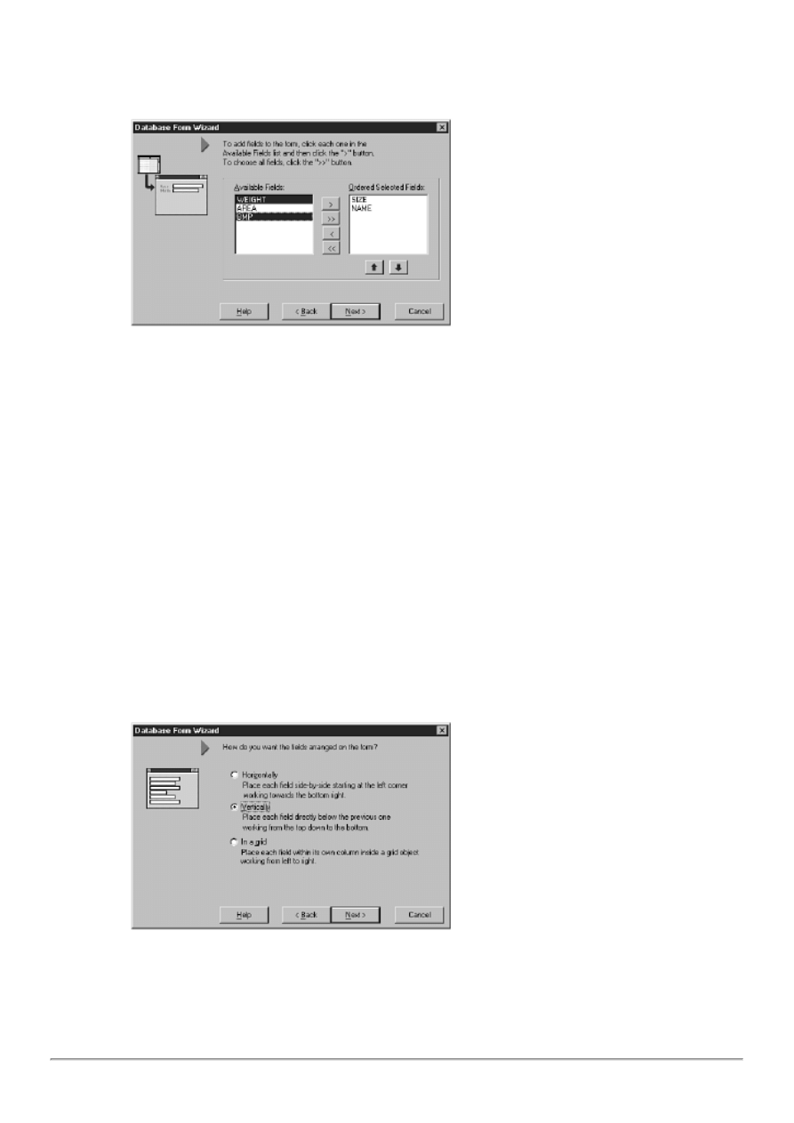
FIGURE 17.3. Page three of the
Database Form Wizard, adding fields.
The next page of the Database Form Wizard dialog asks you how you want the components for each field arranged on the
form. You have three layout choices:
Horizontally
●
Vertically
●
In a grid
●
Click each of the three radio buttons and watch the image to the left of the wizard as you select different options. The image
changes to show you the layout for each choice. Select the radio button labeled Vertically and click the Next button to
continue. Figure 17.4 shows this page of the wizard.
FIGURE 17.4. Selecting a layout style
with the Database Form Wizard.
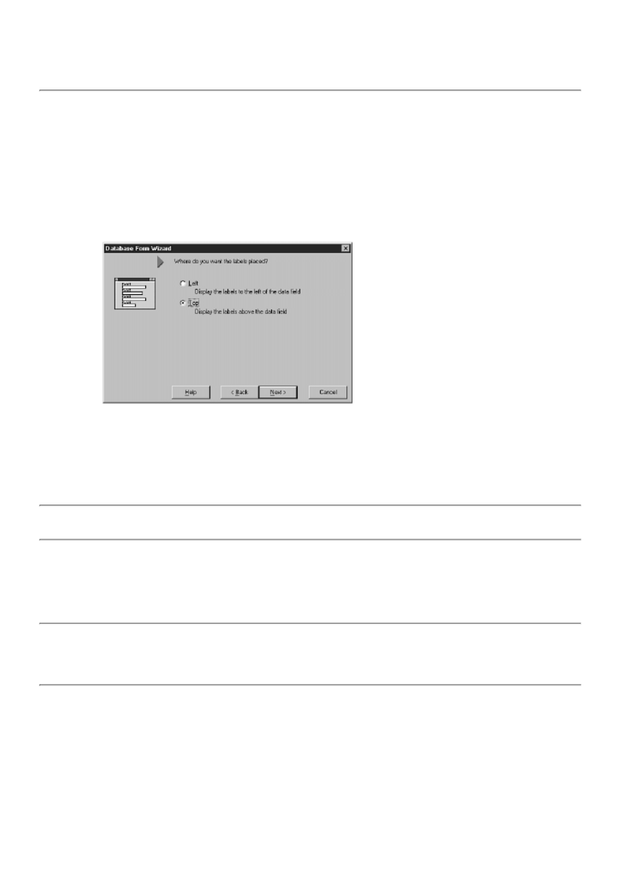
NOTE: When Delphi creates the database form, it chooses the component type that most closely matches the
data type of the field that component represents. For example, a regular text field is represented by a DBEdit
component, a memo field by a DBMemo component, and a BLOB image field by a DBImage component.
Delphi makes a best guess as to the component type to place on the form for a given data type. You might have
to edit the form to get exactly the component you want for a given field.
The next page asks where you want to place the labels for the fields relative to each data component. You can put the labels
on top of the components or to the left. Notice that here, too, the image on the Database Form Wizard changes depending on
which of the two options is currently selected. For now, choose the second option in order to place the labels on top of the
components. Figure 17.5 shows this page of the Database Form Wizard.
FIGURE 17.5. This page enables you
to place the labels.
NOTE: The page shown in Figure 17.5 appears only if you select the option for vertical component layout on
the previous page of the Database Form Wizard.
The final page of the Database Form Wizard asks you to make two choices:
The first choice, to create the new database form as the main form of the application, is in the form of a check box near
the top of the page. Check this option if this form is going to be the main form of the application. If this form isn't the
main form, clear the check box.
●
NOTE: If you choose to have Delphi create the new database form as the main form of the application, be aware
that the existing main form will still be part of the application's project. You need to remove the old main form
from the project if you don't want it anymore. To remove the old main form, click the Remove from Project
button and remove the main form's unit (Unit1.pas for a default project).
The second choice asks you whether to create just the form or the form and a data module. If you choose the first
option (Form Only), the form will contain all the data components, the DataSet component (Table or Query), and the
DataSource component. If you choose the second option (Form and DataModule), the DataSet component and the
DataSource component will be removed from the form and placed in a separate data module.
●
I'll talk more about data modules tomorrow in the section "Working with Data Modules." For now, make certain that the
Generate a Main Form check box is checked and that the Form Generation option is set to Form Only. Figure 17.6 shows the
last page of the Database Form Wizard.
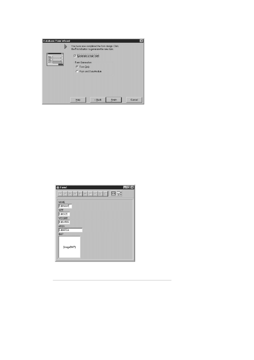
FIGURE 17.6. The last page of the
Database Form Wizard.
Click the Finish button and the form will be created. The finished form looks like the one shown in Figure 17.7.
FIGURE 17.7. The finished form.
Notice in Figure 17.7 that the form contains a data component for each field that was selected and a label for each
component. The label is capitalized because that's the way the field names are stored in this particular table. Notice that the
top of the form contains a DBNavigator component so that you can browse the records of the table.
The New Form in Action
Now you are ready to click the Run button and see how the form works. When the application starts, the first record in the
dataset is displayed. Use the buttons of the DBNavigator to move through the dataset. Keep in mind that you are working
with live data at this point. You can edit a record by changing a value in one of the edit components. To save the changes to
the database, click the Post button on the DBNavigator (the check mark). To cancel any changes to the record, click the
Cancel button on the DBNavigator (the X button). When you post a record or move to another record, the changes are saved

to the database.
Close the application and return to the Delphi IDE. Spend some time examining the components on the form and the
components' properties. Later I am going to go over some of the data components, but for now just experiment a little.
NOTE: If you find yourself re-creating a database form over and over again, consider adding the form to the
Object Repository. Forms in the Object Repository can be reused with just a few mouse clicks.
Creating a Master/Detail Form
Next, you create a master/detail form using the Database Form Wizard. When creating a master/detail form, the first few
pages of the wizard are nearly the same as when creating a simple form. Only the labels that describe your options are
different. First, perform the following steps. After that, I explain the specifics of the Database Form Wizard that pertain to
master/detail forms. Here goes:
1. Start the Database Form Wizard. On the first page, choose the option to create a master/detail form and the option to
use TTable for the dataset components. Click the Next button.
2. The next step is to choose the table that will serve as the master. Select the DBDEMOS alias and then select the
CUSTOMER.DB table. Click the Next button.
3. Select just the CustNo and Company fields and add them to the Ordered Selected Fields list box. Click the Next
button.
4. Click on the Horizontally option to lay out the components horizontally. Click the Next button.
5. Now choose the table that will provide the details. Select the ORDERS.DB table and then click the Next button.
6. Select the CustNo, OrderNo, SaleDate, and AmountPaid fields and add them to the Ordered Selected Fields list box.
Click the Next button.
7. Choose the option to arrange the components in a grid and click the Next button.
Now you are presented with a page you haven't seen before in the Database Form Wizard. This page asks you to select the
fields that will join the two tables:
1. Click on the Available Indexes combo box at the top of the page and choose the CustNo field. The CustNo field is
designated as a secondary index, so you'll use that field to join the two tables.
2. Select CustNo in both the Detail Fields list box and in the Master Fields list box. After you select CustNo in both list
boxes, the Add button between the two list boxes is enabled.
3. Click the Add button to add the join to the Joined Fields list box at the bottom of the page.
NOTE: If you are paying attention, you might notice that this page of the Database Form Wizard looks almost
identical to the Field Link Designer you saw on Day 16, "Delphi Database Architecture," when you set up a
master/detail form by hand. Both perform the same task.
Figure 17.8 shows the Database Form Wizard after joining the two tables.
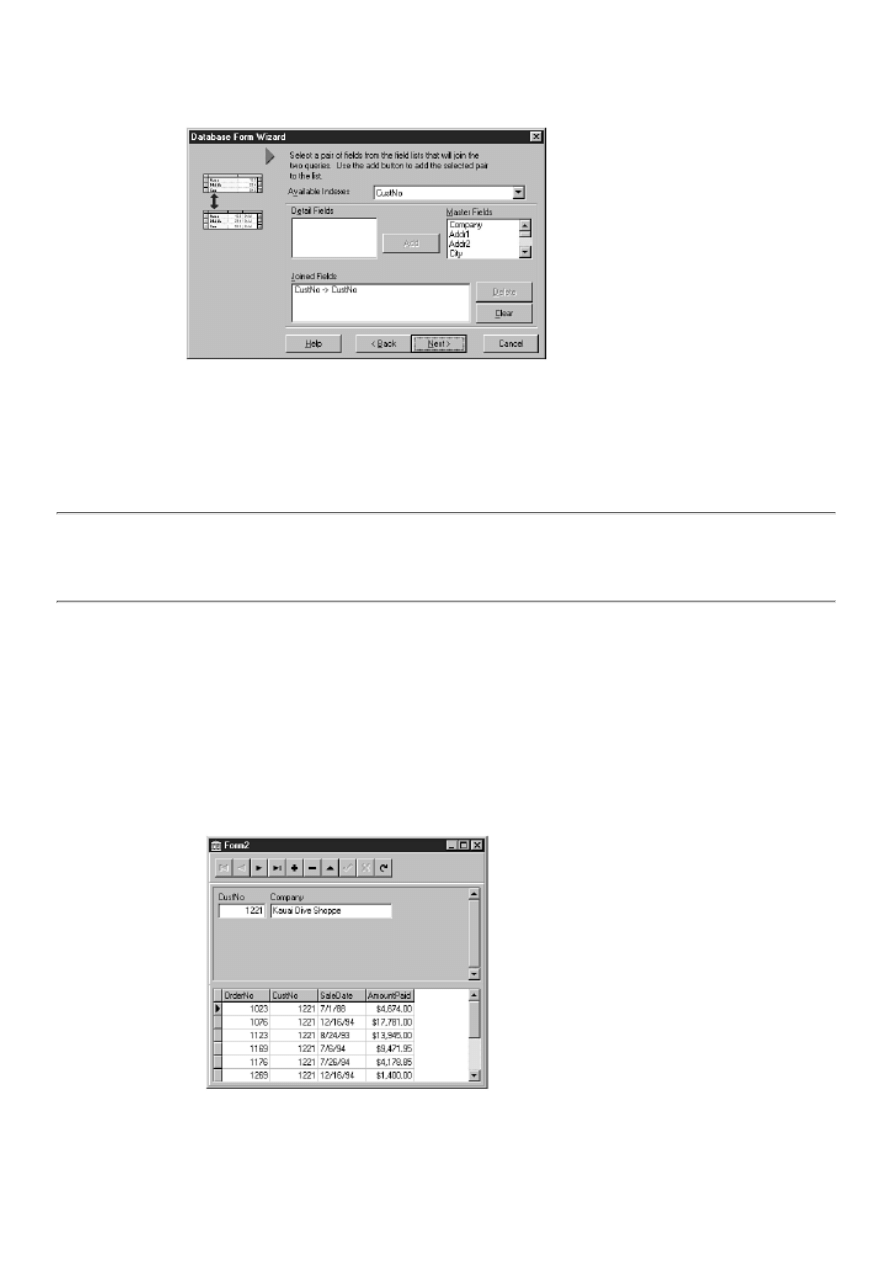
FIGURE 17.8. The two tables joined
on the CustNo field.
NOTE: The page illustrated in Figure 17.8 is slightly different if you are using TQuery--instead of
TTable--components for the datasets. Specifically, the Available Indexes combo box isn't present when using
TQuery components. The reason this combo box isn't displayed when using TQuery components is that the join
is created using SQL statements, and indexes are not used in the same way they are with TTable components.
4. Click the Next button to move to the next page of the Database Form Wizard. Because this page already has the
settings you need, just click the Finish button.
Now Delphi creates the form, and you are ready to try your new creation. Click the Run button to run the program. Use the
DBNavigator to move from record to record. You will notice that the customer name is displayed in the top part of the form
and that all the orders for that customer are displayed in the table in the bottom part of the form. Figure 17.9 shows the
master/detail application running.
FIGURE 17.9. Your new master/detail
form in action.
TIP: If you want to see the SQL statements for a master/detail relationship, run the Database Form Wizard
again, but this time choose TQuery components for the datasets. After the form has been created, click on each
Query component and examine its SQL property.
Creating Database Forms by Hand
The Database Form Wizard is a good tool for quickly laying out a form; it is particularly convenient for quick test programs.
It will not be long, though, before you will need to custom-design your database forms. After you gain experience creating
database forms, you might actually prefer to create your forms by hand rather than use the Database Form Wizard.
There isn't a lot to know about creating database forms by hand. You drop one or more datasets (Tables or Queries) on the
form and a DataSource component for each dataset, and then place a component on the form for each field in the dataset that
you want to view. Sounds easy enough, and it is.
Let's build a new form that approximates the form you created earlier in the section "Creating a Simple Form Using the
Database Form Wizard." First, you lay the groundwork and start adding the data components. Perform these steps:
1. Start a new application. Place a Panel component on the form and set its Align property to alTop. Remove the
caption.
2. Place a ScrollBox component on the form below the panel (you can find it on the Additional tab on the Component
palette). Set the Align property to alClient.
3. Place a Table component on the form. You can place it anywhere you like, but the right side of the panel is probably
the best place. Change the DatabaseName property to DBDEMOS and the TableName property to ANIMALS.DBF.
4. Place a DataSource component on the form next to the Table component. Change the DataSet property to Table1.
5. Place a DBNavigator on the panel at the top of the form. Change its DataSource property to DataSource1.
TIP: You can set the DataSource property quickly by double-clicking the value column next to the property in
the Object Inspector. Delphi will cycle through the available DataSource components each time you
double-click.
Your form now looks like Figure 17.10.
FIGURE 17.10. The form in the initial
stages.
Now you need to add some data components to display the table's data. As you work through this exercise, you might want to
refer to Figure 17.7 to see the result. Do the following:
1. Place a DBEdit component on the main part of the form along the left side. Change the Name property to NameEdit;
change the DataSource property to DataSource1; change the DataField property to NAME (choose NAME from the
drop-down list).
2. Place a Label component above the DBEdit you created in step 1 (use a regular Label component from the Standard
page of the Component palette, not a DBText component). Change its Caption property to Name.
3. Repeat steps 1 and 2 and add DBEdits and Labels for the SIZE, WEIGHT, and AREA fields of the table. Make
certain that you change the Name property and DataField property with respect to each field's name.
In the next two steps, you depart from Figure 17.7 and place the component for the BMP field to the right of the
components you just placed. It makes more sense for it to be there rather than below the existing components.
4. Place a DBImage component on the form to the right of the edit components. Change the Name property to
BMPImage, and change the DataSource property to DataSource1 and the DataField property to BMP.
5. Place a Label component above the DBImage and change its Caption property to Picture (the field name is BMP, but
the word Picture is more descriptive).
Now your form looks like the one shown in Figure 17.11.
FIGURE 17.11. The form with the data
components in place.
Now you need to set the size of the DBImage component. Although you can't always be sure that each image will be the
same size in every database, you can be certain in this case. You might guess at the size of the bitmap, but a better solution
would be to set the size with a live image in the component. That's easy enough to fix. Click on the Table component and set
its Active property to True. The image for the first record in the table is displayed. Now you can size the DBImage as needed
to match the bitmap size.
You have nearly completed the form, but there's one more thing you should do. To imitate the form that the Database Form
Wizard created, you need to open the table when the form is created:
1. First, set the Active property of the Table to False (you just set it to True a minute ago).
2. Now select the form itself in the Object Inspector. (Remember that to select the form, you click on the panel and
then press the Esc key on your keyboard. You can also select the form from the Component Selector at the top of the
Object Inspector.)
3. Switch to the Events page and create an event handler for the OnCreate event. Type this line of code in the event
handler:
Table1.Open;
That's it. Your new form is finished. Click the Run button to test your new creation. It will behave exactly like the first form

you created with the Database Form Wizard.
A Closer Look at the Data Components
At this point, a quick look at the data components is in order. I'll give a brief overview of each component and highlight each
one's key properties and methods. Most of the data components are derived from a standard component and have many of the
properties associated with that type of component. I will discuss only the properties that are specific to the data version of
each component.
Properties Common to Data Components
All the data components have properties in common. For example, all the components have a DataSource property. This
property is used to link a data component with a data source, which is itself linked to a dataset. You have been using the
DataSource property a lot in the past couple of days, so you should have a good idea of how it works.
Most data components also have a DataField property. You use this property to hook the data component to a particular field
in the dataset. You saw how the DataField property is used when you built a database form from scratch. When you hook a
data component to a field in the dataset, the contents of that field are directly displayed in the data component. In the case of
Tables (and Queries if the RequestLive property is True), this means that editing the data in the data control will result in
changes to the data in the database.
Most data components also have a Field property. You use the Field property to gain access to a component's contents
programmatically. For example, to change the contents of a DBEdit component, you can do the following:
NameEdit.Field.AsString := `Clown Fish';
You can also change the field's display characteristics or other TField properties through the Field property.
You can use the ReadOnly property to prevent the user from editing the data in a data component that enables editing
(DBGrid and DBEdit, for example).
The DBGrid Component
The DBGrid component displays a dataset in tabular, or spreadsheet, format. One of the most important properties of the
DBGrid is the Columns property. This property enables you to change the number and order of the columns that appear in the
grid. You can add, remove, and order columns using the Columns Editor.
To invoke the Columns Editor, right-click on the grid and choose Columns Editor from the context menu. You can also click
the ellipsis button next to the Columns property in the Object Inspector. Using the Columns Editor, you can add columns,
remove columns, and arrange the order of columns. For example, a dataset might contain a dozen fields, but you might want
to view only half those fields in the DBGrid. Using the Columns Editor, you can hide the fields that you don't want to see.
NOTE: Don't confuse the DBGrid Columns property (modified with the Columns Editor) with the Table
component's FieldDefs property (modified with the Fields Editor). The FieldDefs property of the Table
component controls which columns are actually contained in the dataset. The Columns property only affects
which fields are visible in the grid.
The DefaultDrawing property indicates whether VCL draws the cells in the grid or the grid cells are owner-drawn. If
DefaultDrawing is False, you must respond to the OnDrawColumnCell and OnDrawDataCell events to provide drawing for
the cells.
The Options property enables you to set the display and behavior options for the grid. Using this property, you can turn off
column titles, allow or disallow column sizing, turn row and column lines on or off, and so on.
The TitleFont property enables you to set the font for the column titles. You use the Font property to set the font for the grid
cells.
The DBGrid has only two public methods. When using an owner-drawn grid, you can call the DefaultDrawColumnCell and
DefaultDrawDataCell methods to ask VCL to draw the cell for you. This is useful if you are owner-drawing particular
columns but you want default drawing behavior for the rest of the columns.
The DBGrid component has several events, most of which pertain to cell editing and data navigation. I won't list the events
here because it is obvious from their names what functions they perform.

The DBNavigator Component
The DBNavigator component enables the user to browse a dataset record by record. The navigator provides buttons for first
record, next record, previous record, last record, insert record, delete record, edit record, cancel edits, post edits, and refresh.
This component is nearly automatic in that most of the time all you have to do is drop it on the form, hook it to a DataSource,
and forget about it.
The ConfirmDelete property, when set to True, causes a dialog box to be displayed whenever the user clicks the Delete
button. You set the Hints property to True to enable fly-over hints for each button on the navigator. The VisibleButtons
property is a set that enables you to control which buttons show up on the navigator. You can add or remove buttons at design
time or runtime.
The DBNavigator has only one method of interest and one event. You can use the BtnClick method to simulate a button click
on the navigator. You can use the OnClick event to detect a click on the navigator. You rarely have to use OnClick, however,
because the navigator already knows what to do when its buttons are clicked.
The DBText Component
The DBText component is the data-aware version of the standard Label component. It provides a way of displaying data from
a field without enabling the user to modify the data. This component provides no database-specific properties, methods, or
events other than those common to all data components.
The DBEdit Component
The DBEdit component provides an edit control that is linked to a field in a dataset. You used a DBEdit earlier today when
you created a database form from scratch. The DBEdit component, like the DBText component, doesn't have any
database-specific properties, methods, or events other than those common to all data components.
The DBMemo Component
The DBMemo is the data version of the standard Memo component. You can use this component to display data contained in
database fields that contain large amounts of text. The AutoDisplay property controls whether the data in the dataset field is
automatically displayed when the cursor changes to a new record.
When AutoDisplay is True, the data is automatically displayed. When AutoDisplay is False, the user must double-click the
DBMemo to display the data (or press Enter when the control has focus). To force the memo to display its contents through
code, you use a related method called LoadMemo. This method is appropriate only when AutoDisplay is False.
The DBImage Component
The DBImage component is used to display binary large object (BLOB) data that is stored in image format. DBImage isn't
necessarily a read-only component. You can change an image by pasting an image from the Clipboard or by using the Picture
property to load a file from disk. The following code will change the image at runtime:
DBImage1.Picture.LoadFromFile(`peregrine.bmp');
The main DBImage properties control how the image is displayed. They are described as follows:
The AutoDisplay property works exactly as described for the DBMemo component.
●
The LoadPicture method can be used to display the image when the AutoDisplay property is False.
●
The Picture property enables access to the image itself and works the same as it does for components such as the
standard Image component.
●
The Center property determines whether the image is centered in the DBImage window.
●
The Stretch property determines whether the image will be stretched to fit the current size of the DBImage window or
whether it will be displayed in its original size. If Stretch is False, part of the image will be clipped if the image is too
large for the DBImage window.
●
The QuickDraw property determines whether to apply a palette to the image when it is displayed. When QuickDraw is
True, no palette is used. When QuickDraw is False, a palette is used to display the image, which results in higher
quality but slightly poorer performance when displaying images.
●
Methods of the DBImage component include CutToClipboard, CopyToClipboard, and PasteFromClipboard. These methods
do exactly what their names indicate.

The DBListBox and DBComboBox Components
The DBListBox component is, for the most part, a standard list box. What distinguishes it is that when the user selects an
item in the list box, the selected item is written to the corresponding field in the dataset (set by the DataField property). To
provide the strings the user can select from, you add strings to the Items property just as you do for a regular ListBox
component. It is important to realize that the strings for the list box don't come from the database (that's what the
DBLookupListBox is for).
The DBComboBox works in exactly the same way as the DBListBox except for the obvious differences between a list box
and a combo box.
The DBCheckBox Component
You use the DBCheckBox primarily to display the contents of a database field containing logical data (True/False, Yes/No,
On/Off). Set the ValueChecked property to a string that should be used to check for a match against the contents of the field.
For example:
DBCheckBox1.ValueChecked := `On';
In this case, if the associated field contains the value On, the DBCheckBox will be checked. If the field contains a value other
than the one specified, the check box will not be checked. You can supply more than one value to check in the ValueChecked
property. For example:
DBCheckBox1.ValueChecked := `On;Yes;True';
If the value of the associated field contains any one of these values, the check box will be checked. The ValueUnchecked
property works in exactly the same way except that any values matching the contents of ValueUnchecked will cause the
check box to be cleared (unchecked). When specifying values for both ValueChecked and ValueUnchecked, the check box
state will be indeterminate (grayed check mark) for field values that don't match.
The DBRadioGroup Component
The DBRadioGroup component works much like the DBListBox and DBComboBox components. You supply the items for
the radio group and when an item is selected, the value (text) associated with that radio button is written to the associated
field in the database.
The Values property holds the current value of the field in the database. You can use the Values property to substitute the
display string in the radio group box with a different string. For example, you might have a radio group box with radio
buttons labeled Yearly, Quarterly, and Monthly. Your database, however, might store codes such as Y, Q, and M instead of
the full names. Given that scenario, you could set the Values property (a string list) like so:
Y
Q
M
Now, when a radio button is selected, the one-letter code will be written to the database field instead of the display string of
the selected radio button. If the Values property is empty, the display string of the radio button will be written to the database
when a radio button is clicked.
The DBLookupListBox and DBLookupComboBox Components
The DBLookupListBox component enables you to display a list of field values from a lookup field. Unlike the
DBComboBox component, the list isn't provided by you; it is provided by a separate dataset. Set the DataSource and
DataField properties to the dataset and field where the selection will be written. Set the ListSource and ListField properties to
the lookup field from which the list should be populated.
The DBLookupComboBox works just like the DBLookupListBox. In addition, the DropDownAlign, DropDownRows, and
DropDownWidth properties control how the drop-down list appears.
The DBRichEdit Component
The DBRichEdit component enables you to display and edit a rich text memo field in a dataset. The AutoDisplay property
and LoadMemo methods of this component work exactly as they do for the DBMemo component.
The DBCtrlGrid Component
DBCtrlGrid is a component that enables you to create custom scrollable grid components. You can place any data
components you want on the first cell of the DBCtrlGrid (or any other components for that matter), and Delphi will duplicate
those components for each record in the dataset.
An illustration helps this explanation make more sense. Figure 17.12 shows a form containing a DBCtrlGrid component that
has been aligned so that it fills the form's client area. The DBCtrlGrid contains a DBEdit, a DBMemo, and a DBImage. All
the data components are placed on the first cell of the grid. The second cell contains a hatch pattern to tell you that you can't
place components on that cell. Figure 17.13 shows the same form when the application is running.
FIGURE 17.12. A form at design time
containing a DBCtrlGrid component.
FIGURE 17.13. The same form at
runtime.
The DBCtrlGrid has a few properties worth mentioning. You use the Orientation property to determine where the scrollbar is
to be placed and how the component acts when the scrollbar is clicked (the DBCtrlGrid in Figures 17.12 and 17.13 has the
Orientation set to goHorizontal). You use the PanelWidth and PanelHeight properties to set the width and height of a cell in
the grid. The RowCount property determines how many records to show at one time.
The DBCtrlGrid component has one event, OnPaintPanel. This event is fired each time a grid cell needs painting. You can
respond to this event in order to draw on the background of the panel. This pertains only to the panel's background. Any
controls on the grid will be painted automatically, so you don't have to worry about them.
Other Data Components
DBChart is a charting component included with the Professional and Client/Server versions of Delphi. This component is not
only powerful, but also complex. I can't begin to explain everything the DBChart component does, so you'll have to
experiment with it to discover all that it is capable of.
The Client/Server version of Delphi includes a tab named Decision Cube that contains six additional components. These
components enable you to do complex data analysis such as cross tabulation of tables and graphs, drill down, pivot, and
aggregation. A discussion of these components wouldn't be productive here, but I want you to be aware that these
components exist in the Client/Server version of Delphi.
Summary
Well, that about sums up the art of building database forms. (Actually, I'm being facetious because I've just scratched the
surface of database form creation and design.) Use the Database Form Wizard for quick and easy database forms. Create
database forms from scratch for more flexibility. Either way you go, building good database forms takes time and experience
to master. It isn't something that you can be great at overnight. On the other hand, it isn't terribly difficult, either. Keep
working at it and you'll be a database whiz in no time. The important thing is knowing the data components available to you
as you build your forms.
Workshop
The Workshop contains quiz questions to help you solidify your understanding of the material covered and exercises to
provide you with experience using what you have learned. You can find the answers to the quiz questions in Appendix A,
"Answers to the Quiz Questions."

Q&A
Q I like the way the Database Form Wizard saves me time, but I don't like the way the components are
arranged on the form. What do you suggest?
A Run the Database Form Wizard to create components for any fields you want on your form. Then manually
rearrange the components to make the form look the way you want. The Database Form Wizard just gives you a head
start. You can do anything you want with the form after the Database Form Wizard has done its job.
Q When using the Database Form Wizard, does it matter whether I create a form using TTable or TQuery
objects?
A It all depends on the type of database you are talking to. If you are dealing with a local database such as Paradox or
dBASE, you will probably use a TTable. If you are dealing with a client/server database, you will likely use a TQuery.
Q Is there any limit to the number of DataSource, Table, and Query components I can have on my form?
A There's no absolute limit, although there are practical limits to how many datasets you can work with at one time.
Q I noticed the DBEdit component doesn't have a Text property like the regular Edit component has. Why is
that?
A The DBEdit component doesn't have a Text property because the component contents are obtained from a dataset.
To access the contents of a DBEdit component, use the dataset's GetFieldByName method and the Value property of
TField.
Q Do I have to use a DBNavigator to enable my users to browse the database?
A No, you could provide your own buttons and then write code to move the database cursor when the buttons are
clicked. Using a DBNavigator is much easier, though.
Q My database contains a number of large images in BLOB fields, and it
seems to take a long time to display the images. Is there something I can do to make
the images draw faster?
A Make certain that you have the QuickDraw property set to True. Your images will draw faster, but they might not
look as good.
Quiz
1. What's the fastest and easiest way to create a database form?
2. How do you control the order and number of columns that appear in a DBGrid component?
3. What component enables you to display a dataset in table format?
4. How can you add or remove buttons from a DBNavigator?
5. What component do you use to display BLOB image data?
6. What property is common to all data-aware components?
7. What property is used to select the field that a data component is linked to?
8. Can you rearrange the columns in a DBGrid component?
9. Which component is used to edit and display text fields in a database?
10. What does BLOB stand for?
Exercises
1. Create a new application that shows the contents of the VENDORS.DB table (DBDEMOS database).
2. Modify the application in step 1 so that only the VendorName, City, State, and Phone fields are displayed.
3. Delphi Professional and Client/Server owners: Create a master/detail form from the IBLOCAL database (install
Local InterBase from the Delphi CD if necessary). Use the EMPLOYEE table as the master and the
EMPLOYEE_PROJECT table as the detail table. (Hint: Use the EMP_NO field to link the tables.)
4. Create a database form that uses a DBCtrlGrid component to browse a table. Use any table and include any fields
you like.
5. Create a database form by hand (not using the Database Form Wizard) using any table and any fields you like. Add a
DBNavigator component to browse the table.
6. Remove all buttons from the DBNavigator used in step 5 except the First, Next, Prior, and Last buttons.

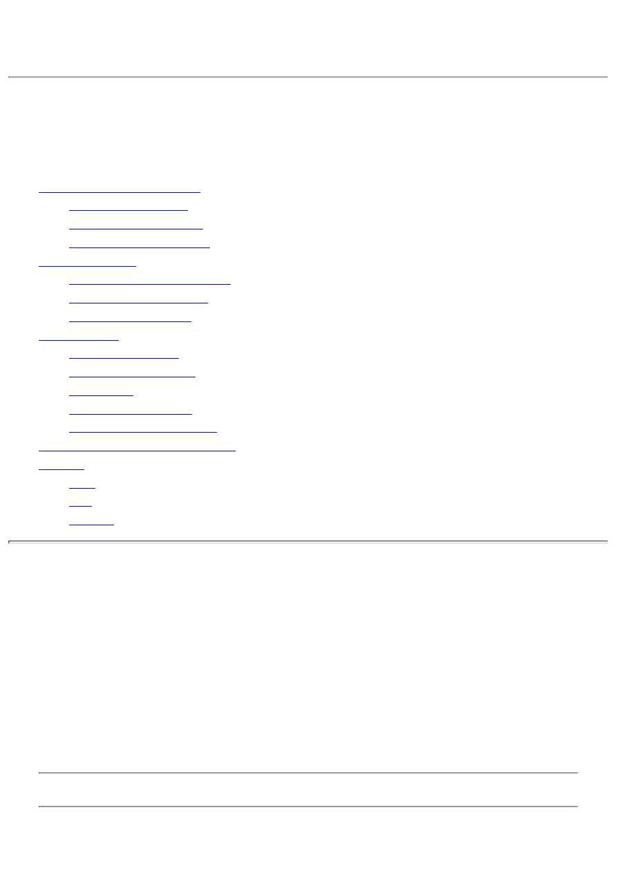
Teach Yourself Borland Delphi 4 in 21 Days
- 18 -
Building Database Applications
Nonvisual Database Programming
❍
❍
Creating the Field Definitions
❍
●
Setting Up a Sample Data Module
❍
❍
❍
●
❍
❍
❍
❍
❍
●
Deploying a Delphi Database Application
●
❍
❍
❍
●
This chapter is about building database applications. The truth is, I cannot tell you everything there is to know about writing
database applications in one short chapter. What I can do is point out some issues you are likely to encounter when writing
database applications.
Because you already know how to create database forms, you will spend most of this day dealing with lower level aspects of
database programming. You'll start with creating and populating a database entirely through code, and then you'll move on to
data modules. Toward the end of the day you'll look at creating database reports with the QuickReport components. Finally,
the day ends with a discussion on deploying database applications.
Nonvisual Database Programming
Up to this point, you have examined almost exclusively the visual aspects of database programming with Delphi. That side of
database programming is fun and easy, but sooner or later you have to do some real database programming. The kinds of
programs you have written so far have dealt primarily with simple viewing and editing of data. In this section, you learn how
to perform certain database operations through code.
TIP: I will mention only database operations that pertain to the TTable class. You could also use SQL to perform
database operations in code, but I won't present that aspect of databases today.

Reading from a Database
This section is short because reading from an existing database isn't difficult. As an example exercise, you will take the
CUSTOMER.DB table and create a comma-delimited text file from the data. You won't write every field in the table to the
file, but you'll write most of them.
The first step is to create a TTable object. Next, attach it to a database and to a particular table within the database. Here's how
the code looks:
var
Table : TTable;
begin
Table := TTable.Create(Self);
Table.DatabaseName := `DBDEMOS';
Table.TableName := `Customer.db';
end;
This code emulates what Delphi does when you set the DatabaseName and TableName properties at design time. The next step
is to read each record of the database and write it to a text file. First, I'll show you the basic structure without the actual code to
write the fields to the text file. After that, I'll be more specific. The basic structure looks like this:
Table.Active := True;
while not Table.Eof do begin
{ Code here to read some fields from the }
{ current record and write them to a text file. }
Table.Next;
end;
Table.Free;
This code is straightforward. First, the table is opened by setting the Active property to True (you could also have called the
Open method). Next, a while loop reads each record of the table. When a record is written to the text file, the Next method is
called to advance the database cursor to the next record. The while loop's condition statement checks the Eof property for the
end of the table's data and stops the loop when the end of the table is reached. Finally, the TTable object is freed after the
records have been written to the text file.
NOTE: You don't specifically have to delete the TTable object. When you create a TTable object in code, you
usually pass the form's Self pointer as the owner of the object--for example,
Table := TTable.Create(Self);
This sets the form as the table's owner. When the form is deleted, VCL will automatically delete the TTable object. For a main
form this happens when the application is closed. Although you are not required to delete the TTable object, it's always a good
idea to delete the object when you are done with it.
Naturally, you need to extract the information out of each field in order to write it to the text file. To do that, you use the
FieldByName method and the AsString property of TField. I addressed this briefly on Day 16, "Delphi Database Architecture,"
in the section "Accessing Fields." In the CUSTOMER.DB table, the first field you want is the CustNo field. Extracting the
value of this field would look like this:
var
S : string;
begin
S := Table.FieldByName(`CustNo').AsString + `,';
Notice that a comma is appended to the end of the string obtained so that this field's data is separated from the next. You will
repeat this code for any fields for which you want to obtain data. The entire sequence is shown in Listings 18.1 and 18.2. These
listings contain a program called MakeText, which can be found with the book's code. This short program takes the
CUSTOMER.DB table and creates a comma-delimited text file called CUSOMTER.TXT. Listing 18.1 shows the main form's
unit (MakeTxtU.pas). The form contains just a button and a memo. Look over these listings, and then I'll discuss how the
program works.
LISTING 18.1. MakeTxtU.pas.
unit MakeTxtU;
interface
uses

Windows, Messages, SysUtils, Classes, Graphics, Controls, Forms, ÂDialogs,
StdCtrls, DbTables;
type
TForm1 = class(TForm)
CreateBtn: TButton;
Memo: TMemo;
procedure CreateBtnClick(Sender: TObject);
private
{ Private declarations }
public
{ Public declarations }
end;
var
Form1: TForm1;
implementation
{$R *.DFM}
procedure TForm1.CreateBtnClick(Sender: TObject);
var
Table : TTable;
S : string;
begin
{ Create the Table and assign a database and Table name. }
Table := TTable.Create(Self);
Table.DatabaseName := `DBDEMOS';
Table.TableName := `Customer.db';
{ Change to the busy cursor. }
Screen.Cursor := crHourGlass;
{ We can use a Memo to show the progress as well as to }
{ save the file to disk. First clear the memo of any text.}
Memo.Lines.Clear;
{ Open the Table. }
Table.Active := True;
CreateBtn.Enabled := False;
{ Loop through the records, writing each one to the memo. }
while not Table.Eof do begin
{ Get the first field and add it to the string S, }
{ followed by the delimiter. }
S := Table.FieldByName(`CustNo').AsString + `,';
{ Repeat for all the fields we want. }
S := S + Table.FieldByName(`Company').AsString + `,';
S := S + Table.FieldByName(`Addr1').AsString + `,';
S := S + Table.FieldByName(`Addr2').AsString + `,';
S := S + Table.FieldByName(`City').AsString + `,';
S := S + Table.FieldByName(`State').AsString + `,';
S := S + Table.FieldByName(`Zip').AsString + `,';
S := S + Table.FieldByName(`Phone').AsString + `,';
S := S + Table.FieldByName(`FAX').AsString;
{ Add the string to the Memo. }
Memo.Lines.Add(S);
{ Move to the next record. }
Table.Next;
end;
{ Write the file to disk. }
Memo.Lines.SaveToFile(`customer.txt');
{ Turn the button back on and reset the cursor. }
CreateBtn.Enabled := True;
Screen.Cursor := crDefault;
Table.Free;
end;
end.
All the action takes place in the CreateBtnClick method. When you click the Create
File button, the program extracts data from the database table and puts it into the
Memo component. First, the value of the CustNo field is read and put into a
string, followed by a comma. After that, each subsequent field's value is appended to
the end of the string, again followed by a comma. After all the data has been
extracted from a record, the string is added to the memo, using the Add method. When
the end of the table is reached, the memo contents are saved to disk.
I used a Memo component in this example for two reasons. First, by displaying the results in a memo, you can see what the
program produces. Second, the memo component's Lines property (a TStrings) provides an easy way of saving a text file to
disk. Figure 18.1 shows the MakeText program after the file has been written.
FIGURE 18.1. The MakeText program
running.
Creating a Database in Code
Most of what you read on database operations in Delphi tells you how to create a database with utilities such as Database
Desktop. That's fine if your application has pre-built tables. But if your application has to dynamically create tables, that
approach doesn't work. You must have a way of creating tables through code. For example, if your application enables users to
specify the fields of a table, you won't know what the fields are until the user has supplied them.
Creating a table in code requires these steps:
1. Create a BDE alias for the database.
2. Create a TTable object.
3. Add field definitions to the FieldDefs property.
4. Add index definitions to the IndexDefs property if your table contains indexes.
5. Create the actual table with the CreateTable method.
Let's go over these steps individually so that you know what each step involves.
Creating a BDE Alias and a TTable Object
You already performed steps 1 and 2 on Day 16 when I talked about creating a BDE alias, and you created a TTable object in
the preceding section. Here's a recap of those two steps:
var
Table : TTable;
begin
{ Create the alias. }
CreateDirectory(`c:', nil);
Session.AddStandardAlias(`MyDatabase', `c:', `PARADOX');
Session.SaveConfigFile;
{ Create the table. }
Table := TTable.Create(Self);
Table.DatabaseName := `MyDatabase';
Table.TableName := `MyTable.db';
end;
This code first creates a BDE alias for a database called MyDatabase in the C: directory. After that, a TTable object is created,
and the DatabaseName property is set to the alias created in the first part of the code. Finally, the TableName property is set to
the name of the new table you are going to create. At this point the TTable object has been created, but the table itself doesn't
exist on disk.
Creating the Field Definitions
The next step is to create the field definitions for the table's fields. As you might guess, the field definitions describe each field.
A field definition contains the field name, its type, its size (if applicable), and whether the field is a required field. The field's
type can be one of the TFieldType values. Table 18.1 lists the TFieldType values.
TABLE 18.1. DATABASE TABLE FIELD TYPES.
Field type
Description
ftUnkown
Unknown or undetermined
ftString
Character or string field
ftSmallint
16-bit integer field
ftInteger
32-bit integer field
ftWord
16-bit unsigned integer field
ftBoolean
Boolean field
ftFloat
Floating-point numeric field
ftCurrency
Money field
ftBCD
Binary-Coded Decimal field
ftDate
Date field
ftTime
Time field
ftDateTime
Date and time field
ftBytes
Fixed number of bytes (binary storage)
ftVarBytes
Variable number of bytes (binary storage)
ftAutoInc
Auto-incrementing 32-bit integer counter field
ftBlob
Binary large object field
ftMemo
Text memo field
ftGraphic
Bitmap field
ftFmtMemo Formatted text memo field
ftParadoxOle Paradox OLE field
ftDBaseOle
dBASE OLE field
ftTypedBinary Typed binary field
You create a field definition by using the Add method of the TFieldDefs class. The FieldDefs property of TTable is a
TFieldDefs object. Putting all this together, then, adding a new string field to a database would look like this:
Table.FieldDefs.Add(`Customer', ftString, 30, False);
This code line adds a string field called Customer with a size of 30 characters. The field is not a required field because the last
parameter of the Add method is False. Add as many field definitions as you need, setting the appropriate data type and size for
each field.

Creating the Index Definitions
If your table will be indexed, you also need to add one or more index definitions. Adding index definitions is much the same as
adding field definitions. The IndexDefs property of TTable contains the index definitions. To add a new index definition, call
the Add method of TIndexDefs:
Table.IndexDefs.Add(`', `CustNo', [ixPrimary]);
The first parameter of the Add method is used to specify the index name. If you are creating a primary index (as in this
example), you don't need to specify an index name. The second field is used to specify the field or fields on which to index. If
you have more than one field in the index, you separate each field with a semicolon--for example,
Table.IndexDefs.Add(`', `Room;Time', [ixPrimary]);
The last parameter of the Add method is used to specify the index type. This parameter takes a TIndexOptions set. Different
index options can be specified in combination. For example, an index might be a primary index that is sorted in descending
order. In that case, the call to Add might look like this:
Table.IndexDefs.Add(`', `CustNo', [ixPrimary, ixDescending]);
Creating the Table
After you add all the field and index definitions to the table, you create the table. So far you have been setting up the table's
layout but haven't actually created the table. Creating the table is the easiest step of all:
Table.CreateTable;
The CreateTable method performs the actual creation of the table on disk. CreateTable takes the contents of the FieldDefs and
IndexDefs properties and creates the table structure, based on those contents.
Now that the table is created, you can fill it with data by using any method required for your application. You can fill the table
programmatically or allow your users to add or edit the data from a form.
The book's code contains a program called MakeTabl. This program first creates a table and then fills it with data. The
program fills the table with data from the CUSTOMER.TXT file created with the MakeText program earlier in the chapter.
Listing 18.2 contains the unit for the main form (MakeTblU.pas). Note that the uses list for this program includes the DBGrids,
DBTables, and DB units.
LISTING 18.2. MakeTblU.pas.
unit MakeTblU;
interface
uses
Windows, Messages, SysUtils, Classes, Graphics, Controls,
Forms, Dialogs, StdCtrls, Grids, DBGrids, DbTables, Db;
type
TForm2 = class(TForm)
DBGrid: TDBGrid;
CreateBtn: TButton;
FillBtn: TButton;
procedure CreateBtnClick(Sender: TObject);
procedure FillBtnClick(Sender: TObject);
private
{ Private declarations }
public
{ Public declarations }
end;
var
Form2: TForm2;
implementation
{$R *.DFM}
procedure TForm2.CreateBtnClick(Sender: TObject);
const
Dir : PChar = `c:';
var
Table : TTable;

begin
{ Create a BDE alias, but only if it doesn't already exist. }
if not Session.IsAlias(`MyDatabase') then begin
CreateDirectory(Dir, nil);
try
Session.AddStandardAlias(`MyDatabase', Dir, `PARADOX');
Session.SaveConfigFile;
except
MessageDlg(`Error Creating Alias', mtError, [mbOk], 0);
Exit;
end;
end;
{ Now create the Table. }
Screen.Cursor := crHourGlass;
Table := TTable.Create(Self);
try
Table.DatabaseName := `MyDatabase';
Table.TableName := `MyTable.db';
{ Add the field definitions for each field. }
Table.FieldDefs.Add(`CustNo', ftFloat, 0, True);
Table.FieldDefs.Add(`Customer', ftString, 30, False);
Table.FieldDefs.Add(`Addr1', ftString, 30, False);
Table.FieldDefs.Add(`Addr2', ftString, 30, False);
Table.FieldDefs.Add(`City', ftString, 15, False);
Table.FieldDefs.Add(`State', ftString, 20, False);
Table.FieldDefs.Add(`Zip', ftString, 10, False);
Table.FieldDefs.Add(`Phone', ftString, 15, False);
Table.FieldDefs.Add(`Fax', ftString, 15, False);
{ Add an index definition for the primary key. }
Table.IndexDefs.Add(`', `CustNo', [ixPrimary]);
{ Everything is set up, so create the Table. }
Table.CreateTable;
except
MessageDlg(`Error Creating Table', mtError, [mbOk], 0);
Screen.Cursor := crDefault;
Table.Free;
Exit;
end;
{ All done, so let the user know. }
Table.Free;
Screen.Cursor := crDefault;
CreateBtn.Enabled := False;
FillBtn.Enabled := True;
MessageDlg(
`Table Created Successfully', mtInformation, [mbOk], 0);
end;
procedure TForm2.FillBtnClick(Sender: TObject);
var
Table : TTable;
Datasource : TDataSource;
Lines : TStringList;
S, S2 : string;
I, P : Integer;
begin
{ Create a TTable. }
Table := TTable.Create(Self);
Table.DatabaseName := `MyDatabase';
Table.TableName := `MyTable.db';
{ Create a data source and hook it up to the Table. }
{ Then hook the DBGrid to the datasource. }

Datasource := TDataSource.Create(Self);
Datasource.DataSet := Table;
DBGrid.Datasource := Datasource;
{ Open the Table and the text file. }
Table.Active := True;
Lines := TStringList.Create;
Lines.LoadFromFile(`customer.txt');
{ Put the Table in edit mode. }
Table.Edit;
{ Process the Lines. }
for I := 0 to Pred(Lines.Count) do begin
{ Append a record to the end of the file. }
Table.Append;
{ Parse the string and get the first value. }
S := Lines[I];
P := Pos(`,', S);
S2 := Copy(S, 1, P - 1);
Delete(S, 1, P);
{ Write the value to the CustNo field. }
Table.FieldByName(`CustNo').Value := StrToInt(S2);
{ Continue for each of the fields. }
P := Pos(`,', S);
S2 := Copy(S, 1, P - 1);
Delete(S, 1, P);
Table.FieldByName(`Customer').Value := S2;
P := Pos(`,', S);
S2 := Copy(S, 1, P - 1);
Delete(S, 1, P);
Table.FieldByName(`Addr1').Value := S2;
P := Pos(`,', S);
S2 := Copy(S, 1, P - 1);
Delete(S, 1, P);
Table.FieldByName(`Addr2').Value := S2;
P := Pos(`,', S);
S2 := Copy(S, 1, P - 1);
Delete(S, 1, P);
Table.FieldByName(`City').Value := S2;
P := Pos(`,', S);
S2 := Copy(S, 1, P - 1);
Delete(S, 1, P);
Table.FieldByName(`State').Value := S2;
P := Pos(`,', S);
S2 := Copy(S, 1, P - 1);
Delete(S, 1, P);
Table.FieldByName(`Zip').Value := S2;
P := Pos(`,', S);
S2 := Copy(S, 1, P - 1);
Delete(S, 1, P);
Table.FieldByName(`Phone').Value := S2;
P := Pos(`,', S);
S2 := Copy(S, 1, P - 1);
Delete(S, 1, P);
Table.FieldByName(`FAX').Value := S2;
{ We might get a key violation exception if we try to add a }
{ record with a duplicate customer number. If that happens, }
{ we need to inform the user, cancel the edits, put the }
{ put the Table back in edit mode, and continue processing. }
try
Table.Post;
except
on EDBEngineError do begin

MessageBox(Handle,
`Duplicate Customer Number', `Key Violation', 0);
Table.Cancel;
Table.Edit;
Continue;
end;
end;
end;
{ All done with the TStringList so it. }
Lines.Free;
{ We won't the Table so that the Table's data shows }
{ in the DBGrid. VCL will the Table and Datasource }
{ for us. }
{Table.Free; }
{Datasource.Free; }
end;
end.
Using Data Modules
As you know by now, setting up database components is easy in Delphi. Still, there is some time involved, even for the simple
examples you have been writing.
You have to place a Table or Query component on the form and choose the database name. Then you have to set the table
name (for a Table) or SQL property (for a Query). You might have to set other properties, depending on how you are using the
database. You might also have several events to handle. Next, you have to place a DataSource component on the form and
attach it to the table or query. If your application makes use of a Database component, you have to set that component's
properties and events as well. None of this is hard, but it would be nice if you could do it all just once for all your programs.
Data modules enable you to do exactly that.
At the base level, data modules are really just specialized forms. To create a data module, open the Object Repository and
double-click the Data Module icon. Delphi creates the data module and a corresponding source unit just as it does when you
create a new form. You can set the Name property of the data module and save it to disk, again, just like a form.
After you create the data module, you place data access components on it. Then you set all the properties for the data access
components as needed. You can even create event handlers for any components on the data module. When you have set
everything just the way you want it, save the data module. Every form in your application can then access the data module.
Setting Up a Sample Data Module
A simple exercise will help you understand data modules better. First, you'll set up the data module, and then you'll put it to
work:
1. Create a new application. Change the main form's Name property to MainForm. Save the project. Save the main form
as DSExMain.pas and the project as DSExampl.dpr.
2. Choose File|New. When the Object Repository appears, double-click the Data Module icon to create a new data
module. The Form Designer displays the data module. Change the Name property to DBDemos.
3. Click on the Data Access tab on the Component palette. Place a Table component on the data module. Change the
DatabaseName property to DBDEMOS and the TableName to ANIMALS.DBF. Change the Name property to
AnimalsTable.
4. Place a second Table component on the data module. Set the DatabaseName property to DBDEMOS and the
TableName property to BIOLIFE.DB. Change the Name property to BiolifeTable.
5. Place a DataSource component on the data module. Change its Name property to Animals and its DataSet property to
AnimalsTable.
6. Place another DataSource component on the data module. Change this data source's Name to Biolife and its DataSet
property to BiolifeTable. Your data module now looks like Figure 18.2.
FIGURE 18.2. The finished data
module.
7. Double-click on the background of the data module. An OnCreate event handler will be created for the data module.
Type this code in the event handler:
AnimalsTable.Open;
BiolifeTable.Open;
8. Save the project. When prompted, save the data module as DataMod.pas.
Adding to Your Data Module
Now let's put the new data module to use. You are going to create two buttons for the application's main form. One button will
display a form that shows the Animals table, and the other will display the Biolife table. Here goes:
1. Create a new form. Change the form's Caption property to Animals Form and the Name property to AnimalsForm.
2. Choose File|Use Unit. Choose the DataMod unit from the Use Unit dialog and click OK. The data module is now
accessible from the main form.
3. Place a DBGrid component and a DBNavigator component on the form. Select both the DBGrid and DBNavigator
components. Locate the DataSource property in the Object Inspector and click the drop-down arrow next to the property.
You will see the following displayed in the list of available data sources:
DBDemos.Animals
DBDemos.Biolife
Choose the DBDemos.Animals data source.
4. Save the unit as DSExU2.pas (or a more meaningful name if you like).
5. Again, create a new form for the project. Repeat steps 1 through 3, but this time choose DBDEMOS.Biolife for the
data source and change the Caption to BioLife Form. Change the Name property to BiolifeForm. Save the form as
DSExU3.pas. Figure 18.3 shows the Delphi IDE after completing this step.
Running the Data Module
These steps demonstrate that after you create a data module, you can use the components on that data module from anywhere
in your program. All you have to do is use the unit for the data module, and then all data-aware components will be capable of
detecting the data module. Let's finish this application so that you can try it out:
1. Place a button on the main form. Change its Caption property to Show Animals.
2. Double-click the button to generate an OnClick handler for the button. Type this code in the event handler:
AnimalsForm.Show;
3. Drop another button on the form. Change its Caption property to Show Biolife.
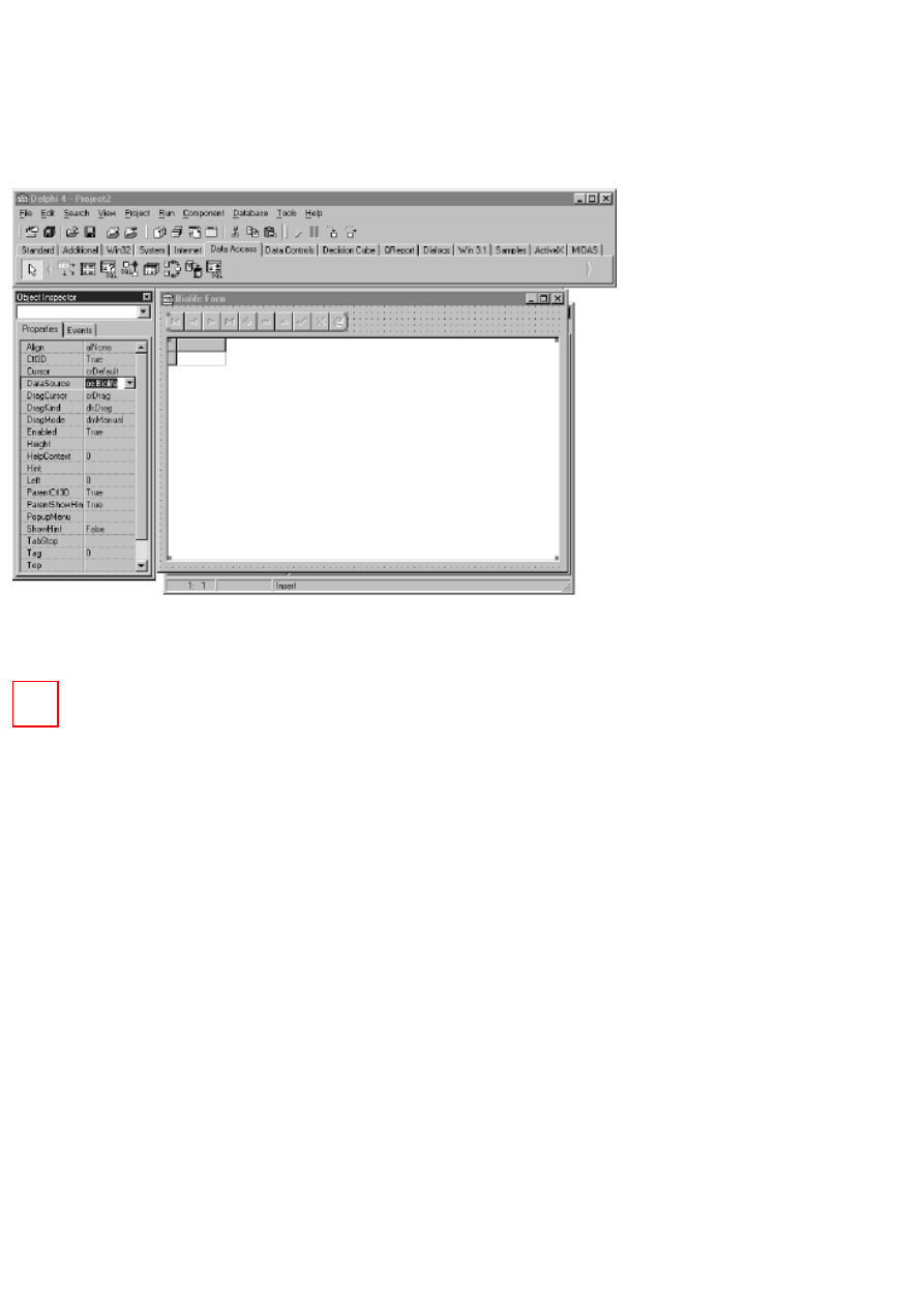
4. Create an OnClick event handler for this button and type the following code in the event handler:
BiolifeForm.Show;
5. Choose File|Use Unit. Choose the DSExU2 unit and click OK.
6. Repeat step 5 to include the DSExU3 unit.
Now you can run the program. When you click a button, the appropriate form will appear. Figure 18.4 shows the program
running.
FIGURE 18.3. The second form
completed.
FIGURE 18.4. The program running with both forms displayed.
Data modules make it easy to set up your database components once and then reuse those components over and over. After you
create a data module, you can save it to the Object Repository, where it is always available for your use.
Creating Reports
A database program is not complete without some way of viewing and printing data, and that is where reports enter the picture.
Up to this point, you have been looking at ways to view individual records or multiple records with the DBGrid component.
These methods might be perfect for some applications, but sooner or later you will need more control over the viewing of
records.
Besides viewing the data onscreen, you will almost certainly need to print the data. A database application that can't print is not
very useful. Delphi's QuickReport components enable you to view and print your data with ease.
QuickReport Overview
Before you can create a report, you need an overview of how the QuickReport components work.
The QuickRep Component
The base QuickReport component is the QuickRep component. This component acts as a canvas on which you place the
elements that your report will display (I'll discuss the report elements soon).
The QuickRep component has properties that affect the way the report will appear when printed. For example, the Page
property is a class containing properties called TopMargin, BottomMargin, LeftMargin, RightMargin, Columns, Orientation,
PaperSize, and so on.
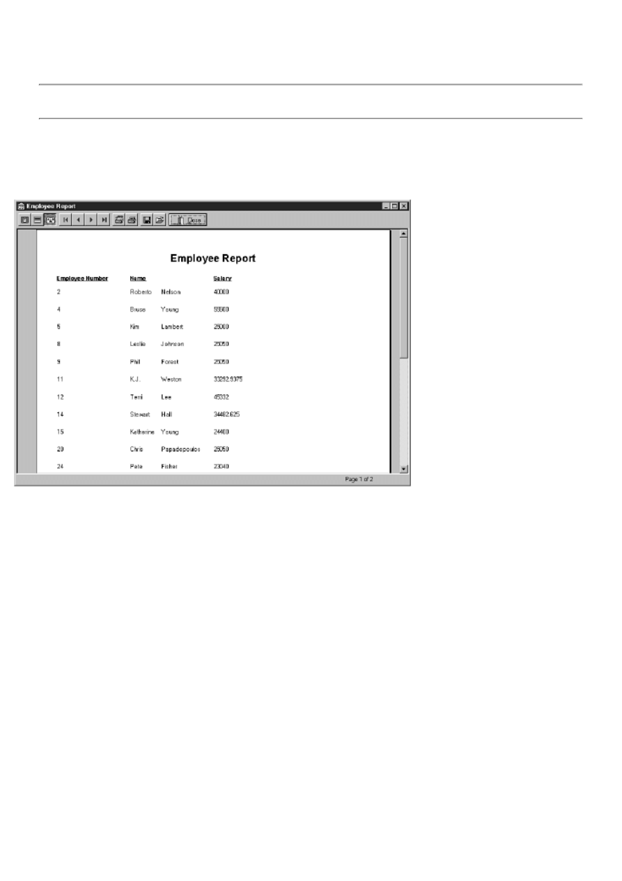
The PrinterSettings property is also a class. This property has its own properties, called Copies, Duplex, FirstPage, LastPage,
and OutputBin. The ReportTitle property is used to display the print job description in the Windows Print Manager and in the
title bar of the QuickReport preview window. The Units property controls whether margins are displayed in millimeters,
inches, picas, or other choices. The DataSet property is used to set the dataset from which the report's data will be obtained.
NOTE: The DataSet property must be set and the associated dataset must be active before anything will show up
in the report.
Primary QuickRep methods include Preview and Print. The Print method, as its name implies, prints the report. The Preview
method displays a modal preview window. The preview window includes buttons for viewing options, first page, last page,
previous page, next page, print, print setup, save report, open report, and close preview. Figure 18.5 shows the QuickReport
preview window at runtime.
FIGURE 18.5. The QuickReport preview
window.
QuickRep events of note include OnPreview and OnNeedData. You can use the OnPreview event, instead of the default
preview window, to provide a custom preview window. When using a data source other than a VCL database, you use the
OnNeedData event. For example, you can create a report from a string list, an array, or a text file.
Report Bands
A QuickReport is composed of bands. Bands come in many different types. A basic report has at least three types: a title band,
a column header band, and a detail band. The title band contains the report title, which is displayed only on the first page of the
report. The column header band is used to display the column headers for the fields in the dataset; the column header appears
at the top of every page. Some reports, such as a report used to generate mailing labels, do not have a column headers band.
The detail band is the band that does all the work. On the detail band you place any data that you want in the report. You
define the contents of the detail band, and QuickReport repeats the detail band for every record in the dataset. In a minute
you'll do an exercise that illustrates how the different bands work.
Other commonly used band types include page header, page footer, group header, group footer, and summary bands. The
QRBand component defines a QuickReport band. The BandType property is used to specify the band type (title, detail, header,
footer, and so on).
The bands automatically arrange themselves on the QuickRep component, based on the band's type. For example, if you place
a QRBand on the report and change its BandType to rbPageFooter, the band will be moved below all other bands. Likewise, a
page header band will be placed above all other bands.
QuickReport Design Elements

QuickReport design elements come in three forms. The first form includes components for text labels, images, shapes, headers,
footers, and so on. These components are primarily used to display static design elements. For example, the report title is
usually set once and then doesn't change. Another example is a graphic used to display a company's logo on the report. The
components in this group are very similar to the standard VCL components. The QRLabel component resembles a standard
Label component, a QRImage is similar to the VCL Image component, the QRShape component is similar to the regular Shape
component, and so on. Use these components to design the static portions of your reports.
The second category of elements contains QuickReport versions of the standard VCL data-aware components. These
components are placed on the detail band of a report. Components in this group include the QRDBText, QRDBRichEdit, and
QRDBImage components. Data is pulled from the dataset and placed into these components to fill the body of the report.
The third group of QuickReport components includes the QRSysData component and the QRExpr component. The
QRSysData component is used to display page numbers, the report date, the report time, the report title, and so on. The
QRExpr component is used to display calculated results. The Expression property defines the expression for the calculation.
The Expression property has a property editor called the Expression builder that is used to define simple expressions. An
expression might be simple, such as multiplying two fields, or complete with formulas such as AVERAGE, COUNT, or SUM.
Creating Reports by Hand
Certainly the best way to write truly custom reports is by hand. That might sound difficult, but fortunately the QuickReport
components make it easy. The best way for me to explain how to create reports by hand is to take you through an exercise.
This exercise creates a simple application that displays and prints a report in list form. I won't tell you to perform every single
step in this exercise. For example, I won't tell you to save the project or give you filenames to use--you can figure those out for
yourself. Also, you don't have to worry about making the report real pretty at this point. You can go back later and tidy up.
The first step is to create the main form of the application. After that's done, you create the basic outline of the report. Here
goes:
1. Create a new application. Place two buttons on the main form. Change the caption of the first button to Preview
Report and the caption of the second button to Print Report.
2. Choose File|New. Double-click the Report icon in the Object Repository. Delphi creates a new QuickReport form.
3. Place a Table component on the QuickReport form. Change the DatabaseName property to DBDEMOS and the
TableName property to EMPLOYEE.DB. Set the Active property to True.
4. Select the QuickReport form. Change the DataSet property to Table1 and change the ReportTitle property to
Employee Report.
5. Switch back to the main form. Double-click the button labeled Preview Report. Type this code in the OnClick event
handler:
QuickReport2.Preview;
6. Double-click the Print Report button and type the following in the OnClick event handler:
QuickReport2.Print;
7. Choose File|Use Unit and include the QuickReport form.
Now you have a blank report. What you need to do next is add a title band, a column header band, and a detail band. For the
next few steps you might want to look ahead to Figure 18.6 to see the final result. Follow these steps:
1. Select a QRBand component from the QReport tab of the Component palette and place it on the report. The band is a
title band by default.
2. Select a QRLabel component and place it on the title band. Change the Caption property to Employee Report and
change the Font property to your preference (I used Arial, 18 point, bold). Align the component so that it is centered on
the band.
3. Place another band on the report. Change the BandType property to rbColumnHeader and change the Font to bold and
underlined.
4. Place a QRLabel on the left side of the column header band and change the Caption property to Employee Number.
Place a second QRLabel on the band to the right of the first and change the Caption property to Name. Place a third
QRLabel on the band to the right of the last label and change the Caption to Salary.
5. Place another band on the report and change the BandType property to rbDetail. Notice that the band moves below
the other bands after you change the band type.
6. Place a QRDBText component on the left edge of the detail band (align it with the Employee Number label on the
column header band). Change the DataSet property to Table1 and the DataField property to EmpNo.
7. Place another QRDBText on the detail band and align it with the Name component on the column header band.
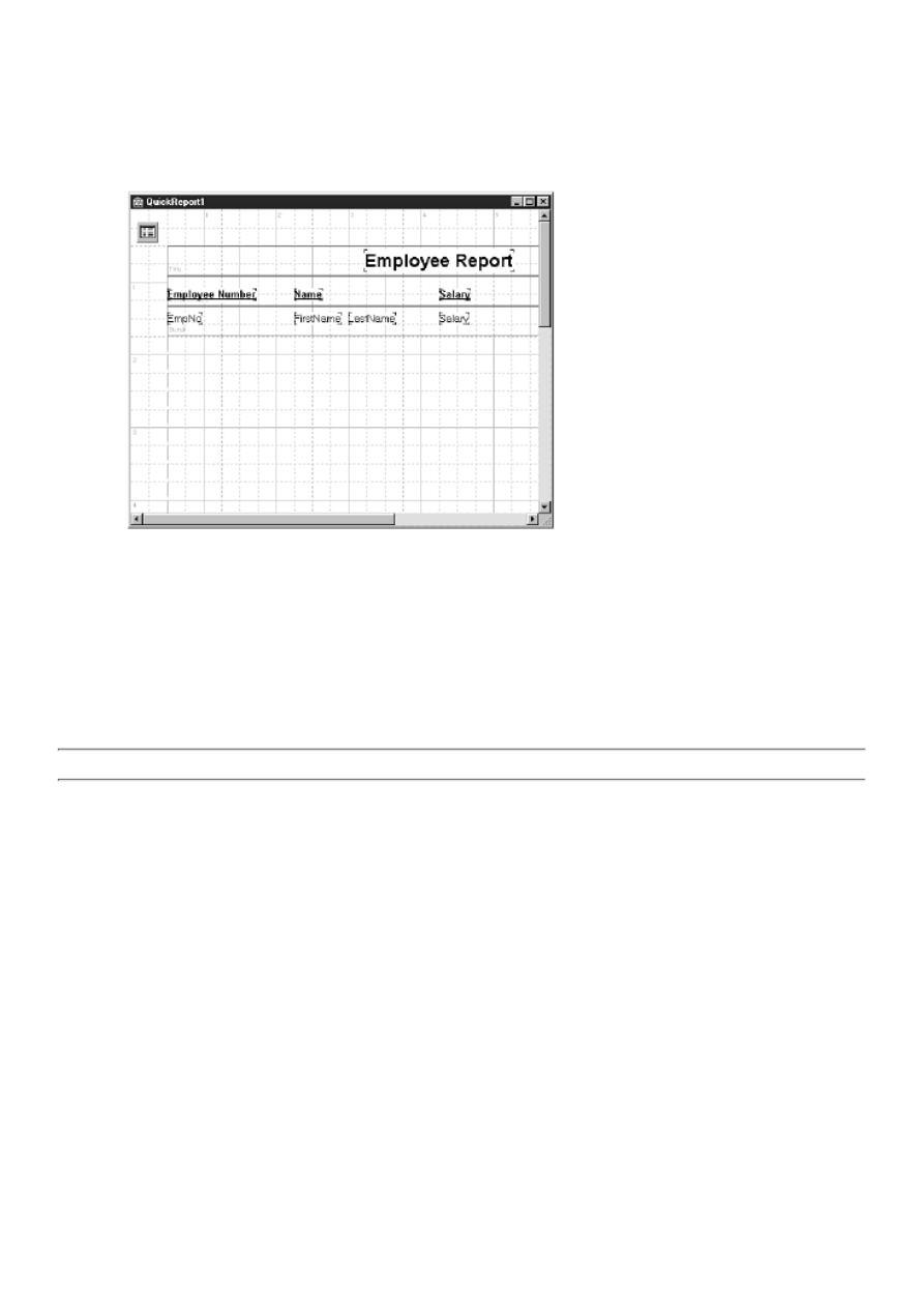
Change the DataSet property to Table1 and the DataField property to FirstName. Place another QRDBText just to the
right of the last one (see Figure 18.6). Attach it to the LastName field of the database table.
8. Add a final QRDBText component on the detail band. Place it below the
Salary component on the column header band and attach it to the Salary field in the
table. Your form now looks like Figure 18.6.
FIGURE 18.6. Your QuickReport form.
You are probably wondering what the report will look like on paper. Guess what? You don't have to wait to find out. Just
right-click on the QuickReport form and choose Preview from the context menu. The QuickReport preview window is
displayed, and you can preview the report.
To print the report, click the Print button. When you are done with the report preview, click the Close button. You can now run
the program and try out the Preview Report and Print Report buttons.
NOTE: The report you just created is double-spaced. To change the spacing, reduce the height of the detail band.
Before leaving this discussion of reports, let me show you one other nice feature of QuickReport. Right-click on the
QuickReport form and choose Report settings from the context menu. The Report Settings dialog will be displayed, as shown
in Figure 18.7. This dialog enables you to set the primary properties of the QuickRep component visually rather than use the
Object Inspector.
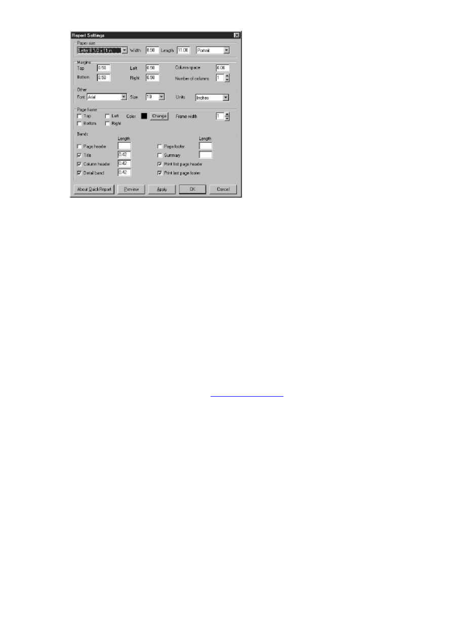
FIGURE 18.7. The QuickReport Report
Settings dialog.
Creating Reports the Easy Way
Delphi comes with three built-in QuickReport forms, which can be found on the Forms tab of the Object Repository. The
forms are called Quick Report Labels, Quick Report List, and Quick Report Master/Detail. These forms give you a head start
on creating reports. You can generate one of the forms from the Object Repository and then modify the form as needed.
Deploying a Delphi Database Application
As I said on Day 16, the Borland Database Engine (BDE) is a collection of DLLs and drivers that enable your Delphi
application to talk to various types of databases. When you ship an application that uses the BDE, you need to make sure that
you ship the proper BDE files and that they are properly registered on your users' machines.
The most sensible way to do this is with a Borland-approved installation program. Here at TurboPower Software, we use the
Wise Install System from Great Lakes Business Solutions (
). Others include InstallShield and its little
brother, InstallShield Express. Conveniently, InstallShield Express comes with Delphi Professional and Client/Server, so if you
have one of those versions of Delphi, you don't have to rush right out and buy an installation program.
You might be wondering why Borland is involved in dictating how the BDE must be deployed. The reason is simple when you
think about it: There are many BDE versions in use. Some folks might be writing and deploying applications that use the BDE
from Delphi 1. Others might be using the BDE from C++Builder 1. Still others could be using the BDE that comes with Delphi
4 in their applications.
The important point to realize is that the BDE is backward compatible. Newer BDE versions are guaranteed to work with
applications written for older BDE versions. This system will only work, however, as long as everyone plays by the rules. Part
of the rules say, "Thou shalt not arbitrarily overwrite existing BDE files." Certified installation programs check the version
number of any BDE files they find. If the file being installed is older than the existing file, the installation program leaves the
existing file in place.
This ensures that the user will always have the latest BDE files on his or her system. Another service that these certified
installation programs provide is to determine exactly which files you need to deploy for your application. You should read
DEPLOY.TXT in the Delphi root directory for more details on deploying applications that use the BDE.

Summary
There's no question that creating database applications requires a lot of work. The good news is that Delphi makes the job
much easier than other development environments. Today you found out something about the nonvisual aspects of database
programming. You also found out about data modules and how to use them. You ended the day with a look at QuickReport.
QuickReport makes creating reports for your database applications easy. I also explained what is required to deploy a database
application.
Workshop
The Workshop contains quiz questions to help you solidify your understanding of the material covered and exercises to
provide you with experience in using what you have learned. You can find answers to the quiz questions in Appendix A,
"Answers to the Quiz Questions."
Q&A
Q I am trying to create a database at runtime. I have created a BDE alias and set all the field definitions, but the
table is never created on my hard disk. What have I done wrong?
A You have probably failed to call the CreateTable method. You must call this method to physically create the table.
Q When designing a report, can I set all my report's properties at one time?
A Yes. Just right-click the QuickRep component and choose Report settings from the context menu. The Report Settings
dialog is displayed, and you can set most of the report properties visually.
Q Can a data module include code as well as components?
A Yes. A data module can contain any code necessary to carry out operation of the data module. The data module can
contain event handlers or methods that you create. The methods you create can be public or private (for the data
module's use only).
Q When I preview my report, it is blank. What is wrong?
A More than likely you have not set the Active property of the dataset to True. The dataset must be open before the
report will function.
Q Can I use more than one detail band on a report?
A No. You can place more than one detail band on a report, but only the first one will be used when the report is
generated.
Q Why do I need a Borland-approved installation program to install my database application?
A The BDE is complicated to install, and an approved installation program is guaranteed to do the installation correctly.
Quiz
1. What method do you call to create a database table at runtime?
2. What does the Edit method of TTable do?
3. What method do you call when you want to apply the changes made to a record?
4. How do you create a new data module?
5. Is a data module a regular form?
6. What method do you call to print a QuickReport?
7. What type of QuickReport band displays the dataset's data?
8. What component is used to display the page number on a report?
9. How can you preview a report at design time?
10. What is the QRExpr component used for?
Exercises
1. Create a database (a BDE alias) and a table for the database, either through code or by using the Delphi database
tools.
2. Create a data module containing the database table from exercise 1.
3. Generate a report that creates mailing labels. (Hint: Start with a QuickReport Labels object from the Forms page of

the Object Repository.)
4. Modify the QuickReport you created in this chapter so that the employee's first and last names are displayed by a
QRExpr component.
5. Read the DEPLOY.TXT file in your Delphi directory to understand what is involved in deploying a Delphi database
application.
©
Teach Yourself Borland Delphi 4 in 21 Days
- 19 -
Creating and Using DLLs
❍
❍
❍
●
●
Functions and Procedures in DLLs
❍
●
❍
●
❍
❍
●
Calling Functions and Procedures Located in DLLs
❍
Calling Functions and Procedures Using Dynamic Loading
❍
●
Creating a DLL Project with the Object Repository
●
Writing a DLL Containing a Form
❍
❍
●
❍
Putting the Resource DLL to Work
❍
●
●
❍
❍
❍
●
If you use Windows, you can't escape dynamic link libraries (DLLs). Just take a look in your \Windows and \Windows\System
directories. I run Windows NT 4, and I count more than 650 DLLs in the \Winnt directories on my system. So, let's not debate
the facts. DLLs are part of everyday life in Windows.
The question, then, is whether you need to create and use DLLs. That's what you find out today. Specifically, you will look at
the following:
What DLLs are and why you use them
●
Writing DLLs
●
Calling function and procedures in DLLs
●

Using forms in DLLs
●
Using resource DLLs
●
By the end of today you will have a good idea of whether DLLs are for you. I suspect that DLLs will fit into your development
plan somewhere down the road.
DLL Overview
Simply put, DLLs are very useful. Today I discuss the benefits of DLLs and how this translates for you, the Delphi
programmer. First, let's explore exactly what a DLL is.
What Is a DLL?
New Term: A DLL (dynamic link library) is one or more pieces of code stored in a file with a .dll extension.
The DLL code can be called from executable programs, but the DLL itself isn't a stand-alone program. You can consider the
DLL a helper file for a main program. Applications that use code in DLLs are called calling applications because they call
functions or procedures in the DLL.
There are two types of DLLs: code DLLs and resource DLLs. This is not an exclusive arrangement. You can have both code
and resources in the same DLL, and there's no problem with that whatsoever. In some cases, though, it's convenient to store
your code in one DLL and your resources in another. I'll talk about why you might want to do that in the section "Using
Resources in DLLs."
Code contained in a DLL can be of two primary forms. The first form is a standalone function that you call from your main
application. You have already done that several times in this book. Remember the code from Day 14, "Advanced
Programming," as follows:
Screen.Cursors[myCursor] := LoadCursor(HInstance, `MYCURSOR');
or this, also from Day 14:
DrawText(Canvas.Handle, Panel.Text,
-1, Temp, DT_CENTER or DT_VCENTER or DT_SINGLELINE);
Both LoadCursor and DrawText are Windows API functions. You probably knew that. But did you know that these functions
are called from DLLs? When you think about it, these functions have to be stored somewhere. But where? In this case, both
LoadCursor and DrawText are contained in the Windows DLL called User32.dll.
And what about all those common dialog boxes you've been using, such as the File Open dialog box, the Print dialog box, and
the Printer Setup dialog box? They have to come from somewhere. In this case, these dialog boxes are stored as resources in
the file called Comctl32.dll. So, without knowing it, you have been using DLLs all along.
The second form of code contained in a DLL consists of procedures and functions used internally by the DLL. These functions
and procedures perform some task in the DLL and are not visible to the outside world (applications using the DLL).
Using DLLs is one thing, but using and creating your own DLLs is an entirely different matter, right? Not really. After you
create a DLL, you can call functions and procedures in the DLL just as you do when calling Windows API functions. Creating
DLLs is not difficult, so there's nothing to stop you from putting DLLs to work for you.
Why Should You Use a DLL?
That's a good question. After all, what does a DLL give you? DLLs offer these benefits:
Effective code reuse
●
Capability to easily share code among many applications
●
Capability to compartmentalize code
●
Internationalization of your application
●
Effective use of Windows resources
●
Let's take a look at these points individually and see whether I can convince you what a good thing DLLs are.
Effective Code Reuse
Code reuse is a big part of object-oriented programming. After all, why reinvent the wheel? DLLs aid in code reuse in a big

way. Let's say you have a large amount of code you wrote to handle a specific task in Windows. You've worked hard to write
that section of code, so it would be nice if you could reuse it in any of your applications that need it. DLLs enable you to do
exactly that.
What you do is compile all of your code into a DLL. Then all you have to do in order to use the code in any of your programs
is basically load the DLL from an application and begin using the code. What could be easier? (Actually, there are a couple
other steps required, but they are simple and I don't want to get ahead of myself by explaining them now.)
Now you have this code at your fingertips any time you need it. Better yet, you can give the DLL to your programming pals,
and they can use the code, too. Hey, this is starting to sound good. Better yet, you can sell the DLL to other programmers. You
put all that work into it, so you might as well get out of it what you can!
NOTE: You can easily create DLLs that can be called from applications written in C++Builder, Visual Basic,
Visual C++, or other programming environments. Of course, this depends on the code contained in the DLL and
how that code is called, but it can be done.
So, do you see where this is heading? After writing a DLL, you can use it with ease whenever and wherever you want. Getting
at all the goodies contained in your DLL is just a few mouse clicks away.
Sharing Code Among Applications
Sharing code ties in with code reuse but takes it a step farther. Let's say that you are a programmer for a large corporation. You
might have hundreds of users, each with his or her own system. (I'll ignore networking considerations for this example.) Let's
say that you've written five applications for those users. Further, let's assume that each of those five applications uses a
common set of code that compiles to 100KB (a modest figure). If you don't use a DLL, you will have 100KB of code repeated
five times (once for each of the five applications) for a total of 500KB of code. That's code waste, folks.
A better approach is to put the classes in a DLL. Each of the five programs can use the same DLL for the common code. That's
part of the beauty of DLLs: After the DLL is written, all your applications can share it. Each user will get an additional 100KB
DLL on his or her machine, but each of the five applications will be reduced in size by 100KB. The bottom line is that each
user saves 400KB of disk space. Saving 400KB might not sound like a lot, but if you multiply it by hundreds of users, it starts
to add up from a corporate perspective (bean counters tend to look at those types of issues). This is just a simple example. In a
real-world situation, you could easily save several megabytes per user by using DLLs.
What if three of the five programs are running simultaneously? No problem. Each program pulls code from the DLL as
needed, and there are no conflicts. Windows keeps track of who's calling whom and makes sure that it all works together. All
you do is write the DLL and start using it. (If this discussion sounds familiar, it is probably because I used roughly this same
argument when discussing runtime packages on Day 8, "Creating Applications in Delphi.")
Compartmentalizing Code
By keeping your code compartmentalized, you can deal with it more easily when it comes time to update your code. I am not
advocating a separate DLL for each aspect of your program, but when and where it is sensible to break up your program into
related chunks of code, you should do so. There isn't much benefit in breaking an application into DLLs just for the sake of
compartmentalizing the code. If you have libraries of common code that you have written, though, it does make sense to keep
those libraries in separate DLLs. Again, this is most obvious when creating libraries that can be used by any of your programs.
One advantage to this approach is that your applications can be more easily upgraded if necessary. Let's face it. Even the best
of programs go to market with bugs. It's more a question of how many or how severe than a question of whether there are bugs
at all. If you discover bugs in your DLL, you can fix the bug and ship a new DLL to your users rather than recompile and ship
an entire executable file.
At first this might not appear to benefit the types of applications you have written so far. However, you might eventually write
programs several megabytes in size with dozens of source modules. In that case, compartmentalizing makes much more sense.
Internationalization
A few years ago, you could write a program and not worry about the international market. You would write the program and
create menu items, dialog boxes, hint text, error messages, and so forth in your native language, and that was that. You put the
program on the market and didn't think about it again.
The world, however, is becoming smaller. With the explosion of the Internet and the World Wide Web, things are completely
different than they were just a couple of years ago. You can create a demo of your program or maybe a shareware version, and
put it on the Internet. Within hours, minutes even, people all around the world have access to your program. It's exciting and

frightening at the same time. This phenomenon means that you must plan ahead and prepare for translating your program into
other languages.
One way you can do this is to create resource DLLs that contain string resources in various languages. You can have a separate
DLL for each language, or as an alternative, you can have all the string resources in a single DLL and load the correct
language version of each string at runtime. At runtime, you can use the Windows API function LoadString to load the strings
and assign them to various components, as needed.
NOTE: One disadvantage to the Delphi programming model is that it doesn't use traditional resources as other
programming environments do. Resources such as menus are not loaded as resources but rather are contained
within the form's resource. This makes internationalization more difficult and is one of the few times that this
model works against you.
Again, planning ahead can save you a lot of work later. If you plan your application with internationalization in mind, it is
much easier to translate your application into other languages when necessary.
Effective Use of Windows Resources
Today's systems are faster, have more RAM, and have more hard disk space than ever before. It's easy to fall into the mode of
"Hey, I'm only using 2MB of system RAM, so what's the big deal?" The truth is, you should always be conscious of how much
of your users' system resources you are consuming. Here again, DLLs can help. This is really a continuation of the discussion
on sharing code among different applications.
Let's go back to the example I used earlier. (Remember, you have five applications using some common code.) If you don't use
DLLs, when several of your programs are running at the same time, they will all load some of the same code into memory.
You are wasting system resources because each program loads its own copy of the exact same code. Rather than have each
program load the same code, you use a DLL and load the code once. All your applications can use the same code in memory
and reduce the drain on the system.
Anatomy of a DLL Unit
As with any other Pascal unit, a DLL unit follows a particular format. Listing 19.1 shows a minimal DLL unit.
LISTING 19.1. A BASIC DLL UNIT.
library TestDLL;
uses
SysUtils,
Classes,
Forms,
Windows;
procedure SayHello(AForm : TForm);
begin
MessageBox(AForm.Handle, `Hello From a DLL!',
`DLL Message Box', MB_OK or MB_ICONEXCLAMATION);
end;
exports
SayHello;
begin
end.
First notice the library keyword at the top of the unit. The library keyword identifies this unit as a DLL unit. This DLL has a
single procedure called SayHello. The SayHello procedure is no different than any other Object Pascal procedure.
Now turn your attention to the exports keyword near the bottom of the unit. Any procedure or function identifiers in the
exports section are exported from the DLL. In this case the SayHello procedure is exported. Exporting functions and
procedures is discussed in detail in the section "The exports Keyword."
Finally, at the end of the DLL unit you see begin and end keywords. This code block is the DLL's main code block and is
where you put any code that your DLL needs to execute when the DLL initially loads. In many cases (as in this example), you
don't need any initialization code at all, so this code block is empty.

The Basics of DLL Writing
Writing a DLL is not difficult. There are a couple of points to be aware of, but most of it is straight Object Pascal
programming. Let's start with a discussion on the basics of writing DLLs. After that, you can build your first DLL.
Functions and Procedures in DLLs
Functions and procedures in a DLL fall into two basic categories:
Functions and procedures local to the DLL
●
Functions and procedures exported from the DLL
●
A DLL might also contain classes that could, of course, have methods. I'm not going to talk about methods of a class contained
in a DLL at this time, but I'll discuss the other two types of functions and procedures next.
Functions and Procedures Local to the DLL
Functions and procedures called within a DLL require no special handling. You declare this type of function or procedure just
as you do any function or procedure. The function or procedure can be called by other functions within the DLL, but it can't be
called from outside the DLL. In other words, a calling application will not have access to these functions and procedures. They
can be considered private to the DLL, much as private methods of a class are private to the class in which they reside. In effect,
a calling application won't be able to "see" the functions and procedures to even know they exist.
NOTE: In addition to functions and procedures, a DLL can contain global data that all procedures in the DLL can
access. In 16-bit Windows, global data in a DLL is shared among all instances of the DLL. In other words, if one
program changed the global variable x to 100, x would have the value 100 for all other applications using the DLL
as well. In 32-bit Windows, this is not the case. In 32-bit Windows, a separate copy of a DLL's global data is
created for each process that attaches to the DLL.
Functions and Procedures Exported from the DLL
Another category of functions and procedures comprises those that can be called from outside the DLL. These are functions
and procedures that are made public by exporting them from the DLL. They can be called by other functions and procedures in
the DLL or by applications outside the DLL.
NOTE: Functions and procedures in a DLL can be called by executable applications and also by other DLLs. In
other words, one DLL can call functions and procedures in another DLL.
After a function or procedure has been exported, you call it from your application.
The exports Keyword
To export a function or procedure, you use the exports keyword in the DLL. Refer to Listing 19.1 for an example of a DLL
that exports a procedure called SayHello. Because the SayHello procedure is exported, it can be called from any Delphi
application.
Exporting by Name
The most common way of exporting functions and procedures is by name--for example,
exports
SayHello,
DoSomething,
DoSomethingReallyCool;
These procedures are exported by their identifier name. You might have noticed that the exports section has the same syntax as
a uses list. Each identifier to be exported is listed, separated by a comma. A semicolon follows the last identifier in the list.
Exporting by Ordinal Value
You can also export procedures and functions by ordinal value. Procedures and functions are exported by ordinal value by
implementing the index keyword like this:
exports
SayHello index 1,
DoSomething index 2,
DoSomethingReallyCool index 3;
When you import the function in the calling application, you specify the ordinal number (I'll discuss importing functions and
procedures later in the section, "Calling Using Static Loading"). Most of the time you will export functions and procedures by
name and won't bother with exporting by ordinal.
NOTE: Delphi automatically assigns an ordinal value to every exported function and procedure regardless of
whether you specify an index number. Specifying an index number lets you control the ordinal value of the
exported function or procedure.
Exporting a function or procedure is only half the story. When you build the application that calls the function or procedure,
you must import the functions and procedures you want to call from the DLL. I'll talk about importing functions and
procedures later in the section "Calling Functions and Procedures in DLLs."
NOTE: The global variable HInstance, when used in a DLL, will contain the instance handle of the DLL.
To find out whether your code is executing in a DLL or in an application, check the value of the global variable
IsLibrary. IsLibrary is True when called from a DLL and False when called from an application.
TIP: If you are having trouble exporting functions or procedures, run the TDUMP utility on the DLL. TDUMP
produces information containing a section on symbols exported from the DLL. Examining that section will give
you a better idea of where the problem lies. To see just the exported symbols, run TDUMP with the --ee
switch--for example,
tdump --ee mydll.dll
Remember, you can redirect the output of a command-line application to a text file with the > symbol:
tdump --ee mydll.dll > dump.txt
Using a DLLProc
As I mentioned earlier, any initialization code that the DLL needs to execute can be done in the DLL's main code block. That's
easy enough, but what about finalization code? DLLs don't have initialization and finalization sections as other units do. You
might dynamically allocate memory in the DLL's main code block, but where do you free it? The answer is a DLLProc. A
DLLProc is a procedure that is called at certain times during the life of a DLL. I'll explain how to use a DLLProc in just a bit,
but first let me tell you why DLLProc exists.
A DLL receives messages from Windows when it is loaded into memory and just before it is unloaded from memory. It also
receives messages when a process attaches to or detaches from an already-loaded DLL (as in the case of several applications
all using the same DLL). To get these messages, you create a procedure with a specific signature and assign the address of that
procedure to the global variable DLLProc. A typical DLLProc procedure might look like this:
procedure MyDLLProc(Reason: Integer);
begin
if Reason = DLL_PROCESS_DETACH then
{ DLL is unloading. Cleanup code here. }
end;
Just declaring a DLLProc procedure is not enough to ensure that the DLLProc will be used. You must also assign the address
of the procedure to the DLLProc global variable. You do that in the DLL's main code block. For example:
begin
DLLProc := @MyDLLProc;
{ More initialization code. }
end.
This code will be executed as soon as the DLL loads. The DLLProc is now installed and will be called automatically as
processes attach and detach from the DLL or when the DLL unloads. Listing 19.2 shows the source code for a DLL that
implements a DLLProc.
LISTING 19.2. A DLL UNIT THAT USES A DLLProc.
library TestDLL;
uses
SysUtils,
Classes,
Forms,
Windows;
var
SomeBuffer : Pointer;
procedure MyDLLProc(Reason: Integer);
begin
if Reason = DLL_PROCESS_DETACH then
{ DLL is unloading. Cleanup code here. }
FreeMem(SomeBuffer);
end;
procedure SayHello(AForm : TForm);
begin
MessageBox(AForm.Handle, `Hello From a DLL!',
`DLL Message Box', MB_OK or MB_ICONEXCLAMATION);
end;
{ More DLL code here that uses SomeBuffer. }
exports
SayHello;
begin
{ Assign our DLLProc to the DLLProc global variable. }
DLLProc := @MyDLLProc;
SomeBuffer := AllocMem(1024);
end.
As you might have surmised from Listing 19.2, the Reason parameter of the DLLProc procedure contains a value representing
the reason that the DLLProc is being called. Table 19.1 lists the possible values of the Reason parameter.
TABLE 19.1. DLLProc Reason VALUES.
Value
Description
DLL_PROCESS_DETACH The DLL is about to unload from memory.
DLL_THREAD_ATTACH A process is attaching to the DLL.
DLL_THREAD_DETACH A process is detaching from the DLL.
NOTE: Earlier in this section I said that a DLL will receive a message from Windows when the DLL is initially
loaded into memory. It is reasonable to expect that when a DLL loads, the DLLProc is called with a Reason
parameter equal to DLL_PROCESS_ATTACH. That doesn't happen, however. Windows defines a
DLL_PROCESS_ATTACH message, but Object Pascal does not pass it on to the DLLProc. Instead, Object
Pascal calls the DLL's main code block when the DLL_PROCESS_ATTACH message is received. Because the
main block is called when DLL_PROCESS_ATTACH is received, it is not necessary for Object Pascal to pass
that message on to the DLLProc.
The DLL_PROCESS_DETACH message is received only once, just before the DLL unloads from memory. (The
DLL_THREAD_ATTACH and DLL_THREAD_DETACH messages might be received many times if a DLL is used by
several processes. Processes can include applications, multiple threads in a single application, or other DLLs.) You can use a
DLLProc, then, to perform any cleanup code required for the DLL.
Loading DLLs
Before you use a function or procedure in a DLL, you first have to load the DLL into memory. Loading DLLs at runtime can
be accomplished in two ways, as follows:
Static loading
●

Dynamic loading
●
Both methods have their advantages and disadvantages. I'll explain the differences between static loading and dynamic loading
next.
Static Loading
Static loading means that your DLL is automatically loaded when the application that calls the DLL is executed. To use static
loading, you declare a function or procedure that resides in the DLL with the external keyword (more on that in the section
"Calling Using Static Loading"). The DLL is automatically loaded when the application loads, and you call any functions or
procedures exported from the DLL just as you would any other function or procedure. This is by far the easiest way to use
code contained in a DLL. The disadvantage to this approach is that if a DLL that the program references is missing, the
program will refuse to load.
Dynamic Loading
Dynamic loading means that you specifically load the DLL when needed and unload it when you are done with it. This type of
DLL loading has its advantages and disadvantages, too. One advantage is that the DLL is in memory only as long as you need
it, so you are making more efficient use of memory. Another advantage is that your application will load more quickly when
using dynamic loading because not all the code needed to run the program is loaded when the application initially loads.
The primary disadvantage to using the dynamic loading approach is that it is a bit more work for you. First, you need to load
the DLL with the Windows API function LoadLibrary. Then, when you are done with the DLL, you unload it with
FreeLibrary. Further (and this is where the work comes in), you need to use the GetProcAddress function to obtain a pointer to
the function or procedure you want to call. To say that this approach can be a tad confusing would be an understatement. The
following section describes how to call procedures and functions in DLLs using both static and dynamic loading.
Calling Functions and Procedures Located in DLLs
The method you use to call a function or procedure in a DLL depends on whether the DLL was statically or dynamically
loaded.
Calling Using Static Loading
Calling functions and procedures from DLLs that are statically loaded is simple.
First the calling application must contain a declaration for the function or
procedure. After that, you call the function or procedure as you do a regular
function
or procedure. To import a function or procedure contained in a DLL, use the external
modifier in the function or procedure declaration. For example, given the SayHello
procedure shown earlier, the declaration in the calling application would look like
this:
procedure SayHello(AForm : TForm); external `testdll.dll';
The external keyword tells the compiler that the procedure can be found in a DLL (TESTDLL.DLL in this case). The actual
procedure call looks no different than any other:
SayHello(Self);
After you have properly imported the function or procedure, you call it like any other function or procedure. This step
presumes, of course, that the procedure has been exported from the DLL as described earlier.
CAUTION: When you declare functions and procedures contained in a DLL, be sure you get spelling and
capitalization right. This is one place in Object Pascal programming where capitalization counts! If you misspell
or improperly capitalize a function or procedure name, you will get an exception at runtime and the application
will refuse to load.
USING THE external KEYWORD
The external keyword has three flavors. Using external you can import a procedure or function in one of three
ways:

By actual name
●
By ordinal value
●
By renaming
●
The first way of importing, by actual name, is the method you have seen used up to this point. You simply declare
the name of the function or procedure exactly as it appears in the DLL--for example,
procedure SayHello(AForm : TForm); external `testdll.dll';
The second way of importing, by ordinal value, requires you to specify the ordinal value of the function or
procedure as exported from the DLL:
procedure SomeOrdinalProcedure; external `testdll.dll' index 99;
In this case, I am importing the procedure that is exported from the DLL as index 99. I can name the procedure
anything I want in the calling application as long as the signature matches that of the procedure in the DLL. I can
name the procedure anything I want because the procedure is exported by ordinal value and not by the procedure
name.
The third method, by renaming, enables me to import the procedure by it original name, but give the procedure a
new name in the calling application. It looks like this:
procedure CoolProcedure;
external `testdll.dll' name `DoSomethingReallyCool';
Here I am importing a procedure called DoSomethingReallyCool and renaming it to CoolProcedure.
Of these three methods, the first, importing by name, is the most commonly used.
The trick in writing and using DLLs, then, is in getting the imports and exports right. Otherwise, there's nothing to it. Unless
you need the flexibility that dynamic loading provides, you should almost always opt for static loading.
Calling Functions and Procedures Using Dynamic Loading
Calling functions and procedures in DLLs that are dynamically loaded isn't a lot of fun. It requires that you declare a pointer to
the function or procedure in the DLL, and pointers to functions can be confusing. To illustrate, let's say you have a procedure
in a DLL called SayHello (the SayHello procedure gets a workout in this chapter). It would look like this in the DLL's source
code:
procedure SayHello(AForm : TForm);
begin
MessageBox(AForm.Handle, `Hello From a DLL!',
`DLL Message Box', MB_OK or MB_ICONEXCLAMATION);
end;
To call this procedure from your program, you first have to declare a type that describes the procedure:
type
TSayHello = procedure(AForm : TForm);
Now that you've done that, you must load the DLL, use GetProcAddress to get a pointer to the procedure, call the procedure,
and, finally, unload the DLL. Here's how the whole operation looks:
var
DLLInstance : THandle;
SayHello : TSayHello;
begin
{ Load the DLL. }
DLLInstance := LoadLibrary(`testdll.dll');
{ Get the address of the procedure. }
@SayHello := GetProcAddress(DLLInstance, `SayHello');
{ Call the procedure. }
SayHello(Self);
{ Unload the DLL. }
FreeLibrary(DLLInstance);
end;
As I said, loading a DLL dynamically is a bit more work. Still, when you need to load a DLL at runtime, that's the way you
have to do it. Note that this code is pared down a bit for clarity. You will almost always add some error-checking code to

ensure that the DLL loads correctly and that GetProcAddress returns a good address. Here's how the code looks with error
checking code in place:
procedure TForm1.DynamicLoadBtnClick(Sender: TObject);
type
TSayHello = procedure(AForm : TForm);
var
DLLInstance : THandle;
SayHello : TSayHello;
begin
DLLInstance := LoadLibrary(`testdll.dll');
if DLLInstance = 0 then begin
MessageDlg(`Unable to load DLL.', mtError, [mbOK], 0);
Exit;
end;
@SayHello := GetProcAddress(DLLInstance, `SayHello');
if @SayHello <> nil then
SayHello(Self)
else
MessageDlg(`Unable to locate procedure.', mtError, [mbOK], 0);
FreeLibrary(DLLInstance);
end;
As you can see, you probably won't use dynamic loading of DLLs unless you absolutely have to.
Creating a DLL Project with the Object Repository
Creating a DLL in Delphi is accomplished through the Object Repository. (The Object Repository is covered on Day 8,
"Creating Applications in Delphi."). To create a DLL project, follow these steps:
1. Choose File|New to display the Object Repository.
2. Double-click the DLL icon.
Were you expecting it to be more complicated than that? Delphi creates the DLL project and displays the Code Editor. The file
in the edit window looks like this:
library Project2;
{ Important note about DLL memory management: ShareMem must be the
first unit in your library's USES clause AND your project's (select
View-Project Source) USES clause if your DLL exports any procedures or
functions that pass strings as parameters or function results. This
applies to all strings passed to and from your DLL--even those that
are nested in records and classes. ShareMem is the interface unit to
the DELPHIMM.DLL shared memory manager, which must be deployed along
with your DLL. To avoid using DELPHIMM.DLL, pass string information
using PChar or ShortString parameters. }
uses
SysUtils,
Classes;
begin
end.
Now you can begin adding code to the DLL. Be sure to add any exported procedure or function names to the exports section.
Write any standalone functions or procedures that you need in your DLL. When you are finished adding code, you can choose
Compile or Build from the Project menu to build the DLL.
COMMENTING THE DLL UNIT
I want to take a moment to explain the large comment block at the top of a DLL unit. This message is telling you
that if your DLL has exported functions and procedures that take a long string type as a parameter or if your
exported functions return a long string, you must do the following:
Put ShareMem at the beginning of the uses list in both the DLL source and the calling application's main
unit. Be sure that ShareMem comes before other units in the uses list.
●

Ship the Borlndmm.dll file with your DLL. Notice that I said Borlndmm.dll and not Delphimm.dll, as the
comments in the DLL code indicate. Borland changed the name of the memory manager DLL but neglected
to change the comments generated when you create a new DLL unit. The comments are not completely
misleading, however, because both Delphimm.dll and Borlndmm.dll are included with Delphi 4.
●
To avoid this requirement, just be sure that your DLL functions and procedures don't take any long string
parameters and that your DLL functions don't return a long string. Instead of using a long string, you can use a
PChar or a short string. For example, rather than use
procedure MyProcedure(var S : string);
begin
{ Procedure code here. }
end;
use this:
procedure MyFunction(S : PChar);
begin
{ Procedure code here. }
end;
This situation is easy enough to work around, so you should never have the need for Borlndmm.dll. You just need
to be aware of the restrictions placed on using the long string in DLL functions and procedures. Note that you can
use long strings in functions and procedures used within the DLL itself without the need for Borlndmm.dll. This
applies only to exported functions and procedures.
NOTE: I always remove the comments about Borlndmm.dll when I create a new DLL. You can certainly leave
them in the DLLs source code if you want. After you understand what the comments are saying, you won't need
them anymore, so you might as well remove them.
The next three listings contain code that illustrates the concepts discussed thus far. Listing 19.3 contains a DLL that will be
called statically from a calling application. Listing 19.4 contains a DLL that is called dynamically from the calling application
and implements a DLLProc. Finally, Listing 19.5 contains a program that calls the two DLLs. The program has a form with
four buttons that call various procedures in the two DLLs. The book's code (available at http://www.mcp.com/info) contains
the sample programs for the projects in these three listings.
LISTING 19.3. TestDll.dpr.
library TestDLL;
uses
SysUtils,
Classes,
Forms,
Windows;
procedure SayHello(AForm : TForm);
begin
MessageBox(AForm.Handle, `Hello From a DLL!',
`DLL Message Box', MB_OK or MB_ICONEXCLAMATION);
end;
procedure DoSomething;
begin
MessageBox(0, `This procedure was exported by ordinal.',
`DLL Message Box', MB_OK or MB_ICONEXCLAMATION);
end;
procedure DoSomethingReallyCool;
begin
MessageBox(0, `Something really cool.',
`DLL Message Box', MB_OK or MB_ICONEXCLAMATION);
end;
exports
SayHello,

DoSomething index 99,
DoSomethingReallyCool;
begin
end.
LISTING 19.4. DynLoad.dpr.
library TestDLL;
uses
SysUtils,
Classes,
Forms,
Windows;
procedure MyDLLProc(Reason: Integer);
begin
if Reason = DLL_PROCESS_DETACH then
{ DLL is unloading. Cleanup code here. }
MessageBox(0, `DLL is unloading!',
`DLL Message', MB_OK or MB_ICONEXCLAMATION);
end;
procedure SayHelloDyn(AForm : TForm);
begin
MessageBox(AForm.Handle, `Hello From a DLL!' + #13 +
`This DLL was loaded dynamically',
`DLL Message', MB_OK or MB_ICONEXCLAMATION);
end;
exports
SayHelloDyn;
begin
DLLProc := @MyDLLProc;
end.
LISTING 19.5. CallDllU.pas.
unit CallDLLU;
interface
uses
Windows, Messages, SysUtils, Classes, Graphics,
Controls, Forms, Dialogs, StdCtrls;
type
TForm1 = class(TForm)
HelloBtn: TButton;
OrdBtn: TButton;
DynamicLoadBtn: TButton;
NamedBtn: TButton;
procedure HelloBtnClick(Sender: TObject);
procedure OrdBtnClick(Sender: TObject);
procedure DynamicLoadBtnClick(Sender: TObject);
procedure NamedBtnClick(Sender: TObject);
private
{ Private declarations }
public
{ Public declarations }
end;
var
Form1: TForm1;
{ A procedure imported by name. }
procedure SayHello(AForm : TForm);
external `testdll.dll';
{ A procedure imported by ordinal. }
procedure OrdinalProcedure;

external `testdll.dll' index 99;
{ A procedure imported and renamed. }
procedure CoolProcedure;
external `testdll.dll' name `DoSomethingReallyCool';
implementation
{$R *.DFM}
procedure TForm1.HelloBtnClick(Sender: TObject);
begin
SayHello(Self);
end;
procedure TForm1.OrdBtnClick(Sender: TObject);
begin
OrdinalProcedure;
end;
procedure TForm1.NamedBtnClick(Sender: TObject);
begin
CoolProcedure;
end;
procedure TForm1.DynamicLoadBtnClick(Sender: TObject);
type
TSayHello = procedure(AForm : TForm);
var
DLLInstance : THandle;
SayHello : TSayHello;
begin
{ Load the DLL. }
DLLInstance := LoadLibrary(`DynLoad.dll');
{ If loading fails then bail out. }
if DLLInstance = 0 then begin
MessageDlg(`Unable to load DLL.', mtError, [mbOK], 0);
Exit;
end;
{ Assign the procedure pointer. }
@SayHello := GetProcAddress(DLLInstance, `SayHelloDyn');
{ If the procedure was found then call it. }
if @SayHello <> nil then
SayHello(Self)
else
MessageDlg(`Unable to locate procedure.', mtError, [mbOK], 0);
{ Unload the DLL. }
FreeLibrary(DLLInstance);
end;
end.
Using Forms in DLLs
Your DLLs can contain forms as well as code. There isn't much difference in the way the form is created compared to the way
a form in an application is created. First, I'll explain how to write a DLL containing a form. After that, I'll talk about the special
case of using an MDI form in a DLL.
Writing a DLL Containing a Form
Writing a DLL that contains forms is not much more difficult than writing a DLL that
contains code only. I believe in learning by example, so in this section, you build a
DLL containing a form. Perform these steps:
1. Create a new DLL project (remove the comments at the top of the DLL, if desired). Save the DLL as MyForms.dpr.
2. Choose File|New Form to create a new form for the DLL project. Add any components you want to the form.
3. Change the Name property of the new form to DLLForm. Save the form as DLLFormU.pas.
4. Switch back to the DLL source unit. Add a function called ShowForm that creates and shows the form. Use this code:

function ShowForm : Integer; stdcall;
var
Form : TDLLForm;
begin
Form := TDLLForm.Create(Application);
Result := Form.ShowModal;
Form.Free;
end;
5. Add an exports section to the DLL and export the ShowForm function. Here's how the exports section should look:
exports
ShowForm;
6. Choose Project|Build MyForms to build the DLL. Save the DLL.
That's all there is to creating the DLL. Notice that the ShowForm function is declared with the stdcall keyword. This keyword
tells the compiler to export the function using the standard call calling convention. Exporting the function as stdcall enables
this DLL to be used by development environments other than Delphi.
New Term: Calling conventions specify how the compiler should pass arguments when calling functions and procedures. The
five primary calling conventions are stdcall, cdecl, pascal, register, and safecall. See the "Calling Conventions" topic in the
Delphi help file for more information on calling conventions.
Notice also that the return value of the DLL's ShowForm function is the value returned from the ShowModal function. This
enables you to return some status information to the calling application. Listing 19.6 shows the code for the DLL.
LISTING 19.6. THE FINISHED DLL.
library MyForms;
uses
SysUtils,
Classes,
Forms,
DLLFormU in `DLLFormU.pas' {DLLForm};
function ShowForm : Integer; stdcall;
var
Form : TDLLForm;
begin
Form := TDLLForm.Create(Application);
Result := Form.ShowModal;
Form.Free;
end;
exports
ShowForm;
begin
end.
Now the calling application can declare the ShowForm function and call the function. Listing 19.7 shows a Delphi application
that calls the MyForms DLL.
LISTING 19.7. AN APPLICATION TO CALL THE MyForms DLL.
unit TestAppU;
interface
uses
Windows, Messages, SysUtils, Classes, Graphics,
Controls, Forms, Dialogs, StdCtrls;
type
TForm1 = class(TForm)
Button1: TButton;
procedure Button1Click(Sender: TObject);
private
{ Private declarations }

public
{ Public declarations }
end;
var
Form1: TForm1;
function ShowForm : Integer; stdcall;
external `myforms.dll';
implementation
{$R *.DFM}
procedure TForm1.Button1Click(Sender: TObject);
begin
ShowForm;
end;
end.
Notice that I used the stdcall keyword again when I declared the function in the calling application. Because the function was
exported from the DLL with stdcall, it must also be imported with stdcall. You must always import a function or procedure
with the same calling convention that you used to export it.
NOTE: If your Delphi DLLs are going to be used only by Delphi applications, you don't need to worry about
using stdcall when exporting your functions and procedures. If, however, there is a chance that your DLL will be
called from a wide range of applications, you should export your functions and procedures with stdcall.
Calling an MDI Form in a DLL
Having an MDI child form in a DLL is a special case. (MDI forms are discussed on Day 4, "The Delphi IDE Explored.") Let's
say you have a Delphi application and the main form is an MDI form. If you try to use an MDI child form contained in a DLL,
you will get an exception from VCL that says No MDI forms are currently active. "What? But I have an MDI form in my
application!" Not according to VCL, you don't. Here's what happens.
When you attempt to show your MDI child form, VCL checks whether the Application object's MainForm property is valid. If
the MainForm property is not valid, an exception is thrown. So what's the problem? The MainForm is valid, right? The
problem is that the DLL also contains an Application object, and it is the DLL Application object's MainForm that is checked,
not the application's MainForm. Because a DLL doesn't have a main form, this check will always fail.
The fix for this problem is to assign the DLL's Application object to the Application object of the calling application.
Naturally, this will work only if the calling application is a VCL application. That's not the whole story, though. Before the
DLL unloads, you must also set the DLL's Application object back to its original state. This enables the VCL memory manager
to clean up any memory allocated for the DLL. It means that you have to store the DLL's Application object pointer in a global
variable in the DLL so that it can be restored before the DLL unloads.
Let's back up for a moment and review the steps required to show an MDI child form in a DLL:
1. Create a global TApplication pointer in the DLL.
2. Save the DLL's Application object in the global TApplication pointer.
3. Assign the calling application's Application object to the DLL's Application object.
4. Create and show the MDI child form.
5. Reset the DLL's Application object before the DLL unloads.
The first step is easy. Just place the following code near the top of your DLL's source unit:
var
DllApp : TApplication;
Be sure that you place the var keyword below the uses list in the DLL source unit.
Next, create a procedure that will do the TApplication switch and create the child form. The procedure will look like this:
procedure ShowMDIChild(MainApp : TApplication);
var
Child : TMDIChild;
begin
if not Assigned(DllApp) then begin

DllApp := Application;
Application := MainApp;
end;
Child := TMDIChild.Create(Application.MainForm);
Child.Show;
end;
Examine this code for a moment. When you call this procedure, you will pass the Application object of the calling application.
If the DllApp pointer has not yet been assigned, you assign the DLL's Application object to the temporary pointer. Then you
assign the Application object of the calling application to the DLL's Application object. This check ensures that the
Application object is set only once. After that, the MDI child form is created, passing the calling application's MainForm as the
owner. Finally, the form is shown.
All that remains is to reset the DLL's Application pointer before unloading the DLL. You can use a DLLProc to restore the
DLL's application pointer:
procedure MyDLLProc(Reason: Integer);
begin
if Reason = DLL_PROCESS_DETACH then
{ DLL is unloading. Restore the Application pointer. }
if Assigned(DllApp) then
Application := DllApp;
end;
Remember, you saved the DLL's Application pointer earlier, so now you just restore it.
As you can see, placing an MDI child form in a DLL requires extra work, but it is certainly possible. The code for the book has
an application project called MDIApp and a DLL project called MyForms. These two projects illustrate using an MDI form in
a DLL.
Showing a DLL Form from a Non-Delphi Application
Calling a form from a non-VCL application requires a slightly different approach. What you have to do is create a standalone
function in the DLL that is called by the calling application. This function can be called from any program provided you
declare the function with stdcall. Within the function body, you then create and execute the form. The function looks like this:
function ShowForm : Integer; stdcall;
var
Form : TMyForm;
begin
Form := TMyForm.Create(Application);
Result := Form.ShowModal;
Form.Free;
end;
Notice that Application is passed for the form's parent. This is the DLL's Application object and serves as the owner of the
form. Although I explicitly free the TMyForm object, it isn't strictly necessary because the DLL's Application object will
delete the form if I neglect to.
Using Resources in DLLs
Sometimes it's convenient to have resources contained in a DLL. I've already mentioned internationalization and how a DLL
can be used to make your program more easily portable to languages other than the one for which it was designed. Let's say
you have an instructions screen for your application and that those instructions are contained in five strings in a DLL. The
strings might be named IDS_INSTRUCTION1, IDS_INSTRUCTION2, and so on. You could load and display the strings like
this:
LoadString(DllInstance, IDS_INSTRUCTION1, Buff, SizeOf(Buff));
InstructionLabel1.Caption := Buff;
The first parameter of the LoadString function contains the instance handle of the module where the strings can be found. The
second parameter contains the ID number of the resource to load. You could create DLLs that contain string resources in
several different languages and simply load the appropriate DLL based on a user selection. The code might look like the
following:

var
DLLName : String;
begin
case Language of
laFrench : DllName := `french.dll';
laGerman : DllName := `german.dll';;
laSpanish : DllName := `spanish.dll';
laEnglish : DllName := `english.dll';
end;
DllInstance := LoadLibrary(PChar(dllName));
end;
You only have to load the correct DLL; the rest of the code remains the same (assuming the strings have the same identifiers in
each of the DLLs, of course). This is just one example of using resources contained in a DLL. You will find many uses for this
technique.
Creating a Resource DLL
You can create a DLL that contains only resources, or you can mix code and resources in the same DLL. Placing resources in a
DLL is much the same as adding resources to an application. To create a resource DLL, start a new DLL project and then add a
line in the DLL to link the resources:
{$R RESOURC.RES}
That's all there is to creating a resource DLL. I discussed creating resource files on Day 8, so I won't go over that ground again
here.
Putting the Resource DLL to Work
You must have the DLL's instance handle before you can access resources contained in the DLL. If your DLL contains
resources only, you will load the DLL dynamically. If your DLL contains resources and code, you might choose to load the
DLL statically. If you load the DLL statically, you will still have to call LoadLibrary to get the instance handle:
DllInstance := LoadLibrary(`resource.dll');
Now you can use the instance handle wherever required. The following code loads a bitmap resource contained in a DLL into
an Image component:
procedure TMainForm.FormCreate(Sender: TObject);
begin
DLLInstance := LoadLibrary(`resource.dll');
if DLLInstance <> 0 then begin
Image.Picture.Bitmap.
LoadFromResourceName(DLLInstance, `ID_BITMAP1');
FreeLibrary(DLLInstance);
end else
MessageDlg(`Error loading resource DLL.',
mtError, [mbOk], 0);
end;
Actually, there's not much left to say. To review, though, you know that you can load resource DLLs either statically or
dynamically. Either way you have to use LoadLibrary to get the instance handle of the DLL. Don't forget to call FreeLibrary
when you are done with the DLL or before your application closes.
NOTE: Using dynamic loading has the added advantage of allowing your application to load faster. In many
cases you load the resource DLL only when it's needed and unload it when it's no longer needed. This results in
your application using less memory than when the resources are contained in the executable file. The downside to
static loading is that your users might see a slight pause when the resource DLL loads. Try to anticipate as much
as possible and load the resource DLL when it is least likely to be noticed.
Remember JumpingJack from Day 8? The book's code has a version of JumpingJack that loads the bitmap, sound, and string
resources from a DLL. Check out that program for an example of using resources in a DLL.

Summary
Using dynamic link libraries isn't as difficult as it might first appear. DLLs are a great way to reuse code. After you create a
DLL, you can call it from any application that needs the functionality the code in that DLL provides. Placing VCL forms in a
DLL and then calling those forms from a non-Delphi application is a powerful feature. This means that you can create forms
that others can call from just about any type of Windows application, whether it is an application written in OWL, MFC,
straight C, Visual Basic, and so on. Using resources in DLLs is effective if you have a lot of resources in your application and
you want to control when and where those resources are loaded.
Workshop
The Workshop contains quiz questions to help you solidify your understanding of the material covered and exercises to
provide you with experience in using what you have learned. You can find the answers to the quiz questions in Appendix A,
"Answers to the Quiz Questions."
Q&A
Q I have a relatively small program, and I don't see the need to use DLLs. Should I reevaluate my structure?
A Probably not. For small applications, DLLs are often not necessary. Any time you have classes that can be reused, you
might as well use a DLL, but don't go out of your way to use DLLs in a small application.
Q I'm trying to use a function in a DLL, but I keep getting an error on the function declaration. The error says,
Unsatisfied forward or external declaration. What am I doing wrong?
A You have forgotten the external keyword in your function declaration.
Q That GetProcAddress thing is a little weird. Do I have to use it to call functions and procedures in my DLL?
A No. Just use static loading and you won't have to worry about the LoadLibrary, GetProcAddress, and FreeLibrary
functions.
Q My program compiles correctly, but at runtime I get an error that says The procedure entry point XXX cannot
be found in the dynamic link library XXX.DLL. What's wrong?
A There are two possibilities that can lead to that error. First, you might have accidentally misspelled or improperly
capitalized a function name when you declared the function in the calling application. Second, you might have forgotten
to place the function name in the exports section of the DLL.
Q I have a form contained in a DLL, and my calling application is a Delphi program. The size of the DLL is
pretty large. Is there any way I can reduce that?
A Unfortunately, no. This is where the power of programming in Delphi works against you a little. Both the calling
application and the DLL contain some of the same VCL code. In other words, the code is being duplicated in both the
.exe and the .dll. You just have to live with the larger overall program size if you are using forms in DLLs. You can
eliminate this problem by using runtime packages. When you use runtime packages, both the calling application and the
DLL can use code in the runtime packages.
Q I have a lot of wave files for my application. Right now they are contained in separate files, but I would like to
place them all in one file. Is a resource DLL a good idea here?
A Absolutely. The only disadvantage is that if you need just one wave file, you must load the entire DLL. Still, by using
dynamic loading, you can load and unload the DLL as required. The PlaySound function makes it easy to play sounds
from a DLL.
Q I live in a French-speaking country. Why should I bother with internationalization of my program?
A It depends entirely on your target audience. If you know that your application will be distributed only in countries
where French is the native language, you don't have to worry about internationalization. But if there is even the slightest
possibility that your program could be marketed in other countries, you should plan from the beginning on international
support. It's much easier to do it right the first time than to go back and fix it later.
Quiz
1. How do you load a DLL using static loading?
2. How do you load a DLL using dynamic loading?
3. How do you call a function or procedure from a DLL that has been loaded statically?
4. What steps do you have to take to ensure that a function or procedure in your DLL can be called from outside the
DLL?
5. In the case of a DLL that has been dynamically loaded, can you unload the DLL at any time or only when the
program closes?
6. What must you do to display a Delphi form contained in a DLL from a non-Delphi program?
7. What is the name of the keyword used to declare functions and procedures imported from a DLL?
8. How do you add resources to a DLL?
9. Does a resource DLL need to contain code as well as the resources?
10. Can a DLL containing resources be loaded statically (when the program loads)?
Exercises
1. Create a DLL that contains a procedure that displays a message box when called.
2. Create a calling application that will call the DLL in exercise 1.
3. Create a DLL containing a form and a calling application that will display the form.
4. Create a DLL that has two bitmap resources.
5. Create a program that will display on demand either bitmap resource in your new DLL. (Hint: Use a TImage
component and the LoadFromResourceId method.)
6. Extra Credit: Write five DLLs, each of which contains the same strings but in different languages.
7. Extra Credit: Write a calling application that displays the strings you created in exercise 6. Enable the user to choose
the language to be used in the application. Display the strings in the language chosen.
©
Teach Yourself Borland Delphi 4 in 21 Days
- 20 -
Creating Components
●
Creating the FlashingLabel Component
❍
❍
●
Component Properties and Methods
❍
Properties Can Be Read-Only or Write-Only
❍
Writing Methods for Components
❍
●
Adding Functionality to TFlashingLabel
❍
❍
❍
❍
❍
●
●
Adding the Component to the Component Palette
●
Adding a Custom Bitmap to the Component's Button
●
❍
Declaring the Underlying Data Field
❍
❍
●
●
●
❍
❍
❍
●
Delphi provides a wide assortment of components to use in your applications. These components cover the basic Windows
controls as well as provide some specialty components not inherent in Windows itself. Still, you might need to create a
component of your own to perform a task not provided by the pre-installed components. Writing a component requires these
steps:
1. Use the New Component dialog box to begin the creation process.
2. Add properties, methods, and events to the component's class.
3. Test the component.
4. Add the component to the Component palette.
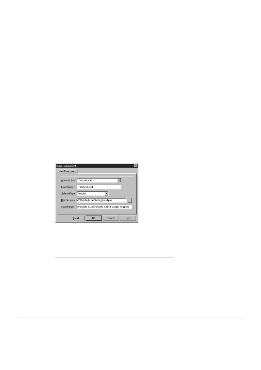
Today you learn how to create components. As with most of the more difficult concepts in Delphi, it's not so bad after you've
done it once or twice. You will learn this technique by building a component called TFlashingLabel. TFlashingLabel is a
regular Label component that flashes its text. By the time the day is done, you will know what you need in order to create basic
components.
Creating a New Component
Writing components requires a higher level of programming expertise than you have used up to this point. First, you have to
create a class for your new component. The class needs to be designed so that some of its properties show up in the Object
Inspector, whereas others will be used only at runtime. In addition, you will almost certainly have to write methods for your
component. Some will be private to the component; others will be made public so that users of the component can access them.
Finally, you might have to write events for the component. Obviously, there is some work involved. As great as Delphi's visual
programming environment is, it won't help you here. Writing components is pure programming.
The New Component Dialog Box
The New Component dialog box gives you a head start on writing a component. To access the New Component dialog box,
choose File|New to display the Object Repository and then double-click the Component icon. Figure 20.1 shows the New
Component dialog box you see when creating a new component.
FIGURE 20.1. The New Component
dialog box.
The Ancestor type field is used to specify an ancestor class for the new component. The classes of all installed components are
listed in the Ancestor type combo box. When you create a new component, you should choose a base class that most closely
matches the type of component you want to create.
For example, the FlashingLabel component is just a label that flashes. In that case, the standard Label component has
everything you need to get started, so you could use a TCustomLabel for the ancestor class. If, on the other hand, you want to
create a component that creates Windows shortcuts, you would probably derive the component from TComponent (the base
class for all components) because there is no other VCL component that gives you a better base from which to work.
NOTE: Delphi provides several classes that you can use as base classes for new components. The names of these
classes all start with TCustom. For example, the base class for a TLabel is TCustomLabel. You can derive from
one of these classes whenever you create a new component. The custom classes already provide the properties
you are most likely to need for that component type, but the properties are not published (published properties are
the properties shown in the Object Inspector at design time). All you have to do to make the properties published
is re-declare the base class's properties in the published section of your component's class declaration. This is
important because after a property is published, it can't be unpublished. Starting with a custom class enables you
to choose exactly the properties you want published.
When you derive a new component from an existing component, you are using the Object Pascal feature called inheritance. It's
been a while since I talked about inheritance, so refer to Day 3, "Classes and Object-Oriented Programming," if you need a
refresher course. Inheriting from a component is, in effect, taking everything that component has and adding some
functionality of your own. The class you are inheriting from is the base class, and the new class is the derived class. In the
previous example, TCustomLabel would be the base class and TFlashingLabel would be the derived class.
After you select an ancestor class, type the name of your new component's class in the Class Name field. The classname should
begin with a T and should describe the function the class performs. The component you build today will have the name
TFlashingLabel (you'll begin creating the component soon). If you choose a classname that already exists in the component
library, the New Component dialog box will tell you so when you click the OK button. You will have to choose a unique
classname before you can continue.
NOTE: There's no reason that you have to begin the classname with T; it just happens to be customary for
Borland classes. (The use of T in Borland classes is a Borland tradition that goes back to the early days of Turbo
Pascal. It was used in Turbo Vision, OWL, and now in VCL.) Some people use T when deriving from a Borland
class but not when creating their own classes. It's entirely up to you.
NOTE: Professional component writers learned long ago to be sure that their component classes have unique
names. Imagine the problems if two component vendors both name a component TFancyLabel. At TurboPower
where I work, our Async Professional components start with TApd, our Orpheus components start with TOr,
Abbrevia components start with TAb, and so on. Although this doesn't guarantee that these component names
won't clash with those of other vendors, it certainly goes a long way to prevent that from happening.
The Palette Page field enables you to specify the page on the Component palette where you want the component's icon to
appear. (The component's icon won't actually appear on the Component palette until you install the design package containing
the component.) You can choose an existing tab on the Component palette, or you can type the name of a new tab you want
Delphi to create for this component.
The Unit file name field is used to specify the name of the file that will contain the component's source. Delphi automatically
creates a unit filename based on the component's name, but you can change the supplied filename if you want. The Search path
field is used to specify the search path that Delphi should use when looking for component packages. You won't usually need
to modify this field.
The Install button is used to install the new component directly into a package. You need not worry about that now, though,
because you will use the default package that Delphi provides for miscellaneous components.
Creating the FlashingLabel Component
You are now ready to perform the first steps in creating the TFlashingLabel component. As I said earlier, this component is a
regular Label component that flashes its text on the screen. With that in mind, let's get started creating the component:
1. Choose File|New to invoke the Object Repository.
2. Double-click the Component icon in the Object Repository. The New Component dialog box is displayed.
3. From the Ancestor type combo box, choose the TCustomLabel class as the base class.
4. Type TFlashingLabel in the Class Name field.
5. The Palette Page field contains Samples. Leave this field as is. The new component will be added to the Samples page
of the Component palette when you install the component.
6. Click OK to close the New Component dialog box. The Code Editor appears and displays a new source code unit.
7. Save the unit as FlashingLabel.pas.
Listing 20.1 shows the source unit as it appears now.
LISTING 20.1. FlashingLabel.pas.
unit FlashingLabel;
interface
uses
Windows, Messages, SysUtils, Classes, Graphics,

Controls, Forms, Dialogs, StdCtrls;
type
TFlashingLabel = class(TCustomLabel)
private
{ Private declarations }
protected
{ Protected declarations }
public
{ Public declarations }
published
{ Published declarations }
end;
procedure Register;
implementation
procedure Register;
begin
RegisterComponents(`Samples', [TFlashingLabel]);
end;
end.
As you can see, the TFlashingLabel class is derived from TCustomLabel. The class declaration is empty except for the access
keywords (private, public, protected, and published). You can fill in the blanks later after I've had a chance to go over what
comprises a component.
As you can see, the New Component dialog box gives you a head start by filling out some of the basic parts of the component's
unit for you. You still have to do the hard stuff, but at least the Register procedure is written and the class declaration is started.
Let me sidetrack here and talk about the Register procedure.
The Register Procedure
Registering the component is necessary so that Delphi knows what components are in the component library and on what tab
they should appear. A typical Register procedure looks like this:
procedure Register;
begin
RegisterComponents(`Samples', [TMyComponent]);
end;
The Register procedure calls RegisterComponents to register the component. RegisterComponents takes two parameters. The
first parameter is the name of the Component palette page on which the component will appear after it is installed; the second
parameter is an array of components to be registered. If you were creating an entire library of components, you could register
them all at one time by placing each component's classname in the array. For example:
procedure Register;
begin
RegisterComponents(`Essentials 1',
[TEsLabel, TEsScrollingMarquee, TEsCalendar,
TEsCalculator, TEsDateEdit, TEsNumberEdit, TEsMenuButton,
TEsColorComboBox, TEsTile, TEsGradient, TEsRollUp]);
end;
This Register procedure registers 11 components and places them on the Component palette tab called "Essentials 1." Most of
the time you will be dealing with one component at a time, but you can certainly register more than one component if you need
to.
NOTE: The Register procedure is also used to register component editors and property editors. Component and
property editors are special editors, usually dialog boxes, that aid in modifying a component or a component's
property at design time. I won't discuss component and property editors in this book because they are beyond the
book's scope.
At this point the component doesn't do anything special, but before you go on with the component's creation, I need to explain
what makes up a component. After that, you'll write the rest of the TFlashingLabel component. Keep the component that you
just created (such as it is) open in the IDE because you'll need it a little later.

Component Properties and Methods
A big part of writing components is writing the component's properties and methods. Events are also a big part of writing
components, but let's talk first about properties and methods, and then I'll discuss events.
Properties
You have been using properties a lot in your journey thus far; from a user's perspective you know what properties are. Now
you need to understand properties from a component writer's perspective. Before you write components, you need to
understand what properties are--and what they are not.
Specifically, properties are not class data fields. It is natural to think of properties as data fields of the class to which they
belong. After all, you treat properties just like class data fields when you perform actions like this:
var
W : Integer;
begin
W := Width;
Height := W * 2;
But properties are not class data fields, and you must keep that in mind when writing components. Properties differ from class
data fields in many ways but have at least one feature in common with data fields: They have a specific data type. A property's
type can be one of the integral data types (Integer, Word, Double, string, and so on), a class (TCanvas, TFont, and so on), or a
record (TRect, for example).
What properties are, then, is a special type of object that meets the following criteria:
Properties have an underlying data field that is used to store the property's value.
●
Properties can implement a write method.
●
Properties can implement a read method.
●
Properties can use direct access instead of read and write methods.
●
Properties can be read-only or write-only.
●
Properties can have a default value.
●
Properties can be published or non-published.
●
For this to make more sense, let's take a look at these features of properties one at
a time.
Properties Have Underlying Class Data Fields
Each property has an underlying class data field associated with it. It is this data field that holds the actual value associated
with a property. Take a simple assignment, for example:
Label.Caption := `Pat McGarry';
This statement assigns a string to the Caption property of a Label component. What happens behind the scenes is more than
just a simple assignment, though. Because a Caption property is of the string type, it has a string object as its underlying data
field. When an assignment is made like this one, the underlying data field is given the value of the assigned string. Using an
underlying data field is necessary because a property does not have the capability to store data on its own.
You can name the underlying data field anything you want, but tradition dictates that the data field associated with a property
have the same name as the property, with the addition of a leading F. For example, the data field associated with the Caption
property is named FCaption.
NOTE: This association between the property and its underlying data field can be the source of much confusion
when you start writing components. It's not that it's difficult to understand; it's just that you might mix up the two
when writing code for the component. For example, you might accidentally write
Left := 20;
when you mean to write
FLeft := 20;
This results in all sorts of interesting behavior in your component. You'll see why when I discuss write methods in

the next section.
The underlying data field is almost always declared as private. This is because you want your users to modify the data field
through the property or by calling a method, but never directly. This way you are in control of the data field as much as
possible, which leads you to the next feature of properties.
Properties Can Have Write Methods
When you make an assignment to a property, many things can happen behind the scenes. Exactly what happens depends on the
specific property. For example, this code looks simple:
Left := 20;
But several things happen when this line is executed. First, the underlying data field, FLeft, is changed to the new value. Next,
the form (assuming this code was executed from a form) is moved to the new left position using the Windows API function
MoveWindow. Finally, the form is repainted by calling Invalidate for the form.
How does all that happen? It happens through the Left property's write method. The
write method is a method that is called any time the property is assigned a value.
You can use the write method to do validation of the assigned value or to
perform special processing.
You declare a property's write method when you declare the property. Here's an example of a typical property declaration:
property FlashRate : Integer
read FFlashRate write SetFlashRate;
This declaration contains syntax that you haven't seen before because it is syntax specific to properties. First of all, notice that
the property is declared with the property keyword and that the property type follows the property name. The second line of
code tells the compiler that the property is read directly from the FFlashRate data field (I'll talk more about read methods in
just a bit), and that the property uses a write method called SetFlashRate. You can name the write method anything you want,
but traditionally the write method has the same name as the property prepended with the word Set.
When the property is written to (assigned a value), the write method associated with the property will be called automatically.
The write method must be a procedure and must have one parameter. That parameter must be of the same type as the property
itself. For example, the write method's declaration for the FlashRate property would be
procedure SetFlashRate(AFlashRate : Integer);
The value passed to the write method is the value that was assigned to the property. So, given this line:
FlashingLabel.FlashRate := 1000;
You end up with the value of 1000 passed to the SetFlashRate function. What you do with the value within the write method
depends on a wide variety of factors. At a minimum, you assign the value to the associated data field. In other words, the write
method would look like this:
procedure TFlashingLabel.SetFlashRate(AFlashRate : Integer);
begin
FFlashRate := AFlashRate;
{ Do some other stuff. }
end;
NOTE: The use of the leading A for the parameter name in a write method is another Delphi tradition.
You will nearly always do something more than assign the value to the underlying data field. If you are only assigning the
value to the data field associated with the property, you don't need a write method for the property. I'll explain that in just a
moment. First, let's look at read methods.
Properties Can Have Read Methods
The read method works exactly like the write method (aside from the obvious difference). When a property's value is read, the
read method is executed and the value of the underlying data field is returned.
The name of the read method is the property name preceded by Get. The read method takes no parameters and returns the
property type. For example, if you were to use a read method for the FlashRate property, it would be declared like this:
function GetFlashRate : Integer;

The read method might perform some processing and then return the value of the
underlying data field, FFlashRate in this case. The reading of a property happens in
many different ways. Sometimes it's the result of an assignment to a variable:
Rate := FlashingLabel.FlashRate;
At other times it is used within a statement:
case FlashingLabel.FlashRate of
1000 : SpeedUp;
{ etc. }
end;
Regardless of how the property is read, the read method is called each time a read takes place.
Notice that a couple of paragraphs ago I said if you are using a read method. Frequently you won't use a read method but
instead will use direct access to retrieve the value of the data field associated with a property. Let's take a look at direct access
right now.
Properties Can Use Direct Access
You don't have to use read and write methods for your properties. If you are assigning a value to the underlying data field or
reading the value of the underlying data field, you can use direct access. The declaration for a property using direct access
looks like this:
property FlashRate : Integer
read FFlashRate write FFlashRate;
This snippet tells the compiler that the data field itself (FFlashRate) is used for both the read and the write specifiers rather
than a read method or a write method. When the property is written to, the data field is changed and nothing more takes place.
When the property is read, the value of the underlying data field is returned. It's as simple as that.
NOTE: It is common to use direct access when reading the property and to use a write method for writing to the
property. Take a look at this earlier example of a property declaration:
property FlashRate : Integer
read FFlashRate write SetFlashRate;
The property uses direct access for reading, but it uses a write method for writing. Writing to a property often
produces side effects, as I explained in the previous section. In fact, the capability to spawn side effects is one of
the big strengths of properties. To cause side effects when your property is written to, you use a write method.
Reading a property, on the other hand, is usually just a matter of returning the value of the underlying data field.
In that case, direct access makes the most sense.
Properties Can Be Read-Only or Write-Only
You can specify a property to be read-only or write-only. Making a property read-only is a useful feature (VCL has many
read-only properties). For example, you might have a property that you want the user to be able to read but not modify. It could
be that modifying the property directly would have adverse effects on the component, so you need to protect against that.
Making a property read-only is easy, you simply omit the write specifier in the property's declaration:
property FlashRate : Integer
read FFlashRate;
If the user attempts to write to a property that is declared as read-only, he or she will get a compiler error that says "Cannot
assign to a read-only property". As you can see, making a property read-only is very simple.
You can make a property write-only by omitting the read specifier from the property's declaration. It's difficult to imagine a
use for a property that can be written to but not read, but you certainly can write such a property, if necessary.
Properties Can Have Default Values
A default value is another useful feature of properties. You will notice that when you place a component on a form, many
properties that are displayed in the Object Inspector already contain values. These are the default values as defined by the
component writer. Assigning default values makes life easier for the component user. All properties should have a default
value, if possible. This enables the user to change only specific properties and leave the rest alone. Certain types of properties
(such as string properties) do not lend themselves to default values, but most do.
NOTE: String properties cannot have a default value.
Like the read and write methods, the default value is set when the property is declared. Let's go back to the
component's FlashRate property. Declaring the FlashRate property with a default value would look like this:
property FlashRate : Integer
read FFlashRate write SetFlashRate default 800;
Now, when the FlashingLabel component is displayed in the Object Inspector, the value of 800 (milliseconds in
this case) will already be displayed for the FlashRate property.
NOTE: Setting a default value for the property displays only the default value in the Object Inspector. It does not
set the value of the underlying data field for the property. You must still assign the default value to the data field
in the component's constructor. For example, the constructor for the FlashingLabel component would look like
this:
constructor TFlashingLabel.Create(AOwner : TComponent);
begin
inherited;
FFlashRate := 800;
{ Other things here. }
end;
Be sure to set the appropriate values for all class data fields that correspond to properties with default values.
If you don't want to use a default value for a property, omit the default specifier in the property's declaration.
Properties Can Be Published, Public, or Private
Some properties are available at design time. These properties can be modified at design time through the Object Inspector and
can also be modified or read at runtime. These properties are said to be published. Simply put, a published property is one that
shows up in the Object Inspector at design time. Any properties located in the published section of the component's class
declaration will be displayed in the Object Inspector at design time.
Other properties, called public properties, are runtime-only. These properties can't be accessed at design time (they don't show
up in the Object Inspector). Properties of this type are declared in the public section of the component's class declaration.
Private properties are properties that are used internally by the component and are not available to the component users.
Private properties are declared in the protected or private sections in the component's class declaration.
Writing Methods for Components
Writing methods for components is no different than writing methods for any Object Pascal class. Your component's methods
can be private, protected, or public. It pays to keep in mind access levels as you write components.
Determining what methods to make public is easy. A public method is one that users of your component can call to cause the
component to perform a specific action. The use of private versus protected methods is more difficult to decide. After
programming for a while, you will be better able to recognize the situations when protected access should be used instead of
private access.
Generally speaking, though, use private methods for tasks that are internal to the component and should not be accessible to
derived classes. Use protected methods for tasks that are internal to the component, but are tasks that derived classes might
want to alter to provide additional functionality to the component.
NOTE: Read and write methods for properties are usually made protected. Thus, you enable classes derived from
your component to modify the behavior of the read and write methods by overriding the method.
As I said earlier, methods of components are just methods and, for the most part, can be treated as regular class member
functions.

Adding Functionality to TFlashingLabel
A little later today I'll talk about events and how to write them, but for now you have enough information to write your first
component. The FlashingLabel component has the following features:
A property called FlashRate that controls the blink rate
●
A property called FlashEnabled that turns the flashing on or off
●
Write methods for the FlashRate and FlashEnabled properties
●
Default values for the FlashRate and FlashEnabled properties
●
A private class member (a TTimer class instance) to control the timing of the flash
●
All the characteristics of a regular Label component
●
First, I'll show you the complete FlashingLabel unit. After that, I'll go over what is happening with the code. Listing 20.2
shows the FlashingLabel unit.
Listing 20.2. FLASHINGLABEL.PAS.
unit FlashingLabel;
interface
uses
Windows, Messages, SysUtils, Classes, Graphics, Controls,
Forms, Dialogs, StdCtrls, ExtCtrls;
type
TFlashingLabel = class(TCustomLabel)
private
{ Private declarations }
FFlashEnabled : Boolean;
FFlashRate : Integer;
Timer : TTimer;
protected
{ Protected declarations }
{ Protected write methods for the properties. }
procedure SetFlashEnabled(AFlashEnabled : Boolean);
procedure SetFlashRate(AFlashRate : Integer);
{ OnTimer event handler. }
procedure OnTimer(Sender : TObject); virtual;
public
{ Public declarations }
constructor Create(AOwner : TComponent); override;
published
{ Published declarations }
{ The component's properties. }
property FlashEnabled : Boolean
read FFlashEnabled write SetFlashEnabled default True;
property FlashRate : Integer
read FFlashRate write SetFlashRate default 800;
{ All the properties of TCustomLabel redeclared. }
property Align;
property Alignment;
property AutoSize;
property BiDiMode;
property Caption;
property Color;
property Constraints;
property DragCursor;
property DragKind;
property DragMode;
property Enabled;
property FocusControl;
property Font;
property ParentBiDiMode;
property ParentColor;

property ParentFont;
property ParentShowHint;
property PopupMenu;
property ShowAccelChar;
property ShowHint;
property Transparent;
property Layout;
property Visible;
property WordWrap;
property OnClick;
property OnDblClick;
property OnDragDrop;
property OnDragOver;
property OnEndDock;
property OnEndDrag;
property OnMouseDown;
property OnMouseMove;
property OnMouseUp;
property OnStartDock;
property OnStartDrag;
end;
procedure Register;
implementation
constructor TFlashingLabel.Create(AOwner : TComponent);
begin
inherited;
{ Set the data fields to their default values. }
FFlashEnabled := True;
FFlashRate := 800;
{ Initialize the timer object. }
Timer := TTimer.Create(Self);
{ Set the timer interval using the flash rate. }
Timer.Interval := FFlashRate;
{ Assign our own OnTimer event handler to the
{ TTimer OnTimer event. }
Timer.OnTimer := OnTimer;
end;
procedure TFlashingLabel.SetFlashEnabled(AFlashEnabled : Boolean);
begin
{ Set FFlashEnabled data field. }
FFlashEnabled := AFlashEnabled;
{ Don't start the timer if the component is on a form
{ in design mode. Instead, just return. }
if csDesigning in ComponentState then
Exit;
{ Start the timer. }
Timer.Enabled := FFlashEnabled;
{ If flashing was turned off, be sure that the label
{ is visible. }
if not FFlashEnabled then
Visible := True;
end;
procedure TFlashingLabel.SetFlashRate(AFlashRate : Integer);
begin
{ Set the FFlashRate data field and the timer interval. }
FFlashRate := AFlashRate;
Timer.Interval := AFlashRate;
end;
procedure TFlashingLabel.OnTimer(Sender : TObject);
begin
{ If the component is on a form in design mode,
{ stop the timer and return. }
if csDesigning in ComponentState then begin
Timer.Enabled := False;
Exit;
end;
{ Toggle the Visible property each time the timer
{ event occurs. }
Visible := not Visible;
end;
procedure Register;
begin
RegisterComponents(`Samples', [TFlashingLabel]);
end;
END.
The Class Declaration
First, let's take a look at the class declaration. Notice that the private section declares three class data fields. The first two,
FFlashEnabled and FFlashRate, are the data fields associated with the FlashEnabled and FlashRate properties. The third
declaration looks like this:
Timer : TTimer;
This declares a pointer to a TTimer object. The TTimer object is used to regulate the flash rate.
NOTE: I haven't discussed timers yet. A timer is set up to fire at a specified interval (in milliseconds). When a
timer fires, a WM_TIMER message is sent to the window that owns the timer and, as a result, the OnTimer event
is triggered. For example, if you set the timer interval to 1,000 milliseconds, your OnTimer event will be called
nearly every second. I should point out that the WM_TIMER message is a low-priority message and can be
preempted if the system is busy. For this reason, you can't use a regular timer for mission-critical operations. Still,
for non-critical timings, the TTimer does a good job. (For more information on timers, refer to the Delphi help
under TTimer or the WM_TIMER message.)
The protected section of the class declaration contains declarations for the write methods for the FlashRate and FlashEnabled
properties. The protected section also declares the OnTimer function. This function is called each time a timer event occurs. It
is protected and declared as virtual, so derived classes can override it to provide other special handling when a timer event
occurs. For example, a derived class might want to change the color of the text each time the label flashes. Making this method
virtual enables overriding of the function to add additional behavior.
The Published Section
Finally, notice the published section. This section contains declarations for the FlashEnabled and FlashRate properties. In the
case of the FlashEnabled property, the read specifier uses direct access, the write specifier is set to the SetFlashEnabled
method, and the default value is set to True. The FlashRate property uses a similar construct.
Notice that following the two property declarations, I have declared all the properties of TCustomLabel that I want
republished. If you don't perform this step, the usual properties of a label component won't be available to the class at runtime
nor later at design time (after you install the component to the Component palette).
The Implementation Section
Now turn your attention to the implementation section. First you see the TFlashingLabel Create constructor. Here you see that
the default values for the class data fields representing the FlashEnabled and FlashRate properties are assigned. Remember that
you declared default values for these properties, but that affects only the way the property is displayed in the Object Inspector.
So you must assign the actual values in the constructor.
Notice these three lines (comments removed):
Timer := TTimer.Create(Self);
Timer.Interval := FFlashRate;
Timer.OnTimer := OnTimer;
The first line creates an instance of the TTimer object. The second line assigns the value of the FFlashRate data field to the

Interval property of the Timer component, which sets the timer interval that will be used to flash the text on the label. Finally,
the last line assigns the OnTimer function to the OnTimer event of the Timer object. This ensures that when a timer event
occurs, the component will receive notification.
The SetFlashEnabled procedure is the write method for the FlashEnabled property. This procedure first assigns the
FFlashEnabled data field to the value of AFlashEnabled. Next, the Enabled property of the Timer object is set according to the
value of AFlashEnabled. By writing to the FlashEnabled property, the user of the component can turn the flashing on or off.
This function also contains a code line that sets the Visible property to True when flashing is disabled. This eliminates the
situation in which the flashing could be turned off in mid-flash and, as a result, keep the text hidden.
The SetFlashRate Procedure
Now turn your attention to the SetFlashRate procedure. This is the write method for the FlashRate property. The user can
assign a value to the FlashRate property to control how fast the component flashes. (A rate of 1200 is slow, and a rate of 150 is
very fast.) This function contains these lines:
FFlashRate := AFlashRate;
Timer.Interval := AFlashRate;
This procedure simply assigns the value of AFlashRate first to the FFlashRate data field and then to the Interval property of the
Timer object. This ensures that if the user changes the flash rate at runtime, the flash rate will change accordingly.
The OnTimer method doesn't require much explanation. This method is called in response to an OnTimer event. All you do is
toggle the component's visible state each time a timer event occurs. In other words, if the FlashRate were set to 1000, the timer
events would occur nearly every second. When the first timer event occurs, the component is hidden. A second later, the next
timer event occurs and the component is shown. This continues until the FlashEnabled property is set to False or until the
application closes. Finally, at the end of the unit you see the component registration.
Enter the code from Listing 20.2 into the FlashingLabel.pas file that Delphi created for you earlier (when you used the New
Component dialog box). Don't worry about typing the comment lines if you don't want to. A bit later I'll show you how to test
the component to see whether it works.
TIP: Delphi's class completion makes declaring read and write methods for properties easy. Let's say, for
example, that you typed this property declaration:
property FlashRate : Integer
read FFlashRate write SetFlashRate;
The next step would probably be to declare and define the SetFlashRate method. Guess what? Delphi will do it for you! Just
press Ctrl+Shift+C and Delphi will create any read or write methods you haven't yet defined, and it will even add a declaration
for the data field (FFlashRate in this example).
TIP: If you have Delphi Professional or Client/Server, you can copy the property redeclarations directly from the
VCL source. Just open \Delphi 4\Source\Vcl\ StdCtrls.pas, copy the properties list from the TLabel class
declaration, and paste it into your class declaration.
The ComponentState Property
I'm getting a little ahead of myself here, but I want to point out some code that I didn't discuss in the analysis of Listing 20.2.
There is one important line in the SetFlashEnabled function that requires explanation. Here's that line, and the one that follows:
if csDesigning in ComponentState then
Exit;
This code checks whether the component is being used on a form at design time. If the form is being used at design time, you
need to prevent the timer from starting. When a component is placed on a form in the Form Designer, it does not necessarily
have full functionality--the Form Designer can't fully approximate a running program. In this case, you don't want the timer to
run while the component is being used in design mode.
NOTE: You could write the TFlashingLabel component so that the label flashes at design time as well as
runtime. It is easier not to deal with that now, plus it gives me a chance to talk about the ComponentState
property.
All components have a property called ComponentState. The ComponentState property is a set that indicates, among other
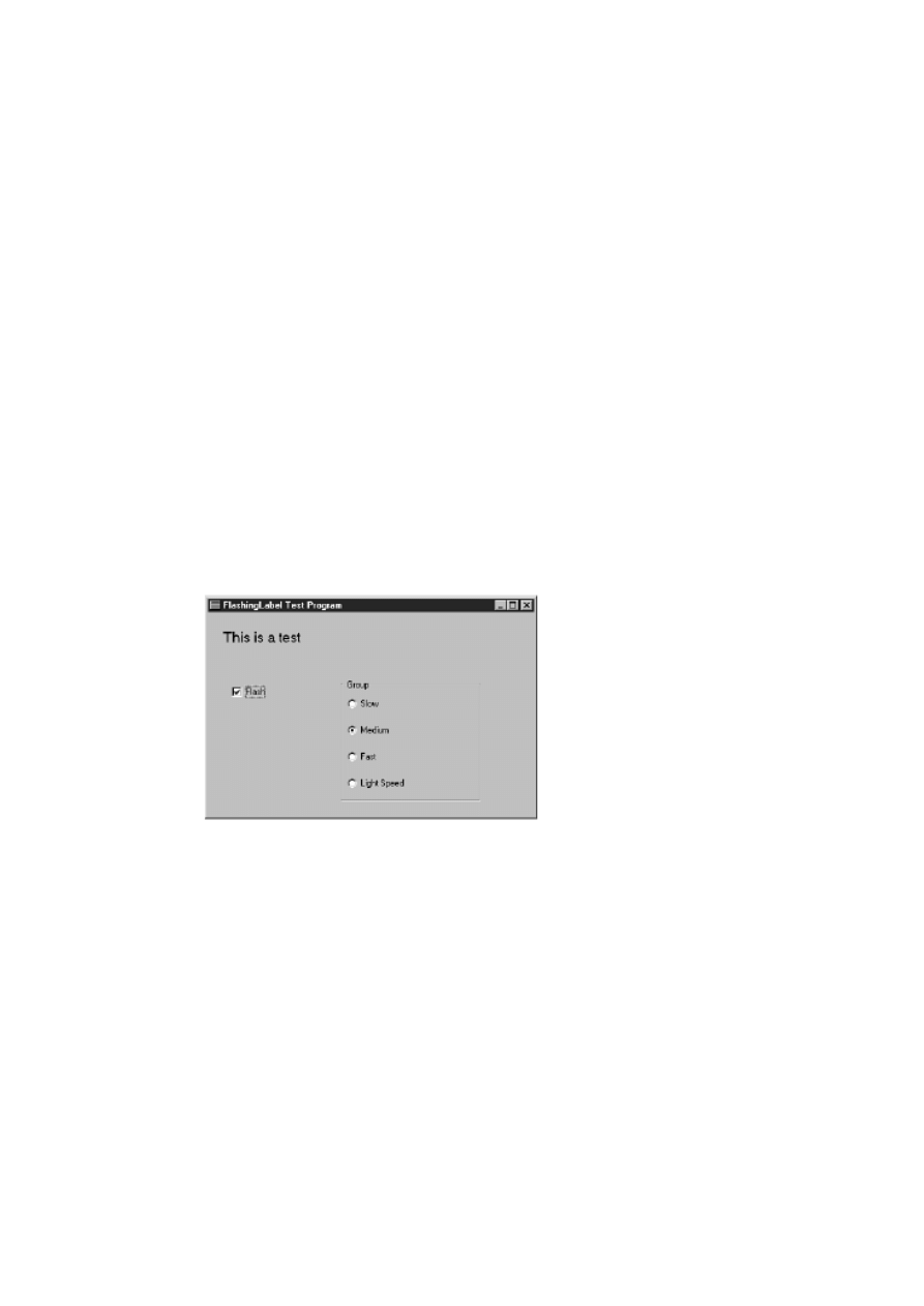
things, whether the component is being used at design time. If the set includes csDesigning, you know that the component is
being used on a form in the Form Designer. In this case, when you determine that the component is being used at design time,
you can return from the OnTimer function without starting the timer.
This code, then, checks whether the component is being used on a form in the Form Designer. If the component is being used
in the Form Designer, the timer is turned off, and the method exits without performing the remaining code in the method. The
timer, by default, will be started in the TFlashingLabel constructor, so it needs to be immediately turned off if the component is
being used at design time.
Testing the Component
Ultimately, you will add your newly created component to the Component palette. First, though, you must test your component
to be sure that it compiles and that it functions as you intended. This is a vital step in component development, and one that
many component writers overlook. There's no point in being in a hurry to add a new component to the Component palette.
First be sure that the component works as expected and then worry about adding the component to the Component palette.
To test your component, write an application that will serve as a testing ground. Because you can't drop the component on a
form from the Component palette, you have to create the component manually. In this case, because your FlashingLabel
component has two properties, you want to make sure that each property works.
For that reason, your test program will need to turn the flashing mode on and off. In addition, the test program should enable
you to set several flashing rates to see whether the FlashRate property performs as designed. Figure 20.2 shows the test
program running. This will give you an idea of what you'll be trying to accomplish.
FIGURE 20.2. The test program
running.
Now that you've had a peek at the test program, let's create it. As always, start with a blank form. First, add the check box and
radio group components as you see them in Figure 20.2:
1. Change the form's Name property to MainForm and the Caption property to FlashingLabel Test Program.
2. Using Figure 20.2 as a pattern, add a CheckBox component to the form. Change its Name property to FlashBox, its
Caption property to Flash, and its Checked property to True.
3. Double-click the check box to create an event handler for the OnClick event. When the Code Editor displays the
OnClick handler, type this code at the cursor (the name of the FlashingLabel component will be Flasher):
Flasher.FlashEnabled := FlashBox.Checked;
This will enable or disable flashing depending on the state of the check box.
4. Place a RadioGroup component on the form. Change its Name property to Group and its Caption property to Flash
Speed.

5. Double-click on the Value column next to the Items property. When the String Editor is displayed, type these lines:
Slow
Medium
Fast
Light Speed
Click OK to close the String Editor. The strings you typed will be displayed as radio buttons in the group box.
6. Set the ItemIndex property to 1. The Medium radio button will be selected.
7. Double-click the radio group component. The Code Editor will display the OnClick event handler for the group box.
Type the following code at the cursor:
case Group.ItemIndex of
0 : Flasher.FlashRate := 1200;
1 : Flasher.FlashRate := 800;
2 : Flasher.FlashRate := 400;
3 : Flasher.FlashRate := 150;
end;
This will set the FlashRate value of the FlashingLabel component based on the radio button selected.
8. Save the project in the same directory where your TFlashingLabel component resides. Save the main form's unit as
FlshTstU and the project as FlashTst (remember, I use short filenames for the book's code, but you can use long
filenames if you want).
Okay, now you add the component itself. Because this component isn't yet visual (you can't add it from the Component
palette), you will have to add it manually.
1. Click the Add to Project button (from the toolbar, from the main menu, or from the Project Manager context menu).
When the Add to Project dialog box is displayed, choose the FlashingLabel.pas file and click OK.
2. Navigate to the top of the unit and add FlashingLabel to the unit's uses list.
3. Add this declaration in the private section of the TMainForm class:
Flasher : TFlashingLabel;
4. Double-click the form's background to create an OnCreate event handler for the form. Type the following code in the
event handler:
Flasher := TFlashingLabel.Create(Self);
Flasher.Parent := Self;
Flasher.SetBounds(20, 20, 200, 20);
Flasher.Font.Size := 16;
Flasher.Caption := `This is a test';
Flasher.FlashRate := 800;
Now you are ready to test the component. Click the Run button to compile and run the test program. If you encounter any
compiler errors, carefully check your code and fix any errors the compiler points out.
When the program runs, click the Flash check box to turn the flashing on or off. Change the flash rate by choosing one of the
radio buttons in the group box. Hey, it works! Congratulations, you've written your first component.
Adding the Component to the Component Palette
After the component is working properly and you are satisfied with it, you can add it to the Component palette. To add the
FlashingLabel component to the Component palette, choose Component|Install Component. The Install Component dialog box
will appear. This dialog box enables you to add a component to a package. Figure 20.3 shows the Install Component dialog
box.
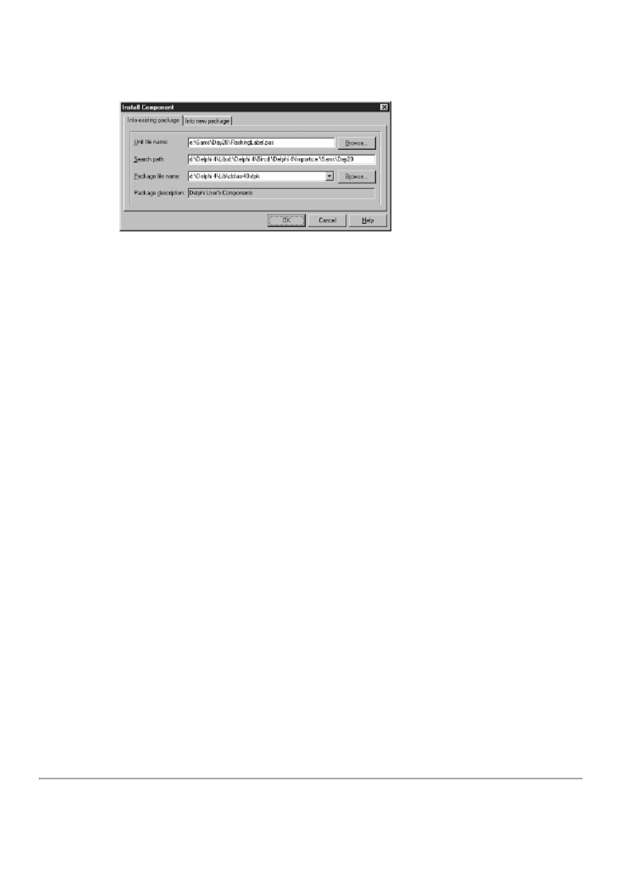
FIGURE 20.3. The Install Component
dialog box.
Okay, you're ready to add the FlashingLabel component to the Component palette. Perform the following steps:
1. Choose Component|Install Component from the main menu. The Install Component dialog box is displayed.
2. Click the Browse button to the right of the Unit file name field. When the Unit file name dialog box comes up, locate
the FlashingLabel.pas file and click Open.
3. Now look at the Package file name field. It should contain the file DCLUSR40.DPK. If not, click the drop-down
button and select DCLUSR40.DPK from the list. If you don't see this package listed, click the Browse button and find
the file (it is in the \Delphi 4\Lib directory).
4. Click OK to close the Install Component dialog box. Delphi displays a message telling you that it is about to build
and install the package. Click Yes to continue.
5. Delphi builds and installs the package. When the process is complete, Delphi displays a message box telling you that
the TFlashingLabel component has been registered.
Your component will now appear on the Samples page of the Component palette. Check the Samples page on the Component
palette and you will see a button that has the Delphi default component icon. If you pause over the button, the tooltip says
FlashingLabel.
Start a new project and test the FlashingLabel component by dropping it on the form. Note that all the usual properties of a
Label component are present in the Object Inspector, as well as the FlashRate and FlashEnabled properties. Note also that the
default values you specified for these properties are displayed in the Object Inspector.
I want to explain what you did in step 3. Delphi has a default package called DCLUSR40 that can be used to install individual
components. I had you install the FlashingLabel component in this package primarily because TFlashingLabel is a single
component (not part of an overall component library), and that's what this package is for. You could have created a new
package rather than use the DCLUSR40 package, but it is easier to use the package provided.
Adding a Custom Bitmap to the Component's Button
You might have noticed a problem with your newly installed component: The button for the FlashingLabel component on the
Component palette has the default Delphi bitmap. You can't have that! Fortunately, you can specify a bitmap for your new
component. You have to create a bitmap and place it in a compiled resource file (a .dcr file).
TIP: Sometimes you might want to take the button for the base class and modify it slightly to represent your new
component. In that case, start the Image Editor and open one of the .dcr files in the \Delphi 4\Lib\Obj directory.
You'll have to hunt to find the exact bitmap. For example, the bitmap for the Label component is in the file called
Stdreg.dcr. Open that file, copy the TLABEL bitmap to the Clipboard, begin a new resource file, and paste the
bitmap from the Clipboard into a new bitmap resource called TFLASHINGLABEL. Modify the bitmap as desired
and then save the resource project.
The bitmap for the component's button must be 24¥24 pixels. Most of the time a 16-color bitmap is sufficient. Delphi uses the
lower-left pixel in the bitmap for the transparent color, so keep that in mind when designing your component's bitmap. (Delphi
bitmaps use the dark yellow color as the transparent color, so you can follow that convention if you want.)
NOTE: Be sure you create a bitmap resource and not an icon resource. The Component palette buttons are often
called icons, but their images are bitmaps and not icons.
After you create the resource file, Delphi automatically adds the component's bitmap to the Component palette when you
install the component's package. For this to happen, you must follow a specific naming convention for the bitmap.
Specifically, the resource file must have a bitmap resource that exactly matches the classname of the component. For example,
to create a bitmap for the FlashingLabel component's button, you use Image Editor to create a resource file that contains a
bitmap resource called TFLASHINGLABEL. You can name the resource file anything you want.
Now that you have created a resource file, you must tell Delphi to link the resource file with the component's code. To do that,
add a line like this to your component's source code:
{$R Flashing.res}
The $R compiler directive tells the compiler to include the contents of a resource file with the unit's compiled code. Now
rebuild the package. If you've done everything correctly, the bitmap you created for the button will show up in the Component
palette.
NOTE: Notice that the filename extension of the resource file in the preceding code snippet is .res. The .res
extension is used interchangeably with the .dcr extension. Some component vendors use a unique naming
convention for their compiled resources and don't use either .res or .dcr. The filename extension is not important
when using the $R compiler directive. What is important, however, is that the file contains valid resources.
As an alternative, you can also add the $R directive directly to the package source. Most of the time this is not
necessary, though.
CAUTION: You can add compiled resources only in one place. Place the $R compiler directive in either the
package source or in the component's unit, but not both. If you add the same resources more than once, you will
get a compiler error and the package will not install.
TIP: If you have a library of several components, you can use one resource file for all of the component's
bitmaps. You don't need to have a separate resource file for each component in your library.
Writing Events for Components
Writing events requires some planning. When I speak of events, I am talking about two possibilities. Sometimes an event
occurs as the result of a Windows message, and sometimes an event occurs as a result of a change in the component. An event
triggered by a Windows message is more or less out of your control. You can respond to this type of event, but you generally
don't initiate the event. The second type of event is triggered by the component itself. In other words, as the component writer,
you are in control of when this type of event occurs.
Working with events at this level can be confusing. I'll try to get past that confusion and show you how events can be used on a
practical level. To do this, let's add an event to the TFlashingLabel class. First, however, let's cover a few of the event basics.
Events Overview
To begin with, you should understand that events are properties, and, as such, they have all the features that a regular property
has. Events use a private data field to store their values, as do other properties. In the case of an event, the underlying data field
contains the address of a function that will be called when the specified event occurs. Like properties, events can be published
or non-published. Published events show up in the Object Inspector just as published properties do.
Second, events are method pointers. Method pointers are like function super-pointers: They can point not only to a function in
a class instance, but they can also point to a function in an instance of an unrelated class. As long as the function declarations
match (the same return type and the same function parameters), the method pointer happily calls the function regardless of
where it's located. For example, the OnClick event of a TLabel object can point to an event-handling function in a TEdit
object, a TForm object, a TListBox object, and so on. Method pointers are more complicated than that, but I won't go into the
gory details.
NOTE: Event handlers must always be procedures. An event might pass one or more parameters depending on
the type of the event, but it can't return a value. You can get information back from the event handler, though, by
using one or more var parameters and enabling the user to change those parameters to achieve a particular
behavior.
You might deal with events on any one of several levels. For example, you might want to override the base class event handler
for a particular event to add some functionality. Let's say you want something special to happen when the user clicks on your
component with the mouse. There's no use going to all the trouble of creating a new event for a mouse click because the event
already exists in the form of the base class's OnClick event. You just tag onto that event rather than create a new event to catch
the mouse click.
Another way you might deal with events is by creating an event that you trigger from within the component. I will describe
this type of event first. As I said, you're going to add an event to the TFlashingLabel component that you created earlier.
Adding this event requires that you also add a new property. The event will be called OnLimitReached, and the new property
will be called FlashLimit. This event will be fired after the component flashes the number of times specified by FlashLimit. If
FlashLimit is 0 (the default), the OnLimitReached event will never be fired.
Writing a user-defined event for a component can be divided into five basic tasks:
1. Determine the event type.
2. Declare the underlying data field.
3. Declare the event.
4. Create a virtual method that is called when the event is to be triggered.
5. Write code to trigger the event.
Let's walk through these steps so that you better understand what is involved.
Determining the Event Type
Earlier, when I discussed properties, I said that a property is of a specific type. The same is true of events. In the case of events,
though, the type is a method pointer that includes a description of the event handler's parameters. Yesterday, Day 19, "Creating
and Using DLLs," I talked a little about function pointers when I discussed DLLs.
As I have said several times, there are two basic types of events. One is the notification event. This event tells you that
something happened, but it doesn't give you any other details. The function declaration of the event handler for a notification
event looks like this:
procedure Clicked(Sender : TObject);
The only information you get in a notification event is the sender of the event. Delphi provides the TNotifyEvent type for
notification events. Any events you create that are notification events should be of the TNotifyEvent type.
The other type of event is an event that has more than one parameter and actually passes information to the event handler. If
you want to, you can create this type of event for your components. Let's say you want to use an event handler that is
prototyped like this:
procedure LimitReached(Sender : TObject; var Stop : Boolean);
Using this type of event handler enables the user to modify the Stop parameter, thereby sending information back to the
component. If you are going to create events that have parameters, you need to declare your own method type.
Let's say you want to write an event type for the preceding method declaration and that the event type will be named
TLimitReachedEvent. It would look like this:
TLimitReachedEvent =
procedure(Sender : TObject; var Stop : Boolean) of object;
Although that's kind of confusing, all you have to do is copy this pattern and then add or remove parameters as needed. After
you have the event type defined, you can declare an event to be of the type TLimitReachedEvent. (This won't make a lot of
sense until you work through the whole process, so bear with me.)

NOTE: Place the declaration for a new event type in the type section of the unit just above the class declaration.
For example:
unit FlashingLabel;
interface
uses
Windows, Messages, SysUtils, Classes, Graphics, Controls,
Forms, Dialogs, StdCtrls, ExtCtrls;
type
TLimitReachedEvent =
procedure(Sender : TObject; var Stop : Boolean) of object;
TFlashingLabel = class(TCustomLabel)
private
{ Rest of unit follows. }
Try to determine to the best of your ability what type of events (if any) you need for your component. If you need only
notification events, you will create your events to be of the TNotifyEvent type. If your events will pass parameters to the event
handler, you need to define your own event type.
Declaring the Underlying Data Field
Declaring the underlying data field is the simple part. All you have to do is declare a private data field with the same type as
your event. It looks like this:
FOnLimitReached : TLimitReachedEvent;
As with properties, the data field's name is the same as the event name with the F on the front.
Declaring the Event
Now that you have determined the event type, you can declare the event for the component. The declaration for an event looks
almost identical to the declaration for any other property. Here's a typical declaration for an event:
property OnSomeEvent : TNotifyEvent
read FOnSomeEvent write FOnSomeEvent;
For the most part, this looks like the property declarations that you dealt with earlier. Notice that there is no default specifier.
Notice also that the read and write specifiers both point to the FOnSomeEvent data field. This illustrates that events use direct
access and do not use read and write methods. Finally, notice that in this example the event's type is TNotifyEvent.
The OnLimitReached event will pass parameters, so you must define a special type and apply it to the event. Given that, your
declaration for the OnLimitReached event looks like this:
property OnLimitReached : TLimitReachedEvent
read FOnLimitReached write FOnLimitReached;
Soon I'll show you the entire unit so that you can see it in perspective. (If you want to look ahead, check out Listing 20.3.)
Creating a Virtual Method to Trigger the Event
Creating a virtual method to trigger the event requires explanation. You will trigger the event as a result of some change within
the component. In this case, you are going to trigger the event when the number of times the component has flashed reaches
the value of the FlashLimit property. You trigger an event by calling the event:
var
Stop : Boolean;
begin
Stop := False;
FOnLimitReached(Self, Stop);
You trigger the event from one of several places in the component based on different factors. To centralize this trigger, you
create a virtual method that triggers the event. The virtual method will have the same name as the event, minus the On part and
prepended with Do.
NOTE: There are two popular naming conventions for naming methods that generate events. The first naming

convention removes the On prefix and replaces it with Do. In the case of the OnLimitReached event, the virtual
method that generates the event would be called DoLimitReached. The second naming convention drops the On
prefix and leaves it at that. I've used both naming conventions, but I have a slight preference for the former.
First, declare the method in the class declaration:
procedure DoLimitReached; virtual;
Then, write the method that actually triggers the event. That method will look like this:
procedure TFlashingLabel.DoLimitReached;
var
Stop : Boolean;
begin
Stop := False;
if Assigned(FOnLimitReached) then
FOnLimitReached(Self, Stop);
FlashEnabled := not Stop;
end;
There are several issues to note here. First, notice that you set up the default value of the Stop parameter. If the user doesn't
modify the parameter, the value of Stop will be False. The Stop parameter is used to determine whether the flashing should
stop when the FlashLimit value is reached. In the event handler for the event (in the application that uses the component), the
user can set Stop to True to cause the flashing to stop or can leave the Stop parameter as is to enable the flashing to continue.
Notice that Self is passed in the first parameter, setting the Sender parameter to the component's pointer.
Now, notice the statement that triggers the event:
if Assigned(FOnLimitReached) then
FOnLimitReached(Self, Stop);
If the component user has attached an event handler to the event, you call the event handler. If no event handler has been
attached, you do the default handling for the event. (In this case, there is no default handling.) It is important to enable the user
to ignore the event if he or she so chooses. This code enables that choice.
NOTE: One concept that is difficult to grasp when writing events is that the component itself does not provide
the event handler. The application using the component provides the event handler; you merely provide the
mechanism by which the event handler can be called when the event occurs.
CAUTION: If the user hasn't defined an event handler for your event, the event will be nil (no value assigned).
Never call an event handler without first ensuring that the event has been assigned. Attempting to call an event
that has not been assigned will result in an Access Violation in your component.
As I mentioned earlier, DoLimitReached is a virtual method. It is a virtual method because derived classes might want to
redefine the event's default behavior. Because you were kind enough to make the method virtual, any components derived
from your component only have to override the DoLimitReached function to change the default event-handling behavior. This
makes it easy to change the behavior of the event without having to hunt through the code and locate every place the event is
triggered. The event is triggered only here in the DoLimitReached method.
Writing Code That Triggers the Event
Somewhere in the component there must be code to call the DoLimitReached method (which, in turn, triggers the event). In
the case of the TFlashingLabel component, you call DoLimitReached from the OnTimer procedure. Here's how the function
looks after being modified to trigger the event:
procedure TFlashingLabel.OnTimer(Sender : TObject);
begin
{ If the component is on a form in design mode,
{ stop the timer and return. }
if csDesigning in ComponentState then begin
Timer.Enabled := False;
Exit;
end;

{ Toggle the Visible property each time }
{ the timer event occurs. }
Visible := not Visible;
{ Trigger the event if needed. Only increment }
{ the counter when the label is visible. }
if (FFlashLimit <> 0) and Visible then begin
{ Increment the FlashCount data field. }
Inc(FlashCount);
{ If the FlashCount is greater than or equal to }
{ the value of the FlashLimit property, reset the }
{ FlashCount value to 0 and trigger the event. }
if FlashCount >= FFlashLimit then begin
FlashCount := 0;
DoLimitReached;
end;
end;
end;
As you can see, when the FlashLimit is reached, the DoLimitReached method is called and the event is triggered. By the way,
you count only every other OnTimer event. If you incremented the counter every time the OnTimer function was called, you
would get an inaccurate count because the OnTimer event is fired twice for every flash (on and off). The Count variable is a
class data field and FlashLimit is a property.
Overriding Base Class Events
The preceding discussion ties in with something else I want to mention briefly. If you want to override the default behavior of
one of the events defined in the base class, all you have to do is override its event-triggering function as I've described. Let's
say you want to override the default OnClick event to make the speaker beep when the component is clicked. All you do is
override the Click function of the base class like this:
procedure TFlashingLabel.Click;
begin
{ Beep the speaker and then call the base class }
{ Click method for the default handling. }
MessageBeep(-1);
inherited;
end;
Because this function is declared as dynamic in the base class, it will be called automatically any time the component is clicked
with the mouse. It will work only when the component is visible, so keep that in mind if you try to click the component while
it is flashing. The call to MessageBeep is there just to prove that it works.
Putting It All Together
You took a peek at most of the new and improved TFlashingLabel component in the preceding pages, but let's look at the
entire component to put it all in perspective. Listing 20.3 shows the source file for the finished TFlashingLabel component.
Study the implementation of the OnLimitReached event to gain an understanding of how events should be implemented in
your components. Listing 20.4 contains the main unit of the modified test program. The MainFormLimitReached method
shows use of the OnLimitReached event.
LISTING 20.3. FlashingLabel.pas (NEW AND IMPROVED).
unit FlashingLabel;
interface
uses
Windows, Messages, SysUtils, Classes, Graphics, Controls,
Forms, Dialogs, StdCtrls, ExtCtrls;
type
TLimitReachedEvent =
procedure(Sender : TObject; var Stop : Boolean) of object;
TFlashingLabel = class(TCustomLabel)

private
{ Private declarations }
FFlashEnabled : Boolean;
FFlashLimit : Integer;
FFlashRate : Integer;
FOnLimitReached : TLimitReachedEvent;
FlashCount : Integer;
Timer : TTimer;
protected
{ Protected declarations }
{ Protected write methods for the properties. }
procedure SetFlashEnabled(AFlashEnabled : Boolean);
procedure SetFlashRate(AFlashRate : Integer);
procedure DoLimitReached; virtual;
procedure Click; override;
{ OnTimer event handler. }
procedure OnTimer(Sender : TObject); virtual;
public
{ Public declarations }
constructor Create(AOwner : TComponent); override;
published
{ Published declarations }
{ The component's properties. }
property FlashEnabled : Boolean
read FFlashEnabled write SetFlashEnabled default True;
property FlashRate : Integer
read FFlashRate write SetFlashRate default 800;
property FlashLimit : Integer
read FFlashLimit write FFlashLimit default 0;
property OnLimitReached : TLimitReachedEvent
read FOnLimitReached write FOnLimitReached;
{ All the properties of TCustomLabel redeclared. }
property Align;
property Alignment;
property AutoSize;
property BiDiMode;
property Caption;
property Color;
property Constraints;
property DragCursor;
property DragKind;
property DragMode;
property Enabled;
property FocusControl;
property Font;
property ParentBiDiMode;
property ParentColor;
property ParentFont;
property ParentShowHint;
property PopupMenu;
property ShowAccelChar;
property ShowHint;
property Transparent;
property Layout;
property Visible;
property WordWrap;
property OnClick;
property OnDblClick;
property OnDragDrop;
property OnDragOver;

property OnEndDock;
property OnEndDrag;
property OnMouseDown;
property OnMouseMove;
property OnMouseUp;
property OnStartDock;
property OnStartDrag;
end;
procedure Register;
implementation
constructor TFlashingLabel.Create(AOwner : TComponent);
begin
inherited;
{ Set the data fields to their default values. }
FFlashEnabled := True;
FFlashRate := 800;
FFlashLimit := 0;
FlashCount := 0;
{ Initialize the timer object. }
Timer := TTimer.Create(Self);
{ Set the timer interval using the flash rate. }
Timer.Interval := FFlashRate;
{ Assign our own OnTimer event handler to the
{ TTimer OnTimer event. }
Timer.OnTimer := OnTimer;
end;
procedure TFlashingLabel.SetFlashEnabled(AFlashEnabled : Boolean);
begin
{ Set FFlashEnabled data field. }
FFlashEnabled := AFlashEnabled;
{ Don't start the timer if the component is on a form
{ in design mode. Instead, just return. }
if csDesigning in ComponentState then
Exit;
{ Start the timer. }
Timer.Enabled := FFlashEnabled;
{ If flashing was turned off, be sure that the label
{ is visible. }
if not FFlashEnabled then
Visible := True;
end;
procedure TFlashingLabel.SetFlashRate(AFlashRate : Integer);
begin
{ Set the FFlashRate data field and the timer interval. }
FFlashRate := AFlashRate;
Timer.Interval := AFlashRate;
end;
procedure TFlashingLabel.OnTimer(Sender : TObject);
begin
{ If the component is on a form in design mode,
{ stop the timer and return. }
if csDesigning in ComponentState then begin
Timer.Enabled := False;
Exit;
end;
{ Toggle the Visible property each time }
{ the timer event occurs. }
Visible := not Visible;
{ Trigger the event if needed. Only increment }
{ the counter when the label is visible. }

if (FFlashLimit <> 0) and Visible then begin
{ Increment the FlashCount data field. }
Inc(FlashCount);
{ If the FlashCount is greater than or equal to }
{ the value of the FlashLimit property, reset the }
{ FlashCount value to 0 and trigger the event. }
if FlashCount >= FFlashLimit then begin
FlashCount := 0;
DoLimitReached;
end;
end;
end;
procedure TFlashingLabel.DoLimitReached;
var
Stop : Boolean;
begin
Stop := False;
if Assigned(FOnLimitReached) then
FOnLimitReached(Self, Stop);
FlashEnabled := not Stop;
end;
procedure TFlashingLabel.Click;
begin
{ Beep the speaker and then call the base class }
{ Click method for the default handling. }
MessageBeep(-1);
inherited;
end;
procedure Register;
begin
RegisterComponents(`Samples', [TFlashingLabel]);
end;
end.
LISTING 20.4. FlshTstU.pas.
unit FlshTstU;
interface
uses
Windows, Messages, SysUtils, Classes, Graphics, Controls, Forms, Dialogs,
StdCtrls, ExtCtrls, Flashing;
type
TMainForm = class(TForm)
FlashBox: TCheckBox;
Group: TRadioGroup;
procedure FormCreate(Sender: TObject);
procedure GroupClick(Sender: TObject);
procedure FlashBoxClick(Sender: TObject);
private
{ Private declarations }
Flasher : TFlashingLabel;
procedure OnLimitReached(Sender : TObject; var Stop : Boolean);
public
{ Public declarations }
end;
var
MainForm: TMainForm;
implementation
{$R *.DFM}

procedure TMainForm.FormCreate(Sender: TObject);
begin
Flasher := TFlashingLabel.Create(Self);
Flasher.Parent := Self;
Flasher.SetBounds(20, 20, 200, 20);
Flasher.Font.Size := 16;
Flasher.Caption := `This is a test';
Flasher.FlashRate := 800;
Flasher.FlashLimit := 5;
Flasher.OnLimitReached := OnLimitReached;
end;
procedure TMainForm.OnLimitReached(Sender : TObject; var Stop : Boolean);
begin
{ The OnLimitReached event handler. Set Stop to }
{ true to stop flashing or leave as-is to }
{ continue flashing.}
Stop := True;
end;
procedure TMainForm.GroupClick(Sender: TObject);
begin
case Group.ItemIndex of
0 : Flasher.FlashRate := 1200;
1 : Flasher.FlashRate := 800;
2 : Flasher.FlashRate := 400;
3 : Flasher.FlashRate := 150;
end;
end;
procedure TMainForm.FlashBoxClick(Sender: TObject);
begin
Flasher.FlashEnabled := FlashBox.Checked;
end;
end.
This component and the FlashTst test program are included with the book's code. However, the component's source unit is
called Flashing.pas.
Run the test program to see whether the event works as advertised. Experiment with the test program to get a better feeling for
how the event and the event handler work. Notice that the speaker beeps when you click on the label (as long is it is visible).
This is because of the overridden dynamic method called Click. I added this function to illustrate how to override a base class
event.
NOTE: If you want to install the new and improved FlashingLabel component on the Component palette, open
the DCLUSR40 package and click on the Compile Package button. The old version of FlashingLabel will be
updated to the new version.
Writing events takes time to master. You have to kiss a lot of frogs before being rewarded with the prince (or princess). In
other words, there's no substitute for experience when it comes to writing events. You just have to get in there and do it. You'll
probably hit a few bumps along the way, but it will be good experience, and you'll find yourself a better programmer for it.
Summary
Well, you're in the big league now. Writing components isn't necessarily easy, but when you have a basic understanding of
writing components, the world is at your fingertips. If you are anything like me, you will learn to enjoy your nonvisual
programming time as much as you enjoy the visual programming you do. If this chapter seems overwhelming, don't feel bad.
You might have to let it soak in for a few days and then come back to it. You might have to read several different documents
on writing components before it all comes together. Keep at it and it will eventually make sense.

Workshop
The Workshop contains quiz questions to help you solidify your understanding of the material covered and exercises to
provide you with experience in using what you have learned. You can find answers to the quiz questions in Appendix A,
"Answers to the Quiz Questions."
Q&A
Q Is there any reason I must know how to write components?
A No. You can use the basic components that Delphi gives you in your applications. You might never need to write
components.
Q Can I buy components?
A Yes. A wide variety of sources exist for third-party component libraries. These libraries are sold by companies that
specialize in VCL components. In addition, many freeware or shareware components are available from various online
sources. Be sure to search the Internet for sources of VCL components.
Q Can I use my Delphi components with C++Builder?
A Yes. C++Builder has the capability to compile and install Delphi components.
Q Do I have to use read and write methods to store my property's value?
A No. You can use direct access and store the property's value directly in the underlying data field associated with the
property.
Q What's the advantage of using a write method for my properties?
A Using a write method enables you to perform other operations when a property is written to. Writing to a property
often causes the component to perform specific tasks. Using a write method enables you to carry out those tasks.
Q Why would I want a property to be public but not published?
A A published property is displayed in the Object Inspector at design time. Some properties don't have a design-time
interface. Those properties should be made public so that the user can modify or read them at runtime but not at design
time.
Q How do I test my component to be sure it works correctly before I install it?
A Write a test program and add the component's source file to your project. In the constructor of the main form, create
an instance of your component. Set any properties that you need to set prior to the component being made visible. In the
test program, manipulate your component's public properties to see whether everything works properly.
Q Do I have to write events for my components?
A Not necessarily. Some components make use of events; others do not. Don't go out of your way to write events for
your components, but by the same token don't shy away from writing events when you need them.
Quiz
1. Must a property use a write method? Why or why not?
2. Must a property have an underlying data field? Why or why not?
3. Can you create a component by extending an existing component?
4. What happens if you don't specify a write specifier (either a write method or direct access) in a property's declaration?
5. What does direct access mean?
6. Must your properties have a default value? Why or why not?
7. Does the default value of the property set the underlying data field's value automatically?
8. How do you install a component on the Component palette?
9. How do you specify the button bitmap that your component will use on the Component palette?
10. How do you trigger a user-defined event?
Exercises
1. Review the FlashingLabel component source in Listing 20.3. Study it to learn what is happening in the code.
2. Remove the FlashingLabel component from the component library. Reinstall the FlashingLabel component.
3. Write a test program that uses three FlashingLabel components, all with different flash rates.
4. Change the bitmap for the FlashingLabel button on the Component palette to one of your own design.

5. Write a write method for the FlashLimit property of the FlashingLabel component so that the user can't enter a
number greater than 100.
6. Change the OnLimitReached event for the FlashingLabel component to a regular notification event (Hint: Use
TNotifyEvent).
7. Extra Credit: Write a component of your own design.
8. Extra Credit: Test your new component and install it on the Component palette.
©
Teach Yourself Borland Delphi 4 in 21 Days
- 21 -
Delphi and C++Builder
Similarities Between Delphi and C++Builder
❍
❍
❍
❍
●
Differences Between Delphi and C++Builder
❍
❍
❍
●
❍
●
C++Builder Can Compile Pascal Units
❍
❍
Delphi Compiles Faster and Produces Smaller EXEs
❍
●
Converting from Delphi to C++Builder
❍
❍
❍
❍
●
●
❍
●
❍
●
●
When Borland released Delphi 1 a few years ago, it was a huge success. Now on version 4, Delphi continues to be a huge
success today. Sometime after Delphi 2, Borland decided to leverage the success of Delphi by creating a RAD development
environment for C++. Borland leveraged that success in more ways than one. One way was by reusing parts of Delphi in
C++Builder. In this chapter you learn about how Delphi and C++Builder are similar and how they are different. You also
learn how to exchange code between Delphi and C++Builder and how to convert code from C++Builder to Delphi.
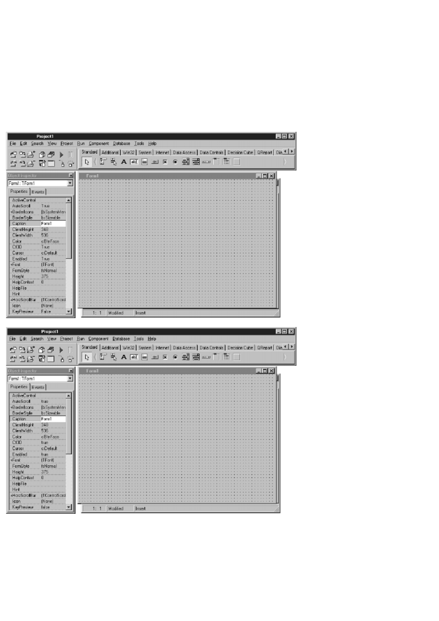
Similarities Between Delphi and C++Builder
Delphi and C++Builder are more similar than they are different. Let's look at those similarities in the following sections.
The IDE
If you have used both Delphi and C++Builder, you might have been struck by how similar their Integrated Development
Environments (IDEs) are. Those of you who haven't used both Delphi and C++Builder (and even those who have), take a
look at Figures 21.1 and 21.2. One of these figures is a screen shot of Delphi 3 and the other is a screen shot of C++Builder 3.
I have removed the icons and program name from the title bars so that it isn't immediately apparent which is which. Can you
tell the difference?
FIGURE 21.1. Delphi or C++Builder?
FIGURE 21.2. Delphi or C++Builder?
Do you give up? Figure 21.1 shows the Delphi IDE and Figure 21.2 shows the C++Builder IDE. If you have used both
Delphi and C++Builder, you might have recognized from the Object Inspector which figure shows the Delphi IDE and which
shows the C++Builder IDE. The Delphi Object Inspector shows properties with values of True and False, whereas the
C++Builder Object Inspector shows true and false.
The point of this exercise is that the IDEs of C++Builder 3 and Delphi 3 are nearly identical. (You might have noticed I used
Delphi 3 for this illustration rather than Delphi 4. I used Delphi 3 because I wanted to compare it with C++Builder 3, the
latest version of C++Builder at the time of this writing, and the version that corresponds to Delphi 3.)
When you start examining the menus, you will see some differences, naturally, but for the most part the IDEs are so similar
that if you know how to use one of these development environments, you know how to use the other. This has obvious
benefits. For example, let's say your company has been using Delphi and now wants to add C++ to its toolset. Using
C++Builder as your C++ development tool saves you time and money because your programmers don't have to learn a new
development environment. That leads to another similarity between Delphi and C++Builder: the Visual Component Library.
The Visual Component Library
Not only are the IDEs of Delphi and C++Builder nearly identical, but they also share the exact same component library in the
VCL. The VCL is written in Object Pascal, but both Delphi and C++Builder share the same VCL (with some minor
differences that I address later in the section, "VCL Enhancements").
NOTE: There has been a fair amount of discussion on the Borland newsgroups among C++ programmers on the
subject of a Pascal component library in a C++ development environment. Some C++ programmers can't get
over the fact that the VCL is written in Object Pascal. Most programmers, though, take the sensible approach of
not caring what language the VCL is written in. They just want to get their work done on time and within
budget. For these programmers, the added productivity of C++Builder far outweighs the language issue.
The fact that both Delphi and C++Builder use the same framework is again a huge benefit if you use both Delphi and
C++Builder. Other than the syntactical differences between Object Pascal and C++, the VCL components are used identically
in the two IDEs. Take the following Delphi code:
if OpenDialog1.Execute then
Memo1.Lines.LoadFromFile(OpenDialog1.FileName);
Now look at the C++Builder equivalent:
if (OpenDialog1->Execute())
Memo1->Lines->LoadFromFile(OpenDialog1->FileName);
As you can see, there is no difference in the use of VCL. The only differences are the differences between C++ syntax and
Object Pascal syntax. This means that you don't have to learn a new framework if you want to switch between Delphi and
C++Builder, or vice versa. For a company with a large number of programmers, this means that you can leverage your
programmers' knowledge to the maximum. Even if you are a single programmer, knowing both Delphi and C++Builder is
very valuable.
Form Files
The form files used in Delphi and C++Builder are also identical. You can create a form in Delphi and reuse that form in
C++Builder. Later I will explain exactly how to do that in the section "Reusing Forms." Although creating forms in Delphi
and C++Builder is easy, it still takes time to design and create complex forms. By reusing your forms, you don't have to
repeat work that has already been done.
Packages
Both Delphi and C++Builder use packages. In almost all cases, packages created for Delphi can be used in C++Builder. They
will probably have to be recompiled in C++Builder, but that is a trivial task. The capability of C++Builder to use Delphi
packages means that you have a wealth of commercial, shareware, and freeware VCL components available to you. These
components are almost always written with Delphi, so they can be used in both Delphi and C++Builder. At this time you
cannot use packages written for C++Builder in Delphi, but that might change with the later versions of these two products.
Differences Between Delphi and C++Builder
Although Delphi and C++Builder have many similarities, they also have many
differences. Most of the differences are a result of the variations in the Object
Pascal and C++ languages.
Other differences are due to what I like to call the "leapfrog effect." In the beginning there was Delphi 1. After that, naturally,
came Delphi 2. After Delphi 2 was released, Borland began working on C++Builder. C++Builder 1 was patterned after
Delphi 2 (which was released about a year before C++Builder 1). As such, C++Builder 1 acquired most of its features from
Delphi 2. C++Builder 1 didn't add anything significant to what Delphi 2 offered--it was primarily a copycat. Shortly after
C++Builder 1 was released, Borland released Delphi 3.
C++Builder 3 followed (Borland skipped version 2 of C++Builder to match Delphi's version number). C++Builder 3 is
patterned after Delphi 3, just as C++Builder 1 was patterned after Delphi 2. However, C++Builder 3 added several features
not found in Delphi 3 (the Project Manager, for example). Delphi 4 inherited the features introduced in C++Builder 3 and, of
course, added a number of new features. C++Builder 4 will likely contain the new features of Delphi 4, will add more new
features, and so on. This leapfrogging will likely continue for some time, with each release (whether it be Delphi or
C++Builder) gaining the benefit of the previous release and adding new features of its own.
Now let's look at the differences between Delphi and C++Builder.
Language
The most obvious difference between Delphi and C++Builder is that C++Builder generates C++ code and Delphi generates
Object Pascal code, which leads to variations in the IDEs of the two products. For example, Delphi has a menu item under
the File menu called Use Unit. C++ uses header files (.H or .HPP files) for each unit, so that menu item in C++Builder is
called Include Unit Hdr. These types of differences abound throughout the two IDEs for obvious reasons.
Filename Extensions
Delphi and C++Builder use different filename extensions for project and support files. This is partly a result of the language
differences between the two products. The contrasting filename extensions enable you to easily distinguish a Delphi file from
a C++Builder file. Table 21.1 lists the various project elements and their respective file extensions for both Delphi and
C++Builder.
TABLE 21.1. DELPHI AND C++BUILDER FILE EXTENSIONS.
Element
Delphi
C++Builder
Project file
.DPR
.BPR
Project group file
.BPG
.BPG
Source file
.PAS
.CPP
Header file
None
.H or .HPP
Form file
.DFM
.DFM
Compiled binary file
.DCU
.OBJ
Compiled resources
.RES or .DCR .RES
Saved desktop settings .DSK
.DSK
Project options
.DOF
None
Package source files
.DPK
.BPK
Compiled package
.BPL
.BPL
Notice that in some cases the filename extensions used by Delphi and C++Builder are the same.
IDE
The Delphi 4 IDE is brand new. In particular, the following features are new to the Delphi 4 IDE and are not found in the
current version of C++Builder:
Dockable menu, toolbars, and Component palette
●
New button bitmaps for the IDE toolbar buttons
●
Bitmaps for key menu items
●
Dockable tool windows
●
Some of the IDE enhancements listed here are cosmetic (hey, it doesn't hurt to give an application a facelift every once in
awhile!). Other enhancements, such as the dockable toolbars, menus, and tool windows, are productivity boosters.

Code Editor
The Delphi 4 Code Editor has many features not found in C++Builder. In particular, the following features are found in
Delphi 4:
Module navigation
●
Code completion
●
Class completion
●
Code parameters
●
Module navigation is a feature specific to the Object Pascal language, so it's no surprise that C++Builder doesn't have module
navigation--but why doesn't C++Builder have code completion and code parameters? Delphi compiles the current unit each
time the code completion or code parameters features are invoked. This is possible due to the incredible speed of the Object
Pascal compiler. C++ code takes much longer to compile, so it is not feasible to implement code completion and code
parameters in C++Builder using this same design. There are alternative means of implementing these features, so future
versions of C++Builder might very well have code completion and code parameters.
C++Builder does not have class completion because it is a feature new to Delphi 4. The next version of C++Builder will
likely have class completion.
Code Explorer
The Code Explorer is also new to Delphi 4, so it is not found in any version of C++Builder. This is also a feature I expect to
see in future versions of C++Builder.
VCL Enhancements
The Delphi 4 VCL includes a few enhancements to VCL not yet found in C++Builder. In particular, these classes are new to
VCL in Delphi 4:
TActionList
●
TControlBar
●
TDateTimePicker
●
TPageScroller
●
TSimpleMail
●
Additional QuickReports components: TQRTextFilter, TQRCSVFilter, TQRHTMLFilter
●
Additional client/server MIDAS components for DCOM connections, CORBA connections, OLE Enterprise
connections, and others
●
As with many of the additions to Delphi 4, these new VCL components will almost certainly be added to the next version of
C++Builder.
C++Builder Can Compile Pascal Units
C++Builder can compile Pascal units just as easily as it can compile C++ units. This means that you can add a Pascal source
file directly to a C++Builder project and C++Builder will compile the unit and link that unit's code into the project's EXE.
You can add a Delphi form and unit to a C++Builder project and that form will be called just like a native C++Builder form.
C++Builder has the capability to compile Pascal units, but Delphi can't compile C++Builder source files. Delphi 4 can,
however, create C++ object files (.obj) from Object Pascal source.
ActiveX Support
Support for creating ActiveX controls is slightly different in C++Builder than in Delphi. Primarily, C++Builder ActiveX
controls make use of the ActiveX Template Library (ATL), a C++ framework for ActiveX creation.

Delphi Compiles Faster and Produces Smaller EXEs
Delphi programs will always compile faster than C++Builder programs. Pascal compiles much faster than C++ because it
isn't as complex. C++Builder's use of pre-compiled headers and the incremental linker helps reduce the effects by speeding
up compile and link times, but Delphi programs still compile much faster than C++Builder programs.
Along the same lines, Delphi programs are always smaller than C++Builder programs. This is because of a number of factors,
but primarily because the VCL is written in Object Pascal. Because the VCL is written in Object Pascal, a C++Builder
program has to include both the C++ Runtime Library and the Object Pascal Runtime Library. Both C++ and Pascal use
different exception handling and runtime type information code, which results in extra code in a C++Builder application.
Converting from Delphi to C++Builder
At some point you might need to convert an application from Delphi to C++Builder or from C++Builder to Delphi. I have
done dozens of such conversions and, although time-consuming, they are not difficult. (By the way, when converting a
project, I run Delphi and C++Builder simultaneously.) In the following section I discuss converting only from Delphi to
C++Builder. Converting the other way is simply a variation of the same concepts.
NOTE: Why discuss converting a Delphi application to C++Builder and not the other way around? Primarily
because Delphi has a larger installed base (it's been on the market longer) and the most likely conversion is from
Delphi to C++Builder. That does not necessarily mean that developers are switching to C++Builder from
Delphi. I have done nearly 200 such conversions for TurboPower Software (my employer). In that case, I was
converting our products' example programs, which were written in Delphi, to C++Builder. This was necessary
when we began supporting our components for use in C++Builder.
Converting a project from Delphi to C++Builder involves two basic steps. The first step is to copy the Delphi application's
forms to the C++Builder project. The second step is to modify the Delphi code. Let's look at these two steps in more detail.
Copying the Delphi Forms
The first thing you need to do is copy the Delphi forms to the C++Builder application. A C++Builder form and a Delphi form
use the same basic format, but there is at least one significant difference that you should be aware of.
It is obvious that a form file contains the size and position of the form itself and of every component on the form. What might
not be obvious, however, is that the form file also contains information about events and event handlers. Specifically, the
form file includes a description of any event handlers that have been created for the form and for any components on the
form. In a Delphi form file, the events contain references to event handlers in Pascal.
In a C++Builder form file, the events point to C++ event handlers. Naturally, you will have to remove the Pascal references
in order to use the form in C++Builder. It isn't important that you understand this in detail, but it is a factor you will have to
deal with when converting a Delphi form to C++Builder.
Here are the steps required to copy a Delphi main form:
1. Open the project in Delphi and make note of the main form's filename and its Name property.
2. Switch to C++Builder and select the main form. Change the Name property to the same name as the Delphi project's
main form.
3. Save the C++Builder project. Save the main form's unit with the same filename the form had in Delphi (minus the
.PAS extension, of course). Save the project with the same project name as the Delphi project.
4. Switch to Windows Explorer. Copy the main form's form file (the .DFM file) from the Delphi project's directory to
the C++Builder project's directory. Make sure that you copy the file, not move it. Explorer will warn you that a file
with the same filename exists in the destination directory. Click Yes to overwrite the form file in the C++Builder
directory. If you don't get this warning, you have done something wrong in saving the C++Builder unit.
5. Switch back to C++Builder. A dialog box will be displayed that says Module XXX.CPP's time/date has changed.
Reload?. Click Yes to reload the form. When the form reloads, it will contain the components found on the Delphi
form.
6. Make sure that the form is selected and then choose Edit|Select All from the C++Builder main menu to select all the
form's components. Now choose Edit|Cut from the main menu, immediately followed by Edit|Paste. This step ensures
that all the declarations for the individual components are placed in the main form's header file.
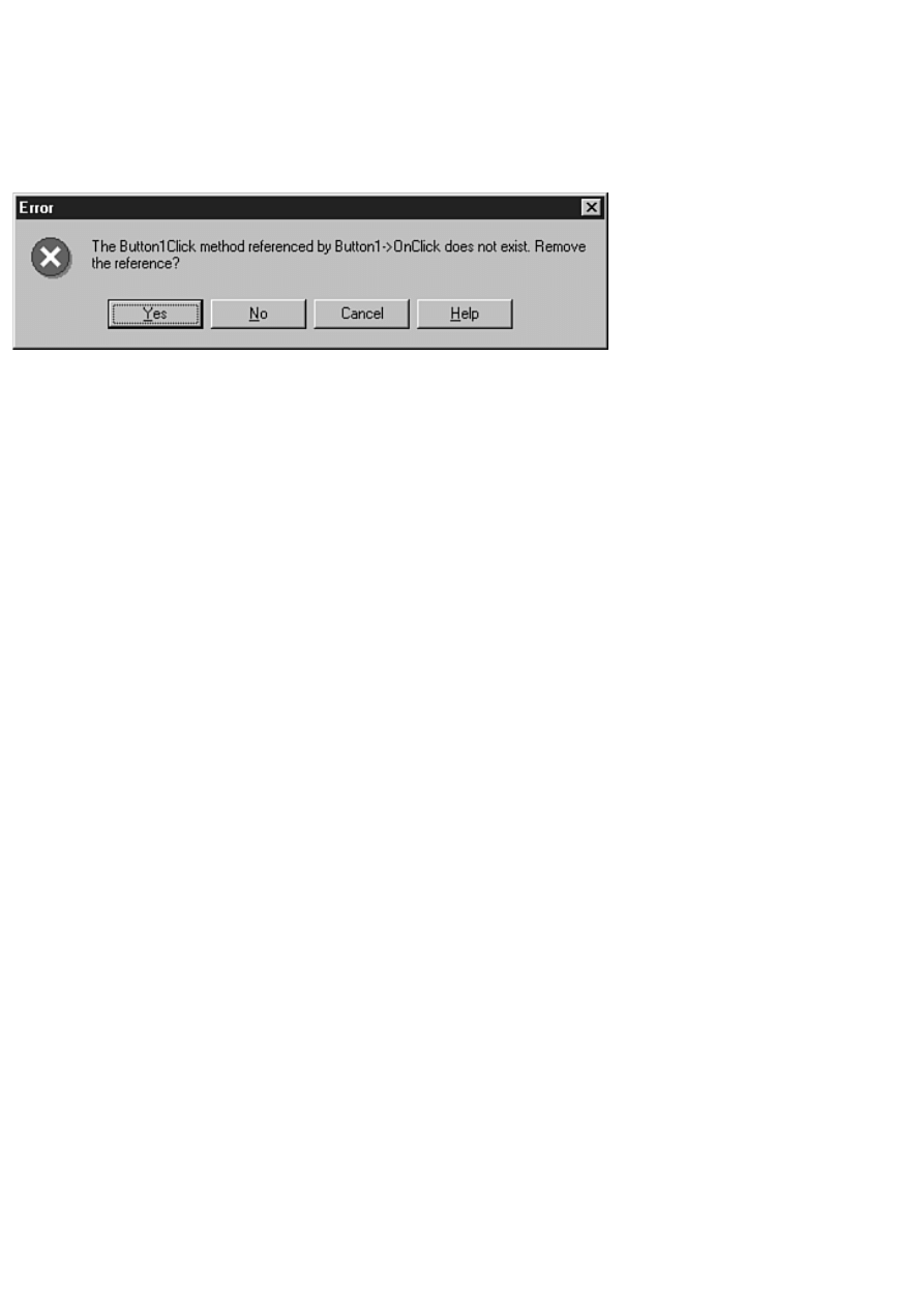
At this point you need to be certain that all references to the Delphi event handlers are removed from the C++Builder form
file. Doing this is simple, as follows:
1. Choose File|Save from the C++Builder main menu or click the Save File button on the toolbar.
2. C++Builder will display a message box for each event handler associated with the form, as shown in Figure 21.3.
Click Yes each time the dialog box is displayed to remove all event handlers. Be aware that you might have to click
Yes dozens of times to remove all the event handlers. (I've had to remove as many as 100 event handlers for a single
form!)
FIGURE 21.3. Removing event handlers
from the form.
At this point, you are done copying the form itself. Now you can move on to converting the code.
NOTE: You need to repeat this form-copying process for every form in the Delphi application.
Converting the Code
Converting the code from Delphi to C++Builder is much more difficult than copying the form. There are many ways to
proceed, but I'll explain the method that I use. First, look for any variables and methods that were created by the programmer
and not by Delphi, as follows:
1. Locate the main form's class declaration in the Delphi unit.
2. Make note of any variables or methods declared in the private or public sections.
3. Copy any such declarations to the Clipboard. For example, part of the Delphi class declaration might look like this:
private
{ Private declarations }
DrawColor : TColor;
procedure DoDrawing;
function SetDrawColor : Integer;
In this case you would copy the declarations for DrawColor, DoDrawing, and SetDrawColor.
4. Switch back to C++Builder. Display the main form's header in the Code Editor. Locate the private section and paste
the code from the Clipboard.
5. Convert the declarations you pasted to C++ syntax. For example, the declarations in the example in step 3 would
look like this after being converted:
private: // User declarations
TColor DrawColor;
void DoDrawing();
int SetDrawColor();
6. Switch back to Delphi. In the implementation section of the Delphi unit, locate any methods declared in the class
declaration (DoDrawing and SetDrawColor in this example). Copy the methods in the Delphi unit to the Clipboard.
7. Switch to C++Builder. Paste the methods copied in step 6 from the Clipboard to the form's source unit. Convert the
first line of the methods (the method header) from Pascal syntax to C++ syntax. Don't worry about the function bodies
or the begin and end statements. You'll fix that later.
Copying the Event Handlers
The next step is to copy the code for the event handlers in the Delphi unit to the C++Builder unit. The best way I have found
to do this is to start at the top of the implementation section in the Delphi unit and work down. Here are the steps to take
when you encounter an event handler in the Delphi code:
1. Make note of the event handler's name. If the name is Button1Click, you know that the event handler is for the
OnClick event of the component named Button1.
2. Copy the code inside the event handler to the Clipboard.
3. Switch to C++Builder. Generate an event handler that matches the event handler from which you copied the code.
4. Paste the Delphi code from the Clipboard into the event handler.
Repeat steps 1 through 4 for every event handler in the Delphi unit. When you are done, you will have several event handlers
in your C++Builder project.
Using the Replace Text Dialog Box
The event handlers in the Delphi form file contain Pascal code, so you need to convert that code to C++. Fortunately, you can
do a lot of the conversion with C++Builder's Replace Text dialog box. Table 21.2 lists the Pascal syntax you are searching for
and the C++ syntax that is the replacement text. Spaces in the search or replace text are denoted by a small dot. In most cases,
you will want to perform the Find and Replace operations in the order listed in Table 21.2.
TABLE 21.2. FIND AND REPLACE TEXT WHEN CONVERTING FROM DELPHI TO C++BUILDER.
Description
Find Text
Replace Text
Equality operator
[lozenge]=[lozenge] [lozenge]==[lozenge]
Assignment operator :=
=
Inequality operator
<>
!=
Membership operator .
->
String quote
`
"
Begin comment
{
//
End comment
}
(Nothing)
Pascal True keyword True
true
Pascal False keyword False
false
if statement
if[lozenge]
if[lozenge](
Start of block
begin
{
End of block
end;
}
End of block (form 2) end
}
Pascal then statement then
)[lozenge]
Pascal do statement
[lozenge]do[lozenge] (Nothing)
Pascal not statement
not[lozenge]
!
Pascal nil keyword
nil
NULL
Pascal case statement case[lozenge]
switch[lozenge](
Pascal case statement [lozenge]of[lozenge] )[lozenge]{
Pascal Self keyword
Self
this
When performing the Find and Replace, you should use the Replace All option, but you need to take care when doing so. For
example, you don't want to replace all occurrences of a period with -> starting at the top of the file because the first several
lines of every C++Builder source unit contain include statements with filenames.
Make sure that if you replace Pascal comments (which begin with { and end with }) with C++ comments, you do so before
replacing the begin and end statements. Also, when replacing words such as end, you should turn on the Whole Words Only
option in the Replace Text dialog box. This ensures that you don't accidentally replace individual characters within longer
words. Be aware that some of your Find and Replace operations could have undesirable side effects (such as replacing the
period that separates a filename and its extension with ->).
TIP: Consider writing a Microsoft Word macro that performs the Find and Replace operations shown in Table
21.2. It can save you a great deal of time if you have a lot of units to convert.
After you have performed the Find and Replace operations, you will have a file that
is a mixture of Pascal and C++. The easy part is finished, and now you must go to
work converting the rest of the file by hand. You have to know enough about each
language to know how to convert Pascal syntax to C++ syntax. You're on your own from
this point on, but I can point out a few issues to be aware of as you convert the

rest of the file.
The Pascal with Statement
First, there is no C++ equivalent to the Pascal with statement. Take this code, for example:
with MyForm do begin
Width := 200;
Height := 500;
Caption := `Hello there';
end;
When you convert this code to C++Builder, you have to specifically reference each property:
MyForm->Width = 200;
MyForm->Height = 500;
MyForm->Caption = "Hello there";
The Pascal as Statement
Another Pascal statement that requires some work to convert is the as statement. You frequently see code like this in Delphi
programs:
with Sender as TButton do
Click;
In C++Builder, this code is translated as follows:
TButton* button = dynamic_cast<TButton*>(Sender);
if (button)
button->Click();
Dealing with Strings
Another area that requires special attention is string handling. Pascal has string manipulation functions that operate on the
string data type. C++Builder, on the other hand, has the AnsiString class, which has its own string manipulation functions.
Take, for example, this Pascal code:
X := STRTOINT(EDIT.TEXT);
This code is translated to C++Builder code like this:
X = Edit->Text.ToInt();
Converting Sets
As with strings, the C++Builder equivalent to Pascal sets is a C++ class. In the case of sets, the C++ class is called Set. The
following code examples illustrate conversion of Pascal set syntax to C++Builder's Set class. I used the Font property's Style
member to illustrate. First look at the Pascal code:
{Clear the set.}
Font.Style := [];
{ Add the bold and italics styles. }
Font.Style := Font.Style + [fsBold, fsItalic];
{ Remove the italics style. }
Font.Style := Font.Style - [fsItalic];
{ See if the set contains the fsBold style. }
if fsBold in Font.Style then
{ Code here if the font is bold. }
Here's the C++Builder equivalent to this code:
// Clear the set.
Font->Style.Clear();
// Add the bold and italics styles.
Font->Style = Font->Style << fsBold << fsItalic;
// Remove the italics style.

Font->Style = Font->Style >> fsItalic;
// See if the set contains the fsBold style.
if (Font->Style.Contains(fsBold))
// Code here if the font is bold.
I can't explain every difference between Object Pascal and C++ in this chapter, but these few examples should be enough to
get you started. If you are using C++Builder, you should check out my C++Builder book, Sams Teach Yourself Borland
C++Builder 3 in 21 Days (ISBN 0-672-31266-2). That book explains some of the differences between Object Pascal and
C++ in detail.
Reusing Forms
You don't have to convert Delphi forms to C++ at all if you don't want to. You can use Delphi forms in C++Builder just as
they are. Simply add the .PAS file for the form directly to your C++Builder project. C++Builder will create a header for the
Delphi unit that you can use in any C++Builder units that reference the Delphi form.
NOTE: Although you can add a Delphi form to a C++Builder project, you cannot edit the form with the
C++Builder Form Designer. Any modifications that you want to make to the form visually must be made from
the Delphi IDE. You can, however, edit the form as text from within the C++Builder IDE. Choose the View As
Text option from the C++Builder Form Designer's context menu to edit the form in text format.
Summary
Delphi and C++Builder are not so much competing products as they are complementary
products. If you know how to program with C++Builder, learning Delphi is relatively
easy. Moving from Delphi to C++Builder isn't quite as easy because of the
complexity of the C++ language, but if you decide to move from Delphi to C++Builder,
you can at least be assured that you won't have to learn a new framework. Without
question, being proficient in both Delphi and C++Builder makes you a more valuable
programmer.
Workshop
The Workshop contains quiz questions to help you solidify your understanding of the material covered and exercises to
provide you with experience using what you have learned. You can find the answers in Appendix A, "Answers to the Quiz
Questions."
Q&A
Q Can I use Pascal units in a C++Builder project?
A Yes. Add the Pascal unit to your project just as you would add a C++ unit. Be sure to put the Pascal units above any
C++ units that reference code in the Pascal units in the Project Manager.
Q Can I use C++ units in my Delphi projects?
A No. You can use Pascal units in C++Builder but not the other way around.
Q As a programmer, I'm curious about something: Are the Delphi and C++Builder IDEs built from the same
code base?
A Yes. Although Delphi and C++Builder have obvious differences, they have many similarities, so Borland uses a
single code base for both IDEs.
Q Why do my Delphi projects compile so much faster than my C++Builder projects?
A Because Object Pascal is less complex than C++ and thus compiles faster.
Q I have heard that if I know C++Builder, learning Delphi is simple. Is that true?
A Not exactly, no. Despite stereotypes regarding Pascal, Delphi's Object Pascal is relatively complex. Although going
from C++Builder to Delphi is easier than the reverse, it is still not something that should be approached lightly.

Quiz
1. Do Delphi and C++Builder project files have the same filename extension?
2. Do Delphi and C++Builder form files have the same filename extension?
3. Can you use packages from third-party component vendors in both Delphi and C++Builder?
4. Can you open a Delphi form file in C++Builder?
5. Can you edit a Delphi form file using the C++Builder Form Designer?
6. Can you use a C++Builder source unit in Delphi?
7. Which is better, Delphi or C++Builder?
Exercises
1. If you have C++Builder, take an example from the Delphi Demos directory and convert it to C++Builder.
2. Take an example in the C++Builder Examples directory and convert it to Delphi.
3. Take a break, you've finished your 21st day!
In Review
This was a pretty productive week, wasn't it? Unlike Visual Component Library (VCL) components, COM and ActiveX
controls can be used by a wide variety of programming environments. The good news is that Delphi gives you the fastest
route to ActiveX creation of any programming environment available today.
You probably had no idea that database operations could be so easy. Easy is a relative thing. I wouldn't go so far as to say
that database programming is ever simple, but Delphi certainly makes it easier than it would be in other programming
environments.
On Day 19, you learned about dynamic link libraries (DLLs). Regardless of whether you decide to use DLLs right away, you
can at least see their benefits and can make an informed decision regarding their use in your programs. If you plan on calling
Delphi forms from programs not written in Delphi, you will have to use DLLs. DLLs are not difficult, but here again, a little
experience goes a long way.
On Day 20, you learned about creating your own components. You either loved it or you were left scratching your head. If
the latter is the case, don't worry about it. You might never have to write your own components. There are plenty of sources
for good, commercial-quality components. (See Appendix B, "Delphi Internet Resources," for a few.) Plus, you can always
go back and tackle Day 20 again after you've accumulated some time in your Delphi log book. If you enjoyed learning about
writing components, it was probably difficult for you to read the last chapter! I'd be willing to bet that at some time during
Day 20 you could have been overheard saying, "Wow!" Writing your own components is rewarding--no question. I had time
only to scratch the surface of covering how to write components. There is a lot more to learn, and much of that can be learned
by experience only. This chapter gives you enough to get you started.
Finally, you learned about Delphi and C++Builder and how they can work together. Delphi and C++Builder are two great
products. If you know how to use one of these programming environments, learning the other is very easy. The more you
know, the more valuable you are as a programmer.
, Macmillan Computer Publishing. All rights reserved.

Teach Yourself Borland Delphi 4 in 21
Days
- A -
Answers to the Quiz Questions
This appendix provides the answers to the quiz sections at the end of each chapter.

Day 1
1. What is the filename extension of a Pascal unit?
.pas
2. What is the name of the keyword that marks the section in which variables are declared?
var
3. What does the IntToStr function do?
The IntToStr function converts an integer value into a Pascal string.
4. What is the purpose of the uses list in a Pascal unit?
The uses list in a Pascal unit lists the units that this unit is dependent on. The compiler needs to
be able to see those units in order to compile the current unit.
5. Are the following two declarations different? Why or why not?
var
top : Integer;
Top : Integer;
The declarations are identical because the Pascal language is not case sensitive.
6. How do you concatenate Pascal strings?
By using the + operator. (You can also use the StrCat function for null-terminated strings.)
7. How can you embed a control character in a string?
By using the # symbol followed by the ASCII value of the character you want to embed.
8. What is the maximum length of a short string?
255 characters.
9. Look at this line of code:
MyArray : array [0..10] of Byte;
How many bytes can this array hold?
11 bytes (0 through 10).
10. What is the index number of the first element of an array, 0 or 1?
That depends on how the array is declared. This array has a base index of 0:
Array1 : array [0..9] of Integer;
This array, however, has a base index of 1:
Array2 : array [1..10] of Integer;
Day 2
1. What statements are executed in the event an if expression evaluates to True?
The statement immediately following the if statement. If a code block follows an if statement,
the entire code block will be executed.
2. How many return values can a function return?
One. On the other hand, if you implement variable parameters, a function can effectively return
more than one value.

3. Besides syntax, what is the difference between a while loop and a repeat loop?
A while loop checks the conditional expression at the beginning of the loop. A repeat loop
checks the conditional expression at the end of the loop.
4. What do the Break and Continue procedures do?
The Break procedure is used to break out of a loop. The statement following the body of the
loop will be executed after a call to Break. The Continue procedure forces program execution
back to the top of the loop.
5. What is a global variable?
A variable that is in scope anywhere in the program. It can be accessed by any function in the
program.
6. Can a record contain a mixture of data types (Char, Integer, Word, and so on)?
Yes, a structure can contain any number and type of data members.
7. How do you access the members of a record?
With the dot operator (.). Here's an example:
record.LastName = "Noble";
8. How many functions or procedures can a program have?
There is no practical limit to the number of functions or procedures a program can have.
9. Can a function call another function or procedure?
Yes, functions and procedures can, and often do, call other functions or procedures.
10. Is it legal to have arrays of records?
Yes, you can have arrays of records just as easily as you can have arrays of integers, bytes, or
strings.
Day 3
1. How do you clear a set of all values?
By assigning an empty set constructor to the set--like this:
Font.Style := [];
2. What is the purpose of having private fields and methods?
Private data members protect data from being modified directly by users of the class. Private
data members can be modified through public member functions or properties, but not directly.
3. How can you keep fields private and yet enable users to read and set their values?
By using methods or properties.
4. When is a class's destructor called?
The destructor is called when the object is destroyed.
5. What does it mean to override a method of the base class?
To override a method means to replace a method in the base class with a method in your
derived class. The new method must have the exact same name, parameters, and return type to
override the base class method.
6. How can you override a base class method and still get the benefit of the operation the base
class method performs?

Call the base class function from within the overridden function:
procedure MyClass.DoIt;
begin
Inherited DoIt;
{ do some other stuff }
end;
7. What operator is used to dereference a pointer?
The pointer operator (^).
8. Can a class contain other class instances as fields?
Yes. It's very common.
9. What keyword is used to specify a pointer that has no value?
The nil keyword.
10. What is the as keyword used for?
To cast a pointer from a derived type to an ancestor type, or vice versa.
Day 4
1. How do you invoke the main window's Customize dialog box?
Right-click any toolbar and choose Customize from the context menu.
2. When you have the Customize dialog box open, how do you add buttons to a toolbar?
Simply drag an item from the Commands page to a toolbar and drop it where you want the item
to appear on the toolbar.
3. How do you remove buttons from a toolbar?
Drag unwanted buttons off the bottom of the toolbar and drop them.
4. What's the easiest way to place multiple components of the same type on a form?
Hold the Shift key when you click the component in the Component palette. Each time you
click on the form, a new component will be placed.
5. What's the easiest way to place a component in the center of the form?
Double-click the component's button in the Component palette.
6. List the file types needed to build an application in Delphi.
The .dpr, .pas, and .dfm files.
7. What VCL method do you use to display a form modelessly?
The Show method.
8. What VCL method do you use to display a form modally?
The ShowModal method.
9. How can you attach an event to an event handler that has been previously defined?
In the Object Inspector, switch to the Events page. In the value column next to the event, click
the drop-down arrow button. A list of compatible event handlers is displayed. Choose one.
10. When using the Object Inspector, how can you enumerate the choices for a particular
property?
Double-click the value column next to the property name in the Object Inspector. Each time

you double-click, the value changes to the next item in the list.
Day 5
1. Are all components visible at design time?
No. Only visual components can be seen at design time.
2. Is the OpenDialog component a visual component or a nonvisual component?
It's a nonvisual component. Although it is displayed at runtime, it is considered nonvisual
because it is not visible at design time.
3. What is the name of the VCL class that represents a Delphi form?
TForm.
4. Do all versions of Delphi ship with the same set of components?
No. The Professional version comes with more components than the Standard version.
Likewise, the Client/Server version comes with more components than does the Professional
version.
5. Are all VCL classes ultimately derived from TObject?
Yes.
6. Name one nonvisual VCL component.
TOpenDialog, TSaveDialog, TRegistry, TColorDialog, TTimer, TImageList, TFontDialog, and
many more, are all nonvisual VCL components.
7. Do all components share certain common properties?
Yes. All components are ultimately derived from TComponent, so they all have the properties
found in TComponent, such as Name and Owner.
8. Name two common properties that all visual components share.
Common properties that all visual components share include Top, Left, Owner, Parent, Width,
Height, and so on.
9. Can two or more components share the same event handler?
Yes.
10. What is the VCL terminology for a Windows device context? What is the name of the VCL
class that encapsulates device contexts?
A canvas is a Windows device context. VCL encapsulates device contexts through the TCanvas
class.
Day 6
1. When do you use Ctrl+drag in selecting components?
When selecting components that are children of another component (components on a panel, for
example).
2. What significance does the first component selected have when aligning a group of
components?
It is the anchor component. It retains its position, and all other components are aligned to it.
3. What is the quickest method to select a group of components?

Drag a bounding rectangle around (or just touching) them.
4. How can you make a group of components all have the width of the group's widest
component?
Select all the components you want to modify. Then choose Edit | Size from the main menu and
choose the Grow to Largest radio button.
●
5. What happens when you double-click a component on a form?
The default event handler for that component is displayed in the Code Editor. In the case of
many components, the OnClick event handler will be displayed. In some special cases (such as
the Image component), a dialog box is displayed.
6. What does the Align property's alClient option do?
It forces the component to fill the entire client area of its parent, regardless of how the parent
(usually a form) is sized.
7. What does the ellipsis following a menu item mean?
Traditionally, it means that choosing that menu item will result in a dialog being displayed.
8. What two ways can you move a menu item?
In the Menu Designer, you can drag the menu to a new location or you can use cut and paste.
9. How do you add menu accelerators to menu items?
When typing the caption for the menu item, add the ampersand (&) before the shortcut key you
choose as the shortcut for that menu item. For example, the Caption for the File | Exit menu
item would read E&xit.
10. How do you initially disable a menu item?
Set its Enabled property to False.
Day 7
1. Can you change the Name property of a component at runtime?
Yes, but it's a very bad idea.
2. What property is used to enable and disable controls?
The Enabled property.
3. How can you tell at runtime that a button is disabled?
Its text is grayed out.
4. What is the difference between the long hint and the short hint?
The long hint is used for the status bar text, and the short hint is used for the tooltip text.
5. Name three of the four methods that can be used to tell a control to repaint itself.
Invalidate, Repaint, Refresh, and Update.
6. How many types of combo boxes are there?
Three: simple, drop-down, and drop-down list.
7. How is the ModalResult property used for button components?
When a button with a ModalResult property set to a whole number is clicked, the form will
close. The value of the ModalResult property for the button clicked will be the return value
from the ShowModal method.

8. What component is often used as a container for other components?
The Panel component. Several others qualify, too.
9. What is the return value from the Execute method for an OpenDialog component if the user
clicks OK to close the dialog box?
true.
10. How do you make the SaveDialog component into a Save As dialog box?
Just change its Title property to Save As.
Day 8
1. When do you use the Inherit option when selecting an object in the Object Repository?
Use the Inherit option when you want all the features of the base object and you want the
inherited object to change if the base object changes.
2. What is the procedure for saving a project to the Object Repository?
To save a project to the Object Repository, choose Project|Add to Repository from the main
menu.
3. What happens to inherited forms when you change the base form?
When you change the base form, all the inherited forms change to reflect the change made to
the base form.
4. Where in the form's class declaration do you place user method declarations?
You place user method declarations in the private or public sections of the class declaration.
Never place user declarations in the Delphi-managed section of the class declaration (unless
you know what you are doing).
5. Where do you place the method definition (the method itself) when you add your own
methods to Delphi code?
In the implementation section of the unit.
6. How can you determine who wrote a particular object in the Object Repository?
You can tell who wrote an object in the Object Repository by switching to the Details view.
The object's author is listed there.
7. Where do you add and delete pages in the Object Repository?
You add or delete pages in the Object Repository from the Object Repository configuration
dialog box (which you get by selecting Tools | Repository from the main menu).
8. Is it easier to create a basic application from scratch or by using the Application Wizard?
It is easier to create a new application by using the Application Wizard in almost all cases.
9. Which is better for small applications: static linking or dynamic linking using packages?
For small applications, static linking is usually better than dynamic linking (no runtime
packages).
10. Can you create a resource script file containing a string table with a text editor?
Yes, you can easily create a string table with a text editor. You only need to understand the
basic layout of a string table.

Day 9
1. How can you quickly switch between a unit's form and source code when working with
Delphi?
Use the F12 key to quickly switch between the Form Designer and the Code Editor.
2. If you remove a file from your project via the Project Manager, is the file removed from your
hard drive?
No, it is only removed from the project.
3. How do you set the main form for an application?
Go to the Forms page of the Project Options dialog box and select the form you want to be the
main form in the Main form combo box.
4. What does it mean if you do not have Delphi Auto-create forms?
You will have to take the responsibility of creating the forms before using them.
5. How do you add new items to your unit using the Code Explorer?
Right-click and choose New from the Code Explorer context menu. Type in the declaration for
the new item and hit Enter.
6. What is the significance of generating debug information for your application?
When debug information is generated, you will be able to step through your code during
debugging sessions.
7. What is the Find in Files option used for?
Find in Files is used to find text in files.
8. What is the keyboard shortcut for saving a file in the Code Editor?
Ctrl+S (assuming that you're using the default keymapping).
9. How do you set a bookmark in an editor window? How many bookmarks are available?
Set a bookmark with Ctrl+K+0 through Ctrl+K+9. There are 10 bookmarks available.
10. How do you set a file to read-only in the Code Editor?
Choose Read Only from the Code Editor context menu.
Day 10
1. How do you set a breakpoint on a particular code line?
Click in the gutter (the left margin) on that code line. You can also press F5 or choose Toggle
Breakpoint from the Code Editor context menu.
2. What is an invalid breakpoint?
A breakpoint that is inadvertently set on a source code line that generates no compiled code.
3. How do you set a conditional breakpoint?
Set the breakpoint, choose View|Debug Windows|Breakpoints from the main menu, click the
breakpoint in the Breakpoint List window, and then choose Properties from the Breakpoint List
context menu. Set the condition in the Condition field of the Edit Breakpoint dialog box.
4. How can you change the properties of an item in the Watch List?

Double-click the item in the Watch List window. The Watch Properties dialog box is displayed.
Modify the properties as needed.
5. What's the quickest way to add a variable to the Watch List?
Click the variable and press Ctrl+F5 (or choose Add Watch at Cursor from the Code Editor
context menu).
6. What tool do you use to view the data fields and methods of a class?
The Debug Inspector is used to view classes and records.
7. How do you trace into a method when stepping with the debugger?
Use F7 or Run|Trace Into to step into a method.
8. How can you change the value of a variable at runtime?
Click the variable and then choose Evaluate/Modify from the Code Editor context menu (or
choose Run|Evaluate/Modify from the main menu). Change the value in the Evaluate/Modify
dialog box.
9. How can you send your own messages to the Event Log?
You can send your own messages to the Event Log by calling the Windows API function,
OutputDebugString.
10. What does the Integrated debugging option on the Debugger Options dialog box do?
When this option is on and the program is run from the IDE, the program runs under control of
the debugger. When this option is off, the program runs without using the debugger.
Day 11
1. How is the transparent color used for icons and cursors?
The background shows through wherever the transparent color is used on the icon or cursor.
2. How do you choose a color in the Image Editor?
Click a color in the color palette.
3. How do you select an area on a bitmap to cut or copy?
Choose the Marquee tool and then drag a rectangle with the mouse. You could also use
Edit|Select All to select the entire image or the Lasso tool.
4. What is the maximum number of colors allowed in an Image Editor bitmap?
256.
5. What is a cursor's hot spot?
The exact pixel in the cursor that is used to report the screen coordinates to Windows when the
mouse is clicked.
6. Can WinSight spy on hidden windows?
Yes. WinSight shows hidden windows as well as visible windows.
7. What's the fastest way to locate a window in the WinSight Window Tree?
Choose Window|Follow to Focus from the main menu and then click on the window you want
to spy on.
8. How can you have your editor files automatically saved each time your program runs through
the debugger?

Turn on the Editor files option on the Preferences page (Autosave options section) of the
Environment Options dialog box.
9. Where do you go to rearrange the contents of the Component Palette?
Use the Palette page of the Environment Options dialog box.
Day 12
1. What component can you use to draw graphics on a form?
Although you can draw directly on the form's canvas, the PaintBox component enables you to
draw in a predefined area of a form (the area the PaintBox occupies).
2. Which TCanvas property controls the fill color of the canvas?
The Brush property.
3. What does a clipping region do?
The clipping region defines a canvas area within which drawing can take place, but outside
which no drawing takes place. Any drawing outside the clipping region won't be displayed.
4. What function do you use to draw multiple lines of text on a canvas?
The DrawText function with the DT_WORDBREAK flag.
5. What TCanvas method can be used to draw a bitmap with a transparent background?
The BrushCopy method.
6. Which TCanvas method do you use to copy an entire bitmap to a canvas?
You can use several, but the easiest and fastest is the Draw method. Others include BrushCopy,
StretchDraw, and CopyRect.
7. How do you save a memory bitmap to a file?
With the SaveToFile method.
8. What component do you use to play a wave file?
The TMediaPlayer component. To play a wave file using the Windows API, use the PlaySound
function.
9. What is the TimeFormat property of TMediaPlayer used for?
The TimeFormat property is used to set the time format based on the media type being played.
Some media types can use several time formats (CD audio, for example).
10. Can you record wave audio with the MediaPlayer component?
Yes, but you have to jump through some hoops.
Day 13
1. How do you attach an event handler to a toolbar button's OnClick event?
In the Object Inspector, click the Event tab. Click the drop-down arrow next to the OnClick
event. Choose an event handler from the list.
2. Can you put controls other than buttons on toolbars?
Yes. You can put virtually any type of component on a toolbar. Combo boxes are commonly
found on toolbars.

3. What is the name of the TActionList event you respond to when doing command enabling?
The OnUpdate event.
4. What does the SimplePanel property of the StatusBar component do?
It forces the status bar to have a single panel.
5. How do you change the status bar text manually?
For a simple status bar, use the following:
StatusBar.SimpleText := `Text';
6. How do you enable and disable menu items and buttons?
For individual components, set the component's Enabled property to True to enable the
component or False to disable it. For several components that have a common task, create an
Action for that task and set the Action's Enabled property accordingly.
7. How do you access the printer in a Delphi application?
Through the Printer function.
8. What method do you call to begin printing with the TPrinter class?
The BeginDoc method.
9. What method of TPrinter do you call when you want to start a new page when printing?
The NewPage method.
10. How do you change the cursor for a component at runtime?
Modify the component's Cursor property.
Day 14
1. How do you set the help file that your application will use?
Use the Project Options dialog (Application page) or set the HelpFile property of the
Application object at runtime.
2. How do you implement F1 key support for a particular form or dialog box?
Just assign a nonzero value to the HelpContext property. Make sure that there is a
corresponding help context ID in the help file and that the help file has been set for the
application.
3. What method do you call to display the index for your help file?
The HelpCommand method.
4. What types of objects can an exception raise?
Any class derived from Exception.
5. Is it legal to have more than one except statement following a try statement?
No, there can only be one except statement.
6. How do you raise an exception?
With the raise keyword--for example,
raise EMyException.Create(`An error occurred.');
7. What is the default value of the TRegistry class RootKey property?
\HKEY_CURRENT_USER

8. Must you call CloseKey when you are done with a key?
No. The TRegistry destructor will close the key for you. You shouldn't leave a key open
indefinitely, though.
9. What is the difference between SendMessage and PostMessage?
PostMessage posts the message to the Windows message queue and returns immediately.
SendMessage sends the message and doesn't return until the message has been handled.
10. What is the name of the VCL method that is used to send a message directly to a
component?
The Perform method.
Day 15
1. What is the base (or parent) interface for all COM interfaces?
The base interface from which all other interfaces are derived is IUnknown.
2. What is a GUID?
A GUID is a 128-bit integer that uniquely identifies a COM object (interface, class, or type
library).
3. What happens when a COM object's reference count reaches 0?
When a COM object's reference count reaches 0, the COM object is unloaded from memory by
Windows.
4. What is the name of the Delphi utility used when working with type libraries?
The utility used to modify type libraries is the Type Library Editor.
5. How do you create GUIDs when writing COM objects in Delphi?
You don't have to specifically create GUIDs when creating COM objects in Delphi. Delphi
creates the GUIDs for you automatically (trick question, I know). If you want to specifically
create a GUID in your code, you can press Ctrl+Shift+G in the Code Editor. Delphi will
generate and insert a GUID in your code.
6. What do you choose from the Object Repository when creating an ActiveX from a VCL
component?
To create an ActiveX control from an existing VCL component, choose the ActiveX Control
item in the Object Repository.
7. Can you use Delphi-created ActiveX controls in Visual Basic?
Yes, you can use Delphi ActiveX controls in VB. You must be sure that the ActiveX contains
version information, but otherwise a Delphi ActiveX should work in VB with no trouble.
8. After your ActiveX control is built and registered, how do you install it to the Delphi
Component palette?
To install an ActiveX control to the Delphi Component palette, choose Component | Import
ActiveX Control from the Delphi main menu.
9. How do you unregister an ActiveX that you have created?
To unregister an ActiveX control, you can either choose Run | Unregister ActiveX Server from
the main menu or you can run the TREGSVR utility on the ActiveX with the -u switch. You
can also uninstall an ActiveX control from the Import ActiveX dialog box.

10. Can you use the ActiveX controls created in Delphi on a Web page?
Yes. Delphi ActiveX controls are designed to be deployed on a Web page.
Day 16
1. What is a local database?
A database that resides on the user's machine rather than on a database server. This term usually
refers to Paradox or dBASE tables.
2. What is the purpose of the BDE?
The BDE provides your Delphi application access to databases.
3. Are a dataset and a table the same thing? If not, explain the difference.
No, they are not the same thing. A dataset might include an entire table's contents, or it might
contain only a small subset of the table.
4. Name one advantage of cached updates.
Cached updates reduce network traffic, enable you to modify a read-only dataset, and enable
you to make several changes and then either commit or roll back all changes at once.
5. What is a stored procedure?
An application that acts on a database and resides on a database server.
6. What is the purpose of the SQL property of the TQuery component?
The SQL property contains the SQL statements to execute when the Open or Execute methods
are called.
7. Name one reason you might want to use your own TDatabase object instead of the default.
To allow automatic login to a database.
8. Why would you want to keep a connection to a remote database open even when you are not
currently using the connection?
To reduce the time required to log in to the database each time a connection is requested.
9. What does the TBatchMove component do?
TBatchMove enables you to create or modify one dataset with the contents of another dataset.
10. What is a BDE alias?
A set of parameters that describes a database connection.
Day 17
1. What's the fastest and easiest way to create a database form?
With the Database Form Wizard.
2. How do you control the order and number of columns that appear in a DBGrid component?
With the Columns Editor. (Right-click a DBGrid component and choose Columns Editor from
the context menu.)
3. What component enables you to display a dataset in table format?
The DBGrid component.

4. How can you add or remove buttons from a DBNavigator?
By modifying the VisibleButtons property.
5. What component do you use to display BLOB image data?
The DBImage component.
6. What property is common to all data-aware components?
The DataSource property (among others).
7. What property is used to select the field that a data component is linked to?
The DataField property.
8. Can you rearrange the columns in a DBGrid component?
Yes. Use the Columns Editor at design time or drag and drop them at runtime.
9. Which component is used to edit and display text fields in a database?
The DBEdit component.
10. What does BLOB stand for?
Binary large object.
Day 18
1. What method do you call to create a database table at runtime?
CreateTable.
2. What does the Edit method of TTable do?
The Edit method puts the dataset in edit mode so that records can be modified.
3. What method do you call when you want to apply the changes made to a record?
The Post method.
4. How do you create a new data module?
Through the Object Repository.
5. Is a data module a regular form?
A data module is very similar to a regular form but not the same.
6. What method do you call to print a QuickReport?
The Print method.
7. What type of QuickReport band displays the dataset's data?
A detail band.
8. What component is used to display the page number on a report?
The QRSysData component can display page numbers, the current date, the current time, and
more.
9. How can you preview a report at design time?
Right-click the report and choose Preview from the context menu.
10. What is the QRExpr component used for?
The QRExpr component is used to display the results of an expression (usually a calculated
result).

Day 19
1. How do you load a DLL using static loading?
In your calling application declare any functions or procedures contained in the DLL using the
extern keyword. The DLL will automatically load when the application starts.
2. How do you load a DLL using dynamic loading?
Use the Windows API function LoadLibrary.
3. How do you call a function or procedure from a DLL that has been loaded statically?
Call the function or procedure just as you would call a regular function or procedure.
4. What steps do you have to take to ensure that a function or procedure in your DLL can be
called from outside the DLL?
The function or procedure must be exported from the DLL. Place the function or procedure
name in the exports section of the DLL.
5. In the case of a DLL that has been dynamically loaded, can you unload the DLL at any time
or only when the program closes?
You can unload the DLL any time you want (using the FreeLibrary function).
6. What must you do to display a Delphi form contained in a DLL from a non-Delphi program?
Create an exported function that the calling application can call. In this function, create the
form and display it. Be sure the function is declared with the stdcall keyword.
7. What is the name of the keyword used to declare functions and procedures imported from a
DLL?
The external keyword.
8. How do you add resources to a DLL?
Link a compiled resource file (.res or .dcr) to the DLL with the $R compiler directive--for
example,
{$R Resources.res}
9. Does a resource DLL need to contain code as well as the resources?
No. A resource DLL doesn't need any code.
10. Can a DLL containing resources be loaded statically (when the program loads)?
It's possible, but there's rarely any reason to load a resource DLL statically. You need the return
value from LoadLibrary to access resources in the DLL, so you might as well use dynamic
loading for resource DLLs.
Day 20
1. Must a property use a write method? Why or why not?
No. You can use direct access instead.
2. Must a property have an underlying data field? Why or why not?
No, a property doesn't have to have an underlying data field, but most properties usually do. A
property that doesn't store a value is unusual.
3. Can you create a component by extending an existing component?

Absolutely. That's the easiest way to create a new component.
4. What happens if you don't specify a write specifier (either a write method or direct access) in
a property's declaration?
The property becomes read-only.
5. What does direct access mean?
The underlying data member for the property is modified and/or read directly (no read method
and no write method).
6. Must your properties have a default value? Why or why not?
No, default values for properties are optional. Published properties should have a default value,
though. Properties that are string properties cannot have a default value (and some other types
of properties as well).
7. Does the default value of the property set the underlying data field's value automatically?
No, the default value only displays a value in the Object Inspector at design time. You must set
the underlying data member to the default value in the component's constructor.
8. How do you install a component on the Component Palette?
Choose Component | Install from the main menu.
9. How do you specify the button bitmap that your component will use on the Component
Palette?
Create a .dcr file with the same name as the component's source. The .dcr should contain a
24¥24 bitmap with the same name as the component's classname. Be sure that the .dcr is in the
same directory as the .pas file for the component.
10. How do you trigger a user-defined event?
Just call the event after checking whether an event handler exists for the event:
if Assigned(FOnMyEvent) then
FOnMyEvent(Self);
Day 21
1. Do Delphi and C++Builder project files have the same filename extension?
No, Delphi and C++Builder project files do not have the same filename extension. Delphi
projects have a .dpr extension and C++Builder projects have a .bpr extension.
2. Do Delphi and C++Builder form files have the same filename extension?
Yes. Both Delphi and C++Builder have .dfm filename extensions.
3. Can you use packages from third-party component vendors in both Delphi and C++Builder?
In most cases, you can use packages from third-party component vendors in both Delphi and
C++Builder. In some cases, the packages will have to be rebuilt with C++Builder. Ask the
component vendor for packages compatible with C++Builder.
4. Can you open a Delphi form file in C++Builder?
Yes. You cannot edit the form (add or remove components), but you can view the form.
5. Can you edit a Delphi form file using the C++Builder Form Designer?
No, you cannot edit a Delphi form file using the C++Builder Form Designer. However, you can
edit the Delphi form as text by choosing View As Text from the C++Builder context menu.
6. Can you use a C++Builder source unit in Delphi?
With the current version of Delphi, you cannot use a C++Builder source unit in Delphi.
7. Which is better, Delphi or C++Builder?
Neither Delphi or C++Builder is better. Both have their strengths. It depends largely on whether
you prefer Pascal or C++.
Bonus Day
1. What control do you use to display Web pages?
The THMTL control.
2. What control do you use to connect to newsgroups?
The TNMNNTP control.
3. What is the name of the method used to display an HTML document with the THTML
control?
RequestDoc.
4. What event is generated when an HTML document has completed loading?
The OnEndRetrieval event.
5. What control do you use to send email messages?
The TNMSMTP control.
6. What control do you use to retrieve email messages?
The TNMPOP3 control.
7. What is the name of the method used to send mail with the TNMSMTP control?
SendMail.
8. Can you freely distribute the Internet Explorer ActiveX control?
No, you must obtain a license from Microsoft to distribute the Internet Explorer ActiveX
control.
9. What is the name of the utility used to register ActiveX controls?
TREGSVR.EXE.
10. What company provides the bulk of the Internet controls that come with Delphi?
NetMasters.
, Macmillan Computer Publishing. All rights reserved.
Teach Yourself Borland Delphi 4 in 21
Days
- B -
Delphi Internet Resources
Delphi has been around for several years now, so there are some very good sources of information
about it available on the Internet. These resources fall into four basic categories: commercial Web
sites (including Borland's own Web site), user Web sites, newsgroups, and publications. What follows
is a brief description of some of these categories.
Be sure to check out my errata page for the book at www.home.turbopower.com/
~kentr/delphi, as well as the book's Web site for examples and sample code (www.mcp/com/info).
INPRISE Corporation
INPRISE Corporation (formerly Borland International) is the best source of information on Borland
products. The INPRISE Web site (www.inprise.com) has the latest news on Delphi, any patches that
are available, FAQ pages, and listings of vendors that sell Delphi components or supporting utilities.
Be sure to check this site from time to time to see whether there is any new news on Delphi.
Commercial Web Sites
Commercial Web sites are sites that belong to companies that sell Delphi components commercially.
Table B.1 contains a partial list of sites (in no particular order) that you might want to check out.
TABLE B.1. COMMERCIAL WEB SITES.
Company Name (Web Address)
Description/Features
)
With more than 10 years in the business,
TurboPower is the oldest vendor of tools
for Borland products. TurboPower
specializes in Delphi and C++Builder
components and utilities. Its
AsyncProfessional is the premier serial
communications component package.
Raize Software Solutions (
General-purpose VCL components.
)
Home of IP*Works, Internet components
for C++Builder and Delphi.
Out and About Productions (
)
DTalk speech enabling components.
Skyline Tools (
)
Home of ImageLib, an image
manipulation component library.
QuSoft AS (
Makers of QuickReport.
TeeChart Pro (
Home of the TeeChart component.
Home of the Ace Reporter.
Engineering Objects International
(
)
Engineering and Scientific components.
Luxent Development Corp. (
)
Success Ware, Light Lib, and AS/400
Middleware.
This is by no means a complete list of commercial sites. For a more complete list, refer to the
INPRISE Delphi Tools Page at www.inprise.com/delphi/deltools.html.
User Web Sites
The following are Delphi user sites set up by Delphi users and for Delphi users. The sites are listed in
no particular order. These pages contain links to other pages, so when you get started, you can enjoy
many hours of browsing. In particular, the Delphi Deli has a huge list of links.
Delphi32.com
Dr. Bob's JBuilder, C++Builder, and Delphi Clinic
The Delphi Deli
The Delphi Super Page
Torry's Delphi Pages
The Delphi Games Creator
Newsgroups
INPRISE sponsors newsgroups so that Borland users can help one another with questions about using
Borland products. These are private newsgroups that INPRISE has set up for its users. All you have to
do is point your newsreader to forums.inprise.com, and you will find thousands of messages in dozens
of newsgroups. For complete information, see the Newsgroups page on the INPRISE Web page
(www.inprise.com/
newsgroups).
Publications
There are several Delphi periodical publications. Some of the major publications are
listed here. Most of these sites offer a free trial issue:
Delphi Developer's Journal (The Cobb Group)
Visual Developer (Coriolis Group)
Delphi Developer (Pinnacle Publishing)
Delphi Informant (Informant Communications Group)
Delphi Magazine
, Macmillan Computer Publishing. All rights reserved.
Teach Yourself Borland Delphi 4 in 21 Days
- Bonus -
Building Internet Applications
Internet Components Available in Delphi
Who Needs Yet Another Browser?
❍
First Steps in Building Your Browser
❍
❍
❍
Using Internet Explorer as an ActiveX Control
Deploying Internet Applications
❍
❍
Are you one of those people who think the Internet is just a fad, something that will never last? If so, let me tell
you something...you're wrong! The Internet is huge and it's getting bigger every day. In part, the Internet is
about the Web and about people spending hour after hour browsing the Web. But the Internet is also about file
transfers, email, and electronic commerce. The Internet is big business. It isn't going away anytime soon, so you
might want to polish your Internet programming skills. Thankfully, Delphi makes it easy to experiment with
Internet programming and to do serious Internet programming as well.
Today, you look at some aspects of Internet programming with Delphi. There's a whole world waiting out there
on the Internet, so let's get to it.
Internet Components Available in Delphi
The Internet components in Delphi are located on the Internet page of the Component palette and come in two
categories. The first category is a group of components provided by NetMasters. With one exception, these are
native VCL components. The exception is the THTML control, which is an ActiveX control. Table BD.1 lists
the NetMasters controls and provides a description of each control. The controls are listed in the order in which
they appear on the Component palette.
TABLE BD.1. NETMASTERS ACTIVEX INTERNET CONTROLS.
Control
Description
TNMDayTime
Obtains the date and time from Internet daytime servers.
TNMEcho
Sends text to and receives text from Internet echo servers.
TNMFinger
Obtains information about a user from an Internet finger server.
TNMFTP
Performs file transfers between networked machines using FTP (File Transfer Protocol).
TNMHTTP
Performs file transfers using HTTP (Hypertext Transport Protocol). Hypertext documents
are normally viewed in a Web browser. You use THTTP to retrieve Web documents that
don't need to be displayed in a Web browser.
TNMMsg
Sends simple ASCII text messages using TCP/IP.
TNMMSGServ
Receives messages sent with the TNMMsg control.
TNMNNTP
Sends messages to and receives messages from Internet news servers using NNTP
(Networking News Transfer Protocol).
TNMPOP3
Retrieves email messages from mail servers using POP3 (Post Office Protocol).
TNMUUProcessor Encodes or decodes MIME or uuencoded files.
TNMSMTP
Sends email through SMTP (Simple Mail Transfer Protocol) mail servers.
TNMStrm
Sends data streams to a network or Internet stream server.
TNMStrmServ
Receives streams sent by the TNMStrm control.
TNMTime
Obtains the date and time from Internet time servers.
TNMUDP
Transfers data across networks using UDP (User Datagram Protocol).
TPowersock
Encapsulates the Winsock API.
TNMGeneralServer Used for general TCP/IP servers.
THTML
Displays HTML (Hypertext Markup Language) files. This is a Web
browser component.
TNMURL
Converts URL data to a readable string and string data to URL format.
The second category of controls includes native VCL components provided by Borland. The TClientSocket and
TServerSocket components come with both the Professional and Client/Server versions of Delphi. The Web
Broker components (TWebDispatcher, TPageProducer, TQueryTableProducer, and TDataSetTableProducer)
come with only the Client/Server version. The VCL Internet components are listed in Table BD.2.
TABLE BD.2. NATIVE VCL INTERNET COMPONENTS.
Component
Description
TClientSocket
Manages a TCP/IP client socket connection.
TServerSocket
Manages a TCP/IP server socket connection.
TWebDispatcher
Converts an ordinary data module to a Web module.
TPageProducer
Enables building of dynamic HTML pages.
TQueryTableProducer
Takes TQuery results and generates an HTML document from them.
TDataSetTableProducer Takes TDataSet records and generates an HTML document from them.
These two groups of controls give you all the power you need to build high-quality Internet applications.

Building a Web Browser
One of the most visible Internet programming tasks is building a Web browser. Certainly it's the most
glamorous. The good news is that it can also be the easiest.
Who Needs Yet Another Browser?
You might be wondering why anyone would want to build a Web browser. After all, the world already has
Netscape Navigator and Internet Explorer, so who needs another browser? True enough, you probably aren't
going to try to build a Web browser that competes with Netscape or Microsoft. On the other hand, consider a
company that has hundreds or even thousands of employees who need access to the Web. It can be very costly
to license thousands of copies of a commercial Web browser. On the other hand, you can write a quality Web
application with Delphi in just a few hours, thereby saving the company a lot of money.
Another reason a company might want a custom Web browser is to restrict access to the Web. For example,
there might be sites on the Internet that employees have to visit from time to time. A custom Web browser
enables access to authorized sites on the Web but not to any other (unauthorized) sites. In fact, a custom
browser is perfect for your kids!
Finally, one of the most compelling reasons for a custom Web browser is an intranet. An intranet is a Web site
that is local to a particular network. An intranet can contain a variety of information for a company's internal
use--information on company benefits, company policies, an employee address book, meeting schedules, or
even information on the company bowling league. A custom Web application can provide access to an intranet
and prevent access to the Internet.
So with that in mind, you'll build a simple Web browser. You'll probably be surprised how easy it is.
First Steps in Building Your Browser
The THTML control is a ready-to-use Web browser. All you have to do is place one of these controls on a form
and call the RequestDoc method. Well, that might be a little oversimplified, but you can display a Web
document from anywhere on the Internet as easily as that. With that in mind, let me show you how quickly you
can write a Web browser application. Here are the first steps:
1. Start with a new application. Change the form's Name property to WebMain and the Caption property
to EZ Web Browser.
2. Place a Panel component on the form and change its Align property to alTop and its Height property to
60. Clear the Caption property.
3. Place a ComboBox component on the panel. Move it near the top of the panel and make it as wide as
the panel itself. Change the Name property to URLComboBox. Change the Text property to an URL of
your choice (try http://www.turbopower.com). Double-click the Constraints property and change the
AnchorHorz constraint to akStretch.
4. Place a StatusBar component on the form. It will automatically position itself at the bottom of the
form. Change its Name property to StatusBar and its SimplePanel property to True.
5. Place an HTML control in the middle of the form. Change its Align property to alClient. The HTML
control fills the screen. Change the Name property to HTML.
Now your form should look similar to the one shown in Figure BD.1. If your application doesn't look
exactly like Figure BD.1, adjust as necessary or just leave it. (A little individuality isn't a bad thing, after
all.)
At this point, you should save the project. Save the form as WebBrwsU.pas and the project as
WebBrows.dpr. Now you'll add just enough functionality to make the browser do something useful.
●
FIGURE BD.1. Your new
Web browser after the first steps.
6. Click on the URL combo box. Generate an event handler for the OnClick event. Type the following
code in the event handler:
if URLComboBox.Text <> `' then
HTML.RequestDoc(URLComboBox.Text);
The RequestDoc method loads the requested document after first checking that the combo box contains
text.
7. Now generate an event handler for the OnKeyPress event. Type the following code in the event
handler:
if Key = Char(VK_RETURN) then begin
Key := #0;
if URLComboBox.Text = `' then
Exit;
URLComboBoxClick(Sender);
end;
This code first checks the Key parameter to see whether the Enter key was pressed. If so, it sets Key to 0
and calls the URLComboBoxTest method (created in step 6). Setting Key to 0 prevents the speaker from
beeping when the Enter key is pressed. The call to the URLComboBoxClick method loads the URL into
the Web browser.
8. Now compile and run the program. Type an URL in the combo box and press Enter. If you typed in a
valid URL, the page will load in the HTML control.
Wow! A Web browser in 15 minutes! Notice that the browser acts like any other Web browser...well, sort of.
You need to add a lot of functionality, but it's a start.
NOTE: If you are fortunate enough to have a full-time Internet connection, your new browser will
work immediately. If you are using dial-up networking with auto dial enabled, the dialer will start
automatically and connect to your Internet service provider (ISP). If you don't have dial-up
networking installed, you have to connect to the Internet manually before running the program.

Adding a Progress Indicator
You now have a good start on your Web browser. One of the features you are missing is some status
information on each page as it loads. What you'll do is add a routine that updates the status bar as a page loads.
You make use of the THTML control's OnUpdateRetrieval and OnEndRetrieval events to obtain periodic status
updates. You will use the GetBytesTotal and GetBytesDone methods to calculate a percentage and then display
the percentage loaded in the status bar. Ready?
1. Click on the HTML control on your form. Generate an event handler for the OnUpdateRetrieval event.
Add code to the event handler so that it looks like this:
procedure TWebMain.HTMLUpdateRetrieval(Sender: TObject);
var
Total : Integer;
Done : Integer;
Percent : Integer;
begin
Total := HTML.RetrieveBytesTotal;
Done := HTML.RetrieveBytesDone;
if (Total = 0) or (Done = 0) then
Percent := 0
else
Percent := ((Done * 100) div Total);
StatusBar.SimpleText := Format(
`Getting Document: %d%% of %dK', [Percent, Total div 1024]);
end;
2. Now generate an event handler for the OnEndRetrieval event. Type this code in the event handler:
StatusBar.SimpleText := `Done';
Take a closer look at the code in step 1. There isn't very much to it. The GetBytesTotal method tells you how
many bytes are in the document or the embedded object currently being loaded (objects include images). The
GetBytesDone method gives the number of bytes that have been retrieved for the page or object up to this point.
From there it's a simple matter to calculate the percentage of the object that has been retrieved. Finally, you
format a string with the information obtained from the HTML control and send it to the status bar. The code in
step 2 simply updates the status bar after the entire document has been loaded.
Run the program again and watch what happens when you load a page. The status bar shows the percentage
loaded for the page and for any embedded objects.
Some Finishing Touches
Now for some finishing touches. First, you'll add some buttons beneath the URL combo box. (For a peek at the
finished product, see Figure BD.2.) Here goes:
1. Place a button on the panel beneath the URL combo box. Make its Name property GoBtn and change
its Caption to Go!.
2. Generate an event handler for the OnClick event for the new button. Enter the following code in the
event handler:
URLComboBoxClick(Self);
3. Place another button on the panel, just to the right of the first button. Change the Name to StopBtn and
the Caption to Stop.
4. Generate an event handler for the OnClick event for this button and type the following code in the
event handler:
HTML.Cancel(0);
StatusBar.SimpleText := `Done';
5. Place a third button on the panel to the right of the other two buttons. Change the Name property to
ReloadBtn. Change the Caption property to Reload.
6. Create an event handler for the OnClick event for this button and enter the same code as in step 2:
URLComboBoxClick(Self);
7. Place a fourth (and final) button on the panel. Change the Name to SourceBtn and change the Caption
to View Source.
8. Create an event handler for the OnClick event and enter this code:
HTML.ViewSource := not HTML.ViewSource;
if HTML.ViewSource then
SourceBtn.Caption := `View Document'
else
SourceBtn.Caption := `View Source';
Your form should now look like the one shown in Figure BD.2.
FIGURE BD.2. The EZ
Web Browser with buttons in place.
These steps introduce a couple of new THTML elements. The Cancel method stops the process of loading a
document. The ViewSource property is used to toggle between viewing the document as HTML source or as a
regular HTML document.
Now run the program again. Check out the new buttons and see what they do. In particular, give the View
Source button a try.
Okay, you're almost done with your Web browser. Let's add a couple of more features. You are going to
respond to two more events of the THTML control in order to provide more status information.
1. Generate an event handler for THTML's OnDoRequestDoc event. Type this code in the event handler:
StatusBar.SimpleText := `Connecting to ` + URL + `...';
2. Now create an event handler for the OnBeginRetrieval event. When the event handler appears, type
this code:
StatusBar.SimpleText := `Connected...';
URLComboBox.Items.Insert(0, URLComboBox.Text);
In this sequence, step 1 makes use of the OnDoRequestDoc event, which is generated when a document is
requested. The URL parameter of the DoRequestDoc event handler is the URL of the site to which you are
connected. As long as the URL is provided, you can use it to build a string to display in the status bar. Step 2
adds a little more status information when the document actually starts to load. It also takes the URL and adds it
to the URL combo box's list. You need to make sure that you have connected to a site before adding the URL to
the list of visited sites.
Congratulations, you have finished (or nearly finished) your first Internet application. Figure BD.3 shows the
EZ Web Browser in operation.
FIGURE BD.3. The
finished EZ Web Browser displaying a page.
Hey, that's good work! There are some things that your Web browser doesn't do, but it does a lot, so you can be
proud. Stand back and admire your work. You can take your new creation and add some new features of your
own. One feature you might want to add is a list of URLs that can be used to implement browse buttons (back
and next). You could also replace the standard buttons with a toolbar and add glyphs to the toolbar's buttons. If
you really want to add the ultimate touch, provide an animation while the document is loading so that your users
can tell when your browser is doing something. You can do that most easily with a TImageList component,
although the TAnimate component would work, too.
The THTML control has several properties that I didn't cover. Most of these properties have to do with user
preferences such as background color, the color of links, the color of visited links, the various fonts used for
each heading size, and so on. I'm not going to explain those properties because they are easy to figure out. For
the most part you can just accept the default values for these properties. If you want to customize your browser
further, though, you can certainly spend some time reviewing the properties list for the THTML control.
Listing BD.1 lists the browser program's main unit.
LISTING BD.1. WebBrwsU.pas.

unit WebBrwsU;
interface
uses
Windows, Messages, SysUtils, Classes, Graphics, Controls, Forms, Dialogs,
StdCtrls, ExtCtrls, OleCtrls, NMHTML, ComCtrls;
type
TWebMain = class(TForm)
Panel1: TPanel;
URLComboBox: TComboBox;
StatusBar: TStatusBar;
HTML: THTML;
GoBtn: TButton;
StopBtn: TButton;
ReloadBtn: TButton;
SourceBtn: TButton;
procedure URLComboBoxClick(Sender: TObject);
procedure URLComboBoxKeyPress(Sender: TObject; var Key: Char);
procedure HTMLUpdateRetrieval(Sender: TObject);
procedure HTMLEndRetrieval(Sender: TObject);
procedure Gobtnclick(Sender: Tobject);
procedure StopBtnClick(Sender: TObject);
procedure ReloadBtnClick(Sender: TObject);
procedure SourceBtnClick(Sender: TObject);
procedure HTMLDoRequestDoc(Sender: TObject; const URL: WideString;
Element: HTMLElement; DocInput: DocInput;
var EnableDefault: WordBool);
procedure HTMLBeginRetrieval(Sender: TObject);
private
{ Private declarations }
public
{ Public declarations }
end;
var
WebMain: TWebMain;
implementation
{$R *.DFM}
procedure TWebMain.URLComboBoxClick(Sender: TObject);
begin
if URLComboBox.Text <> `' then
HTML.RequestDoc(URLComboBox.Text);
end;
procedure TWebMain.URLComboBoxKeyPress(Sender: TObject; var Key: Char);
begin
if Key = Char(VK_RETURN) then begin
Key := #0;
if URLComboBox.Text = `' then
Exit;
URLComboBoxClick(Sender);
end;
end;
procedure TWebMain.HTMLUpdateRetrieval(Sender: TObject);
var
Total : Integer;

Done : Integer;
Percent : Integer;
begin
Total := HTML.RetrieveBytesTotal;
Done := HTML.RetrieveBytesDone;
if (Total = 0) or (Done = 0) then
Percent := 0
else
Percent := ((Done * 100) div Total);
StatusBar.SimpleText := Format(
`Getting Document: %d%% of %dK', [Percent, Total div 1024]);
end;
procedure TWebMain.HTMLEndRetrieval(Sender: TObject);
begin
StatusBar.SimpleText := `Done';
end;
procedure TWebMain.GoBtnClick(Sender: TObject);
begin
URLComboBoxClick(Self);
end;
procedure TWebMain.StopBtnClick(Sender: TObject);
begin
HTML.Cancel(0);
StatusBar.SimpleText := `Done';
end;
procedure TWebMain.ReloadBtnClick(Sender: TObject);
begin
URLComboBoxClick(Self);
end;
procedure TWebMain.SourceBtnClick(Sender: TObject);
begin
HTML.ViewSource := not HTML.ViewSource;
if HTML.ViewSource then
SourceBtn.Caption := `View Document'
else
SourceBtn.Caption := `View Source';
end;
procedure TWebMain.HTMLDoRequestDoc(Sender: TObject; const URL: WideString;
Element: HTMLElement; DocInput: DocInput; var EnableDefault: WordBool);
begin
StatusBar.SimpleText := `Connecting to ` + URL + `...';
end;
procedure TWebMain.HTMLBeginRetrieval(Sender: TObject);
begin
StatusBar.SimpleText := `Connected...';
URLComboBox.Items.Insert(0, URLComboBox.Text);
end;
end.
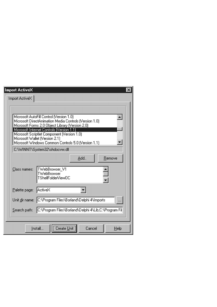
Using Internet Explorer as an ActiveX Control
If you have Microsoft Internet Explorer installed on your system, you can use it as an ActiveX control. The first
thing you need to do is import the control into Delphi's Component palette. After that, you can place it on a
form just as you would any control. First, let me show you how to import Internet Explorer. (I showed you how
to import ActiveX controls on Day 15, "COM and ActiveX," but it doesn't hurt to review.) Here are the steps:
1. Choose Component | Import ActiveX Control from the main menu. The Import ActiveX dialog box is
displayed.
2. Locate Microsoft Internet Controls (Version 1.x) in the list of ActiveX controls (see Figure BD.4). If
you have Internet Explorer 3 installed, the version number will be 1.0. If you have Internet Explorer 4
installed, the control will be listed as version 1.1. Notice that the Class names field shows TWebBrowser
as the control contained in this file. If you have Internet Explorer 4, the Class names field will also show
TWebBrowser_V1 (the original WebBrowser control) and TShellFolderViewOC.
FIGURE BD.4. The Import ActiveX
dialog box.
3. Click Install to install the control (the rest of the fields on this dialog box can be left on their default
values).
4. The Install dialog box appears asking for a package name. Click on the Into new package tab at the top
of the dialog and type IE in the File name field. (You can type a description if you want, but it's not
necessary.) Click OK to create the package.
5. A confirmation dialog box appears asking whether you want to build and install the package. Click Yes
to create the package.
Delphi builds the package and then displays a dialog box saying that the TWebBrowser control has been

installed. Now you can try out the control:
1. First, choose File | Close All to close all windows, and then create a new application.
2. Click the ActiveX tab on the Component palette. Choose the WebBrowser control and drop it on your
main form. Size the control as desired, but leave room on the form for a button.
3. Drop a Button component on the form. Double-click the button to generate an OnClick event handler.
Type the following code in the event handler (use any URL you want):
WebBrowser1.Navigate(`http:\\www.turbopower.com',
EmptyParam, EmptyParam, EmptyParam, EmptyParam););
As you might surmise, the Navigate method loads the document in the Web browser.
4. Click the Run button to run the program.
When the program runs, click the form's button. The Web page will load and be displayed in the WebBrowser
control.
When you install this control, Delphi creates a unit called SHDocVw_TLB.pas. You can look at this unit to see
what properties and methods are available for TWebBrowser.
TIP: You can find documentation for the WebBrowser control on Microsoft's Web site. Search the
Microsoft site for the text Reusing the WebBrowser Control.
Notice that you can't redistribute the TWebBrowser control itself without obtaining a license from Microsoft.
However, if you know your users have Internet Explorer installed on their systems, your application will work
because the control is already installed. You still have to register the control on your user's machine for your
application to run. See "Deploying Internet Applications" later in this chapter for more information on
registering ActiveX controls.
Sending Mail
There are many reasons you might want to send mail from one of your applications. The good news is that
sending email isn't difficult at all. Maybe you want your program users to be able to email you with any
problems they encounter. In that case, your application could pop up a form containing a Memo component and
a Send button. Your users can type text in the Memo component, press the Send button, and the message is
emailed to you. You can even go so far as to attach a log file from your application to diagnose any problems
the user is having.
The TNMSMTP control is used for sending mail through an SMTP server. SMTP is an odd protocol in that it
doesn't require authenticated logon to the server (at least on most SMTP servers). You can simply connect to
any mail server, send the email message, and disconnect. The Host property is used to specify the host name of
the mail server to which you want to connect. Most of the time, you can just use mail as the host name.
Specifying mail tells the TNMSMTP control to connect to your local mail server, whether it's your ISP's mail
server or your company's mail server.
If you want, you can specifically set the mail server name (such as mail.mycompany.com), but it isn't usually
necessary. If you specify an incorrect mail server, you get an ESockError exception. The Port property is used
to specify the port on which to connect. The default SMTP port is port 25. The Port property defaults to a value
of 25, so you shouldn't have to change this property.
All the pertinent information for the mail message itself is contained in the PostMessage property. This property
is a class that contains properties such as ToAddress, FromAddress, Subject, Body, and so on. You fill in the
appropriate fields of the PostMessage property and then send the message.
Before you can send a mail message, you need to connect to the SMTP server. This is done with the Connect
method:

SMTP.Host := `mail';
SMTP.Connect;
After you're connected, you can send the email. The OnConnect event handler is a good place for this code
because you know that you are connected to an SMTP server. For example:
procedure TMainForm.SMTPConnect(Sender: TObject);
begin
with SMTP.PostMessage do begin
FromAddress := `bilbo@baggins.com';
ToAddress.Add(`gandolf@baggins.com');
Subject := `Test';
Body.Add(`This is a test');
end;
SMTP.SendMail;
end;
This code sets up the FromAddress, ToAddress, Subject, and Body parameters of the PostMessage property and
then sends the message with the SendMail method. It's as simple as that. Notice that the ToAddress and Body
properties of PostMessage are TStringLists. The mail message body can contain several lines of text, so it's not
surprising that the Body property is a TStringList. The ToAddress property is also a TStringList, so you can
specify several recipients for the message.
NOTE: The FromAddress and ToAddress fields are required fields. All other fields (even the
message body) are optional.
After you know the message has been sent successfully, you can disconnect from the SMTP server. The
OnSuccess event is generated when the mail has been sent. Your OnSuccess event handler might be as simple
as the following:
void __fastcall tform1.smtpsuccess(tobject *sender then
begin
SMTP.Disconnect;
end;
You can send several messages per connection, of course. If you have several messages to send, you don't have
to disconnect from the server and reconnect for each message. Just connect once, send all your messages, and
then disconnect from the server.
Your mail message might go through without incident, or it might fail in one way or another. In either case, you
must be prepared to disconnect from the server. The OnFailure event is generated if the mail message fails to go
through, so you can use that event to disconnect from the server as well as the OnSuccess event. The book's
code, found at http://www.mcp.com/info, contains a simple mail program that illustrates how to send mail with
TNMSMTP.
Deploying Internet Applications
If your Internet application uses only the VCL Internet components, there is nothing special to do when you
deploy your application unless you are using runtime packages. If you are using runtime packages, you need to
ship INET40.BPL, and if you are using the page producer components, ship INETDB40.BPL as well.
Deploying an application that uses ActiveX controls, however, requires more work. ActiveX controls must be
registered on the machine on which your application will run. The easiest way to register ActiveX controls is
with a good installation program. InstallShield Express comes with Delphi Professional and Client/Server
versions, so you should try that program. Another good installation program is Wise Install from Great Lakes
Business Solutions. The better installation programs register, as part of the installation process, the ActiveX
controls that your application uses.
If you don't use a commercial installation program, you have to manually register any ActiveX controls your
application uses. The TREGSVR.EXE utility is used to register and unregister ActiveX and OCX controls. This
utility is in your Delphi 4\Bin directory. For example, to install the EZ Web Browser application you created
earlier today, you ship the following files:
HTML.OCX
NMOCOD.DLL
NMSCKN.DLL
NWM3VWN.DLL
NMORENU.DLL
WEBBROWS.EXE
After you install all these files, you have to run TREGSVR.EXE on the HTML.OCX and NMOCOD.DLL files
to register them. From the command line, you type
TREGSVR HTML.OCX
Do the same for NMOCOD.DLL. The THTML control is now registered on your user's machine and your
program will run as intended.
NOTE: If you don't register your ActiveX controls properly, your users will see a message box
that says, "Class not registered." when they attempt to run your program. Your application will
then terminate, leaving your users wondering what went wrong.
To unregister a control, use the /u switch as follows:
TREGSVR /u HTML.OCX
Here again, a good installation program will have an uninstall option that takes care of this for you.
As you can see, ActiveX controls require a bit of work to install after your application is built. If you aren't
aware of the fact that you need to register the ActiveX controls, it can lead to confusion for both you and your
users. By the way, the files needed to deploy an application using the THTML control total about 900KB, so
using ActiveX controls can be expensive in terms of disk space. I prefer to use native VCL controls whenever
possible for exactly this reason.
Summary
Today you learned about the Internet components provided in Delphi. You built a simple but usable Web
browser with the THTML control, and you learned how to send mail using the TNMSMTP control. Internet
programming is big business right now. It certainly can't hurt to have some Internet programming experience.
Workshop
The Workshop contains quiz questions to help you solidify your understanding of the material covered and
exercises to provide you with experience in using what you have learned. You can find the answers to the quiz
questions in Appendix A, "Answers to the Quiz Questions."
Q&A
Q What components or controls should I use to create a TCP/IP client/server application?
A Use the TClientSocket and TServerSocket components.
Q Can I create Web pages from my database tables?

A Yes. The TQueryTableProducer and TDataSetTableProducer components create an HTML document
from a database table. You can learn more about these components by examining the sample projects in
the Delphi 4\Demos\Webserv directory.
Q The TNMSMTP control is for receiving mail and the TNMPOP3 control is for retrieving mail.
Why are there two controls for email operations?
A There are two controls because there are two separate mail protocols: one for sending mail (SMTP) and
one for retrieving mail (POP3).
Q When were most of the Internet protocols (SMTP, POP3, FTP, UDP, and so on) defined?
A You might be surprised to learn that many protocols used in Internet programming have been around
for 20 years or more even though the Internet is much younger than that. The Internet protocols were
originally designed for the UNIX platform.
Quiz
1. What control do you use to display Web pages?
2. What control do you use to connect to newsgroups?
3. What is the name of the method used to display an HTML document with the THTML control?
4. What event is generated when an HTML document has completed loading?
5. What control do you use to send email messages?
6. What control do you use to retrieve email messages?
7. What is the name of the method used to send mail with the TNMSMTP control?
8. Can you freely distribute the Internet Explorer ActiveX control?
9. What is the name of the utility used to register ActiveX controls?
10. What company provides the bulk of the Internet controls that come with Delphi?
Exercises
1. Write an application for sending email. The application's main form should have fields for the from
address, the to address, the mail subject, and the message text.
2. Add Forward and Back buttons to the EZ Web Browser application and make them operational.
3. Extra Credit: Add animation to the EZ Web Browser application so that the user can tell when the
browser is loading a document.
, Macmillan Computer Publishing. All rights reserved.
Document Outline
- Borland Delphi 4 in 21 Days
- Scroll down to the Underground
- Table of Contents
- Introduction
- Ch 1 -- Getting Started with Delphi
- Ch 2 -- More on Pascal
- Ch 3 -- Classes and Object-Oriented Programming
- Ch 4 -- The Delphi IDE Explored
- Ch 5 -- The Visual Component Model
- Ch 6 -- Working with the Form Designer and the Menu Designer
- Ch 7 -- VCL Components
- Ch 8 -- Creating Applications in Delphi
- Ch 9 -- Projects, the Code Editor, and the Code Explorer
- Ch 10 -- Debugging Your Applications
- Ch 11 -- Delphi Tools and Options
- Ch 12 -- Graphics and Multimedia Programming
- Ch 13 -- Beyond the Basics
- Ch 14 -- Advanced Programming
- Ch 15 -- COM and ActiveX
- Ch 16 -- Delphi Database Architecture
- Ch 17 -- Building Database Forms
- Ch 18 -- Building Database Applications
- Ch 19 -- Creating and Using DLLs
- Ch 20 -- Creating Components
- Ch 21 -- Delphi and C++Builder
- Appendix A -- Answers to the Quiz Questions
- Appendix B -- Delphi Internet Resources
- Appendix C -- Building Internet Applications
Wyszukiwarka
Podobne podstrony:
Borland Delphi 4 in 21 Days
Ebook SQL PDF Teach Yourself MySQL in 21 Days SAMS UKANKTOFCUM7NVQSNFAZAQ5E2K5JNMXIG224BRA
21 Pounds in 21 Days The Martha s Vineyard Diet Detox
SQL Sams Teach Yourself MySQL in 21 Days SAMS
Around the World in 80 Days 2
How to Change Your Life Around in 30 days
generowanie aplikacji borland delphi w oparciu o repozytoriu DNROMA5ZOBSMCLU3G53A2H6WNJ7SETGX5RBSYTI
Borland Delphi Magazine Getting Started With Sql Part 2
Bennett levy, Oxford guide to behaviour experiments in (1 21)
030 Round the World in 80 Days
(Ebook History) Church, Alfred J Roman Life In The Days Of Cicero
(eBook) Borland Delphi SQL User Guide
Around the World in 80 Days
PENGUIN READERS Level 2 Round the World in 80 Days (Answers)
Make 1000$ in 10 days
Jules Verne Around The World In 80 Days
Around the World in 80 Days Jules Verne
How to Make a Mummy in 70 Days or Less
Teach Yourself Scheme in Fixnum Days
więcej podobnych podstron