htdctmw 131

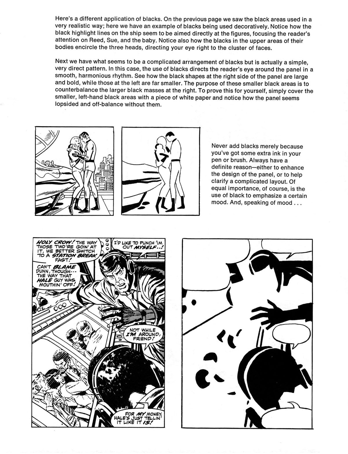
Here’s a different application of blacks. On the previous page we saw the black areas used in a very realistic way; here we have an example of blacks being used decoratively. Notice how the black highlight lines on the ship seem to be aimed directly at the figures, focusing the reader’s attention on Reed, Sue, and the baby. Notice also how the blacks in the upper areas of their bodies encircle the three heads, directing your eye right to the cluster of faces.
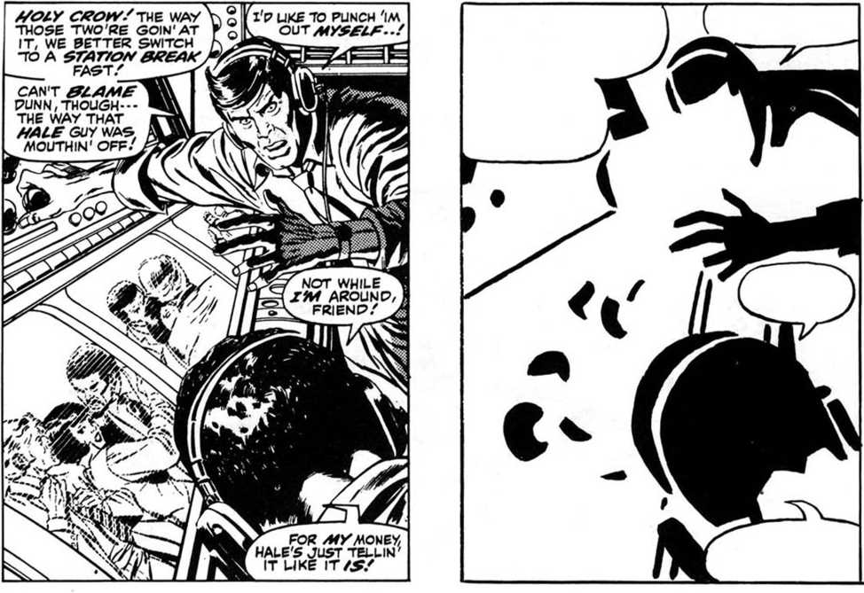
Next we have what seems to be a complicated arrangement of blacks but is actually a simple, very direct pattern. In this case, the use of blacks directs the reader's eye around the panel in a smooth, harmonious rhythm. See how the black shapes at the right side of the panel are large and bold, while those at the left are far smaller. The purpose of these smaller black areas is to counterbalance the larger black masses at the right. To prove this for yourself, simply cover the smaller, left-hand black areas with a piece of white paper and notice how the panel seems lopsided and off-balance without them.

Never add blacks merely because you’ve got some extra ink in your pen or brush. Always have a definite reason—either to enhance the design of the panel, or to help clarify a complicated layout. Of equal importance, of course, is the use of black to emphasize a certain mood. And, speaking of mood ...

Wyszukiwarka
Podobne podstrony:
lnnovative use of Information from CRM systems to create strategie actions of companies on the marke
76 Kaushik, I.S. (2010). Effect of herbicide with different modes of action on physiological and cel
00085 ?5c54cc53a0b9e32369adfc9c63114c 84Hurwitz & Mathur factors of complexity. On the other ha
(31) In order to increase the availability of information on the use of medicinal products in t
38TREATMENTS JPRS-UMS-92-003 16 March 1992 The Effect of Cycling on the Crack Formation of Austenite
m231 A lack of cohesion on the part of Southern military elites has often been blamed for their def
Effect Of Dividends On Stock Prices 12 4. Research Methodology This paper has used the Panel data ap
Effect Of Dividends On Slock Prices 4 is affected by managerial and behavioral environment in U.S. T
lnnovative use of information from CRM systems to create strategie actions of companies on the marke
więcej podobnych podstron