147097860
7 GRAPHIC DESIGN PRINCIPLES TO
UP-LEVEL YOUR
GRAPHICS
BALANCE
Each design element carries visual weight (ie. darker colors have morę visual weight than lighter colors, thicker lines have morę visual weight than thinner lines, etc.). Use this visual weight to create balance in the composition of the graphic.
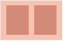
SYMMETRICAL BALANCE

ASYMMETR1CAL BALANCE
PROXIMITY
Use proximity in your graphics by grouping together like items so that it is obvious to the viewer that they’re related. This also helps organize the composition while also making your graphic easier to read and digest.
HEADER1
SUB-HEADER
HEADER2 HEADER3
SUB-HEADER SUB-HEADER
ALIGNMENT
Every design element placed in your graphic should be visually aligned to something else on the page. Whether that’s the side of the page, the edge of an image, the text that’s above it, etc. Nothing should be arbitrarily placed.

LEFT ALIGNED CENTERED RIGHT ALIGNED
REPETITION
Repeating certain characteristics (ie. fonts, colors, layouts, design elements, etc.) within your design will keep the design unified and cohesive. This then creates a visual theme that creates this unification and consistency. This is especially helpful when creating a brand or a series of images.

CONTRAST
lf two items are not exactly the same, make them different. And it most cases, make them really different (while still keeping them within the same visual theme, of course). This creates morę interest on the page and makes certain elements stand out among the rest.
WHITE SPACE
White space, or the lack of any design elements (ie. negative space), is your friend, so use it! The morę white space, the cleaner, morę modern, and morę organized the graphic.
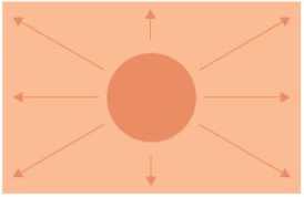
HIERARCHY
Hierarchy should rank each design element by importance, creating a path for your eye to move around the graphic. Viewers will start with the most dominant feature of your graphic, then move to the next dominant, and the next until they’ve looked over the entire thing.
Wyszukiwarka
Podobne podstrony:
how to wear burgundy Iow to wear burgundy http://www.trinnyandsusannah.com/rules/burgundyHOW TO WEAR
how to wear grey How to wear grey http://www.trinnyaridsusannah.com/rules/greyHOW TO WEAR GREY charc
screenshot 1 Price tables These clearly visible Windows with a smooth graphical design draw attentio
TITANIUM bmp V/RTUAL DJ2 Skin design byZanard- www.virtuofdj.com 604-VLZ WłTH PREMIUM XDRł 1604VLZPR
scan0024 6 Sign up for the FREE LeisureArts E-newsłetter at www.leisurearts.com to receive free proj
image005 Slgnlflcant factor Not slgnlflcant Overstlmulated Has your child been exposed to a high lev
img0067 WWW.MlDNIGHTlNKBOOKS.COM From the gritty streets of New York City to sacred tombs in the Mid
img0067 WWW.MlDNIGHTlNKBOOKS.COM From the gritty streets of New York City to sacred tombs in the Mid
r / MARINA C by OLEG MORENKO :: ORK5INAL FILES UP TO 39 MP IN :: © MET-ART.com :: ONLINE SINCE 1999
- Graphic Design Poster project (10%) • Online Blog 15% of finał grade (combined) Finał Grade in Des
nickelback silver side up b Produced by Rick Parashar and Nickelback Mixed by Randy Staub4221 0077
F00574 016 f007 tKł intake © Elsevier. Boon et al.: Davidson s Principles and Practice of Medicine 2
F00574 020 f022c tę] © Elsevier. Boon et al.: Davidson’s Principles and Practice of Medidne 20e - ww
więcej podobnych podstron