BASIC
DESIGN
PRINCIPLES
2003 K S Wildermann
[This version dated 15 April, 2003 supersedes previous ones]
This document aims to provide very basic information related to design, to help put the
novice on the right track. Design students could spend a full year just to grasp the theory of
design. So, you can imagine how much material could be written. If anything, this document
is merely a sketch and, therefore, will not turn you into an award-winning designer.
In order to keep it slim, I have excluded several important pieces of information. These can
be found in my tips thread in the General Swish Help forum (
http://www.swish-
tutorials.com/forum/index.php?act=ST&f=4&t=8030&s=aceefe888a4b3da9733b115ac6bd3a8b)
.
Our slant is towards web site design. Before we plunge into that subject, we need to have
some foundation work; and this is catered for in the first two parts.
My appreciation to –
Ms Lisa Abke for providing the logos of a few well known companies
Mr John Clark for pictures of groups of people
email:
wildermann@swish-tutorials.com
This document was prepared especially for you. It may not be distributed nor sold.

Part I
GENERAL
In everything we create, choose only one master, Nature
Leonardo da Vinci (1452-1519)
Design is subjective
Whether a design is good or bad, it is in the eyes of the beholder. As with music and
literature, our taste for design is very much dictated by the culture we belong to, and our
environment, upbringing, and training. In this short discussion, we shall confine ourselves to
what is generally accepted as good design practice from a Western viewpoint. The reason for
the choice of this perspective is simply that most, if not all, readers would either be from the
West or have been schooled in the Western system of education and exposed to the Western
culture.
Colours, shapes and textures
Design involves three elements – colours, shapes and textures. All three must be present,
otherwise there would be no design to speak of. Where is line, you might ask. Line is
included in shape, as shapes are defined or delineated by, or composed of, lines. As these
three elements are critical, let us take a look at how we employ them in our design.
Colours
The study of colours is a science in itself. Discussing it in detail would fill volumes and is
beyond both the scope of this discussion as well as of my limited knowledge. For example,
colours can be turned pure, cold and warm, depending on the time of day and the source of
sunlight. This is important for Interior Designers to know.
Colours can affect our mood or psyche subtly. Red, for example, is supposed to help to whet
our appetite. That is why tablecloths in restaurants are traditionally red or, at least, have the
colour as the dominant one. It also signifies anger and danger. Blue helps us to feel relaxed; it
promotes calmness and harmony. Yellow is refreshing; it signifies happiness, and promotes
activities in which we use our power of reasoning. Of course, yellow is also associated with
cowardice. Green is soothing – to our eyes and psyche. That is why Nature gives us plenty of
it in the form of forests. Too bad we are decimating our forests like there is no tomorrow.
How do we use colours?
To start with, we need a colour wheel. It can be obtained from good stationery shops or shops
selling art materials.
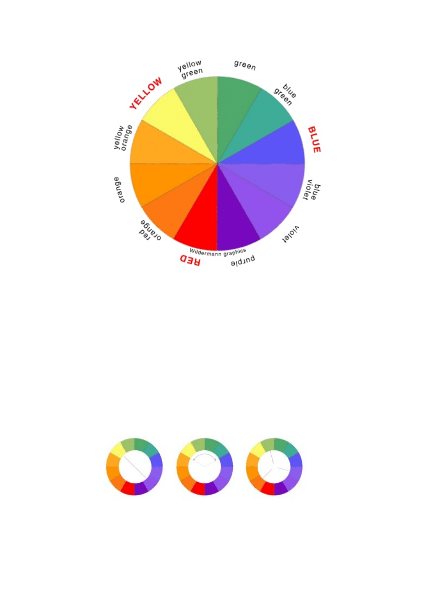
A typical colour wheel looks like the illustration above. It contains twelve colours, which
vary continuously. Each of these colours can have millions of shades.
The main or primary colours are indicated in red. They are red, yellow and blue, although in
the modern sense there are four, green being the fourth. Incidentally, black and white are also
colours, but they are usually not considered so by the layman.
You can create your own wheel with additional colours. For example, you can add four more
between, say, yellow (Y) and yellow-green (YG) by having them in the following proportions
(in percentage) – 80Y20YG, 60Y40YG, 40Y60YG, 20Y80YG.
The more shades you have, the easier it will be for you to determine which colour matches or
contrasts with which.
Figure A
Figure B
Figure C
Colours diametrically opposite each other on the wheel (Fig A) complement one another.
They should not be used in the same amount, that is to say, each occupying 50% of a given
area; rather, one should be used on most of the area, while the other is used a little, just to set
off the overall effect.
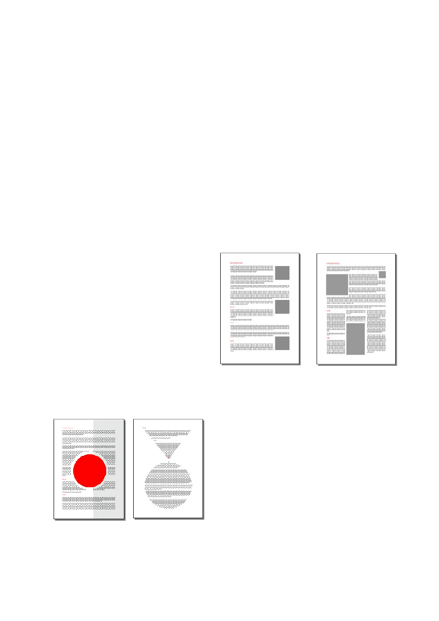
Any three or four colours adjacent to each other (Fig B) are harmonious. We can see this
happening in Nature, for example, yellow flowers amid green leaves. If we do not know how
to match colours, going this path is the safest thing to do.
Fig C illustrates any three colours separated by a third. Choosing any set creates relationships
based on colour purity and makes for a well-balanced design. However, we do not have to
use all three colours. Using two will suffice in many cases. Whether we use two or all three,
one should be the dominant colour, or, occupying most of the space.
Take a look at Nature, and we can see excellent examples of good colour combinations. We
note the colours of flowers on leaves supported by branches and trunk which sprouts out of
the soil; of seawater, beaches, and rock outcrops; and so on.
As a point of interest, the genius Leonardo daVinci advised to choose only one master in
anything we create, Nature.
Shapes
Using of shapes of different sizes and types
can help to make for an interesting design.
One must not go overboard, however. A
page still can look nice even with only two
types of shapes, say, square and rectangle;
however, we ought to vary their sizes and
positions.
On the right are two sample pages. The left
page is clinically clean and precise, but it is
boring due to the squares being in the same
size and the way they are arranged. On the right page, we have shapes of different sizes that
are positioned to divide the area occupied by copy to present a balanced look. Notice how
much more interesting, lively, warm it is. If the left page is a group of soldiers marching in a
drill, the right page is a fun-filled party in progress.
There are other ways we can use shapes on our
pages as illustrated by the two sample pages on
the left. The left page has its background divided
into two vertically, so that what we see are five
shapes. Five? – yes, the page itself and the area
covered by the text are shapes, too. On the right
page, the text is formatted to assume shapes, an
upended triangle and a circle.
In photography and painting, we are taught to have the horizon about ⅔ down our frame or
canvas. We ought to bear in mind, though, that such a rule should not be followed to the letter
T. It applies if we paint or photograph, say, a scene from ground level. Take a picture of, say,
part of Paris from the top of the Eiffel Tower, and the rule does not apply anymore. The rule
can work well for our web page if we want to divide it into two horizontally.
Want a perfect rectangle? No problem. Have its sides in the Golden Ratio. The Golden Ratio
or Golden Mean is 1:phi where phi is1.618033989
∝ (the decimal is actually infinite). For our
purpose, we’ll take it as 1:1.6. It is used by Nature in the design of the human form and other
species, by ancient civilisations when designing pyramids and buildings that are considered
beautiful even today, although they are no longer fully intact such as the Parthenon in Athens,
and by individual masters such as da Vinci and Michelangelo in their paintings.
Textures
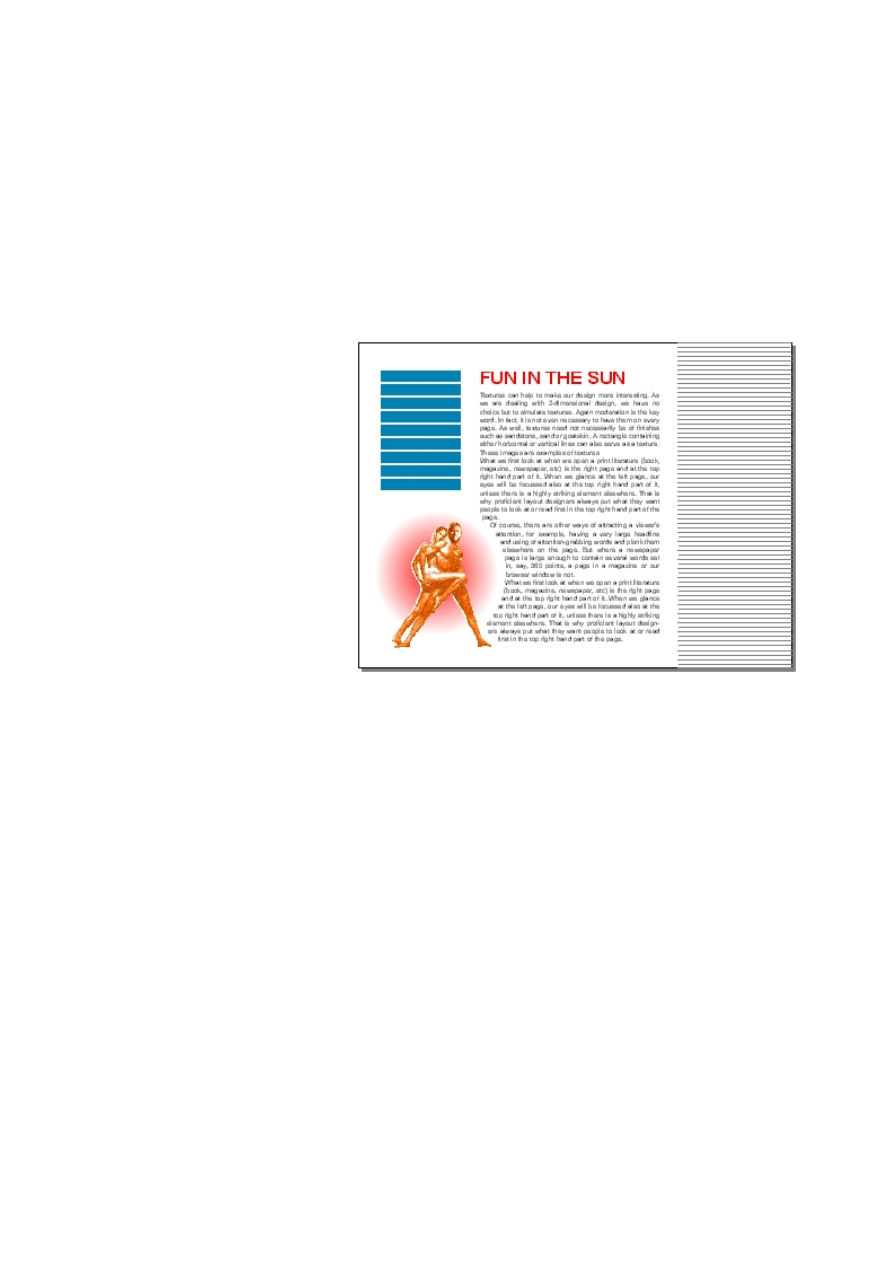
Textures can help to make our
design more interesting. As we
are dealing with 2-dimensional
design, we have no choice but
to simulate textures. Again
moderation is the key word. In
fact, it is not even necessary to
have them on every page. As
well, textures need not
necessarily represent finishes
we are familiar with such as
sandstone, sand or goatskin. A
rectangle containing either
horizontal or vertical lines can
also serve as a texture. On the
sample web page on the right,
the menu bars on the left and
the lines on the right can serve
as textures.
Part II
LAYOUT DESIGN
We are told that a survey carried out some years ago revealed that what we first look at when
we open a print literature (book, magazine,
newspaper, etc) is the top right hand part of the
right page. Open up your newspaper now, and
you will find it is true.
When we glance at the left page, our eyes will
also be first focussed at the top right hand part
of it, unless there is a highly striking element
elsewhere. That is why proficient layout
designers always put what they want people to
look at or read first in the top right hand part of
the page.
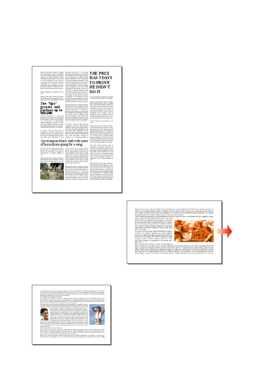
Of course, there are other ways of attracting a
viewer's attention, for example, having a very
large headline and using of attention-grabbing
words and plonk them elsewhere on the page.
But where a newspaper page is large enough to
contain several words set in, say, 244 points, a
page in a magazine or our browser window is
not. On the sample page on the left, it should be
obvious what I want you to read first.
Having said this, our eyes are usually led
towards a picture or any kind of graphic,
especially if it is in colour, on a page.
Which brings us to another important
point. When we have pictures of people
(either an individual or a group), we should
not put them in such a way at either the
right or left side so that the person or the
group looks away from the page. Why not?
– because pictures thus positioned make
our eyes wander away from the page, but,
yet, we want to (or at least one would hope we do) read what is on the page. The conflicting
messages in our brain make for an uncomfortable experience, although it may be subtle. Take
a look at the sample page above. As the photograph is positioned in that way, we tend to look
away from the page - to the right of it. The
photograph should be put on the left side of the page
instead.
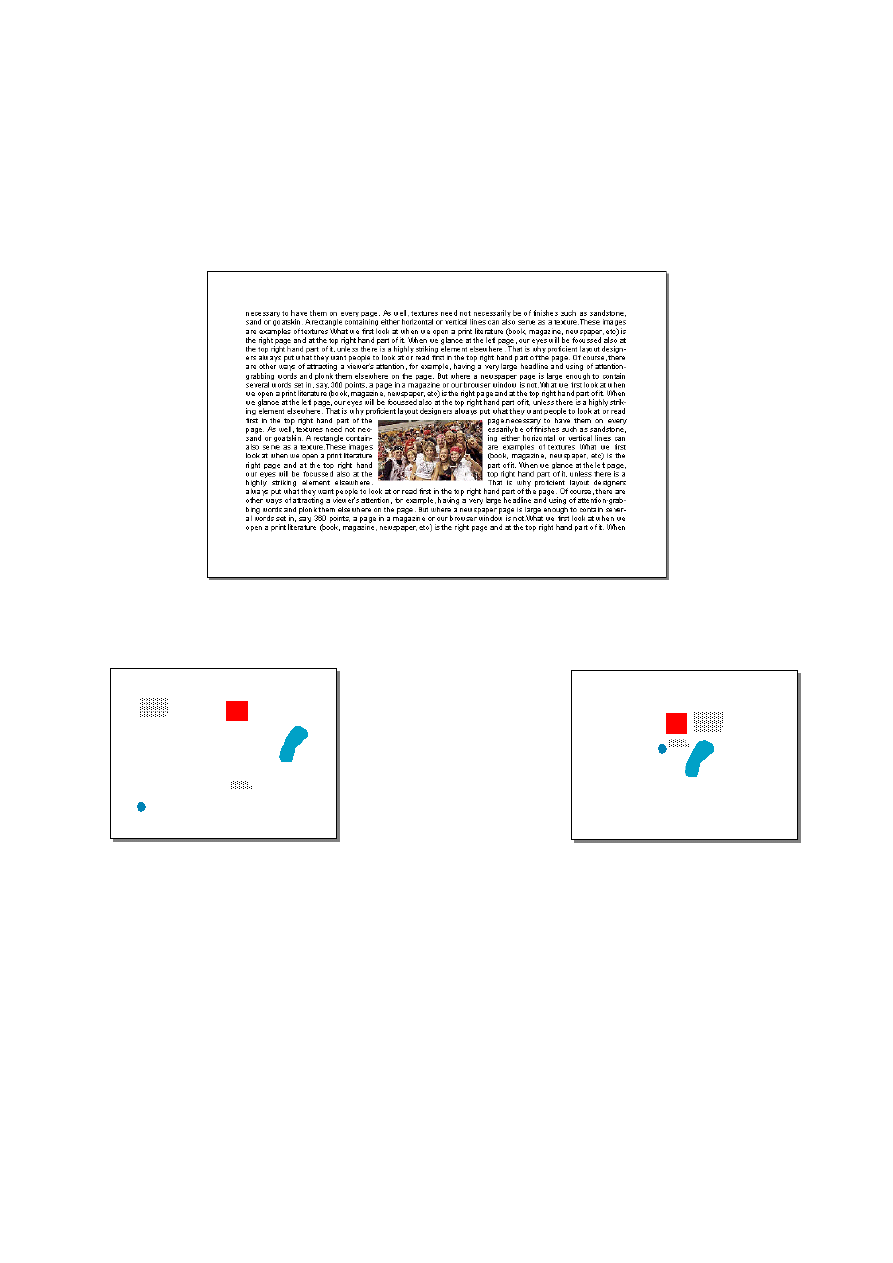
The sample page on the left shows an example of
proper placement of photographs. Both the women
look into the page, and, therefore, our attention is
kept on the page itself.
Another common mistake novice designers commit occurs in handling photographs of groups
of people. They reduce the photographs so much that the viewer cannot make out who is who
in them. Remember, people – normal ones, anyway – feel proud when they see themselves
(or names) in print. Here we are, of course, assuming that they are portrayed in a positive
light, not wearing handcuffs or being connected to some felony or other. See the photograph
on the sample page below? Yep, that’s me wearing a pair of real kewl shades. Can’t see me?
Oops! Never mind. I’ll ask the publisher to send a magnifying glass to you ☺
Tighten it up
I have seen at least one
web page where the
elements were positioned
all over the place. Elements
on our page should be
positioned reasonably close
to each other so as to create
a cohesive whole. Elements
positioned haphazardly not
only mark us as a complete novice, but they also make our pages look very boring. The
sample page on the left illustrates a bad layout. The elements should be positioned such as is
shown on the sample page on the right. Please bear in mind that there is absolutely no need to
use up every available space. See how strong the right page visual is? If I may digress a little,
this is the sort of argument we put forward when our (advertising) clients try to shoot down
our work and insist that we use up every available space. Why should we pay so much for all
those empty spaces? they would usually ask. What they fail to realise is that their ad is going
to compete with many interesting items elsewhere on the page or doublespread, and using up
all available space will only cause it to get lost.
Handling of copy
In the publishing and advertising worlds, anything written for publishing or recording is also
called copy. As we are publishing (putting our web pages on the Internet), we shall use the
word copy to refer to text.

Generally speaking, copy set in a serif font is easier to read than that set in a sans serif. That
is why our newspapers, for example, are set in a serif font. Times Roman is one example of a
serif font; Arial is a sans serif. A serif has those little ornaments sticking out of their
extremities, whereas a sans serif does not. Sans means without, and serif is the cross-line
finishing off a stroke of a letter.
Form follows function
What is that first word again?
Form follows function
Now you can see it a lot better.
Of course, this does not mean that you should never use a sans serif. If you are certain that
your copy set in a sans serif will be read with ease, then by all means use such a font.
What else do we need to know to make reading our material a pleasure for our viewers?
We really should not use more than two different fonts. Having too many different types of
fonts is like seeing a roomful of stunning women or, if you are a lady, of gorgeous hunks.
You’d go gaga. Again, using of many different fonts only either mark you as a novice
designer or you haven’t a clue as to how to use fonts. That won’t impress your informed
clients at all.
The same applies with rendering in colour. Keep our copy in as few colours as possible.
Having our copy in many colours makes our page look like a fairground – nice to look at for
a few minutes, but it soon tires our eyes. Two should be enough in most cases, as we can
have different shades of them as well. Red, for example, can be applied in 100% for our
headlines and in, say, 50% for our subheads and crossheads.
Cursive fonts may look nice, but if we use them for lengthy copy, reading can become
tiresome. The same applies with italics. These should be used only for short copy and perhaps
for captions for photographs and diagrams. And lengthy text should also not be rendered all
in capital letters, as doing so makes for hard reading, too.
Another common treatment is reversed copy. Many professionals actually frown on reversing
out copy. It makes for uncomfortable reading as compared to normal copy. If we want to
reverse out copy, we should ensure that –
1] we use a sans serif (a serif would be acceptable if our bit of copy is set in very large point
size, say, at least 24 points for a web page)
2] our point-size is bigger than the normal body copy
3] our copy is not lengthy
4] our background sets off our reversed copy well
Probably the worst layout crime is putting our copy on a pictorial background with details
that compete with the letters for our attention.
It is a good idea to take a look at established publications such as the National Geographic
magazine, Life, Readers Digest, Time, etc to see how we should lay out our contents on a
page. Of course, some of the techniques you will see may not be feasible for a web page, but
they will give you some ideas for good layout design.

Part III
WEB SITE DESIGN
I have surfed to personal web sites where I waited and waited and waited for the very first
page to load fully. There were marquees, flashing lights, java applets displaying practically
everything under the Sun, cupids flying and shooting arrows at moving hearts, photos of the
site owner as well as of his or her entire lineage since the Homo erectus or that point in time
when the Mayflower dropped anchor off Cape Cod, grating midis, et cetera ad infinitum. In
fact, even the tiled background image took an eternity to load fully.
I have also been to commercial web sites where it appeared to be that the entire set of the
Encyclopaedia Britannica or the manuscript of Gone With The Wind was put on their first
page. If that was a complete turn off, their navigation system required me to guess and try.
What did I do? – I simply clicked on either the back button or that little X at the top right-
hand corner of my browser.
Moral of the story: Our first page makes or breaks our site.
If you want your visitors to stay at your site and go to every page, ensure that your first
page arrest their attention and pique their curiosity. As it does in writing, the KISSS
(Keep It Short and Sweet, Stupid) rule also applies here. Of course, it goes without saying
that your every other page also must be exciting or, at least, contains some things people will
want to see or read.
Remember, what may be a spectacular design to you may not be to another. This is not to say
that you are incapable; rather, it is that as you are deeply immersed in your work, you can
overlook even certain small but important items. Even the best of us do that, so don’t worry.
Get a few friends you can trust to give their honest opinion to take a look at and critique your
web site design. Don't ask your boyfriend, girlfriend, mother, father, sister, brother, wife,
husband. If your design is rubbish, they may not have the heart to tell you it is so.
So you want to design web sites
In my humble opinion, programmers must have some knowledge of art and design in order to
be able to create reasonably attractive web sites, while design-based people ought to know a
little of the appropriate programming languages. Those design-based people need not
necessarily know how to write any of those languages (it would be better for them if they
can). Knowing something about how those languages work or what they are supposed to do
would be good enough. This is so that they can tell which one or ones to incorporate not only
to produce more interesting pages, but also to make the web sites they design better serve the
purposes for which they are intended. Both a programmer and a design-based person, in turn,
also must know enough of visible manifestation. Whassat again? Ah, an interesting question,
and we’ll get to it shortly.
Personal web site
Many of us start with our personal web site or what is commonly called home page. (I avoid
using the term home page because it is really our first page at our site.) However, we shall not
dwell too long on personal web site design as most of the guides for designing commercial
web site also apply here.
Obviously there can be two types of personal web sites. One is a vehicle for us to merely
share our personal information with whoever it is that cares to find out about it. The other is
to promote ourselves with the view to earning enough geld so that we won’t have to line up at
a soup kitchen.
If it is merely for sharing our personal information, it can be – and is usually – an informal,
fun type.
If it is to promote ourselves, it should be formal – because we don’t want our potential clients
to think that we are frivolous, do we now? – and is done to the very best of our ability. After
all, our potential clients are going to judge our ability based on what they see on our web site.
Commercial web site
Unless we are designing a site for, say, an entertainment company, our design should,
generally speaking, reflect a serious, business-like tone. However, this ought not to be taken
to mean pages after pages of boring copy and pictures. With the advent of dHTML, Flash
movies and the like, and applying clever use of colours, shapes and textures, and good layout
design, we can make pages containing a mass of officious-sounding copy interesting and easy
to read.
How we begin
Designing a web site is similar to building a house or designing-building a machine. We need
to first plan what it will contain and look like. What and how much copy will we have? What
images (diagrams and photographs) will be used and how many are they? Which images will
illustrate or accompany which part of the copy? Do we need tables, sound effects, music,
animation? We must deal with this part systematically to make the assembling part easier for
ourselves.
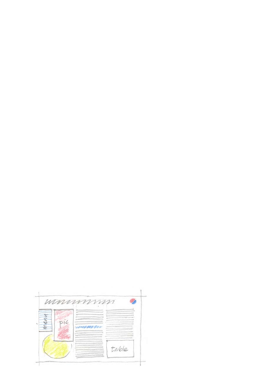
Having decided the above, we proceed to make rough sketches of the pages. A drawing block
and coloured pencils are needed. In the advertising world, such rough sketches are called
scamps, and they will give us a good idea of what the contents of our proposed web site will
look like.
Lay out the scamps on the floor, study
them carefully, and judge for yourself
what need to be removed, added,
repositioned or substituted.
When you are happy, you proceed to
the processing part. This is when you
create the graphics needed, resize and
compress photographs to be used,
choose and edit audio files, and
produce your movies.

Finally, we begin to create our web pages. You will find that you may need some alterations,
but they are highly likely to be minor ones. Your work will be a lot easier and smoother.
The keyword is plan. If we fail to plan our web site, we will, more likely than not, have to
reshuffle and rehash things later. That translates into time wasting; and if we are into it for
money, we’ll lose the opportunity to make more than we could have because of the time
wasted which could be put to use for income-generating activities.
The look – preserving an identity
Large corporations usually pay a lot of attention to the image they present to the public. They
value their corporate identity as much as they do their most valuable physical assets, and are
normally very strict about how their logos and corporate colours should or should not be
used.
How these are applied comes in a document usually called a visible manifestation guide or
manual. (Incidentally, at a company where I spent most of my employed life and which has
been in the top ten of Fortune 500 companies for as long as I can remember, the guide was
about 1½” / 4cm thick.) Such a guide usually spells out minute details like how many
millimetres should the logo be positioned from the top and left (or right) edges of the
particular company’s business card, what type font and font sizes to use in their letterhead,
the depths and widths (measurement) of their corporate colours on the sides of their motor
vehicles, et cetera.
Those commercial entities usually have a Public Relations Department to handle the non-
visual aspect of their publicity matters, and either one person or probably a small department
to be responsible for the desired projection of their visual image. Rule number one,
therefore, is, when designing a commercial web site, we must ensure that we use our client’s
logo (or logotype) and corporate colours as specified in their guides.
Rule number two: use either our client’s logo or corporate colours, or a mnemonic device,
on every page to create a unified, easily-recognised identity. This will also help to cause a
pleasant viewing experience for our visitors. Naturally, none of these should be
overpowering. For example, on a 1024x768 screen resolution, the size of a logo if repeated
on every page should really be no more than 4,000 square pixels. At this point, we must also
be made aware that an image measuring, say, 60x60 px will appear much bigger on an
800x600 screen resolution than it would be when displayed on a 1024x768 screen resolution.
What is a mnemonic device? It is a piece of graphic that is either
representational or stylised and serves to remind us that we are
reading or looking at a piece of material (a page or an advertisement)
that comes from the same series or company. In case you do not
know what representational and stylised images are, let me explain
that the former are realistic, while the latter are simplified drawings
that may be simply an outline or the rough shape of a particular
object represented. The illustration on the left is a stylised drawing.

Choice of site type
Do we want a full Flash site or html? If we are just starting out, we would probably do well to
go for an html-based site. Besides making it easier for search engines to find our pages
(assuming we have the proper keywords*, of course), this type of site also presents less of a
hassle when revision becomes necessary. An html-based site incorporating Flash movies can
also look very attractive; it all depends on our design and treatment.
*
Keywords come in the head section of our html. The words ought to be those that surfers are most likely to
type in the search box of any search site when they are looking for a site like ours. They are enclosed by meta
tags. Below is a typical example.
<meta name="KEYWORDS" content="animation flash movies swish tutorials sound editing streaming raster
vector graphics">
What we need
If we want to go professional, we need to have several pieces of software besides our Swish.
For example, we should have more than just Photoshop as our image editors. Up to the time
of writing this, Photoshop turns out raster graphics, and we also need one that can be used to
create vector ones. I personally prefer Adobe Illustrator, which I use to create most of my
graphics or to modify letters and export them into swf format for insertion into my swi. Such
images are still editable within our movie.
Besides image editors, we really ought to have a sound editor. As with any other types of
software, there is a slew of them on the market. Choose one that is within your budget and is
popular. Remember, though, that nice things aren’t cheap; cheap things aren’t nice.
These are the basic tools. As we go along and gain more experience, we may want to add
other software such as those used for 3D animation, streaming sounds, and conversion of one
specialised format into a different one.
While we are on this subject, please be aware that certain html editors have the bad habit of
removing codes that they do not recognise even if those codes are correct. It is a good idea to
learn how to hand-code your pages and eventually get rid of your html editor. For your
general information, you may want to look up XML and SGML on the Internet. These are
extensions to html.
Navigation
Obviously, the purpose of providing a menu is to show our visitors what our web site
contains. Their clicking on a menu item is supposed to either direct them to a page containing
more information on that particular item or to display a sub-menu providing various topics
under the particular group. Naturally, then, our links should be correct (or else our visitors
would be taken to the wrong pages), and sub-menu items are put in the proper groups.
So, before we announce to the whole world of the existence of our web site, it is good to test
it first. After we are satisfied that everything is fine, we get one or two other people to check
it also.

Incidentally, there is a small application that can be used to check our sites for links that are
dead. It is a good idea to run it now and then. Do a search on a popular search site such as
Google for the application.
Animation
Animation helps to make our page look interesting, but too much of it and our visitors can get
turned off also. We need to limit animation so as to not distract our visitors from the more
important contents of our pages or, worse, irritate them. Of course, if our animation
constitutes the only content, then this guide is irrelevant.
Byte-size
Apparently, some people still insist that no page should be more than 45Kb in size. I am quite
sure that that rule was introduced when folks were on 14.4K dial-up. With much faster dial-
up connection and even broadband commonly available now, it would not be silly to increase
that limit to around 100Kb. Bear in mind, though, that our first page should be as small
(byte-wise) as possible without compromising on drama.
If we must have a relatively big (byte-wise) first page because, for example, of the music we
want to include in our movie, a preloader will help to retain the visitors' interest. Speaking of
which, it is an act of courtesy if we state the size of the thingagy being preloaded. We don't
want to frustrate our visitor by having him or her guess how much is coming and whether he
or she has the time to wait. After a few minutes, he or she may probably click on the back
button when what is left to be loaded may take only another second or two.
So you want to please everyone
Pleasing every one – that is, designing a web site to cater for all browsers – is a splendid idea,
indeed. If you want to do this, you should find out what the idiosyncrasies and limitations of
the various browsers in use world wide are, and produce separate sets of your pages (and
contents too, of course) to cater for them. Or, do just one set to cater for all of them. If you
opt for the latter, I really wish you lots and lots of luck – because, in my humble opinion
again, you will most likely end up with a quite boring web site. As a matter of interest, it
appears that more than 95% of computer users worldwide use Internet Explorer.
Logo design and tagline
At some point in time in your career, you may be asked by your clients to design a logo or to
come up with a suitable tagline for them. I am including these items in this guide because I
have seen many awful, highly forgettable logos and meaningless or ineffective taglines.
Logo
How do we go about designing a logo?
We should remember that a logo is the alter ego of an entity. We often see a big company in
our third eye as the image of their logo. Mention IBM, and we see the acronym rendered in
blue with white stripes running horizontally across it. Mention Ferrari, and we see a prancing
horse. The list goes on.
If we choose to create a graphic for the logo we design, then the image should ideally relate,
even if it is in an abstract manner, to what the company does, its background, or its founder.
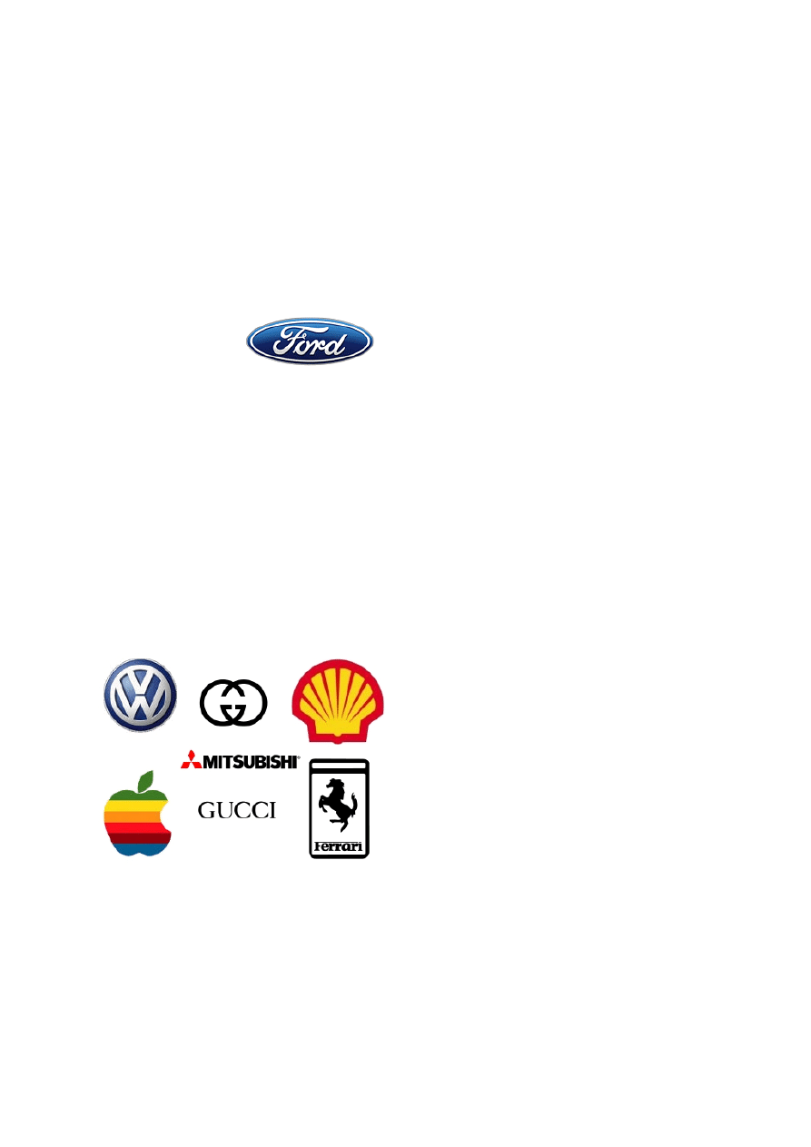
For example, Ford
in the Ford logotype. Most, if not all, of us know
who Mr Henry Ford
was. Another example is the giant Dutch-British
conglomerate, The
Royal Dutch-Shell Group, which has shell
(pecten) as its logo.
This is because its founder, one Mr Marcus
Samuel, started his business importing and selling seashells. He eventually went into the oil
business, and the rest is history. During the Victorian era, seashells were much prized in
Britain and parts of Europe for making such things as ornaments, jewellery boxes, buttons
and combs. Today, the pecten is easily recognised in some 200 countries around the world.
Volkswagen’s logo is as simple as the car was originally meant to be – peoples’ car (volks
wagen), a utilitarian vehicle for the masses. All we have is the letter V above W enclosed in a
circle. It is very easy to remember. A partly eaten apple is synonymous with Steve Job’s
Macintosh.
A logo should be simple yet so unique that it stays in our memory after one or two times
seeing it.
A logo should look good whether it is reduced to a size small enough for a business card
or enlarged very many times to mount on the façade of a building or its rooftop.
So as to help reduce printing costs, it should
not be rendered in many colours. One colour
is ideal; two-colour rendition is common; three
is not really recommended; four is, well, if the
client is not concerned with costs, so be it.
Notice how those well known corporations
tend to have simple but memorable logos,
while the obscure, a-dime-a-dozen companies
have complex, colourful, forgettable ones?
That should tell us a lot.
Tagline
You are not likely to be asked to come up with a tagline, if your client is a big company,
because such companies would have a contract with an ad agency. You may be asked to, if
you are dealing with small and medium-sized companies. What is a tagline?
A tagline is a short phrase usually put under or to one side of a company’s logo or logotype.
Or it may even be rendered on its own. Nike’s Just Do It is one example. A simple phrase,

right? You, too, can cough up something just as powerful for your client, right? Or maybe
even more powerful, right? Hmmm…if I were you, I would think very, very carefully.
While we should not underrate ourselves, at the same time we should not overrate ourselves.
Although there are a lucky few of us who can write as well as design, not many of us can. We
may be able to create award-winning designs, but it does not necessarily mean that we can
also write. And strange as it may sound to you, even those whose mother tongue is English
and hold a master’s in the language may not be able to write. Sure most of them can write – a
piece of writing with no grammatical and spelling errors, that is – but they may be lost when
it comes to specialised genres. Whereas “O” Levels Certificate holders or High School
graduates may turn out awe-inspiring copy, radio scripts and film scripts – or even
bestsellers!
Writing a tagline comes under adcopy writing. Copywriters in a reputable ad agency are your
best bet to come up with a good tagline. They are trained to use the right words to mean the
right things and in as few numbers as possible. They can paint a thousand pictures with one
word. So, tell a copywriter what you want done, and offer enough money to make him (or
her) smile with his eyes. It will be worth it, I can assure you.
Conclusion - Enhancing your value
Knowing a lot of one thing and something of a lot else is one of the important keys to success
As an aspiring professional web site developer or designer, you should enhance your value.
You ought to read up as many subjects (at least related to Information Technology) as you
can, and learn to be proficient in a few of them if possible. Do this, and you will stand to
make more money – because you will be able to offer more to your clients. Remember, this
does not necessarily mean that you will have to physically do certain things yourself. Let us
take one simple example to see what I mean.
A client has a publication to be printed, but he hasn’t even heard of the term colour separation
and never mind what lithography involves. You do. He’ll be impressed, and get you to handle
the printing of his publication. All you will be doing is running to and from a colour
separator’s and a printer’s. When the publication is bound, packed and delivered, you present
your invoice. A couple or so weeks later, the teller at your bank grins hugely at you yet again.
Another thing to bear in mind is that clients usually prefer to deal with as few parties as
possible; so, the lolly, geld, dinero, lucre or dough that would otherwise go to Mary, Jane,
Sally, Tom, Dick and Harry will go to you instead.
Good luck! May job after job come your way so that you will laugh all the way to as well as
from the bank. When – not if, but when, ok? – that happens, buy me a cup of coffee, won’t
you? ☺
Wyszukiwarka
Podobne podstrony:
BASIC FIBONACCI PRINCIPLES
Basic Tube Design
kurs rysowanie basic painting and drawing principles 56R3OH6IXOXH3MLLJUG4HH6IFQRMWM3PU6JGLFI
Passive Cooling Part I Basic Principles
S Belavenets Basic principles of game are in middlegame (RUS, 1963) w doc(1)
basic principles and calculations in chemical engineering solution
Basic Principles Of Celestial Navigation James Allen
Communist League Basic Principles of the Communist League (2005)
Basic Principles Of Perspective Drawing For The Technical Illustrator
3 ABAP 4 6 Basic Functions
Amadeus Basic Podręcznik szkoleniowy
Basic Shed
BASIC MALTESE GRAMMAR AND DIC (G Falzon)
Mettern S P Rome and the Enemy Imperial Strategy in the Principate
Principles of Sigma Delta Conversion for Analog to Digital Converters
History Costume History Costume Design Viking Women
więcej podobnych podstron