

Charting
Made
Easy
B
B Y
Y
J
J
O
O H
H N
N
J
J ..
M
M
U
U R
R P
P H
H Y
Y



Copyright © 2000 Marketplace Books for portions of the text.
Copyright © 1999 Bridge Commodity Research Bureau for
portions of the text.
Published by Marketplace Books.
Reprinted by arrangement with Bridge/CRB.
MetaStock and MetaStock Professional are trademarks and service
marks of Equis International, Inc., registered in the United States
and other countries. Screen captures for all charts from MetaStock
or MetaStock Professional are © 2001 Equis International, Inc.
All rights reserved.
Marketplace Books would like to express its appreciation to Equis
International and MetaStock for use of their charts.
Reproduction or translation of any part of this work beyond
that permitted by section 107 or 108 of the 1976 United States
Copyright Act without the permission of the copyright owner is
unlawful. Requests for permission or further information should be
addressed to the Permissions Department at Traders’ Library.
This publication is designed to provide accurate and authoritative
information in regard to the subject matter covered. It is sold with
the understanding that neither the author nor the publisher is
engaged in rendering legal, accounting, or other professional service.
If legal advice or other expert assistance is required, the services of a
competent professional person should be sought.
From a Declaration of Principles jointly adopted by a Committee
of the American Bar Association and a Committee of Publishers.
ISBN 1-883272-59-9
Printed in the United States of America.
This book, along with other books, are available at discounts
that make it realistic to provide them as gifts to your
customers, clients, and staff. For more information on these
long lasting, cost effective premiums, please call John Boyer
at 800.272.2855 or e-mail him at john@traderslibrary.com.

Contents
Introduction . . . . . . . . . . . . . . . . . . . . . . . . . . . . . . . . . . . . . . . ix
Chapter 1
WHY IS CHART ANALYSIS SO IMPORTANT? . . . . . . . . . . . . . 1
Market Timing . . . . . . . . . . . . . . . . . . . . . . . . . . . . . . . . . . . . 2
Chapter 2
WHAT IS CHART ANALYSIS? . . . . . . . . . . . . . . . . . . . . . . . . . . 3
Charts Reveal Price Trends . . . . . . . . . . . . . . . . . . . . . . . . . . 4
Types of Charts Available . . . . . . . . . . . . . . . . . . . . . . . . . . . . 5
Any Time Dimension . . . . . . . . . . . . . . . . . . . . . . . . . . . . . . . 5
Chapter 3
HOW TO PLOT THE DAILY BAR CHART . . . . . . . . . . . . . . . . . 7
Charts Are Used Primarily to Monitor Trends . . . . . . . . . . . . 7
Chapter 4
SUPPORT AND RESISTANCE
TRENDLINES AND CHANNELS . . . . . . . . . . . . . . . . . . . . . . . . 9
Chapter 5
REVERSAL AND CONTINUATION PRICE PATTERNS . . . . . . 13
Reversal Patterns
The Head and Shoulders . . . . . . . . . . . . . . . . . . . . . . . . . . 13
Double and Triple Tops and Bottoms . . . . . . . . . . . . . . . . 14
Saucers and Spikes. . . . . . . . . . . . . . . . . . . . . . . . . . . . . . . 15
Continuation Patterns
Triangles . . . . . . . . . . . . . . . . . . . . . . . . . . . . . . . . . . . . . . . 16
Flags and Pennants . . . . . . . . . . . . . . . . . . . . . . . . . . . . . . 20
Chapter 6
PRICE GAPS. . . . . . . . . . . . . . . . . . . . . . . . . . . . . . . . . . . . . . . 23

Chapter 7
THE KEY REVERSAL DAY . . . . . . . . . . . . . . . . . . . . . . . . . . . . 25
Chapter 8
PERCENTAGE RETRACEMENTS . . . . . . . . . . . . . . . . . . . . . . . 27
Chapter 9
THE INTERPRETATION OF VOLUME. . . . . . . . . . . . . . . . . . . 29
Volume Is an Important Part of Price Patterns . . . . . . . . . . 30
On-Balance Volume (OBV). . . . . . . . . . . . . . . . . . . . . . . . . . 30
Plotting OBV . . . . . . . . . . . . . . . . . . . . . . . . . . . . . . . . . . . . 31
OBV Breakouts . . . . . . . . . . . . . . . . . . . . . . . . . . . . . . . . . . . 32
Other Volume Indicators . . . . . . . . . . . . . . . . . . . . . . . . . . . 32
Chapter 10
USING DIFFERENT TIME FRAMES FOR
SHORT- AND LONG-TERM VIEWS . . . . . . . . . . . . . . . . . . . . . 35
Using Intraday Charts . . . . . . . . . . . . . . . . . . . . . . . . . . . . . 35
Going from the Long Term to the Short Term . . . . . . . . . . 36
Chapter 11
USING A TOP-DOWN MARKET APPROACH . . . . . . . . . . . . . 39
The First Step:The Major Market Averages . . . . . . . . . . . . . 39
Different Averages Measure Different Things . . . . . . . . . . 40
The Second Step: Sectors and Industry Groups . . . . . . . . . 41
The Third Step: Individual Stocks . . . . . . . . . . . . . . . . . . . . 41
Chapter 12
MOVING AVERAGES . . . . . . . . . . . . . . . . . . . . . . . . . . . . . . . . 45
Popular Moving Averages. . . . . . . . . . . . . . . . . . . . . . . . . . . 45
Bollinger Bands . . . . . . . . . . . . . . . . . . . . . . . . . . . . . . . . . . 46
Moving Average Convergence Divergence (MACD) . . . . . . 46
Chapter 13
OSCILLATORS . . . . . . . . . . . . . . . . . . . . . . . . . . . . . . . . . . . . . 47
Relative Strength Index (RSI) . . . . . . . . . . . . . . . . . . . . . . . 47
Stochastics . . . . . . . . . . . . . . . . . . . . . . . . . . . . . . . . . . . . . . 47
Any Time Dimension . . . . . . . . . . . . . . . . . . . . . . . . . . . . . . 49

Charting Made Easy
vii
Chapter 14
RATIOS AND RELATIVE STRENGTH . . . . . . . . . . . . . . . . . . . 51
Sector Ratios . . . . . . . . . . . . . . . . . . . . . . . . . . . . . . . . . . . . 51
Stock Ratios . . . . . . . . . . . . . . . . . . . . . . . . . . . . . . . . . . . . . 51
Market Ratios . . . . . . . . . . . . . . . . . . . . . . . . . . . . . . . . . . . . 52
Chapter 15
OPTIONS . . . . . . . . . . . . . . . . . . . . . . . . . . . . . . . . . . . . . . . . . 53
Option Put/Call Ratio . . . . . . . . . . . . . . . . . . . . . . . . . . . . . 54
Contrary Indicator . . . . . . . . . . . . . . . . . . . . . . . . . . . . . . . . 54
CBOE Volatility Index (VIX). . . . . . . . . . . . . . . . . . . . . . . . . 54
Chapter 16
THE PRINCIPLE OF CONFIRMATION . . . . . . . . . . . . . . . . . . 55
Chapter 17
SUMMARY AND CONCLUSION . . . . . . . . . . . . . . . . . . . . . . . 57
Investing Resource Guide. . . . . . . . . . . . . . . . . . . . . . . . . . . . . 59


Charting Made Easy
ix
Introduction
C
hart analysis has become more popular than ever. One
of the reasons for that is the availability of highly
sophisticated, yet inexpensive, charting software. The
average trader today has greater computer power than major
institutions had just a couple of decades ago. Another reason
for the popularity of charting is the Internet. Easy access to
Internet charting has produced a great democratization of
technical information.Anyone can log onto the Internet today
and see a dazzling array of visual market information. Much of
that information is free or available at very low cost.
Another revolutionary development for traders is the avail-
ability of live market data.With the increased speed of market
trends in recent years, and the popularity of short-term trading
methods, easy access to live market data has become an indis-
pensable weapon in the hands of technically oriented traders.
Day-traders live and die with that minute-to-minute price data.
And, it goes without saying, that the ability to spot and profit
from those short-term market swings is one of the strong points
of chart analysis.
Sector rotation has been especially important in recent years.
More than ever, it’s important to be in the right sectors at the
right time. During the second half of 1999, technology was the
place to be and that was reflected in enormous gains in the
Nasdaq market. Biotech and high-tech stocks were the clear
market leaders. If you were in those groups, you did great. If you
were anywhere else, you probably lost money.

During the spring of 2000, however, a sharp sell off of biotech
and technology stocks pushed the Nasdaq into a steep correc-
tion and caused a sudden rotation into previously ignored sec-
tors of the blue chip market — like drugs, financials, and basic
industry stocks — as money moved out of “new economy”
stocks into “old economy”stocks.While the fundamental reasons
for those sudden shifts in trend weren’t clear at the time, they
were easily spotted on the charts by traders who had access to
live market information — and knew how to chart and interpret
it correctly.
That last point is especially important because having access
to charts and data is only helpful if the trader knows what to do
with them. And that’s the purpose of this booklet. It will intro-
duce to you the more important aspects of chart analysis. But
that’s only the start.The Investing Resources Guide at the end of
the booklet will point you toward places where you can contin-
ue your technical studies and start taking advantage of that valu-
able new knowledge.
Charts can be used by themselves or in conjunction with
fundamental analysis. Charts can be used to time entry and exit
points by themselves or in the implementation of fundamental
strategies. Charts can also be used as an alerting device to warn
the trader that something may be changing in a market’s under-
lying fundamentals.Whichever way you choose to employ them,
charts can be an extremely valuable tool — if you know how to
use them.This booklet is a good place to start learning how.
John J. Murphy
▲ ▲ ▲ ▲ ▲ ▲
Note from the Publisher: Please note that trend lines, analysis,
and commentary have been added to the charts for the edifi-
cation of the reader.
x
Trade Secrets

Charting
Made
Easy


WHY IS CHART ANALYSIS
SO IMPORTANT?
S
uccessful participation in the financial markets virtually
demands some mastery of chart analysis. Consider the
fact that all decisions in various markets are based, in one
form or another, on a market forecast.Whether the market par-
ticipant is a short-term trader or long-term investor, price fore-
casting
is usually the first, most important step in the decision-
making process. To accomplish that task, there are two meth-
ods of forecasting available to the market analyst — the funda-
mental and the technical.
Fundamental analysis
is based on the traditional study of
supply and demand factors that cause market prices to rise or
fall. In financial markets, the fundamentalist would look at such
things as corporate earnings, trade deficits, and changes in the
money supply.The intention of this approach is to arrive at an
estimate of the intrinsic value of a market in order to deter-
mine if the market is over- or under-valued.
Technical or chart analysis,
by contrast, is based on the
study of the market action itself. While fundamental analysis
studies the reasons or causes for prices going up or down, tech-
nical analysis studies the effect, the price movement itself
.
That’s where the study of price charts comes in. Chart analysis
Chapter 1
Charting Made Easy
1

2
Trade Secrets
is extremely useful in the price-forecasting process. Charting
can be used by itself with no fundamental input, or in con-
junction with fundamental information. Price forecasting, how-
ever, is only the first step in the decision-making process.
Market Timing
The second, and often the more difficult, step is market tim-
ing.
For short-term traders, minor price moves can have a dra-
matic impact on trading performance. Therefore, the precise
timing of entry and exit points is an indispensable aspect of
any market commitment.To put it bluntly, timing is everything
in the stock market.
For reasons that will soon become appar-
ent, timing is almost purely technical in nature.This being the
case, it can be seen that the application of charting principles
becomes absolutely essential at some point in the decision-
making process. Having established its value, let’s take a look at
charting theory itself.

WHAT IS CHART
ANALYSIS?
C
hart analysis (also called technical analysis) is the
study of market action, using price charts, to forecast
future price direction. The cornerstone of the tech-
nical philosophy is the belief that all of the factors that
influence market price — fundamental information, politi-
cal events, natural disasters, and psychological factors —
are quickly discounted in market activity.
In other words,
the impact of these external factors will quickly show up in
some form of price movement, either up or down. Chart
analysis, therefore, is simply a short-cut form of funda-
mental analysis.
Consider the following: A rising price reflects bullish funda-
mentals, where demand exceeds supply; falling prices would
mean that supply exceeds demand, identifying a bearish fun-
damental situation. These shifts in the fundamental equation
cause price changes, which are readily apparent on a price
chart. The chartist is quickly able to profit from these price
changes without necessarily knowing the specific reasons caus-
ing them. The chartist simply reasons that rising prices are
indicative of a bullish fundamental situation and that falling
prices reflect bearish fundamentals.
Chapter 2
Charting Made Easy
3
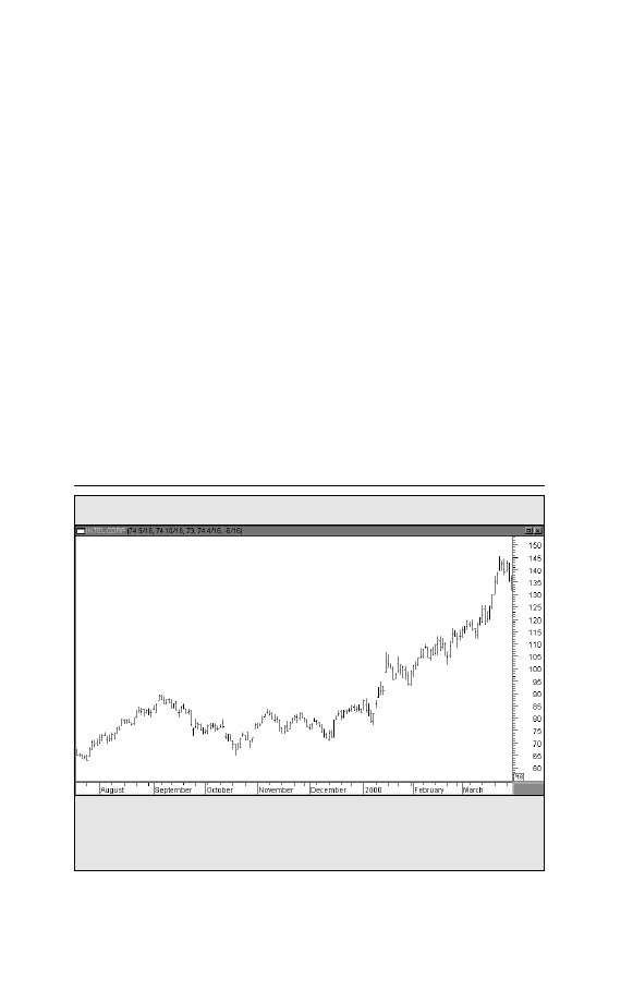
Figure 2-1. DAILY BAR CHART
Intel Corporation (INTC)
4
Trade Secrets
Another advantage of chart analysis is that the market price
itself is usually a leading indicator of the known fundamentals.
Chart action, therefore, can alert a fundamental analyst to the
fact that something important is happening beneath the sur-
face and encourage closer market analysis.
Charts Reveal Price Trends
Markets move in trends. The major value of price charts is
that they reveal the existence of market trends and greatly
facilitate the study of those trends. Most of the techniques used
by chartists are for the purpose of identifying significant
trends, to help determine the probable extent of those trends,
and to identify as early as possible when they are changing
direction (See Figure 2-1).
This daily chart of Intel is a good example of an uptrend over a six-month period.
Charts facilitate the study of trends. Important trends persist once they are estab-
lished.
Charts powered by MetaStock
Charting Made Easy
5
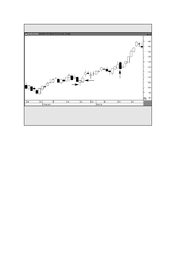
Figure 2-2. CANDLESTICK CHART
Intel Corporation (INTC)
A candlestick chart of Intel covering two months. The narrow wick is the day’s range.
The fatter portion is the area between the open and close. Open candles are positive;
darker ones are negative.
Types of Charts Available
The most popular type of chart used by technical analysts is
the daily bar chart (see Figure 2-1). Each bar represents one
day of trading. Japanese candlestick charts have become pop-
ular in recent years (see Figure 2-2). Candlestick charts are
used in the same way as bar charts, but present a more visual
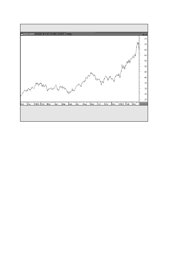
representation of the day’s trading. Line charts can also be
employed (see Figure 2-3).The line chart simply connects each
successive day’s closing prices and is the simplest form of
charting.
Any Time Dimension
All of the above chart types can be employed for any time
dimension
. The daily chart, which is the most popular time
period, is used to study price trends for the past year. For
Area between open and close.
Open candles are positive.
Darker candles are negative.
Day’s
range
Charts powered by MetaStock
6
Trade Secrets
longer range trend analysis going back five or ten years, week-
ly and monthly charts can be employed. For short-term (or day-
trading) purposes, intraday charts are most useful. [Intraday
charts can be plotted for periods as short as 1-minute, 5-minute
or 15-minute time periods.]
Figure 2-3. LINE CHART
Intel Corporation (INTC)
A line chart of Intel for an entire year. A single line connecting successive closing
prices is the simplest form of charting.
Charts powered by MetaStock

HOW TO PLOT
THE DAILY BAR CHART
P
rice plotting is an extremely simple task. The daily bar
chart has both a vertical and horizontal axis. The verti-
cal axis (along the side of the chart) shows the price
scale, while the horizontal axis (along the bottom of the chart)
records calendar time. The first step in plotting a given day’s
price data is to locate the correct calendar day.This is accom-
plished simply by looking at the calendar dates along the bot-
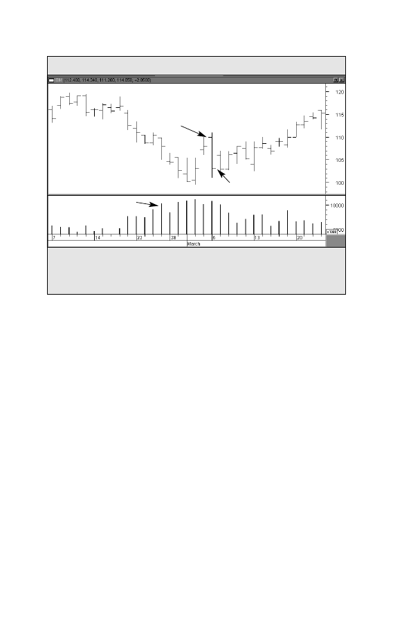
tom of the chart. Plot the high, low, and closing (settlement)
prices for the market. A vertical bar connects the high and
low
(the range).The closing price is recorded with a horizon-
tal tic to the right of the bar. (Chartists mark the opening price
with a tic to the left of the bar.) Each day simply move one step
to the right. Volume is recorded with a vertical bar along the
bottom of the chart (See Figure 3-1).
Charts Are Used Primarily to Monitor Trends
Two basic premises of chart analysis are that markets trend
and that trends tend to persist. Trend analysis is really what
chart analysis is all about.Trends are characterized by a series
of peaks and troughs.An uptrend is a series of rising peaks and
troughs. A downtrend shows descending peaks and troughs.
Finally, trends are usually classified into three categories: major,
Chapter 3
Charting Made Easy
7
secondary, and minor. A major trend lasts more than a year;
a secondary trend, from one to three months; and a minor
trend, usually a couple of weeks or less.
8
Trade Secrets
Figure 3-1. CONSTRUCTION OF A DAILY BAR CHART
IBM
The construction of a daily bar chart is simple. The vertical bar is drawn from the
day’s high to the low. The tic to the left is the open; the tic to the right is the close.
Volume bars are drawn along the bottom of the chart.
Volume
Open
Close
High
Volume Bars
Low
Charts powered by MetaStock

Charting Made Easy
9
Chapter 4
SUPPORT AND RESISTANCE
TRENDLINES AND CHANNELS
T
here are two terms that define the peaks and troughs
on the chart.A previous trough usually forms a support
level. Support is a level below the market where buy-
ing pressure exceeds selling pressure and a decline is halted.
Resistance
is marked by a previous market peak. Resistance is a
level above the market where selling pressure exceeds buying
pressure and a rally is halted (See Figure 4-1).
Support and resistance levels reverse roles once they are
decisively broken.
That is to say, a broken support level under
the market becomes a resistance level above the market. A
broken resistance level over the market functions as support
below the market.The more recently the support or resistance
level has been formed, the more power it exerts on subsequent
market action. This is because many of the trades that helped
form those support and resistance levels have not been liqui-
dated and are more likely to influence future trading decisions
(See Figure 4-2).
The trendline is perhaps the simplest and most valuable tool
available to the chartist.An up trendline is a straight line drawn
up and to the right, connecting successive rising market bot-
toms.The line is drawn in such a way that all of the price action
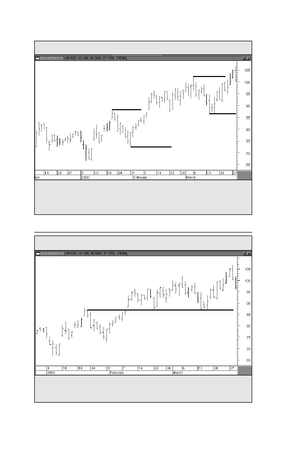
10
Trade Secrets
Figure 4-2. ROLE REVERSAL
Sun Microsystems (SUNW)
An example of role reversal. A broken resistance level usually becomes a new sup-
port level. In a downtrend, a broken support level becomes resistance.
Prior resistance
level . . .
. . . becomes new support level
Figure 4-1
SUPPORT AND RESISTANCE
Sun Microsystems (SUNW)
An uptrend is marked by rising peaks and troughs. Each peak is called resistance;
each trough is called support. The uptrend is continued when a resistance peak is
exceeded.
Resistance
Support
Support
Resistance
Charts powered by MetaStock
Charts powered by MetaStock
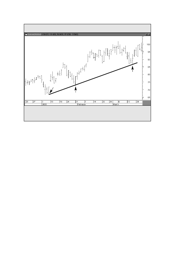
Figure 4-3. RISING TRENDLINE
Sun Microsystems (SUNW)
An example of a rising trendline. Up trendlines are drawn under rising lows. A valid
trendline should be touched three times as shown here.
Charting Made Easy
11
is above the trendline. A down trendline is drawn down and
to the right, connecting the successive declining market highs.
The line is drawn in such a way that all of the price action is
below the trendline. An up trendline, for example, is drawn
when at least two rising reaction lows (or troughs) are visible.
However, while it takes two points to draw a trendline, a third
point is necessary to identify the line as a valid trend line.
If
prices in an uptrend dip back down to the trendline a third
time and bounce off it, a valid up trendline is confirmed (See
Figure 4-3).
Trendlines have two major uses.They allow identification of
support and resistance levels that can be used, while a market
is trending, to initiate new positions. As a rule, the longer a
trendline has been in effect and the more times it has been test-
ed, the more significant it becomes.The violation of a trendline
is often the best warning of a change in trend.
Up trendlines drawn
under rising lows
1
2
3
Charts powered by MetaStock
12
Trade Secrets
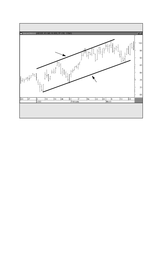
Channel lines
are straight lines that are drawn parallel to
basic trendlines. A rising channel line would be drawn above
the price action and parallel to the basic trendline (which is
below the price action). A declining channel line would be
drawn below the price action and parallel to the down trend-
line (which is above the price action). Markets often trend with-
in these channels.When this is the case, the chartist can use that
knowledge to great advantage by knowing in advance where
support and resistance are likely to function (See Figure 4-4).
Figure 4-4. CHANNEL LINE
Sun Microsystems (SUNW)
An example of a channel line. During an uptrend, prices will often meet new selling
along an upper channel line which is drawn parallel to the rising trendline.
Rising trendline
Channel line
Charts powered by MetaStock

REVERSAL AND
CONTINUATION PRICE
PATTERNS
O
ne of the more useful features of chart analysis is the
presence of price patterns, which can be classified
into different categories and which have predictive
value.These patterns reveal the ongoing struggle between the
forces of supply and demand, as seen in the relationship
between the various support and resistance levels, and allow
the chart reader to gauge which side is winning. Price patterns
are broken down into two groups — reversal and continuation
patterns. Reversal patterns usually indicate that a trend rever-
sal is taking place. Continuation patterns usually represent
temporary pauses in the existing trend. Continuation patterns
take less time to form than reversal patterns and usually
result in resumption of the original trend.
REVERSAL PATTERNS
The Head and Shoulders
The head and shoulders is the best known and probably the
most reliable of the reversal patterns.A head and shoulders top
is characterized by three prominent market peaks.The middle
Chapter 5
Charting Made Easy
13
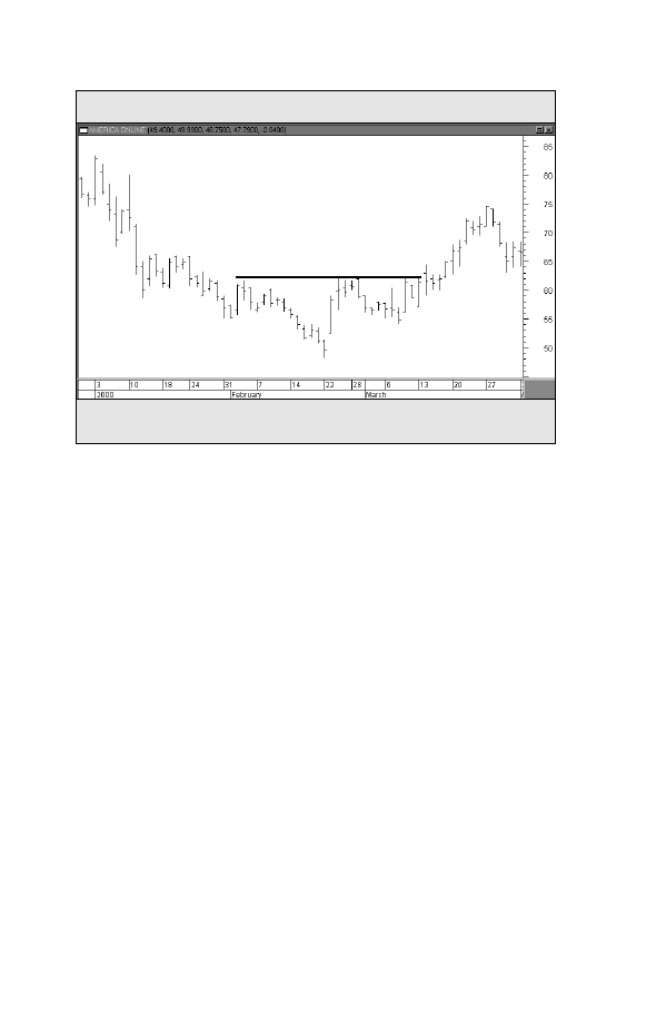
Figure 5-1. HEAD AND SHOULDERS
America Online (AOL)
Example of a head and shoulders bottom on a daily chart of America Online (AOL).
14
Trade Secrets
peak, or the head, is higher than the two surrounding peaks
(the shoulders). A trendline (the neckline) is drawn below the
two intervening reaction lows.A close below the neckline com-
pletes the pattern and signals an important market reversal (See
Figure 5-1).
Price objectives or targets can be determined by measuring the
shapes of the various price patterns.The measuring technique in
a topping pattern is to measure the vertical distance from the top
of the head to the neckline and to project the distance down-
ward from the point where the neckline is broken.The head and
shoulders bottom is the same as the top except that it is turned
upside down.
Double and Triple Tops and Bottoms
Another one of the reversal patterns, the triple top or bottom,
is a variation of the head and shoulders.The only difference is
Neckline
Head
Right shoulder
Left shoulder
Charts powered by MetaStock
that the three peaks or troughs in this pattern occur at about the
same level. Triple tops or bottoms and the head and shoulders
reversal pattern are interpreted in similar fashion and mean
essentially the same thing.
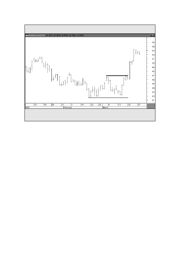
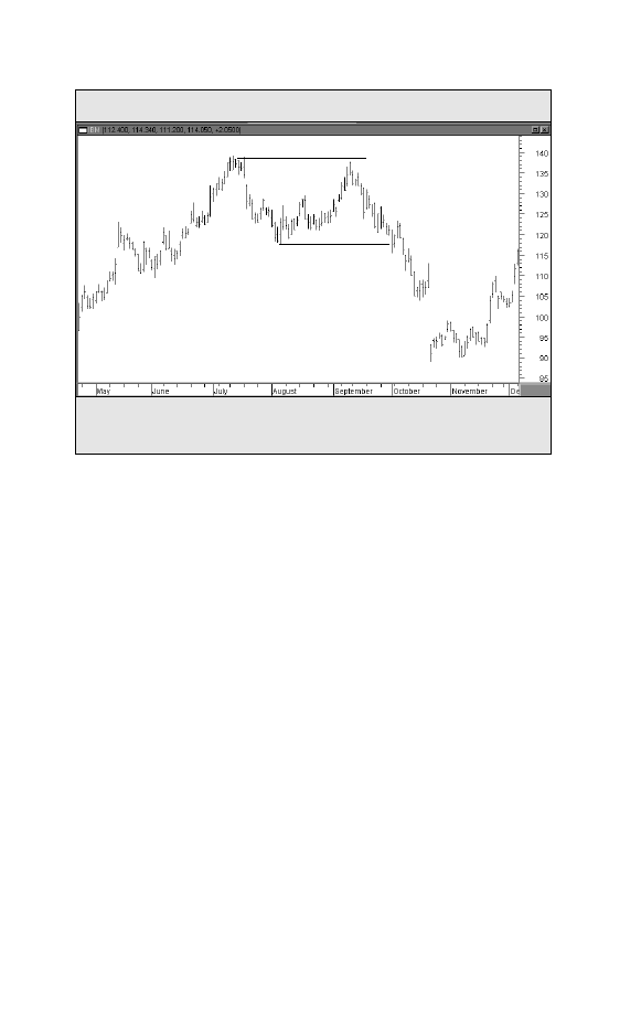
Double tops and bottoms
(also called M’s and W’s because
of their shape) show two prominent peaks or troughs instead
of three. A double top is identified by two prominent peaks.
The inability of the second peak to move above the first peak
is the first sign of weakness. When prices then decline and
move under the middle trough, the double top is completed.
The measuring technique for the double top is also based on
the height of the pattern. The height of the pattern is mea-
sured and projected downward from the point where the
trough is broken. The double bottom is the mirror image of
the top (See Figures 5-2 and 5-3).
Figure 5-2. DOUBLE BOTTOM
General Electric (GE)
Example of a double bottom on the daily chart of General Electric (GE).
Charting Made Easy
15
1
2
Charts powered by MetaStock
16
Trade Secrets
Saucers and Spikes
These two patterns aren’t as common, but are seen enough
to warrant discussion.The spike top (also called a V-reversal)
pictures a sudden change in trend. What distinguishes the
spike
from the other reversal patterns is the absence of a tran-
sition period, which is sideways price action on the chart con-
stituting topping or bottoming activity. This type of pattern
marks a dramatic change in trend with little or no warning
(See Figure 5-4).
The saucer, by contrast, reveals an unusually slow shift in
trend. Most often seen at bottoms, the saucer pattern represents
a slow and more gradual change in trend from down to up.The
chart picture resembles a saucer or rounding bottom — hence
its name (See Figure 5-5).
Figure 5-3. DOUBLE TOP REVERSAL PATTERN
IBM
Two prominent peaks can be seen on the chart of IBM, forming a double top reversal
pattern.
1
2
Charts powered by MetaStock
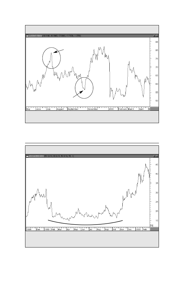
Figure 5-5. SAUCER BOTTOM
Advanced Micro Devices (AMD)
Some bottoms are a slow, gradual process and have a rounding shape like a saucer.
This saucer bottom in Advanced Micro Devices (AMD) took almost a year to form.
Charting Made Easy
17
Saucer Bottom
Figure 5-4. SPIKE TOPS AND BOTTOMS
Lucent Technologies (LU)
Two examples of a stock changing direction with little or no warning.
Spike Top
Spike Bottom
Charts powered by MetaStock
Charts powered by MetaStock
18
Trade Secrets
CONTINUATION PATTERNS
Triangles
Instead of warning of market reversals, continuation patterns
are usually resolved in the direction of the original trend. Tri-
angles are among the most reliable of the continuation pat-
terns. There are three types of triangles that have forecasting
value — symmetrical, ascending and descending triangles.
Although these patterns sometimes mark price reversals, they
usually just represent pauses in the prevailing trend.
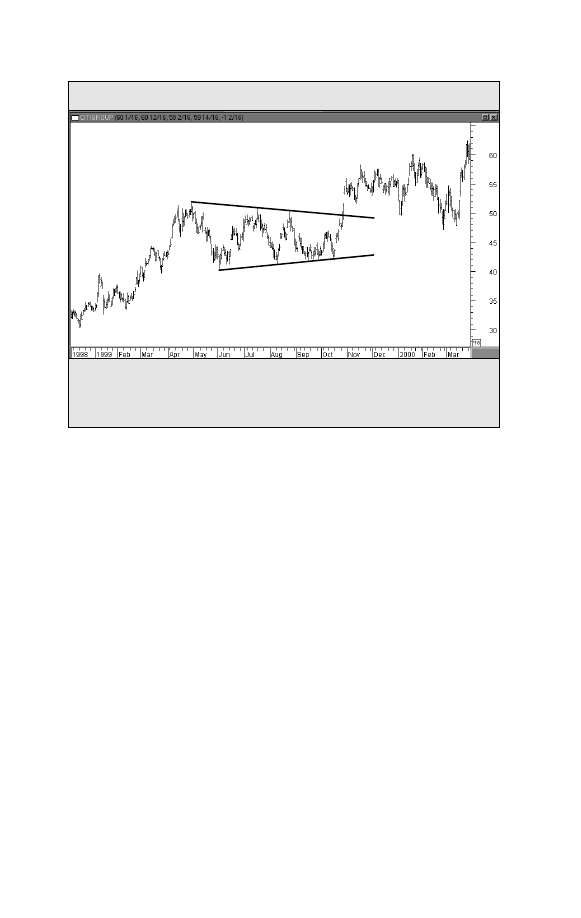
The symmetrical triangle (also called the coil) is distinguished
by sideways activity with prices fluctuating between two con-
verging trendlines.The upper line is declining and the lower line
is rising. Such a pattern describes a situation where buying and
selling pressure are in balance. Somewhere between the half-
Figure 5-6. SYMMETRICAL TRIANGLE
Citigroup (C)
An example of a symmetrical triangle during the 1999 advance in Citigroup. The two
lines converge, with the upper line falling and the lower line rising. Since this is a
continuation pattern, the odds favored resumption of the bull trend.
Rising lower line
Declining upper line
Charts powered by MetaStock
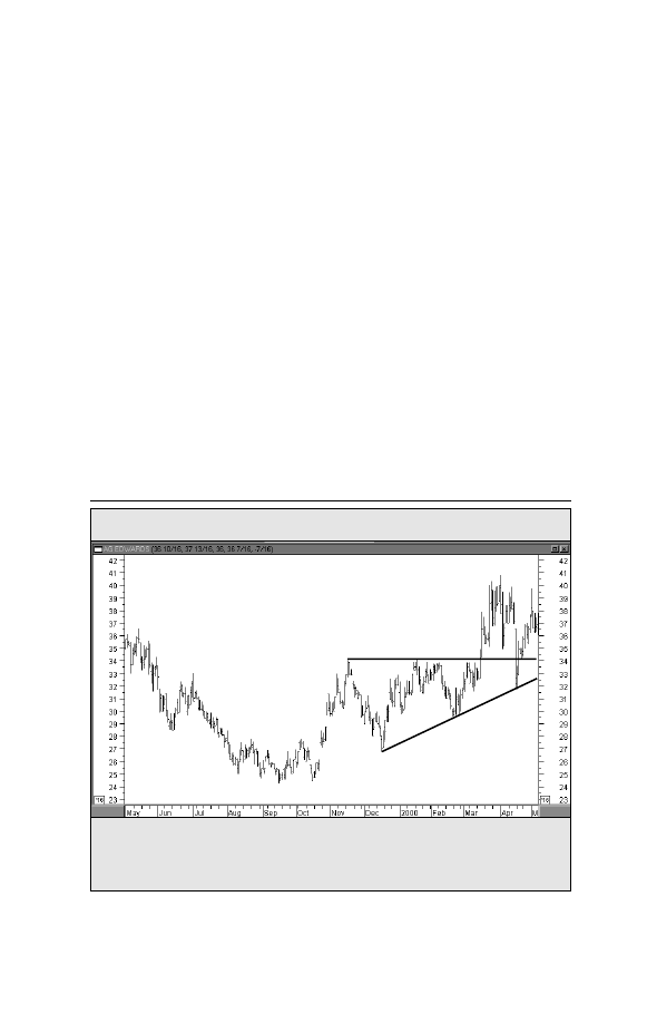
Figure 5-7. ASCENDING TRIANGLE
AG Edwards (AGE)
way and the three-quarters point in the pattern, measured in
calendar time from the left of the pattern to the point where
the two lines meet at the right (the apex), the pattern should
be resolved by a breakout. In other words, prices will close
beyond one of the two converging trendlines (See Figure 5-6).
The ascending triangle has a flat upper line and a rising
lower line. Since buyers are more aggressive than sellers, this is
usually a bullish pattern (See Figure 5-7).
The descending triangle has a declining upper line and a flat
lower line. Since sellers are more aggressive than buyers, this is
usually a bearish pattern.
The measuring technique for all three triangles is the same.
Measure the height of the triangle at the widest point to the left
of the pattern and measure that vertical distance from the point
Charting Made Easy
19
Flat upper line
Rising lower line
An example of an ascending triangle. The upper line is flat, while the lower line is
rising. This is usually a bullish pattern and is completed when prices close above the
upper line.
Charts powered by MetaStock
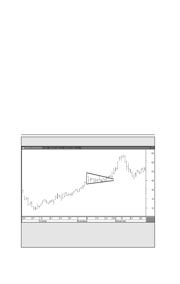
Figure 5-8. PENNANT
Apple Computer (AAPL)
An example of a pennant forming during the ascent of Apple Computer during
November 1999. The pennant looks like a small symmetrical triangle, but normally
doesn’t last for more than two or three weeks. The breaking of the upper line signals
resumption of the uptrend.
20
Trade Secrets
where either trendline is broken. While the ascending and de-
scending
triangles have a built-in bias,the symmetrical triangle is
inherently neutral. Since it is usually a continuation pattern, how-
ever, the symmetrical triangle does have forecasting value and
implies that the prior trend will be resumed.
Flags and Pennants
These two short-term continuation patterns mark brief paus-
es, or resting periods, during dynamic market trends. Both are
usually preceded by a steep price move (called the pole). In an
uptrend, the steep advance pauses to catch its breath and
moves sideways for two or three weeks.Then the uptrend con-
tinues on its way. The names aptly describe their appearance.
The pennant is usually horizontal with two converging trend-
Bullish pennant
Charts powered by MetaStock
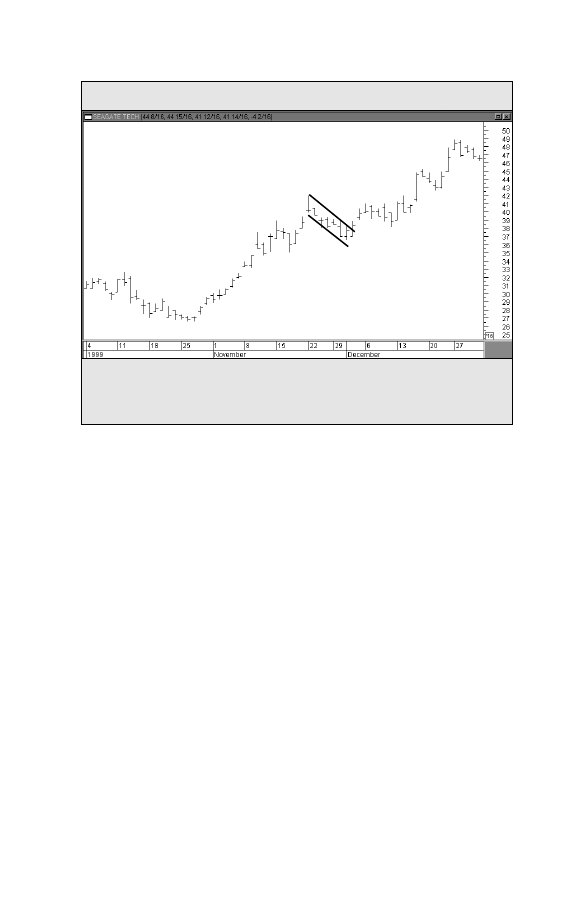
Figure 5-9. FLAG
Seagate Technology (SEG)
An example of a bullish flag forming during November 1999 about midway through
the rally in Seagate Technology. Bull flags are short-term patterns that slope against
the prevailing trend. The uptrend usually resumes after the upper line is broken.
Charting Made Easy
21
Bull flag
lines (like a small symmetrical triangle). The flag resembles a
parallelogram that tends to slope against the trend. In an
uptrend, therefore, the bull flag has a downward slope; in a
downtrend, the bear flag slopes upward. Both patterns are said
to “fly at half mast,”meaning that they often occur near the mid-
dle of the trend, marking the halfway point in the market move
(See Figures 5-8 and 5-9).
In addition to price patterns, there are several other forma-
tions that show up on the price charts and that provide the
chartist with valuable insights. Among those formations are
price gaps, key reversal days, and percentage retracements.
Charts powered by MetaStock


PRICE GAPS
G
aps are simply areas on the bar chart where no trad-
ing has taken place.An upward gap occurs when the
lowest price for one day is higher than the highest
price of the preceding day. A downward gap means that the
highest price for one day is lower than the lowest price of the
preceding day.There are different types of gaps that appear at
different stages of the trend. Being able to distinguish among
them can provide useful and profitable market insights. Three
types of gaps have forecasting value — breakaway, runaway and
exhaustion gaps (See Figure 6-1).
The breakaway gap usually occurs upon completion of an
important price pattern and signals a significant market move.
A breakout above the neckline of a head and shoulders bottom,
for example, often occurs on a breakaway gap.
The runaway gap usually occurs after the trend is well
underway. It often appears about halfway through the move
(which is why it is also called a measuring gap since it gives
some indication of how much of the move is left.) During
uptrends, the breakaway and runaway gaps usually provide sup-
port below the market on subsequent market dips; during
downtrends, these two gaps act as resistance over the market
on bounces.
Chapter 6
Charting Made Easy
23
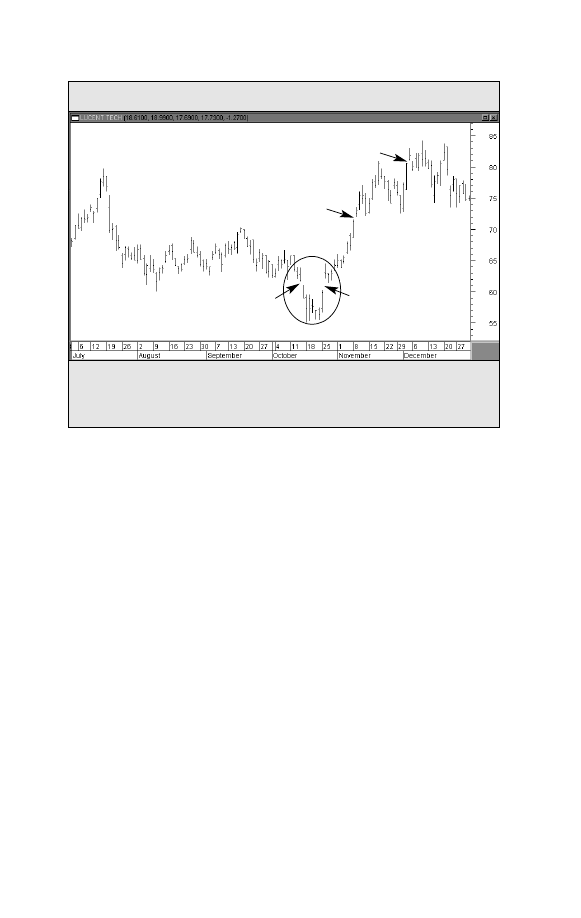
Figure 6-1. PRICE GAPS
Lucent Technologies (LU)
Examples of price gaps. The two gaps along the bottom formed an island reversal in
October 1999 in Lucent. There’s also a measuring gap halfway through the rally and
an exhaustion gap near the final top.
24
Trade Secrets
The exhaustion gap occurs right at the end of the market
move and represents a last gasp in the trend. Sometimes an
exhaustion gap is followed within a few days by a breakaway
gap in the other direction, leaving several days of price action
isolated by two gaps. This market phenomenon is called the
island reversal
and usually signals an important market turn.
Exhaustion gap
Downside
exhaustion gap
Measuring or
halfway gap
Upside
breakway gap
Island Reversal Bottom
Charts powered by MetaStock
THE KEY REVERSAL DAY
A
nother price formation is the key reversal day. This
minor pattern often warns of an impending change in
trend. In an uptrend, prices usually open higher, then
break sharply to the downside and close below the previous
day’s closing price. (A bottom reversal day opens lower and
closes higher.)
Chapter 7
Charting Made Easy
25
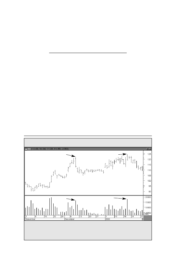
Figure 7-1. KEY REVERSAL DAYS
IBM
Examples of key reversal days. The two downside reversal days are identified by
higher openings and lower closings on heavy volume. The bigger the price range, the
more significant is the reversal signal.
Downside reversal day
Downside
reversal day
Volume
Heavy
volume
Heavy
volume
Charts powered by MetaStock

26
Trade Secrets
The wider the day’s range and the heavier the volume, the
more significant the warning becomes and the more authority
it carries. Outside reversal days (where the high and low of the
current day’s range are both wider than the previous day’s
range) are considered more potent.The key reversal day is a rel-
atively minor pattern taken on its own merits, but can assume
major importance if other technical factors suggest that an
important change in trend is imminent (See Figure 7-1).

PERCENTAGE
RETRACEMENTS
M
arket trends seldom take place in straight lines. Most
trend pictures show a series of zig-zags with sever-
al corrections against the existing trend.These cor-
rections usually fall into certain predictable percentage para-
meters. The best-known example of this is the fifty-percent
retracement
. That is to say, a secondary, or intermediate, cor-
rection against a major uptrend often retraces about half of
the prior uptrend before the bull trend is again resumed. Bear
market bounces often recover about half of the prior down-
trend.
A minimum retracement is usually about a third of the prior
trend. The two-thirds point is considered the maximum re-
tracement that is allowed if the prior trend is going to resume.
A retracement beyond the two-thirds point usually warns of a
trend reversal in progress. Chartists also place importance on
retracements of 38% and 62% which are called Fibonacci
retracements.
Chapter 8
Charting Made Easy
27


THE INTERPRETATION
OF VOLUME
C
hartists employ a two-dimensional approach to market
analysis that includes a study of price and volume. Of
the two,price is the more important.However,volume
provides important secondary confirmation of the price action
on the chart and often gives advance warning of an impending
shift in trend (See Figure 9-1).
Volume is the number of units traded during a given time
period, which is usually a day. It is the number of common stock
shares traded each day in the stock market.Volume can also be
monitored on a weekly basis for longer-range analysis.
When used in conjunction with the price action, volume tells
us something about the strength or weakness of the current
price trend.Volume measures the pressure behind a given price
move. As a rule, heavier volume (marked by larger vertical
bars at the bottom of the chart) should be present in the direc-
tion of the prevailing price trend.
During an uptrend, heavier
volume should be seen during rallies, with lighter volume
(smaller volume bars) during downside corrections. In down-
trends, the heavier volume should occur on price selloffs. Bear
market bounces should take place on a lighter volume.
Chapter 9
Charting Made Easy
29
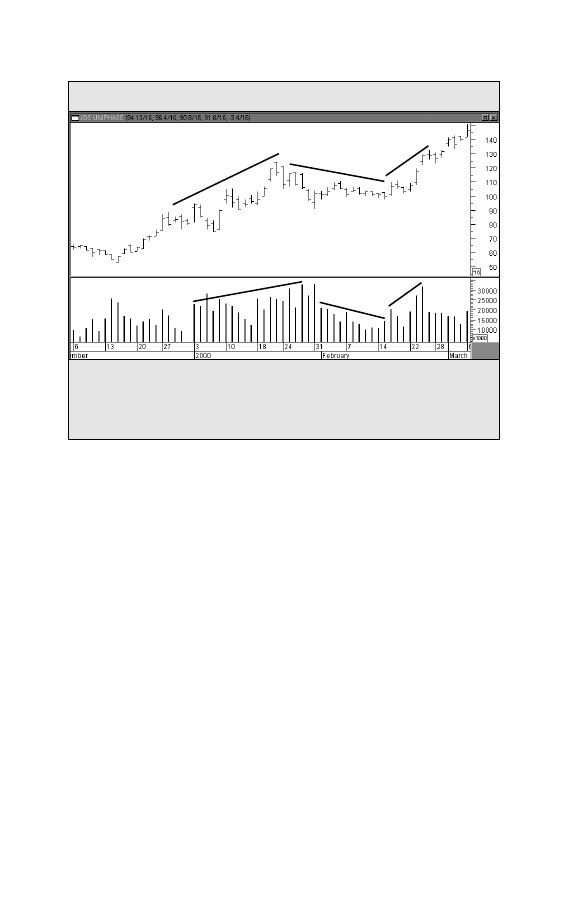
An example of price and volume moving in harmony during an uptrend. The price
advance during January 2000 saw heavy trading. The February correction was on light
volume. The resumption of the uptrend was on heavier volume again. That’s what
should happen during an uptrend.
Volume
Figure 9-1. PRICE AND VOLUME
JDS Uniphase (JDSU)
30
Trade Secrets
Volume Is an Important Part of Price Patterns
Volume also plays an important role in the formation and res-
olution of price patterns. Each of the price patterns described
previously has its own volume pattern. As a rule, volume tends
to diminish as price patterns form.The subsequent breakout that
resolves the pattern takes on added significance if the price
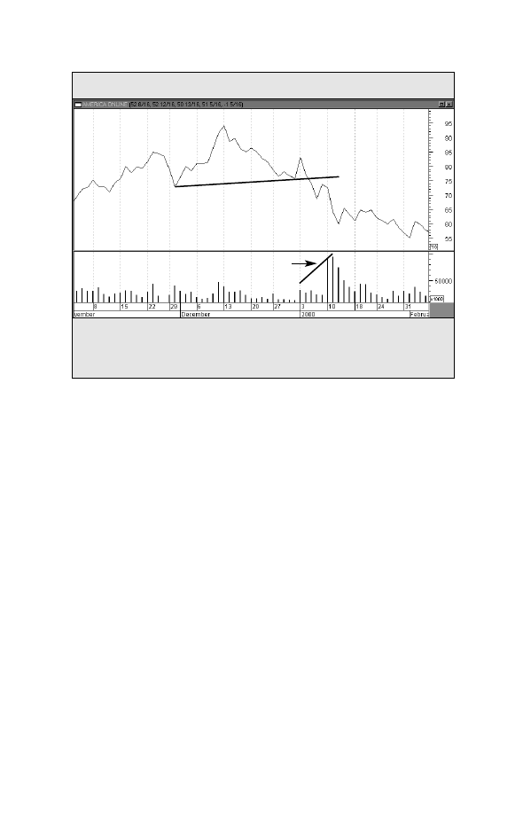
breakout is accompanied by heavier volume. Heavier volume
accompanying the breaking of trendlines and support or resis-
tance levels lends greater weight to price activity (See Figure 9-2).
On-Balance Volume (OBV)
Market analysts have several indicators to measure trading
volume. One of the simplest, and most effect, is on-balance vol-
ume
(OBV). OBV plots a running cumulative total of upside ver-
Charts powered by MetaStock
sus downside volume. Each day that a market closes higher, that
day’s volume is added to the previous total. On each down day,
the volume is subtracted from the total. Over time, the on-bal-
ance volume will start to trend upward or downward. If it
trends upward, that tells the trader that there’s more upside
than downside volume, which is a good sign.A falling OBV line
is usually a bearish sign.
Plotting OBV
The OBV line is usually plotted along the bottom of the price
chart.
The idea is to make sure the price line and the OBV line
are trending in the same direction. If prices are rising, but the
OBV line is flat or falling, that means there may not be enough
volume to support higher prices. In that case, the divergence
between a rising price line and a flat or falling OBV line is a neg-
ative warning (See Figure 9-3).
Charting Made Easy
31
An example of volume used in a price pattern. The chart shows AOL breaking a “neck-
line” of a head and shoulders top. The breaking of the neckline coincided with a burst
in trading activity — which is usually a negative sign for the stock.
Volume
Figure 9-2. VOLUME USED IN A PRICE PATTERN
America Online (AOL)
Heavy volume during
the price breakdown
Broken neckline
Charts powered by MetaStock
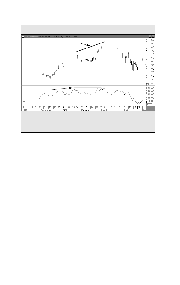
An example of price and OBV lines not confirming each other. The March 2000 move
to new highs by JDS Uniphase was accompanied by a flat OBV line. That was an early
warning of a possible top.
Figure 9-3. PRICE AND OBV LINES
JDS Uniphase (JDSU)
OBV Breakouts
During periods of sideways price movement, when the mar-
ket trend is in doubt, the OBV line will sometimes break out
first and give an early hint of future price direction.
An upside
breakout
in the OBV line should catch the trader’s eye and
cause him or her to take a closer look at the market or stock in
question.At market bottoms, an upside breakout in on-balance
volume is sometimes an early warning of an emerging uptrend
(See Figure 9-4).
Other Volume Indicators
There are many other indicators that measure the trend of
volume — with names like Accumulation Distribution, Chaikin
Oscillator, Market Facilitation Index, and Money Flow. While
32
Trade Secrets
Flat OBV line
Rise in price
Charts powered by MetaStock
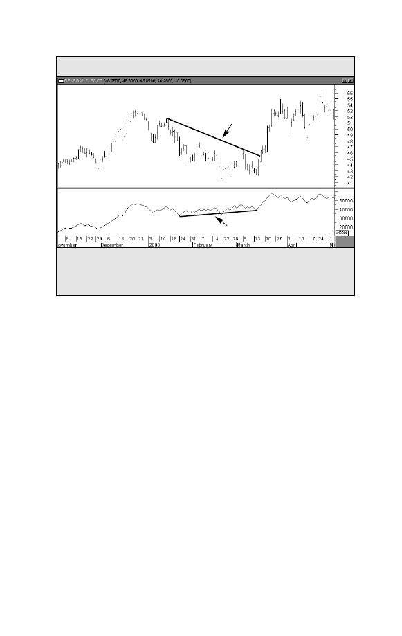
An example of the OBV line giving a bullish warning. During the decline in the price
of GE during the 1st quarter of 2000, the rising On-Balance Volume line hinted at the
bottom.
Figure 9-4. ON-BALANCE VOLUME (OBV) LINE
General Electric (GE)
Charting Made Easy
33
Decline in price
Rising OBV line
On-Balance Volume (OBV) Line
they’re more complex in their calculations, they all have the
same intent — to determine if the volume trend is confirming,
or diverging from, the price trend.
Charts powered by MetaStock


USING DIFFERENT TIME
FRAMES FOR SHORT- AND
LONG-TERM VIEWS
B
ar chart analysis is not limited to daily bar charts.Weekly
and monthly charts provide a valuable long-term per-
spective on market history that cannot be obtained by
using daily charts alone.The daily bar chart usually shows up to
twelve months of price history for each market. Weekly charts
show almost five years of data, while the monthly charts go
back over 20 years (See Figure 10-1).
By studying these charts,the chartist gets a better idea of long-
term trends, where historic support and resistance levels are lo-
cated, and is able to obtain a clearer perspective on the more re-
cent action revealed in the daily charts. These weekly and
monthly charts lend themselves quite well to standard chart
analysis described in the preceding pages. The view held by
some market observers that chart analysis is useful only for
short-term analysis and timing is simply not true.The principles
of chart analysis can be used in any time dimension.
Using Intraday Charts
Daily and weekly charts are useful for intermediate- and long-
term analysis. For short-term trading, however, intraday charts
Chapter 10
Charting Made Easy
35
36
Trade Secrets
are extremely valuable. Intraday charts usually show only a few
days of trading activity. A 15-minute bar chart, for example,
might show only three or four days of trading.A 1-minute or a
5-minute chart usually shows only one or two days of trading
respectively, and is generally used for day-trading purposes.
Fortunately, all of the chart principles described herein can also
be applied to intraday charts (See Figure 10-2).
Going From the Long Term to the Short Term
As indispensable as the daily bar charts are to market timing
and analysis, a thorough chart analysis should begin with the
monthly and weekly charts — and in that order.The purpose of
that approach is to provide the analyst with the necessary long-
term view as a starting point. Once that is obtained on the 20-
year monthly chart, the 5-year weekly chart should be consult-
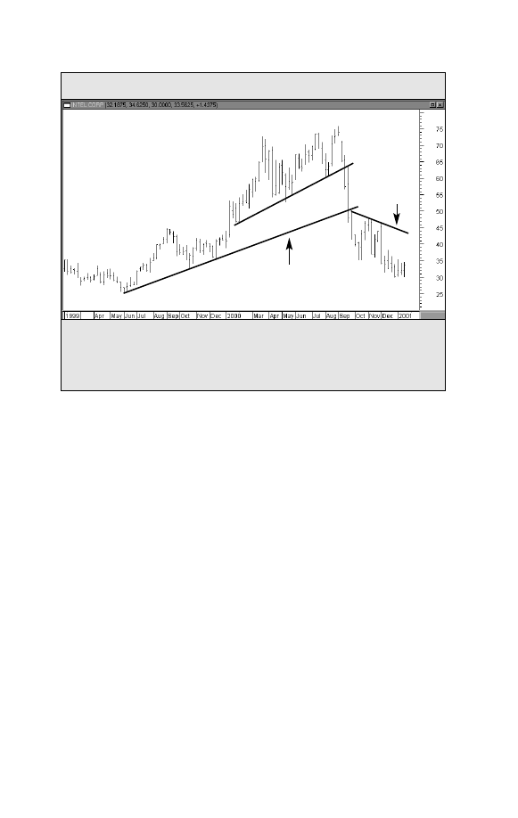
A demonstration of the importance of long-term perspective achieved by a weekly chart
going back almost two years. The triple top provides the first clue that a major reversal
may have begun. The reversal is later confirmed by a break in the trend begun in early
2000, followed by a second break of the longer term up trend.
Figure 10-1. WEEKLY BAR CHART
Intel Corporation (INTC)
2nd broken trendline
Downward
trend
Triple top
1
2
3
1st broken
trendline
Charts powered by MetaStock
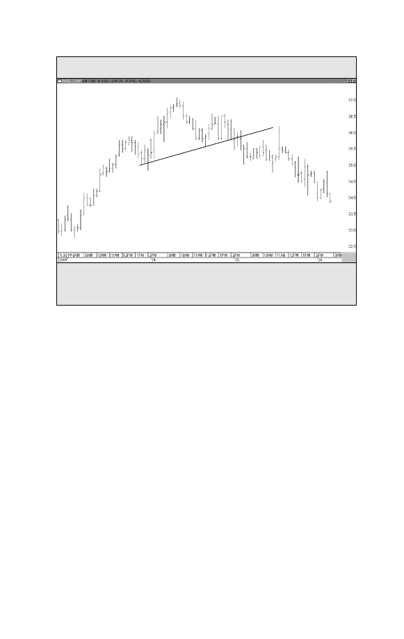
Example of a 15-minute bar chart showing only four days of trading. Charting principles
can be seen on these intraday charts and are extremely helpful for short-term trading.
Figure 10-2. INTRADAY CHART
Intel Corporation (INTC)
Charting Made Easy
37
Head
Left shoulder
Right shoulder
Broken neckline
Neckline
15-Minute Bar Chart
ed. Only then should the daily chart be studied. In other words,
the proper order to follow is to begin with a solid overview and
then gradually shorten the time horizon. (For even more micro-
scopic market analysis, the study of the daily chart can be fol-
lowed by the scrutiny of intraday charts.)
Charts powered by MetaStock


USING A TOP-DOWN
MARKET APPROACH
T
he idea of beginning one’s analysis with a broader view
and gradually narrowing one’s focus has another impor-
tant application in the field of market analysis.That has
to do with utilizing a “top-down” approach to analyzing the
stock market. This approach utilizes a three-step approach to
finding winning stocks. It starts with an overall market view to
determine whether the stock market is moving up or down,
and whether this is a good time to be investing in the market.
It then breaks the stock market down into market sectors and
industry groups to determine which parts of the stock market
look the strongest. Finally, it seeks out leading stocks in those
leading sectors and groups.
THE FIRST STEP: The Major Market Averages
The intent of the first step in the “top-down” approach is to
determine the trend of the overall market. The presence of a
bull market (a rising trend) is considered a good time to invest
funds in the stock market. The presence of a bear market (a
falling trend) might suggest a more cautious approach to the
stock market. In the past, it was possible to look at one of sev-
eral major market averages to gauge the market’s trend. That
Chapter 11
Charting Made Easy
39

40
Trade Secrets
was because most major averages usually trended in the same
direction. That hasn’t always been the case in recent history
however. For that reason, it’s important to have some familiari-
ty with the major market averages, and to know what each one
actually measures.
Different Averages Measure Different Things
The traditional blue chip averages — like the Dow Jones
Industrial Average, the NYSE Composite Index, and the S&P
500 — generally give the best measure of the major market
trend.The Nasdaq Composite Index, by contrast, is heavily influ-
enced by technology stocks.While the Nasdaq is a good barom-
eter of trends in the technology sector, it’s less useful as a mea-
sure of the overall market trend. The Russell 2000 Index mea-
sures the performance of smaller stocks. For that reason, it’s
used mainly to gauge the performance of that sector of the mar-
ket.The Russell is less useful as a measure of the broader mar-
ket which is comprised of larger stocks.
Since most of these market averages are readily available in the
financial press and on the Internet,it’s usually a good idea to keep
an eye on all of them.The strongest signals about market direc-
tions are given when all or most of the major market averages are
trending in the same direction (See Figure 11-1).
THE SECOND STEP: Sectors and Industry Groups
The stock market is divided into market sectors which are
subdivided further into industry groups. There are ten market
sectors, which include Basic Materials, Consumer Cyclicals,
Consumer Non-Cyclicals, Energy, Financial, Healthcare, Indus-
trial, Technology, Telecommunications, and Utilities. Each of
those sectors can have as many as a dozen or more industry
groups. For example, some groups in the Technology sector are
Computers, the Internet, Networkers, Office Equipment, and
Semiconductors. The Financial sector includes Banks, Insur-
ance, and Securities Brokers.
The recommended way to approach this group is to start
with the smaller number of market sectors. Look for the ones
that seem to be the strongest. During most of 1999 and into the
early part of 2000, for example, technology stocks represented
the strongest market sector. Once you’ve isolated the preferred
sector, you can then look for the strongest industry groups in
that sector. Two leading candidates during the period of time
just described were Internet and Semiconductor stocks. The
idea is to be in the strongest industry groups within the
strongest market sectors (See Figure 11-2).
For many investors, the search can stop there.The choice to
be in a market sector or industry group can easily be imple-
Charting Made Easy
41
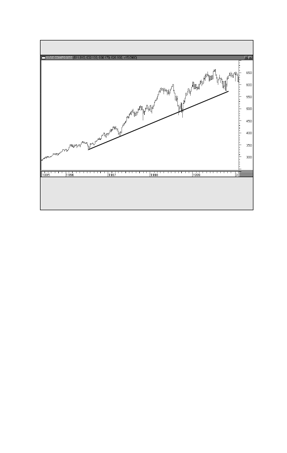
The best way to determine the trend of the stock market is to chart one of the major mar-
ket averages. This example shows that the NYSE Composite Index has been rising for
several years.
Figure 11-1. MAJOR MARKET AVERAGE
NYSE Composite Index (Weekly)
Charts powered by MetaStock
42
Trade Secrets
mented through the use of mutual funds that specialize in spe-
cific market sectors or industry groups.
THE THIRD STEP: Individual Stocks
For those investors who deal in individual stocks, this is the
third step in the “top-down” market approach. Having isolated an
industry group that has strong upside potential, the trader can
then look within that group for winning stocks. It’s been esti-
mated that as much as 50% of a stock’s direction is determined
by the direction of its industry group. If you’ve already found a
winning group, your work is half done.
Another advantage of limiting your stock search to winning
sectors and groups is that it narrows the search considerably.
There are as many as 5,000 stocks that an investor can choose
from. It’s pretty tough doing a market analysis of so many mar-
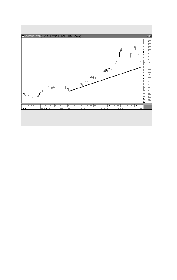
An example of a strong industry group. During the first quarter of 2000, semiconductor
stocks were the strongest group in a strong technology sector.
Figure 11-2. STRONG INDUSTRY GROUP
PHLX Semiconductor (SOX) Index
Daily Bars
Charts powered by MetaStock
Charting Made Easy
43
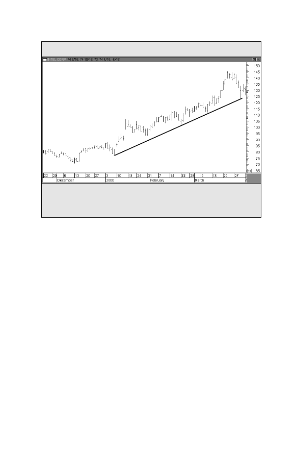
Intel was one of the strongest semiconductor stocks during the first three months of
2000. Having started the search in a strong semiconductor group, the search for a
winning stock is made a lot easier.
Figure 11-3. INDIVIDUAL STOCKS
Intel Corporation (INTC)
Daily Bars
Charts powered by MetaStock
kets. Some sort of screening process is required.That’s where the
three-step process comes in. By narrowing your stock search to a
small number of industry groups, the number of stocks you have
to study is dramatically reduced.You also have the added comfort
of knowing that each stock you look at is already part of a win-
ning group (See Figure 11-3).


MOVING AVERAGES
I
n the realm of technical indicators, moving averages are
extremely popular with market technicians and with good
reason. Moving averages smooth the price action and make
it easier to spot the underlying trends. Precise trend signals can
be obtained from the interaction between a price and an aver-
age or between two or more averages themselves. Since the
moving average is constructed by averaging several days’ clos-
ing prices, however, it tends to lag behind the price action.The
shorter the average (meaning the fewer days used in its calcu-
lation), the more sensitive it is to price changes and the closer
it trails the price action. A longer average (with more days
included in its calculation) tracks the price action from a
greater distance and is less responsive to trend changes. The
moving average is easily quantified and lends itself especially
well to historical testing. Mainly for those reasons, it is the main-
stay of most mechanical trend-following systems.
Popular Moving Averages
In stock market analysis, the most popular moving average
lengths are 50 and 200 days. [On weekly charts, those daily val-
ues are converted into 10 and 40-week averages.] During an
uptrend, prices should stay above the 50-day average. Minor
pullbacks often bounce off that average, which acts as a sup-
Chapter 12
Charting Made Easy
45

46
Trade Secrets
port level.A decisive close beneath the 50-day average is usual-
ly one of the first signs that a stock is entering a more severe
correction. In many cases, the breaking of the 50-day average
signals a further decline down to the 200-day average. If a mar-
ket is in a normal bull market correction,it should find new sup-
port around its 200-day average. [For short-term trading pur-
poses, traders will employ a 20-day average to spot short-term
trend changes].
Bollinger Bands
These are trading bands plotted two standard deviations
above and below a 20-day moving average. When a market
touches (or exceeds) one of the trading bands, the market is
considered to be over-extended. Prices will often pull back to
the moving average line.
Moving Average Convergence Divergence (MACD)
The MACD is a popular trading system. On your computer
screen, you’ll see two weighted moving averages (weighted
moving averages give greater weight to the more recent price
action).Trading signals are given when the two lines cross.

OSCILLATORS
O
scillators
are used to identify overbought and over-
sold
market conditions. The oscillator is plotted on
the bottom of the price chart and fluctuates within a
horizontal band. When the oscillator line reaches the upper
limit of the band, a market is said to be overbought and vulner-
able to a short-term setback.When the line is at the bottom of
the range, the market is oversold and probably due for a rally.
The oscillator helps to measure market extremes and tells the
chartist when a market advance or decline has become over-
extended.
Relative Strength Index (RSI)
This is one of the most popular oscillators used by technical
traders.The RSI scale is plotted from 0 to 100 with horizontal
lines drawn at the 70 and 30 levels.An RSI reading above 70 is
considered to be overbought. An RSI reading below 30 is con-
sidered to be oversold.The most popular time periods for the
RSI are 9 and 14 days (See Figure 13-1).
Stochastics
This oscillator is also plotted on a scale from 0 to 100.
However, the upper and lower lines (marking the overbought
Chapter 13
Charting Made Easy
47
and oversold levels) are at the 80 and 20 levels. In other words,
readings above 80 are overbought, while readings below 20 are
oversold. One added feature of stochastics is that there are two
oscillator lines instead of one. (The slower line is usually a 3-day
moving average of the faster line). Trading signals are given
when the two lines cross.A buy signal is given when the faster
line crosses above the slower line from below 20.A sell signal is
given when the faster line crosses beneath the slower line from
above 80.The time period used by most chart analysts is four-
teen days (See Figure 13-2).
Any Time Dimension
As is the case with most technical indicators, these oscillators
can be employed in any time dimension.That means they can
be used on weekly, daily, and intraday charts. It’s a good idea to
use the same time span in all time dimensions. When plotting
48
Trade Secrets
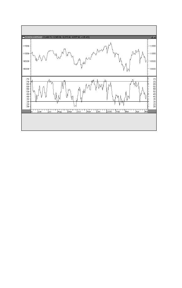
A 9-day RSI oscillator applied to the Dow Industries. RSI readings over 70 often coin-
cide with short-term pullbacks. Readings below 30 often identify market bottoms.
Figure 13-1. RSI OSCILLATOR
Dow Jones Industrial Average
Daily Closes
9-Day Relative Strength Index (RSI)
Overbought
Oversold
Charts powered by MetaStock
Charting Made Easy
49
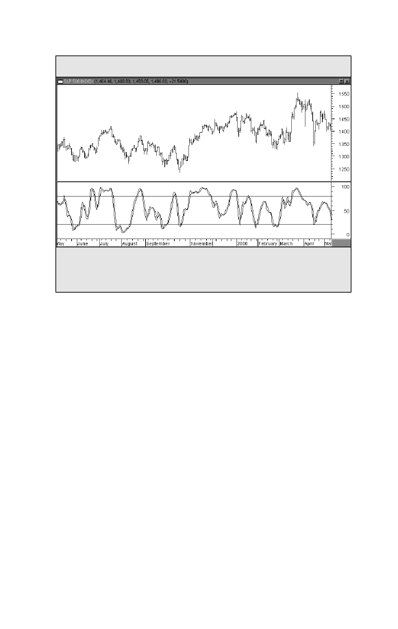
The 14-day stochastics oscillator applied to the S&P 500. The last two bottoms in the
S&P were marked by oversold stochastic readings below 20. Readings over 80 coin-
cided with several short-term peaks.
Figure 13-2. STOCHASTICS OSCILLATOR
S&P 500 Index
Daily Bars
Overbought
Oversold
14-Day Stochastics
the stochastics lines, for example, use 14 weeks on the weekly
chart, 14 days on the daily chart, and 14 hours on an hourly
chart, etc.Another reason for keeping the same numbers is that
computers allow you to switch back and forth between week-
ly, daily, and intraday charts with a keystroke. Using the same
time spans in all time dimensions makes your work a lot easier.
Charts powered by MetaStock


RATIOS AND RELATIVE STRENGTH
T
echnical analysis can be applied to ratio charts.
Trend-
lines and moving averages, for example, can help mea-
sure trends on ratios and can alert the user to changes
in those trends.A close monitoring of the ratio charts can add a
valuable dimension to market analysis.
Sector Ratios
Chapter 11 recommended using a “top-down” market ap-
proach to find winning sectors, industry groups, and individual
stocks. That is done by applying ratio analysis to determine
each market’s relative strength. When choosing industry
groups, for example, the common technique is to divide an
industry index (like the Semiconductor Index) by a market
benchmark like the S&P 500.When the ratio line is rising, that
means the industry is outperforming the general market.When
the ratio is falling, that industry is lagging behind the rest of the
market. The idea is to concentrate your attention on groups
with rising ratios and avoid those groups with falling ratios.That
way you’ll be buying only those industry groups that are show-
ing superior relative strength.
Stock Ratios
Once you’ve identified a winning group, you can apply ratio
analysis
to the stocks in that group. Simply divide the individ-
Chapter 14
Charting Made Easy
51
52
Trade Secrets
ual stocks in the group by the group index itself.
The stocks
with rising ratio lines are the strongest stocks in the group.The
idea here is to find the stocks in the group that are showing the
greatest relative strength. That way you’ll be buying the
strongest stocks in the strongest groups.
Market Ratios
Ratio analysis can also be used to compare major market aver-
ages. By dividing the Nasdaq Composite Index by the S&P 500,
for example, you can determine if technology stocks are leading
or lagging the rest of the market.You can use the Russell 2000
versus the S&P to gauge the relative strength (or weakness) of
smaller stocks (See Figure 14-1).
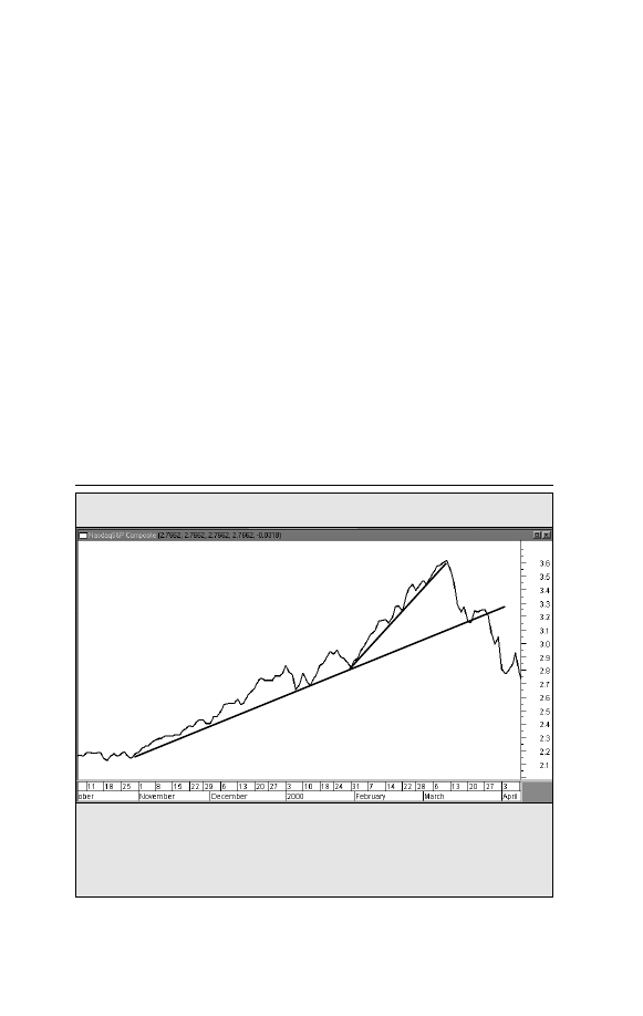
The rising Nasdaq/S&P 500 ratio shows remarkable relative strength in the technology
sector during the last quarter of 1999 and the first quarter of 2000. The breaking of the
up trendlines, however, signalled new relative weakness in technology. Ratio charts
are a good way to spot sector rotations within the stock market.
Figure 14-1. RATIOS AND RELATIVE STRENGTH
Nasdaq/S&P 500 Ratio
Charts powered by MetaStock

OPTIONS
O
ptions
give the holder the right, but not the obliga-
tion, to purchase (in the case of a call) or sell (in the
case of a put) an underlying market entity at a specif-
ic price within a specified period of time. In its simplest appli-
cation, a trader who is bullish on a market can simply purchase
a call; a trader who is bearish can simply purchase a put.
The main advantage in options trading is limited risk. The op-
tion trader pays a premium to purchase the option. If the market
doesn’t move as expected, the option simply expires.The maxi-
mum loss the option trader can suffer is the size of the premium.
There are countless option strategies that can be utilized by
option traders. However, most option strategies require a mar-
ket view. In other words, the option trader must first determine
whether the market price of the underlying market contract is
going to rise, fall, or stay relatively flat.This is because the major
factor influencing the value of an option is the performance of
its underlying market. In determining an appropriate option
strategy, it’s important to remember that the principles of mar-
ket analysis are not applied to the option itself, but to the
underlying market.
Therefore, it can be seen that the principles of chart analysis
covered in the preceding pages and their application to the
financial markets play an important role in options trading.
Chapter 15
Charting Made Easy
53

54
Trade Secrets
Option Put/Call Ratio
Trading activity in the options markets is used to generate a
popular stock market sentiment indicator — called the put/call
ratio.
This ratio is actually a ratio of put volume divided by call
volume. It is generally applied to the S&P 100 (OEX) index op-
tion traded on the Chicago Board Options Exchange (CBOE) or
the CBOE Equity put/call ratio, which uses option volume in
individual stocks.
Contrary Indicator
The S&P 100 or the CBOE Equity put/call ratio is a contrary
indicator
. In other words, a high put/call ratio is considered
bullish for the market (because it shows too much bearish sen-
timent). In the same way, a low put/call ratio (which betrays
strong bullish sentiment) is considered bearish for the market.
The reasoning behind the put/call ratio being used as a contrary
indicator is based on the idea that option traders get too bullish
near market tops and too bearish near market bottoms.
CBOE Volatility Index (VIX)
This contrary indicator is based on the volatility of the S&P
100 (OEX) index option. Since it is a contrary indicator, a rising
VIX index implies greater volatility and growing concern about
downside movement in the stock market. By contrast, a falling
VIX implies less volatility and more confidence in the market.
The VIX usually trades in a band between 30 and 20.Dips below
20 are usually associated with market peaks. Moves above 30
are usually associated with market bottoms.

THE PRINCIPLE OF
CONFIRMATION
T
he principle of confirmation holds that the more tech-
nical evidence supporting a given analysis, the stronger
the conclusion becomes. In the study of an individual
market, for example, all of the technical signs should be point-
ing in the same direction. If some signs are pointing up and the
others down, be suspicious. Consult other stocks in the same
group.A bullish analysis in a stock would be less than convinc-
ing if the other stocks in its group were trending lower. Since
stocks in the same group tend to move together, make sure that
the other stocks agree with the one being studied.
Look at the various technical indicators to see if they agree.Are
the chart patterns being confirmed by the volume? Do the mov-
ing averages and oscillators confirm the chart analysis? What do
the weekly and monthly charts show? While it is seldom that all
of these technical factors will point in the same direction, it pays
to have as many of them in your corner as possible.
Chapter 16
Charting Made Easy
55


SUMMARY AND CONCLUSION
W
e have provided here an introduction to technical
analysis as it is applied to the financial markets.
We’ve discussed briefly the major tools utilized by
the chartist, including: basic chart analysis, the study of volume,
moving averages, oscillators, ratios, weekly, and intraday charts.
The successful trader learns how to combine all these elements
into one coherent theory of market analysis.
The many software and Internet-based products available on
the market today also provide powerful tools that make chart-
ing and technical analysis much easier — and far more accessi-
ble to general investors — than ever bef ore. For example, many
software and Internet-based products include a full suite of
technical analysis tools that allow you to create charts easily,
have instant access to historical data, and have the ability to cre-
ate, backtest and optimize self-designed trading systems with-
out any programming knowledge or experience.
▲ ▲ ▲ ▲ ▲ ▲
Technical analysis provides an excellent vehicle for market
forecasting
, either with or without fundamental input. Where
technical analysis becomes absolutely essential, however, is in
Chapter 17
Charting Made Easy
57

58
Trade Secrets
the area of market timing. Market timing is purely technical in
nature, so successful participation in the markets dictates some
application of technical analysis.
It’s not necessary to be an expert chartist to benefit from
chart analysis. However, chart analysis will go a long way in
keeping the trader on the right side of the market and in help-
ing to pinpoint market entry and exit points, which are so vital
to trading success.Whether the participant is a day trader or a
long-term investor, it’s to his or her advantage to learn about
chart analysis.

Investing
Resource
Guide
▲ ▲ ▲ ▲ ▲ ▲
TOOLS FOR SUCCESS
IN INVESTING


Charting Made Easy
61
Technical Analysis of the Financial Markets
by John Murphy
From how to read charts to understanding indicators and the
crucial role of technical analysis in investing, you will not find a
more thorough or up-to-date source.This comprehensive guide,
revised and expanded for today’s changing financial world, ap-
plies to both equities and futures markets. A must have refer-
ence, from the industry expert.
$80.00 Item #BC94-10239
Martin Pring’s Introduction to Technical Analysis
A CD-Rom Seminar and Workbook
by Martin J. Pring
The foremost expert on technical analysis and forecasting finan-
cial markets gives you a one-on-one course in every aspect of
technical analysis.This interactive guide explains how to evaluate
trends, highs & lows, price/volume relationships, price patterns,
moving averages, and momentum indicators.
The accompanying CD-ROM includes videos, animated diagrams
audio clips and interactive tests. It’s the user-friendly way to mas-
ter technical analysis from an industry icon.
$49.95 Item #BC94-8521
▲ ▲ ▲ ▲ ▲ ▲
To order any book listed
Call 1-800-272-2855 ext. BC94
SUGGESTED READING

62
Trade Secrets
Technical Analysis Simplified
by Clif Droke
Here’s a concise, easy-reading manual for learning and imple-
menting this invaluable investment tool.The author, a well-known
technician and editor of several technical analysis newsletters, dis-
tills the most essential elements of technical analysis into a brief,
easy-to-read volume.
$29.95 Item #BC94-11087
How Charts Can Help You in the Stock Market
by William L. Jiler
William Jiler's book is the must-have primer on technical
analysis. First published in 1962, it was the first book to
explain how all investors can use charting to more profitably
time both their buys and sells. It is globally renowned to this
day for helping traders and investors use the tools of techni-
cal analysis to increase their profits.
Featuring a new Foreword by the investing experts at
Standard & Poor's, this special reprint edition will be an excel-
lent resource for beginners as well as a vital reference for
experienced technicians.
$19.95 Item #BC94-1661720
▲ ▲ ▲ ▲ ▲ ▲
To order any book listed
Call 1-800-272-2855 ext. BC94
Charting Made Easy
63
The MetaStock Difference
Make sure you’re getting the most advanced
technical analysis software available —
choose MetaStock
®
.
Greater Depth. Study your charts with nine
charting styles. Calculate moving averages
with seven different methods. Plus, choose
from over 120 indicators and line studies.
Create, Backtest, Optimize, and
Compare Your Trading Systems.
Scan your databases to find the winners.
Learn from noted experts to spot important
trading situations, and more. You’ll never
outgrow MetaStock.
Easy to Use. You only need to learn two
commands to run MetaStock: Click & Pick
and Drag & Drop. Moving price plots, etc.
is extremely easy. And making changes to
objects is even easier.
You’ll Love MetaStock! MetaStock does
it all. From finding what to trade, to knowing
when to trade, MetaStock is available on a
monthly subscription or a one-time purchase
plan.
Free Data CD. Order MetaStock now
and get a free data CD with over 5 years
of historical data, covering over 30,000
securities.
C
Caallll ffo
orr aa ffrre
ee
e iin
nffo
orrm
maattiio
on
n
p
paac
ck
k..
1
1--8
80
00
0--2
27
72
2--2
28
85
55
5
E
Ex
xtt..B
BC
C9
94
4
A Product
MetaStock is a registered trademark of Equis International, Inc. All other product names are property of their respective owners.
©2000, Equis International, Inc.
64
Trade Secrets
Get strong buy and sell signals with . . .
John Murphy’s
CPR
John Murphy’s Chart Pattern Recognition
™
(CPR), plug in software
for MetaStock 7.0, can help you make better buy and sell decisions in just
three easy steps!
Step 1:
Find charts with good pattern trading potential.
Quickly scan
thousands of charts using MetaStock 7.0 from Equis and CPR.You’ll find
charts with definite patterns and even in the early stages of patterns.
Step 2:
Focus on specific chart patterns.
With a list of the best candidates, you can now
analyze individual charts with CPR and MetaStock
7.0’s Expert Advisor
™
. CPR will label both
Reversal Patterns and Continuation Patterns.
Step 3:
Receive insightful, detailed commentary. Know exactly how
to place your buy and sell positions, and even where to place your stops. This
commentary also projects where the security price may move within a specified
period of time.Also generate trading alerts with patterns. Each pattern is
computer verified and supplemented with John’s own expert commentary.
There is no other product on the market that implements the experience and
expertise of John Murphy with the computerized technology of MetaStock.
The result is simple: you’ll make better trading decisions.
Call Today for your copy of CPR and MetaStock.
1-800-272-2855
Extention BC94
Reversal Patterns: Head and Shoulders, Inverse Head and Shoulders,
Double Tops,Triple Tops, Double Bottoms, and Triple Bottoms.
Continuation Patterns: Symmetrical,Ascending, and Descending Triangles.
This product is not a recommendation to buy or sell, but rather a guideline to interpreting the specified analysis methods. This information should only be used
by investors who are aware of the risk inherent tin securities trading. Equis International, MurphyMorris, John Murphy, and Greg Morris accept no liability what-
soever for any loss arising from any use of this product or its contents. ©2000 Equis International, Inc. MetaStock is a registered trademark of Equis
International.

John Murphy Products
Technical Analysis Tools from the World’s Foremost Market Technician
Mastering High Probability Chart
Reading Methods with John Murphy
82 min. video $99.00 Item# BC94-2044547
Renowned technical analyst John Murphy shows you step-
by-step how to pinpoint the right sectors to play at the
right time - with profits in tow. Citing key relationships
among markets, Murphy's methods help you determine
when to move from one to the other, so you're poised to
capture the most lucrative opportunities available in any
market climate. With a full online support manual avail-
able at www.traderslibrary.com/tradesecrets, Murphy's on-tar-
get cues for rotating among sectors will keep you in the "hot" winning ones, at the best
points in the business cycle - time after time.
Intermarket Analysis: Profits From Global
Market Relationships
John Murphy $69.95 Item#BC94-1523697
Drawing on his vast experience as both an educator and
an expert trader, the author lays out his key tools to
understanding global markets and illustrates how these
tools can help today's serious investors profit in any eco-
nomic climate. Murphy incorporates and reflects on the
most recent world market data to show how seemingly
disparate world markets interact and ultimately influ-
ence each other. The book includes practical applica-
tions of Murphy's popular analysis technique. Armed
with the knowledge of how economic forces impact the
various markets and sectors, investors and traders can
profit by exploiting opportunities in markets about to
rise and avoiding those poised for a fall.
Charting Made Easy
65
Order NOW: 800-272-2855 ext. BC94
Online orders: www.traderslibrary.com/ BC94

@
Save Now with
Rewards Weekly
This exclusive e-mail service gives
you, our preferred customer, a
different special offer - every week!
Take advantage of:
• FREE books, videos & software offers
• Deeply DISCOUNTED titles
• FREE SHIPPING offers
• And information on new books ...
Investment conferences ...
and much, much, MORE!
Don’t miss out!
Go to:
www.traderslibrary.com/BC94
and start saving today
with
Rewards Weekly!

Charting Made Easy
67
About the Author
▲ ▲ ▲ ▲ ▲ ▲
John Murphy
has authored three best-selling books on
technical analysis, including Intermarket Technical
Analysis
and The Visual Investor. His latest work,
Technical Analysis of the Financial Markets
(1999), is
a revised edition of his 1986 classic text which has
been translated into eight languages. He is president of
MURPHYMORRIS.COM which produces interactive
educational products on technical analysis and online
analysis for investors. As the former host of CNBC’s
Tech Talk show and a speaker at all the major trading
and investment forums and conferences around the
world, Mr. Murphy is one of the most recognized and
highly respected technical analysts of our time.

This book,
along
with other books,
are available at discounts
that make it realistic to provide them as
gifts to your customers, clients, and staff.
For more information on these long last-
ing, cost effective premiums, please call
John Boyer at 800-272-2855 or e-mail
him at john@traderslibrary.com

Wyszukiwarka
Podobne podstrony:
charting made easy john murphy 1
Inwestycje kapitałowe, inwestycje-3,4, * John Murphy - guru (rewolucjonista
Goal Realization Made Easy
Obedience Training Made Easy
Inwestycje kapitałowe, wykład, * John Murphy - guru (rewolucjonista
linux administration made easy Nieznany
Option Spreads Made Easy
High Probability Chart Reading John Murphy(1)
vocabulary improvement words made easy
Gann Made Easy by Bill McLaren
Herbert M Shelton Food Combining Made Easy (Fragment)
Freestyle Made Easy A User’s Manual
Human Biology Mental Health Psychology Made Easy The 100 Simple Secrets Of Happy People
Dating Made Easy
John Murphy s Ten Laws of Technical Trading
McLaren, William Gann Made Easy
więcej podobnych podstron