
anth
udin
‘A Sign of Good Taste’: Andy Warhol
and the Rise of Brand Image
Advertising
Anthony E. Grudin
http://oaj.oxfordjournals.org
Downloaded from


‘A Sign of Good Taste’: Andy Warhol and the Rise
of Brand Image Advertising
Anthony E. Grudin
In the slums
. . . the closer colors are to the rainbow, the more enticing they are.
—Louis Cheskin, Color Research Institute
1
The working-class connotations of Warhol’s very earliest pop paintings have
long been recognised: ‘crudely anonymous, out-of-date, tasteless trash’, as
Kirk Varnedoe memorably described them.
2
The ‘brand image’ artworks, by
contrast – the neatly reproduced soup cans, cola bottles, and detergent
boxes that Warhol began to make late in 1961 – have traditionally been
interpreted as marking a shift from class-specific to universal imagery.
Hence, for Varnedoe:
In choosing the Campbell’s Soup cans in particular, Warhol moved out of the
expressionist grunge of tabloid vulgarity towards the commonplace banality of
middle-class commodities, and into a zone of commerce where time stood still.
. . .
As Warhol’s later comments about Coca-Cola make clear, such consumables
seemed to provide a steady common denominator of experience across every age
and class (42).
This interpretive dichotomy – between works referencing ‘tasteless trash’ and
those derived from ‘common denominator[s] of experience across every age and
class’ – has been both seductive and misleading; it has allowed Warhol’s
interpreters to find in his mature pop works a universal Americanism that
has proved compatible with a variety of critical viewpoints. This article will
argue that, while Warhol’s key motifs during this period aspired to
universality, they clearly did not attain it immediately. The brand images
Warhol borrowed – the so-called ‘national’ brands, advertised and
distributed nationwide under brands owned by their manufacturer or
distributer, like Coca-Cola, Campbell’s Soup, and Brillo – were, during the
late 1950s and early 1960s, being targeted specifically at working-class
consumers, who were thought to be less likely than their wealthier and more
educated peers to succumb to the growing appeal of ‘private’ or generic
brands (products advertised by their retailer rather than their manufacturer
or distributor, and produced and distributed without the benefit of national
advertising). Thus, although some of Warhol’s borrowed brands – Coke,
Campbell’s, Brillo, and Heinz – may now have reached a stage of perceived
American ubiquity, this was not the case in the early 1960s when Warhol
made them central subjects of his art. The classed specificity of these brands
was widely reported in the contemporary discourses of marketing, and
would likely have been familiar to anyone who, like Warhol, had established
a position of prominence within the field during this period.
3
Understood in
its context as an embattled and strategically active category, the brand image
1. Paraphrased in Vance Packard, The Hidden
Persuaders
(Van Rees: New York, 1957), p. 120.
2. Kirk Varnedoe, ‘Campbell’s Soup Cans,
1962’, in Heiner Bastian (ed.), Andy Warhol:
Retrospective
(The Museum of Contemporary Art:
Los Angeles, 2001), p. 42.
3. See Victor Bockris, Warhol: The Biography
(Da Capo: New York, 2003), pp. 88, 100, 114.
# The Author 2010. Published by Oxford University Press; all rights reserved.
OXFORD ART JOURNAL 33.2 2010
211 – 232
doi:10.1093/oxartj/kcq014
http://oaj.oxfordjournals.org
Downloaded from

sheds new light on Warhol’s early pop work and its cultural reception. Likewise,
Warhol’s reconfigurations of these brand images reframe the strengths and
weaknesses of an ambitious marketing strategy that remains powerful and
pervasive to this day.
The invisibility of the social history of Warhol’s brand image motifs has
underwritten the most ambitious and influential readings of his work.
4
Again
and again, across a variety of political and hermeneutical frames of reference,
we are told that Warhol’s motifs appealed to ‘everyone’, or that they
rendered the problem of class irrelevant. For Arthur Danto, art and the
everyday became visually indistinguishable in Warhol’s brand image art
because it ‘redeemed the signs that meant enormously much to everyone, as
defining their daily lives’.
5
For Fredric Jameson, Warhol’s work epitomised a
new era of postmodern superficiality, since, ‘There is . . . in Warhol no way
to complete the hermeneutic gesture and restore to these oddments that
whole larger context of the dance hall or the ball, the world of jetset fashion
or glamour magazines’.
6
For Benjamin Buchloh, Warhol’s achievement is to
have demystified the idea of the artist: ‘one important quality of Warhol’s
work . . . is its capacity to suspend the traditional function of iconographic
representation, cancelling out traditional iconographic readings. There is a
degree of randomness, arbitrariness in the various objects that are chosen’.
7
Mary Anne Staniszewski puts the point even more sharply: ‘Pop represents
the language of images circulated within the mass media where all sense of
origin and concrete substance dissolves’.
8
While Warhol’s recent commentators have tended to emphasise the ubiquity
and universality of the branded image, some of his earliest critics took the
specificities of his subject matter more seriously. As is often the case, pop’s
harshest critics were sometimes best able to pinpoint its underlying
connotations; their responses were lodged early on, while pop’s acceptability
and worthiness for exhibition were still in question. Reviewing Lawrence
Alloway’s ‘Six Painters and the Object’ exhibit at the Guggenheim in 1963,
Barbara Rose rejected Roy Lichtenstein’s paintings in the following terms:
I find his images offensive; I am annoyed to have to see in a gallery what I’m forced to
look at in the supermarket. I go to the gallery to get away from the supermarket, not to
repeat the experience.
9
On Rose’s account, pop’s context was all too apparent; there was something
overbearing, aggressive, and decidedly unfamiliar about the supermarket and
its wares. The specific logic behind Rose’s aversion to the world of the
supermarket was left unspoken in her article, but her anxieties were shared
by other prominent critics. Speaking in 1962 at a symposium on pop art,
Hilton Kramer voiced his displeasure with pop’s consequences:
Its social effect is simply to reconcile us to a world of commodities, banalities, and
vulgarities – which is to say an effect indistinguishable from advertising art. This is a
reconciliation that must – now more than ever – be refused, if art – and life itself –
is to be defended against the dishonesties of contrived public symbols and pretentious
commerce.
10
Kramer’s use of the term ‘reconcile’ is noteworthy: pop was reconciling its
audience with commercialism, just as advertisements did. Like Rose’s,
Kramer’s world was still at odds with this commercialism. His reference to
advertising’s ‘contrived public symbols’ directly contradicted future claims for
the ubiquity and universality of these images, implying instead that they had
4. There have been a few exceptions: see Mark
Francis, ‘No There There or Horror Vacui: Andy
Warhol’s Installations’, in Martin Schwander
(ed.), Andy Warhol: Paintings 1960 – 1986 (Hatje:
Stuttgart, 1995), p. 67; John Roberts, ‘Warhol’s
“Factory”: Painting and the Mass-Cultural
Spectator’, in Paul Wood (ed.), Varieties of
Modernism
(Yale University Press: New Haven,
2004), p. 357; and Mary Harron, ‘Pop Art/Art
Pop: The Warhol Connection’, Melody Maker, 16
February 1980, p. 21: ‘Warhol’s soup cans stood
for everything that was trashy, disposable and
mass-produced in American life’.
5. Arthur Danto, Beyond the Brillo Box: The Visual
Arts in Post-Historical Perspective
(Farrar Straus
Giroux: New York, 1992), p. 41. See also
Michael J. Golec, The Brillo Box Archive: Aesthetics,
Design, and Art
(Dartmouth College Press:
Hanover, 2008).
6. Fredric Jameson, Postmodernism, or, The Cultural
Logic of Late Capitalism
(Duke University Press:
Durham, 1991), pp. 8 – 9.
7. ‘Discussion’, in Gary Garrels (ed.), The Work of
Andy Warhol
(Bay: Seattle, 1989), p. 127. In recent
years, scholarly investigations of the racial and sexual
dimensions of Warhol’s production have dramatically
enlivened questions of audience and iconography, but
they have thus far concentrated on Warhol’s more
anthropomorphic motifs (see particularly Richard
Meyer, ‘Warhol’s Clones’, The Yale Journal of
Criticism
, vol. 7, no. 1, 1994, pp. 79–109, and Anne
Wagner, ‘Warhol Paints History, or Race in
America’, Representations, vol. 55, Summer, 1996,
pp. 98–119); brand image artworks have remained
mostly outside of their purview. In his ‘Modes of
Disclosure: The Construction of Gay Identity and the
Rise of Pop Art’, Kenneth E. Silver makes the crucial
point that Warhol’s ‘class origins and his sexual
preferences could be expressed in one utterance, for
on the common ground of “camp,” that is to say in
popular culture, the working class and the
homosexual meet’ (in Russell Ferguson (ed.),
Hand-Painted Pop: American Art in Transition,
1952–1962
(The Museum of Contemporary Art:
Los Angeles, 1992), p. 198). See also Jonathan
Flatley, ‘Warhol Gives Good Face: Publicity and the
Politics of Prosopopoeia’, in Jennifer Doyle,
Jonathan Flatley, and Jose´ Esteban Mun˜oz (eds), Pop
Out: Queer Warhol
(Duke University Press: Durham,
1996), pp. 101–33.
8. ‘Capital Pictures’, in Paul Taylor (ed.),
Post-Pop Art
(MIT Press: Cambridge, 1989),
p. 168.
9. Barbara Rose, ‘Pop Art at the Guggenheim’,
[1963]; reprinted in Steven Henry Madoff (ed.),
Pop Art: A Critical History
(University of California
Press: Berkeley, 1997), p. 84.
10. Peter Selz and others, ‘A Symposium on Pop
Art’, Arts, vol. 37, no. 7, April 1963, pp. 38 – 9.
214
OXFORD ART JOURNAL 33.2 2010
Anthony E. Grudin
http://oaj.oxfordjournals.org
Downloaded from

been produced by one group in order to appeal to another while appearing
universal. Rose’s and Kramer’s rejections of pop art can plausibly be chalked
up to snobbery and art-world elitism; in this case, however, snobbery and
elitism, registered before pop had been completely accepted into the art
world, seem to have helped these critics to see the implications of the pop
iconography more clearly than did many of their peers.
It was the poet Stanley Kunitz – speaking at The Museum of Modern Art in
New York alongside Kramer and sharing his antipathies towards the
symposium’s subject – who was best able to sum up the social dimension of
pop’s imagery and the stakes of its obsession with the American supermarket:
Pop art rejects the impulse towards communion; most of its signs and slogans and
stratagems come straight out of the citadel of bourgeois society, the communications
stronghold where the images and desires of mass man are produced, usually in plastic
(42).
Like Kramer, Kunitz emphasised the falseness of pop’s chosen motifs, their
dissimilarity to true communication or ‘communion’. But Kunitz’s
description stood out among the early responses to pop and to Warhol
because of its willingness to introduce the notion of class strategy into its
interpretive framework.
11
Kunitz, who had worked as a newspaper reporter
and as an editor at H. W. Wilson, was able to see the true strategic import
of pop themes and preoccupations. In Kunitz’s formulation, pop derived its
themes from imagery produced within ‘the citadel of bourgeois society’, a
‘communications stronghold’ that manufactured ‘the images and desires of
mass man’. The ‘signs and slogans and stratagems’ pop appropriated belonged
neither to the working nor the vaguely defined ‘middle classes’, nor could
they unproblematically be attributed to the bourgeoisie. Instead, during the
late 1950s and early 1960s, they could best be understood as produced by
one class – the bourgeoisie – and targeted directly at another – the
working class, Kunitz’s ‘mass man’. The key arena for the offensive Kunitz
described was the American supermarket, and the key commodity was the
national brand.
The Function of the Brand Image
It turns out that the advertising industry’s own understanding of brand images
during the 1950s and early 1960s was far closer to Kunitz’s and Rose’s than to
Danto’s or Buchloh’s. For all their perceived ubiquity today, brand images were,
by the late 1950s, being described by their creators as both deeply vulnerable
and fundamentally targeted and manipulative.
Writing in 1957, William D. Tyler laid out the formidable strengths of the
brand image approach:
This is advertising that sells by implanting a literal image in the consumer’s mind. A
visual image. A picture.
. . . The lettering on the Colgate toothpaste carton says Colgate
so distinctively that the word need not be read. These are visual images that are
‘branded’ into people’s mind.
Tyler’s is one of the frankest descriptions the brand image received during this
period; the passage seems to call forth a new world of subliminal advertising, to
which all would be susceptible. But the article culminated in a series of
arguments that distinctly narrowed the reach of this audience:
11. Other critics had only vaguely been able to
ascribe a class identity to these new images and
objects. Max Kozloff described pop as ‘the
pinheaded and contemptible style of gum
chewers, bobby soxers, and worse, delinquents’,
(‘“Pop” Culture, Metaphysical Disgust, and the
New Vulgarians’, Art International, March 1962,
pp. 35 – 6), while Sidney Tillim identified the
class of the objects for sale in Claes Oldenburg’s
The Store
as ‘no higher than middle’ (‘Month in
Review: New York Exhibitions’, Arts Magazine,
February 1962, pp. 34 – 7).
OXFORD ART JOURNAL 33.2 2010
215
‘A Sign of Good Taste’
http://oaj.oxfordjournals.org
Downloaded from

In the bewildering maze of today’s advertising, an imposing percentage of Americans
look at our advertising without consciously seeing it.
. . . It can be argued that these are
dull, unimaginative clods whose emotions cannot be stirred by pictures, words, or song.
. . . But these same people have to go to the food store and the drug store and select
branded merchandise off the shelf just like other people. How do they do it? [
. . .] They
reach out with their hand and pick up the package with the brand name they feel
familiar with – the one they feel right about – the one they know or think they know.
These are the forgotten people – forgotten by advertising, that is.
. . . They want to play
follow-the-leader. That way they know they will not go wrong. How can they do it? They
can do it if the advertising they do not consciously look at dins into their minds a
simple, memorable, repetitive visual symbol of that brand name enough times so that
it becomes part of their daily living, one of those familiar talismans on which they can
rely rather than making independent decisions (164-5).
The passage is remarkable both for its frankness and its condescension.
Ironically, there are clear echoes of Vance Packard’s The Hidden Persuaders
throughout, which had been published to wide acclaim only six months
earlier. But where Packard’s book condemned the advertising industry for
‘subliminally’ manipulating its consumers, Tyler’s article represented one of
the industry’s leading lights bragging to his peers about the depths and
breadths of this manipulation.
12
It is critical to recognise that, for Tyler,
there was absolutely nothing neutral or transparent about a brand image; it
was something consumers ‘know or think they know’, a ‘talisman’ that
bypasses or short-circuits the consumer’s ability to make ‘independent
decisions’. Yes, as Danto argued, this image ‘becomes part of their daily
living’, but only through force, through non-conscious and manipulative
exposure and repetition. On Tyler’s view, the brand image was meant to
simulate and ultimately to replace the work previously done by circuitries of
social experimentation and emulation; instead of ‘following-the-leader’, the
branded consumer followed a mark that had been imprinted in her mind
through repetition. The universality so often ascribed to Warhol’s chosen
motifs was, in his own time, actively being produced, disseminated, and
disguised as a fact of life, a socially determined tradition. To treat these
motifs retroactively as unproblematic is to refuse to see their history and
their function in their own time.
13
But there are other important facts to glean from Tyler’s description. The
question of class – the different economic classes of consumers and the
different ways to target them – did not appear explicitly in Tyler’s
argument, although it was implied throughout. The paragraphs just quoted
focused on ‘the forgotten people’, ‘dull, unimaginative clods’ who were ‘not
bright enough to be convinced by our most cogent sales arguments’. But
even ‘clods’ needed something from the products they buy: ‘they need this
feeling of reassurance and familiarity. . . . They want to play follow-the-leader.
That way they know they will not go wrong’.
These final phrases – in many ways, the proposition of the article as a whole
– call to mind a discourse that may already have been familiar to Tyler in 1957,
and that was to become very widely propagated in the following years. Tyler’s
claim – that some consumers derive their social standing from the familiarity of
brand name products – became the key conclusion of research being funded and
disseminated by Macfadden Publications, Inc., a company that produced
magazines like True Story, True Romances, and True Experiences for an almost
exclusively working-class audience.
14
Where Tyler only implicitly identified
the disadvantaged consumer as being most susceptible to the brand image,
Macfadden Inc. explicitly singled out the working-class consumer as the
solution to what they called ‘the battle of the brands’. A closer look at the
12. On the subject of advertising as
manipulation, and its relation to pop art, the artist
Dan Graham has suggestively remarked that
‘America of that time, for that generation, was
officially liberal, permissive. It congratulated itself
on having stopped the fascist countries and in
moving beyond that period. But consciously there
was a troubling thought that these fascist
structures had actually infiltrated mass
psychological subliminal consciousness through
advertising. I think Pop art was alluding to
this. . . ’ ‘Dan Graham Interviewed by Ludger
Gerdes’, in Alexander Alberro (ed.), Two-Way
Mirror Power: Selected Writings by Dan Graham on His
Art
(MIT Press: Cambridge, 1999), p. 71.
13. The new prominence of the brand image was
briefly addressed by the Independent Group
architectural critic Reyner Banham in 1961:
‘BRAND IMAGE (OR HOUSE STYLE). During
the 1950s, it became the practice in all large
industrial concerns to inculcate into the minds of
the public a recognisable style to identify their
products or services. . . . Where unification of
style . . . was undertaken as part of an advertising
campaign it was called ‘fixing the brand image’’
(‘An Alphabetical Chronicle of Landmarks and
Influences, 1951 – 1961’, originally published in
Architectural Review
, vol. 130, July 1961,
pp. 43 – 8. Reprinted in Foster and Francis (eds),
Pop: Themes and Movements
, p. 213).
14. See Ann Fabian, ‘Making a Commodity of
Truth: Speculations on the Career of Bernarr
Macfadden’, American Literary History, vol. 5,
no. 1, Spring 1993, pp. 51 – 76, and Shelley
Nickles, ‘More is Better: Mass Consumption,
Gender, and Class Identity in Postwar America’,
American Quarterly
, vol. 54, no. 4, December
2002, pp. 581 – 622, which addresses the
influence of Macfadden’s class-based arguments
on industrial design.
216
OXFORD ART JOURNAL 33.2 2010
Anthony E. Grudin
http://oaj.oxfordjournals.org
Downloaded from

Macfadden argument reveals Tyler’s dysphemisms for what they were: a way of
describing the working class and their supposed vulnerabilities to advertising
without directly naming them.
15
Battle of the Brands: Class Strategies
From a twenty-first century vantage point, where brands seem to have colonised
every area not just of consumption and production and leisure, but of life itself,
it is hard to imagine a relatively recent moment when the brand strategy was in
crisis. And yet such a crisis was widely reported in the late 1950s, and would
have been familiar to anyone – like Kunitz, Warhol, or Tyler – who had
recently worked in the fields of news, media, or marketing. The perceived
problem, in the mid- to late 1950s and early 1960s, was that national brands
were losing significant ground to their private brand competitors. A 1956
A&P Supermarket advertisement from The Chicago Times is indicative of this
trend; the full-page ad, listing dozens of items, includes only one national
brand image: Campbell’s Soup, soon to become one of Warhol’s favourite
motifs.
16
A New York Times article from 1956 entitled ‘Battle of Brands
Growing Fiercer: Retailers Using Own Labels to Bolster Their Profits and
Foil Discounters’ described the situation as follows:
The battle of the brands is intensifying.
Arrayed on one side are manufacturers with well-established national brands. Opposing
them are retailers with their newer but rapidly gaining private brands. The fight for
sales is sharpest in department stores and supermarkets.
. . . The new stress on private
brands is attributable to the fact that retailers are desperately striving to improve their
dwindling profit margins.
17
The article’s glum tone echoed the advertising industry’s overall response to the
rise of the private brand. Madison Avenue had a significant vested interest in the
success of national brands; in many ways, the fate of these brands was a verdict on
the effectiveness of advertising: ‘ . . . many people in advertising, particularly in the
agency and media fields, look upon the trend with a certain amount of alarm
(mainly because one of the biggest factors setting private brands apart from
name brands is the fact that they are not heavily advertised, if at all) . . . ’.
18
According to a 1962 New York Times article, ‘[the] extraordinary growth of
private label products has caused concern among advertising agencies and the
success of these products has forced many makers of brand name goods to
reduce prices and curtail advertising budgets to meet competition’.
19
The
president of Compton Advertising, Inc. was cited in the article as claiming that,
in one major chain store, generic labels accounted for 85% of orange juice sales
and 33% of instant coffee and light-duty detergent sales. The same article cited
the president of Seagram and Sons, who promised to send a letter to every
Seagram employee requesting that in the future she purchase only ‘well known
advertised brands’, and to encourage other executives to forward the same
request to their own employees.
20
At the height of this perceived crisis, Macfadden Publications launched an
ambitious advertising campaign advancing an alternate solution. Instead of
continuing to throw good advertising money after bad, Macfadden proposed
that national brands think more critically about the constituencies they
intended to target. The Macfadden campaign began with a bang on the
morning of 14 August 1961, when ‘a score of [advertising] space salesmen . . .
set out on visits to leading advertising agencies carrying lunch pails [“a symbol
of the blue collar working class”] instead of attache´ cases’.
21
The basic thrust of
15. Throughout most of the analysis that follows, I
have chosen to discuss the ways in which brand
images were marketed to working-class consumers
without extensive discussion of these consumers’
gender. My research has found that, although some
of the discourses of marketing during this period
conceptualised their working-class targets as women
or ‘wives’, their arguments and analysis privileged
class over gender. The differences between women
– and class differences above all others – were what
counted for the success of national brands. And,
while some analyses did focus specifically on
working-class women, other prominent versions,
like those of Tyler and Pierre Martineau did not;
Tyler’s ‘dull, unimaginative clods’ were not gender
specific. A 1957 study entitled ‘The American
Male. . . On Ascendancy as Force in Food
Purchases’, claimed that 40% of food shoppers were
male, and that the men were ‘much more prone to
impulse buying than women’ (June Owen, ‘Food:
Did I Buy That?’ New York Times, 31 May 1957,
p. 32). As Vance Packard put it in The Hidden
Persuaders
, ‘Apparently the only people who are
more prone to splurging when they get in a
supermarket than housewives are the wives’
husbands and children’ (p. 111). In 1968, Jean
Baudrillard made the intriguing suggestion that
‘what we are seeing very generally today is the
extension of the feminine model to the whole field of
consumption . . .
. Entire classes are thus fated, in the
image of Woman (who, as Woman/Object remains
emblematic of consumption), to function as
consumers’ (The Consumer Society: Myths and
Structures
[trans. by Chris Turner, Sage Publications:
Thousand Oaks, 1998], p. 98). Baudrillard’s
argument could potentially bridge the gap between
the arguments presented in this essay, which focuses
on class, and the work of scholars like Ce´cile
Whiting and Andreas Huyssen who have emphasised
‘the gendered difference between high art and mass
culture’ (Whiting, ‘Borrowed Spots: The
Gendering of Comic Books, Lichtenstein’s
Paintings, and Dishwasher Detergent’, American Art,
vol. 6, no. 2, Spring 1992, p. 19).
16. ‘A & P Supermarket advertisement’, Chicago
Daily Tribune
, 9 September 1956, p. 27.
17. Carl Spielvogel, ‘Battle of Brands Growing
Fiercer’, New York Times, 11 November 1956,
p. 185.
18. Fred Farrar, ‘Store Display Ad Group Eyes
Sunny Trend’, Chicago Tribune, 14 October 1963,
p. C8.
19. Peter Bart, ‘Advertising: Competing with
House Brands’, New York Times, 12 November
1962, p. 45.
20. Bart, ‘House Brands’, p. 45.
21. Peter Bart, ‘Advertising: Blue Collars and
Brand Names’, New York Times, 14 August 1961,
p. 34.
OXFORD ART JOURNAL 33.2 2010
217
‘A Sign of Good Taste’
http://oaj.oxfordjournals.org
Downloaded from

Macfadden’s theory of working-class buying habits was straightforward:
Working-class customers – Tyler’s ‘dull, unimaginative clods’, Kunitz’s ‘mass
men’ – could be relied upon to value national brands, where their middle and
upper class counterparts could not. Macfadden justified this hypothesis with
two interrelated arguments: working-class consumers were willing to pay
more for national brands both because they valued the status accrued thereby,
and because they were not sufficiently educated to recognise that advertising
was deceptive, since nationally branded and privately branded products were
qualitatively indistinguishable.
The blue collar person depends on brands as status symbols.
. . . Unlike the white collar
wife, the working class wife is not suspicious of advertising as a ‘hidden persuader’.
She prefers and wants to lean on the security she gets from buying national brands.
The Times solicited opposing viewpoints, but these did little to undermine
Macfadden’s case. Macfadden ended up with the last word: ‘there are
26,000,000 working class housewives in the United States, and they control
57.5 per cent of total discretionary spending . . . “This is a vast new
marketing frontier and we are going out and exploiting it” [Robert L. Young,
Vice President of Macfadden Publications]’.
Macfadden supplemented its lunch pail campaign with a remarkable series of
fullpage newspaper advertisements that ran through most of 1961 and 1962 –
the very moment when Warhol was first producing and exhibiting his brand
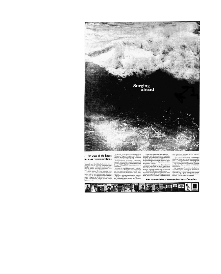
image artworks. The first such advertisement (Fig.
) – which appeared on
the same day in the Times, the Wall Street Journal, and the Chicago Tribune –
featured a large picture of a breaking wave, captioned ‘Surging ahead’, and
asserted that ‘Macfadden’s expansion program is founded on one widely
unrecognized, yet now fully documented truth: middle-class communications
media, especially middle-class magazines, do NOT effectively reach the mass consumer
.
. . . This is Macfadden’s conviction: the battle of the national brands will be
won or lost depending on the attitudes of mass, not middle-class, consumers’.
22
This bold claim was reinforced in at least four more full-page ads, each titled
with a provocative headline and then filled from margin to margin with three
columns of densely packed text. The headlines spoke directly to the anxieties
surrounding national brands: ‘Can Advertising Block Sales?’ (12/20/61, 68)
(Fig.
); ‘The Quality Revolution – New Hope for National Brands’ (3/7/
1962, 72); ‘Who Needs National Brands?’ (4/11/1962, 88); ‘Which Half of
the Market Needs National Brands?’ (5/16/1962, 84). The accompanying
texts reiterated and expanded the lunch pail campaign’s key points.
Macfadden’s recommended class strategy was juxtaposed to conventional
marketing, which promised that ‘classes sell the masses’: ‘advertise to the
people at the top and the masses will follow’.
That’s where the trouble started.
The masses don’t follow. Not anymore. The mass consumers, America’s working class
– the newest consumer sales phenomenon on the U.S. marketing scene – picks its
own path
. . . .
. . . a great myth has been perpetrated upon America’s business community. It goes:
Influence flows downward from the people in the upper levels to the masses in the
middle and lower levels.
Nothing could be further from reality.
23
Having established the independence of working-class consumers from upper
class influence, the advertisement proceeded to its main point:
22. 15 May 1961 in the New York Times, p. 32;
Wall Street Journal
, p. 11; Chicago Tribune, p. C6.
23. New York Times, 20 December 1961, p. 68.
218
OXFORD ART JOURNAL 33.2 2010
Anthony E. Grudin
http://oaj.oxfordjournals.org
Downloaded from
The best news of all is the attitude towards nationally advertised brands. In the face of
a sharp rise in retailer brand [e.g. private brand] competition, the wife of working class
America looms as a massive ally for the national manufacturer.
. . . Middle class
shoppers, with their higher cultural level, are secure in their buying judgments –
hence, have no qualms about buying private labels. Working class women, on the other
hand, are less sophisticated, less certain.
Many products are unfamiliar to them because heretofore they couldn’t afford to give
them a second thought. As a result, these women want to lean on the security derived
from buying a brand name that is nationally advertised by a company they know will
stand behind its brand. Moreover, to wage-earner women – unlike their middle class
opposites – the national brand is a status symbol. ‘(White collar wives, as you may
know, seek status elsewhere – e.g., country clubs, foreign cars and trips to exotic
vacation lands.)’
Fig. 1. Macfadden advertisement, The New York Times, 15 May 1961, 32.
OXFORD ART JOURNAL 33.2 2010
219
‘A Sign of Good Taste’
http://oaj.oxfordjournals.org
Downloaded from
The question of the empirical accuracy of Macfadden’s claims is in some ways
beyond the scope of this article. The advertisements were clearly biased;
their express goal was to sell advertising space in publications with an
established working-class readership. The claims they made in the service of
this goal are broad and difficult to verify. But a few things about the ads are
clear: first, they were supported by empirical research. Macfadden’s claims
relied heavily on the findings of Social Research, Inc. (SRI), a Chicago-based
firm. SRI’s findings were cited repeatedly in Macfadden’s ads, one of which
offered its readers a free copy of a Macfadden-issued paperback edition of
SRI’s Workingman’s Wife, a ‘penetrating analysis of the working-class wife’.
24
Second, they were well distributed and immensely visible. It would have
been difficult to be involved in the world of Madison Avenue advertising
during this period – as Warhol was – and to have been unaware of the
Lunch Pail campaign, or of the series of full-page advertisements in The
New York Times
and Wall Street Journal. Third and most important, the
Macfadden campaign seems to have been successful in drawing national brand
advertising to their magazines.
25
Put another way, whether or not Macfadden
was right in claiming that working-class consumers preferred national brands
for the reasons cited, they managed to convince the manufacturers of these
national brands to market their goods to this specific audience. One
Macfadden advertisement cited a 35% rise in advertising lineage for the
company’s ‘women’s group’ publications in the first quarter against an overall
downward trend in women’s magazine lineage.
26
The Times’ follow-up article
cited Macfadden’s vice president and advertising director as claiming that the
ad linage for the company’s ‘women’s group’ of magazines in 1962 would be
up 28% over 1961. The Times ran a third report eight months later, in June
of 1962, which informed the public that, as a result of its success, the
Macfadden campaign ‘had scrapped its grey pails and substituted gold ones’.
27
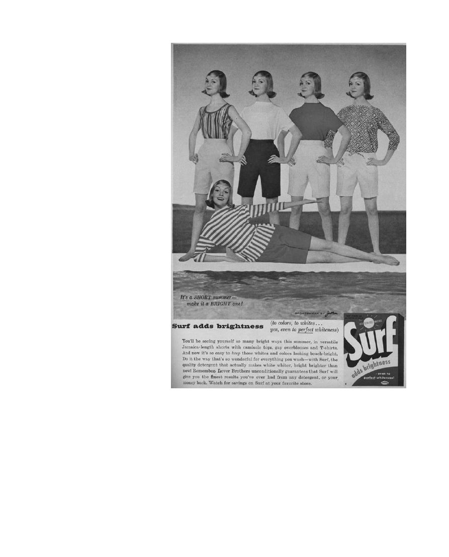
A survey of the advertising pages in Macfadden’s magazines from the late
1950s and early 1960s confirms the prominence of brand name goods. The
first sixteen advertisements in the June 1958 issue of True Story all featured
nationally branded commodities, as did every full-colour advertisement in the
issue (Fig.
). (Interestingly, the back pages of these issues were still
dominated by the drab black-and-white advertisements upon which Warhol
based his earliest pop artworks.) The full-colour advertisements touted
cosmetic and grocery items, and almost all followed the same basic pattern:
a large, vivid photograph of the advertised item in use, accompanied by a
textual description, and a picture of the item in its branded package in the
lower right-hand corner. In each case, the model and her enjoyment of the
product were intended to draw the viewer’s attention, and the accompanying
text to explain the product’s virtues, but the branded image in the lower
right-hand corner was the page’s last word, the mnemonic device
recommended by Tyler and meant to be retained until the consumer had
reached the proper aisle in the grocery store. Many of Warhol’s key brand
images of the early 1960s were borrowed from this same style of
advertisement.
28
Would Warhol have been aware of these arguments when he painted the
Campbell’s Soup cans? Their relevance to his work clearly does not depend
on proving that he was. The Macfadden campaign had gained enough
prominence during this period to be considered an important factor in these
works’ reception. The confluence between Tyler’s 1957 article, the
numerous newspaper accounts of a national brand crisis, and Macfadden’s
1961 – 62 campaign suggests that these ideas had achieved a wide audience
Fig.
2. Macfadden
advertisement,
The
New York Times, 20 December 1961, 68.
24. New York Times, 16 May 1962, p. 84. Quotes
from the study’s working-class subjects confirmed
this view: ‘I have a tendency to go toward
name-brands. I think they stand behind their
things better.’ [. . .] ‘I don’t trust off brands. Too
many of them might not be good. I want the
people who sell me something to back up the
brand’ (Lee Rainwater, Richard P. Coleman and
Gerald Handel, Workingman’s Wife [Oceana
Publications: New York, 1959], p. 166).
25. Peter Bart, ‘Advertising: A Shift for
Dristan’, New York Times, 27 June 1962, p. 51.
26. New York Times, 11 April 1962, p. 88.
27. Bart, ‘Advertising: A Shift for Dristan’,
p. 51.
28. This is true of one of the two early Coca Cola
works, Peach Halves, and the Mo¨nchengladbach
type Campbell’s Soup Cans. See Catalogue Raisonne´,
figs 23 – 4, 27, 28, 60, 63.
220
OXFORD ART JOURNAL 33.2 2010
Anthony E. Grudin
http://oaj.oxfordjournals.org
Downloaded from
within the advertising and media industries. Throughout these accounts,
supermarkets were repeatedly emphasised as one of the most volatile arenas
for brand competition. Warhol’s classic brand image artworks borrowed
exclusively from supermarket products; this is the primary shared feature of
the Brillo boxes, soup cans, cola bottles, six packs, and coffee labels. At the
very least, then, the crisis of the brand image has to be recognised as an
important contributing element in the reception of Warhol’s work, and in its
broader historical context.
That said, a strong case can be made for Warhol’s awareness of these issues.
Warhol worked as an illustrator for The New York Times from 1955 through
October 1962, a period that included every major Macfadden article and
advertisement, as well as scores of other articles on the national brand
Fig. 3. Surf advertisement, True Story, June 1958, 25.
OXFORD ART JOURNAL 33.2 2010
221
‘A Sign of Good Taste’
http://oaj.oxfordjournals.org
Downloaded from

‘crisis’.
29
Furthermore, the specific brand images that Warhol chose to borrow
during the early 1960s were directly implicated in the ’battle of the brands. The
Warhol Catalogue Raisonne´ lists seventy-two brand image paintings made during
the period from 1961 to 1963. Of these, two-thirds (fourty-eight) were derived
from the Campbell’s Soup label. Roughly one-fifth (fifteen) were derived from
Coca-Cola advertising. The remaining works are split among Martinson Coffee
(six), Schlitz beer (one), Del Monte canned fruit (one), and Pepsi-Cola (one).
Although not all of these brands were directly cited in the discourses
surrounding the national brand crisis, the most prominent were, and all were
affected by the shifting marketing and sales strategies that characterised this
period. Coca-Cola and Campbell’s Soup, Warhol’s two most iconic and
familiar brand motifs, were both actively involved during the 1950s with
projects to improve the images of their brands. Del Monte had initiated a
similar project. Martinson and Schlitz, by contrast, were attempting during
this same period to transfer previously high status brands into a working-class
market.
Of all Warhol’s brand image motifs, Campbell’s Soup is the most closely
linked to the battle of the brands. In his interview with The New York Times
on the occasion of the first day of the lunch pail campaign, Macfadden Inc.’s
vice president and advertising director used Campbell’s to illustrate his
fundamental point:
The middle class wife feels free to serve any kind of private label soup, for example,
but the working class wife derives status and confidence by serving Campbell’s Soup.
30
In many ways, Campbell’s perfectly exemplified the national brand problem: a
food that had never been particularly valued for its quality was now being sold
on the basis of status. Writing in the Journal of Marketing in 1958, Clarence
Eldridge, Campbell’s ex-vice president of marketing, described this method
of advertising as ‘Franchise Building’, and traced its roots to the Nazi theory
of propaganda: ‘This kind of advertising seeks to exploit, in a perfectly
legitimate manner, the Nazis’ hypothesis (unfortunately, in that case,
perverted to evil use) that “if you tell it often enough, long enough, it will
be believed.” As applied to honest advertising claims, this principle is
perfectly sound – and as a matter of fact is the fundamental basis for
practically all “franchise building” advertising’.
31
Eldridge used Campbell’s
Soup as his first example for the necessity of franchise building. It was
Campbell’s image as a cheap food that necessitated this endeavour: ‘the
notion of soup as something that is merely inexpensive, or convenient, or
filling must be destroyed, and a new concept put in its place’ (250).
Although its product was not directly mentioned in the Macfadden campaign,
the Coca-Cola Company also seems to have been well aware of the potential
benefits of marketing their product to working-class consumers by
emphasising the status its consumption supposedly bestowed. The company’s
Annual Report to Stockholders
of 1956 even announced that the company had
added a second product slogan in order to further emphasise status over
taste, or rather to conflate one into the other:
Wherever Coca-Cola is present, in any land or climate, it is a sign of good taste. The
special enjoyment and pleasure which one realizes from the unique taste of Coca-Cola
is always our chief product distinction. At the same time, the special status of
Coca-Cola as a social amenity of distinctive prestige is recognized by hosts and guests
everywhere. ‘So good in taste
. . . in such good taste’. Coca-Cola is liked for itself, as
well as for its significance. It is always A SIGN OF GOOD TASTE.
32
29. Warhol’s final illustration for the Times seems
to have run on 26 October 1962 (Marylin Bender,
‘Shift to Low Sneakers Still Plagues Mothers,’
p. 48).
30. Bart, ‘Blue Collars’, p. 34.
31. Clarence E. Eldridge, ‘Advertising
Effectiveness: How Can It Be Measured’, Journal
of Marketing
, vol. 22, no. 3, January 1958, p. 249,
emphasis original.
32. Coca-Cola Annual Report to Stockholders, 1956
(The Coca-Cola Company: New York, 1956),
p. 7.
222
OXFORD ART JOURNAL 33.2 2010
Anthony E. Grudin
http://oaj.oxfordjournals.org
Downloaded from

The Annual Report described the transition from exchange and use value to sign
exchange value as being driven by class aspirations. Good taste (the taste of the
soda) became ‘good taste’ (high-status taste) when consumers were encouraged
to value Coke less for how it tasted or made them feel, and more for what it
represented – what it was ‘a sign of ’ – and how its purchase was seen to
improve their social status. The 1957 report came close to recognising this
project’s inherent paradox: Coke was at once ‘a social amenity – a sign of
good taste’ and ‘the most popular refreshment beverage in the world’.
33
The
drink’s exclusivity was fundamentally illusory, and could only be maintained
through advertising. In this way, Coke was able to establish an imaginary
distance between its product and its chief competitor, Pepsi-Cola, which ‘was
plagued by its past image as a lot of drink for little money – oversweet
bellywash for kids and poor people’.
34
‘Think Rich. Look Poor’. Brand Image Borrowings
Up to this point, this article has defended a fairly straightforward thesis: rather
than being ubiquitous and transparent, the national brand images that Warhol
borrowed in his artworks of the early 1960s were designed and mobilised to
target working-class consumers. If this much is established, important
interpretative questions remain: do the specific histories and strategies of
Warhol’s borrowed brand images contribute to the meaning of the works in
which they appear? Were these histories and strategies made visible in
Warhol’s work, or did his work ultimately assist in their disappearance?
Writing on pop, Greil Marcus has argued that
there is
. . . very little true pop visual art: very little that actually tells stories of and in
the modern market, that does not keep its distance – its distance from the images it
seizes, its distance from the noise it seeks to replicate, its distance from the speed,
flash and glamour it wishes to capture and contain: its distance from itself.
35
Were Warhol’s artworks able to tell stories of the modern market, or did they
ultimately keep their distance, and turn these stories into empty signs?
The first thing to acknowledge is that Warhol’s brand image artworks did
eventually help to turn their motifs into empty signs. They did this by
moving images of the cola bottle and the soup can out of the magazine and
the grocery store and into the bourgeois art gallery and museum, thereby
assisting in the ‘universalization’ of imagery that had previously been
considered as having limited socioeconomic appeal. The works’ quick and
comprehensive incorporation into the Western canon, the ramping up of the
Warhol myths, the artist’s seemingly complete capitulation to the demands of
profitability in his later work, and his contemporary crowning as the
supposed ‘most important international artist of the 20th century’ have all
helped to universalise the appeal of the brand image, as have the manifold
attempts to quarantine Warhol’s work in a depoliticised neo-avant-garde
tradition.
36
As one of Warhol’s early collectors put it, ‘The only reason
you’ll know they’re art is because they’re in my house’.
37
This is a real
consequence of Warhol’s work; it may be embarrassing to his admirers, but
it should not be disregarded.
38
This universalisation certainly has not been
overlooked by the companies whose images Warhol borrowed; they have
been quick to recuperate the value he added to their brands. The recent
Warhol exhibit at the Coca-Cola headquarters in Atlanta, where a cease and
desist letter sent by Coke’s lawyers to Warhol in the 1960s was on display, is
33. Coca-Cola Annual Report.
34. Mark Pendergrast, For God, Country and
Coca-Cola
(Basic Books: New York, 2000), p. 259.
The other brand images Warhol chose to borrow
for his work were reliant on similar strategies.
Martinson coffee originated as an up-market
brand. But by the early 1950s, with instant coffee
sales reaching 17% of total coffee consumption,
Martinson began to market a low-cost brand. By
the time Warhol borrowed the Martinson label,
the company was effectively using the built-in
prestige of an established label to sell cheaper
coffee to poorer consumers. See Mark
Pendergrast, Uncommon Grounds: The History of
Coffee and How it Transformed our World
(Basic
Books: New York, 1999), pp. 198, 240 – 1.
Schlitz beer effected a similar transformation.
Marketed in the 1920s in upperclass magazines
like the New Yorker for its purity (see, for instance,
The New Yorker
, 28 February 1925, p. 97), the
brand was, by the 1950s, widely identified with
working-class consumers.
35. Greil Marcus, ‘No Money Down: Pop Art,
Pop Music, Pop Culture’, unpublished
manuscript; printed in Foster and Francis (eds),
Pop: Themes and Movements
, p. 210.
36. Angus Maguire, head of contemporary art at
Bloomsbury Auctions, cited in Dalya Alberge,
‘Move over Picasso. Mass appeal pushes Warhol
to the top of art market’, http://entertainment.
timesonline.co.uk/tol/arts_and_entertainment/
visual_arts/article1723156.ece; [accessed 2
February 2008.]
37. Leon Kraushar quoted in Zinsser, Pop Goes
America
, p. 28.
38. It is why scholars can still generalise Warhol’s
‘classic sixties imagery’ as the ‘opium of the
American middle class’ (Trevor Fairbrother,
‘Skulls’, in Gary Garrels (ed.), The Work of Andy
Warhol
, p. 101), or as ‘seeking the desires of the
consumer’ (Caroline Jones, Machine in the Studio
[University of Chicago Press: Chicago, 1996],
p. 189).
OXFORD ART JOURNAL 33.2 2010
223
‘A Sign of Good Taste’
http://oaj.oxfordjournals.org
Downloaded from

only the latest milestone in this history. As Peter Schelstraete, Coca-Cola’s
global brand director, put it recently, ‘Andy Warhol was one of our best
brand directors’.
39
The work done by Warhol’s artworks in the actual
universalisation of the brand image should remind us that the process of
commodity universalisation has and continues to have its moments of relative
strength and weakness. Warhol’s work should not be mistaken as merely a
reflection of – or on – the spread of commodification and spectacularised
society; it needs to be recognised instead as having made a specific and
timely contribution to those processes, whether or not it did so intentionally.
And yet this impertinent universalisation cannot be isolated as the sole legacy
of Warhol’s brand image borrowing. The consistent and immediately
recognisable style of his brand image artworks is by no means neutral or
transparent.
Instead,
it
responded
eloquently to
an
unprecedented
development in the history of American culture: the production and
distribution of a readymade visual vocabulary targeted at the working class.
Two key general elements of Warhol’s style, long recognised by
commentators, are illuminated by – and in turn, illuminate – the specific
history of the branded image and its strategic targetings. The first is these
works’ apparent reverence for the images they borrow and duplicate.
Warhol’s brand image artworks were the first major artistic attempt to make
these images their exclusive subject matter. The works are large and
formidable; they assert the importance of their motifs, their adequacy as
independent subjects for representation. Warhol is alone among the artists of
this period in his ability to resist the temptation to reduce the brand image
to one component in a larger drama.
40
In Warhol’s work, the drama inheres
solely in the brand image itself, and in the possibility of its reproduction.
This drama of reproduction forms the second key element of Warhol’s style.
Brand images were neither appropriated (in the sense of being directly imported
as material, as in the work of Paolozzi, Johnson, or Vostell) nor drawn in
Warhol’s work; they were inaccurately reproduced with mechanical
techniques. Its ‘slurs and gaps and mottlings and tics’ set Warhol’s work
apart from that of his contemporaries, who tended, when they adopted
brand images, either to appropriate their motifs directly (as in collage), to
reproduce them in an impeccably slick style, or to emphasise the artist’s
hand in their depictions.
41
As James Rosenquist put it in 1964, ‘One thing,
though, the subject matter isn’t popular images, it isn’t that at all’.
42
Attempts to read these works as appropriations too often fail to account for
their blatant and consistent divergence from their actual motifs. Even the
cleanest works, like Coca-Cola [3] (1962), are haunted by ghost lettering and
shaky script.
43
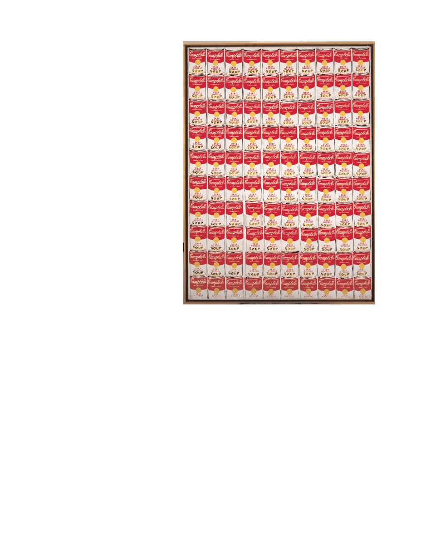
Some of the imperfections in the Campbell’s Soup Can works
are relatively subtle: contours always slightly shaky and inconsistent, lines
that should be parallel and are not, transparently hand-made and irregular
lettering. But a glaring inconsistency occurs at the centre of every early 1960s
Campbell’s Soup Can
: the engraved gold medallion from ‘the Exposition
Universelle Internationale’ is always left either blank or, in rare cases,
unfinished (Fig.
). In place of the medallion, designed by J. C. Chaplain for
the 1900 Exposition in Paris, the works have a blank gold circle, which
varied in hue from work to work, and often retained faint but legible
brushwork. Through this absence, the product’s old-fashioned seal of quality
and authenticity is rhetorically revealed to be irreproducible. These distinct
and irreducible imperfections can be identified throughout Warhol’s work,
and should probably be recognised as a defining element of his style; they
39. http://abcnews.go.com/Entertainment/
wireStory?id=3131074; [accessed 5 February
2008.]
40. It bears repeating that other artists’ interest
in brand images anticipated or coincided with
Warhol’s. British and European pop and de´collage
artists like Jacques de la Villegle´, Raymond Hains,
Eduardo Paolozzi, Richard Hamilton, Peter
Blake, Wolf Vostell, Derek Boshier, David
Hockney, and Mimmo Rotella included brand
images in their art – variously through
appropriation, reproduction, and depiction – but
these images were always integrated into a larger
whole, brimming with metaphor or facture or
both. American painters, photographers, and
filmmakers like Rudy Burckhardt, William Klein,
Ray Johnson, Larry Rivers, Tom Wesselmann, Ed
Ruscha, Billy Al Bengston, Allan D’Arcangelo,
William Eggleston, Gary Winogrand, and Lee
Friedlander also brought the brand image into
their art during this period, but they too used
these images as one element of a larger narrative
or metaphor.
41. Kirk Varnedoe, ‘Campbell’s Soup Cans’,
p. 43. Warhol almost never worked with
ready-made appropriations during the 1960s.
Exception are the You’re In series, a group of silver
painted Coca-Cola bottles produced by Warhol in
1967, and Bomb ’67, a silver-sprayed air force
practice bomb from the same year.
42. G. R. Swenson, ‘What is Pop Art, Part II’,
Art News
, February 1964, p. 64.
43. The ghost lettering is visible under the
cropped ‘Coca-Cola’ script, but only when
viewed in person or in excellent reproductions.
224
OXFORD ART JOURNAL 33.2 2010
Anthony E. Grudin
http://oaj.oxfordjournals.org
Downloaded from
are, as David Antin put it in 1966, the ‘precisely pinpointed defectiveness that
gives [Warhol’s] work its brilliant accuracy’.
44
Compelling precedents for these two stylistic elements exist in Warhol’s
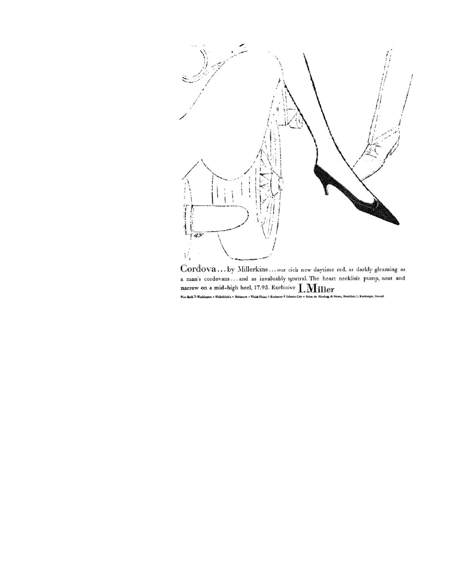
prolific and inventive advertising illustrations of the mid-1950s. The I. Miller
shoe advertisements, which Warhol worked on throughout most of the
second half of the decade, are particularly instructive in this regard. The
recurrent subject of these advertisements is shoe fetishism, but primarily of a
commodity rather than a sexual type. Shoes are treated in these ads as the
key actors in various dramas, and are continually depicted as more interesting
and vital than their human counterparts. In one ad (Fig.
), two ‘Little Black
Silk Shoes’ take centre stage before a bevy of waiters and bellhops, who
seem to be serving the shoes rather than the woman who wears them. In a
striking series of four ads, each published on a separate page of the same
day’s paper, a ‘female’ and a ‘male’ shoe are shown in the early stages of a
romance (Fig.
). (As Warhol would put it to an interviewer in 1971, ‘One
fur coat talks to another fur coat’.
45
) As in the brand image artworks,
overvaluation is half of these images’ effectiveness. But a second drama is
Fig. 4. Andy Warhol, 100 Cans, 1962, Oil on canvas, 182.9
× 132.1 cm. Collection Albright-Knox Art
Gallery, Buffalo, NY. Gift of Seymour H. Knox, Jr., 1963. # 2010 The Andy Warhol Foundation for the
Visual Arts, Inc. / Artists Rights Society (ARS), New York.
44. David Antin, ‘Warhol: The Silver
Tenement’, Art News, vol. 65, no. 4, Summer
1966, p. 59.
45. Marian Christy, ‘Andy Warhol Doesn’t Trust
You’, Boston Sunday Globe, 7 February 1971,
p. 76A.
OXFORD ART JOURNAL 33.2 2010
225
‘A Sign of Good Taste’
http://oaj.oxfordjournals.org
Downloaded from
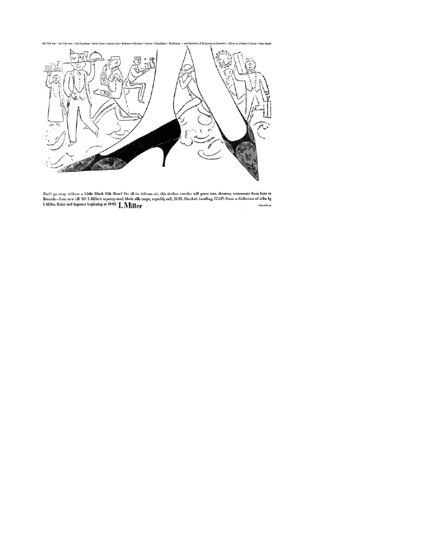
constantly layered under the first. Here, the action is reproductive: can this
quivering, amateurish, irregular line possibly hold itself together long enough
to render the delicate and elegant contours of a ‘copper colored calf pump’?
The answer is never seriously in doubt: the line is always only flirting with
failure, never actually risking it. This flirtation with mess and imperfection
endows the images with whimsy, and sets Warhol’s work apart from that of
almost every other illustrator working in this period. The competitors are
polished and precise by comparison, and therefore completely bereft of the
rhetoric of desire mobilised by Warhol’s line.
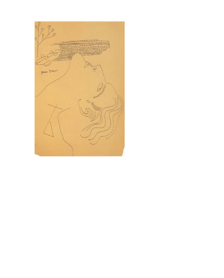
A second important precedent for these stylistic elements is Warhol’s
homoerotic work of the mid- and late 1950s. In these drawings, the virtuoso
quality of his line is often enlivened by a subtle wavering, which seems to
suggest a psychological strain. This tension between virtuoso-erotic
communion and the imperfections of visual reproduction is activated in
Warhol’s James Dean drawing (Fig.
), from 1955, where the perfectly
smooth line of the dead figure’s sculpted chin intersects the brick wall in the
background, against which the figure’s upturned car has come to rest. Where
the contour of the neck and chin are effortless and elegant, the brick wall –
here the sign both of death and, in its relationship with the figure’s chin,
penetration – is defined by irregularity and imperfection. The presumed
regularity and precision of the wall’s geometrically regular form serve to
highlight the faultiness and irregularity of its reproduction. Penetration is
attached, in this image, not just to death but also to the impossibility of
visual reproduction. But this impossibility is also figured – melodramatically
in the tree with its imperfect little heart-shaped leaves – as a sign of
distance and desire. The line stalls and awkwardly blots; it seems to get
stuck at certain moments, as though too consumed with looking at the
image – too overpowered by it – to reproduce it smoothly. ‘I can’t
understand why I was never an abstract expressionist’, wrote Warhol,
‘because with my shaking hand I would have been a natural’.
46
Fig. 5. Andy Warhol, I. Miller advertisement, The New York Times, 24 August 1958, 93.
46. Andy Warhol, The Philosophy of Andy Warhol,
p. 150.
226
OXFORD ART JOURNAL 33.2 2010
Anthony E. Grudin
http://oaj.oxfordjournals.org
Downloaded from
To return to Antin’s formulation, defectiveness produces accuracy in
Warhol’s work – pop and pre-pop – because it is mobilised stylistically as a
marker of subjective desire and objective desirability. Read as the subjective
remnant of the artist’s hand, the irregular, quivering contour line
demonstrates the anxieties of looking and of visual reproduction. It signals –
rhetorically or indexically – the intensity of the artist’s efforts to reproduce,
and their eventual succumbing to the forces of attraction and desire.
Simultaneously, however, the defections of the contour line attest to the
perfection and irreproducibility of the motif, which is presented – in and
through this reproductive defectiveness – as being beyond the reach of visual
reproduction. Reproductive defectiveness thus connotes both a rhetoric of
subjective desire and a structural iconoclasm; the two connotations are
complementary and mutually reinforcing. Desire and desirability – perfection
of the motif and imperfection of the reproductive process – enliven each
other in neat circuitries.
When this stylistic device was applied in the homoerotic drawings to a man’s
image of a beautiful man, it signalled both the attractiveness and the difficulty of
attaining homoerotic union: ‘Kiss me with your eyes’ was apparently one of
Warhol’s favourite expressions.
47
When it was applied to a high-end shoe, it
signalled the intense desirability – again, the attractiveness and the relative
difficulty – of attaining the beautiful luxury commodity. In both instances,
Warhol’s stylistic approach was effective but by no means groundbreaking, in
Fig. 6. Andy Warhol, I. Miller advertisement, The New York Times, 16 October 1955, 95.
47. George Klauber, cited in Bockris, Warhol: The
Biography
, p. 90.
OXFORD ART JOURNAL 33.2 2010
227
‘A Sign of Good Taste’
http://oaj.oxfordjournals.org
Downloaded from
part because luxury goods and beautiful bodies have long been recognised as
highly desirable.
48
But when this stylistic strategy was applied to the
mechanically aided reproduction of a schematised and disposable image of a
cola bottle or a soup can, it signalled something entirely new in fine art: a
subject who could somehow value the image of a soup can or a cola bottle
enough to want desperately to reproduce it.
49
Like the aspiration to mass
cultural participation, during the late 1950s and early 1960s, this intense
attachment to brand images was widely identified with working-class
consumers. With the brand image artworks, Warhol upped the stakes on this
aspiration, by consistently foregrounding the impossibility of visually
reproducing these images even with the aid of the best available
consumer-grade creative technologies – opaque projectors, photostatic
copies, and eventually silkscreening, photography, film, and video.
50
It is
here that Walter Benjamin’s ‘The Work of Art in the Age of Its
Technological Reproducibility’ could have real bearing on Warhol’s project,
except that from this angle – and in contrast to the way this comparison is
usually deployed – it is Warhol who critiques and illuminates Benjamin.
51
Fig. 7. Andy Warhol. James Dean, 1955. Ball-point ink on tinted paper, 44.8
× 29.8 cm. The Brant
Foundation, Greenwich, CT. # 2010 The Andy Warhol Foundation for the Visual Arts, Inc. / Artists
Rights Society (ARS), New York.
48. Ben Shahn’s line drawing style has long been
recognised as an important precedent for
Warhol’s blotted line technique (see Patrick
S. Smith, Andy Warhol’s Art and Films (UMI Press:
Ann Arbor, 1986), pp. 248 – 9), while Benjamin
Buchloh has pointed out that his ‘decadent style’
borrows directly from Aubrey Beardsley, Jean
Cocteau, and Charles Demuth (‘The Andy
Warhol Line’, in The Art of Andy Warhol, p. 53).
49. Mary Anne Staniszewski makes a related
point regarding the relationship between Warhol’s
1950s sketches of Elvis, and his Elvis paintings of
the early 1960s: ‘In the Fifties sketch, the artist’s
fetishism is directed at Elvis Presley; in the
Sixties, it is redirected to the system of repetition
and exchange that creates cultural codes’ (‘Capital
Pictures’, in Post-Pop Art, p. 166). One goal of this
article has been to make this fetishism specific and
historical.
50. As William S. Wilson pointed out in 1968,
‘Silk-screening makes repetition part of the
meaning of the image.. . . Warhol repeats these
images until repetition is magnified into a theme
228
OXFORD ART JOURNAL 33.2 2010
Anthony E. Grudin
http://oaj.oxfordjournals.org
Downloaded from

The utopian possibility of mechanical reproduction was, for Benjamin, the
possibility of a truly common and open cultural sphere.
52
This is the great
promise of the newspaper, where everyone can be an author, but also of the
camera, the tape recorder, the projector, and the silkscreen.
53
Still and
movie camera sales were booming in the late 1950s, and manufacturers were
paying special attention to their down-market models.
54
The back pages of
Macfadden’s magazines were littered with ads for photographic services; the
June 1958 issue of True Story had eight such ads in its final seventeen pages –
promises of cash for baby photos; a service that converted snapshots and
negatives into enlarged oil paintings – sharing space with ‘POEMS
WANTED’, ‘BANISH UNWANTED HAIR’, ‘The Opposite Sex and Your
Perspiration’ (Fig.
).
‘The Gong Show’: Manufactured Alienation and Failure as Spectacle
This article has argued that the images of desire mobilised in Warhol’s classic
pop artworks were fundamentally class specific, and that their relationship
with the class to which they were marketed was troubled and contradictory;
the point has been to de-universalise the brand image, and to reconstruct the
history of its origins. But, in this same spirit, it is crucial to remember that
the working class itself was by no means homogeneous during the 1960s,
and that the desires and frustrations inscribed in Warhol’s work were
themselves not just classed, but racially specific as well. The ‘working class’
referred to by most advertisers and targeted by the vast majority of
advertising campaigns during this period was implicitly white. A closer look
at the evidence reveals that the reasons for this exclusion were at least as
strategic as they were discriminatory. Appearances to the contrary, the
post-war US advertising industry recognised the African-American working
class as a substantial and desirable market. Nevertheless, the logic of
working-class consumerism dictated that it would be counterproductive to
engage this market directly. Instead, marketers viewed the African-American
working class as being doubly afflicted by the doubts and insecurities that
characterised their white counterparts; advertising directly to their interests
was thus judged to be counterproductive.
55
Like the working class, African-American consumers were thought to be
more susceptible than their more privileged counterparts to the status
supposedly conferred by the branded commodity. Brand attractiveness and
social insecurity, whether racial or economic, went hand in hand, and one
insecurity could compound another:
The Negro
. . . will spend much more money on food, clothing, appliances, automobiles,
and other items in order to help overcome his insecurity neurosis. The result has been
that Negro standards of living in many categories of goods are a match for white
standards. When matched on an income level, the Negro standards are often higher,
particularly when it concerns something he can wear, use himself, or consume
personally.
56
The social realities of this so-called ‘insecurity neurosis’ were fleshed out in
more detail by Marcus Alexis:
It has been claimed that Negros spend more for food and clothing than do whites in
the same income bracket, because discriminatory housing practices preclude equal
opportunity to enjoy better dwellings.
. . . This phenomenon is of great importance to
Fig. 8. Advertisements, True Romance, May
1958, 123.
of variance and invariance, and of the success and
failures of identicalness. The silk-screening . . . is
used sloppily by Warhol, allowing sentiment and
lack of sentiment, care and carelessness, to jostle
together’ (‘Prince of Boredom: The Repetitions
and Passivities of Andy Warhol’, Art and Artists,
March 1968, pp. 12 – 15; reprinted in Pop Art: A
Critical History
, p. 291).
51. For readings of Benjamin’s relevance to
Warhol, see Rainer Crone, Andy Warhol (Praeger:
New York, 1970) and Andreas Huyssen, ‘The
Cultural Politics of Pop’, in Post-Pop Art, pp. 45 –
77.
52. Benjamin had his own concerns about
commercial film: ‘In western Europe today, the
capitalist exploitation of film obstructs the human
being’s legitimate claim to being reproduced.
Under these circumstances, the film industry has
an overriding interest in stimulating the
involvement of the masses through illusionary
displays and ambiguous speculations’ (‘The Work
of Art in the Age of Its Technological
Reproducibility [Third Version]’, trans. by
H. Zohn and E. Jephcott, in Howard Eiland and
Michael Jennings (eds), Walter Benjamin: Selected
Writings, 1938 – 1940
[Belknap Press: Cambridge,
2003], p. 263).
OXFORD ART JOURNAL 33.2 2010
229
‘A Sign of Good Taste’
http://oaj.oxfordjournals.org
Downloaded from

many sellers. It is a product of the institutional setting which may not change for some
time.
57
The argument is both logical and breathtakingly cynical: American traditions of
racism and discrimination were seen to render the African-American community
an especially easy target for consumer goods, a target so easy that advertising for it
would be redundant. As a 1965 article in the Journal of Marketing put it,
The once prevalent stereotype that Negroes were uninterested in, or incompetent to
judge, the quality of goods has long been displaced – with the contrary image now of
Negroes being extremely interested in quality, and being even more concerned with the
symbolic value of goods than are whites (2).
Where working-class ‘insecurities’ were, during the 1950s, mainly socially and
economically enforced, racial ‘insecurities’ were implemented not just socially
and economically but juridically as well. Alexis and Sponsor and the Journal of
Marketing
all seemed quite comfortable in their claims that these
circumstances – an ‘institutional setting which may not change for some
time’ – constituted a boon for American advertisers. For the advertising
industry, the institutionalised racism of the post-war period sustained a class
of African-American ‘super-consumers’, so desperate for the status conferred
by objects that they rendered directed advertising superfluous.
Testifying before New Jersey’s Lilley Commission on the Newark riots of 1967,
Amiri Baraka confirmed the ubiquity of white advertising in African-American
communities: ‘The poorest black man in Newark, in America, knows how
white people live. We have television sets; we see movies. We see the fantasy
and the reality of white America every day’.
58
But, as pervasive as white
advertising was, the actual attainment of the products on offer was another
matter. Baraka put the point bluntly in his poem ‘BLACK PEOPLE!’ published
in December of the same year: ‘What about that bad short you saw last week
on Frelinghuysen, or those stoves and refrigerators, record players, shotguns,
in Sears, Bambergers, Klein’s, Hahnes’, Chase, and the smaller, joosh
enterprises? You know how to get it, you can get it, no money down, no
money never. . . . All the stores will open up if you will say the magic words.
The magic words are: Up against the wall mother fucker this is a stick up!’
59
Institutionalised racism was, during the post-war period, explicitly recognised
and celebrated by the advertising industry as a special opportunity for
brand-image marketing; the frustration and violence this situation produced
should never be misidentified as merely aesthetic.
Writing in 1965, Guy Debord described the Watts riots in the following terms:
The Los Angeles rebellion was a rebellion against the commodity.
. . . Like the young
delinquents of all the advanced countries, but more radically because they are part of
a class totally without a future, a sector of the proletariat unable to believe in any
significant chance of integration or promotion, the Los Angeles blacks take modern
capitalist propaganda, its publicity of abundance, literally. They want to possess
immediately all the objects shown and abstractly accessible because they want to use
them.
. . . Through theft and gift they rediscover a use that immediately refutes the
oppressive rationality of the commodity, revealing its relations and manufacture to be
arbitrary and unnecessary.
. . . People who destroy commodities show their human
superiority over commodities.
60
There is no denying that Warhol’s work from the early 1960s fell far short of
‘the potlatch of destruction’ described by Baraka and Debord. Where the Watts
and Newark rioters destroyed and repossessed concrete objects, Warhol’s work
53. I examine the force of these promises at
greater length in my dissertation Television Dreams
(Berkeley, 2008).
54. See Donald C. Bacon, ‘Camera Makers
Automate, Simplify Picture Snapping, See New
Lines as Spur to Sales’, Wall Street Journal, 30
March 1959, p. 5; and Thomas O’Toole,
‘Photography Industry Expects Sales To Hit High
in ’58 Despite Recession’, Wall Street Journal, 8
April 1958, p. 4.
55. Harold H. Kassarjian, ‘The Negro and
American Advertising, 1946 – 1965’, Journal of
Marketing Research
, vol. 6, no. 1, February 1969,
pp. 36, 39.
56. ‘The Forgotten 15,000,000. . . Three Years
Later’, Sponsor, vol. 6, 28 July 1952, pp. 76 – 7;
cited in Alexis, 121.
57. Marcus Alexis, “Pathways to the Negro
Market,” The Journal of Negro Education, vol. 28,
no. 2 Spring 1959, p. 121;.
58. Cited in Lizabeth Cohen, A Consumers’
Republic
(Alfred A. Knopf: New York, 2003),
p. 377; Cohen’s discussion of this period is
particularly insightful. See also James Smethurst,
‘“Pat Your Foot and Turn the Corner”: Amiri
Baraka, the Black Arts Movement, and the Poetics
of a Popular Avant-Garde’, African American
Review
, vol. 37, nos. 2/3, Summer – Autumn
2003, pp. 261 – 70.
59. Cohen, p. 377.
60. Guy Debord, ‘The Decline and Fall of the
Spectacle-Commodity Economy’, [1966], in Ken
Knabb (ed.), Situationist International Anthology
(Bureau of Public Secrets: Berkeley, 1989),
p. 155.
230
OXFORD ART JOURNAL 33.2 2010
Anthony E. Grudin
http://oaj.oxfordjournals.org
Downloaded from

haltingly reproduced their associated images; where the rioters presented an
ardent and ambitious challenge to the world of commodities, Warhol’s
provocations were always tinged with doubt and insincerity; where the
rioters were fuelled by racial and working-class frustration and hopelessness,
these motivations became at least partially rhetorical in Warhol’s work –
they were used to draw crowds and sell paintings, not to tear down Los
Angeles. But, for these same reasons, Baraka’s and Debord’s descriptions are
deeply relevant to Warhol’s project. Throughout the early 1960s and beyond,
Warhol’s work pretended to take the ‘publicity of abundance’ literally, at
least as it applied to images. Warhol’s contemporary culture promised and
emphasised cultural reproducibility, even as it simultaneously blocked it. For
the first time in American marketing, it was the literal image being
marketed, not the product, nor its quality, nor even the connotations it was
promised to carry. These images were artistically produced – designed,
drawn, painted, and printed – but they were not intended to be reproduced
artistically. Their trajectory was specific and unidirectional: from the drawing
board to the supermarket to the cupboard. Even as the spectacle of cultural
productivity was increasingly being marketed, true aesthetic feedback
occurred only as consumption; designs that failed to sell might be
discontinued or altered. In his work, Warhol made a show of cashing in on
these promises. He effectively made a (highly successful and lucrative)
spectacle out of his purported distance from spectacular productivity. The
paradoxes inherent in this strategy account for the strange arc of Warhol’s
career, his works’ lasting power and ambivalence. This ambivalence
penetrated every aspect of Warhol’s persona: the notoriously ill-fitting wig,
the almost imperceptible voice, the ‘inanimate’ handshake.
61
And it is
equally visible in Warhol’s aphorisms, where cultural accessibility and
egalitarianism are constantly being held out as false promises, pleasant but
impossible dreams:
I’m confused about who the news belongs to. I always have it in my head that if your
name’s in the news, then the news should be paying you. Because it’s your news and
they’re taking it and selling it as their product.
There should be supermarkets that sell things and supermarkets that buy things back,
and until that equalizes, there’ll be more waste than there should be.
. . . We all have
something, but most of what we have isn’t saleable, there’s such a preference today for
brand new things. People should be able to sell their old cans, their old chicken bones,
their old shampoo bottles, their old magazines. We have to get more organized.
62
These utopian visions are always presented in Warhol’s work and writings as
dreamy impossibilities. The entertainment value lies in the pathetic inability
actually to attain the visions of accessibility and equality that are trumpeted.
In this respect, Warhol’s work clearly set the precedent for the spectacles of
cultural failure that are today so dominant: the Gong Show/American Idol
model of culture, where the appeal lies in the contestants’ inability
successfully to reproduce the cultural ideals they emulate, and in the
merciless criticism they almost invariably receive from ‘celebrity judges’.
Through this process, cultural failure is spectacularised and converted into
cultural success. American Idol is, in the words of one contemporary
magazine, ‘the country’s great uniter, bringing together rich and poor, blue
state and red, Gershwin-loving grandmas and text-happy tweens – a rare
instance of cultural consensus in an increasingly fractured age’.
63
Instead of
being sold only the spectacle of their possible participation in mass culture,
consumers are today simultaneously consoled by the spectacle of their peers’
61. Sterling McIlhenny and Peter Ray, ‘Inside
Andy Warhol’, Cavalier, 1966; reprinted in
Kenneth Goldsmith, Reva Wolf and Wayne
Koestenbaum (eds), I’ll Be Your Mirror: The Selected
Andy Warhol Interviews: 1962 – 1987
(Carroll &
Graf: New York, 2004), p. 97. To my mind, the
great precedent for Warhol’s studied indifference
is not Duchamp, but rather Manet’s barmaid at
the Folies-Berge`re: ‘if one could not be bourgeois
– if that status was always pushed just a little
further out of reach – then at least one could
prevent oneself from being anything else: fashion
and reserve would keep one’s face from any
identity, from identity in general. The look which
results is a special one. . . . Expression is its
enemy, the mistake it concentrates on avoiding at
all costs; for to express oneself would be to have
one’s class be legible’ (T. J. Clark, The Painting of
Modern Life
, rev. ed. (Princeton University Press:
Princeton, 1999), p. 253).
62. The Philosophy of Andy Warhol, pp. 78, 145.
63. Josh Eells, ‘So You Think You Can Sing?’
Blender
, October 2007, p. 90.
OXFORD ART JOURNAL 33.2 2010
231
‘A Sign of Good Taste’
http://oaj.oxfordjournals.org
Downloaded from

inability to actually achieve this same participation.
64
Once or twice a season, a
contestant survives the ordeal and graduates to stardom. But, increasingly, it is
the breathtaking failure that garners the most attention. Just as the domain of
spectacularised life has expanded – from wanting and buying things to
wanting to participate and to be integrated into the spectacle oneself – so
has the range of people to whom the spectacle can be expected to appeal;
one no longer needs to be poor and uneducated to believe deeply in the
glamour of a life surrounded and defined by flat, empty, and irreproducible
signs.
65
In outlining the logic of this strange alchemy, and its function as a
mode of class domination, Warhol’s work provides an essential window onto
the origins of our contemporary cultural environment.
One final question: Why would Warhol’s ventriloquisation of the working
class have resonated so strongly in the art world of the early 1960s? What
would this voice have had to offer for a class of patrons who in many ways
had little in common with the world of brandlovers, TV-watchers,
and comic-readers? As T. J. Clark has shown in his work on Abstract
Expressionism, the bourgeois class in the second half of the twentieth
century faced the difficult problem of disguising rather than accentuating its
difference from the social strata beneath it.
66
On Clark’s account, the
American bourgeoisie can only preserve real power – economic power – by
sacrificing symbolic and cultural power to its subordinates, and thus placating
them: ‘the bourgeoisie’s great tragedy is that it can only retain power by
allowing its inferiors to speak for it: giving them the leftovers of the cry for
totality, and steeling itself to hear the ludicrous mishmash they make of it –
to hear and pretend to approve, and maybe, in the end, to approve without
pretending’.
67
In the 1940s and 1950s, the beneficiary of this cultural shift was the Abstract
Expressionist movement, which seemed to epitomise the petty bourgeois
character: its ‘overstuffed, unctuous, end-and-beginning-of-the-world quality’
(401). This article has argued that, by 1960, the need to downgrade and
declass the American cultural voice had become more pressing. Ideological
strategies of consumerism and cultural participation were deployed to address
this situation, promising consumers that social mobility was a matter of
acquiring properly branded commodities, and that the common culture
would always welcome the contributions of its audience. But where
consumerism and the promise of participation functioned mostly in the realm
of mass culture, pop art (and in a different way, minimalism) took up the
challenge in the realm of fine art, giving ever more de´classe´ voices a chance
to achieve cultural prominence. In Warhol’s work of the early 1960s, these
voices are mobilised both through the reproduction of motifs that were
commonly thought to appeal strongly only to working-class audiences (the
same objects and images being marketed to these audiences as status
symbols), and through the works’ pronounced struggle actually to reproduce
these motifs, a troubled striving that also constitutes an implicit denouement
of the promises of working-class cultural participation.
I am very grateful to Binta Ayofemi, Joyce Cellars, Tim Clark, Janie Cohen, Whitney
Davis, Nancy Dwyer, Richard Meyer, Kaja Silverman, Anne Wagner (and the
participants in her ‘Rethinking Appropriation’ graduate seminar), and Matt Wrbican
for their invaluable contributions to this article. My thanks also to the Javits
Foundation, the University of California, Berkeley, and the University of Vermont for
their generous support of my work.
64. For a fascinating discussion of the problem of
cultural emulation, see Julian Stallabrass, ‘What’s
in a Face? Blankness and Significance in
Contemporary Art Photography’, October, vol.
122, Fall 2007, pp. 71 – 90.
65. Writing in the Washington Post and Times
Herald
in 1959 under the headline ‘Norms of
Middle Class Slipping’, Malvina Lindsay claimed
that ‘The adolescent level is the place where
lower-class culture is reported diffusing itself
most successfully into the middle-class
community. . .. The middle class itself seems
generally unaware of this threat. This may be
because of the popular assumption that no
well-defined and widely different cultures exist in
this democratic country. It likely is also owing to
the middle class’ complacent faith that it is the
unchallenged cultural dean (“boss” in lower-class
language) of American society and does not need
to cherish and promote its standards’ (14 May
1959, p. A22).
66. For a corroborative reading, See Bonnie
H. Erickson, who argues, contra Bourdieu, that
when it comes to cross-class professional
relationships, ‘Domination alone. . . cannot be
enough. Company rulers must coordinate and
motivate the efforts of all ranks in the company,
and this calls for shared culture to smooth
relationships across class boundaries. Culture that
has little or no correlation with class is a necessary
part of class relationships’ (‘Culture, Class, and
Connections’, The American Journal of Sociology,
vol. 102, no.1 July 1996, p. 221).
67. T. J. Clark, ‘In Defense of Abstract
Expressionism’, in Farewell to an Idea (Yale
University Press: New Haven, 1999), p. 389.
232
OXFORD ART JOURNAL 33.2 2010
Anthony E. Grudin
http://oaj.oxfordjournals.org
Downloaded from
Wyszukiwarka
Podobne podstrony:
Karpińska Krakowiak, Małgorzata The Impact of Consumer Knowledge on Brand Image Transfer in Cultura
Karpinska Krakowiak, Małgorzata; Modliński, Artur Prankvertising – Pranks as a New Form of Brand Ad
Image Good shepherd draw
Image Good shepherd 03
Image Processing with Matlab 33
lec6a Geometric and Brightness Image Interpolation 17
Herbs to Relieve Headaches Keats Good Herb Guide
Nokia Image Frame SU 7 PL Manual
Acronis True Image 11 0 Ulotka
226 Example 1 Image Check)
sciaga good, budownictwo
Good and Ruined Walls #1
Kotler Social Marketing Influencing Behaviors for Good
Ankieta good, Prywatne, STUDIA, Metodologia, metodologia
good vs well
U S Budget?ficit Good or?d
więcej podobnych podstron