reference photos002


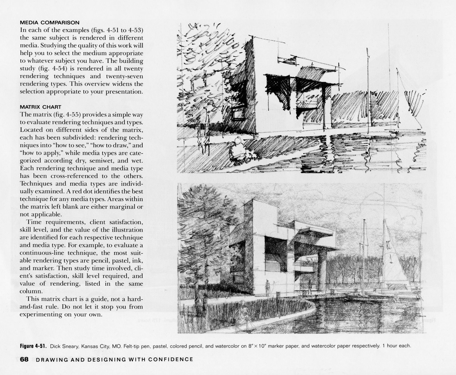
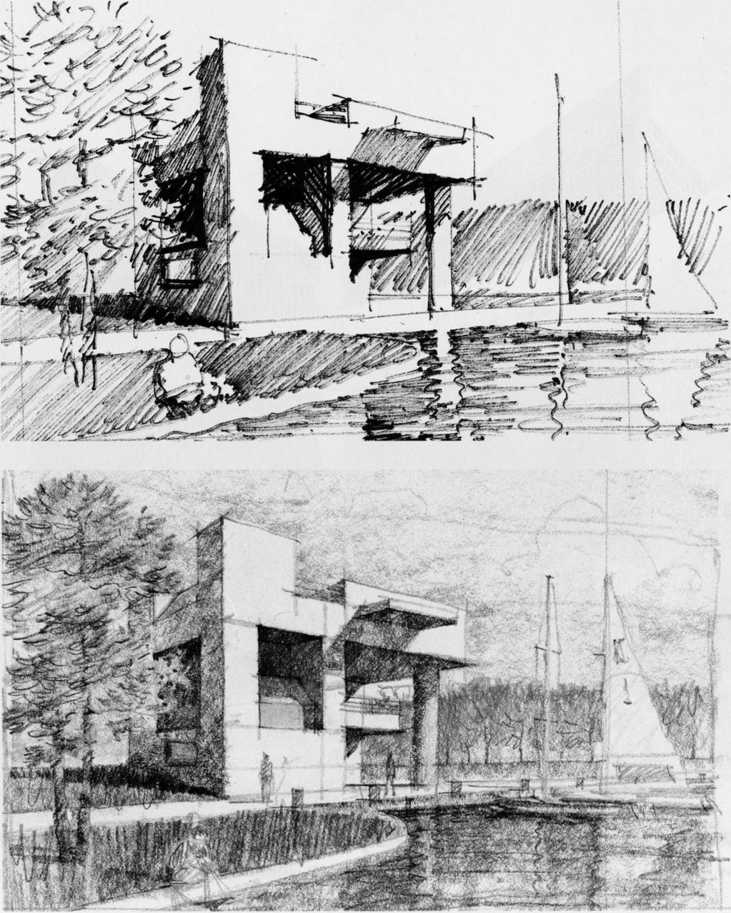
Figurę 4-51. Dick Sneary, Kansas City, MO. Felt-tip pen, pastel, colored pencil, and watercolor on 8"x 10" marker paper, and watercolor paper respectively. 1 hour each.
MEDIA COMPARISON
In each of the examples (figs. 4-51 to 4-53) the same subject is rendered in different media. Studying the quality of this work will help you to select the medium appropriate to whatever subject you have. The building study (fig. 4-54) is rendered in all twenty rendering techniques and twenty-seven rendering types. This overview widens the selection appropriate to your presentation.
MATRIX CHART
The matrix (fig. 4-55) provides a simple way to evaluate rendering techniques and types. Located on different sides of the matrix, each has been subdivided: rendering tech-niques into “how to see,” “how to draw,” and “how to apply,” while media types are cate-gorized according dry, semiwet, and wet. Each rendering technique and media type has been cross-referenced to the others. Techniques and media types are individ-ually examined. A red dot identifies the best technique for any media types. Areas within the matrix left blank are either marginal or not applicabie.
Time requirements, client satisfaction, skill level, and the value of the illustration are identified for each respective technique and media type. For example, to evaluate a continuous-line technique, the most suit-able rendering types are pencil, pastel, ink, and marker. Then study time involved, cli-ent’s satisfaction, skill level required, and value of rendering, listecl in the same column.
This matrix chart is a guide, not a hard-and-fast rule. Do not let it stop you from experimenting on your own.
68 DRAW ING AND DESIGNING WITH CONFIDENCE
Wyszukiwarka
Podobne podstrony:
reference photos003 Figurę 8-7. Left: Chaturong Chaisupranond. Lockwood Greene Engineers. Inc., Spar
KANSAS CITY LIBRARY (MISSOURI, USA) 1 IM I ■!■■■ •rFFrrrr fł—HF=f Bł-BCŚsi r ———-
KANSAS CITY LIBRARY (MISSOURI, USA) 1 IM I ■!■■■ •rFFrrrr fł—HF=f Bł-BCŚsi r ———-
List otwarty studentów W sierpniu 2001 r. studenci i profesorowie z 22 krajów zebrali się w Kansas C
TTR?stinations PENVER • P. PASO KANSAS CITY • HOUSTON 1 Js. PORTLAND - NASH VILI.II gl 1 11
50 (241) 94 The Viking Age in Denmark Figurę 26 Part of thc city of Lund (Skinę) at the beginning of
KANSAS CITY LIBRARY (MISSOURI, USA) 1 IM I ■!■■■ •rFFrrrr fł—HF=f Bł-BCŚsi r ———-
66883 strona (16) 1 Match the photos to the captions. 1 In the city 2
3 51 Figurę 3-50 Deep stripping of superolateral trapezius Figurę 3-51 Pincer compression of trapezi
hiddencity Hidden City Contro! of the Hidden City gives your llluminati ♦2 to their Power and Global
32 (319) 3 : Ectoparasitic skin diseases Figurę 3:1: Erythema and crusting on the face and pinnae of
więcej podobnych podstron