Micro Course - Lesson 13
1
Images and text © Karl Taylor Photography
Composition is a combination of subject matter and how you decide that subject matter should be
arranged within the area of your picture. It is one of the most artistic aspects of photography and can
make the difference between a good photo and a great photo! Simply put it is choice – You are deciding
what the subject will be and how it will be arranged in your picture.
The success of your choices visually in the final image can be a measure of your creativity. However
composition is not the only “creative” process, many other factors such as your exposure, shutter speed
and depth of field all have a bearing on the visual success of your final image.
The human brain digests the information contained in your picture more easily if the structure of an image
follows some basic rules, although more complex composition can make an image more interesting and
hold the viewers attention for longer.
Don’t worry if good composition doesn’t come to you naturally, it can be learnt. A more detailed look
at composition can be found in our
Introduction to Photography DVD
important aspects below for you to think about when making decisions about composition. As you will see
there are many things to be considered aside from simple picture layout.
THE SUBJECT MATTER
1. Choice of subject - Is my subject matter that interesting? Will it make a good photograph?
2. Colours of subject - Do the colours of my subject work well with the colour of my background?
Can I move position to get a better background or can I replace the background in a still life image?
3. The Lighting on subject - Does the light on my subject affect it’s shape, texture or contrast and can
it be improved?
4. The story of my subject (probably the most important) - What is the picture about? Does it tell a story
and will people easily understand the information? Remember that most photography is the means
to tell a story or an idea visually, therefore that story or message should be clear and easy for the eye
to digest!
COMPOSITION
1. Position of subject – If the layout is not working can I move my subject?
2. Position of camera –Can I find a better angle or height to shoot from?
3. Choice of lens – (affects the position of your camera) Your choice of lens will affect the camera to
subject distance which in turn will affect your position in relation to subject and the effective
perspective of your subject in relation to it’s background!
4. Choice of focus point – It’s important to remember that the area in your picture that is in focus will
draw the viewers eye to that zone.
5. Choice of depth of field (affecting the rang of sharpness) – The same picture taken with a different
depth of field can have a totally different feel to it.
6. Choice of shutter speed (affecting the effect motion) – By using slower shutter speeds the motion of
moving objects will record there path across your image as opposed to being recorded in a static
position with a faster shutter speed.

2
Images and text © Karl Taylor Photography
RULE OF THIRDS
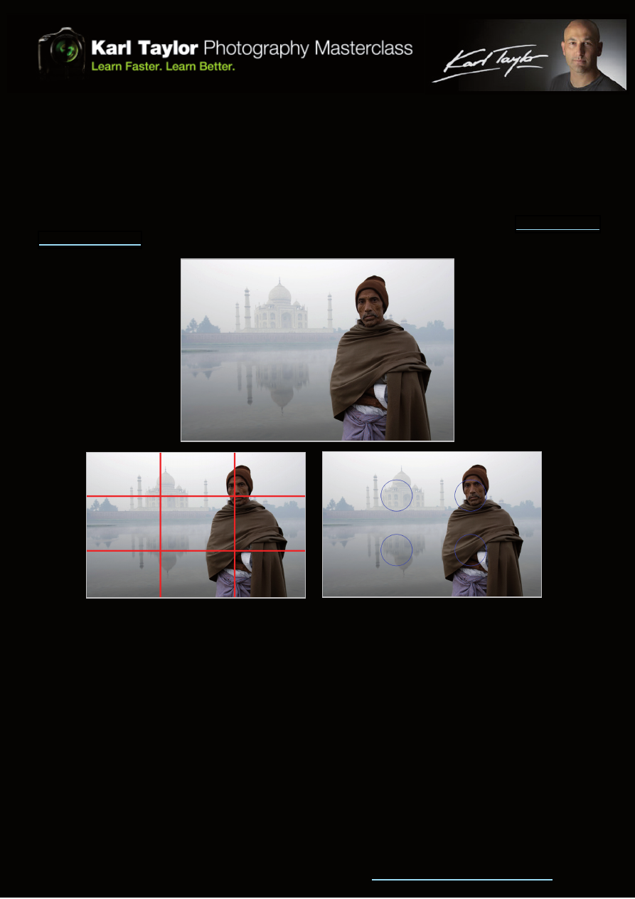
One of the most common and easier to understand compositional guides is “the rule of thirds”. The rule of
thirds teaches you to split your picture area into thirds vertically and horizontally – where those imaginary
lines cross or lay is often the best place to place your subject. You can also place the secondary subject at
the opposite third for balance.
Using the rule of thirds will generally give you the most pleasing layouts, but these rules can be broken.
Your composition ability and creativity will generally improve with practise and study, although it does
appear that certain people have a greater natural ability. For a fuller understanding view our
, our more advanced titles go into greater depth on other issues affecting composition.
Third Lines
KARL’S OTHER TIPS FOR IMPROVING COMPOSITION
1. Use of texture & shape
2. Lines – shadows and edges as leading lines
3. Balance & symmetry
4. Isolating the main subject
5. Simplicity – keep it simple & avoid confusing backgrounds
6. Framing your subject with other objects
7. What is my point of interest?
8. What is the story?
When composing the picture - think! Is this actually any good? Take the picture and then if it’s not good try
to identify why not!
Look through your viewfinder or at your LCD screen more carefully and not too quickly.
Look at the corners of your viewfinder for distractions and try to avoid them and decide whether your pic-
ture would be better in Landscape (horizontally) or Portrait (vertically).
Intersection Areas
Wyszukiwarka
Podobne podstrony:
Lekcje, Nauka.pl Lesson 13, Lesson 13
Lesson 13 23
Lekcje, Nauka.pl Lesson 14, Lesson 13
adafruit arduino lesson 13 dc motors
lesson 13
English podstawy Lesson 13
Lesson 13 23
Lesson 13
Spanish Lesson 13
lesson 13
Japanese Is Possible Lesson 13
13 Lesson13 Your First Expert Advisor (Part 1)
13 New JLPT N3 Prep Course 13 Lesson Notes Lite
13 New JLPT N3 Prep Course 13 Lesson Notes
13 ZMIANY WSTECZNE (2)id 14517 ppt
13 zakrzepowo zatorowa
więcej podobnych podstron