
TMS SOFTWARE
TPLANNER - TDBPLANNER
DEVELOPERS GUIDE
1
TPLANNER – TDBPLANNER
DEVELOPERS GUIDE
Dec 2004
Copyright © 1999 – 2004 by tmssoftware.com bvba
Web:
http://www.tmssoftware.com
Email :
info@tmssoftware.com

TMS SOFTWARE
TPLANNER - TDBPLANNER
DEVELOPERS GUIDE
2
Table of contents
TPlanner / TDBPlanner availability .........................................................................3
Web planner solutions.........................................................................................3
TPlanner / TDBPlanner use...................................................................................4
TPlanner / TDBPlanner organisation .......................................................................4
Settings of TPlanner / TDBPlanner visual elements .....................................................7
Inside the TPlannerItem .................................................................................... 19
The TPlannerItems collection.............................................................................. 32
Saving and loading in non data-aware TPlanner........................................................ 35
Printing of the TPlanner component ..................................................................... 36
Saving the TPlanner to HTML .............................................................................. 37
Saving the TPlanner to a bitmap .......................................................................... 38
Drag & drop in TPlanner .................................................................................... 38
Export & Import of TPlannerItems ........................................................................ 41
Additional TPlanner / TDBPlanner methods and properties.......................................... 42
TDBPlanner architecture.................................................................................... 47
Database requirements ..................................................................................... 48
Setting up TDBPlanner, TDBItemSource and the database ........................................... 49
Performance guidelines ..................................................................................... 51
TDBPlanner and database synchronisation .............................................................. 52
The standard TDBItemSource components .............................................................. 53
TDBPlanner recurrency support ........................................................................... 58
Advanced TPlanner / TDBPlanner techniques .......................................................... 61
TPlannerWaitList component .............................................................................. 69
TPlannerMonthView component........................................................................... 70
TMS SOFTWARE
TPLANNER - TDBPLANNER
DEVELOPERS GUIDE
3
TPlanner / TDBPlanner availability
TPlanner and TDBPlanner are available as VCL and as CLX components.
VCL versions:
TPlanner is available for Borland Delphi 5, 6, 7, 2005 and Borland C++Builder 5, 6
TDBPlanner is available for Borland Delphi 5, 6, 7 and Borland C++Builder 5, 6
TPlanner and TDBPlanner have been designed for and tested with: Windows 98, ME, NT4, 2000 and
XP.
VCL.NET versions:
TPlanner is available for Borland Delphi 8, 2005
TDBPlanner is available for Borland Delphi 8, 2005
TPlanner and TDBPlanner for VCL.NET have been designed for and tested with the Microsoft .NET
Framework v1.1
CLX versions:
TPlanner is available for Borland Delphi 6, 7 Borland C++Builder 6 and Borland Kylix 2, 3
TDBPlanner is available for Borland Delphi 6, 7 Borland C++Builder 6 and Borland Kylix 2, 3
TPlanner and TDBPlanner have been designed for and tested with: Windows 2000 and XP and Linux
Mandrake 9.0
Web planner solutions
For creating web interfaces for scheduling applications, TMS software has developed a version for
IntraWeb (the framework for web application development from AtoZed software
(
www.atozedsoftware.com
) It can be used with Delphi 5,6,7 or C++Builder 5,6. Details can be found
at
http://www.tmssoftware.com/tmsiwplan.htm
TMS software has also developed a version for ASP.NET that can be used with Microsoft Visual Studio
.NET, Borland C#Builder, Microsoft WebMatrix and Borland Delphi 8 for the .NET framework. This
version is commercialized by ComponentScience and details can be found at
http://www.componentscience.net

TMS SOFTWARE
TPLANNER - TDBPLANNER
DEVELOPERS GUIDE
4
TPlanner / TDBPlanner use
The TMS TPlanner and TDBPlanner components are designed to be used in the most broad types of
planning and scheduling type of applications. This can range from the typical single person PIM
application to schedulers of activities for a group of persons, time planning for resources such as
hotel rooms, car rental, university courses and so much more. As such, the TPlanner and TDBPlanner
are very highly configurable components to suite all these various types of applications. The
underlying framework of TPlanner therefore has an open interface towards the coupling to time or
resources. Standard modes include day time view, week view, month view, day period view, half-
day period view, multi-month view while at the same time custom modes allow to view any type of
timescale. Multi day and multi resource views can be combined as well.
TPlanner / TDBPlanner organisation
Non visual organisation of TPlanner / TDBPlanner
The TPlanner holds a collection of TPlannerItem objects. A TPlannerItem fully specifies how an
event or appointment is displayed in the TPlanner grid. TPlannerItem objects can be added or
inserted in the TPlannerItems collection and the TPlanner takes care of the visualisation of the
TPlannerItem objects in the grid. At the same time, it takes care that TPlannerItem objects are
modified when edited, moved or resized at run-time. It is thus key that only items that should
be displayed in the TPlanner are added.
In the not data-aware version TPlanner, it is the responsibility of the programmer to save and
load these TPlannerItem objects to file for persistence. With TDBPlanner, a TDBItemSource
descendent component takes care of the streaming of TPlannerItem objects to and from the
TDBPlanner from a dataset and updating for appropriate records in the database when
TPlannerItem objects are changed at run-time. Currently, TDBItemSource based interfaces exist
for day, month, period and multi-month mode.
Visual organisation of TPlanner / TDBPlanner
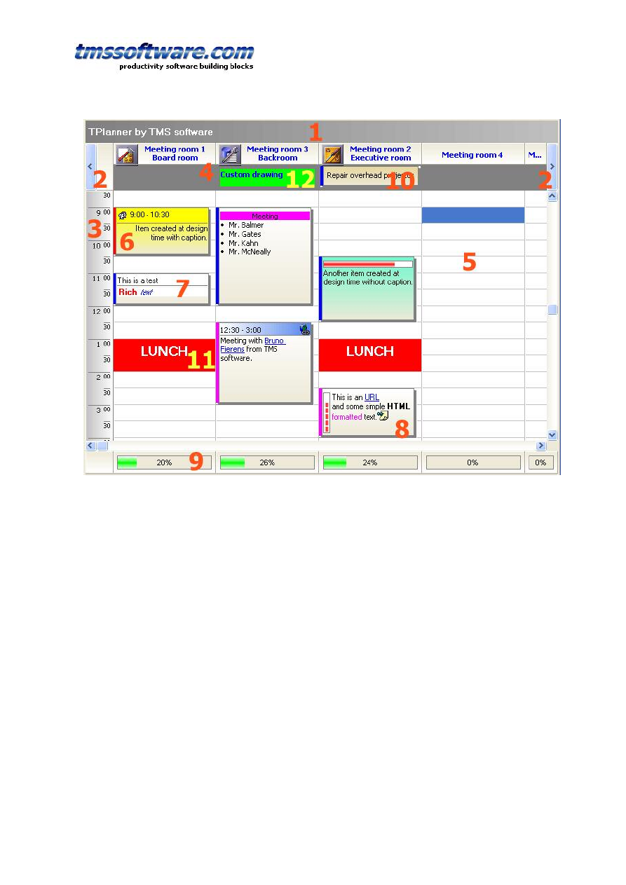
Visually the TPlanner consists of various elements shown here:
TMS SOFTWARE
TPLANNER - TDBPLANNER
DEVELOPERS GUIDE
5
1: TPlanner caption
Settings are controlled through the Planner.Caption property. It can be selected whether the
caption is visible or not.
2: TPlanner navigator buttons
Settings are controlled through the Planner.NavigatorButtons property. It can be selected
whether the Navigator buttons are visible or not.
3: TPlanner sidebar
Settings are controlled through the Planner.Sidebar property. The Sidebar can be visible or not.
It can be at the left side, right side, left and right side, or top side of the grid. In addition, or it
can be repeated between columns in the grid.
4: TPlanner header
Settings are controlled through the Planner.Header property. It can be selected whether the
header is visible or not.
5: TPlanner grid
Various settings are controlled through the Planner properties as well as Planner.Display
property
6: TPlannerItem
Normal text TPlannerItem with caption with time indication.
7: TPlannerItem
Rich text TPlannerItem with fixed text caption.
8: TPlannerItem
HTML formatted TPlannerItem with gradient caption. The TPlannerItem can hold links to URLs
or application handled anchors.
9: TPlanner footer
Zone where completion of a resource can be displayed by a progress bar
TMS SOFTWARE
TPLANNER - TDBPLANNER
DEVELOPERS GUIDE
6
10: TPlannerItem
In header displayed TPlannerItem.
11: TPlannerItem
Background TPlannerItem.
12: TPlanner header custom drawing
TPlanner supports a vertical view (as shown above) as well as a horizontal view. In the
horizontal view, all elements of the TPlanner simply rotated. This means that the Sidebar here
at left is displayed on top and the header and navigator buttons are displayed at the left side in
horizontal mode. The position coordinates of TPlannerItem objects along vertical and horizontal
axis in vertical mode become the coordinates along horizontal and vertical axis respectively in
horizontal mode.
The TPlanner component can be easily switched from vertical view to horizontal view by setting
the TPlanner.Sidebar.Position property to spTop.
TMS SOFTWARE
TPLANNER - TDBPLANNER
DEVELOPERS GUIDE
7
Settings of TPlanner / TDBPlanner visual elements
TPlanner Caption
The TPlanner caption is the most simple visual element of the TPlanner. It’s properties are
controlled through the TPlanner.Caption property :
Alignment: sets alignment of caption text
BackgroundColor: sets background color
BackgroundColorTo: if different from clNone, draws a gradient background from
BackgroundColor to BackgroundColorTo.
Font: sets the font for the caption text
Height: sets the height of the caption
Title: sets the caption text. Caption text can have HTML formatting
Visible: sets the visibility of the TPlanner caption
The caption only triggers events for handling anchors (<A> tags with HTML formatted text)
through the events: OnCaptionAnchorClick, OnCaptionAnchorEnter, OnCaptionAnchorExit.
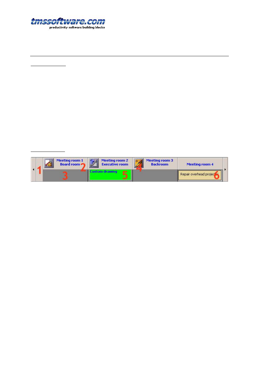
TPlanner Header
The header consists of various sections which automatically adapt to the size of the columns
(vertical mode) or rows (horizontal mode) in the planner grid.
1: First header section covering the sidebar space
2: Normal header section text as defined through the stringlist Planner.Header.Captions
3: Placeholder for items in the header
4: Image associated with the header section
5: Custom drawn item in the header
6: Normal drawn item in the header
The Planner.Header has following properties:
Alignment: sets the text alignment of normal header captions
AllowPositionResize: allow resizing of a single position in the planner with the mouse
AllowResize: allows resizing with mouse of the header (height in vertical mode, width in
horizontal mode)
AutoSize: When set to true, the header height automatically sizes to make sure that all items in
the header can be displayed
Captions: stringlist holding header captions (note that the caption with Index zero (0) is usually
occupied by the sidebar)
Color: sets the background color of the normal header section
TMS SOFTWARE
TPLANNER - TDBPLANNER
DEVELOPERS GUIDE
8
ColorTo: sets the end gradient color for the gradient in the header. When clNone, a solid color
is used in the header
DragDrop: when true, sections can be rearranged through drag & drop
Flat: when true the header is displayed in flat style
Font: sets the font of the normal header caption text
GroupCaptions: when the planner has grouping, captions for the grouped sections are set
through this stringlist
Height: sets the total height of the header
ImagePosition: sets the position of images displayed in the header to either left or right of the
caption text
Images: imagelist to be used for the header caption. First section uses image 0, second section
image 1 and so on …
ItemColor: sets the background color of the zone in the header where items are placed
ItemHeight: sets the height of the part of the header where items are displayed
LineColor: sets the line color of the divider line between header sections
PopupMenu: assigns the popup menu to be used for the header
ReadOnly: when true, header caption text cannot be edited at runtime
RotateOnLeft: uses a rotated font for header caption display when the planner is in horizontal
mode
TextHeight: sets the height of the normal header caption text.
VAlignment: sets the vertical alignment of header caption text
Visible: sets the visibility of the header
Note about Height, ItemHeight and TextHeight: As TextHeight is the height from top for of the
normal caption text and ItemHeight is the height of the space for items under below the normal
caption text, make sure that total Header height is larger or equal or larger than TextHeight +
ItemHeight.
Identical settings apply when the header is displayed on the left side of the TPlanner when
horizontal mode is chosen. Note that the meaning of a height property should in this case
be interpreted as a width setting.
Programmatically setting captions:
The planner header above shows normal header captions and group captions (settings of
grouping is discussed later in the documentation)
Example:
Programmatically, this can be set by filling the Planner.Header.Captions and
Planner.Header.GroupCaptions stringlists in following way:
with Planner1.Header do
begin
Captions.Clear;
GroupCaptions.Clear;
Captions.Add(''); // take first sidebar header section into account
Captions.Add('A1');
Captions.Add('A2');
Captions.Add('A3');
GroupCaptions.Add('Group A');
Captions.Add('B1');
Captions.Add('B2');

TMS SOFTWARE
TPLANNER - TDBPLANNER
DEVELOPERS GUIDE
9
Captions.Add('B3');
GroupCaptions.Add('Group B');
end;
Note:
At design time it is easy to enter multiline header captions by using ‘\n’ as line separator.
Setting at design time in the Captions stringlist editor : ‘This is line 1\n and here line2’ will
result in a caption with:
This is line1
and here line 2
The events triggered from the header are straightforward and related to mouse actions:
OnHeaderClick: triggered when mouse is left clicked on the header
OnHeaderDblClick: triggered when mouse is double clicked on the header
OnHeaderDragDrop: triggered when header sections are moved through drag & drop
OnHeaderRightClick: triggered when mouse is right clicked on the header
OnHeaderHint: queries the hint to be displayed for a given position in the header
OnHeaderStartEdit: event triggered before editing starts in the header
OnHeaderEndEdit: event triggered when editing ends in the header
Identical settings apply when the header is displayed on the left side of the TPlanner when
horizontal mode is chosen. Note that the meaning of a height property should in this case
be interpreted as a width setting.
TPlanner navigator buttons
The navigator buttons are sitting left and right of the planner header in vertical mode and on
top and bottom of the header in horizontal mode. The navigator buttons are treated as a
Previous (left or top) and Next (right or bottom) button. Settings of the navigator buttons are
simple:
TPlanner.NavigatorButtons :
Flat: when true, navigator buttons are displayed in flat style
NextHint: sets the button hint for the Next button
PrevHint: sets the button hint for the Previous button
ShowHint: when true, navigator button hints are displayed
Visible: when true, the navigator buttons are visible
TPlanner Sidebar
TMS SOFTWARE
TPLANNER - TDBPLANNER
DEVELOPERS GUIDE
10
The sidebar is the time indicating visual element in the TPlanner component. It can sit in
various positions in the TPlanner. The height of the sidebar sections automatically adapts to the
row height in the planner grid.
This is a left positioned sidebar showing the occupied time
zones in a different color
TPlanner.Sidebar has following properties to control display of the sidebar :
ActiveColor: When different from clNone, the active cell in the planner grid is displayed in the
sidebar as well with the background color defined by ActiveColor
Alignment: sets the alignment of the sidebar text
AMPMPos: sets the position of the AM/PM string (when TPlanner.HourType is htAMPM0 or
htAMPM1). This can be either under the minutes (as in picture above) or on after the minutes.
Background: sets the background color of the sidebar
BackgroundTo: when different from clNone, the sidebar is drawn with a gradient with colors
ranging from Background to BackgroundTo.
Border: when true, a 3D border effect is displayed on the sidebar
DateTimeFormat: date / time format string that can be used to set the format of the text in
the SideBar. Refer to the Delphi / C++Builder FormatDateTime format specifier for options.
Flat: when true, the sidebar is displayed in flat style
Font: sets the font for the sidebar
LineColor: sets the color of splitter lines in the sidebar
Occupied: sets the color to show occupied time zones in the planner
OccupiedFontColor: sets the font color for the occupied time zones
OccupiedTo: sets the end gradient color of occupied time zones in the planner. When set to
clNone, a solid color is used.
Position: sets the sidebar position relative to the grid, it can be set to the left, the right, the
top, or both the left and the right of the grid. Setting the position to the top of the grid, rotates
the whole grid 90 degrees, exchanging columns/rows and width/height settings.to left from the
TPlanner, on top or on both left and right side.
RotateOnTop: when true, text is 90 degrees rotated in the sidebar when positioned on top.
Note that this requires a TrueType font to be used.
SeparatorLineColor: sets the color of the small separator lines between two sidebar sections.
ShowDayName: Adds the name of day in month and period planner mode to day.

TMS SOFTWARE
TPLANNER - TDBPLANNER
DEVELOPERS GUIDE
11
ShowInPositionGap: when true, the sidebar will also be display can be repeated in the gaps
between all positions in the planner. In this case the Planner.PositionGap property controls the
width of the sidebar between each the position.
ShowOccupied: when true, occupied time zones are displayed in the sidebar in the Occupied /
OccupiedFontColor
Visible: sets the visibility of the sidebar (note that when Visible is False, ShowInPositionGap can
still be True)
Width: sets the width of the sidebar (or height if the Position is at the top of the grid)
What is displayed in the sidebar depends on the mode of the TPlanner (see
TPlanner.Mode.PLannerType) This can be the hours of the day, when mode is set to plDay, or
the dates in plMonth, plPeriod, plMultiMonth, and plWeek modes.
If the TPlanner is in day mode, then the time of the day is displayed in the sidebar. The range
and unit of the timescale in the sidebar is determined by the TPlanner.Display property (see
under TPlanner display) It consists of 3 parts:
1: hour text
2: minutes text
3: optional AM/PM string
It is possible to override what is displayed in the sidebar by using the
TPlanner.OnGetSideBarLines event, which queries these 3 parts for each section of the sidebar.
If the TPlaner.Mode.PlannerType is plWeek, then the sidebar shows day names. Those can be
configured in the Tplanner.DayNames property.
If the TPlanner.Mode.PlannerType is plMultiMonth, then the sidebar shows day numbers within
the month.
If the TPlanner.Mode.PlannerType is plDayPeriod, plMonth, or plPeriod, plMultiMonth, plWeek,
then the sidebar shows the date (range of dates is also set through the TPlanner.Mode property)
The formatting of the date displayed is according to the DateTimeFormat property, and Day
names are taken from the SysUtils. ShortDayNames variable.
Example:
When setting Planner.Sidebar.DateTimeFormat is equal to: ‘ddd m mmm / yyyy’, the date
7/7/2002 is displayed as ‘Fri 7 Jul / 2002’
Finally, full custom draw of the sidebar is possible. To achieve this, the OnPlannerSideDraw
event can should be used:
TMS SOFTWARE
TPLANNER - TDBPLANNER
DEVELOPERS GUIDE
12
Example:
procedure TForm1.Planner1PlannerSideDraw(Sender: TObject;
Canvas: TCanvas; Rect: TRect; Index: Integer);
begin
Canvas.TextOut(Rect.Left,Rect.Top,IntToStr(Index));
end;
This simple procedure just displays the section index in the sidebar.
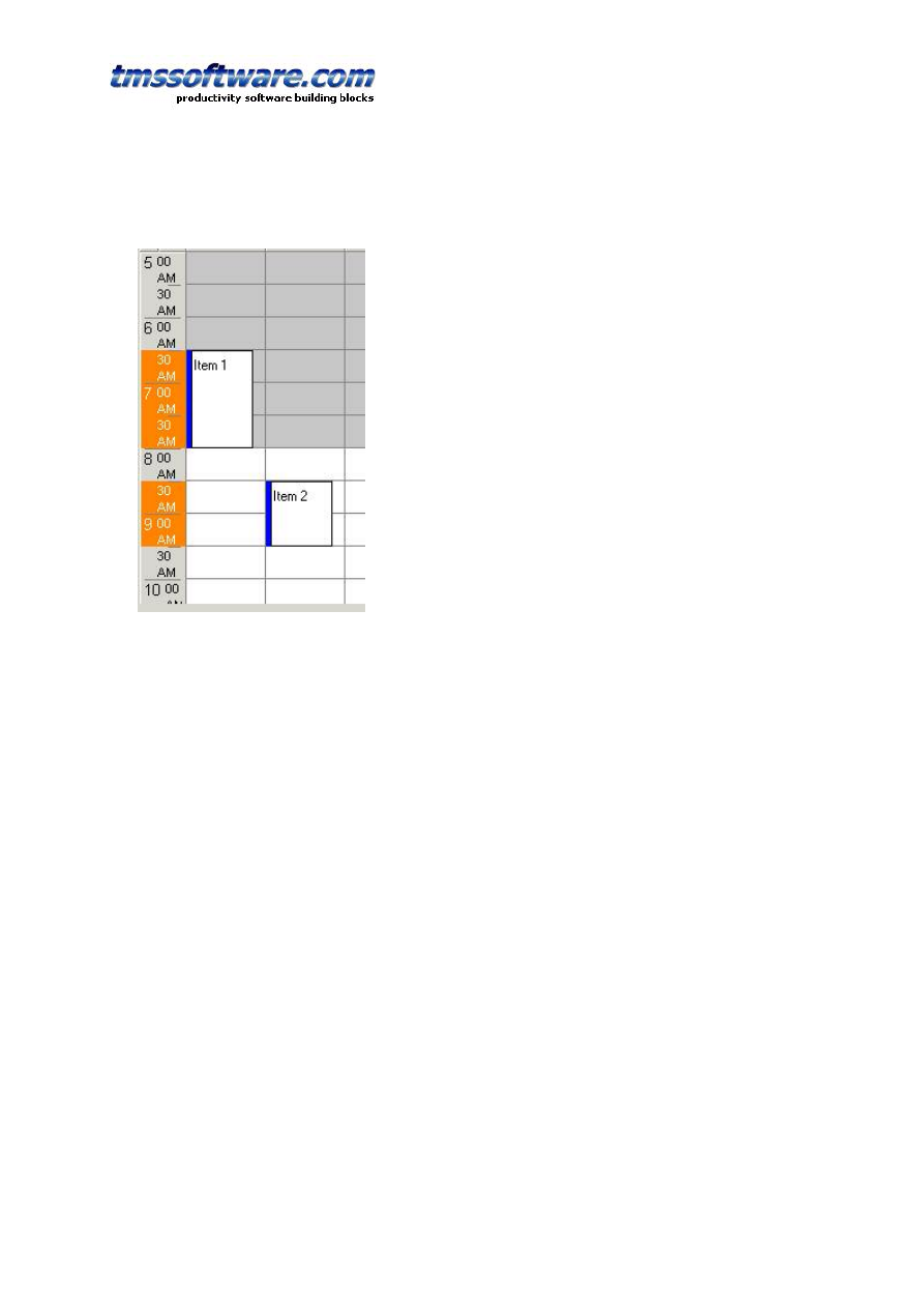
Non visible item indicators in the sidebar
When the Planner can be scrolled, little arrow indicators in the sidebar can indicate the
presence of events in the non-visible regions of the planner grid. In the example screenshot
below, this means that more items are present in the grid on the right side of the currently
visible item.
The feature is enabled by setting Planner.IndicateNonVisibleItems = true. The indicators are
automatically displayed and updated when items are created or when the planner grid is
scrolled. Whenever items are programmatically created, an update of the non visible item
indicators can be forced with:
Planner.UpdateNVI;
Example: programmatically add an item and update non visible item indicators
with Planner.CreateItem do
begin
itembegin := 33;
itemend := 37;
completiondisplay := cdHorizontal;
completion := 80;
end;
Planner.UpdateNVI;
TPlanner footer
TMS SOFTWARE
TPLANNER - TDBPLANNER
DEVELOPERS GUIDE
13
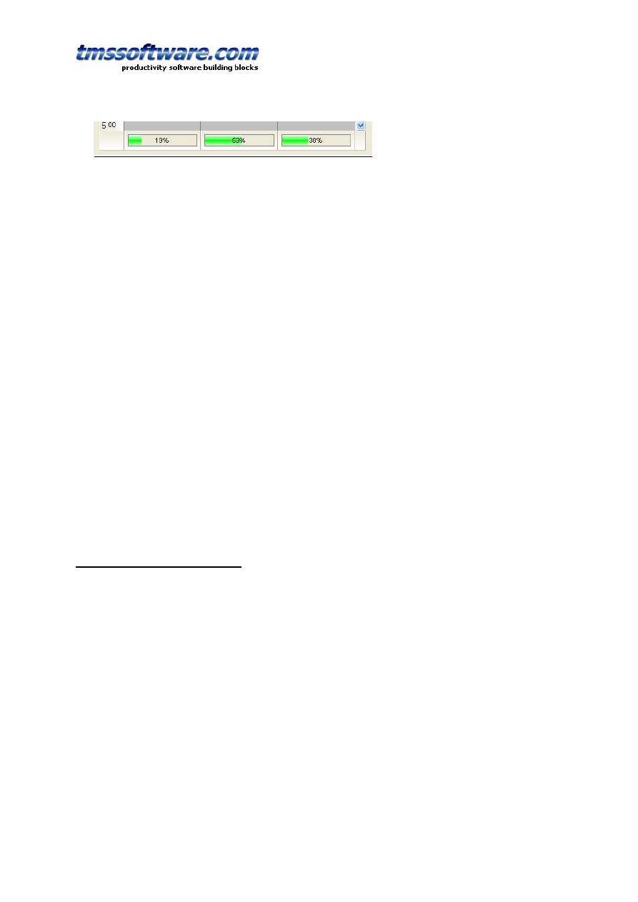
The planner footer is similar to the planner header and can display text through setting the
Captions. In addition to simple text display, the footer can also be used to show the position
completion by a progress bar. The position completion represents the percentage of the number
of time slots in a position that are occupied. The completion automatically dynamically updates
as items are sized or moved around in the planner, always giving an instantaneous feedback on
occupation level of a position. Extensive control over progressbar appearance is possible with
different colors that can be used for different completion levels.
A full list of planner footer properties is:
Alignment: sets the horizontal text alignment of the footer text
Captions: stringlist holding the text for each position in the footer.
Color: background footer color
ColorTo: sets the end gradient color of the footer background. When set to clNone, a solid
background is displayed.
Completion: holds various settings for progress bar colors and levels
Flat: when true, the footer is painted in flat style
Height: sets the height of the footer
Images: when the imagelist is assigned to Images, images are displayed in each position in the
footer. Position 0 will display the first image in the imagelist, position 1 will display the second
image in the imagelist etc…
ImagePosition: The ImagePosition controls whether the image is shown left or right from the
footer text.
LineColor: sets the footer separator line color
ShowCompletion: when true, a progressbar is displayed in the footer indicating automatically
the position completion
VAlignment: sets the vertical alignment of the footer text
Visible: when true, the footer is visible
TPlanner position display control
The TPlanner introduces the concept of Positions. This can be considered as an orientation
independent name for columns in vertical mode and rows in horizontal mode. So Position zero
corresponds to the first column, Position 1 to the second column and so on.
In day mode, the Positions are typically used to represent TPlannerItem objects for several days
or resources. In week of month mode, the Positions typically represent multiple resources.
Finally, in multi-month mode the number of positions controls the number of months displayed
simultaneously.
At design-time these visualisation settings can be controlled with:
PositionGap: sets the empty distance in pixels between columns (vertical mode) or rows
(horizontal mode) Note that when Planner.Sidebar.ShowInPositionGap is true, the sidebar
display is repeated between each column or each row in this space.
GroupGapOnly: when true, the positiongap as described above is only displayed between the
groups to make different position groups more visually clear in the planner.
ShowOccupiedInPositionGap: when true, occupied time is indicated in the positiongap in the
color set by planner.TrackColor
TMS SOFTWARE
TPLANNER - TDBPLANNER
DEVELOPERS GUIDE
14
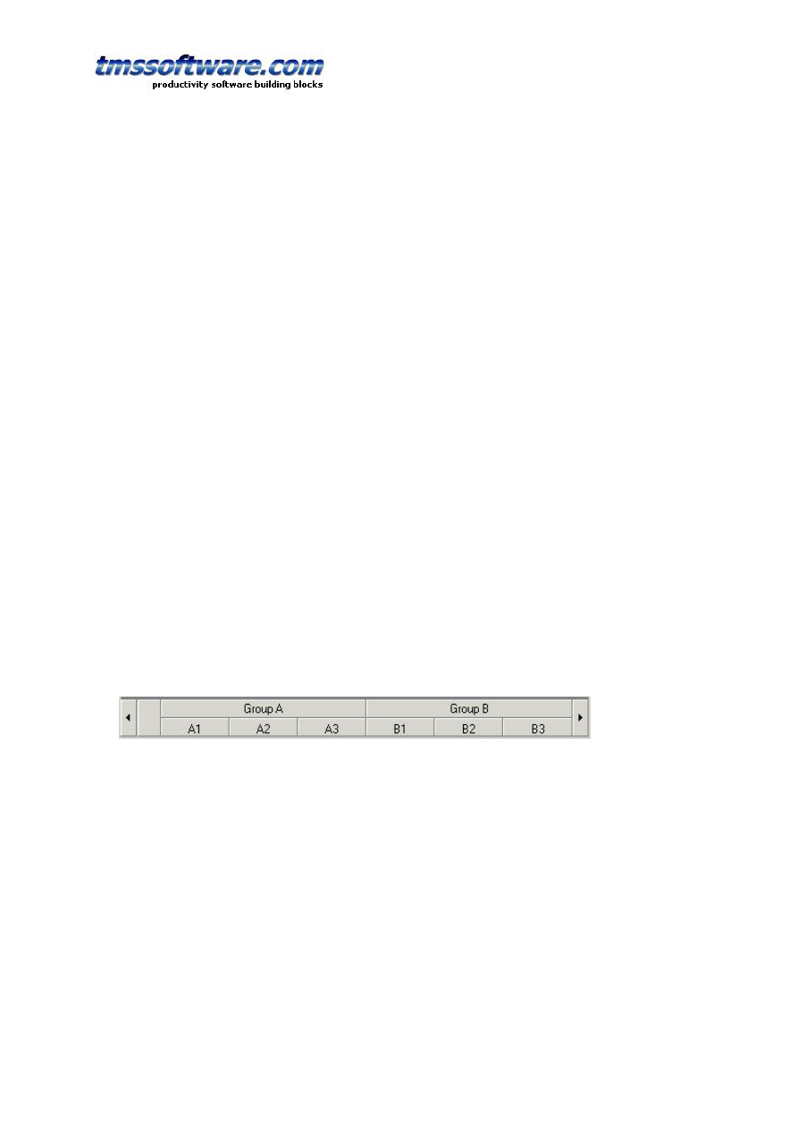
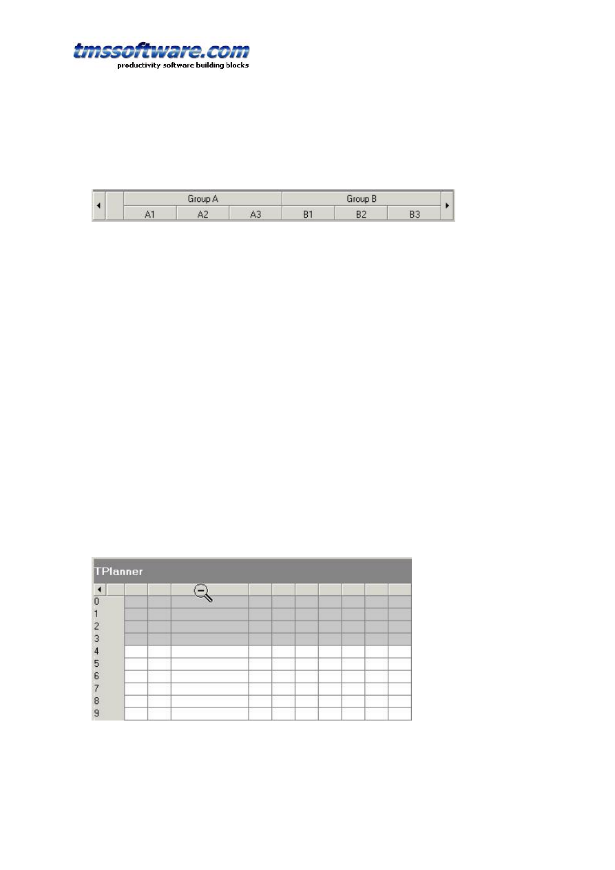
PositionGroup: sets the number of positions that are displayed in a group as shown in the
picture below. This view is typically used when multiple resources are displayed for multiple
days or multiple days are displayed for multiple groups. Note that when PositionGroup is
different from zero, the TPlanner header starts displaying GroupCaptions.
In this sample, the PositionGroup is set to 3. That is, each group holds 3 positions, meaning also
that only for every 3 position captions in the header a group caption needs to be set. The code
for this example is a few pages back.
PositionProps: This is a collection holding optional display properties such as colors for each
position. The use of PositionProps is discussed later.
Positions: this sets the total number of positions in the planner. In the example above, the
number of positions was is 6.
PositionWidth: This determines the width of a position. When zero, the width of each position
is automatically calculated depending on the sized with of the grid in order to allow that all
positions are displayed at a glance once without requiring a scrollbar. When PositionWidth is
different from zero, each position is displayed with this width, possible possibly requiring
scrollbars or leaving empty white space in the planner grid. Note that the width of the
PositionGap is substracted from the PositionWidth in order to get the actual width.
PositionZoomWidth: This determineswhen different from zero, this sets the width in pixels to
which positions a position can be zoomed. When zero, positions cannot be zoomed, but of the
zoomed positions
At run-time, when PositionZoomWidth is different from zero a magnifying glass cursor is used
shown when the mouse moves over the header. By clicking this header, the position width
toggles between the values PositionZoomWidth and PositionWidth. In the sample image below,
the PositionWidth was set to 30 while the PositionZoomWidth was 100. Clicking on the
positionheaders toggles the width of the positions between 30 and 100.
At runtime, further control is possible with:
TPlanner.PositionsWidths[positionindex: Integer]: Integer

TMS SOFTWARE
TPLANNER - TDBPLANNER
DEVELOPERS GUIDE
15
This sets the width of each position in the grid. Note that this setting does not have effect when
TPlanner.PositionWidth is zero, as in this mode, all positions are automatically sized to fit in the
planner.
TPlanner.ZoomPosition(position: Integer) & TPlanner.UnZoomPosition(position: Integer)
This is the programmatical access to the capabilities as described above that allows zooming of
positions. Zoom and UnZoom toggles widths of positions between the property values
PositionWidth and PositionZoomWidth.
TPlanner modes
The main TPlanner mode settings that control the relationship between displayed items and
time are centralized under TPlanner.Mode. The key property is TPlanner.Mode.PlannerType
which can currently be :
plDay: day mode
- the time axis represents hours of a day
- active & non-active cells are set through the TPlanner.Display property
- positions can represent multiple days or multiple resources, coupling is not predefined
plWeek: week mode
- the time axis represents days for one or more weeks
- active & non-active cells are set per day. By default Saturday & Sunday are considered as non-
active days but this can be overridden with the TPlanner.InActiveDays property
- positions represent multiple resources
- first day displayed is set by TPlanner.Mode.WeekStart. 0 is Saturday … 6 is Sunday.
- first date is first week of month set by TPlanner.Mode.Month / TPlanner.Mode.Year
plMonth: month mode
- the time axis represents all days of a selected month
- active & non-active cells are set per day. By default Saturday & Sunday are considered as non-
active days but this can be overridden with the TPlanner.InActiveDays property
- positions represent multiple resources
- month displayed is set by TPlanner.Mode.Month
plDayPeriod: configurable period mode
- the time axis represents days of a selected period
- active & non-active cells are set per day. By default Saturday & Sunday are considered as non-
active days but this can be overridden with the TPlanner.InActiveDays property
- period displayed is between PeriodStartDay / PeriodStartMonth / PeriodStartYear and
PeriodEndDay / PeriodEndMonth / PeriodEndYear
plHalfDayPeriod: configurable half day period mode
- the time axis represents half days of a selected period
- active & non-active cells are set per day. By default Saturday & Sunday are considered as non-
active days but this can be overridden with the TPlanner.InActiveDays property
- period displayed is between PeriodStartDay / PeriodStartMonth / PeriodStartYear and
PeriodEndDay / PeriodEndMonth / PeriodEndYear
plMultiMonth: multi month mode
- time axis represents days of the month, positions represent multiple months
- active & non-active cells are set per day. By default Saturday & Sunday are considered as non-
TMS SOFTWARE
TPLANNER - TDBPLANNER
DEVELOPERS GUIDE
16
active days but this can be overridden with the TPlanner.InActiveDays property
- first month displayed is set by TPlanner.Mode.Month, number of months displayed is controlled
by the number of positions set by TPlanner.Positions
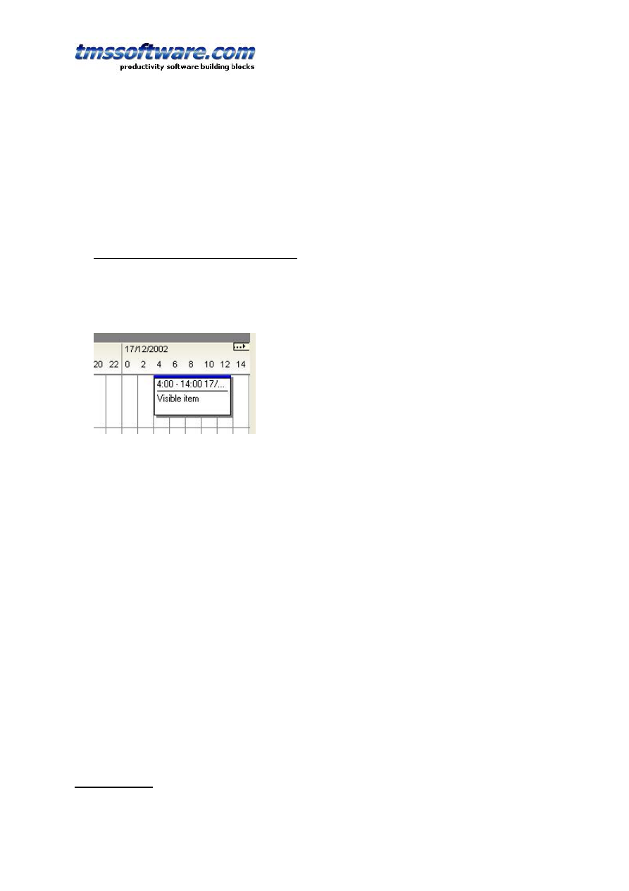
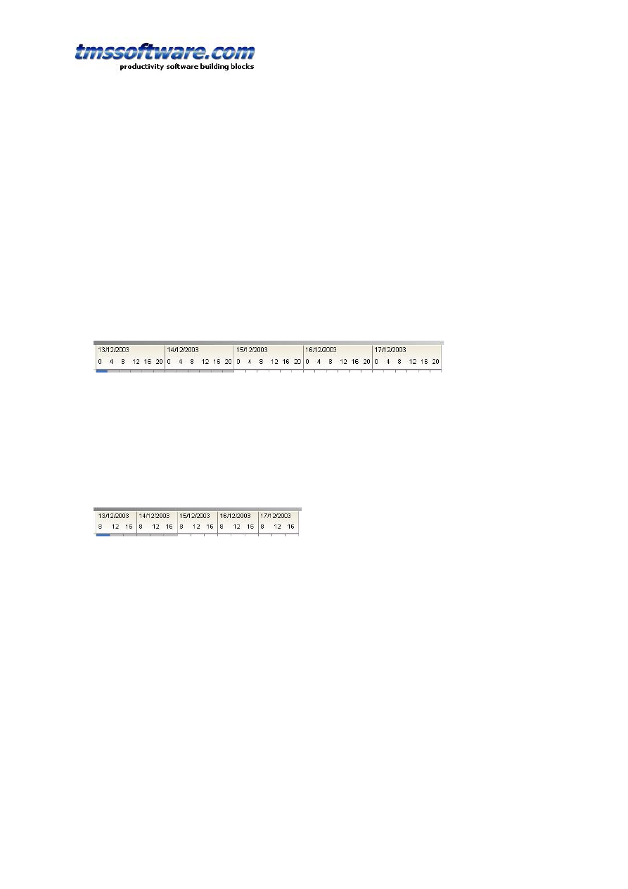
plTimeLine: timeline mode
- time axis represents multiple days with days divided in units defined by TPlanner.
Display.DisplayUnit
- starting day is set by TPlanner.Mode.TimeLineStart
- number of days is defined by number of units to display set by TPlanner.Display.DisplayEnd
Example:
Suppose we want to display a timeline of 5 days, with each day divided in 4 hour blocks. The
first day to be displayed is set with the TPlanner.Mode.TimeLineStart property.
TPlanner.Display.DisplayUnit is set to 240, representing the 4 hour blocks.
TPlanner.Display.DisplayStart is set to 0 and TPlanner.Display.DisplayEnd is set to 29 (to show 5
days of 6 blocks of 4 hours). The resulting timeline looks like:
As can be seen, by default, a day on the timeline is fully divided in blocks of desired number of
minutes set by TPlanner.Display.DisplayUnit. Often, it is not desirable to display a full day but
rather only display active or used time of the day. Suppose it makes only sense to show the part
of the day from 8h00 to 20h00. In that case, two additional properties come to help:
TPlanner.Mode.TimeLineNVUBegin and TPlanner.Mode.TimeLineNVUEnd. By default these
property values are 0. With NVU meaning “non visible units”, it can be specified that
TimeLineNVUBegin is 2 to hide the block from 0h00 to 4h00 and 4h00 to 8h00. By setting
TimeLineNVUEnd to 1, the block from 20h00 to 0h00 is hidden. The resulting timeline looks like:
plCustom: custom mode
- no fixed relationship between time axis and planner grid
- no predefined active &non-active cells
- number of cells displayed is controlled by TPlanner.Display.DisplayStart /
TPlanner.Display.DisplayEnd
plCustomList: custom mode with timelist
- the relationship between time axis and planner grid is set through the list
TPlanner.DateTimeList (this is a list of TDateTime values)
- each entry in the DateTimeList corresponds to the start time of a row (in vertical mode) or
column (in horizontal mode)
TMS SOFTWARE
TPLANNER - TDBPLANNER
DEVELOPERS GUIDE
17
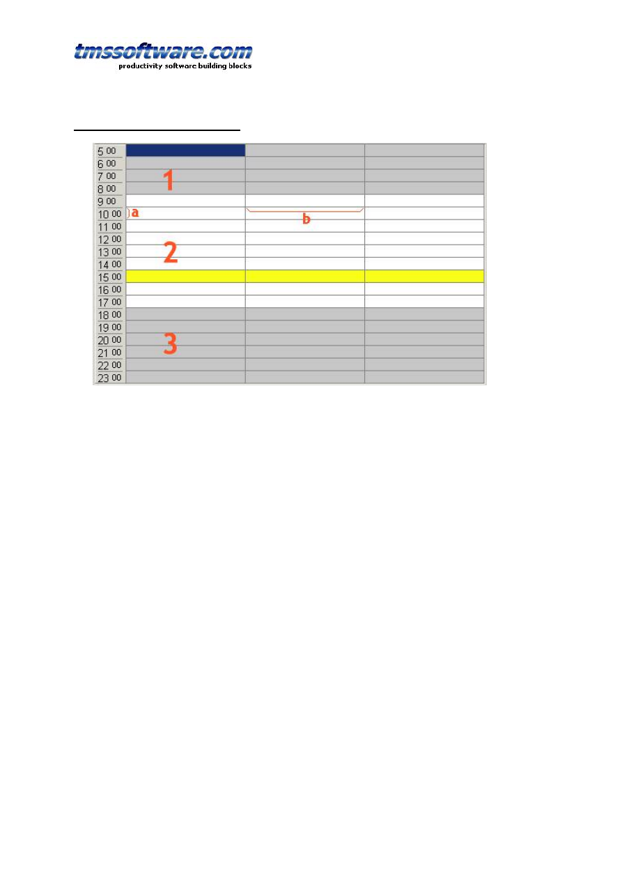
TPlanner time axis display control
Through the TPlanner.Display property, several settings can be done to control the display of
the grid along the time axis. In the above image, 1 is considered the first inactive zone, 2 is the
active zone and 3 is the second inactive zone. Distance a is the scale of the time axis and is set
through the property TPlanner.Display.DisplayScale in pixels. Distance b is the width (or height
in horizontal mode) of a position and is set by the property TPlanner.PositionWidth. In day
mode, the time difference between 2 rows is set by the property TPlanner.Display.DisplayUnit.
This value is expressed in minutes and can be any value starting from 1. A complete overview of
the TPlanner.Display property is here:
ActiveEnd: sets the end of the active time zone. This is expressed in number of cells from the
top of the grid.
ActiveStart: sets the start of the active time zone. This is expressed in the number of cells from
the top of the grid.
ColorActive: sets the color of the active time zone
ColorNonActive: sets the color of the non active time zone
ColorCurrent: sets the color of the cells that are in the current time zone. When the
computer’s internal clock time is in the time zone, these cells are displayed with the
ColorCurrent color. Note that an internal timer takes care to always indicate the current time
this way when the property TPlanner.Display.ShowCurrent is true.
Example:
In the above image, the ColorCurrent is set to clYellow and the internal computer clock is
15h17. The highlighted cells will remain highlighted as such till 15h59
ColorCurrentItem: sets the background color of TPlannerItem objects displayed in the grid that
fall within the current internal clock time. When TPlanner.Display.ShowCurrentItem is true, the
items that fall within the current time are automatically displayed in this special color. An
internal timer in TPlanner takes care to continuously update the current items in the planner.
DisplayEnd: sets the end of the displayed time zone. This is expressed in number of display
units.

TMS SOFTWARE
TPLANNER - TDBPLANNER
DEVELOPERS GUIDE
18
DisplayStart: sets the start of the displayed time zone. This is expressed in the number of
display units.
DisplayScale: sets the height (or width) in pixels of a single time unit.
DisplayText: Sets the interval where text is displayed in the sidebar. When DisplayText is zero,
this is ignored and for every position in the sidebar, the text is displayed. For example: setting
DisplayText = 2, will show the text in the sidebar only on every other position.
DisplayUnit: in Day mode sets the time in minutes that corresponds to a single row (in vertical
mode) or column (inhorizontal modeview) in the planner. For the other modes, it scales the
displayed number of rows (or columns in horizontal view).
ScaleToFit: when the property is set to true, the DisplayScale property is automatically adapted
to make sure all cells along the time axis fit in the grid without the need to display scrollbars.
ShowCurrent: when true, cells in current time are displayed in the ColorCurrent color
ShowCurrentItem: when true, items in the current time are displayed in the ColorCurrentItem
color
CurrentPosFrom, CurrentPosTo: When different from -1, only items in positions between
CurrentPosFrom, CurrentPosTo can displayed as 'current' items
Example:
The planner needs to display an active time between 9 AM and 5 PM in 15 minute intervals. The
total time displayed is from 6AM to 22PM. The settings for Display are :
var
RowsPerHour: integer;
begin
with Planner1.Display do
begin
DisplayUnit := 15;
RowsPerHour := (60 div DisplayUnit);
DisplayStart := 6 * RowsPerHour;
DisplayEnd := 22 * RowsPerhour;
ActiveStart := (9 - 6) * RowsPerHour;
ActiveEnd := (17 - 6) * RowsPerHour;
end;
end;
TMS SOFTWARE
TPLANNER - TDBPLANNER
DEVELOPERS GUIDE
19
Inside the TPlannerItem
The TPlannerItem is the central object that stores all information for display of events and
appointments in the TPlanner. TPlannerItems are inserted into the TPlanner.Items collection
and TPlanner takes care of showing these at the correct place in the TPlanner. The TPlanner has
a property DefaultItem through which default properties for newly created items are defined.
When calling TPlanner.CreateItem: TPlannerItem or TPlanner.CreateItemAtSelection:
TPlannerItem, all initial property settings are taken from the default item. This allows to define
a standard look for the TPlannerItem and only set some specific properties that are unique for
the created TPlannerItem. First a brief overview is given of the TPlannerItem properties and
then the methods that are available in the TPlannerItems collection to add, find, move items
and more ...
TPlannerItem position control
The most important properties of the TPlannerItem are the properties that control the position
of the TPlannerItem within the planner grid. As the base framework of the TPlanner is time
independent, the most simple properties with which the TPlannerItem position can be set are :
TPlannerItem.ItemBegin: Integer;
TPlannerItem.ItemEnd: Integer;
TPlannerItem.ItemPos: Integer;
The ItemBegin / ItemEnd properties set the cell index of start of the item and end of the item
along the time axis, ie. either the row indexes when the TPlanner is in vertical mode (sidebar
on left) or the column indexes in horizontal mode (sidebar on top) The ItemPos property then
sets the position index. This is the or column index in vertical mode or and the row index in
horizontal mode. Note that ItemBegin, ItemEnd and ItemPos are independent of the
TPlanner.Display.DisplayUnit.
When a TPlanner mode is choosen such as plDay, plMonth, or plPeriod, the position of the
TPlannerItem can be set in a more convenient way through public properties:
TPlannerItem.ItemStartTime: TDateTime;
TPlannerItem.ItemEndTime: TDateTime;
Setting or getting the position through these properties take the TPlanner mode and Display
settings into account to convert a TDateTime to a row and column position of the item in the
planner grid.
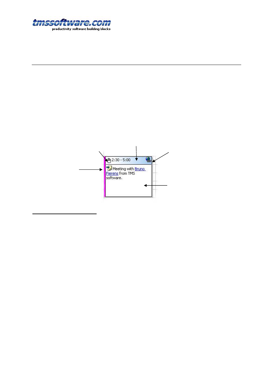
Imagelist image
Gradient caption
HTML referenced
image
HTML formatted
item text with email
hyperlink
Website
hyperlink

TMS SOFTWARE
TPLANNER - TDBPLANNER
DEVELOPERS GUIDE
20
Example:
In day mode, a TPlannerItem can be created from 8 AM to 9 AM in following way :
with Planner1.CreateItem do
begin
ItemStartTime := EncodeTime(8,0,0,0); // 08:00 AM
ItemEndTime := EncodeTime(9,0,0,0);
// 09:00 AM
end;
Suppose the TPlanner.Display property settings have the TPlanner configured to display a time
axis in units of 30 minutes starting from 0h, the equivalent code for using TPlanner.ItemBegin
and TPlannerItem.ItemEnd would be :
with Planner1.CreateItem do
begin
ItemBegin := 8 * (60 div Planner.Display.DisplayUnit);
ItemEnd := 9 * (60 div Planner.Display.DisplayUnit);
end;
When setting item positions through ItemBegin / ItemEnd, the time of the item is of course
always set or returned on boundaries of currently selected TPlanner.Display.DisplayUnit. When
changing from one DisplayUnit to another DisplayUnit, it is preferred that the full time precision
is kept when switching from a small DisplayUnit to a large DisplayUnit and back. This is where
the properties TPlannerItem.ItemBeginPrecis and TPlannerItem.ItemEndPrecis can be used.
These properties set the TPlannerItem position by minutes starting from 0h in day mode.
Creating the same item from 8 AM to 9 AM through these properties becomes :
const
MinutesPerHour = 60;
with Planner1.CreateItem do
begin
ItemBeginPrecis := 8 * MinutesPerHour;
ItemEndPrecis := 9 * MinutesPerHour;
ItemPos := 3;
end;
Thus, like using ItemBegin and ItemEnd, the setting of the position through ItemBeginPrecis and
ItemEndPrecis is again independent of the choosen DisplayUnit. When creating a TPlannerItem
this way and switching the display unit, ItemBeginPrecis / ItemEndPrecis and ItemStartTime and
ItemEndTime will always keep the full time resolution.
A similar approach can be used for a TPlanner in month or period mode. The TPlannerItem
position can be set by :
with Planner1.CreateItem do
begin
ItemStartTime := EncodeDate(2002,7,15);
ItemEndTime := EncodeDate(2002,7,16);
end;
The TPlannerItem.ItemPos: Integer property is simpler and just sets the column (vertical mode)
or row (horizontal mode)
Overlapping TPlannerItems
TMS SOFTWARE
TPLANNER - TDBPLANNER
DEVELOPERS GUIDE
21
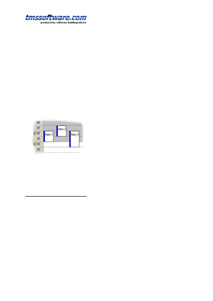
Within a given cell by default TPlannerItems can overlap. Creating 2 items at the same time will
show these as overlapped in a cell.
Overlapping can be turned of in TPlanner by the Overlap property or for each TPlannerItem
separately with the TPlannerItem.AllowOverlap property.
This will prevent at run time that users can at run time move or drag items into positions that
already have non-overlappable items.
It will not prevent though that programmatically items are created in positions that already
have items. It is the responsibility of the programmer to ensure that no items are available in
the position where the TPlannerItem is created. This can be checked with the function
TPlanner.Items.HasItem and an appropriate message can be shown to the user if it is not
allowed to create overlapping items.
If overlapping items are allowed, multiple items are displayed in a single cell. The properties
TPlannerItem.Conflicts: Integer returns the number of conflicting or overlapping items that
exist for this item and TPlannerItem.ConflictPos: Integer returns in which position the
overlapping item is displayed in the cell.
In the sample above, each item will return 3 for the readonly property TPlannerItem.Conflicts
while Item 1 will return 0 for TPlannerItem.ConflictPos, Item 2 will return 1 for
TPlannerItem.ConflictPos and Item 3 will return 2 for TPlannerItem.ConflictPos.
Using TPlannerItems in 3 dimensions
TPlanner has support to use different layers. This means items can be assigned to a layer in the
TPlanner and the TPlanner can be instructed to show all, a single or a combination of different
layers. Therefore, each TPlannerItem has a Layer property. The TPlanner component itself also
has a Layer property.
Layer selection is done in a binary way. Layer numbers are 1,2,4,8,16 … (i.e. all powers of 2).
If a TPlannerItem.Layer is 2, it will be displayed in the TPlanner if TPlanner.Layer is 2. If
TPlanner.Layer is 0, this means all layers are displayed. To display items from 2 layers in the
TPlanner, this can be done by a logical OR of the layer numbers in the TPlanner.Layer property.
Example:
3 TPlannerItems are in the TPlanner, TPlannerItem A has a Layer property 1, and TPlannerItem
B has a Layer property 2 and TPlannerItem C has a Layer property 4.
If TPlanner.Layer is 0, items A,B,C are displayed in the TPlanner. If TPlanner.Layer is 1, only
item A will be displayed in the TPlanner. If TPlanner.Layer is 2, only item B is displayed in the

TMS SOFTWARE
TPLANNER - TDBPLANNER
DEVELOPERS GUIDE
22
TPlanner. When items from both layer 1 and layer 2 need to shown in the TPlanner, this can be
done by setting the TPlanner.Layer property to 3 (= 1 OR 2)
Controlling moving and sizing of TPlannerItems at runtime
With default properties, all items shown in the planner grid can be sized and moved at runtime
without limitations. It might be desirable to limit what can be done with a TPlannerItem at
runtime. This is done through following properties :
FixedPos: Boolean : When true, prevents that items are moved in the TPlanner
FixedSize: Boolean : When true, prevents that items are sized in the TPlanner
FixedTime: Boolean : When true, items can only be moved between positions (position being a
column in vertical mode or row in horizontal mode) and the item cannot be moved so that the
start time and end time would change.
FixedPosition: Boolean : When true, items can only be moved within the same position (position
being a column in vertical mode or row in horizontal mode)
Background: Boolean : When true, the item cannot be selected, moved or sized
Further finer control is possible through the events:
OnItemMove: triggered after the item has been moved
OnItemMoving: triggered while the item is moving, the allow parameter can enable / disable
the moving.
OnItemSize: triggered after the item has been sized
OnItemSizing: triggered while the item is sized, the Allow parameter can enable / disable the
sizing
Editing items with popup editor or inplace editor
The TPlannerItem.ReadOnly property controls whether the item can be edited at runtime or
not. Editing behaviour is controlled with following properties and events:
Editor : TCustomItemEditor
This Property sets the popup editor to be used for the item. If the property is not assigned, then
default inplace editing is assumed.
The TCustomItemEditor class is an interface between the TPlanner and a popup form that can
be used for editing the TPlannerItem. TPlanner currently comes with 3 popup editors:
TSimpleItemEditor, TPeriodItemEditor, and TDefaultItemEditor.
As each TPlannerItem has an Editor property, different items can have different popup editors.
As the TCustomItemEditor has a simple interface, it is easy to create a descendent component
for other types of popup editors.
TCustomItemEditor = class(TComponent)
public
function QueryEdit(APlannerItem: TPlannerItem): Boolean; virtual;
procedure CreateEditor(AOwner: TComponent); virtual;
procedure DestroyEditor; virtual;
function Execute: Integer; virtual;
procedure PlannerItemToEdit(APlannerItem: TPlannerItem); virtual;
procedure EditToPlannerItem(APlannerItem: TPlannerItem); virtual;

TMS SOFTWARE
TPLANNER - TDBPLANNER
DEVELOPERS GUIDE
23
property Planner: TPlanner read FPlanner;
published
property Caption: string;
end;
Override the TCustomItemEditor methods to hook another popup editor. When the item is
clicked to start edit, first the QueryEdit function is called. If this returns true, editing starts by
first calling CreateEditor (to allow creating the popup editor form). After this PlannerItemToEdit
is called to allow setting the various popup editor form controls according the current
TPlannerItem properties. Next, the Execute method should show the popup editor and return
mrOK if changes can be accepted. If changes can be accepted, the EditToPlannerItem method is
called to transfer editor form values to the TPlannerItem.
InplaceEdit : TPlannerItemEdit (peMemo, peEdit, peMaskEdit, peRichText, peCustom, peForm)
If no Editor is assigned, inplace is assumed. Depending on the value of the InplaceEdit property
inplace editing can be done with a memo control, simple or masked edit control, rich text
editor, a custom editor or a HTML form. Inplace editing happens inside the boundaries of the
item in the planner grid.
The event TPlanner.OnItemStartEdit is called before editing starts, the
TPlanner.OnItemEndEdit is called when editing ends. If copy & paste is used in the inplace edit
memo or edit control, this is notified by the event OnItemClipboardAction.

TMS SOFTWARE
TPLANNER - TDBPLANNER
DEVELOPERS GUIDE
24
Other properties that control the PlannerItem appearance
Additional properties that control the appearance of a TPlannerItem in the grid are:
Alignment: sets the alignment of text in the TPlannerItem
Attachement: string that can point to an attachement. If Attachement is a non-empty string,
this is indicated by a clip in the TPlannerItem caption
BrushStyle: sets the background brush style of the TPlannerItem
CaptionAlign: sets the alignment of the TPlannerItem caption text
CaptionBkg: sets the background color of the TPlannerItem caption. This property has no effect
when UniformBkg is true, as the TPlannerItem will always have a full uniform color
CaptionBkgTo: when different from clNone and UniformBkg is false, the caption is drawn with a
gradient from CaptionBkg color to CaptionBkgTo color
CaptionFont: sets the font for the TPlannerItem caption
CaptionText: sets the text for the caption. This text is only displayed when CaptinTupe is either
ctText or ctTimeText
CaptionType: can be
- ctNone : no caption is displayed
- ctText : CaptionText is displayed
- ctTime : time of item is displayed
- ctTimeText : time and CaptionText are displayed at the same time
Color: sets the background color of the TPlannerItem
ColorTo: sets the gradient end color for the background of the TPlannerItem. When set to
clNone, the background is drawn in a solid color.
Completion: sets the completion of the item. This is a value between 0 and 100.
CompletionDisplay: sets where to display the completion. The value can be : cdNone,
cdVertical, cdHorizontal.
Cursor: sets the cursor that is used when mouse is over the item. If Cursor is -1, default cursors
are used.
DrawTool: this assigns a component that encapsulates custom drawing for the TPlannerItem. If
a drawtool component is assigned, this component will draw the item in the planner.
Font: sets the font of the TPlannerItem
InHeader: when true, the item is displayed inside the TPlanner header
SelectColor: sets the color of the item when it is selected
SelectFontColor: sets the font color of the item when it is selected
Shadow: when true, the TPlannerItem is displayed with a shadow. The shadow color is set with
the property TPlanner.ShadowColor
Shape: sets the shape of the TPlannerItem to rectangle, hexagon, rounded rectangle or skinned.
When skinned, the Planner Skin is used to draw the item.
ShowDeleteButton: when true, a delete button is displayed in the upper right corner of the
planner item.
ShowSelection: when true, selected items are displayed with SelectColor and SelectFontColor
Text: the stringlist through which the TPlannerItem text is set
TrackColor: sets the color of the trackbar. The trackbar is the small colored bar with which the
item can be dragged and moved inside the planner grid.
TrackVisible: when true, the trackbar is visible on the TPlannerItem
UniformBkg: when true, CaptionBkg color has no effect
URL: string that can point to an URL. If URL is a non-empty string a link icon is displayed in the
TPlannerItem caption
Visible: sets the visibility state of the TPlannerItem
WordWrap: when true, TPlannerItem text is displayed with wordwrapping.

TMS SOFTWARE
TPLANNER - TDBPLANNER
DEVELOPERS GUIDE
25
Displaying multiple images in the TPlannerItem caption
Images in the TPlannerItem caption should be stored in the imagelist assigned to the
TPlanner.PlannerImages property. Any number of images can be displayed in the caption by
adding the image indexes to the public property TPlannerItem.ImageIndexList. This is a TList of
integer values. To set image 2 and image 4 of the imagelist in the caption, following code can
be used :
PlannerItem.ImageIndexList.Add(2);
PlannerItem.ImageIndexList.Add(4);
Using HTML formatted text in a TPlannerItem
The text of a TPlannerItem has support for various HTML tags through which fine control of the
display is possible. These tags form a subset of the HTML tags and are further named as mini
html.
Supported tags
•
B : Bold tag
<B> : start bold text
</B> : end bold text
Example : This is a <B>test</B>
•
U : Underline tag
<U> : start underlined text
</U> : end underlined text
Example : This is a <U>test</U>
•
I : Italic tag
<I> : start italic text
</I> : end italic text
Example : This is a <I>test</I>
•
S : Strikeout tag
<S> : start strike-through text
</S> : end strike-through text
Example : This is a <S>test</S>
•
A : anchor tag
<A href="value"> : text after tag is an anchor. The 'value' after the href identifier is the
anchor. This can be an URL (with ftp,http,mailto,file identifier) or any text. If the value is
an URL, the shellexecute function is called, otherwise, the anchor value can be found in the
OnAnchorClick event
</A> : end of anchor
Examples :
This is a <A href=
"mailto:myemail@mail.com
">test</A>
This is a <A href="http://www.tmssoftware.com">test</A>
This is a <A href="somevalue">test</A>

TMS SOFTWARE
TPLANNER - TDBPLANNER
DEVELOPERS GUIDE
26
•
FONT : font specifier tag
<FONT face='facevalue' size='sizevalue' color='colorvalue' bgcolor='colorvalue'> : specifies
font of text after tag.
with
- face : name of the font
- size : HTML style size if smaller than 5, otherwise pointsize of the font
- color : font color with either hexidecimal color specification or Borland style color name,
ie clRed,clYellow,clWhite ... etc
- bgcolor : background color with either hexidecimal color specification or Borland style
color name
</FONT> : ends font setting
Examples :
This is a <FONT face="Arial" size="12" color="clRed">test</FONT>
This is a <FONT face="Arial" size="12" color="#FF0000">test</FONT>
•
P : paragraph
<P align="alignvalue" [bgcolor="colorvalue"]> : starts a new paragraph, with left, right or
center alignment. The paragraph background color is set by the optional bgcolor parameter.
</P> : end of paragraph
Example : <P align="right">This is a test</P>
Example : <P align="center">This is a test</P>
Example : <P align="left" bgcolor="#ff0000">This has a red background</P>
Example : <P align="right" bgcolor="clYellow">This has a yellow background</P>
•
HR : horizontal line
<HR> : inserts linebreak with horizontal line
•
BR : linebreak
<BR> : inserts a linebreak
•
BODY : body color / background specifier
<BODY bgcolor="colorvalue" background="imagefile specifier"> : sets the background color of
the HTML text or the background bitmap file
Example :
<BODY bgcolor="clYellow"> : sets background color to yellow
<BODY background="file://c:\test.bmp"> : sets tiled background to file test.bmp
•
IND : indent tag
This is not part of the standard HTML tags but can be used to easily create multicolumn text
<IND x="indent"> : indents with "indent" pixels
Example :
This will be <IND x="75">indented 75 pixels.
•
IMG : image tag
<IMG src="specifier:name" [align="specifier"] [width="width"] [height="height"]
[alt="specifier:name"] > : inserts an image at the location
specifier can be :
idx : name is the index of the image in the associated imagelist
ssys : name is the index of the small image in the system imagelist or a filename for which
the corresponding system imagelist is searched

TMS SOFTWARE
TPLANNER - TDBPLANNER
DEVELOPERS GUIDE
27
lsys : same as ssys, but for large system imagelist image
file : name is the full filename specifier
res : name of a resource bitmap (not visible at design time)
no specifier : name of image in an PictureContainer
Optionally, an alignment tag can be included. If no alignment is included, the text
alignment with respect to the image is bottom. Other possibilities are : align="top" and
align="middle"
The width & height to render the image can be specified as well. If the image is embedded
in anchor tags, a different image can be displayed when the mouse is in the image area
through the Alt attribute.
Examples :
This is an image <IMG src="idx:1" align="top">
This is an image <IMG src="ssys:1"> and another one <IMG src="ssys:worfile.doc">
This is an image <IMG src="file://c:\my documents\test.bmp">
This is an image <IMG src="res://BITMAP1">
This is an image <IMG src="name">
•
SUB : subscript tag
<SUB> : start subscript text
</SUB> : end subscript text
Example : This is <SUP>9</SUP>/<SUB>16</SUB> looks like
9
/
16
•
SUP : superscript tag
<SUP> : start superscript text
</SUP> : end superscript text
•
BLINK : blink tag (supported in TAdvStringGrid and descendants and THTMListbox)
<BLINK> : start blinking text
</BLINK> : stop blinking text
Example : This is <FONT color="clred"><BLINK>blinking red</BLINK></FONT>text.
•
UL : list tag
<UL> : start unordered list tag
</UL> : end unordered list
Example :
<UL>
<LI>List item 1
<LI>List item 2
<UL>
<LI> Sub list item A
<LI> Sub list item B
</UL>
<LI>List item 3
</UL>
•
LI : list item
<LI> : new list item

TMS SOFTWARE
TPLANNER - TDBPLANNER
DEVELOPERS GUIDE
28
•
SHAD : text with shadow
<SHAD> : start text with shadow
</SHAD> : end text with shadow
•
Z : hidden text
<Z> : start hidden text
</Z> : end hidden text
•
HI : hilight
<HI> : start text hilighting
</HI> : stop text hilighting
•
E : Error marking
<E> : start error marker
</E> : stop error marker
•
Special characters
Following standard HTML special characters are supported :
< : less than : <
> : greater than : >
& : &
" : "
: non breaking space
™ : trademark symbol
€ : euro symbol
§ : section symbol
© : copyright symbol
¶ : paragraph symbol
HTML formatting related events
The hyperlinks that can be added inside TPlannerItems cause following events when the mouse
is over or clicked on hyperlink. The events are:
OnItemAnchorClick: triggered when a hyperlink is clicked on a TPlannerItem
OnItemAnchorEnter: triggered when the mouse enters a hyperlink
OnItemAnchorExit: triggered when the mouse leaves a hyperlink
Example:
A hyperlink is added with
TPlannerItem.Text.Text :=
‘This is a <a href=”myhyperlink”>hyperlink<a>’;

TMS SOFTWARE
TPLANNER - TDBPLANNER
DEVELOPERS GUIDE
29
When the mouse clicked on the hyperlink, the OnItemAnchorClick is called with a reference to
the TPlannerItem and the Anchor parameter is ‘myhyperlink’
Using TPlannerItem alarms
Through the Alarm property in a TPlannerItem and alarm handlers, all types of alarms can be
triggered by the TPlannerItem. Note that alarms are enabled in the TPlanner by the property
TPlanner.EnableAlarms. Different alarm handlers that play sound, send email, show a message,
run a script, execute a program can be downloaded from
http://www.tmssoftware.com/planaddon.htm
The setup of the alarm handler is discussed later,
first the properties are explained for the alarm settings for each TPlannerItem.
Properties in TPlannerItem.Alarm:
Active: Boolean; when true the alarm is active for the TPlannerItem
Address: string; destination where the alarm should be sent to
Handler: TPlannerAlarmHandler; refers to the component handling the alarm
ID : Integer; alarm identification number
Message: string; message sent to the alarm handler
NotifyType: TAlarmNotifyType; (anCaption,anNotes,anMessage) selects what to send to the
alarm handler, the TPlannerItem caption, the TPlannerItem text or the Alarm.Message
Tag: Integer; free to use integer property
Time: selects whether to use the TimeAfter or TimeBefore property to control the alarm
TimeAfter: TDateTime; time after the TPlannerItem ends the alarm should trigger
TimeBefore: TDateTime; time before the TPlannerItem starts the alarm should trigger
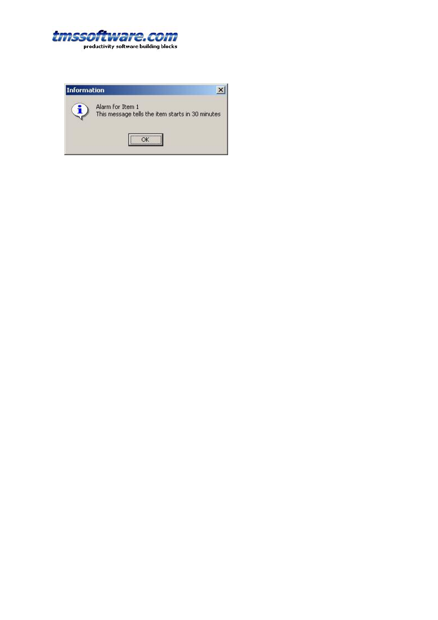
Example:
Following example creates a TPlannerItem in a day mode TPlanner that starts at 2AM and
triggers an alarm message 30 minutes before the TPlannerItem starts :
with Planner1.CreateItem do
begin
ItemStartTime := EncodeTime(2,0,0,0); // 02:00 AM
ItemEndTime := EncodeTime(3,0,0,0); // 03:00 AM
CaptionText := 'Item 1';
Text.Text := 'This message tells the item starts in 30 minutes';
CaptionType := ctText;
Alarm.Active := True;
Alarm.Handler := AlarmMessage1;
Alarm.TimeBefore := EncodeTime(0,30,0,0); // 30 minutes
Alarm.NotifyType := anNotes;
end;
The item inserted in the TPlanner will thus trigger an alarm at 1.30AM . The AlarmMessage1 is a
simple alarm handler that displays a message box. The selected text for the alarm message is
the text of the TPlannerItem itself as selected by the NotifyType which is anNotes. At 1.30AM
the message displayed is:
TMS SOFTWARE
TPLANNER - TDBPLANNER
DEVELOPERS GUIDE
30
Alarm handlers are easy to write. An alarm handler descends for the TPlannerAlarmHandler class
which is defined as :
TPlannerAlarmHandler = class(TComponent)
public
function HandleAlarm(Address,Message:string; Tag, ID: Integer;
Item: TPlannerItem): Boolean; virtual;
end;
One single function should thus be defined. The result of the function indicates whether the
alarm has been successfully handled or not. If the user selects for example to snooze the alarm
for a given amount of time, return false, update the TPlannerItem.Alarm.TimeBefore property
to the new time of the alarm and it will be triggered again. The Address, Message, Tag and ID
parameters of this function are taken from the TPlannerItem.Alarm property.
The TAlarmMessage alarm handler defines this function in the following way:
{ TAlarmMessage }
function TAlarmMessage.HandleAlarm(Address, Message: string; Tag,
ID: Integer; Item: TPlannerItem): Boolean;
begin
MessageDlg('Alarm for’ +Item.CaptionText+#13+
HTMLStrip(Item.Text.Text),mtInformation,[mbok],0);
Result := True;
end;

TMS SOFTWARE
TPLANNER - TDBPLANNER
DEVELOPERS GUIDE
31
Using a custom TPlannerItem class
For maintaining custom data with each planner item you can assign any TObject descendent
class to the PlannerItem's public Object property. However there is a more convenient way to
create a descendent class from TPlanner that has a TPlannerItem with new custom properties
which can be used at design time and at run time to hold any additional values with each
planner item. The code involved comes down to:
1. Write your descendent class of TPlannerItem and add the additional properties. Override the
assign procedure to copy the extra properties added.
2. Write your descendent class of the TPlannerItems collection and override the GetItemClass
method to instruct the collection to create collection items from your descendent TPlannerItem
class.
3. Write your descendent class of TPlanner and override the protected CreateItems method to
let the planner use your descendent TPlannerItems collection.
Following code where a new property MyProperty was added to the TPlannerItem, makes this
clear:
Example:
unit MyPlanner;
interface
uses
Windows, Messages, SysUtils, Classes, Graphics, Controls, Forms,
Dialogs, Planner;
type
TMyPlannerItem = class(TPlannerItem)
private
FMyProperty: string;
public
procedure Assign(Source: TPersistent); override;
published
property MyProperty: string read FMyProperty write FMyProperty;
end;
TMyPlannerItems = class(TPlannerItems)
public
function GetItemClass: TCollectionItemClass; override;
end;
TMyPlanner = class(TPlanner)
private
{ Private declarations }
protected
{ Protected declarations }
function CreateItems: TPlannerItems; override;
public
{ Public declarations }
published
{ Published declarations }
end;
procedure Register;

TMS SOFTWARE
TPLANNER - TDBPLANNER
DEVELOPERS GUIDE
32
implementation
procedure Register;
begin
RegisterComponents('TMS', [TMyPlanner]);
end;
{ TMyPlannerItems }
function TMyPlannerItems.GetItemClass: TCollectionItemClass;
begin
Result := TMyPlannerItem;
end;
{ TMyPlanner }
function TMyPlanner.CreateItems: TPlannerItems;
begin
Result := TMyPlannerItems.Create(Self);
end;
{ TMyPlannerItem }
procedure TMyPlannerItem.Assign(Source: TPersistent);
begin
inherited Assign(Source);
if Assigned(Source) then
FMyProperty := TMyPlannerItem(source).MyProperty;
end;
end.
Note: the same method can be used for creating custom TPlannerItem classes with the
TDBPlanner. In some events, such a TDBItemSource.OnFieldsToItem or
TDBItemSource.OnItemToFields, the extra properties of the custom TPlannerItem class can be
accessed by casting the Item parameter to the custom TPlannerItem class.
The TPlannerItems collection
The collection that holds all TPlannerItem objects features a whole array of methods and
functions that allow manipulating the items inside the planner.
Important note:
When making changes that affect a lot of items in the planner or when adding or removing a lot
of items, performance will vastly improve when enclosing the operations with
TPlanner.Items.BeginUpdate;
// do update, adding, removing of items here
TPlanner.Items.EndUpdate;
Searching items in the planner
function HasItem(ItemBegin, ItemEnd, ItemPos: Integer): Boolean;

TMS SOFTWARE
TPLANNER - TDBPLANNER
DEVELOPERS GUIDE
33
Returns if the planner cell has items at a given position
function FindFirst(ItemBegin, ItemEnd, ItemPos: Integer): TPlannerItem;
Returns the first item at a given cell
function FindNext(ItemBegin, ItemEnd, ItemPos: Integer): TPlannerItem;
Returns the next item at a given cell
function FindText(StartItem:TPlannerItem;s: string; Param: TFindTextParams):TPlannerItem;
Finds text in all TPlannerItem Object’s Text property in the planner grid
function HeaderFirst(ItemPos: Integer): TPlannerItem;
Returns the first item in a planner header at position ItemPos
function HeaderNext(ItemPos: Integer): TPlannerItem;
Returns the first item in a planner header at position ItemPos
function ItemsAtPosition(Pos: Integer): Integer;
Returns the number of items in a given position
function ItemsAtIndex(Idx: Integer): Integer;
Returns the number of items at a given index along the time axis
Example:
This code fragment searches all items in the TPlanner for the word ‘Meeting’ :
var
plIt: TPlannerItem;
begin
plIt := nil;
repeat
plIt :=
Planner1.Items.FindText(plIt,'Meeting',[fnAutoGoto,fnText]);
if Assigned(plIt) then
ShowMessage('Found appointment');
until plIt = nil;
ShowMessage('No more items found');
end;
Item selection in the planner
Item selection is by default single selection. Selecting an item automatically unselects the
previously selected item. If the property TPlanner.MultiSelect is true, multiple items can be
selected by Ctrl – Left Click.
function SelectNext: TPlannerItem;

TMS SOFTWARE
TPLANNER - TDBPLANNER
DEVELOPERS GUIDE
34
Selects the next item in the list
function SelectPrev: TPlannerItem;
Selects the previous item in the list
procedure UnSelect;
Unselects the currently selected item
procedure UnSelectAll;
Unselects all items in the planner
procedure Select(Item: TPlannerItem);
Selects the TPlannerItem programmatically
property Selected: TPlannerItem;
Returns the currently selected item.
Clipboard support
Items can be cut, copied to the clipboard with all properties and pasted afterwards
procedure CopyToClipboard;
Copy selected TPlannerItem to the clipboard
procedure CutToClipboard;
Cut selected TPlannerItem to the clipboard
procedure PasteFromClipboard;
Paste item from the clipboard. It is inserted at its original position in the planner
procedure PasteFromClipboardAtPos;
Paste item from the clipboard at the current selected cells in the planner.
Example:
Programmatically selecting & copying an item to the next position in the planner :
Planner1.Items.Select(APlannerItem);
Planner1.Items.CopyToClipboard;
Planner1.SelectCells(Planner1.SelItemBegin,Planner1.SelItemEnd,
Planner1.SelPosition + 1);
Planner1.Items.PasteFromClipboardAtPos;
Moving, sizing & removing items

TMS SOFTWARE
TPLANNER - TDBPLANNER
DEVELOPERS GUIDE
35
procedure MoveAll(DeltaPos, DeltaBegin: Integer);
Moves all items with DeltaPos for Position and DeltaBegin for ItemBegin
procedure MoveSelected(DeltaPos, DeltaBegin: Integer);
Moves selected items only with DeltaPos for Position and DeltaBegin for ItemBegin
procedure SizeAll(DeltaStart, DeltaEnd: Integer);
Sizes all items with DeltaStart for ItemBegin and DeltaEnd for ItemEnd
procedure SizeSelected(DeltaStart, DeltaEnd: Integer);
Sizes selected items only with DeltaStart for ItemBegin and DeltaEnd for ItemEnd
procedure ClearPosition(Position: Integer);
Removes all items in a given position
procedure ClearLayer(Layer: Integer);
Removes all items in a given layer
procedure ClearAll;
Removes all items
Saving and loading items in non data-aware TPlanner
Several methods exist to save and load TPlannerItem objects to a stream or to a file. Using
these methods, all properties of the TPlannerItem objects are saved on a stream or file. The
format of the TPlannerItem’s on the stream or in the file is both a binary format.
The methods can be summarized as:
Save and load all TPlanner items to a stream or file:
procedure SaveToStream(Stream: TStream);
procedure LoadFromStream(Stream: TStream);
procedure SaveToFile(FileName: string);
procedure LoadFromFile(FileName: string);
Save and load only items in a given position to a stream or file:
procedure SavePositionToStream(Stream: TStream; Position: Integer);
procedure LoadPositionFromStream(Stream: TStream; Position: Integer);
procedure SavePositionToFile(FileName: string; Position: Integer);
procedure LoadPositionFromFile(FileName: string; Position: Integer);
Save and load only items of a given layer to a stream or file:
procedure SaveLayerToStream(Stream: TStream; Layer: Integer);
procedure LoadLayerFromStream(Stream: TStream; Layer: Integer);
procedure SaveLayerToFile(FileName: string; Layer: Integer);
procedure LoadLayerFromFile(FileName: string; Layer: Integer);

TMS SOFTWARE
TPLANNER - TDBPLANNER
DEVELOPERS GUIDE
36
Add items from from a stream or file to the existing TPlannerItems
procedure InsertFromFile(FileName: string);
procedure InsertFromStream(Stream: TStream);
Example:
If there are 2 TPlanner components are on a form, the method below makes a copy of all
TPlannerItem objects from Planner1 to Planner2 by a memory stream:
procedure TForm1.Save(Sender: TObject);
var
ms: TMemoryStream;
begin
ms := TMemoryStream.Create;
Planner1.SaveToStream(ms);
ms.Position := 0;
Planner2.LoadFromStream(ms);
ms.Free;
end;
Printing of the TPlanner component
TPlanner has built-in support for printing. The TPlanner.PrintOptions property controls
various options for the printout. At the same time, different methods exist for printing the
TPlanner :
procedure Print;
Prints the TPlanner as is on a single page
procedure PrintPages(NrOfPages: Integer);
Spreads the printing of the TPlanner on the selected number of pages
procedure PrintSelection(FromPos, ToPos: Integer);
Prints only positions FromPos to ToPos
procedure PrintRange(FromPos, ToPos, FromItem, ToItem: Integer);
Prints only positions FromPos to Top and cells along the time axis FromItem to ToItem
procedure PrintTo(ACanvas:TCanvas);
Prints the TPlanner on the selected canvas.
procedure PrintSelectionTo(ACanvas:TCanvas;FromPos, ToPos: Integer);
Prints only positions FromPos to ToPos on the selected canvas
procedure PrintRangeTo(ACanvas:TCanvas;FromPos, ToPos, FromItem, ToItem: Integer);

TMS SOFTWARE
TPLANNER - TDBPLANNER
DEVELOPERS GUIDE
37
Prints only positions FromPos to Top and cells along the time axis FromItem to ToItem on the
selected canvas.
The TPrintOptions property of TPlanner has following properties through which further
control of the printout is possible:
CellHeight: Integer; when different from zero, sets the number of pixels to use during
printout for the height of a cell. When zero, this is autocalculated for fitting the TPlanner
onto a page.
CellWidth: Integer; when different from zero, sets the number of pixels to use during
printout for the height of a cell. When zero, this is autocalculated for fitting the TPlanner
onto a page.
FitToPage: Boolean; when true, the TPlanner tries to fit the printout on a single page.
Footer: TStrings; sets the footer text to print.
FooterAlignment: TAlignment; sets the alignment of the footer text.
FooterFont: TFont; sets the font of the footer text.
FooterSize: Integer; sets the number of pixels to use for the footer height.
Header: TStrings; sets the header text to print.
HeaderAlignment : TAlignment; sets the alignment of the header text.
HeaderFont: TFont; sets the font of the header text.
HeaderSize: Integer; sets the number of pixels to use for the header height.
JobName: string; sets the job name in the print spooler.
LeftMargin: Integer; sets the number of pixels to indent from left for the printout.
Orientation: TPrinterOrientation; sets the printer orientation to either landscape or portrait.
RightMargin: Integer; sets the number of pixels to indent from right.
SidebarWidth: Integer; sets the width of the sidebar during printout. When zero, the sidebar
width is automatically calculated to fit on the page.
Saving the TPlanner to HTML
The SaveToHTML method generates a HTML file of the TPlanner with all its TPlannerItem
objects. This is done with:
procedure SaveToHTML(FileName: string);
The HTMLOptions property consists of following subproperties :
BorderSize: Integer; sets the border size of the HTML table containing the TPlanner.
CellSpacing: Integer; sets the cell spacing of the HTML table containing the TPlanner.
FooterFile: string; specifies a HTML file that can be inserted after the TPlanner HTML output.
HeaderFile: string; specifies a HTML file that can be inserted beforethe TPlanner HTML
output.
TableStyle: string; sets extra tag information for the main <TABLE> tag.
PrefixTag: string; sets additional tags that precede the TPlanner HTML output.
SuffixTag: string; sets additional tags after the TPlanner HTML output.
Width: Integer; specifies the width in % of the table.
CellFontTag: string; sets additional font tags for each cell of the planner grid.
CellFontStyle: TFontStyles; sets the font styles for each cell of the planner grid.
HeaderFontTag: string; sets additional font tags for the TPlanner header output.

TMS SOFTWARE
TPLANNER - TDBPLANNER
DEVELOPERS GUIDE
38
HeaderFontStyle: TFontStyles; sets the font styles for the TPlanner header output.
SidebarFontTag: string; sets additional font tags for the TPlanner sidebar output.
SidebarFontStyle: TFontStyles; sets additional font styles for the TPlanner sidebar output.
ShowCaption: Boolean; when true, a TPlannerItem caption is also saved in the HTML output.
Example:
This example outputs the TPlanner in HTML in a table that has 80% width, centered on the
page with bold header and sidebar font. It shows the output in a browser:
uses
ShellAPI;
Planner1.HTMLOptions.Width := 80;
Planner1.HTMLOptions.SidebarFontStyle := [fsBold];
Planner1.HTMLOptions.HeaderFontStyle := [fsBold];
Planner1.HTMLOptions.PrefixTag := ‘<CENTER>’;
Planner1.HTMLOptions.SuffixTag := ‘</CENTER>’;
Planner1.SaveToHTML(‘myHTML.htm’);
ShellExecute(0,’open’,’myHTML.htm’,nil,nil,SW_NORMAL);
Saving the TPlanner to a bitmap
procedure SaveToBMP(FileName: string; Size: TSize);
The SaveToBMP method saves the planner to a bitmap. The size parameters set the width and
height to be used for the generated bitmap.
Drag & drop in TPlanner
Through drag & drop it is possible to do anything from dragging text onto a TPlannerItem,
drag a TPlannerItem to and from a TPlanner and drag & drop items between multiple
TPlanner components. To handle drag & drop on the TPlanner from any component, it
sufficient to handle the events :
OnDragOver: event triggered when mouse is over the TPlanner during a drag & drop.
OnDragOverCell: event triggered when mouse is over a planner grid cell during a drag &
drop.
OnDragOverItem: event triggered when mouse is over a TPlannerItem during drag & drop
OnDragDrop: general event triggered when drop operation on the TPlanner happens.
OnDragDropCell: event triggered when a drop operation in a planner grid cell happens.
OnDragDropItem: event triggered when a drop operation on a TPlannerItem happens.
Example:
In this example, a listbox contains descriptions for appointments. A drag & drop of these
descriptions is enabled from the listbox on TPlannerItem objects in the planner that have not
yet a description set in their Text property.

TMS SOFTWARE
TPLANNER - TDBPLANNER
DEVELOPERS GUIDE
39
For the TListBox component on the form, the DragMode is set to dmAutomatic and the listbox
items is filled with some descriptions for events.
To allow only a drag & drop of a description for a TPlannerItem that has an empty Text
property, the OnDragOverItem is defined in following way :
procedure TForm1.Planner1DragOverItem(Sender, Source: TObject; X,
Y: Integer; APlannerItem: TPlannerItem; State: TDragState;
var Accept: Boolean);
begin
Accept := APlannerItem.Text.Text = '';
end;
The drop operation is handled by following event code for OnDragDropItem:
procedure TForm1.Planner1DragDropItem(Sender, Source: TObject; X,
Y: Integer; PlannerItem: TPlannerItem);
begin
with SourCe as TListBox do
PlannerItem.Text.Text := Items[ItemIndex];
end;
If the drag and drop operation is over an empty cell in the TPlanner, it is possible to create a
new appointment. Thus, two cases need to be handled : either the drop occurs on an existing
item and the appointment text must be updated if it is empty or the drop operation occurs on
a empty planner grid cell and a new appointment must be created. The full source becomes:
procedure TForm1.Planner1DragOverItem(Sender, Source: TObject; X,
Y: Integer; APlannerItem: TPlannerItem; State: TDragState;
var Accept: Boolean);
begin
// Allow drop on item only when Text is empty
Accept := APlannerItem.Text.Text = '';
end;
procedure TForm1.Planner1DragDropItem(Sender, Source: TObject; X,
Y: Integer; PlannerItem: TPlannerItem);
begin
// For drop on item, update its Text property
with Source as TListBox do
PlannerItem.Text.Text := Items[ItemIndex];
end;
procedure TForm1.Planner1DragDropCell(Sender, Source: TObject; X,
Y: Integer);
begin
// Create new item only when no items are in the cell
if Planner1.CellToItemNum(X,Y) = 0 then
begin
with Planner1.CreateItem do
begin
ItemBegin := Y;
ItemEnd := Y + 1;
itemPos := X;
with Source as TListBox do

TMS SOFTWARE
TPLANNER - TDBPLANNER
DEVELOPERS GUIDE
40
Text.Text := Items[ItemIndex];
end;
end;
end;
procedure TForm1.Planner1DragOverCell(Sender, Source: TObject; X,
Y: Integer; State: TDragState; var Accept: Boolean);
begin
// Accept this only when no items are in this cell
Accept := Planner1.CellToItemNum(X,Y) = 0;
end;
In the next example, drag & drop of full TPlannerItem objects between two TPlanner
components is discussed. To differentiate between drag and drop inside the TPlanner itself
for moving the item to a different time and drag and drop inter components, the Ctrl key is
used while moving the item with the trackbar. This is enabled by setting the global property
TPlanner.DragItem = true. In this example, a second planner is put on the form and through
the events OnDragOverCell, OnDragDropCell, drag and drop of TPlannerItem’s from the first
Planner1 to the second Planner2 is enabled.
Example:
procedure TForm1.Planner2DragOverCell(Sender, Source: TObject; X,
Y: Integer; State: TDragState; var Accept: Boolean);
begin
// Do not accept that items are dropped
Accept := Planner2.CellToItemNum(X,Y) = 0;
end;
procedure TForm1.Planner2DragDropCell(Sender, Source: TObject; X,
Y: Integer);
var
Delta: Integer;
begin
with Planner2.CreateItem do
begin
// Copy selected item of drag drop operation to new created item
Assign(Planner1.Items.Selected);
// Get duration of item and make sure duration is identical
Delta := ItemEnd - ItemBegin;
ItemBegin := y;
ItemEnd := y + delta;
ItemPos := x;
end;
// Delete item in drag & drop source component
Planner1.FreeItem(Planner1.Items.Selected);
end;
Export & import of TPlannerItems

TMS SOFTWARE
TPLANNER - TDBPLANNER
DEVELOPERS GUIDE
41
Through an easy interface, it is possible to either use existing import and export add-on
components or write custom import / export add-on components. For export, items that
should be handled in the export, have a public property TPlannerItem.DoExport = True. It is
the task of the TPlanner export handler to write all items to the destination. Different
examples are available at
http://www.tmssoftware.com/planaddon.htm
TPlanner provides functions to mark automatically a series of TPlannerItems for export with:
procedure ExportItem(APlannerItem); mark a single item for export
procedure ExportItems; marks all items for export
procedure ExportPosition(Pos: Integer); marks all items in a position for export
procedure ExportLayer(Layer: Integer); marks all items in a layer for export
procedure ExportClear; resets all marked items for export
A very simple export handler to export TPlannerItem objects to XML descends from
TPlannerExchange and overrides the DoExport function. The TPlannerExchange base class
provides a function NumItemsForExport which returns the number of items that should be
exported and a property Planner: TPlanner that is the instance of the TPlanner component to
which it is connected. The DoExport routine becomes:
procedure TPlannerXMLExchange.DoExport;
var
i,j: Integer;
f: TextFile;
xml: TStringList;
begin
if NumItemsForExport = 0 then
Exit;
xml := TStringList.Create;
try
AssignFile(f,FFilename);
{$i-}
Rewrite(f);
{$i+}
if IOResult <> 0 then
raise Exception.Create('Cannot Create file ' + FFileName);
writeln(f,'<?xml version="1.0"?>');
writeln(f,'<' + FListName + '>');
for i := 1 to Planner.Items.Count do
begin
if Planner.Items[i - 1].DoExport then
begin
writeln(f,'<' + FItemName + '>');
write(f,'<' + FStartTimeName + '>');
write(f,FormatDateTime(DateTimeFormat,
Planner.Items[i - 1].ItemStartTime));
writeln(f,'</' + FStartTimeName + '>');
write(f,'<' + FEndTimeName + '>');
write(f,FormatDateTime(DateTimeFormat,
Planner.Items[i - 1].ItemEndTime));
writeln(f,'</' + FEndTimeName + '>');

TMS SOFTWARE
TPLANNER - TDBPLANNER
DEVELOPERS GUIDE
42
writeln(f,'<' + FCaptionName + '>' +
Planner.Items[i - 1].CaptionText + '</'
+ FCaptionName + '>');
writeln(f,'<' + FTextName + '>' +
Planner.Items[i - 1].Text.Text+ '</' + FTextName + '>');
xml.Clear;
if Assigned(FOnItemToXML) then
FOnItemToXML(Self,Planner.Items[i - 1], xml);
for j := 1 to xml.count do
begin
writeln(f,xml.Strings[j - 1]);
end;
writeln(f,'</' + FItemName + '>');
end;
end;
writeln(f,'</' + FListName + '>');
CloseFile(f);
finally
xml.Free;
end;
end;
For importing, the routine DoImport is defined. It is the task of the custom TPlannerExchange
descendent component to handle reading or getting the appointment information and create
the items in the TPlanner component.
Additional TPlanner / TDBPlanner methods and properties
Cell selection
Several functions exist to get the selected cells in the planner grid, to set the selected cells
or to convert date & time to cell coordinates and vice versa.
The selected cells in the planner grid can be retrieved with:
SelPosition: Integer; retrieves the index of the position where the selected cell is
SelItemBegin: Integer; retrieves the index along the time axis where the cell selection starts
SelItemEnd: Integer; retrieves the index along the time axis where the cell selection ends
In a vertical oriented grid, the SelPosition thus indicates the column index of the selected cell
and SelItemBegin, SelItemEnd indicate the row indexes where the selection starts and ends.
Selecting cells programmatically in the planner grid can be done with:
procedure SelectCells(SelBegin,SelEnd,SelPos: Integer);
Conversion of absolute time to cell index along the time axis depends of the mode of the
TPlanner and can be done with:
procedure CellToAbsTime(x: Integer;var dtStart,dtEnd: TDateTime);
and vice versa:

TMS SOFTWARE
TPLANNER - TDBPLANNER
DEVELOPERS GUIDE
43
function AbsTimeToCell(DateTime: TDateTime): Integer;
Example:
If the planner is in day mode, the following code selects the cells from 14h PM to 15h30 PM
and adapts the scrolling of the grid to make sure the selected cells are visible.
var
sb,se: Integer;
begin
sb := Planner1.AbsTimeToCell(EncodeTime(14,0,0,0));
se := Planner1.AbsTimeToCell(EncodeTime(15,30,0,0));
Planner1.SelectCells(sb,se - 1,0);
Planner1.GridTopRow := sb;
end;
If the planner is in month mode, the following code selects the day span from 15/7/2002 to
20/7/2002 :
var
sb,se: Integer;
begin
sb := Planner1.AbsTimeToCell(EncodeDate(2002,7,15));
se := Planner1.AbsTimeToCell(EncodeDate(2002,7,20));
Planner1.SelectCells(sb,se - 1,0);
Planner1.GridTopRow := sb;
end;
Other methods available for cell selection are:
function IsSelected(AIndex, APosition: Integer): Boolean;
This function returns true if the cell is within the range of selected cells.
procedure HideSelection; hides the selection of cells
procedure UnHideSelection; unhides the selection of cells
Cells, mouse coordinates and TPlannerItems
The conversion between mouse coordinates and cell coordinates and/or TPlannerItem objects
can be done with :
function XYToCell(X,Y: Integer): TPoint;
Returns the cell coordinates of the cell in which mouse coordinates X,Y are.
function XYToItem(X,Y: Integer): TPlannerItem;
Returns the planneritem under the mouse at coordinates X,Y. If no TPlannerItem objects are
at mouse coordinates X,Y, nil is returned.

TMS SOFTWARE
TPLANNER - TDBPLANNER
DEVELOPERS GUIDE
44
function CellToItem(X,Y: Integer): TPlannerItem;
Returns the planneritem at cell coordinates X,Y. If no TPlannerItem objects are at cell
coordinates X,Y, nil is returned.
function CellToItemNum(X,Y: Integer): Integer;
Returns the number of items in cell X,Y. The result will only be higher than 1 if items can be
overlapped in the TPlanner.
function CellToItemIndex(X,Y,Index: Integer): TPlannerItem;
If multiple overlapped TPlannerItem objects are at cell X,Y, this function returns item Index a
this cell.
function CellInCurrTime(X,Y: Integer): Boolean;
Returns true if the current time is within the time span of cell X,Y.
Position handling
As explained earlier, the number of positions is either the number of columns (in vertical
mode, Sidebar is on left or right) or the number of rows (in horizontal mode, Sidebar is on
top) The number of positions can be set with TPlanner.Positions. When
TPlanner.PositionWidth is zero, positions are scaled to fit in the TPlanner either vertically and
horizontally. If TPlanner.PositionWidth is different from zero, this width is applied for all
positions. The TPlanner provides 3 additional methods to move, delete and insert positions
and 2 methods to zoom and unzoom :
procedure MovePosition(FromPos, ToPos: Integer);
Moves a position from one position FromPos to a new position ToPos.
procedure DeletePosition(Position: Integer);
Deletes a position from the planner.
procedure InsertPosition(Position: Integer);
Inserts a new position in the planner at Position index in the planner.
procedure ZoomPosition(Position: Integer);
Applies the PositionZoomWidth to position Position
procedure UnZoomPosition(Position: Integer);
Resets the position width to normal width PositionWidth

TMS SOFTWARE
TPLANNER - TDBPLANNER
DEVELOPERS GUIDE
45
Position properties
As the TPlanner.Display settings normally apply to the full planner and thus all positions, the
PositionProps offer the capability to override these global settings per position. The
PositionProps property is a collection of TPositionProp objects that control Active / Non
Active colors, selection color and ActiveStart / ActiveEnd per position. When inserting
TPositionProp objects in the PositionProps collection, these control properties of consecutive
positions in the planner, ie. the first PositionProp object controls position 0, the second
position 1 and so further. The PositionProp only has effect when its Use property is set true.
The full list of PositionProp properties is:
ActiveStart: Integer; sets the start of the active time zone
ActiveEnd: Integer; sets the end of the active time zone
Background: TBitmap; if a bitmap is specified, the bitmap is used as background for the
position
ColorActive: TColor; sets the color of the active time zone
ColorNonActive: TColor; sets the color of the non active time zone
MinSelection: Integer; if different from zero, sets the minimum selectable cell
MaxSelection: Integer; if different from zero, sets the maximum selectable cell
ColorNoSelect: TColor; sets the color of the non selectable cells in the position. This has
effect only when MinSelection / MaxSelection are set
BrushNoSelect: TBrushStyle; sets the brush style for the non selectable cells
ShowGap: Boolean; if true and the global planner PositionGap is different from zero, the
position gap is displayed for this position.
Use: Boolean; when true, the PositonProp settings are used, otherwise global Display settings
apply.
Example:
Suppose the TPlanner is in day mode with 5 positions and each position represents a day of
the week. On Monday and Friday office hours are from 9AM to 17PM while on other days the
office hours are from 8AM to 17PM. To indicate the office hours as active hours in each
position, following code is used :
with Planner1.PositionProps.Add do
begin
ActiveStart := Planner1.AbsTimeToCell(EncodeTime(9,0,0,0));
ActiveEnd := Planner1.AbsTimeToCell(EncodeTime(17,0,0,0));
ColorActive := clYellow;
end;
with Planner1.PositionProps.Add do
begin
ActiveStart := Planner1.AbsTimeToCell(EncodeTime(8,0,0,0));
ActiveEnd := Planner1.AbsTimeToCell(EncodeTime(17,0,0,0));
end;
with Planner1.PositionProps.Add do
begin
ActiveStart := Planner1.AbsTimeToCell(EncodeTime(8,0,0,0));
ActiveEnd := Planner1.AbsTimeToCell(EncodeTime(17,0,0,0));
end;
with Planner1.PositionProps.Add do
begin
ActiveStart := Planner1.AbsTimeToCell(EncodeTime(8,0,0,0));
ActiveEnd := Planner1.AbsTimeToCell(EncodeTime(17,0,0,0));

TMS SOFTWARE
TPLANNER - TDBPLANNER
DEVELOPERS GUIDE
46
end;
with Planner1.PositionProps.Add do
begin
ActiveStart := Planner1.AbsTimeToCell(EncodeTime(9,0,0,0));
ActiveEnd := Planner1.AbsTimeToCell(EncodeTime(17,0,0,0));
ColorActive := clYellow;
end;
Balloon tooltips
In addition to support for normal hints, the planner has support for showing balloon tooltips.
The settings for the balloon tooltips are available through TPlanner.Balloon with properties:
AutoHideDelay: integer; sets the delay in milliseconds to auto hide the balloon
BackgroundColor: TColor; sets the background color of the balloon tooltip
Enable: Boolean; when true, displaying balloon tooltips is enabled
InitialDelay: integer; sets the delay in milliseconds to wait before the first balloon tooltip is
shown
ReshowDelay: integer; sets the delay in milliseconds to wait before a new balloon tooltip is
shown
TextColor: TColor; sets the text color of the balloon tooltip
Transparency: integer; sets the transparency of the balloon tooltip
Balloon tooltips can be displayed for items in the planner or for planner grid cells. By default,
the balloon tooltips for planner items display the item’s caption and item’s text. No balloon
tooltips are shown by default for grid cells. The balloon tooltip can be customized by two
events:
procedure OnItemBalloon(Sender: TObject; APlannerItem: TPlannerItem; var ATitle, AText:
String; var AIcon: Integer);
This event is triggered before the balloon tip is about to be displayed. The parameters ATitle,
AText are preset with default values of the item for which the balloon tip is displayed. The
AIcon can be:
0: no icon
1: information icon
2: warning icon
3: cancel icon
procedure OnPlannerBalloon(Sender: TObject; X, Y: Integer; var ATitle, AText: String; var
AIcon: Integer);
This event is triggered when a balloon tooltip is about to be displayed for a normal empty grid
planner cell. By default, the ATitle, AText parameters are blank strings. Only when ATitle is a
non blank string, the balloon tooltip will be displayed.
TMS SOFTWARE
TPLANNER - TDBPLANNER
DEVELOPERS GUIDE
47
TDBPlanner architecture
TDBPlanner provides a seamless connection to a dataset for a codeless solution to store
events, appointments, allocations to a database. By using standard Borland database
connectivity technology, the TDBPlanner component can successfully connect to all well
known databases supported in Borland Delphi, C++Builder and Kylix. TDBPlanner has been
used and tested for using BDE dBase & Paradox, ADO MS Access and SQL server, DBIsam,
Apollo, Flashfiler, Interbase, mySQL, TurboDB …
As TDBPlanner is a multi-purpose scheduling viewer and user interface handling component,
the database connectivity is abstracted in the TDBItemSource that handles all communication
with a TDataSource as in the diagram below
The TDBItemSource component is an abstract class for communication handling between
TDBPlanner and the database. Descendent classes of TDBItemSource handle specific
TDBPlanner scheduler setups for a given database of appointment, events, … records.
TDBPlanner comes standard with following descendent components of TDBItemSource :
TDBDaySource : day mode connection between database and TDBPlanner
TDBWeekSource : week mode connection between database and TDBPlanner
TDBMonthSource : month mode connection between database and TDBPlanner
TDBPeriodSource : period mode connection between database and TDBPlanner
TDBMultiMonthSource : multi month mode connection between database and TDBPlanner
TDBTimeLineSource : timeline based connection between database and TDBPlanner
TDBDisjunctDaySource : daysource for displaying selected days only
TDBActiveDaySource : daysource for displaying active days only
To display appointments or events in a database in different ways, this can be achieved by
replacing the TDBItemSource with a new appropriate interface.
Case 1: day mode view:
TDBPanner
TDBItemSource
TDataSource
TDBDaySource
TDBPlanner
Database
TMS SOFTWARE
TPLANNER - TDBPLANNER
DEVELOPERS GUIDE
48
Case 2: month mode view:
In case 2, the TDBDaySource is simply replaced by a TDBMonthSource. Programmatically, a
TDBDaySource and TDBMonthSource can be on the form or datamodule and upon need
connected to the TDBPlanner with :
case Mode of
monthmode: DBPlanner1.ItemSource := DBMonthSource1;
daymode: DBPlanner1.ItemSource := DBDaySource1;
end;
As such, it is relatively easy to write custom TDBItemSource descendents to accommodate
special needs for mapping between the database and the TDBPlanner.
Database requirements
The minimum requirement is that 3 fields exist in the database:
- Start time: full date/time field (can be a 20 char field for databases not supporting
datetime fields)
- End time: full date/time field (can be a 20 char field for databases not supporting datetime
fields)
- Key: 40 char unique item key field (or other key field type when the
ItemSource.OnCreateKey event is used) When no OnCreateKey event handler is assigned the
unique key to identify an appointment is a GUID. If the OnCreateKey event handler is used
any other scheme that guarantees a unique key creation can be used such as auto increment
fields.
Other fields are optional. TDBItemSource has built-in support for mapping following fields to a
TPlannerItem
- Notes field: memo field or character field holding the planner item text
- Subject field: character field holding the planner item caption text
TDBMonthSource
TDBPlanner
Database

TMS SOFTWARE
TPLANNER - TDBPLANNER
DEVELOPERS GUIDE
49
- Resource field: numeric field holding the planner item position in dmMultiResource mode
- Recurrency field: string field that holds the recurrency specifier. This is an optional field
only used when recurrency capabilities are required in the application. See chapter on
TDBPlanner recurrency.
- MinTimeField: full date/time field that holds the first occurrence start date of an event.
This is an optional field only used when recurrency capabilities are required in the
application. See chapter on TDBPlanner recurrency.
- MaxTimeField: full date/time field that holds the last occurrence end date of an event.
This is an optional field only used when recurrency capabilities are required in the
application. See chapter on TDBPlanner recurrency.
Any other fields that link to planner item properties can be added with field type of choice.
Use the DBItemSource.OnFieldsToItem and DBItemSource.OnItemToFields event for setting
field values to Item properties and vice versa.
Example:
Following code maps additional database fields COLOR to the TPlannerItem.Color, IMAGE field
to the TPlannerItem.ImageID and CAPTION field to captiontype of the TPlannerItem:
procedure
TForm1
.
DBDaySource1FieldsToItem
(
Sender
:
TObject
;
Fields
:
TFields
;
Item
:
TPlannerItem
);
begin
Item
.
Color
:=
TColor
(
Fields
.
FieldByName
(
'COLOR'
).
AsInteger
);
Item
.
CaptionBkg
:=
Item
.
Color
;
Item
.
ImageID
:=
Fields
.
FieldByName
(
'IMAGE'
).
AsInteger
;
if
Fields
.
FieldByName
(
'CAPTION'
).
AsBoolean
then
Item
.
CaptionType
:=
ctTime
else
Item
.
CaptionType
:=
ctNone
;
end
;
procedure
TForm1
.
DBDaySource1ItemToFields
(
Sender
:
TObject
;
Fields
:
TFields
;
Item
:
TPlannerItem
);
begin
Fields
.
FieldByName
(
'COLOR'
).
AsInteger
:=
Integer
(
Item
.
Color
);
Fields
.
FieldByName
(
'CAPTION'
).
AsBoolean
:=
Item
.
CaptionType
=
ctTime
;
Fields
.
FieldByName
(
'IMAGE'
).
AsInteger
:=
Item
.
ImageID
;
end
;

TMS SOFTWARE
TPLANNER - TDBPLANNER
DEVELOPERS GUIDE
50
Note: in some cases, it might be necessary to store the start and end times of an event in a
different way. This could be a starttime field and a duration field. In this case, the events
OnFieldsToTime and OnTimeToFields can be used. The definition for OnFieldsToTime is:
procedure TForm1.DBDaySource1FieldsToTime(Sender: TObject; Fields: TFields;
var dtS, dtE: TDateTime);
With this event, the fields required can be read and the start and end time can be set in the
dtS and dtE parameters.
The inverse operation is done with:
procedure TForm1.DBDaySource1TimeToFields(Sender: TObject; Fields: TFields;
dtS, dtE: TDateTime);
Setting up TDBPlanner, TDBItemSource and the database
Drop a database table or query component with datasource on the form. Add a
TDBItemSource component on the form and assign a datasource component to your used
database.
Set the applicable fields to the TDBItemSource fields properties.
It is required that the KeyField, StartTimeField, EndTimeField properties are defined.
The TDBItemSource can be:
TDBDaySource component for a day mode planner
TDBWeekSource component for a month mode planner
TDBMonthSource component for a month mode planner
TDBPeriodSource component for a day period mode planner
TDBHalfDayPeriodSource component for a half-day period mode planner
TDBMultiMonthSource component for a month mode planner
TDBTimeLineSource component for a timeline mode planner
TDBDisjunctDaySource : component for planner with selected days only
TDBActiveDaySource : component for planner with displaying active days only
or any custom derived TDBItemSource component…
There is only a single connection between the TDBPlanner and the TDBItemSource. Each
TDBPlanner must have as such its unique TDBItemSource. A datasource component can have
multiple TDBItemSource components connected though.
Example:
An Access database is used with following fields:
KEYFIELD: 40 char field
STARTTIME: datetime field
ENDTIME: datetime field
SUBJECT: 40 char field
NOTES: memo field
COLOR: long integer field
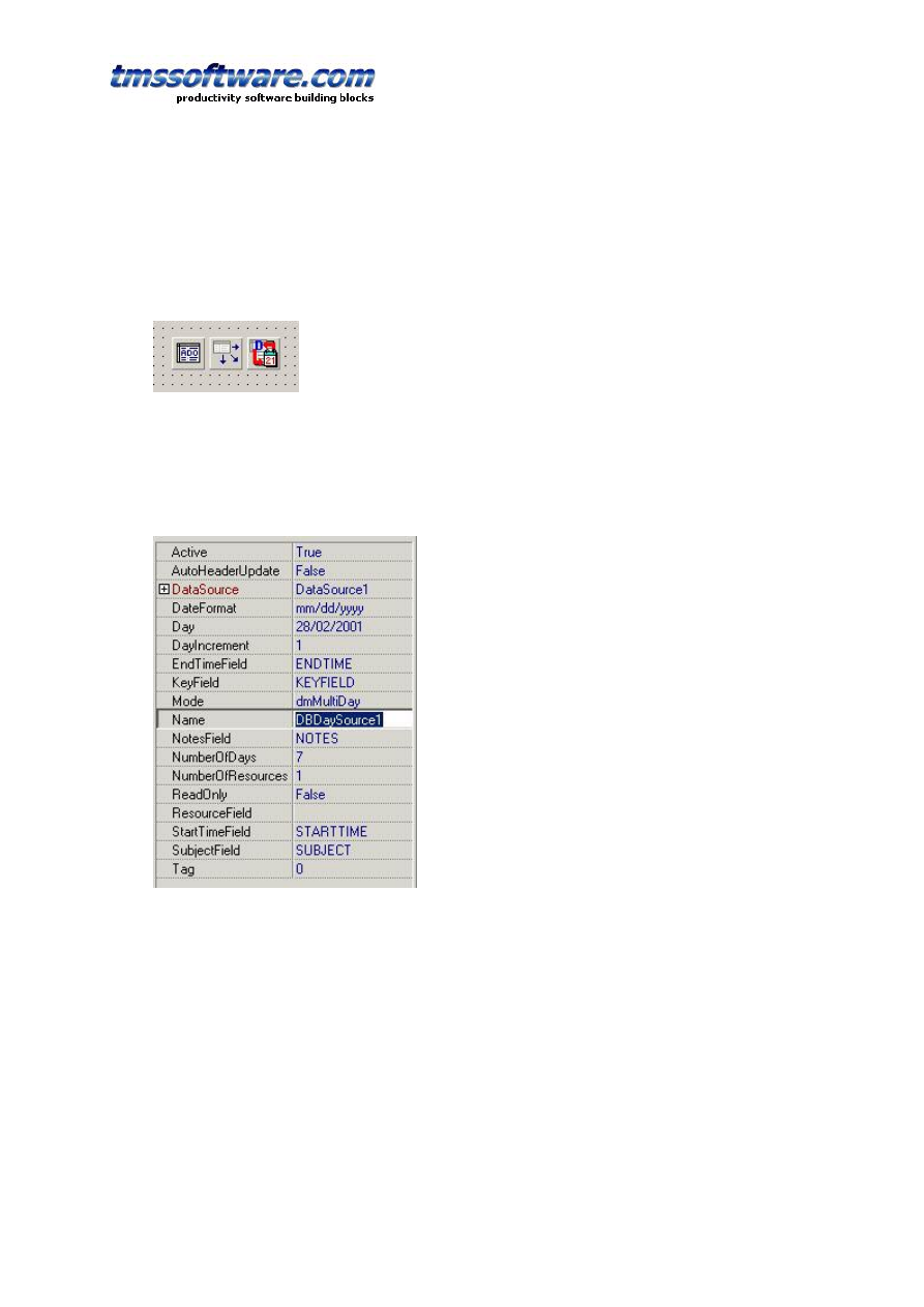
TMS SOFTWARE
TPLANNER - TDBPLANNER
DEVELOPERS GUIDE
51
IMAGE: long integer field
CAPTION: boolean field
On the form, a TADOTable with connection to the Access database is dropped, a TDataSource
component and a TDBDaySource. The TDBDaySource component is assigned to the
TDBPlanner.ItemSource property. The DataSource component is connected to the
TDBDaySource.DataSource property :
Next, the fields that are defined in the TDBDaySource component properties:
When making the ADO table active, the database is searched for all items that should be
displayed in the TDBPlanner for the date(s) selected by TDBDaySource and these are displayed
appropriately in the TDBPlanner.
Important note:
As the TDBItemSource is the interface that has the knowledge of how to map and display the
items in the TDBPlanner, it is the TDBItemSource that sets TDBPlanner properties
automatically for selecting modes and display. As such, in the above example, connecting a
TDBDaySource to the TDBPlanner.ItemSource property will automatically put the
TDBPlanner.Mode.PlannerType into plDay. Depending on what each TDBItemSource
component visualises, other TDBPlanner properties might be automatically set by the
TDBItemSource component.

TMS SOFTWARE
TPLANNER - TDBPLANNER
DEVELOPERS GUIDE
52
Performance guidelines
The TDBItemSource will search all records of the dataset for items that should be displayed in
the TDBPlanner. As such, it is important that the number of records that must be searched
through is as small as limited to minimum number possible. This can be achieved by using a
TQuery with a SQL statement that returns only a minimum set of records to search through or
by applying a filter. This filter or query can be set at any time, but a good place would be to
do this as well as just before the TDBItemSource searches through the records, using the
TDBItemSource events OnSetFilter and OnChangeQuery.. The TDBItemSource will therefore
trigger the events OnSetFilter and OnChangeQuery to allow updating filter or query before it
needs to do a new search.
Example:
When using a TDBDaySource for a single day and a single resource in a database with
appointments for multiple resources and multiple days, it is recommend to specify a query or
set a filter to return only a dataset of records for this single day and single resources in order
to avoid useless needless searches of the TDBDaySource through records of appointments for
other days and other resources.
This is a good design method for databases applications in general: always try to minimize the
amount of data that you load from the database.
TDBPlanner and database synchronisation
Records can be added either directly in the database as well as via the TDBPlanner
component. When the TDBPlanner is connected to a database via a TDBItemSource
component, following interactions happen :
TDBPlanner.CreateItem and TDBPlanner.CreateItemAtSelection:
A new record is created in the database.
TDBPlanner.FreeItem(APlannerItem: TPlannerItem);
The record associated in the database with APlannerItem is deleted.
Whenever planner item properties are changed, the property changes are reflected in the
database by calling the PlannerItem's Update method.
When records from the database that are displayed in the TDBPlanner are changed through
other DB-aware controls , the field changes are immediately updated in the TDBPlanner by
changes in the planner item properties. When a record is deleted or inserted from the
database through another DB-aware component or programmatically, the TDBPlanner must be
synchronized. This synchronization is achieved by calling the TDBItemSource SynchDBItems
method in the dataset AfterDelete or AfterInsert event.
Example:

TMS SOFTWARE
TPLANNER - TDBPLANNER
DEVELOPERS GUIDE
53
This creates a one hour appointment now in a TDBPlanner with TDBDaySource connected to a
database :
DBDaySource1
.
Day
:=
Now
;
with
DBPlanner1
.
CreateItem
do
begin
ItemStartTime
:=
Now
;
ItemEndTime
:=
ItemStartTime
+
EncodeTime
(
1
,
0
,
0
,
0
);
CaptionText
:=
'Auto created'
;
Text
.
Text
:=
'This item is auto created'
;
Update
;
end
;
The standard TDBItemSource components
TDBPlanner comes default with ready to use TDBItemSource components for several modes of
the TPlanner:
TDBDaySource component for a day mode planner
TDBWeekSource component for a month mode planner
TDBMonthSource component for a month mode planner
TDBPeriodSource component for a day period mode planner
TDBMultiMonthSource component for a month mode planner
TDBTimeLineSource component for a timeline mode planner
TDBDisjunctDaySource : component for planner with selected days only
TDBActiveDaySource : component for planner with displaying active days only
These different TDBItemSource components have properties that are specific for each mode
which is discussed here.
TDBDaySource
The TDBDaySource is the interface for handling a database connection in 4 different
TDBPlanner modes. The main setting for these capabilities is the TDBDaySource.Mode
property with can be :
dmMultiday : Single or multiple days for a single resource
dmMultiResource : Single or multiple resources for a single day
dmMultiDayRes : Multiple days for multiple resources
dmMultiResDay : Multiple resources for multiple days
The first 2 modes are the most simple modes :
dmMultiDay
The number of days shown in the TDBPlanner is set with the TDBDaySource.NumberOfDays
property. Multiple days will be displayed in multiple positions of the TDBPlanner. As such, this
NumberOfDays property sets the TDBPlanner.Positions property. The first day displayed is set
with the property TDBDaySource.Day. The date difference between 2 positions is set by the
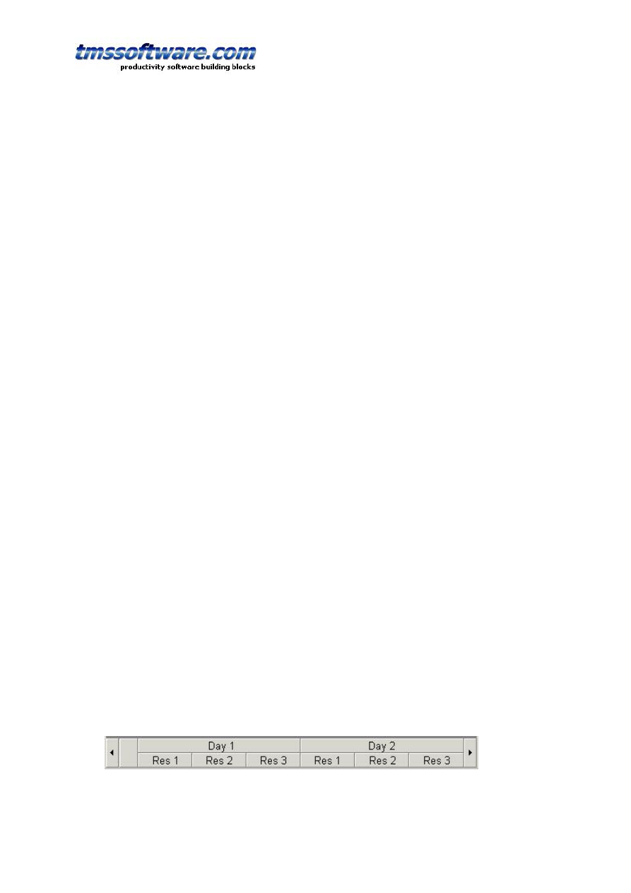
TMS SOFTWARE
TPLANNER - TDBPLANNER
DEVELOPERS GUIDE
54
TDBDaySource.DayIncrement property. Setting this property to 7 for example can show only a
given day of the week for multiple weeks in the TDBPlanner.
This TDBDaySource component can also automatically fill the TDBPlanner Header captions
with the dates displayed. This is done when its property AutoHeaderUpdate is true. The
format of the displayed dates is set with the TDBDaySource.DateFormat property.
dmMultiResource
In this mode, multiple resources (identified by the RESOURCEFIELD) can be displayed in
different positions in the TDBPlanner. The date for which the resources are displayed is set
by the TDBDaySource.Day property. The number of resources displayed (and thus also the
number of positions that will be in the TDBPlanner) is set by
TDBDaySource.NumberOfResources. The normal mapping between the resource field in the
database and the positions in the TDBPlanner is that an integer value of 0 in the resource
field maps to position 0 in the TDBPlanner. However, the resource identification might be
different in particular cases, when used for example as employee or room numbers.
Therefore, the TDBDaySource component has 2 events that allows the mapping of the
resource field value to a position in the TDBPlanner and vice versa. The 2 events are:
OnResourceToPosition(Sender: TObject; Field: TField; var Position: Integer; var Accept:
Boolean);
This event is triggered for each appointment or event that can be shown in the TDBPlanner.
The field values can used to determine the appropriate position for this record and through
the Accept parameter, setting it to false can disable loading the particular appointment or
event in the TDBPlanner. The OnResourceToPosition event will be triggered when the
TDBPlanner is loading items from the database.
OnPositionToResource(Sender: TObject; Field: TField; Position: Integer);
This event allows to set a field value according to the position in the Fields collection of the
record. This event is triggered whenever a TPlannerItem is updated or moved in the
TDBPlanner and needs to be written back to the database.
Finally, as with the dmMultiDay mode, the TDBDaySource component can automatically
update the TDBPlanner header captions with the resource names displayed. An event
TDBDaySource.OnGetResourceName is used to query this resource name for each position.
Each time the TDBPlanner reloads items from the database it will query the resource names
again to update its header captions.
dmMultiDayRes
Displays multiple days for multiple resources. This combines both multi day and multiresource
modes. The comments for previous are thus applicable for the dmMultiDayRes mode. The
difference is that now the TDBPlanner positions and header are setup to show multiple days
and multiple resources. In the dmMultiDayRes mode, the number of groups created is equal to
the TDBDaySource.NumberOfDays property while each day is divided in
TDBDaySource.NumberOfResources positions. The image below makes this clear :
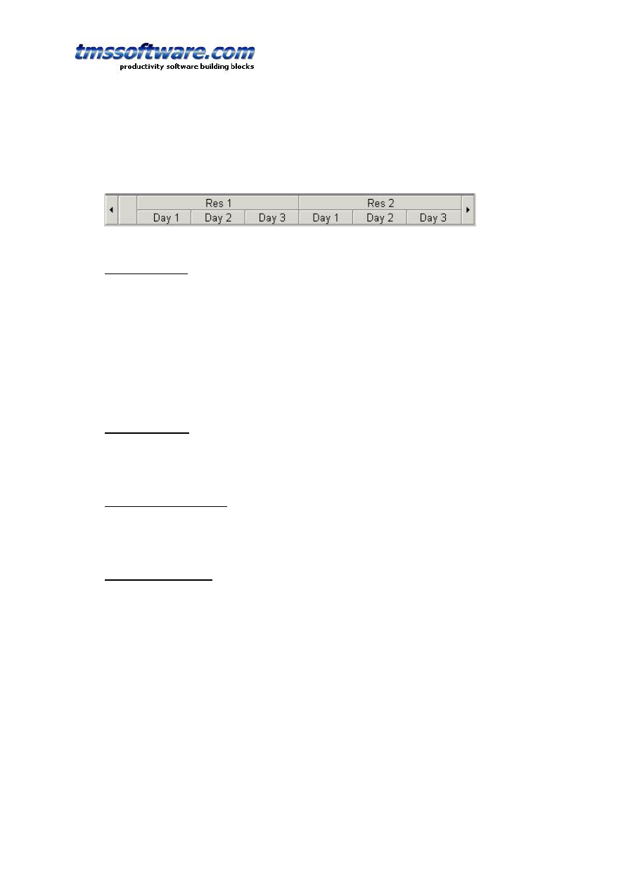
TMS SOFTWARE
TPLANNER - TDBPLANNER
DEVELOPERS GUIDE
55
dmMultiResDay
This is the inverse setup of the dmMultiDayRes mode and organises the TDBPlanner as in the
image below :
TDBMonthSource
The TDBMonthSource shows appointments and events from the database in for a month in the
TDBPlanner. Mapping of the fields to the TPlannerItem object is identical as in the
TDBDaySource component. If multiple resources are used, these can be mapped on multiple
positions in the TDBPlanner. Custom mapping between resource fields and position index is
also possible with the events TDBMonthSource.OnResourceToPosition and
TDBMonthSource.OnPositionToResource.
The month that is displayed in the TDBPlanner is selected by the properties
TDBPlanner.Month and TDBPlanner.Year properties.
TDBPeriodSource
The TDBPeriodSource is similar to the TDBMonthSource but allows viewing any period
between the dates set by its properties TDBPeriodSource.StartDate and
TDBPeriodSource.EndDate properties.
TDBHalfDayPeriodSource
The TDBHalfDayPeriodSource is similar to the TDBPeriodSource but allows viewing any period
between the dates set by its properties TDBHalfDayPeriodSource.StartDate and
TDBHalfDayPeriodSource.EndDate properties with a halfday resolution.
TDBMultiMonthSource
This database interface component puts the TDBPlanner into multimonth mode. This means
that multiple months are displayed in the TDBPlanner in multiple positions. Mapping of the
database fields to the TPlannerItem properties is identical as with the TDBDaySource. The
TDBMultiMonthSource component does not support a multiresource view though as the
positions are used to show multiple months. A mapping to the ResourceField is thus ignored.
The months displayed are selected with these properties :
TDBMultiMonthSource.StartMonth : first month to display in TDBPlanner position 0
TDBMultiMonthSource.NumberOfMonths : number of months to display and thus number of
positions shown in the TDBPlanner
TDBMultiMonthSource.Year : year of the first month displayed.
As some items in multimonth mode can be displayed in 2 or more positions when the start and
end date of the appointment or event are in different months, the TDBMultiMonthSource
displays part of the appointment in one month while the other part in another month. For
such events, the TDBMultiMonthSource creates fixed size and fixed position items.
Repositioning of such events should thus happen by editing the start and / or end date

TMS SOFTWARE
TPLANNER - TDBPLANNER
DEVELOPERS GUIDE
56
through a popup editor. Events that have start and end date in the same month can be sized
or moved in the TDBPlanner but can of course be edited with a popup editor as well.
TDBTimeLineSource
The TDBTimeLineSource is a database interface for a timeline mode planner. In a timeline
mode planner, the days between StartDate and EndDate are displayed with a time resolution
set by the property TPlanner.Display.DisplayUnit.
TDBDisjunctDaySource
The TDBDisjunctDaySource component displays different selected days only. With such
component, it is possible to display each Friday for four weeks for example. This is done by
putting the days to view in the TDBDisjunctDaySource.Dates collection. To update the days
to be viewed in the planner, set the TDBDisjunctDaySource.Active property to false, fill the
Dates collection with dates that should be displayed in the planner and set the
TDBDisjunctDaySource.Active to true again.
TDBActiveDaySource
The TDBActiveDaySource is very similar to the TDBDaySource. The difference with the
TDBDaySource is that this TDBActiveDaySource only displays the active days in the planner. If
Sunday and Saturday are marked as inactive days, the TDBActiveDaySource will skip these
days and only display Monday through Friday. If the Day property of TDBActiveDaySource is
set to a day that is indicated as an inactive day, it will show only the first active day as first
day in the planner.
Using the TDBItemSource.ResourceMap
If the field values that identify resources in the database do not match the indexes of the
positions where resources are displayed, the events OnResourceToPosition and
OnPositionToResource can be used. Using the TDBItemSource.ResourceMap makes it easier by
avoiding to have to use these events and implement there in code the mapping between the
resource indexes and the position indexes. The ResourceMap is a collection of
TResourceMapItem objects. This object has following properties:
property ResourceIndex: Integer;
property PositionIndex: Integer;
property DisplayName: string;
The ResourceIndex is the value of the resource in the database, the PositionIndex is the value
of the position where this resource should be displayed. The DisplayName is an optional
property with which the display name of the resource can be set.
Example:
Suppose that three employees have tasks scheduled in the planner. Employee John has an
internal company employee number assigned of 515. Employee Bill has number 264 and
employee Richard 177. In the database, these employee numbers are used in each record to
identify to who the task is assigned. In the planner, we want to display these employees in
the sequence: Bill, Richard and John. The TDBItemSource.ResourceMap is configured with:

TMS SOFTWARE
TPLANNER - TDBPLANNER
DEVELOPERS GUIDE
57
with
DBItemSource
.
ResourceMap
.
Add
do
begin
ResourceIndex
:=
264
;
PositionIndex
:=
0
;
DisplayName
:=
'Bill'
;
end
;
with
DBItemSource
.
ResourceMap
.
Add
do
begin
ResourceIndex
:=
177
;
PositionIndex
:=
1
;
DisplayName
:=
'Richard'
;
end
;
with
DBItemSource
.
ResourceMap
.
Add
do
begin
ResourceIndex
:=
515
;
PositionIndex
:=
2
;
DisplayName
:=
'John'
;
end
;
Writing custom database interface components
This can be done by creating a descendent class from TDBItemSource and overriding a set of
methods that perform the interfacing between database and TDBPlanner and vice versa.
These methods are listed here :
procedure SynchDBItems; override;
procedure ReadDBItems; override;
procedure WriteDBItem; override;
procedure ReadDBItem; override;
procedure AddDBItem; override;
procedure GotoDBItem; override;
procedure DeleteDBItem(APlanner: TPlanner); override;
procedure ItemChanged(DBKey:string); override;
procedure Next; override;
procedure Prev; override;
The TDBItemSource makes a reference to the connected TDBPlanner available through the
property TDBItemSource.Planner.
For single item methods such as ReadDBItem, WriteDBItem, GotoDBItem, AddDBItem,
DeleteDBItem and ItemChanged, the TDBPlanner always puts a reference to the TPlannerItem
in the property TDBPlanner.Items.DBItem: TPlannerItem.
Thus, when writing a method for ReadDBItem, set all properties read from DB fields to the
TPlannerItem provided by TDBItemSource.Planner.Items.DBItem. The same is applies for
WriteDBItem which should write the property settings of the TPlannerItem in
TDBItemSource.Planner.Items.DBItem to the current database record. In the methods
ReadDBItems and SynchDBItems, the full TDBItemSource.Planner.Items collection can be
manipulated.

TMS SOFTWARE
TPLANNER - TDBPLANNER
DEVELOPERS GUIDE
58
TBDPlanner Recurrency support
The TDBPlanner component has built-in support for recurrency. Recurring events can be
mixed with non recurring events. If an event is recurring, this means that an event in a single
database record can have multiple occurrences in the Planner. Recurrency is specified via a
recurrency formula that is based on an implementation of the the RFC 2445 iCalendar spec.
The recurrency formula is a string and therefore stored as a stringfield in the database. Note
that recurrency formulas can become long for complex recurrency specifications. It is
therefore recommended (but not mandatory) to use a memo field. For simple recurrencies
without recurrency exceptions, a 60 character field should be sufficient. Note that for
scheduling applications that do not need recurrency, no recurrency field is required in the
database.
In addition to the recurrency field, 2 additional fields are required: MinTimeField and
MaxTimeField. These fields hold the start time of the first occurrence of the event and the
end time of the last occurrence of the event. When MinTimeField and MaxTimeField are used,
these are also automatically maintained to the event start time and event end time for non
recurring events. Note that for events with an infinite recurrency, the end time will be
specified as start time + 100 years. When recurrency is used, the MinTimeField and
MaxTimeField should be used to specify queries for events that should be displayed in the
viewed Planner timespan. The StartTimeField and EndTimeFields will hold the start time and
end time of the first event in a recurring series only.
The TDBPlanner comes with a recurrency editor so it should not be necessary to write
recurrency formulas directly. The recurrency editor can be used by dropping it on the form
and the following code:
var
RE
:
TPlannerRecurrencyEditor
;
procedure
TForm1
.
RecurrEditClick
(
Sender
:
TObject
);
begin
if
Assigned
(
DBPlanner1
.
Items
.
Selected
)
then
begin
RE
.
Recurrency
:=
DBPlanner1
.
Items
.
Selected
.
Recurrency
;
if
RE
.
Execute
then
begin
DBPlanner1
.
Items
.
Selected
.
Recurrency
:=
RE
.
Recurrency
;
DBPlanner1
.
Items
.
Selected
.
Update
;
end
;
end
else
ShowMessage
(
'No item selected'
);
end
;
To programmatically create recurrent items, the structure of the recurrency string is built
from a series of specifiers SPECIFIER=value, separated by a ‘;’ delimiter. The rule is prefixed
by RRULE: while the exceptions are prefixed by EXDATES:
Example:
RRULE:FREQ=MONTHLY;COUNT=5;BYDAY=2WE

TMS SOFTWARE
TPLANNER - TDBPLANNER
DEVELOPERS GUIDE
59
Possible specifiers:
Frequency
FREQ=MONTHLY
The frequency specifier can be : HOURLY, DAILY, WEEKLY, MONTHLY, YEARLY
Interval
INTERVAL=2
The default interval is 1. When the interval is 1, this does not need to be specified in the
recurrency formula. The interval sets the number of time blocks between two recurring
events. If the interval is set to 2 for a hourly recurring event of 1 hour duration, this will
create a recurring series of events with one hour blocks between the events.
Count
COUNT=3
Sets the number of occurencies of the event
Until
UNTIL=end date
Sets the date of the last occurrence of the time. Note that the time specification is in ISO
format, ie: YYYYMMDD’T’HHMMSS. So, Sep 21, 2004 16h30 is written as 20040921T163000
Note, a recurrency without COUNT or UNTIL specifier is considered an inifinite recurrency.
ByDay, ByMonth
BYDAY=series of days
BYMONTH=series of months
The ByDay and ByMonth specifiers set for which days or months the recurrency rule is
applicable. The series of days or months is a comma delimited series of the names of days
using the 2 first letters for days or month numbers.
BYDAY=MO,TU,WE,TH,FR,SA,SU
BYMONTH=1,2,3,4,5,6,7,8,9,10,11,12
Example:
RRULE:FREQ=WEEKLY;COUNT=9;BYDAY=TU,TH
This rule specifies a recurrencies for 9 occurencies weekly repeated on every Tuesday and
Thursday of the week.
RRULE:FREQ=DAILY;UNTIL=20051231T000000;BYMONTH=1,2
This rule specifies daily recurring events during the months january and february till Dec 31,
2005.

TMS SOFTWARE
TPLANNER - TDBPLANNER
DEVELOPERS GUIDE
60
Optional specifier for ByDay
An optional specifier can be used for the day of weeks to indicate in what day of a month an
event should occur. This is done by prefixing the day name by the occurrency number of the
day in the month.
Example:
RRULE:FREQ=MONTHLY;COUNT=5;BYDAY=2WE
This specifies a recurrent event, every month, for 5 months on the 2
nd
Wednesday of the
month.
Exceptions
Exceptions to recurrency rules are a list of dates for which the rule is not applicable. The
exceptions can be specified by adding these to the recurrency string as comma delimited ISO
start and end dates:
EXDATES:startdate1/enddate1,startdate2/enddate2, ….
Example:
EXDATES:20040913T000000/20040913T235959,20040914T000000/20040914T235959
The recurrency support in TDBPlanner is transparent. Recurring planner items have the same
DBKey, a public property TPlannerItem.Recurrent indicates whether an item is recurrent and
the property TPlannerItem.Recurrency holds the recurrency formula. The properties
TPlannerItem.RecurrentStart: TDateTime and TPlannerItem.RecurrentEnd hold the start and
end times of the first event in the recurrent series. When moving one of the items in a
recurrent series, all items in the series move along the same delta time.

TMS SOFTWARE
TPLANNER - TDBPLANNER
DEVELOPERS GUIDE
61
Advanced TPlanner / TDBPlanner techniques
Linking TPlannerItems
A TPlannerItem can be linked in various ways to another TPlannerItem. Linking two items
means that if the user will move or size one item, the linked item will also move or size.
Linking is achieved through 2 TPlannerItem properties :
TPlannerItem.LinkedItem: TPlannerItem; defines to which the item is linked
TPlannerItem.LinkType: TPlannerLinkType; defines the type of the link
The LinkType can be :
ltLinkFull: both ItemBegin and ItemEnd are linked. This means that item duration is always
synchronised between the items. When the item moves or sizes, both begin and end of the
linked item will do the same move or size.
ltLinkBeginEnd: ItemBegin of the item is linked to the ItemEnd of the linked item. This
means that if the ItemBegin of the item changes, the ItemEnd of the linked item will change
with the same delta
ltLinkEndBegin: ItemEnd of the item is linked to the ItemBegin of the linked item
ltLinkEndEnd: ItemEnd of the item is linked to the ItemEnd of the linked item
ltLinkBeginBegin: ItemBegin of the item is linked to the ItemBegin of the linked item
Example:
In this example, two events need to be planned: a release of the software and the shipping of
software to distributors. It is clear that shipping to distributors can only happen after the
software release and that if the software release is delayed, the shipping will be delayed as
well. Therefore, the two events are added in the planner with a link between the ItemEnd of
the software release to the ItemBegin of the software shipping.
var
plIt1,plIt2: TPlannerItem;
begin
plIt1 := planner1.CreateItem;
with plIt1 do
begin
ItemStartTime := EncodeDate(2002,7,15);
ItemEndTime := EncodeDate(2002,7,20);
ItemPos := 0;
Text.Text := 'Release of version 1.0';
end;
plIt2 := planner1.CreateItem;
with plIt2 do
begin
ItemStartTime := EncodeDate(2002,7,21);
ItemEndTime := EncodeDate(2002,7,22);
ItemPos := 1;
Text.Text := 'Ship CD and manuals';
end;
plIt1.LinkedItem := plIt2;
plIt1.LinkType := ltLinkBeginEnd;
end;
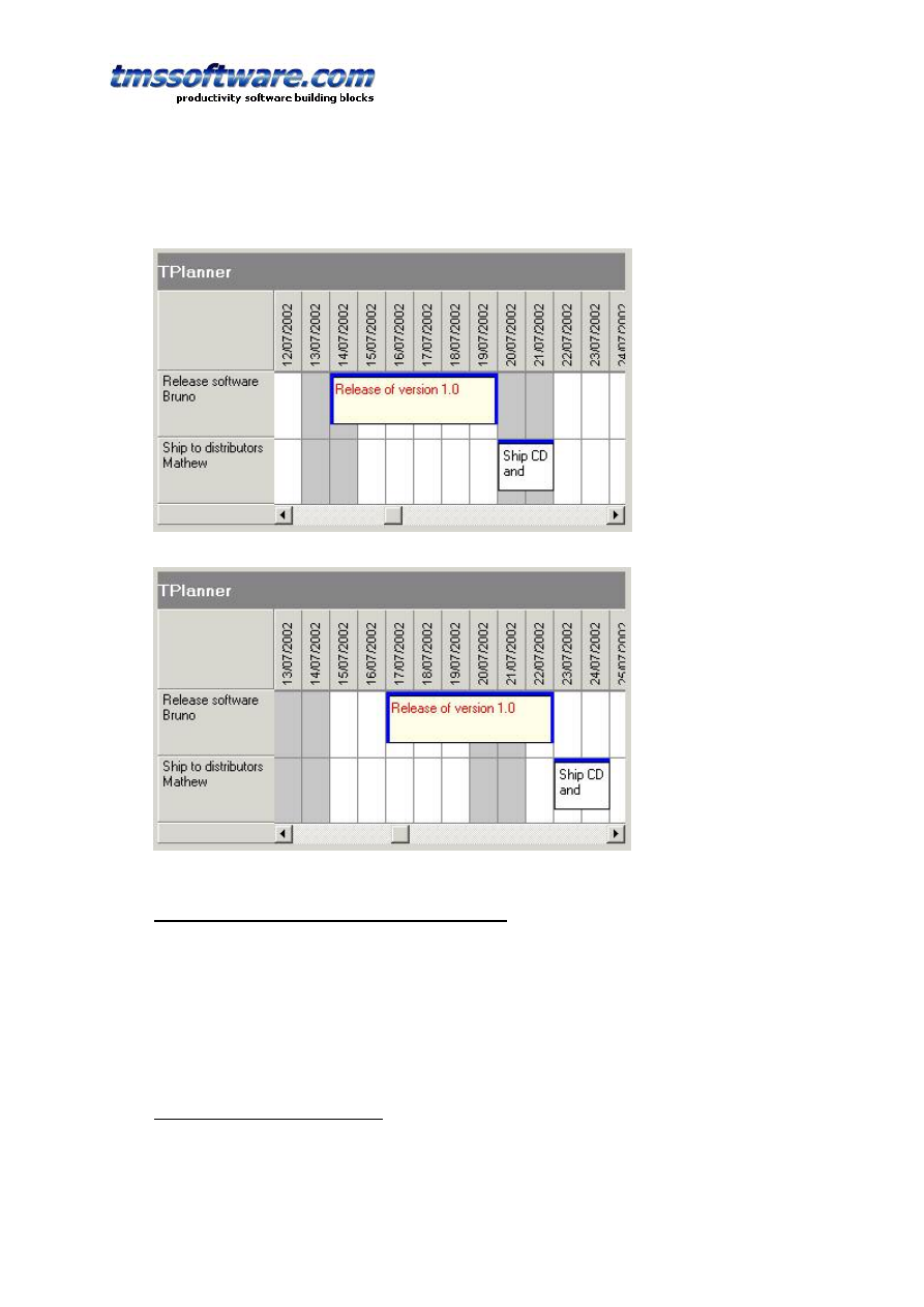
TMS SOFTWARE
TPLANNER - TDBPLANNER
DEVELOPERS GUIDE
62
The result in the planner grid is:
delaying the software release by 3 days automatically moves and delays the shipping:
Setting background color for individual grid cells
If there is an additional need to set colors of planner grid cells other than through the Display
settings of PositionProps, this can be done with the property :
TPlanner.BackGroundColor[ACol, ARow: Integer]: TColor;
This sets the color for a given cell in the planner grid.
Overlappable background items
Normally, when adding a background item, this is by default a non overlappable item. Setting
the Background property to true automatically also sets the AllowOverlap property to false. A
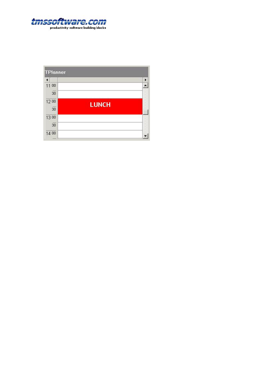
TMS SOFTWARE
TPLANNER - TDBPLANNER
DEVELOPERS GUIDE
63
background item cannot be selected, moved or sized. Background items are normally used to
indicate fixed time allocations, such as a time for lunch:
It can be convenient though to override this behaviour and create background items that only
give a visual hint, cannot be selected or edited and over which other items can be positioned.
To create such items, it is sufficient to reset the AllowOverlap property back to true after
settting the Background property to true. (Note that this is not possible at design time) The
code for this is:
with Planner1.CreateItemAtSelection do
begin
Background := True;
// reset AllowOverlap to create overlapable background item
AllowOverlap := True;
Text.Text := '<br><br>This is <b>background</b> that can be ' +
'<b><font color="clRed">overlapped !</font></b>';
Alignment := taCenter;
Color := clYellow;
end;
The yellow item created as such can be overlapped with normal TPlannerItem and its only
function is a visual hint as background in the planner grid:
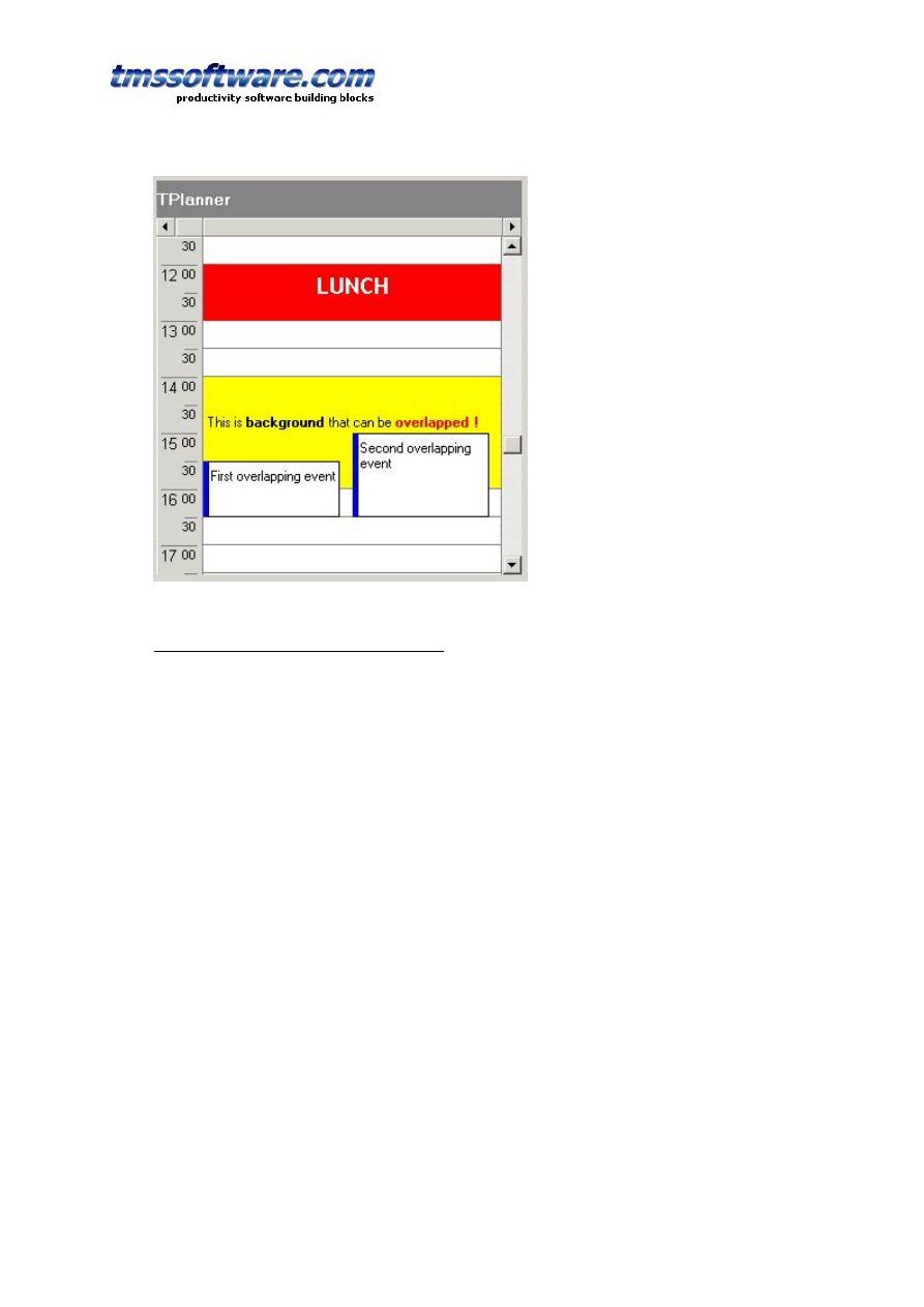
TMS SOFTWARE
TPLANNER - TDBPLANNER
DEVELOPERS GUIDE
64
Using a non-linear time axis in TPlanner
In some situations, it is not desirable that the time axis is divided in equal units. Image a
school where in the morning, lessons of 90 minutes are given, a 1 hour break follow and in the
afternoon, excersise courses are given in blocks of 1h 15 minutes. While the planner could be
used in 30 minute display mode to handle this, it leaves the possibility to schedule a lesson at
invalid times or with invalid lengths. With the TPlanner put in plCustomList mode, the
possible times for scheduling an event can be defined to avoid this.
To handle the plCustomList mode, the TPlanner has a property TPlanner.DateTimeList.
Following methods are defined:
TPlanner.DateTimeList.Clear; clears all datetime info from the list.
TPlanner.DateTimeList.Add(dt: TDateTime); adds a datetime value to the list.
TPlanner.DateTimeList.Insert(Index: Integer; dt: TDateTime); inserts a datetime value to the
list.
TPlanner.DateTimeList.Delete(Index: Integer); deletes the datetime at position Index from
the list.
TPlanner.DateTimeList.Items[Index]: TDateTime; returns the datetime values in the list.
Example: setup the TPlanner through the DateTimeList in plCustomList mode
// setup of the DateTimeList
with Planner.DateTimeList do
begin
Add(encodetime(8,0,0,0));
Add(encodetime(9,30,0,0));
Add(encodetime(11,00,0,0));
Add(encodetime(12,30,0,0));
Add(encodetime(13,30,0,0));
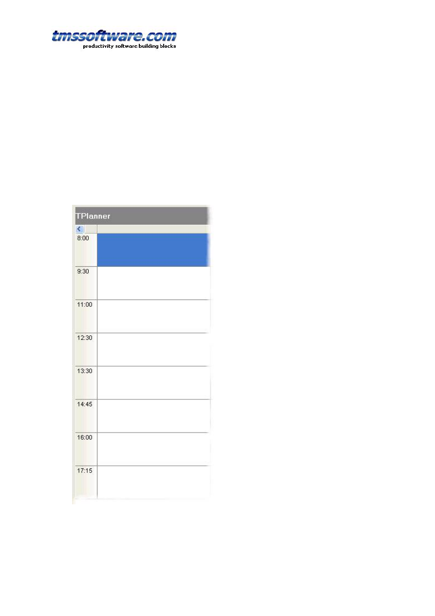
TMS SOFTWARE
TPLANNER - TDBPLANNER
DEVELOPERS GUIDE
65
Add(encodetime(14,45,0,0));
Add(encodetime(16,00,0,0));
Add(encodetime(17,15,0,0));
end;
// setup of the number of cells to display and cellheight
with Planner.Display do
begin
DisplayStart := 0;
DisplayEnd := 7;
DisplayScale := 60;
end;
This results in the planner as
When programmatically inserting an item, this can be done with:
with Planner.CreateItem do
begin
itemstarttime := encodetime(11,0,0,0);

TMS SOFTWARE
TPLANNER - TDBPLANNER
DEVELOPERS GUIDE
66
itemendtime := encodetime(12,30,0,0);
end;
Disjunct selection in the planner
It is possible to allow the user to select multiple disjunct cells in the planner. This enables
the user to insert multiple events in one go on different places in the planner.
Disjunct selection is enabled by setting Planner.DisjunctSelect to true and disjunct selected
cells are created by Ctrl & mouse click and drag in the planner. The disjunct selected cells
can be marked in a different color by setting the property DisjunctSelectColor.
After disjunct selection, the selected time spans in the planner can be retrieved with
Planner.Selections
This is a collection of TPlannerSelection objects. The TPlannerSelection object holds:
property SelBegin: Integer;
property SelEnd: Integer;
property SelPos: Integer;
as such, each item in this collection holds the coordinates of the selected time spans.
Example:
This example code creates planner items for each disjunct selected time zone in the planner
procedure TForm1.Button1Click(Sender: TObject);
var
i: integer;
begin
for i := 1 to planner1.Selections.Count do
with planner1.CreateItem, planner1.Selections[i - 1] do
begin
ItemBegin := selbegin;
ItemEnd := selend;
ItemPos := selpos;
end;
end;
Skinning planner items
Through skins, it is possible to apply a skin for a planneritem. If the TPlannerItem.Shape
property is set to plSkin, it is displayed with the skin assigned to the planner.
A skin can be loaded from a file with
Planner.Skin.LoadFromFile(filename);

TMS SOFTWARE
TPLANNER - TDBPLANNER
DEVELOPERS GUIDE
67
A planner skin file has the default extension .plskin and has the structure of an INI file.
Example:
This is an example skin file
[NORMAL]
TOP=tubeh.bmp
CENTER=tubec.bmp
BOTTOM=tubeb.bmp
[SELECTED]
TOP=tubehs.bmp
CENTER=tubec.bmp
BOTTOM=tubeb.bmp
[MARGIN]
X=4
Y=4
CAPTIONX=4
CAPTIONY=0
As can be seen from this file, the skin consists of minimum 3 bitmap files. A top bitmap that
is used for the item caption, a center bitmap that is used for the body of the item and a
bottom bitmap that is used for the bottom border. Different bitmaps can be set to show the
item when it is selected under the [SELECTED] section.
In addition, margins can be set for displaying the item text and item caption. These margins
are the extra space (in pixels) that the border of the skin bitmaps take.
The skin bitmaps are scaled in an intelligent way to fit the size of the planner items.
The caption skin bitmap and bottom border skin bitmap are scaled in following way:
The left half of the bitmap is drawn on the left side of the caption, the middle 2 pixels of the
bitmap are stretched to fill the full size of the caption between the left and right part of the
bitmap and the right half of the skin bitmap is drawn on the right side of the planner item.
To illustrate this:
Skin bitmap
Scaled to planner caption
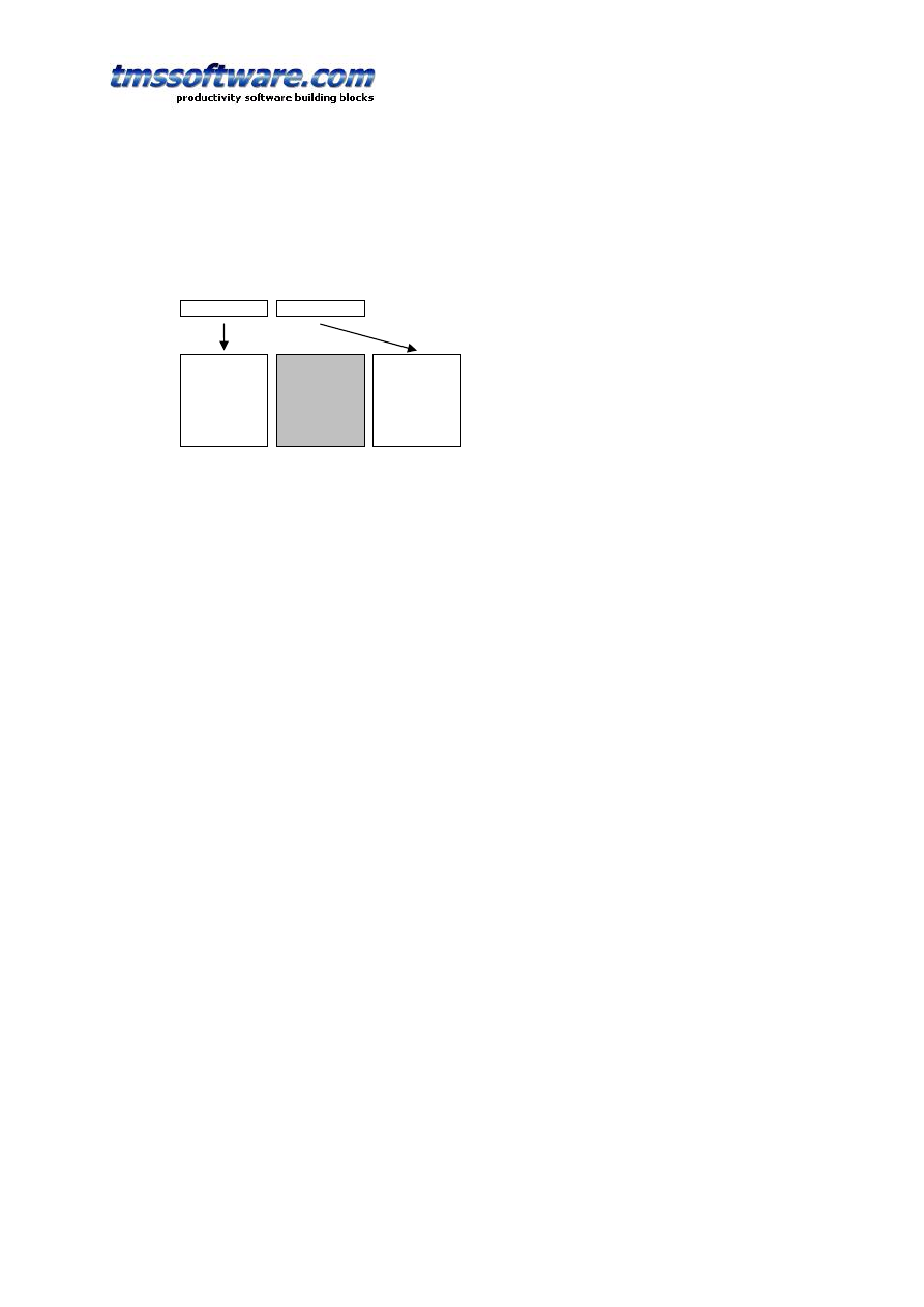
TMS SOFTWARE
TPLANNER - TDBPLANNER
DEVELOPERS GUIDE
68
The center bitmap is scaled both in vertical direction. The middle rectangle is filled with the
skin center bitmap middle pixel color.
Center skin bitmap
Scaled to planner item
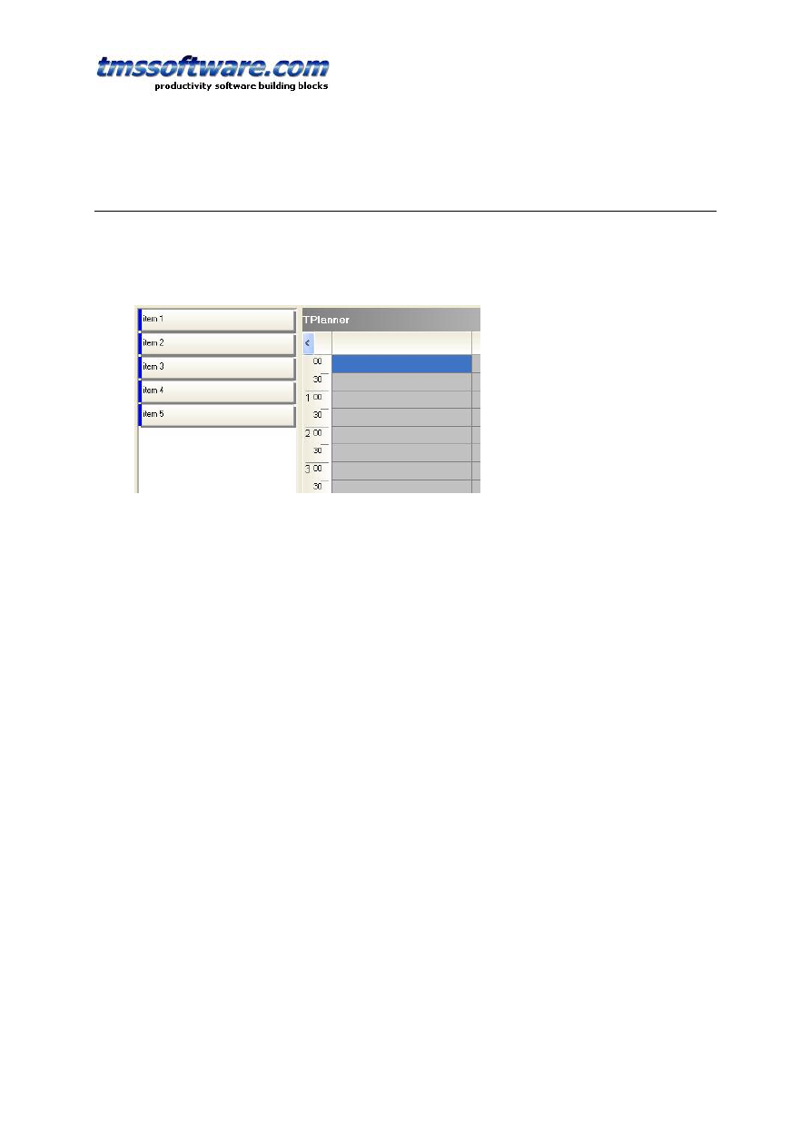
TMS SOFTWARE
TPLANNER - TDBPLANNER
DEVELOPERS GUIDE
69
TPlannerWaitList component
The TPlannerWaitList is a component that serves as a container for unallocated events. The
TPlannerWaitList is organised as a list that shows all items it contains. The items contained in
the component are in the Items collection that holds TPlannerItem class objects that are as
such fully compatible with TPlanner items.
This means that the items in the TPlannerWaitList will be displayed identical in the
TPlannerWaitList as in the TPlanner. The preferred way to move items from the
TPlannerWaitList to the TPlanner is by mouse drag & drop although scenarios with moving
items by toolbar or menus would be equally possible.
In order to implement drag & drop between TPlanner and TPlannerWaitList, a few events
must be implemented:
1) Making the TPlanner accept items dragged from the TPlannerWaitList
procedure TForm1.Planner1DragOver(Sender, Source: TObject; X, Y: Integer;
State: TDragState; var Accept: Boolean);
begin
Accept := (Source is TPlannerWaitList);
end;
2) Handling the drop on the TPlanner
procedure TForm1.Planner1DragDrop(Sender, Source: TObject; X, Y: Integer);
begin
if (Source is TPlannerWaitList) then
begin
(Source as TPlannerWaitList).MoveToPlanner((Sender as TPlanner),(Source as
TPlannerWaitlist).ItemIndex,x,y);
end;
end;
This code shows the TPlannerWaitList’s method MoveToPlanner that transfers the item in the
waitlist to the planner at the coordinate x,y where the mouse was dropped. This method
MoveToPlanner will create a new event in the planner at mouse coordinates and assign all
properties of the waitlist item to it and finally destroy the waitlist selected item.
The inverse operation requires no code. The TPlannerWaitList will automatically sense a drag
operation from the TPlanner component and when dropping the item, will take the necessary
steps to move the item from the planner to the waitlist.
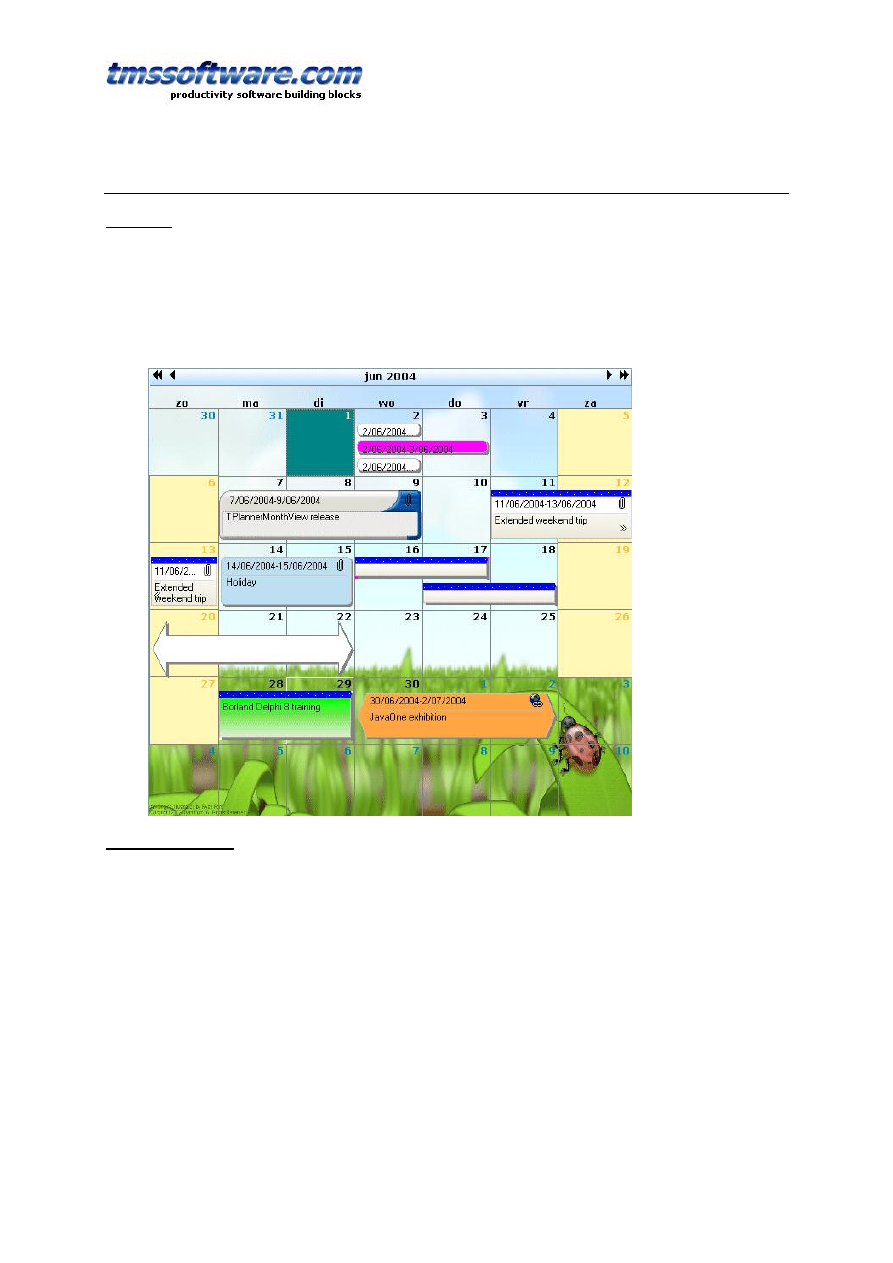
TMS SOFTWARE
TPLANNER - TDBPLANNER
DEVELOPERS GUIDE
70
TPlannerMonthView & TDBPlannerMonthView component
Overview
The TPlannerMonthView and TDBPlannerMonthView components are very similar and very
compatible with the TPlanner and TDBPlanner components. The TPlanner and TDBPlanner
components offer a one dimensional time axis, where the T(DB)PlannerMonthView offers the
typical monthly by week organised calendar view. Similar to the TPlanner, central to the
TPlannerMonthView operation is the collection of events: Items. This is a collection of
TPlannerItem objects (fully identical and compatible with TPlanner’s TPlannerItem objects)
General operation
The Items collection is where the planner events are stored. The Items collection can hold
events for the current displayed month as well as months that are not being displayed. For
optimum performance, it is recommended for performance though that this Items collection
is kept to a minimal set of displayed items.
Creating an event in the PlannerMonthView can be done with:
with
PlannerMonthView1
.
CreateItem
do
begin
ItemStartTime
:=
Now
;
ItemEndTime
:=
Now
+ 2
;
Text
.
Text
:=
'3 days holiday'
;
end
;

TMS SOFTWARE
TPLANNER - TDBPLANNER
DEVELOPERS GUIDE
71
or creating the event on the selection date(s) with:
with
PlannerMonthView1
.
CreateItemAtSelection
do
begin
Text
.
Text
:=
'3 days holiday'
;
end
;
Deleting an event can be done with:
PlannerMonthView1
.
FreeItem(myPlannerItem)
The properties of a TPlannerItem control the appearance and its behaviour in the planner.
This appearance and behaviour is identical as in the TPlanner and can be found in the
chapter: ‘Inside the TPlannerItem’
DB PlannerMonthView operation
As the TDBPlannerMonthView can only display items in a month calendar, there is no need to
separate the DB interface in a different component like it is the case with TDBPlanner and its
TDBxxxSource components. The interfacing to the database in TDBPlannerMonthView is
controlled by the property DataBinding.
This class exposes following properties in the TDBPlannerMonthView:
AutoIncKey: Boolean : when true, the TDBPlannerMonthView does not generate unique keys
for items but uses the database autoincrement field value.
StartTimeField: string : fields that holds the start time of an event.
EndTimeField: string : field that holds the end time of an event
KeyField: string : field that holds the unique key value for an event
SubjectField: string : field that holds the subject of the event
NotesField: string : field that holds the description of the event
UpdateByQuery: Boolean : when true, TDBPlannerMonthView does not use its built-in direct
DB updating capabilities but requires that DB updates are performed by SQL commands from
events. These events are : OnInsertItem, OnUpdateItem, OnDeleteItem. This is for databases
that can only be updated through SQL commands.
Using the TDBPlannerMonthView with a database is as such easy. Connect the datasource and
set the fields with the DataBinding property. Activate the dataset and the events that should
be displayed in the current displayed month should appear.
Just like in the TDBPlanner with its TDBxxxSource components, events OnItemToFields,
OnFieldsToItem, OnTimeToFields, OnFieldsToTime are exposed to allow customizing how DB
fields are mapped on TPlannerItem properties and start or end time. These
TDBPlannerMonthView events are identical to equivalent TDBxxxSource events and the
detailed use can be found in the section on ‘TDBItemSource’.
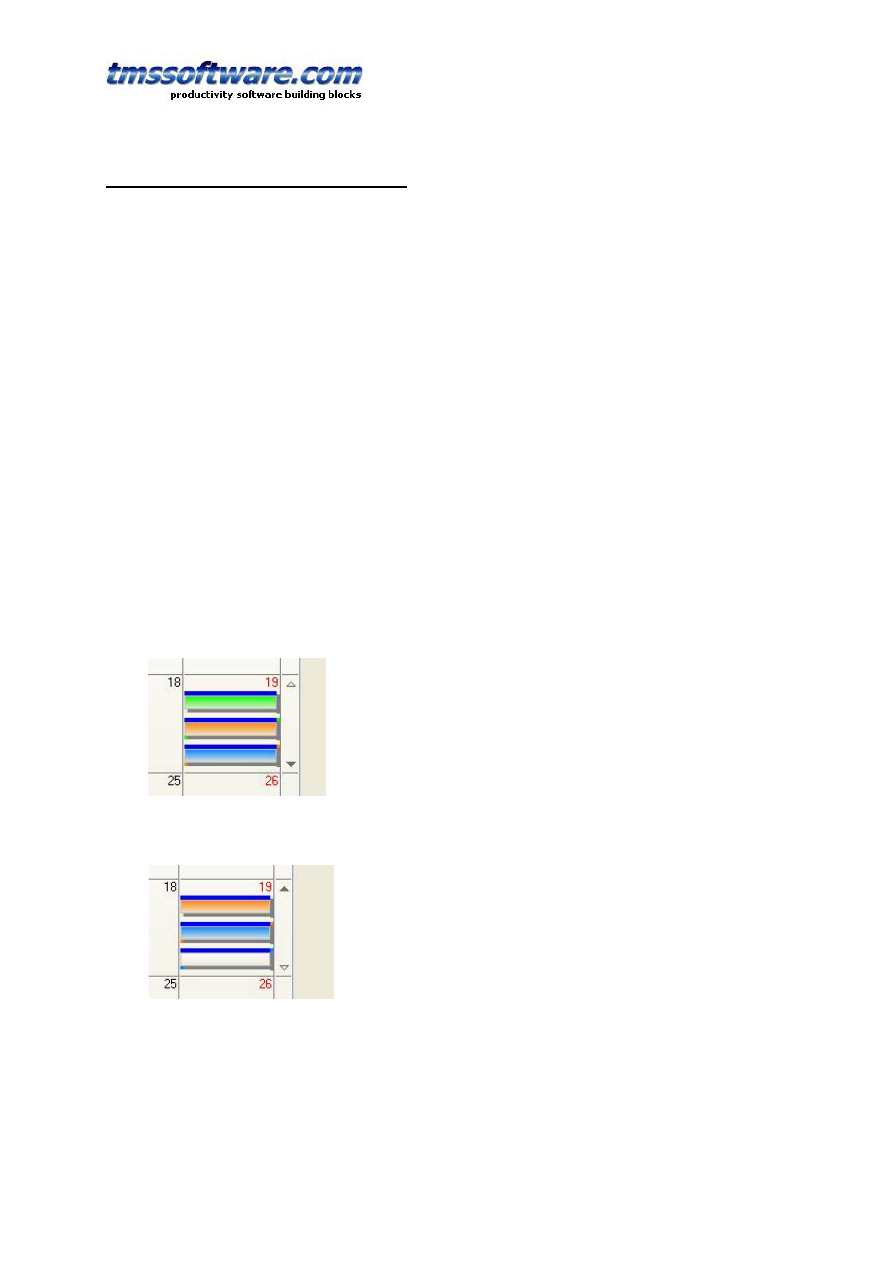
TMS SOFTWARE
TPLANNER - TDBPLANNER
DEVELOPERS GUIDE
72
Additional TPlannerMonthView capabilities
The PlannerMonthView has a few additional display capabilities explained here.
Week number display
When ShowWeeks is set to true, the week number is shown in a left column (width is
controlled by WeekWidth) The week number calculation starts from what is considered the
first day of the year. As this can be different for different countries and organisations, what is
considered as the first day of the year can be customized with the YearStartAt property.
When week numbers are shown, full weeks can be selected with a single click on the week
number when the property WeekSelect is set to true.
Maximum overlapped number of items
The property MaxItemsDisplayed controls how much overlapped events are displayed in a day
cell. By setting this value, it can be assured that events always have a minimum size and this
visibility. When more overlapping items are in a day cell, only MaxItemsDisplayed items will
be visible at a time. The other non displayed items can be made visible by scroll buttons.
These scroll buttons appear automatically for each week where days with more items are
overlapping than can be displayed. The scroll buttons appear in a right side column, made
visible with ShowScrollColumn set to true.
In this example, day 19 has 4 overlapping events where MaxItemsDisplayed is set to 3. As such
scroll buttons appear in the scroll column with the scroll button indicating that scrolling down
is possible.
After clicking the scroll down button, the fourth overlapping item appears and the scroll up
button becomes highlighted indicating the scrolling up is possible:
Days before and days after the current month
By default, days in the month before the current displayed month and days in the month after
the current displayed month are shown. This can be disabled by setting ShowDaysAfter or
ShowDaysBefore to false. Also by default, clicking on days before the current month and days

TMS SOFTWARE
TPLANNER - TDBPLANNER
DEVELOPERS GUIDE
73
after the current month, change the planner to the previous or next month. This can be
disabled by setting AutoChangeMonth to false.
Multiselect and disjunct selection
Selecting multiple days in a range or selecting disjunct days (with Ctrl – left click) is possible
by setting MultiSelect = true or DisjunctSelect = true.
The selected days in the PlannerMonthView can be retrieved through the Dates collection.
This example shows all selected days in a listbox:
var
i
:
integer
;
begin
for
i
:=
1
to
PlannerMonthView1
.
Dates
.
Count
do
begin
with
Listbox1
.
Items
do
Add
(
DateToStr
(
PlannerMonthView1
.
Dates
[
i
-
1
].
Date
));
end
;
end
;
As such, it is possible to automatically create events at all selected dates with:
var
i
:
integer
;
begin
for
i
:=
1
to
PlannerMonthView1
.
Dates
.
Count
do
begin
with
PlannerMonthView1
.
CreateItem
do
begin
ItemStartTime
:=
PlannerMonthView1
.
Dates
[
i
-
1
].
Date
;
ItemEndTime
:=
PlannerMonthView1
.
Dates
[
i
-
1
].
Date
;
end
;
end
;
end
;
Wyszukiwarka
Podobne podstrony:
Pure Developer Guide IGN Insiders Guide
Barnett C Helzberg, Jr What I Learned Before I Sold to Warren Buffett [An Entrepreneur’s Guide to D
Personal Development Plan Example Guide
4 Plant Structure, Growth and Development, before ppt
Human Development Index
guide camino aragones pl
Herbs for Sports Performance, Energy and Recovery Guide to Optimal Sports Nutrition
Meezan Banks Guide to Islamic Banking
NLP for Beginners An Idiot Proof Guide to Neuro Linguistic Programming
freespan spec guide
Eaton VP 33 76 Ball Guide Unit Drawing
Herbs to Relieve Headaches Keats Good Herb Guide
50 Common Birds An Illistrated Guide to 50 of the Most Common North American Birds
Configuration Guide WAN Access(V100R006C00 02)
5 TMS v7
installation guide
Development of Carbon Nanotubes and Polymer Composites Therefrom
więcej podobnych podstron