essentÊrvingḟ57

I X C1S E D LeTTERING
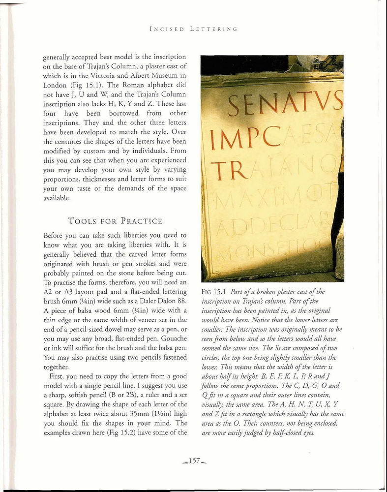
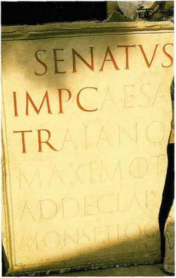
generally acceptcd best model is the inscription on the base of Trajans Column, a plaster cast of which is in the Victoria and Albert Museum in London (Fig 15.1). The Roman alphabet did not have J, U and W, and the Trajans Column inscription also lacks H, K, Y and Z. Thesc lasr four have been borrowed from other inscriptions. They and the other three letters have been dcveloped to match the style. Over the centuries the shapes of the letters have been inodified by custom and by individuals. From this you can see thar when you are experienced you may dcvelop your own style by varying proportions, thicknesses and lettcr forms to suit your own taste or rhe demands of the space avai labie.
Tools FOR Practice
Bcfore you can take such liberties you need to know what you are taking liberties with. It is generally believed thai the carved lettcr forms originated with brush or pen strokes and were probably painted on the stone before being cut. To practise the forms, thereforc, you will need an A2 or A3 layout pad and a flat-endcd lettering brush 6mm (Win) wide such as a Daler Dalon 88. A piece of balsa wood 6mm (Win) wide with a thin edge or the same width of veneer set in the end of a pencil-sized dowel may serve as a pen, or you may use any broad, flat-ended pen. Gouache or ink will suffice for the brush and the balsa pen. You may also practise using two pencils fastened together.
First, you need to copy rhe letters from a good model with a single pencil linÄ. I suggest you usc a sharp, softish pencil (B or 2B), a ruler and a set square. By drawing the shape of each letter of the alphabet at least twice about 35mm (lWin) high you should fix the shapes in your mind. The cxamples drawn here (Fig 15.2) havc some of the

FlG 15.1 Part ofa broken plaster cast of the inscription on Trajans column. Part of the inscription has been painted in, as the original would have been. Notice that the lower letters are smaller. The inscription was originally meant to be seen from below and so the letters would all have seemed the same size. The Ss are composed of two circles, the rop one being slightly smaller than the lower. This means that the width of the letter is about half its heighr. B, E, F, K, L, P, R and J follow the same proportions. The C, D, C, O and Qft in a sejuare and their outer lines eon tain, oisually, the same area. The A, H, N, T, U, X, Y and Z fit in a rectangle which visually has the same area as the O. Their counters, not being enclosed, are morÄ easily judged by half-closed eyes.
_157â
Wyszukiwarka
Podobne podstrony:
5 3 According to Williama Ury, BATNA is the base of negotiations strength and thc tool to evaluate t
6 6 EfFective communication is the base of successful negotiation... The way we communicate with the
18.3 million NOK is the cost of the all the essential GMS network eÄ uipment for the cities of Stavan
ADVANTAGES OF BODY COMPOSITION ANALYSIS Body composition analyzer is the best help for the diagnosis
image002 oiÃġ. The chimera was creatcd by a forcign govcrnmcnt. 017. The chimera is
00219 a6d333666646e915e39fbc117115f5 221 Applications of the EWMA The Control Algorithm In this al
00246 !d6f6da4a401d8c9089d33a3b3c255f 248 Vander Wiel the probabilistic characteristics of run leng
00348 ?54a8dde21a0078d8595ba9c1bc514e 352 Prairie & Zimmer Rules of Concordance The basis for c
img045 (27) TEVA DURHAM is the author of Loop-d-Loop: MorÄ Than 40 Novel Designs for Knitters (Stewa
smpb 37 Health is the keysione of life, so tu ind ynu place it securely in pn sit i on and do it /V
1. Mathematics in Chemistry 1.1. Mathematics in chemistry Chemistry is the study of matter and the c
17. What is the West of London famous for? 18. Name at least two famous football clubs in London? 19
SCAN0032 Vergence âḃ Vergence is the measure of convergence or divergence of a
wiÄcej podobnych podstron