Page 1
© Usability Analysis & Design, Xerox Corporation, 1995
Heuristic Evalualtion - A System Checklist
1. Visibility of System Status
The system should always keep user informed about what is going on, through appropriate feedback within reasonable time.
#
Review Checklist
Yes No N/A
Comments
1.1
Does every display begin with a title or header that describes screen contents?
O O O
1.2
Is there a consistent icon design scheme and stylistic treatment across the system?
O O O
1.3
Is a single, selected icon clearly visible when surrounded by unselected icons?
O O O
1.4
Do menu instructions, prompts, and error messages appear in the same place(s) on each menu?
O O O
1.5
In multipage data entry screens, is each page labeled to show its relation to others?
O O O
1.6
If overtype and insert mode are both available, is there a visible indication of which one the user is
in?
O O O
1.7
If pop-up windows are used to display error messages, do they allow the user to see the field in
error?
O O O
1.8
Is there some form of system feedback for every operator action?
O O O
1.9
After the user completes an action (or group of actions), does the feedback indicate that the next
group of actions can be started?
O O O
1.10
Is there visual feedback in menus or dialog boxes about which choices are selectable?
O O O
1.11
Is there visual feedback in menus or dialog boxes about which choice the cursor is on now?
O O O
1.12
If multiple options can be selected in a menu or dialog box, is there visual feedback about which
options are already selected?
O O O
1.13
Is there visual feedback when objects are selected or moved?
O O O
1.14
Is the current status of an icon clearly indicated?
O O O

Page 2
© Usability Analysis & Design, Xerox Corporation, 1995
#
Review Checklist
Yes No N/A
Comments
1.15
Is there feedback when function keys are pressed?
O O O
1.16
If there are observable delays (greater than fifteen seconds) in the system’s response time, is the
user kept informed of the system's progress?
O O O
1.17
Are response times appropriate to the task?
O O O
1.18
Typing, cursor motion, mouse selection: 50-1 50 milliseconds
O O O
1.19
Simple, frequent tasks: less than 1 second
O O O
1.20
Common tasks: 2-4 seconds
O O O
1.21
Complex tasks: 8-12 seconds
O O O
1.22
Are response times appropriate to the user's cognitive processing?
O O O
1.23
Continuity of thinking is required and information must be remembered throughout
several responses: less than two seconds.
O O O
1.24
High levels of concentration aren't necessary and remembering information is
not required: two to fifteen seconds.
O O O
1.25
Is the menu-naming terminology consistent with the user's task domain?
O O O
1.26
Does the system provide visibility: that is, by looking, can the user tell the state of the system and
the alternatives for action?
O O O
1.27
Do GUI menus make obvious which item has been selected?
O O O
1.28
Do GUI menus make obvious whether deselection is possible?
O O O
1.29
If users must navigate between multiple screens, does the system use context labels, menu maps,
and place markers as navigational aids?
O O O

Page 3
© Usability Analysis & Design, Xerox Corporation, 1995
2. Match Between System and the Real World
The system should speak the user’s language, with words, phrases and concepts familiar to the user, rather than system-
oriented terms. Follow real-world conventions, making information appear in a natural and logical order.
#
Review Checklist
Yes No N/A
Comments
2.1
Are icons concrete and familiar?
O O O
2.2
Are menu choices ordered in the most logical way, given the user, the item names, and the task
variables?
O O O
2.3
If there is a natural sequence to menu choices, has it been used?
O O O
2.4
Do related and interdependent fields appear on the same screen?
O O O
2.5
If shape is used as a visual cue, does it match cultural conventions?
O O O
2.6
Do the selected colors correspond to common expectations about color codes?
O O O
2.7
When prompts imply a necessary action, are the words in the message consistent with that action?
O O O
2.8
Do keystroke references in prompts match actual key names?
O O O
2.9
On data entry screens, are tasks described in terminology familiar to users?
O O O
2.10
Are field-level prompts provided for data entry screens?
2.11
For question and answer interfaces, are questions stated in clear, simple language?
O O O
2.12
Do menu choices fit logically into categories that have readily understood meanings?
O O O
2.13
Are menu titles parallel grammatically?
O O O
2.14
Does the command language employ user jargon and avoid computer jargon?
O O O
2.15
Are command names specific rather than general?
O O O
2.16
Does the command language allow both full names and abbreviations?
O O O
2.17
Are input data codes meaningful?
O O O
2.18
Have uncommon letter sequences been avoided whenever possible?
O O O
2.19
Does the system automatically enter leading or trailing spaces to align decimal points?
O O O
2.20
Does the system automatically enter a dollar sign and decimal for monetary entries?
O O O
Page 4
© Usability Analysis & Design, Xerox Corporation, 1995
#
Review Checklist
Yes No N/A
Comments
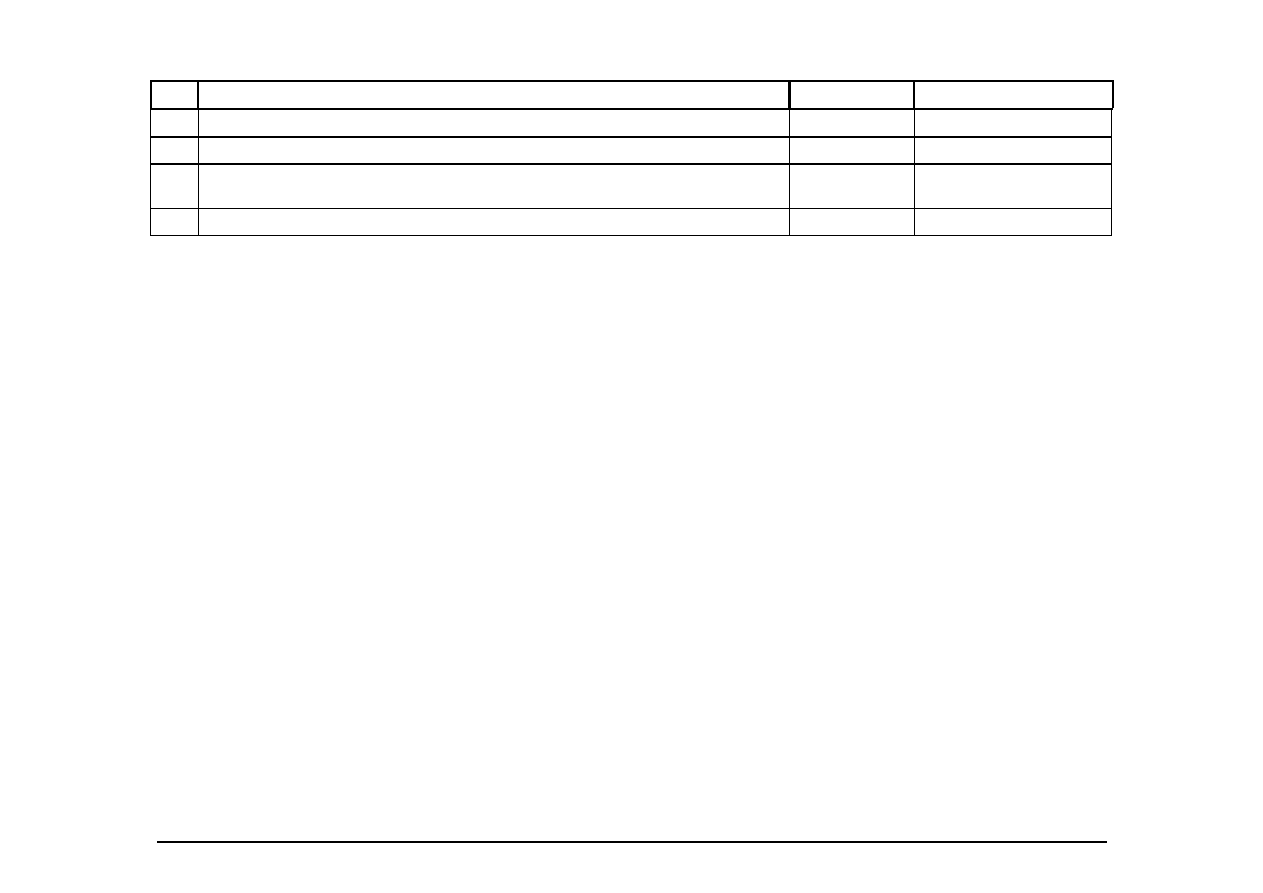
2.21
Does the system automatically enter commas in numeric values greater than 9999?
O O O
2.22
Do GUI menus offer activation: that is, make obvious how to say “now do it"?
O O O
2.23 Has the system been designed so that keys with similar names do not perform opposite (and
potentially dangerous) actions?
O O O
2.24
Are function keys labeled clearly and distinctively, even if this means breaking consistency rules?
O O O

Page 5
© Usability Analysis & Design, Xerox Corporation, 1995
3. User Control and Freedom
Users should be free to select and sequence tasks (when appropriate), rather than having the system do this for them. Users
often choose system functions by mistake and will need a clearly marked “emergency exit” to leave the unwanted state without
having to go through an extended dialogue. Users should make their own decisions (with clear information) regarding the
costs of exiting current work. The system should support undo and redo.
#
Review Checklist
Yes No N/A
Comments
3.1
If setting up windows is a low-frequency task, is it particularly easy to remember?
O O O
3.2
In systems that use overlapping windows, is it easy for users to rearrange windows on the screen?
O O O
3.3
In systems that use overlapping windows, is it easy for users to switch between windows?
O O O
3.4
When a user's task is complete, does the system wait for a signal from the user before processing?
O O O
3.5
Can users type-ahead in a system with many nested menus?
O O O
3.6
Are users prompted to confirm commands that have drastic, destructive consequences?
O O O
3.7
Is there an "undo" function at the level of a single action, a data entry, and a complete group of
actions?
O O O
3.8
Can users cancel out of operations in progress?
O O O
3.9
Are character edits allowed in commands?
O O O
3.10
Can users reduce data entry time by copying and modifying existing data?
O O O
3.11
Are character edits allowed in data entry fields?
O O O
3.12
If menu lists are long (more than seven items), can users select an item either by moving the cursor
or by typing a mnemonic code?
O O O
3.13
If the system uses a pointing device, do users have the option of either clicking on menu items or
using a keyboard shortcut?
O O O
3.14
Are menus broad (many items on a menu) rather than deep (many menu levels)?
O O O
3.15 If the system has multiple menu levels, is there a mechanism that allows users to go back to
previous menus?
O O O
Page 6
© Usability Analysis & Design, Xerox Corporation, 1995
#
Review Checklist
Yes No N/A
Comments
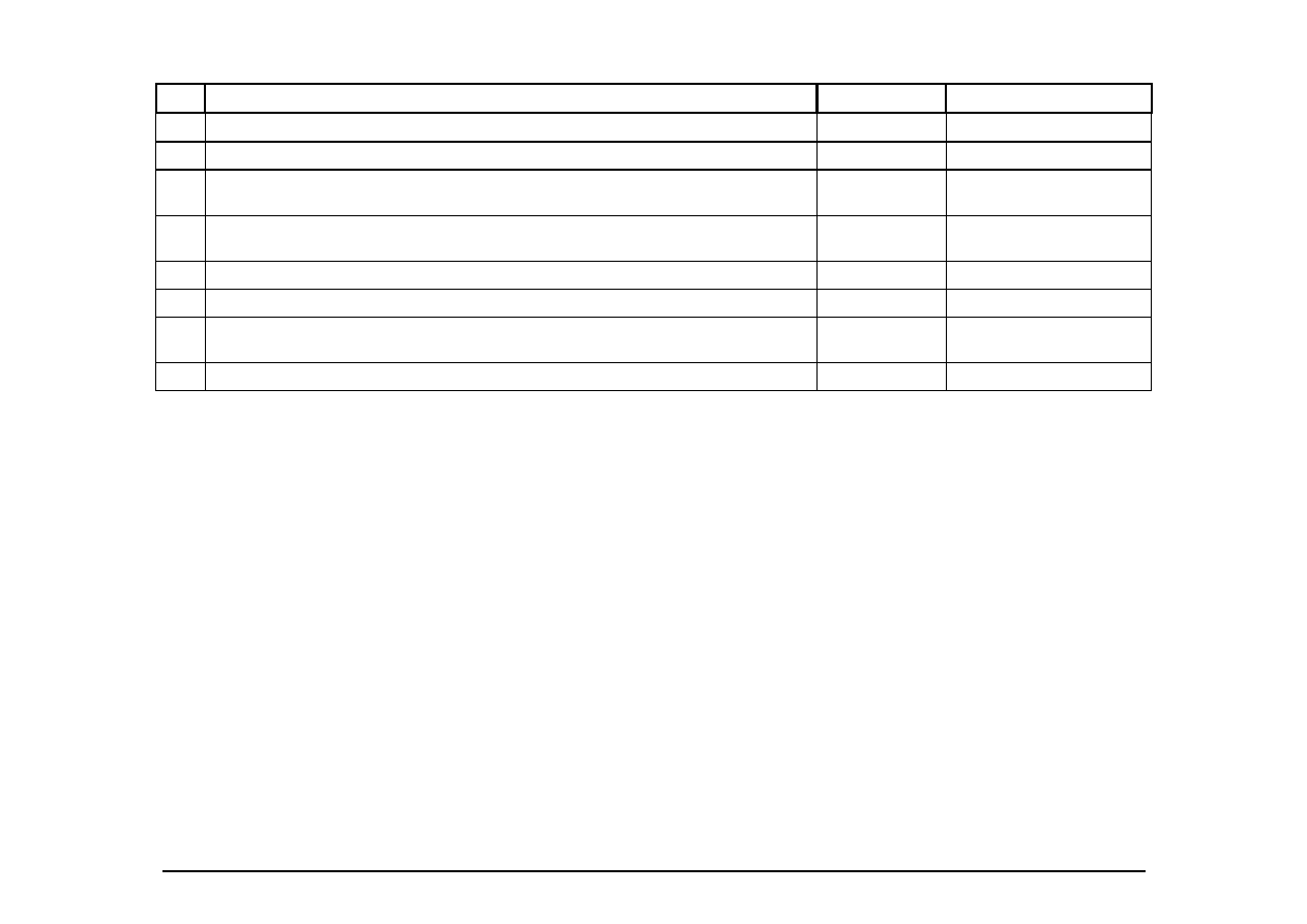
3.16
If users can go back to a previous menu, can they change their earlier menu choice?
O O O
3.17
Can users move forward and backward between fields or dialog box options?
O O O
3.18
If the system has multipage data entry screens, can users move backward and forward among all
the pages in the set?
O O O
3.19
If the system uses a question and answer interface, can users go back to previous questions or skip
forward to later questions?
O O O
3.20
Do function keys that can cause serious consequences have an undo feature?
O O O
3.21
Can users easily reverse their actions?
O O O
3.22 If the system allows users to reverse their actions, is there a retracing mechanism to allow for
multiple undos?
O O O
3.23
Can users set their own system, session, file, and screen defaults?
O O O

Page 7
© Usability Analysis & Design, Xerox Corporation, 1995
4. Consistency and Standards
Users should not have to wonder whether different words, situations, or actions mean the same thing. Follow platform
conventions.
#
Review Checklist
Yes No N/A
Comments
4.1
Have industry or company formatting standards been followed consistently in all screens within a
system?
O O O
4.2
Has a heavy use of all uppercase letters on a screen been avoided?
O O O
4.3
Do abbreviations not include punctuation?
O O O
4.4
Are integers right-justified and real numbers decimal-aligned?
O O O
4.5 Are
icons
labeled?
O O O
4.6
Are there no more than twelve to twenty icon types?
O O O
4.7
Are there salient visual cues to identify the active window?
O O O
4.8
Does each window have a title?
O O O
4.9
Are vertical and horizontal scrolling possible in each window?
O O O
4.10
Does the menu structure match the task structure?
O O O
4.11
Have industry or company standards been established for menu design, and are they applied
consistently on all menu screens in the system?
O O O
4.12
Are menu choice lists presented vertically?
O O O
4.13
If "exit" is a menu choice, does it always appear at the bottom of the list?
O O O
4.14
Are menu titles either centered or left-justified?
O O O
4.15
Are menu items left-justified, with the item number or mnemonic preceding the name?
O O O
4.16
Do embedded field-level prompts appear to the right of the field label?
O O O
4.17
Do on-line instructions appear in a consistent location across screens?
O O O
4.18
Are field labels and fields distinguished typographically?
O O O
4.19
Are field labels consistent from one data entry screen to another?
O O O
4.20
Are fields and labels left-justified for alpha lists and right-justified for numeric lists?
O O O

Page 8
© Usability Analysis & Design, Xerox Corporation, 1995
#
Review Checklist
Yes No N/A
Comments
4.21
Do field labels appear to the left of single fields and above list fields?
O O O
4.22
Are attention-getting techniques used with care?
O O O
4.23
Intensity: two levels only
O O O
4.24
Size: up to four sizes
O O O
4.25
Font: up to three
O O O
4.26
Blink: two to four hertz
O O O
4.27
Color: up to four (additional colors for occasional use only)
O O O
4.28
Sound: soft tones for regular positive feedback, harsh for rare critical conditions
O O O
4.29 Are attention-getting techniques used only for exceptional conditions or for time-dependent
information?
O O O
4.30
Are there no more than four to seven colors, and are they far apart along the visible spectrum?
O O O
4.31
Is a legend provided if color codes are numerous or not obvious in meaning?
O O O
4.32
Have pairings of high-chroma, spectrally extreme colors been avoided?
O O O
4.33
Are saturated blues avoided for text or other small, thin line symbols?
O O O
4.34
Is the most important information placed at the beginning of the prompt?
O O O
4.35
Are user actions named consistently across all prompts in the system?
O O O
4.36
Are system objects named consistently across all prompts in the system?
O O O
4.37
Do field-level prompts provide more information than a restatement of the field name?
O O O
4.38
For question and answer interfaces, are the valid inputs for a question listed?
O O O
4.39
Are menu choice names consistent, both within each menu and across the system, in grammatical
style and terminology?
O O O
4.40
Does the structure of menu choice names match their corresponding menu titles?
O O O
4.41
Are commands used the same way, and do they mean the same thing, in all parts of the system?
O O O
4.42
Does the command language have a consistent, natural, and mnemonic syntax?
O O O
4.43 Do abbreviations follow a simple primary rule and, if necessary, a simple secondary rule for
abbreviations that otherwise would be duplicates?
O O O
Page 9
© Usability Analysis & Design, Xerox Corporation, 1995
#
Review Checklist
Yes No N/A
Comments
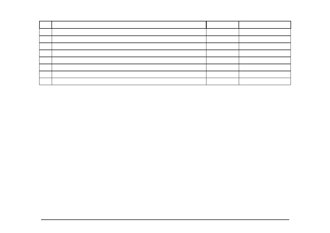
4.44
Is the secondary rule used only when necessary?
O O O
4.45
Are abbreviated words all the same length?
O O O
4.46
Is the structure of a data entry value consistent from screen to screen?
O O O
4.47
Is the method for moving the cursor to the next or previous field consistent throughout the system?
O O O
4.48
If the system has multipage data entry screens, do all pages have the same title?
O O O
4.49
If the system has multipage data entry screens, does each page have a sequential page number?
O O O
4.50
Does the system follow industry or company standards for function key assignments?
O O O
4.51
Are high-value, high-chroma colors used to attract attention?
O O O

Page 10
© Usability Analysis & Design, Xerox Corporation, 1995
5. Help Users Recognize, Diagnose, and Recover From Errors
Error messages should be expressed in plain language(NO CODES).
#
Review Checklist
Yes No N/A
Comments
5.1
Is sound used to signal an error?
O O O
5.2
Are prompts stated constructively, without overt or implied criticism of the user?
O O O
5.3
Do prompts imply that the user is in control?
O O O
5.4
Are prompts brief and unambiguous.
O O O
5.5
Are error messages worded so that the system, not the user, takes the blame?
O O O
5.6
If humorous error messages are used, are they appropriate and inoffensive to the user population?
O O O
5.7
Are error messages grammatically correct?
O O O
5.8
Do error messages avoid the use of exclamation points?
O O O
5.9
Do error messages avoid the use of violent or hostile words?
O O O
5.10
Do error messages avoid an anthropomorphic tone?
O O O
5.11 Do all error messages in the system use consistent grammatical style, form, terminology, and
abbreviations?
O O O
5.12
Do messages place users in control of the system?
O O O
5.13
Does the command language use normal action-object syntax?
O O O
5.14
Does the command language avoid arbitrary, non-English use of punctuation, except for symbols
that users already know?
O O O
5.15 If an error is detected in a data entry field, does the system place the cursor in that field or
highlight the error?
O O O
5.16
Do error messages inform the user of the error's severity?
O O O
5.17
Do error messages suggest the cause of the problem?
O O O
5.18
Do error messages provide appropriate semantic information?
O O O
5.19
Do error messages provide appropriate syntactic information?
O O O
5.20
Do error messages indicate what action the user needs to take to correct the error?
O O O
5.21
If the system supports both novice and expert users, are multiple levels of error-message detail
available?
O O O

Page 11
© Usability Analysis & Design, Xerox Corporation, 1995
6. Error Prevention
Even better than good error messages is a careful design which prevents a problem from occurring in the first place.
#
Review Checklist
Yes No N/A
Comments
6.1
If the database includes groups of data, can users enter more than one group on a single screen?
O O O
6.2
Have dots or underscores been used to indicate field length?
O O O
6.3
Is the menu choice name on a higher-level menu used as the menu title of the lower-level menu?
O O O
6.4
Are menu choices logical, distinctive, and mutually exclusive?
O O O
6.5
Are data inputs case-blind whenever possible?
O O O
6.6
If the system displays multiple windows, is navigation between windows simple and visible?
O O O
6.7
Are the function keys that can cause the most serious consequences in hard-to-reach positions?
O O O
6.8
Are the function keys that can cause the most serious consequences located far away from low-
consequence and high-use keys?
O O O
6.9
Has the use of qualifier keys been minimized?
O O O
6.10
If the system uses qualifier keys, are they used consistently throughout the system?
O O O
6.11
Does the system prevent users from making errors whenever possible?
O O O
6.12
Does the system warn users if they are about to make a potentially serious error?
O O O
6.13
Does the system intelligently interpret variations in user commands?
O O O
6.14 Do data entry screens and dialog boxes indicate the number of character spaces available in a
field?
O O O
6.15
Do fields in data entry screens and dialog boxes contain default values when appropriate?
O O O

Page 12
© Usability Analysis & Design, Xerox Corporation, 1995
7. Recognition Rather Than Recall
Make objects, actions, and options visible. The user should not have to remember information from one part of the dialogue to
another. Instructions for use of the system should be visible or easily retrievable whenever appropriate.
#
Review Checklist
Yes No N/A
Comments
7.1
For question and answer interfaces, are visual cues and white space used to distinguish questions,
prompts, instructions, and user input?
O O O
7.2
Does the data display start in the upper-left corner of the screen?
O O O
7.3
Are multiword field labels placed horizontally (not stacked vertically)?
O O O
7.4
Are all data a user needs on display at each step in a transaction sequence?
O O O
7.5
Are prompts, cues, and messages placed where the eye is likely to be looking on the screen?
O O O
7.6
Have prompts been formatted using white space, justification, and visual cues for easy scanning?
O O O
7.7
Do text areas have "breathing space" around them?
O O O
7.8
Is there an obvious visual distinction made between "choose one" menu and "choose many"
menus?
O O O
7.9
Have spatial relationships between soft function keys (on-screen cues) and keyboard function keys
been preserved?
O O O
7.10
Does the system gray out or delete labels of currently inactive soft function keys?
O O O
7.11
Is white space used to create symmetry and lead the eye in the appropriate direction?
O O O
7.12
Have items been grouped into logical zones, and have headings been used to distinguish between
zones?
O O O
7.13
Are zones no more than twelve to fourteen characters wide and six to seven lines high?
O O O
7.14
Have zones been separated by spaces, lines, color, letters, bold titles, rules lines, or shaded areas?
O O O
7.15
Are field labels close to fields, but separated by at least one space?
O O O
7.16
Are long columnar fields broken up into groups of five, separated by a blank line?
O O O
7.17
Are optional data entry fields clearly marked?
O O O
7.18
Are symbols used to break long input strings into "chunks"?
O O O

Page 13
© Usability Analysis & Design, Xerox Corporation, 1995
#
Review Checklist
Yes No N/A
Comments
7.19
Is reverse video or color highlighting used to get the user's attention?
O O O
7.20
Is reverse video used to indicate that an item has been selected?
O O O
7.21
Are size, boldface, underlining, color, shading, or typography used to show relative quantity or
importance of different screen items?
O O O
7.22
Are borders used to identify meaningful groups?
O O O
7.23
Has the same color been used to group related elements?
O O O
7.24
Is color coding consistent throughout the system?
O O O
7.25
Is color used in conjunction with some other redundant cue?
O O O
7.26
Is there good color and brightness contrast between image and background colors?
O O O
7.27
Have light, bright, saturated colors been used to emphasize data and have darker, duller, and
desaturated colors been used to de-emphasize data?
O O O
7.28
Is the first word of each menu choice the most important?
O O O
7.29 Does the system provide mapping: that is, are the relationships between controls and actions
apparent to the user?
O O O
7.30
Are input data codes distinctive?
O O O
7.31
Have frequently confused data pairs been eliminated whenever possible?
O O O
7.32
Have large strings of numbers or letters been broken into chunks?
O O O
7.33
Are inactive menu items grayed out or omitted?
O O O
7.34
Are there menu selection defaults?
O O O
7.35
If the system has many menu levels or complex menu levels, do users have access to an on-line
spatial menu map?
O O O
7.36
Do GUI menus offer affordance: that is, make obvious where selection is possible?
O O O
7.37
Are there salient visual cues to identify the active window?
O O O
7.38
Are function keys arranged in logical groups?
O O O
7.39
Do data entry screens and dialog boxes indicate when fields are optional?
O O O
7.40
On data entry screens and dialog boxes, are dependent fields displayed only when necessary?
O O O

Page 14
© Usability Analysis & Design, Xerox Corporation, 1995
8. Fexibility and Minimalist Design
Accelerators-unseen by the novice user-may often speed up the interaction for the expert user such that the system can cater to
both inexperienced and experienced users. Allow users to tailor frequent actions. Provide alternative means of access and
operation for users who differ from the “average” user (e.g., physical or cognitive ability, culture, language, etc.)
#
Review Checklist
Yes No N/A
Comments
8.1
If the system supports both novice and expert users, are multiple levels of error message detail
available?
O O O
8.2
Does the system allow novices to use a keyword grammar and experts to use a positional
grammar?
O O O
8.3
Can users define their own synonyms for commands?
O O O
8.4
Does the system allow novice users to enter the simplest, most common form of each command,
and allow expert users to add parameters?
O O O
8.5
Do expert users have the option of entering multiple commands in a single string?
O O O
8.6
Does the system provide function keys for high-frequency commands?
O O O
8.7
For data entry screens with many fields or in which source documents may be incomplete, can
users save a partially filled screen?
O O O
8.8
Does the system automatically enter leading zeros?
O O O
8.9
If menu lists are short (seven items or fewer), can users select an item by moving the cursor?
O O O
8.10
If the system uses a type-ahead strategy, do the menu items have mnemonic codes?
O O O
8.11
If the system uses a pointing device, do users have the option of either clicking on fields or using a
keyboard shortcut?
O O O
8.12
Does the system offer "find next" and "find previous" shortcuts for database searches?
O O O
8.13
On data entry screens, do users have the option of either clicking directly on a field or using a
keyboard shortcut?
O O O
8.14
On menus, do users have the option of either clicking directly on a menu item or using a keyboard
shortcut?
O O O
8.15
In dialog boxes, do users have the option of either clicking directly on a dialog box option or using
a keyboard shortcut?
O O O
8.16
Can expert users bypass nested dialog boxes with either type-ahead, user-defined macros, or
keyboard shortcuts?
O O O

Page 15
© Usability Analysis & Design, Xerox Corporation, 1995
9. Aesthetic and Minimalist Design
Dialogues should not contain information which is irrelevant or rarely needed. Every extra unit of information in a dialogue
competes with the relevant units of information and diminishes their relative visibility.
#
Review Checklist
Yes No N/A
Comments
9.1
Is only (and all) information essential to decision making displayed on the screen?
O O O
9.2
Are all icons in a set visually and conceptually distinct?
O O O
9.3
Have large objects, bold lines, and simple areas been used to distinguish icons?
O O O
9.4
Does each icon stand out from its background?
O O O
9.5
If the system uses a standard GUI interface where menu sequence has already been specified, do
menus adhere to the specification whenever possible?
O O O
9.6
Are meaningful groups of items separated by white space?
O O O
9.7
Does each data entry screen have a short, simple, clear, distinctive title?
O O O
9.8
Are field labels brief, familiar, and descriptive?
O O O
9.9
Are prompts expressed in the affirmative, and do they use the active voice?
O O O
9.10
Is each lower-level menu choice associated with only one higher level menu?
O O O
9.11
Are menu titles brief, yet long enough to communicate?
O O O
9.12
Are there pop-up or pull-down menus within data entry fields that have many, but well-defined,
entry options?
O O O

Page 16
© Usability Analysis & Design, Xerox Corporation, 1995
10. Help and Documentation
Even though it is better if the system can be used without documentation, it may be necessary to provide help and
documentation. Any such information should be easy to search, focused on the user’s task, list concrete steps to be carried out,
and not be too large.
#
Review Checklist
Yes No N/A
Comments
10.1
If users are working from hard copy, are the parts of the hard copy that go on-line marked?
O O O
10.2
Are on-line instructions visually distinct?
O O O
10.3
Do the instructions follow the sequence of user actions?
O O O
10.4
If menu choices are ambiguous, does the system provide additional explanatory information when
an item is selected?
O O O
10.5
Are data entry screens and dialog boxes supported by navigation and completion instructions?
O O O
10.6
If menu items are ambiguous, does the system provide additional explanatory information when
an item is selected?
O O O
10.7
Are there memory aids for commands, either through on-line quick reference or prompting?
O O O
10.8
Is the help function visible; for example, a key labeled HELP or a special menu?
O O O
10.9
Is the help system interface (navigation, presentation, and conversation) consistent with the
navigation, presentation, and conversation interfaces of the application it supports?
O O O
10.10
Navigation: Is information easy to find?
O O O
10.11
Presentation: Is the visual layout well designed?
O O O
10.12
Conversation: Is the information accurate, complete, and understandable?
O O O

Page 17
© Usability Analysis & Design, Xerox Corporation, 1995
#
Review Checklist
Yes No N/A
Comments
10.13
Is the information relevant?
O O O
10.14
Goal-oriented (What can I do with this program?)
O O O
10.15
Descriptive (What is this thing for?)
O O O
10.16
Procedural (How do I do this task?)
O O O
10.17
Interpretive (Why did that happen?)
O O O
10.18
Navigational (Where am I?)
O O O
10.19
Is there context-sensitive help?
O O O
10.20
Can the user change the level of detail available?
O O O
10.21
Can users easily switch between help and their work?
O O O
10.22
Is it easy to access and return from the help system?
O O O
10.23
Can users resume work where they left off after accessing help?
O O O

Page 18
© Usability Analysis & Design, Xerox Corporation, 1995
11. Skills
The system should support, extend, supplement, or enhance the user’s skills, background knowledge, and expertise ----not
replace them.
#
Review Checklist
Yes No N/A
Comments
11.1
Can users choose between iconic and text display of information?
O O O
11.2
Are window operations easy to learn and use?
O O O
11.3
If users are experts, usage is frequent, or the system has a slow response time, are there fewer
screens (more information per screen)?
O O O
11.4
If users are novices, usage is infrequent, or the system has a fast response time, are there more
screens (less information per screen)?
O O O
11.5
Does the system automatically color-code items, with little or no user effort?
O O O
11.6
If the system supports both novice and expert users, are multiple levels of detail available.
O O O
11.7
Are users the initiators of actions rather than the responders?
O O O
11.8
Does the system perform data translations for users?
O O O
11.9
Do field values avoid mixing alpha and numeric characters whenever possible?
O O O
11.10
If the system has deep (multilevel) menus, do users have the option of typing ahead?
O O O
11.12
When the user enters a screen or dialog box, is the cursor already positioned in the field users are
most likely to need?
O O O
11.13
Can users move forward and backward within a field?
O O O
11.14
Is the method for moving the cursor to the next or previous field both simple and visible?
O O O
11.15
Has auto-tabbing been avoided except when fields have fixed lengths or users are experienced?
O O O
11.16
Do the selected input device(s) match user capabilities?
O O O
11.17
Are cursor keys arranged in either an inverted T (best for experts) or a cross configuration (best
for novices)?
O O O
Page 19
© Usability Analysis & Design, Xerox Corporation, 1995
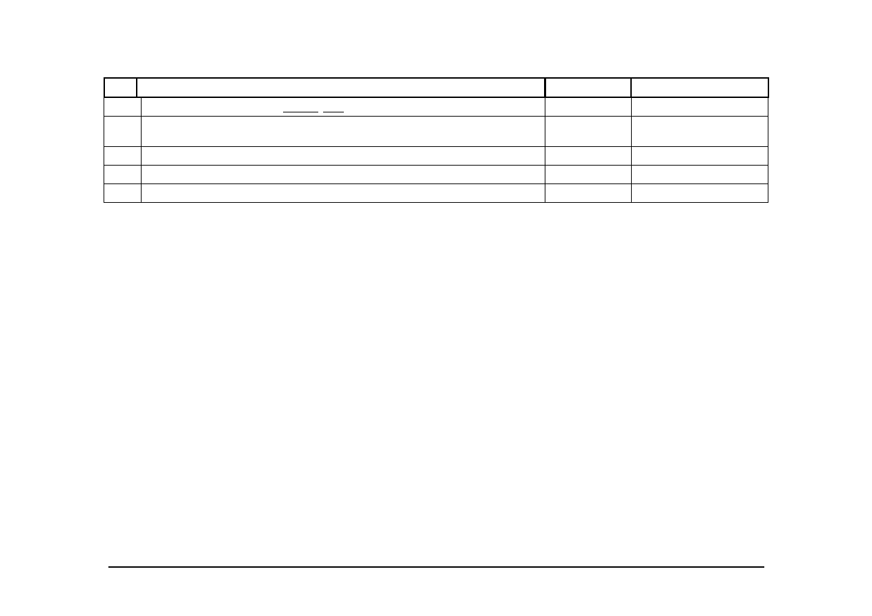
#
Review Checklist
Yes No N/A
Comments
11.18
Are important keys (for example, ENTER , TAB) larger than other keys?
O O O
11.19 Are there enough function keys to support functionality, but not so many that scanning and
finding are difficult?
O O O
11.20
Are function keys reserved for generic, high-frequency, important functions?
O O O
11.21
Are function key assignments consistent across screens, subsystems, and related products?
O O O
11.22
Does the system correctly anticipate and prompt for the user's probable next activity?
O O O

Page 20
© Usability Analysis & Design, Xerox Corporation, 1995
12. Pleasurable and Respectful Interaction with the User
The user’s interactions with the system should enhance the quality of her or his work-life. The user should be treated with
respect. The design should be aesthetically pleasing- with artistic as well as functional value.
#
Review Checklist
Yes No N/A
Comments
12.1
Is each individual icon a harmonious member of a family of icons?
O O O
12.2
Has excessive detail in icon design been avoided?
O O O
12.3
Has color been used with discretion?
O O O
12.4
Has the amount of required window housekeeping been kept to a minimum?
O O O
12.5
If users are working from hard copy, does the screen layout match the paper form?
O O O
12.6
Has color been used specifically to draw attention, communicate organization, indicate status
changes, and establish relationships?
O O O
12.7
Can users turn off automatic color coding if necessary?
O O O
12.8
Are typing requirements minimal for question and answer interfaces?
O O O
12.9
Do the selected input device(s) match environmental constraints?
O O O
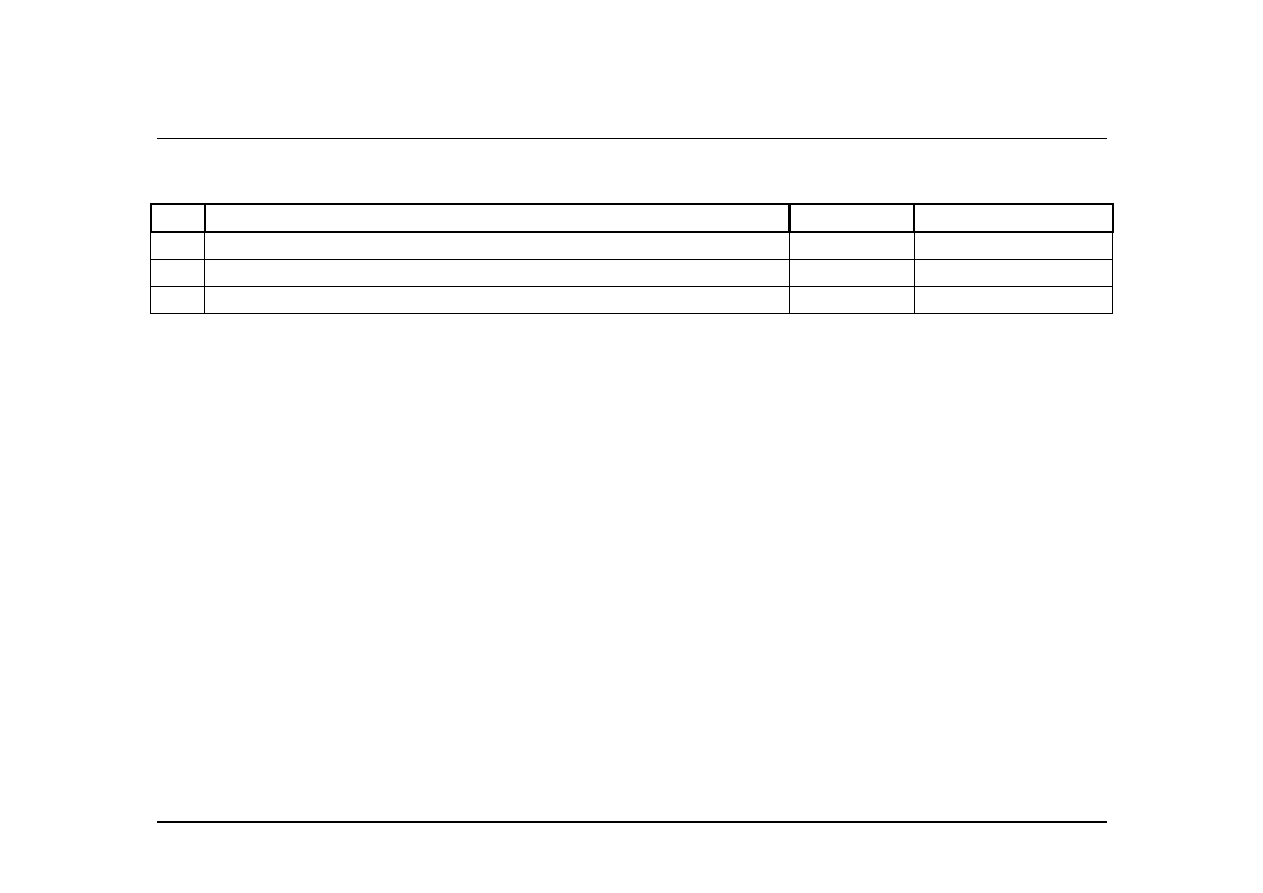
12.13 If the system uses multiple input devices, has hand and eye movement between input devices
been minimized?
O O O
12.14
If the system supports graphical tasks, has an alternative pointing device been provided?
O O O
12.15
Is the numeric keypad located to the right of the alpha key area?
O O O
12.16
Are the most frequently used function keys in the most accessible positions?
O O O
12.17
Does the system complete unambiguous partial input on a data entry field?
O O O
Page 21
© Usability Analysis & Design, Xerox Corporation, 1995
13. Privacy
The system should help the user to protect personal or private information- belonging to the user or the his/her clients.
#
Review Checklist
Yes No N/A
Comments
13.1
Are protected areas completely inaccessible?
O O O
13.2
Can protected or confidential areas be accessed with certain passwords.
O O O
13.3
Is this feature effective and successful.
O O O

Page 22
© Usability Analysis & Design, Xerox Corporation, 1995
Heuristic Evaluation
A System Checklist
Primary Source
Making Computers-People Literate. © Copyright 1993.
By
Elaine Weiss
ISBN:
0-471-01877-5 System
Title:__________________________
Release
#:
__________________________
Evaluator:
__________________________
Secondary Source
Date: __________________________
Usability Inspection Methods. © Copyright 1994.
By
Jakob Nielsen and Robert Mack
ISBN: 1-55542-622-0
Xerox
The Document Company
Wyszukiwarka
Podobne podstrony:
Konkurs historyczny SP etap rejonowy
Etap rejonowy 2007 2008 klucz
Etap podstawowy XXV Olimpiady Wiedzy Ekologicznej ODPOWIEDZI
54 Olimpiada chemiczna Etap III
Konkurs historyczny GIM etap szkolny 2
gimnazjum etap szkolny 2013 angielski
Końcowy etap tworzenia pracy dyplomowej
historia 3 etap 2010 klucz
arkusz oceny 1 etap
46 Olimpiada chemiczna Etap I Zadania teoretyczne
Etap 8
chemia 3 etap 2010 klucz
Etap rejonowy 2006 2007 arkusz
52 Olimpiada chemiczna Etap III Zadania teoretyczne
chemia 3 etap gim 2012 id 11187 Nieznany
Przekrój pionowy studenci, Etap 2
Prezentacja I etap przyklad 3
56 Olimpiada Chemiczna I etap (2)
52 Olimpiada chemiczna Etap III (2)
więcej podobnych podstron