A Stylish
Credenza
P A R T O N E
Style
&
Design
P A T R I C K W A R N E R
■
STYLE & DESIGN
10
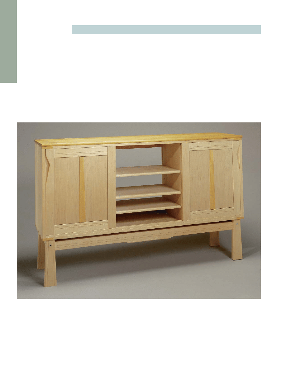
SYMMETRY AND SUBTLE SHADOW LINES
give Patrick Warner’s maple and yellow satinwood office
credenza a dynamic visual rhythm. The same piece could serve as a buffet or as a case for audio and
video equipment.
because of the tight quarters and because I
like to roam around on my castered chair
and don’t need more obstacles. But part of
the piece’s beauty is that all these elements
are adaptable to your own situation and so
is the overall function of the piece.
O
PTIONS AND
A
DAPTATIONS
Though I built my piece as a credenza, you
could just as easily call it a buffet and use it
in the dining room to store china and silver-
ware. In that case, you might add a bank or
two of drawers. And the doors, two or
A STYLISH CREDENZA
■
11
I
t always bothers me when I begin
applying the finish on a piece of
furniture and suddenly realize I’m
only halfway to completing the job. I
work like crazy to apply good design,
milling, and joinery to the furniture
I make. That should be enough. Now
just flood with Danish oil and deliver.
Right? Well, perhaps. Danish oil is an
easy, cheap, and often acceptable
finish, but for furniture that will take
a beating or for high-end work, a hard
finish and some filling and coloring
is often required. To obtain such a
finish takes special skills, techniques
and equipment, and often large
amounts of time and money. This is
not woodworking. It’s chemistry, abra-
sives, coloring, compressors, spray
guns, resins, solvents, clean rooms,
and rubber gloves. And I’d rather not
get tangled up in all of that if I can
avoid it.
Finishes have their advantages, I
admit. But when neither the environ-
ment nor the users are particularly
threatening, a bare wood cabinet can
be a refreshing change. Unfinished
furniture is warmer both to the touch
and the eye. It develops a nice patina
and won’t wear out a minute sooner
than work that’s French polished or
sprayed with automotive acrylic urethane.
If it does suffer an occasional insulting
hand smear or wet glass mark, a simple
sanding or steel wool buff-up will quickly
restore the original look. Try that with a
catalyzed lacquer or an acrylic.
When you finish wood, you empha-
size the grain, color, and figure, and this
will limit its use in some applications.
The soft, nonreflecting surfaces of unfin-
ished wood, no matter the tree, play
down the characteristics of the wood and
put the material more in the service of
the design.
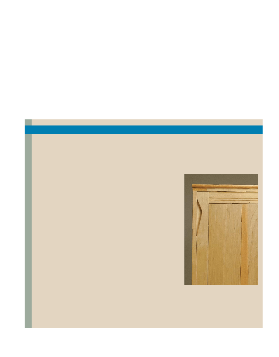
A “no finish” finish is a natural
with light woods like birch, beech, or
maple that will yellow badly under finish.
These are beautiful woods that shouldn’t
be discarded for this idiosyncrasy. Left
unfinished, these woods yellow a little,
but with the advance of the patina, the
color mellows, bringing up light tans and
other tonal subtleties, as you can see
in the photo of the sliding door of my
credenza at right.
If you’re hesitant about making an
unfinished piece for the house or a
client, make something for the shop:
perhaps a jig, fixture, or bench. Get first-
hand experience with bare stock, and see
how it wears and ages. If you like it, think
of how much more quality time you can
invest in the next piece—time that would
have been spent sanding, priming, seal-
ing, and rubbing out that finish.
■
A CASE AGAINST THE FINISH
COMPLETE BUT UNFINISHED.
Fed up
with finishing, the author never flowed
finish onto his credenza. Two years later,
the maple and yellow satinwood have
taken on the subtler tones time gives to
bare wood.
C
redenza, the Italian word for sideboard,
has come to mean a low, lateral piece
of office furniture for storage. I
designed the credenza shown in the photo
on the facing page for my office at home,
and its dimensions and organization reflect
that. It’s fairly shallow because I couldn’t
afford to lose much floor space in my
small office and because I don’t like deep
shelves—you can never get to the stuff at
the back. Its top is counter height: I wanted
to be able to work at it standing up some-
times. I chose sliding doors for the piece
I decided early on that the whole thing
would be solid maple with a top and accents
of yellow satinwood. I planned a fairly sim-
ple box carcase lifted off the ground by a
separate and removable base. I hoped the
base would lend the piece an airy feeling
and avoid the impression of immovable
weight that such office furniture often gives.
I knew that the case inevitably would be
dragged across a few floors, so I designed
the base to be strong, though light, joining
its legs and rails with dovetail tenons rein-
forced with machine-threaded knockdown
fittings and hardwood corner braces, as
shown in the drawing on the facing page.
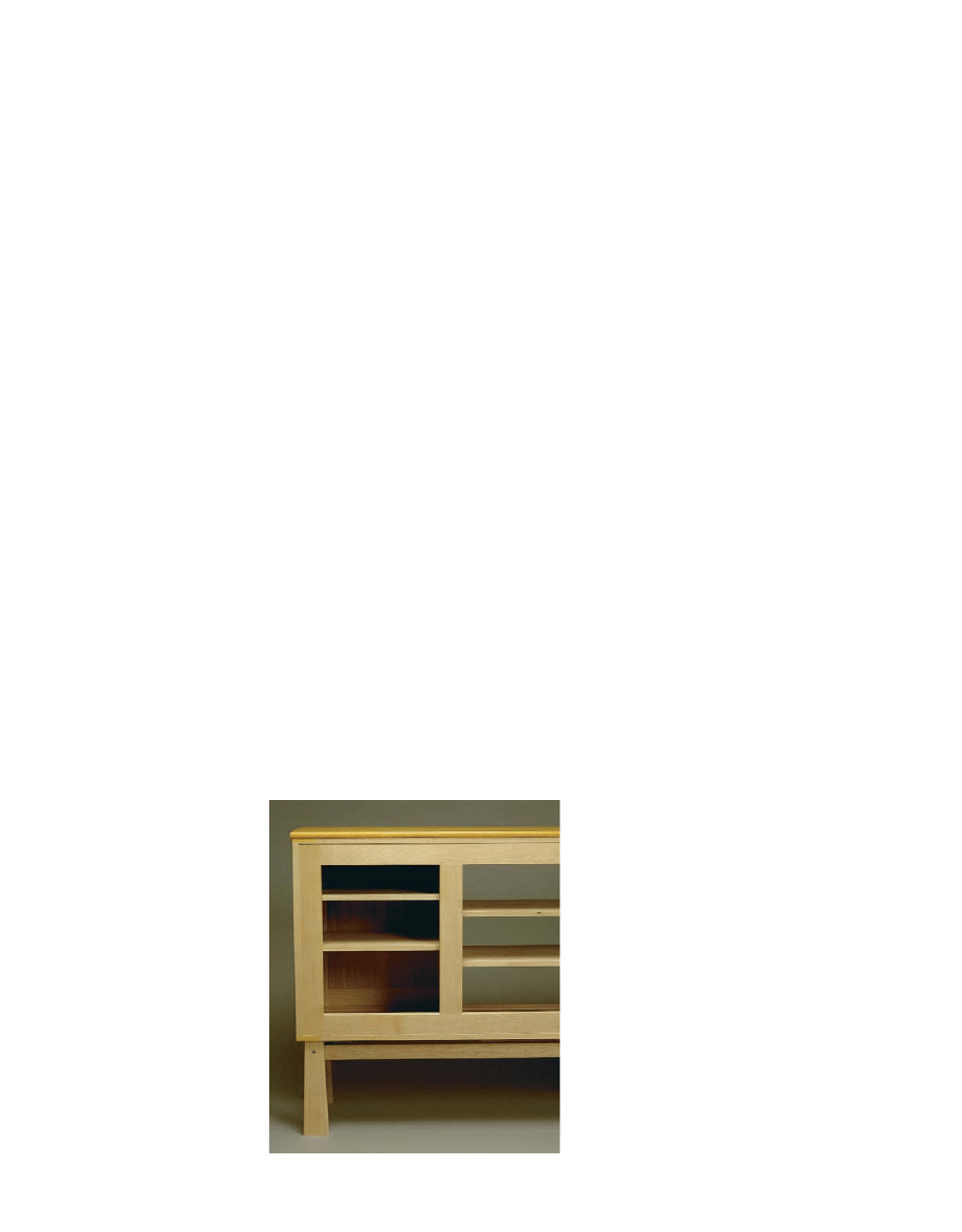
For aesthetic reasons, I wanted the slid-
ing doors in the same plane. So I left the
center section of the case open to give the
doors a space to slide into. I also decided to
run the doors on a removable track. They
would be installed with the track, avoiding
the usual loose fit of sliding doors and the
wide clearance required at the top to lift
them out. The doors could be removed by
unscrewing the track and sliding it out.
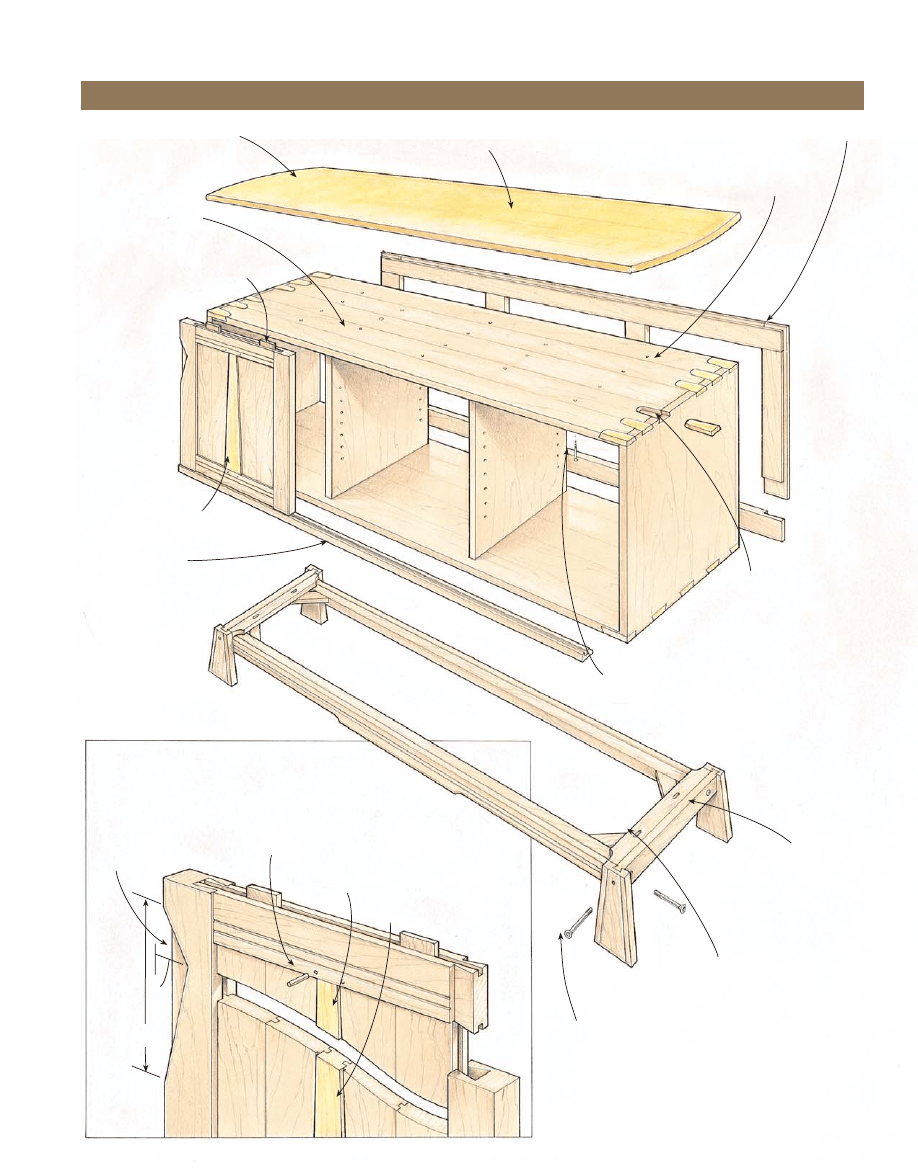
I chose a two-stage joinery method for
the corners of the carcase. In the first stage,
I joined the sides and subtop and bottom
with tongue-and-groove joints across their
full width. After the carcase was together,
I routed out wedge-shaped recesses with a
dovetail bit and filled them with yellow
satinwood, as shown in the drawing. I make
the recesses and the loose wedges with mat-
ing router templates. These floating wedges
have the appearance of dovetails, and the
joint is nearly as strong. I used the tech-
nique in a spirit of adventure to explore the
decorative advantages it offered, and I cer-
tainly didn’t exhaust them. You could also
use any carcase joinery you like on this
piece, from true dovetails or finger joints in
solid wood to the range of possible joints
in plywood or medium-density fiberboard.
I wanted to leave the back of the case
largely open but give the piece resistance
to racking stress. So I made a frame at the
back of 2
1
⁄
2
-in.-wide members joined to
each other with half-lap joints and to the
case with a tongue and groove (see the
photo at left).
three as you wish, could be mounted on
hinges or pocket-door hardware.
You could also easily move the piece into
a living room, and use it to house audio and
video equipment. The center section could
have a swiveling television slide installed,
and a drawer or two could be added at the
bottom of the side sections for tapes. In
this arrangement, tambour doors would be
an apt solution. They could be made as a
pair that wrap laterally and meet in the
middle or as three separate doors that track
vertically.
If you wanted to use the cabinet as a
display case, you could fit it with glazed
doors, glass shelves, and, possibly, a glass
top. In this arrangement, you might want
to make shallow, traylike drawers, or simply
install bottom-mount drawer slides on the
shelving. And interior lighting also might
be in order.
J
OINERY
D
ECISIONS
Once I’d resolved the configuration and
dimensions of my credenza, I set to work
on the anatomy—what the parts would be
and how they would be joined. Whenever I
build a piece for myself, I view it as an
opportunity to experiment, so I tested a
number of ideas in this credenza that had
been brewing as I made furniture for less
indulgent clients.
AROUND BACK.
A half-lapped
open frame is all the back
the cabinet needs. It is
tongued around its perimeter
and glued into a groove in
the carcase. The back affords
excellent clamp access during
glue-up.
■
STYLE & DESIGN
12
13
■
Credenza
Ends of yellow satinwood top,
arced at 8 ft. radius
Twin thread screws
driven through subtop
fix vertical dividers.
Shot runners eliminate binding;
they run in groove in underside
of subtop.
Top measures
22
⁄
32
x 16
1
⁄
2
x 60
1
⁄
2
.
Back frame pieces are half-lapped
together, then tongued
into carcase.
Dovetails and recesses are
routed after tongue-and-groove
carcase assembly.
Top is secured with screws
through subtop.
Overall base dimensions:
12 x 15 x 58
13
⁄
16
Carcase is screwed to base
through ledger strip.
Cap screws engage threaded cross dowels.
Grooves create shadow line.
Muntin is tongued top and
bottom along with panel.
Pins keep unglued panel
centered as it floats in frame.
Holes are drilled after assembly.
For visual interest, thickness
of door members increases by
small increments from panel to
muntin to rails to stiles.
Pull recess,
1
⁄
2
in. deep
8
1
1
⁄
16
DOOR DETAIL
Carcase measures 24 x 16 x 59
3
⁄
4
.
False muntin of yellow
satinwood
Door runners slide
in removable track.
A STYLISH CREDENZA
■

recedes. I wasn’t out to do anything star-
tling, just to use what small devices I could
to tie the piece together visually as well as
structurally.
How thick is that?
You could make this credenza using
3
⁄
4
-in.
material for nearly all the parts. In a dim
room, it would be hard to tell yours from
mine. But when light hit the two credenzas,
they’d look quite different. I constantly play
with thicknesses of material. Variations of
as little as
1
⁄
32
in. between adjacent boards
can be perceived. I made the top and subtop
each a shade under
3
⁄
4
in. and did the same
for the bottom and the door track. I made
the sides
13
⁄
16
in., so they didn’t seem too
skinny by comparison with the doubled
elements at the top and bottom. I used
5/8 stock for the dividers to show that
their structural role is subordinate to the
sides. There are no strict rules governing the
thicknesses of different elements, but if you
play around with the size of parts, you’ll
find the overall appearance of the work can
be subtly controlled.
Proud of it
Varying thickness is also useful in parts that
are viewed face-on rather than from the
edge. On the sliding doors, I made the stiles
1
⁄
16
in. thicker than the rails, leaving them
proud in the front. This slight variation
in the plane of the door frames acknowl-
edges the joint line and distinguishes the
separate parts of the frame. I inset the pan-
els
1
⁄
16
in. from the rails to create a third plane.
And at the center of the panels, I used a
false muntin of yellow satinwood as an
accent, which stands proud of the panel by
a bit less than
1
⁄
16
in. If these offsets were
greater, the door might begin to seem frac-
tured, but because they are only slight, they
add visual nuance without attracting too
much attention.
For the vertical dividers, I chose tongue-
and-groove joints for the subtop and bot-
tom with the tongues stopped so they
wouldn’t show at the front. There’s no real
glue surface on this joint, so I screwed the
dividers in place with #10 twin-thread
screws driven through the subtop and
bottom. These wonderful screws contradict
the old saw about not screwing into end
grain: They get great purchase in a hard-
wood like maple.
When it came to the subtop and the
bottom of the carcase, I looked for a way to
make them that would simplify the glue-up.
Instead of edge-joining them into panels
and proceeding in the usual way with an
increasingly frantic case assembly, I chose to
install them as slats. I machined tongues
and grooves along their edges and tongues
on their ends and dadoed them to accept
the tongues of the vertical dividers. When
it came time to assemble, I first joined the
sides, the back frame, and the rearmost slats
of the subtop and bottom. Having only an
open frame for a back greatly simplified the
clamping. And once that initial assembly
was clamped and squared up, I could then
insert the rest of the slats at my leisure. A
rare, tension-free glue-up.
The top went on when the case was fin-
ished. I made it of yellow satinwood and
attached it with screws through the subtop.
D
ETAILS
, D
ETAILS
With all the decisions made regarding con-
figuration, dimensions, materials, and join-
ery, it might seem that the design process
was at an end. But to me, one of the critical
aspects of any piece of furniture is the
detailing. Those subtle details are telling,
particularly in a piece like this one that I
had decided to leave unfinished (see the
sidebar on p. 11). In a piece that’s been
filled or stained and lacquered, the grain
and color of the wood can leap out at you
and carry a plain design. But when the
wood is left unfinished, it mellows and
■
STYLE & DESIGN
14
legs’ blockiness) with grooves parallel to the
tapered edges.
A curve or two for contrast
As I was finishing up, I saw that virtually all
the lines in the credenza were rectilinear.
Because the top was of contrasting material
anyway, yellow satinwood to the maple of
the base and carcase, I decided to express
the distinction between them a little further
by arcing the ends of the top and rounding
over the edges. I cut the arc on an 8-ft.
radius with a router and template and the
roundover with a router and a
3
⁄
8
-in. round-
over bit. I used the same bit to round over
the front edges of the shelves to give them
a visual link to the top.
Shadow lines and shallow grooves
Shadows can be used like a pencil to vary
the weight of the lines in a piece of furni-
ture, to interrupt a featureless surface, or
to outline and highlight a part or detail.
As with the varying of thicknesses, the use
of shadows can be overdone and requires
careful control.
I created a reveal around the floating
panels in the sliding doors to underscore
the distinctness of the panel and the frame.
The reveal is
1
⁄
4
in. deep, and the shadows
are dark. Shallower grooves cut to either
side of the false muntins create a softer
shadow and, therefore, mark the tapered
shape with lighter emphasis. In the center
section of the case, I created a shadow line
with a chamfer at the back of the vertical
divider where it meets the back frame. This
balances the gap shadow between door and
divider and picks out the divider as a dis-
crete part (see the photo on p. 10).
The boldest shadow line in the credenza
is the one between the bottom of the case
and the front rail of the base. I dropped the
rail to create this line, intending it to signify
the functional separation between the car-
case and the base. I’ve always liked the idea
of making the base of a case piece look like
a pedestal and tried to carry it out in this
design. But I didn’t want the two parts to
be unrelated, and that led me to introduce
several other details.
I had routed
1
⁄
8
-in. grooves across the
rails of the doors, and I echoed these on
the base with the pair of grooves in the
front rail. I hoped these grooves, with their
lateral sweep across the length of the piece,
would tie the three sections of the carcase
together.
The leg design also was intended to
relate the base to the carcase. I borrowed
the tapered form from the false muntins
and emphasized it (while breaking up the
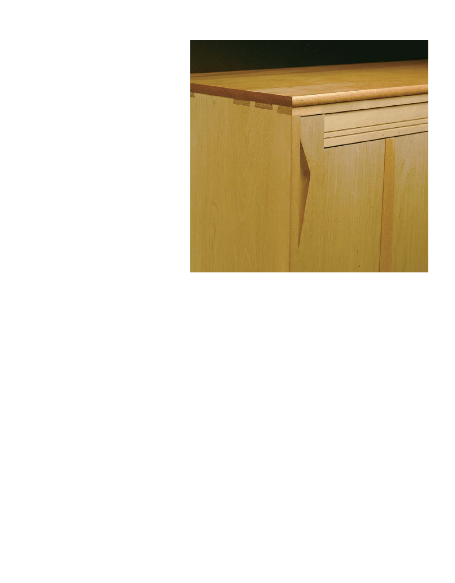
ANGLED FORMS PLAY OFF
STRAIGHT LINES.
Floating
dovetail wedges, tapered
muntins, and recessed triangu-
lar handholds form a subtheme
in Warner’s rectilinear composi-
tion in lines and planes.
A STYLISH CREDENZA
■
15
Wyszukiwarka
Podobne podstrony:
Strukturalizm i stylistyka (część II)
środki stylistyczne, Matura, Polski
Środki stylistyczne i rodzaje rymów - powtórzenie wiadomości., Sql, Projekty, prace domowe, dodatkow
SRODKI STYLIST, Nauka o języku
5 1 Środki stylistyczne
Praktyczna stylistyka nie tylko dla polonistów
Darmowa wyszukiwarka - HELP DESK, Ulepszanie Chomika, Wyszukiwarki
Z poprawna polszczyzną - 2 etap, ►► UMK TORUŃ - wydziały w Toruniu, ►► Filologia polska, Stylistyka
dlaczego frazeologia, Filologia polska UWM, Stylistyka współczesna
ŚRODKI STYLISTYCZNE, RYMY, GATUNKI I RODZAJE LITERACKIE
ŚRODKI STYLISTYCZN2
ŚROSKI STYLISTYCZNE W POEZJI ZNACZENIE POJĘĆ
Środki stylistyczne
0092 hey tonight credence WPNGVNYVKVN3T5FWT2L5EZFJS7TKVD6GA7U6IRA
ŚRODKI STYLISTYCZNE mgr A Steliżuk
Build Desk
więcej podobnych podstron