Learning Center
Home > Your Courses > Graphic Design for Everyone
Lesson 5: Color My World
It's no secret that color has a huge effect on human beings. I always feel down on the gray, December
days, and I have an incredible lift of spirits upon seeing the first green leaves of spring against a blue sky.
This lesson focuses on Color Theory, the science of color relationships, and how they can help or hamper a
design.
What's Color Theory?
Page 1 of 7
In the Lesson 4, you learned about typography and the impact it
has on design. This lesson focuses on color and how you can use it
to make your designs great.
is a vast subject first studied by Greek philosophers,
the most well known being Aristotle and Plato. Modern artists still
discuss and write about color theory, including 20th century
theorists and members of the
school,
I will touch on the basics of color theory, but like most other topics
covered in this course, it's a complex subject that you can explore
in more detail at your convenience. I'm not going to get into the
of color and its effect on the human brain because I'm not a
scientist and this is a design class. However, it's an extremely
interesting topic, so I encourage you to seek out more information.
A Note on Color Blindness
A better term is color deficiency, because very few people are
truly color blind. The most common difficulty is the inability to
distinguish between reds and greens. One author on the
describes the difficulty in observing pink flowers on a shrub:
Because this person couldn't differentiate between pink and green,
the flowers were undetectable.
As designers in a world that loves to use color, we must keep in
mind that people can't always see the colors we choose. Therefore,
we must think not only in terms of color, but also tint or value
(discussed later in this lesson).
I had a professor who challenged us to give the visual definition of
a word using only type, the word itself, and no color. My word was
anger, so I set about using quotation books and dictionaries to read
different interpretations of the word. I kept thinking that anger was
like seeing red, but I couldn't use red in my design. I finally found a
quote that said anger is danger without the d. (I apologize for not
knowing the source of the quote.) In the end, I had a great concept
Color Deficiency:
Check your
Information from a
http://learningcenter.netscape.com/sessions/lessons/viewLessonAllPages.jsp?lessonId=2316&courseSessionId=2705 (1 of 10)2004/5/8 11:01:22
Lesson 5
Learning Center
based on the quote and I didn't have to use color to describe it.
The Wheel Keeps on Turnin'
Page 2 of 7
Now we're going to get into the nitty-gritty of color. One inexpensive and indispensable resource is
a color wheel. I really like the
because it has the basic color information and also shows
what a color will look like when mixed with another one.
The color wheel is the best place to start when looking at color relationships, and it's a good visual
tool to use when learning color definitions.
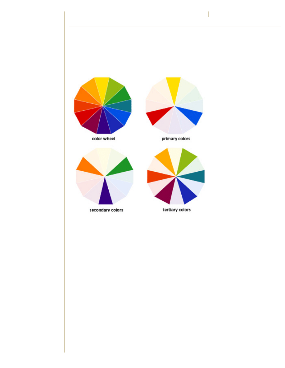
Figure 5-1: The basics of the Color wheel.
Figure 5-1 shows the three basic categories of color:
Primary
Red, yellow, and blue are primary colors. They could be called pure, because no other color is
mixed to create them.
Secondary
When you mix two of the primary colors together, you get secondary colors.
●
Red + Yellow = Orange
●
Blue + Yellow = Green
●
Red + Blue = Violet (Purple)
Tertiary
When you mix a secondary color with a primary color, you get tertiary colors.
http://learningcenter.netscape.com/sessions/lessons/viewLessonAllPages.jsp?lessonId=2316&courseSessionId=2705 (2 of 10)2004/5/8 11:01:23
Learning Center
●
Yellow + Green = Yellow Green
●
Green + Blue = Green Blue
●
Red + Orange = Red Orange
Opposites Attract
Page 3 of 7
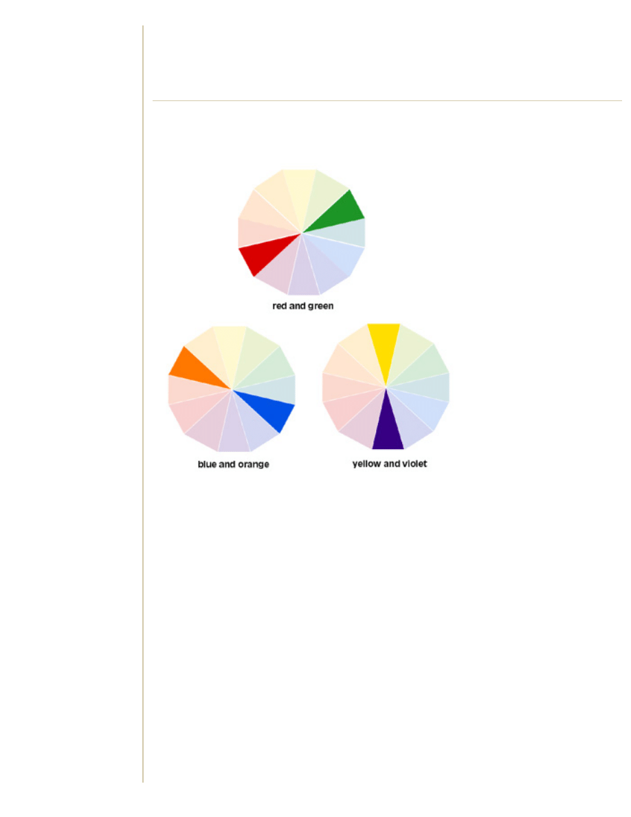
Each primary color has a secondary complement -- it's easy to remember which is which, but the
color wheel also comes in handy here. Two complementary colors lie opposite one another on the
color wheel, as shown in Figure 5-2.
Figure 5-2: Complementary colors.
Did you know that one color longs to be with its complement? This phenomenon is called
simultaneous contrast. A good explanation I got from a professor is that a color and its
complement are like two people who always think about one another -- when they get together,
there's a ton of energy.
In real terms, simultaneous contrast is one color leaving its complement on another or leaving a
visual imprint of its complement. For example, my brother brought home an optical trick from school
in the form of a simple, flat color drawing of the American flag. I was told to stare at the image for a
little while and then look at a blank sheet of white paper. I saw the same flag, but this time in
shades of black, green, and orange instead of the familiar red, white, and blue.
Print Figure 5-3 on a color printer and stare at the black dot in the center for at least 30 seconds.
What do you see?
http://learningcenter.netscape.com/sessions/lessons/viewLessonAllPages.jsp?lessonId=2316&courseSessionId=2705 (3 of 10)2004/5/8 11:01:23
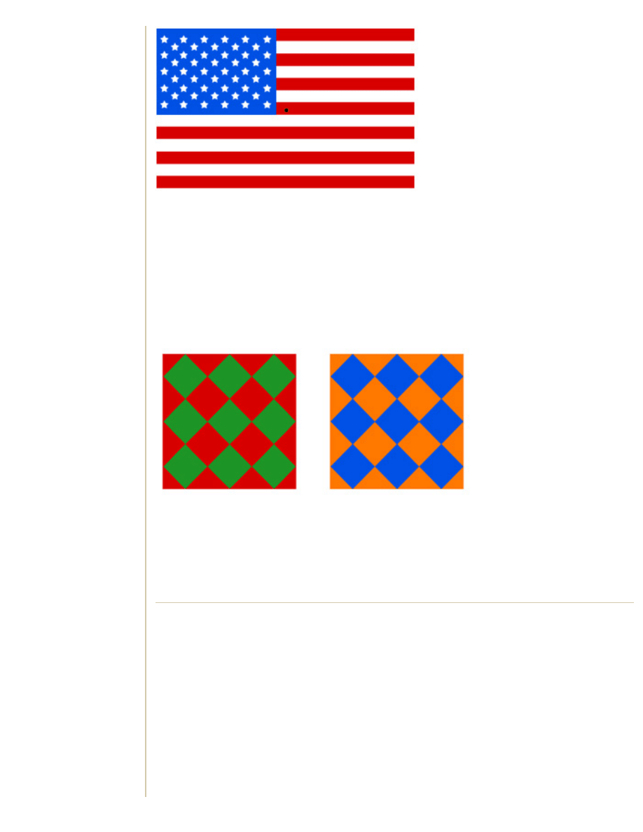
Learning Center
Figure 5-3: Simultaneous contrast experiment.
As I was typing this lesson, I noticed that when I wasn't looking directly at the flag, I could see green
streaks coming off the red stripes. Pretty cool, huh?
Complementary color is often used to get people's attention (think red and green for Christmas and
pastel violet and yellow for Easter). But another thing to keep in mind is that although colors can be
attention-getting, they can also be very tiring to the eye. This is the energy my professor was
referring to. When these colors are put next to one another, they jump and vibrate. Take a look at
Figure 5-4 to see what I mean.
Figure 5-4: Vibrating complementary colors.
Imagine setting green text on a red background. After a while, it would be extremely difficult to read
because your eyes have a hard time finding the borders of the text. Notice how the boundary
between the red and green diamonds looks darker? This isn't a Photoshop trick; it's simultaneous
contrast in action. Red appears on its complement, green, which makes the edge darker.
It's Hot in Here!
Page 4 of 7
There has always been a lot of discussion on the emotions that colors evoke. In Pantone Guide to
Communicating with Color, Bright Red is described as "exiting, energizing, sexy, and provocative,"
and Lime is described as "tart, acidic, and refreshing."
These are good guidelines, but remember that every person will associate color differently. Certain
shades of pink give me the warm fuzzies, but a lot of people are completely turned off by it. This is
why it is essential to know your audience and their tastes.
I'm not here to debate color emotions (although you're welcome to on the Message Board). I will,
however, talk about color combinations. Have you ever heard the terms warm and cool colors?
Have you been told that you are an autumn or summer? What colors do these words bring to your
mind?
http://learningcenter.netscape.com/sessions/lessons/viewLessonAllPages.jsp?lessonId=2316&courseSessionId=2705 (4 of 10)2004/5/8 11:01:23
Learning Center
●
Warm colors are reds, yellows, and oranges. These are the colors we tend to see first;
they're great to use when trying to gain someone's attention.
●
Cool colors are the blues, greens, and violets. These colors are known to recede, and are
often used to create a sense of dimension. Think about the song lyric, "purple mountains
majesty." Are mountains actually purple? No, but objects that have that grayish-purple
quality tell your eyes that they are far away.
The cosmetics industry has made a fortune by telling women their seasons. This really has to do
with what colors look good on you. Think about the colors of fall: They are deep oranges and reds,
browns, and deep greens. They make me think of football games and high school marching bands.
Whereas the colors of spring are bright greens and yellows, pinks, and sky blues (not necessarily
pastel but vibrant). These colors remind me of days spent lying in the grass picking out shapes in
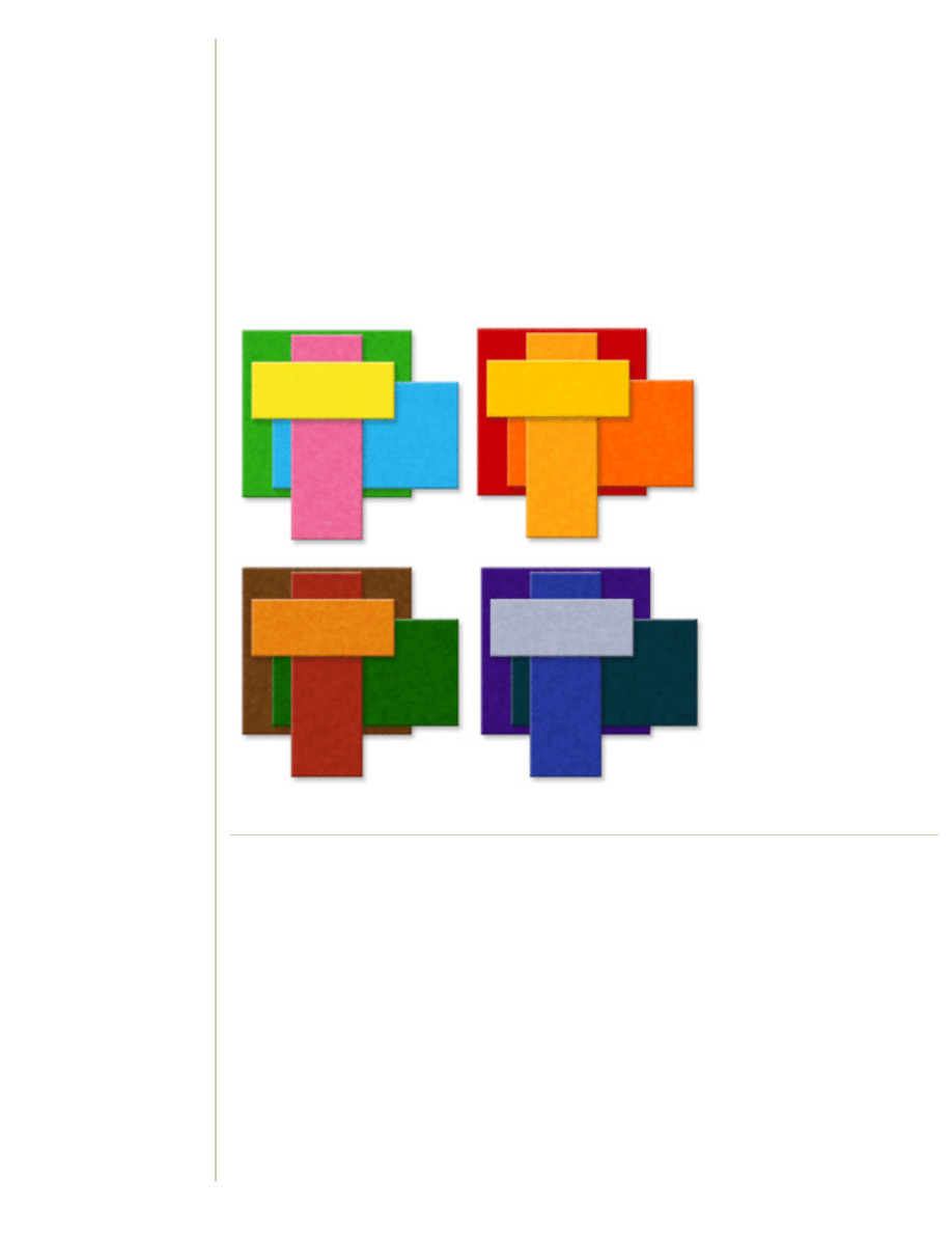
the clouds. Figure 5-5 shows representation of seasonal color.
Figure 5-5: Seasonal color combinations: spring, summer, fall, and winter.
I Love Hugh
Page 5 of 7
Did you see him in Sense and Sensibility? He's in love with Eleanor but she is too poor for his
fami . . . Wait, what was that? Hue, not Hugh? Oh, well; it looks like my babbling about Hugh Grant
will have to wait. I'm supposed to be discussing H-U-E, as in the color of something.
Did you know hue is another way to say color? I didn't until I started taking design classes in school.
Below is a list of color jargon for you to familiarize yourself with. (You do that while I dig up my copy
of Four Weddings and a Funeral.)
●
Hue, as I've said, is simply another word for color. If you shift the hue of something (which
can be done in Photoshop), you're basically changing the color of that object.
●
Saturation indicates the amount of that color. The lower the saturation, the grayer the color
gets.
●
Value is the lightness or darkness of a color. For example, gray is a lighter value of black,
and pink is a lighter value of red.
●
Brightness is the equivalent of value.
http://learningcenter.netscape.com/sessions/lessons/viewLessonAllPages.jsp?lessonId=2316&courseSessionId=2705 (5 of 10)2004/5/8 11:01:23
Learning Center
●
Tint is the addition of white to a hue and is a great method for adding highlights to an
image.
●
Shade is the addition of black to a hue and is a great way to create believable shadows.
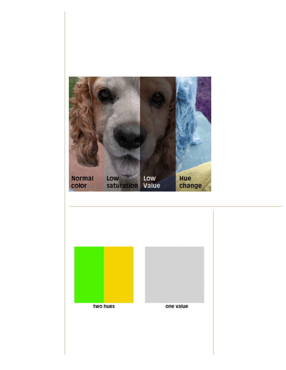
Babe the Wonder Dog illustrates these definitions in Figure 5-6. The first pane is the normal
photograph. The second has been somewhat desaturated: There is still some color remaining
(notice the slightly pink tongue), but it's primarily gray. The third pane's value has been taken
almost completely to black, and the fourth pane's hue has been shifted. The greens are now purple
and the reds and oranges are now blue. (All of these were accomplished with Photoshop's Hue/
Saturation adjustment tool.)
Figure 5-6: Here's a truly wondrous dog who loves color theory.
Contrasting Viewpoints
Page 6 of 7
Remember when I was talking about color deficiencies? I mentioned
that a good design trick is to work with value. This is because, believe
it or not, the hue can be different while the value remains the same
(see Figure 5-7 for an example).
Figure 5-7: Believe it or not, this green and yellow have the same
value.
This illustration proves the necessity of using contrast in your
design. Contrast is simply the art of juxtaposition. Place black against
white or small next to large, and one highlights and essentially shows
off the other, just like complementary colors.
More Color Links:
has free downloads
and color advice. Lynda
Weinman is one of the
preeminent authorities on using
color on the Web.
industry standard for color
management.
Here's
about color in
relation to photography, by
Agfa, which is still relevant to
this discussion.
Learn about different color
schemes at
.
Creative with Color
http://learningcenter.netscape.com/sessions/lessons/viewLessonAllPages.jsp?lessonId=2316&courseSessionId=2705 (6 of 10)2004/5/8 11:01:23
Learning Center
Contrast not only helps when designing with color deficiencies in
mind, it can also help keep money in the bank. Oftentimes, color is
not a viable option in design simply because it's expensive to
reproduce.
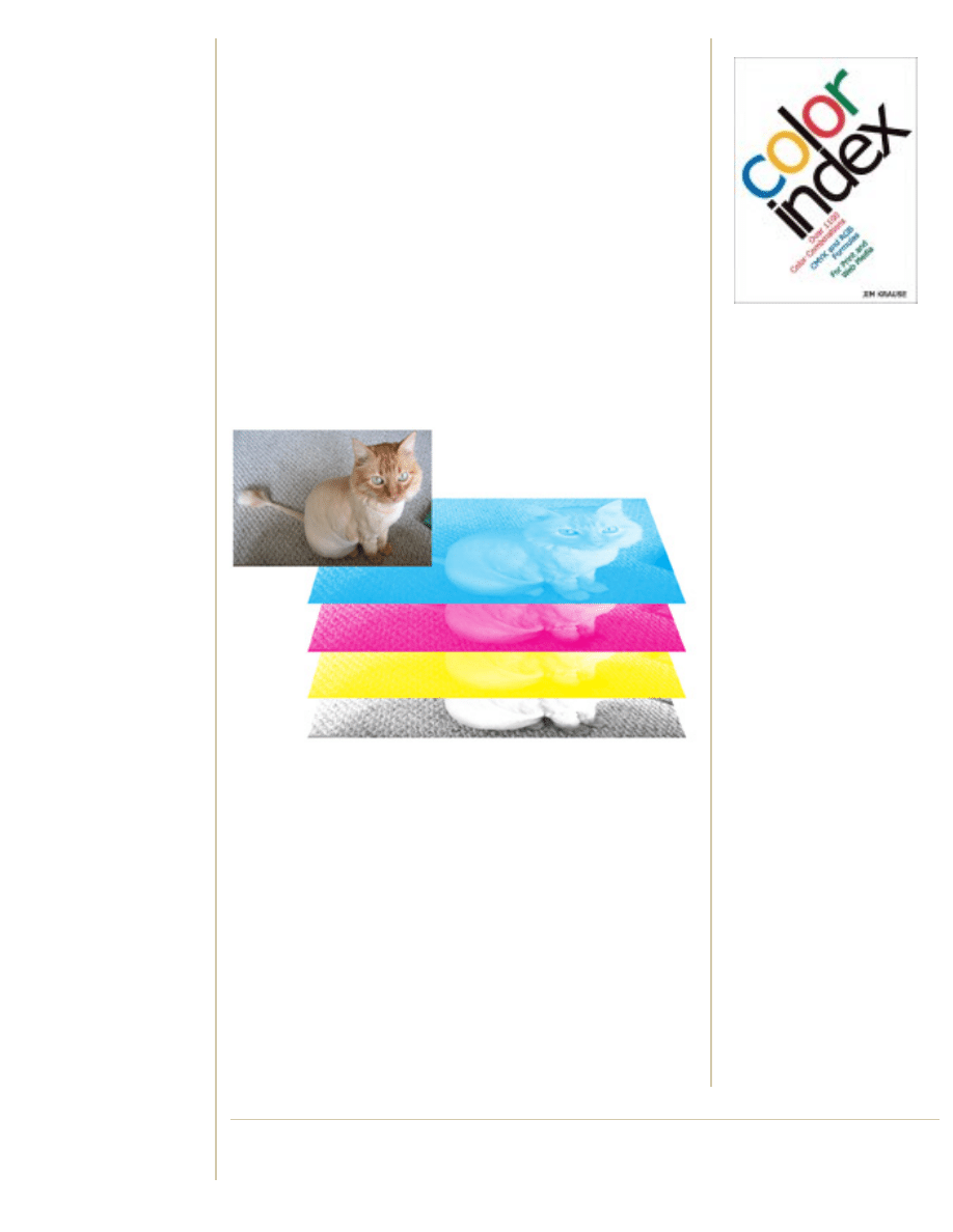
Have you ever wondered why large art books are so expensive? It's
because of the large amount of color images. Color photographs in
newspapers, magazines, books, and most other printed material are
composed of the four printing colors: cyan (blue-green), magenta
(sort of like fuchsia), yellow, and black.
Photographs are essentially separated into layers, each composed of
tiny dots based on the values in that layer. Each layer of dots is
etched into a metal plate, and each plate is inked with its respective
color: cyan, magenta, yellow, or black. Then a print from each inked
plate is laid down, one over the other, on the paper. The complex
system of dots allows colors to be optically mixed to simulate a
seamless photograph. Figure 5-8 shows a simple example.
Figure 5-8: Tom the Magnifi-cat shows the four colors used in
printing.
So for every color photograph in that art book, four plates have to be
etched, inked, and printed. That's a lot of metal and ink, which equal
a lot of dollars.
This is why so many art books -- like my copy of A History of Graphic
Design -- use primarily black and white throughout and have special
sections of color images in the middle. It's much more cost effective
to print this way.
However, sometimes color is simply not an option. At times like this,
don't forget that Black, White, and all of the grays in between are
colors, too. Using contrast can really make them pop. Sometimes
really
effective and interesting design
combinations of black and white.
Color Index provides more
than one thousand color
combinations and
formulas--guaranteed to
help graphic artists solve
design dilemmas and
create effective images for
both print and the Web.
Color Projects
Page 7 of 7
http://learningcenter.netscape.com/sessions/lessons/viewLessonAllPages.jsp?lessonId=2316&courseSessionId=2705 (7 of 10)2004/5/8 11:01:23
Learning Center
In this section, we are going to focus on some of the projects that are
used in color theory classes. In his book, Interaction of Color, Josef
Albers suggests using colored paper when doing these kinds of
projects because mixing pigments can be inconsistent. A good
source of colored paper is
. Just shuffling through the deck
of papers can be very inspirational.
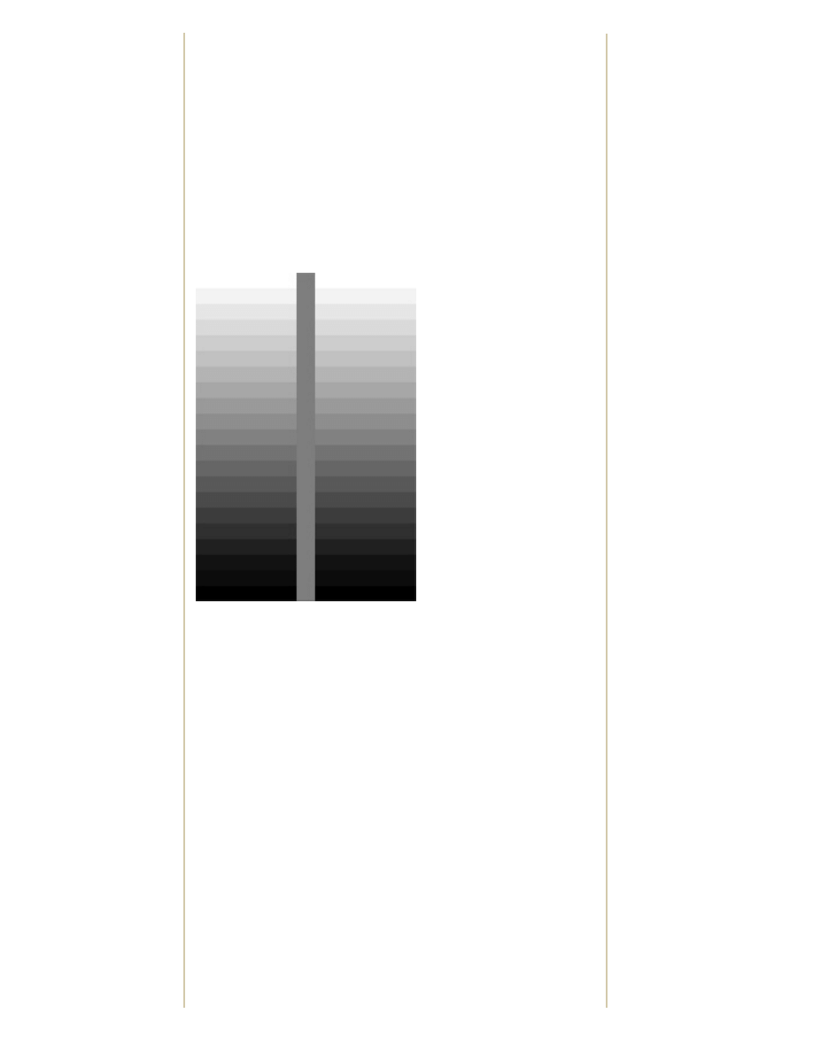
Value Study
A value study looks at black and white and the shades of gray in
between. Figure 5-9 is a series of 21 tints of black to pure white at
five percent increments. The line through the center is 50 percent
gray.
Figure 5-9: A value study.
Do you see the optical illusion? Even though the center vertical line is
actually one color, it appears to be a gradient of dark gray to light
gray as it travels downward. This is a great example of how one color
changes another. Remember that what you put next to a color has
the ability to dramatically alter that color.
Simultaneous Contrast
Now we'll do two experiments with simultaneous contrast.
The first, Figure 5-10, is a color background with two gray squares in
the center.
Coloring Books
Great books to check out:
The Art of Color: The
Subjective Experience and
Objective Rationale of
Color by Johannes Itten
The Elements of Color by
Johannes Itten
Interaction of Color by
Josef Albers
Color Index: Over 1100
Color Combinations,
CMYK and RGB Formulas,
for Print and Web Media by
Jim Krause
Pantone Guide to
Communicating with Color
by Leatrice Eiseman
http://learningcenter.netscape.com/sessions/lessons/viewLessonAllPages.jsp?lessonId=2316&courseSessionId=2705 (8 of 10)2004/5/8 11:01:23
Learning Center
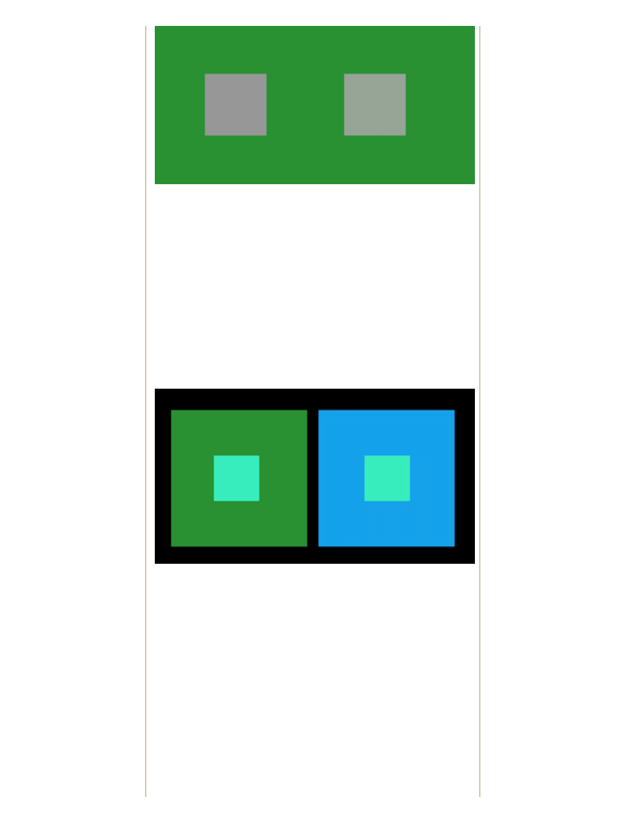
Figure 5-10: Green with gray.
So which of the squares is pure gray? It just so happens that the left
square is gray. It appears to have a reddish tint because of
simultaneous contrast. The background is green, and it wants to be
close to its complement, red; therefore, you see red in the neutral
gray.
The gray square on the right has been tinted with a little green (the
background color) to combat the simultaneous contrast. This project
illustrates how to get rid of unwanted color illusions.
Our second experiment, Figure 5-11, uses simultaneous contrast to
attempt to make one color look like two different colors .
Figure 5-11: Our attempt to make one color look like two different
colors.
The center, smaller square is the same color, a sort of sea foam
green, set in front of two different color larger squares. The illusion is
really apparent if you stare at the black dividing line in the center and
allow your peripheral vision to do the work. What do you think is
causing the color difference? (Hint: think about complementary
colors.)
Here are some more projects to try on your own:
●
Create your own color wheel using paper or paints.
●
Repeat the projects illustrated in Figures 5-10 and 5-11 using
different colors.
●
A twist on the experiment in Figure 5-11 is to make two
different colors appear to be the same color by using different
http://learningcenter.netscape.com/sessions/lessons/viewLessonAllPages.jsp?lessonId=2316&courseSessionId=2705 (9 of 10)2004/5/8 11:01:23
Learning Center
background colors. This one is pretty difficult, but you'll have
fun trying to make it work!
Moving On
This lesson only scraped the surface of color theory. You learned the
difference between hue and value and that black and white can be
cool when the pocketbook won't allow for color. And you also learned
some cool optical tricks to play on your friends when they've had a bit
too much to drink.
The next lesson, on composition, is our last one. It will take
everything we have learned so far and put it all together. As I said
earlier in the course: design is a sum of its parts. All of the parts have
to be good, and they also have to be put together well. Lesson 6
concentrates on putting everything together.
Don't forget to take the quiz and to do the assignment. Then make
sure to stop by the Message Board to discuss color with your fellow
classmates.
Pages
1.
2.
3.
4.
5.
6.
7.
© 2003 Netscape Learning Center. All Rights Reserved. Terms of Service | Privacy Policy | About
http://learningcenter.netscape.com/sessions/lessons/viewLessonAllPages.jsp?lessonId=2316&courseSessionId=2705 (10 of 10)2004/5/8 11:01:23
Document Outline
- netscape.com
Wyszukiwarka
Podobne podstrony:
Graphic Design For Everyone 01
Graphic Design For The Web
(paper)Learning Graphical Models for Stationary Time Series Bach and Jordan
A New Hybrid Transmission designed for FWD Sports Utility Vehicles
Forex For Everyone Learn To Trade The Forex Market Like A Professional
ŚCIĄGA FROM BIOLOGIA FOR EVERYONE xD, Tekstowe, Ściągi
Design For Pcb Emi Emc Compliance
Graphic Design USA Corporate Identity 15 Trends Taking Shape In Logo Design
A New Hybrid Transmission designed for FWD Sports Utility Vehicles
GUIDE Wine for Everyone
Marcus Queer Theory for Everyone
Graphic Design Tutorial
Boost Converter Design For 20Kw Wind Turbine Generator
Designed for Love Erin Dutton
VCO designs for wireless handset and catv
McGraw Hill Briefcase Books Design for Six Sigma
Review of Orthomolecular Medicine for Everyone
więcej podobnych podstron