Landing Pages that Work
Google Conversion Team
Northern and Central Europe (NACE)
Disclaimer
In general, there are no such things as best practices that offer a full guarantee to success
when it comes to optimizing landing pages for conversion.
There are however a number of things that every site owner should take into account when
creating or optimizing landing pages – or in other words – a couple of boxes that (nearly) every
landing page should check.
This deck covers these and aims to provide clients with 10 questions they should ask
themselves when looking at their own landing pages. It explains why these are important
to ask and gives tips on what to improve / test in case the answer to any of the 10 questions
turns out to be negative.
To get started, find an important landing page for your client and an ad leading to that page
10
Landing pages that work – The BIG ten
4
Branding
& site purpose
2
Speed
1
Confirmation
3
First
impression
3
5
Design
6
Visuals
7
Text
8
Call-to-action
9
Value
proposition
Persuasion
1
Confirmation
Why is it important?
•
Visitors click on your ad because they saw
something they liked
•
If what they liked is not present or not confirmed
on the landing page they are more likely to
leave your site right away
What you should do
•
Make sure the text (and colours) of your landing
page match the ads driving traffic to them
•
Keep the promises from your ads: if you are
advertising with free delivery, a specific product
price or a discount, these should be confirmed
on your landing page.
Question to ask
Does your landing page confirm what was in the Ad? (e.g. Product from the Ad, Number
of offers, Price, Discounts, Free Delivery, Top Rated site…)
2
Speed
Why is it important?
•
Load time is a ranking factor in the organic Google
results and affect your AdWords LPQ score
•
Around 50% of visitors will leave your site if it does
not load within 3 seconds (sources: PhocusWright,
Forrester Consulting)
What you should do
•
Use
Google PageSpeed Insights
,
YSlow
and/or
WebPagetest
to identify slow loading pages and review
specific advice on how to speed up load times on your
pages
•
Review
Let's Make The Web Faster
to find more
information on how to make your site faster, with access
to more Google tools
•
If you use Google Analytics, explore the
site and page speed reports
there over time to assess
how much you are improving as you get to work on page
speeds
Question to ask
Does your landing page load fast? – aim for less than 3 seconds for the page to load
using a normal broadband connection (tip: use
pagespeed.googlelabs.com
to check
landing page load time performance for desktop and mobile)
3
First impression
Why is it important?
•
Various studies show that it only takes a fraction
of a second for visitors to get a first impression
of your site
•
It is extremely hard to change the first
impression of a visitor. A negative first
impression will stick to their mind and reduce
the chance they will convert on this visit or ever
come back
•
Research shows that indications of sincerity
and competence are key in building visitors’
initial trust
What you should do
•
Use a limited number of mostly natural colours and
make sure the contrast between page background
and your text is strong
•
Limit the number of advertisements and banners
on your page
•
Remove any elements that look out-dated – visitors
will respond positively to a page that looks modern
and up-to-date
•
Make sure there are absolutely no errors / layout issues
on your landing pages for all major browsers and screen
resolutions, you can check what your site looks like on
most devices with
Screenfly
Question to ask
Does the page make a good first impression? Without looking any
further, is this a site run by someone you would buy something from?
“You never get
a second chance
to make a first
impression”
4
Branding & Site Purpose
Why is it important?
•
Your landing page acts as a highly targeted
storefront and visitors will appreciate immediately
knowing where they are and what is being offered
•
Visitors who know your brand expect to
recognize things on your site, like your logo
or corporate colours
What you should do
•
Clearly show your corporate logo
•
Use your corporate colours as part of the colour
scheme of your page
•
If available, show well know spokespeople / mascots
•
Use a tagline below or next to your logo to serve as a
memorable and easily recognizable phrase associated
with your brand name
•
Use BIG HEADLINES that explain what visitors can
expect on your site.
Question to ask
When coming to the page, is it immediately clear whose site it is and what the purpose of the
page / site is? (things like a logo, corporate colors, and a clear tag-line are things to look for)
5
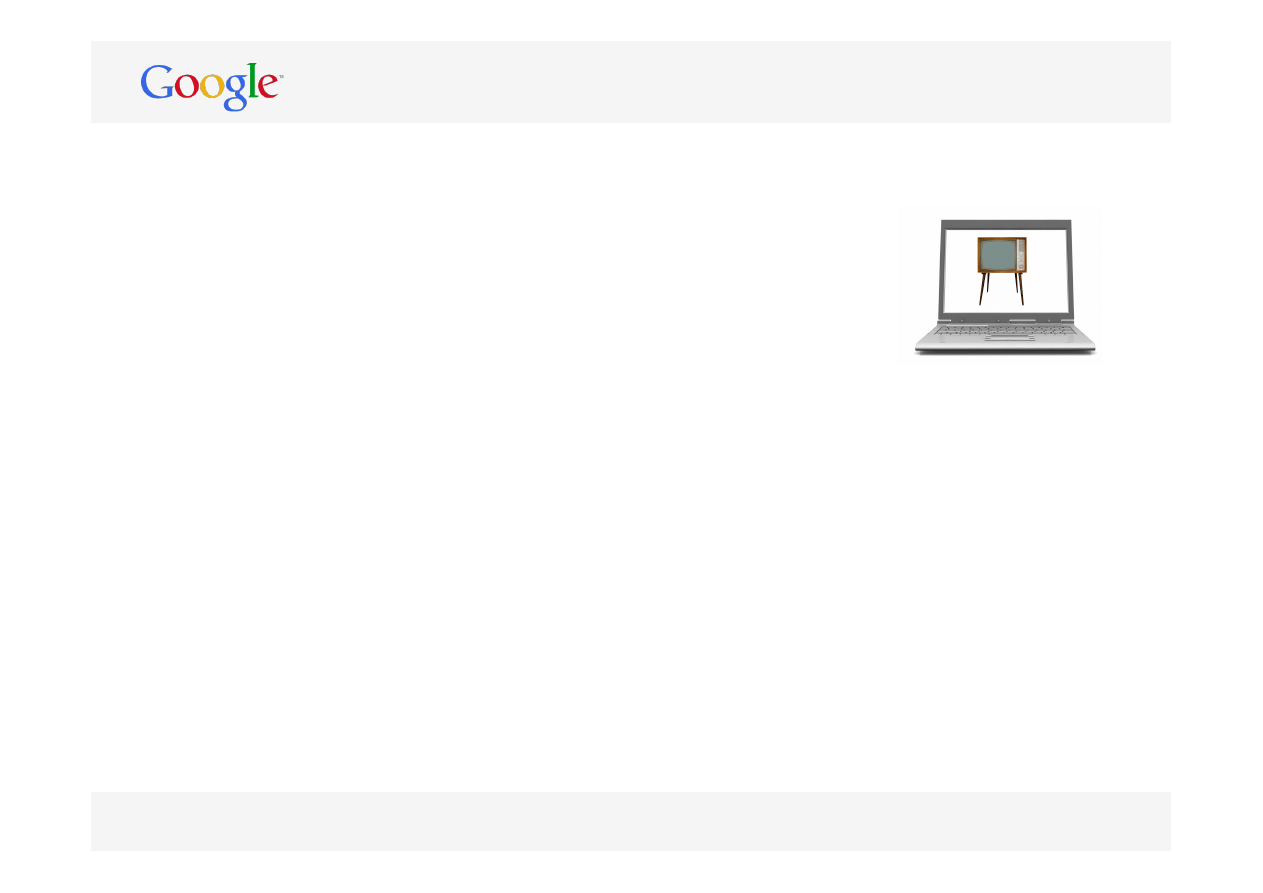
Design
Why is it important?
•
Distracting visitors from the actual offers they
came looking for will have a negative impact
on your conversion rate
•
Overwhelming visitors with options, offers,
specials and call-to-action buttons will make
them indecisive, confused and less likely
to convert.
What you should do
•
Remove as many elements as possible from your landing
pages that can draw the attention of your visitors away
from your offers
•
Show your key offers above the fold
•
Keep your page clean and uncluttered
•
Make use of whitespace
Question to ask
Is the design of the landing page ‘clean’ and does it focus your attention on the actual
offer(s) on the page?
6
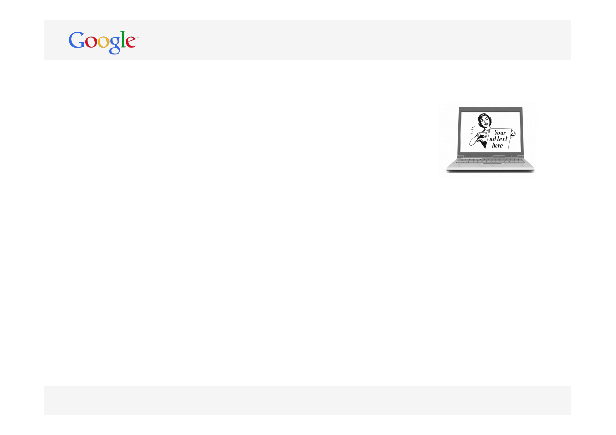
Visuals
Why is it important?
•
Visuals can be used to show off your products
from all possible angles, build trust, create the
right emotions or make your landing page just a
bit more personal
•
A so-called Hero Shot (an image that makes your
offer look more substantial) can do wonders for
your conversion rate
What you should do
•
Make sure that the visuals you show are of high quality
(though compressed enough not to slow down your load
times)
•
Don’t auto-play videos upon page load
•
Consider showing your products ‘in action’ or show
what great things your product / service can do
•
Let visitors zoom in to the very details of your products
if you are selling products with a high ‘touch factor’
•
Ensure images of products show the size dimensions of
the product
•
Consider testing the impact of product videos on the
conversion rate of your landing pages
Question to ask
Are high quality graphics / images / videos used that support the offer(s)
on the landing page?
7
Text
Why is it important?
•
Most visitors do not take the time to read
everything on your landing page but quickly
scan it to see if it is what they were looking for
•
Text tailored to your target audience will help
create the right emotions
What you should do
•
Use BIG HEADLINES to get your key message across
•
Keep sentences and paragraphs short
•
Make use of bullet points to list important features
and benefits
•
Write positive and activating text
•
Customize standard product or service description
•
Start with the most important message at the top
of your page
•
Avoid obvious marketing lingo and jargon unless you are
certain every visitors would understand the terms
Question to ask
Is the text used on the landing page tailored to the target audience and is it easy to scan
and skim the text?
8
Call-to-action
Why is it important?
•
Call-to-action buttons provide guidance to visitors
coming to your page
•
A clear call to action will grab the attention of your
visitor and with the right wording can improve the
conversion rate of your page
What you should do
•
Use wording that describes what will happen next
preferably starting with a verb (example: ‘Download
our free Guide book’)
•
Make sure your call-to-action appears above the fold
and keep a considerable amount of space between
call-to-action and the rest of your content
•
Use a colour that lets your call-to-action stand out from
the rest of your page
•
Size your call-to-actions based on their priority
•
Try and limit the amount of call-to-actions on your page
Question to ask
Is a (limited amount of) call-to-action button(s) provided above the fold, and is it
immediately clear where to click to continue to the next step in the process?
Read this text
9
Value proposition*
Why is it important?
•
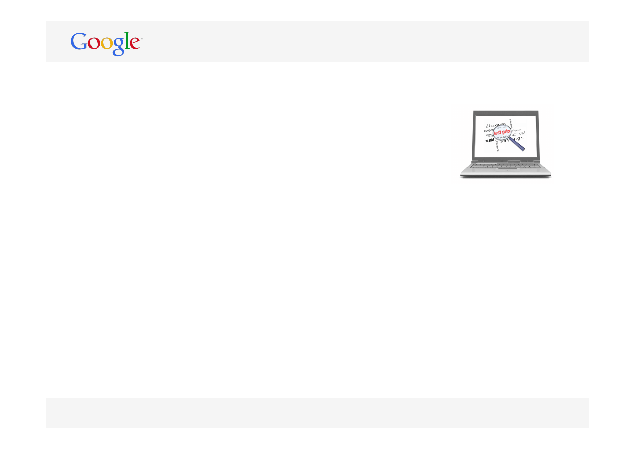
Consumers often compare the offers on multiple
sites and make their final decision based not only
on price but also on the additional value provided
•
For many products, your value proposition is what
distinguishes you from your competitors
What you should do
•
Summarize your Value Proposition on your landing page
•
Phrase your Value Proposition in a way that it
shows the benefit to your potential customer
•
Keep it short and simple (e.g. ‘Delivery in less than
24 hours’)
•
If you offer a wide range of payment methods, consider
showing these right here
•
Consider providing the answer to FAQs in your
Value Proposition
Question to ask
Does the landing page do a good job in explaining why to buy here, instead of
somewhere else?
* The unique added value an organization offers customers through their operations
10
Persuasion
Why is it important?
•
Improving the usability of your site is just one
part of the equation – the other part is to get
visitors to want what you are offering
•
Persuasion tactics can be used to replace the
friendly sales person assisting visitors with their
buying decision
What you should do
•
Try Reciprocation:
if you want visitors to perform a
certain action, offer them something in return (like a 5%
discount in return for signing up for a newsletter)
•
Show Commitment:
make sure visitors know that you
deliver what you promise with your offer (e.g. by offering a
money back guarantee)
•
Use Social Proof
: social influences are a huge factor in
human decision making, so use this to your advantage
(example: show how often a specific hotel was already
booked this week, or which friends of the visitor endorsed
the product or service on a social media site)
Question to ask
Is the landing page doing a good job persuading visitors to make a purchase on the site?
(1 of 2)

10
Persuasion
What you should do
•
Reveal Scarcity
: if visitors get the feeling that a product is running out they will feel
more inclined to buy it (now) instead of running the risk that they will be too late.
Additionally, something that is running out must be a good buy, right?
•
Show Authority
: if your landing page appears to be credible and authoritative, visitors
will be more likely to convert. Show customer testimonials, trust and security
certificates and awards
•
Use Framing
: if your landing page has multiple products or service options, help your
visitor make a decision by for instance listing one offer that is clearly the best or show
one that visually stands out from the rest
(2 of 2)
Summary
✓
✓
✓
✓
✓
✓
✓
✓
✓
✓
Final comments / summarizing thoughts:
Final Score
Confirmation
Speed
First impression
Branding & Site Purpose
Design
Visuals
Text
Call-to-action
Value proposition
Persuasion
16
Track visits to your website with
http://www.google.com/analytics
Google conversion team
Northern and Central Europe (NACE)
Original author: Jos Meijerhof
For more information contact:
Oliver Borm -
oliverborm@google.com
Shane Cassells -
shanecassells@google.com
Wyszukiwarka
Podobne podstrony:
Jankovsky Jason Alan Trading Rules That Work The 28 Essential Lessons Every Trader Must Master
wykłady NA TRD (7) 2013 F cz`
Pr UE Zródła prawa (IV 2013)
W WO 2013 technologia
TEORIE 6 2013 R
Wyk ECiUL#1 2013
Leczenie wrzodziejacego zapalenia jelit, wyklad 2013
TEORIE 1 2013 IIR
Wyk ECiUL#9S 2013
Estrogeny 2013
Problemy zrownowazonego rozwoju UKG 2013
wykład 15 bezrobocie 2013
Temat6+modyf 16 05 2013
Antropologialiteracka2012 2013
2013 MYSLENIE inteligencja
psychologia ogólna W5 2013
więcej podobnych podstron