
Lean Six Sigma
The root of both Lean and Six Sigma reach back to the time when the greatest pressure for quality and speed were on
manufacturing. Lean rose as a method for optimizing automotive manufacturing; Six Sigma evolved as a quality initiative
to eliminate defects by reducing variation in processes in the semiconductor industry. It is not surprising that the earliest
adopters of Lean Six Sigma arose in the service support functions of manufacturing organizations like GE Capital,
Caterpillar Finance, and Lockheed Martin.
Lean Six Sigma for services is a business improvement methodology (
details on DMAIC
) that maximizes shareholder
value by achieving the fastest rate of improvement in customer satisfaction, cost, quality, process speed, and invested
capital. The fusion of Lean and Six Sigma improvement methods is required because:
Lean cannot bring a process under statistical control
Six Sigma alone cannot dramatically improve process speed or reduce invested capital
Both enable the reduction of the cost of complexity
Ironically, Six Sigma and Lean have often been regarded as rival initiatives. Lean enthusiasts note that Six Sigma pays
little attention to anything related to speed and flow, while Six Sigma supporters point out that Lean fails to address key
concepts like customer needs and variation. Both sides are right. Yet these arguments are more often used to advocate
choosing one over the other, rather than to support the more logical conclusion that we blend Lean and Six Sigma.
Key Concept
In short, what sets Lean Six Sigma apart from its individual components is the recognition that you cannot do “just quality” or “just speed,” you need the balanced
process that can help an organization to focus on improving service quality, as defined by the customer within a set time limit.
How is it that Six Sigma and Lean are complementary?
Six Sigma
Emphasizes the need to recognize opportunities and eliminate defects as defined by customers
Recognizes that variation hinders our ability to reliably deliver high quality services
Requires data driven decisions and incorporates a comprehensive set of quality tools under a powerful framework for
effective problem solving
Provides a highly prescriptive cultural infrastructure effective in obtaining sustainable results
When implemented correctly, promises and delivers $500,000+ of improved operating profit per Black Belt per year (a hard
dollar figure many companies consistently achieve)
Lean
Focuses on maximizing process velocity
Provides tools for analyzing process flow and delay times at each activity in a process
Centers on the separation of "value-added" from "non-value-added" work with tools to eliminate the root causes of non-
valued activities and their cost
o
The 8 types of waste / non-value added work
Wasted human talent – Damage to people
Defects – "Stuff" that’s not right & needs fixing
Inventory - "Stuff" waiting to be worked
Overproduction – "Stuff" too much/too early
Waiting Time – People waiting for "Stuff" to arrive
Motion – Unnecessary human movement
Transportation – Moving people & "Stuff"
Processing Waste – "Stuff" we have to do that doesn’t add value to the product or service we are supposed
to be producing.

Provides a means for quantifying and eliminating the cost of complexity
Did You Know?
Approximately 30% to 50% of the cost in service organizations is caused by costs related to slow speed or performing rework to satisfy customer needs.
The two methodologies interact and reinforce one another, such that percentage gains in Return on Investment Capital
(ROIC%) are much faster if Lean and Six Sigma are implemented together.
In short, what sets Lean Six Sigma apart from its individual components is the recognition that you cannot do "just
quality" or "just speed," you need a balanced process that can help an organization focus on improving service quality, as
defined by the customer within a set time limit.
Define-Measure-Analyze-Improve-Control (DMAIC)
Using DMAIC to Improve Service Processes
No matter how you approach deploying improvement teams in your organization, they will all need to know what is
expected of them. That is where having a standard improvement model such as DMAIC (Define-Measure-Analyze-
Improve-Control) is extremely helpful. It provides teams with a roadmap. DMAIC is a structured, disciplined, rigorous
approach to process improvement consisting of the five phases mentioned, where each phase is linked logically to the
previous phase as well as to the next phase.
There are many resources that describe the DMAIC process. Our purpose here is to focus on special considerations for
using the Lean Six Sigma DMAIC process in a service environment, including both methods and tools that are
particularly helpful as well as hints on how to model the people side of each phase.
Elements of Define (DMAIC)
Key Concept
The tools most commonly used in the Define phase are:
Project Charter
Stakeholder Analysis
SIPOC Process Map
Voice of the Customer
Affinity Diagram
Kano Model
Critical-To-Quality (CTQ) Tree
The first phase is Define. During the Define phase, a team and its sponsors reach agreement on what the project is and
what it should accomplish. Presuming that a draft of the Project Charter is already in place, the main work in the Define
phase is for the project team to complete an analysis of what the project should accomplish and confirm understanding
with the sponsor(s). They should agree on the problem, which customers are affected, and how the current process or
outcomes fail to meet their customers’ needs through "
Voice of the Customer
or
Critical-To-Quality (CTQ)
." The
outcome of the Define phase is:
A clear statement of the intended improvement (Project Charter)
A high-level map of the Processes (SIPOC)
A list of what is important to the customer (CTQ)
An understanding of the project's link to corporate strategy and its contribution to ROIC
Project Charter
The charter is a contract between the organization’s leadership and the project team created at the outset of the project. Its
purpose is:
To clarify what is expected of the team
To keep the team focused
To keep the project and team aligned with organizational priorities
To transfer the project from the champion to the team
Stakeholder Analysis
A DMAIC project will require a fundamental change in the process. In an effort to mitigate the resistance to change when
the improvement is implemented, it is crucial to identify the stakeholders early on, and to develop a communication plan
for each of them. Typical stakeholders include managers, people who work in the process under study, upstream and
downstream departments, customers, suppliers and finance. Regular communication can create more buy-in, identify
better solutions, and avoid pitfalls.
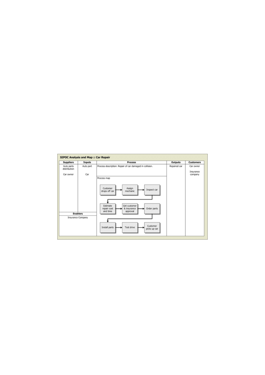
SIPOC Process Map
A SIPOC is a high-level process map that includes Suppliers, Inputs, Process, Output, and Customers. Quality is judged
based on the output of a process. The quality is improved by analyzing inputs and process variables. An example of a
SIPOC Process Map is provided below.
Figure 1: SIPOC Process Map example
Voice of the Customer
The “Voice of the Customer” is a process used to capture the requirements/feedback from the customer (internal or
external) to provide them with best-in-class service/product quality. This process is all about responsiveness and
constantly innovating to capture the changing requirements of the customers over time.
The “Voice of the Customer” is the term used to describe the stated and unstated needs or requirements of the customer.
The “Voice of the Customer” can be captured in a variety of ways: Direct discussion or interviews, surveys, focus groups,
customer specifications, observation, warranty data, field reports, complaint logs, etc.
This data is used to identify the quality attributes needed for a supplied component or material to incorporate in the
process or product. The VOC is critical for an organization to:
Decide what products and services to offer
Identify critical features and specifications for those products and services
Decide where to focus improvement efforts
Obtain a baseline measure of customer satisfaction against which improvement will be measured
Identify key drivers of customer satisfaction
The following is a list of typical outputs of the VOC process:
A list of customers and customer segments
Identification of relevant reactive and proactive sources of data
Verbal or numerical data that identify customer needs
Defined Critical-To-Quality requirements (CTQs)
Specifications for each CTQ requirement
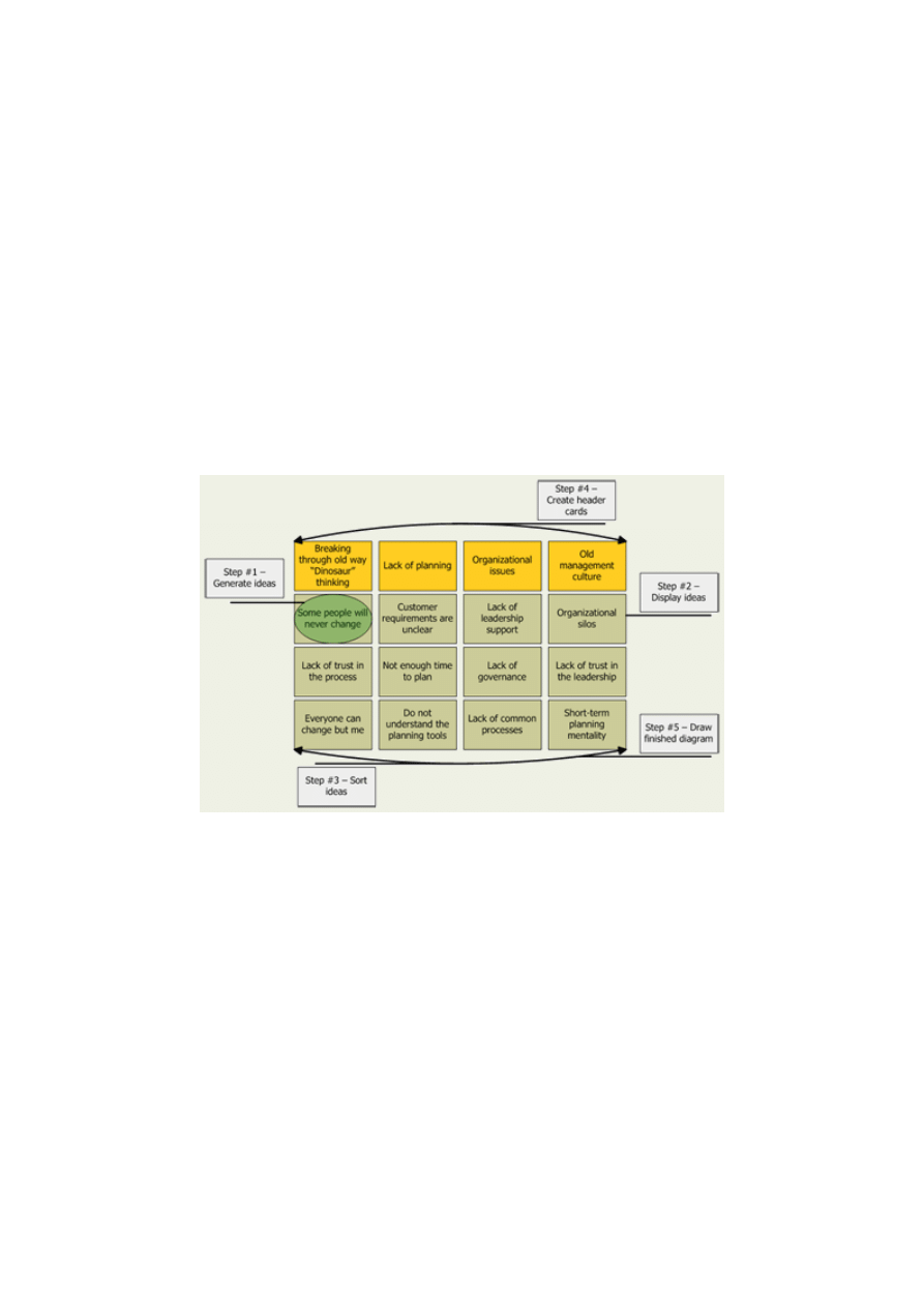
Affinity Diagram
An Affinity Diagram (sometimes referred to as a "KJ", after the initials of the person who created this technique,
Kawakita Jiro) is a special kind of brainstorming tool. You use an Affinity Diagram to:
Gather large numbers of ideas, opinions, or issues and group those items that are naturally related
Identify, for each grouping, a single concept that ties the group together
Figure 2: Affinity Diagram example
An Affinity Diagram is especially useful when:
Chaos exists
The team is drowning in a large volume of ideas
Breakthrough thinking is required
Broad issues or themes must be identified
Building an Affinity Diagram is a creative rather than a logical process that encourages participation because everyone's
ideas find their way into the exercise.
Kano Model
Developed in the 80's by Professor Noriaki Kano, the Kano model is based on the concepts of customer quality and
provides a simple ranking scheme which distinguishes between essential and differentiating attributes. The model is a
powerful way of visualizing product characteristics and stimulating debate within the design team. Kano also produced a
rigorous methodology for mapping consumer responses into the model. Product characteristics can be classified as:
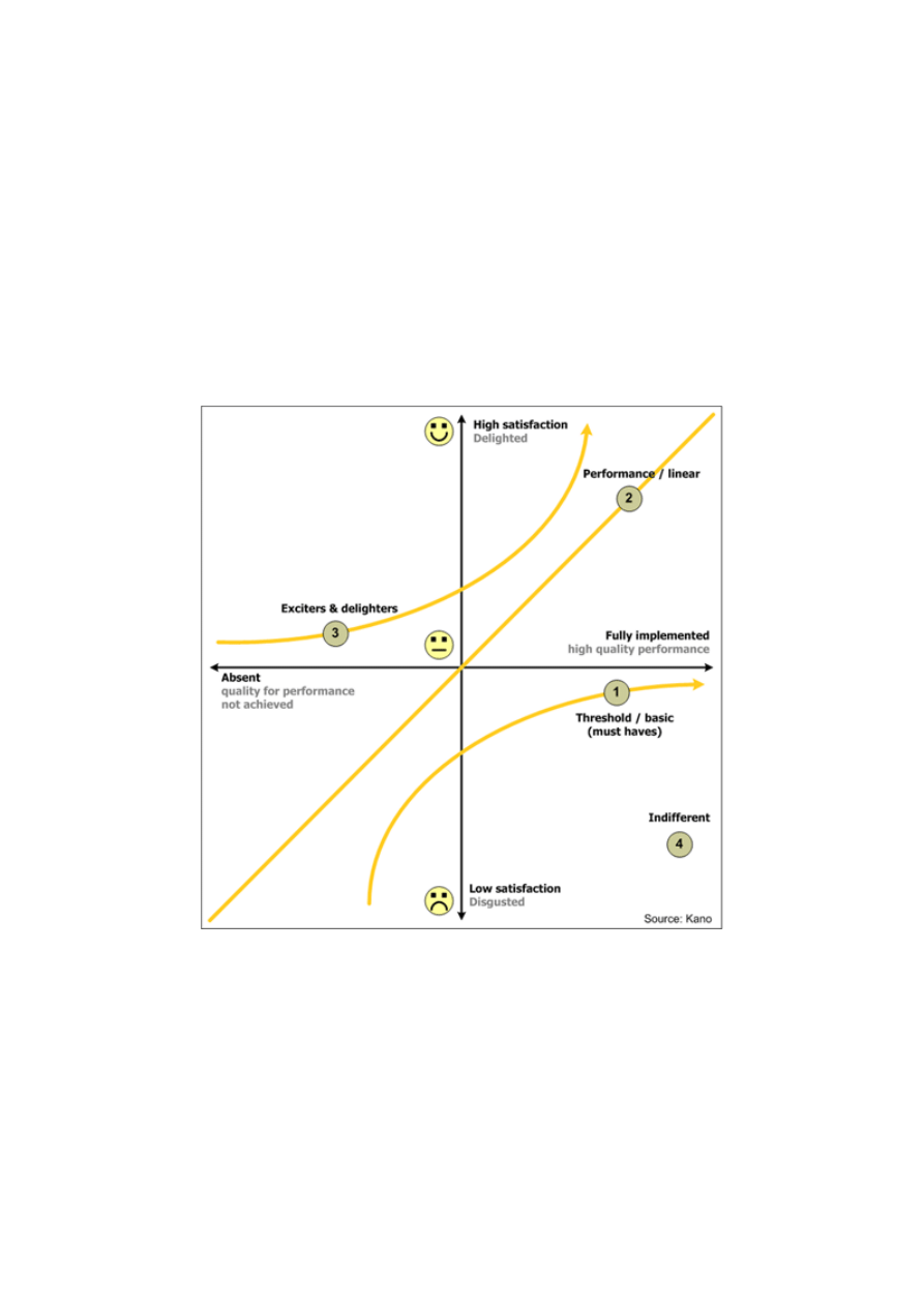
Threshold / Basic attributes
Attributes which must be present in order for the product to be successful, and can be viewed as a ‘price of entry’.
However, the customer will remain neutral towards the product even with improved execution of these threshold
and basic attributes.
One dimensional attributes (Performance / Linear)
These characteristics are directly correlated to customer satisfaction. Increased functionality or quality of
execution will result in increased customer satisfaction. Conversely, decreased functionality results in greater
dissatisfaction. Product price is often related to these attributes.
Attractive attributes (Exciters / Delighters)
Customers receive great satisfaction from a feature and are willing to pay a price premium. However, satisfaction
will not decrease (below neutral) if the product lacks the feature. These features are often unexpected by
customers and can be difficult to establish as needs during initial design. They are sometimes called unknown or
latent needs.
An example of Kano Model is provided below.
Figure 3: Kano Model example
Critical-To-Quality (CTQ) tree
The purpose of Critical-To-Quality trees is to convert customer needs/wants to measurable requirements for the business
to implement.
For example: A retail merchant was receiving a significant number of complaints regarding their homeowner warranty
policies from their customers. By analyzing customer survey data and developing the CTQ tree, the business was able to
identify critical-to-satisfaction requirements. These requirements became the focus for improving customer satisfaction.
The business eliminated mandatory warranty visits and made all warranty visits optional. Eliminating mandatory visits
satisfied the customers who thought there were too many visits and adding an extra optional visit satisfied customers who
thought there were too few visits. Expanding the time frame for scheduling warranty visits from two weeks to three
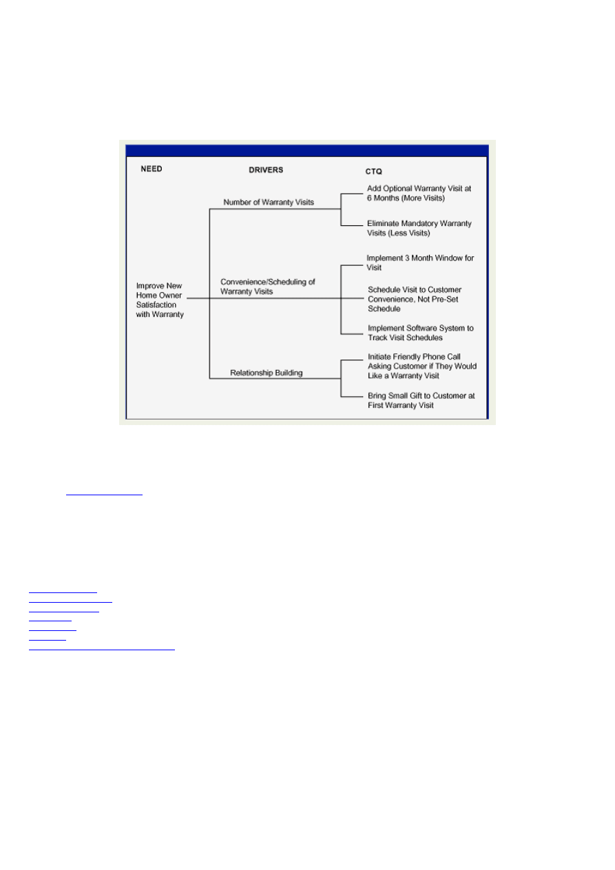
months eliminated the inconvenience for customers who had busy schedules and found the time frame difficult to
manage.
The business took a general, difficult-to-measure need (to improve homeowner warranty satisfaction) and developed
specific, measurable, and actionable requirements to drive improvements in customer satisfaction.
Figure 4: Critical-to-Quality (CTQ) tree example
References
iSixSigma.com
Elements of Measure (DMAIC)
Key Concept
The tools most commonly used in the Measure phase are:
Prioritization Matrix
Process Cycle Efficiency
Time Value Analysis
Pareto charts
Control charts
Run Charts
Failure Modes and Effect Analysis (FMEA)
One of the major benefits of Six Sigma is its demand for a fact-based and data-driven analytical approach. Most other
improvement methodologies, including Lean, tend to attempt process improvement without sufficient data to understand
the underlying causes of the problem. The result is typically many quick-hit projects with short-lived or disappointing
results. Combining data with knowledge and experience is what separates true improvement from mere process tinkering.
One of the goals of the Measure phase is to pin-point the location or source of a problem as precisely as possible by
building a factual understanding of existing process conditions. That knowledge helps you narrow the range of potential
causes requiring investigation in the Analyze phase. An important part of Measure is to establish a baseline capability
level.
Prioritization Matrix
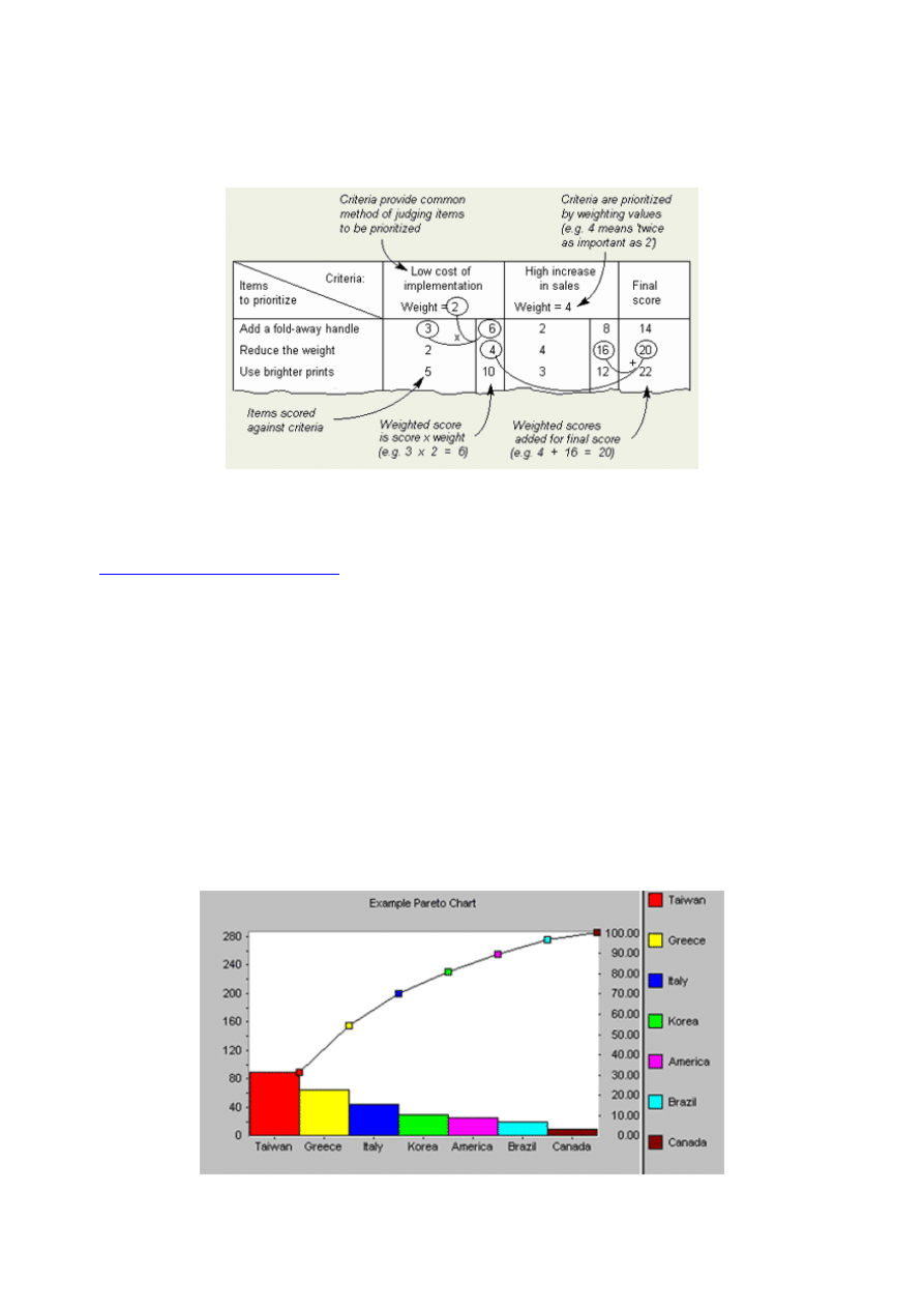
The Prioritization Matrix provides a way of sorting a diverse set of items into an order of importance. It also enables their
relative importance to be identified by deriving a numerical value of the importance of each item. Thus an item with a
score of 223 is clearly far more important than one with a score of 23, but is not much more important than one with a
score of 219. Items are compared, scored against a set of key criteria, and the scores for each item are then summed.
Figure 5: Prioritization Matrix
References
The Improvement Encyclopedia
Process Cycle Efficiency
A calculation that relates the amount of value-added time to total cycle time in a process.
Time Value Analysis
A chart that visually separates value-added from non-value-added time in a process.
Pareto Charts
Vilfredo Pareto, a turn-of-the-century Italian economist, studied the distributions of wealth in different countries,
concluding that a fairly consistent minority – about 20% – of people controlled the large majority – about 80% – of a
society's wealth. This same distribution has been observed in other areas and has been termed the Pareto effect.
Figure 6: Example Pareto Chart
The Pareto effect even operates in quality improvement: 80% of problems usually stem from 20% of the causes. Pareto
charts are used to display the Pareto principle in action, arranging data so that the few vital factors that are causing most
of the problems reveal themselves. Concentrating improvement efforts on these few issues will have a greater impact and
be more cost-effective than undirected efforts.
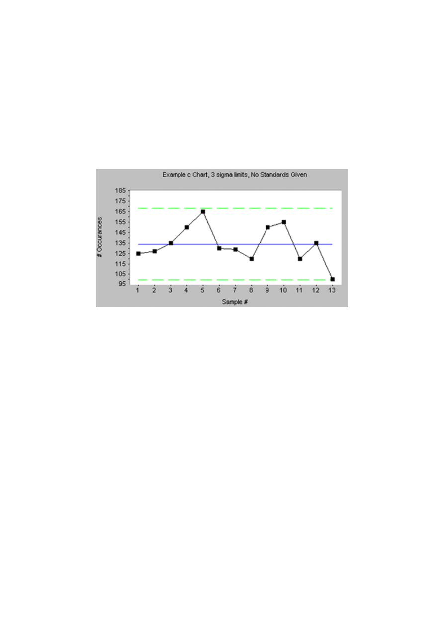
Control Charts
Every process varies. If you write your name ten times, your signatures will all be similar, but no two signatures will be
exactly alike. There is an inherent variation, but it varies between predictable limits. If, as you are signing your name,
someone bumps your elbow, you get an unusual variation due to what is called a "special cause". If you are cutting
diamonds, and someone bumps your elbow, the special cause can be expensive. For many processes, it is important to
notice special causes of variation as soon as they occur.
Figure 7: Example Control Chart
There's also "common cause" variation. Consider a baseball pitcher. If he has good control, most of his pitches are going
to be where he wants them. There will be some variation, but not too much. If he is "wild", his pitches aren't going where
he wants them; there's more variation. There may not be any special causes - no wind, no change in the ball - just more
"common cause" variation. The result: more walks are issued, and there are unintended pitches over the plate where
batters can hit them. In baseball, control wins ballgames. Likewise, in most processes, reducing common cause variation
saves money.
Happily, there are easy-to-use charts which make it easy see both special and common cause variation in a process. They
are called control charts, or sometimes Shewhart charts, after their inventor, Walter Shewhart, of Bell Labs. There are
many different subspecies of control charts which can be applied to the different types of process data which are typically
available.
All control charts have three basic components:
A centerline, usually the mathematical average of all the samples plotted.
Upper and lower statistical control limits that define the constraints of common cause variations.
Performance data plotted over time.
Run Charts
Run charts (often known as line graphs outside the quality management field) display process performance over time.
Upward and downward trends, cycles, and large aberrations may be spotted and investigated further. In a run chart,
events, shown on the y axis, are graphed against a time period on the x axis. For example, a run chart in a hospital might
plot the number of patient transfer delays against the time of day or day of the week. The results might show that there are
more delays at noon than at 3 p.m. Investigating this phenomenon could unearth potential improvement needs. Run charts
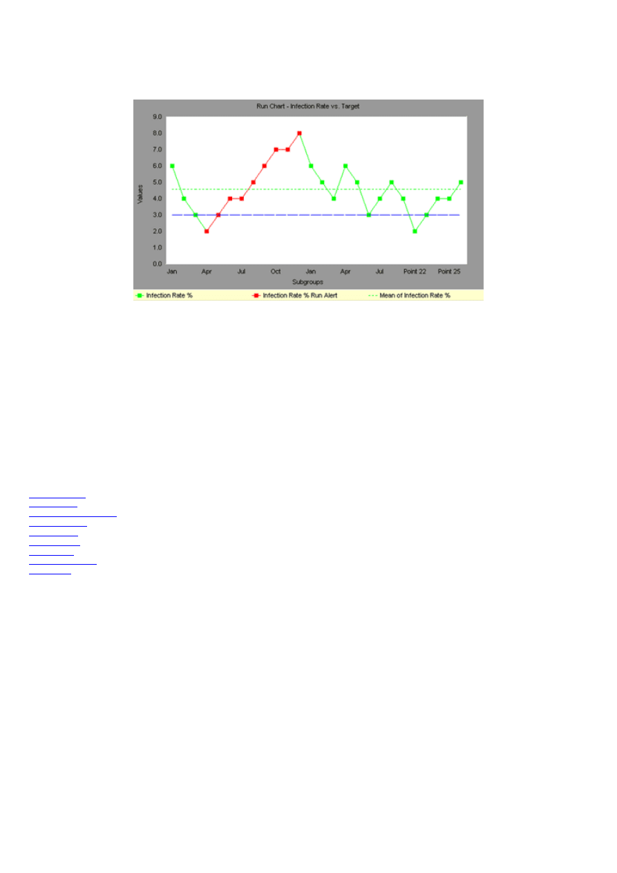
can also be used to track improvements that have been put into place, checking to determine their success. Also, an
average line can be added to a run chart to clarify movement of the data away from the average.
Figure 8: Example Run Chart
Failure Modes and Effect Analysis (FMEA)
Procedures and tools that help to identify every possible failure mode of a process or product, determine its effect on other
sub-items and on the required function of the product or process. The FMEA is also used to rank & prioritize the possible
causes of failure as well as develop and implement preventive actions, with responsible persons assigned to carry out
these actions.
Elements of Analyze (DMAIC)
Key Concept
The tools most commonly used in the Analyze phase are:
5 Whys Analysis
Brainstorming
Cause and Effect Diagram
Affinity Diagram
Control Charts
Flow Diagrams
Pareto Charts
Regression Analysis
Scatter Plots
The Measure phase has identified the baseline performance of the process. By stratifying (sequenced in order of ranks or
order) the data in the baseline performance, it becomes possible to pinpoint the location or source of problems by building
a factual understanding of existing process conditions and problems. That helps to focus the problem statement. In the
Analyze phase you will develop theories of root causes, confirm the theories with data, and finally identify the root
cause(s) of the problem. The verified cause(s) will then form the basis for solutions in the Improve phase.
5 Whys Analysis
Key Concept
Benefits of the 5 Whys:
- It helps to quickly identify the root cause of a problem
- It helps determine the relationship between different root causes of a problem
- It can be learned quickly and doesn't require statistical analysis to be used

5 Whys Analysis is a problem solving technique that allows you to get at the root cause of a problem fairly quickly. It was
made popular as part of the Toyota Production System (1970’s). Application of the strategy involves taking any problem
and asking "Why - what caused this problem?"
By repeatedly asking the question "Why" (five is a good rule), it is possible to peel away the layers of symptoms to
identify the root cause of a problem. Very often the first reason for a problem will lead you to another question and then
to another. Although this technique is called "5 Whys," you may find that you will need to ask the question fewer or more
times than five before you find the issue related to a problem.
An example of a five Why Analysis . . . The "wheel" example.
1. Why is our largest customer unhappy? Because our deliveries of bicycles have been late for the last month.
2. Why have our bicycle deliveries been late for the last month? Because production has been behind schedule.
3. Why has production been behind schedule? Because there is a shortage of wheels.
4. Why are we having a shortage of wheels? Because incoming inspection has rejected a large number of wheels for
not being round.
5. Why are we rejecting so many parts? Because purchasing switched to a cheaper wheel supplier that has
inconsistent quality.
Brainstorming
Brainstorming
is simply listing all ideas put forth by a group in response to a given problem or question. In 1939, a team
led by advertising executive Alex Osborn coined the term "brainstorm." According to Osborn, "Brainstorm means using
the brain to storm a creative problem and to do so "in commando fashion, each stormer audaciously attacking the same
objective." Creativity is encouraged by not allowing ideas to be evaluated or discussed until everyone has run dry. Any
and all ideas are considered legitimate and often the most far-fetched are the most fertile. Structured brainstorming
produces numerous creative ideas about any given "central question". Done right, it taps the human brain's capacity for
lateral thinking and free association.
Brainstorms help answer specific questions such as:
What opportunities face us this year?
What factors are constraining performance in Department X?
What could be causing problem Y?
What can we do to solve problem Z?
However, a brainstorm cannot help you positively identify causes of problems, rank ideas in a meaningful order, select
important ideas, or check solutions.
Cause and Effect (C&E) Diagram
The Cause & Effect diagram is the brainchild of
Kaoru Ishikawa
, who pioneered quality management processes in the
Kawasaki shipyards, and in the process became one of the founding fathers of modern management. The C&E diagram is
used to explore all the potential or real causes (or inputs) that result in a single effect (or output). Causes are arranged
according to their level of importance or detail, resulting in a depiction of relationships and hierarchy of events. This can
help you search for root causes, identify areas where there may be problems, and compare the relative importance of
different causes.
Causes in a C&E diagram are frequently arranged into four major categories. While these categories can be anything, you
will often see:
Manpower, methods, materials, and machinery (recommended for manufacturing)
Equipment, policies, procedures, and people (recommended for administration and service
)
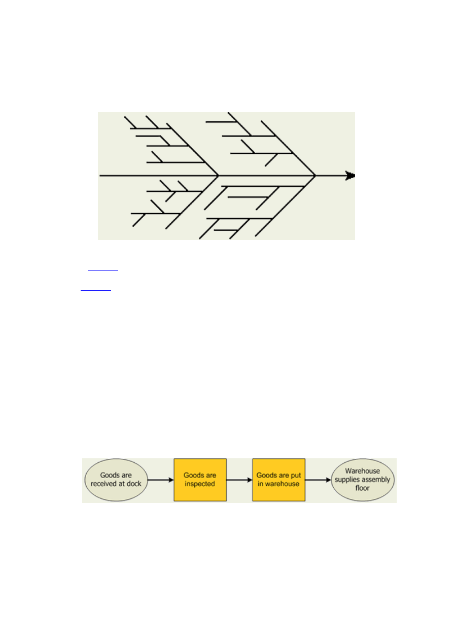
These guidelines can be helpful but should not be used if they limit the diagram or are inappropriate. The categories you
use should suit your needs. Often we can create the branches of the cause and effect tree from the titles of the affinity sets
in a preceding affinity diagram.
The C&E diagram is also known as the fishbone diagram because it is drawn to resemble the skeleton of a fish, with the
main causal categories drawn as "bones" attached to the spine of the fish.
Figure 9: Example C&E diagram
Affinity Diagram (
Covered
in the Define phase)
Control Charts (
Covered
in the Measure phase)
Flow Diagrams
Flowcharts are maps or graphical representations of a process. Steps in a process are shown with symbolic shapes, and the
flow of the process is indicated with arrows connecting the symbols. Computer programmers popularized flowcharts in
the 1960's, using them to map the logic of programs. In quality improvement work, flowcharts are particularly useful for
displaying how a process currently functions or could ideally function. Flowcharts can help you see whether the steps of a
process are logical, uncover problems or miscommunications, define the boundaries of a process, and develop a common
base of knowledge about a process. Flowcharting a process often brings to light redundancies, delays, dead ends, and
indirect paths that would otherwise remain unnoticed or ignored. But flowcharts don't work if they aren't accurate, if team
members are afraid to describe what actually happens, or if the team is too far removed from the actual workings of the
process.
There are many varieties of flowcharts and scores of symbols that you can use. Experience has shown that there are three
main types that work for almost all situations:
High-level flowcharts map only the major steps in a process and provide a good
overview:
Figure 10: High-level flow diagram example
Detailed flowcharts show a step-by-step mapping of all events and decisions in a
process:
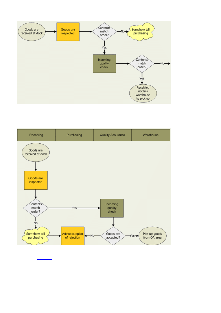
Figure 11: Detailed flow diagram example
Deployment flowcharts organize the flowchart by columns with each column representing a person or department
involved in a
process:
Figure 12: Deployment flow diagram example
Pareto Charts (
Covered
in the Measure phase)
Regression Analysis
Regression analysis is a statistical forecasting model that describes and evaluates the relationship between a given
variable, usually called the dependent variable, and one or more other variables, usually known as the independent
variables.
Regression analysis models are used to help us predict the value of one variable compared to one or more other variables
whose values can be predetermined.
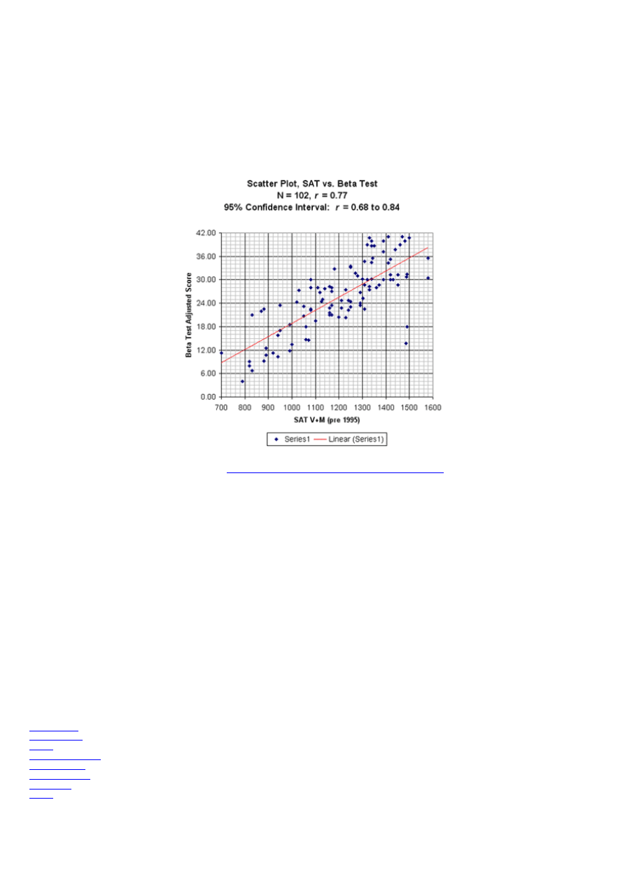
Scatter Plots
Scatter Plots (also called scatter diagrams) are used to investigate the possible relationship between two variables that
both relate to the same "event." A straight line of best fit, using the least squares method, is often included.
Figure 13: Scatter plot example
Reference:
Scatter Plot example - Beta Test Correlation with SAT
Things to look for in a scatter plot:
If the points cluster in a band running from lower left to upper right, there is a positive correlation (if x increases,
y increases).
If the points cluster in a band from upper left to lower right, there is a negative correlation (if x increases, y
decreases).
Imagine drawing a straight line or curve through the data so that it "fits" as well as possible. The more the points
cluster closely around the imaginary line of best fit, the stronger the relationship that exists between the two
variables.
If it is hard to see where you would draw a line, and if the points show no significant clustering, there is probably
no correlation.
Elements of Improve (DMAIC)
Key Concept
The tools most commonly used in the Improve phase are:
Brainstorming
Follow charting
FMEA
Stakeholder Analysis
Setup Reduction
Queuing Methods
5S's Method
Kaizen

The sole purpose of the Improve phase is to demonstrate, with fact and data, that your solutions solve the problem. Your
organization will make changes in a process that will eliminate the defects, waste, and unnecessary costs that are linked to
the customer need identified during the Define phase. Tools and strategies you will find for the Improve phase will
include solution matrices that link brainstormed solution alternatives to customer needs and the project purpose, and
methods for implementing desired solutions.
Setup Reduction
Setup reduction is the process of reducing changeover time (i.e., from the last good piece of the previous run to the first
good piece of the next run). Since setup activities add no marketable form, fit, or function to the product, they are by
definition non-value adding. The tool for tackling setup time is the Four-Step Rapid Setup method. The principle of this
method is to eliminate anything that interrupts or hinders productivity. The following steps provide a high level
description of the Four-Step Rapid Setup method:
Key Concept
Benefits of Setup Reduction:
- Reduce lead time, resulting in improved delivery
- Improve documentation of setup processes, leading to improved processes
- Decreased inventory and costs, while increasing capacity
Step #1 – Identify and tabulate any process-related activity that fits into one or more of the following categories:
Activity that delays the start of value-added work
Activity that causes interruptions to value-added work
Activity where it is similar or identical to another task in the process
Step #2 – See if any of the interruptive/delaying tasks can be offloaded: Our focus here is to move preparatory work
outside of the main process flow so that information or material ends up waiting for you, not the other way around. The
goal is to quickly complete value-added work without any non-value-added activity.
Step #3 - Streamline or automate any interruptive/delaying tasks that cannot be offloaded.
Step #4 – Bring the process under statistical control: The setup is not complete until the output of the process is “within
specification” and under statistical control, meaning the amount of variation in lead time is within predictable limits of +⁄-
3 sigma.
Queuing Methods for Reducing Congestion and Delays
Often congestion occurs because of variation in demand, much like travel congestion and delays that we all witness
during the holiday season. Once identified, there are two principal techniques for reducing congestion that arises from
variation in the demand for service.
Pooling: Cross training staff to step in during times of peak loads. One hotel chain, for example, trains office and
other staff to help out with registration during unexpected and predictable peak times.
Triaging: Sorting jobs into categories that reflect different levels of effort required. Typical schemes include: fast
service times versus slow service times; routine problems versus catastrophic problems. Once Triaging categories
have been identified, you then develop different strategies to deal with each category.
5S’s Method
Key Concept
Benefits of the 5Ss Method
- Improve safety and communication

- Reduce space requirements
- Increase compliance with processes and procedures
- Boost morale by creating a pleasant workplace
- Reduce time wasted looking for tools and equipment
5S’s method/visual is the process of creating workplace cleanliness and organization including visual signals. The 5-S
process includes five steps:
Sort: Organize and separate needed from unneeded
Straighten: Arrange and identify for ease of use
Shine: Clean and look for ways to keep it clean
Standardize: Maintain and monitor the first 3 S’s
Sustain: Discipline, stick to the rules and maintain motivation
By eliminating the unnecessary, establishing a place for what remains, and cleaning up remaining equipment, tools, and
storage devices, clutter is reduced and needed items are readily found. Visual management involves the use of visual cues
(e.g. road traffic signs and signals) to assure things happen and improve documentation.
Kaizen
Kaizen is often translated in the West as ongoing, continuous improvement. Some authors explain Japan's competitive
success in the world market place as the result of the implementation of the Kaizen concept in Japanese corporations. In
contrast to the usual emphasis on revolutionary, innovative change on an occasional basis, Kaizen looks for uninterrupted,
ongoing incremental change. In other words, there is always room for improvement and continuously trying to become
better.
In practice, Kaizen can be implemented in corporations by improving every aspect of a business process in a step-by-step
approach, while gradually developing employee skills through training and increased involvement. Principles in Kaizen
implementation are:
1. Human resources are the most important company asset.
2. Processes must evolve by gradual improvement rather than radical changes.
3. Improvement must be based on statistical/quantitative evaluation of process performance.
Elements of Control (DMAIC)
Key Concept
The tools most commonly used in the Control phase are:
-
Control Charts
-
Flow Diagrams
-
Comparative charts
(e.g. Pareto Charts)
-
Quality Control Process Chart
-
Standardization
During the Improve phase, the solution is piloted, and plans are made for full scale implementation. Putting a solution in
place can fix a problem for the moment, but the activities in the Control phase are designed to insure that the problem
does not reoccur and that the new processes can be further improved over time.
Quality Control Process Chart
A Quality Control (QC) Process Chart is a tool that helps you document Plan-Do-Check-Act (PDCA) activities for the
process. The Plan-Do-Check-Act (PDCA) cycle is a well-known model for CPI. It teaches organizations to plan an action,
do it, check to see how it conforms to the plan and act on what has been learned.

Did You Know?
History of PDCA:
The PDCA cycle is also known by two other names, the Shewhart cycle and the Deming cycle.
Walter A. Shewhart first discussed the concept of PDCA in his 1939 book, Statistical Method From the Viewpoint of Quality Control. Shewhart said the cycle draws its
structure from the notion that constant evaluation of management practices, as well as the willingness of management to adopt and disregard unsupported ideas, is key
to the evolution of a successful enterprise.
Deming is credited with encouraging the Japanese in the 1950s to adopt PDCA. The Japanese eagerly embraced PDCA and other quality concepts, and to honor
Deming for his instruction, they refer to the PDCA cycle as the Deming cycle.
The PDCA cycle is made up of four steps for improvement or change:
Plan: Recognize an opportunity, and plan the change.
Do: Test the change.
Check: Review the test, analyze the results and identify key learning points.
Act: Take action based on what you learned in the check step.
If the change was successful, incorporate the learning from the test into wider changes. If not, go through the cycle again
with a different plan.
Standardization
Standardization enables high quality production of goods and services on a reliable, predictable, and sustainable basis.
Standardization is making sure that important elements of a process are performed consistently in the most effective
manner. Changes are made only when data shows that a new alternative is better. Use of standard practices will:
Reduce variation among individuals or groups and make process output more predictable
Provide “know-why” for operators and managers now on the job
Provide a basis for training new people
Provide a trail for tracing problems
Provide a means to capture and retain knowledge
Give direction in the case of unusual conditions
Process Simulation and Modeling
Process Simulation
One of the greatest complaints we hear from senior managers is “projects are successfully completed, but I’m not seeing a
significant change to the bottom line.” That’s because in the Define stage of
DMAIC
, Six Sigma experts don’t have
enough information to quantify the benefits. They are predicting a bottom line financial benefit without truly
understanding how the process behaves, let alone how it would behave after the change. Without seeing the big picture
you may complete a successful Six Sigma project and see no impact in dollars for your organization. There is a better
way. With Process Modeling you create a simple simulated model of the process. You will visually see which projects
will affect the total output and which will sub-optimize the system.
Key advantages of integrating Six Sigma phases (DMAIC) with Process Modeling are provided below:
Overall interdependencies in processes - The standard Six Sigma toolbox has no way of showing the
interdependencies between one area of the process and another. In complex change initiatives where there are
interdependencies between processes, when incidents happen that cause delays, bottlenecks, variability etc., if
you can’t show the interdependencies, understanding the system and resolving issues is very difficult. If you can’t
understand the system and pinpoint the waste and bottlenecks, changing the system could be risky and typically

does not provide the desired results. A simulated model shows those interdependencies, which allows you to
uncover changes that will affect the overall system.
Risk free experimentation - It is proven that real-time experiments are costly and can have an enormous
negative impact on the system. If you are experimenting with a simulated model of the system, the only cost is
setting up the experiment and reviewing the results. There are no negative impacts to system output or to the
morale of the workforce in trying new process experiments. You can change the parameters, run various
scenarios and if the desired outcome is not achieved, you can pinpoint the root causes, all the while gathering
more information about system behavior – without any disruption to the real system.
Reduced experimentation time - You can run hundreds of experiments a day rather than hundreds of days per
experiment. Many processes have a cycle time of weeks or even months. Running enough replications of an
experiment to validate the results can be overwhelming. With a simulated model, you can run as many computer
simulations as you want and develop plans based upon the review of results.
Impact of change on the existing process - Processes that achieve the goal of Six Sigma (or a high sigma level)
fall out of spec if the volumes change. For example a 50% change to incoming calls to a call center may cripple a
customer-oriented sales process. Planning for change in your system by using a simulated model to understand
the effects of volume change, product stream substitution, staffing policy or other changes can significantly
reduce project risks and the associated costs.
Process Modeling
For details on Process Modeling please refer to "
Work process documentation guide
."
Difference between DMAIC and
Design For Six Sigma (DFSS)
One of the most confusing issues associated with the phrase "I'm using Six Sigma" has to do with what methodology is
actually being used. A majority of the time it's the
DMAIC
methodology, because use of existing processes is causing
resources to be wasted (hence the big savings you've heard about at GE, Honeywell and others over the past years). The
remaining minority of Six Sigma practitioners are using the Design For Six Sigma (DFSS) approach to design a new
product for Six Sigma quality. For details on the DFSS, refer to "
Transform Your Organization Into One That’s World
Class
" by Maurice L. Berryman, Berryman & Associates
Wyszukiwarka
Podobne podstrony:
Lean Six Sigma, Lean
business management McGraw Hill Leaning Into Six Sigma A Parable of the Journey to Six Sigma and
Project Management Six Sigma (Summary)
SIX SIGMA raport
Ref six sigma
AMACOM Demystifying Six Sigma 2003
Tabela przeliczeniowa Six Sigma, WZR UG, III semestr, Zarządzanie jakością - prof. UG, dr hab. Małgo
Sześć sigma six sigma metoda 6 sigm
Nowa Six Sigma nowasi
Six Sigma
Implementing Six Sigma Quality at Better Body Manufacturing
Cz Mesjasz SIX SIGMA 25 01 2012
pytania wszystkie six sigma, jakość pytania
Zarządzanie przez jakość Six Sigma
Zarządzanie przez jakość Six Sigma tekst do mówienia
SIX SIGMA koncepcja doskonalenia jakości (8 stron)
Six Sigma
AMACOM Demystifying Six Sigma 2003
więcej podobnych podstron