Pareto Chart
What is a Pareto Chart?
• The Pareto Chart is named after Vilfredo Pareto, a 19
th
century economist who
postulated that a large share of wealth is owned by a small percentage of the
population. This basic principle translates well into quality problems. A Pareto
Chart is a series of bars whose heights reflect the frequency or impact of
problems. The bars are arranged in descending order of height from left to right.
This means the categories represented by the tall bars on the left are relatively
more significant then those on the right. This bar chart is used to separate the
“vital few” from the “trivial many”. These charts are based on the Pareto Principle
which states that 80 percent of the problems come from 20 percent of the
causes. Pareto charts are extremely useful because they can be used to identify
those factors that have the greatest cumulative effect on the system, and thus
screen out the less significant factors in an analysis. Ideally, this allows the user
to focus attention on a few important factors in a process.
Why should a Pareto Chart be used?
• You can think of the benefits of using a Pareto Charts in economic terms. A
Pareto Chart breaks a big problem down into smaller pieces, identifies the most
significant factors, shows where to focus efforts, and allows better use of limited
resources. You can separate the few major problems from the many possible
problems so you can focus your improvement efforts, arrange data according to
priority or importance, and determine which problems are most important using
data, not perception.
• A Pareto Chart can answer the following questions:
o
What are the largest issues facing our team or business?
o
What 20% of sources are causing 80% of the problems?
o
Where should we focus our efforts to achieve the greatest improvements?
When should a Pareto Chart be used?
• A Pareto Chart is a good tool to use when the process you are investigating
produces data that are broken down into categories and you can count the
number of times each category occurs. A Pareto diagram puts data in a
hierarchical order, which allows the most significant problems to be corrected
first. The Pareto analysis technique is used primarily to identify and evaluate
nonconformities, although it can summarize all types of data. It is the perhaps
the diagram most often used in management presentations.
• Making problem solving decisions isn’t the only use of the Pareto Principle.
Since Pareto Charts convey information in a way that enables you to see clearly
the choices that should be made, they can be used to set priorities for many
practical applications. Some examples are:
o
Process
improvement
efforts for increased unit readiness
o
Skills you want your division to have
o
Customer
needs
o
Suppliers
o
Investment
opportunities

How is a Pareto Chart constructed?
• To construct a Pareto Chart, you need to start with meaningful data which you
have collected and categorized. You need to segment the range of the data into
groups (also called segments or categories). For example, if your business was
investigating the delay associated with processing credit card applications, you
could group the data into the following categories: no signature, residential
address not valid, non-legible handwriting, already a customer, and other (a
category that is inclusive of additional categories with small counts).
• You may either construct a Pareto Chart manually or with Excel. Both
options are listed below.
• The following steps describe how to construct a Pareto Chart manually:
o
Step 1 – Record the raw data. List each category (i.e., no signature,
residential address not valid, non-legible handwriting, already a customer,
and other) and its associated data count (how many times each category
occurred).
Analysis Sheet
Category Frequency
No address
9
Illegible 22
Current customer
15
No signature
40
Other 8
o
Step 2 – Order the data. Prepare an analysis sheet, putting the categories
in order by placing the one the largest count first.
Analysis Sheet
Category Frequency
No signature
40
Illegible 22
Current customer
15
No address
9
Other 8
o
Step 3 – Label the left-hand vertical axis. This is where the “count” of
each category will appear. Make sure the labels are spaced in equal
intervals from 0 to a round number equal to or just larger than the total of
all counts. Provide a caption to describe the unit of measurement being
used, in this case we will label the left-hand vertical axis “Frequency”.
o
Step 4 – Label the horizontal axis. This where your different “categories”
will appear. Make the widths of all the bars the same and label the
categories from largest to smallest. An “other” category can be used to
last to capture several smaller sets of data. Provide a caption to describe
them. If the contributor names are long, label the axis A. B. C, etc. and
provide a key. In the case of our example, the bars on the horizontal axis
will be labeled: no signature, illegible, current customer, no address, and
other.

o
Step 5 – Plot a bar for each category. The height of each bar should
equal the count for that category. The widths of the bars should be
identical.
o
Step 6 – Determine the percentage that each category represents. To do
this, total the counts (for our example, this would be 94). Next, determine
the percentage for each category (i.e., 40/94 for no signature). It is your
choice to determine rounding, but the total of all percentages added
together, should equal 100%.
Analysis Sheet
Category Frequency
Percentage
No signature
40
43%
Illegible 22
23%
Current customer
15
16%
No address
9
10%
Other 8
8%
o
Step 7 – Find the cumulative percentage. Each category’s cumulative
percentage is the percentage for that category added to the percentage of
the category of the larger category before it. (For example: the cumulative
percentage for the category of illegible would be 43+23.)
Analysis Sheet
Category Frequency
Percentage
Cumulative
Percentage
No signature
40
43%
43%
Illegible 22
23%
66%
Current customer
15
16%
82%
No address
9
10%
92%
Other 8
8%
100%
o
Step 8 – Add a cumulative line. This is optional. Label the right axis from
0 to 100% and line up the 100% with the grand total on the left axis. For
each category, put a dot as high as the cumulative total and in line with
the right edge of the category’s bar. Connect all the dots with a straight
lines.
o
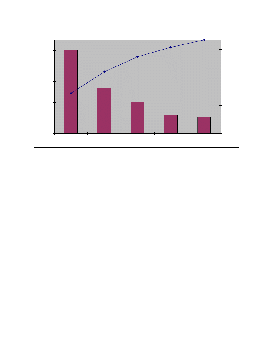
Step 9 – Add title, legend (optional), and date (optional). See chart below.

Delay in Processing Credit Card Applications
0
5
10
15
20
25
30
35
40
45
No signature
Illegible
Current customer
No address
Other
Fr
e
q
ue
nc
y
0%
10%
20%
30%
40%
50%
60%
70%
80%
90%
100%
o
Step 10 – Analyze the diagram. Look for a break point on the cumulative
percent graph. It can be identified by a marked change in the slope of the
graph. This separates the significant few from the trivial many.
Note: The significant few-trivial many principle does not always hold. No matter
how may data are categorized, they can be ranked and made into a Pareto
diagram. Sometimes, no single bar is dramatically different from the others, and
the Pareto Chart looks flat or gently sloping. To attack the tall bar in that
situation is no help. You need to look for another way to categorize the data.
• To create a Pareto Chart in Excel: - setup a spreadsheet such that the first
column contains the categories of your data and the second column contains the
frequency.
All examples in steps will be for data used in Figure 1:
o
Step 1 – Sort your data in descending order by frequency of occurrence.
In order to do this, select the data you want to sort (highlight category and
frequency columns) and click “Data”, “Sort”, and then sort by “Frequency”
(from drop down menu) and select “Descending”.
o
Step 2 – At the bottom of the frequency column, total up the number of
occurrences (e.g. =SUM(B2:B6)).
o
Step 3 – Format columns C and D so that percentages will appear when
data is entered into cells for those columns. To do this, highlight columns
C and D, click format, cells, and on number tab, click percentage and
change the decimal places to whatever is appropriate for your use. It is
your choice to determine rounding, but the total of all percentages added
together, should equal 100%. For this example, we are going to round to
two (2) decimal places.

o
Step 4 – In the third column, create percentages of each occurrence
based on the frequency (e.g. in cell C2, type =B2/B7, for cell C3, type
=B3/B7, etc.) Remember, the total of the percentages should add up to
100%.
o
Step 5 – Create a fourth column and enter the cumulative percentage (e.g.
in cell D2, type: =C2. In cell D3, type (=D2 + C3), as shown in Figure 1. In
cell D4, type (=D3 +C4), etc. The cumulative percentage for the last
category should equal 100%. The cumulative percentage will be used to
create your cumulative line on your chart.
o
Step 6 – Use the control key to select noncontiguous columns, highlight
the Category, Percentage and Cumulative Percentage data. In the Figure
1 this corresponds to cells A1:A6 and C1:D6. You will not include the total
of column B when selecting this data.
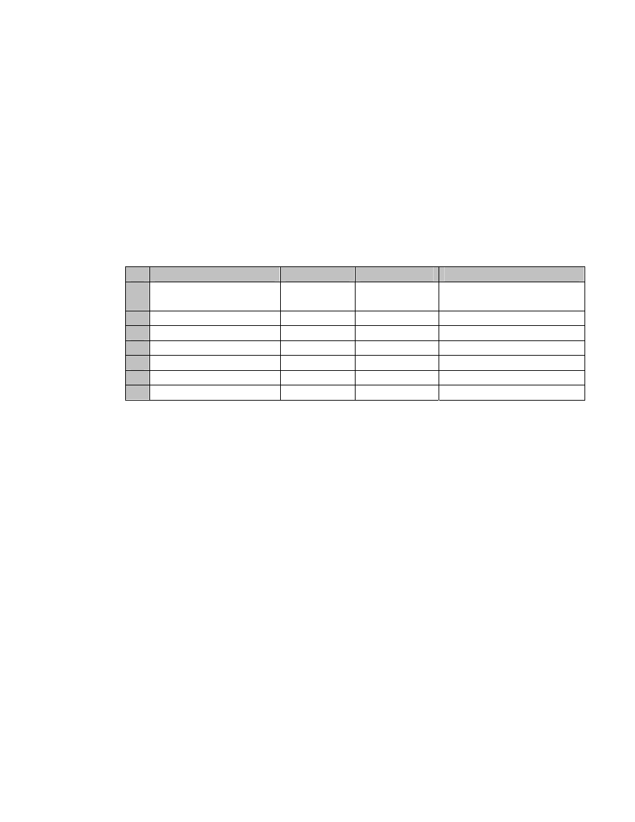
Figure 1
A
B
C
D
1 Category Frequency
Percentage Cumulative
Percentage
2 No signature
40
3 Illegible 22
4 Current customer
15
5 No address
9
6 Other 8
7 94
o
Step 7 –Generate a combination bar chart. To do this, click Insert from
toolbar, then chart, or click the Chart Wizard icon from your toolbar. This
will bring up the Chart Wizard. Select Custom Type and then scroll down
to select Line- Column on 2 axis. You will then click the Next button at the
bottom of the Chart Wizard screen. You have already highlighted your
data range in Step 6. Make sure the columns tab for the “Series in” button
is clicked. Then click next.
o
Step 8– Add proper titles, labels and axis formats. Then click next. Now
you must decide if you want the chart to be located as an object in the
worksheet or if you would like the chart to appear as a separate
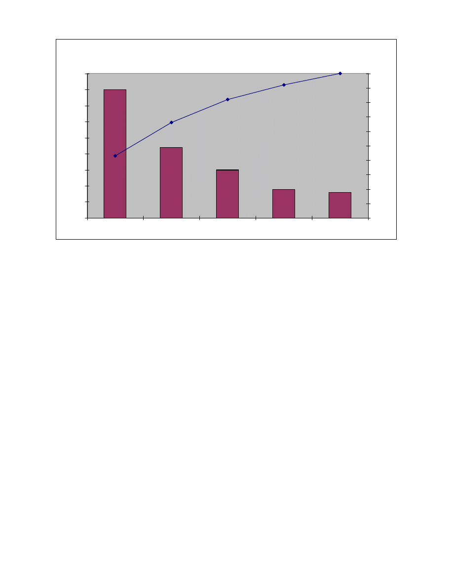
worksheet. Once you have selected an option, you will get a chart that
resembles the following:

Delay in Processing Credit Card Applications
0
5
10
15
20
25
30
35
40
45
No signature
Illegible
Current customer
No address
Other
F
re
q
ue
nc
y
0%
10%
20%
30%
40%
50%
60%
70%
80%
90%
100%
Things to look for on your Pareto Chart:
• In most cases, two or three categories will tower above the others. These few
categories which account for the bulk of the problem will be the high-impact
points on which to focus. If in doubt, follow these guidelines:
1. Look for a break point in the cumulative percentage line. This point occurs
where the slop of the line begins to flatten out. The factors under the
steepest part of the curve are the most important.
2. If there is not a fairly clear change in the slope of the line, look for the factors
that make up at least 60% of the problem. You can always improve these
few, redo the Pareto analysis, and discover the factors that have risen to the
top now that the biggest ones have been improved.
3. If the bars are all similar sizes or more than half of the categories are needed
to make up the needed 60%, try a different breakdown of categories that
might be more appropriate.
Points to Remember:
• The measurement units can significantly affect your Pareto Chart. You must
determine which factors are the most important. For example, using the chart
above, it may change significantly if you were looking at the factors which cost
the company the most money when examining scrap. For instance, bad material
may cost the company more the tool changes when it comes to the cost of scrap.
• It is essential to use the same units of measure and clearly mark these units on
the chart.
• Make sure the “other” category (if you chose to have one) doesn’t become
unreasonably large. If your “other” category accounts for more than 25% of your
problem, you should probably try to break it down.
Wyszukiwarka
Podobne podstrony:
Zasada PARETO
teoria?n czyli teoria wyboru vilfredo pareto KBXDST3SXHEMVV3BAAKJ7JY33JCQARBQMJZUVPY
Pareto Hierarchia spoeczna i krenie elit
Pareto Referat
Pareto 2, teorie socjologiczne
Vilfredo Pareto2, SOCJOLOgia, Socjologia polityki
Zarzadzanie Jakoscia I rok Z semestr letni 2010, Cwiczenie PARETO, Zadanie 2 - analiza Pareto
Diagram Pareto Lorenza
ZASADA PARETO
Zasada Pareto Lorenza
Wykres Pareto
Klasyfikacja materiałów z wykorzystaniem metody ABC (reguła Pareto) i metody XYZ, logistyka zaopatrz
Analiza Pareto Lorentza
06 Zasada Paretoid 6456 ppt
Pareto OF2
zastosowanie diagramu Ishikawy i diagramu Pareto Lorenza, Marketing
PARETO, Socjologia materiały
więcej podobnych podstron